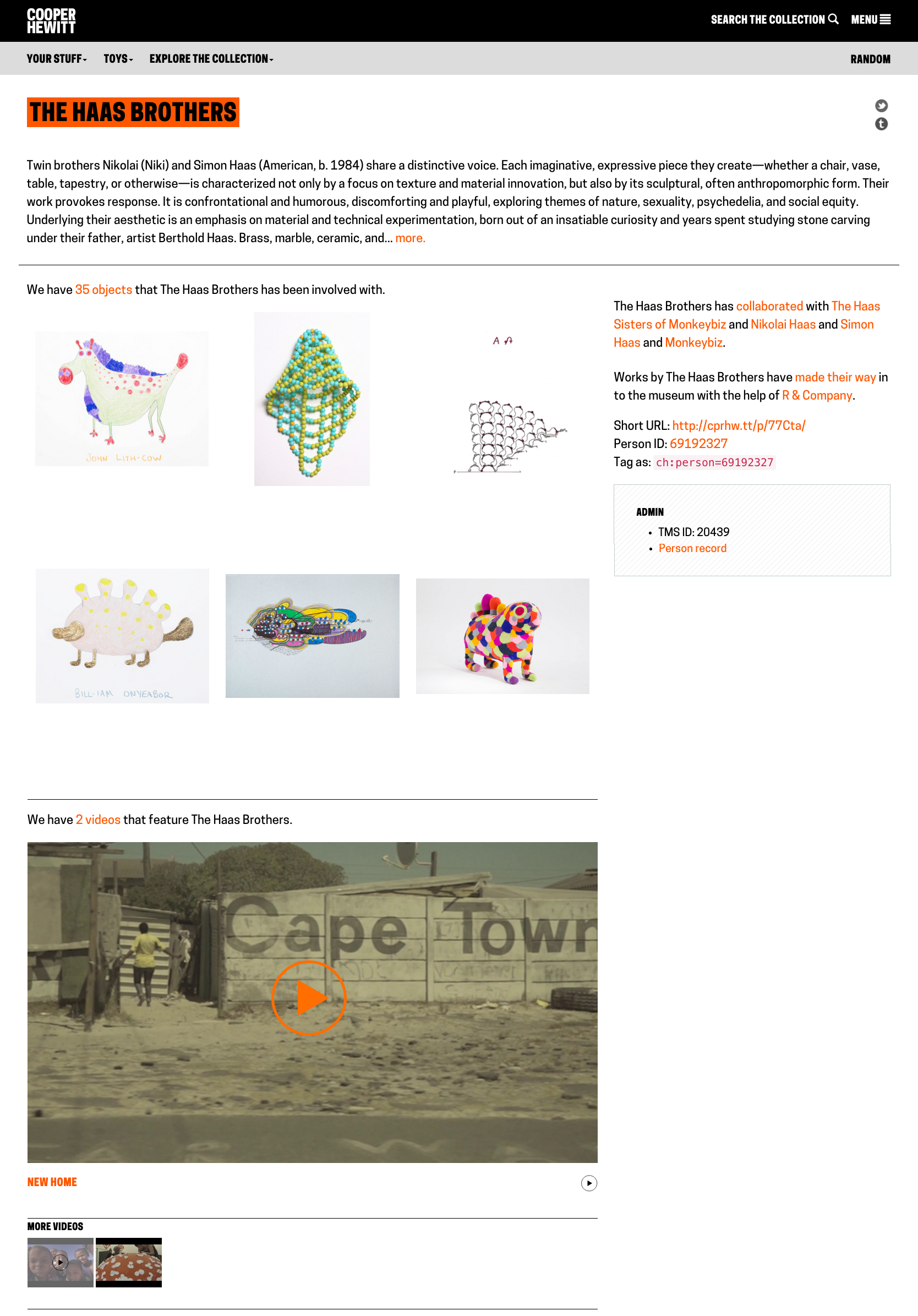
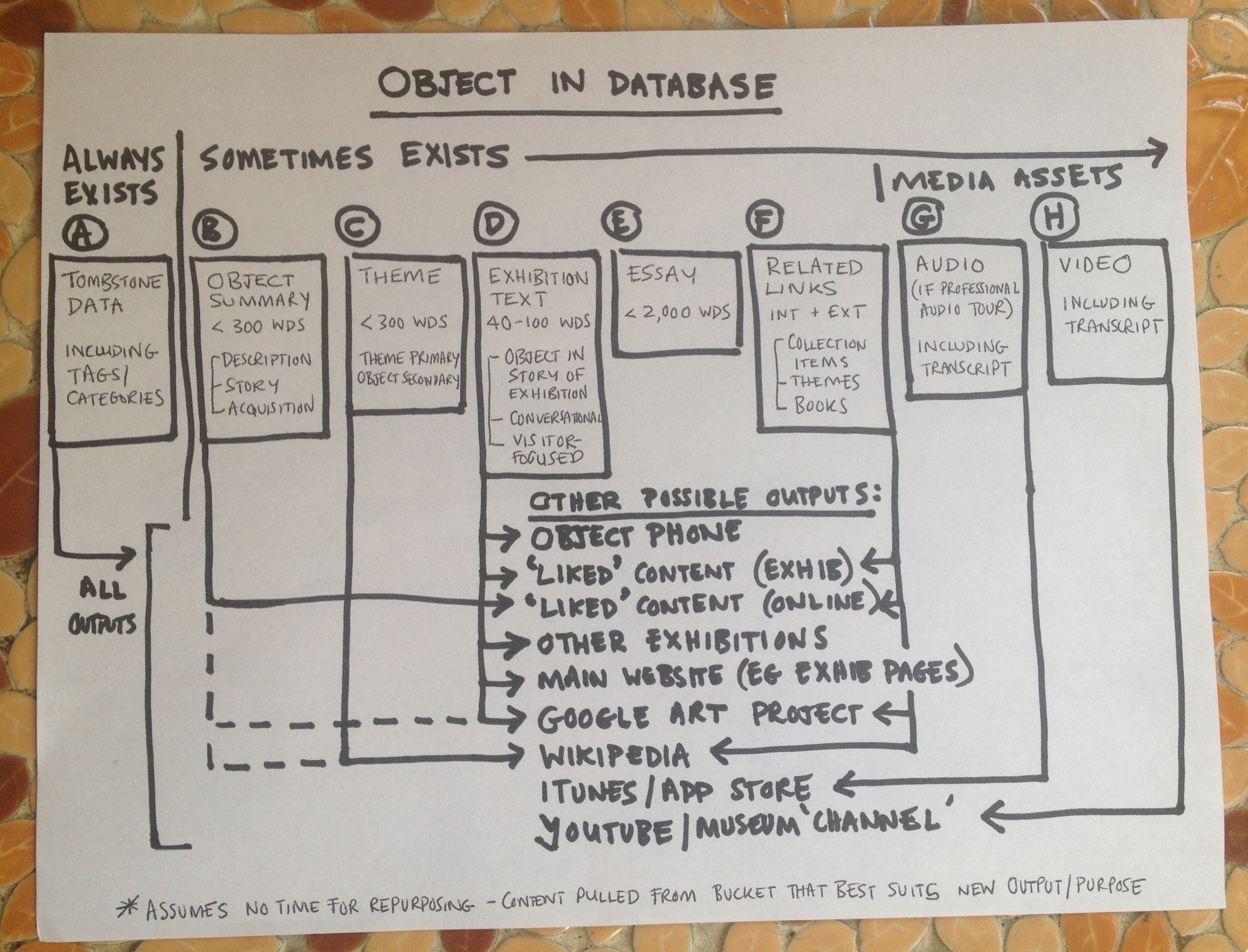
To date, Cooper Hewitt has published several groupings of exhibition-related content in the channels editorial web format. You can read about the development of channels in my earlier post on the topic. This article will focus on post-launch observations of the two most content-rich channels currently on cooperhewitt.org: Scraps and By the People. The Scraps channel contains a wonderful series of posts about sustainability and textiles by Magali An Berthon, and the By the People channel has a number of in-depth articles written by the Curator of Socially Responsible Design at Cooper Hewitt, Cynthia E. Smith. This article focuses on channels as a platform, but I’d like to note that the metrics cited throughout reflect the appeal of the fabulous photography, illustration, research, and writing of channel contributors.
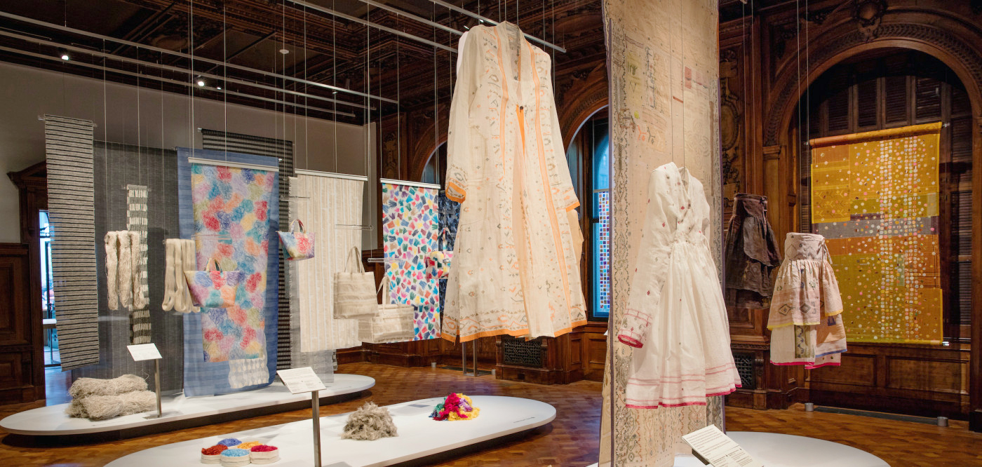
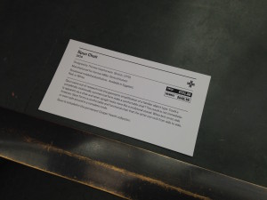
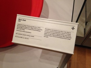
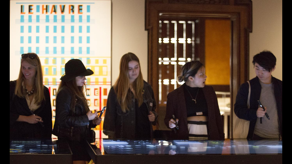
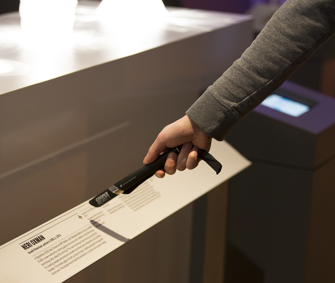
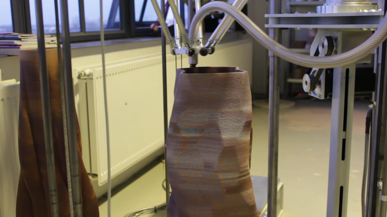
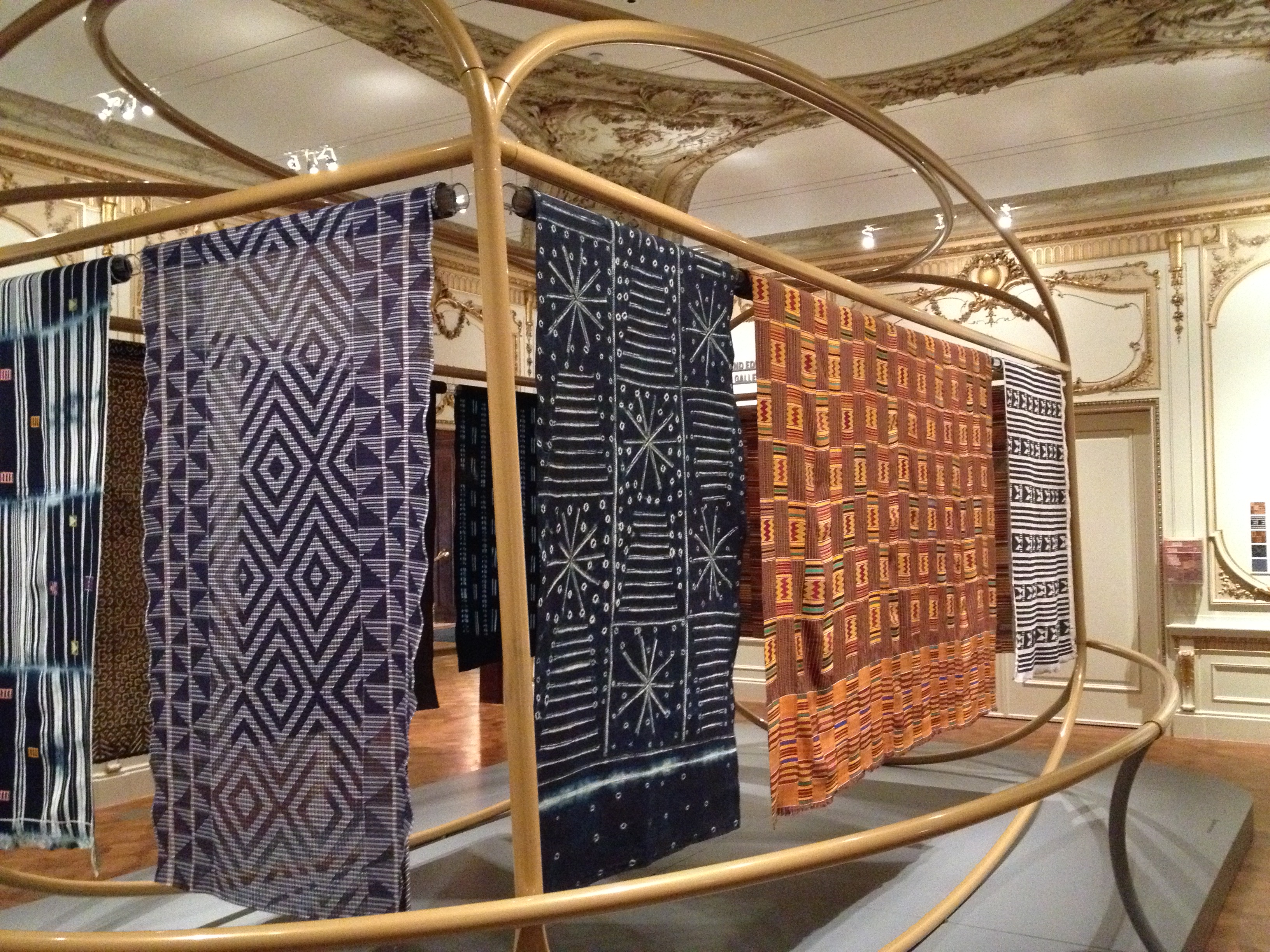
The Scraps exhibition installed in Cooper Hewitt’s galleries.
Since launch, there’s been a positive reaction among staff to channels. Overall they seem excited to have a considered editorial space in which to communicate with readers and exhibition-goers. There has also been strong user engagement with channels. Through Google Analytics we’ve seen two prominent user stories emerge in relation to channels. The first is a user who is planning or considering a trip to the museum. They enter the most common pathway to channel pages through the Current Exhibitions page. From the channel page, they then enter the ticket purchase path through the sidebar link. [Fig. 1] 4.25% of channel visitors proceeded to tickets.cooperhewitt.org from the Scraps channel; 6.09% did the same from the By the People channel. Web traffic through the Scraps channel contributed 13.31% of all web sales since launch, and By the People contributed 15.7%.
Fig. 1. The Scraps channel sidebar contains two well-trafficked links: one to purchase tickets to the museum, and one to the Scraps exhibition page on the collection website.
The second most prominent group of users demonstrates interest in diving into content. 16.32% of Scraps channel visitors used the sidebar link to visit the corresponding exhibition page that houses extended curatorial information about the objects on display; 10.99% used the navigation buttons to view additional channel posts. 19.11% of By the People channel visitors continued to the By the People exhibition page, and 2.7% navigated to additional channel posts.
Navigation patterns indicate that the two main types of users — those who are planning a visit to the museum and those who dive into editorial content — are largely distinct. There is little conversion from post reads to ticket sales, or vice-versa. Future iterations on channels could be directed at improving the cross-over between these user behaviors. Alternately, we could aim to disentangle the two user journeys to create clearer navigational pathways. Further investigation is required to know which is the right course of development.
Through analytics we’ve also observed some interesting behaviors in relation to channels and social media. One social-friendly affordance of the channel structure is that each post contains a digestible chunk of content with a dedicated URL. Social buttons on posts also encourage sharing. Pinterest has been the most active site for sharing content to date. Channel posts cross-promoted through Cooper Hewitt’s Object of the Day email subscription service are by far the most read and most shared. Because posts were shared so widely, 8.65% of traffic to the Scraps channels originated from from posts. (By the People content has had less impact on social media and has driven a negligible amount of site traffic.)
Since posts are apt for distribution, we realized they needed to serve as effective landing pages to drive discovery of channel content. As a solution, Publications department staff developed language to append to the bottom of each post to help readers understand the editorial context of the posts and navigate to the channel page. [Fig. 2] To make use of posts as points of entry, future channel improvements could develop discovery features on posts, such as suggested content. Currently, cross-post navigation is limited to a single increment forward or backward.
Fig. 2. Copy appended to each post contextualizes the content and leads readers to the channel home page or the exhibition page on the collection website.
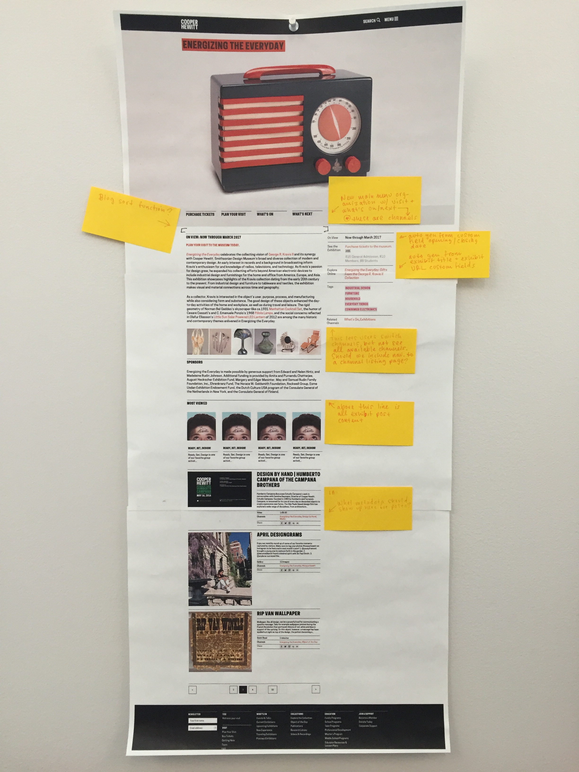
Further post-launch iterations focused on the appearance of posts in the channels page. Publications staff began utilizing an existing feature in WordPress to create customized preview text for posts. [Fig. 3] These crafted appeals are much more to inviting potential readers than the large blocks of excerpted text that show up automatically. [Fig. 4]
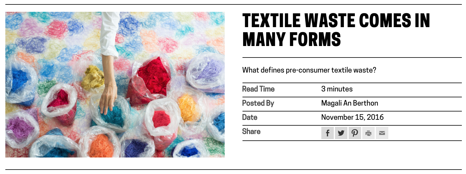
Fig. 3. View of a text-based post on a channel page, displaying customized preview text and read time.
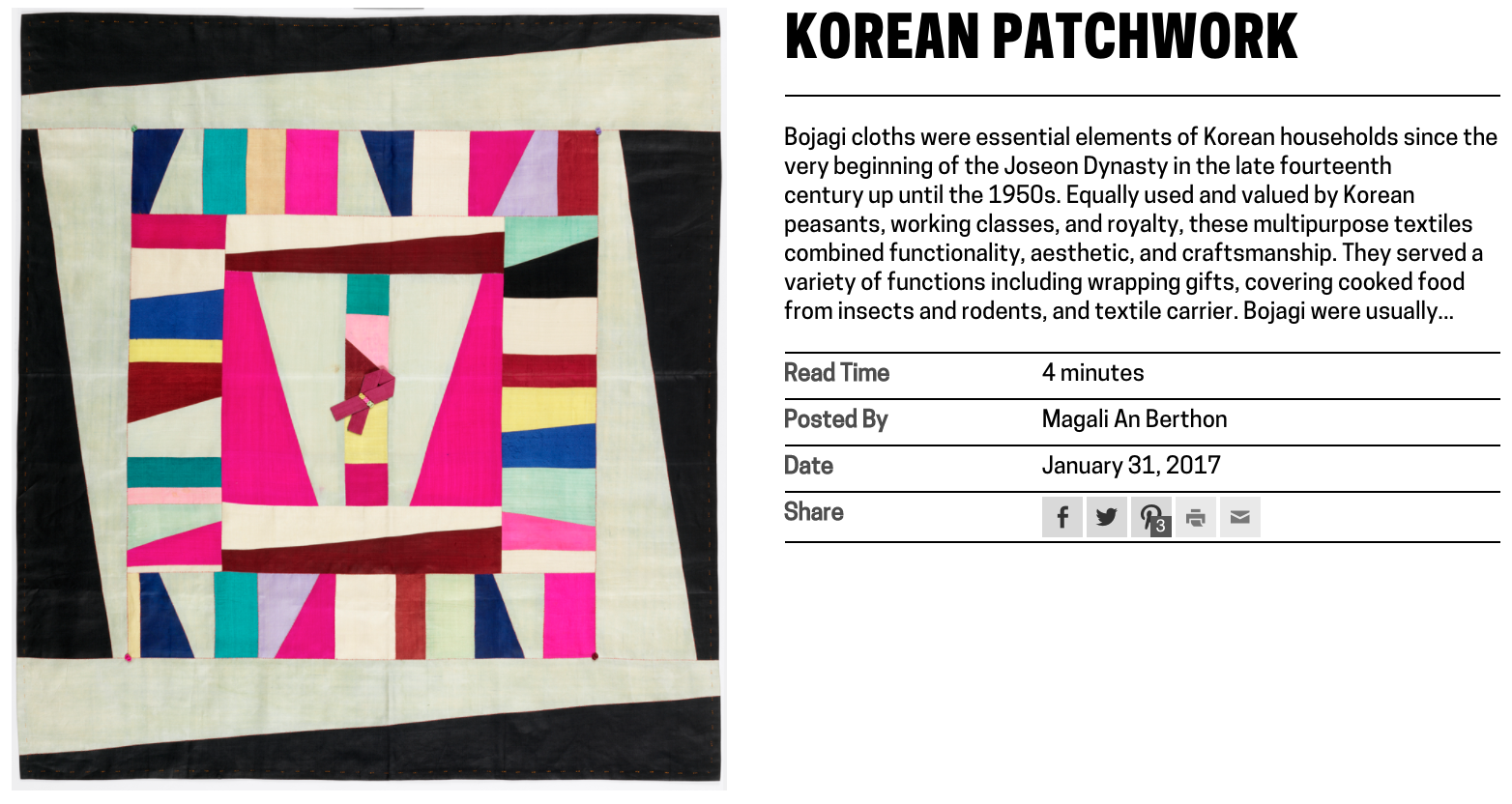
Fig. 4. View of a text-based post on a channel page, displaying automatically excerpted preview text.
Digital & Emerging Media (D&EM) department developer, Rachel Nackman, also implemented some improvements to the way that post metadata displays in channels. We opted to calculate and show read time for text-based posts. I advocated for the inclusion of this feature because channel posts range widely in length. I hypothesized that showing read time to users would set appropriate expectations and would mitigate potential frustration that could arise from the inconsistency of post content. We also opted to differentiate video and publication posts in the channel view by displaying “post type” and omitting post author. [Fig. 5 and 6] Again, these tweaks were aimed at fine-tuning the platform UX and optimizing the presentation of content.
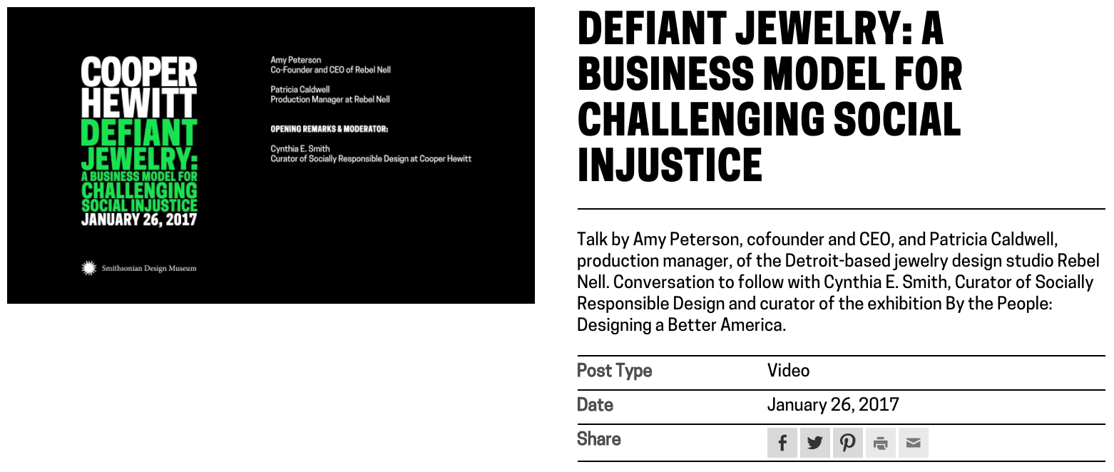
Fig. 5. View of a video post on a channel page, displaying “post type” metadata and omitting post author information.
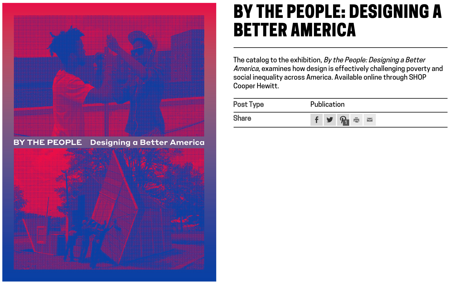
Fig. 6. View of a publication post on a channel page, displaying “post type” metadata and omitting post author information.
The channels project is as much an expansion of user-facing features as it is an extension of the staff-facing CMS. It has been useful to test both new methods of content distribution and new editorial workflows. Initially I intended channels to lean heavily on existing content creation workflows, but we have found that it is crucial to tailor content to the format in order to optimize user experience. It’s been an unexpectedly labor intensive initiative for content creators, but we’ve seen a return on effort through the channel format’s contribution to Cooper Hewitt business goals and educational mission.
Based on observed navigation patterns and engagement analytics it remains a question as to whether the two main user journeys through channels — toward ticket purchases and toward deep-dive editorial content — should be intertwined. We’ve seen little conversion between the two paths, so perhaps user needs would be better served by maintaining a separation between informational content (museum hours, travel information, what’s on view, ticket purchasing, etc.) and extended editorial and educational content. The question certainly bares further investigation — as we’ve seen, even the smallest UI changes to a content platform can have a big impact on the way content is received.


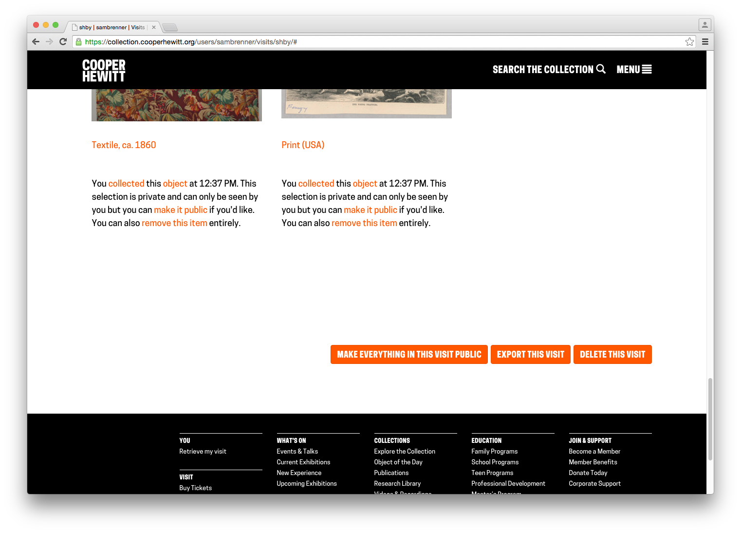
 Objects that haven’t been collected yet have a grey icon.
 Objects that have been collected in the galleries, as part of a visit to the museum, have a pink icon.
 Objects that that have been collected on the collections website have an orange icon.