Author Archives: Sam Brenner

On Exhibitions and Iterations

Since reopening in December 2014, we’ve found that the coming opening of an exhibition is a big driver of iteration. The work involved in preparing an exhibition involves the whole museum and is one of the most coordinated and planned-out things we do, and because of this, new exhibitions push us to improve in a number of ways.

First, new exhibitions can highlight existing gaps or inefficiencies in our systems. Our tagging tool, for example, always sees a round of bug fixes or new features before an exhibition because it coincides with a time when it will see heavy use. Second, exhibitions present us with new technical challenges. Objects in the Heatherwick exhibition, for example, were displayed in the galleries grouped into “projects,” which is also how we wanted users to collect them with their Pens and view them on the website. To accomplish this we had to figure out a way that TMS, our collections management software, could store both the individual objects (for internal purposes) and the grouped projects (which would hold all the public-facing images and text), and figure out how to see that through to the website in a way that made registrars, curators and ourselves comfortable. Finally, a new exhibition can present an opportunity for experimentation. David Adjaye Selects gave us the opportunity to scale up Object Phone, a telephone-based riff on the audio guide, which originally started as a small, rough prototype.

Last week was the opening of our triennial exhibition “Beauty,” which similarly presented us with a number of technical challenges and opportunities to experiment. In this post I’ll share some of those challenges and the work we did to approach them.

Collecting Exhibition Text

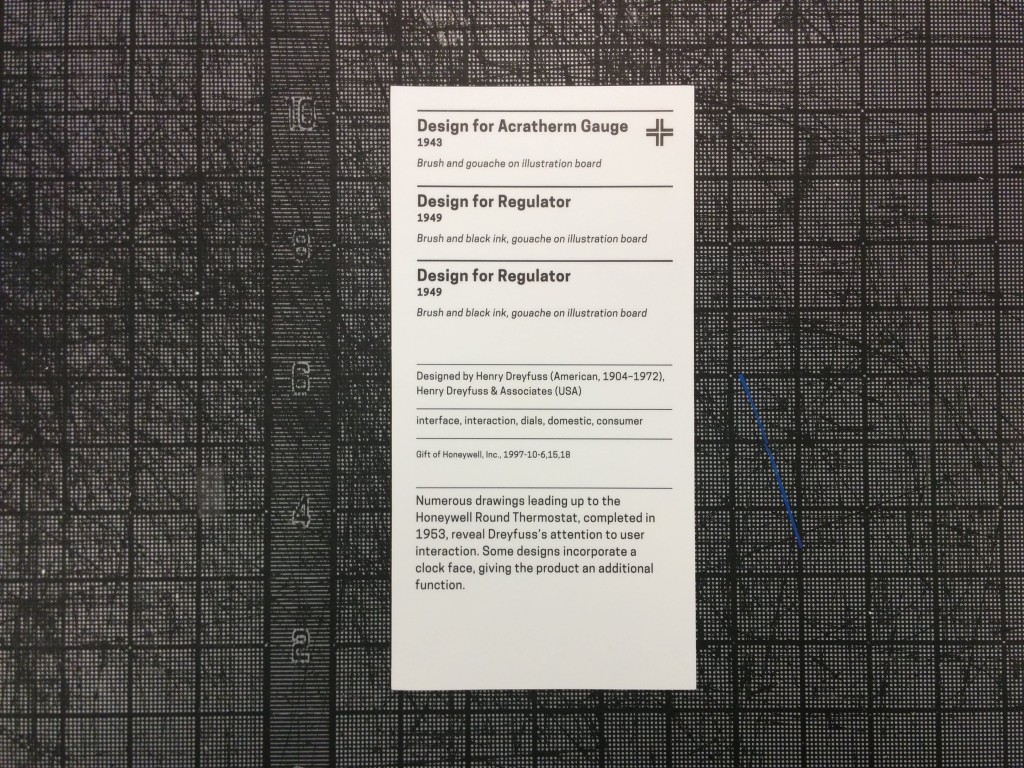
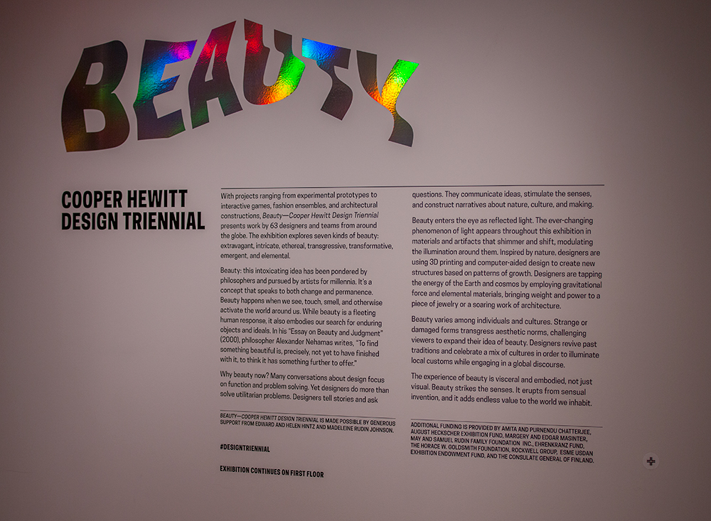
Triennial's wall text, with the collect icon in the lower-right corner

Triennial’s wall text, with the collect icon in the lower-right corner

Since the beginning of the pen project we’ve been saying that the Pens don’t just have to collect objects. Aaron and Seb wrote in their paper on the project that “nothing would prevent the museum from allowing visitors to ‘collect’ individual designers, entire exhibitions or even architectural elements from the building itself in the future.” To that end, we’ve experimented with collecting shop items and decided that with the triennial we would allow visitors to collect exhibition text as well.

Exhibition text (in museum argot, “A-Panel” is the main text at the beginning of an exhibition and “B-Panel” are any additional texts you might find along the way) makes total sense as something that a visitor should be able to remember for later. It explains and contextualizes an exhibition’s goals, contents and organization. We’ve had the text on our collections since we reopened but it took a few clicks to get through from a visitor’s post-visit website. Now, the text will be right there alongside all of a visitor’s objects.

The exhibition text on a post-visit website

The exhibition text on a post-visit website

The open-ended part of this is what visitors will expect when they collect an “exhibition.” We installed the collection points with no helper text, i.e. it doesn’t say “press here to collect this exhibition’s text.” We think it’s clear that the crosshairs refer to the text, but one of our original ideas was that we could have a way for the visitor to automatically collect every object in the exhibition and I wonder if that might be the implied function of the text tag. We will have to observe and adapt accordingly on that point.

Videos Instead of Images

When we first added videos to our collections site, we found that the fastest way to accomplish what we needed was to use TMS for relating videos to objects but use custom software for the formatting and uploading of the videos. We generate four versions of every video file — subtitled and not subtitled at two resolutions each — which we use in the galleries, on the tables and on the website. One of the weaknesses of this pipeline is that because the videos don’t live in the usual asset repository the way all of our images do, the link between TMS and the actual file’s location is made by nothing more than a “magic string” and a bit of guesswork. This makes it difficult to work with the video records in TMS: users get no preview and it can be difficult to know which video ID refers to which specific video. All of this is something we’ll be taking another look at in the near future, but there is one small chunk of this problem we approached in advance of the Triennial: how to make our website show the video in place of the primary image if it would be more appropriate to do so.

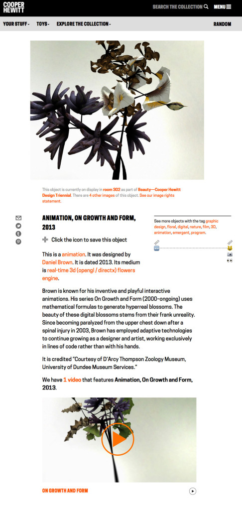
Here’s an example. Daniel Brown’s On Growth and Form is an animation on display in the Triennial. Before, it would have looked like this — the primary image is a still rendering that has been added in TMS, and the video appears as related content further down the page.

growthandform

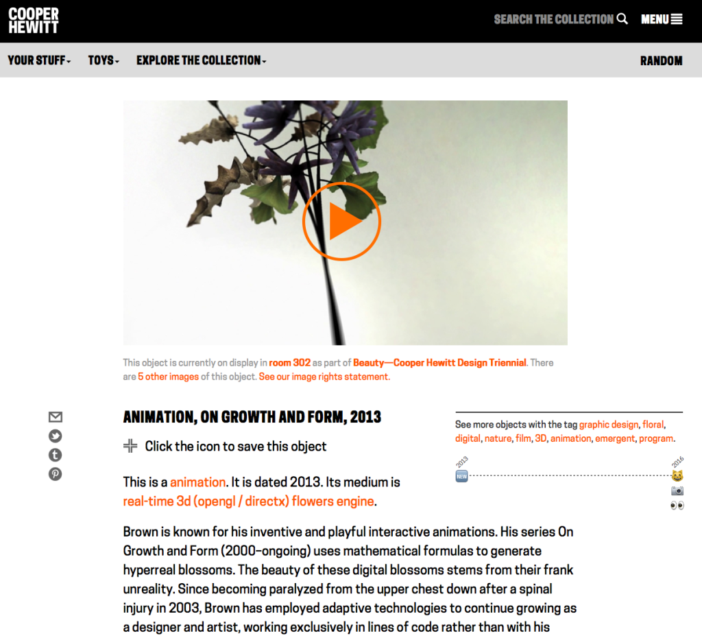
What we did is to say if the object is itself a video, animation or other screen-based media and we have an associated video record linked to the object, remove the primary image and put the video there instead. That looks like this:

Screen Shot 2016-02-16 at 3.33.50 PM

Like all good iterations, this one opened up a bunch of next steps. First, we need to figure out how to add videos into our main digital asset pipeline so that the guesswork can be removed from picking primary videos and a curator or image specialist can select it as “primary” the same way they would do with an image. Next, it brought up an item that’s been on the backburner for a while, which is a better way to display alternate images of an object. Currently, they have their own page, which gets the job done, but it would be nice to present some alternate views on the main object page as well.

Just a Reflektor Sandbox

It's fun!

It’s fun!

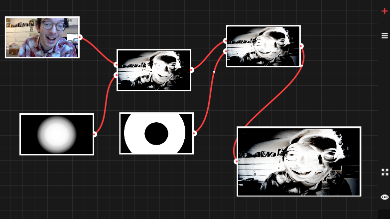
We had a great opportunity to do some experimentation on our collections site due to the inclusion of Aaron Koblin and Vincent Morisset’s interactive video for Arcade Fire’s Just a Reflektor. The project’s source code is already available online and contains a “sandbox” environment, a tool that demonstrates some of the interactive visual effects created for the music video in a fun, open-ended environment. We were able to quickly adapt the sandbox’s source code to fit on our collections site so that visitors who collect the video with their Pen will be able to explore a more barebones version of the final interactive piece. You can check that out here.

Fully Loaded Labels

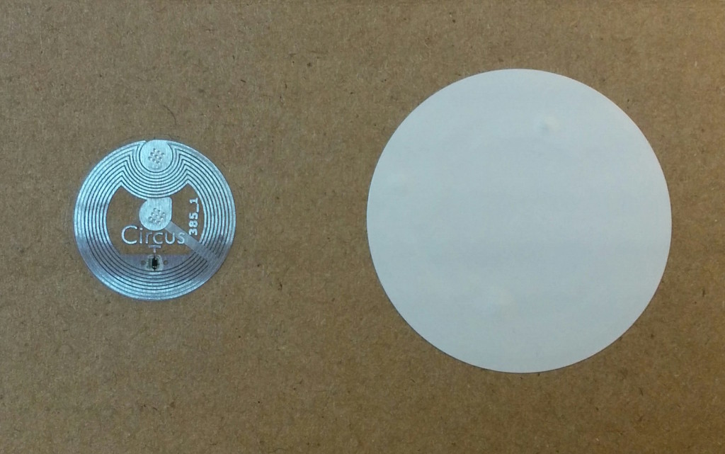
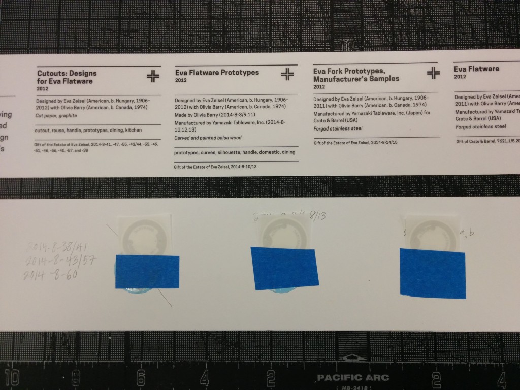
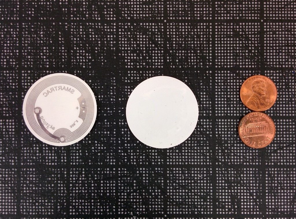
When we were working on the Pen prototypes, we tried six different NFC tags before getting to the one that met all of our requirements. We ended up with these NTAG203 tags whose combination of size and antenna design made them work well with our Pens and our wall labels. Their onboard memory of 144 bytes, combined with the system we devised for encoding collection data on them, meant that we could store a maximum of 11 objects on a tag. Of course we didn’t see that ever being a problem… until it was. The labels in the triennial exhibition are grouped by designer, not by object, and in some cases we have 35 objects from a designer on display that all need to be collected with one Pen press. There were two solutions: find tags with more memory (aka “throw more hardware at it”) or figure out a new way to encode the tags using fewer bytes and update the codebase to support both the new and old ways (aka “maintenance nightmare”). Fortunately for us, the NTAG216 series of tags have become more commonly available in the past year, which feature 888 bytes of memory, enough for around 70 objects on a tag. After a few rounds of end-to-end testing (writing the tag, collecting it with a pen and having it show up on the post-visit website), we rolled the new tags out to the galleries for the dozen or so “high capacity” labels.

The new tag (smaller, on the left) and the old tag (right)

The new tag (smaller, on the left) and the old tag (right)

The most interesting iteration that’s been made overall, I think, is how our exhibition workflow has changed over time to accommodate the Pen. With each new exhibition, we take what sneaked up on us the last time and try to anticipate it. As the most recent exhibition, Beauty’s timeline included more digitally-focused milestones from the outset than any other exhibition yet. Not only did this allow us to anticipate the tag capacity issue many months in advance, but it also gave us more time to double check and fix small problems in the days before opening and gave us more time to try new, experimental approaches to the collections website and post-visit experience. We’re all excited to keep this momentum going as work ramps up on the next exhibitions!

 

Iterating the “Post-Visit Experience”

The final phase of a visitor’s experience at Cooper Hewitt, after they’ve left the museum, is what we call the “post-visit experience.” Introduced along with the Pen in March, it is a personalized website that displays a visitor’s interactions with the museum as a grid of images, including objects they collected from the galleries and wallpapers they created in the Immersion Room.

Our focus leading up to its launch was just to have it working, and as such, some of the details of a visitor’s experience with the application were overlooked. As a result of this, our theoretically simple interface became cluttered with extra buttons, calls to action and explanatory texts. In this post, I’ll present the experience as it existed before and describe some of the steps we took in the past month to iterate on the post-visit experience.

The “Before” Experience

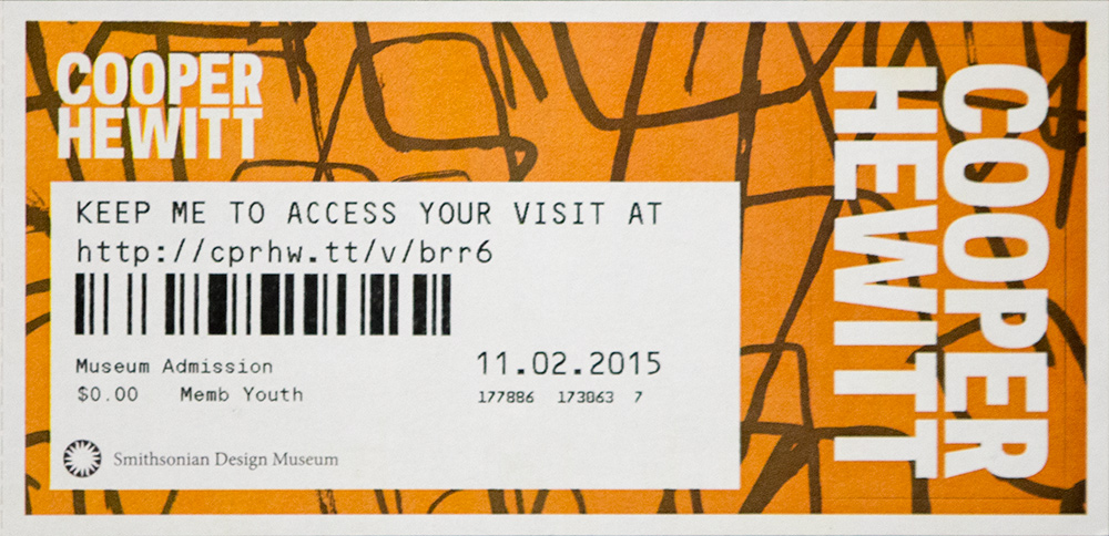
ticket_old

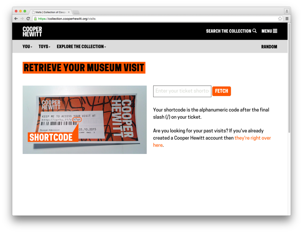
First, let’s walk through the experience as it existed up until this week. The post-visit begins when a visitor accesses their personal website, which they could do by going to a URL on their physical ticket. On the ticket above, that URL is https://cprhw.tt/v/brr6. The domain is our “URL shortener,” https://cprhw.tt, followed by /v/ to indicate a visit (the shortener also supports /o/ for objects or /p/ for people), followed by a four or five-character alphanumeric code which we call the “shortcode.” If a visitor recognized this whole thing as a URL, they would get access to their visit. If a visitor didn’t recognize this as a URL, they would hopefully go to our homepage and find the link that took them to the “visit shortcode page” seen below.

Screen Shot 2015-10-29 at 4.03.33 PM copy

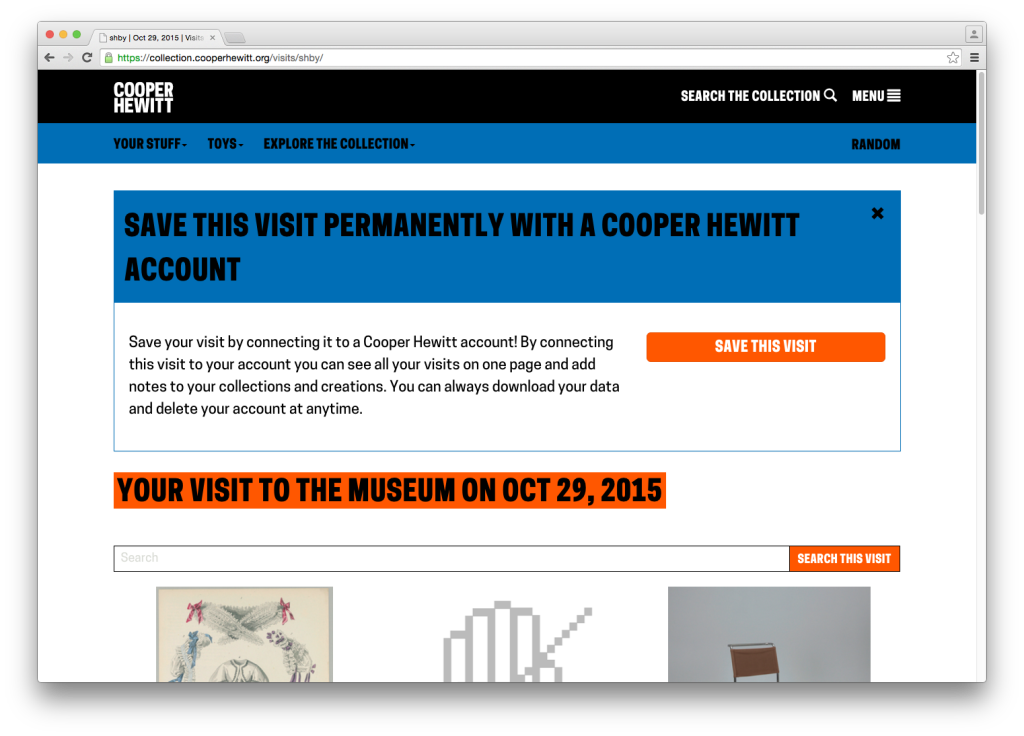
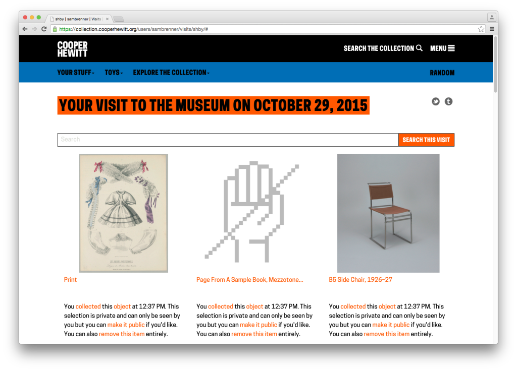
From here, they would enter their shortcode and get their visit. A visit page contains a grid of all the images of items you collected and created during your visit to the museum, which looked like this:

Screen Shot 2015-10-29 at 12.37.47 PM

You will notice the unwieldy CTA. It’s big, it’s ugly and it gets in the way of what we’re all here to do, but this was our first opportunity to present the concept of “visit claiming” to the visitor. Visit claiming is the idea that your visit is initially anonymous, but you can create an account and claim it as your own. Let’s say the visitor engages the CTA and claims their account. They are taken through a log in / sign up flow and return to their visit page which has now been linked to their account.

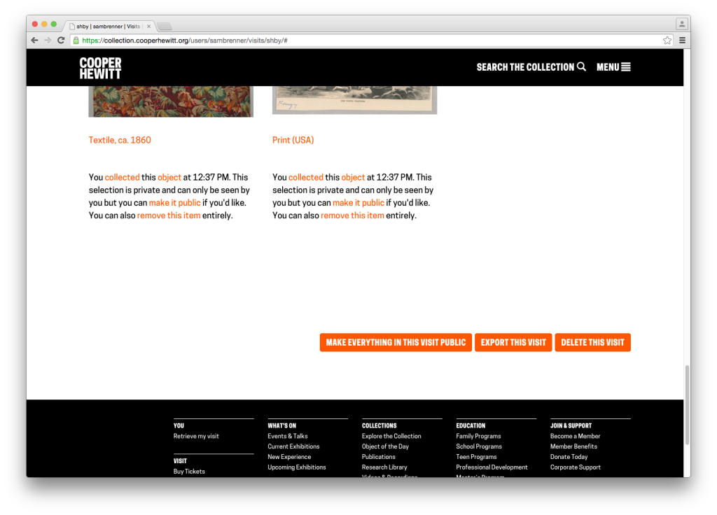
After claiming a visit, the visitor has access to some new functionality. At the top of the page are the token share tools. Under every image now live privacy controls, in the form of a repeated paragraph. At the very bottom of the page are buttons to make everything public, export the visit and delete the visit.

Screen Shot 2015-10-29 at 12.38.28 PM Screen Shot 2015-10-29 at 12.38.57 PM

What to Work On?

The goal for this work was to redesign the post-visit experience to put the visitor’s experience above all of our functional and technical requirements. At this point, we were all familiar with the many complex details along the way, so we met to discuss the end-to-end experience. Taking a step back and thinking in terms of expectations — both ours and the visitors’ — helped us rebuild the experience from the ground up. Feedback we had collected both anecdotally and through our online feedback form was helpful in this process. Once we had an idea of a visitor’s overall expectations of the post-visit experience, we were able to turn that into actionable tasks.

Step 1: Redesigning Visit Retrieval

Screen Shot 2015-11-02 at 5.45.33 PM

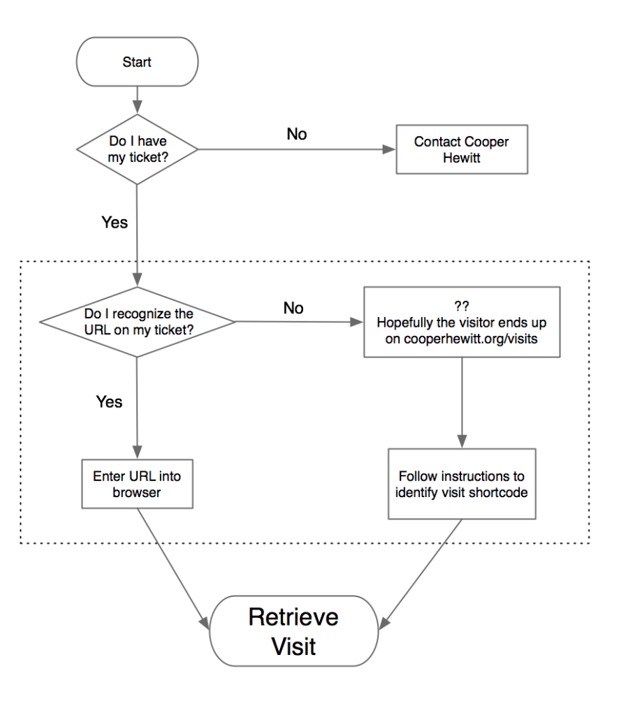
The first pain point we identified was the beginning of the experience: visit retrieval. Katie, our former Labs technologist, has written before about some of the ways we’ve tried to get visitors quickly up to speed on “how everything works” — the idea that you get a pen, you use the pen to collect objects, you go to a website and you get your objects. Her work focused on informational postcards and the introductory script used by the visitor experience staff. In the case of the visit retrieval flow chart above, this helped reduce the number of “no” answers to the two questions: “do I have my ticket?” and “do I recognize the URL on my ticket?”

That second question — “do I recognize the URL on my ticket?” — is not a question we would have expected visitors to even be asking. To us, the no-vowel/non-standard-TLD “URL-shortener”-style URL, a la bit.ly or t.co, has an instantly recognizable purpose. Through visitor feedback, we learned that for some visitors, it understandably looked more like an internal tracking number than the actual website we wanted people to go visit.

For these visitors, the best-case scenario is that the they would go to our main website where we provide links, both in the header and on the homepage, to the “visit retrieval” page. Here it is again, for reference:

Screen Shot 2015-10-29 at 4.03.33 PM copy

Since we expected users to go straight to the URL on their ticket, this page was more of a backup and as such hadn’t received a lot of attention. As a consequence of this, there were a few things that confused users on the page. First, the confirm button’s CTA is “fetch,” which is different from the “retrieve” used in the header and “access” used on the ticket. Second, the placeholder text in the input field is cut off. Third, the introduction of the word “shortcode,” which we’ve always used internally to refer to a visitor’s visit ID, had no meaning in the visitor’s mind. We tried explain it by saying that it means “the alphanumeric code after the final slash on your ticket,” which is a useless jumble of words.

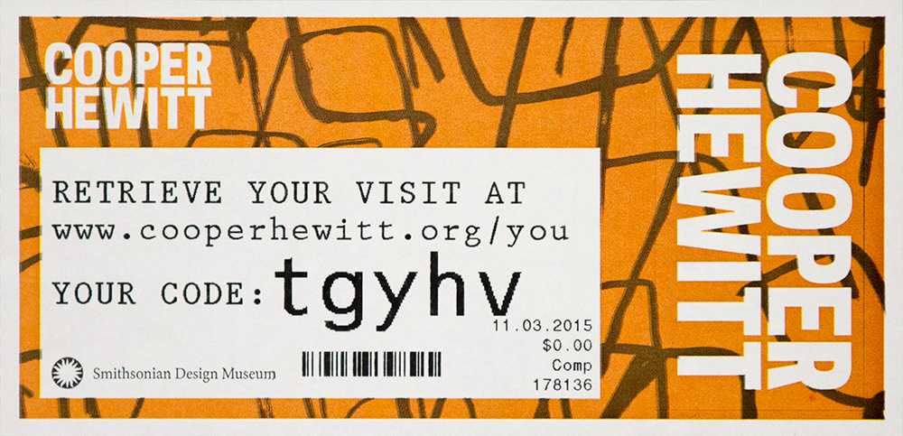
Our approach to this was to eliminate the “do I recognize the URL?” question and its resulting outcomes (the dotted box in the flow chart above) and replace it with self-evident instructions. To that end, we redesigned both the visit retrieval page and the ticket itself. Here’s the new ticket:

ticket_new

We’ve provided a much more human-friendly URL in “www.cooperhewitt.org/you” and established the shortcode (now just called “code”) as a separate entity. Regardless of whether or not visitors were confused by the short URL, the language on the new ticket fits with our desire to use natural language wherever we can to avoid having the digital experience feel unnecessarily technical.

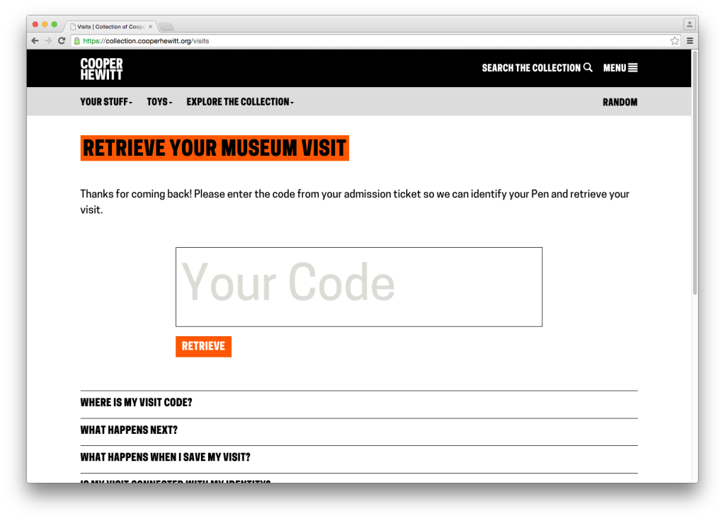
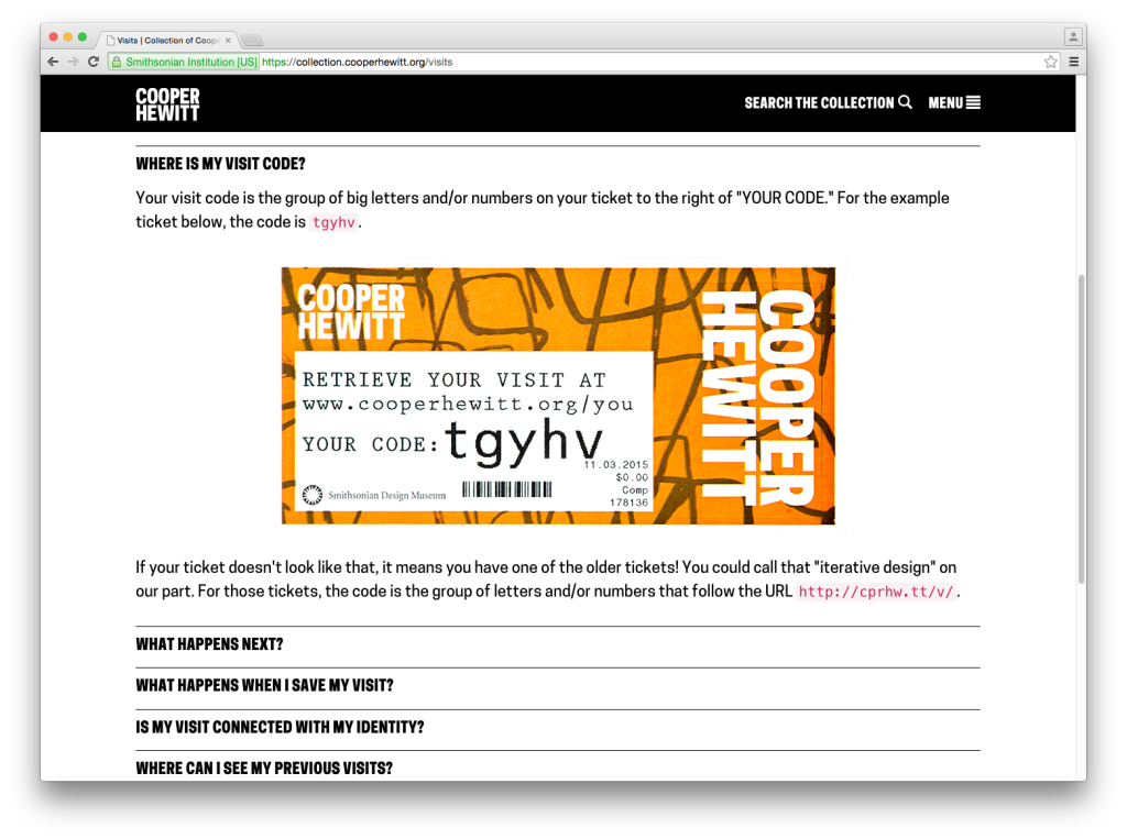
The visit retrieval page (which is accessed via the URL on the ticket) also got an update. The code entry field got much bigger and we tucked a small FAQ below it. We also standardized on the word “retrieve” as the imperative.

Screen Shot 2015-10-29 at 12.17.46 PM

Screen Shot 2015-11-03 at 2.46.14 PM

Step 2: Redesigning the Visit Page

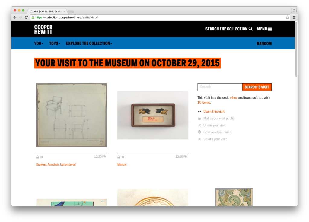
The next pain point we identified was the visit page itself, and specifically how we used it to explain claiming and privacy. Here’s the page again for reference:

Screen Shot 2015-10-29 at 12.37.47 PM

The problem concerning how we explained claiming is fairly straightforward. The visual design of the CTA is obtrusive, but it was our only opportunity to explain the benefits of claiming a visit. We sought to find a less obtrusive, more intuitive way to explain why claiming a visit is an option our visitors might want to take advantage of.

The problem concerning how we explained privacy is the more complicated of the two issues. It specifically regards the concept of the “anonymous visit.” Visits aren’t connected with visitor’s identities in any way except in that only they know the code. We do this because we need a way to uniquely identify each museum visit and the shortcode keeps that unique ID at a reasonable length. We also want to allow visitors to have an anonymous post-visit experience, meaning they can see everything they did in the museum without having to sign up for an account. But we don’t expect everyone to remember their shortcode or hold on to their ticket forever, so we allow visitors to create an account on our website and “claim” their visits. A claimed visit is linked to a visitor’s email address, so now they can throw out their ticket and forget their shortcode. Over time, we also hope that visitors will claim multiple visits with their accounts so they get a complete history of their relationship with our museum.

The problem this presents is that we have to treat every visitor who has a code as if they are the owner of that visit. This manifests itself in a specific (but important) use case. If a visitor shares their visit on social media while it is unclaimed, then any person who accesses the visit will also have the option to sign up and claim it as their own.

Further compounding this issue is the fact that we automatically make claimed visits private. We do this because in claiming an account, the visitor is effectively de-anonymizing it. Claimed visits are linked to real-world identities (in the form of a username) and for that reason we make it an opt-in choice to go public with that connection.

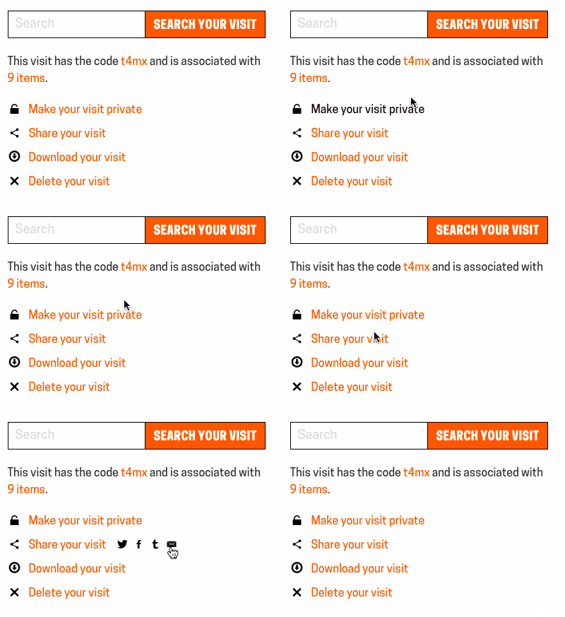
The goal of redesigning this page, then, was to allow the visitor to navigate the complex business logic without having to fully comprehend it. In talking this through we concluded that by consolidating the visit controls (which previously only appeared on the claimed visit page) and adding them (greyed out) to the unclaimed visit we could solve many of our problems. Why have a paragraph of explanatory text about why you should claim your visit when we could just show you the control panel that claimed visits have access to? A control panel presents the functionality plainly and concisely, without confusing language.

This also allowed us to establish a language of icons that we could reuse elsewhere to replace explanatory sentences. We also agreed to standardize on the word “claim” as the action that we wanted visitors to engage in, as it more effectively conveys the idea that other people have visits as well but we need to know that this one was yours.

Best of all, it allowed us to build off the work we’d done earlier this year which had the explicit purpose of organizing our code and visual hierarchy to better support future iterations.

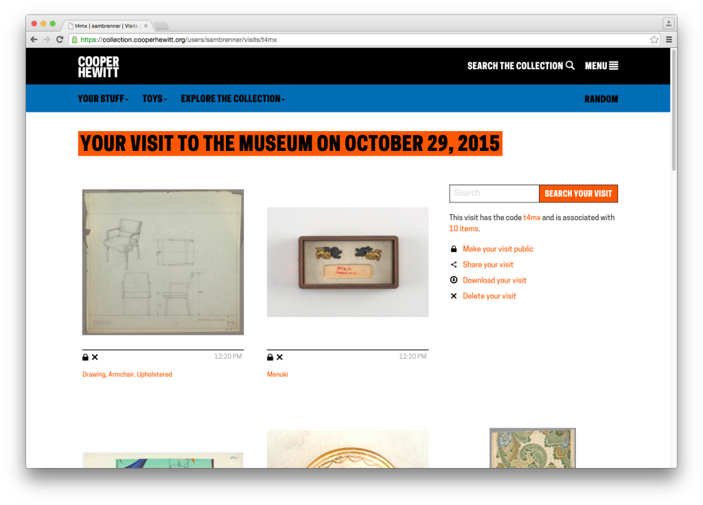
Here’s what that ended up looking like.

Screen Shot 2015-10-29 at 12.21.16 PM

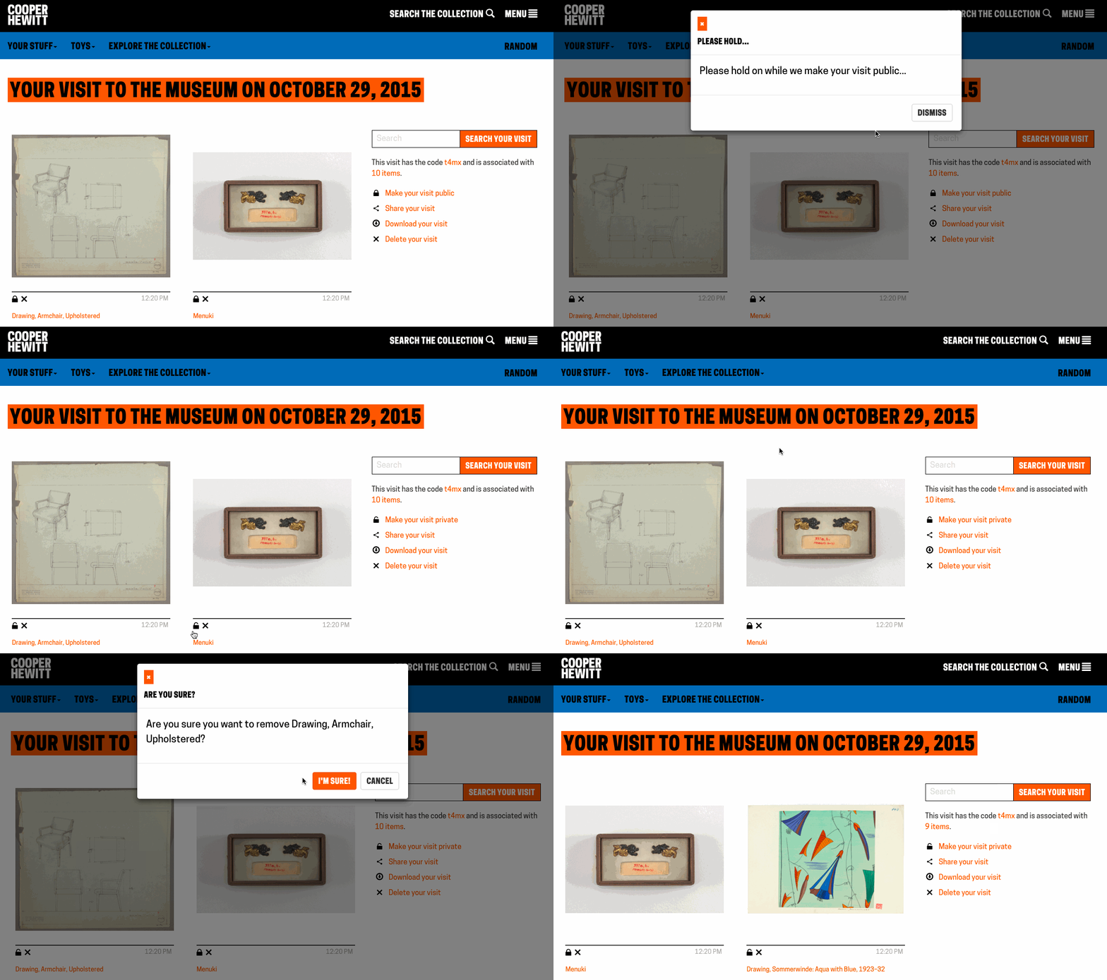
Interacting with any of the controls invokes a modal dialog that prompts the user claim their visit. If they’re not logged in, they are presented with a login / signup prompt. Otherwise they are asked to confirm their desire to claim the visit. Once claimed, the controls function as expected. Like the changes we made to the ticket design, it moves towards a more self-evident experience that requires less information processing time on the visitor’s part.

Screen Shot 2015-10-29 at 12.21.44 PM

Finally, some bonus gifs to show off the interaction details. The control panel has some rollover action:

controls

We use modal dialogs to confirm privacy changing, deleting and claiming actions:

publicification

A Brief Bit About Code

Powering the redesign was a complete overhaul of the Javascript that powers these pages. Specifically, we reorganized it to remove inline code and decouple API logic from DOM logic. In lay terms, this means separating the code that says “when I click this thing…” from the code that says “…perform this action.” When those separate intentions are tightly coupled, the website is less flexible and doing maintenance work or experimenting with alternate user flows requires more effort than necessary. When separate, it makes reusing code much more straightforward, which will allow us to tweak and test with ease going forward. Recent frameworks such as Angular or React, which we’ve only just started experimenting with, excel at this. For now, we opted for a slightly modified module pattern, which gives us just enough structure to keep things organized without having to learn a new framework.

What’s Next?

The changes have only been live for a few days now so it will take some time to build up enough numbers to see where to focus our future improvements on this part of the site. Specifically, we will be looking at the percentage of visitors who visit their website and the percentage of those visitors who create accounts, and hope to see the rate of change increasing for both of those numbers.

One part of this visitor flow where we hope to do structured A/B tests is with the “sign up” functionality. Right now, when a visitor enters their code and clicks the “Retrieve” button, they are taken immediately to their visit page. We want to test whether adding in a guided “visit claiming” flow, which would optionally hold the user’s hand through the account creation process before they’ve seen their objects, results in more account creations. We’ll wait and collect enough “A” data before rolling the “B” test out.

Of course, there are big questions we can start answering as well. How can we enhance the value of a visitor’s personal collection? Right now we have rudimentary note-taking functionality which is severely underutilized. What do we do with that? What about new features? We have all of our object metadata sitting right there waiting to be turned into personalized visualizations. (Speaking of that – we have public API methods for visit data!) Finally, how can we complete the cycle and turn the current “post-visit” into the next “pre-visit” experience?

With each iteration, we strive not only to apply what we’ve learned from visitors, colleagues and peers to our digital ecosystem, but also to improve the ease with which future iterations can be made. We are better able to answer questions both big and small with these iterations, which we hope over time will result in a stronger and more meaningful relationship between Cooper Hewitt and our visitors.

Label Writer: Connecting NFC tags to collection objects

IMG_20150610_113555

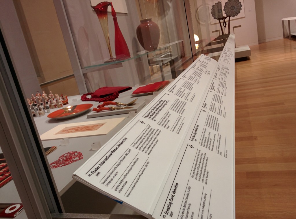
Labels, for better or worse, are central to the museum experience. They provide visitors with access to basic object information (metadata) and a tiny glimpse into the curatorial research for everything in the galleries, helping to place objects in context. At Cooper Hewitt, they are also the gateway through which the Pen‘s “collect” interaction is realized.

In order for the Pen to know which object label you’re trying to collect, every label in the museum contains an NFC tag that is written with the object’s ID. When an object gets added to our database we give it an ID, an integer that is unique across our entire online collections database. Our beloved Spanking Cat, for example, has the ID number 18382391. Writing that number to an NFC tag is a simple task, but doing it hundreds of times for every new exhibition we roll out will get tedious very quickly. Thus, Label Writer was born.

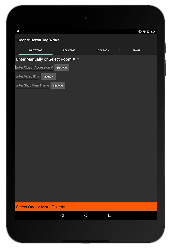
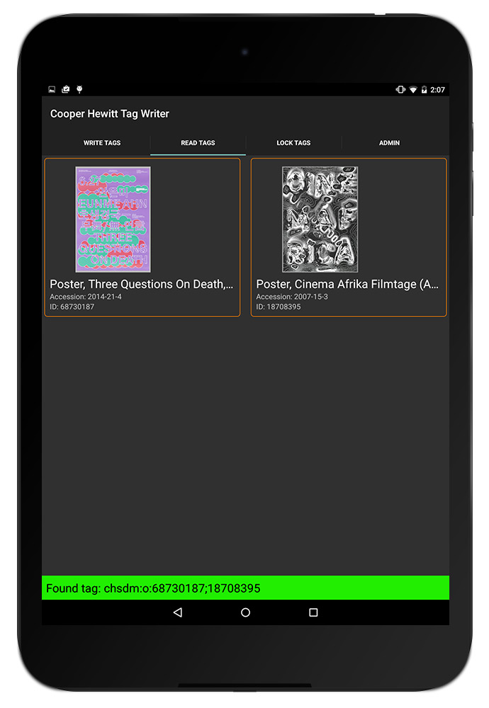
Label Writer is an Android app that writes, reads and locks NFC tags based on the object to which the label refers. The staff member can look up the objects that are in a given room of our museum, select one or more of them, and assign them to the label in question. They can search for specific objects in case an object’s location hasn’t been updated yet. They can also write tags for videos and shop items.

The front and back of the NFC tag we use in our labels, with pennies for scale

From left to right: the back and front of the NFC tags we use in our labels, and pennies for scale.

Planning

After thinking about the app we came up with the following requirements:

  1. When processing a user’s visit, we need to know what type of thing they’ve collected. When the Pen launched, this was either objects or videos, and has since grown to include shop items. To facilitate that process, Label Writer would have to distinguish between types of things and write tags that indicated that.
  2. It would need to write multiple things to a tag, including things of different types. One label might contain three objects. Another label might contain one video and two objects.
  3. It would need to lock tags. Leaving the tags unlocked would enable anyone with an NFC-enabled smartphone to walk around the galleries and overwrite our tags. Locking the tags prevents this.
  4. It would need to read tags and display images of what’s on a tag. This is so we can double-check what is on a tag before we lock it. We only print one copy of every label – sometimes through an offsite service – and the wall labels (as opposed to the rail labels) have their NFC tags glued in and unable to be replaced.
  5. Label Writer would have to present objects in a constrained format — having to find the object on a label from our total collection of 210,000 objects every time, through accession number lookup or other traditional searches, would get annoying very quickly.
IMG_20150608_172543

The NFC tags on our wall labels are built in to the label.

IMG_20150608_172442

The NFC tags on our rail labels are interchangeable.

Production

I decided to build the app in Android because it has great support for NFC and we have plenty of Nexus 9 tablets at the museum for use in the galleries. I started with this boilerplate for an Android read/write NFC app and performed initial tests to make sure we could write a tag that could be read by some of the early Pen prototypes. Once that was established, I began fleshing out the UI of the app and worked on hooking it up to our API.

The API gives us so much to work with on the app’s frontend. Being able to display an object’s image is a much better way to confirm that a label is written correctly than by comparing IDs or accession numbers. The API also lets us see all of the objects in a given room of the museum, which means that the user can write labels in an ordered fashion. When the labels arrive from the printer they are grouped by room, and often we will not write the tags until they have been installed in the galleries, so “by room” is a convenient way to organize objects on the frontend. It also gives us easy access to videos and shop items, and allows the app to easily be expanded to write labels for more things from our collections database. Since our collections site alpha, we have stressed the importance of an easily-accessed permanent ID for everything: people, objects, videos, exhibitions, locations etc., and now with the Pen we can prepare labels that allow users to collect any one of those things during their visit to the museum.

01

When I took all these screenshots, the app was called “Tag Writer”, as in “NFC Tag Writer.” But “Label Writer” sounds better.

When the app is opened, the user is prompted with a few ways to group objects. Since we added videos and shop items to the app, this intro screen has grown a bit so it will probably get a redesign when we next expand its capabilities. But for now, users have a few options here:

  1. They can select a room from a dropdown menu (here’s a list of all of our rooms)
  2. They can enter an individual accession number
  3. They can enter a video’s ID
  4. They can search the shop (see Aaron’s recent post about adding shop items to our online collection)

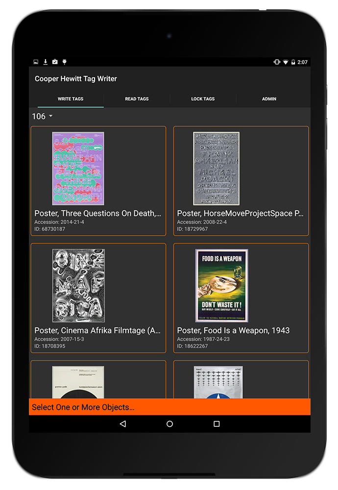
When one of these options is used, the relevant objects appear on the screen. For example, selecting Room 106 brings up some of the posters from our current How Posters Work exhibition. Being able to display the images of the posters makes it much easier for the user to confirm that they are connecting the dots accurately — accession numbers and object IDs are easily confused (not to mention boring to look at).

02

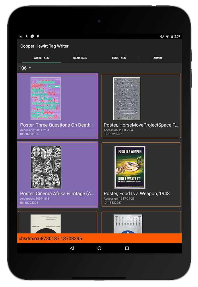
The user can then tap one or more objects to add them to a label. In the screenshot below, you can see that two objects have been selected and the orange bar at the bottom has formatted them to be written to a tag — in this case, chsdm:o:68730187;18708395. The way that things get written to tags follows a format we agreed upon early in the Pen design process, as various developers would be building applications that relied on reading and parsing a Pen’s content. In brief, chsdm is a namespace for our museum that is not particularly necessary but serves as a header for what follows. o stands for object and then the ID (or semicolon-delimited IDs) that follow are the IDs of objects. The letter can change: v for video, s for shop, and on and on for whatever other things we might eventually write to tags. We add a pipe character (|) to delimit multiple types of things on a tag, so a tag with an object and a video might look like chsdm:o:18714653|chsdm:v:68764195. But all of this is handled by the app based on what the user selects in the interface.

03

Next, a user can hold the tablet up to the object label to write the NFC tag. When the tag is written, the orange bar at the bottom turns green to let the user know it went okay. Later, using the “Read Tags” functionality of the app, the user can confirm the tag’s contents by reading the NFC tag. The app parses the tag and loads the things it thinks the tag refers to. When this is confirmed, the user can lock the tag to make sure nobody overwrites it.

05

Here’s everything, from start to finish, using the object-lookup-by-accession-number functionality.

Next Steps

I mentioned that the home screen of this app will get a redesign as we allow more types of things to be written to tags. The user experience of the tag writing process needs a little finessing — a bug in how success messages get displayed has resulted in a few tags that get written with bunk data. Fortunately that is caught in the “read” phase of the workflow, but should be corrected earlier.

Overall, as we keep swapping out exhibitions, Label Writer will get more and more use. We will use these opportunities to collect feedback from the app’s users and make changes to the app accordingly.

Sorting, Synonyms and a Pretty Pony

We’ve been undergoing a massive rapid-capture digitization project here at the Cooper Hewitt, which means every day brings us pictures of things that probably haven’t been seen for a very, very long time.

As an initial way to view all these new images of objects, I added “date last photographed” to our search index and allowed it to be sorted by on the search results page.

That’s when I found this.

[collection_object id=18692335]

I hope we can all agree that this pony is adorable and that if there is anything else like it in our collection, it needs to be seen right now. I started browsing around the other recently photographed objects and began to notice more animal figurines:

[collection_object id=18460201]

[collection_object id=18615463]

As serendipitous as it was that I came across this wonderful collection-within-a-collection by browsing through recently-photographed objects, what if someone is specifically looking for this group? The whole process shows off some of the work we did last summer switching our search backend over to Elasticsearch (which I recently presented at Museums and the Web). We wanted to make it easier to add new things so we could provide users (and ourselves) with as many “ways in” to the collection as possible, as it’s those entry points that allow for more emergent groupings to be uncovered. This is great for somebody who is casually spending time scrolling through pictures, but a user who wants to browse is different from a user who wants to search. Once we uncover a connected group of objects, what can we do to make it easier to find in the future?

Enter synonyms. Synonyms, as you might have guessed, are a text analysis technique we can use in our search engine to relate words together. In our case, I wanted to relate a bunch of animal names to the word “animal,” so that anyone searching for terms like “animals” or “animal figurines” would see all these great little friends. Like this bear.

[collection_object id=18633719]

The actual rule (generated with the help of Wikipedia’s list of animal names) is this:

 "animal => aardvark, albatross, alligator, alpaca, ant, anteater, antelope, ape, armadillo, baboon, badger, barracuda, bat, bear, beaver, bee, bird, bison, boar, butterfly, camel, capybara, caribou, cassowary, cat, kitten, caterpillar, calf, bull, cheetah, chicken, rooster, chimpanzee, chinchilla, chough, clam, cobra, cockroach, cod, cormorant, coyote, puppy, crab, crocodile, crow, curlew, deer, dinosaur, dog, puppy, salmon, dolphin, donkey, dotterel, dove, dragonfly, duck, poultry, dugong, dunlin, eagle, echidna, eel, elephant, seal, elk, emu, falcon, ferret, finch, fish, flamingo, fly, fox, frog, gaur, gazelle, gerbil, panda, giraffe, gnat, goat, sheep, goose, poultry, goldfish, gorilla, blackback, goshawk, grasshopper, grouse, guanaco, fowl, poultry, guinea, pig, gull, hamster, hare, hawk, goshawk, sparrowhawk, hedgehog, heron, herring, hippopotamus, hornet, swarm, horse, foal, filly, mare, pig, human, hummingbird, hyena, ibex, ibis, jackal, jaguar, jellyfish, planula, polyp, scyphozoa, kangaroo, kingfisher, koala, dragon, kookabura, kouprey, kudu, lapwing, lark, lemur, leopard, lion, llama, lobster, locust, loris, louse, lyrebird, magpie, mallard, manatee, mandrill, mantis, marten, meerkat, mink, mongoose, monkey, moose, venison, mouse, mosquito, mule, narwhal, newt, nightingale, octopus, okapi, opossum, oryx, ostrich, otter, owl, oyster, parrot, panda, partridge, peafowl, poultry, pelican, penguin, pheasant, pigeon, bear, pony, porcupine, porpoise, quail, quelea, quetzal, rabbit, raccoon, rat, raven, deer, panda, reindeer, rhinoceros, salamander, salmon, sandpiper, sardine, scorpion, lion, sea urchin, seahorse, shark, sheep, hoggett, shrew, skunk, snail, escargot, snake, sparrow, spider, spoonbill, squid, calamari, squirrel, starling, stingray, stinkbug, stork, swallow, swan, tapir, tarsier, termite, tiger, toad, trout, poultry, turtle, vulture, wallaby, walrus, wasp, buffalo, carabeef, weasel, whale, wildcat, wolf, wolverine, wombat, woodcock, woodpecker, worm, wren, yak, zebra"

Where every word to the right of the => automatically gets added to a search for a word to the left.

Not only does our new search stack provide us with a useful way to discover emergent relationships, but it makes it easy for us to “seal them in,” allowing multiple types of user to get the most from our collections site.

How re-opening the museum enhanced our online collection: new views, new API methods

At the backend of our museum’s new interactive experiences lies our API, which is responsible for providing the frontend with all the data necessary to flesh out the experience. From everyday information like an object’s title to more novel features such as tags, videos and people relationships, the API gathers and organizes everything that you see on our digital tables before it gets displayed.

In order to meet the needs of the experiences designed for us by Local Projects on our interactive tables, we added a lot of new data to the API. Some of it was sitting there and we just had to go find it, other aspects we had to generate anew.

Either way, this marks a huge step towards a more complete and meaningful representation of our collection on the internet.

Today, we’re happy to announce that all of this newly-gathered data is live on our website and is also publicly available over the API (head to the API methods documentation to see more about that if you’re interested in playing with it programmatically).

People

For the Hewitt Sisters Collect exhibition, Local Projects designed a front-end experience for the multitouch tables that highlights the early donors to the museum’s collection and how they were connected to each other. Our in-house “TMS liaison”, Sara Rubinow, worked to gather and structure this information before adding it to TMS, our collection management system, as “constituent associations”. From there I extracted the structured data to add to our website.

We created a the following new views on the web frontend to house this data:

We also added a few new biography-related fields: portraits or photographs of Hewitt Sisters people and two new biographies, one 75 words and the other 50 characters. These changes are viewable on applicable people pages (e.g. Eleanor Garnier Hewitt) and the search results page.

The overall effect of this is to make more use of this ‘people-related’ data, and to encourage the further expansion of it over time. We can already imagine a future where other interfaces examining and revealing the network of relationships behind the people in our collection are easily explored.

Object Locations and Things On Display

Some of the more difficult tasks in updating our backend to meet the new requirements related to dealing with objects no longer being static – but moving on and off display. As far as the website was concerned, it was a luxury in our three years of renovation that objects weren’t moving around a whole lot because it meant we didn’t have to prioritize the writing of code to handle their movement.

But now that we are open we need to better distinguish those objects in storage from those that are on display. More importantly, if it is on display, we also need to say which exhibition, and which room it is on display.

Object locations have a lot of moving parts in TMS, and I won’t get into the specifics here. In brief, object movements from location to location are stored chronologically in a database. The “movement” is its own row that references where it moved and why it moved there. By appropriately querying this history we can say what objects have ever been in the galleries (like all museums there are a large portion of objects that have never been part of an exhibition) and what objects are there right now.

We created the following views to house this information:

Exhibitions

The additions we’ve made to exhibitions are:

There is still some work to be done with exhibitions. This includes figuring out a way to handle object rotations (the process of swapping out some objects mid-exhibition) and outgoing loans (the process of lending objects to other institutions for their exhibitions). We’re expecting that objects on loan should say where they are, and in which external exhibition they are part of — creating a valuable public ‘trail’ of where an object has traveled over its life.

Tags

Over the summer, we began an ongoing effort to ‘tag’ all the objects that would appear on the multitouch tables. This includes everything on display, plus about 3,000 objects related to those. The express purpose for tags was to provide a simple, curated browsing experience on the interactive tables – loosely based around themes ‘user’ and ‘motif’. Importantly these are not unstructured, and Sara Rubinow did a great job normalizing them where possible, but there haven’t been enough exhibitions, yet, to release a public thesaurus of tags.

We also added tags to the physical object labels to help visitors draw their own connections between our objects as they scan the exhibitions.

On the website, we’ve added tags in a few places:

That’s it for now – happy exploring! I’ll follow up with more new features once we’re able to make the associated data public.

Until then, our complete list of API methods is available here.

emacs Cheat Sheet

Due to a frequent need to work off of different servers, I found it necessary to graduate from nano and up my command line text editor skills. Enter emacs! Aaron gave me a quick crash course, from which I generated a cheat sheet of everyday commands to tape to my monitor. Rule #1 of emacs (for me at least) was “forget every keyboard shortcut you’ve ever known,” so having a cheat sheet to remind me that “copy” is “escape key, w key” was necessary until my muscle memory kicked in.
If you’re in this situation maybe this cheat sheet will help you too.

Gist is here.

EMACS CHEAT SHEET

C-g . . . . . . . Stop bothering me
C-x C-c . . . . . Exit Emacs

C-x C-f . . . . . Find File
C-x k . . . . . . Kill Buffer
C-x b . . . . . . Load Buffer
C-x o . . . . . . Next Buffer
C-x left/right  . Next/Previous buffer
C-x [0-3] . . . . Fiddle with buffer views

M-g g . . . . . . Goto Line
C-a . . . . . . . Beginning of line
C-e . . . . . . . End of line
C-v . . . . . . . Page down
M-v . . . . . . . Page up
C-s . . . . . . . Search in buffer
C-x C-s . . . . . Save buffer

C-space . . . . . Set mark
C-w . . . . . . . Cut
M-w . . . . . . . Copy
C-y . . . . . . . Paste

M-x things:
M-x shell . . . . . . Open Shell
M-p . . . . . . . . . Previous shell command
M-x replace-string  . Find/Replace in file
M-x rgrep . . . . . . Find in folders
M-x list-packages . . Package Manager

Magit:
s . . . . Stage
u . . . . Unstage
c . . . . Commit
k . . . . Discard modification
P . . . . Push
F . . . . Pull
C-c C-c . Save commit message

Dired Mode:
m . . . Mark file
u . . . Unmark file
! . . . Perform shell command on file(s)
Sharing our videos, forever

This is one in a series of Labs blogposts exploring the inhouse built technologies and tools that enable everything you see in our galleries.

Our galleries and Pen experience are driven by the idea that everything a visitor can see or do in the museum itself should be accessible later on.

Part of getting the collections site and API (which drives all the interfaces in the galleries designed by Local Projects) ready for reopening has involved the gathering and, in some cases, generation of data to display with our exhibits and on our new interactive tables. In the coming weeks, I’ll be playing blogger catch-up and will write about these new features. Today, I’ll start with videos.

jazz hands

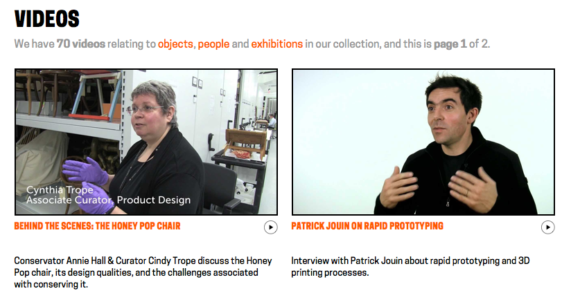
Besides the dozens videos produced in-house by Katie – such as the amazing Design Dictionary series – we have other videos relating to people, objects and exhibitions in the museum. Currently, these are all streamed on our YouTube channel. While this made hosting much easier, it meant that videos were not easily related to the rest of our collection and therefore much harder to find. In the past, there were also many videos that we simply didn’t have the rights to show after their related exhibition had ended, and all the research and work that went into producing the video was lost to anyone who missed it in the gallery. A large part of this effort was ensuring that we have the rights to keep these videos public, and so we are immensely grateful to Matthew Kennedy, who handles all our image rights, for doing that hard work.

A few months ago, we began the process of adding videos and their metadata in to our collections website and API. As a result, when you take a look at our page for Tokujin Yoshioka’s Honey-Pop chair , below the object metadata, you can see its related video in which our curators and conservators discuss its unique qualities. Similarly, when you visit our page for our former director, the late Bill Moggridge, you can see two videos featuring him, which in turn link to their own exhibitions and objects. Or, if you’d prefer, you can just see all of our videos here.

In addition to its inclusion in the website, video data is also now available over our API. When calling an API method for an object, person or exhibition from our collection, paths to the various video sizes, formats and subtitle files are returned. Here’s an example response for one of Bill’s two videos:

{
  "id": "68764297",
  "youtube_url": "www.youtube.com/watch?v=DAHHSS_WgfI",
  "title": "Bill Moggridge on Interaction Design",
  "description": "Bill Moggridge, industrial designer and co-founder of IDEO, talks about the advent of interaction design.",
  "formats": {
    "mp4": {
      "1080": "https://s3.amazonaws.com/videos.collection.cooperhewitt.org/DIGVID0059_1080.mp4",
      "1080_subtitled": "https://s3.amazonaws.com/videos.collection.cooperhewitt.org/DIGVID0059_1080_s.mp4",
      "720": "https://s3.amazonaws.com/videos.collection.cooperhewitt.org/DIGVID0059_720.mp4",
      "720_subtitled": "https://s3.amazonaws.com/videos.collection.cooperhewitt.org/DIGVID0059_720_s.mp4"
    }
  },
  "srt": "https://s3.amazonaws.com/videos.collection.cooperhewitt.org/DIGVID0059.srt"
}

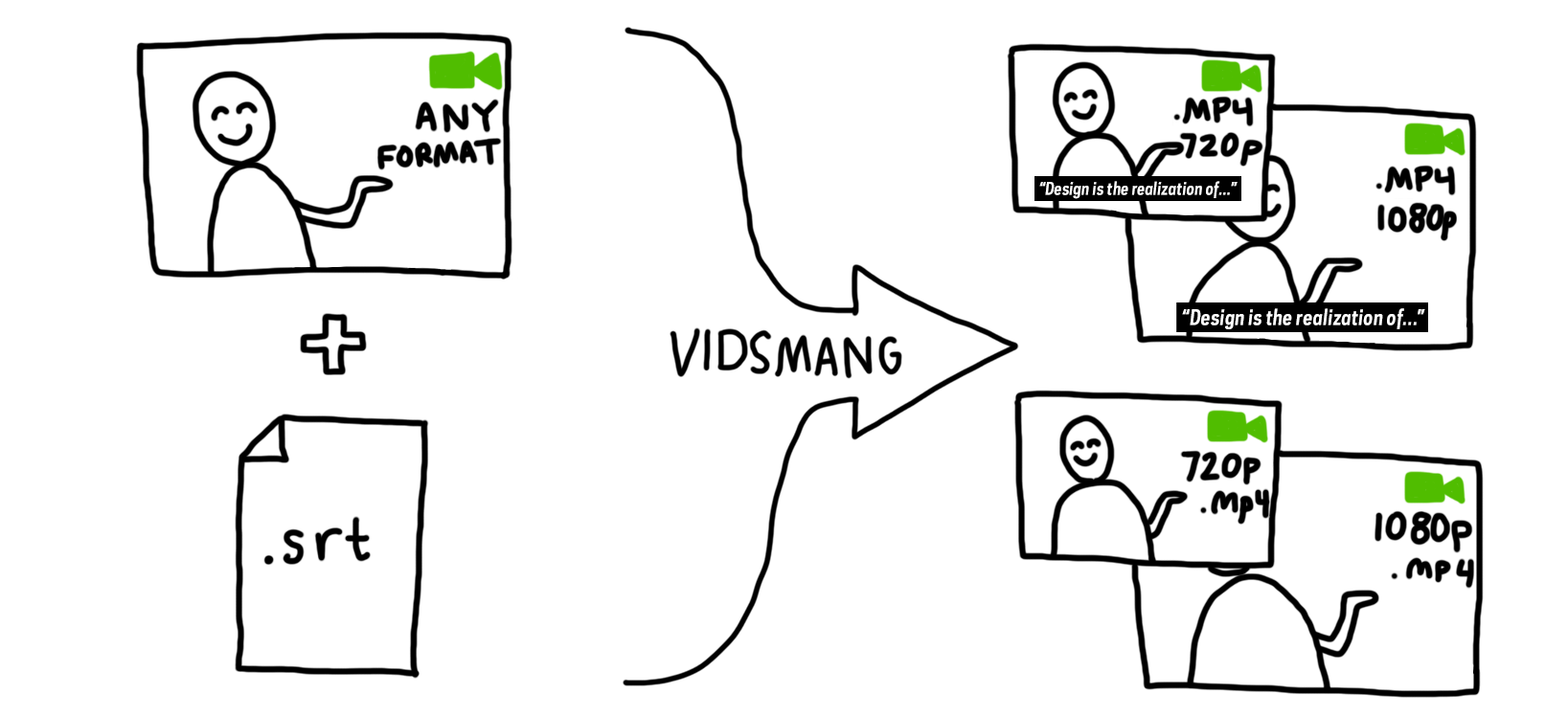
The first step in accomplishing this was to process the videos into all the formats we would need. To facilitate this task, I built VidSmanger, which processes source videos of multiple sizes and formats into consistent, predictable derivative versions. At its core, VidSmanger is a wrapper around ffmpeg, an open-source multimedia encoding program. As its input, VidSmanger takes a folder of source videos and, optionally, a folder of SRT subtitle files. It outputs various sizes (currently 1280×720 and 1920×1080), various formats (currently only mp4, though any ffmpeg-supported codec will work), and will bake-in subtitles for in-gallery display. It gives all of these derivative versions predictable names that we will use when constructing the API response.

a flowchart showing two icons passing through an arrow that says "vidsmang" and resulting in four icons

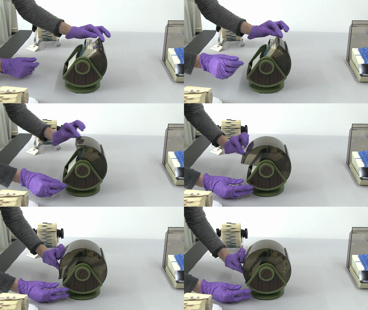
Because VidSmanger is a shell script composed mostly of simple command line commands, it is easily augmented. We hope to add animated gif generation for our thumbnail images and automatic S3 uploading into the process soon. Here’s a proof-of-concept gif generated over the command line using these instructions. We could easily add the appropriate commands into VidSmanger so these get made for every video.

anim

For now, VidSmanger is open-source and available on our GitHub page! To use it, first clone the repo and the run:

./bin/init.sh

This will initialize the folder structure and install any dependencies (homebrew and ffmpeg). Then add all your videos to the source-to-encode folder and run:

./bin/encode.sh

Now you’re smanging!

Rethinking Search on the Collections Site

One of my longer-term projects since joining the museum has been rethinking how the search feature functions on the collections website. As we get closer to re-opening the museum with a suite of new technologies, our work in collaboration with Local Projects has prompted us to take a close look at the moving pieces that comprise the backend of our collections site and API. Search, naturally, forms a large piece of that. Last week, after a few weeks of research and experimentation, I pushed the first iteration live. In this post, I’ll share some of the thoughts and challenges that informed our changes.

First, a glossary of terms for readers who (like me, a month ago) have little-to-no experience with the inner-workings of a search engine:

  • Platform: The software that actually does the searching. The general process is that we feed data to the platform (see “index”), and then we ask it for results matching a certain set of parameters (see “query”). Everything else is handled by the platform itself. Part of what I’ll get into below involves our migration from one platform, Apache Solr, to another, Elasticsearch.
  • Index: An index is the database that the search platform uses to perform searches on. The search index is a lot like the primary database (it probably could fill that role if it had to) but it adds extra functionality to facilitate quick and accurate retrieval of search results.
  • Query: The rules to follow in selecting things that are appropriate to provide as search results. For users, the query could be something like “red concert poster,” but we have to translate that into something that the search provider will understand before results can be retrieved. Search providers give us a lot of different ways we can query things (ranges of a number, geographic distance or word matching to name a few), and a challenge for us as interface designers is to decide how transparent we want to make that translation. Queries also allow us to define how results should be sorted and how to facet results.
  • Faceting/Aggregation: A way of grouping results based on traits they posses. For example, faceting on “location” when you search our collection for “cat” reveals that 80 of our cat-related things are from the USA, 16 are from France, and so on.
  • Analysis (Tokenization/Stemming etc): A process that helps a computer work with sentences. Tokenization, for example, would split a search for “white porcelain vase” into the individual tokens: “white,” “porcelain” and “vase,” and then perform a search for any number of those tokens. Another example is stemming, which would allow the platform to understand that if a user searches for “running,” then items containing other words like “run” or “runner” are also valid search results. Analysis also gives us the opportunity to define custom rules that might include “marathon” and “track” as valid results in a search for “running.”

The State of Search

Our old search functionality showed its symptoms of under-performance in a few ways. For example, basic searches — phrases like “red concert poster” — turned up no results despite the presence of such objects in our collection, and searching for people would not return the person themselves, only their objects. These symptoms led me to identify what I considered the two big flaws in our search implementation.

On the backend, we were only indexing objects. This meant that if you searched for “Ray Eames,” you would see all of the objects we have associated with her, but to get to her individual person page, you would have to first click on an object and then click on her name. Considering that we have a lot of non-objects1, it makes sense to index them all and include them, where relevant, in the results. This made my first objective to find a way to facilitate the indexing and querying of different types of things.

On the frontend, we previously gave users two different ways to search our collection. The default method, accessible through the header of every page, performed a full text search on our Solr index and returned results sorted by image complexity. Users could also choose the “fancy search” option, which allows for searches on one or more of the individual fields we index, like “medium,” “title,” or “decade.” We all agreed here that “fancy search” was confusing, and all of its extra functionality — faceting, searching across many fields — shouldn’t be seen as “advanced” features. My second objective in rethinking how search works, then, was to unify “fancy” and “regular” search into just “search.”

Objective 1: Update the Backend

Our search provider, Solr, requires that a schema be present for every type of thing being indexed. The schema (an XML file) tells Solr what kind of value to expect for a certain field and what sort of analysis to perform on the field. This means I’d have to write a schema file — anticipating how I’d like to form all the indexed data — for each new type of thing we want to search on.

One of the features of Elasticsearch is that it is “schemaless,” meaning I can throw whatever kind of data I want at the index and it figures out how to treat it. This doesn’t mean Elasticsearch is always correct in its guesses — for example, it started treating our accession numbers as dates, which made them impossible to search on — so it also gives you the ability to define mappings, which has the same effect as Solr’s schema. But if I want to add “people” to the index, or add a new “location” field to an object, using Elasticsearch means I don’t have to fiddle with any schemas. This trait of Elasticsearch alone made worth the switch (see Larry Wall’s first great virtue of programmers, laziness: “the quality that makes you go to great effort to reduce overall energy expenditure”) because it’s important to us that we have the ability to make quick changes to any part of our website.

Before building anything in to our web framework, I spent a few days getting familiar with Elasticsearch on my own computer. I wrote a python script that loops through all of the CSVs from our public collections repository and indexed them in a local Elasticsearch server. From there, I started writing queries just to see what was possible. I was quickly able to come up with a lot of the functionality we already have on our site (full-text search, date range search) and get started with some complex queries as well (“most common medium in objects between 1990-2000,” for example, which is “paper”). This code is up on Github, so you can get started with your own Cooper Hewitt search engine at home!

Once I felt that I had a handle on how to index and query Elasticsearch, I got started building it into our site. I created a modified version of our Solr indexing script (in PHP) that copied objects, people, roles and media from MySQL and added them to Elasticsearch. Then I got started on the endpoint, which would take search parameters from a user and generate the appropriate query. The code for this would change a great deal as I worked on the frontend and occasionally refactored and abstracted pieces of functionality, but all the pieces of the pipeline were complete and I could begin rethinking the frontend.

Objective 2: Update the Frontend

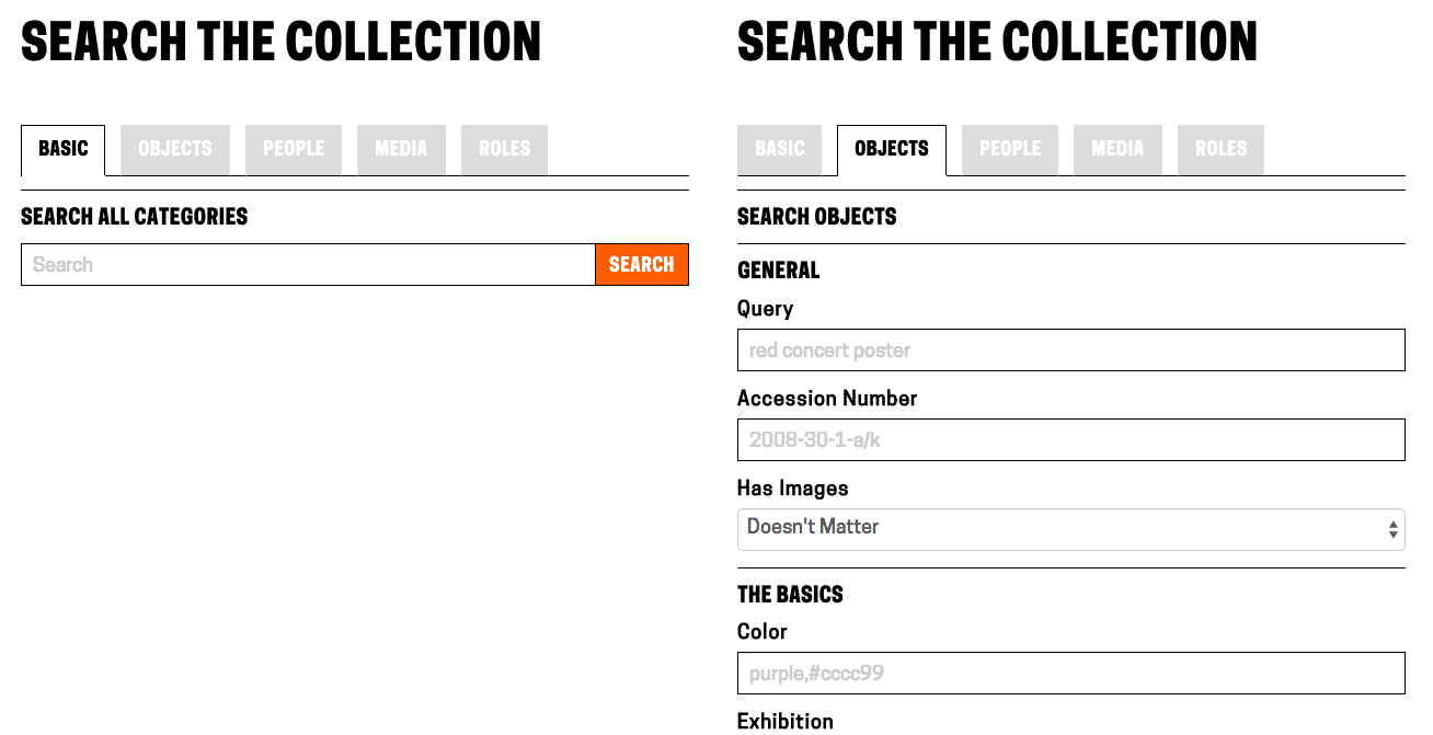
Updating the frontend involved a few changes. Since we were now indexing multiple categories of things, there was still a case for keeping a per-category search view that gave users access to each field we have indexed. To accommodate these views, I added a tab bar across the top of the search forms, which defaults to the full-collection search. This also eliminates confusion as to what “fancy search” did as the search categories are now clearly labeled.

Showing the tabbed view for search options

Showing the tabbed view for search options

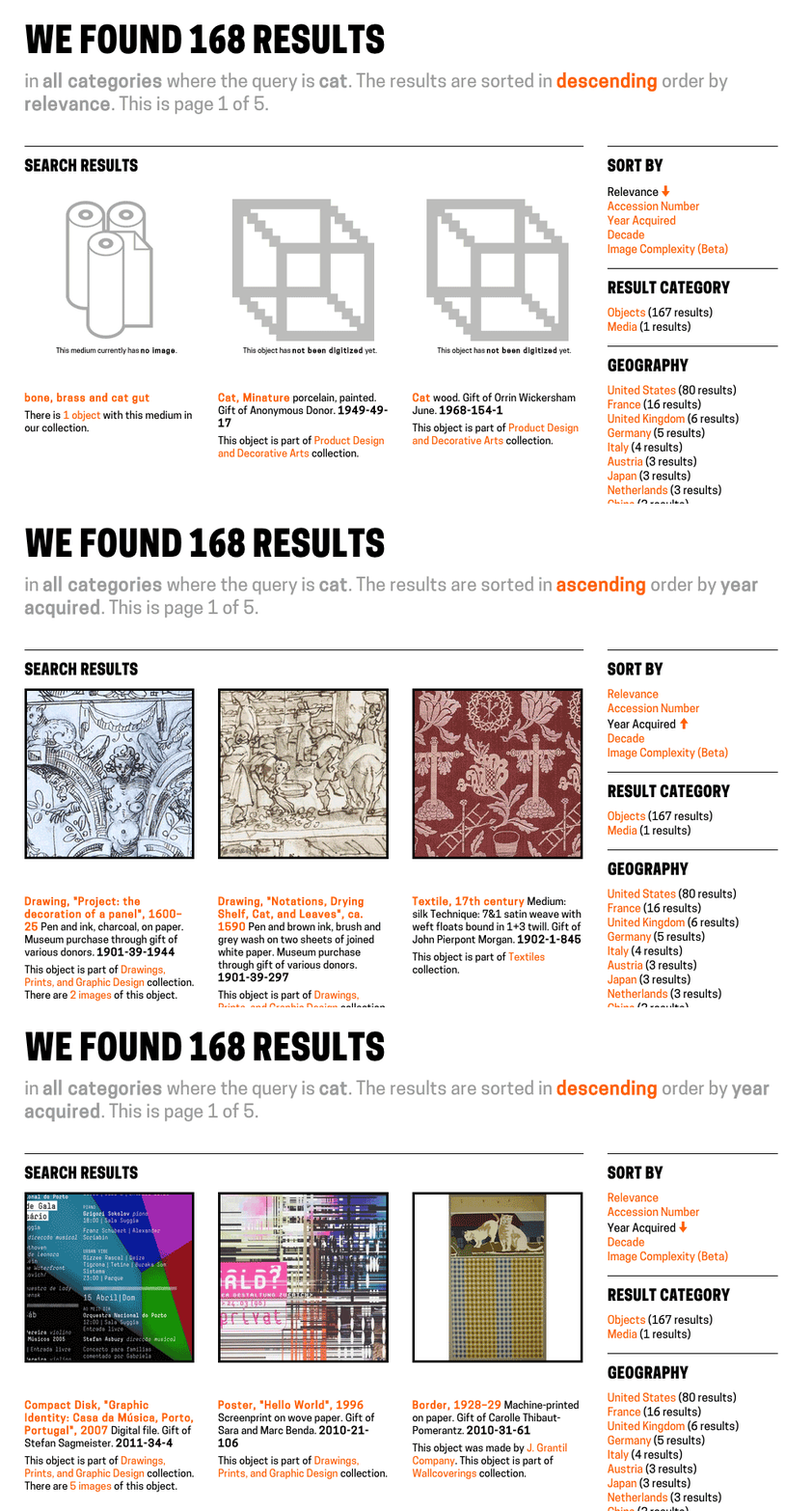
The next challenge was how to display sorting. Previously, the drop-down menu containing sort options was hidden in a “filter these results” collapsible menu. I wanted to lay out all of the sorting options for the user to see at a glance and easily switch between sorting modes. Instead of placing them across the top in a container that would push the search results further down the page, I moved them to a sidebar which would also house search result facets (more on that soon). While it does cut in to our ability to display the pictures as big as we’d like, it’s the only way we can avoid hiding information from the user. Placing these options in a collapsible menu creates two problems: if the menu is collapsed by default, we’re basically ensuring that nobody will ever use them. If the menu is expanded by default, then it means that the actual results are no longer the most important thing on the page (which, on a search results page, they clearly are). The sidebar gives us room to lay out a lot of options in an unobtrusive but easily-accessible way2.

Switching between sort mode and sort order.

Switching between sort mode and sort order.

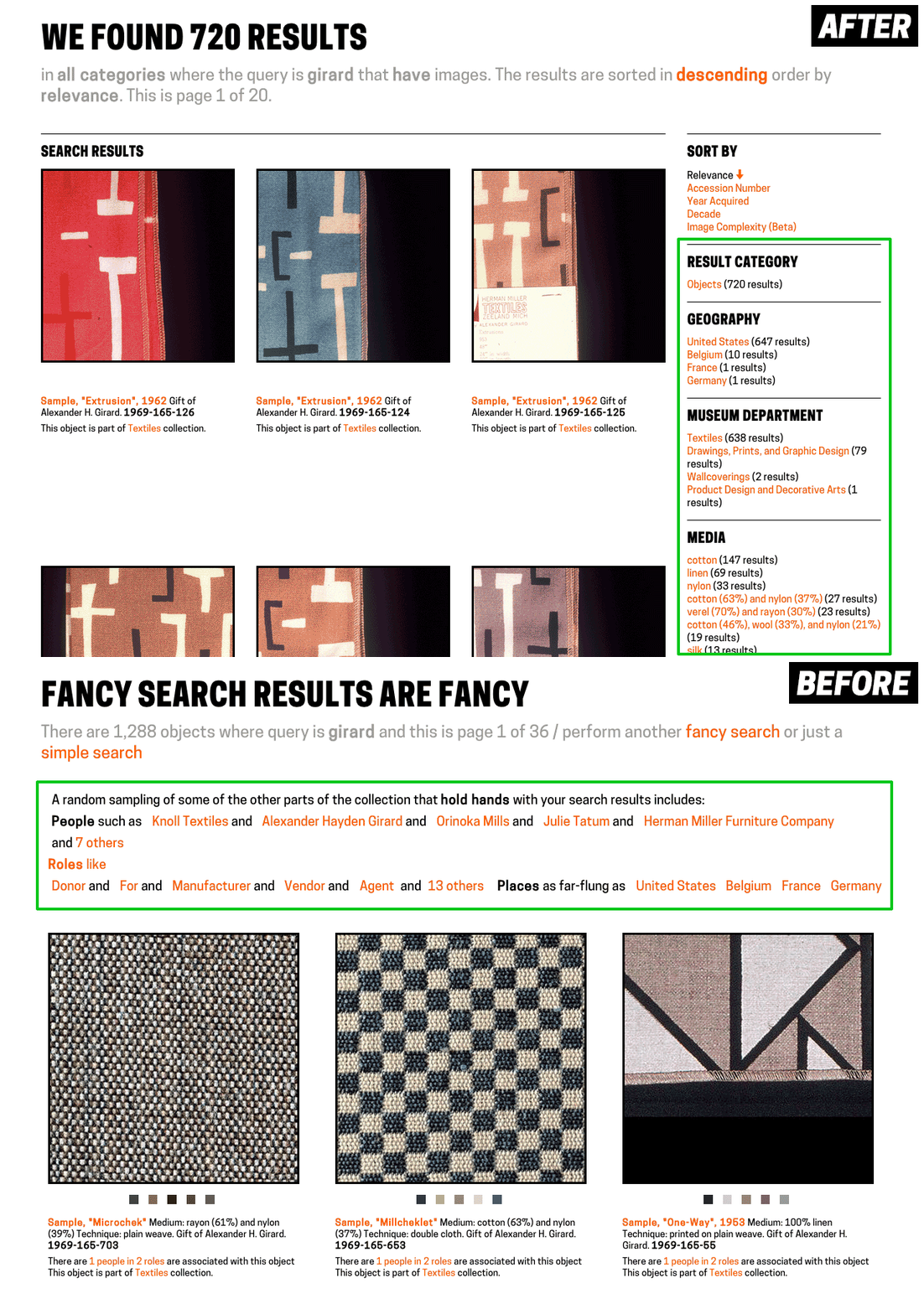
The final challenge on the frontend was how to handle faceting. Faceting is a great way for users who know what they’re looking for to narrow down options, and a great way for users who don’t know what they’re looking for to be exposed to the various buckets we’re able to place objects in to.

Previously on our frontend, faceting was only available on fancy search. We displayed a few of the faceted fields across the top of the results page, and if you wanted further control, users could select individual fields to facet on using a drop-down menu at the bottom of the fancy search form. When they used this, though, the results page displayed only the facets, not the objects. In my updates, I’ve turned faceting on for all searches. They appear alongside the search results in the sidebar.

Relocating facets from across the top of the page to the sidebar

Relocating facets from across the top of the page to the sidebar

Doing it Live

We initially rolled these changes out about 10 days ago, though they were hidden from users who didn’t know the URL. This was to prove to ourselves that we could run Elasticsearch and Solr alongside each other without the whole site blowing up. We’re still using Solr for a bit more than just the search (for example, to show which people have worked with a given person), so until we migrate completely to Elasticsearch, we need to have both running in parallel.

A few days later, I flipped the switch to make Elasticsearch the default search provider and passed the link around internally to get some feedback from the rest of the museum. The feedback I got was important not just for working out the initial bugs and kinks, but also (and especially for myself as a relative newbie to the museum world) to help me get the language right and consider all the different expectations users might have when searching our collection. This resulted in some tweaks to the layout and copy, and some added functionality, but mostly it will inform my bigger-picture design decisions going forward.

A Few Numbers…

Improving performance wasn’t a primary objective in our changes to search, but we got some speed boosts nonetheless.

Query Before (Solr) After (Elasticsearch)
query=cat, facets on 162 results in 1240-1350ms 167 results in 450-500ms
year_acquired=gt1990, facets on 13,850 results in 1430-1560ms 14,369 results in 870-880ms
department_id=35347493&period_id=35417101, facets on 1,094 results in 1530-1580ms 1,150 results in 960-990ms

There are also cases where queries that turned up nothing before now produce relevant results, like “red concert poster,” (0 -> 11 results) “German drawings” (0 -> 101 results) and “checkered Girard samples” (0 -> 10 results).

Next Steps

Getting the improved search in front of users is the top priority now – that means you! We’re very interested in hearing about any issues, suggestions or general feedback that you might have — leave them in the comments or tweet us @cooperhewittlab.

I’m also excited about integrating some more exiting search features — things like type-ahead search and related search suggestion — on to the site in the future. Additionally, figuring out how to let users make super-specific queries (like the aforementioned “most common medium in objects between 1990-2000”) is a challenge that will require a lot of experimentation and testing, but it’s definitely an ability we want to put in the hands of our users in the future.

New Search is live on our site right now – go check it out!

1 We’ve been struggling to find a word to use for things that are “first-class” in our collection (objects, people, countries, media etc.) that makes sense to both museum-folk and the laypeople. We can’t use “objects” because those already refer to a thing that might go on display in the museum. We’ve also tried “items,” “types” and “isas” (as in, “what is this? it is a person”). But nothing seems to fit the bill.

2 We’re not in complete agreement here at the labs over the use of a sidebar to solve this design problem, but we’re going to leave it on for a while and see how it fares with time. Feedback is requested!