Category Archives: Papernet

Print The Exhibition – The Label Book Generator

As a Peter A. Krueger intern this summer, I am working in both the Digital and Emerging Media and Cross-Platform Publishing Departments at the Cooper Hewitt. Since I am traversing the two departments, a project that allows me to learn from each and create something that benefits both is of course ideal. The Label Book Generator does this in a twofold manner: It allows me the opportunity to learn and write code to develop a digital product, which in turn, serves to produce a physical publication of interpretive content for an exhibition.

09

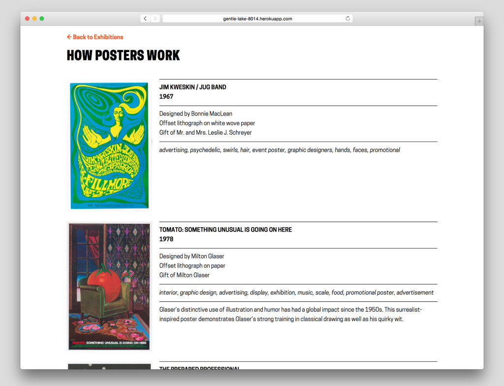
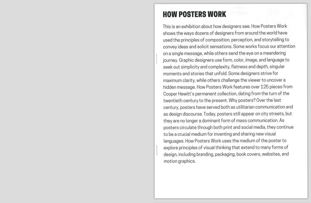
Label Book Generator–’How Posters Work’ exhibition page

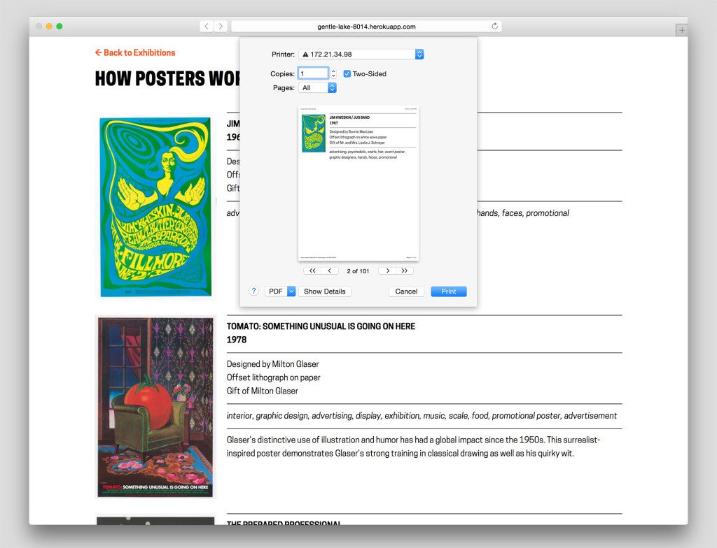
Currently a prototype, The Label Book Generator is a tool that creates a printed publication of object labels for each exhibition at the Cooper Hewitt. In its most basic use, Visitor Services at the museum can navigate to an exhibition from a list on the website’s homepage and once on an exhibition page, press Command-P (or File > Print) to generate a PDF with an initial cover page followed by a single label on each page–all entirely set in a larger font-size.

What initially prompted the development of this prototype was to solve readability issues visitors may have with existing wall labels. This does not imply that the current label design needs to change or be set in a larger font-size, but instead that the labeling system as a whole should be augmented with something to make them more accessible, to provide a magnifying glass of sorts when needed.

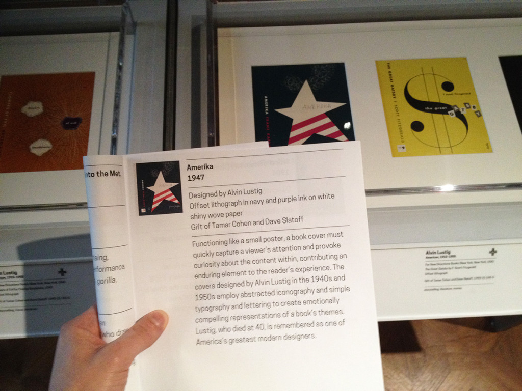
photo (1)

Publication in use in the gallery

The entire process proved to be invaluable as a learning experience. From the start it was obvious that I needed to leverage the museum’s API to access object data by exhibition to ultimately populate fields in each label. As the Label Book Generator website is currently, the selection and order of the fields are in accordance with a predefined template that begins to apply the typographic guidelines of the existing wall labels. As a graphic designer it was particularly interesting for me to consider the meticulous planning that is usually involved in typesetting parallel to the time spent writing the code. Whereas typically, these two processes are dealt with in succession.

Since the end result needed to be a book, I was set on formatting the data in a markdown document that would have typographic styles manually applied in InDesign. A Python script was written to create a markdown document with syntax assigned to each field, e.g., titles would be prepended with ‘#’ to be a top level header, dates with ‘##’ to be a second level, etc.

Stumbling along with my rudimentary skills in Python–and at one point rewriting the whole thing in Javascript, only to go back to Python–led me to conclude that outputting the final document with InDesign can be circumvented. With the much-appreciated help of Micah Walter, it was settled that rather than generating a markdown file, I should instead produce a small web application using Python and Flask as a framework. The most salient aspect of the entire project now being a simple print style sheet for the website that automatically generates the same final document that having to manually use InDesign would have produced (Here is the code available on Github).

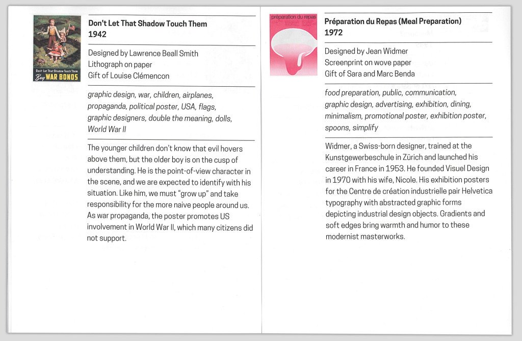
With a central concern for typography, the print style sheet seamlessly flows all the content into any fixed page format, which in this case would be a printable PDF. The printed document once bound can be considered an exhibition catalog reduced to its essential elements: A list of every work, with their respective information and descriptions (when available).

06

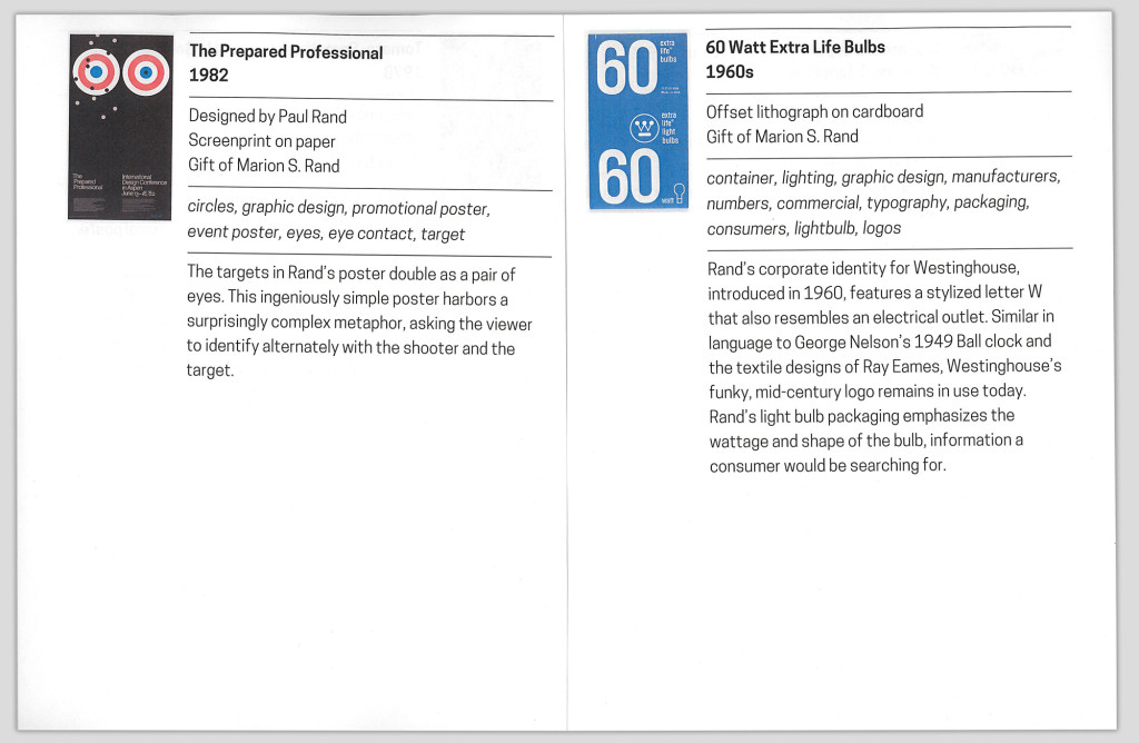
Interior spread of printed publication

The Label Book Generator solves the initial prompt of assisting those hard of seeing. However, considering that the website from the get-go is built with a responsive layout and scalable typography (again due to the simultaneity of graphic design and web development) there are a number of opportunities to expand it’s role and purpose.

The typography, padding and margins set in REMs (Root EM), rather than fixed sizes, allows for the ability to control the base size and relatively adjust the measurements. A future version of the website can include in the interface a means to control how large or small the base size of the document should be, given the dimensions of the fixed format–whether it be a standard letter-sized PDF, or otherwise.

10

Browser print dialog box

01

Cover page of printed publication generated from the website

02

Interior spread of printed publication

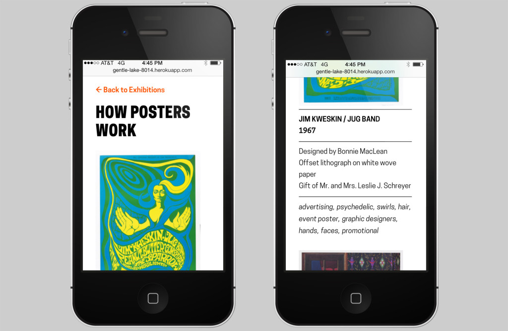
When presenting the prototype to others here at the museum Katie Shelly brought up an interesting future use case involving blind visitors and screen reader software. In addition to the possibilities with printable versions of the Label Book Generator, the website itself provides a responsive mobile view of all the labels which could theoretically be read to the visitors via their personal device.

iphone_01

Mobile view of website

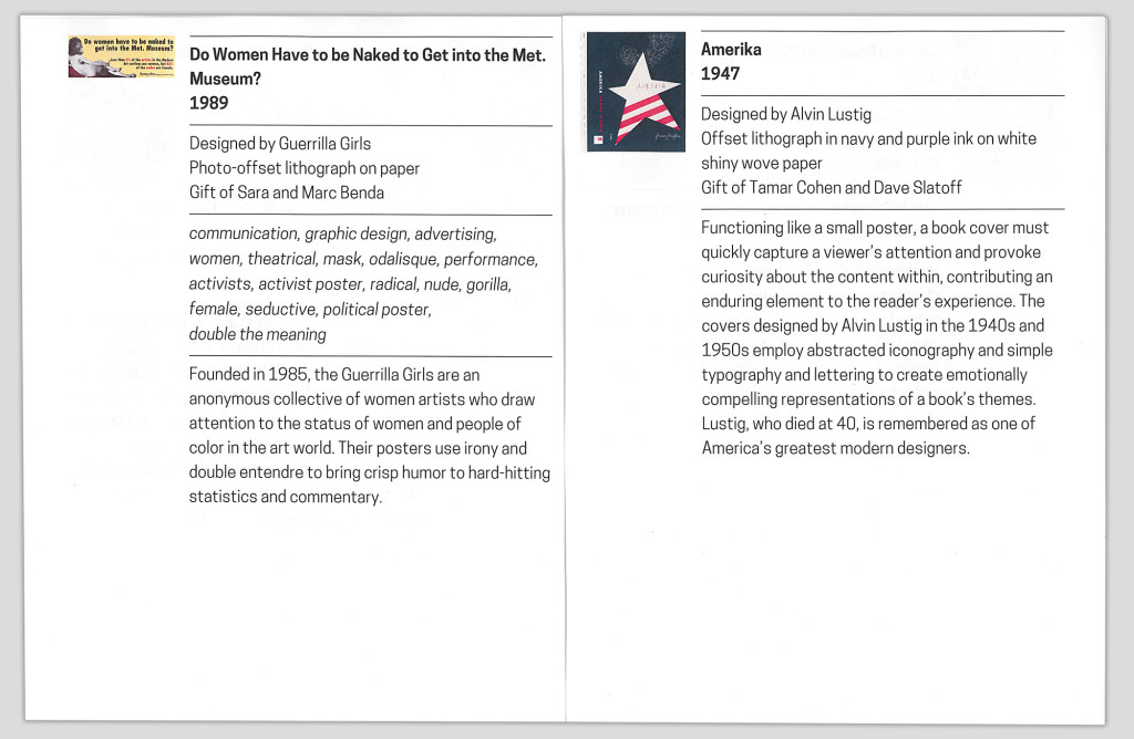
Finally, the printed label book serves as a means to visualize the collection database. If a label in the book and website is missing a field, it reflects an oversight at the ‘source of truth’. In other words, there is a one-to-one relationship between the fields in both the labels and the database. Ultimately, this brings to mind the commonplace workflow of producing wall labels that are manually written, designed, and edited (on this topic see also: Label Whisperer). In perhaps a later version, a similar process of using the museum’s API to automate the process of generating the label book, could theoretically be applied to the entire production of wall labels for the museum.

Missing tags for the object on recto

Missing tags for ‘Amerika’

Give the Generator a go!
When the optimal interface is paper: improving visitor information

Earlier in this series I wrote about improving customer-facing ticketing touchpoints and UX improvements to a internal-facing app. This 3rd post is about the design and thinking behind a valuable— albeit non-tech— touchpoint: a postcard explaining how to use the pen.

When we first launched the Pen, it was obvious that we needed to quicken up the front desk transaction. One thing that was really slowing down the transactions (and causing a big line) was the “Pen schpiel.” A verbal explanation of what the Pen is, why it’s cool, and how to use it could hog up several minutes per transaction.

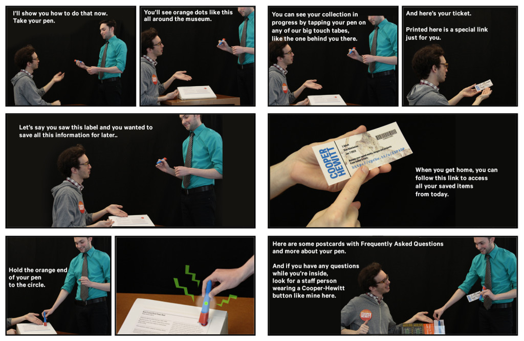
a comic-book style grid of photos showing a transaction between two gentlemen step-by-step

I made this storyboard in April 2014 with some willing coworkers and simple props (3D printed pen, fake ticket, fake postcard, fake “sample label,” and fake staff badge). In the last frame, the desk rep references an FAQ postcard.

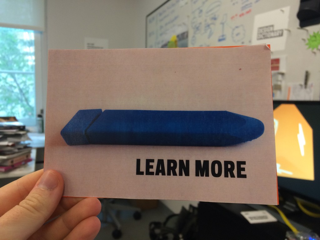
We predicted the need for a postcard almost a year before the pen launch, but didn’t print one until we were sure it was necessary. I mocked up a fake postcard with a photo of a 3D-printed pen to provide some needed conversation-starting visuals in our early meetings. This was long before the pen had a final form factor, and you can see that our initial conversations about pen size and shape were a little uncomfortable.

person's hand holding up a postcard in an office setting. postcard says "LEARN MORE" with a blue plastic tube-like object.

This was the ‘sample’ postcard in the above storyboard, all created months before the Pen had a final form factor.

The postcard idea was on the back burner for many months as we all focused on the bare essentials of getting the Pen and its suite of services running at a baseline level. Once the Pen was released to the public in March 2015, the length of time of each transaction became an obvious “pain point” that needed our attention. So, the postcard was brought back to the table.

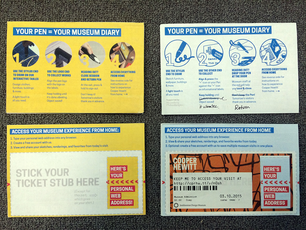
two postcards, shown front and back, with 1-2-3-4 illustrated steps

My first pass (left) used real images. The second pass (right) used illustrations, which were widely preferred by everyone I asked for input.

Sam had a cool idea to let visitors peel up the non-badge part of their ticket and stick it to the card, with some text boldly pointing to your “personal URL.” (The whole ticket is printed on sticker paper). This was clever because it could minimize the possibility of visitors losing or unthinkingly discarding their tickets, which contains the precious personal URL they’ll need to access their personal visit diary. When stuck to a postcard, the ticket might have a better chance of making it safely to a visitor’s home.

I worked closely with the front desk staff to get the language just right. It had to be concise but also explanatory. When the cards arrived from the printer, the desk staff was super excited and hopeful that these cards could help them save time and energy at each transaction.

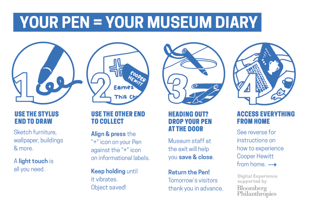
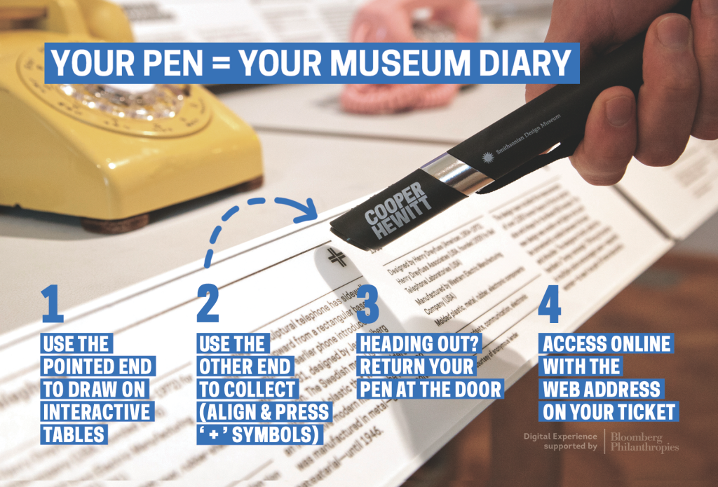
Informational graphic and text with steps 1-4 under the heading " YOUR PEN = YOUR MUSEUM DIARY"

The first printing of the pen postcard.

When put to the test, these postcards turned out to be less useful than we all imagined.

Only about 2 in 5 visitors wanted to take a postcard. And even the guests who did take a postcard still wanted verbal explanation in addition to the card. (We ended up handling this by diverting the most explanation-hungry visitors to a representative stationed at the nearest interactive table for informal “group tutorials”.)

So the postcard was not a panacea, but it did ease the pain somewhat.

There was an overall feeling from visitors and desk reps that the postcard was too verbose and this is why most guests didn’t want to pick it up and read it. Another point brought up by the desk staff was that while the card functions well as a didactic, it doesn’t sell the pen. It doesn’t tell you why you ought to try it. A third observation: most people were not springing for the cool peel-and-stick feature. Humbug.

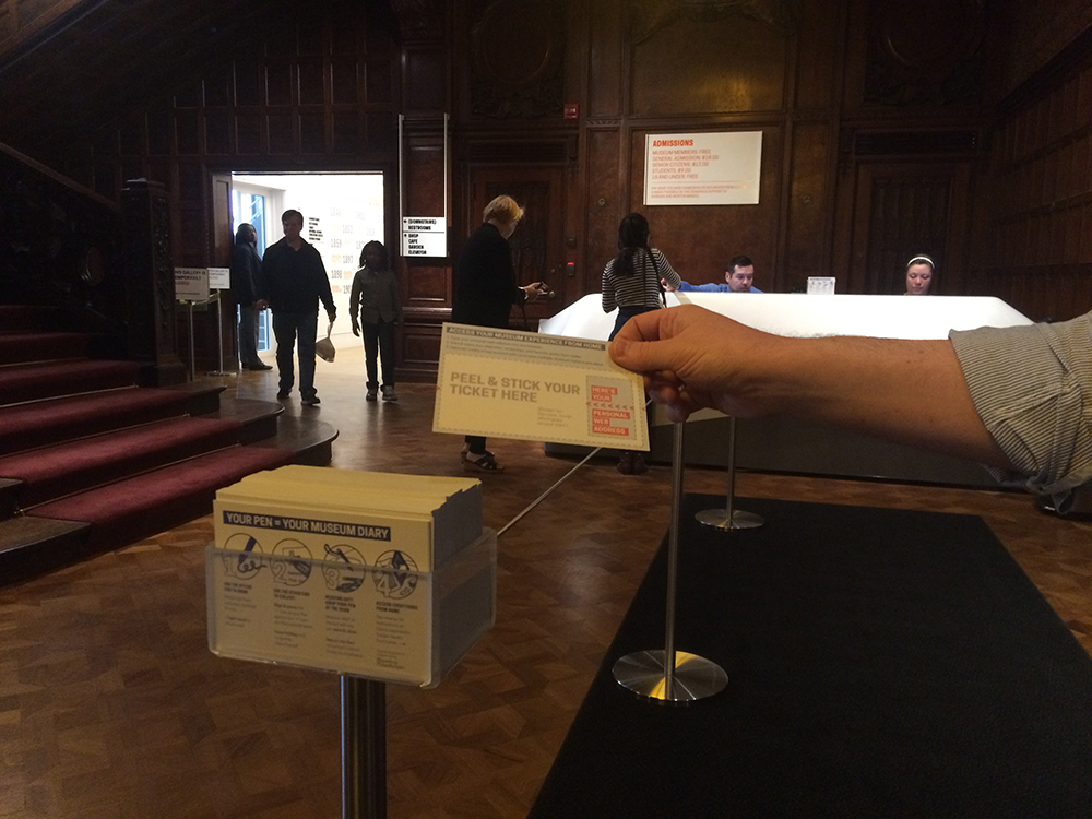
a person's hand pulling a postcard out of an acrylic stand which holds a stack of cards. the setting is a darkened lobby.

People are more willing to read a document while they’re waiting in line than when they’ve reached the front desk and are already talking to someone.

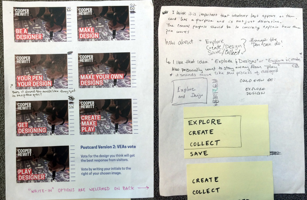
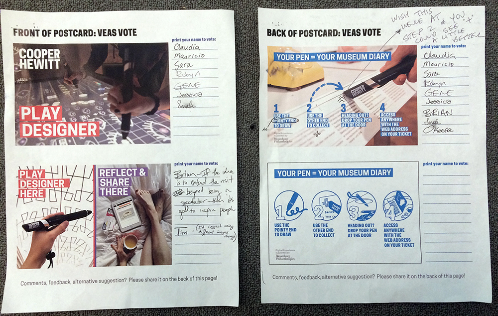
So we hit the drawing board again. I created a voting ballot so the front desk staff could weigh in on two choices for the front and back of the card. We had clear winners, as you can see in the image below. The voting sparked a conversation that led to further refinement of the text and images.

two pieces of paper with images and written-in-pen names beside each image.

Desk Reps are always working on their feet or dealing with the public, so the most convenient way to get their imput is an old-fashioned paper ballot (not a web form).

The desk reps were unanimously against “PLAY DESIGNER” as sell copy for the Pen, because they were sure that many guests would think the word “play” meant the message was targeted at kids. So, I came up with 7 copy variations and we did another round of voting. The desk staff almost unanimously voted for a “write-in option” from one of their peers for its directness and clarity. The suggestion was: “EXPLORE AND DESIGN.”

a piece of paper, shown front and back, the first with a grid of images and initials scribbled in pen, and the back with many handwritten notes on a blank page, all in pen

The winning idea was actually a “write-in” contender on the back of the page, which sparked impassioned debate among desk staff.

The voting was not just a method for collecting votes, but also a way to spark conversation among many staff, across departments.

What I learned from this experience is that the folks on the “front lines” tend to dislike any language or collateral that is in any way subtle, abstract, or “overly clever,” citing the likelihood that too much coyness will just confuse visitors. It makes sense; when a visitor is trying to get going in the museum, corral his kids, juggle his bag and coat, get himself to the restroom, keep an eye on the time, and so on, he won’t have a lot of “brain space” for interpreting any subtleties. They just need crystal clear information to get them on their way.

a telephone on museum display with a label beneath, a hand holding a large black wand, and steps 1-4 for use written in blue bold text

These instructions are less detailed, but also less tl;dr

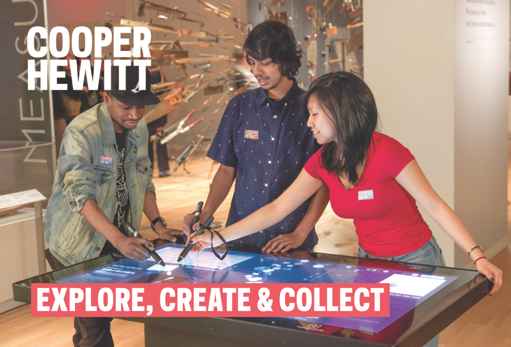
three young people in a museum setting holding large black wands and pressing them to a touchscreen glass tabletop

The new postcard shows real people using the pen, making it visually obvious what a person should do with it.

The second version has:

  • Giant copy to “sell” the pen by describing its basic functions (Create, Collect, Save).
  • Bigger images to catch attention and make the card more “pick-up-able.”
  • Less text to ease tl;dr anxiety.
  • Image and word choice is intended to make the function of the pen’s “tip” and “base” obvious just by looking.

Publishing is as publishing does – revealing ‘books’ in the collection

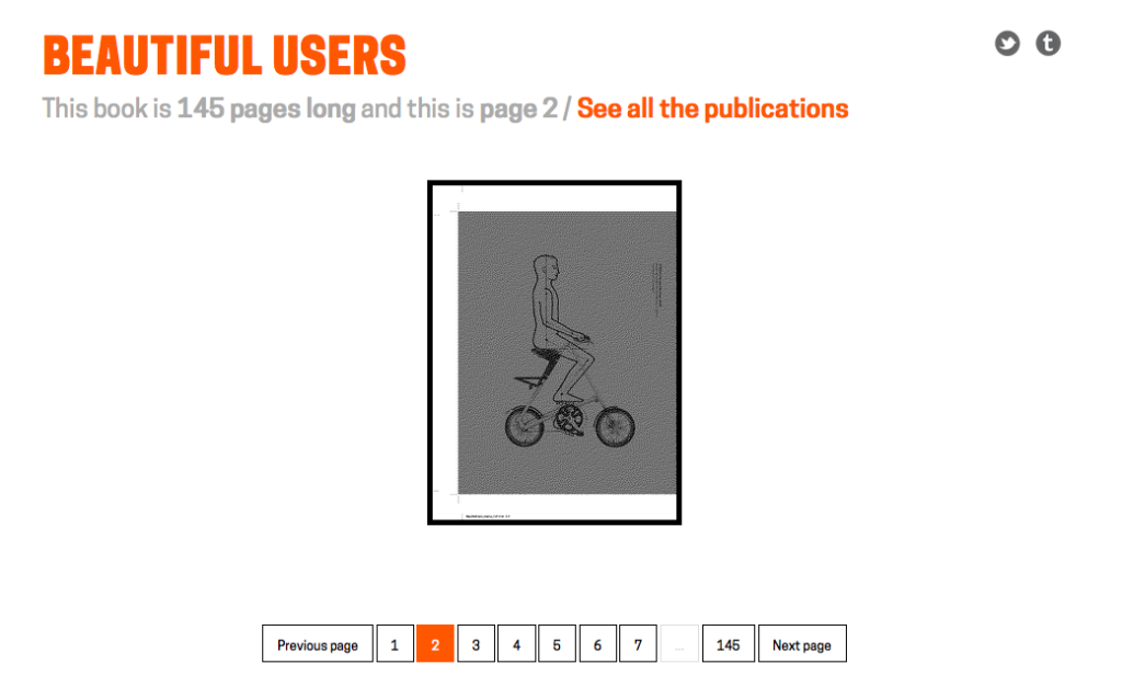
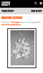
Screen Shot 2015-04-23 at 10.48.30 AM

Note: This book is actually 144 pages long and the count is a by-product of the way we’ve stitched things together. By the time you read this that problem may be fixed. So it goes, right?

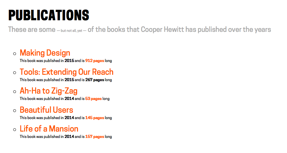
We’ve added a new section to the Collections website: publications. You know, books.

This is the simplest dumbest thing we could think of to create a bridge between analog publications and the web. It’s only a handful of recent publications at the moment and whether or not older publications will be supported remains an open question, for now.

To be clear – there are already historical publications available for viewing on the main Cooper Hewitt website. As I was writing this blog post Micah reminded me that we’ve even uploaded them in to the Internet Archive so you can use their handy book reader to view the books online. All of which means that we’ll likely be importing those publications to the collections website soon enough.

All of this (newer) work is predicated on the fact that we have the luxury, with these specific publications, of operating outside the “work” versus “edition” dilemma that many other kinds of books have to negotiate. All we’ve done is created stable permanent URLs for each book and each page in that book. That’s it.

Screen Shot 2015-04-23 at 11.28.22 AM

The goal is not to reproduce the book online, for all the usual reasons, but to give meaningful atomic units of a book – pages – a presence on the Interwebs and a scaffolding for future stuff (object lists, additional photographs, notes and other ancillary materials and so on) as time and circumstance permit.

Related, Emily Fildes’ and Allison Foster’s Museums and the Web (2015) paper
What the Fonds?! The ups and downs of digitising Tate’s Archive
is a good discussion around the issues, both technical and user-facing, that are raised as various sources of disparate data (artworks, library and archive data, curatorial files) all start to share the same conceptual space on the web.

Screen Shot 2015-04-23 at 10.47.28 AM

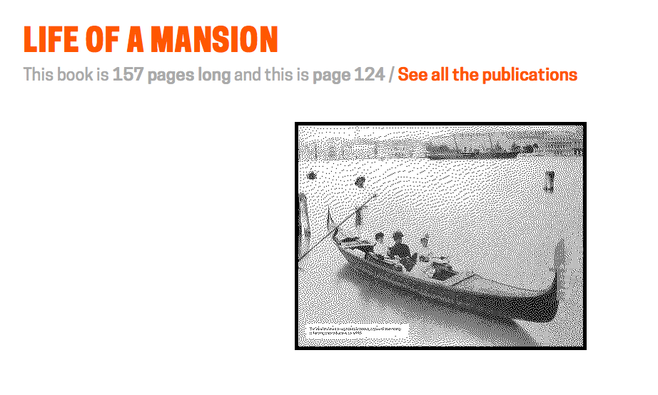
We’re not there yet and it may take us a while to get there so in the meantime every page URL has a small half-toned reproduction of the book page in question. That’s meant to give people a visual cue and confidence in the URL itself — specifically they look the same — such that you might bookmark it, share it with a friend, or whatever awesome use you dream up without having to wonder whether the ground will shift out from underneath it.

Kind of like books, right?

Finally, all the links indicating how many pages a particular book has are “magic” – click on them and you’ll be redirected to a random page inside that book.

Enjoy!

Screen Shot 2015-04-23 at 12.29.48 PM
Screen Shot 2015-04-23 at 12.30.14 PM

Label Whisperer

Screen Shot 2014-01-24 at 6.06.47 PM

Have you ever noticed the way people in museums always take pictures of object labels? On many levels it is the very definition of an exercise in futility. Despite all the good intentions I’m not sure how many people ever look at those photos again. They’re often blurry or shot on an angle and even when you can make out the information there aren’t a lot of avenues for that data to get back in to the museum when you’re not physically in the building. If anything I bet that data gets slowly and painfully typed in to a search engine and then… who knows what happens.

As of this writing the Cooper-Hewitt’s luxury and burden is that we are closed for renovations. We don’t even have labels for people to take pictures of, right now. As we think through what a museum label should do it’s worth remembering that cameras and in particular cameras on phones and the software for doing optical character recognition (OCR) have reached a kind of maturity where they are both fast and cheap and simple. They have, in effect, showed up at the party so it seems a bit rude not to introduce ourselves.

I mentioned that we’re still working on the design of our new labels. This means I’m not going to show them to you. It also means that it would be difficult to show you any of the work that follows in this blog post without tangible examples. So, the first thing we did was to add a could-play-a-wall-label-on-TV endpoint to each object on the collection website. Which is just fancy-talk for “another web page”.

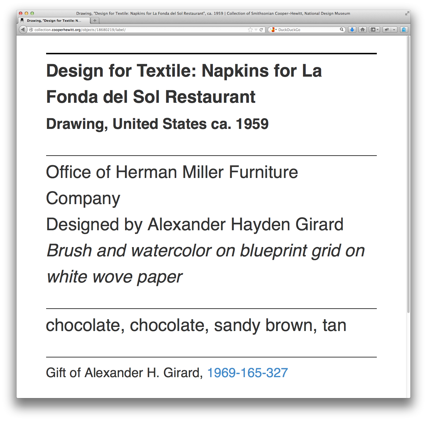
Simply append /label to any object page and we’ll display a rough-and-ready version of what a label might look like and the kind of information it might contain. For example:

https://collection.cooperhewitt.org/objects/18680219/label/

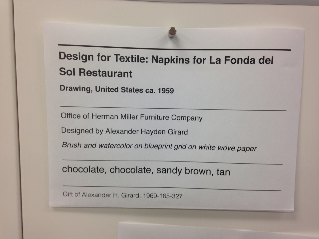
Now that every object on the collection website has a virtual label we can write a simple print stylesheet that allows us to produce a physical prototype which mimics the look and feel and size (once I figure out what’s wrong with my CSS) of a finished label in the real world.

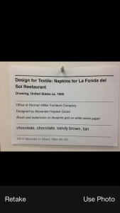
photo 2

So far, so good. We have a system in place where we can work quickly to change the design of a “label” and test those changes on a large corpus of sample data (the collection) and a way to generate an analog representation since that’s what a wall label is.

Careful readers will note that some of these sample labels contain colour information for the object. These are just placeholders for now. As much as I would like to launch with this information it probably won’t make the cut for the re-opening.

Do you remember when I mentioned OCR software at the beginning of this blog post? OCR software has been around for years and its quality and cost and ease-of-use have run the gamut. One of those OCR application is Tesseract which began life in the labs at Hewlitt-Packard and has since found a home and an open source license at Google.

Tesseract is mostly a big bag of functions and libraries but it comes with a command-line application that you can use to pass it an image whose text you want to extract.

In our example below we also pass an argument called label. That’s the name of the file that Tesseract will write its output to. It will also add a .txt extension to the output file because… computers? These little details are worth suffering because when fed the image above this is what Tesseract produces:

$> tesseract label-napkin.jpg label
Tesseract Open Source OCR Engine v3.02.01 with Leptonica
$> cat label.txt
______________j________
Design for Textile: Napkins for La Fonda del
Sol Restaurant

Drawing, United States ca. 1959

________________________________________
Office of Herman Miller Furniture Company

Designed by Alexander Hayden Girard

Brush and watercolor on blueprint grid on white wove paper

______________._.._...___.___._______________________
chocolate, chocolate, sandy brown, tan

____________________..___.___________________________
Gift of Alexander H. Girard, 1969-165-327

I think this is exciting. I think this is exciting because Tesseract does a better than good enough job of parsing and extracting text that I can use that output to look for accession numbers. All the other elements in a wall label are sufficiently ambiguous or unstructured (not to mention potentially garbled by Tesseract’s robot eyes) that it’s not worth our time to try and derive any meaning from.

Conveniently, accession numbers are so unlike any other element on a wall label as to be almost instantly recognizable. If we can piggy-back on Tesseract to do the hard work of converting pixels in to words then it’s pretty easy to write custom code to look at that text and extract things that look like accession numbers. And the thing about an accession number is that it’s the identifier for the thing a person is looking at in the museum.

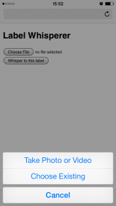
To test all of these ideas we built the simplest, dumbest HTTP pony server to receive photo uploads and return any text that Tesseract can extract. We’ll talk a little more about the server below but basically it has two endpoints: One for receiving photo uploads and another with a simple form that takes advantage of the fact that on lots of new phones the file upload form element on a website will trigger the phone’s camera.

This functionality is still early days but is also a pretty big deal. It means that the barrier to developing an idea or testing a theory and the barrier to participation is nothing more than the web browser on a phone. There are lots of reasons why a native application might be better suited or more interesting to a task but the time and effort required to write bespoke applications introduces so much hoop-jumping as to effectively make simple things impossible.

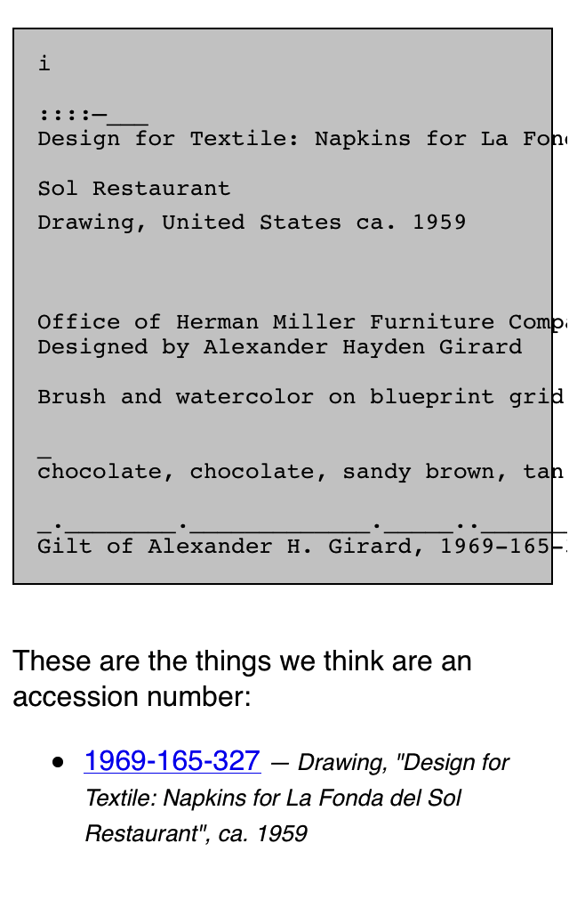
photo 2
photo 3

Given a simple upload form which triggers the camera and a submit button which sends the photo to a server we get back pretty much the same thing we saw when we ran Tesseract from the command line:

Untitled-cropped

We upload a photo and the server returns the raw text that Tesseract extracts. In addition we do a little bit of work to examine the text for things that look like accession numbers. Everything is returned as a blob of data (JSON) which is left up to the webpage itself to display. When you get down to brass tacks this is really all that’s happening:

$> curl -X POST -F "file=@label-napkin.jpg" https://localhost | python -mjson.tool
{
    "possible": [
        "1969-165-327"
    ],
    "raw": "______________j________nDesign for Textile: Napkins for La Fonda delnSol RestaurantnnDrawing, United States ca. 1959nn________________________________________nOffice of Herman Miller Furniture CompanynnDesigned by Alexander Hayden GirardnnBrush and watercolor on blueprint grid on white wove papernn______________._.._...___.___._______________________nchocolate, chocolate, sandy brown, tannn____________________..___.___________________________nGift of Alexander H. Girard, 1969-165-327"
}

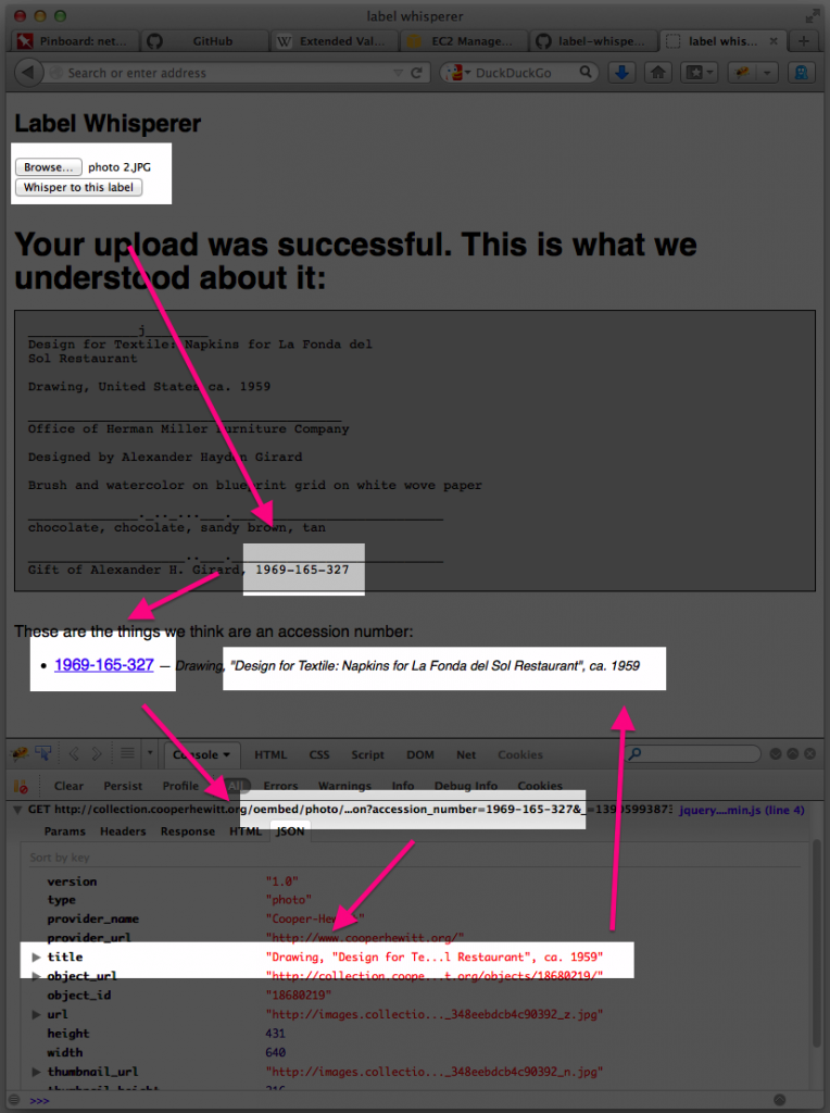
Do you notice the way, in the screenshot above, that in addition to displaying the accession number we are also showing the object’s title? That information is not being extracted by the “label-whisperer” service. Given the amount of noise produced by Tesseract it doesn’t seem worth the effort. Instead we are passing each accession number to the collections website’s OEmbed endpoint and using the response to display the object title.

Here’s a screenshot of the process in a plain old browser window with all the relevant bits, including the background calls across the network where the robots are talking to one another, highlighted.

label-whisperer-napkin-boxes

  1. Upload a photo
  2. Extract the text in the photo and look for accession numbers
  3. Display the accession number with a link to the object on the CH collection website
  4. Use the extracted accession number to call the CH OEmbed endpoint for additional information about the object
  5. Grab the object title from the (OEmbed) response and update the page

See the way the OEmbed response contains a link to an image for the object? See the way we’re not doing anything with that information? Yeah, that…

But we proved that it can be done and, start to finish, we proved it inside of a day.

It is brutally ugly and there are still many failure states but we can demonstrate that it’s possible to transit from an analog wall label to its digital representation on a person’s phone. Whether they simply bookmark that object or email it to a friend or fall in to the rabbit hole of life-long scholarly learning is left an as exercise to the reader. That is not for us to decide. Rather we have tangible evidence that there are ways for a museum to adapt to a world in which all of our visitors have super-powers — aka their “phones” — and to apply those lessons to the way we design the museum itself.

We have released all the code and documentation required build your own “label whisperer” under a BSD license but please understand that it is only a reference implementation, at best. A variation of the little Flask server we built might eventually be deployed to production but it is unlikely to ever be a public-facing thing as it is currently written.

https://github.com/cooperhewitt/label-whisperer/

We welcome any suggestions for improvements or fixes that you might have. One important thing to note is that while accession numbers are pretty straightforward there are variations and the code as it written today does not account for them. If nothing else we hope that by releasing the source code we can use it as a place to capture and preserve a catalog of patterns because life is too short to spend very much of it training robot eyes to recognize accession numbers.

The whole thing can be built without any external dependencies if you’re using Ubuntu 13.10 and if you’re not concerned with performance can be run off a single “micro” Amazon EC2 instance. The source code contains a handy setup script for installing all the required packages.

Immediate next steps for the project are to make the label-whisperer server hold hands with Micah’s Object Phone since being able to upload a photo as a text message would make all of this accessible to people with older phones and, old phone or new, requires users to press fewer buttons. Ongoing next steps are best described as “learning from and doing everything” talked about in the links below:

Discuss!