Monthly Archives: May 2015

Object concordances – what is the simplest thing to match like with like?

eames-concordances-full

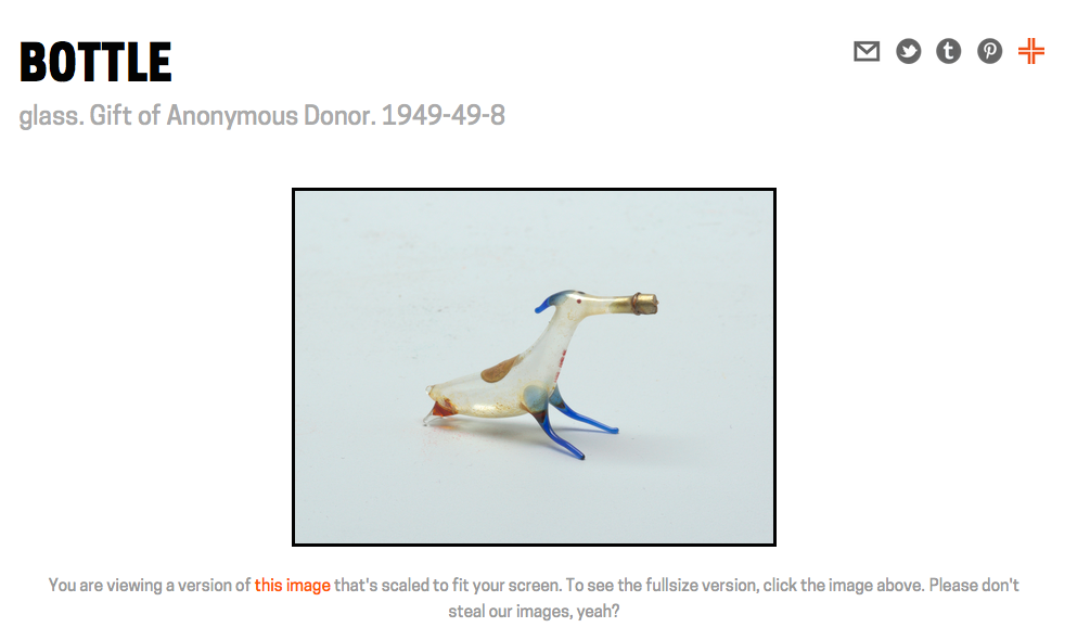
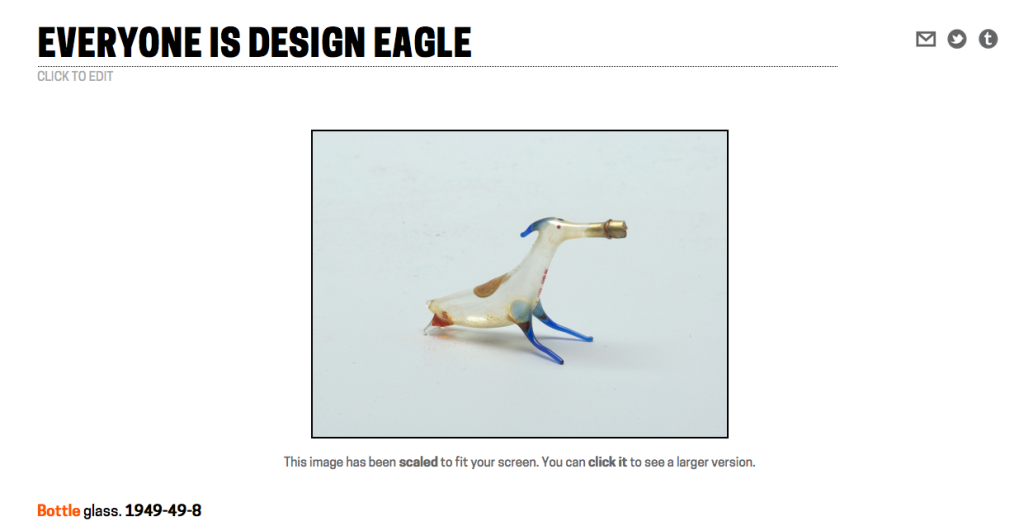
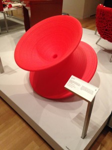
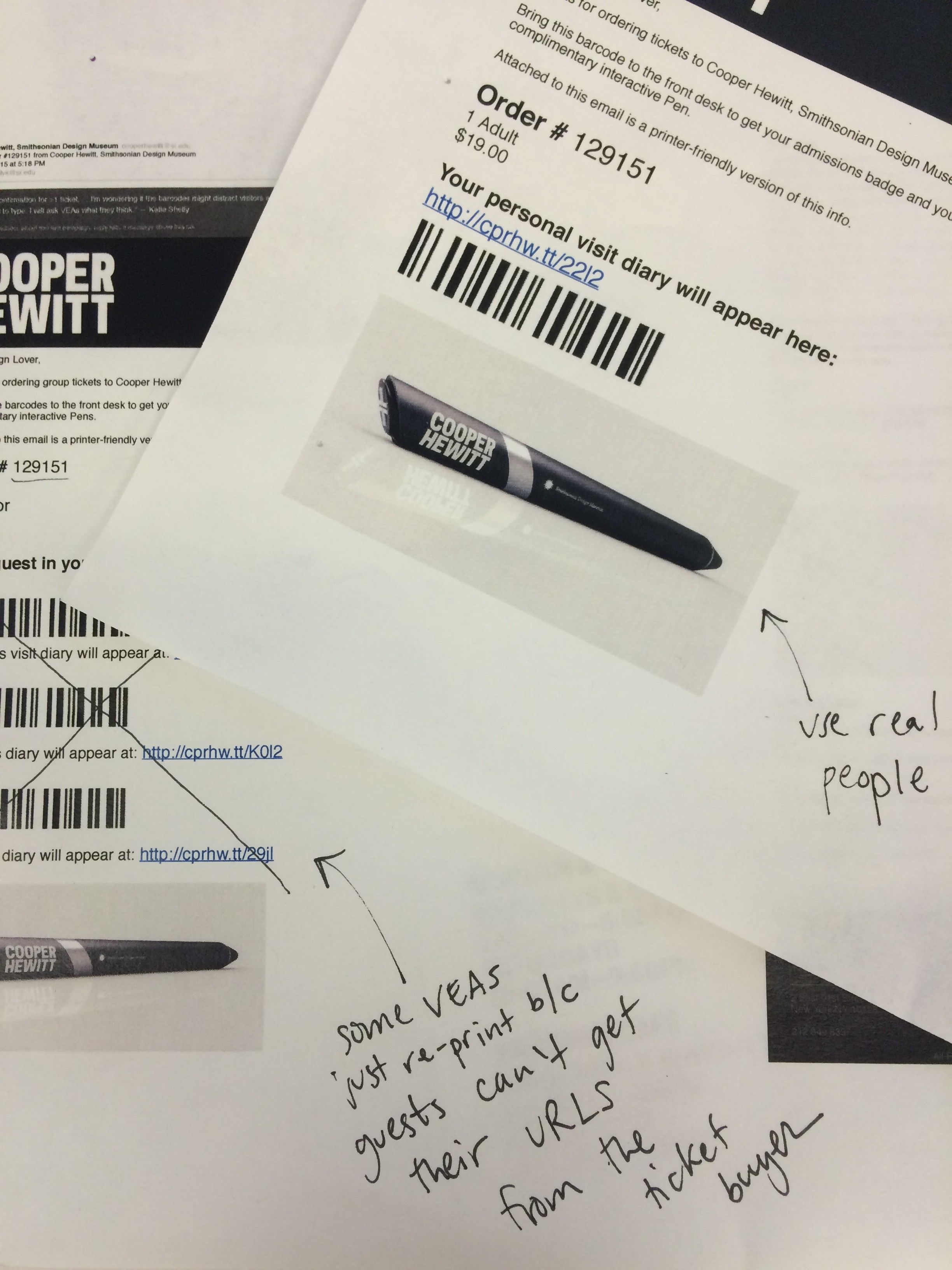
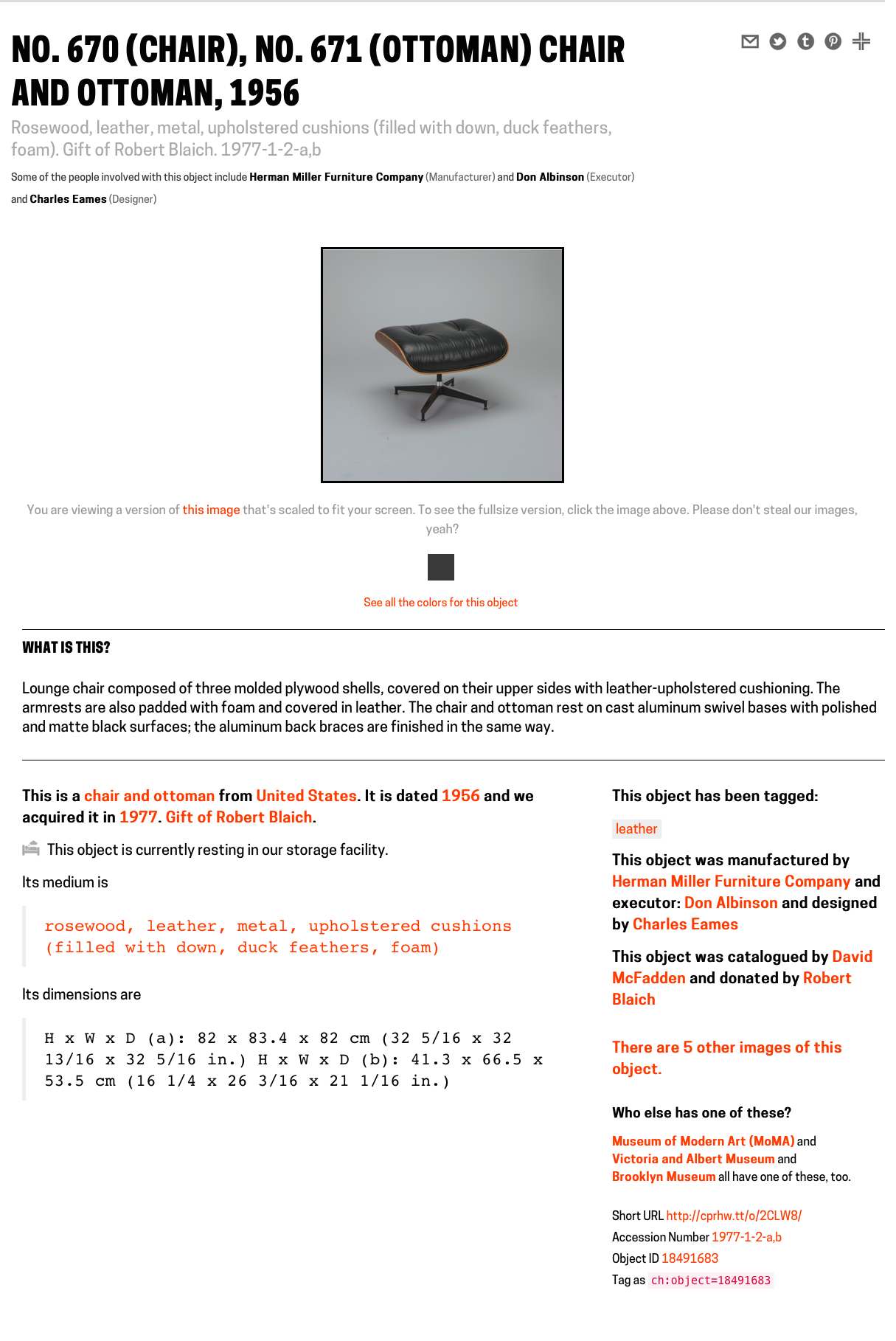
Do you notice anything special about this screenshot of Charles Eames’ famous No. 670 Chair?

It might be hard to see because it’s a tall screenshot and this is a small thumbnail. Have a look at the large version. Hint: It’s not the part where the chair is missing in the picture. It’s actually this, on the right-hand side of the object details:

eames-concordances-crop

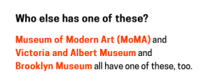
Object concordances! With other museums! To the same objects in their collections!! On their own websites !!!

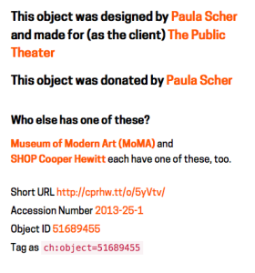
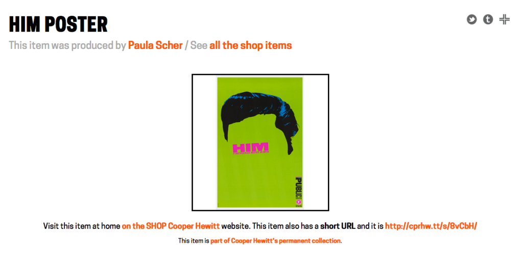
Before you get too excited (and think its actual working ‘Linked Data’), we should point out that as of this writing we have only “concordified” four distinct objects – this one, this one, this one and that one – eight times with four separate organizations, one of which is our own shop, so there is a lot of work left to do.

Screen Shot 2015-05-28 at 6.57.20 PM

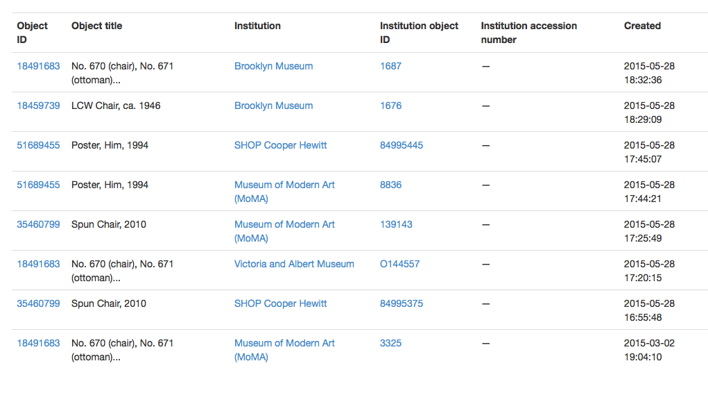
If you look carefully you can see that most of the concordances, to date, were added within about 90 minutes of one another. That’s because Seb and I were talking about object concordances over lunch that day and agreed that we could probably push the simplest and dumbest thing out the door before I went home. It has been something that has been on the agenda since mid-2012.

Specifically, we maintain a fixed list of institutions with whom we will “concordify” objects. If your institution isn’t on that list yet it’s not personal. We can add as many institutions as we want but we think the narrow focus helps to explain the purpose of the tool. Then we simply record that institutions unique ID, the object ID for something in our collection and the object ID for something in their collection. That’s it.

Screen Shot 2015-05-28 at 6.10.49 PM

Currently the tools for adding concordances, or editing institutions, are … terrible.

(Or rather, they are the unadorned plumbing that makes the whole thing work. So they are beautiful and elegant in their own way but most people would be forgiven for not seeing those qualities right away.)

Short-term the goal is to build some friendlier “admin” web page for a few more people to add concordances without having to worry about the technical details. Medium-term the goal is to create restricted API methods for doing fancy-pants buttons and pop-up dialogs on the object pages themselves to allow staff to add concordances as they think of them or are otherwise just poking around the collections website. Maybe in the long term, ‘the crowd’ might be invited to do it too.

Screen Shot 2015-05-28 at 6.11.02 PM

Somewhere between those two things we will also build proper “index” pages on the collections website of all the objects that have been concordified, all the institutions that have concordified objects and so on. Just like we’ve already done for people.

The other thing we’ll do shortly is make sure that these concordances are included in the CC0 Cooper Hewitt collections metadata dump which is available on GitHub.

When we said “the simplest thing” we meant it.

There isn’t much yet but it’s a start – a tangible proof of what it could be – and if we’ve done our job right then it is one of those things that will grow exponentially, as always, as time and circumstance permit.

(If you’ve been a long time reader you might remember we did Rijkscolors back in 2013 as an experiment in automatically matching objects – but we were undone by language and structural differences in metadata, and the reality that humans might still be better at this at least until the sector irons a few things out)

Collect all the things – shoeboxes, shop items and the Pen

Screen Shot 2015-05-27 at 6.15.22 PM

You can now collect any object in the collection, or on display, from the collections website itself. Just like in the galleries there is a small “collect” icon on the top right-hand side of every object page on the collections website. It’s not just individual object pages but also all the object list pages, too. So many “collect” icons!

20150527-shoebox-visit-icon

  Objects that haven’t been collected yet have a grey icon.

  Objects that have been collected in the galleries, as part of a visit to the museum, have a pink icon.

  Objects that that have been collected on the collections website have an orange icon.

Simply click the grey icon to collect an object or click one of the orange or pink icons to remove or un-collect that object.

That’s it!

Screen Shot 2015-05-27 at 6.14.55 PM

Just like visit items, things you collect on the website have a permanent URL that can be made public to share with other people and can be given a bespoke title or description. Objects that you collect on the collections website live in something we’re calling the “shoebox”.

You can get your to shoebox by visiting https://collection.cooperhewitt.org/users/YOUR-USERNAME/shoebox or if you’re already logged in to your Cooper Hewitt account by visiting https://collection.cooperhewitt.org/you/shoebox/.

There is also a handy link in the Your stuff menu, located at the top-left of every page on the collections website.

The shoebox is the set of all the objects you’ve collected (or created) on the website or during your visits to the museum. Although visits and visit items overlap with things in your shoebox we still treat them differently because although you need to be logged in to you Cooper Hewitt account to add things to your shoebox a visit to the museum can be entirely anonymous if a visitor so chooses.

The default view for the shoebox is to display everything together in reverse-chronological order but you can filter the view to show only things collected online or things collected during a visit. You can also see the set of all the objects you’ve made public or private.

20150528-shoebox-loggedout

logged out view (large version)

2015-shoebox-loggedin

logged in view (large version)

But it’s not just objects, either. You can already collect videos during your museum visit so those are included too. Ultimately the only limit to what you might collect with the Pen is time-and-typing. Things we’re thinking about making collect-able include: entire exhibitions or the introductory texts on the wall for an exhibition or people or individual rooms in the Mansion.

Museum retail

We’ve started this process by allowing you to collect things in the museum Shop.

By “things in the Shop” we mean all the things that have ever been sold in the Shop over the years. And by “all the things” we mean almost all the things. There is some technical hoop-jumping related to inventory management systems and that is why we don’t have everything yet but we’ll get there in time.

We are a captial-D design museum with a capital-D design shop and many of the things that have been available in the Shop have gone on to become part of our permanent collection so it only makes sense to give them a home on the collections website. In fact MoMA already does similarly with their “find related products in the MoMA Store” feature though ours is a bit different.

20150527-shop-landing

You can see for yourself at https://collection.cooperhewitt.org/shop

The /shop section is divided in two parts: Brands and Items (and all the items for a given brand of course). There isn’t a whole lot of extra information beyond titles and links to the SHOP Cooper Hewitt website for those items that are currently in-stock but it’s a start. Like the rest of the collections website we’ve started with the idea that providing permanent stable URLs that people can have confidence we create something that can be improved on over time.

20150527-shop-brands-crop

Shop items and brands don’t get updated as regularly as we’d like yet. We are still working through the fiddly details of bridging our systems with the Shop’s ecommerce and POS system and some things still need to be done by hand. We’ve been able to get this far though so we expect things will only get better.

20150527-shoebox-listview-shop

You might be wondering…

You might be reading this and starting to wonder Hmmm… does that mean I can also collect things in the Shop as I walk around the museum with the Pen? the answer is… Yes!

As of this writing there are only one or two items that can be collected with the Pen because the Shop staff are still getting familiar with the tools and thinking about how making collect-able labels changes in their day-to-day workflow. The obvious future of this might be the infamous ‘wedding register’, however we believe that many museum visitors actually would like to bookmark objects to possibly buy later, or just remember as part of their overall visit to the ‘museum campus’.

Practically what that has meant are some changes to Sam‘s “tag writer” application (the subject of a future blog post) to fetch shop items via our API and then letting the Shop folks decide what they want to tag and when they want to do it.

There has been a whole lot of change here over the course of the last three years and allowing the various parts of the museum warm up to the possibilities that the Pen starts to afford at their own pace and with not only a minimum of fuss but plenty of wiggle-room for experimentation is really important.

In the meantime we hope that you enjoy collecting at least more, if not all, of the things that make up the museum.

Happy Staff = Happy Visitors: Improving Back-of-House Interfaces

“You have to make the back of the fence that people won’t see look just as beautiful as the front, just like a great carpenter would make the back of a chest of drawers … Even though others won’t see it, you will know it’s there, and that will make you more proud of your design.”

—Steve Jobs

In my last post I talked about improvements to online ticketing based on observations made in the first weeks after launching the Pen.

Today’s post is about an important internal tool: the registration station whose job is to pair a new ticket with a new pen. Though visitors will never see this interface, it’s really important that it be simple, easy, clear, and fast. It is also critical that staff are able to understand the feedback from this app because if a pen is incorrectly paired with a ticket then the visitor’s data (collections and creations) will be lost.

Like a Steve-Jobs-approved iPod or a Van Cleef & Arpels ruby brooch, the “inside” of our system should be as carefully and thoughtfully designed as the outside.

the view from behind a desk with screens and wires everywhere. a tablet positioned upright with some tiny text and bars of color.

Version 1 of the app was functional but cluttered, with too much text, and no clear point of focus for the eye.

Because the first version of the app was built to be procedurally functional, its visual design was given little consideration. However, the application as a whole was designed so that the user interface – running in a web browser – was completely separate from the underlying pen pairing functionality, which makes updating the front-end a relatively straightforward task.

Also, we were getting a few complaints from visitors who returned home eager to see their visit diary, and were disappointed to see that their custom URL contained no data. We suspected this could have been a result of the poor UI at ticketing.

With this in mind, I sat behind the desk to observe our staff in action with real customers. I did about three sessions, for about ten minutes each, sometimes during heavy visitor traffic and sometimes during light traffic. Here’s what I kept an eye on while observing:

  • How many actions are required per transaction? Is there any way to minimize the number of “clicks” (in this case, “taps”) required from staff?
  • Is the visual feedback clear enough to be understood with only partial attention? Or do  typography, colors, and composition require an operator’s full attention to understand what’s going on?
  • What extraneous information can we minimize or omit?
  • What’s the critical information we should enlarge or emphasize?

After observing, I tried my hand at the app myself. This was actually more edifying than doing observations. Kathleen, our head of Visitor Services, had a batch of about 30 Pens to pair for a group, and I offered to help. I was very slow with the app, so I wasn’t really of much help, moving through my batch of pens at about half the speed of Kathleen’s staff.

Some readers may be thinking that since the desk staff had adjusted to a less-than-excellent visual design and were already moving pretty fast with it, this could be a reason not to improve it. As designers, we should always be helping and improving. Nobody should have to live with a crappy interface, even if they’ve adjusted to it! And, there will be new staff, and they will get to skip the adjustment process and start on the right foot with a better-designed tool.

My struggle to use the app was fuel for its redesign, which you can see germinating in my drawings below.

some marker sketches of a tablet interface with lots of scribbled notes

After several rounds of paper sketches like these, the desk reps and I decided on this sequence as the starting point for version two of the app.

These were the last in a series of drawings that I worked through with the desk staff. So our first few “iterative prototypes” were created and improved upon in a matter of minutes, since they were simply scribbled on paper. We arrived at the above stopping point, which Sam turned into working code.

Here’s what’s new in version 2:

  • The most important information—the alphanumeric shortcode— is emphasized. The font is about 6 or 7 times bigger, with exaggerated spacing and lots of padding (white space) on all sides for increased legibility. Or as I like to call it, “glanceability.” This helps make sure that the front of house staff pair the correct pen with the correct ticket.
  • Fewer words. For example, “Check Out Pen With This Shortcode” changed to “GO”, “Pen has been successfully checked out and written with shortcode ABCD” changed to “Success,” etc. This makes it easier for staff to know, quickly, that the process has worked and they can move on to the next ticket/pen/customer.

“I didn’t have time to write a short letter, so I wrote a long one instead.”
Mark Twain

  • More accurate words. Our team uses a different vernacular from the people working at the desk. This is normal, since we don’t work together often, and like any neighboring tribes, we’ve developed subtly different words for different things. Since this app is used by desk staff, I wanted it to reflect their language, not ours. For example, “Pair” is what they call “check-out” and “Return” is what they call “check-in.”
  • Better visual hierarchy: The original app had many competing horizontal bands of content, with no clear visual clue as to which band needed the operator’s attention at any given time. We used white space, color (green/yellow/red for go/wait/stop), and re-arranging of elements (less-used features to the bottom, more-used features to the top) to better direct the eye and make it clear to the user what she ought to be looking at.
  • Simple animations to help the user understand when the app is “working” and they should just wait.

Still to come are added features (bulk pairing, maintenance mode) and any ideas the desk reps might develop after a couple of weeks of using the new version.

Imagine how difficult this process would have been if the museum had outsourced all of its design and programming work, or if it were all encased in a proprietary system.

Exporting your visits

Screen Shot 2015-05-12 at 7.03.10 PM

Starting today you can export the items you have collected or created during your visits to the museum. When you export a visit we will bundle up all the objects you’ve collected and all the items you’ve created in to a static website that is then compressed and made available for you to download directly.

A static website means that you can view all of your visit items in any old web browser, even when it’s not connected to the Internet. It means that if you have your own website you can copy your visit export over it and host it and share it and, well… do whatever you want with it.

Where “whatever you want” means “so long as you comply” with the Smithsonian Terms of Use or assert your rights under Fair Use if you are based in the US.

We think that this is of particular importance to educators who may not have unfiltered or functional internet connections in their classrooms.

Screen Shot 2015-05-13 at 2.44.53 PM

A visit export doesn’t have all the same bells and whistles that your visit on the Cooper Hewitt collections website does but everything you need to view an export (except a web browser obviously) is contained in the file you download. There is a landing page, and a paginated view of everything you’ve done and a page for every object collected and each one of your creations.

Visit exports also come with a friendly and detailed JSON file for every item you’ve collected or created. If you don’t know what that last sentence means, don’t worry about it. It just means that everything you’ve done during a visit also has a file containing structured metadata about that activity which your developer friends may get excited about.

Screen Shot 2015-05-12 at 7.03.29 PM

Visit exports use are very own js-cooperhewitt-images library to manage square-cropped thumbnails that reveal the complete thumbnail when you mouse over them, just like on the collections website.

Screen Shot 2015-05-12 at 5.34.16 PM

Images for loan objects are not included with your visit download. That’s because they’re loan objects and we only have permission to host those images from our own collections website. Instead of including the images locally in your visit download every time there is a loan object we link directly to the image hosted on our own website.

If you’re not online (or your web browser hasn’t already cached a copy of the image on your hard drive) then your visit pages are smart enough to load a placeholder image for that object. Like this:

Screen Shot 2015-05-13 at 2.43.08 PM

We do the same for individual item pages too:

Screen Shot 2015-05-13 at 2.44.08 PM

online
Screen Shot 2015-05-13 at 2.43.41 PM

offline

Visit exports are deliberately minimal, by design. They contain a small amount of HTML markup that’s been enhanced with a little bit of JavaScript and CSS to create a minimally elegant export that people can easily tailor to their own needs. Some people may quibble with the idea that including both the jQuery and Bootstrap libraries is not really a “little bit of JavaScript and CSS” but we hope that we have done things in such a way that it’s easy for people to change if they choose to.

Visit exports are currently only available for visits that have been “paired” with your Cooper Hewitt account. A visit that has been exported is cached on our servers but it can be regenerated when something about your visit changes – you delete an item, or add a note and so on – not more than once per day. Each one of your visits (remember: each one of your paired visits) has a handy export button at the bottom of each page and you can see a list of all your exported/exportable visits by going to: https://collection.cooperhewitt.org/you/visits/exports/

Screen Shot 2015-05-13 at 11.05.26 AM

The exports themselves are generated using our own API and the recently released cooperhewitt.visit and cooperhewitt.visit.items family of methods. There is a bunch of bespoke code that we’ve written to manage how exports are scheduled and stored but the part that actually builds your export is a plain-vanilla API application using the same public API methods that you might use to generate your own visit export.

Screen Shot 2015-05-19 at 2.19.04 PM

In time we may open source the API application we’ve written but for now we’re going to keep putting it through its paces to make sure that it works consistently, as expected, and to force ourselves to use the same tools we’re making available to people outside the “hula hoop“.

Screen Shot 2015-05-12 at 5.53.41 PM

Finally, a little bit of administrivia: Your visit exports are made available under the Smithsonian Terms of Use agreement. You can read the entire document but the short (and relevant) bits are:

The Smithsonian Institution (the “Smithsonian”) provides the content on this website (www.si.edu), other Smithsonian websites, and third- party sites on which it maintains a presence (“SI Websites”) in support of its mission for the “increase and diffusion of knowledge.” The Smithsonian invites you to use its online content for personal, educational and other non-commercial purposes; this means that you are welcome you to make fair use of the Content as defined by copyright law. Information on United States copyright fair use law is available from the United States Copyright Office. Please note that you are responsible for determining whether your use is fair and for responding to any claims that may arise from your use.

In addition, the Smithsonian allows personal, educational, and other non-commercial uses of the Content on the following terms:

You must cite the author and source of the Content as you would material from any printed work.

You must also cite and link to, when possible, the SI Website as the source of the Content.

You may not remove any copyright, trademark, or other proprietary notices including attribution information, credits, and notices, that are placed in or near the text, images, or data.

In addition to copyright, you must comply with all other terms or restrictions (such as trademark, publicity and privacy rights, or contractual restrictions) as may be specified in the metadata or as may otherwise apply to the Content. Please note that you are responsible for making sure that your use does not violate or infringe upon the rights of anyone else.

Screen Shot 2015-05-18 at 3.59.53 PM

Enjoy!

Redesigning Post-Purchase Touchpoints

We re-opened the museum with “minimum viable product” relating to online ticket orders. Visitor-facing touchpoints like confirmation emails, eTicket PDFs and “thank you for your order” webpages were built to be simple and efficient. After putting them to the test with real visitors, room for improvement became obvious.

Here’s how we used staff feedback and designerly observation to iterate and improve upon 3 important touchpoints. The goal of this undertaking was to make things smoother for our front-of-house staff (who turned out to have quite a bit to juggle, given the new Pen and its backend complexities), and simpler for visitors (some of whom were confused by our system.. how dare they!).

The original confirmation webpage was designed with visitors buying on mobile (perhaps even while en route to the museum) in mind:

screen shot of a webpage with order number and a barcode for each ticket.

The original “Thank You” webpage was stripped of information, with the idea of getting you through the front desk transaction as efficiently as possible.

The original confirmation email was a few lines of text:

Screen shot of an email confirming cooper hewitt ticket order

Made in a pre-opening vacuum without real visitors to test upon, The original confirmation email was more self-promotional than it was anticipatory of visitors’ needs.

The original PDF attached to this confirmation email was designed for visitors who like to print things out and have something on paper:

The original eTicket PDF had one page (one "ticket") per visitor. The email went to the purchasing visitor's inbox.

The original eTicket PDF had one page (one “ticket”) per visitor. The email went to the purchasing visitor’s inbox.

Over a few weeks of heavy visitor traffic (with about 20% of visitors buying advance tickets online), I sat behind the front desk staff to quietly observe a handful of transactions every day. I initiated my observation sessions knowing that we needed to make the front desk move smoother and faster, but I didn’t yet know which touchpoints/services/operations would need changing.

These 3 touchpoints stood out to me as something that needed re-addressing if we wanted to make the front desk run more smoothly. (My daily observations also led to many efficiency-boosting changes made to internal tools, IT concerns, staffing needs, signage, and more.) This experience has made me a big believer in quiet observation as a direct route to improving services and systems. “Conference room conjecture” is worth very little compared to real observations and listening-based chats with your public-facing staff.

My advice on Observing and Listening for service design:

  •  You may observe a staff person answer a question incorrectly, or a problem that you could resolve yourself on the spot. Don’t intervene, tempting as it might be! You’re not there to fix problems, you’re there to fix problem patterns. Your mission is long-term.
  • When chatting with staff, listen quietly and attentively. It’s OK if you can’t offer an instant fix. You may not have a magic wand, but listening with empathy is at least half as good.
  • Focus on building trust with the staff you are observing over a period of days or weeks, so they will become comfortable sharing bad news as easily as they share the good. Remind them repeatedly that your intention is to improve their daily work situation.
  • Remember it can be very intimidating to feel “interrogated” or “observed” by someone who is your direct/indirect superior. Make sure they know your questions are motivated by a spirit of service, not by “tattle-telling” to other staff that things might be going amiss. You will get more honesty, and thereby, better design insights.

Here are the observation-based insights that motivated our choices:

  • Visitors sometimes get confused by the barcodes. They think something has to be scanned after their visit in order for their pen diary to get “Saved” or “sent to their email.”
  • Because this collateral is called an “eTicket,” some visitors are marching right up to the gallery entrance with their “eTicket,” and bypassing the front desk. “I already bought my ticket, why do I have to wait on this line?”
  • Visitors don’t know what the Pen is, and explaining it takes several minutes, slowing down the line.
  • Visitors may not have great cell service in our lobby, and probably haven’t gotten the wifi working yet, so if their email attachment hasn’t pre-downloaded, this will slow everything down.
  • Front desk staff each have different ways of handling eTickets. Most staff ask for the order number verbally. A few staff take the printout or phone and scan the barcode, avoiding the need to re-print a ticket (this is how the barcode was intended to be used).
  • The diversity of collateral that visitors may bring to the transaction makes things more complicated for our staff. “Is my customer looking at a webpage, an email, or a PDF? Should I tell them to look for an order number, hand me a barcode, or open the attachment?”
two gentlemen at a large white desk in a dark room full of wood paneling. a third gentleman sits behind the desk.

For their own ease of use, most desk reps were initiating the transaction by asking: “What’s your Order number?” so we designed to accommodate that preference instead of working against it.

The ideas we cycled through:

  • A picture of the Pen with an “enticing” explanation of what it does might help offset the burden on the front desk to explain it all very quickly.
  • We thought one barcode per visitor displayed in a list might let us hold on to our original “paperless dream.” (The “paperless dream” entailed scanning each barcode and pairing immediately with pens, bypassing our CRM and house-printed tickets.) When we ran this idea by our colleagues at the desk, though, we learned quickly that this would be extraordinarily confusing for guests, who need to remember their personal URL (usually printed on the ticket) to access their post-visit diary. What if a group of 5 friends come together, will we put the burden on the visitor to remember which URL goes with which friend? Will they have to write it down, or forward around the ticket email with added whose-URL-is-whose notes? That’s too much of a burden on guests, who are already working to assimilate new information about our Pen, which has already buffeted their expectations (and tried their transaction-length-patience) about what to expect during a museum front desk experience.
printouts of an email confirming tickets with barcodes and giant pen scribbled "x" with handwritten pen notes

What seems like a good idea at your desk may not seem so smart after you’ve shown it around to ground-level users

The current solution (after all, our work is never final):

screen shot of an email with lots of information about cafe, hours, map, the pen, and an image of museum interior and pen usage.

The order number is large and at the top of the email. It’s also in the subject line. Click this image to enlarge.

  • This solution makes the front desk staffer’s job simpler when a pre-order person arrives. It’s all about the order number. There is no more choice involved about whether to ask for the order number, or the barcode, or the purchaser’s name… or….
  • There is still a confirmation webpage, and it looks exactly like this.
  • There is no more PDF attachment to the email.
  • Since this is a “will-call” paradigm instead of an “eTicket” paradigm, we hope this solution will keep visitors from expecting that they can enter the museum directly without talking to a desk attendant first.
  • The order number is in the subject line, so if your email hasn’t fully downloaded, you won’t slow down the line.
  • The original idea was to save paper by allowing a visitor’s PDF to work as their ticket/URL reminder. This idea, though it does now involve reprinting tickets, may involve less user-printouts, since we’re simply asking folks to “bring” their order number, and not any printouts.

This is just one piece of an elaborate service design puzzle. More posts will be coming about other touchpoints we’ve created and re-designed based on observations made in the first months of running our new Pen service.