Tag Archives: HCD

Museums and the Web Conference Recap: Administrative Tools at Cooper Hewitt

The Labs team had a great time at Museums and the Web this year. We published two papers for the conference and presented them both to the audience of cultural heritage thinkers, makers, planners and administrators. Sam Brenner and I shared our paper, “Winning (and losing) hearts and minds of museum staff: Administrative interfaces at Cooper Hewitt,” which outlines the process of designing, developing and iterating two in-house built, staff-facing tools: Tagatron and the Pen Pairing Station. Both administrative tools are essential aides to staff managing new responsibilities associated with visitor-facing gallery technologies.

Here is the deck from our presentation:

Administrative interfaces at Cooper Hewitt (14)

Administrative interfaces at Cooper Hewitt

Introduction

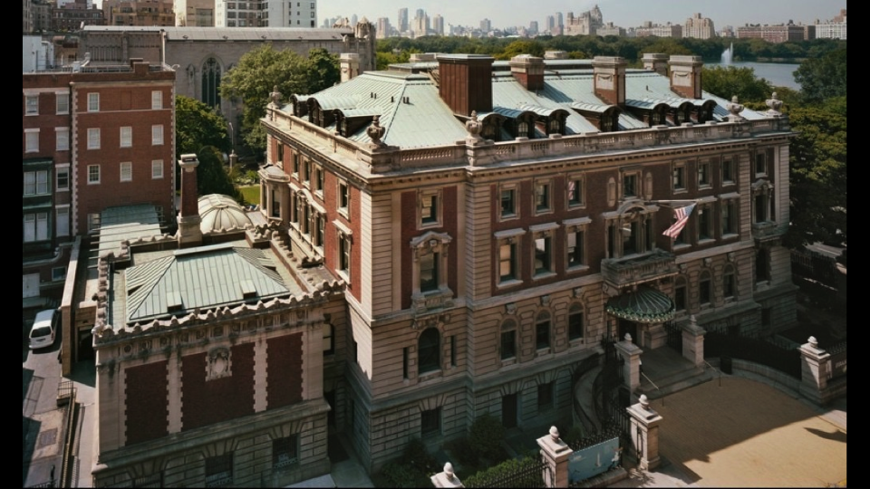
  • Cooper Hewitt, Smithsonian Design Museum. New York, New York.
  • Our strategy around presenting design is to expose process—how things are made, how they are conceived, how they are designed.
  • This presentation will speak to our philosophy of openness around design process in sharing part of the back-story of how our current visitor-facing experience came together and how it’s maintained.

Administrative interfaces at Cooper Hewitt (1)

Visitor Interfaces

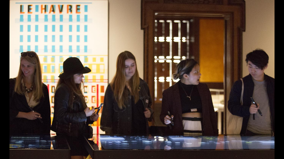
  • The visitor-facing technologies in the museum, introduced in 2014, invite new forms of engagement with the Cooper Hewitt collection. They encourage active participation, letting visitors play, design and collect through multi-touch table applications and the Pen.
  • Before we were able to re-design the visitor’s relationship to the museum we went through comprehensive changes at every level.

Administrative interfaces at Cooper Hewitt (2)

Comprehensive Re-design / Institutional Shift

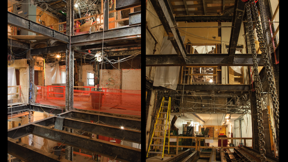
  • We began a restoration of the mansion, stripping it down to its Carnegie steel girders.
  • To a similar degree we rethought the organizational infrastructure of Cooper Hewitt with a comprehensive re-design of operations, workflows and responsibilities.

Administrative interfaces at Cooper Hewitt (3)

New Responsibilities (for Everyone)

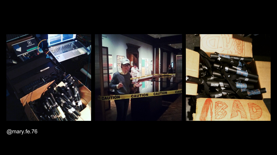
  • There were new jobs created to support the new visitor experience, including that of our Gallery Technology Manager, Mary Fe, whose job responsibilities include maintaining the Pens and troubleshooting touch tables and gallery interactives
  • The re-design affects every staff member at Cooper Hewitt:
  • Registrars: aggressive timetable to enter data
  • Security: understand the mission and visitor experience, teaching visitors on pen usage
  • Exhibitions: label programming, maintenance
  • Curators: tags, relations, chat formatting for length
  • Visitor services: pen pairing – whole new step in between “welcome” and ticket sale
  • Before we got to this stage there was the task of onboarding staff to new responsibilities, which fell largely to the Digital & Emerging Media department. With the allocation of new responsibilities also came the opportunity to create tools that could facilitate some of the work.

Administrative interfaces at Cooper Hewitt (4)

Defining the Need for Considered Interfaces

  • Why did we decide that new interfaces were necessary in certain parts of the workflow?
  • We started with observation, watching workflows as they emerged. We created tools to assist where necessary. The need for interfaces was in part logistical, in part technical and also in part human.
  • Candidates for interface development are parts of the new digital ecosystem where there is:
  • High volume of data
  • Large number of users
  • Complex tasks
  • Something that needs constraints or enforcement
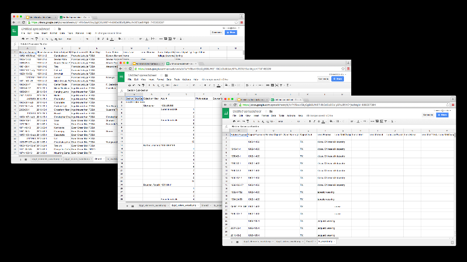
  • Example: the job of assigning tags and related objects to everything we put on display for the reopening. The touch table interfaces utilize tag and related object information. This data does not live in TMS, so it is housed in a custom database.
  • The task of creating the data fell to the curators. Originally this was stored in Excel files. While the curators were happy using spreadsheets, we identified a few major issues with them. The biggest one was that every department had devised their own schema for storing the data, which would ultimately have to be reconciled
  • This example fits all of the criteria above.

Administrative interfaces at Cooper Hewitt (5)

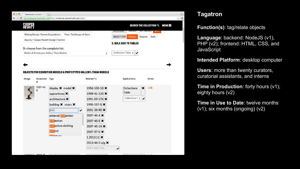
Case Study 1: Tagatron

  • Explicit purpose of the Tagatron tool: make the work quicker; make the metadata consistent; make the organization of the metadata consistent
  • Making this tool highlighted for the digital team the complex relationship between the work, the tool, and the people responsible for each—even though we believed the tool made things easier, the tool had its own set of ongoing technical and usability issues
  • We found that those issues propagated an amount of distrust or lack of confidence in the larger project. Some of these were due to bugs in the tool, but some of it was just that now it was known that this was work that would be “enforced” or taken more seriously, which made users uncomfortable.
  • Key idea: the interface takes on a symbolic value in representing “new responsibilities” and can bring about issues that it might not have been designed to address. It takes on a complex position between human needs and technical needs.

Administrative interfaces at Cooper Hewitt (6)

Tagatron (continued)

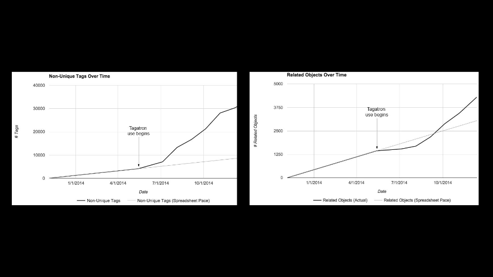
  • These graphs illustrate how prolific the task of tagging and relating objects is. It was important to build Tagatron because it is crucial tool in the ongoing operation of the museum’s digital experience. More so than the spreadsheets ever could, it allows for scalability.
  • Since the re-opening the tool went through one major design and backend overhaul, and continues to see small iterations.

Administrative interfaces at Cooper Hewitt (7)

Case Study 2: Pen Pairing Stations

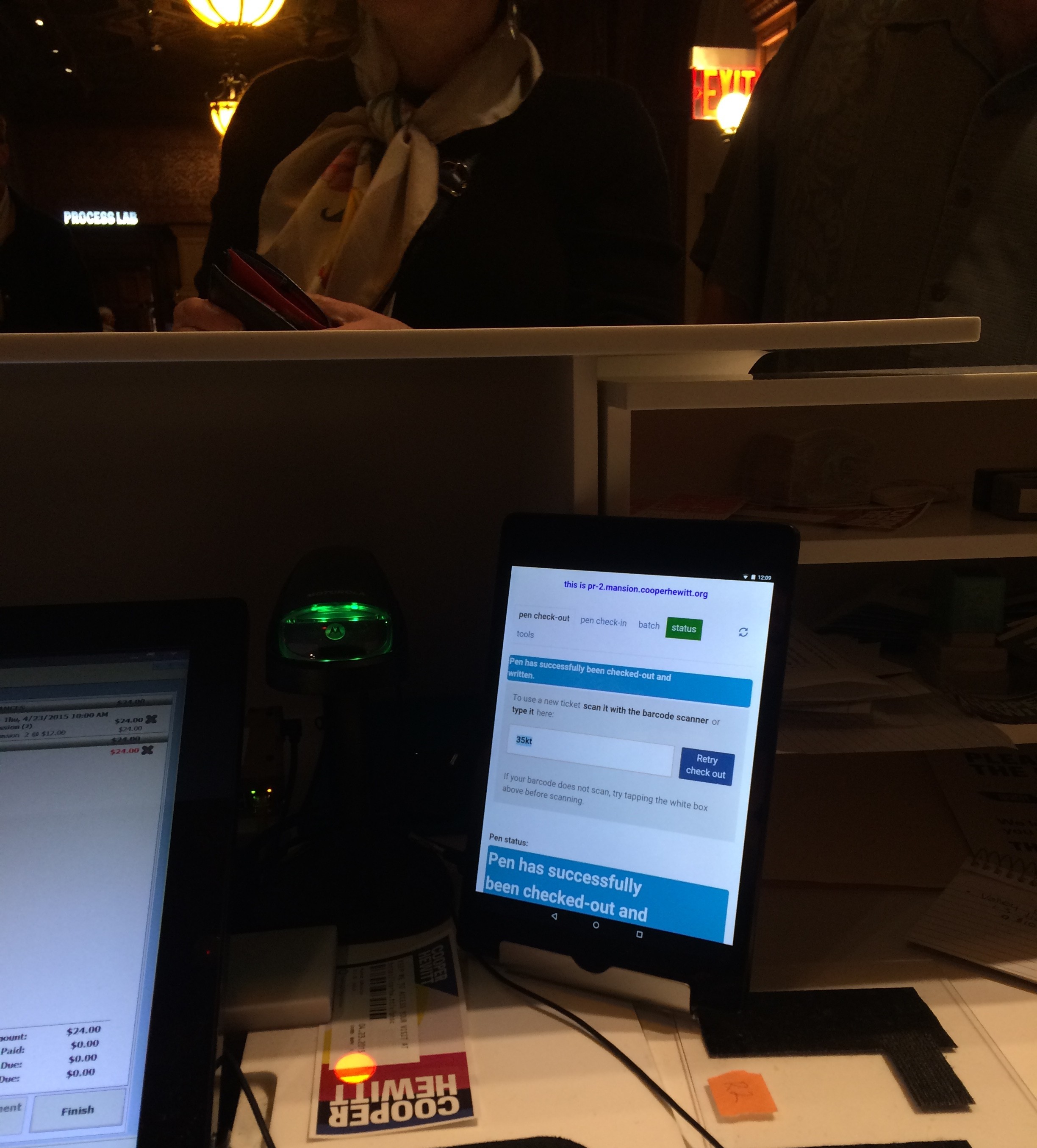
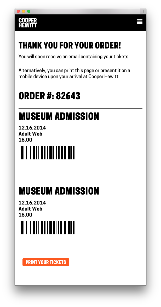
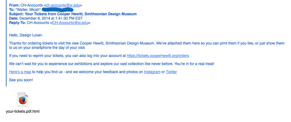
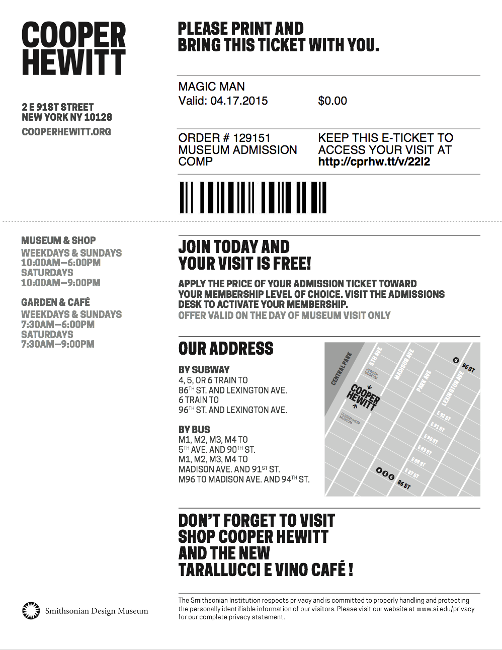
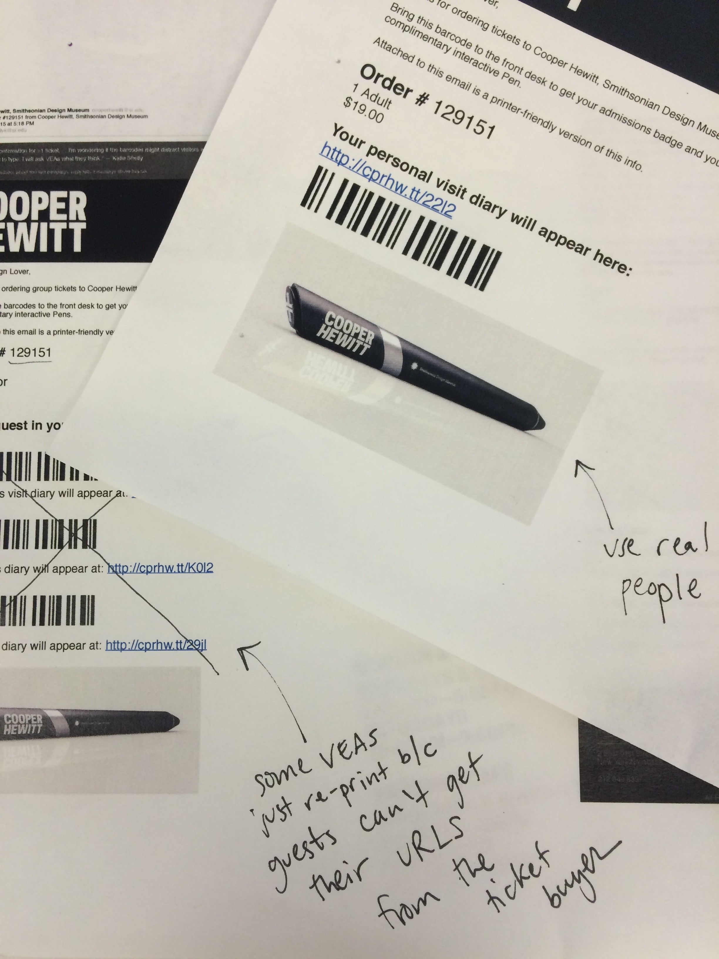
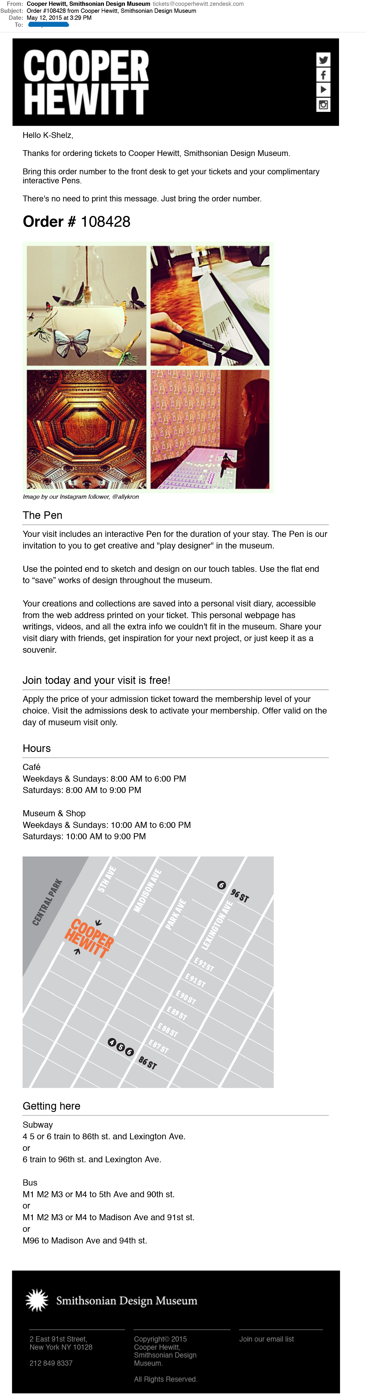
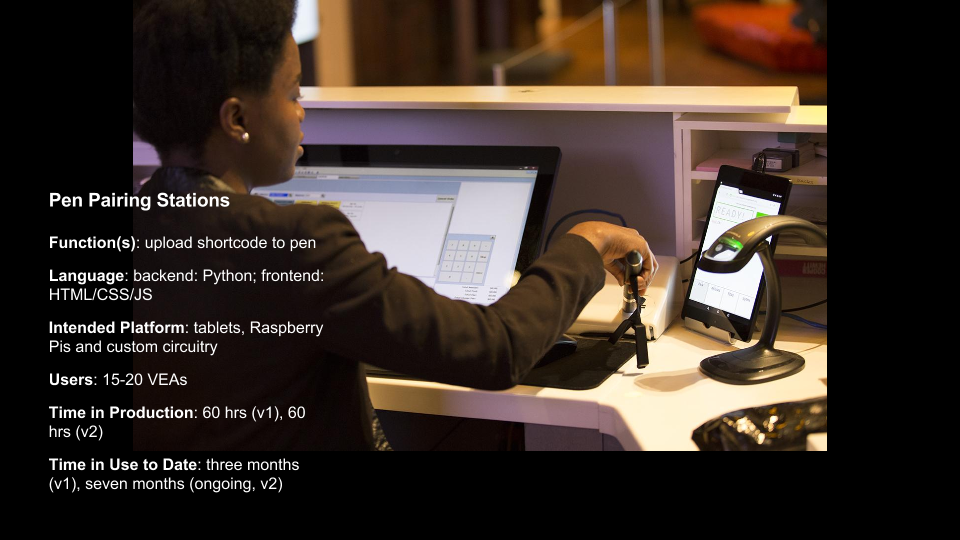
  • Context of Pen Pairing: Every visitor to the museum receives a Pen. At the museum’s front desk each Pen is paired with a unique admission ticket. Every ticket has a shortcode identifier that allows visitors to retrieve their Pen visit data online when they enter the code on their ticket.
  • Pen pairing is done at a very critical point in the visitor experience when the interaction needs to be quick and frictionless. Visitor Services Associates have to coordinate a number of simultaneous tasks.

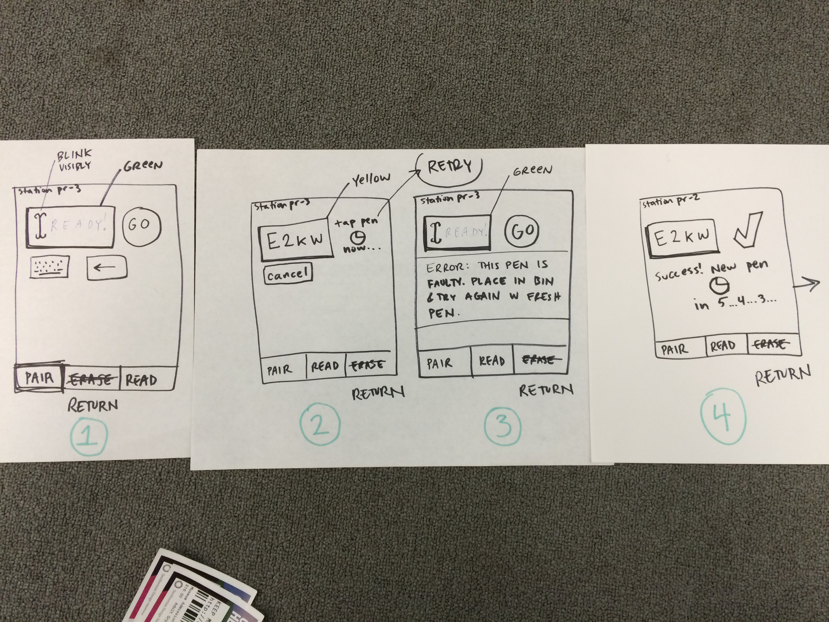
Pen Pairing Station (continued)

  • This video depicts the Pen pairing process behind the front desk. It documents the first version of the Pen Pairing application, and shows the exposed Pen-reading circuit board before housing was built.
  • Pen pairing is one of the most demanding of the new responsibilities created by the “new experience”–has to fit between welcoming a visitor, taking their money, answering any questions, looking up their member ID.
  • Each use of the tool only lasts 5-10 seconds but we’ve spent many hours and built many versions of this tool to figure out exactly what needs to happen in that time to accomplish all the tasks, including updating databases, handling failures, serial communication
  • Every one of these iterations gave us an opportunity to be connected to the staff using the tools, not only to make something that works better, but to be a part of the conversation

Administrative interfaces at Cooper Hewitt (8)

Administrative Interfaces: What does success look like? How does it feel?

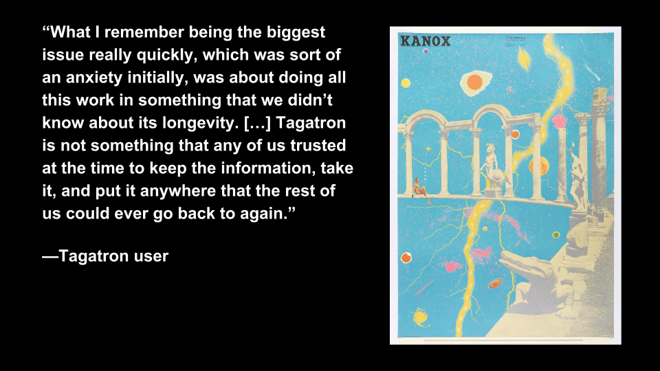
  • In informal interviews with Tagatron users we found trust to be a central theme of users’ response to the interface
  • Since Tagatron augments the curators’ use of TMS, they were less trusting of its database as a long-lasting data repository
  • Improving user feedback (like confirmation messages) helped build trust in the interface
  • Bill Moggridge, Designing Interaction: designing interaction is designing the relationship between people and things
  • We came to realize the responsibility of designing interfaces—validating and responding to users’ concerns; acknowledging the burden of new responsibilities
  • Administrative interfaces at the crux of the staff relationship to the new Cooper Hewitt experience
  • Anticipating issues in developing and maintaining administrative interfaces (when success feels like failure):
  • First, the human factor: being open to the feedback and creating an environment where the channels exist to communicate staff thoughts on the tool.
  • Second, the technical factor: being able to act on what you hear from staff and make the required changes to complete the feedback loop.
  • Our responsibility as facilitators of technology in the museum to hear and act on concerns.

Administrative interfaces at Cooper Hewitt-9

Questions to ask when starting an administrative application to anticipate issues and accommodate of feedback.

Question 1: To what degree should the (administrative) tool fit with pre-existing notions?

  • This question addresses the need to understand contextual use of the tool
  • Tagatron: curatorial culture around spreadsheets and TMS
  • Pen Pairing Station: this tool disrupted the expected ticket selling workflow. We learned the that the tool needed to make Pen Pairing as unobtrusive as possible

Administrative interfaces at Cooper Hewitt (10)

Question 2: How much of the underlying technology should come through to the interface?

  • Infrastructure & interfaces are layers of an onion—the best mental model for a tool’s interface might not reflect the best technical model for its back end
  • Tagatron: the filtering tools were a reflection of how data was stored in the database, not how curators expected it
  • Pen Pairing Station: error messages from all parts of the application stack came through to the user unaltered, this was not helpful to users
  • Highlights the need for a technical solution that allows for flexibility in the middle, “translation layer” of an application

Administrative interfaces at Cooper Hewitt (11)

Question 3: What kinds of feedback does the tool provide?

  • Feedback is the voice of the interface/ its personality–is it finicky or reliable? Annoying or supportive?
  • Tagatron: missing feedback created distrust
  • Pen Pairing: too much feedback caused confusion (error messages, validation handshake)
  • Our design and production methodology: working code always wins/ learning through doing; build small, working prototypes and continually iterate.
  • A more anticipatory form of design (like design thinking) could have helped us find answers to this question sooner

Administrative interfaces at Cooper Hewitt (12)

Question 4: Is it an appropriate time for experimentation?

  • Tagatron’s v1 included relatively unknown-to-us technology like MongoDB and nodejs. We should have used more familiar technology or done small-scale tests before implementing a project of this scale–it severely hindered our ability to accommodate feedback
  • Other tools we built that involved experimental tech were only successful because their scale and userbase were far smaller (label writer)

Administrative interfaces at Cooper Hewitt (13)

The result of everything: bridges, lines of communication opened

  • Building administrative tools for staff created cross-departmental conversation—in taking on the role of building and maintaining Tagatron and the Pen Pairing Station, the Digital & Emerging Media team engaged users from departments across the museum and observed closely how the tools fit into staff members’ larger roles

Happy Staff = Happy Visitors: Improving Back-of-House Interfaces

“You have to make the back of the fence that people won’t see look just as beautiful as the front, just like a great carpenter would make the back of a chest of drawers … Even though others won’t see it, you will know it’s there, and that will make you more proud of your design.”

—Steve Jobs

In my last post I talked about improvements to online ticketing based on observations made in the first weeks after launching the Pen.

Today’s post is about an important internal tool: the registration station whose job is to pair a new ticket with a new pen. Though visitors will never see this interface, it’s really important that it be simple, easy, clear, and fast. It is also critical that staff are able to understand the feedback from this app because if a pen is incorrectly paired with a ticket then the visitor’s data (collections and creations) will be lost.

Like a Steve-Jobs-approved iPod or a Van Cleef & Arpels ruby brooch, the “inside” of our system should be as carefully and thoughtfully designed as the outside.

the view from behind a desk with screens and wires everywhere. a tablet positioned upright with some tiny text and bars of color.

Version 1 of the app was functional but cluttered, with too much text, and no clear point of focus for the eye.

Because the first version of the app was built to be procedurally functional, its visual design was given little consideration. However, the application as a whole was designed so that the user interface – running in a web browser – was completely separate from the underlying pen pairing functionality, which makes updating the front-end a relatively straightforward task.

Also, we were getting a few complaints from visitors who returned home eager to see their visit diary, and were disappointed to see that their custom URL contained no data. We suspected this could have been a result of the poor UI at ticketing.

With this in mind, I sat behind the desk to observe our staff in action with real customers. I did about three sessions, for about ten minutes each, sometimes during heavy visitor traffic and sometimes during light traffic. Here’s what I kept an eye on while observing:

  • How many actions are required per transaction? Is there any way to minimize the number of “clicks” (in this case, “taps”) required from staff?
  • Is the visual feedback clear enough to be understood with only partial attention? Or do  typography, colors, and composition require an operator’s full attention to understand what’s going on?
  • What extraneous information can we minimize or omit?
  • What’s the critical information we should enlarge or emphasize?

After observing, I tried my hand at the app myself. This was actually more edifying than doing observations. Kathleen, our head of Visitor Services, had a batch of about 30 Pens to pair for a group, and I offered to help. I was very slow with the app, so I wasn’t really of much help, moving through my batch of pens at about half the speed of Kathleen’s staff.

Some readers may be thinking that since the desk staff had adjusted to a less-than-excellent visual design and were already moving pretty fast with it, this could be a reason not to improve it. As designers, we should always be helping and improving. Nobody should have to live with a crappy interface, even if they’ve adjusted to it! And, there will be new staff, and they will get to skip the adjustment process and start on the right foot with a better-designed tool.

My struggle to use the app was fuel for its redesign, which you can see germinating in my drawings below.

some marker sketches of a tablet interface with lots of scribbled notes

After several rounds of paper sketches like these, the desk reps and I decided on this sequence as the starting point for version two of the app.

These were the last in a series of drawings that I worked through with the desk staff. So our first few “iterative prototypes” were created and improved upon in a matter of minutes, since they were simply scribbled on paper. We arrived at the above stopping point, which Sam turned into working code.

Here’s what’s new in version 2:

  • The most important information—the alphanumeric shortcode— is emphasized. The font is about 6 or 7 times bigger, with exaggerated spacing and lots of padding (white space) on all sides for increased legibility. Or as I like to call it, “glanceability.” This helps make sure that the front of house staff pair the correct pen with the correct ticket.
  • Fewer words. For example, “Check Out Pen With This Shortcode” changed to “GO”, “Pen has been successfully checked out and written with shortcode ABCD” changed to “Success,” etc. This makes it easier for staff to know, quickly, that the process has worked and they can move on to the next ticket/pen/customer.

“I didn’t have time to write a short letter, so I wrote a long one instead.”
Mark Twain

  • More accurate words. Our team uses a different vernacular from the people working at the desk. This is normal, since we don’t work together often, and like any neighboring tribes, we’ve developed subtly different words for different things. Since this app is used by desk staff, I wanted it to reflect their language, not ours. For example, “Pair” is what they call “check-out” and “Return” is what they call “check-in.”
  • Better visual hierarchy: The original app had many competing horizontal bands of content, with no clear visual clue as to which band needed the operator’s attention at any given time. We used white space, color (green/yellow/red for go/wait/stop), and re-arranging of elements (less-used features to the bottom, more-used features to the top) to better direct the eye and make it clear to the user what she ought to be looking at.
  • Simple animations to help the user understand when the app is “working” and they should just wait.

Still to come are added features (bulk pairing, maintenance mode) and any ideas the desk reps might develop after a couple of weeks of using the new version.

Imagine how difficult this process would have been if the museum had outsourced all of its design and programming work, or if it were all encased in a proprietary system.

Redesigning Post-Purchase Touchpoints

We re-opened the museum with “minimum viable product” relating to online ticket orders. Visitor-facing touchpoints like confirmation emails, eTicket PDFs and “thank you for your order” webpages were built to be simple and efficient. After putting them to the test with real visitors, room for improvement became obvious.

Here’s how we used staff feedback and designerly observation to iterate and improve upon 3 important touchpoints. The goal of this undertaking was to make things smoother for our front-of-house staff (who turned out to have quite a bit to juggle, given the new Pen and its backend complexities), and simpler for visitors (some of whom were confused by our system.. how dare they!).

The original confirmation webpage was designed with visitors buying on mobile (perhaps even while en route to the museum) in mind:

screen shot of a webpage with order number and a barcode for each ticket.

The original “Thank You” webpage was stripped of information, with the idea of getting you through the front desk transaction as efficiently as possible.

The original confirmation email was a few lines of text:

Screen shot of an email confirming cooper hewitt ticket order

Made in a pre-opening vacuum without real visitors to test upon, The original confirmation email was more self-promotional than it was anticipatory of visitors’ needs.

The original PDF attached to this confirmation email was designed for visitors who like to print things out and have something on paper:

The original eTicket PDF had one page (one "ticket") per visitor. The email went to the purchasing visitor's inbox.

The original eTicket PDF had one page (one “ticket”) per visitor. The email went to the purchasing visitor’s inbox.

Over a few weeks of heavy visitor traffic (with about 20% of visitors buying advance tickets online), I sat behind the front desk staff to quietly observe a handful of transactions every day. I initiated my observation sessions knowing that we needed to make the front desk move smoother and faster, but I didn’t yet know which touchpoints/services/operations would need changing.

These 3 touchpoints stood out to me as something that needed re-addressing if we wanted to make the front desk run more smoothly. (My daily observations also led to many efficiency-boosting changes made to internal tools, IT concerns, staffing needs, signage, and more.) This experience has made me a big believer in quiet observation as a direct route to improving services and systems. “Conference room conjecture” is worth very little compared to real observations and listening-based chats with your public-facing staff.

My advice on Observing and Listening for service design:

  •  You may observe a staff person answer a question incorrectly, or a problem that you could resolve yourself on the spot. Don’t intervene, tempting as it might be! You’re not there to fix problems, you’re there to fix problem patterns. Your mission is long-term.
  • When chatting with staff, listen quietly and attentively. It’s OK if you can’t offer an instant fix. You may not have a magic wand, but listening with empathy is at least half as good.
  • Focus on building trust with the staff you are observing over a period of days or weeks, so they will become comfortable sharing bad news as easily as they share the good. Remind them repeatedly that your intention is to improve their daily work situation.
  • Remember it can be very intimidating to feel “interrogated” or “observed” by someone who is your direct/indirect superior. Make sure they know your questions are motivated by a spirit of service, not by “tattle-telling” to other staff that things might be going amiss. You will get more honesty, and thereby, better design insights.

Here are the observation-based insights that motivated our choices:

  • Visitors sometimes get confused by the barcodes. They think something has to be scanned after their visit in order for their pen diary to get “Saved” or “sent to their email.”
  • Because this collateral is called an “eTicket,” some visitors are marching right up to the gallery entrance with their “eTicket,” and bypassing the front desk. “I already bought my ticket, why do I have to wait on this line?”
  • Visitors don’t know what the Pen is, and explaining it takes several minutes, slowing down the line.
  • Visitors may not have great cell service in our lobby, and probably haven’t gotten the wifi working yet, so if their email attachment hasn’t pre-downloaded, this will slow everything down.
  • Front desk staff each have different ways of handling eTickets. Most staff ask for the order number verbally. A few staff take the printout or phone and scan the barcode, avoiding the need to re-print a ticket (this is how the barcode was intended to be used).
  • The diversity of collateral that visitors may bring to the transaction makes things more complicated for our staff. “Is my customer looking at a webpage, an email, or a PDF? Should I tell them to look for an order number, hand me a barcode, or open the attachment?”
two gentlemen at a large white desk in a dark room full of wood paneling. a third gentleman sits behind the desk.

For their own ease of use, most desk reps were initiating the transaction by asking: “What’s your Order number?” so we designed to accommodate that preference instead of working against it.

The ideas we cycled through:

  • A picture of the Pen with an “enticing” explanation of what it does might help offset the burden on the front desk to explain it all very quickly.
  • We thought one barcode per visitor displayed in a list might let us hold on to our original “paperless dream.” (The “paperless dream” entailed scanning each barcode and pairing immediately with pens, bypassing our CRM and house-printed tickets.) When we ran this idea by our colleagues at the desk, though, we learned quickly that this would be extraordinarily confusing for guests, who need to remember their personal URL (usually printed on the ticket) to access their post-visit diary. What if a group of 5 friends come together, will we put the burden on the visitor to remember which URL goes with which friend? Will they have to write it down, or forward around the ticket email with added whose-URL-is-whose notes? That’s too much of a burden on guests, who are already working to assimilate new information about our Pen, which has already buffeted their expectations (and tried their transaction-length-patience) about what to expect during a museum front desk experience.
printouts of an email confirming tickets with barcodes and giant pen scribbled "x" with handwritten pen notes

What seems like a good idea at your desk may not seem so smart after you’ve shown it around to ground-level users

The current solution (after all, our work is never final):

screen shot of an email with lots of information about cafe, hours, map, the pen, and an image of museum interior and pen usage.

The order number is large and at the top of the email. It’s also in the subject line. Click this image to enlarge.

  • This solution makes the front desk staffer’s job simpler when a pre-order person arrives. It’s all about the order number. There is no more choice involved about whether to ask for the order number, or the barcode, or the purchaser’s name… or….
  • There is still a confirmation webpage, and it looks exactly like this.
  • There is no more PDF attachment to the email.
  • Since this is a “will-call” paradigm instead of an “eTicket” paradigm, we hope this solution will keep visitors from expecting that they can enter the museum directly without talking to a desk attendant first.
  • The order number is in the subject line, so if your email hasn’t fully downloaded, you won’t slow down the line.
  • The original idea was to save paper by allowing a visitor’s PDF to work as their ticket/URL reminder. This idea, though it does now involve reprinting tickets, may involve less user-printouts, since we’re simply asking folks to “bring” their order number, and not any printouts.

This is just one piece of an elaborate service design puzzle. More posts will be coming about other touchpoints we’ve created and re-designed based on observations made in the first months of running our new Pen service.

Three adventures: shadowing a visit to the Metropolitan Museum of Art (3/3)

This is the third in a series of three “adventures in universal design,” a design research experiment carried out by Rachel Sakai and Katie Shelly. For an introduction to the project, see our earlier post, here.

SHADOWING:
OBSERVE LINDA & DAVE AS THEY VISIT THE METROPOLITAN MUSEUM OF ART
AUGUST 22 2013

On the Science Sense tour, we met a wonderfully friendly and warm husband and wife duo named Linda & Dave. We asked if they’d be interested in volunteering for some more research by allowing us to shadow them at any museum they chose.

They agreed, and a week later, off we went. Linda is blind and Dave is sighted. They love museums, and they have visited many around the world, together.


Linda & Dave stand in front of the museum, Dave has his arm around Linda. It is a sunny summer day and the entrance is full of people. They are smiling and Dave is wearing a red flowered shirt.

Linda & Dave in front of the Met Museum

Here’s a play-by-play of their visit:

-As we entered the crowded lobby, I noticed that Dave firmly placed his hand near the back of Linda’s neck to guide her—it was so crowded and loud, he had to use firm physical contact to help her navigate the security bag check and chaotic lobby. Linda also used her rolling cane in her left hand.

-Once we got inside, the first thing they did was go to the information desk and ask how to find the exhibition they wanted to see—Brush Writing in the Arts of Japan. The desk person indicated the location on a paper map. L & D didn’t use the map; instead they listened and remembered the attendant’s verbal instructions (left at the arch, elevator to floor 3, make a left, etc).

-Linda carried a paper flyer in her purse with a list of special exhibitions on it, and she brought it out when talking to the attendant, saying “yes, we want to see the one on this list.” Interesting that though she herself could not see what was on the paper, she knew what it said (ostensibly because Dave had told her earlier) and she kept it in her hand, so she could use it later when conversing with others.

-On the way to the elevator, we walked past a table with audioguides, L&D did not notice it.

-At the top of the elevator, we saw an Information Desk with an attendant. Dave expressed excitement that they have Info Desks throughout the Met, saying “before they had these things, I would just wander around this place getting lost!”

-L&D approached the satellite info desk, and asked about the acoustiguide— does it include the Japanese Brush Writing exhibition? The attendant explained that the audioguide covers the whole museum. Audioguides are not being given out from this desk, though. L&D did not get an audioguide.

-We walk down a hall full of artifacts toward the Japanese Brush Writing show. Dave went into “concise tour guide mode” just to give Linda a sense of the scenery, simply naming a few of the objects we went past: “Perfume bottles.” “Ceramic horses.”

-We found our destination: a dimly lit gallery. Linda asked, “is it all paintings?” And Dave explained that no, the gallery had a combination of statues, ceramics, and scrolls. They were pleased that there was a variety of objects and it wasn’t all flat work.

-L&D approached the standing warrior statue at the entrance of the show. Dave began with a visual description of the statue— materials, colors, posture. When talking about the statue’s long earlobes, he lightly tugged Linda’s earlobes. When talking about the statue’s tufty hair, he lightly touched the crown of Linda’s head— anything to make the experience more than just standing and listening. After his thorough description, he read the object label aloud.

-They were very methodical. This is what they did in front of each object they looked at:

1) Dave gave a purely visual description. Colors, size, subject matter, mood.

2) Maybe a few clarifying questions from Linda (“Are the lines roundish or squarish?” “Are the lines harsh?” “Are the people done finely?”)

3) Dave read the object label aloud, sometimes omitting a bit of info, sometimes reading it all right down to the donor details.

4) A bit of back-and-forth, sharing their reactions to the piece, making a connection to prior knowledge or experiences, or simply expressing how pretty and/or interesting they find it.

Dave & Linda standing with their backs to us, facing a beige and black painting.. Dave has Linda's hand in his, and is holding it outstretched.

In front of this artwork, Dave guided Linda’s hand through the air to help explain the size and composition. (It looks a bit like she is touching the artwork because of the angle of this photo, but we assure you that she is not).

-Dave often would take Linda’s hand in his, hold it outstretched, and wave it around to delineate shapes and spatial relationships (“there are mountains here, and a waterfall right here…”)

-A few of the Buddha statues were doing mudras with their hands. Dave would put Linda’s arms and hands into the same position, mimicking the statue. Sometimes he’d join her in the pose, so they’d both be frozen, holding the pose for a moment of contemplation. (Extremely adorable.) I don’t think many sighted visitors would think to do this, but it looked like they were having fun, and perhaps gave them a bit of “somatic insight” into how that statue might be feeling.

-As Linda got more details about the piece in front of her, she would exclaim surprise, “oh!” “oo-ooh!” As if she was building an image in her imagination, and each new bit of info from Dave was like an exciting clue in an unsolved mystery.

Dave and Linda are facing each other, standing a few feet in front of a Buddha statue. Dave is looking at the statue, and hoding Linta's arms. Linda is facing Dave and holding the pose.

Dave puts Linda’s arms into the same position as the statue.

-I noticed that sometimes Linda would touch the glass in front of an object. Just to get some sense of space and anchoring, I’d guess.

-About halfway through the exhibition, Dave took a break to sit down on a bench. Linda, Rachel and I took the chance to chat a bit. Linda commented that she would like to get a sense of scale and mood upon entering a museum. A sighted visitor gets a whole bunch of scene-setting information right upon entering with a sweep of the eye, and can choose what piece they want to check out. For her, however, she’s generally subject to Dave’s decisions about what to look at when they tour an exhibition. She said that she doesn’t mind this, because she likes Dave’s taste, but it is a consideration for any blind visitor.

-From Dave’s perspective, it’s a lot of talking and mental work. He seemed to be a bit worn out at times when reading aloud those long object labels. No wonder he needed a break!

-Linda also mentioned that they like to go to the gift shop, and that sometimes there are statuettes or replicas of things in the exhibition that you can touch, so that’s a good blind person’s “hack.”

Linda stands in front of three shelves full of smallish, about one foot tall statues and figurines. She is touching one of the statues.

Hacking the museum: the gift shop is a good place to find touchable replicas of objects in the collection.

-As we moved on, we neared a fountain. Right away, Linda heard the water trickling and said, “I hear a fountain!” Dave started to describe the fountain, which, as it turned out, is kinda hard to describe in words. There were some children seated on the wooden platform beside the fountain. Linda asked if she could sit down on the platform, which is somewhat bench-like, but sort of ambiguous-looking as to whether you can sit there or not. We said, sure, go for it. One thing led to another.. and soon Linda was feeling the white stones, and then the fountain itself. There was no guard in the area, just a few fellow patrons who seemed touched and tickled, as were we, watching Linda light up as she discovered the different textures and shapes. “Ooooh!” “Ahhh!” “Wowww!!” She was so, so into it. Just totally beaming. Finally, something to touch! Dave turned to us with a wink, and said “See what a difference tactile makes?”

A darkly colored, slick slab of basalt perfectly centered in a rectangular bed of round white stones. The basalt slab has some smooth planes and some rough planes, and a well of water in the top. Water is running down all sides of the slab.

The Water Stone, a basalt fountain by Isamu Noguchi. Photo by Flickr user wallyg

-Our last stop was a Japanese Reading Room, where the museum has tea ceremonies and other social events. The room has some Japanese-style floral arrangements, and beautiful wooden furniture by George Nakashima. Linda gave herself a thorough tour of the furniture, feeling the curves, bends, and joints in the massive walnut table and matching chairs. since it was definitely OK to touch. It was really the only moment when Linda could be independent in the museum.

A room with wood-paneled walls and a large raw-edge, round wooden table in the center. Linda is standing, stooped at the far end of the table, with one hand on the table surface and the other hand on her rolling cane.

Linda giving herself a tactile tour of the Japanese Reading Room furniture at the Met.

Takeaways

– Linda & Dave had carbon-copy experiences. Many people enjoy visiting a museum with a partner and staying side-by-side the whole time. Sometimes, though, you don’t want to visit in that way. Personally, when I’m in a museum, I tend to break off from the group and explore on my own. How might we allow blind visitors to have the option for an independent experience?

– Sighted visitors can easily get a sweep of the room immediately upon entering. What looks interesting in this gallery? What’s the mood? Where do I want to go first? How might we afford blind visitors a “sweep of the room” upon entering?

– Linda pointed this out to us during the tour: neutral description > coded description. A neutral (and blind-friendly) description would be, “on the left there is a small, simple building with a thatched roof and open balcony on all sides.” A coded (and blind-unfriendly) description would be “on the left there is a small building, looks like early Japanese architecture.” Get the difference? A neutral description uses transparent language that requires a minimum amount of previous knowledge. A coded description requires some prior education or knowledge to understand it.

Tactile makes a huge difference. Tactile moments were highlights of the tour: Dave tapping Linda on the head while describing a warrior’s messy hairdo, Dave sweeping her hand around to convey space, folding her hands into a Buddhist mudra, Linda tapping the glass in front of her for a spatial anchor, detailedly exploring the furniture in the Reading Room and a covert tickling of the Noguchi fountain. I’d argue that if these literal “touchpoints” were formally afforded to all visitors, all visitors’ experiences would be enhanced, not just experiences of the blind and partially sighted.

Quietness of the gallery was on our side. The gallery was small, only had a few people in it, and was carpeted. Dave and Linda could hear each other without straining their voices or their ears. This made the experience very tranquil and pleasant. Imagine how different their visit would have felt in a noisier, more echoy gallery.

We didn’t observe much active use of sound. L&D didn’t have audioguides, and there was no music or anything like that in the galleries. Linda mentioned various fountains in different museums that she liked. As a sighted person, I have to admit that fountains are not usually a highlight for me, but I think for Linda, because it’s something she can experience directly, they are often a highlight. What if museums with fountains (or any acoustically cool architectural feature) encouraged all visitors to close their eyes and really listen?

We didn’t observe any use of tech. L&D kept this visit analog. Wonder how the visit might have been better/worse/the same with some type of technological aid? How to design such technology to support and enhance rather than distract and annoy?

Linda, Rachel and Katie smiling inside a contemporary Asian art gallery at the Met museum. There is a very unusual sculpture in the background of a real deer, taxidermied and covered in glass orbs of variable sizes, as if it had been dunked in an oversized glass of club soda, and all the bubbles were sticking to its sides.

Linda, Rachel and Katie at the Met. We had a good time!


Three adventures: the Science Sense tour at American Museum of Natural History (2/3)

This is the second in a series of three “adventures in universal design,” a design research experiment carried out by Rachel Sakai and Katie Shelly. For an introduction to the project, see our earlier post, here.

The entrance to the American Museum of Natural History. Clear blue sky, pedestrians walking up the stairs, banners hanging on the facade, and taxicabs in the foreground. Architecture is stately, four tall columns and ornate inscriptions and statues near the roofline.

The American Museum of Natural History. Photo by Flickr user vagueonthehow.

COMPETITIVE PRODUCT SURVEY:
SCIENCE SENSE TOUR AT AMERICAN MUSEUM OF NATURAL HISTORY
AUGUST 15 2013

About once a month, AMNH offers a special tour for the blind, a program called Science Sense. Many museums in New York City have similar monthly tours for the blind. (The Jewish Museum’s Touch Tours, The Whitney Museum’s Touch Tours, MoMA’s Art inSight, the Met Museum’s Picture This! Workshop, and many more).

We chose to go on Science Sense because it worked with our schedule. Our tour was in the iconic Hall of North American Mammals.

Screenshot of the AMNH site. The page reads: Science Sense Tours  Visitors who are blind or partially sighted are invited to attend this program, held monthly in the Museum galleries. Specially trained Museum tour guides highlight specific themes and exhibition halls, engaging participants through extensive verbal descriptions and touchable objects.  Science Sense is free with Museum admission.  Thursday, August 15th, 2:30 PM North American Mammals Discover the dioramas in the stunningly restored Bernard Family Hall of North American Mammals, which offers a snapshot of North America’s rich environmental heritage.

The AMNH website’s info page about access for the blind and partially sighted

Here are some highlights and observations from our tour:

– We gathered in the lobby of the planetarium. The tour’s organizer, Jess, explained that the tour meets in the planetarium entrance and not the main NMAH entrance because it is a more accessible entrance. (Ramp, no stairs, large doorways with push-button opening, etc)

– It was a summer Thursday at 2:30, so we were a small group. Many of our fellow tour-goers appeared to be about retirement-age, which makes sense given the time of day. There was one teenaged boy, who was with his mom who has partial vision.

– The group had a chatty and friendly vibe. About 10 guests total. People were chatting with each other and having getting-to-know-you type conversations during our walk to the Hall of Mammals.

– Only 2 out of the 10 attendees appeared to be blind or low-vision. Each of the blind/low-vision guests had a sighted companion with them. The other 6 attendees appeared to be fully sighted.

– Irene, our tour guide, wore a small amplifier around her waist and a head-mounted microphone (something like this). The hall wasn’t terribly loud, but the amplifier made for more comfortable listening (and probably more comfortable speaking, too).

In a very dimly lit gallery, Irene stands with a group of attentively listening museumgoers on her left, and a brighly lit diorama of taxidemy bison on her right. She wears a blue employee badge and microphone headset.

Our guide Irene describing the bison diorama for the group.

– Once we arrived in the darkened Hall, Irene began our tour the same way most tours begin: an explanation of historical context. (When and why the dioramas were originally created, when and why they were restored… etc.)

– Irene described the first diorama thoroughly, element by element. (Backdrop, foreground elements, taxidermy animals.) One guest asked about how big the diorama is. Good question. Irene suggested that a second guide take the blind guests for a walk from one edge of the diorama to the other to get a sense of scale. This was a suggestion I wouldn’t have thought of; seems more fun than just stating a measurement.

Irene is holding an approximately two foot by one foot swatch of bison fur in both hands, grinning as she holds it out for others to feel.

Irene delights in sharing the touch sample (bison fur) with the group.

– Irene had a number of touch samples on a rolling cart. Some plastic animal skulls and a sample swatch of bison fur. At the end of our time in front of the bison diorama, she gave everyone a chance to feel the musky, matted fur.

– Naturally, as Irene was explaining the diorama and the touch samples were sitting behind her on the cart, many other visitors to the Hall (not part of the tour) took the opportunity to touch the fun stuff as it sat unattended on the cart.

– We went around to four more stunning dioramas, where Irene and a second guide (who was in training) took turns describing and contextualizing the displays.

– I noticed that sometimes the sighted companion of one of the attendees would quietly add on his own description to what the tour guide was saying. Once I saw him lift his blind partner’s arm, and sweep it through the space to explain where different objects in the diorama were positioned. (We would later chat with these folks, Linda & Dave, who ended up going on a trip with us to the Met, which we’ll talk about in the next section.)

Takeaways:

– Rachel & I both happen to be big radio/podcast listeners. During the tour, I realized that a blind person’s experience is a lot like listening to radio. They are relying only on the guide’s words to “see” what’s there.

What if museum tour guides were trained to think and speak like radio hosts? What if each stop on the tour opened with a detailed, theatrically delivered, visual description? Listening to a luscious, mood-setting, masterfully crafted description of anything on display— be it a Bison diorama or a Dyson Vacuum Cleaner or a Van Gogh painting would be a delight for sighted and blind visitors alike.

A photo of Ira Glass smiling and looking into the distance. There is a microphone in front of him.

What if your tour guide could describe works as viscerally and virtuosically as Ira Glass could?

-There was some confusion about the basic size and shape of the dioramas. What if there was a tiny model of each diorama that visitors could feel? Blind visitors could understand scale and shape right away, and sighted visitors might enjoy a touchable model, too. Imagine touchable mini-models of paintings, sculptures, and other museum stuff, too.

Check out our third and last adventure in universal design research, observing a blind person’s museum visit.

Three adventures: a blindfolded visit to the Guggenheim (1/3)

This is the first in a series of three “adventures in universal design,” a design research experiment carried out by Rachel Sakai and Katie Shelly. For an introduction to the project, see our earlier post, here.

A black and white photo of the Guggenheim Museum in NYC. Traffic lights and pedestrians on the sidewalk are in the foreground. The museum's famous architecture looks like lots of big smooth white shapes stacked on each other: A big rectangle at the bottom, four big circles stacked on the right, and a second rotunda with windows on the left.

The Guggenheim Museum, which is just a stone’s throw away from our office. Photo by Flickr user Ramón Torrent.

EMPATHY TOOLS:
BLINDFOLDED VISIT TO THE GUGGENHEIM
AUGUST 5 2013 

Taking a cue from Patricia Moore’s empathy research in NYC in the 1990s, Katie and I began our research with an empathy-building field trip to the Guggenheim. I took on the role of the blind visitor and Katie played the part of my sighted companion. The entire trip lasted for about 45 minutes and I kept my eyes shut for the duration.

Even though the Guggenheim is just a block away from our office, this was my first visit so I had no pre-existing mental map of the space. With my eyes closed, it did not take long before I felt completely disoriented, vulnerable, and dependent on my companion. After five minutes I had no idea where I was or where we were going; it felt like we were walking in circles (actually, we may have been because of the Guggenheim spiral…). I trust Katie, but this was unnerving.

(Note: this intensity of discomfort would not apply for a “real” blind or partially-sighted person, who would be entirely familiar with the experience of walking around without sight. A mild feeling of disorientation in the space, though, is still worth noting. Maybe the level of discomfort for a blind person would be more subtle, more like how a sighted person would feel wandering around without a map.)

The Guggenheim's large round lobby, shown completely bathed in ruby-red light. The benches and floor area are crowded with people reclining, laying on the floor, and looking upwards at the light source.

The James Turrell exhibition at the Guggenheim. Photo by Flickr user Mr Shiv.

We started the visit on our own with Katie guiding me and doing her best to describe the space, the other visitors, and the art. After a few minutes, we found one of the Guggenheim’s Gallery Guides wearing a large “Ask Me About the Art” button. When Katie asked the guide whether she was trained to describe art to low-vision guests, her response, “…I had one training on that,” was hesitant. To my ear, it sounded like reluctance and I immediately felt as though our request was a bother. Katie also felt like a pest, like she was “drilling the attendant” on her training. After some initial awkwardness, though, she offered to just share what she usually says about the piece (James Turrell’s Prado (White)), which turned out to be a very interesting bit of interpretation. We thanked her for the info and moved on.

By the second half of our visit we had picked up a couple of audioguides. The Guggenheim, like many other museums, has the encased iPod touch flavor of audio guide. The look and feel is nice and slick, but it’s not great for accessibility because the home button is blocked. (A triple-tap of this button is how you open accessibility controls in iOS).

Dependence on the GUI meant that when I wanted to hear a description, Katie would take my audioguide, start it playing, hand it back to me, then start up her own audioguide. If I missed a word and needed to go back, or if I wanted to pause for a second, well, I was pretty much out of luck. I could have asked Katie, but I felt like too much of a bother, so just I let it go.

The audio content was interesting, but it was written with sighted visitors in mind, with very little visual description of the work being discussed.

There was a big chunk of text on the wall explaining a bit about James Turrell’s work, which Katie read aloud to me. It would have been great to just have that text available for playback in the audioguide.

After our visit, I dug deeper into the Guggenheim’s website and learned that they have a free app that includes verbal imaging description tours written for visitors who are blind. Some of these tours have associated “touch object packs” that can be picked up from staff. That would have been great, but at the time of our trip Katie and I were unaware that these options existed, even though we did check out the Guggenheim website before visiting. None of the staff (who could see that I appeared to be blind) reached out to let us know about these great accessibility options. What a shame!

On the afternoon we visited, the Guggenheim was packed. We didn’t want to be too much of a nuisance to the already-busy staff so Katie went into “hacker mode,” looking for ways to tweak the experience to fit our needs. The visit became about hunting for things we could share.

A white cable with one 3.5mm male audio jack plug connected to two 3.5mm female jacks.

A headphone splitter lets two people listen to the same device.

Takeaways

A simple hack idea: headphone splitters. Though it wouldn’t give blind visitors more control over their audio guide, it would take away the clumsiness of one person having to manage two audioguides. Plus, whether you are blind or not, using a headphone splitter is fun and can strengthen a shared experience.

– I was disoriented throughout the trip and this was very uncomfortable. A better understanding of how I was moving through the space would have helped. How might we orient blind visitors when they first enter the museum so that they have a broad mental map of the space?

– I was dependent on Katie and did not have many options for how I might want to experience the museum (deep engagement with a few works, shallow engagement with many works, explore independently, explore with a friend, etc). How might we provide blind visitors with options for different types of experiences?

– Katie did her best to “hack” the experience and tried to discover things we could share in order to create a meaningful museum visit for both of us. How might we help create and shape shared experiences for pairs who visit the museum?

Staff training is important. The Museum has great accessibility tools, but they were invisible to us because nobody on staff mentioned them. The front desk person didn’t ask whether we would be interested in the accessibility tools, even though she had seen that I appeared to be blind.

– Staff mood is important. Many of the staff we interacted with seemed bashful or embarrassed about the situation and our accessibility questions. The museum was hectic and they were very busy; we felt like asking for too much help would have been pesky.

Check out our next adventure in universal design, a museum tour designed for the blind.

Three adventures in universal design, or, what does a veggie peeler have in common with a museum? (0/3)

A hand shown holding a black, rubberized OXO veggie peeler against a crisp white backdrop.

Though designed specifically for the arthritic, this product “appeals” to everyone.

“The way to think about ‘everybody’ is not to think about the average person in the middle, but to think about the extremes. Think about people at the edges of your potential buying public and think about people who are most challenged.”
[Dan Formosa interviewed by Debbie Millman in Brand Thinking]

If you hang out at a design museum long enough, you start to pick up on certain recurring concepts. One good recurring concept has to do with a thing called universal design:

The term “universal design” was coined by the architect Ronald L. Mace to describe the concept of designing all products and the built environment to be aesthetic and usable to the greatest extent possible by everyone, regardless of their age, ability, or status in life.
[Wikipedia]

So what’s the lesson behind universal design? Pretend you’re a bossman trying to cut costs wherever possible. For you, universal design might seem like a non-critical endeavor. Sure, it would be nice for the disabled and the elderly to have easy access to all aspects of your [insert product being designed here], but you don’t have room in the budget for anything elaborate. “We’ll tackle accessibility if we have leftover funds at the end of the project,” you’d say. Or “after we design the bulk of our [widget], then we’ll start work on the accessibility stuff because it’s required by law.”

If you were to study your design history, however, you’d realize that this view could limit your opportunities for innovation and crowd-pleasing design.

A sign in the foreground reads "This ramp and fishing platform meet the standards of the Americans with Disabilities Act and may be used by anyone. Please respect the desire of people with disabilities to fish on the fishing platform. In the background is a lake surrounded by trees.

The Americans with Disabilities Act of 1990 required organizations and institutions to make buildings, public transportation, signage, and more accessible to everyone. Image by USFWS Pacific.

The amazing truth of universal design is that when a design team focuses on “edge users,” or “extreme users,” it very often leads to unexpected insights, which can then lead to innovative features that benefit all users. When you design for the edges, everybody benefits.

The OXO Good Grips line is one of the most commonly cited examples of this phenomenon. The Smart Design team sat down to design a line of veggie peelers, can openers and scissors for people with arthritis and limited hand mobility. After the chunky, ergonomically superior new products hit the market, they became a huge mainstream success.

A group of five people riding motorized segway scooters riding single-file down the sidewalk curb cut and into the crosswalk. Washington DC in wintertime. They are wearing winter coats and helmets.

Segway scooter riders enjoy the benefits of curb cut sidewalks. Photo by Mariordo Mario Roberto Duran Ortiz

Another example are Selwyn Goldsmith‘s “curb cuts.” The mini-ramps we see now on most city street corners were designed primarily with wheelchair users in mind. After they were implemented, it became obvious that this ergonomic consideration benefitted not only wheelchair users, but also luggage-toters, stroller-pushers, stiletto-wearers, cyclists and anybody who enjoys a bit of added ease and comfort in getting around.

With all this in mind, our summer intern (psst—applications for next year are open!Rachel Sakai and I set out to do some research. We have a very small part in the über-mega-process that is the Cooper Hewitt gallery re-design, and we wanted to take on a summer project that could enrich that work.

We decided to focus in on a blind person’s museum experience. How might an understanding of a blind visitor’s experience inform and enhance the design decisions being made in our re-design project?

We chose to embrace a mindset of Human Centered Design. (Note that Human Centered Design is not the same thing as universal design). I’ve helped to create lots of Museum content—videos, exhibitions, books—on the topic of Human Centered Design. After so much experience intellectualizing about the technique, I was pretty eager to find a way to try it myself.

Human-Centered Design (HCD) is a process and a set of techniques used to create new solutions for the world….The reason this process is called “human-centered” is because it starts with the people we are designing for. The HCD process begins by examining the needs, dreams, and behaviors of the people we want to affect with our solutions.
[From IDEO’s HCD ToolKit]

front and back of 3 different method cards. Each card explains a different HCD research method. The front of each card has a full-bleed photo, the back has the name of the method and a short paragraph describing it.

Our 3 chosen IDEO method cards: Empathy Tools, Competitive Product Survey, and Shadowing

We borrowed a set of IDEO method cards from Cara and chose three that served our goal to better understand the blind museum visitor’s experience. In the next three posts, we’ll explain how we applied the methods of Empathy tools, Competitive Product Survey, and Shadowing:

1. Empathy Tools: Go on a blindfolded museum visit.

2. Competitive Product Survey: Take a museum tour designed for the blind.

3. Shadowing: Observe a blind person’s museum visit.