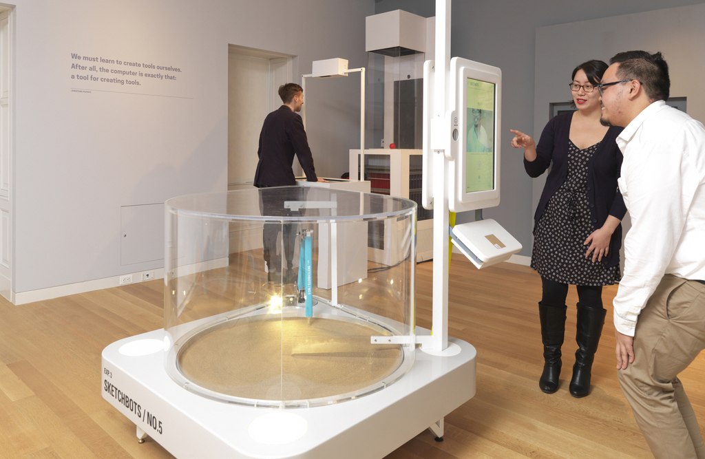
Fig.1. Process Lab: Citizen Designer exhibition and signage, on view at Cooper Hewitt
Background
The Process Lab is a hands-on educational space where visitors are invited to get involved in design process. Process Lab: Citizen Designer complimented the exhibition By the People: Designing a Better America, exploring the poverty, income inequality, stagnating wages, rising housing costs, limited public transport, and diminishing social mobility facing America today.
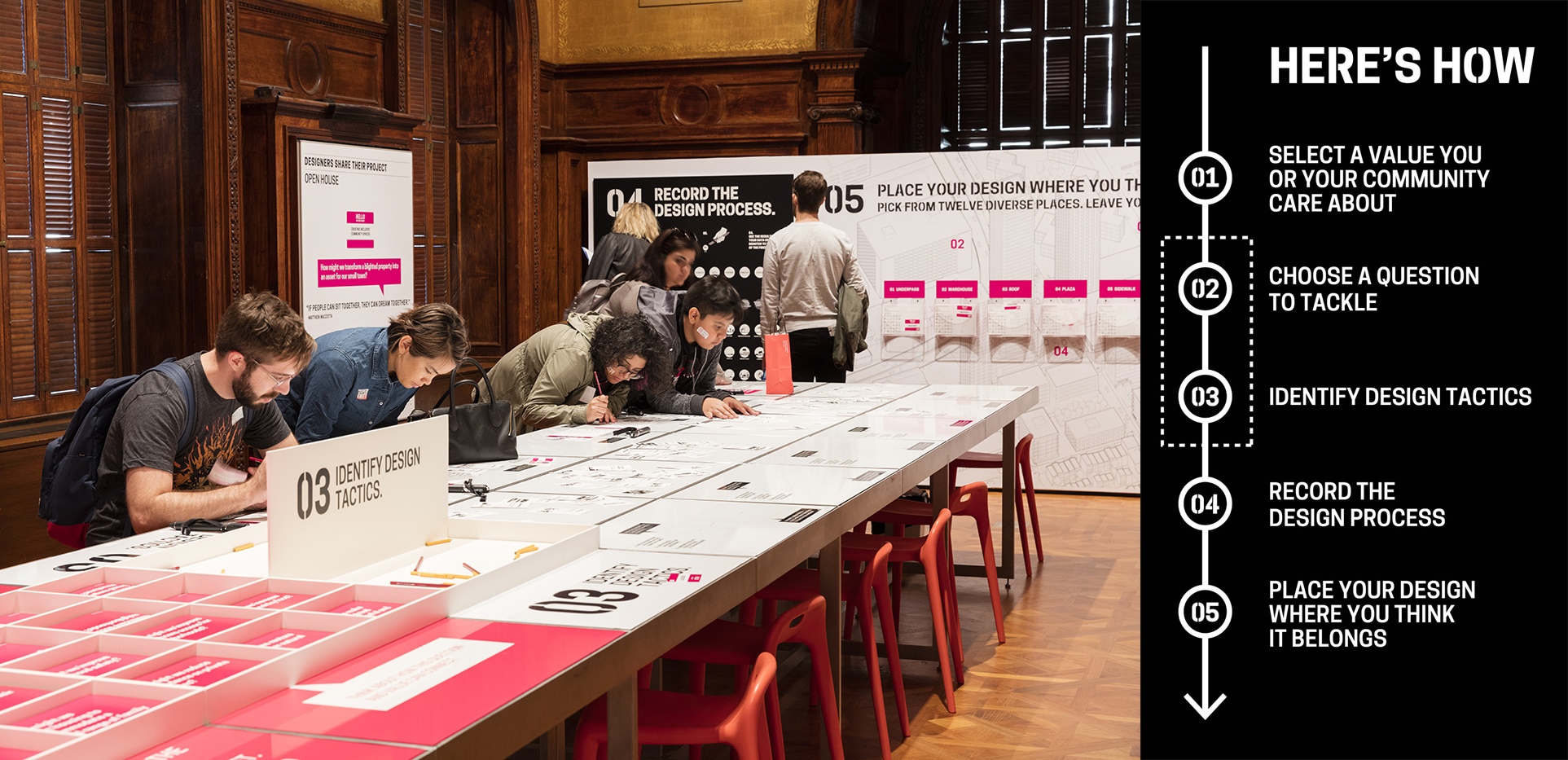
In Process Lab: Citizen Designer participants moved through a series of prompts and completed a worksheet [fig. 2]. Selecting a value they care about, a question that matters, and design tactics they could use to make a difference, participants used these constraints to create a sketch of a potential solution.
Design Brief
Cooper Hewitt’s Education Department asked Digital & Emerging Media (D&EM) to build an interactive experience that would encourage visitors to learn from each other by allowing them to share and compare their participation in exhibition Process Lab: Citizen Designer.
I served as project manager and user-experience/user-interaction designer, working closely with D&EM’s developer, Rachel Nackman, on the project. Interface Studio Architects (ISA) collaborated on concept and provided environmental graphics.

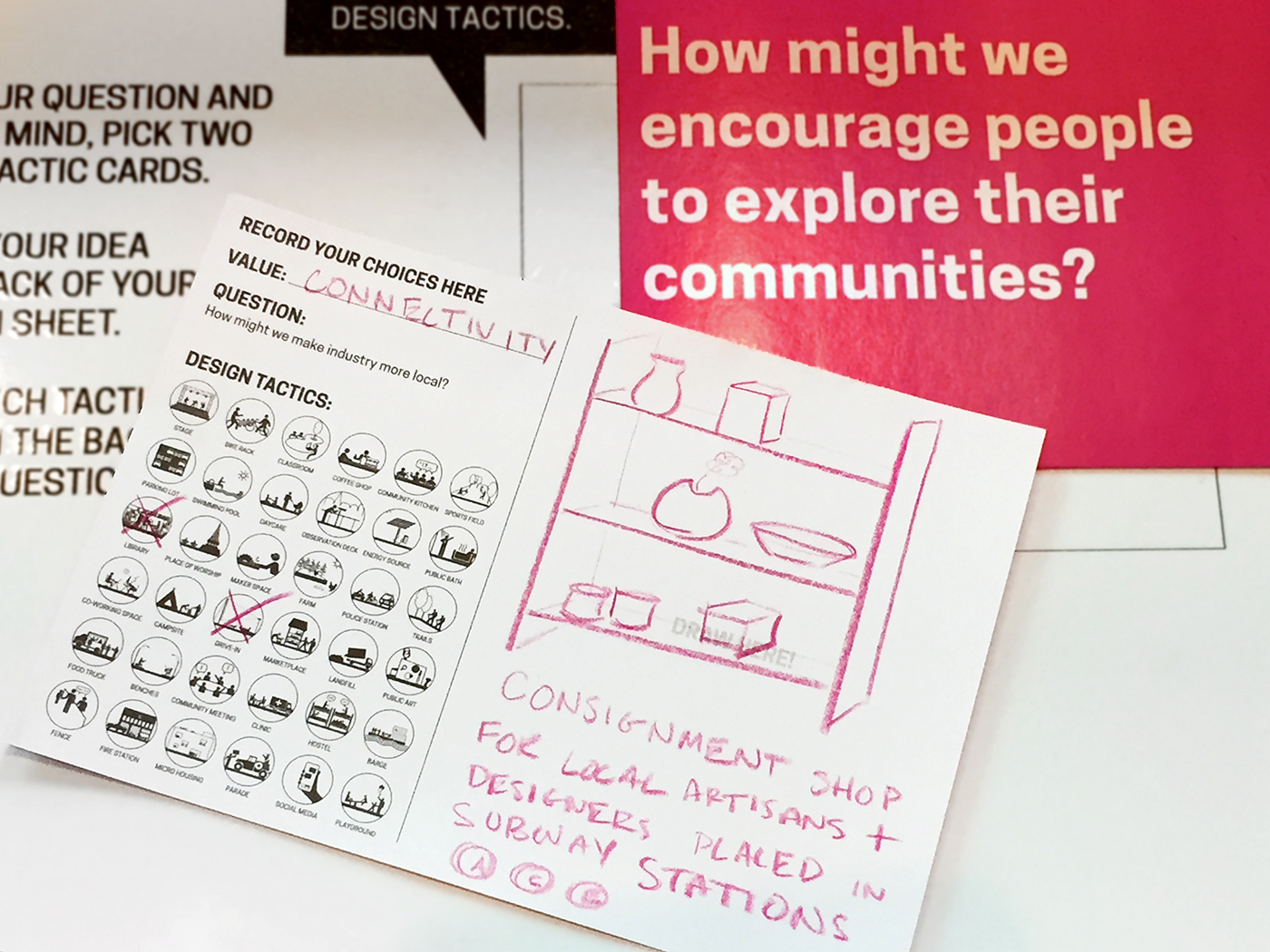
Fig. 2. Completed worksheet with question, value and tactic selections, along with a solution sketch
Process: Ideation
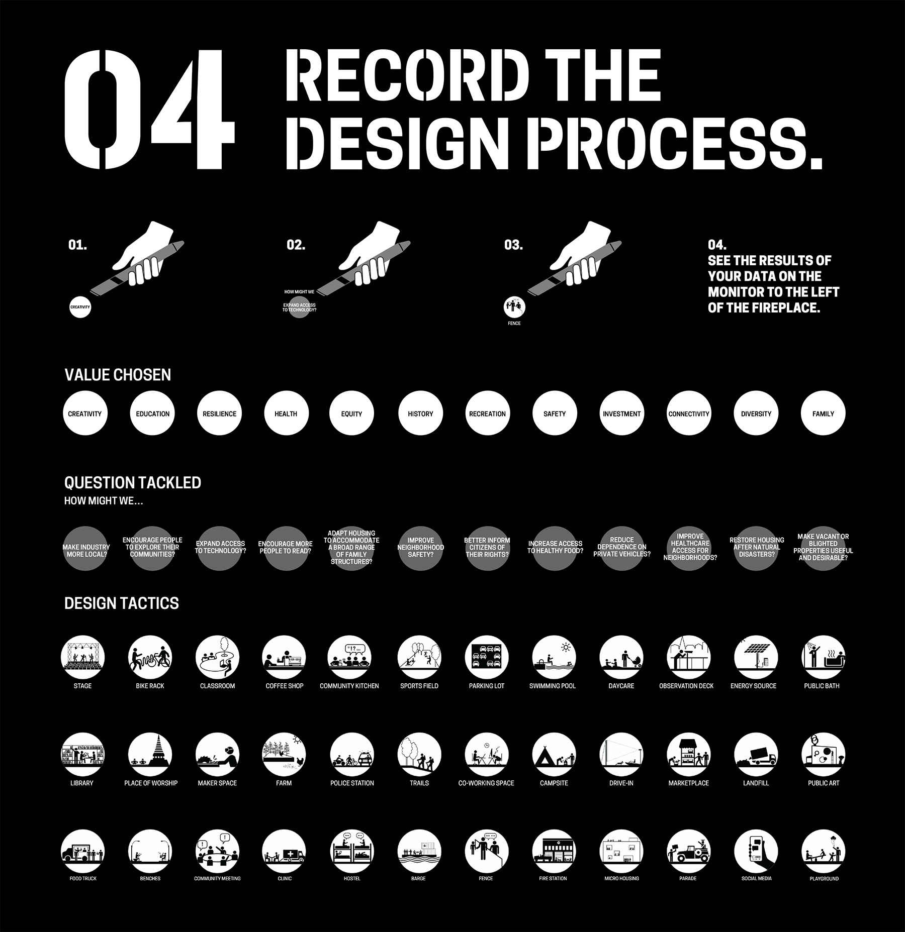
Project collaborators—D&EM, the Education Department, and ISA—came together for the initial steps of ideation. Since the exhibition concept and design was well established at this time, it was clear how participants would engage with the activity. Through the process of using cards and prompts to complete a worksheet they would generate several pieces of information: a value, a question, one to two tactic selections, and a solution sketch. The group decided that these elements would provide the content for the “sharing and comparing” specification in the project brief.
Of the participant-generated information, the solution sketch stood out as the only non-discrete element. We determined that given the available time and budget, a simple analog solution would be ideal. This became a series of wall-mounted display bins in which participants could deposit their completed worksheets. This left value, question, and tactic information to work with for the content of the digital interactive.
From the beginning, the Education Department mentioned a “broadcast wall.” Through conversation, we unpacked this term and found a core value statement within it. Phrased as a question, we could now ask:
“How might we empower participants to think about themselves within a community so that they can be inspired to design for social change?”
Framing this question allowed us to outline project objectives, knowing the solution should:
- Help form a virtual community of exhibition participants.
- Allow individual participants to see themselves in relation to that community.
- Encourage participants to apply learnings from the exhibition other communities
Challenges
As the project team clarified project objectives, we also identified a number of challenges that the design solution would need to navigate:
- Adding Value, Not Complexity. The conceptual content of Process Lab: Citizen Designer was complex. The design activity had a number of steps and choices. The brief asked that D&EM add features to the experience, but the project team also needed to mitigate a potentially heavy cognitive load on participants.
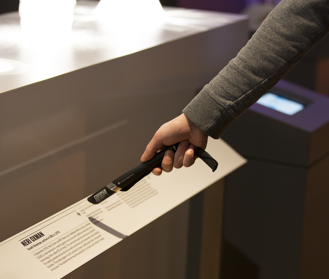
- Predetermined Technologies. An implicit part of the brief required that D&EM incorporate the Pen into user interactions. Since the Pen’s NFC-reading technology is embedded throughout Cooper Hewitt, the digital interactive needed to utilize this functionality.
- Spatial Constraints. Data and power drops, architectural features, and HVAC components created limitations for positioning the interactive in the room.
- Time Constraints. D&EM had two months to conceptualize and implement a solution in time for the opening of the exhibition.
- Adapting to an Existing Design. D&EM entered the exhibition design process at it’s final stages. The solution for the digital interactive had to work with the established participant-flow, environmental graphics, copy, furniture, and spatial arrangement conceived by ISA and the Education Department.
- Budget. Given that the exhibition design was nearly complete, there was virtually no budget for equipment purchases or external resourcing.
Process: Defining a Design Direction
From the design brief, challenges, objectives, and requirements established so far, we could now begin to propose solutions. Data visualization surfaced as a potential way to fulfill the sharing, comparing and broadcasting requirements of the project. A visualization could also accommodate the requirement to allow an individual participants to compare themselves to the virtual exhibition community by displaying individual data in relation to the aggregate.
ISA and I sketched ideas for the data visualization [figs. 3 and 4], exploring a variety of structures. As the project team shared and reviewed the sketches, discussion revealed some important requirements for the data organization:
- The question, value and tactic information should be hierarchically nested.
- The hierarchy should be arranged so that question was the parent of value, and value was the parent of tactics.
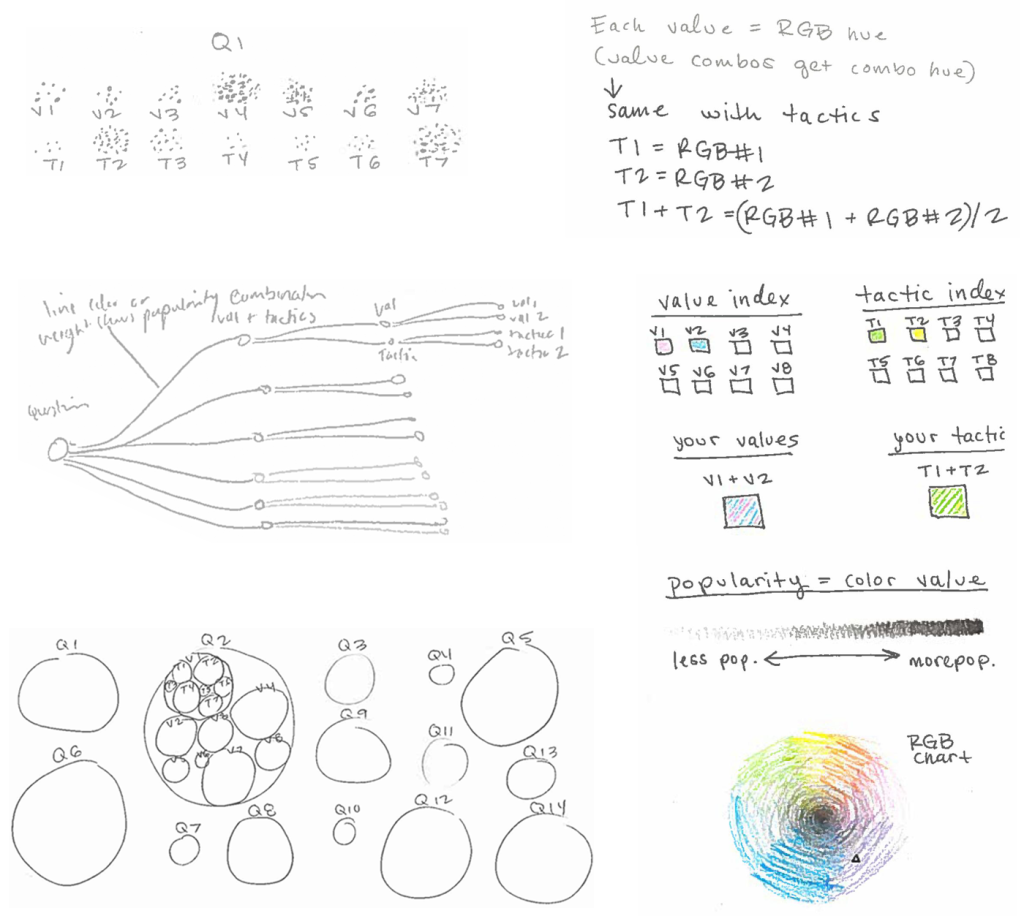
Fig. 3. My early data visualization sketches
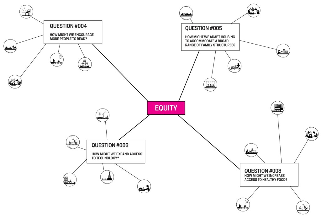
Fig. 4. ISA’s data visualization sketch
With this information in hand, Rachel proceeded with the construction of the database that would feed the visualization. The project team identified an available 55-inch monitor to display the data visualization in the gallery; oriented vertically it could fit into the room. As I sketched ideas for data visualizations I worked within the given size and aspect ratio. Soon it became clear that the number of possible combinations within the given data structure made it impossible to accommodate the full aggregate view in the visualization. To illustrate the improbability of showing all the data, I created a leaderboard with mock values for the hundreds of permutations that result from the combination of 12 value, 12 question and 36 tactic selections [fig. 5, left]. Not only was the volume of information overwhelming on the leaderboard, but Rachel and I agreed that the format made no interpretive meaning of the data. If the solution should serve the project goal to “empower participants to think about themselves within a community so that they can be inspired to design for social change,” it needed to have a clear message. This insight led to a series steps towards narrativizing the data with text [fig. 5].
Concurrently, the data visualization component was taking shape as an enclosure chart, also known as a circle packing representation. This format could accommodate both hierarchical information (nesting of the circles) and values for each component (size of the circles). With the full project team on board with the design direction, Rachel began development on the data visualization using D3.js library.
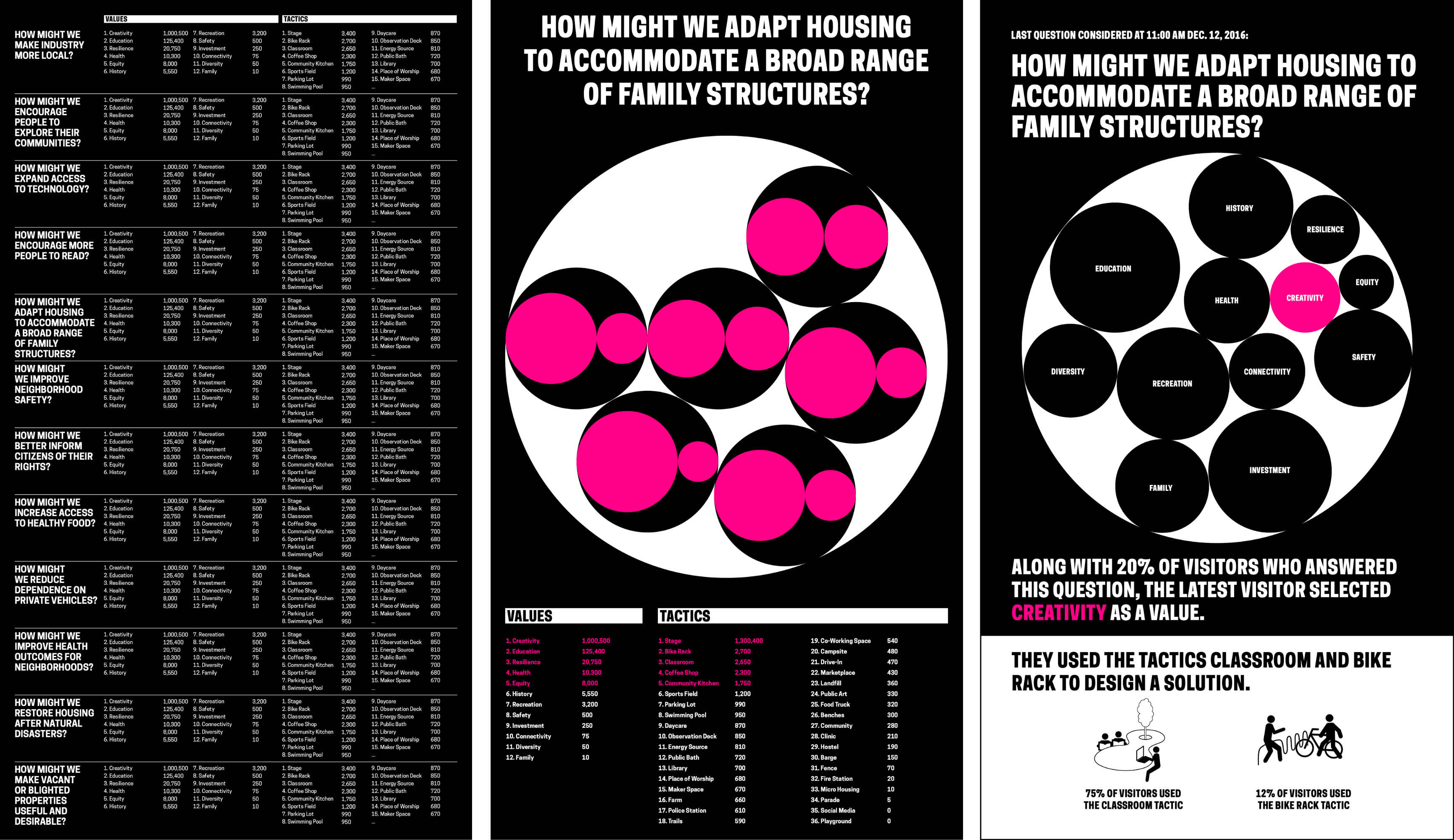
Fig. 5. Series of mocks moving from a leaderboard format to a narrativized presentation of data with an enclosure chart
Process: Refining and Implementing a Solution
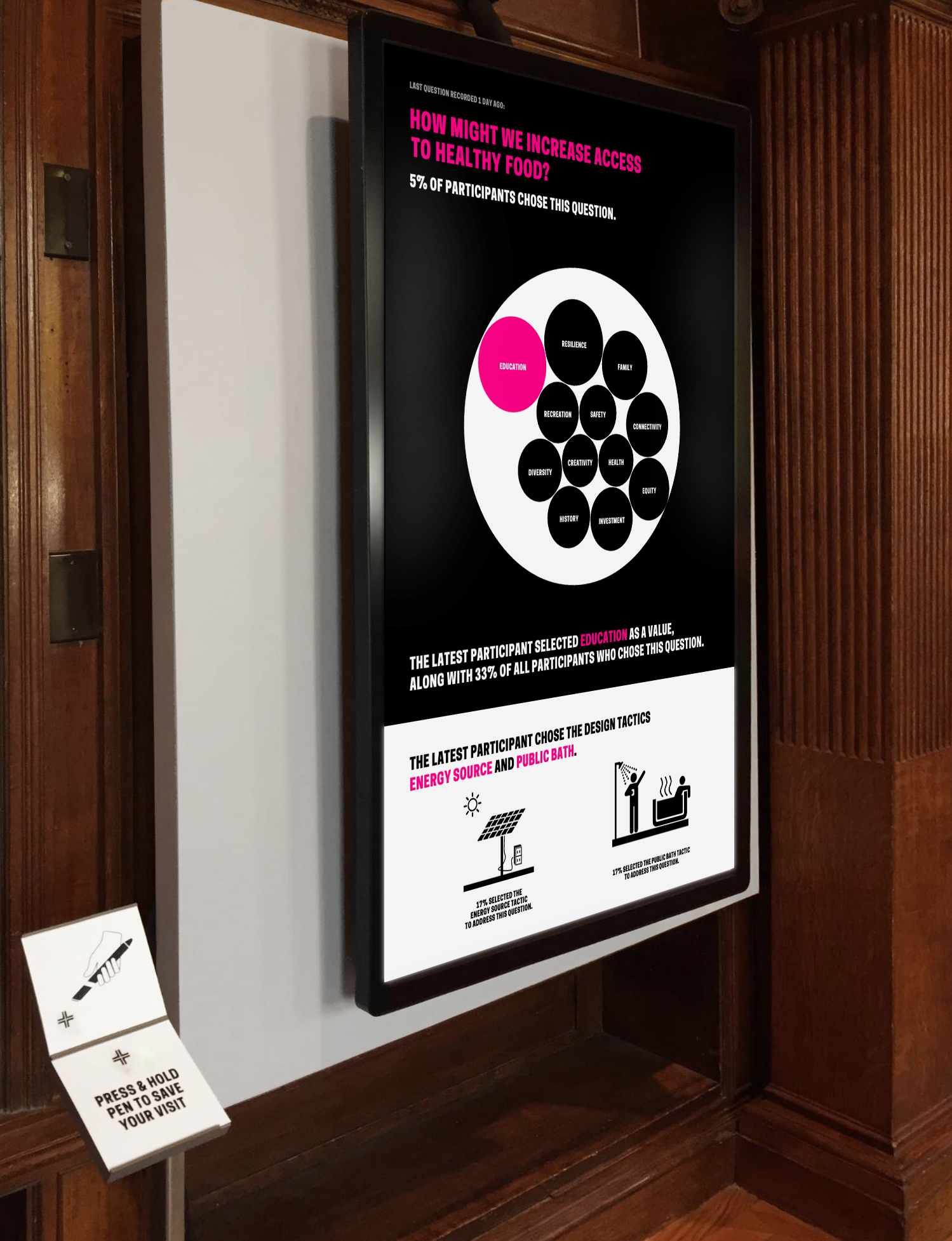
Through parallel work and constant communication, Rachel and I progressed through a number of decisions around visual presentation and database design. We agreed that to enhance legibility we should eliminate tactics from the visualization and present them separately. I created a mock that applied Cooper Hewitt’s brand to Rachel’s initial implementation of the enclosure chart. I proposed copy that wrapped the data in understandable language, and compared the latest participant to the virtual community of participants. I opted for percentage values to reinforce the relationship of individual response to aggregate. Black and white overall, I used hot pink to highlight the relationship between the text and the data visualization. A later iteration used pink to indicate all participant data points. I inverted the background in the lower quarter of the screen to separate tactic information from the data visualization so that it was apparent this data was not feeding into the enclosure chart, and I utilized tactic icons provided by ISA to visually connect the digital interactive to the worksheet design [fig. 2].
Next, I printed a paper prototype at scale to check legibility and ADA compliance. This let us analyze the design in a new context and invited feedback from officemates. As Rachel implemented the design in code, we worked with Education to hone the messaging through copy changes and graphic refinements.
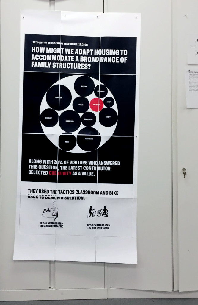
Fig. 5. A paper prototype made to scale invited people outside the project team to respond to the design, and helped check for legibility
The next steps towards project realization involved integrating the data visualization into the gallery experience, and the web experience on collection.cooperhewitt.org, the collection website. The Pen bridges these two user-flows by allowing museum visitors to collect information in the galleries. The Pen is associated with a unique visit ID for each new session. NFC tags in the galleries are loaded with data by curatorial and exhibitions staff so that visitors can use the Pen to save information to the onboard memory of the Pen. When they finish their visit the Pen data is uploaded by museum staff to a central database that feeds into unique URLs established for each visit on the collection site.
The Process Lab: Citizen Designer digital interactive project needed to work with the established system of Pens, NFC tags, and collection site, but also accommodate a new type of data. Rachel connected the question/value/tactic database to the Cooper Hewitt API and collections site. A reader-board at a freestanding station would allow participants to upload Pen data to the database [fig. 6]. The remaining parts of the participant-flow to engineer were the presentation of real time data on the visualization screen, and the leap from the completed worksheet to digitized data on the Pen.
Rachel found that her code could ping the API frequently to look for new database information to display on the monitor—this would allow for near real-time responsiveness of the screen to reader-board Pen data uploads. Rachel and I decided on the choreography of the screen display together: a quick succession of entries would result in a queue. A full queue would cycle through entries. New entries would be added to the back of the queue. An empty queue would hold on the last entry. This configuration assumed that if the queue was full when they added their entry participants may not see their data immediately. We agreed to offload the challenge of designing visual feedback about the queue length and succession to a subsequent iteration in service of meeting the launch deadline. The queue length has not proven problematic so far, and most participants see their data on screen right away.
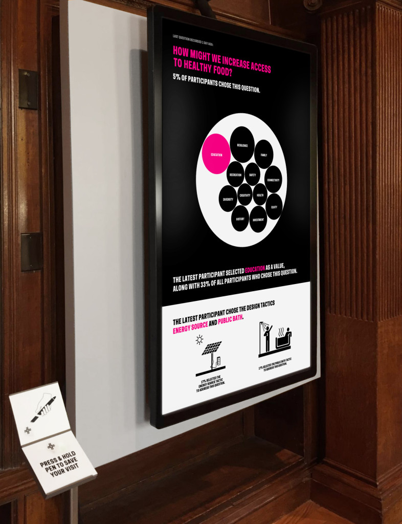
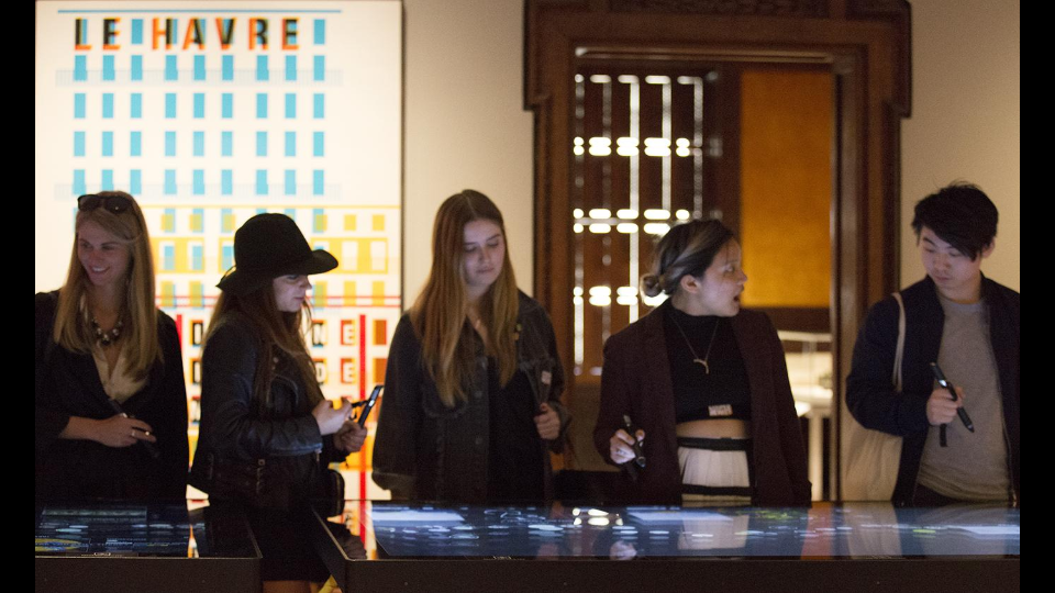
Fig. 6. Monitor displaying the data visualization website; to the left is the reader-board station
As Rachel and I brought the reader board, data visualization database, and website together, ISA worked on the graphic that would connect the worksheet experience to the digital interactive. The project team agreed that NFC tags placed under a wall graphic would serve as the interface for participants to record their worksheet answers digitally [fig. 7].

Fig. 7. ISA-designed “input graphic” where participants record their worksheet selections; NFC tags beneath the circles write question, value and tactic data to the onboard memory of the Pen
Process: Installation, Observation & Iteration
Rachel and I had the display website ready just in time for exhibition installation. Exhibitions staff and the project team negotiated the placement of all the elements in the gallery. Because of obstacles in the room, as well as data and power drop locations, the input wall graphic [fig. 7] had to be positioned apart from the reader-board and display screen. This was unfortunate given the interconnection of these steps. Also non-ideal was the fact that ISA’s numeric way-finding system omitted the step of uploading Pen data at the reader-board and viewing the data on-screen [fig.1]. After installation we had concerns that there would be low engagement with the digital interactive because of its disconnect from the rest of the experience.
As soon as the exhibition was open to the public we could see database activity. Engagement metrics looked good with 9,560 instances of use in the first ten days. The quality of those interactions, however, was poor. Only 5.8% satisfied the data requirements written into the code. The code was looking for at least one question, one value, and one tactic in order to process the information and display it on-screen. Any partial entries were discounted.
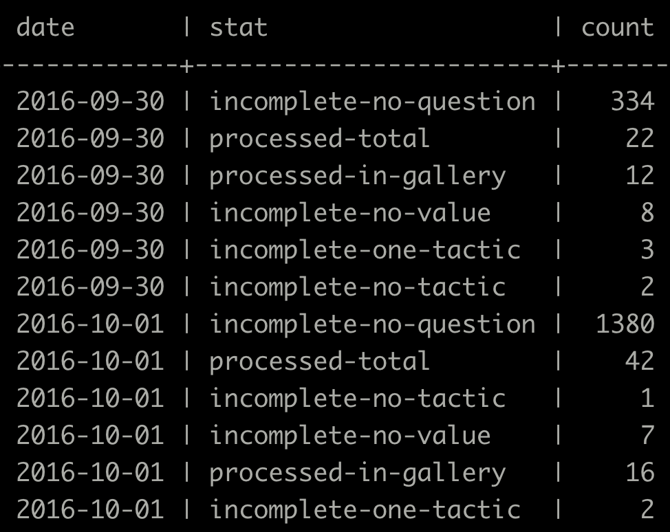
Fig. 8. A snippet of database entries from the first few days of the exhibition showing a high number of missing question, value and tactic entries
Conclusion
The project team met the steep challenges of limited time and budget—we designed and built a completely new way to use the Pen technology. High engagement with the digital interactive showed that what we created was inviting, and fit into the participatory context of the exhibition. Database activity, however, showed points of friction for participants. Most had trouble selecting a question, value and tactic on the input graphic, and most did not successfully upload their Pen data at the reader-board. Stringent database requirements added increased difficulty.
Based on these observations, it is clear that the design of the digital interactive could be optimized. We also learned that some of the challenges facing the project could have been mitigated by closer involvement of D&EM with the larger exhibition design effort. Our next objective is to stabilize the digital interactive at an acceptable level of usability. We will continue observing participant behavior in order to inform our next iterations toward a minimum viable product. Once we meet the usability requirement, our next goal will be to hand-off the interactive to gallery staff for continued maintenance over the duration of the exhibition.
As an experience, the Process Lab:Citizen Designer digital interactive has a ways to go, but we are excited by the project’s role in expanding how visitors use the Pen. This is the first time that we’ve configured Pen interactivity to allow visitors to input information and see that input visualized in near real-time. There’s significant potential to reuse the infrastructure of this project again in a different exhibition context, adapting the input graphic and data output design to a new educational concept, and the database to new content.