Monthly Archives: September 2017

New Relationships: A Summer at Cooper Hewitt

This summer I was the Peter A. Kruger Cross-Platform Publishing intern. When asked about my responsibilities many people want to know, “What does “Cross-Platform” mean?”

At Cooper Hewitt, Cross-Platform Publishing sits at the nexus of the Digital and Emerging Media, Communications, Curatorial, Education, and Exhibitions departments. During my internship I have helped to research, develop, and manage all forms of content for print and electronic publications. As a part of the Cross-Platform Publications team, I have had the opportunity to participate in decision-making that affects the design and content of museum channels, printed books, and digital tables.

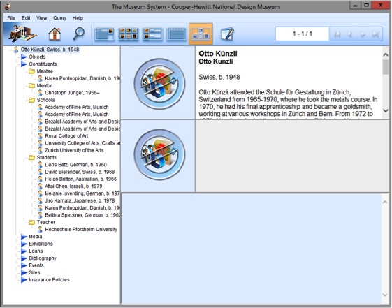
One of my favorite projects this summer was collaborating with the Product Design and Decorative Arts department to develop their plan for the digital tables in the museum’s upcoming exhibition, Jewelry of Ideas: Gifts from the Susan Grant Lewin Collection. The process for developing an application appearing on one of the museum’s digital tables in an exhibition begins with thinking about what stories are not being told in the exhibition didactics. When Cooper Hewitt launched its digital tables in 2014 the team built an application that shows relationships between the founding donors of the Cooper Hewitt collection. It has been in use in the exhibition Hewitt Sisters Collect. So I was asked how might we modify that application to apply to the constituents in the Jewelry of Ideas exhibition. I began looking at research about the designers in the exhibition to uncover meaningful relationships and connections between designers. Working with the curator, we decided which relationships we believed were the most important to highlight. From there, I along with the help of our registrar created relationship hierarchies in TMS. For the Susan Grant Lewin exhibition we decided that the most important relationships to feature on the digital table were those created by the schools that various designers attended or taught for. With this information we hope visitors can see how various styles and techniques arose from certain schools and how these designers’ works influenced one another.

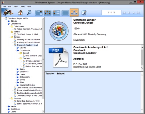
To build the foundation of the interactive content in TMS, I recorded the connections between designers based on school, mentorship, and history of collaboration. Currently, new code is being written to modify the donor application. Once completed the collecetion site records and the digital table will reveal the relationships to its users. The table interface is designed with a “river” where objects and designer images will flow on the digital table. When a designer is selected, a short biography will appear. Underneath the biography, related designers are listed who either participated in the same school or worked together in some way. We hope that this interactive digital experience will help visitors visualize the interconnected nature of the collection in a new way.


Designing for Digital and Print

As this year’s intern in Digital and Emerging Media, I was tasked with creating designs that needed to work as a static .pdf in both print and digital format. This presented a significant challenge: the design created for printable paper dimensions is approached differently than a design for digital display. To accommodate both, the use of space in a limited size must be efficient and readable.

The first project I tackled this issue with was Cooper Hewitt’s Fall 2017 Public Programs calendar. The design brief was to create a brochure that visitors can view on their screens as a landscape orientation .pdf page on the Public Programs website. We designed this .pdf so that visitors could print at home. For easy transport, the brochure needed to fold up small enough to fit in a pocket. The desired layout and size of this brochure presented a fun but difficult design challenge.

The image below is what the .pdf will look like when opened on the website. The dashes represent folding lines, which when printed onto a double-sided letter-size piece of paper act as a guide for folding it into 8 small rectangles for a pocket size calendar or 4 longer vertical rectangles for a brochure size. Should we decide to print on-site, an 11×17 layout was also created.

The second project I worked on was less complex to design for print, but was much more complex in creating the digital layout. The book Enwheeled by Penny Wolfson is the latest publication in Cooper Hewitt’s DesignFiles e-book series. The e-books in the series are currently offered through online stores for $2.99 per book. Cooper Hewitt will be shifting this distribution model for the DesignFiles series beginning with Enwheeled publishing in December 2017. Enwheeled will be the first web-based publication available on cooperhewitt.org but that is a whole other post! My task was to create a traditional InDesign layout for the text and then use the instructions developed by last year’s Digital and Emerging Media intern, Emma Weil, for creating a Markdown-friendly HTML code. The text was first entered into threaded text boxes with the related images dispersed accordingly. Once that process was complete, I followed Emma’s instructions for tagging the text and images so that they appear in the correct order when exported to HTML.

Certain images needed to be placed in between threaded text boxes; in this case, the images had to be anchored to their corresponding caption, and the caption anchored to the end of the paragraph that it coincides with.

The final step in preparing the InDesign document for export to HTML was to assign paragraph and character styles to the text. Each text format needs to be assigned a specific style setting in order for the text to appear correctly in the HTML. Character styles include all italic, bolded, and superscripted text. Paragraph styles act the same way with entire bodies of text, as well as signifying the headers and sub-headers of the book.

When the document is exported to HTML, the order of the text and images remains intact and correctly formatted in simple text form. The HTML reformats to the size of the window or screen it is being used on, and after being entered into Emma’s Python script is ready to be entered into Markdown.