Category Archives: Tablets

Label Writer: Connecting NFC tags to collection objects

IMG_20150610_113555

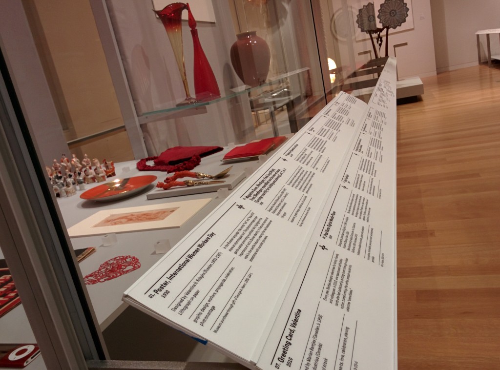
Labels, for better or worse, are central to the museum experience. They provide visitors with access to basic object information (metadata) and a tiny glimpse into the curatorial research for everything in the galleries, helping to place objects in context. At Cooper Hewitt, they are also the gateway through which the Pen‘s “collect” interaction is realized.

In order for the Pen to know which object label you’re trying to collect, every label in the museum contains an NFC tag that is written with the object’s ID. When an object gets added to our database we give it an ID, an integer that is unique across our entire online collections database. Our beloved Spanking Cat, for example, has the ID number 18382391. Writing that number to an NFC tag is a simple task, but doing it hundreds of times for every new exhibition we roll out will get tedious very quickly. Thus, Label Writer was born.

Label Writer is an Android app that writes, reads and locks NFC tags based on the object to which the label refers. The staff member can look up the objects that are in a given room of our museum, select one or more of them, and assign them to the label in question. They can search for specific objects in case an object’s location hasn’t been updated yet. They can also write tags for videos and shop items.

The front and back of the NFC tag we use in our labels, with pennies for scale

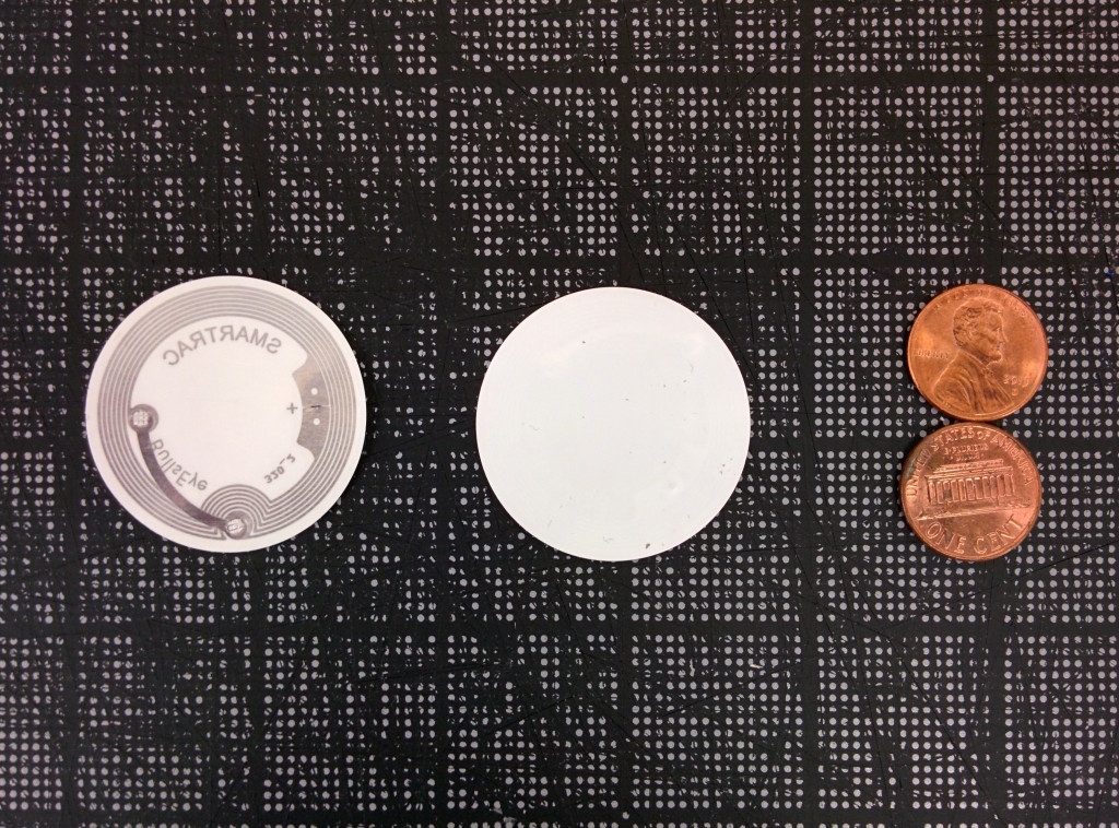
From left to right: the back and front of the NFC tags we use in our labels, and pennies for scale.

Planning

After thinking about the app we came up with the following requirements:

  1. When processing a user’s visit, we need to know what type of thing they’ve collected. When the Pen launched, this was either objects or videos, and has since grown to include shop items. To facilitate that process, Label Writer would have to distinguish between types of things and write tags that indicated that.
  2. It would need to write multiple things to a tag, including things of different types. One label might contain three objects. Another label might contain one video and two objects.
  3. It would need to lock tags. Leaving the tags unlocked would enable anyone with an NFC-enabled smartphone to walk around the galleries and overwrite our tags. Locking the tags prevents this.
  4. It would need to read tags and display images of what’s on a tag. This is so we can double-check what is on a tag before we lock it. We only print one copy of every label – sometimes through an offsite service – and the wall labels (as opposed to the rail labels) have their NFC tags glued in and unable to be replaced.
  5. Label Writer would have to present objects in a constrained format — having to find the object on a label from our total collection of 210,000 objects every time, through accession number lookup or other traditional searches, would get annoying very quickly.
IMG_20150608_172543

The NFC tags on our wall labels are built in to the label.

IMG_20150608_172442

The NFC tags on our rail labels are interchangeable.

Production

I decided to build the app in Android because it has great support for NFC and we have plenty of Nexus 9 tablets at the museum for use in the galleries. I started with this boilerplate for an Android read/write NFC app and performed initial tests to make sure we could write a tag that could be read by some of the early Pen prototypes. Once that was established, I began fleshing out the UI of the app and worked on hooking it up to our API.

The API gives us so much to work with on the app’s frontend. Being able to display an object’s image is a much better way to confirm that a label is written correctly than by comparing IDs or accession numbers. The API also lets us see all of the objects in a given room of the museum, which means that the user can write labels in an ordered fashion. When the labels arrive from the printer they are grouped by room, and often we will not write the tags until they have been installed in the galleries, so “by room” is a convenient way to organize objects on the frontend. It also gives us easy access to videos and shop items, and allows the app to easily be expanded to write labels for more things from our collections database. Since our collections site alpha, we have stressed the importance of an easily-accessed permanent ID for everything: people, objects, videos, exhibitions, locations etc., and now with the Pen we can prepare labels that allow users to collect any one of those things during their visit to the museum.

01

When I took all these screenshots, the app was called “Tag Writer”, as in “NFC Tag Writer.” But “Label Writer” sounds better.

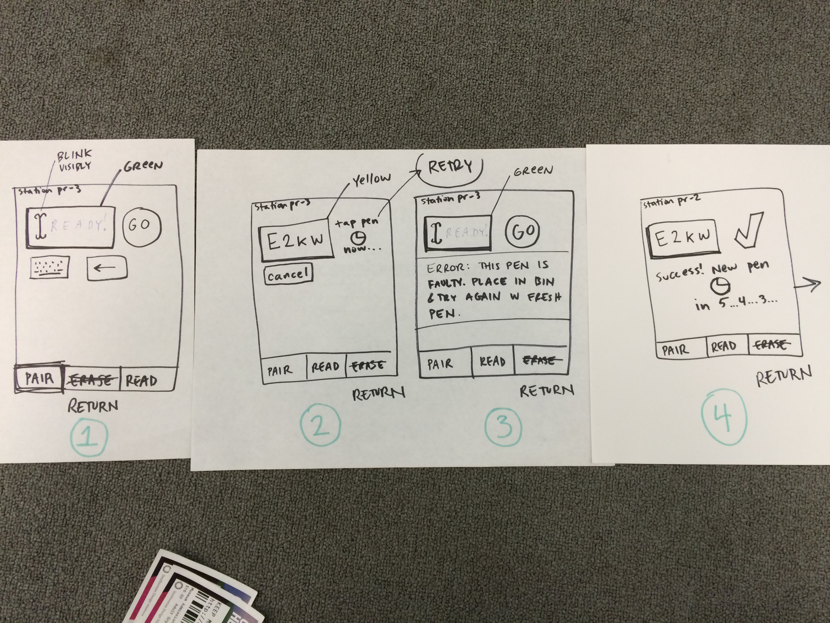
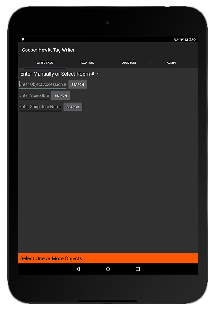
When the app is opened, the user is prompted with a few ways to group objects. Since we added videos and shop items to the app, this intro screen has grown a bit so it will probably get a redesign when we next expand its capabilities. But for now, users have a few options here:

  1. They can select a room from a dropdown menu (here’s a list of all of our rooms)
  2. They can enter an individual accession number
  3. They can enter a video’s ID
  4. They can search the shop (see Aaron’s recent post about adding shop items to our online collection)

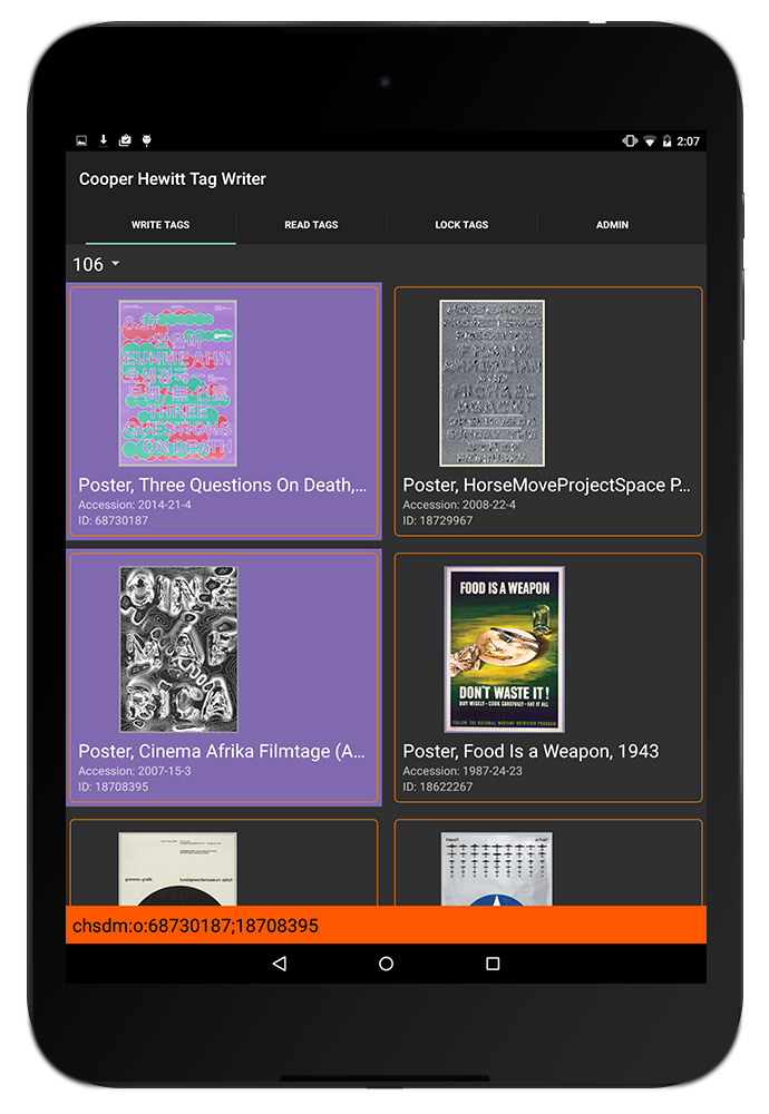
When one of these options is used, the relevant objects appear on the screen. For example, selecting Room 106 brings up some of the posters from our current How Posters Work exhibition. Being able to display the images of the posters makes it much easier for the user to confirm that they are connecting the dots accurately — accession numbers and object IDs are easily confused (not to mention boring to look at).

02

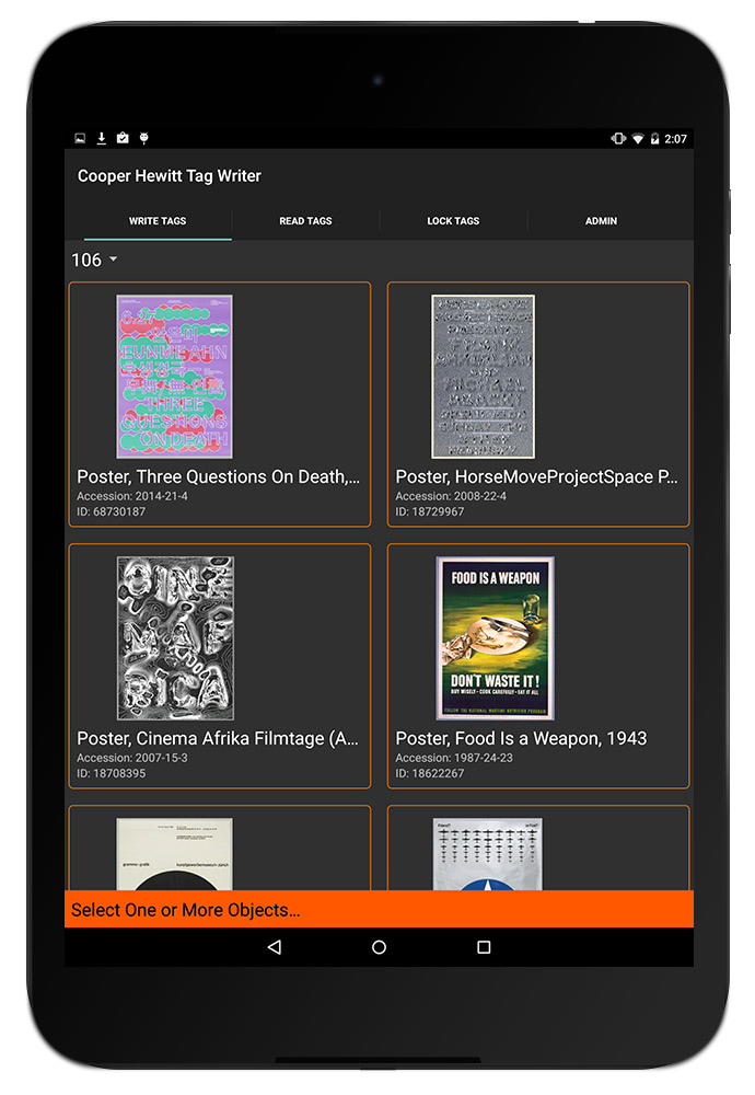
The user can then tap one or more objects to add them to a label. In the screenshot below, you can see that two objects have been selected and the orange bar at the bottom has formatted them to be written to a tag — in this case, chsdm:o:68730187;18708395. The way that things get written to tags follows a format we agreed upon early in the Pen design process, as various developers would be building applications that relied on reading and parsing a Pen’s content. In brief, chsdm is a namespace for our museum that is not particularly necessary but serves as a header for what follows. o stands for object and then the ID (or semicolon-delimited IDs) that follow are the IDs of objects. The letter can change: v for video, s for shop, and on and on for whatever other things we might eventually write to tags. We add a pipe character (|) to delimit multiple types of things on a tag, so a tag with an object and a video might look like chsdm:o:18714653|chsdm:v:68764195. But all of this is handled by the app based on what the user selects in the interface.

03

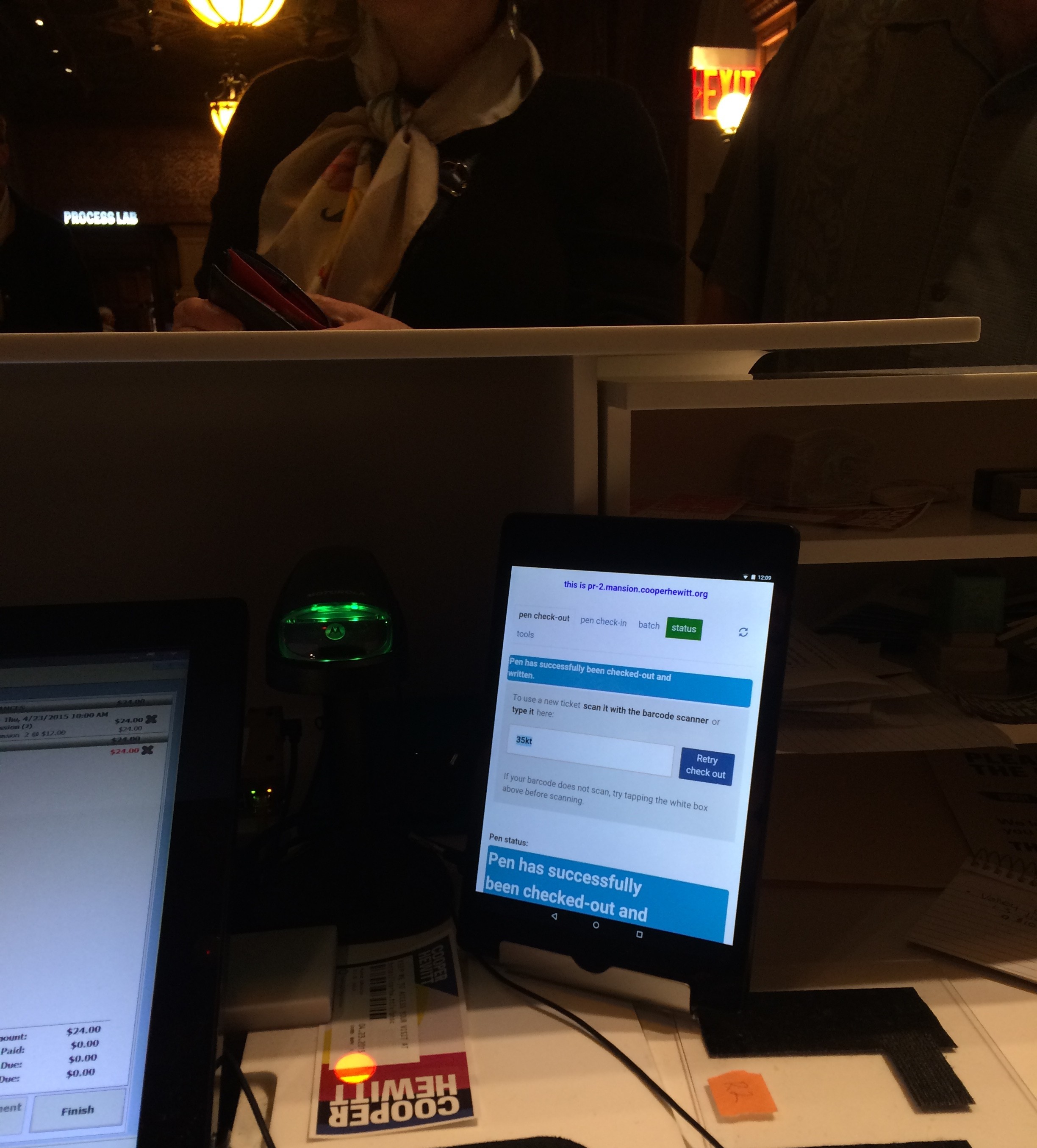
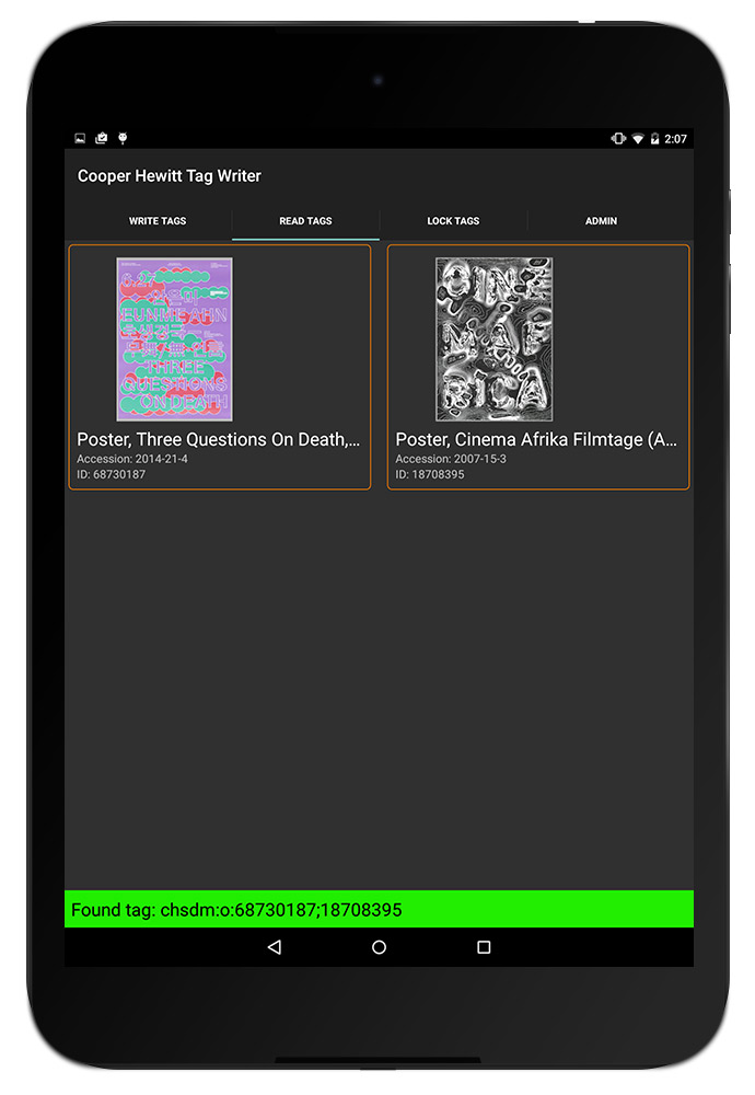
Next, a user can hold the tablet up to the object label to write the NFC tag. When the tag is written, the orange bar at the bottom turns green to let the user know it went okay. Later, using the “Read Tags” functionality of the app, the user can confirm the tag’s contents by reading the NFC tag. The app parses the tag and loads the things it thinks the tag refers to. When this is confirmed, the user can lock the tag to make sure nobody overwrites it.

05

Here’s everything, from start to finish, using the object-lookup-by-accession-number functionality.

Next Steps

I mentioned that the home screen of this app will get a redesign as we allow more types of things to be written to tags. The user experience of the tag writing process needs a little finessing — a bug in how success messages get displayed has resulted in a few tags that get written with bunk data. Fortunately that is caught in the “read” phase of the workflow, but should be corrected earlier.

Overall, as we keep swapping out exhibitions, Label Writer will get more and more use. We will use these opportunities to collect feedback from the app’s users and make changes to the app accordingly.

Happy Staff = Happy Visitors: Improving Back-of-House Interfaces

“You have to make the back of the fence that people won’t see look just as beautiful as the front, just like a great carpenter would make the back of a chest of drawers … Even though others won’t see it, you will know it’s there, and that will make you more proud of your design.”

—Steve Jobs

In my last post I talked about improvements to online ticketing based on observations made in the first weeks after launching the Pen.

Today’s post is about an important internal tool: the registration station whose job is to pair a new ticket with a new pen. Though visitors will never see this interface, it’s really important that it be simple, easy, clear, and fast. It is also critical that staff are able to understand the feedback from this app because if a pen is incorrectly paired with a ticket then the visitor’s data (collections and creations) will be lost.

Like a Steve-Jobs-approved iPod or a Van Cleef & Arpels ruby brooch, the “inside” of our system should be as carefully and thoughtfully designed as the outside.

the view from behind a desk with screens and wires everywhere. a tablet positioned upright with some tiny text and bars of color.

Version 1 of the app was functional but cluttered, with too much text, and no clear point of focus for the eye.

Because the first version of the app was built to be procedurally functional, its visual design was given little consideration. However, the application as a whole was designed so that the user interface – running in a web browser – was completely separate from the underlying pen pairing functionality, which makes updating the front-end a relatively straightforward task.

Also, we were getting a few complaints from visitors who returned home eager to see their visit diary, and were disappointed to see that their custom URL contained no data. We suspected this could have been a result of the poor UI at ticketing.

With this in mind, I sat behind the desk to observe our staff in action with real customers. I did about three sessions, for about ten minutes each, sometimes during heavy visitor traffic and sometimes during light traffic. Here’s what I kept an eye on while observing:

  • How many actions are required per transaction? Is there any way to minimize the number of “clicks” (in this case, “taps”) required from staff?
  • Is the visual feedback clear enough to be understood with only partial attention? Or do  typography, colors, and composition require an operator’s full attention to understand what’s going on?
  • What extraneous information can we minimize or omit?
  • What’s the critical information we should enlarge or emphasize?

After observing, I tried my hand at the app myself. This was actually more edifying than doing observations. Kathleen, our head of Visitor Services, had a batch of about 30 Pens to pair for a group, and I offered to help. I was very slow with the app, so I wasn’t really of much help, moving through my batch of pens at about half the speed of Kathleen’s staff.

Some readers may be thinking that since the desk staff had adjusted to a less-than-excellent visual design and were already moving pretty fast with it, this could be a reason not to improve it. As designers, we should always be helping and improving. Nobody should have to live with a crappy interface, even if they’ve adjusted to it! And, there will be new staff, and they will get to skip the adjustment process and start on the right foot with a better-designed tool.

My struggle to use the app was fuel for its redesign, which you can see germinating in my drawings below.

some marker sketches of a tablet interface with lots of scribbled notes

After several rounds of paper sketches like these, the desk reps and I decided on this sequence as the starting point for version two of the app.

These were the last in a series of drawings that I worked through with the desk staff. So our first few “iterative prototypes” were created and improved upon in a matter of minutes, since they were simply scribbled on paper. We arrived at the above stopping point, which Sam turned into working code.

Here’s what’s new in version 2:

  • The most important information—the alphanumeric shortcode— is emphasized. The font is about 6 or 7 times bigger, with exaggerated spacing and lots of padding (white space) on all sides for increased legibility. Or as I like to call it, “glanceability.” This helps make sure that the front of house staff pair the correct pen with the correct ticket.
  • Fewer words. For example, “Check Out Pen With This Shortcode” changed to “GO”, “Pen has been successfully checked out and written with shortcode ABCD” changed to “Success,” etc. This makes it easier for staff to know, quickly, that the process has worked and they can move on to the next ticket/pen/customer.

“I didn’t have time to write a short letter, so I wrote a long one instead.”
Mark Twain

  • More accurate words. Our team uses a different vernacular from the people working at the desk. This is normal, since we don’t work together often, and like any neighboring tribes, we’ve developed subtly different words for different things. Since this app is used by desk staff, I wanted it to reflect their language, not ours. For example, “Pair” is what they call “check-out” and “Return” is what they call “check-in.”
  • Better visual hierarchy: The original app had many competing horizontal bands of content, with no clear visual clue as to which band needed the operator’s attention at any given time. We used white space, color (green/yellow/red for go/wait/stop), and re-arranging of elements (less-used features to the bottom, more-used features to the top) to better direct the eye and make it clear to the user what she ought to be looking at.
  • Simple animations to help the user understand when the app is “working” and they should just wait.

Still to come are added features (bulk pairing, maintenance mode) and any ideas the desk reps might develop after a couple of weeks of using the new version.

Imagine how difficult this process would have been if the museum had outsourced all of its design and programming work, or if it were all encased in a proprietary system.

iPads and tech in schools update

Since our last post, NYC public school teachers participating in the Arts Achieve pilot have had 3 months to start working with their new projectors, iPads, styli, microphones, and other tech stuff.

Here’s a glimpse into the tech training sessions we did with teachers last March, in close collaboration with my colleague in the education department, Marianna Siciliano.

Our teachers have now had the summer to process the training and in-classroom experience, and share feedback with us about the ups and downs.

Here’s what we gave out to teachers.

What have we learned since putting tech in teachers’ hands?

1. Camera, camera, camera.

The iPad camera is by far the most popular and widely-used feature of any products we gave to teachers. Video and stills are pouring out of the classrooms. They’re handy for more than sharing outward; often the camera is being used as a way to “take notes” or play back video for review locally.

2. When it comes to projectors, quality trumps portability.

We thought the portability factor would be great for teachers who do “art on a cart,” however the pico projectors we provided did not go over as well as we’d hoped. This might be because these guys are in the arts, so strong image quality is important to them. Also, more and more classrooms in NYC are being outfitted with high-res, high-brightness Smar

This is the tech support printout we gave our teachers

tboards, so it looks like pico projectors, with their dim lamps and small images, are not an exciting addition to most classrooms. Additionally, the pico projectors were confusing for the few teachers in the project already fluent with Smartboards.

With teachers, any existing familiarity is priceless, because you can spend precious training hours on other topics.

3. People like DropBox and iMovie.

It’s a really good idea to use services and brand names that are already familiar to people. It lowers the intimidation factor and opens the possibility of finding easy, instant tech support from family, students, colleagues, or Google search. DropBox and iMovie had a level of instant familiarity and both are being used.

Ning Network activity and survey data after three months of tech in the classroom.

4. Play is the way!

In our trainings and tipsheets, we outlined a bunch of best practices. Some teacher frustration has arisen from the feeling that these outlines were the only way to operate. We should have emphasized even more that it is OK to play, poke, experiment, test, and try stuff. This is definitely the best way to learn “tech stuff” (it’s why kids are so good) and It’s really hard to get this ethos across to adults!

Some teachers have also reported to us that they have had great success when they simply asked their students for help with their tech questions. We like to see teaching flow both ways!

5. AirWatch was unnecessary.

We killed our subscription to AirWatch mobile device management. I found the product limited; it didn’t do anything useful for us. In the dream scenario, we could keep all the iPads uniform, add apps and manage media remotely, make changes on the device without user consent (which is hard to get when some users need instructions outlining how to consent), and troubleshoot remotely. None of this was actually possible with AirWatch. When any given iPad gets too far adrift from the original image with crazy apps and settings, we simply re-image it from iCloud. This works very well, and quickly, and it’s free!

Deploying 129 iPads to NYC Schools

One of the exciting projects we have underway is deploying 129 iPads to teachers in New York City public schools. As you can imagine, this is a somewhat challenging project and not just from a technical perspective.

This is happening as part of a US Department of Education funded project called Arts Achieve. Here’s Katie Shelly, who is handling the tech for the project.

What is i3 and Arts Achieve?

i3, which stands for Investing In Innovation, is a new grant program of the U.S. Department of Education. Established in 2009 as part of the American Recovery and Reinvestment Act, the i3 Fund provides competitive grants to cultural and educational organizations to expand innovative practices that will have an impact on improving education by advancing student achievement, student growth, closing achievement gaps, decreasing dropout rates, increasing graduation, college enrollment and/or college completion rates.

In 2010, Studio in a School was awarded an i3 grant in conjunction with five partner institutions – including Cooper-Hewitt. The winning entry, called Arts Achieve, proposed the development of an ambitious pilot program in New York City public schools to improve student achievement in the arts by building high-quality, digitally replicable arts assessments, along with a corresponding digital community and resource kit. Each partnering organization brings a different expertise to the development of the pilot. Carnegie Hall, The 92nd Street Y, ArtsConnection and Studio in a School bring music, dance, theatre and visual art expertise respectively. Cooper-Hewitt brings expertise on the innovative use of technology for education and design thinking expertise, and The NYC Department of Education brings expertise in curricula, state and national standards, and very importantly, the ability for us to connect with public schools. We’re currently in year 2 of 5, which means the Arts Achieve program is up and running– with 43 participating schools, hundreds of educational professionals and thousands of students participating. Our online community, powered by Ning, is abuzz with about 200 members who use the space to share lesson plans, media, resources, and feedback, bringing hundreds of individuals with different areas of niche expertise together in a single network focused on developing and implementing high-quality assessments for the arts.

How did you come to select iPads as the most appropriate technology? What can they do that others cannot?

We considered laptops, PC tablets, linking up peoples’ phones.. we even considered commissioning an elaborate arts assessment booth or kiosk (we jokingly call this wild idea “the laser box”).

The iPod touch and smartphones were cheap, but had too small of a screen for good collaboration.

Laptop user’s “don’t bug me” body language.

Laptops are highly capable but too individual-oriented to cultivate the feedback-rich classroom environment we wanted. When people are working on a laptop, it sends out this message that says: “I’m working–don’t bug me!” We wanted technology that would set the stage for collaboration, teamwork and most importantly, many layers of feedback– from student to student, teacher to student, outside the school to inside, and so on. Constant feedback flow is a big philosophical pillar in the project.

The kiosk idea, though tempting for the ability to infinitely customize for our project, was too pricey to be nationally replicable. A key goal of our pilot is to create something that can be replicated elegantly and affordably in any public school classroom in the United States. So for that reason we deciced to adapt existing technologies rather than develop something proprietary.

The only thing we rely on schools to provide is an Internet connection. Everything you need to participate is included our package. The package has 3 customized iPads, wireless access point with 14ft ethernet cable, speaker/pico projector combo dock (chosen for its wonderful lack of hookup cables) some styli, iRig mic, and durable iPad cases.

iPad users’ ‘hey, let’s explore together!’ body language

We liked iPads because we know that many teachers and students are already familiar and comfortable with the interface. The touchscreen was a big thing for us, because the flat, “swipey” interface fosters body language that says “come play with me, let’s explore!” We could imagine a bunch of kids gathered around a video or a group game, working together. And we had seen compelling reports of classrooms around the country using iPad to do just that, which confirmed our hunch that this was the best way to go.

What Apps did you select? What criteria did you use?

Our custom iPad image has 90 apps pre-loaded for the classroom. We asked our partner institutions in the different arts disciplines to suggest high-quality apps for their disciplines.

We looked for apps that we could picture a group of kids using together collaboratively. There’s a beautiful one called Visible Body that lets you zoom and spin around the entire human anatomy–bones, muscles, ligaments. I could see that engaging a group of students trying to draw from life or learning to understand their bodies through dance. I also like one called Educreations, which lets you draw on the screen while speaking/explaining, which you could imagine being useful for theater students planning out blocking while speaking cues, and perhaps using the recorded video to explain their vision to others. A drawing teacher could make a demo video to open a lesson on 3-D shading techniques, or as a tool to support students in need of extra help.

We included several video and photo editing apps to help teachers record and share what’s happening in their classroom in the Arts Achieve online community too.

If an app required elaborate setup or login, we nixed it. We operated on the assumption that since teachers are always extremely pressed for time and juggling many demands, there’s no time for anything that takes more than a few taps to get up and running.

What were the challenges in setting the iPads up for use across so many different schools?

A huge issue for teachers trying to harness the educational power of technology is simply getting online. Find the right wi-fi network, track down the IT guy to get the password, enter a 15 character password… enter a proxy setting, possibly another password in the browser… and repeat that process for multiple devices…. By now your 40 minute lesson time is halfway over.

A huge win for us was the ability to pre-configure these iPads for instant web access. All the teacher has to do is plug in an Airport Express brick to the outlet & the nearest ethernet jack. They turn on their iPads, which are pre-programmed to look for the Airport and pre-configured with DOE proxy settings. They plug in the brick, turn on the iPads, and they’re online. A little bit of configuration legwork from us will save hours of accumulated time for these teachers.

Each iPad has the same disk image that has been custom configured and optimized for the project. They’re pre-loaded with networking settings, relevant bookmarks for the Ning network, wallpaper with our logo and even keyboard shortcuts that reflect the Arts Achieve vocabulary. The iPads are centrally tethered and controlled using AirWatch, so we can see when and how they’re being used, where they are, push out new apps as we learn about them, and block whatever latest new distracting game is out there. We can also troubleshoot problems remotely, which is huge because the test schools are far-flung all around the city.

How did you balance the locked down needs of schools with the needs of the Apps?

3G connection was not an option because we needed to keep everyone inside the school firewall. So we’re satisfying a lot of the schools’ online safety needs because we’re staying inside their firewall.

Transferring photos easily and wirelessly with Photosync App

Use of e-mail to send and receive media is also not something we can encourage because that is currently not allowed for students. To get around this, we found two brilliant apps that let iPad send and receive data with any computer wirelessly– Photosync and MP3 player. This avoids the annoying issue of having to designate a computer and active iTunes account for a given iPad to sync up with. All the teacher wants to do is get their video or photo out of the iPad and onto a computer so they can work on it later or post it online. These apps allow them to do that in the simplest way possible.

What extra features did you wish the iPad/iOS had to help with these sorts of rollouts?

The iPad is designed for an individual to use and sync up with their personal computer. It would be nice if there was a “group mode” or something for iOS that made it easier to deploy multiple iPads  to a user group who don’t have syncing computers. In our dream setup, Arts Achieve central would have a Master iPad, and any changes we made to the master unit would automatically push out to the classroom iPads, without the teachers having to log in to iTunes, memorize any passwords, punch in credit card info, or any other time-killing, lesson-derailing obstacles. “Group mode” would be good for schools, or for a company issuing iPads out to employees, or a parent who wants to manage their kids’ devices. iCloud is close, in that it eliminates some of the headache of plugging in and physically syncing, but again, that service is designed for an individual consumer managing a personal media library… it wouldn’t work that well for a project like Arts Achieve, which demands replicability & uniformity from one classroom to the next.