“What’s theo dot php?” Nate asked.
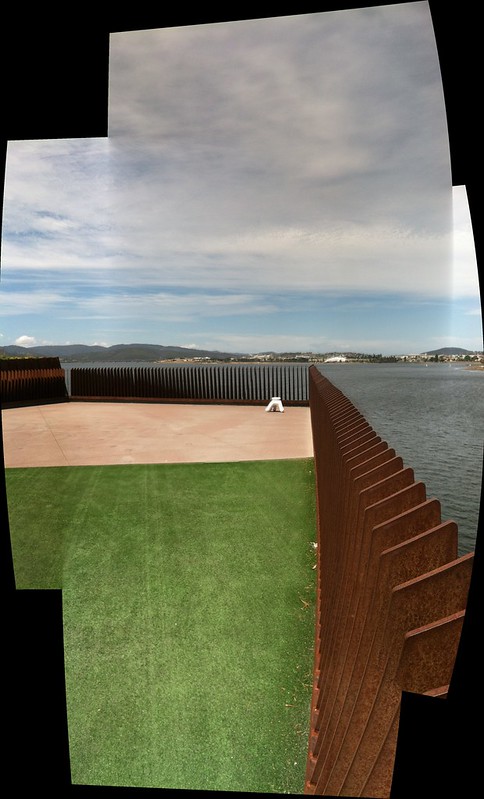
We were sitting in a coffee shop in Melbourne and catching up on things because we still hadn’t sorted out internet access at the hotel. We’d arrived the night before from Hobart, the capital of Tasmania, where we’d spent the day visiting the Museum of Old and New Art which is often just referred to as “MONA”.
“Theo” is actually “The O” the name of the retrofitted iPod touch with custom software that MONA gives to every visitor when they enter the museum. “theo.php” is the URL that you’re emailed the following day which shows you all the stuff you saw during your visit.
It’s not a page that’s especially well-designed for looking at on your phone’s tiny web browser. You can do the pinchy-zoomy thing to move around the page and make the links big enough to click on but only at the cost of feeling vaguely annoyed and disappointed.
Links to individual works are loaded in-situ using Javascript so there are no permalinks (not even self-updating hash marks) or any way to share a link for a particular piece of art that you loved (or hated) with another person. Or even just yourself if you wanted to, say, bookmark it for later reference.
So, that’s not great. On the other hand: Working code always wins.
Few other museums have mustered up the ambition (not to mention the cash dollars) to do something on the scale of The O so until we do any criticism of the work that MONA has done needs to be cut down to size by running it through a filter that is equal parts envy and armchair quarterbacking.
The first thing I did when I got The O was remove the lanyard that you’re supposed to use to drape the thing around your neck. Wearing it around your neck is meant to make the device easier to use which sounds like a classic engineering-as-philosophy excuse. It does actually make it easier to use but only because neither the hardware or the software are particularly well-suited for being shoved in to, and pulled out of, your back pocket.
The second thing I did was put the headphones I was given in the pocket of my jacket. I should have just given them back to the nice “front of house” person but a first visit to the lobby of MONA is a bit overwhelming. I couldn’t tell you what the person who gave me The O said about the device. Mostly I was looking at the impressive glass staircase beyond the entrance and thinking: Oh, it’s an iPod. I can figure this out.
The headphones seemed like overkill. Maybe that’s me. I’ve never been much for audio tours and between The O and the headphones I was starting to feel like I might soon be wearing a fighter pilot’s helmet complete with a built-in heads-up display. One of the nicer bits of The O is that every piece of art comes with a soundtrack; one or more songs that you can play while you contemplate a given work.
I might have been inclined to put the headphones on if The O sported a continuous partial soundtrack. Something that would just play by itself in the background and cut over, from one track to the next, as you moved around the museum.
Or a spoken narrative. That would be awesome and they don’t necessarily need to be pre-recorded. I once walked the 30 minutes it takes to get from the Detroit Institute of the Arts to the city’s downtown core listening to my phone’s text-to-speech software read aloud a very long email from my friend James, so it’s all in the realm of the possible.
Instead it felt like more buttons to press.
The third thing I did, as we were walking down the stairs in to the museum itself, was ask why I couldn’t take pictures with The O.
No one is discouraged from taking photos in the museum but it means fiddling with yet another device. Lots of people are going to want to use their fancy digital SLRs to take high(er) quality photos but most people are going to be perfectly happy with whatever this year’s iPod camera can do. Especially if it makes things easier and especially-er if those photos can be tied to all the stuff that MONA knows about a work that’s being photographed.
Managing photo uploads in a gallery would be a genuine engineering challenge (read: storage and bandwidth) but hardly an insurmountable one and the benefits would be pretty awesome. First of all, it demonstrates that a museum isn’t blind to a reality where everyone walks around with a network-enabled camera, sharing things as they go. Secondly, if you’re thinking about doing 3D digitization of your objects you could do a lot worse than stitching together all the photos that your visitors are taking.
One of the “crazier” aspects of MONA if you’re talking to museum professionals is the absence of wall labels. You know: Those pieces of cardboard stuck to the wall that tell you who the artist is, when a work was made and usually some overly polite interpretive text that is both too short to tell you anything of substance and too long to fit in a Twitter message.
MONA is full of wireless receivers and The O does some fancy-pants triangulation to figure out where you are in the building and only show you works that are nearby. It’s pretty clever, really. It’s also not very fast. Or rather it’s only fast if you remember that our ability to do this at all is still kind of magic – but that gets olds pretty quickly in a museum setting.
Maybe it was because the device isn’t configured to stay on all the time and silently update its location as I moved around? After all, the iPods all come with big honking extra battery packs. Maybe it was because I kept turning the iPod off every time I stuck in my back pocket? Maybe it was because the app itself kept crashing and I had to wait for it to restart?
When it is working and you click on an individual piece you get a handsome photo of the thing you’re looking at with five additional tabs for finding out more information. They are:
Summary
The basics like artist name, dimensions and a button to indicate you’ve seen the work, so that it will show up in the history of your (theo.php) tour around the museum.
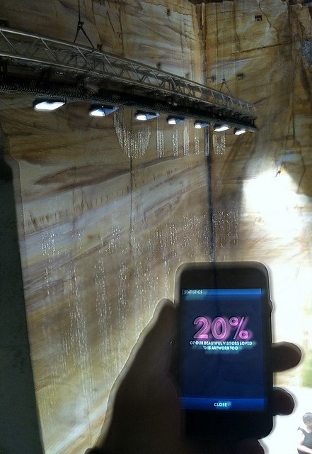
There’s also a “love” and “hate” button which is bit heavy-handed but still kind of charming. After you’ve indicated a choice there’s some nice copy telling you where your ranking falls relative to everyone else’s. I sort of wish that those stats were shown to you before you indicated a preference precisely to see how people would game the system. I would totally go on a tour of the most hated things on view at MONA.
Meanwhile, why can’t I love or hate an artist?
Ideas
Or as I’ve started calling them: Fortune cookies. Short little pithy and fluffy aspirational dribblings of interpretation that are cornier than they are funny. They feel like throwaway comments that betray a lack of faith in the ability of visitors to be smart enough to figure things out on their own.
Art Wank
This felt like a deliberate provocation but it is David Walsh’s party so he can do whatever he wants. MONA is his personal art collection and he paid for the whole thing, building included, out of pocket. I didn’t read any of these texts if that’s what you’re wondering. They were too long to read standing up and too long to make me want to stare at a bright screen in an otherwise dark room.
Gonzo
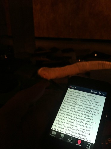
I wish this hadn’t been labeled “gonzo“. At the end of the day, though, I don’t really care what it’s called so long as it never goes away. This is the best part of The O. It leaves you feeling like there’s some avenue for understanding why a given piece was collected by the museum. The tone is conversational and through it emerges all the wiggly and sometimes contradictory motives that went in to acquiring a piece.
It says: We probably know more of the shop-talk that surrounds a work of art but we are still human like you and our appreciation is something that we can, and want, to share with you. That we can hopefully make you appreciate how we fell in love with a work even if you think it’s crap.
Call me crazy, but I’m just not sure what’s “gonzo” about that. It seems like minimal competence, really.
Media
So. Many. Buttons. Do I have to press them all?!
A few quibbles about the tabs:
-
It’s not clear when you’re using the device whether the texts will be included in the summary version of your tour so I found myself literally taking pictures of the thing in order to ensure that I’d have a way to recall the text I was reading. This suggests something that could be made… better.
-
The layout and formatting of the text is terrible. There’s not really any excuse for this. The type is all smushed up together and the line heights are too small and the margins are non-existent. It all smells like some sort of default iOS
NSTextWrapperhandler from 2007. There is no shame in looking at what Readability or Instapaper are doing and just copying that. -
If I’ve gone to the trouble of clicking on one of the buttons for an artwork, or maybe clicking on a button and scrolling through some amount of a text, can that please count as having “viewed” a work? There are a bunch of things, like the creepy-worm-body-artist-guy, that MONA doesn’t think I’ve seen because I neglected to click the
<I SEE YOU>button.
But it mostly works. Except when it doesn’t. Every once in a while, some or all the items in a room (sometimes upwards of 30) will be bundled up in to a single listing that, when clicked, opens a nested list of individual objects which you then have to scroll through to find the thing you’re looking for. In anger.
(pause)
It’s kind of a terrible time to be making mobile apps or, rather, it’s sort of the mobile equivalent of that time when people thought writing websites in Java was a good idea. Java is awesome for lots of things just maybe not websites, or anything that needs to change often. Native mobile apps feel the same way and there’s the added burden that they are being aggressively used as a weapon by the companies (the vertical “stacks“) that support them. See also: The long, sad history of vendor-specific authoring tools.
One of the things that seems to get lost in the discussion of “native” versus the “web” is that the web has not-quite-already-but-nearly won. Which is to say that rendering engines not browsers have won. Which means that HTML (and some combination of Javascript and CSS) has won. As has HTTP.
Almost.
HTTP has basically won as the network and transport layer for most things. Web-based rendering engines are still not really the equal of fussy and bespoke hardware and device-specific APIs when it comes to performance but everyone expects them to be soon, or to reach an acceptable threshold where the rest of it doesn’t matter. Once that happens why would you ever go back?
But we’re not there, yet. And tomorrow’s future promises do little to help get things done today. That is our burden, working in the present.
So, if you ever meet anyone who was involved in building The O buy them a drink and thank them for being willing to step up and stab themselves in the face with the minutiae of the future-now. We are better for it.
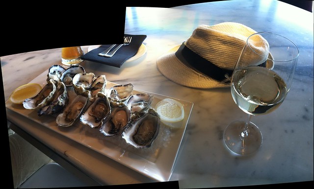
Also, when was the last time you had oysters at a museum?