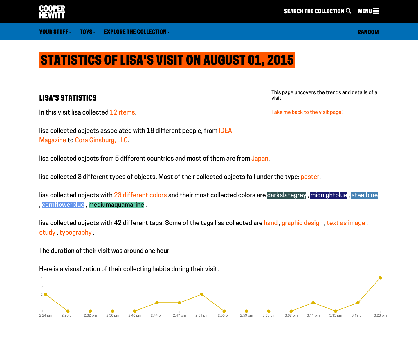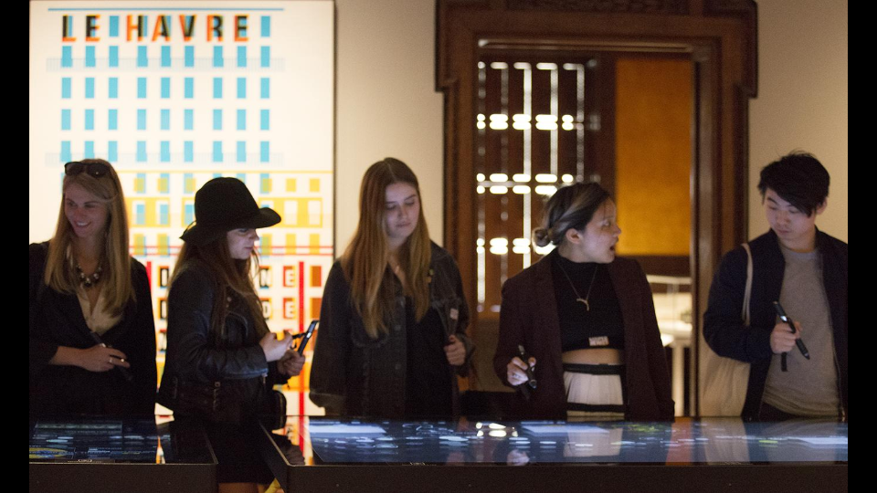
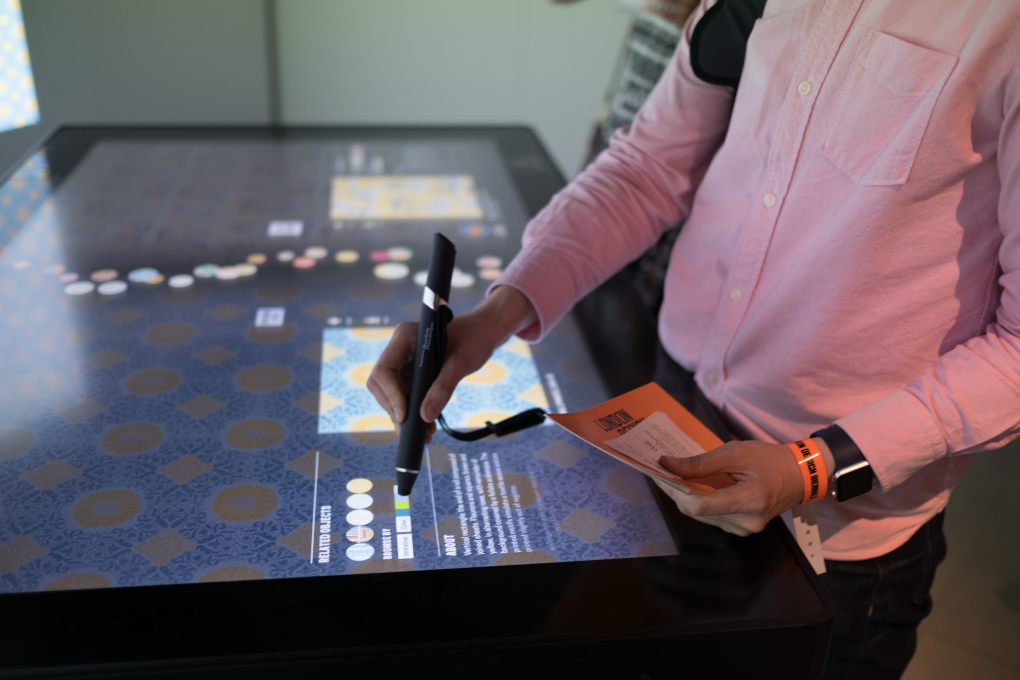
Visitors to the London Design Biennale use our “clone” of the Wallpaper Immersion Room.
Recently, we launched a major initiative at the inaugural London Design Biennale at Somerset House. The installation was up from September 7th through the 27th and now that it has closed and the dust has settled, I thought I’d try and explain the details behind all the technology that went into making this project come alive.
Quite a while back, an invitation was extended to Cooper Hewitt to represent the United States in the London Design Biennale, an exhibition featuring 37 countries from around the world. Our initial idea being to spin up a clone of our very popular “Wallpaper Immersion Room” and hand out Cooper Hewitt Pens.
The idea of traveling our technology outside the walls of the Carnegie Mansion has been of great interest to the museum ever since we reopened our doors in 2014. The process of figuring out how to make our technology portable, and have it make sense in different environments and contexts was definitely a challenge we were up for, and this event seemed like the perfect candidate to put that idea through its paces.
So we started out gathering up the basic requirements and working through all that would be needed to make it all come together, including some very generous support from the Secretary of the Smithsonian and the Smithsonian National Board, Bloomberg Philanthropies, and Amita and Purnendu Chatterjee.
The short version is, this was a huge undertaking. But it all worked in the end, and visitors at the first-ever London Design Biennale were able to use Cooper Hewitt Pens to explore 100 wallpapers from our collection, create their own designs and save them. Plus, visitors could collect and save installations from other Biennale participants.
https://www.instagram.com/p/BKGZ9u9gcHI
https://www.instagram.com/p/BKGZu4yA6dq
The long version is as follows.
An Immersion Room in England
First and foremost, we wanted to bring the Immersion Room over as our installation for the London Design Biennale. So, let’s break down what makes the Immersion Room what it is.
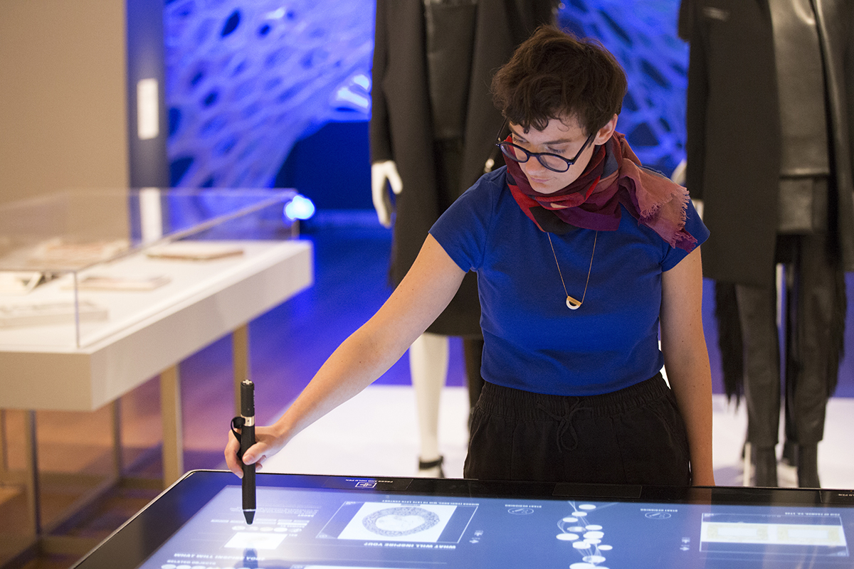
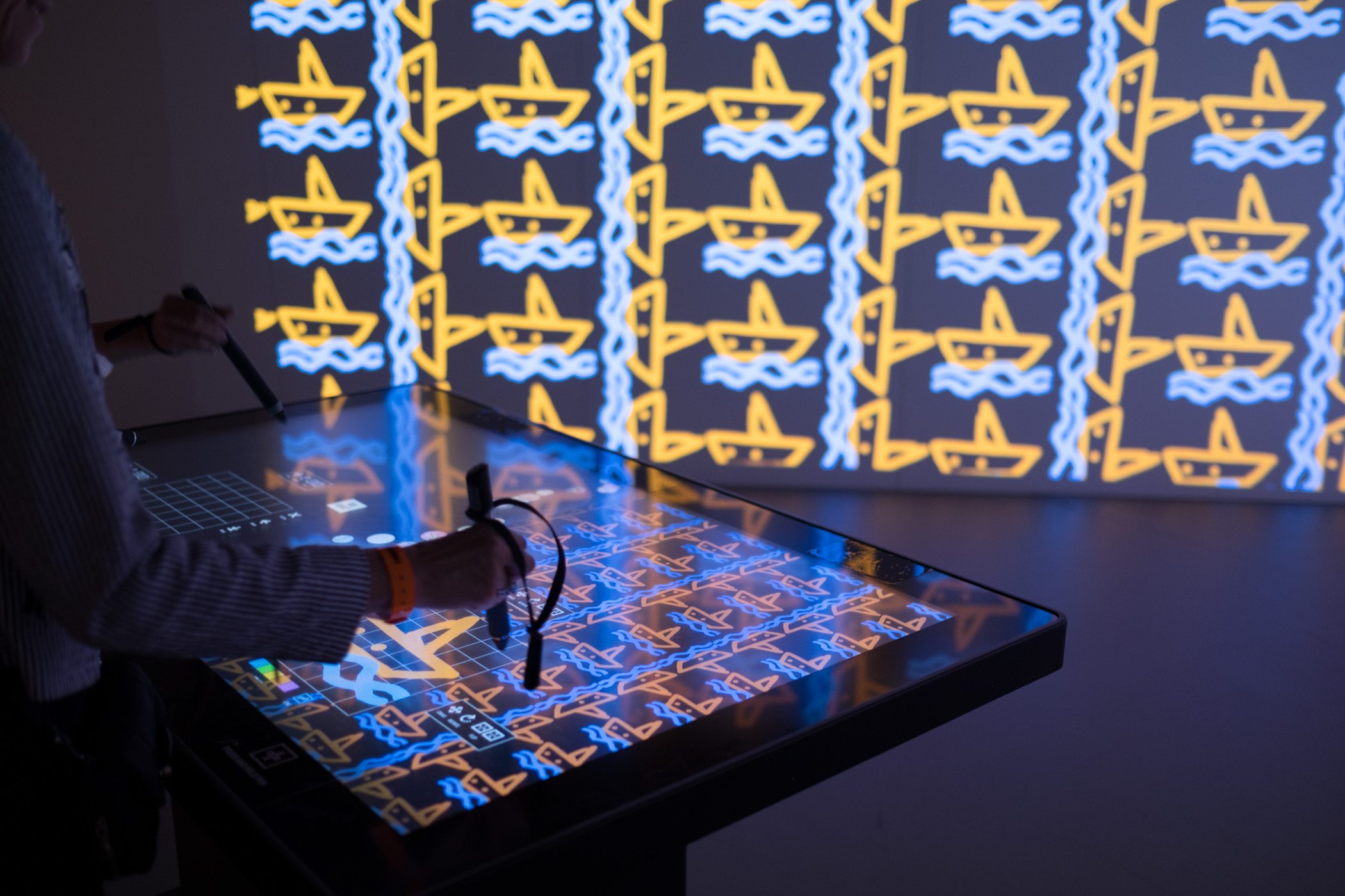
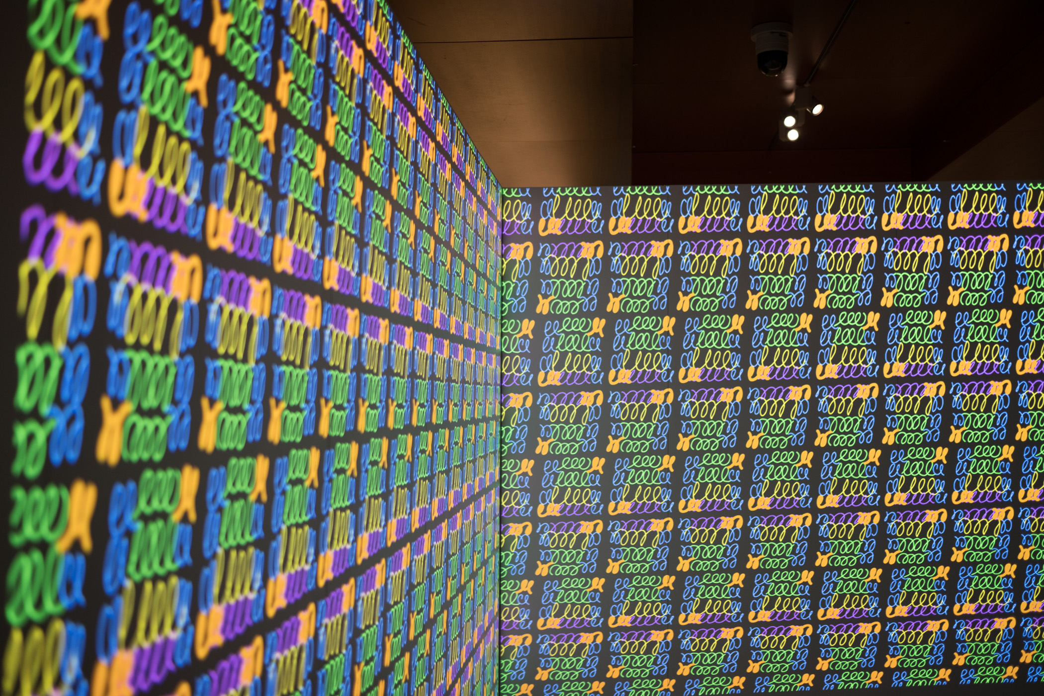
The original Immersion Room, designed by Cooper Hewitt and Local Projects, made its debut when the museum reopened in December 2014, following a major renovation. It is essentially an interactive experience where visitors can manipulate a digital interactive touch-table to browse our collection of wallpapers and view them at scale, in real time, via twin projectors mounted to the ceiling. Additionally, visitors can switch into design mode and create their own wallpapers; adjusting the scale, orientation, and positioning of a repeating pattern on the wall. This latter feature is arguably what makes the experience what it is. Visitors from all walks of life love spending time drawing in the Immersion Room, typically resulting in a selfie or two like the ones you see in the images below.
https://www.instagram.com/p/BKTZ7F0g_eA
https://www.instagram.com/p/BKRMU-QD11m
What I’ve just described is essentially the minimal viable product for this entire effort. One interactive table, two ceiling mounted projectors, a couple of computers, and a couple of walls to project on.
https://www.instagram.com/p/BIlDulOgrBu
The Immersion Room uses two separate computers, each running an application written in OpenFrameworks. There is the “projector app,” which manages what is displayed to the two projectors, and there is the “table app,” which manages what visitors see and interact with on the 55” Ideum table. The two apps communicate with each other over a local network, with the table app essentially instructing the projector app with what it should be displaying in real time.
Here is a basic diagram of how that all fits together.
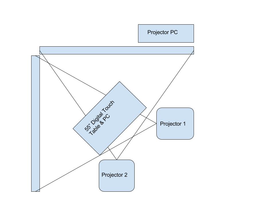
Twin projector and computer setup for Wallpaper Immersion Room
Each application loads in content on startup. This is provided to the application by a giant json file that is managed by our Collections API and meant to be updated each night through a cron job. When the applications start up, they look at the json file and pull down any new or changed assets they might need.
At Cooper Hewitt, this means that our curators are able to update content whenever they want using our collections management system, The Museum System (TMS). Updates they make in TMS get reflected on the digital table following a data-deploy and reboot of the table and projector applications. This is essentially the workflow at Cooper Hewitt. Curators fill in object data in TMS, and through a series of tubes, that data eventually finds its way to the interactive tables and our collections website and API. For this project in London, we’d do essentially the same process, with a few caveats.
Make it do all the things
We started asking ourselves a number of questions. It’s a mix of feature creep and a strong desire to put some of the technology we’ve built through it’s paces–to determine if it’s possible to recontextualize much of what we’ve created at Cooper Hewitt and have it work outside the museum walls.
Questions like:
- What if we want to allow visitors to save the wallpapers and the designs they create?
- What if we wanted to hand out a Cooper Hewitt Pen to each visitor?
- What if we want to let people use the Pen to save their creations, wallpapers, and ALL the other installations around the Somerset House?!
All of a sudden, the project becomes a bit more complicated, but still, a great way to figure out how we would translate a ton of the technology we’ve built at Cooper Hewitt into something useful for the rest of the world. We had loads of other ideas, features, and add-ons, but at some point you have to decide what falls in and out of scope.
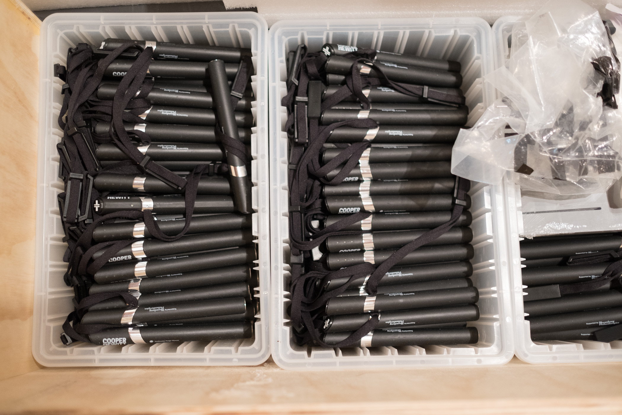
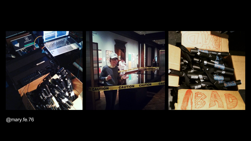
Unpacking 700 Cooper Hewitt Pens we shipped to the U.K., batteries not included!
So this is what we decided to do.
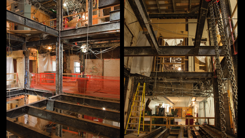
- We would devise a way to construct the physical build out of a second Immersion Room. This would essentially be a “set” with walls and a truss system for suspending two rather heavy projectors. It would have a floor, and would be slightly off the ground so we could conceal wiring and create a place for the 55” touch table to rest.
- We’d pre-fabricate the entire rig in New York and ship it to London to be assembled onsite.
- We’d enable the Immersion Room to allow visitors to save from a selection of 101 wallpapers from our permanent collection. These would be curated for the Utopia theme of the London Design Biennale.
- We’d enable the design feature of the Immersion Room and allow visitors to save their designs.
- We’d hand out Cooper Hewitt Pens to each visitor who wanted one, along with a printed receipt containing a URL and a unique code.
- We’d post coded NFC tags all throughout Somerset House to allow visitors to use their Pens to collect information about each participating country, including our own.
- We’d build a bespoke website where visitors would go following their visit to see all the things they’ve collected or created.
These are all of the things we decided to do from a technology standpoint. Here is how we did it.
pen-www
The first step to making this all work was to extract the relevant code from our production collections website and API. We named this “pen-www” and intended that this codebase serve as a mini framework for developing a collecting system and website. In essence it’s simply a web application (written in PHP) and a REST API (also PHP). It really needed to be “just the code” required to make all the above work. So here is another list, explaining what all those requirements are.
- It needs to somehow generate a simple collections website that is capable of storing relevant info about all the things one could potentially collect. This was very similar to our current codebase at Cooper Hewitt, but we added the idea of “organizations” so that you could have multiple participants contributing info, and not just Cooper Hewitt.
- It needs all the API methods that make the Pen work. There are actually just a handful that do all the hard work. I’ll get to those in a bit.
- It needs to handle image uploads and processing of those images (saved designs from the Immersion Room table).
- It needs to create “visits” which are the pages a visitor lands on when entering their unique code.
- It needs a series of scripts to help us import data and set things up.
- We would also need some new code to allow us to generate paper receipts with unique codes printed on them. At Cooper Hewitt this is all done via our Tessitura ticket printing system, so since we wouldn’t have that at Somerset House, we’d need to devise a new way of dealing with registering and pairing pens, and printing out some kind of receipt.
So, pen-www would become this sort of boilerplate framework for the Pen. The idea being, we’d distill the giant codebase we’ve developed at Cooper Hewitt down to the most essential parts, and then make it specific to what we wanted to do for London. This is an important point. We aren’t attempting to build an actual framework. What we are trying to do is to boil out the necessary code as a starting point, and then use that code as the basis for a new project altogether.
From our point of view, this exercise allows us to understand how everything works, and gets us close enough to the core code so that we can think of repeating this a third or a fourth time—or more.
The API at the center of everything
We built the Cooper Hewitt API with intentions of making it flexible enough to be easily expanded upon or altered. It tries to adhere to the REST API pattern as much as it can, but it’s probably better described as “REST-ish.” What’s nice about this approach has been that we’ve been able to build lots and lots of internal interfaces using this same pattern and code base. This means that when we want to do something as bespoke as building an entire replica of our seemingly complex Pen/Visit system, and deploy it in another country, we have some ground to stand on.
In fact, just about all of the systems we have built use the API in some way. So, in theory, spinning up a new API for the London project should just mean pointing things like the Immersion Room interactive table at a new API endpoint. Since the methods are the same, and the responses use the same pattern, it should all just work!
So let’s unpack the API methods required to make the Pen and Immersion Room come to life. These are all internal/private API methods, so you can’t take them for a spin, and I can’t share the actual code with you that lies beneath, but I think you’ll get the idea.
Pens – there’s a whole class of API methods that deal with the Pen itself. Here are the relevant ones:
- pens.checkoutPen – This marks a Pen as having been checked out for an associated visit
- pens.getCurrentCheckout – This gets the currently checked out Pen for a specific visit
- pens.getCurrentVisit – This does the opposite of the getCurrentCheckout, and returns a visit for a specific Pen.
- pens.returnPen – This marks the Pen as having been returned.
Visits – There is another class of API methods that deal with the idea of “visits.” A visit is meant to represent one individual’s visit to the museum or exhibition, or some other physical location. Each visit has an ID and a corresponding unique code (the thing we print on a visitor’s paper receipt).
- visits.getActivity – Returns all the activity associated with a visit
- visits.getInfo – Returns detailed info about a specific visit
- visits.processPenActivity – This is a major API method that takes any activity recorded by the Pen and processes it before storing the info in the appropriate location in the database. This one gets called frequently and is the method that happens when you tap your Pen on a reader board at one of our digital tables. The reader board downloads all the info on the Pen, and calls this API method to deal with whatever came across.
- visits.registerVisit – This marks a visit as having been registered. It’s what generates your unique code for the visit.
Believe it or not, that is basically it. It’s just a handful of actions that need to be performed to make this whole thing work. With these methods in place, we can:
- Pair pens with newly created visits so we can hand Pens out to visitors.
- Process data collected by the Pen, either from NFC stickers it has read, or via our Interactive Table.
- Do a final read of the Pen and return the Pen to the pool of possible pens.
So, now that we have an API, and all the relevant methods we can start building the website and massaging the API code to do things in the slightly different ways that make this whole thing live up to its bespokiness.
On the website end of things we will follow the KISS principle or “Keep it simple, stupid.” The site will be devoid of fancy image display features, extended relationship mapping and tagging, and all the goodies we’ve spent years developing for the Cooper Hewitt Collections website. It won’t have search, or fancy search, or search by color, or search by anything. It won’t have a shoebox or even a random button (ok, maybe I’ll add that later today). For all intents and purposes, the website will simply be a place to enter your unique code, and see all your stuff.
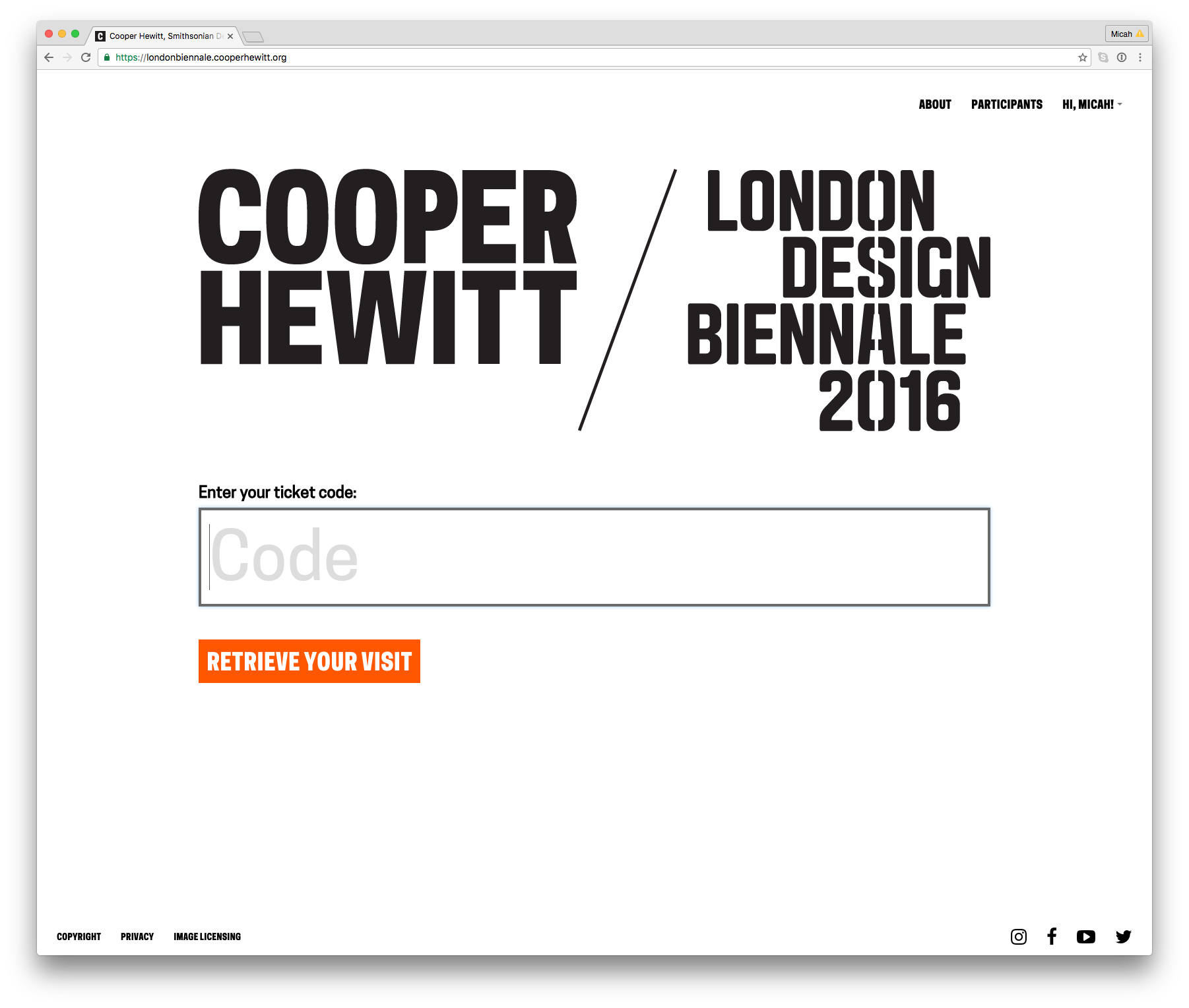
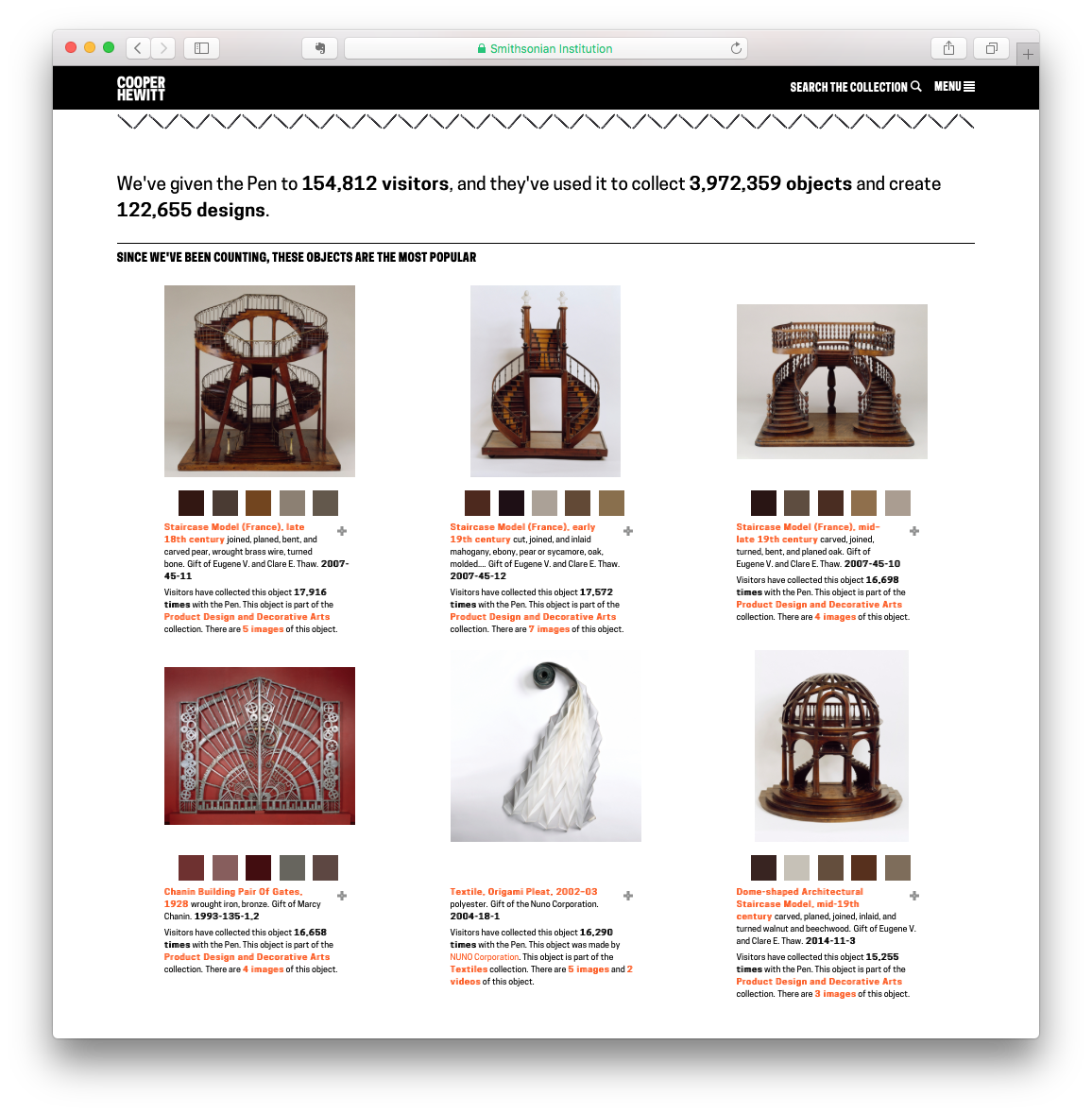
https://londonbiennale.cooperhewitt.org
The website and its API will live at https://londonbiennale.cooperhewitt.org. It consists of just two web front ends running Apache and sitting behind an NGINX load balancer, and one MySQL instance via Amazon’s RDS service. It’s very, very similar to just about all of our other systems and services except that it doesn’t have fancy extras like Logstash logging, or an Elasticsearch index. I did take the time to install server monitoring and alerting, just so we can sleep at night, but really, it’s pretty bare bones.
At first glance there isn’t much there to look at. You can browse the different participants and you can create a Cooper Hewitt account or sign in using our Single Sign On service, but other than that, there is really just one thing to do–enter your code and see all your stuff.
Participants
All your content are belong to us
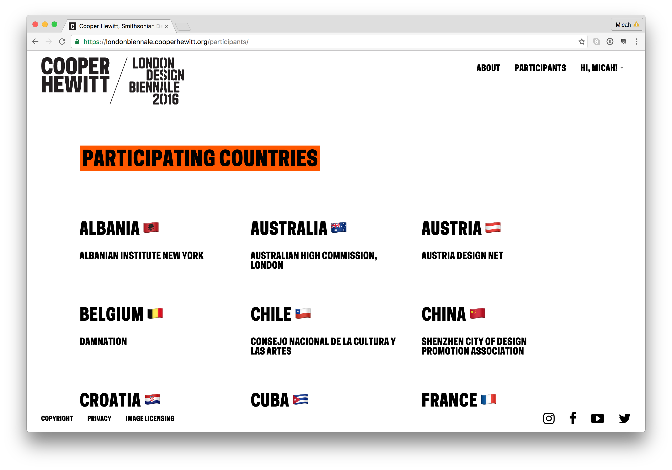
In order for this project to really work, we’d need to have content. Not only our own Cooper Hewitt content, but content from all the participants representing the 36 other countries from around the world.
So here is the breakdown:
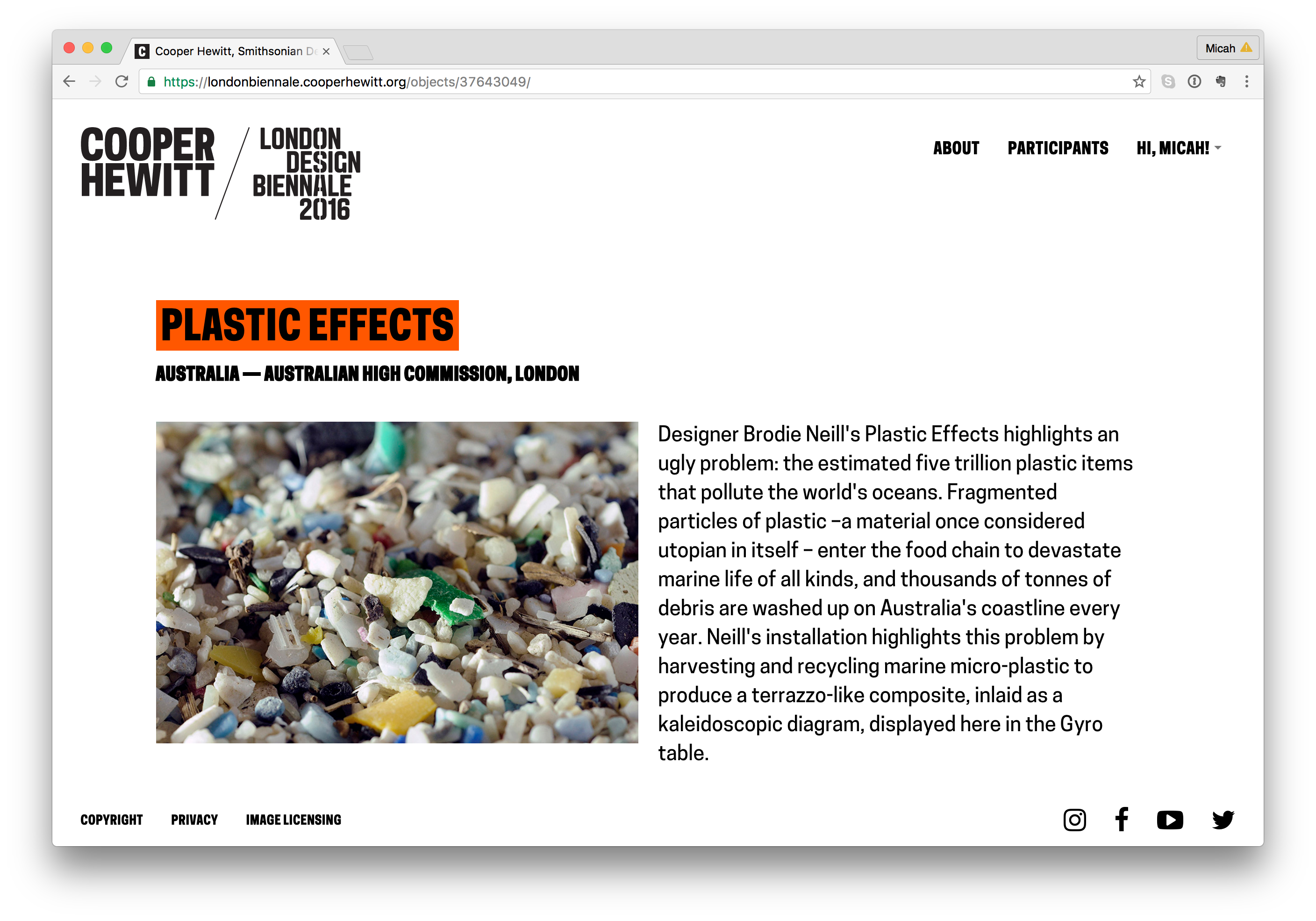
- Each participant or organization will have a page, like this one for Australia https://londonbiennale.cooperhewitt.org/participants/australia/
- Each participant will have one “object.” In the case of all 37 participants, this object will represent their “booth” like this one from Australia – https://londonbiennale.cooperhewitt.org/objects/37643049/
- Each “booth” will contain an image and the catalog text provided by the London Design Biennale team. If there is time, we will consider adding additional information from each participant (we haven’t done this as of yet).
- Cooper Hewitt’s record will have some more stuff. In addition to the object representing Cooper Hewitt’s booth, we will also have 100 wallcoverings from our permanent collection.
- You can collect all of these via the Immersion Room table and your Pen. Here is our page – https://londonbiennale.cooperhewitt.org/participants/usa/ There are also two physical wallapapers that are part of our installation, which you can of course collect as well.
All told, that means 140 objects in this little microsite/sitelet. You can actually browse them all at once if you are so inclined here – https://londonbiennale.cooperhewitt.org/objects/
“Booth” pages
Visit Pages
So what does a visitor get when they go to the webpage and type in their unique code. Well, the answer to that question is “it depends.” For objects that we imported from our permanent collection (the 101 wallpapers) you get a nice photo of the wallpaper, a chatty description of the wallpaper written by our curator, Greg Herringshaw, having to do with “Utopia” — the theme of this year’s London Design Biennale. You also get a link back to the collection page on the Cooper Hewitt website. For the 37 booths, you get a photo and the catalog info for each participants, and if you created and saved your own design in the wallpaper immersion room, you get a copy of the PNG version of your design, which you can, of course, download and do with what you like. (Hint: they make cool wall posters.)
Additionally, you get timestamps related to your visit. This way, just like on the Cooper Hewitt website, you get to retain a record of your visit–the date and time of each collected object and a way to recall your visit anytime in the future.
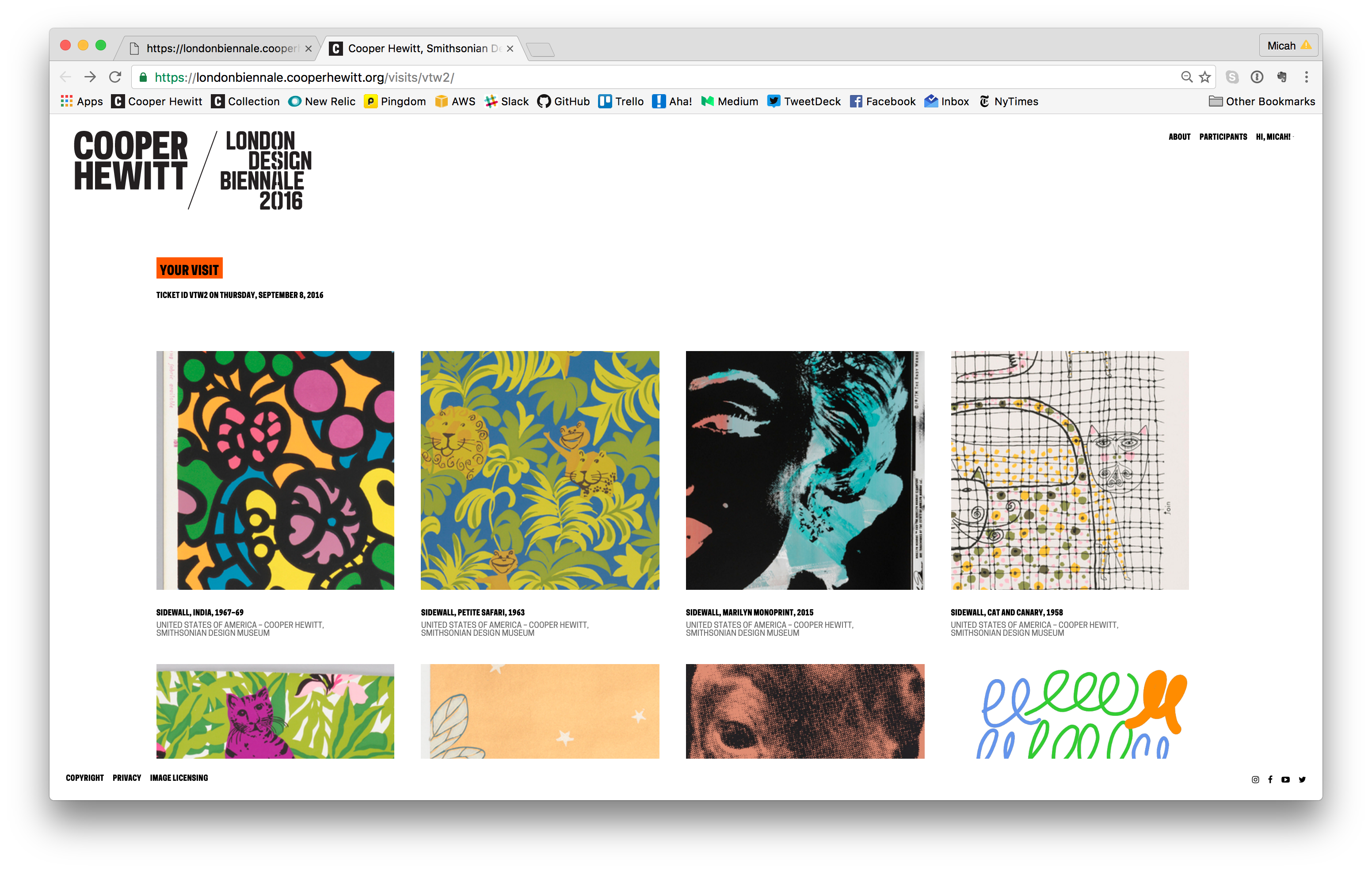
Visit page example
Slow Progress
All of this code replication, extraction, and re-configuring took quite a long time. The team spent long hours, nights, and weekends trying to sort it all out. In theory this should all just work, but like any project, there are unique aspects to the thing you are currently trying to accomplish, which means that, no matter what, you’re gonna be writing some new code.
Ok, so let’s check in with what we’ve got so far.
- A physical manifestation of the Wallpaper Immersion Room and all it’s hardware, computers, wires, etc.
- A website and API to power all the fun stuff.
- A bunch of content from our own permanent collection and the catalog info from the London Design Biennale team.
- Visit pages
We still need the following:
- A way to issue Pens to visitors as they arrive.
- A way to print a unique code on some kind of receipt, which we give to the visitors as well.
- A way to check in Pens as visitors return them.
- The means to get the table pointing at the right API endpoint so it can save things and processPenActivity as well.
To accomplish the first three items on the list, we enlisted the help of Rev Dan Catt.
https://www.instagram.com/p/BJ3WizdAYfc
Dan is planning to write another extensive blog post about his role in all of this, but in a nutshell, he took our Pen registration code and built his own little mini-registration station and ticket printer. It’s pictured below and performs all of the functions above (1 through 3). It uses a small Adafruit thermal printer to print the receipts and unique codes, and it is simple enough to use with a small web based UI to give the operator some basic feedback. Other than that, you tap a pen and it does the rest.
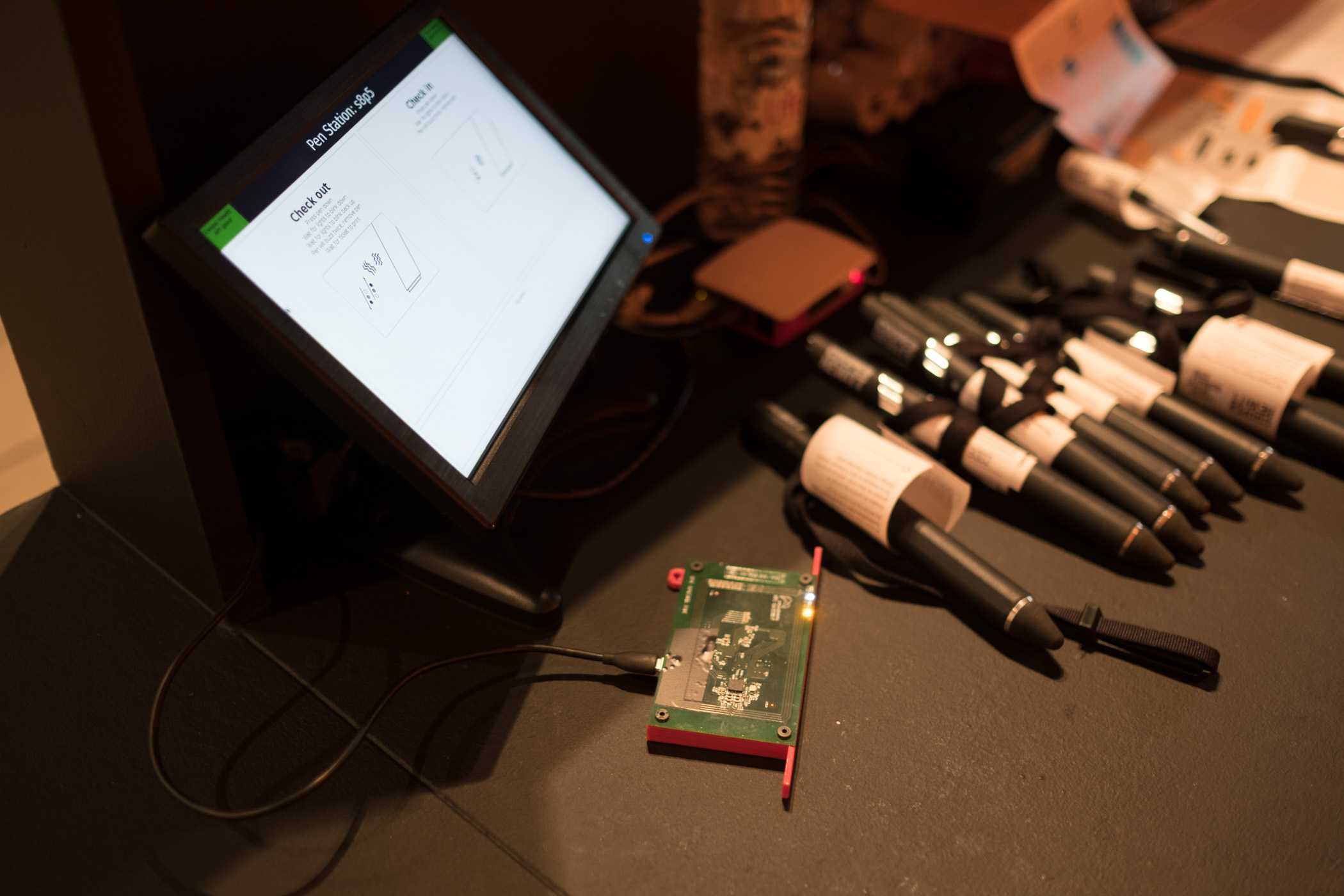
Dan’s Raspberry Pi powered Pen registration and ticket printing station.
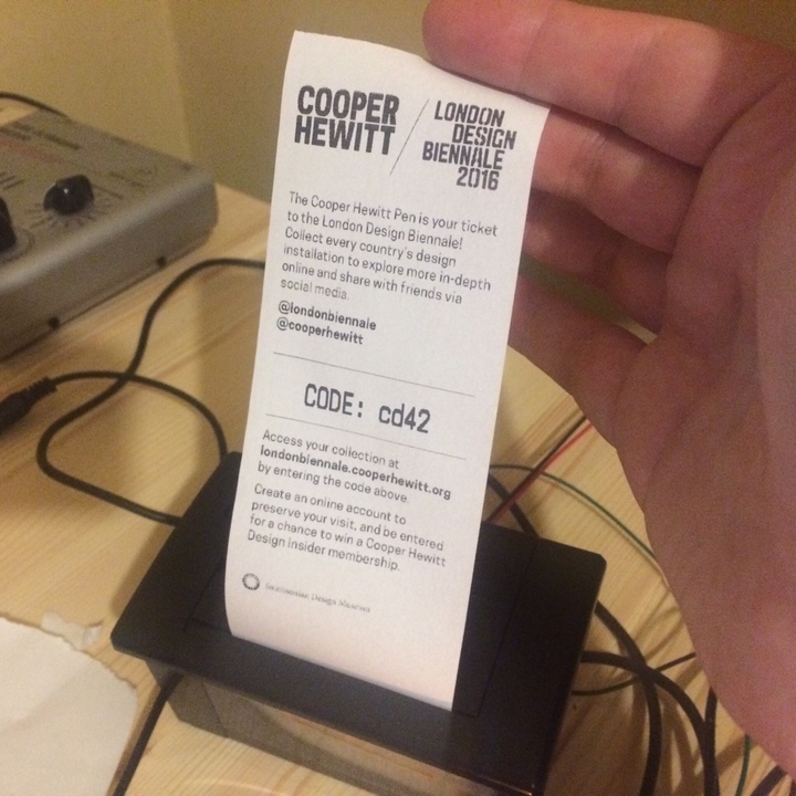
Tickets printing for the first time
For the last item on the list, I had to re-compile the code Local Projects delivered to us. In the code I had to find the references to the Cooper Hewitt API endpoints and adjust them to point at the London API endpoint. Once I did this, and recompiled the OpenFrameworks project we were in business. For a while, I had it all set up for development and testing on my laptop using Parallels and Visual Studio. Eventually I compiled a final version and we installed it on the actual Immersion Room Table.
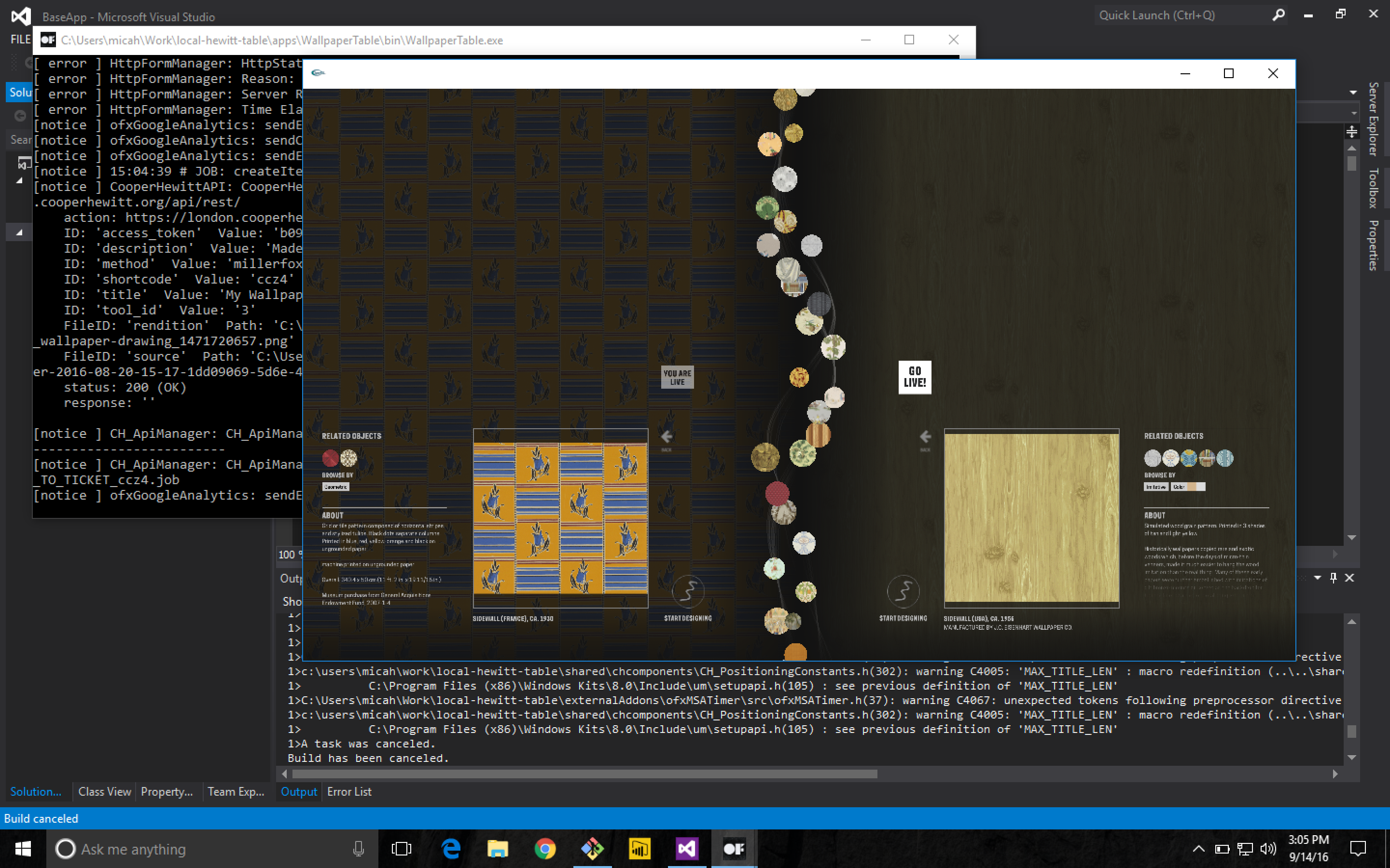
Working on the OpenFrameworks code on Parallels on my MacBook Pro
Cracking open the Local Projects code was a little scary. I’m not really an OpenFrameworks programmer, or at least I haven’t been since grad school, and the Local Projects code base is pretty vast. We’ve had this code compiled and running on all the interactive tables at Cooper Hewitt since December of 2014. This is the first time I (or anyone I know of) has attempted to recompile it from source, not to mention make changes to it beforehand.
That said, it all worked just fine. I had to find an old copy of Visual Studio 2012, but other than that, and tracking down a few dependencies, it wasn’t a very big deal. Now we had a copy of the Immersion Room table application set up to talk to the London API endpoint. As I mentioned before, all the API methods are named the same, and set up the same way, so the data began to flow back and forth pretty quickly.
Content Management
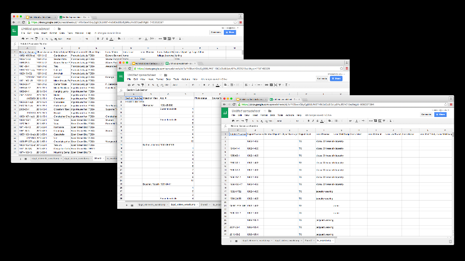
I mentioned above that we had to import 100 wallpapers from our collection as well as the data for all 37 booths. To accomplish all of this, we wrote a bunch of Python and PHP scripts.
We needed to do the following with regard to content:
- Create a record for each of the 37 participants
- Import the catalog info as an object for each of the 37 participants
- Import the 100 wallcoverings from the Cooper Hewitt collection. We just used, you guessed it, our own API to do this.
- Massage the JSON files that live on the Projector and Table applications so they have the correct 100 wallpapers and all their metadata.
- Display the emoji flag for each country, because emoji.
In the end, this was just a matter of building the necessary scripts and running them a number of times until we had what we wanted. As a sort of side note, we decided to use London Integers for this project instead of Brooklyn Integers, which we normally use at Cooper Hewitt, but that’s probably a topic for a future post.
Shipping code, literally
At some point we would need to put all the hardware and construction pieces into crates and ship them across the pond. At the time, our thinking was to get the code running on the digital table and projector computers as close to production ready as we could. We installed all the final builds of the code on the two computers, packed them up with the 55” interactive table, and shipped them over to London, along with six other crates full of the “set” and all its hardware and parts. It was, in a nutshell, impressive.
As the freight went to London, we continued working on the website code back home—making the site look the way we wanted it to look and behave the way we wanted it to behave. As I mentioned before, it’s pretty feature free, but it still required some spit and polish in the form of some of Rachel’s Sassy-CSS. Eventually we all settled on the aesthetics of the site, added a lockup that reflected both the Cooper Hewitt and London Design Biennale brands (both happen to be by Pentagram) and called it a day. We continued testing the table application and Dan continued working on the Pen registration app and receipt printer so it would be ready when we landed.
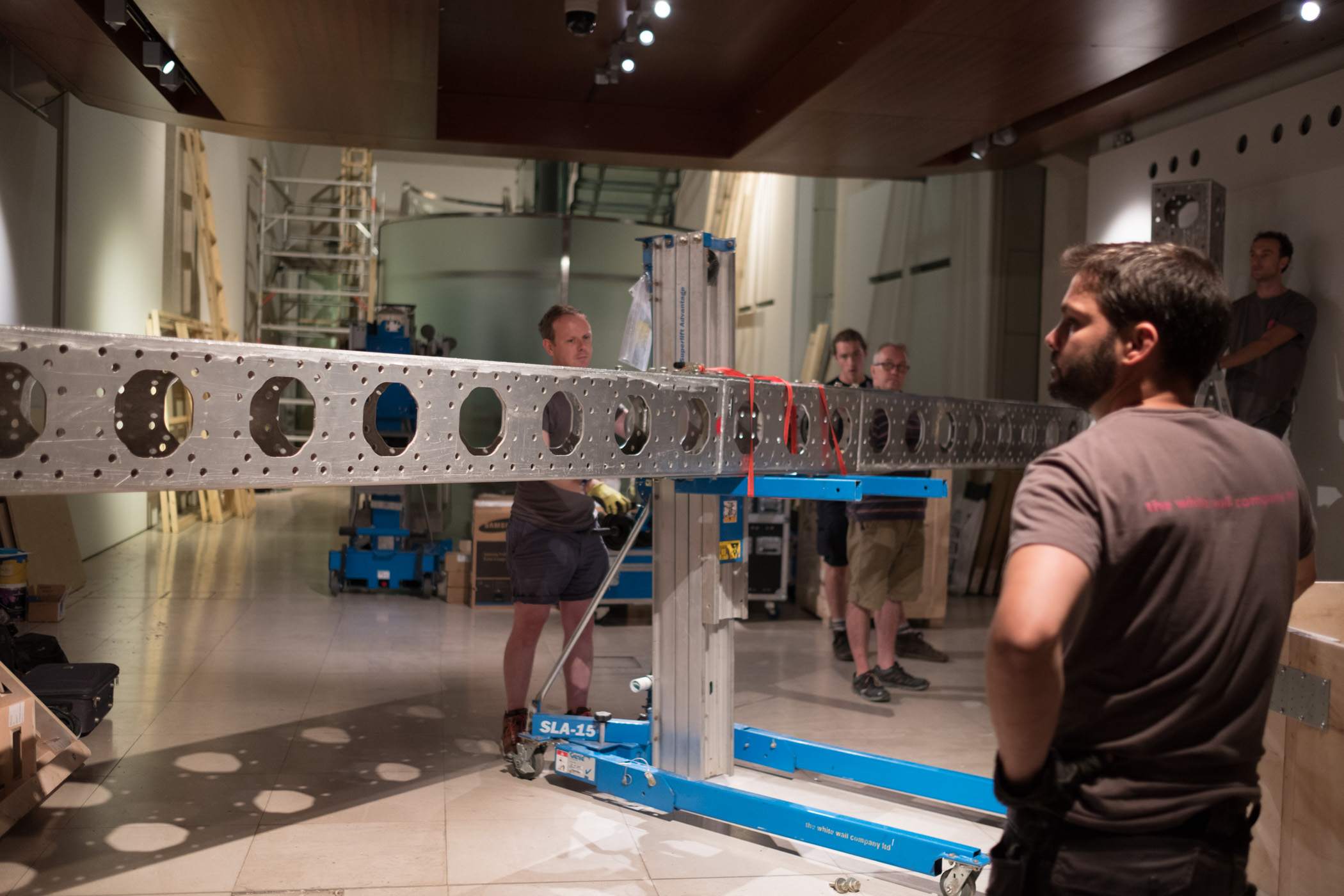
Building the set with the team at Somerset House.
We landed, started to build the set, and many, many things started to go wrong. I think all of the things that went wrong are probably the topic of yet another blog post, but let’s just say for now: if you ever decide to travel a whole bunch of A/V equipment and computers to another country, get everything working with the local power standard and don’t try to transform anything.
https://www.instagram.com/p/BJ2dROFAjLQ
Eventually, through a lot of long days and sleepless nights, and with the help of many, many kind-hearted people, we managed to get all the systems up and running, and everything began to work.
We flipped the switch and the whole thing came to life and visitors started to walk up to our booth, curious and excited to see what it would do. We started handing out Pens and I started watching the data flow through.
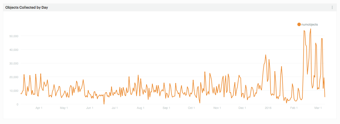
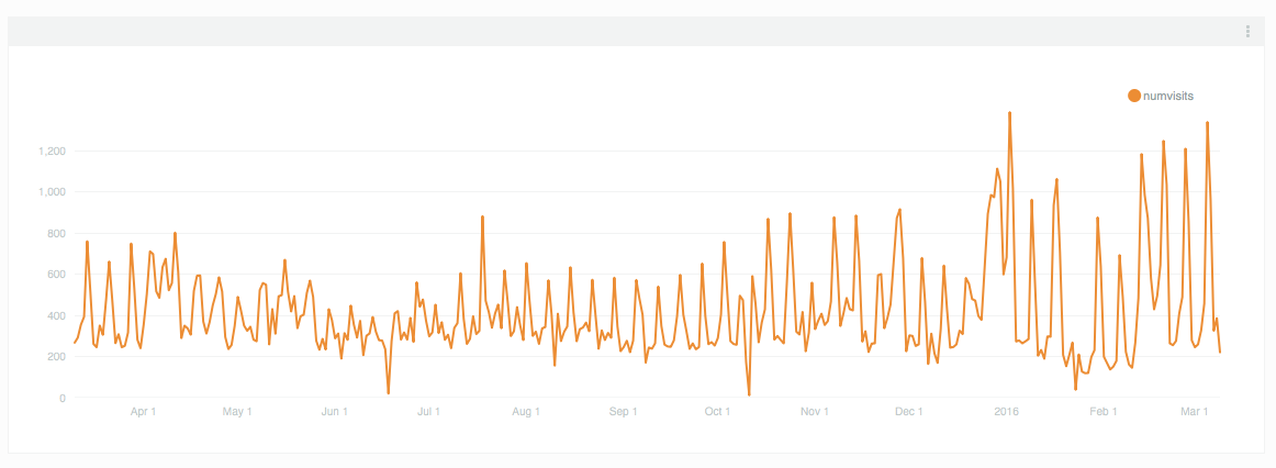
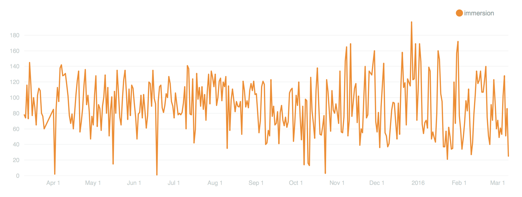
By the close of the show, visitors had used the Pen to collect over 27,000 objects. Eventually, I’ll do a deeper data analysis, but for now, the feeling is really great. We created a portable version of the Pen and all of its underlying systems. We traveled a giant kit of A/V tech and parts overseas, and now people in a country other than the United States can experience what Cooper Hewitt is all about: a dynamic, interactive deep dive into design.
Design your own Utopia at the London Design Biennale
-m

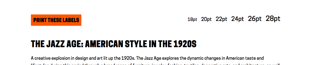
 As of today, when a user visits any exhibition page on our collection site or main website, they’ll see a new option in the sidebar, inviting them to view and print the exhibition labels. The large-print page for each exhibition includes A-panel text alongside all available object images and label chats. If an exhibition is organized into thematic sections, this is reflected in the ordering of the large-print labels, and B-panel text is included alongside the section headers.
 To get around this issue, I decided to assemble the large-print label data for certain “oversized” exhibitions in advance and store it in a series of JSON files on the server. A developer can manually run a PHP script to build the JSON files and write them to a