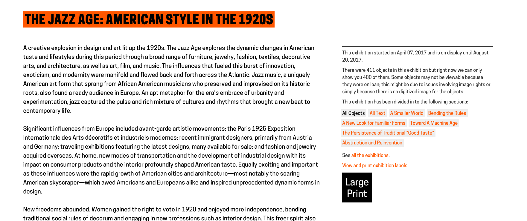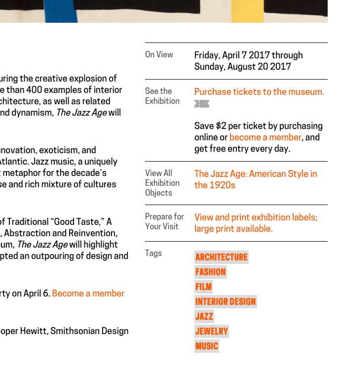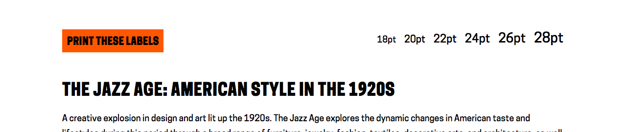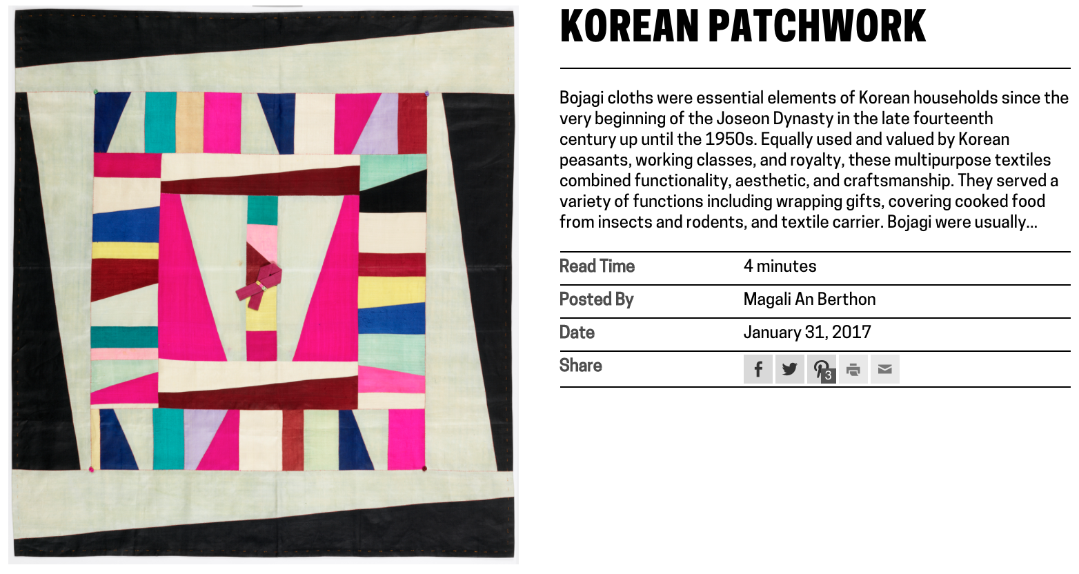
Guest post by Olivia Vane
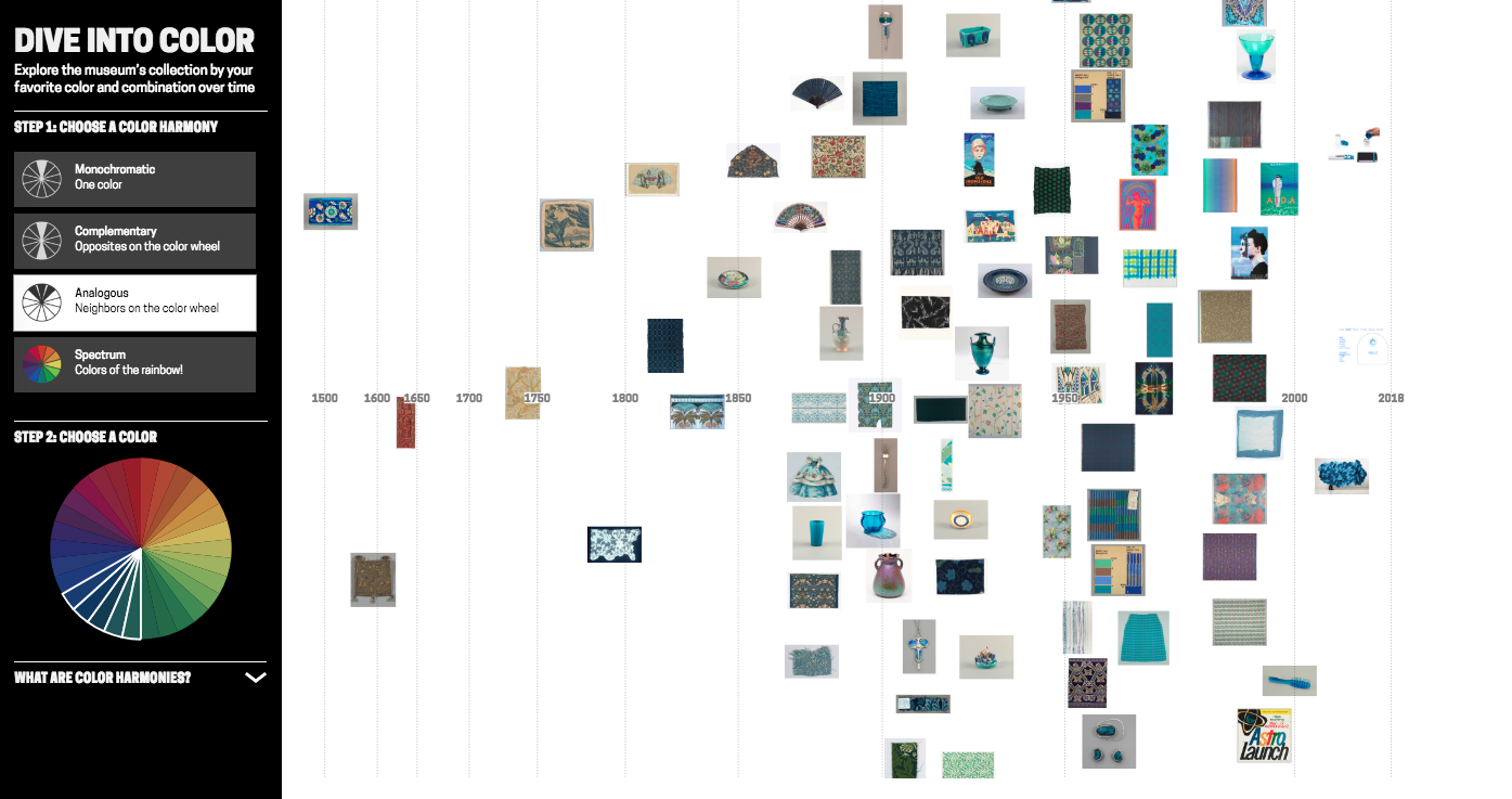
‘Dive into Color’ is an interactive timeline for exploring the Cooper Hewitt collection by colour/colour harmony and time. It is exhibited in ‘Saturated: The Allure and Science of Color’ 11 May 2018 – 13 Jan 2019.
Since spending time at Cooper Hewitt last year on a fellowship, I returned to London where I’m a PhD student at Royal College of Art (RCA) in Innovation Design Engineering supervised by Professor Stephen Boyd Davis. At Cooper Hewitt, I developed a prototype timeline tool for visualising the museum collection by tags.
This post describes further work on that prototype, shifting the tool to exploring the collection by colour. As a curator explained: “[visualising by] colour, I think, is useful for the purposes of the study of the taste for different colours, but it’s also a more interesting exercise for the public just to be able to do and get pleasure out of.” Colour is enjoyable – it’s eye-catching and vibrant – and it offers a visual, intuitive way to explore a digitised collection without needing specialist knowledge. With a design collection like Cooper Hewitt’s, tracing colour through history is also interesting for looking at fashions and innovation in colour technology.
I’ve been asked a few times recently what my process is for designing visualisations. So in this post I’m going to step though the early prototypes and retrace my design decisions. Along the way, I will talk over practical points for working with colour (and colour harmonies!) in collection data, and working between digital and artist colour systems.
Previous colour-collections visualisations
Colour has previously been used both as a facet for search and for visualising collections. Geoff Hinchcliffe’s ‘Tate Explorer’ offers colour as a search facet paired with a timeline. This prototype from the Swedish National Heritage Board (write-up forthcoming) combines colours and tags for exploring a fashion collection. Richard Barrett-Small’s ‘ColourLens’ searches over Rijksmuseum and Walters Art Museum data by colour with a graphic for each item visualising its colour proportions. And Google Arts & Culture’s ‘Art Palette’ is a search engine that finds artworks based on a chosen colour palette.
Collections visualised by colour include the Library of Congress, where Laura Wrubel created this tool for overviewing the colour palettes of objects over a collection and Jer Thorp visualised the colour names present in the titles of works. Also using Cooper Hewitt data, Rubén Abad created this visualisation of the colours present by decade in Cooper Hewitt’s objects. Lev Manovich has visualised artworks, for example Mondrian and Rothko paintings, by colour characteristics including hue and saturation. Everardo Reyes visualised Paul Klee’s paintings by hue. And Brian Foo’s visualisation of the New York Public Library digitised collection has an option to organise items by colour.
I was interested to explore colour alongside the time dimension. And since Cooper Hewitt was preparing for an exhibition, ‘Saturated’, focusing on colour theory and design, I was intrigued to see if I could trace colour harmonies across the collection.
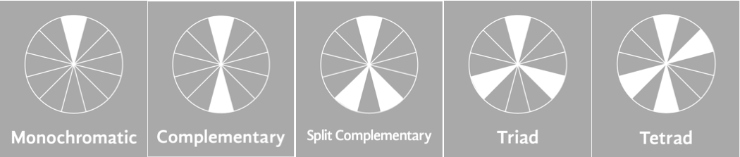
Colour harmonies are combinations of colours that are pleasing to the eye. The relative positions of colours in a colour wheel can be used to describe different harmonies like complementary colours (opposites on the colour wheel), or analogous colours (neighbours on the colour wheel). Artists and designers create different visual effects and contrasts with different harmony types.

Colour harmony examples, image from studiobinder
Extracting colours across the Cooper Hewitt collection
It’s already possible to search by colour on Cooper Hewitt’s collection site. Colour data was extracted using Giv Parvaneh’s great tool RoyGBiv (described in this Cooper Hewitt Labs post). Roughly, RoyGBiv works by checking the colour value of each pixel in an image, clustering colour values that are similar enough to be considered the same and returning up to 5 dominant colours in an image.
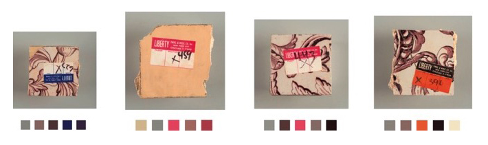
The colours extracted from Cooper Hewitt’s collection with RoyGBiv are good on the whole, but errors sometimes occur. The background colour is sometimes picked up. The effect of light and shadow on a 3D object can introduce multiple, illusory colours:
As always there are quirks working with digitised collections, like these Dutch tiles which had coloured stickers on them when they were photographed:
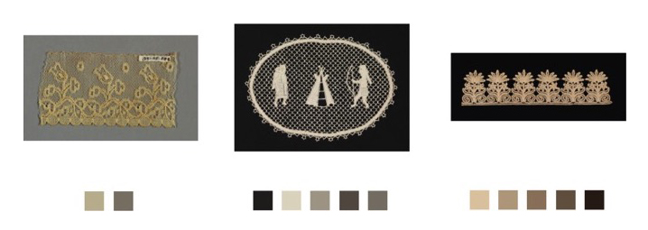
Or lace photographed against a dark background for contrast:
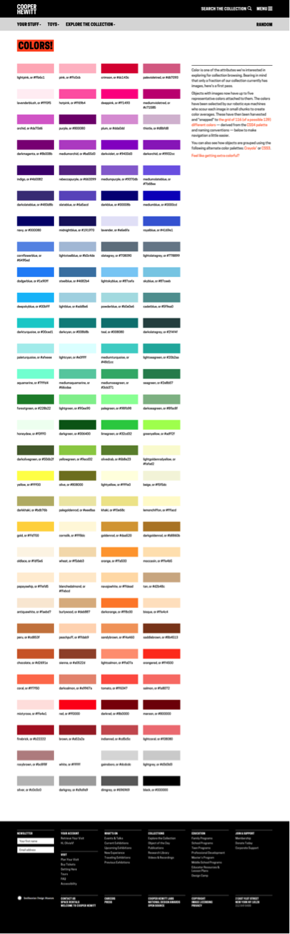
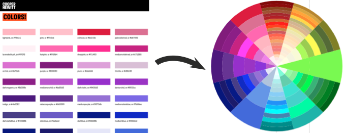
Since the possible number of unique colours extracted across the collection is huge, searching by colour on the Cooper Hewitt website is simplified by snapping extracted colours to the closest value in a standardised palette (the default is the CSS4 web colour palette, but the CSS3 and Crayola palettes are also options). On the Cooper Hewitt website, you can search the collection by 116 CSS4 colours. Both the original and ‘snapped to’ colour palettes are available in the Cooper Hewitt data – all stored as hex codes (six hexadecimal digits representing the levels of red, green and blue).
Prototyping
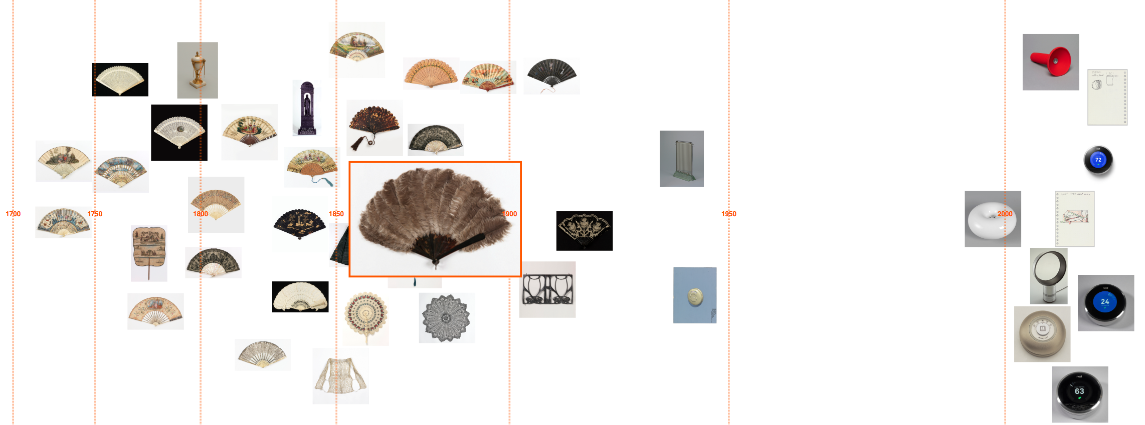
As a first step, I adapted my code to visualise collection items matching a CSS4 colour on a timeline (see visualisations below).
Although Cooper Hewitt has an API (an Application Programming Interface: a way for someone to make use of Cooper Hewitt’s data through a set of pre-defined requests made over the web), there is no method for returning all the objects matching a colour. Instead, I used collection data Cooper Hewitt had put on GitHub – an argument for institutions to offer both!
‘Orangered’
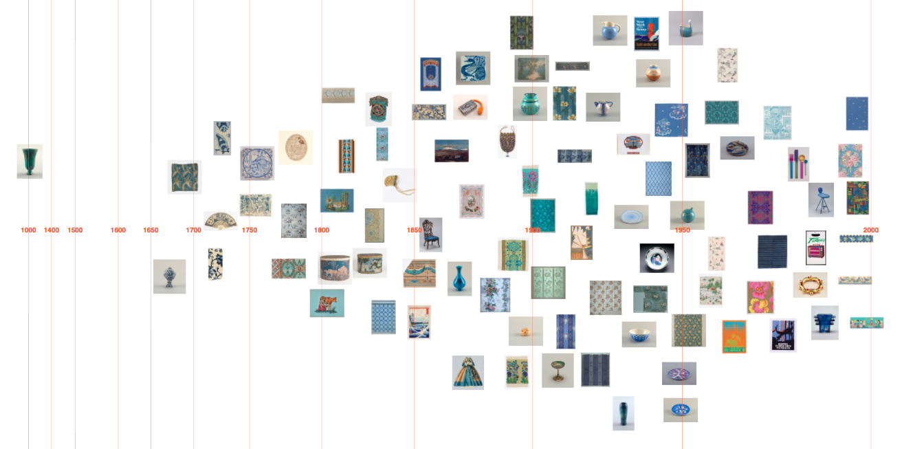
‘Steelblue’

‘Olivedrab’
I then started exploring how I might visualise objects featuring a colour harmony, first trying complementary colours (opposites on the colour wheel).
I initially tried to do this by matching a chosen CSS4 colour with the nearest CSS4 colour of opposite hue. The HSL and HSV (hue, saturation, lightness/value) colour systems define hue as an angle round a circle (0-360°), so I inverted hues by converting hex codes to HSL. The visualised results were unsatisfying though, as often the search failed to find any matches. This doesn’t mean to say there was a lack of objects with complementary colours, but that my search was too precise (and artificially precise since which CSS4 palette colours you can consider to be complementary is fuzzy, and the colour data is imprecise anyway e.g. the illusory colours extracted for 3D objects).
I tried extending the reach of my search to matching several colours close to the inverted hue, but it felt very frustrating not to have a visual reference to the range of colours in a region and what colours were being searched over.
So I started experimenting with using a colour wheel input as a way to pick colour combinations and simultaneously see possible hue relations. I first tried mapping the colours from the standardised palettes by HSL round a circle.
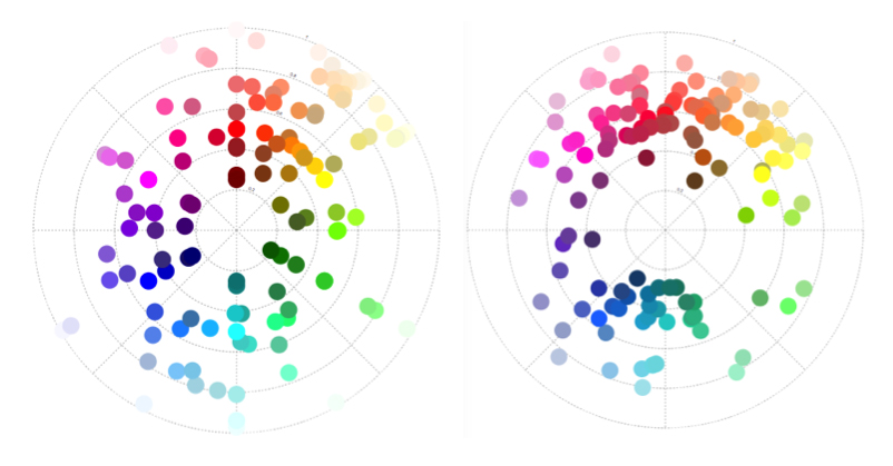
‘Snapped to’ colours in the Cooper Hewitt collection. CSS4 (left) and Crayola (right) palettes mapped by hue (in HSL). Angle = hue, radius = lightness.
And to make it easier to see the possible colours, I wrote some code to map the CSS4 palette colours to a wheel.
CSS4 palette colours → mapped round a wheel. Hue (HSL) = angle, ordered by lightness
I realised at this point, though, that the resulting design doesn’t match a typical artist’s/pigment colour wheel (which has red, yellow, blue – RYB – primary colours). HSL is a simple transformation of RGB colour space, and therefore the wheel has red, green, blue primaries. If this colour wheel is used to search over design artefacts, surely it would be more appropriate to use a design closer to the norm for artists and designers? (These in-depth articles by David Briggs – part 1, part 2 – explain the differences between traditional and modern colour theory, and colour training for artists).
There is no ‘correct’ colour wheel to adopt, but converting my HSL colour wheel to something closer to an artist’s version (using code from Ben Knight’s implementation of Adobe’s ‘Kuler’ colour wheel) felt like a reasonable compromise here.
 (Left) Colours mapped by hue (HSL). Angle = hue, radius = lightness. (Right) Colour mapping adjusted to more closely resemble an artist’s colour wheel.
Using this colour wheel as a guide and an input, I could see and choose which colours to query. By searching over multiple colours, the visualised results were better. (In the images below, white and black borders around tiles in the colour wheel indicate the searched-over colour combinations):
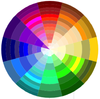
Purple against olive timeline
Orangered against cyan/blue timeline
Querying against colour data in HSV
While the results looked better with this prototype, the user interface is a mess and complicated to use. And the search query was not excluding objects that featured other colours in addition to the searched colour combination.
Sticking with the CSS4 palette was greatly complicating the task, so I abandoned using it. I converted all the original extracted colours (not ‘snapped’) from hex codes to HSV and created my own Elasticsearch index with the HSV colours stored as a nested datatype. This way I can: search over a hue range, with a threshold on saturation and value; exclude objects also featuring other hues; and it is simple to define more complex colour harmony searches (e.g. analogous, triadic, quadratic and split complementary).
Different colour harmonies tried in prototyping
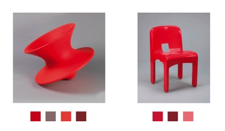
Colour wheel graphic for objects
As a by-product, I realised I could repurpose my code to map individual object palettes round a colour wheel too. Thus, you get a compact graphic describing the colour relationships present in a single design. This is a nice example of the serendipity of designing, where you identify new possibilities as a result of seeing what you have already made.


(Above) Object with colour palette, (below) palette mapped to a wheel: easy to see complementary harmony
Colour wheel graphic examples
I adapted a simple artist’s (RYB) colour wheel to use as an input and tested the prototype with visitors at Royal College of Art’s January 2018 ‘Work in Progress’ show.
Testing the prototype with visitors at Royal College of Art’s Jan 2018 ‘Work in Progress’ show
In order to avoid reducing the size of the images (so it’s still possible to see what the objects are), I’ve capped the number of visualised objects to the 100 most saturated in colour.
There were few hits for the more complex harmonies (quadratic, tetradic, split complementary) and the results felt less convincing. I had widened the hue range to search over in order to increase the small number of hits, so the results were less visually cohesive anyway. And, in conversations with the museum curators, we decided to drop these more complex harmonies from the interface.
As mentioned earlier, there are some errors in the colour data. At this stage, since this setup only allows a fixed set of possible searches, with repeatable results, it was worth it for me to do some manual editing of the colour data to remove obvious errors.
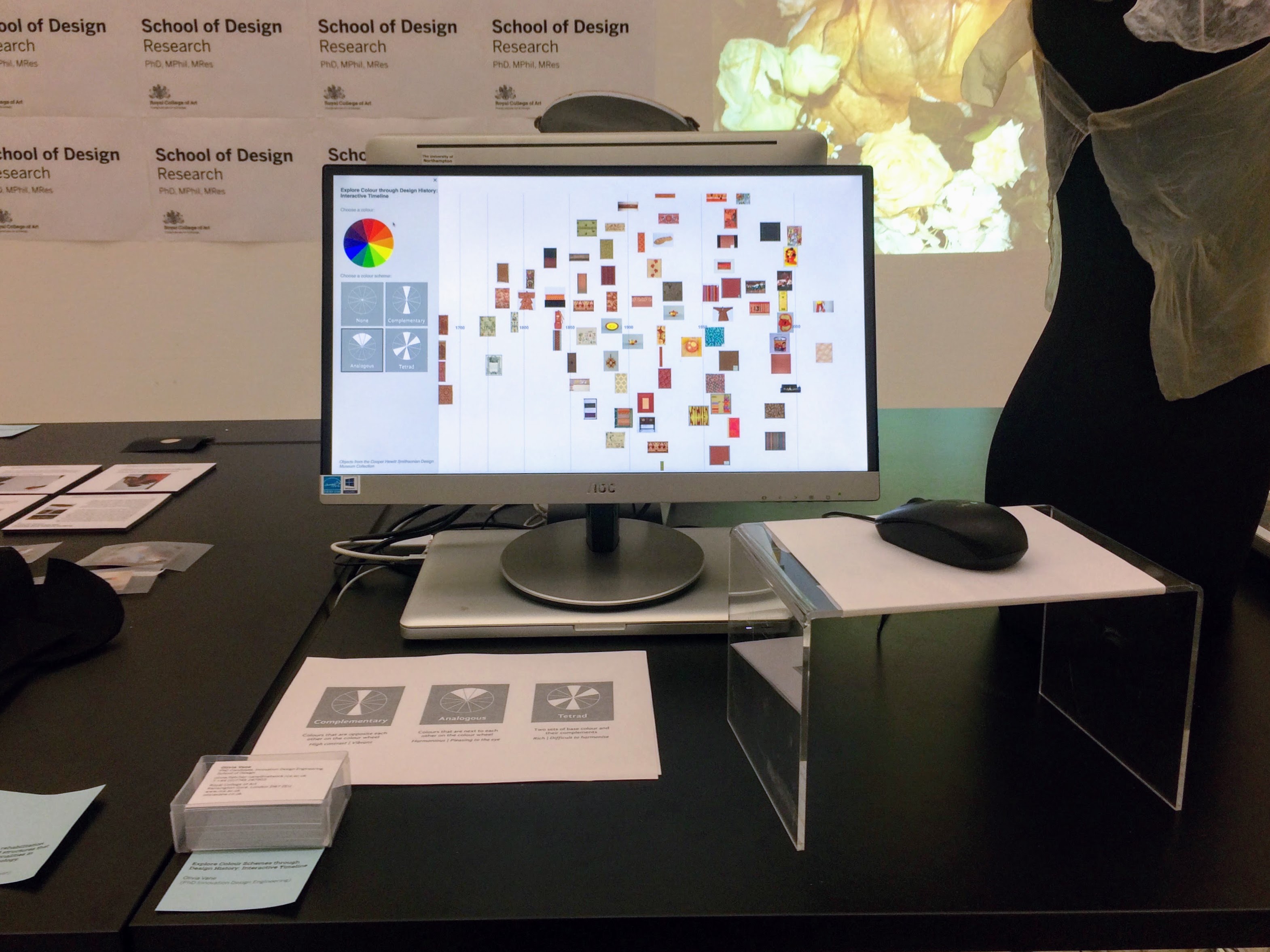
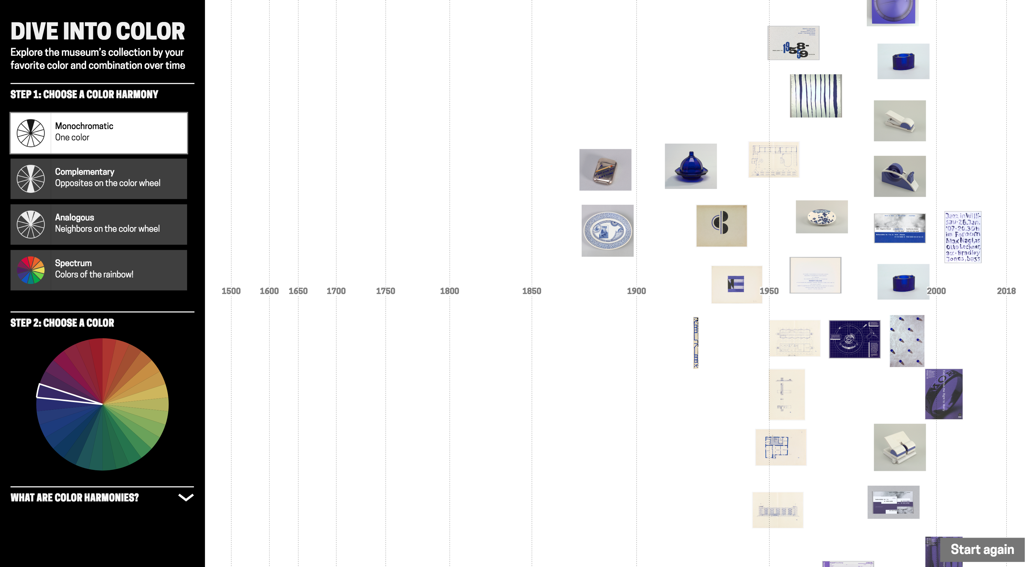
Final interface design
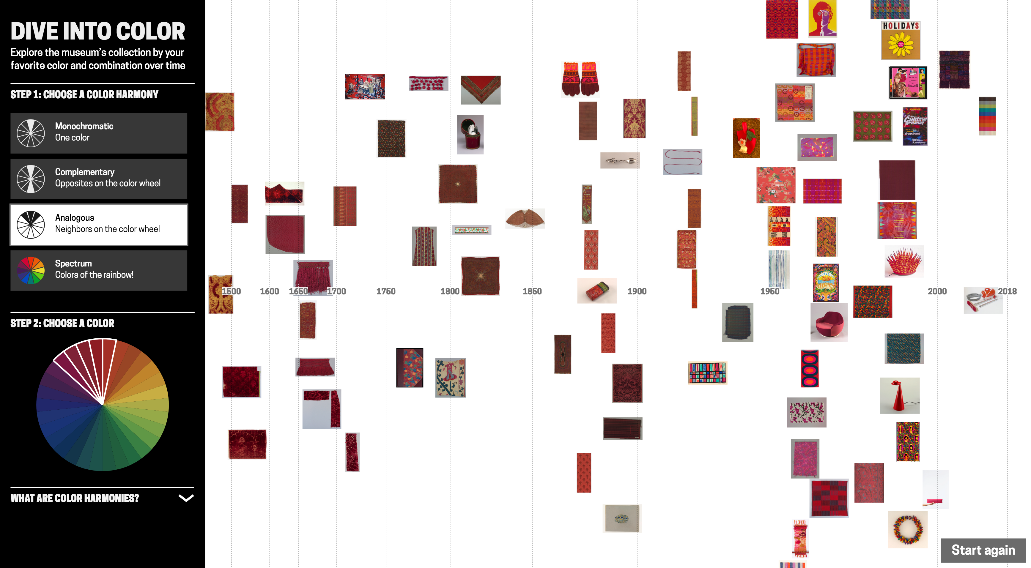
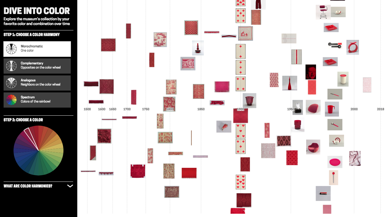
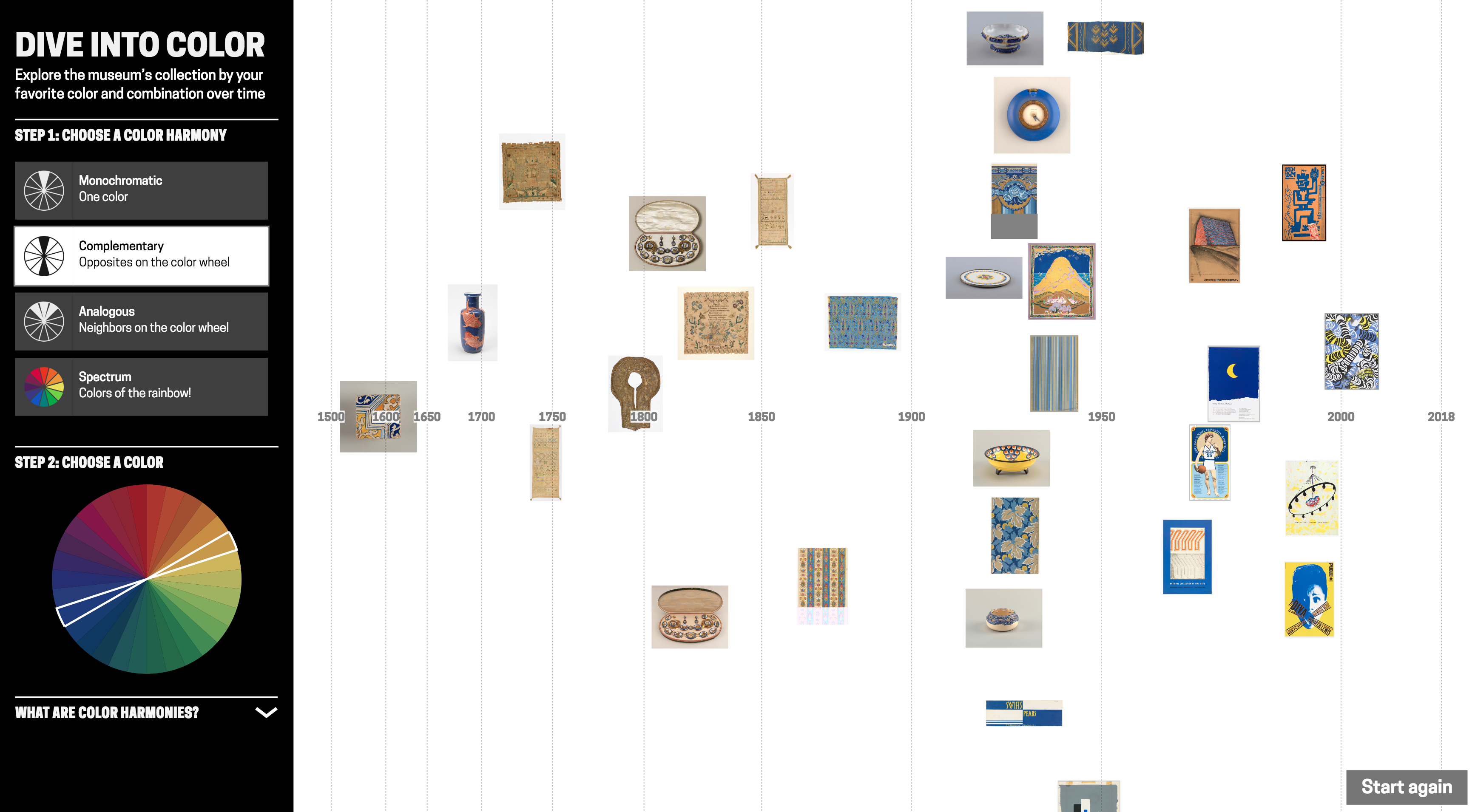
For the final (more polished!) interface design, which is now on display, I set on adopting a colour wheel input inspired by this Hilaire Hiler design in Cooper Hewitt’s collection. (This wheel actually has 4 ‘psychological’ colour primaries and features 30 hues). The interface has 4 harmony options: monochromatic, complementary, analogous and spectrum (a rainbow colour option).
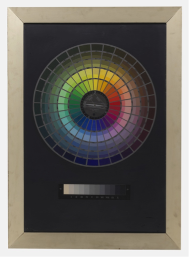
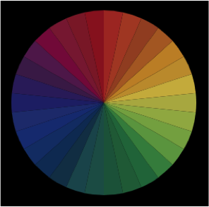
Color wheel picker, inspired by Hiler’s design, used in ‘Dive into Color’
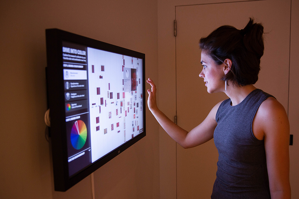
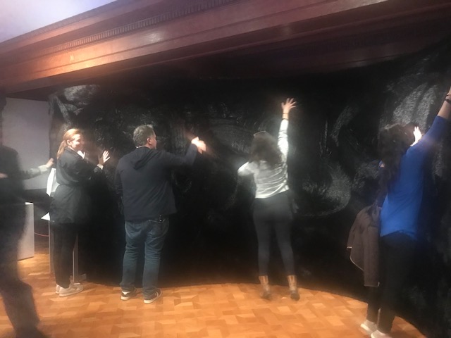
‘Dive into Color’ installed at Cooper Hewitt. Photo credit: Caroline Koh Smith
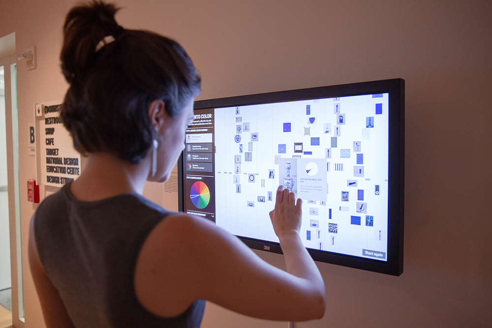
‘Dive into Color’ installed at Cooper Hewitt. Photo credit: Caroline Koh Smith
What does the tool reveal?
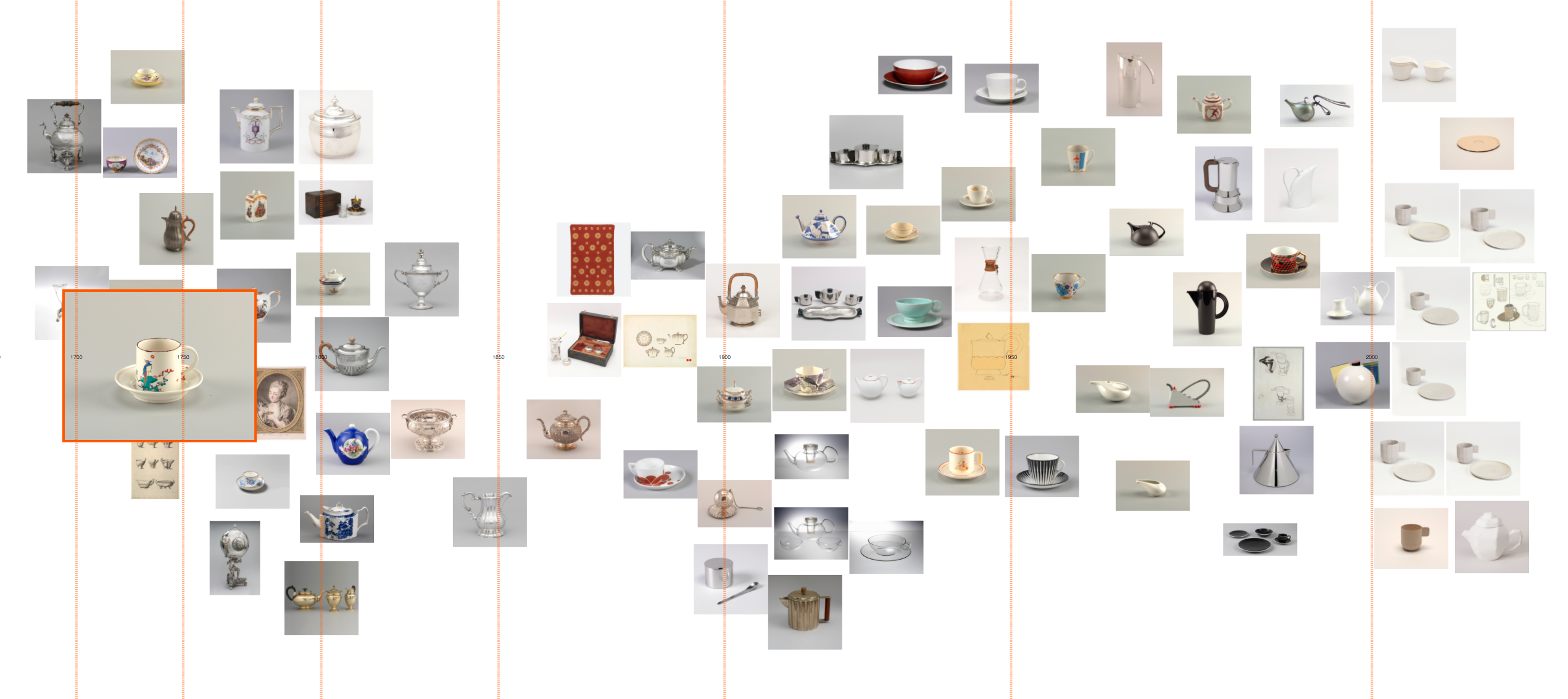
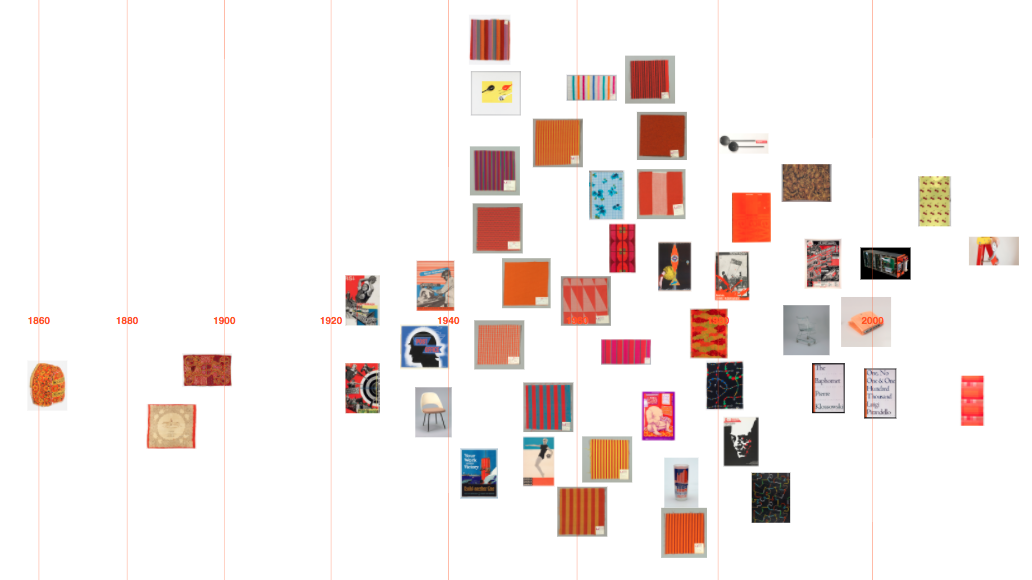
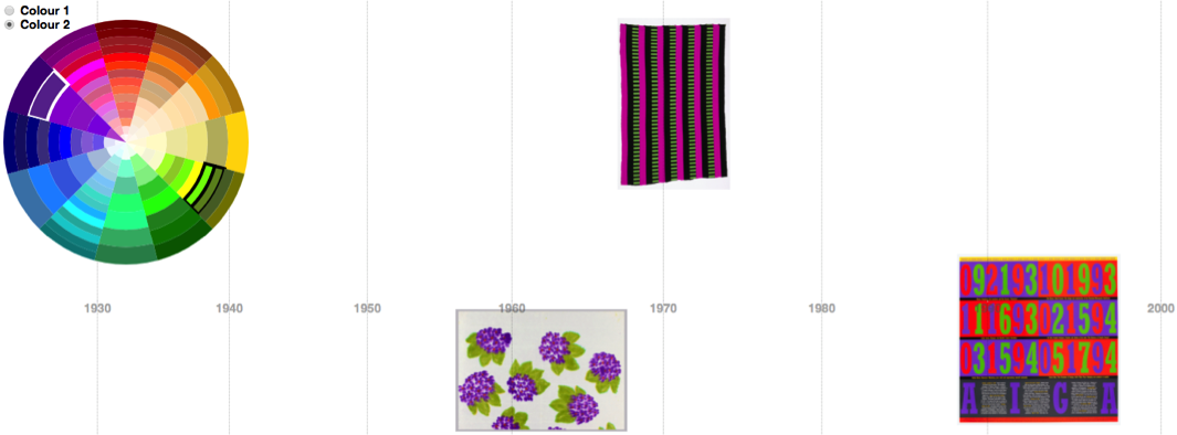
Visualising the Cooper Hewitt data this way gives some sense of when colours appear in time. There are no results for purple pre-19th century. Perhaps because of the difficulty and expense of producing purple before synthetic dyes/pigments were developed in the 19th century?
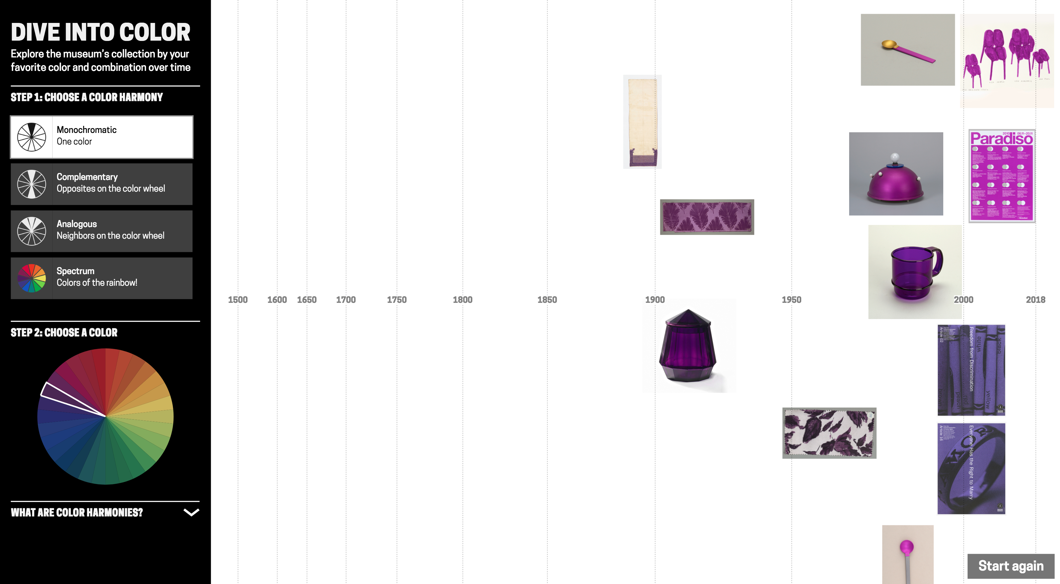
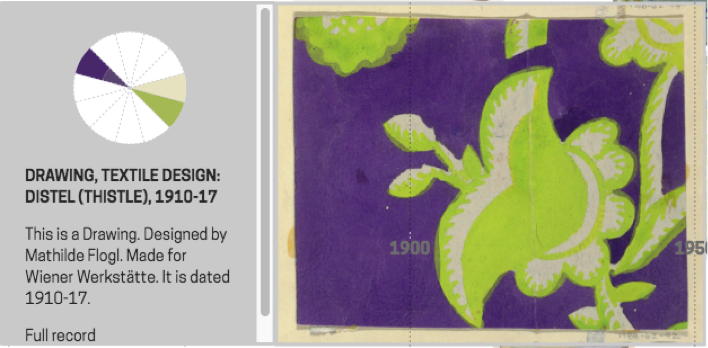
Though, as often is the case interpreting collection visualisations, it is difficult to disentangle historical trends from the biases and character of what has been collected and how it has been catalogued. (And bear in mind I’m only visualising the 100 objects most saturated in colour for a search). For example, these green and purple Japanese prints of irises are clearly part of a set rather than indicating some colour trend around 1910. Using the images themselves as data points is helpful for diagnosing this.

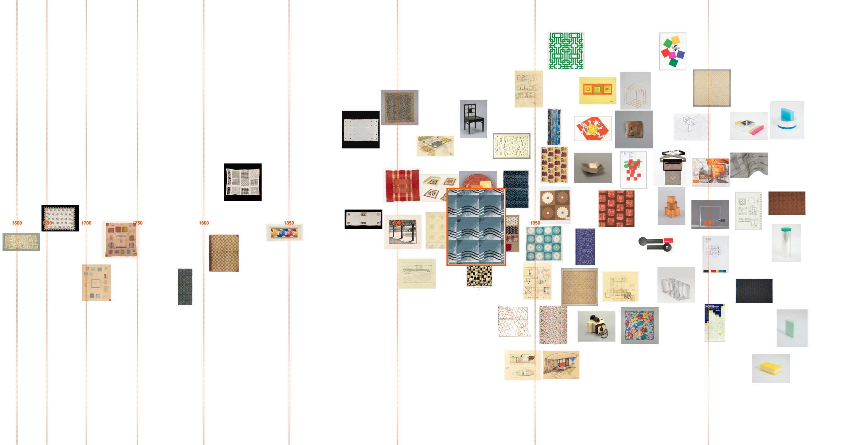
The same purple-green visualisation demonstrates how the tool can connect artefacts across time, in this case with by similar colour scheme/design:

(Left) Frieze (USA), 1890–1910; Manufactured by Hobbs, Benton & Heath, (right) Sidewall, Anemone, 1960–66; Designed by Phoebe Hyde
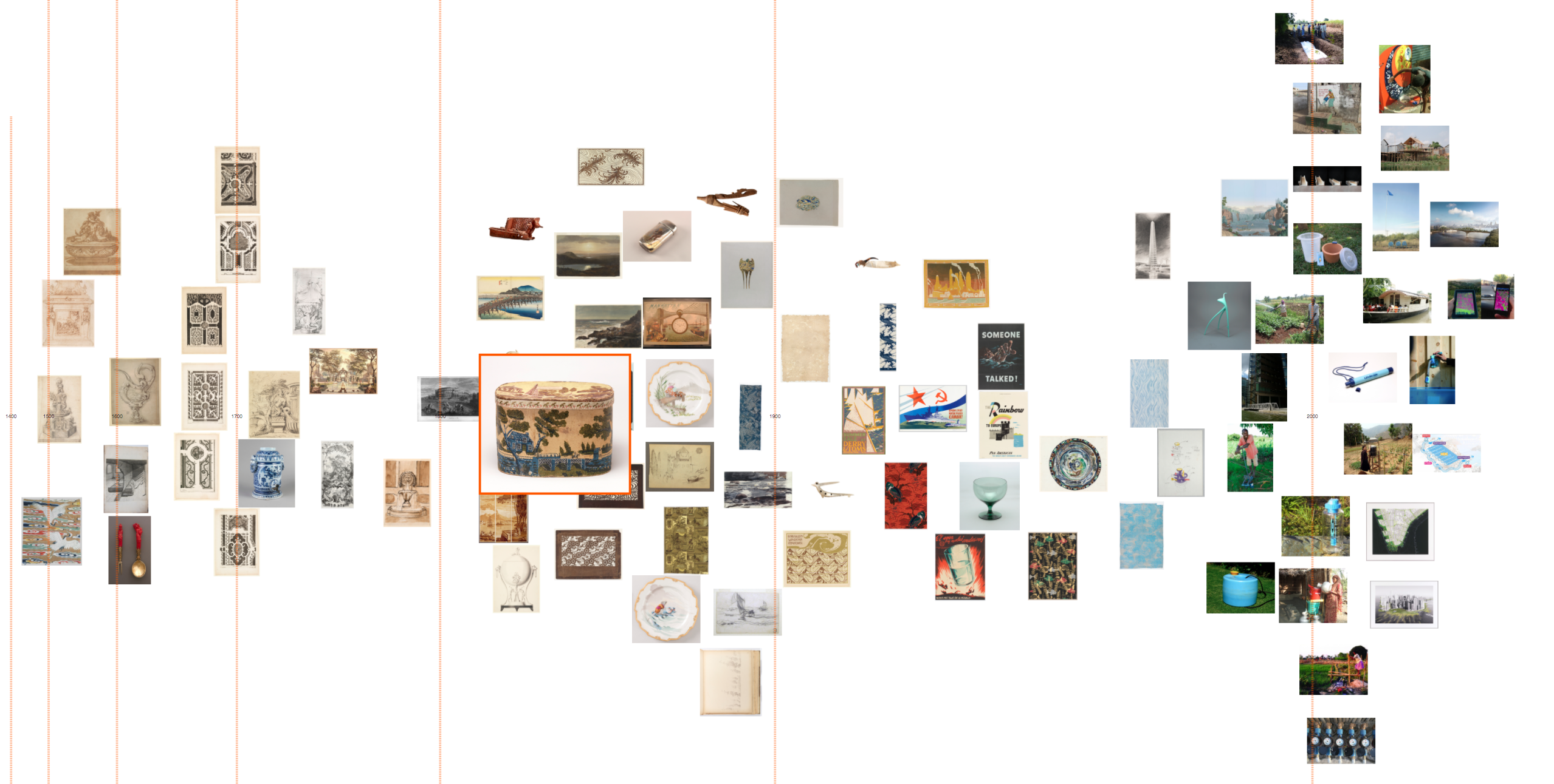
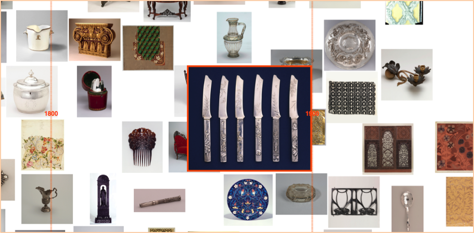
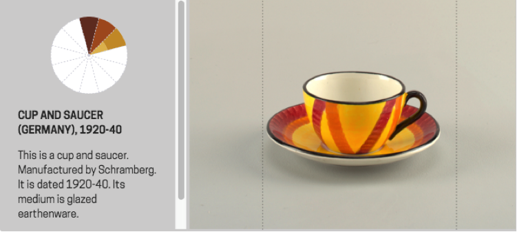
The tool surfaces colours, used in a particular material, that are strongly attached to design types. For example these English vivid blue and white late-18th century ceramic buttons/medallions:
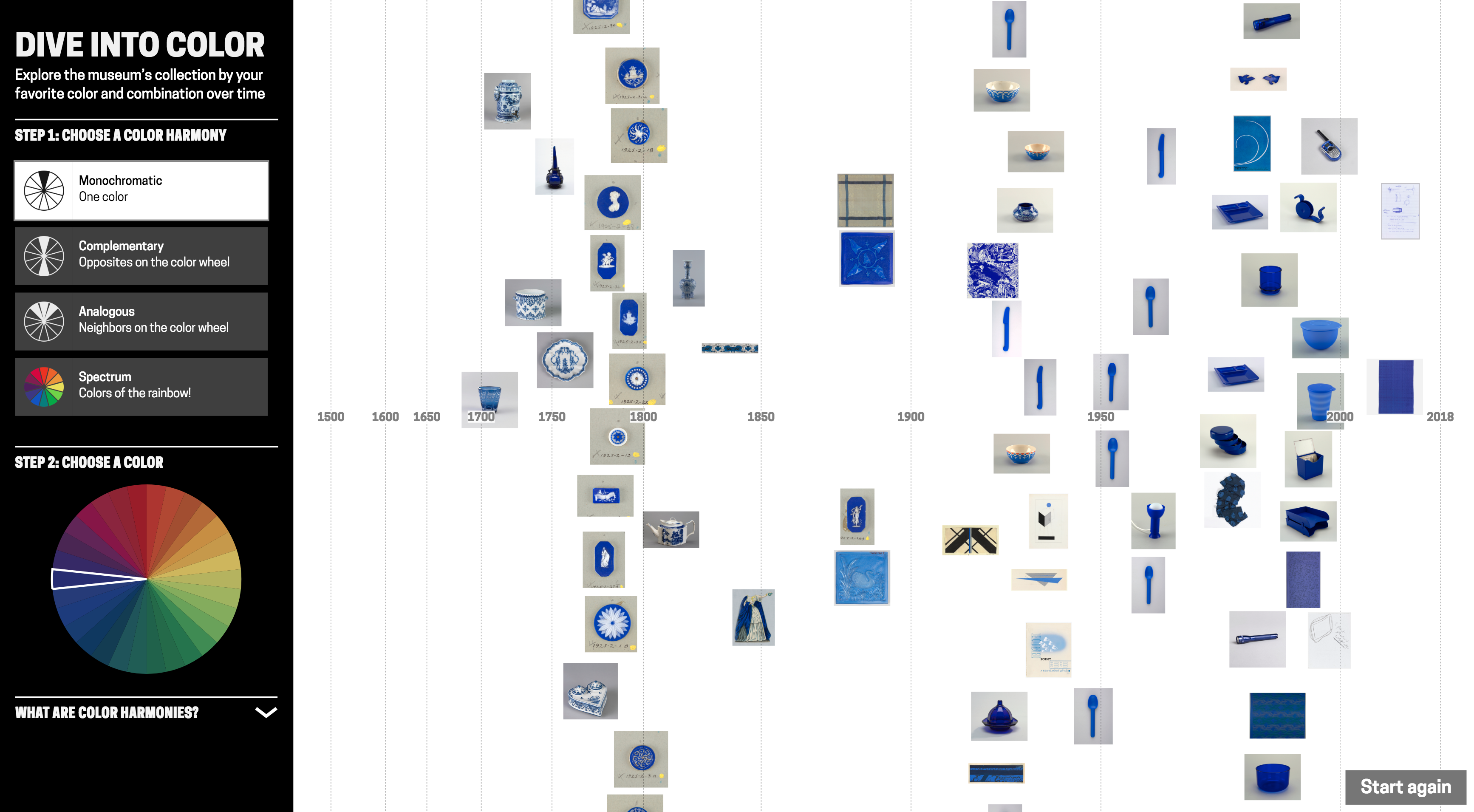

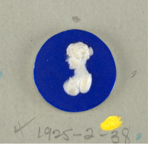
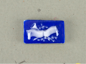
(From left) Medallion (England), late 18th century, stoneware; Medallion (England), late 18th century, stoneware; Button (England), late 18th century; stoneware
Blue and white ceramics manufactured in the Netherlands in the late-17th century, early-18th century:
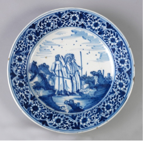
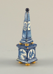
(From left) Plate (Netherlands), 1675–1725, tin-glazed earthenware; Plaque (Netherlands), 1675–1725, tin-glazed earthenware; Obelisk (Netherlands), ca. 1700–25, tin-glazed earthenware
And French red and white textiles in the late 18th/ early 19th century:
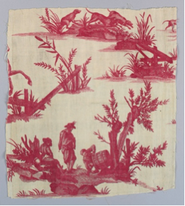


(From left) Textile (France), late 18th century, cotton; Textile (France), ca. 1850, cotton; Textile (France), 18th century, cotton
Visualising blue-yellow shows more saturated colour from mid-19th century onwards. Is this signalling changing fashion, or the availability of new synthetic dyes/pigments? Can we connect the more saturated harmony in designs from the mid-1800s with Chevreul’s influential text from the time ‘The Law of Simultaneous Colour Contrast’, describing how colour harmony can be used to create a more vibrant effect? Though a number of the earlier objects are textiles and the colours will have faded over time. Possibly a combination of these factors is at play here.
User evaluations
While I’ve discussed historical trends and the Cooper Hewitt collection, I’m also interested in how others might use a tool like this in their own projects, and with other collections. I conducted a number of interviews around this tool design with history of design students and colour history specialists, exploring their impressions of it and if/how they might use it in their own work. (I was also interested to talk with designers about using a tool like this for design inspiration, but struggled with recruiting!)
The history of design students (Masters students in History of Design from the Royal College of Art/Victoria & Albert Museum programme) discussed examples from their own work where such a tool could be useful. Example projects included: tracing the use of blue through time in anti-vaccination movement posters to convey trust; or pink clothing in the history of women’s protest movements. In both these examples a hue, rather than a more specific colour, was of interest. Out of these conversations, the most useful features to add would be a filter by object type, and to be able to narrow down a time period.
For the specialist colour audience, though, this tool design has some issues. Not least because I do not know how accurately the photos represent the true colours of the objects (what lighting conditions the photographs were taken in, if they have been retouched etc.). While the overall extracted colours seem generally good, they may not be precise enough for some. The control in searching by colour – only by hue – may also be too limited for some needs.
Seeing is believing?
Colour data is computationally extracted, in contrast with manually added metadata. Do these different cases require different considerations for designing visualisations?
In this post, I’ve used arguments like it ‘looked better’, or the results were ‘more satisfying’ to explain my design decision-making. Working with colour data I knew had errors, I was more comfortable adjusting parameters in my search queries and editing obviously wrong colour data to return what looked ‘better’ to me. For colour, you can immediately see when images appear in the visualisation don’t match. (Though, of course, looking at the visualised results will not tell you if there are absent items). In interviews, I asked whether this data massaging to produce more satisfying results bothered interviewees and was often told the person didn’t mind, but they’d worry if there were obvious errors appearing in the visualisation.
While prototyping the design in conversation with curators at Cooper Hewitt, we discussed the possibility of different versions of this tool: offering more control in search and not massaging parameters for in-depth researchers. But there is also value in visually satisfying results. As a curator expressed it: “We have a large number of professional designers and design students who come here … Just seeing beautiful examples of how people have used particular colour schemes is research. So the visually satisfying… seeing the most compelling works has a value as well. For the professional designers who, say ‘wow this is really incredible use of this colour scheme. I want to share this with my students.’”
‘Dive into Color’ has since been exhibited in the London Design Festival 2018, and will hopefully go online at some point. Any feedback is very welcome: olivia.fletcher-vane@network.rca.ac.uk
Many thanks to Cooper Hewitt for their help with this project: especially Pamela Horn, Jennifer Cohlman Bracchi, Susan Brown and the technical team for getting ‘Dive into Color’ up and running in the galleries. Thanks to Neil Parkinson who showed me the Colour Reference Library at RCA, to Dr Alexandra Loske, Patrick Baty and RCA students for their thoughts, and to Jonny Jiang for help with the final UI design. And thanks to Stephen Boyd Davis for his continued help and support!