Last week marked a pretty significant moment in my career here at Cooper-Hewitt.
As I’m sure most of you already know, we launched our Alpha collections website. The irony of this being an “alpha” of course is that it is by leaps and bounds better than our previous offering built on eMuseum.
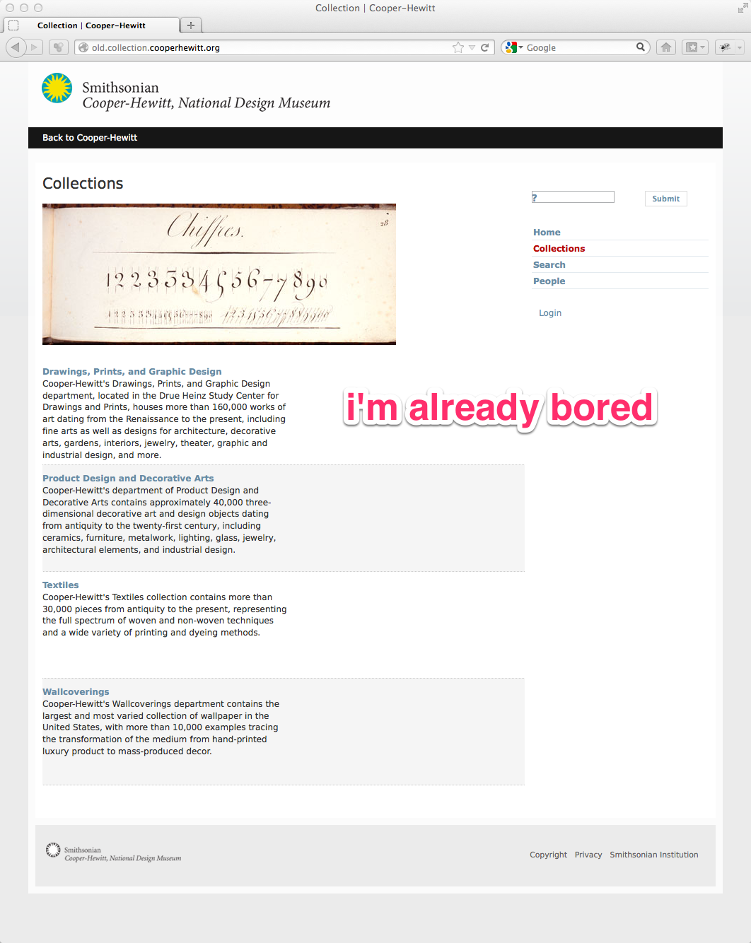
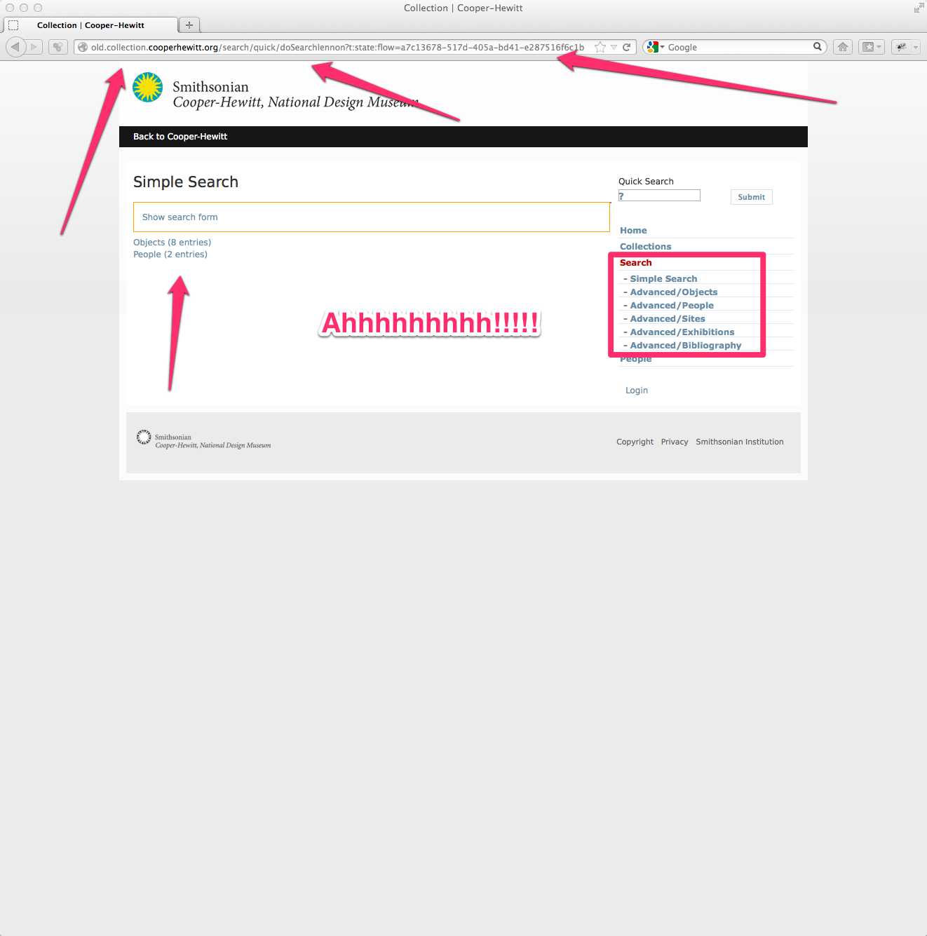
If you notice in the screengrab below, eMuseum was pretty bland. The homepage, which is still available allowed you to engage by selecting from one of 4 museum oriented departments. You could also search. Right…

Upon entering the site, either via search or through browsing one of the four departments several things were in my mind huge problems.

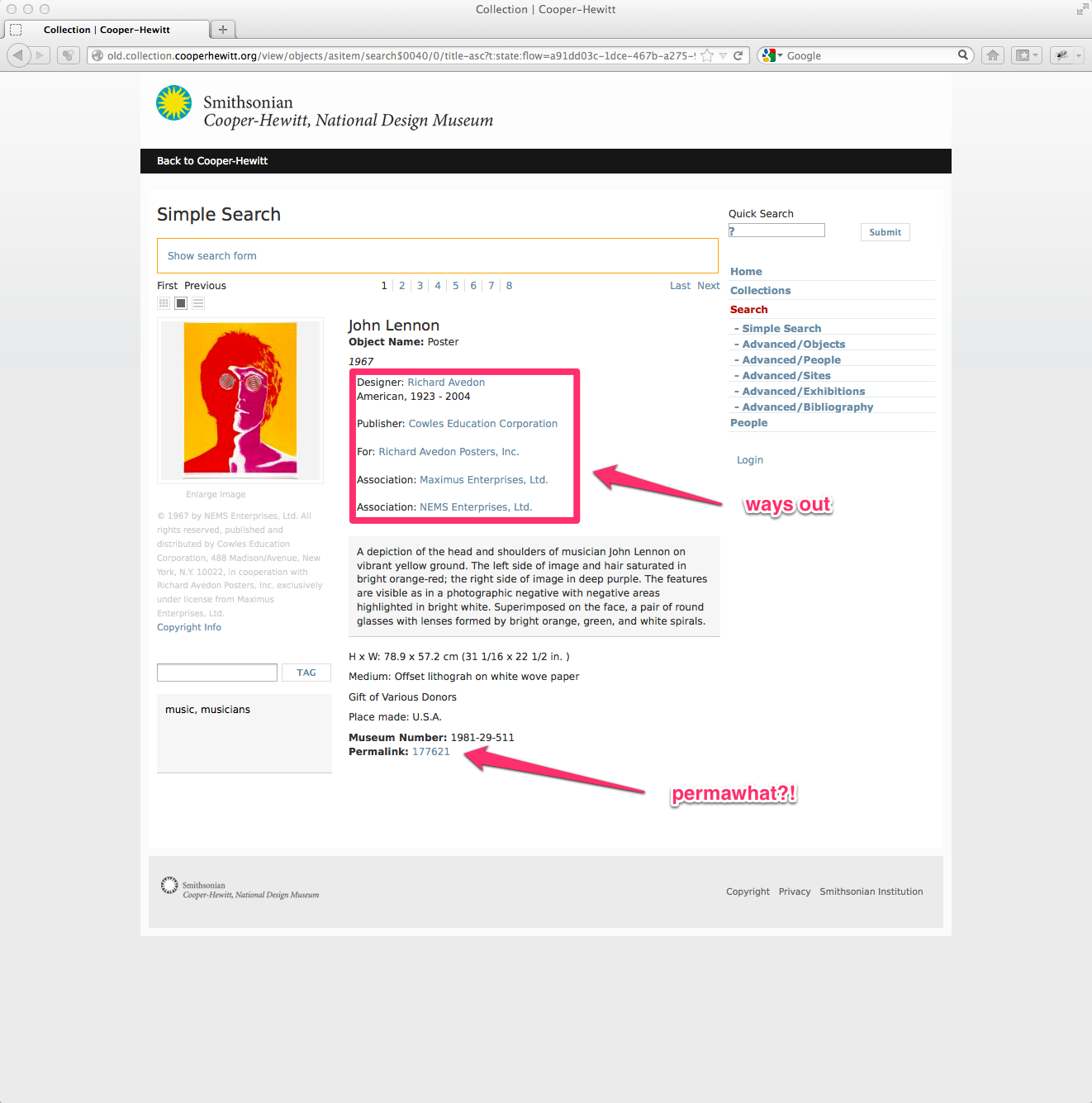
Above is a search for “lennon” and you get the idea. Note the crazy long URLs with all kinds of session specific data. This was for years a huge issue as people would typically copy and paste that URL to use in blog posts and tweets. Trying to come back to the same URL twice never worked, so at some point we added a little “permlink” link at the bottom, but users rarely found it. You’ll also note the six search options under the menu item “Search.” OK, it’s just confusing.

Finally landing on an object page and you have the object data, but where does it all lead you to?
For me the key to a great, deep, user experience is to allow users to get lost within the site. It sounds odd at first. I mean if you are spending your precious time doing research on our site, you wouldn’t really want to “get lost” but in practice, it’s how we make connections, discover the oddities we never knew existed, and actually allow ourselves to uncover our own original thought. Trust me, getting lost is essential. (And it is exactly what we know visitors enjoy doing inside exhibitions.)
As you can probably tell by now, getting lost on our old eMuseum was pretty tough to do. It was designed to do just the opposite. It was designed to help you find “an object.”
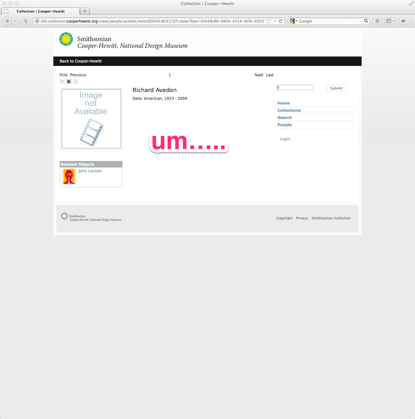
Here’s what happens when you try to leave the object page in the old site.

So we ditched all that. Yes, I said that right, we ditched eMuseum! To tell you the truth, this has been something I have been waiting to do since I started here over two years ago.
When I started here, we had about 1000 objects in eMuseum. Later we upped that to 10,000, and when Seb began (at the end of 2011) we quickly upped that number to about 123,000.
I really love doing things in orders of magnitude.
I noticed that adding more and more objects to eMuseum didn’t really slow it down, it just made it really tough to browse and get lost. There was just too much stuff in one place. There were no other entry points aside from searching and clicking lists of the four departments.
Introducing our new collections website.
We decided to start from scratch, pulling data from our existing TMS database. This is the same data we were exporting to eMuseum, and the same data we released as CC0 on GitHub back in February. The difference would be, presenting the data in new ways.

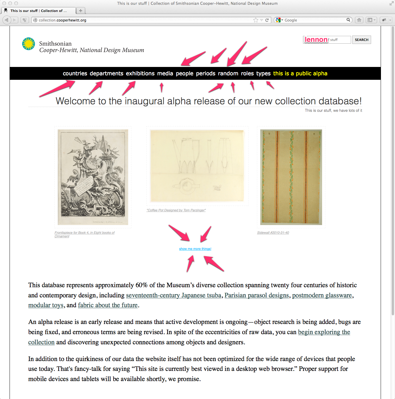
Note the many menu options. These will change over time, but immediately you can browse the collection by some high level categories.
Note the random button–refreshing your browser displays three random objects form our collection. This is super-fun and to our surprise has been one of the most talked about features of the whole alpha release. We probably could have added a random button to eMuseum and called it a day, but we like to aim a little higher.
Search is still there, where it should be. So let’s do a similar search for “lennon” and see what happens.
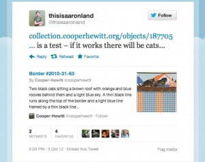
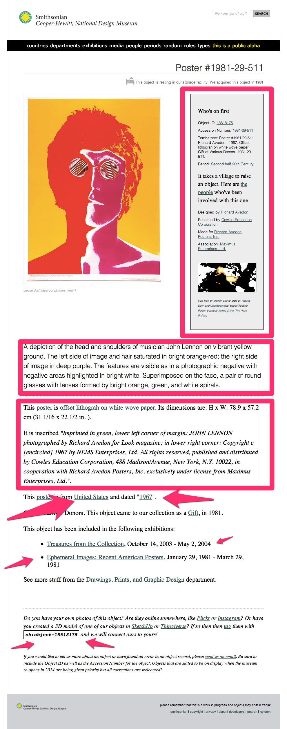
Here, I’ve skipped the search results page, but I will mention, there were a few more results. Our new object page for this same poster by Richard Avedon is located at the nice, friendly and persistent URL https://collection.cooperhewitt.org/objects/18618175/. It has its own unique ID (more on this in a post next week by Aaron) and I have to say, looks pretty simple. We have lots of other kinds of URLs with things in them like “people” , “places” and “periods.” URLs are important, and we intend to ensure that these live on forever. So, go ahead and link away.

The basic page layout is pretty similar to eMuseum, at first. You have essential viatal stats in the gray box on the right. Object ID, Accession Number, Tombstone data, etc, etc. You also have a map, and some helpful hints.
But then things get a little more exciting. We pull in loads of TMS data, crunch it and link it up to all sorts of things. Take a scroll down this page and you’ll see lots of text, with lots of links and a few fun bits at the end, like our “machine tag” field.
Each object has been assigned a machine tag based on its unique ID number. This is simple and straightforward future-proofing. If you’re on a site like Flickr and you come across (or have your own) photo of the same object we have in our collection, you can add the machine tag.
Some day in the near future we will write code to pull in content tagged in this way from a variety of sources. This is where the collection site will really begin to take shape as well not only be displaying the “thing we have” but its relevance in the world.
It puts a whole new spin on the concept of “collecting” and it’s something we are all very excited to see happen. So start tagging!
Moving on, I mentioned that you can get lost. This is nice.

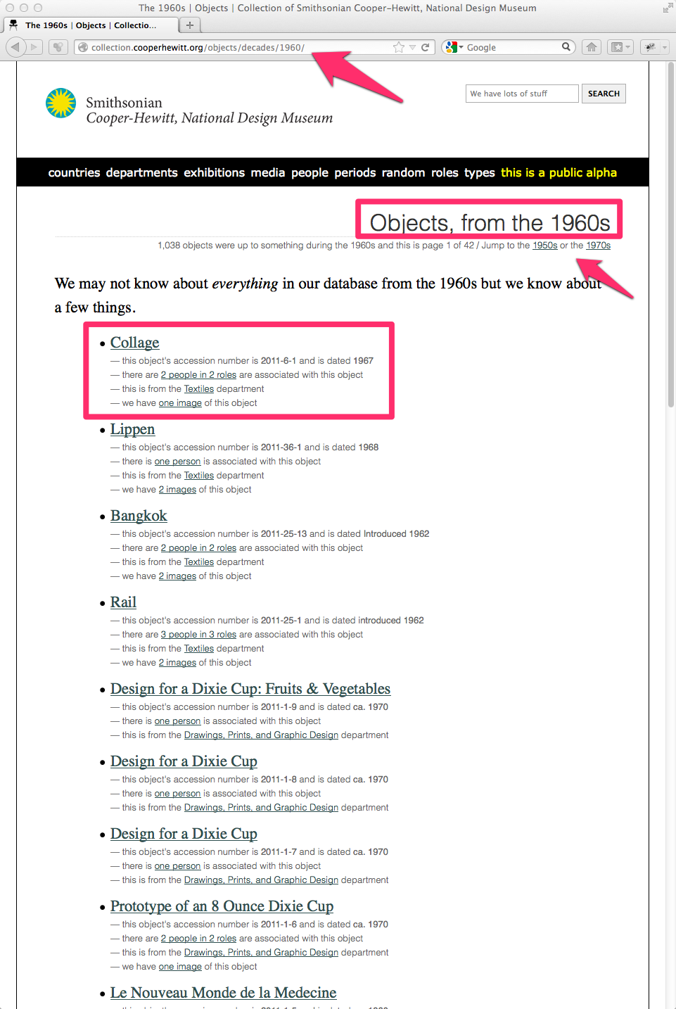
From the Avedon poster page I clicked on the decade called 1960’s This brings me to a place where I can browse based on the decade. You can jump ahead in time and easily get lost. It’s so interesting to connect the object you are currently looking at to others from the same time period. You immediately get the sense that design happens all over the world in a wide variety of ways. It’s pretty addictive.
Navigating to the “person” page for Richard Avedon, we begin to see how these connections can extend beyond our own institutional research. We begin by pointing out what kinds of things we have by Avedon. This is pretty straight-forward, but in the gray box on the right you can see we have also linked up Avedon’s person record in our own TMS database with a wide variety of external datasets. For Avedon we have concordances with Freebase, MoMA, the V & A, and of course Wikipedia. In fact, we are pulling in Wikipedia text directly to the page.
In future releases we will connect with more and more on the web. I mean, thats the whole point of the web, right? If you want to help us make these connections ( we cant do everything in code ) feel free to fork our concordances repository on GitHub and submit a pull request.

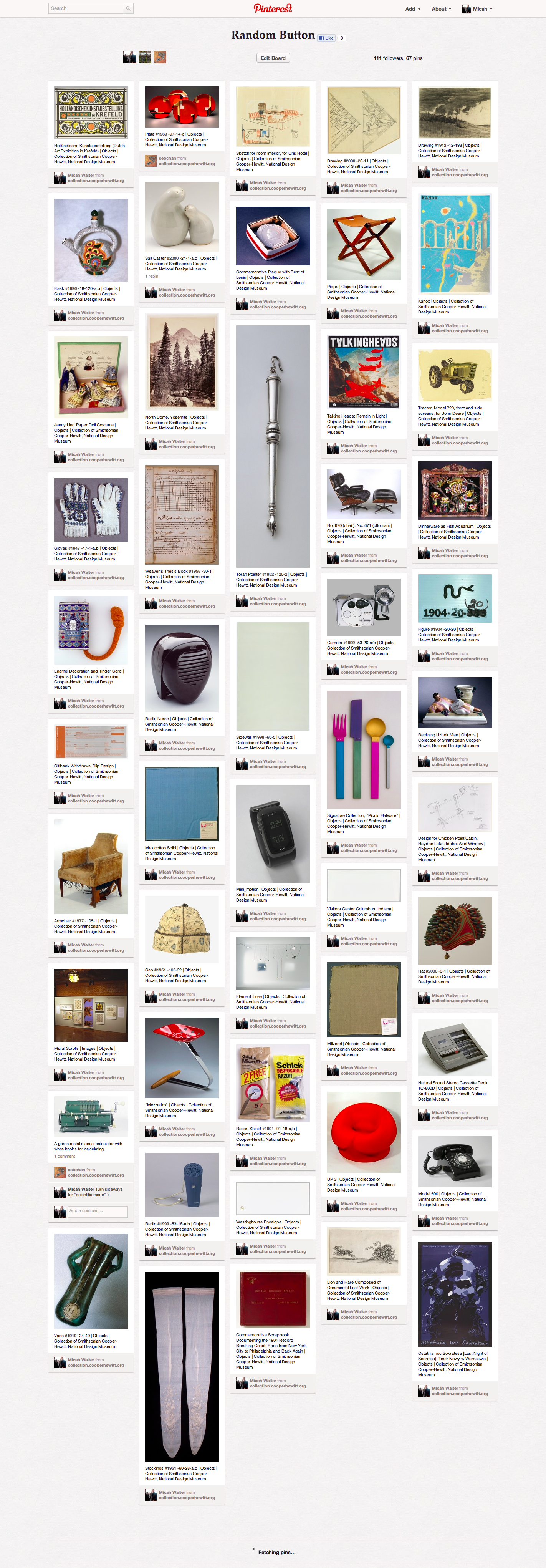
We have many categorical methods of browsing our collection now. But I have to say, my favorite is still the Random images on the home page. In fact I started a Pinterest board called “Random Button” to capture a few of my favorites. There are fun things, famous things, odd things and downright ugly things, formerly hidden away from sight, but now easy to discover, serendipitously via the random button!
There is much more to talk about, but I’ll stop here for now. Aaron, the lead developer on the project is working on a much more in depth and technical post about how he engineered the site and was able to bring us to a public alpha in less than three months!
So stay tuned…. and get exploring.
