Stepping inside a museum storage facility is a cool experience. Your usual gallery ambience (dramatic lighting, luxurious swaths of empty space, tidy labels that confidently explain all) is completely reversed. Fluorescent lights are overhead, keycode entry pads protect every door, and official ID badges are worn by every person you see. It’s like a hospital, but instead of patients there are 17th century nightgowns and Art Deco candelabras. Nestled into tiny, sterile beds of acid-free tissue paper and archival linen, the patients are occasionally woken and gently wheeled around for a state-of-the-art microscope scan, an elaborate chemical test, or a loving set of sutures.
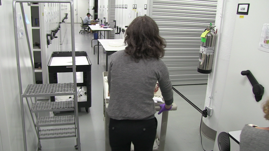
A rare peek inside the storage facility.
If you ask a staff member for an explanation of this or that object on the nearest cart or shelf, they might tell you a detailed story, or they might say that so far, not much is known. I like the element of unevenness in our knowledge, it’s very different from the uniform level of confidence one sees in a typical exhibition.
The web makes it possible to open this space to the public in all its unpolished glory – and many other museums have made significant inroads into new audiences by pulling back the curtain. The prospect is like catnip for the intellectually curious, but hemlock for most museum employees.
Typically, the only form of media that escapes this secretive storage facility are hi-res TIFFs artfully shot in an on-site photography studio. The seamless white backdrop and perfectly staged lighting, while beautiful and ideal for documentation, completely belie the working lab environment in which they were made.
We just launched a new video project called “Collections in Motion.” The idea is super simple: short videos that demonstrate collections objects that move, flip, click, fold, or have any moveable part.
Here are some of the underlying thoughts framing the project:
- Still images don’t suffice for some objects. Many of them have moving parts, make sounds, have a sense of weight, etc that can’t be conveyed through images.
- Our museum’s most popular videos on YouTube are all kinetic, kinda entrancing, moving objects. (Contour Craft 3D Printing, A Folding Bicycle, and a Pop-up Book, for example).
- Videos played in the gallery generally don’t have sound or speakers available.
- In research interviews with various types of visitors, many people said that they wouldn’t be interested in watching a long, involved video in a museum context.
- Animated GIFs, 6-second Vines, and 15-second Instagram videos loom large in our contemporary visual/communication culture.
- How might we think of the media we produce (videos, images, etc) as a part of an iterative process that we can learn from over time? Can we get comfortable with a lower quality but higher number of videos going out to the public, and seeing what sticks (through likes, comments, viewcount, etc)?
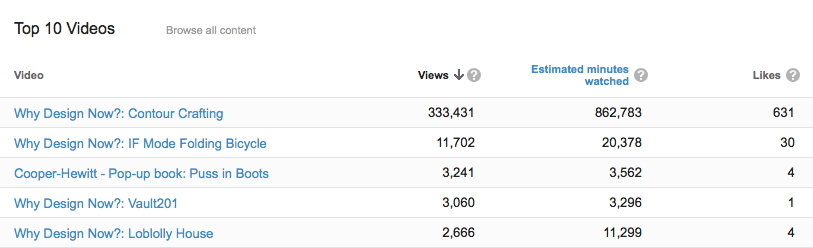
Our most popular YouTube videos for this quarter. They are all somewhat mesmerizing/cabinet-of-curiosity type things.
Here are some of the constraints on the project:
- No budget (pairs nicely with the preceding bullet).
- Moving collections objects is a conservation no-no. Every human touch, vibration and rub is bad for the long-long-longevity of the object (and not to mention the peace of mind of our conservators).
- Conservators’ and curators’ time is in HIGH demand, especially as we get closer to our re-opening. They are busy writing new books, crafting wall labels, preparing gallery displays, etc. Finding a few hours to pull an object from storage and move it around on camera is a big challenge.
So, nerd world, what do you think?