Without a whole lot of fanfare we released the beta
version of the collections website, yesterday. The alpha version was released a little over a year ago and it was finally time to apply lessons learned and to reconsider some of the decisions that we made in the summer of 2012.
At the time the alpha version was released it was designed around the idea that we didn’t know what we wanted the site to be or, more importantly, what the site needed to be. We have always said that the collections website is meant to be a reflection of the overall direction the Cooper-Hewitt is heading as we re-imagine what a design museum might be in the 21st century. To that end the most important thing in 2012 was developing tools that could be changed and tweaked as quickly as possible in order to prove and disprove ideas as they came up.
The beta website is not a finished product but a bunch of little steps on the way to the larger brand redesign that is underway as I write this. One of those small steps is a clean(er) and modular visual design that not only highlights the objects in the collection but does so in a way that is adaptable to a variety of screens and devices.
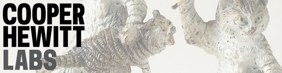
To that end, the first thing we did was to the object pages to make sure that the primary image for an object always appears above the fold.
This is the first of many small changes that have been made, and that work, but that still need proper love and nurturing and spit and polish to make them feel like magic. In order to make the page load quickly we first load a small black and white version of the object that serves as a placeholder. At the same we are fetching the small colour version as well as the the large ooh-shiny version, each replacing the other as your browser retrieves them from the Internet.
Once the largest version has loaded it will re-size itself dynamically so that its full height is always visible in your browser window. All the metadata about the object is still available but it’s just been pushed below the fold.
Metadata is great but… you know, giant pictures!
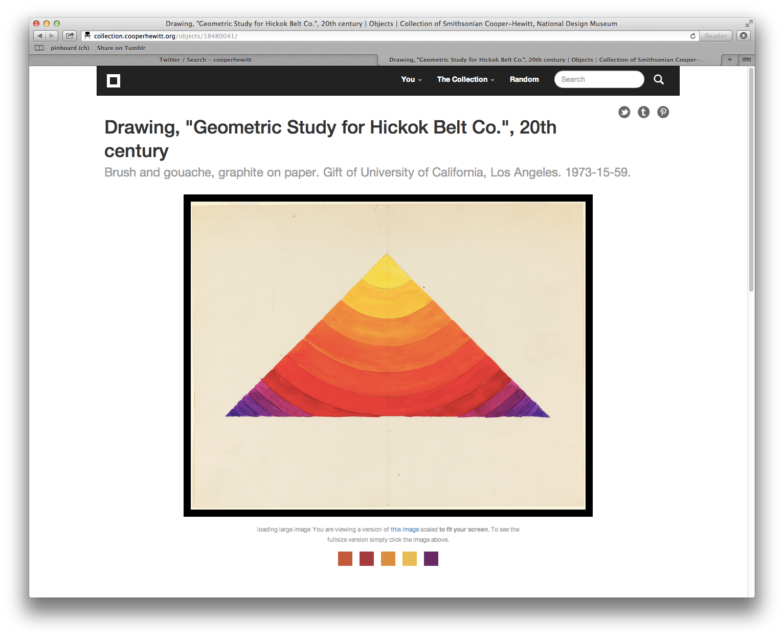
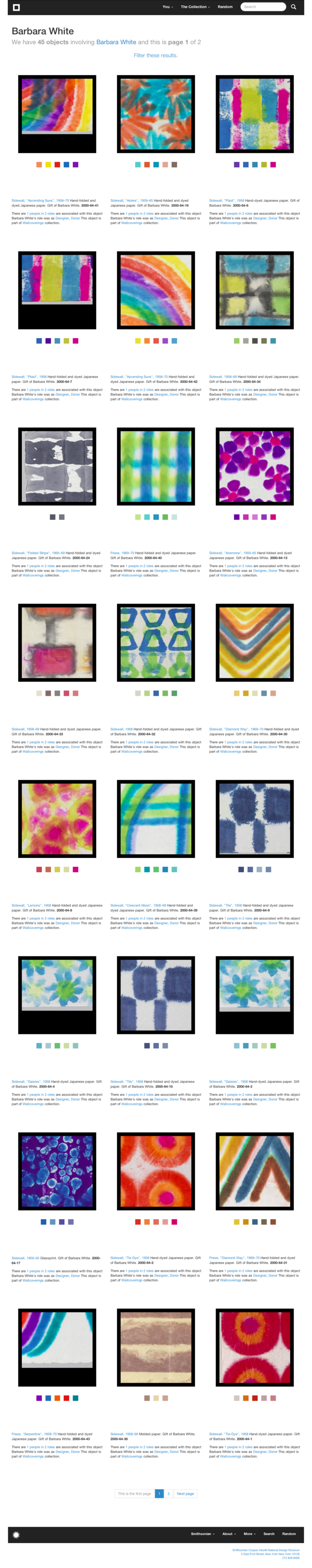
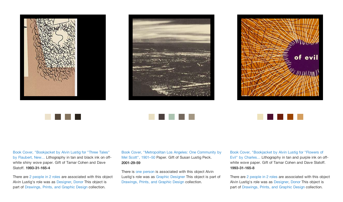
The second thing we did was standardize on square thumbnails for object list views.
This was made possible by Micah’s work calculating the Shannon entropy value for an image. One way to think about Shannon entropy is as the measure of “activity” in an image and Micah applied that work to the problem of determining where the most-best place to crop a image might be. There’s definitely some work and bug fixes that need to be done on the code but most of the time it is delightfully good at choosing an area to crop.
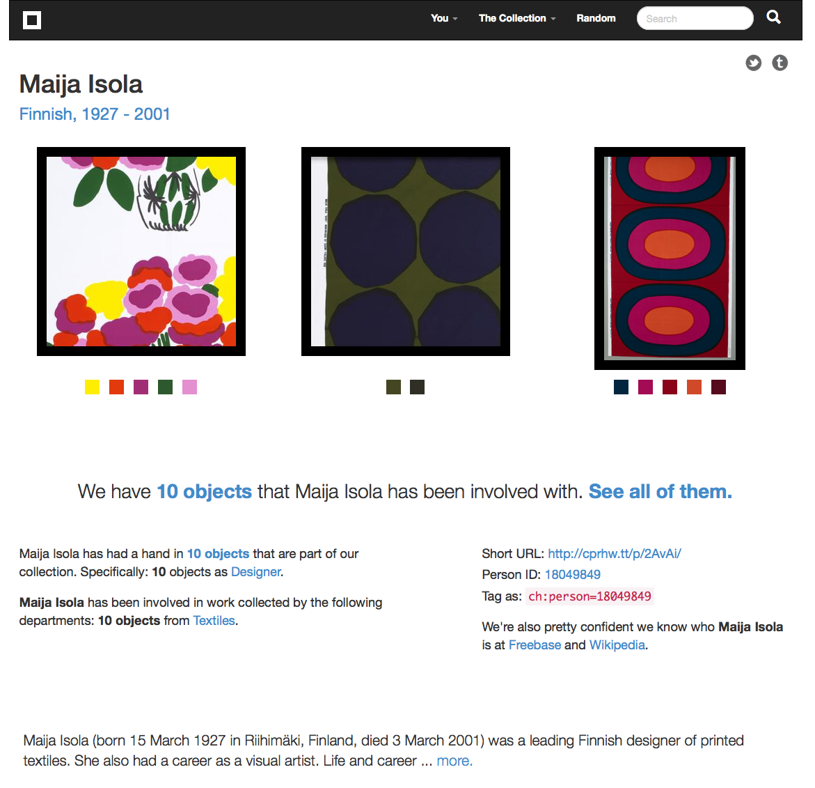
As you move your mouse over the square version we will replace it with the small thumbnail of the complete image (and then replace it again with the square version when you mouse out). Thanks to Sha Hwang for making a handy animated gif of the process to illustrate things.
Given the cacophony of (object) shapes and sizes in our collection standardizing on square thumbnails has some definite advantages when it comes to designing a layout.
Although the code to calculate Shannon entropy is available on our GitHub account the code to do the cropping is not yet. Hopefully we can fix that in the next week and we would welcome your bug fixes and suggestions for improving things. Update: Micah has made the repository for his panel-of-experts code which includes the crop-by-Shannon-entropy stuff public and promises that a blog post will follow, shortly.
mmmmmm….pretty!
It is worth noting that our approach owes a debt of inspiration and gratitude to the work that The Rijksmuseum has done around their own collections website. Above and beyond their efforts to produce high quality digital reproductions of their collection objects and then freely share them with their audiences under a Creative Commons license they also chose to display those works by emphasizing the details of a painting or drawing (or sculpture) rather than zooming further and further back, literally and conceptually, in order to display the entirety of an object.
You can, of course, still see an object in its totality but by being willing to lead with a close-up and having the faith that users will explore and consider the details (that’s sort of the point… right?) it opens up a whole other world of possibilities in how that information is organized and presented. So, thanks Rijksmuseum!
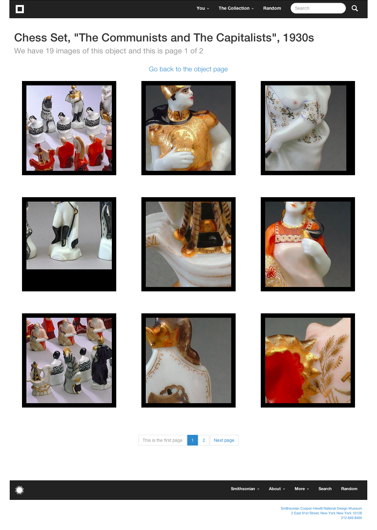
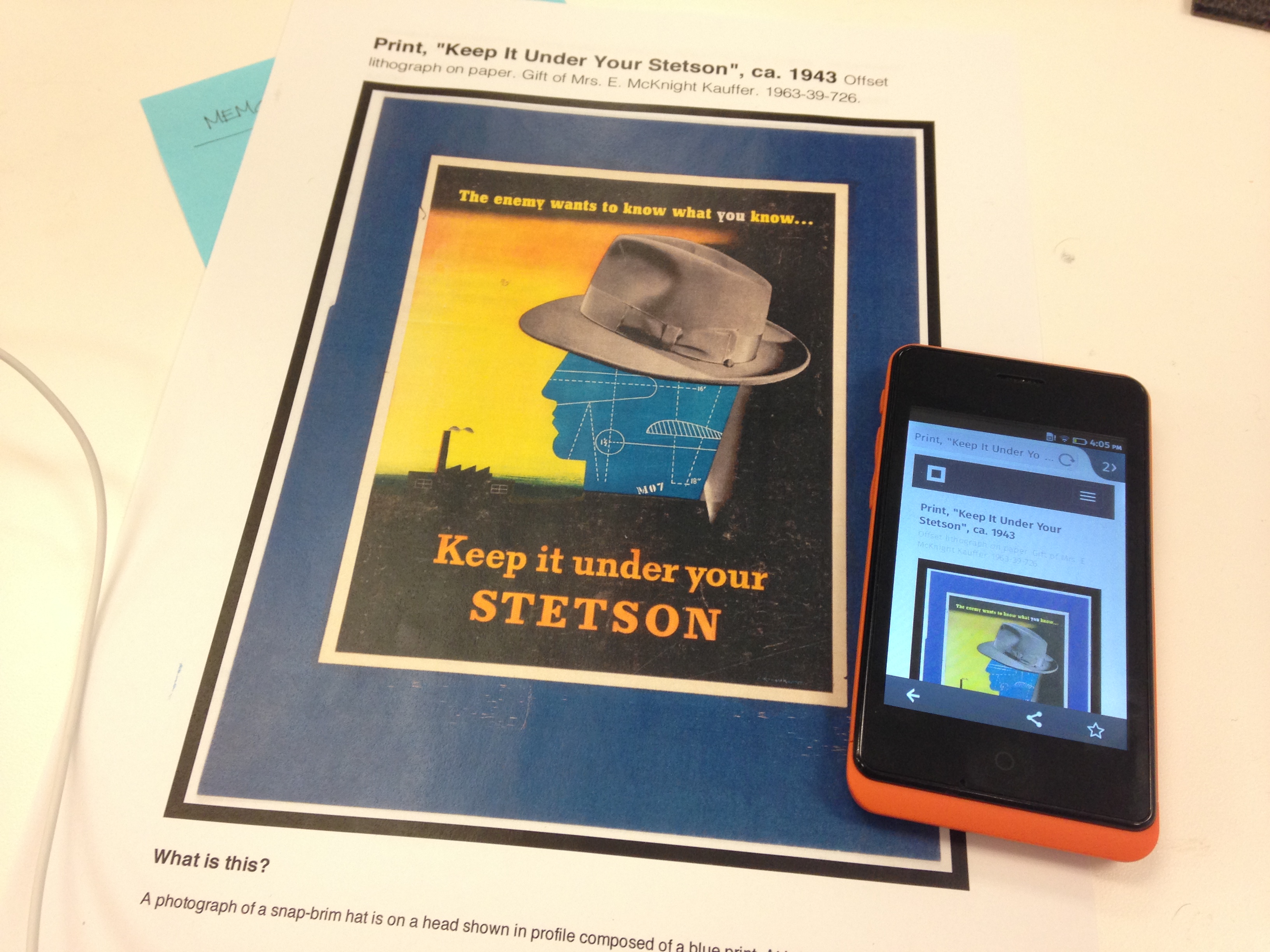
In addition to updating the page listing all the images for an object to use square thumbnails we’ve also made it possible to link to the main object page (the one with all the metadata) using one of those alternate images.
For example the URL for the “The Communists and The Capitalists” chess set is https://collection.cooperhewitt.org/objects/18647699/ and by default it displays an image of all the chess pieces lined up as if on a chess board. If you wanted to link to the chess set but instead display the photo of the handsome chap all dressed up in gold and jodhpurs you would simply link to https://collection.cooperhewitt.org/objects/18647699/with-image-12603/.
The images themselves (on the object images page) all point to their respective with-image-IMAGEID links so just right click on an image to save its permalink.
On most desktop and laptop displays these square list views end up being displayed three to a row which presents many lovely opportunity for surprising and unexpected “haystack triptychs“.
Or even narrative… almost.
In the process of moving from alpha to beta it’s possible that we may have broken a few things (please let us know if you find anything!) but one of the things I wanted to make sure continued to work was the ability to print a properly formatted version of an object page.
We spend so much time wrestling with the pain around designing for small screens and big screens and all the screens in between (I’ll get to that in a minute) that we often forget about paper.
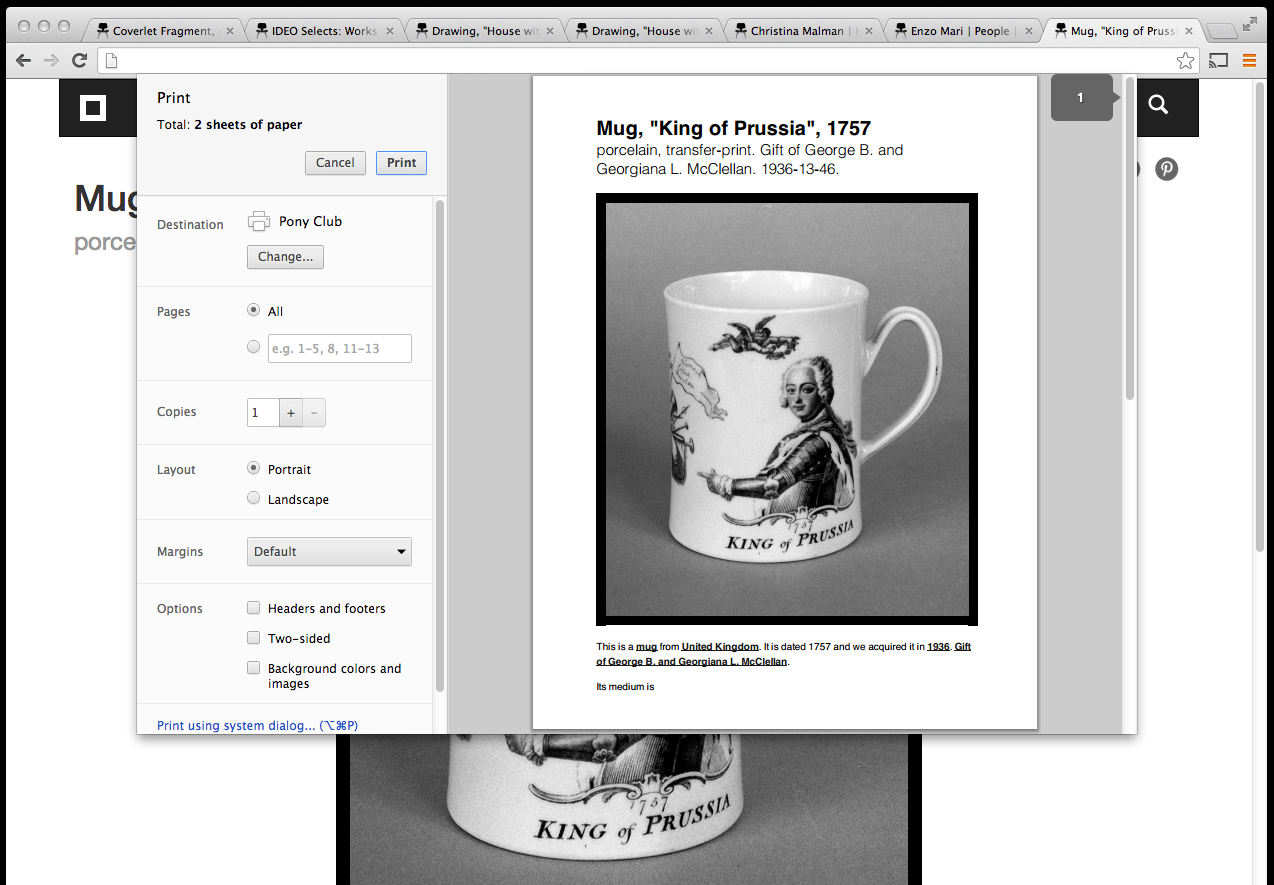
Lots of people have perfectly good reasons for printing out information from our collection so we would like that experience to be as simple and elegant as the rest of the site. We would like for it to be something that people can take for granted before even knowing it was something they needed.
You can print any page obviously but the print-y magic is really only available for object and person pages, right now. Given that the alpha site only supported object pages this still feels like progress.
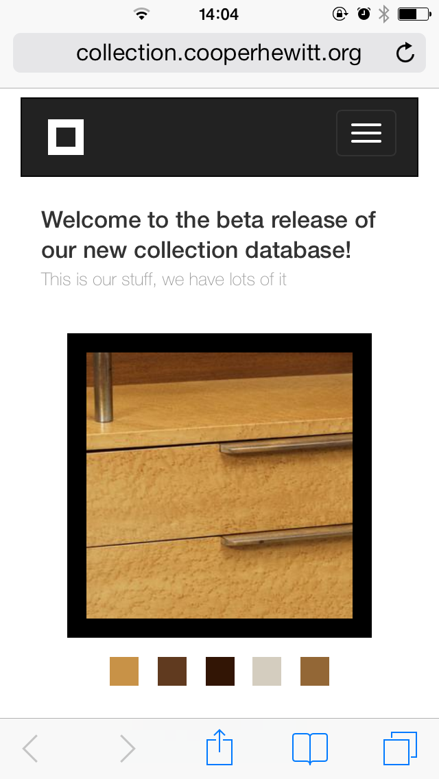
Finally, mobile.
Optimizing for not-your-laptop is absolutely one of the things that was not part of the alpha collections website. It was a conscious decision and, I think, the right one. Accounting for all those devices — and that really means all those view ports — is hard and tedious work where the rewards are short-lived assuming you live long enough to even see them. So we punted and that freed us up to think about the all the other things we needed to do.
But it is also true that if you make anything for the web that people start to enjoy they will want to start enjoying it on their phones and all the other tiny screens connected to the Internet that they carry around, these days. So I take it as some small measure of success that we reached a point where planning and designing for “mobile” became a priority.
Which means that, like a lot of other people, we used Bootstrap.
Bootstrap is not without its quirks but the demands that it places on a website are minimal. More importantly the few demands it does place are negligible compared to the pain of accounting for the seemingly infinite and not-in-a-good-way possibility jelly of browser rendering engines and device constraints.
The nice folks at Twitter had to figure this out for themselves. I choose to believe that they gave their work back to the Internet as a gift and because there is no glory in forcing other people to suffer the same pain you did. We all have better things to do with our time, like working on actual features. So, thanks Twitter!
We’re still working out the kinks using the collections website on a phone or a tablet and I expect that will continue for a while. A big part of the exercise going from alpha to beta was putting the scaffolding in place where we can iterate on the problem of designing a collections website that works equally well on a 4-inch screen as it does on a 55-inch screen. To give us a surface area that will afford us another year of focusing on the things we need to pay attention to rather always looking over our shoulders for a herd of thundering yaks demanding to be shaved.
A few known-knowns, in closing:
- IE 9 — there are some problems with lists and the navigation menus. We’re working on it.
- The navigation menu on not-your-laptop devices needs some love. Now that it’s live we don’t really have any choice but to make it better so that’s a kind of silver lining. Right?
- Search (in the navbar). Aside from there just being too many options you can’t fill out the form and simply hit return. This is not a feature. It appears that I am going to have dig in to Bootstrap’s Javascript code and wrestle it for control of the
enterkey as the first press opens the search drop-down menu and the second one closes it. Or we’ll just do away with a scoped search box in the navigation menu. If anyone out there has solved this problem though, I’d love to know how you did it. - Square thumbnails and mouseover events on touch devices. What mouseover events, right? Yeah, that.
- There are still a small set of images that don’t have square or black and white thumbnails. Those are in the process of the being generated so it’s a problem that will fade away over time (and quickly too, we hope).