Monthly Archives: June 2015

When the optimal interface is paper: improving visitor information

Earlier in this series I wrote about improving customer-facing ticketing touchpoints and UX improvements to a internal-facing app. This 3rd post is about the design and thinking behind a valuable— albeit non-tech— touchpoint: a postcard explaining how to use the pen.

When we first launched the Pen, it was obvious that we needed to quicken up the front desk transaction. One thing that was really slowing down the transactions (and causing a big line) was the “Pen schpiel.” A verbal explanation of what the Pen is, why it’s cool, and how to use it could hog up several minutes per transaction.

a comic-book style grid of photos showing a transaction between two gentlemen step-by-step

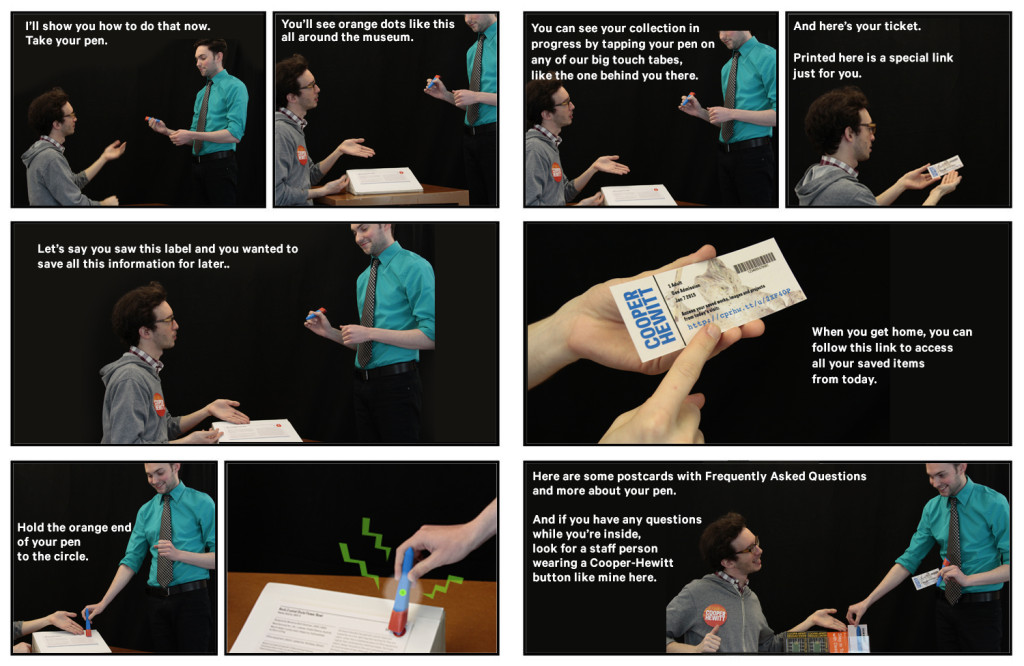
I made this storyboard in April 2014 with some willing coworkers and simple props (3D printed pen, fake ticket, fake postcard, fake “sample label,” and fake staff badge). In the last frame, the desk rep references an FAQ postcard.

We predicted the need for a postcard almost a year before the pen launch, but didn’t print one until we were sure it was necessary. I mocked up a fake postcard with a photo of a 3D-printed pen to provide some needed conversation-starting visuals in our early meetings. This was long before the pen had a final form factor, and you can see that our initial conversations about pen size and shape were a little uncomfortable.

person's hand holding up a postcard in an office setting. postcard says "LEARN MORE" with a blue plastic tube-like object.

This was the ‘sample’ postcard in the above storyboard, all created months before the Pen had a final form factor.

The postcard idea was on the back burner for many months as we all focused on the bare essentials of getting the Pen and its suite of services running at a baseline level. Once the Pen was released to the public in March 2015, the length of time of each transaction became an obvious “pain point” that needed our attention. So, the postcard was brought back to the table.

two postcards, shown front and back, with 1-2-3-4 illustrated steps

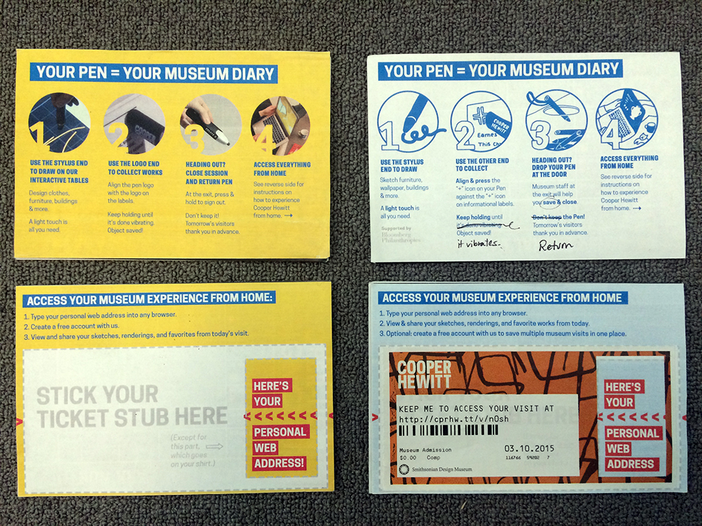
My first pass (left) used real images. The second pass (right) used illustrations, which were widely preferred by everyone I asked for input.

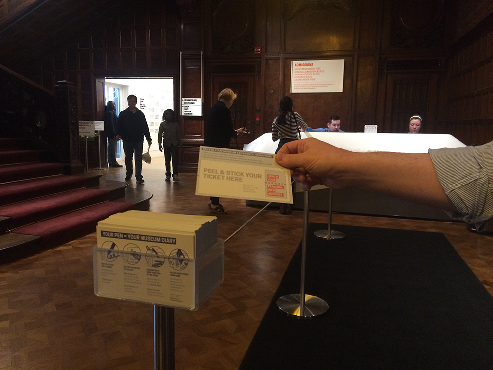
Sam had a cool idea to let visitors peel up the non-badge part of their ticket and stick it to the card, with some text boldly pointing to your “personal URL.” (The whole ticket is printed on sticker paper). This was clever because it could minimize the possibility of visitors losing or unthinkingly discarding their tickets, which contains the precious personal URL they’ll need to access their personal visit diary. When stuck to a postcard, the ticket might have a better chance of making it safely to a visitor’s home.

I worked closely with the front desk staff to get the language just right. It had to be concise but also explanatory. When the cards arrived from the printer, the desk staff was super excited and hopeful that these cards could help them save time and energy at each transaction.

Informational graphic and text with steps 1-4 under the heading " YOUR PEN = YOUR MUSEUM DIARY"

The first printing of the pen postcard.

When put to the test, these postcards turned out to be less useful than we all imagined.

Only about 2 in 5 visitors wanted to take a postcard. And even the guests who did take a postcard still wanted verbal explanation in addition to the card. (We ended up handling this by diverting the most explanation-hungry visitors to a representative stationed at the nearest interactive table for informal “group tutorials”.)

So the postcard was not a panacea, but it did ease the pain somewhat.

There was an overall feeling from visitors and desk reps that the postcard was too verbose and this is why most guests didn’t want to pick it up and read it. Another point brought up by the desk staff was that while the card functions well as a didactic, it doesn’t sell the pen. It doesn’t tell you why you ought to try it. A third observation: most people were not springing for the cool peel-and-stick feature. Humbug.

a person's hand pulling a postcard out of an acrylic stand which holds a stack of cards. the setting is a darkened lobby.

People are more willing to read a document while they’re waiting in line than when they’ve reached the front desk and are already talking to someone.

So we hit the drawing board again. I created a voting ballot so the front desk staff could weigh in on two choices for the front and back of the card. We had clear winners, as you can see in the image below. The voting sparked a conversation that led to further refinement of the text and images.

two pieces of paper with images and written-in-pen names beside each image.

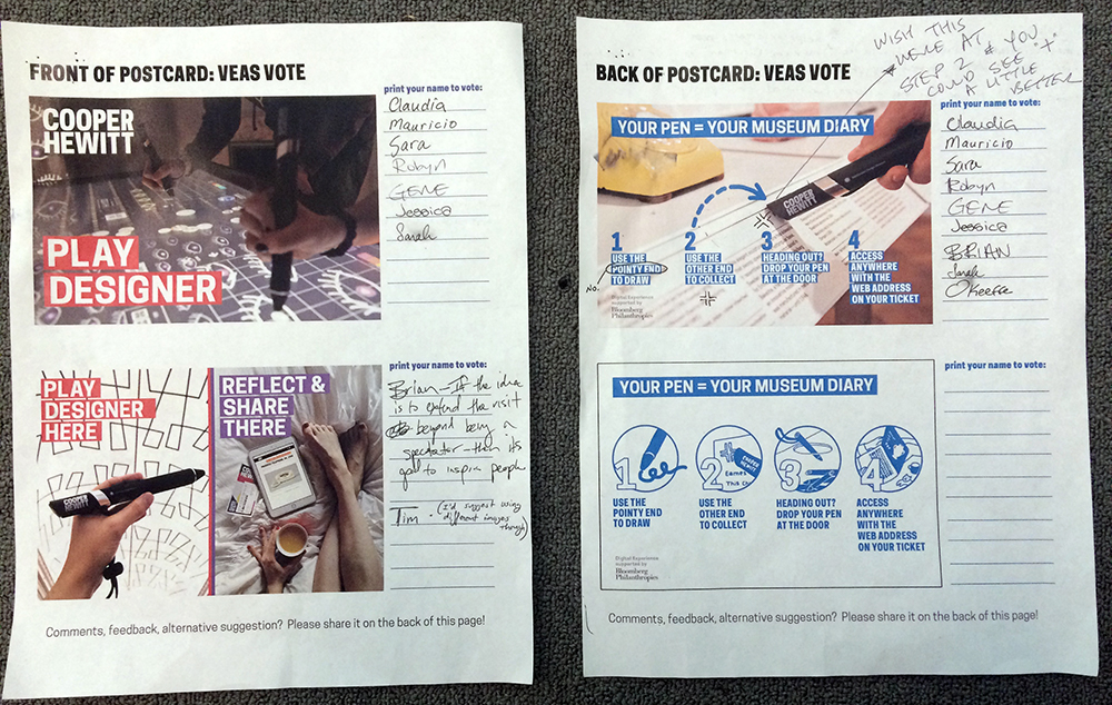
Desk Reps are always working on their feet or dealing with the public, so the most convenient way to get their imput is an old-fashioned paper ballot (not a web form).

The desk reps were unanimously against “PLAY DESIGNER” as sell copy for the Pen, because they were sure that many guests would think the word “play” meant the message was targeted at kids. So, I came up with 7 copy variations and we did another round of voting. The desk staff almost unanimously voted for a “write-in option” from one of their peers for its directness and clarity. The suggestion was: “EXPLORE AND DESIGN.”

a piece of paper, shown front and back, the first with a grid of images and initials scribbled in pen, and the back with many handwritten notes on a blank page, all in pen

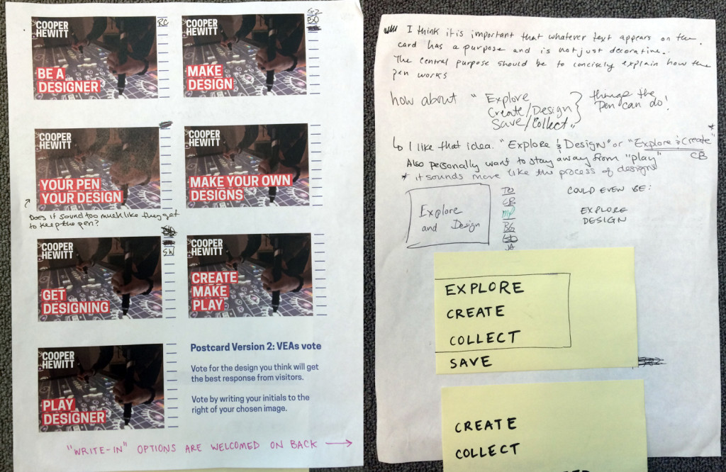
The winning idea was actually a “write-in” contender on the back of the page, which sparked impassioned debate among desk staff.

The voting was not just a method for collecting votes, but also a way to spark conversation among many staff, across departments.

What I learned from this experience is that the folks on the “front lines” tend to dislike any language or collateral that is in any way subtle, abstract, or “overly clever,” citing the likelihood that too much coyness will just confuse visitors. It makes sense; when a visitor is trying to get going in the museum, corral his kids, juggle his bag and coat, get himself to the restroom, keep an eye on the time, and so on, he won’t have a lot of “brain space” for interpreting any subtleties. They just need crystal clear information to get them on their way.

a telephone on museum display with a label beneath, a hand holding a large black wand, and steps 1-4 for use written in blue bold text

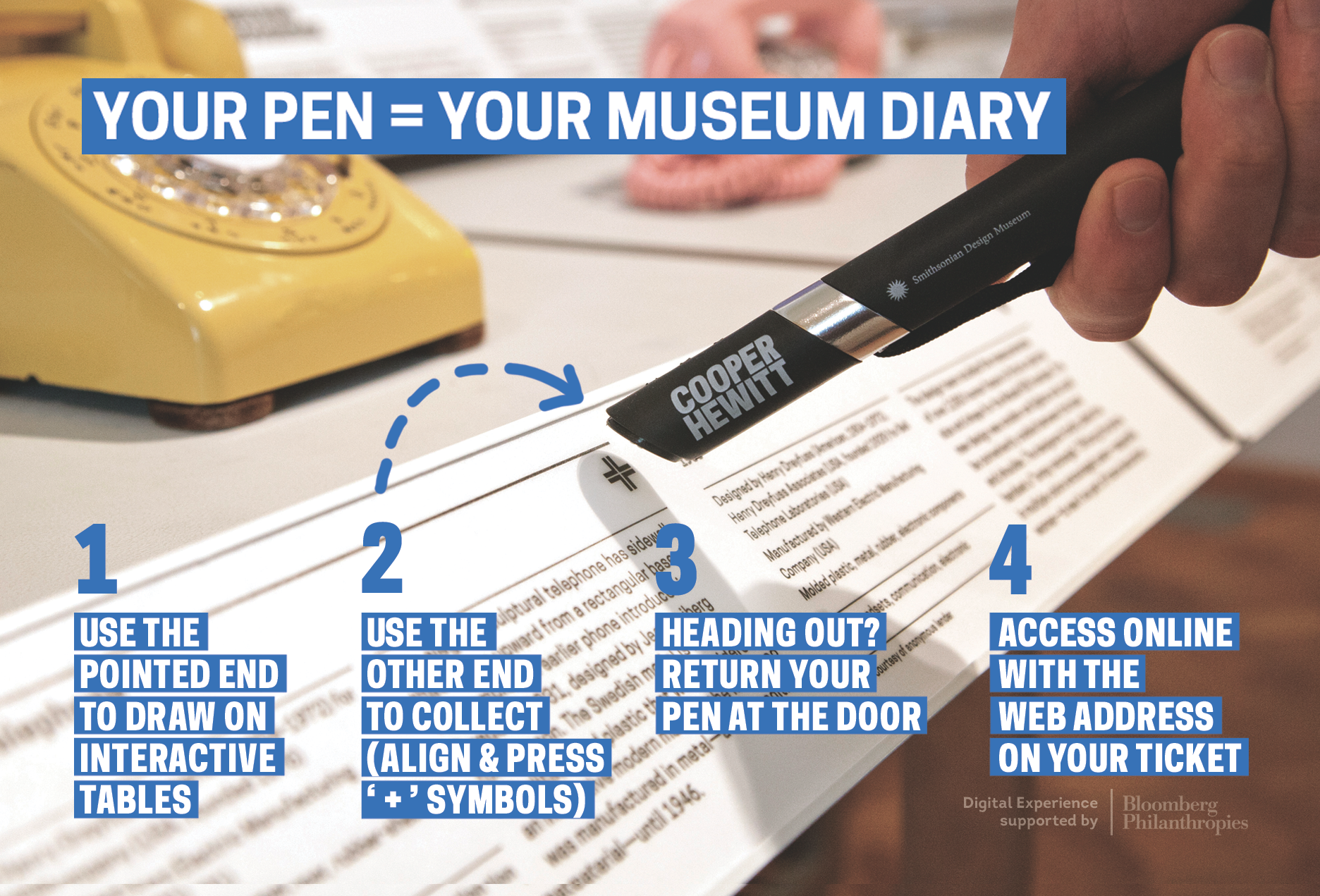
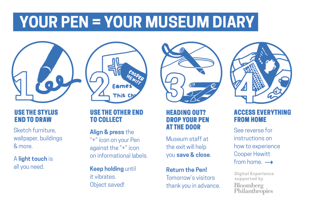
These instructions are less detailed, but also less tl;dr

three young people in a museum setting holding large black wands and pressing them to a touchscreen glass tabletop

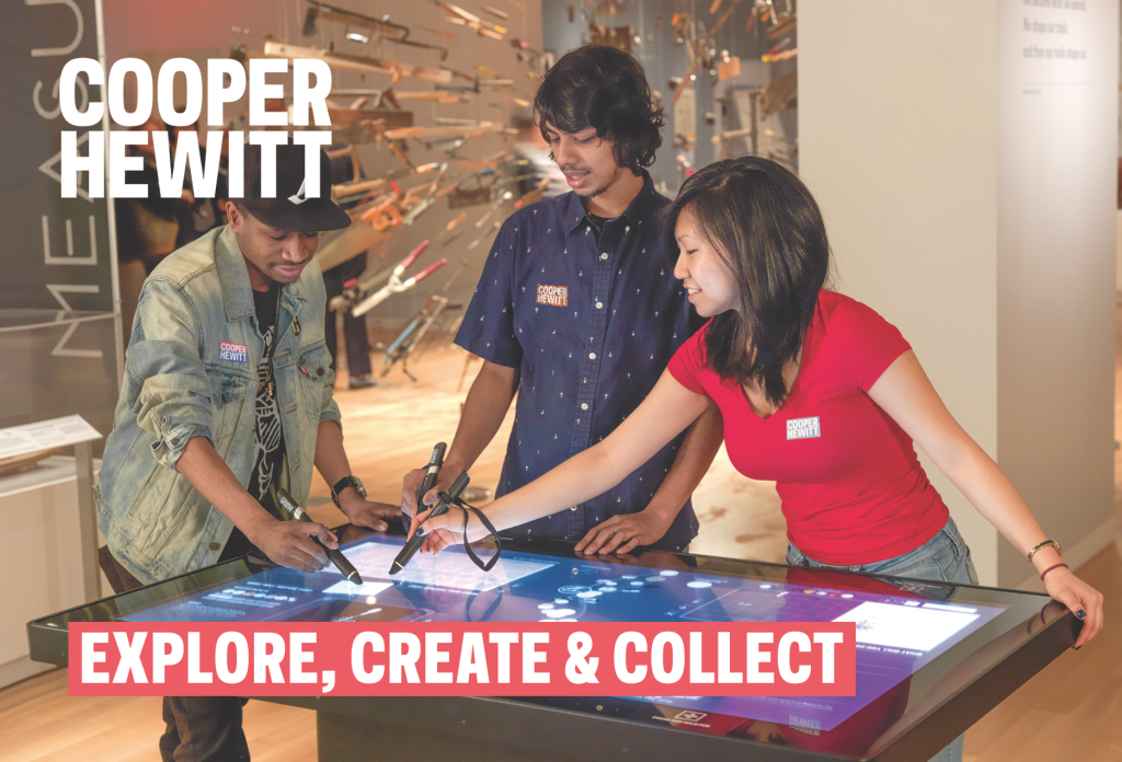
The new postcard shows real people using the pen, making it visually obvious what a person should do with it.

The second version has:

  • Giant copy to “sell” the pen by describing its basic functions (Create, Collect, Save).
  • Bigger images to catch attention and make the card more “pick-up-able.”
  • Less text to ease tl;dr anxiety.
  • Image and word choice is intended to make the function of the pen’s “tip” and “base” obvious just by looking.

100 days

Museum Stats | Collection of Cooper Hewitt, Smithsonian Design Museum

Today marks the 100th day since the Pen started being distributed to visitors. Its been a wild ride and the latest figures are far beyond our estimations.

As of today, Pens have been handed out to 40,846 visitors which represents about 93% of all eligible visitors so far. We’re not currently distributing Pens on Saturday nights, nor to education groups, so they’re excluded from the count.

When we were thinking about the Pen and its integration into the museum, ubiquity was a critical concern. We knew that making it an ‘addon’ or ‘optional’ wasn’t going to achieve the behavior change that we desired, so continuing to make the on-boarding process easier for visitors and staff has been very important.

All of that would be for nought, if those Pens weren’t being used. Those Pens have collected 889,156 objects – averaging nearly 22 per Pen. That’s really surprised us! With a median of 11 we are still working on new methods in the galleries to help visitors collect more with their Pens, and in some cases, get started.

We’ve been equally excited that visitors have chosen to save 35,138 of their own creations from the wallpaper room, 3D designs, and Sketchbot portraits.

We’ve seen dwell times on the campus – from the times visitors take the Pen to when they return on exit – balloon out to a current average of 102 minutes, slightly less on weekends.

Another surprise has been the ‘most collected object’. It is the Noah’s Ark cut paper from 1982, an object that is on display towards the back of Making Design on the 2nd floor – certainly not the first object a visitor encounters. We probably shouldn’t be very surprised though, as it does also show up frequently as a visitor favorite on Instagram.

If you’d like to see what else is popular then hop over to our newly public ‘basic statistics‘ page where the top six objects and other numbers update daily.

And as for the post-visit experience? Just over 25% of ticketed visitors check out their collections after their visit, and a third of them decide to create accounts to permanently store their collection.

Over the coming months we’ll be working on continuously improving the Pen experience in the galleries – and as next week’s new exhibitions open to the public, the museum will have changed over almost every gallery since December. A lot of those improvements are going to be, as we’ve already seen, not technical in nature, but about more human-to-human interaction and assistance.

The digital experience at Cooper Hewitt is supported by Bloomberg Philanthropies.

Label Writer: Connecting NFC tags to collection objects

IMG_20150610_113555

Labels, for better or worse, are central to the museum experience. They provide visitors with access to basic object information (metadata) and a tiny glimpse into the curatorial research for everything in the galleries, helping to place objects in context. At Cooper Hewitt, they are also the gateway through which the Pen‘s “collect” interaction is realized.

In order for the Pen to know which object label you’re trying to collect, every label in the museum contains an NFC tag that is written with the object’s ID. When an object gets added to our database we give it an ID, an integer that is unique across our entire online collections database. Our beloved Spanking Cat, for example, has the ID number 18382391. Writing that number to an NFC tag is a simple task, but doing it hundreds of times for every new exhibition we roll out will get tedious very quickly. Thus, Label Writer was born.

Label Writer is an Android app that writes, reads and locks NFC tags based on the object to which the label refers. The staff member can look up the objects that are in a given room of our museum, select one or more of them, and assign them to the label in question. They can search for specific objects in case an object’s location hasn’t been updated yet. They can also write tags for videos and shop items.

The front and back of the NFC tag we use in our labels, with pennies for scale

From left to right: the back and front of the NFC tags we use in our labels, and pennies for scale.

Planning

After thinking about the app we came up with the following requirements:

  1. When processing a user’s visit, we need to know what type of thing they’ve collected. When the Pen launched, this was either objects or videos, and has since grown to include shop items. To facilitate that process, Label Writer would have to distinguish between types of things and write tags that indicated that.
  2. It would need to write multiple things to a tag, including things of different types. One label might contain three objects. Another label might contain one video and two objects.
  3. It would need to lock tags. Leaving the tags unlocked would enable anyone with an NFC-enabled smartphone to walk around the galleries and overwrite our tags. Locking the tags prevents this.
  4. It would need to read tags and display images of what’s on a tag. This is so we can double-check what is on a tag before we lock it. We only print one copy of every label – sometimes through an offsite service – and the wall labels (as opposed to the rail labels) have their NFC tags glued in and unable to be replaced.
  5. Label Writer would have to present objects in a constrained format — having to find the object on a label from our total collection of 210,000 objects every time, through accession number lookup or other traditional searches, would get annoying very quickly.
IMG_20150608_172543

The NFC tags on our wall labels are built in to the label.

IMG_20150608_172442

The NFC tags on our rail labels are interchangeable.

Production

I decided to build the app in Android because it has great support for NFC and we have plenty of Nexus 9 tablets at the museum for use in the galleries. I started with this boilerplate for an Android read/write NFC app and performed initial tests to make sure we could write a tag that could be read by some of the early Pen prototypes. Once that was established, I began fleshing out the UI of the app and worked on hooking it up to our API.

The API gives us so much to work with on the app’s frontend. Being able to display an object’s image is a much better way to confirm that a label is written correctly than by comparing IDs or accession numbers. The API also lets us see all of the objects in a given room of the museum, which means that the user can write labels in an ordered fashion. When the labels arrive from the printer they are grouped by room, and often we will not write the tags until they have been installed in the galleries, so “by room” is a convenient way to organize objects on the frontend. It also gives us easy access to videos and shop items, and allows the app to easily be expanded to write labels for more things from our collections database. Since our collections site alpha, we have stressed the importance of an easily-accessed permanent ID for everything: people, objects, videos, exhibitions, locations etc., and now with the Pen we can prepare labels that allow users to collect any one of those things during their visit to the museum.

01

When I took all these screenshots, the app was called “Tag Writer”, as in “NFC Tag Writer.” But “Label Writer” sounds better.

When the app is opened, the user is prompted with a few ways to group objects. Since we added videos and shop items to the app, this intro screen has grown a bit so it will probably get a redesign when we next expand its capabilities. But for now, users have a few options here:

  1. They can select a room from a dropdown menu (here’s a list of all of our rooms)
  2. They can enter an individual accession number
  3. They can enter a video’s ID
  4. They can search the shop (see Aaron’s recent post about adding shop items to our online collection)

When one of these options is used, the relevant objects appear on the screen. For example, selecting Room 106 brings up some of the posters from our current How Posters Work exhibition. Being able to display the images of the posters makes it much easier for the user to confirm that they are connecting the dots accurately — accession numbers and object IDs are easily confused (not to mention boring to look at).

02

The user can then tap one or more objects to add them to a label. In the screenshot below, you can see that two objects have been selected and the orange bar at the bottom has formatted them to be written to a tag — in this case, chsdm:o:68730187;18708395. The way that things get written to tags follows a format we agreed upon early in the Pen design process, as various developers would be building applications that relied on reading and parsing a Pen’s content. In brief, chsdm is a namespace for our museum that is not particularly necessary but serves as a header for what follows. o stands for object and then the ID (or semicolon-delimited IDs) that follow are the IDs of objects. The letter can change: v for video, s for shop, and on and on for whatever other things we might eventually write to tags. We add a pipe character (|) to delimit multiple types of things on a tag, so a tag with an object and a video might look like chsdm:o:18714653|chsdm:v:68764195. But all of this is handled by the app based on what the user selects in the interface.

03

Next, a user can hold the tablet up to the object label to write the NFC tag. When the tag is written, the orange bar at the bottom turns green to let the user know it went okay. Later, using the “Read Tags” functionality of the app, the user can confirm the tag’s contents by reading the NFC tag. The app parses the tag and loads the things it thinks the tag refers to. When this is confirmed, the user can lock the tag to make sure nobody overwrites it.

05

Here’s everything, from start to finish, using the object-lookup-by-accession-number functionality.

Next Steps

I mentioned that the home screen of this app will get a redesign as we allow more types of things to be written to tags. The user experience of the tag writing process needs a little finessing — a bug in how success messages get displayed has resulted in a few tags that get written with bunk data. Fortunately that is caught in the “read” phase of the workflow, but should be corrected earlier.

Overall, as we keep swapping out exhibitions, Label Writer will get more and more use. We will use these opportunities to collect feedback from the app’s users and make changes to the app accordingly.