
A few weeks ago we rolled out a small update to the ticketing website that sends a reminder email to anyone who has purchased tickets in advance.
This is sort of an experiment. but first, some background.
Recently I attended an event at another cultural institution ( which I won’t name ). A few days prior to the event I received a very up-selling reminder email, reminding me of membership discounts and other events I might like. The links within the email took me to the landing page for the event, and offered little actual information that I found useful unless I wanted to buy even more tickets, or combine my purchase with a book in the shop.
To make things worse, on the night of the event, and just as it was finishing up, I received a “follow up email” , which I found really annoying. It was literally timed to send exactly as the event was ending and while I was on my way out the door, as if to say, “wait, come back in and buy the book too!”
In fact, the subject line read “How did I enjoy [insert event title here]?” But, the email itself didn’t offer me a way to answer that question ( even if I wanted to ) and instead simply pointed me to the same landing page of the event I had just attended, along with links to their social media channels and other upcoming shows I might be interested in. The whole thing made me cringe a little as I pressed the delete button on my phone.
I thought to myself, “let’s not do that.”
I really just wanted to send a gentle reminder email, full of actually useful info to people who were planning to come visit the museum. I thought it would be nice if I had booked tickets in advance to get something like this the day before I was planning to visit. Something with a map and some info on how to get here, and potentially a little synopsis of what I might do once I arrived.
So, here was my thought process.
Like I said, it’s an experiment, and so I’m still just sort of beta-testing this feature, and trying to analyze how useful/annoying people find it. We already get so many emails, so I really wanted to make sure I wasn’t bombarding our visitors with additional garbage, or even worse, confusing them with unneeded information like what I’d recently experienced.
First of all, it would be all about timing. While talking out loud in the Labs about this one, Aaron’s comment was simply “time zones.” Computer’s have time zones ( all of ours are set to UTC ), people are in time zones. It was clearly something to consider.
Right now, we can only assume that you will be here sometime during our open hours on the day you purchased the ticket. We don’t presently do timed tickets, and unlike an event space, each day’s “performance” spans the entirety of our hours.
So we decided to try out sending the reminders the day before at 4pm, our time. I guess it’s generally safe to say that visitors are nearing our time zone the day before their visit, but its really still a best guess. Also, we are not going to “remind you” if you are booking for the same day as that’s probably overkill. So for now, at 4pm, the day before your visit, is when the email goes out.
Next I had some fun coming up with a way to extract all the relevant info from our Ticketing CRM ( Tessitura ).
I needed the following info:
- All the things going on tomorrow ( this is sort of future proofing for when we let you book other things beyond general admission )
- All the current orders for all the things going on tomorrow.
- All the email addresses for all the orders for all the things going on tomorrow.
Getting “tomorrow” was pretty easy in PHP.
$datetime = new DateTime(‘tomorrow’);
$tomorrow = $datetime->format(‘Y-m-d’);
4pm EST is 9pm UTC on the same day, so all good there in calculating “tomorrow.”
Our Tessitura API wrapper I mentioned in my last post has a method that lets us get all the “performances” in Tessitura for a given date range. Simply passing it “tomorrow” yields us all the things we are looking for. We also have a method that can get all the orders placed for a given performance. Finally, we have a method that gets the email for the user that placed the order.
Now we can send the actual email.
Obviously, people place multiple orders and buy multiple tickets per order. I really only want to send one email regardless of what you’ve booked. So when I am looping through all the orders, I only add the email address to the list once.
The last step was to make a cron job that runs this script once a day at 4pm. Done!
( Incidentally, all of our servers are set to UTC, but for some reason our RedHat server’s crontab doesn’t seem to care, and somehow ( possibly magically ) thinks it’s on EST. I have yet to figure out why this is, but for now I am just going with it. )
Right now, the email is a fixed template. We are sending out emails via Mandrill, so we get some decent analytics and can track open rates, and click rates. We also added Google Analytics tracking codes to all the links in the email so we can see what people are clicking right in GA.
So far we’ve experienced an open rate of about 75% and a click rate of about 20%, which seems pretty good to me.
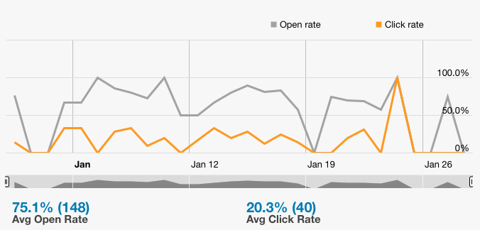
Our open and click rate for the last 30 days.
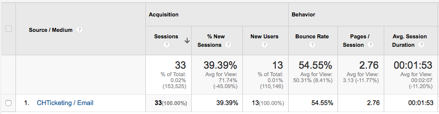
And here is the GA results for the “Ticket Reminder” campaign from the same time period. From here you can dive deeper into the analytics to see what pages people are heading to once they are on the site, and all sorts of other metrics.
Since you can only really “see” this feature if you book an advance ticket I’ve posted an image of what the email looks like below. We went through a few design iterations to get it to look the way it looks, and I’d really love to hear your thoughts about it. If you were visiting us, and received this email the day before your visit at 4pm, would you find it useful, annoying, or confusing?
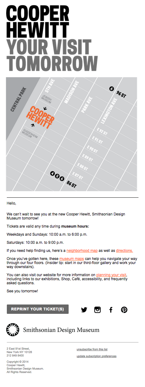
Our reminder email template
Of course this will change again when the Pen goes live shortly.


")
")
")
")


