So, Micah Walter has asked me to blog about Object Phone. I’m Frith Williams, from the Museum of New Zealand (Te Papa), and I’ve been spending time with Micah, and the Cooper Hewitt team exploring all the cool stuff they’ve been doing. They’ve made me feel very welcome. (The Aussie coffee around the corner helps.)
I love the way these guys continually experiment. If something can be done quickly and cheaply, why not do it? You work out where to go from there. On that note … Object Phone.
I’m going to let you experience Object Phone the way I did – by stumbling over it. After all, that’s how many visitors encounter museum content. It’s also how we need to reflect on the visitor experience – as a journey of discovery.
Sounds intriguing
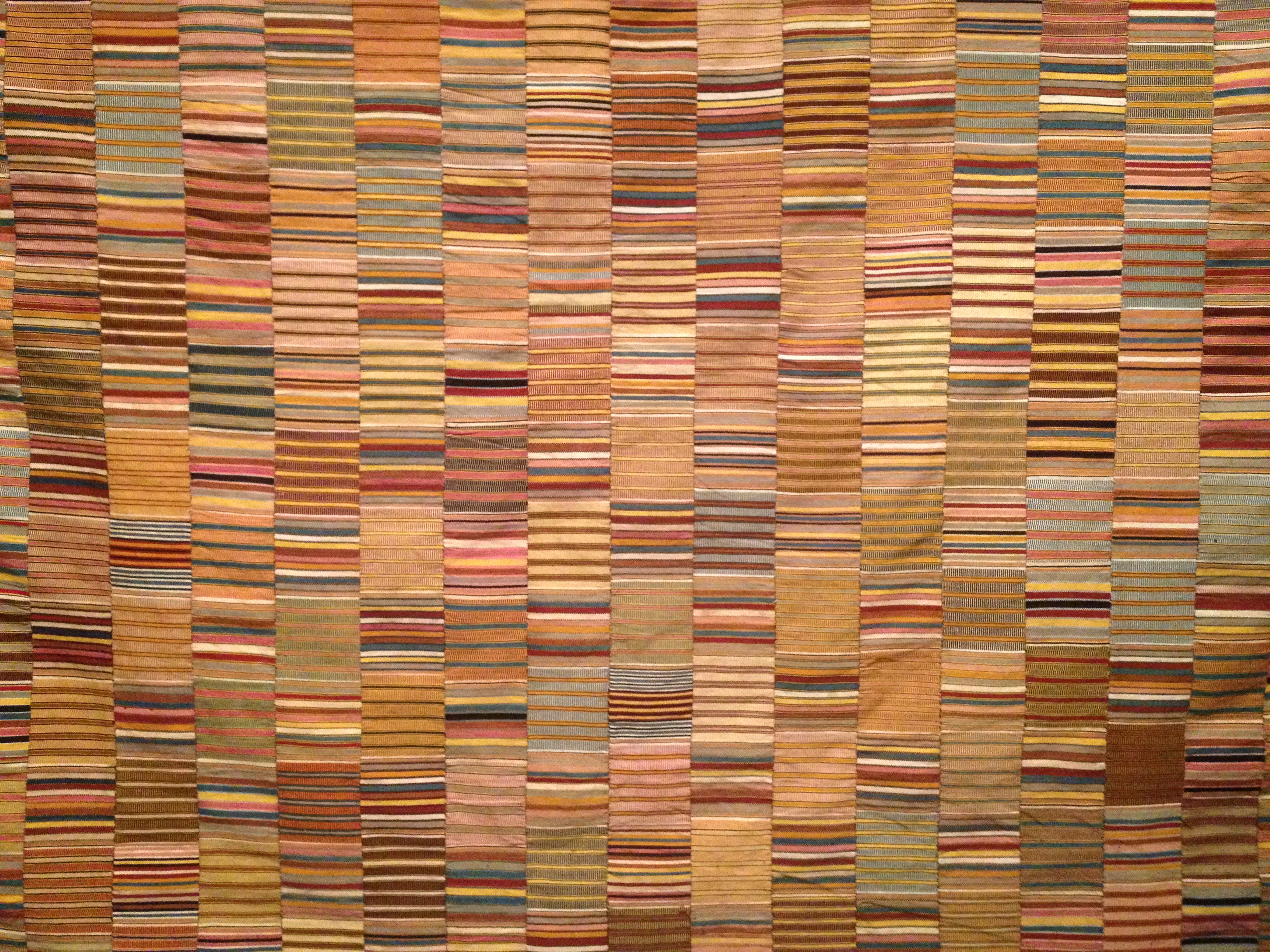
I’m in the exhibit David Adjaye Selects.
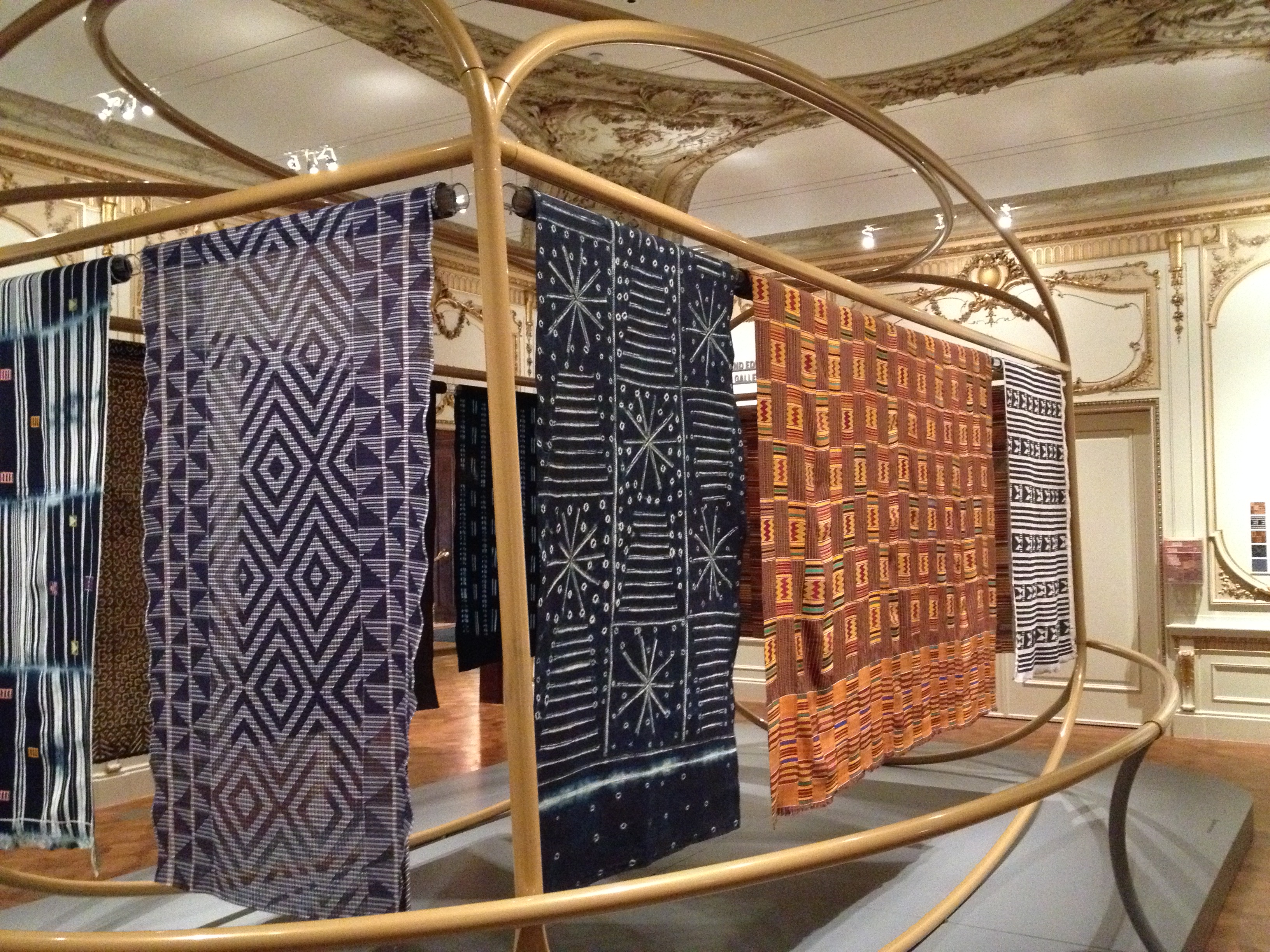
David Adjaye Selects exhibition
I scan rather than read the introduction (as one does). Here’s what I absorb: David’s been asked to respond to the collection, and this installation is the result. He’s an architect of African heritage, and he’s chosen to showcase African textiles. Skimming to the bottom: The exhibit is part of a series of personal responses from designers, artists, and others. Nice concept.
I wander along and notice the Object Phone label before reading anything else. Sounds intriguing.
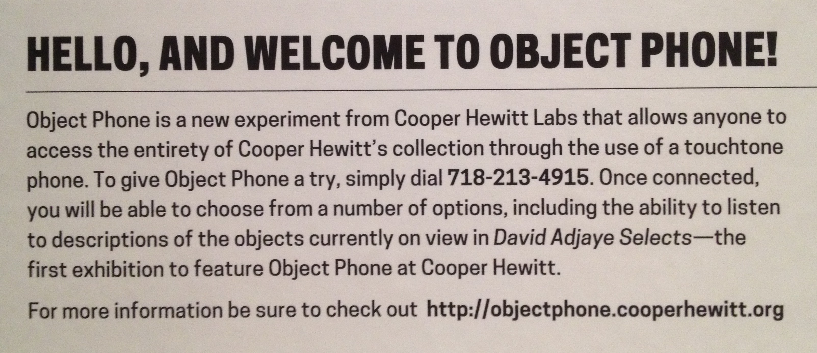
Object Phone intro
Hello, is that David?
I dial 718-213-4915 (you can do this now if you have a US mobile phone) and a nice man introduces me to Object Phone. I can press:
- 1 to listen to objects in David Adjaye Selects
- 2 to search the entire collection (not quite up and running yet)
- 3 to listen to a random object.
I press 1 and receive an intro to the ‘Selects’ gallery. I like that I’m not glued to my mobile screen, and can listen with one ear as I wander. Ah, the freedom of audio.
I zone out a little as the intro continues, but when I hear ‘I was immediately drawn to its African textiles’, I’m back in. Is this David then? Did the voice change without me realising it? What he’s saying sounds familiar, if a bit distant and abstract. The penny drops. It’s the exhibit introduction, so it’s been written for the page rather than the ear. Not David after all, but never mind.
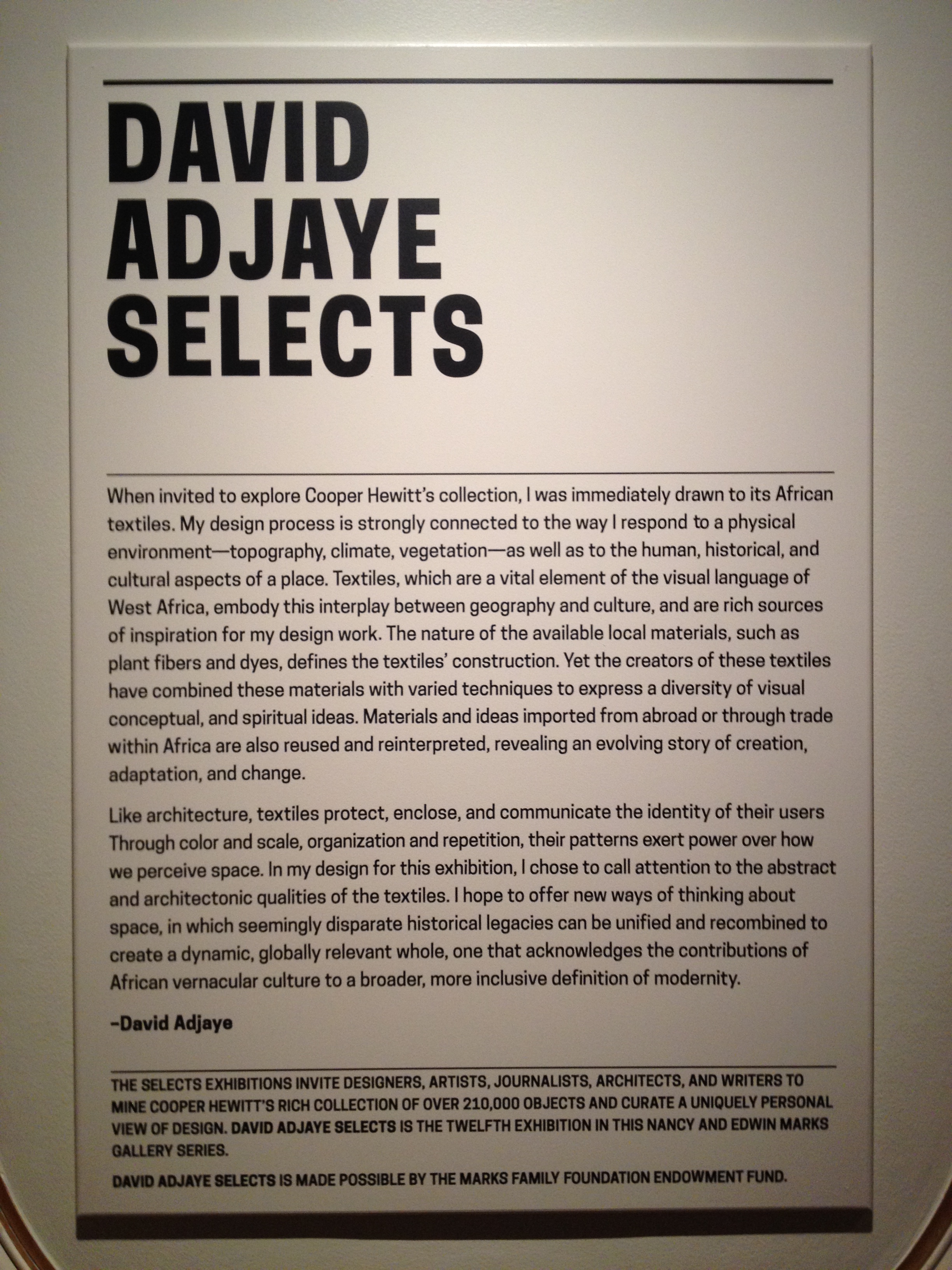
David Adjaye Selects introduction label
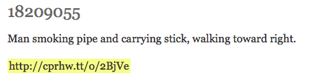
When the intro finishes, I punch in object number 18467877: Woman’s wrapper. What I hear is very detailed (medium, technique, the ins and outs of warps and wefts), so for a moment I wonder whether I’ve accessed information for the visually impaired. At least, David’s story (the story of the exhibition) isn’t the focus.
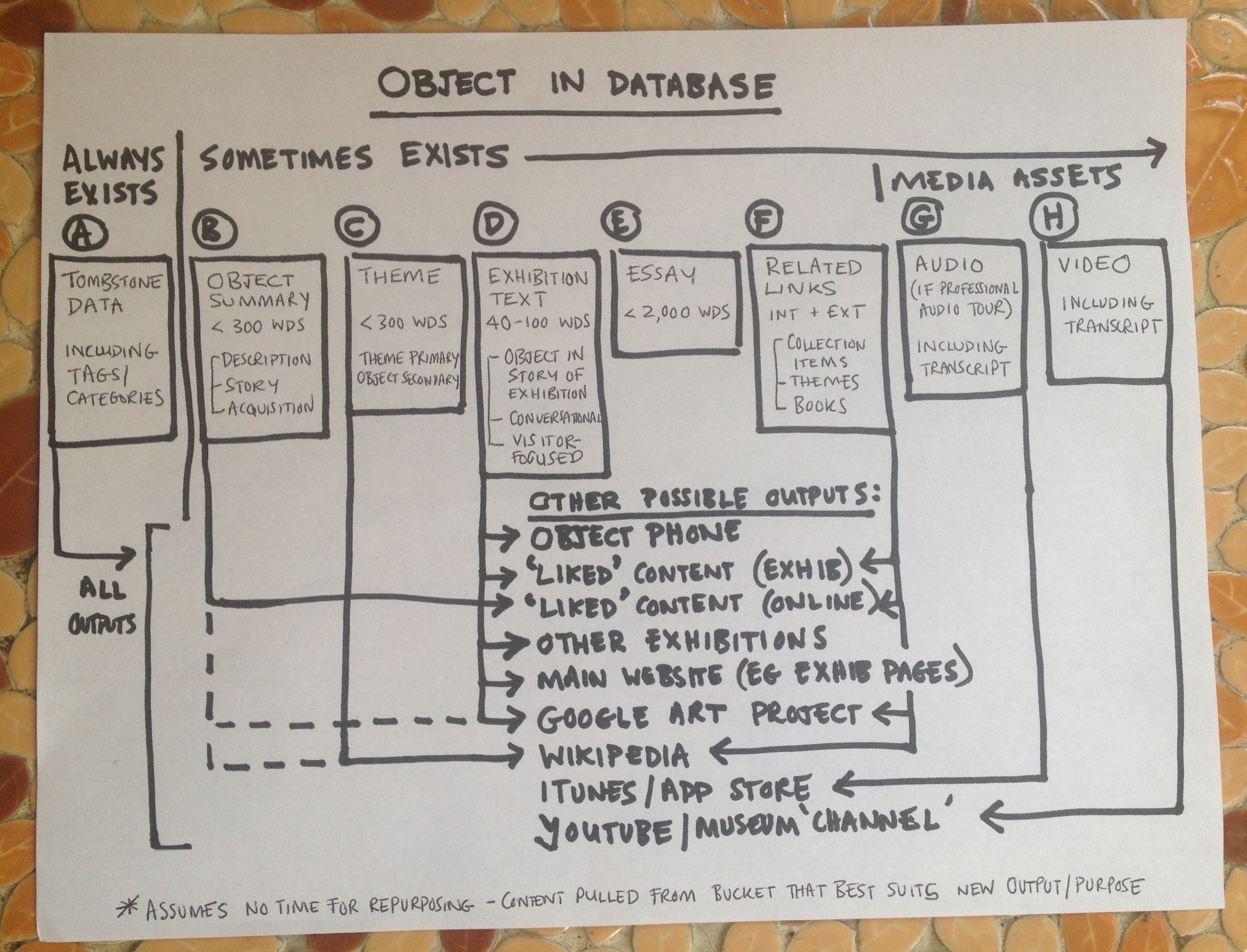
Ka-chink. The content’s coming from the collection database. I recognise the format: 1) basic details, 2) visual description, 3) context (or some combination). Some entries run for a few minutes, and extend to a level of detail that can be hard to absorb for a visitor on the move. Others are shorter and consist of only 1, or 1 and 2. This variation is pretty standard for museum databases.
Kente prestige cloth (18705685) reads like this
Kente prestige cloth, Ghana, early to mid 1900s. Cooper-Hewitt Smithsonian Design Museum (18705685)
Access to info versus customising content
Object Phone raises a really interesting question around the balance between providing access to information and customising content. Like much of the new Cooper Hewitt experience – and I love this – it’s centered on offering new avenues to access and interact with the collection. The Immersion Room does this, as do the interactive Collection Browser tables.
Cooper Hewitt’s new interactive experience
At Te Papa, we’re also looking for innovative ways to repurpose content and push it out across multiple platforms. Populating the database and linking objects via metadata (as Cooper Hewitt has done so brilliantly) are central to that. But we have debates about the extent of rewriting and repackaging required. The two extremes?
- ‘Get the stuff out there now; something is better than nothing’
- ‘You can’t release anything until it’s perfect’ (a hang-over from print-publishing days).
Making the database work for us – and visitors
I’m interested in finding a middle ground – in asking ‘For which places, people, and purposes is this type of content suitable?’ – and embedding that in how we work and in the database.
Context and audience are important, and Create Once Publish Everywhere (COPE) is bit of a myth. Writing a database entry, for example, differs markedly from writing for someone looking at the real thing in the gallery, or writing for the ear. For gallery labels and audio content, we avoid describing what’s obvious, instead drawing attention to what’s harder to see or what you might not know. And the voice/tone of the narrator has a huge impact on how visitors connect with content.
But we can’t give up on COPE completely, particularly with limited resources (we’re not all big, well-funded museums after all). We need to keep sufficiently similar platforms in mind when creating content. For example, a wall label that’s short, uses keywords, starts with the hook, and is ‘chunked’ will work well online. And one that conveys key exhibition messages, has a conversational tone, and encourages close looking could make pretty decent audio for something like Object Phone.
We also need to establish systems to repackage content in the most efficient and visitor-centered way possible. That’s why I love the Cooper Hewitt’s focus on the collection database – they get that it’s the bedrock underlying all we do – and why I think Object Phone is a step in the right direction. Micah’s very clear that Object Phone is an experiment, and it’s about making the most of existing content. But from a user experience perspective, it also helps to make the next steps more concrete.
We need to:
- make our databases more user-friendly for content creation, storage, and repurposing (eg, enable easy editing, importing, and exporting/recording/translating)
- add fields (‘buckets’) so there’s more flexibility to extract appropriate content for sufficiently similar contexts
- create easy-to-follow guidelines to support quick content creation and repurposing.
Cross-platform content publishing
‘Just build it, go for it’
Here’s what Micah says: ‘You build something … however ugly … and do your best to stop fussing with all the mental blocks and insecurities. You put it out there, and … if it really works, and if people respond … you get back to it.’ Exactly what more museums need to do.
So now that Object Phone is an action, what tweaks might be made? A couple come up (like being clear where the information comes from, and avoiding the repetition of the menu and intro after each entry), but many questions will only be answered over time. We’re all trying to work out:
- How many visitors actually want additional collection information in the exhibit space – and what sort/how much do they want?
- Where’s the line between enhancing and confusing the core experience?
- In a world of instant information about everything everywhere, at what point might people become saturated and prefer to be immersed in a more curated museum experience?
Found poetry and other potential
The most exciting aspect of Object Phone is the potential it might reveal. The accessibility applications are obvious, especially for the visually impaired. But my ears really prick up when Micah talks about using the system to capture user feedback in the galleries by phone. Maybe there’s a Halsey Burgund-like soundscape in that? Similarly, I love the potential of Micah’s side project Curatorial Poetry. (Te Papa Writing Team, check it out.)
Curatorial Poetry on Tumblr
By getting experiments like Object Phone out there, the possibilities begin to multiply. Just another reason why techies and content creators should get together and drink coffee more often.
The part of Object Phone I like most is the part you’d think might not work: Random Object. The first entry I strike says (in a stilted, computer voice): ‘Hi, you’ve reached Fragment, 13th century. Thank you for using Object Phone.’ It makes me smile.
Please leave a message after the tone.
Fork Object Phone on GitHub
Welcome to Object Phone on Cooper Hewitt Labs – Micah’s first post on the project


")
")
")
")

