Tag Archives: collections

Making ‘Dive into Color’

Guest post by Olivia Vane

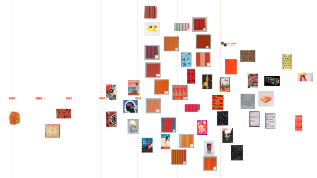
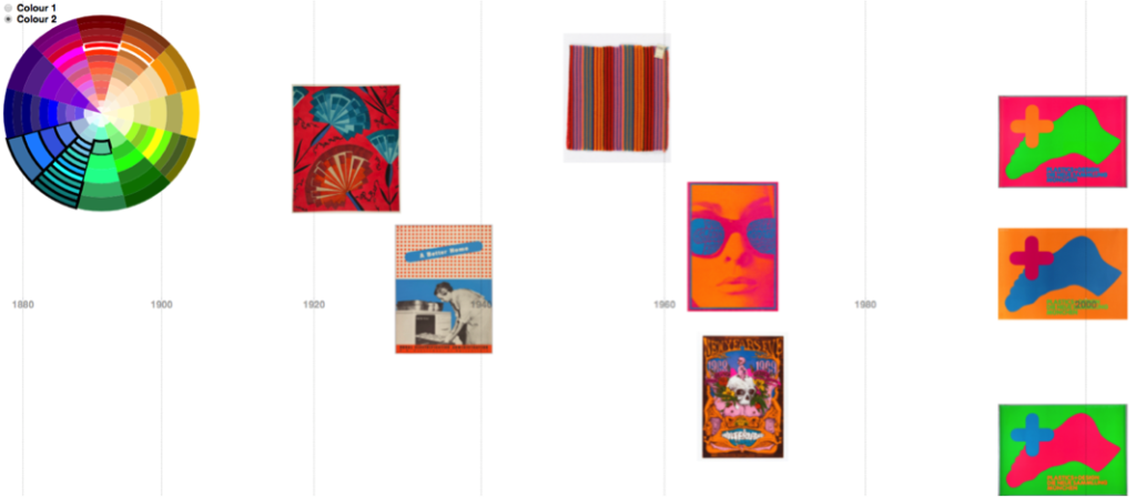
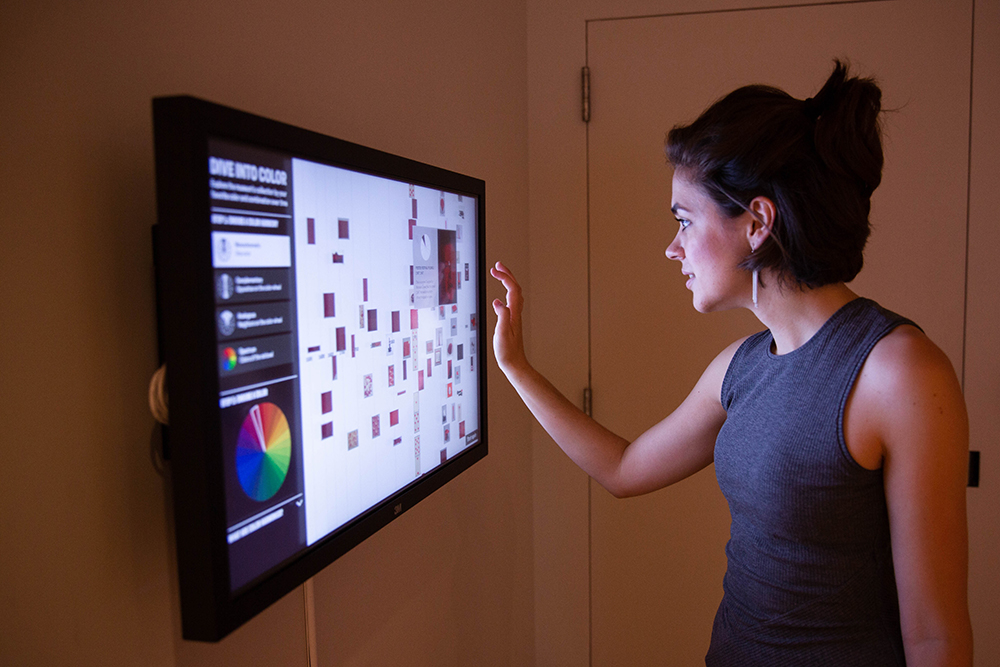
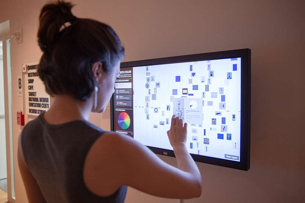
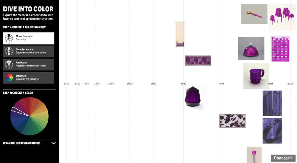
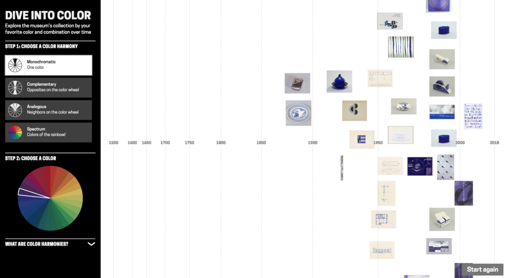
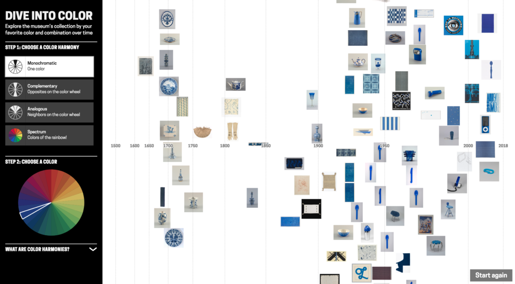
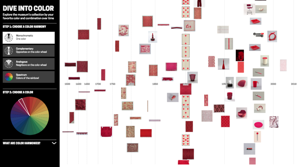
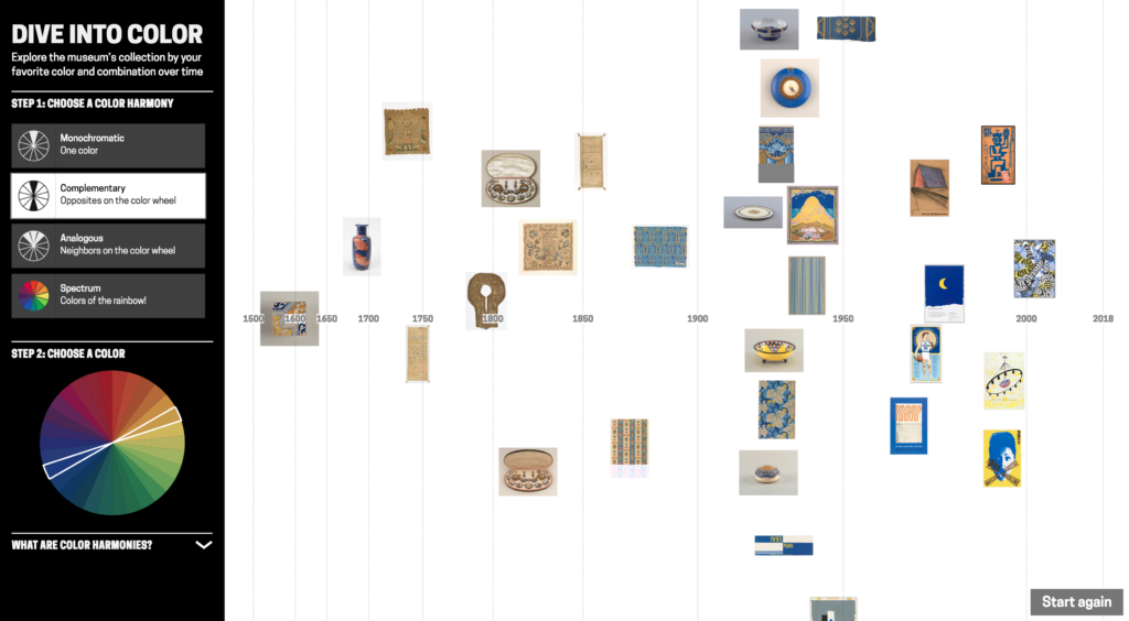
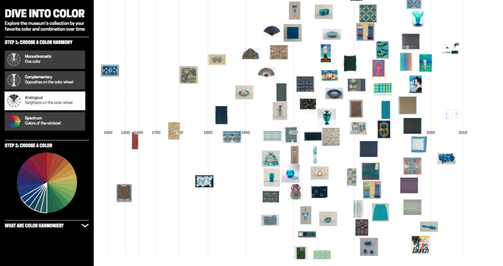
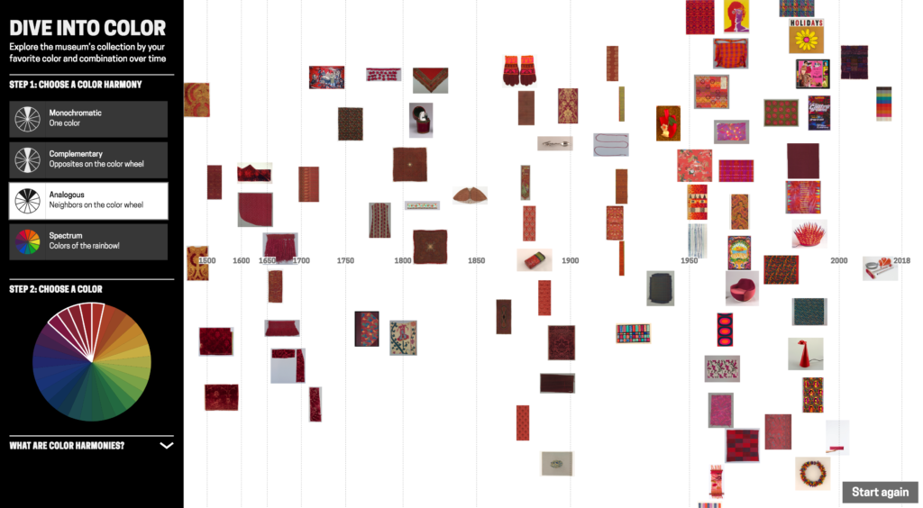
‘Dive into Color’ is an interactive timeline for exploring the Cooper Hewitt collection by colour/colour harmony and time. It is exhibited in ‘Saturated: The Allure and Science of Color’ 11 May 2018 – 13 Jan 2019.

Since spending time at Cooper Hewitt last year on a fellowship, I returned to London where I’m a PhD student at Royal College of Art (RCA) in Innovation Design Engineering supervised by Professor Stephen Boyd Davis. At Cooper Hewitt, I developed a prototype timeline tool for visualising the museum collection by tags.

This post describes further work on that prototype, shifting the tool to exploring the collection by colour. As a curator explained: “[visualising by] colour, I think, is useful for the purposes of the study of the taste for different colours, but it’s also a more interesting exercise for the public just to be able to do and get pleasure out of.” Colour is enjoyable – it’s eye-catching and vibrant – and it offers a visual, intuitive way to explore a digitised collection without needing specialist knowledge. With a design collection like Cooper Hewitt’s, tracing colour through history is also interesting for looking at fashions and innovation in colour technology.

I’ve been asked a few times recently what my process is for designing visualisations. So in this post I’m going to step though the early prototypes and retrace my design decisions. Along the way, I will talk over practical points for working with colour (and colour harmonies!) in collection data, and working between digital and artist colour systems.

Previous colour-collections visualisations
Colour has previously been used both as a facet for search and for visualising collections. Geoff Hinchcliffe’s ‘Tate Explorer’ offers colour as a search facet paired with a timeline. This prototype from the Swedish National Heritage Board (write-up forthcoming) combines colours and tags for exploring a fashion collection. Richard Barrett-Small’s ‘ColourLens’ searches over Rijksmuseum and Walters Art Museum data by colour with a graphic for each item visualising its colour proportions. And Google Arts & Culture’s ‘Art Palette’ is a search engine that finds artworks based on a chosen colour palette.

Collections visualised by colour include the Library of Congress, where Laura Wrubel created this tool for overviewing the colour palettes of objects over a collection and Jer Thorp visualised the colour names present in the titles of works. Also using Cooper Hewitt data, Rubén Abad created this visualisation of the colours present by decade in Cooper Hewitt’s objects. Lev Manovich has visualised artworks, for example Mondrian and Rothko paintings, by colour characteristics including hue and saturation. Everardo Reyes visualised Paul Klee’s paintings by hue. And Brian Foo’s visualisation of the New York Public Library digitised collection has an option to organise items by colour.

I was interested to explore colour alongside the time dimension. And since Cooper Hewitt was preparing for an exhibition, ‘Saturated’, focusing on colour theory and design, I was intrigued to see if I could trace colour harmonies across the collection.

Colour harmonies are combinations of colours that are pleasing to the eye. The relative positions of colours in a colour wheel can be used to describe different harmonies like complementary colours (opposites on the colour wheel), or analogous colours (neighbours on the colour wheel). Artists and designers create different visual effects and contrasts with different harmony types.
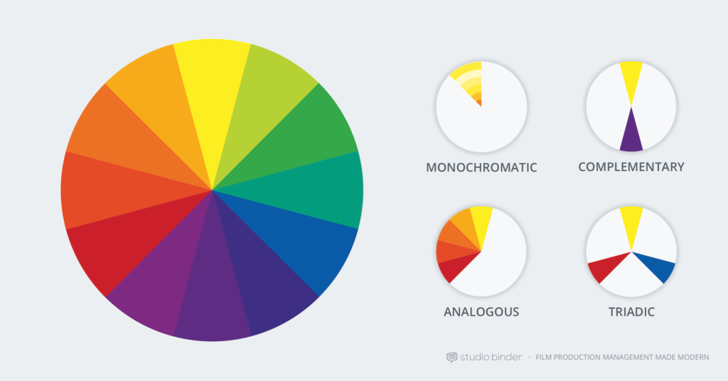
Colour harmony examples, image from studiobinder

Extracting colours across the Cooper Hewitt collection
It’s already possible to search by colour on Cooper Hewitt’s collection site. Colour data was extracted using Giv Parvaneh’s great tool RoyGBiv (described in this Cooper Hewitt Labs post). Roughly, RoyGBiv works by checking the colour value of each pixel in an image, clustering colour values that are similar enough to be considered the same and returning up to 5 dominant colours in an image.

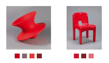
The colours extracted from Cooper Hewitt’s collection with RoyGBiv are good on the whole, but errors sometimes occur. The background colour is sometimes picked up. The effect of light and shadow on a 3D object can introduce multiple, illusory colours:

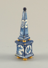
As always there are quirks working with digitised collections, like these Dutch tiles which had coloured stickers on them when they were photographed:

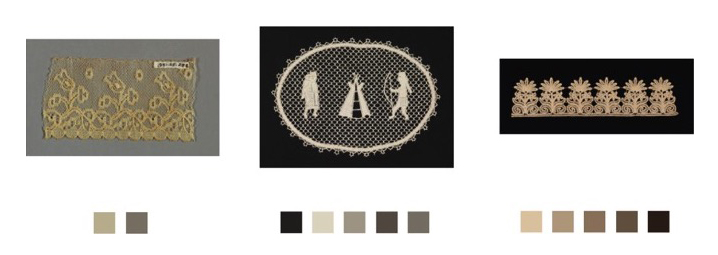
Or lace photographed against a dark background for contrast:

Since the possible number of unique colours extracted across the collection is huge, searching by colour on the Cooper Hewitt website is simplified by snapping extracted colours to the closest value in a standardised palette (the default is the CSS4 web colour palette, but the CSS3 and Crayola palettes are also options). On the Cooper Hewitt website, you can search the collection by 116 CSS4 colours. Both the original and ‘snapped to’ colour palettes are available in the Cooper Hewitt data – all stored as hex codes (six hexadecimal digits representing the levels of red, green and blue).

Prototyping
As a first step, I adapted my code to visualise collection items matching a CSS4 colour on a timeline (see visualisations below).

Although Cooper Hewitt has an API (an Application Programming Interface: a way for someone to make use of Cooper Hewitt’s data through a set of pre-defined requests made over the web), there is no method for returning all the objects matching a colour. Instead, I used collection data Cooper Hewitt had put on GitHub – an argument for institutions to offer both!

‘Orangered’

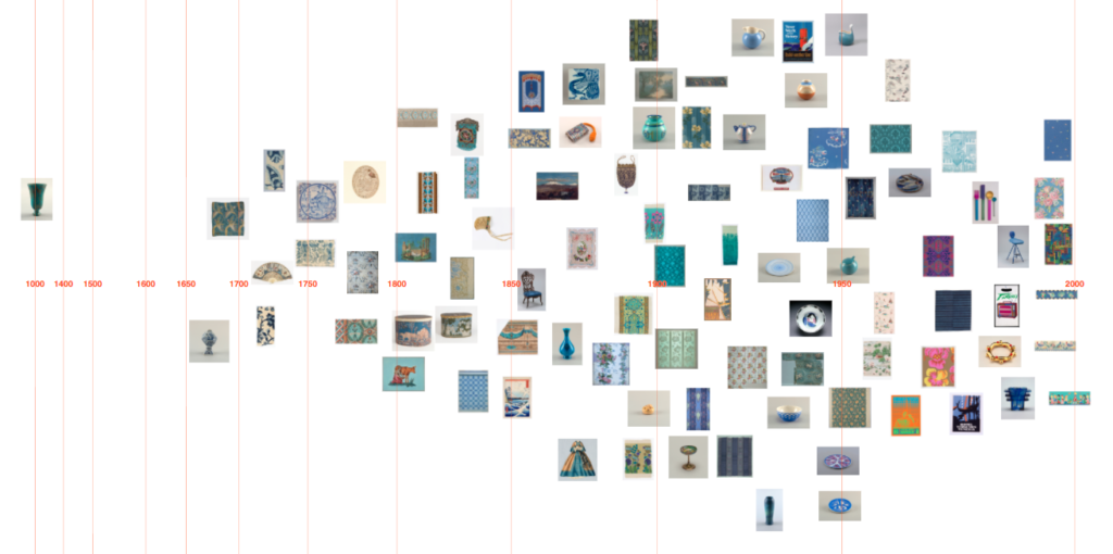
‘Steelblue’

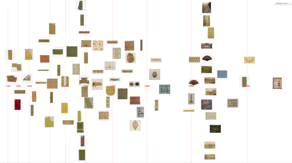
‘Olivedrab’

I then started exploring how I might visualise objects featuring a colour harmony, first trying complementary colours (opposites on the colour wheel).

I initially tried to do this by matching a chosen CSS4 colour with the nearest CSS4 colour of opposite hue. The HSL and HSV (hue, saturation, lightness/value) colour systems define hue as an angle round a circle (0-360°), so I inverted hues by converting hex codes to HSL. The visualised results were unsatisfying though, as often the search failed to find any matches. This doesn’t mean to say there was a lack of objects with complementary colours, but that my search was too precise (and artificially precise since which CSS4 palette colours you can consider to be complementary is fuzzy, and the colour data is imprecise anyway e.g. the illusory colours extracted for 3D objects).

I tried extending the reach of my search to matching several colours close to the inverted hue, but it felt very frustrating not to have a visual reference to the range of colours in a region and what colours were being searched over.

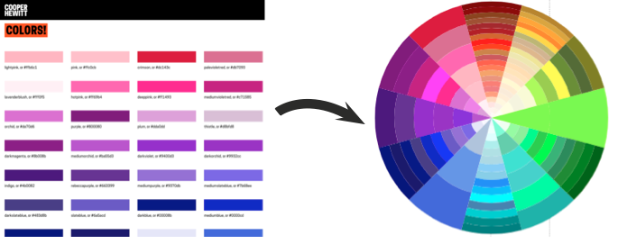
So I started experimenting with using a colour wheel input as a way to pick colour combinations and simultaneously see possible hue relations. I first tried mapping the colours from the standardised palettes by HSL round a circle.
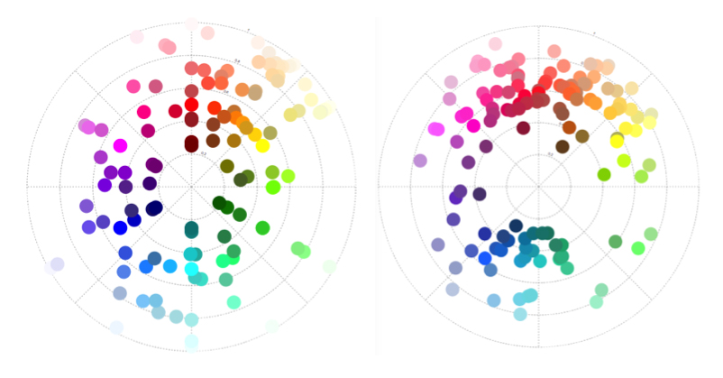
‘Snapped to’ colours in the Cooper Hewitt collection. CSS4 (left) and Crayola (right) palettes mapped by hue (in HSL). Angle = hue, radius = lightness.

And to make it easier to see the possible colours, I wrote some code to map the CSS4 palette colours to a wheel.

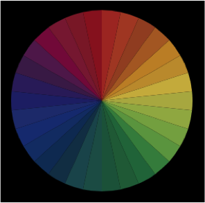
CSS4 palette colours → mapped round a wheel. Hue (HSL) = angle, ordered by lightness

I realised at this point, though, that the resulting design doesn’t match a typical artist’s/pigment colour wheel (which has red, yellow, blue – RYB – primary colours). HSL is a simple transformation of RGB colour space, and therefore the wheel has red, green, blue primaries. If this colour wheel is used to search over design artefacts, surely it would be more appropriate to use a design closer to the norm for artists and designers? (These in-depth articles by David Briggs – part 1, part 2 – explain the differences between traditional and modern colour theory, and colour training for artists).

There is no ‘correct’ colour wheel to adopt, but converting my HSL colour wheel to something closer to an artist’s version (using code from Ben Knight’s implementation of Adobe’s ‘Kuler’ colour wheel) felt like a reasonable compromise here.
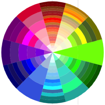
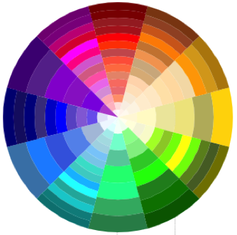
(Left) Colours mapped by hue (HSL). Angle = hue, radius = lightness. (Right) Colour mapping adjusted to more closely resemble an artist’s colour wheel.

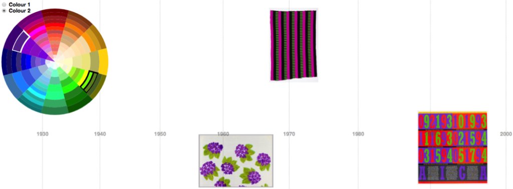
Using this colour wheel as a guide and an input, I could see and choose which colours to query. By searching over multiple colours, the visualised results were better. (In the images below, white and black borders around tiles in the colour wheel indicate the searched-over colour combinations):

Purple against olive timeline

Orangered against cyan/blue timeline

Querying against colour data in HSV
While the results looked better with this prototype, the user interface is a mess and complicated to use. And the search query was not excluding objects that featured other colours in addition to the searched colour combination.

Sticking with the CSS4 palette was greatly complicating the task, so I abandoned using it. I converted all the original extracted colours (not ‘snapped’) from hex codes to HSV and created my own Elasticsearch index with the HSV colours stored as a nested datatype. This way I can: search over a hue range, with a threshold on saturation and value; exclude objects also featuring other hues; and it is simple to define more complex colour harmony searches (e.g. analogous, triadic, quadratic and split complementary).

Different colour harmonies tried in prototyping

Colour wheel graphic for objects
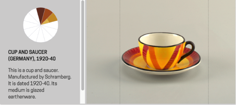
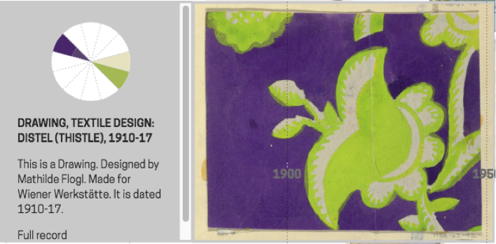
As a by-product, I realised I could repurpose my code to map individual object palettes round a colour wheel too. Thus, you get a compact graphic describing the colour relationships present in a single design. This is a nice example of the serendipity of designing, where you identify new possibilities as a result of seeing what you have already made.


(Above) Object with colour palette, (below) palette mapped to a wheel: easy to see complementary harmony


Colour wheel graphic examples

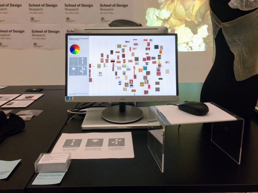
I adapted a simple artist’s (RYB) colour wheel to use as an input and tested the prototype with visitors at Royal College of Art’s January 2018 ‘Work in Progress’ show.

Testing the prototype with visitors at Royal College of Art’s Jan 2018 ‘Work in Progress’ show

In order to avoid reducing the size of the images (so it’s still possible to see what the objects are), I’ve capped the number of visualised objects to the 100 most saturated in colour.

There were few hits for the more complex harmonies (quadratic, tetradic, split complementary) and the results felt less convincing. I had widened the hue range to search over in order to increase the small number of hits, so the results were less visually cohesive anyway. And, in conversations with the museum curators, we decided to drop these more complex harmonies from the interface.

As mentioned earlier, there are some errors in the colour data. At this stage, since this setup only allows a fixed set of possible searches, with repeatable results, it was worth it for me to do some manual editing of the colour data to remove obvious errors.

Final interface design
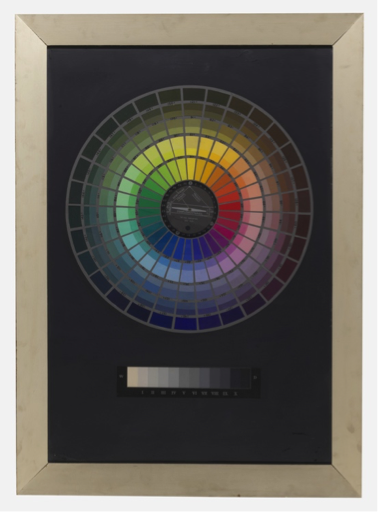
For the final (more polished!) interface design, which is now on display, I set on adopting a colour wheel input inspired by this Hilaire Hiler design in Cooper Hewitt’s collection. (This wheel actually has 4 ‘psychological’ colour primaries and features 30 hues). The interface has 4 harmony options: monochromatic, complementary, analogous and spectrum (a rainbow colour option).

Color wheel picker, inspired by Hiler’s design, used in ‘Dive into Color’


‘Dive into Color’ installed at Cooper Hewitt. Photo credit: Caroline Koh Smith

‘Dive into Color’ installed at Cooper Hewitt. Photo credit: Caroline Koh Smith

What does the tool reveal?
Visualising the Cooper Hewitt data this way gives some sense of when colours appear in time. There are no results for purple pre-19th century. Perhaps because of the difficulty and expense of producing purple before synthetic dyes/pigments were developed in the 19th century?

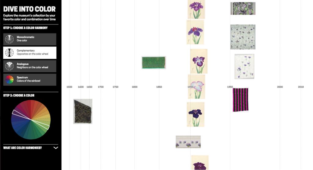
Though, as often is the case interpreting collection visualisations, it is difficult to disentangle historical trends from the biases and character of what has been collected and how it has been catalogued. (And bear in mind I’m only visualising the 100 objects most saturated in colour for a search). For example, these green and purple Japanese prints of irises are clearly part of a set rather than indicating some colour trend around 1910. Using the images themselves as data points is helpful for diagnosing this.

The same purple-green visualisation demonstrates how the tool can connect artefacts across time, in this case with by similar colour scheme/design:
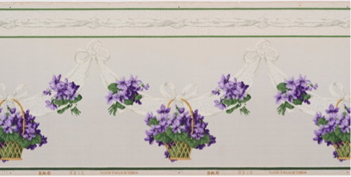
   
(Left) Frieze (USA), 1890–1910; Manufactured by Hobbs, Benton & Heath, (right) Sidewall, Anemone, 1960–66; Designed by Phoebe Hyde 

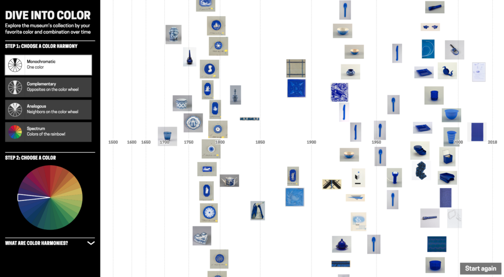
The tool surfaces colours, used in a particular material, that are strongly attached to design types. For example these English vivid blue and white late-18th century ceramic buttons/medallions:

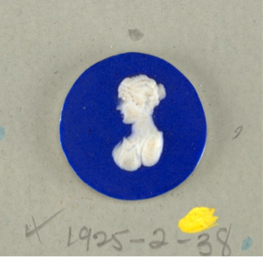
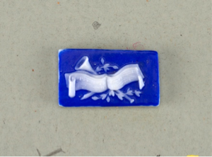
(From left) Medallion (England), late 18th century, stoneware; Medallion (England), late 18th century, stoneware; Button (England), late 18th century; stoneware

Blue and white ceramics manufactured in the Netherlands in the late-17th century, early-18th century:
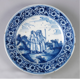
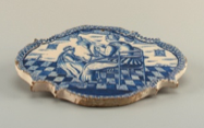
  
(From left) Plate (Netherlands), 1675–1725, tin-glazed earthenware; Plaque (Netherlands), 1675–1725, tin-glazed earthenware; Obelisk (Netherlands), ca. 1700–25, tin-glazed earthenware

And French red and white textiles in the late 18th/ early 19th century:
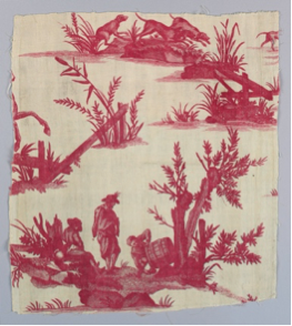

(From left) Textile (France), late 18th century, cotton; Textile (France), ca. 1850, cotton; Textile (France), 18th century, cotton

Visualising blue-yellow shows more saturated colour from mid-19th century onwards. Is this signalling changing fashion, or the availability of new synthetic dyes/pigments? Can we connect the more saturated harmony in designs from the mid-1800s with Chevreul’s influential text from the time ‘The Law of Simultaneous Colour Contrast’, describing how colour harmony can be used to create a more vibrant effect? Though a number of the earlier objects are textiles and the colours will have faded over time. Possibly a combination of these factors is at play here.

User evaluations
While I’ve discussed historical trends and the Cooper Hewitt collection, I’m also interested in how others might use a tool like this in their own projects, and with other collections. I conducted a number of interviews around this tool design with history of design students and colour history specialists, exploring their impressions of it and if/how they might use it in their own work. (I was also interested to talk with designers about using a tool like this for design inspiration, but struggled with recruiting!)

The history of design students (Masters students in History of Design from the Royal College of Art/Victoria & Albert Museum programme) discussed examples from their own work where such a tool could be useful. Example projects included: tracing the use of blue through time in anti-vaccination movement posters to convey trust; or pink clothing in the history of women’s protest movements. In both these examples a hue, rather than a more specific colour, was of interest. Out of these conversations, the most useful features to add would be a filter by object type, and to be able to narrow down a time period.

For the specialist colour audience, though, this tool design has some issues. Not least because I do not know how accurately the photos represent the true colours of the objects (what lighting conditions the photographs were taken in, if they have been retouched etc.). While the overall extracted colours seem generally good, they may not be precise enough for some. The control in searching by colour – only by hue – may also be too limited for some needs.

Seeing is believing?
Colour data is computationally extracted, in contrast with manually added metadata. Do these different cases require different considerations for designing visualisations?

In this post, I’ve used arguments like it ‘looked better’, or the results were ‘more satisfying’ to explain my design decision-making. Working with colour data I knew had errors, I was more comfortable adjusting parameters in my search queries and editing obviously wrong colour data to return what looked ‘better’ to me. For colour, you can immediately see when images appear in the visualisation don’t match. (Though, of course, looking at the visualised results will not tell you if there are absent items). In interviews, I asked whether this data massaging to produce more satisfying results bothered interviewees and was often told the person didn’t mind, but they’d worry if there were obvious errors appearing in the visualisation.

While prototyping the design in conversation with curators at Cooper Hewitt, we discussed the possibility of different versions of this tool: offering more control in search and not massaging parameters for in-depth researchers. But there is also value in visually satisfying results. As a curator expressed it: “We have a large number of professional designers and design students who come here … Just seeing beautiful examples of how people have used particular colour schemes is research. So the visually satisfying… seeing the most compelling works has a value as well. For the professional designers who, say ‘wow this is really incredible use of this colour scheme. I want to share this with my students.’

‘Dive into Color’ has since been exhibited in the London Design Festival 2018, and will hopefully go online at some point. Any feedback is very welcome: olivia.fletcher-vane@network.rca.ac.uk

Many thanks to Cooper Hewitt for their help with this project: especially Pamela Horn, Jennifer Cohlman Bracchi, Susan Brown and the technical team for getting ‘Dive into Color’ up and running in the galleries. Thanks to Neil Parkinson who showed me the Colour Reference Library at RCA, to Dr Alexandra Loske, Patrick Baty and RCA students for their thoughts, and to Jonny Jiang for help with the final UI design. And thanks to Stephen Boyd Davis for his continued help and support!

 

Exploring the Cooper Hewitt collection with timelines and tags: guest post by Olivia Vane

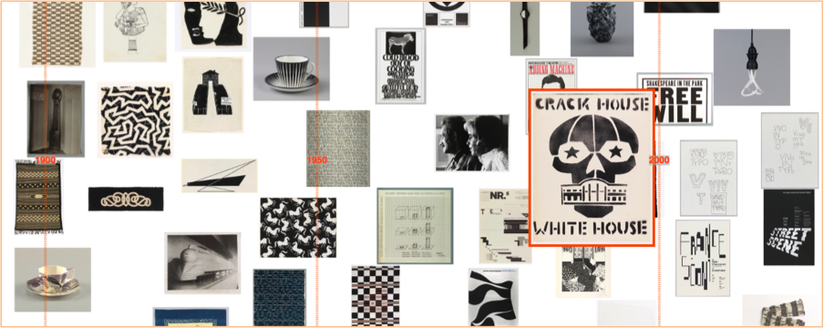
‘Black & white’ timeline detail, Cooper Hewitt data

A physical museum is itself a sort of data set — an aggregation of the micro in order to glimpse the macro. One vase means little on its own, beyond perhaps illustrating a scene from daily life. But together with its contemporaries, it means the contours of a civilization. And when juxtaposed against all vases, it helps create a first-hand account of the history of the world.
From ‘An Excavation Of One Of The World’s Greatest Art Collections

The ability to draw on historic examples from various cultures, to access forgotten techniques and ideas and juxtapose them with contemporary works, creates provocative dialogues and amplifies the historic continuum. This range is an asset few museums have or utilize and provides a continuing source of inspiration to contemporary viewers and designers.”
From ‘Making Design: Cooper Hewitt, Smithsonian Design Museum Collection’ p.28

Guest post by Olivia Vane

I’m 4 months into a 5-month fellowship at Cooper Hewitt working with their digitised collection. I’m normally based in London where I’m a PhD student in Innovation Design Engineering at the Royal College of Art supervised by Stephen Boyd Davis, Professor of Design Research. My PhD topic is designing and building interactive timelines for exploring cultural data (digitised museum, archive and library collections). And, in London, I have been working with partners at the V&A, the Wellcome Library and the Science Museum.

The key issue in my PhD is how we ‘make sense’ of history using interactive diagrams. This is partly about visualisation of things we already know in order to communicate them to others. But it is also about visual analytics – using visuals for knowledge discovery. I’m particularly interested in what connects objects to one another, across time and through time.

I am very fortunate to be spending time at Cooper Hewitt as they have digitised their entire collection, more than 200,000 objects, and it is publicly available through an API. The museum is also known for its pioneering work in digital engagement with visitors and technical innovations in the galleries. It is a privilege to be able to draw on the curatorial, historical and digital expertise of the staff around me here for developing and evaluating my designs.

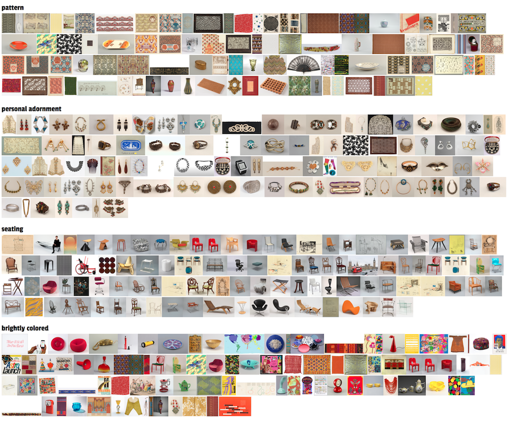
As I began exploring the collection API, I noticed many of the object records had ‘tags’ applied to them (like ‘birds’, ‘black & white’, ‘coffee and tea drinking’, ‘architecture’, ‘symmetry’ or ‘overlapping’). These tags connect diverse objects from across the collection: they represent themes that extend over time and across the different museum departments. This tagging interested me because it seemed to offer different paths through the data around shape, form, style, texture, motif, colour, function or environment. (It’s similar to the way users on platforms like Pinterest group images into ‘boards’ around different ideas). An object can have many tags applied to it suggesting different ways to look at it, and different contexts to place it in.

Where do these tags come from? Here, the tags are chosen and applied by the museum when objects are included in an exhibition. They provide a variety of ways to think about an object, highlighting different characteristics, and purposely offer a contrasting approach to more scholarly descriptive information. The tags are used to power recommendation systems on the museum collection website and applications in the galleries. They constitute both personal and institutional interpretation of the collection, and situate each item in a multi-dimensional set of context.


Some examples of tags and tagged objects in the Cooper Hewitt collection

I was interested to trace these themes over the collection and, since objects often have multiple tags, to explore what it would be like to situate or view each object through these various lenses.

The temporal dimension is important for identifying meaningful connections between items in cultural collections, so my first thoughts were to map tagged objects by date.

I’m working on a prototype interface that allows users to browse in a visually rich way through the collection by tags. A user starts with one object image and a list of the tags that apply to that object. They may be interested to see what other objects in the collection share a given tag and how the starting image sits in each of those contexts. When they click a tag, a timeline visualisation is generated of images of the other objects sharing that tag – arranged by date. The user can then click on further tags, to generate new timeline visualisations around the same starting image, viewing that image against contrasting historical narratives. And if they see a different image that interests them in one of these timelines, they can click on that image making it the new central image with a new list of tags through which to generate timelines and further dig into the collection. By skipping from image to image and tag to tag, it’s easy to get absorbed in exploring the dataset this way; the browsing can be undirected and doesn’t require a familiarity with the dataset.


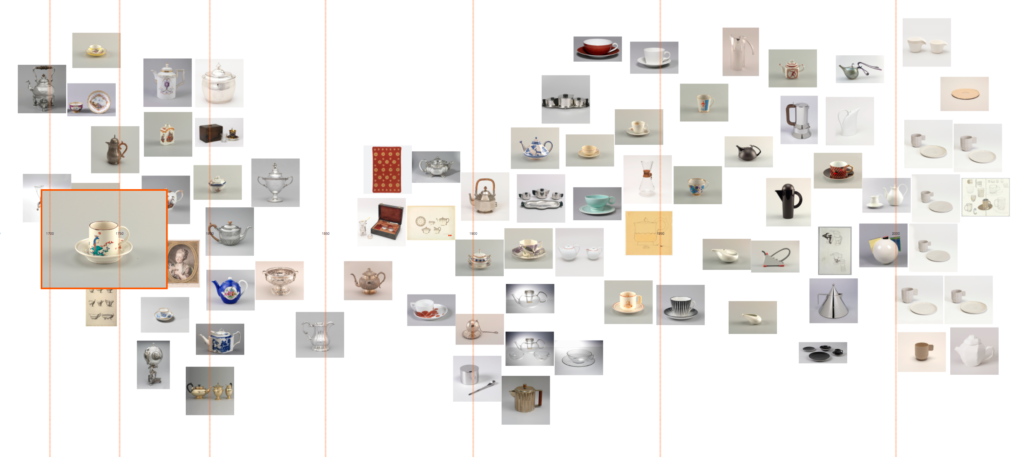
‘Coffee and tea drinking’ timeline: designs in the collection stretch from 1700 to the present with a great diversity of forms and styles, elaborate and minimal.

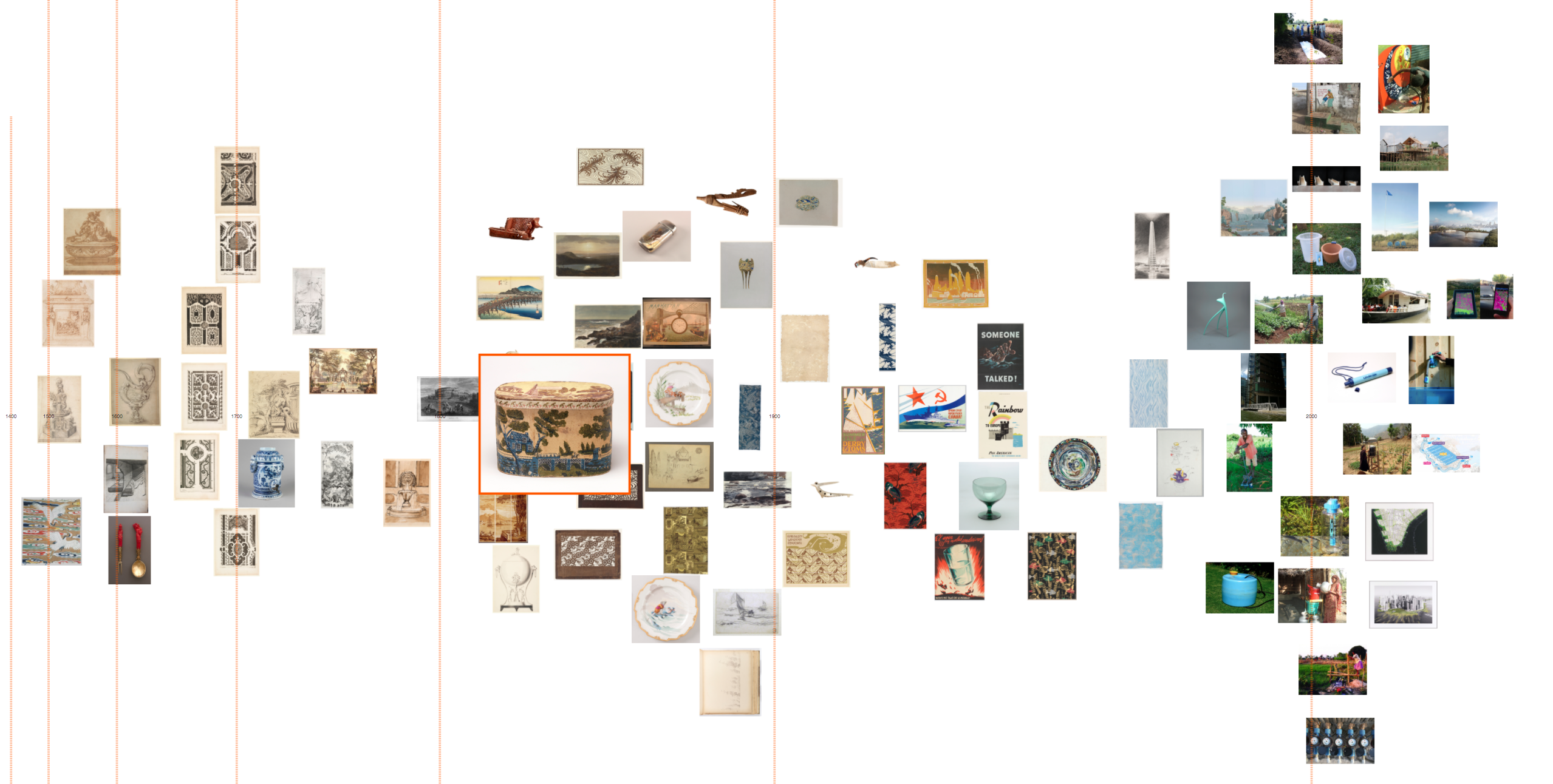
‘Water’ timeline. Here there are many different ways of thinking about water: images of garden plans with fountains and lakes from the 16th–18th Century, or modern interventions for accessing and cleaning water in developing countries. Contrasting representations (landscape painting to abstracted pattern) and functions (drinking to boating) stretch between.

‘Water’ timeline, detail


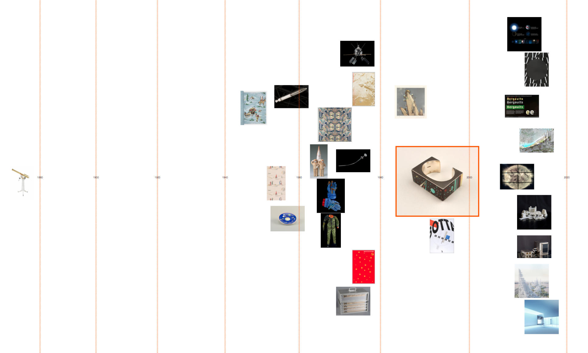
‘Space’ timeline: 1960s ‘space age’ souvenirs (Soviet and American) precede modern telescope imaging. And a 19th Century telescope reminds us of the long history of mankind’s interest in space.

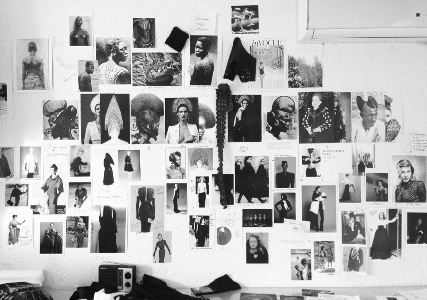
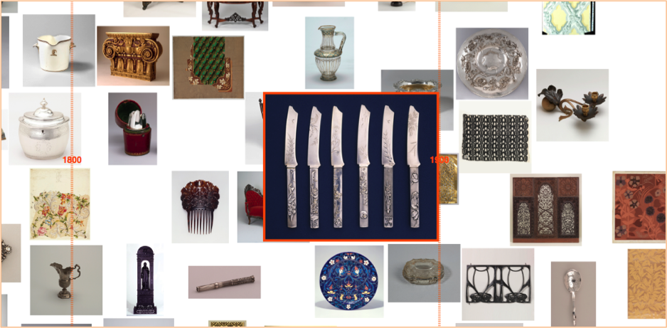
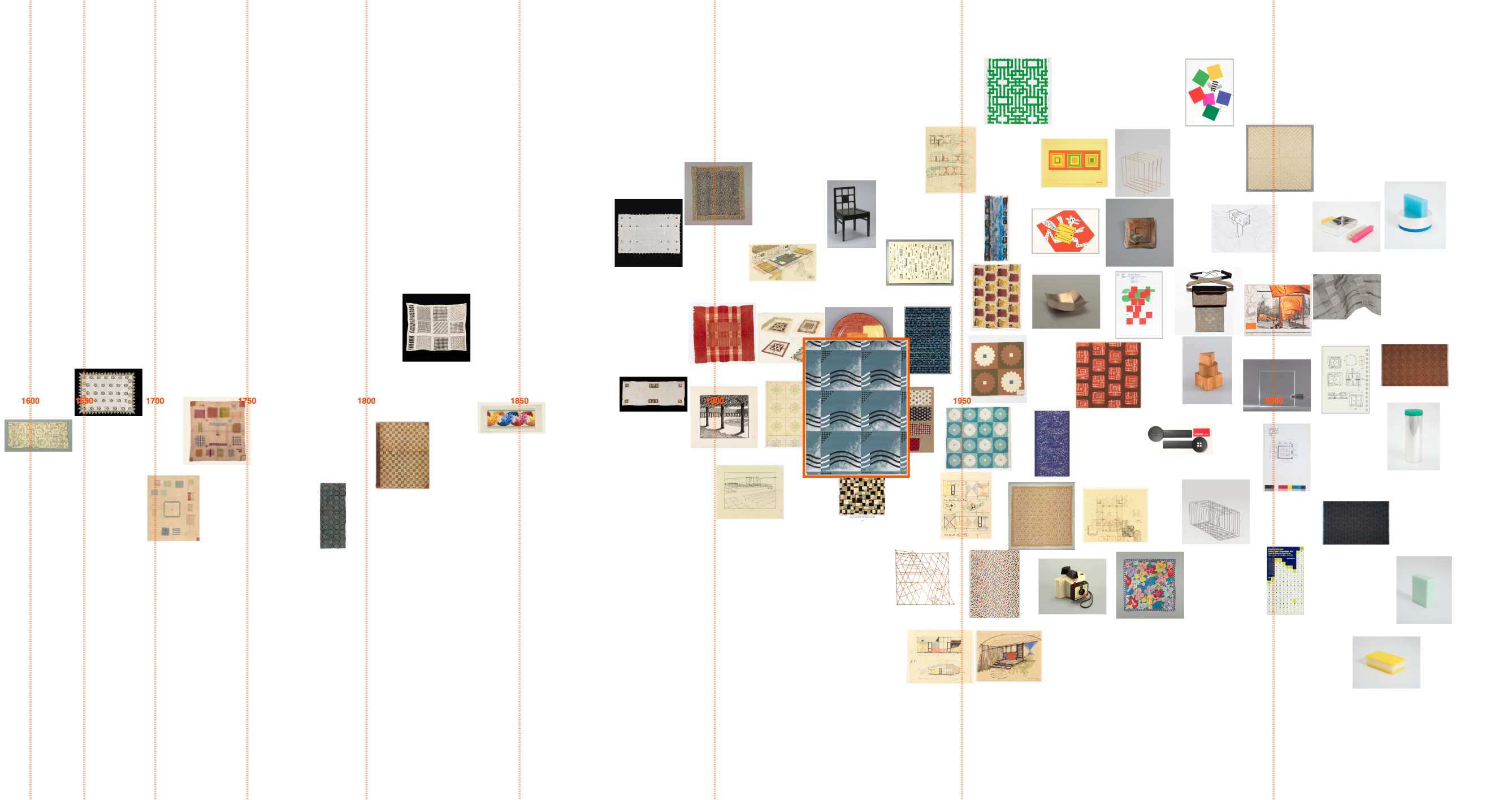
I’m plotting the object images themselves as data points so users can easily make visual connections between them and observe trends over time (for instance in how an idea is visually represented or embodied in objects, or the types of objects present at different points in time). The images are arranged without overlapping, but in an irregular way. I hoped to emulate a densely packed art gallery wall or mood board to encourage these visual connections. Since the tags are subjective and haven’t been applied across the whole collection, I also felt this layout would encourage users to view the data in a more qualitative way.


Yale Center for British Art: Long Gallery, image credit Richard Caspole, YCBA & Elizabeth Felicella, Esto

Moodboard, image credit ERRE

Dealing with dates

How to work with curatorial dating?

While most of the post-1800 objects in the dataset have a date/date span expressed numerically, pre-1800 objects often only have date information as it would appear on a label: for example ‘Created before 1870s’, ‘late 19th–early 20th century’, ‘ca. 1850’ or ‘2012–present’. My colleagues at the Royal College of Art have previously written about the challenges of visualising temporal data from cultural collections (Davis, S.B. and Kräutli, F., 2015. The Idea and Image of Historical Time: Interactions between Design and Digital Humanities. Visible Language49(3), p.101).

In order to process this data computationally, I translated the label date text to numbers using the yearrange library (which is written for working with curatorial date language). This library works by converting, for example, ‘late 18th century’ to ‘start: 1775, end: 1799’ For my purposes, this seems to work well, though I am unsure how to deal with some cases:

  • How should I deal with objects whose date is ‘circa X’ or ‘ca. X’ etc.? At the moment I’m just crudely extending the date span by ±20 years.
  • How should I deal with ‘before X’? How much ‘before’ does that mean? I’m currently just using X as the date in this case.
  • The library does not translate BC dates (though I could make adjustments to the code to enable this…) I am just excluding these at the moment.
  • There are some very old objects in the Cooper Hewitt collection for example ‘1.85 million years old’, ‘ca. 2000-1595 BCE’ and ‘300,000 years old’. These will create problems if I want to include them on a uniformly scaled timeline! Since these are rare cases, I’m excluding them at the moment.
Skewing the timeline scale

The Cooper Hewitt collection is skewed towards objects dating post-1800 so to even out image distribution over the timeline I am using a power scale. Some tags, however, – such as ‘neoclassical’ or ‘art nouveau’ – have a strong temporal component and the power scale fails to even out image distribution in these cases.

How are the images arranged?

My layout algorithm aims to separate images so that they are not overlapping, but still fairly closely packed. I am using a rule that images can be shifted horizontally to avoid overlaps so long as there is still some part of the image within its date span. Since images are large data markers, it is already not possible to read dates precisely from this timeline. And the aim here is for users to observe trends and relationships, rather than read off exact dates, so I felt it was not productive to worry too much about exact placement horizontally. (Also, this is perhaps an appropriate design feature here since dating cultural objects is often imprecise and/or uncertain anyway). This way the images are quite tightly packed, but don’t stray too far from their dates.

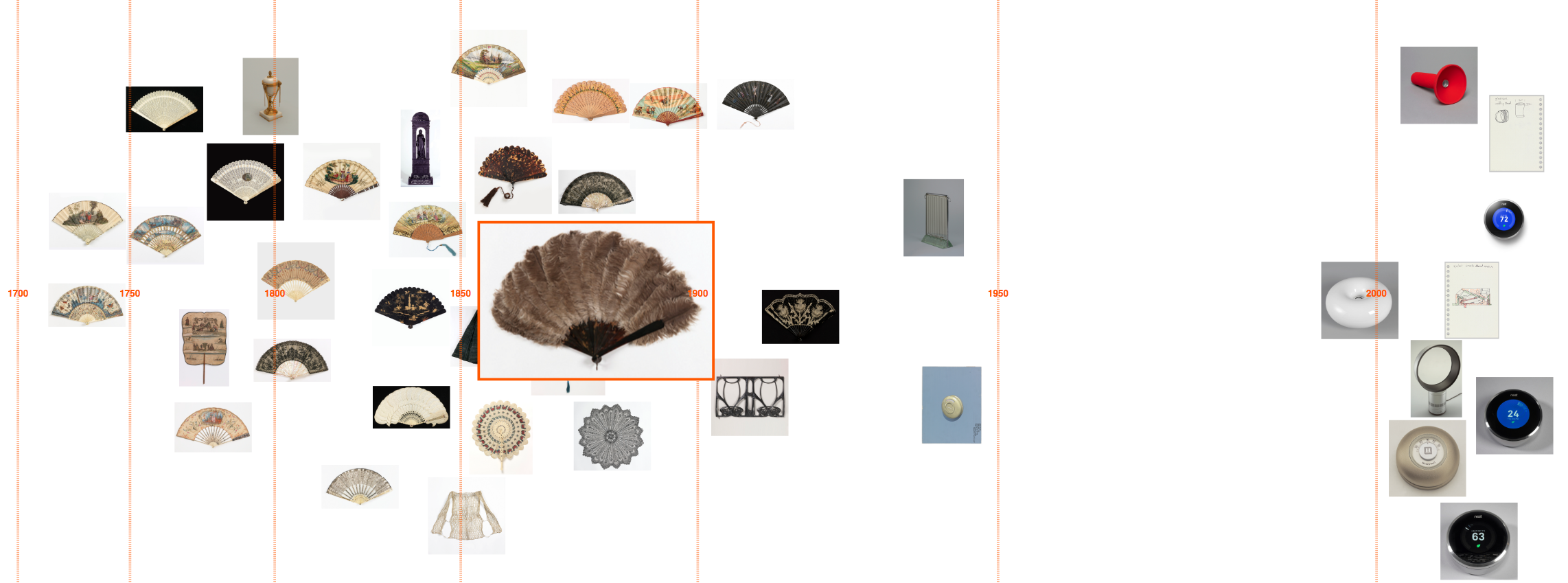
‘Personal environmental control’ timeline: a dry juxtaposition of these decorated fans against modern Nest thermostats.

‘Foliate’ timeline, detail

‘Squares’ timeline

I’ve also tried to spread images out within date spans, rather than just use the central point, to avoid misleading shapes forming (such as a group of objects dating 18th century forming a column at the midpoint, 1750).

Things to think about

Interface design

  • The layout algorithm slows when there are many (100 or more) images visualised. Is there a more efficient way to do this?
  • I’m considering rotating the design 90° for web-use; I anticipate users will be interested to scroll along time, and scrolling vertically may improve usability with a mouse.
  • Would a user be interested to see different timeline visualisations next to each other, to compare them?
  • It could be interesting to apply this interface to other ways of grouping objects such as type, colour, country or other descriptor.
  • I need to build in a back button, or some way to return to previously selected images. Maybe a search option for tags? Or a way to save images to return to?

Tags

  • This visualisation design relies on curator-applied tags and, therefore, would be difficult to apply to other datasets: might there be a way to automate part of this? Maybe using computer vision technologies?
  • Since objects are only tagged if they are featured in an exhibition, the interface misses many relevant objects in the collection when visualising a theme. For instance there are 23 objects tagged ‘Japanese’, but keyword searching the collection for ‘Japanese’ returns 453 objects. While the interface works well with the current quantities of images (up to about 100), what changes to the design would be needed to increase this number?
  • What about grouping tags together? There is no dictionary or hierarchy to them so some are very similar, for instance: ‘floral’, ‘floral bouquets’, ‘floral swag’, ‘flower’, ‘flowering vine’, and ‘flowers’. Though it can be interesting to see the subtle differences in how related tags have been applied. For instance: ‘biomorphic’ is more often applied to modern objects; ‘nature’ is generally applied to depictions of nature such as landscape paintings; while ‘organic’ is applied in a more abstract sense to describe objects’ form.

I’m at a stage where I’d like to get user feedback from a range of audiences (general and scholarly) to explore some of these questions.

This is very much a work in progress, and feedback is welcome! (olivia.fletcher-vane@network.rca.ac.uk to get in touch by email)

Announcing the Digital Collection Materials Project

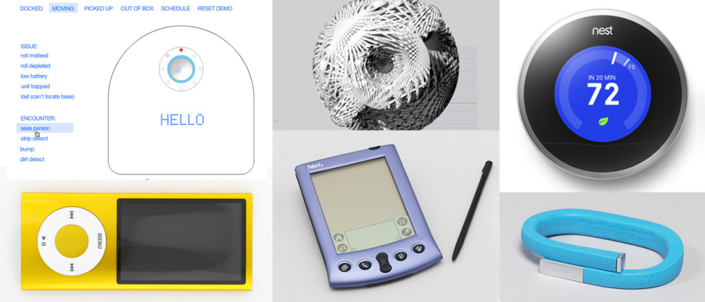
Cooper Hewitt, Smithsonian Design Museum is pleased to announce it will begin its first major initiative to address the conservation needs of digital materials in 2017. Supported by the Smithsonian Collections Care and Preservation Fund, the Digital Collection Materials Project will serve to set standards, practices, and strategies related to digital materials in Cooper Hewitt’s permanent collection. Of the more than 210,000 design objects in the collection, it is estimated that roughly 150 items incorporate information conveyed in a digital form. Many of these objects are home and office electronics, personal computing and mobile devices, and media players with interfaces that span both hardware and software. Among the 150 items, there are also born digital works–examples of design that originated in electronic form that are saved as digital data. These include both creative and useful software applications, as well as media assets, such as videos and computer-aided designs.

The first phase of the Digital Collection Materials Project will be the design and execution of a collection survey. The second phase will be case studies of select objects. The final phase will synthesize the survey results and case study findings in order to determine recommendations for a strategic plan of care, preservation, and responsible acquisition of digital materials for the collection.

The historical core of Cooper Hewitt, Smithsonian Design Museum’s collection is comprised of objects selected by the museum’s founders, Sarah and Eleanor Hewitt, to document outstanding technical and artistic accomplishments in the decorative arts. Established in 1897 as an educational resource for The Cooper Union for the Advancement of Science and Art, Cooper Hewitt’s collection continues to expand to encompass a range of materials exemplifying the broad category of human ingenuity and artistry that today we call design. The diversity of the museum’s collection exemplifies the core institutional belief that design is best understood through process, a framework that fosters understanding of human activity as it intersects with many materials and technologies, including the important fields of interface design, interaction design, and user experience design.

The Digital Collections Materials Project will help preserve long-term access to digital materials in the collection while maintaining the integrity of the designs they express. It will also allow Cooper Hewitt to move forward responsibly with acquisitions in the exciting realm of digital design. Since digital materials are especially vulnerable to the deleterious effects of technological obsolescence and decay, which can lead to inaccessibility and information loss, there is an urgent need to address the conservation needs of digital materials in the collection. It is with an eye to these materials’ cultural significance and vulnerability that the museum moves forward with the Digital Collection Materials Project.

This project received Federal support from the Smithsonian Collections Care and Preservation Fund, administered by the National Collections Program and the Smithsonian Collections Advisory Committee.

Join Labs! Work with Digital Materials in the Collection

There is a goldmine of digital materials in Cooper Hewitt’s permanent collection—rarities like prototypes donated by interaction design pioneer Bill Moggridge; gaming classics like the Game Time wristwatch (which you should really see in action! ); icons of product design like Apple’s iPhone; and artistic achievements in code by contemporary artist-designers like Aaron Koblin.

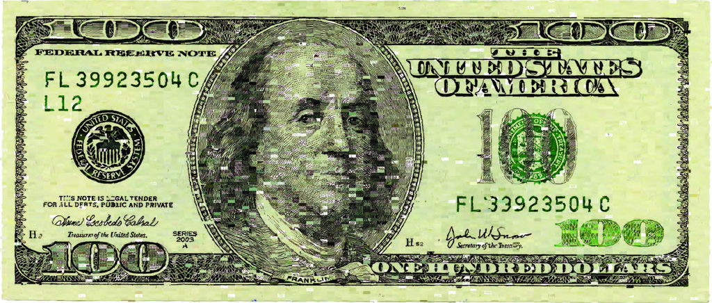
 Digital Project, Ten Thousand Cents, 2007–08; Designed by Aaron Koblin and Takashi Kawashima; USA; processing, adobe flash cs3, php/mysql, amazon mechanical turk, adobe photoshop, adobe after effects; Gift of Aaron Koblin and Takashi Kawashima; 2014-41-2; Object Record

Digital Project, Ten Thousand Cents, 2007–08; Designed by Aaron Koblin and Takashi Kawashima; USA; processing, adobe flash cs3, php/mysql, amazon mechanical turk, adobe photoshop, adobe after effects; Gift of Aaron Koblin and Takashi Kawashima; 2014-41-2; Object Record

And we need your help! We are looking for two ultra-talented and fearless media spelunkers to dive into the collection and surface all of the computer, product design, and interaction design history within. We want you to help research and invigorate this part of the collection so that we can share it with the world. It’s a noble cause, and one that will help give museum visitors an even better experience of design at Cooper Hewitt.

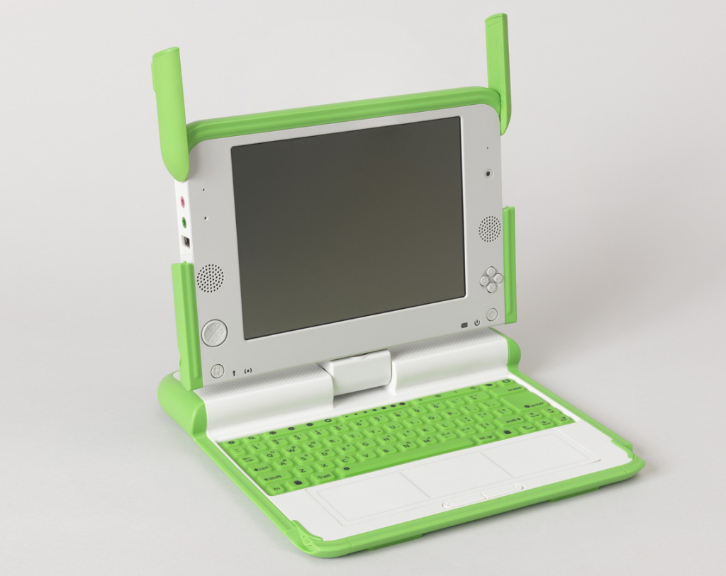
One Laptop Per Child XO Computer, 2007; Designed by Yves Béhar, Bret Recor and fuseproject; injection molded abs plastic and polycarbonate, printed rubber, liquid crystal display, electronic components; steel, copper wire (power plug); H x W x D (closed): 3.5 × 22.9 × 24.1 cm (1 3/8 in. × 9 in. × 9 1/2 in.); Gift of George R. Kravis II; 2015-5-8-a,b; Object Record

One Laptop Per Child XO Computer, 2007; Designed by Yves Béhar, Bret Recor and fuseproject; injection molded abs plastic and polycarbonate, printed rubber, liquid crystal display, electronic components; steel, copper wire (power plug); H x W x D (closed): 3.5 × 22.9 × 24.1 cm (1 3/8 in. × 9 in. × 9 1/2 in.); Gift of George R. Kravis II; 2015-5-8-a,b; Object Record

Project Positions

We are hiring for two contract positions: Media Preservation Specialist and Time-Based Media Curatorial Assistant. The contractors will work together on the first phase of the Digital Collection Materials Project to survey and document collection items. Check out the official project announcement below to understand the full scope of the project.

To Apply

To apply for the Media Preservation Specialist or Time-Based Media Curatorial Assistant position:

  1. Read the official project announcement.
  2. Download the Request for Proposal for the position you wish to apply:
  3. Follow the Proposal Submission Guidelines outlined in the Request for Proposal.
  4. Submit your proposal to cooperhewittdigital@si.edu by December 20, 2016.

Looking forward to seeing your applications—we can’t wait to partner with you for this important work!

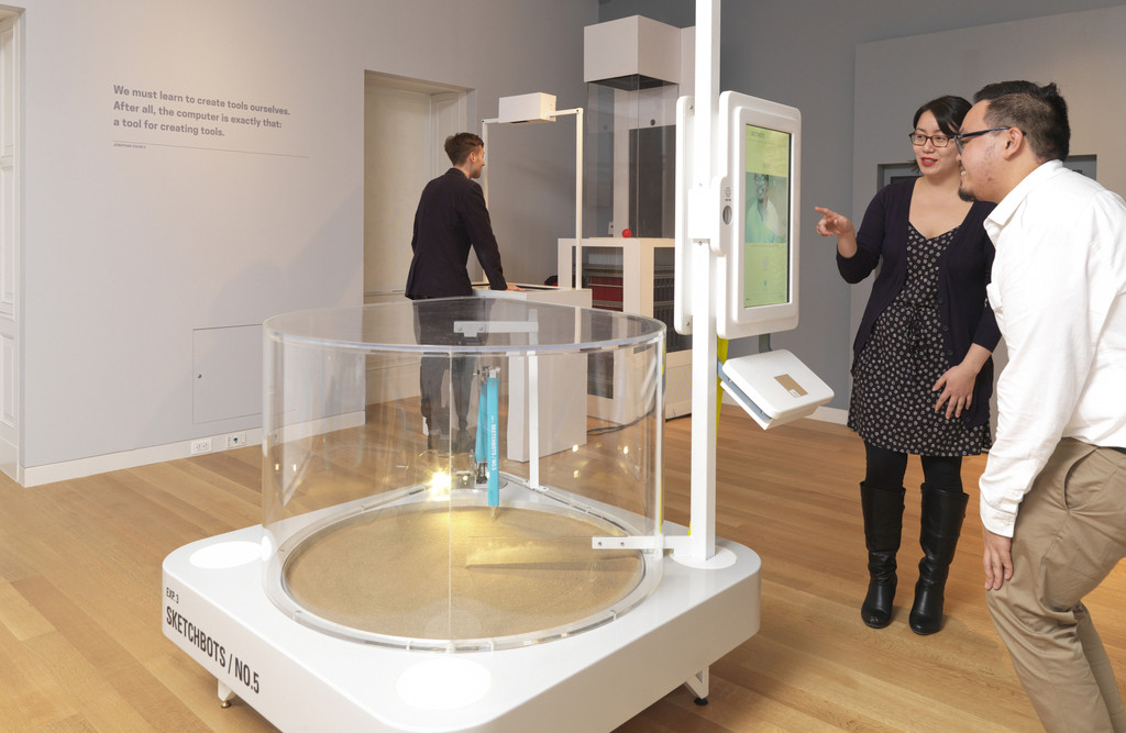
SketchBot (USA), 2012; Industrial Design by Universal Design Studio (United Kingdom); aluminum, plastic, assorted electrical components, javascript, html, css and python source files; H x W x D: 137.2 × 137.2 × 137.2 cm (54 × 54 × 54 in.); Gift of Google Inc.; s-g-1; Object Record

SketchBot (USA), 2012; Industrial Design by Universal Design Studio (United Kingdom); aluminum, plastic, assorted electrical components, javascript, html, css and python source files; H x W x D: 137.2 × 137.2 × 137.2 cm (54 × 54 × 54 in.); Gift of Google Inc.; s-g-1; Object Record

This project received Federal support from the Smithsonian Collections Care and Preservation Fund, administered by the National Collections Program and the Smithsonian Collections Advisory Committee.

Content sharing and ambient display with Electric Objects EO1

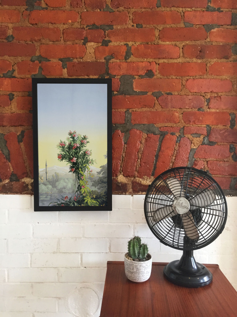
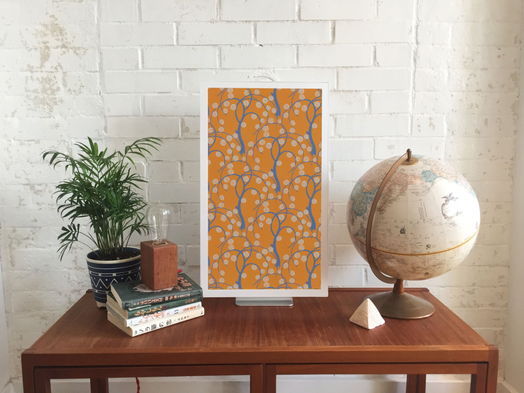
Scenic panel El Dorado, designed by Joseph Fuchs, Eugène Ehrmann and Georges Zipélius and manufactured by Zuber & Cie , 1915-25, Gift of Dr. and Mrs. William Collis. From Cooper Hewitt Collection displayed on an EO1. Photo by Zoe Salditch

Scenic panel El Dorado, designed by Joseph Fuchs, Eugène Ehrmann and Georges Zipélius and manufactured by Zuber & Cie , 1915-25, Gift of Dr. and Mrs. William Collis. From Cooper Hewitt Collection displayed on an EO1. Photo by Zoe Salditch

One of the cornerstones of Cooper Hewitt’s very visible digital strategy has been promiscuity. From the first steps in early 2012 when the online collection was released, we’ve partnered with many people from Google Art Project and Artsy to Artstor and now Electric Objects.

Electric Objects is a little different from the others in that we’ve worked with them to share a very select and small number of collection objects, much in the way that Pam Horn and Chad Phillips have worked to grow the museum’s ‘licensed product’ lines of merchandise.

Electric Objects is a New York startup that raised a significant amount of money on Kickstarter to build and ship a ‘system for displaying digital art’. Jake Levine, Zoe Salditch and their team have now developed the EO1 into a small ecosystem of screens deployed in the homes and offices of about 2500 ‘early adopters’ and digital artists who have been creating bespoke commissions for the system.

Cooper Hewitt joined the New York Public Library in providing a selection of collection materials to see what this community might make of it – and, internally, to think about what it might mean to have a future in which digital art might become ‘ambient’ in people’s homes.

I spoke to Jake and Zoe late last week in their office in New York.

Seb Chan – I like how the EO1 has ‘considered limitations’ – the lack of a slideshow mode, the lack of a landscape mode – can you tell us a bit more about what went into these decisions? And now that EO1s are in homes and offices around the world, what the response has been like?

Jake Levine – Computing has for the last 50 to 60 years been characterized by interaction, generally for the sake of productivity or entertainment. Largely as a result, we’ve built software whose basis for success is defined by volume of interaction. Most companies start with: ‘how often can we get users to engage with our product? ‘

What we’ve been left with is a world filled with software competing for our attention, demanding our interaction. And we feel like crap. We feel overwhelmed.

EO1 was an experiment in a kind of computing that, by definition, could not demand anything from us. We asked whether we could build a computer that brought value into its environment without asking for user interaction. How do we ensure that the experiment remains valid? We make interaction impossible. You can’t ‘use’ EO1, just like you can’t ‘use’ art.

In the interest of exploring a different kind of computing, we made sure not to take any existing software paradigms for granted. The slideshow, of course, is ubiquitous in digital photo frames, to which we are often compared. For that decision, we went back to first principles — why? Why do we want slideshows? My experience with slideshows is characterized by distraction. The image changes, it catches my eye, it interrupts my conversation. Change demands our attention.

We say we want slideshows, but how much of that has to do with expectations informed by how screens have behaved in the past, without enough time spent thinking about how they might behave in the future? We’re so accustomed to the speed of the web, that even while we complain about it, when we’re presented with an alternative, we decide that we miss it.

But what is the value of change on the Internet? For me it’s not about randomness, it’s not about timers and playlists and settings. Change at its most meaningful happens in social contexts, in software that lives on top of a network, where ephemerality is actually just conversation, people talking. Twitter, Facebook, Instagram, Tumblr — these services aren’t an overwhelming flood of information, they are people talking to each other, and that’s why we keep coming back.

So you will likely see change enter the Electric Objects experience in the future, but it won’t be programmatic. It will be social.

Electric Objects, like all networked media discovery software, is a shared experience. And that’s also why we lack landscape. It’s important that everyone experiences Electric Objects in the same way, to create a deeper connection among its members. It also makes for a better user experience.

SC – Defaults matter, I think we all learned that from Flickr, and I really like that EO1 is ‘by default’ Public. This obviously limits the use of the EO1 as a digital photo frame, so what sort of things are you seeing as ‘popular’?

JL – People love water! So many subtly moving water images! But beyond the collective fascination with water, a lot of people are displaying the artwork we’re producing for Art Club, our growing collection of new and original art made for EO1 (including the awesome collection of wallpaper from Cooper Hewitt!).

Sidewall, wallpaper with stylized trees, ca 1920, designed by René Crevel and manufactured by C. H. H. Geffroy and distributed by Nancy McClelland, Inc. From Cooper Hewitt Collection displayed on an EO1. Photo by Zoe Salditch.

Sidewall, wallpaper with stylised trees, ca 1920, designed by René Crevel and manufactured by C. H. H. Geffroy and distributed by Nancy McClelland, Inc. Gift of Nancy McClelland. From Cooper Hewitt Collection displayed on an EO1. Photo by Zoe Salditch.

SC – Cooper Hewitt joined the Art Club early on and we’re excited to see a selection of our historic wallpapers available on the device. This wasn’t as straight forward as any of us had expected, though. Can you tell us about the process of getting our ‘digitised wallpapers’ ready and prepared for the EO1?

JL – When you’re bringing any art onto a screen, you have to deal with a fixed aspect ratio. Software designers and engineers know the pain of accommodating varying screen sizes all too well. In many ways what we offer artists — a single aspect ratio across all of our users — is a welcome relief. What’s more challenging is “porting” existing work into the new dimensions.

Wallpapers were actually a great starting point, because they’re designed to be tiled. Still, we hand cropped and tiled each object, to ensure an optimal experience for the user (and the art!).

SC – Our friends at Ghostly and NYPL took a slightly different route. Can you tell us about how both of those collaborators chose and supplied the works that they have made available?

JL – Ghostly is a label that represents a fantastic group of artists and musicians. Together, we selected a few artists to participate in the Ghostly x EO collection, featuring original work made specifically for Electric Objects.

And NYPL was somewhere between Ghostly and what we did with Cooper Hewitt. NYPL has this incredible collection of maps that they’ve digitized. We knew we didn’t want to simply show a cropped version of the maps on EO1, so we turned to the artist community, and starting taking proposals. We asked: what would you do with these beautiful maps as source material?

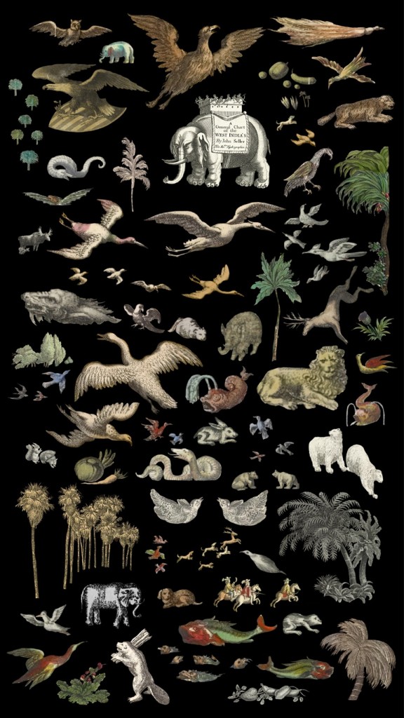
Natural Elements by Jenny Oddell from the NYPL x EO Collection

Natural Elements by Jenny Oddell from the NYPL x EO Collection

Jenny Odell produced an incredible series of collages. She spent ninety-two hours cutting out the illustrations that cartographers often include on the edges of the maps in photoshop — these beautiful illustrations that rarely get any attention since the maps have a primarily functional purpose. In this case we used something old to make something new, something designed with and for the screen. It was perfect.

SC – Art Club feels like it could be sort of a ‘Bandcamp for net art’. I know you’ve been commissioning specific works for the EO1 and making sure artists get paid, so tell us more about how you see this might work in the future?

Zoe Salditch – Without art, EO1 would just be any other screen. And we’ve known since the early days that art made for EO1 is always a better experience.

There are many ways people engage with and have historically paid for art, so we’re exploring a couple different ideas. Right now, we commission artists upfront and ask them to create small series for EO1, and this collection is available for free for EO1 owners for now. Our plan is to eventually put this ever-growing collection behind a subscription, so that the customer can subscribe to gain access to the entire collection.

Other strategies we’re exploring include limited editions, and a commission service for those who want to have something that feels more exclusive and custom. We believe that artists should be paid for their work, and that people will pay for great art. Other than that, we’re open to experimenting, and we have a lot to learn from our community now that EO1 is out in the wild!

SC – Cooper Hewitt’s wallpapers have been up for a little while as you’ve been shipping out units to Kickstarter backers. What can you tell us about how people have been showing them? What sorts of stats are we looking at?

JL – Art from the Cooper Hewitt collection has been displayed 783 times in homes all over the world, with an aggregate on-display time of over 217 days! The three El Dorado scenic panels have been most popular!

Explore the Cooper Hewitt objects available for ambient viewing through Electric Objects, to visit Shop Cooper Hewitt in-store at 2 East 91st in New York to buy an EO1 unit from the museum tax-free [sorry, not currently available via our online store].

Guest post: Notes from hacking on the Cooper-Hewitt collections API

A couple of days ago the Labs hosted a guest to play with our API.

Over to Frankie to explain what he did and the challenges he faced. As it turns out, there’s a lot you can get done in a day.

Hi, I’m Frankie Roberto. I used to work at the Science Museum in London, where I produced their web projects. I’ve also worked with museums such as the British Museum whilst at digital agency Rattle. One theme running through all of this time is the importance of data, and the things that it can enable.

So when I learnt that the Cooper-Hewitt Museum had released a ‘public alpha’ of their collections database, the idea of spending a day playing with the data whilst in New York (on holiday!) seemed like it’d be fun. Plus, I get to hang out with Seb & co.

I signed up for a an API account ahead of time. This does feel like a bit of hurdle. Because the API uses oAuth 2.0, as well as creating an account, you then have to create an application, and then authorise yourself against your own application in order to get an access token which ultimately grants you access to the data. This makes more sense for situations where you want to get access to another user’s data (e.g. let’s say that users can bookmark favourite objects and you want to display a visualisation of them). For accessing public data it’s a little overkill. Thankfully the web interface makes it all fairly straightforward.

Ideally, I think it’d be simpler and more developer-friendly not to require API keys at all, and instead to simply allow anyone to retrieve the data with a simple GET request. These can even be tried out in a browser – a common convention is to simply add ‘.json’ on the end of URLs for JSON views. This also lets you use HTTP-level caching, which works at the browser end, the server end and proxies in the middle, keeping things speedy. On the downside, this would make it harder to monitor API usage.

Authentication quibbles aside, once set up I could begin querying the data.

I came to the Cooper-Hewitt knowing very little about the institution other than that it is a design museum. My expectations then were that the collection would be a treasure trove of great design from the past century – things like the Henry vacuum cleaner or the Juicy Salif lemon squeezer by Philippe Starck. In short: ‘design classics‘.

‘Classic’ is a funny word, after abused as a euphemism for old and obsolete, but when applied to design I think it implies quality, innovation, and timelessness – things you might still use today (hence the community around maintaining ‘classic cars’).

My challenge then was to see if, for a given type of thing, I could show the ‘classic’ versions of that thing from the Cooper-Hewitt collection.

To kick off, I looked at the list of ‘types’ in the collection. There are 2,998 of these, and they are for the most part simple & recognisable words or short phrases – things like ‘teapot’ and ‘chair’. The data is a little messy, also including more specific things like ‘side chair’ and ‘teapot and lid’, but, y’know, it’s good enough for now.

I could have retrieved the entire list of types through the API, but as you only get a small bunch at a time, this would have required ‘paging’ through the results with multiple requests. Not too tricky, but rather than coding the logic for this, it was a lot simpler to just import the full list from the CSV dump on GitHub.

The next step was to retrieve a list of objects for each type.

Unfortunately, this didn’t actually seem to be possible using the API (yet). So I went back to GitHub and used the CSV dump of all objects. This contains around a 100,000 objects. Not a huge amount, but with a tip-off from Seb, I realised that I was actually only interested in the objects from the ‘product design’ department – a much smaller list of just 19,848 objects (the rest seem to be mainly drawings and textiles).

With these objects imported, the next step was to match the objects with the types.

This data didn’t seem to be in the CSV file – and it isn’t returned in the API response for object details either (an accidental omission, I think). Stuck, I turned to Seb’s team, and soon learned that what I thought was the object ‘name’ was actually a concatenation of the object’s type and age, separated by a comma. So, I could get an object’s type by simply reversing the process (slight gotcha: remember to ignore case).

At this point I had a database of objects by type, but no images – which for most purposes are pretty crucial.

Ideally, links to the images would’ve been in the CSV dump. Instead, I’d have to query the API for each object and collect the links. Objects can have multiple images, but I only really need the main one, which is designated the ‘primary’ image in the API. Oddly, a good proportion of the objects had no primary image, but did have one or more non-primary images. In these cases, I’d just select the first image.

Script written, I started hitting the API. With 19,848 requests to make, I figured this’d take some time. About a quarter of the way through, I realised that the same data was also available in GitHub, and this could be queried by requesting the ‘raw’ version of the URLs (constructed by splitting the object id into bunches of three digits). So I modified my script to do just that, and set it going, this time starting from the bottom of my list of objects and working up. The GitHub-querying script ran a little faster than the Cooper-Hewitt API (probably not too surprising), and so both scripts ‘met’ somewhere in the middle of the list.

The results of this were that I had images for roughly a quarter of the product design objects, with around 5,000. This seems like quite a lot, but given that lots of these are rather obscure things like ‘matchsafes’, the collection actually isn’t that big, and is rather patchy.

There’s a limit to how many products you can actually collect (and store), of course, and so I’m not suggesting that the museum go on an acquiring spree. But I do wonder whether, to present a good experience online, it might be wise to try and merge in some external product design databases to fill in the holes.

By the time I’d assembled all the data, I didn’t have too much time to consider how to present the ‘classic’ products from among the collection.

Ideally, I think this is something that the museum should expose its expertise in. It can be tempting for museums to pretend that all objects have equal value, but in reality there are always some objects that are considered better, more unique, or in this case ‘more classic’ than others. Museum curators are ideally placed to make these judgement calls (and to explain them). For mass-manufactured design objects, this is arguably more important than collecting them in the first place (it’s unlikely you’d not be able to find an original iPod for an exhibition if you needed one).

Ideas we came up with amongst the team were to try and look up the price of the object on eBay (price isn’t a perfect indicator of design value, but might be a reasonable proxy), or to try and see whether other museums, like the V&A, had also collected the same object.

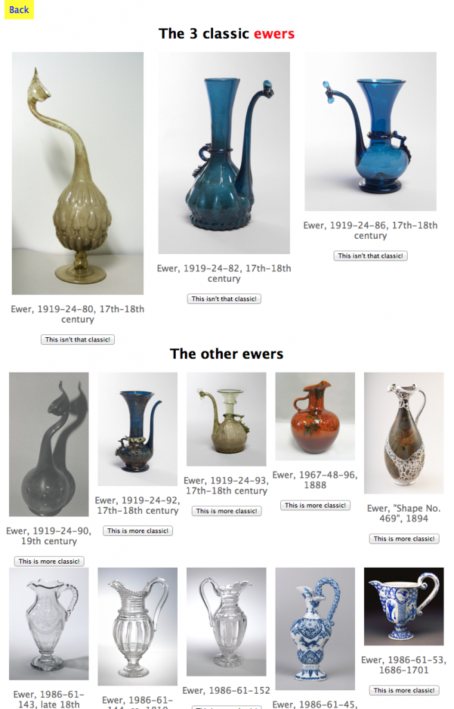
In the end, I went with a simple crowd-sourcing model. Initially three random objects from each type are picked to be shown as the ‘classic’ ones (3 feels like a good number), with the others shown as smaller thumbnails below. You can then very simply vote objects up or down.

The result of this very simple demo is online at https://designclassics.herokuapp.com – feel free to explore (and vote on the objects).

Thanks to the Cooper-Hewitt for hosting me for the day. I look forward to seeing how the ‘alpha’ collections database develops into the ‘beta’, and then the full launch.

If you are an interaction design or digital humanities student, or just a nerd with a bent for playing with museum collections, and you feel like hanging out for a day or two in the Labs to make things then we’d love to have you over.

Drop us a line and we’ll make it happen.

Mia Ridge explores the shape of Cooper-Hewitt collections

Or, “what can you learn about 270,000 records in a week?”

Guest post by Mia Ridge.

I’ve just finished a weeks’ residency at the Cooper-Hewitt, where Seb had asked me to look at ‘the shape of their collection‘.  Before I started a PhD in Digital Humanities I’d spent a lot of time poking around collections databases for various museums, but I didn’t know much about the Cooper-Hewitt’s collections so this was a nice juicy challenge.

What I hoped to do

Museum collections are often accidents of history, the result of the personalities, trends and politics that shaped an institution over its history.  I wanted to go looking for stories, to find things that piqued my curiosity and see where they lead me.  How did the collection grow over time?  What would happen if I visualised materials by date, or object type by country?  Would showing the most and least exhibited objects be interesting?  What relationships could I find between the people listed in the Artist and Makers tables, or between the collections data and the library?  Could I find a pattern in changing sizes of different types of objects over time – which objects get bigger and which get smaller over time?  Which periods have the most colourful or patterned objects?

I was planning to use records from the main collections database, which for large collections usually means some cleaning is required.  Most museum collections management systems date back several decades and there’s often a backlog of un-digitised records that need entering and older records that need enhancing to modern standards.  I thought I’d iterate through stages of cleaning the data, trying it in different visualisations, then going back to clean up more precisely as necessary.

I wanted to get the easy visualisations like timelines and maps out of the way early with tools like IBM’s ManyEyes and Google Fusion Tables so I could start to look for patterns in the who, what, where, when and why of the collections.  I hoped to find combinations of tools and data that would let a visitor go looking for potential stories in the patterns revealed, then dive into the detail to find out what lay behind it or pull back to view it in context of the whole collection.

What I encountered

Well, that was a great plan, but that’s not how it worked in reality.  Overall I spent about a day of my time dealing with the sheer size of the dataset: it’s tricky to load 60 meg worth of 270,000 rows into tools that are limited by the number of rows (Excel), rows/columns (Google Docs) or size of file (Google Refine, ManyEyes), and any search-and-replace cleaning takes a long time.

However, the unexpectedly messy data was the real issue – for whatever reason, the Cooper-Hewitt’s collections records were messier than I expected and I spent most of my time trying to get the data into a workable state.  There were also lots of missing fields, and lots of uncertainty and fuzziness but again, that’s quite common in large collections – sometimes it’s the backlog in research and enhancing records, sometimes an object is unexpectedly complex (e.g. ‘Begun in Kiryu, Japan, finished in France‘) and sometimes it’s just not possible to be certain about when or where an object was from (e.g. ‘Bali? Java? Mexico?’).  On a technical note, some of the fields contained ‘hard returns’ which cause problems when exporting data into different formats.  But the main issue was the variation and inconsistency in data entry standards over time.  For example, sometimes fields contained additional comments – this certainly livened up the Dimensions fields but also made it impossible for a computer to parse them.

In some ways, computers are dumb.  They don’t do common sense, and they get all ‘who moved my cheese’ if things aren’t as they expect them to be.  Let me show you what I mean – here are some of the different ways an object was listed as coming from the USA:

  • U.S.
  • U.S.A
  • U.S.A.
  • USA
  • United States of America
  • United States (case)

We know they all mean exactly the same place, but most computers are completely baffled by variations in punctuation and spacing, let alone acronyms versus full words.  The same inconsistencies were evident when uncertainties were expressed: it might have been interesting to look at the sets of objects that were made in ‘U.S.A. or England’ but there were so many variations like ‘U.S.A./England ?’ and ‘England & U.S.A.’ that it wasn’t feasible in the time I had.  This is what happens when tools encounter messy data when they expect something neat:

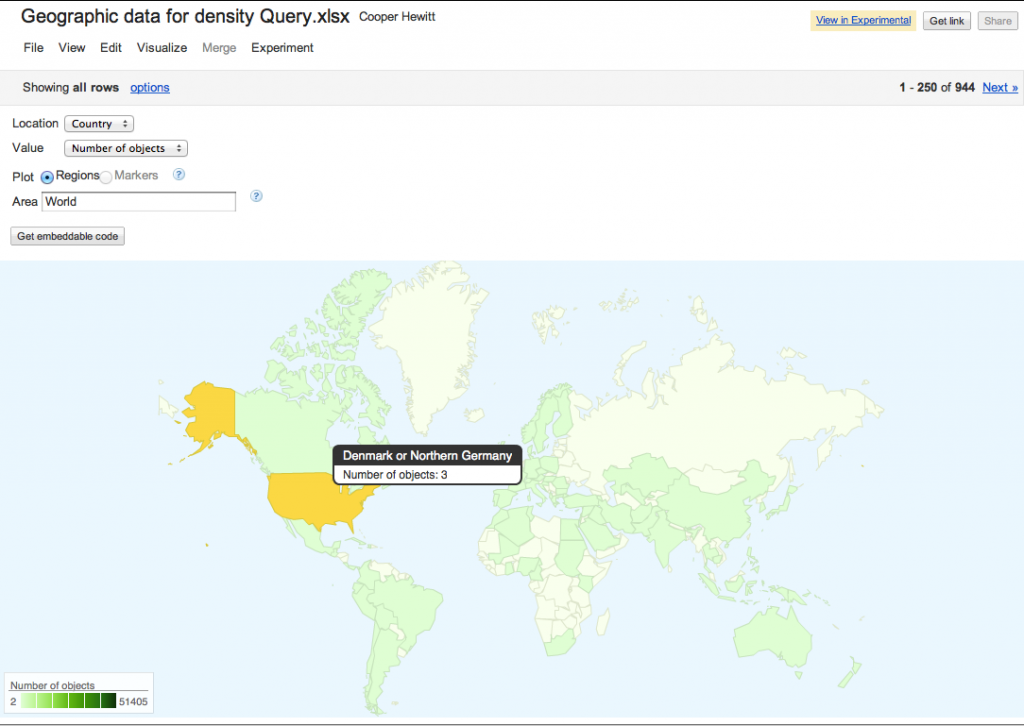
Map with mislabelled location and number of records

3 objects from ‘Denmark or Germany’? No! Messy data confuses geocoding software.

Data cleaning for fun and profit

I used Google Refine to clean up the records then upload them to Google Fusion or Google Docs for test visualisations.  Using tools that let me move data between them was the nearest I could get to a workflow that made it easy to tidy records iteratively without being able to tidy the records at source.

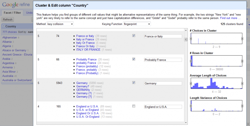
Refine is an amazing tool, and I would have struggled to get anywhere without it.  There are some great videos on how to use it at freeyourmetadata.org, but in short, it helps you ‘cluster‘ potentially similar values and update them so they’re all consistent.  The screenshot below shows Refine in action.

Screenshot

Google Refine in action

One issue is that museums tend to use question marks to record when a value is uncertain, but Refine strips out all punctuation, so you have to be careful about preserving the distinction between certain and uncertain records (if that’s what you want).  The suitability of general tools for cultural heritage data is a wider issue – a generic timeline generator doesn’t know what year to map ‘early 17th century’ to so it can be displayed, but date ranges are often present in museum data, and flattening it to 1600 or 1640 or even 1620 is a false level of precision that has the appearance of accuracy.

When were objects collected?

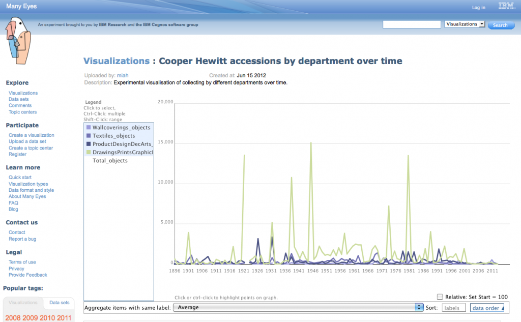
Having lost so much time to data cleaning without resolving all the issues, I eventually threw nuance, detail and accuracy out the window so I could concentrate on the overall shape of the collection. Working from the assumption that object accession numbers reflected the year of accession and probably the year of acquisition, I processed the data to extract just the year, then plotted it as accessions by department and total accessions by year. I don’t know the history of the Cooper Hewitt well enough to understand why certain years have huge peaks, but I can get a sense of the possible stories hidden behind the graph – changes of staff, the effect of World War II?  Why were 1938 and 1969 such important years for the Textiles Department, or 1991 for the Product Design and Decorative Arts Department?

Screenshot

Accessions by Year for all Departments

Or try the interactive version available at ManyEyes.

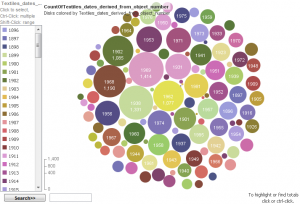
I also tried visualising the Textiles data as a bubble chart to show the years when lots of objects were collected in a different way:

Screenshot

Accessions for Textiles Department by year

Where are objects from?

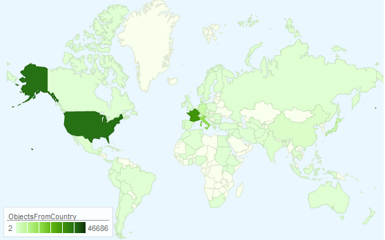
I also made a map which shows which countries have been collected from most intensively.  To get this display, I had to remove out any rows that had values that didn’t exactly match the name of just one country, etc, so it doesn’t represent the entire collection. But you can get a sense of the shape of the collection – for example, there’s a strong focus on the US and Western Europe objects.

Screenshot of intensity map

Object sources by country

The interactive version is available at https://bit.ly/Ls572u.

This also demonstrates the impact of the different tools – I’m sure the Cooper-Hewitt has more than 43 objects from the countries (England, Scotland, Wales and Northern Ireland) that make up the United Kingdom but Google’s map has only picked up references to ‘United Kingdom’, effectively masking the geo-political complexities of the region and hiding tens of thousands of records.

Linking Makers to the rest of the web

Using Refine’s Reconciliation tool, I automatically ‘reconciled’ or matched 9000 names in the Makers table to records in Freebase. For example, the Cooper-Hewitt records about Gianni Versace were linked to the Freebase page about him, providing further context for objects related to him.  By linking them to a URL that identifies the subject of a record, those records can now be part of the web, not just on the web.  However, as might be expected with a table that contains a mixture of famous, notable and ordinary people, Refine couldn’t match everything with a high level of certainty so 66453 records are left as an exercise for the reader.

I also had a quick go at graphing the different roles that occurred in the Makers table.

The benefit of hindsight, and thoughts for the future

With hindsight, I would have stuck with a proper database for data manipulation because trying to clean really large datasets with consumer tools is cumbersome. I also would have been less precious about protecting the detail and nuance of the data and been more pragmatic and ruthless about splitting up files into manageable sizes and tidying up inconsistencies and uncertainties from the start.  I possibly should have given up on the big dataset and concentrated on seeing what could be done with the more complete, higher quality records.

The quality of collections data has a profound impact of the value of visualisations and mashups. The collections records would be more usable in future visualisations if they were tidied in the source database.  A tool like Google Refine can help create a list of values to be applied and provide some quick wins for cleaning date and places fields.  Uncertainty in large datasets is often unavoidable, but with some tweaking Refine could also be used to provide suggestions for representing uncertainty more consistently.  I’m biased as crowdsourcing is the subject of my PhD, but asking people who use the collections to suggest corrections to records or help work through the records that can’t be cleaned automatically could help deal with the backlog.  Crowdsourcing could also be used to help match more names from the various People fields to pages on sites like Freebase and Wikipedia.

If this has whetted your appetite and you want to have a play with some of Cooper-Hewitt’s data, check out Collection Data Access & Download.

Finally, a big thank you to the staff of the Cooper-Hewitt for hosting me for a week.