Category Archives: Interaction Design

Iterating the “Post-Visit Experience”

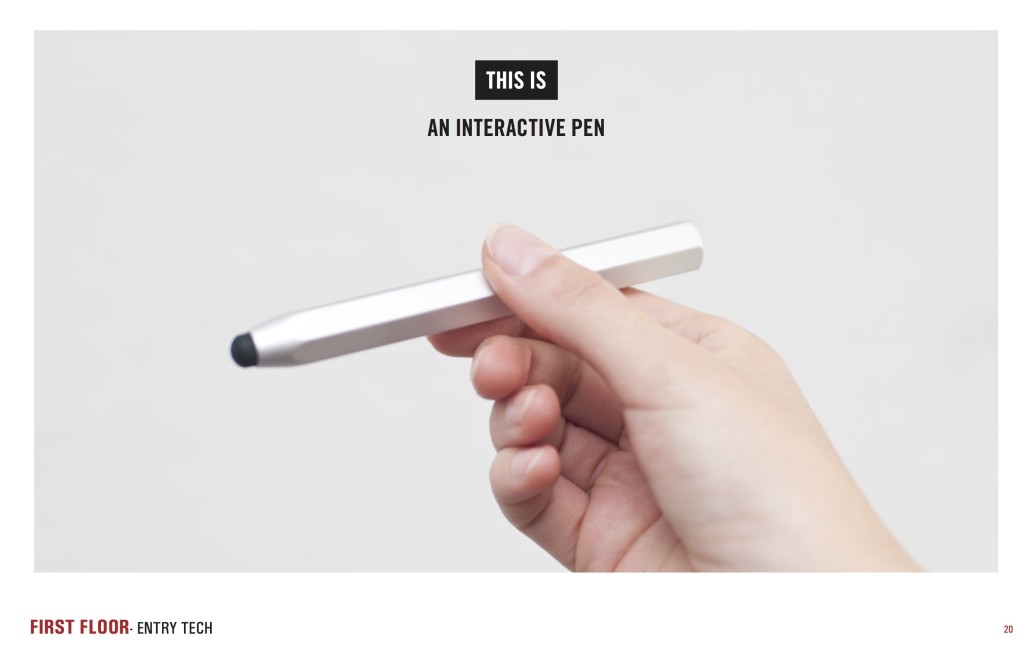
The final phase of a visitor’s experience at Cooper Hewitt, after they’ve left the museum, is what we call the “post-visit experience.” Introduced along with the Pen in March, it is a personalized website that displays a visitor’s interactions with the museum as a grid of images, including objects they collected from the galleries and wallpapers they created in the Immersion Room.

Our focus leading up to its launch was just to have it working, and as such, some of the details of a visitor’s experience with the application were overlooked. As a result of this, our theoretically simple interface became cluttered with extra buttons, calls to action and explanatory texts. In this post, I’ll present the experience as it existed before and describe some of the steps we took in the past month to iterate on the post-visit experience.

The “Before” Experience

ticket_old

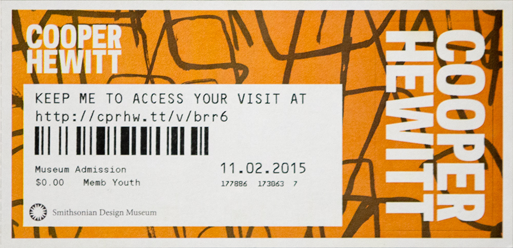
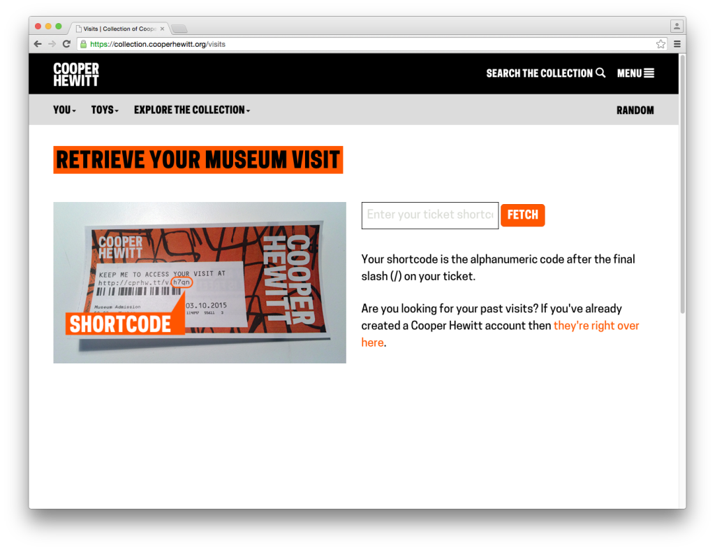
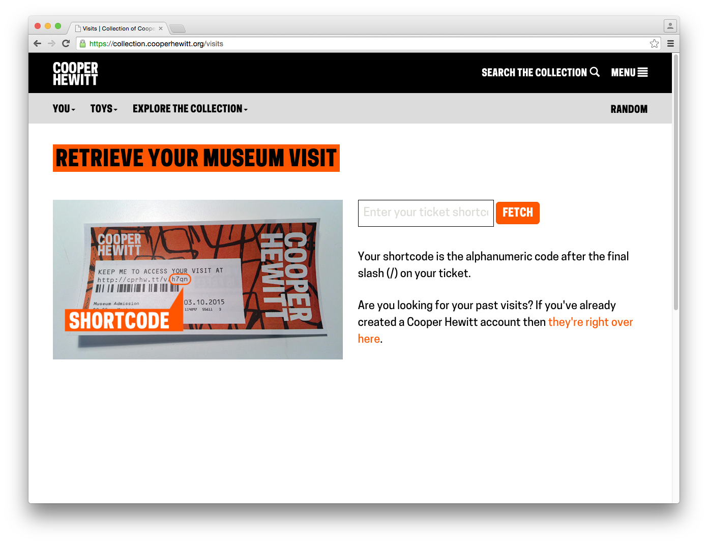
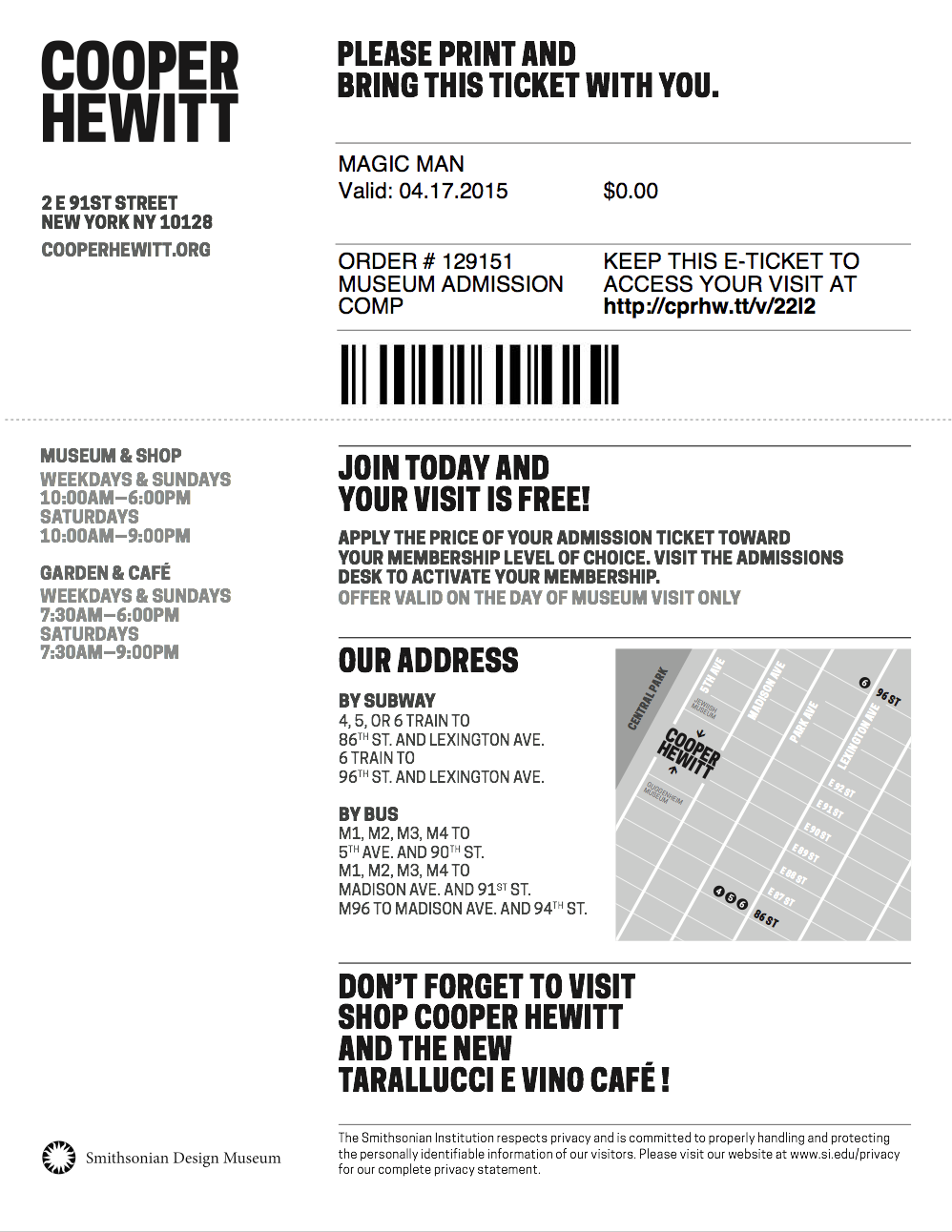
First, let’s walk through the experience as it existed up until this week. The post-visit begins when a visitor accesses their personal website, which they could do by going to a URL on their physical ticket. On the ticket above, that URL is https://cprhw.tt/v/brr6. The domain is our “URL shortener,” https://cprhw.tt, followed by /v/ to indicate a visit (the shortener also supports /o/ for objects or /p/ for people), followed by a four or five-character alphanumeric code which we call the “shortcode.” If a visitor recognized this whole thing as a URL, they would get access to their visit. If a visitor didn’t recognize this as a URL, they would hopefully go to our homepage and find the link that took them to the “visit shortcode page” seen below.

Screen Shot 2015-10-29 at 4.03.33 PM copy

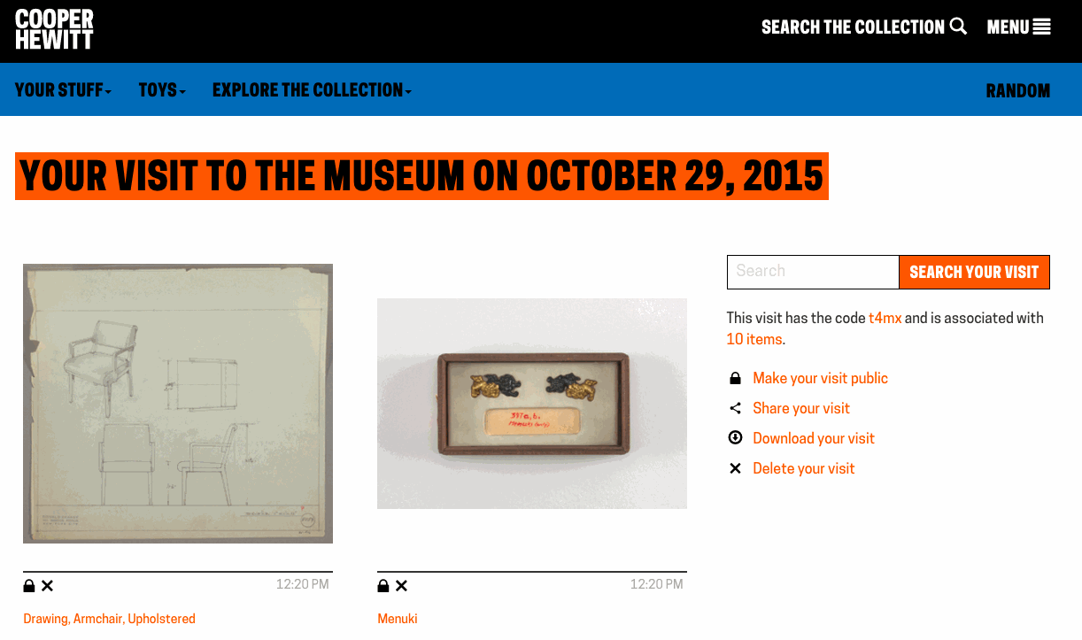
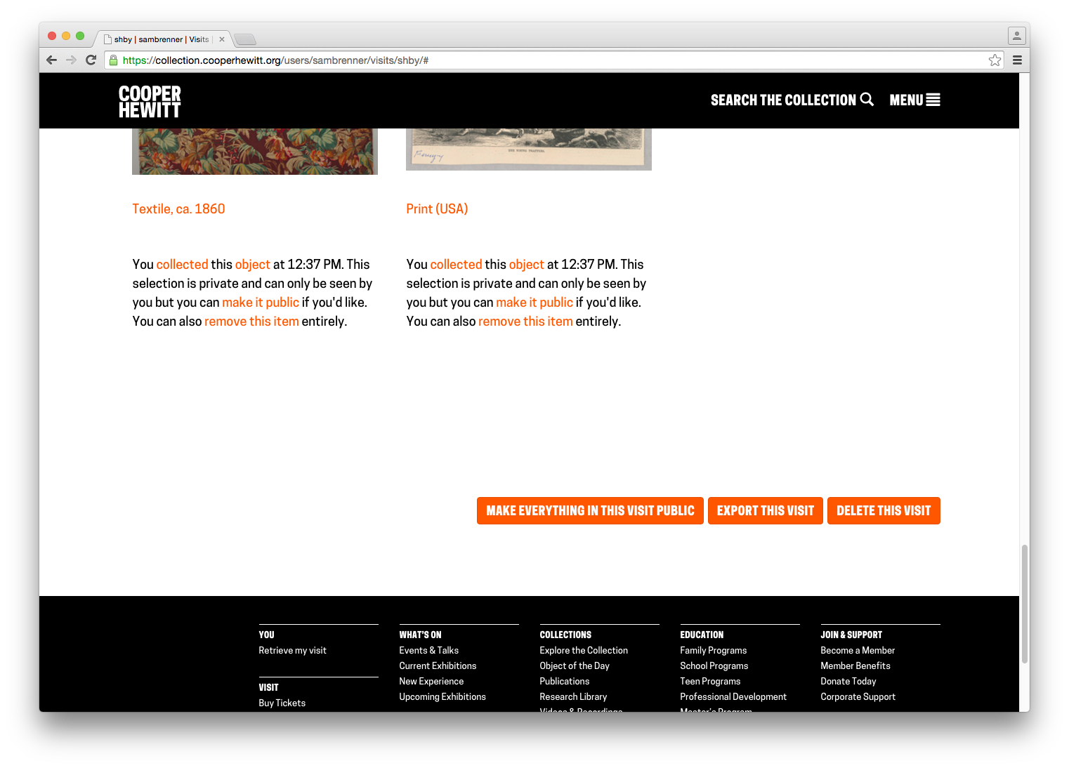
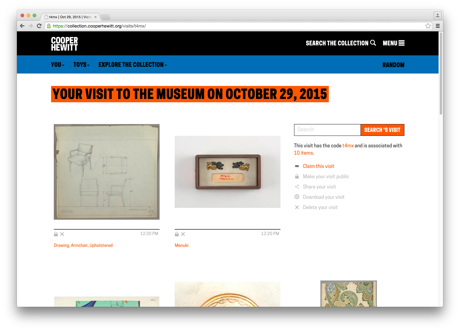
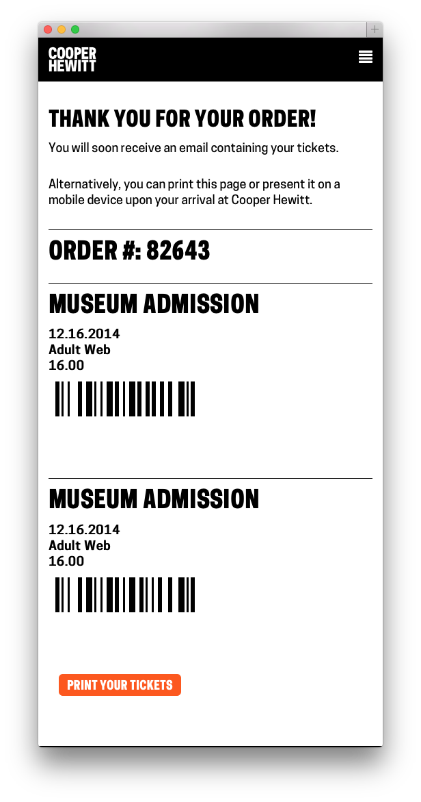
From here, they would enter their shortcode and get their visit. A visit page contains a grid of all the images of items you collected and created during your visit to the museum, which looked like this:

Screen Shot 2015-10-29 at 12.37.47 PM

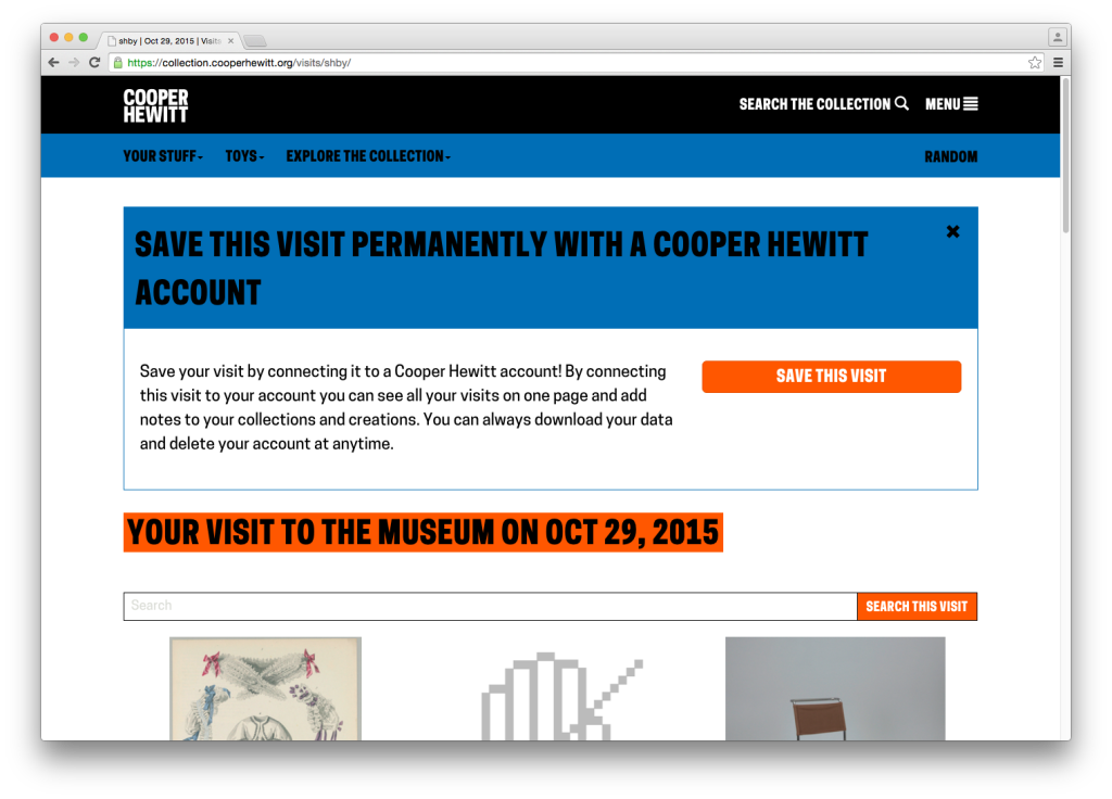
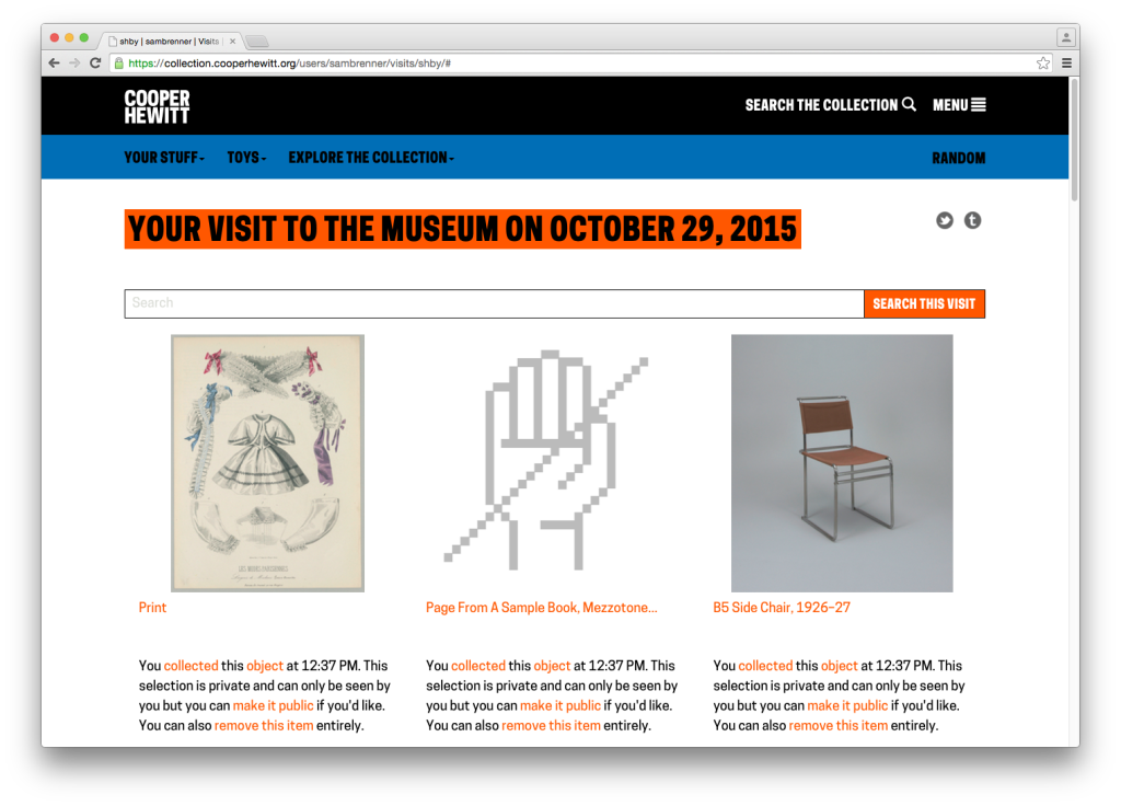
You will notice the unwieldy CTA. It’s big, it’s ugly and it gets in the way of what we’re all here to do, but this was our first opportunity to present the concept of “visit claiming” to the visitor. Visit claiming is the idea that your visit is initially anonymous, but you can create an account and claim it as your own. Let’s say the visitor engages the CTA and claims their account. They are taken through a log in / sign up flow and return to their visit page which has now been linked to their account.

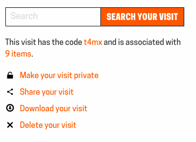
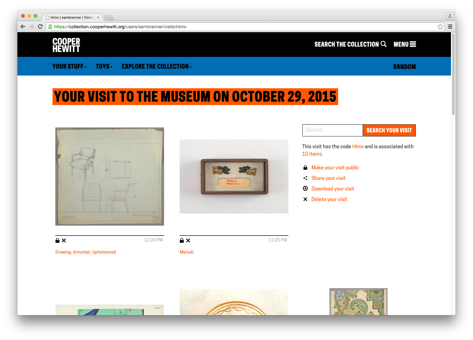
After claiming a visit, the visitor has access to some new functionality. At the top of the page are the token share tools. Under every image now live privacy controls, in the form of a repeated paragraph. At the very bottom of the page are buttons to make everything public, export the visit and delete the visit.

Screen Shot 2015-10-29 at 12.38.28 PM Screen Shot 2015-10-29 at 12.38.57 PM

What to Work On?

The goal for this work was to redesign the post-visit experience to put the visitor’s experience above all of our functional and technical requirements. At this point, we were all familiar with the many complex details along the way, so we met to discuss the end-to-end experience. Taking a step back and thinking in terms of expectations — both ours and the visitors’ — helped us rebuild the experience from the ground up. Feedback we had collected both anecdotally and through our online feedback form was helpful in this process. Once we had an idea of a visitor’s overall expectations of the post-visit experience, we were able to turn that into actionable tasks.

Step 1: Redesigning Visit Retrieval

Screen Shot 2015-11-02 at 5.45.33 PM

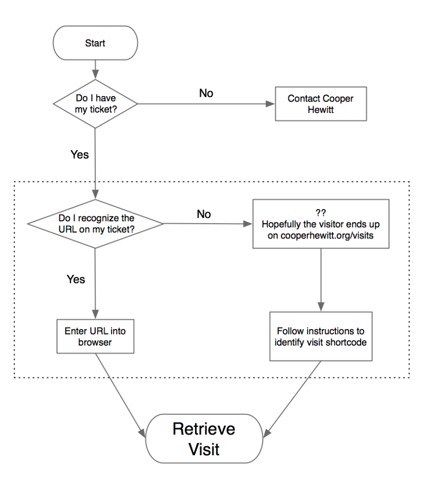
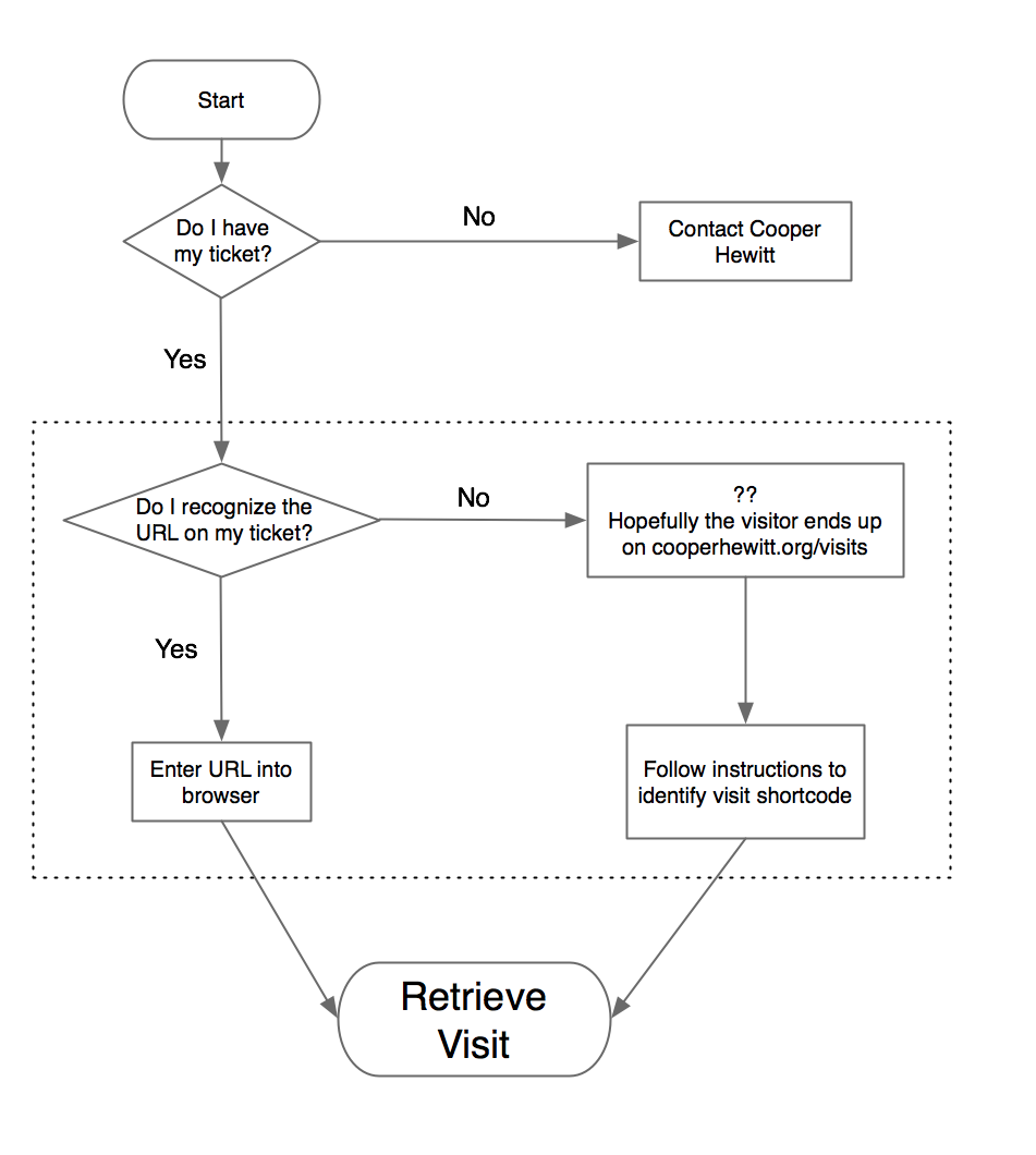
The first pain point we identified was the beginning of the experience: visit retrieval. Katie, our former Labs technologist, has written before about some of the ways we’ve tried to get visitors quickly up to speed on “how everything works” — the idea that you get a pen, you use the pen to collect objects, you go to a website and you get your objects. Her work focused on informational postcards and the introductory script used by the visitor experience staff. In the case of the visit retrieval flow chart above, this helped reduce the number of “no” answers to the two questions: “do I have my ticket?” and “do I recognize the URL on my ticket?”

That second question — “do I recognize the URL on my ticket?” — is not a question we would have expected visitors to even be asking. To us, the no-vowel/non-standard-TLD “URL-shortener”-style URL, a la bit.ly or t.co, has an instantly recognizable purpose. Through visitor feedback, we learned that for some visitors, it understandably looked more like an internal tracking number than the actual website we wanted people to go visit.

For these visitors, the best-case scenario is that the they would go to our main website where we provide links, both in the header and on the homepage, to the “visit retrieval” page. Here it is again, for reference:

Screen Shot 2015-10-29 at 4.03.33 PM copy

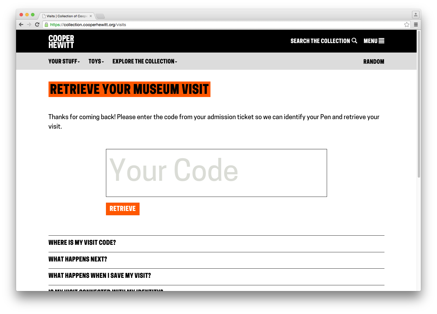
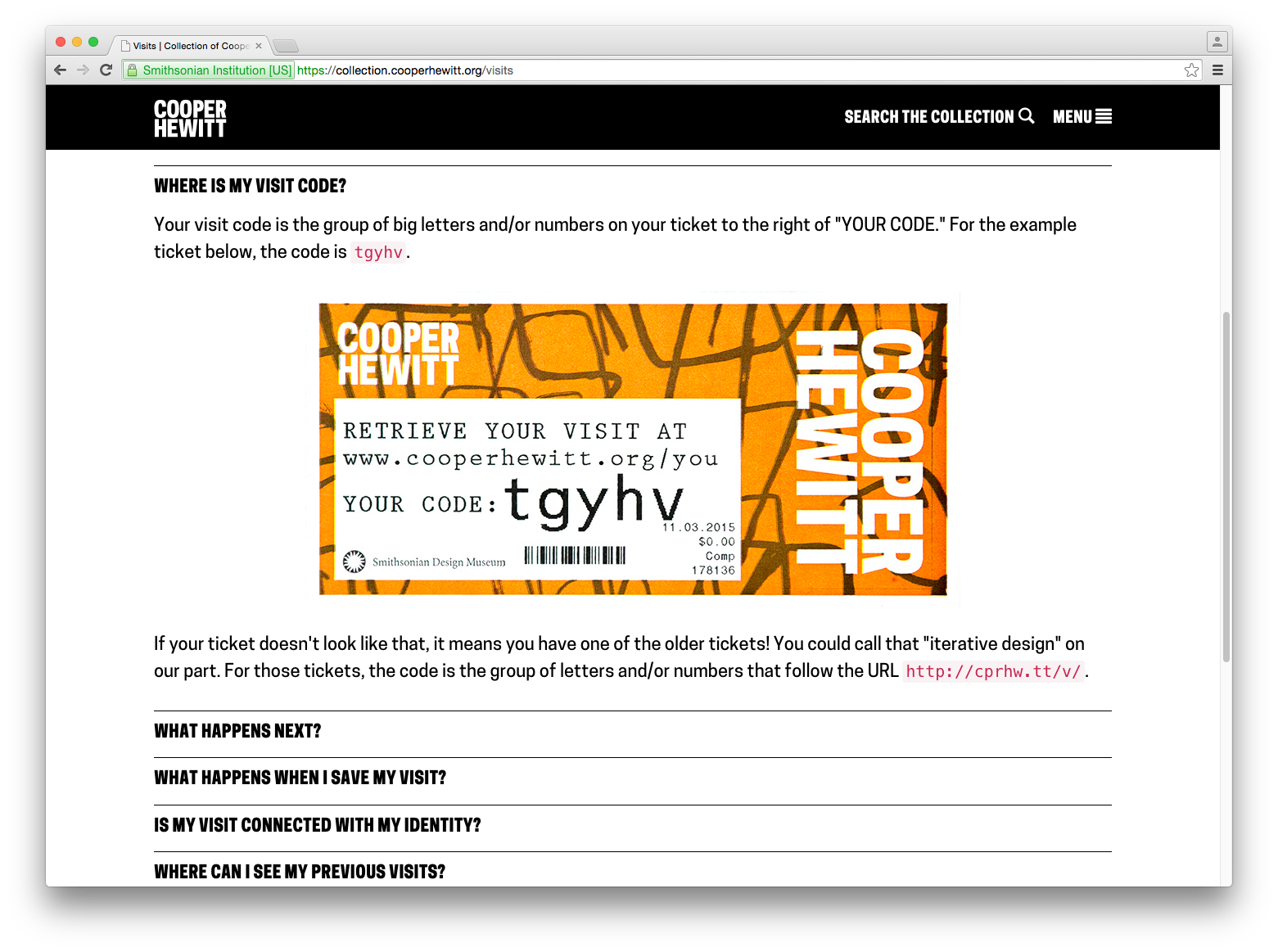
Since we expected users to go straight to the URL on their ticket, this page was more of a backup and as such hadn’t received a lot of attention. As a consequence of this, there were a few things that confused users on the page. First, the confirm button’s CTA is “fetch,” which is different from the “retrieve” used in the header and “access” used on the ticket. Second, the placeholder text in the input field is cut off. Third, the introduction of the word “shortcode,” which we’ve always used internally to refer to a visitor’s visit ID, had no meaning in the visitor’s mind. We tried explain it by saying that it means “the alphanumeric code after the final slash on your ticket,” which is a useless jumble of words.

Our approach to this was to eliminate the “do I recognize the URL?” question and its resulting outcomes (the dotted box in the flow chart above) and replace it with self-evident instructions. To that end, we redesigned both the visit retrieval page and the ticket itself. Here’s the new ticket:

ticket_new

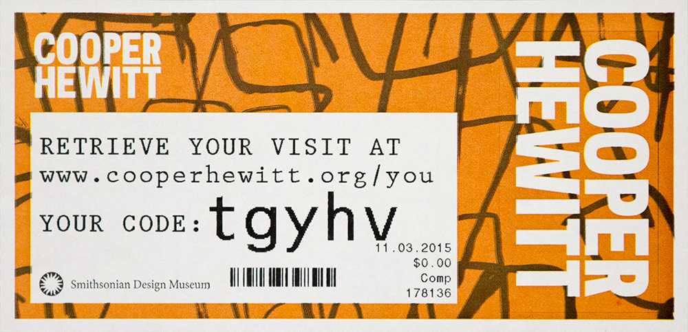
We’ve provided a much more human-friendly URL in “www.cooperhewitt.org/you” and established the shortcode (now just called “code”) as a separate entity. Regardless of whether or not visitors were confused by the short URL, the language on the new ticket fits with our desire to use natural language wherever we can to avoid having the digital experience feel unnecessarily technical.

The visit retrieval page (which is accessed via the URL on the ticket) also got an update. The code entry field got much bigger and we tucked a small FAQ below it. We also standardized on the word “retrieve” as the imperative.

Screen Shot 2015-10-29 at 12.17.46 PM

Screen Shot 2015-11-03 at 2.46.14 PM

Step 2: Redesigning the Visit Page

The next pain point we identified was the visit page itself, and specifically how we used it to explain claiming and privacy. Here’s the page again for reference:

Screen Shot 2015-10-29 at 12.37.47 PM

The problem concerning how we explained claiming is fairly straightforward. The visual design of the CTA is obtrusive, but it was our only opportunity to explain the benefits of claiming a visit. We sought to find a less obtrusive, more intuitive way to explain why claiming a visit is an option our visitors might want to take advantage of.

The problem concerning how we explained privacy is the more complicated of the two issues. It specifically regards the concept of the “anonymous visit.” Visits aren’t connected with visitor’s identities in any way except in that only they know the code. We do this because we need a way to uniquely identify each museum visit and the shortcode keeps that unique ID at a reasonable length. We also want to allow visitors to have an anonymous post-visit experience, meaning they can see everything they did in the museum without having to sign up for an account. But we don’t expect everyone to remember their shortcode or hold on to their ticket forever, so we allow visitors to create an account on our website and “claim” their visits. A claimed visit is linked to a visitor’s email address, so now they can throw out their ticket and forget their shortcode. Over time, we also hope that visitors will claim multiple visits with their accounts so they get a complete history of their relationship with our museum.

The problem this presents is that we have to treat every visitor who has a code as if they are the owner of that visit. This manifests itself in a specific (but important) use case. If a visitor shares their visit on social media while it is unclaimed, then any person who accesses the visit will also have the option to sign up and claim it as their own.

Further compounding this issue is the fact that we automatically make claimed visits private. We do this because in claiming an account, the visitor is effectively de-anonymizing it. Claimed visits are linked to real-world identities (in the form of a username) and for that reason we make it an opt-in choice to go public with that connection.

The goal of redesigning this page, then, was to allow the visitor to navigate the complex business logic without having to fully comprehend it. In talking this through we concluded that by consolidating the visit controls (which previously only appeared on the claimed visit page) and adding them (greyed out) to the unclaimed visit we could solve many of our problems. Why have a paragraph of explanatory text about why you should claim your visit when we could just show you the control panel that claimed visits have access to? A control panel presents the functionality plainly and concisely, without confusing language.

This also allowed us to establish a language of icons that we could reuse elsewhere to replace explanatory sentences. We also agreed to standardize on the word “claim” as the action that we wanted visitors to engage in, as it more effectively conveys the idea that other people have visits as well but we need to know that this one was yours.

Best of all, it allowed us to build off the work we’d done earlier this year which had the explicit purpose of organizing our code and visual hierarchy to better support future iterations.

Here’s what that ended up looking like.

Screen Shot 2015-10-29 at 12.21.16 PM

Interacting with any of the controls invokes a modal dialog that prompts the user claim their visit. If they’re not logged in, they are presented with a login / signup prompt. Otherwise they are asked to confirm their desire to claim the visit. Once claimed, the controls function as expected. Like the changes we made to the ticket design, it moves towards a more self-evident experience that requires less information processing time on the visitor’s part.

Screen Shot 2015-10-29 at 12.21.44 PM

Finally, some bonus gifs to show off the interaction details. The control panel has some rollover action:

controls

We use modal dialogs to confirm privacy changing, deleting and claiming actions:

publicification

A Brief Bit About Code

Powering the redesign was a complete overhaul of the Javascript that powers these pages. Specifically, we reorganized it to remove inline code and decouple API logic from DOM logic. In lay terms, this means separating the code that says “when I click this thing…” from the code that says “…perform this action.” When those separate intentions are tightly coupled, the website is less flexible and doing maintenance work or experimenting with alternate user flows requires more effort than necessary. When separate, it makes reusing code much more straightforward, which will allow us to tweak and test with ease going forward. Recent frameworks such as Angular or React, which we’ve only just started experimenting with, excel at this. For now, we opted for a slightly modified module pattern, which gives us just enough structure to keep things organized without having to learn a new framework.

What’s Next?

The changes have only been live for a few days now so it will take some time to build up enough numbers to see where to focus our future improvements on this part of the site. Specifically, we will be looking at the percentage of visitors who visit their website and the percentage of those visitors who create accounts, and hope to see the rate of change increasing for both of those numbers.

One part of this visitor flow where we hope to do structured A/B tests is with the “sign up” functionality. Right now, when a visitor enters their code and clicks the “Retrieve” button, they are taken immediately to their visit page. We want to test whether adding in a guided “visit claiming” flow, which would optionally hold the user’s hand through the account creation process before they’ve seen their objects, results in more account creations. We’ll wait and collect enough “A” data before rolling the “B” test out.

Of course, there are big questions we can start answering as well. How can we enhance the value of a visitor’s personal collection? Right now we have rudimentary note-taking functionality which is severely underutilized. What do we do with that? What about new features? We have all of our object metadata sitting right there waiting to be turned into personalized visualizations. (Speaking of that – we have public API methods for visit data!) Finally, how can we complete the cycle and turn the current “post-visit” into the next “pre-visit” experience?

With each iteration, we strive not only to apply what we’ve learned from visitors, colleagues and peers to our digital ecosystem, but also to improve the ease with which future iterations can be made. We are better able to answer questions both big and small with these iterations, which we hope over time will result in a stronger and more meaningful relationship between Cooper Hewitt and our visitors.
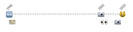
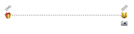
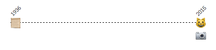
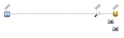
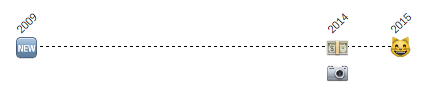
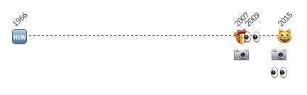
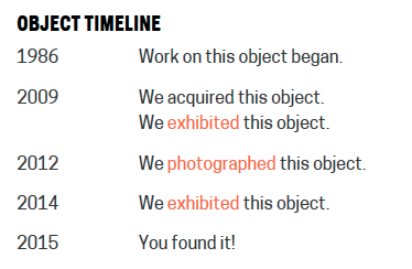
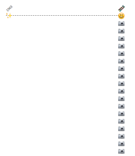
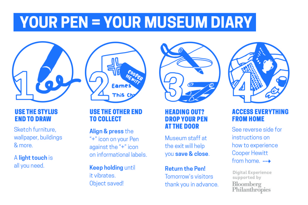
Random Button Television

AppleTV SDK Fun

Recently, Apple announced a number of updates to their product line, including a pretty major update to AppleTV, the small set top box that allows people to listen to their music collection, rent movies and TV shows, and stream audio from their phones to their televisions. The biggest update to AppleTV was definitely the fact that it now supports “Apps”, allowing iOS developers to design and build whatever they can imagine.

I put my hat in the ring, and applied for Apple’s lottery and about a week later a brand new AppleTV Software Development Kit showed up at the Labs.

To be honest, I haven’t had much interest in developing apps for a long time now. It’s problematic at best to go down the road of building something for iOS ( or any brand specific device ) in the context of a museum, and yes, it’s been a long while since I even glanced at Objective-C. But, the device is a curious object, and at the very least made me wonder what it might be like to introduce a way to open up access to our collections through the warm and inviting glow of a television screen. Imagine it for a moment, sitting there atop your dresser, or mounted to your living room wall, next to the fire place, in full HD. The television, no matter how you divide it up over the years has a pretty permanently fixed position in our homes, and in our minds.

As a little side project, I decided to see what I could do with the AppleTV SDK and our Collections API. I decided ahead of time I wouldn’t spend too much time on this, and although I wound up spending at least one night reading up on NSDictionary and a few other oddball data-types in Objective-C, I was able to stick with my original plan and quickly built a little “Hello AppleTV” app that simply allows the “viewer” to flip through objects in our collection by pressing the “select” button on their remotes.

It uses one API method, our old favorite cooperhewitt.objects.getRandom, and yeah, that’s all it does. Keep pressing the select button and you continue to get objects. It’s quite fun!

AppleTV XCode

So here’s how it works. As we say over here at the Cooper Hewitt Labs, “Working code always wins.”

  1. There is a ViewController. This is the thing that represents the screen on your AppleTV, and the thing you can apply all of the subsequent properties to.
  2. There is an ImageView. This is where the image is applied to.
  3. There are a couple Labels which simply allow you to display the title and object ID for each object.
  4. There is a asynchronous way of calling the API.

Here’s the code. There’s basically just the two files for the ViewController that define everything we’re talking about. Beyond that, there is some “wiring up” of the ImageView and Labels so the visuals know what code they are connected to, and there is really the one method “fetchRandom” that does the work of calling the API, parsing the response, and storing the things we are interested in.

And here is the end result.

To be quite honest, we probably won’t be uploading this to the iTunes store. It’s really just a “Hello World” app and only meant to be a conversation starter for staff members who happen by the Labs area. But it does make me wonder — what else could museums do with a device like this?

The device itself is a curious one, with plenty of built in human interface challenges and opportunities. Sitting back, clicking the remote and checking out collection objects, isn’t really my idea of an exciting way to spend an evening at home, but take this a few steps further, maybe a few additional API calls, and who knows what might unfold.

Label Writer: Connecting NFC tags to collection objects

IMG_20150610_113555

Labels, for better or worse, are central to the museum experience. They provide visitors with access to basic object information (metadata) and a tiny glimpse into the curatorial research for everything in the galleries, helping to place objects in context. At Cooper Hewitt, they are also the gateway through which the Pen‘s “collect” interaction is realized.

In order for the Pen to know which object label you’re trying to collect, every label in the museum contains an NFC tag that is written with the object’s ID. When an object gets added to our database we give it an ID, an integer that is unique across our entire online collections database. Our beloved Spanking Cat, for example, has the ID number 18382391. Writing that number to an NFC tag is a simple task, but doing it hundreds of times for every new exhibition we roll out will get tedious very quickly. Thus, Label Writer was born.

Label Writer is an Android app that writes, reads and locks NFC tags based on the object to which the label refers. The staff member can look up the objects that are in a given room of our museum, select one or more of them, and assign them to the label in question. They can search for specific objects in case an object’s location hasn’t been updated yet. They can also write tags for videos and shop items.

The front and back of the NFC tag we use in our labels, with pennies for scale

From left to right: the back and front of the NFC tags we use in our labels, and pennies for scale.

Planning

After thinking about the app we came up with the following requirements:

  1. When processing a user’s visit, we need to know what type of thing they’ve collected. When the Pen launched, this was either objects or videos, and has since grown to include shop items. To facilitate that process, Label Writer would have to distinguish between types of things and write tags that indicated that.
  2. It would need to write multiple things to a tag, including things of different types. One label might contain three objects. Another label might contain one video and two objects.
  3. It would need to lock tags. Leaving the tags unlocked would enable anyone with an NFC-enabled smartphone to walk around the galleries and overwrite our tags. Locking the tags prevents this.
  4. It would need to read tags and display images of what’s on a tag. This is so we can double-check what is on a tag before we lock it. We only print one copy of every label – sometimes through an offsite service – and the wall labels (as opposed to the rail labels) have their NFC tags glued in and unable to be replaced.
  5. Label Writer would have to present objects in a constrained format — having to find the object on a label from our total collection of 210,000 objects every time, through accession number lookup or other traditional searches, would get annoying very quickly.
IMG_20150608_172543

The NFC tags on our wall labels are built in to the label.

IMG_20150608_172442

The NFC tags on our rail labels are interchangeable.

Production

I decided to build the app in Android because it has great support for NFC and we have plenty of Nexus 9 tablets at the museum for use in the galleries. I started with this boilerplate for an Android read/write NFC app and performed initial tests to make sure we could write a tag that could be read by some of the early Pen prototypes. Once that was established, I began fleshing out the UI of the app and worked on hooking it up to our API.

The API gives us so much to work with on the app’s frontend. Being able to display an object’s image is a much better way to confirm that a label is written correctly than by comparing IDs or accession numbers. The API also lets us see all of the objects in a given room of the museum, which means that the user can write labels in an ordered fashion. When the labels arrive from the printer they are grouped by room, and often we will not write the tags until they have been installed in the galleries, so “by room” is a convenient way to organize objects on the frontend. It also gives us easy access to videos and shop items, and allows the app to easily be expanded to write labels for more things from our collections database. Since our collections site alpha, we have stressed the importance of an easily-accessed permanent ID for everything: people, objects, videos, exhibitions, locations etc., and now with the Pen we can prepare labels that allow users to collect any one of those things during their visit to the museum.

01

When I took all these screenshots, the app was called “Tag Writer”, as in “NFC Tag Writer.” But “Label Writer” sounds better.

When the app is opened, the user is prompted with a few ways to group objects. Since we added videos and shop items to the app, this intro screen has grown a bit so it will probably get a redesign when we next expand its capabilities. But for now, users have a few options here:

  1. They can select a room from a dropdown menu (here’s a list of all of our rooms)
  2. They can enter an individual accession number
  3. They can enter a video’s ID
  4. They can search the shop (see Aaron’s recent post about adding shop items to our online collection)

When one of these options is used, the relevant objects appear on the screen. For example, selecting Room 106 brings up some of the posters from our current How Posters Work exhibition. Being able to display the images of the posters makes it much easier for the user to confirm that they are connecting the dots accurately — accession numbers and object IDs are easily confused (not to mention boring to look at).

02

The user can then tap one or more objects to add them to a label. In the screenshot below, you can see that two objects have been selected and the orange bar at the bottom has formatted them to be written to a tag — in this case, chsdm:o:68730187;18708395. The way that things get written to tags follows a format we agreed upon early in the Pen design process, as various developers would be building applications that relied on reading and parsing a Pen’s content. In brief, chsdm is a namespace for our museum that is not particularly necessary but serves as a header for what follows. o stands for object and then the ID (or semicolon-delimited IDs) that follow are the IDs of objects. The letter can change: v for video, s for shop, and on and on for whatever other things we might eventually write to tags. We add a pipe character (|) to delimit multiple types of things on a tag, so a tag with an object and a video might look like chsdm:o:18714653|chsdm:v:68764195. But all of this is handled by the app based on what the user selects in the interface.

03

Next, a user can hold the tablet up to the object label to write the NFC tag. When the tag is written, the orange bar at the bottom turns green to let the user know it went okay. Later, using the “Read Tags” functionality of the app, the user can confirm the tag’s contents by reading the NFC tag. The app parses the tag and loads the things it thinks the tag refers to. When this is confirmed, the user can lock the tag to make sure nobody overwrites it.

05

Here’s everything, from start to finish, using the object-lookup-by-accession-number functionality.

Next Steps

I mentioned that the home screen of this app will get a redesign as we allow more types of things to be written to tags. The user experience of the tag writing process needs a little finessing — a bug in how success messages get displayed has resulted in a few tags that get written with bunk data. Fortunately that is caught in the “read” phase of the workflow, but should be corrected earlier.

Overall, as we keep swapping out exhibitions, Label Writer will get more and more use. We will use these opportunities to collect feedback from the app’s users and make changes to the app accordingly.

Happy Staff = Happy Visitors: Improving Back-of-House Interfaces

“You have to make the back of the fence that people won’t see look just as beautiful as the front, just like a great carpenter would make the back of a chest of drawers … Even though others won’t see it, you will know it’s there, and that will make you more proud of your design.”

—Steve Jobs

In my last post I talked about improvements to online ticketing based on observations made in the first weeks after launching the Pen.

Today’s post is about an important internal tool: the registration station whose job is to pair a new ticket with a new pen. Though visitors will never see this interface, it’s really important that it be simple, easy, clear, and fast. It is also critical that staff are able to understand the feedback from this app because if a pen is incorrectly paired with a ticket then the visitor’s data (collections and creations) will be lost.

Like a Steve-Jobs-approved iPod or a Van Cleef & Arpels ruby brooch, the “inside” of our system should be as carefully and thoughtfully designed as the outside.

the view from behind a desk with screens and wires everywhere. a tablet positioned upright with some tiny text and bars of color.

Version 1 of the app was functional but cluttered, with too much text, and no clear point of focus for the eye.

Because the first version of the app was built to be procedurally functional, its visual design was given little consideration. However, the application as a whole was designed so that the user interface – running in a web browser – was completely separate from the underlying pen pairing functionality, which makes updating the front-end a relatively straightforward task.

Also, we were getting a few complaints from visitors who returned home eager to see their visit diary, and were disappointed to see that their custom URL contained no data. We suspected this could have been a result of the poor UI at ticketing.

With this in mind, I sat behind the desk to observe our staff in action with real customers. I did about three sessions, for about ten minutes each, sometimes during heavy visitor traffic and sometimes during light traffic. Here’s what I kept an eye on while observing:

  • How many actions are required per transaction? Is there any way to minimize the number of “clicks” (in this case, “taps”) required from staff?
  • Is the visual feedback clear enough to be understood with only partial attention? Or do  typography, colors, and composition require an operator’s full attention to understand what’s going on?
  • What extraneous information can we minimize or omit?
  • What’s the critical information we should enlarge or emphasize?

After observing, I tried my hand at the app myself. This was actually more edifying than doing observations. Kathleen, our head of Visitor Services, had a batch of about 30 Pens to pair for a group, and I offered to help. I was very slow with the app, so I wasn’t really of much help, moving through my batch of pens at about half the speed of Kathleen’s staff.

Some readers may be thinking that since the desk staff had adjusted to a less-than-excellent visual design and were already moving pretty fast with it, this could be a reason not to improve it. As designers, we should always be helping and improving. Nobody should have to live with a crappy interface, even if they’ve adjusted to it! And, there will be new staff, and they will get to skip the adjustment process and start on the right foot with a better-designed tool.

My struggle to use the app was fuel for its redesign, which you can see germinating in my drawings below.

some marker sketches of a tablet interface with lots of scribbled notes

After several rounds of paper sketches like these, the desk reps and I decided on this sequence as the starting point for version two of the app.

These were the last in a series of drawings that I worked through with the desk staff. So our first few “iterative prototypes” were created and improved upon in a matter of minutes, since they were simply scribbled on paper. We arrived at the above stopping point, which Sam turned into working code.

Here’s what’s new in version 2:

  • The most important information—the alphanumeric shortcode— is emphasized. The font is about 6 or 7 times bigger, with exaggerated spacing and lots of padding (white space) on all sides for increased legibility. Or as I like to call it, “glanceability.” This helps make sure that the front of house staff pair the correct pen with the correct ticket.
  • Fewer words. For example, “Check Out Pen With This Shortcode” changed to “GO”, “Pen has been successfully checked out and written with shortcode ABCD” changed to “Success,” etc. This makes it easier for staff to know, quickly, that the process has worked and they can move on to the next ticket/pen/customer.

“I didn’t have time to write a short letter, so I wrote a long one instead.”
Mark Twain

  • More accurate words. Our team uses a different vernacular from the people working at the desk. This is normal, since we don’t work together often, and like any neighboring tribes, we’ve developed subtly different words for different things. Since this app is used by desk staff, I wanted it to reflect their language, not ours. For example, “Pair” is what they call “check-out” and “Return” is what they call “check-in.”
  • Better visual hierarchy: The original app had many competing horizontal bands of content, with no clear visual clue as to which band needed the operator’s attention at any given time. We used white space, color (green/yellow/red for go/wait/stop), and re-arranging of elements (less-used features to the bottom, more-used features to the top) to better direct the eye and make it clear to the user what she ought to be looking at.
  • Simple animations to help the user understand when the app is “working” and they should just wait.

Still to come are added features (bulk pairing, maintenance mode) and any ideas the desk reps might develop after a couple of weeks of using the new version.

Imagine how difficult this process would have been if the museum had outsourced all of its design and programming work, or if it were all encased in a proprietary system.

Redesigning Post-Purchase Touchpoints

We re-opened the museum with “minimum viable product” relating to online ticket orders. Visitor-facing touchpoints like confirmation emails, eTicket PDFs and “thank you for your order” webpages were built to be simple and efficient. After putting them to the test with real visitors, room for improvement became obvious.

Here’s how we used staff feedback and designerly observation to iterate and improve upon 3 important touchpoints. The goal of this undertaking was to make things smoother for our front-of-house staff (who turned out to have quite a bit to juggle, given the new Pen and its backend complexities), and simpler for visitors (some of whom were confused by our system.. how dare they!).

The original confirmation webpage was designed with visitors buying on mobile (perhaps even while en route to the museum) in mind:

screen shot of a webpage with order number and a barcode for each ticket.

The original “Thank You” webpage was stripped of information, with the idea of getting you through the front desk transaction as efficiently as possible.

The original confirmation email was a few lines of text:

Screen shot of an email confirming cooper hewitt ticket order

Made in a pre-opening vacuum without real visitors to test upon, The original confirmation email was more self-promotional than it was anticipatory of visitors’ needs.

The original PDF attached to this confirmation email was designed for visitors who like to print things out and have something on paper:

The original eTicket PDF had one page (one "ticket") per visitor. The email went to the purchasing visitor's inbox.

The original eTicket PDF had one page (one “ticket”) per visitor. The email went to the purchasing visitor’s inbox.

Over a few weeks of heavy visitor traffic (with about 20% of visitors buying advance tickets online), I sat behind the front desk staff to quietly observe a handful of transactions every day. I initiated my observation sessions knowing that we needed to make the front desk move smoother and faster, but I didn’t yet know which touchpoints/services/operations would need changing.

These 3 touchpoints stood out to me as something that needed re-addressing if we wanted to make the front desk run more smoothly. (My daily observations also led to many efficiency-boosting changes made to internal tools, IT concerns, staffing needs, signage, and more.) This experience has made me a big believer in quiet observation as a direct route to improving services and systems. “Conference room conjecture” is worth very little compared to real observations and listening-based chats with your public-facing staff.

My advice on Observing and Listening for service design:

  •  You may observe a staff person answer a question incorrectly, or a problem that you could resolve yourself on the spot. Don’t intervene, tempting as it might be! You’re not there to fix problems, you’re there to fix problem patterns. Your mission is long-term.
  • When chatting with staff, listen quietly and attentively. It’s OK if you can’t offer an instant fix. You may not have a magic wand, but listening with empathy is at least half as good.
  • Focus on building trust with the staff you are observing over a period of days or weeks, so they will become comfortable sharing bad news as easily as they share the good. Remind them repeatedly that your intention is to improve their daily work situation.
  • Remember it can be very intimidating to feel “interrogated” or “observed” by someone who is your direct/indirect superior. Make sure they know your questions are motivated by a spirit of service, not by “tattle-telling” to other staff that things might be going amiss. You will get more honesty, and thereby, better design insights.

Here are the observation-based insights that motivated our choices:

  • Visitors sometimes get confused by the barcodes. They think something has to be scanned after their visit in order for their pen diary to get “Saved” or “sent to their email.”
  • Because this collateral is called an “eTicket,” some visitors are marching right up to the gallery entrance with their “eTicket,” and bypassing the front desk. “I already bought my ticket, why do I have to wait on this line?”
  • Visitors don’t know what the Pen is, and explaining it takes several minutes, slowing down the line.
  • Visitors may not have great cell service in our lobby, and probably haven’t gotten the wifi working yet, so if their email attachment hasn’t pre-downloaded, this will slow everything down.
  • Front desk staff each have different ways of handling eTickets. Most staff ask for the order number verbally. A few staff take the printout or phone and scan the barcode, avoiding the need to re-print a ticket (this is how the barcode was intended to be used).
  • The diversity of collateral that visitors may bring to the transaction makes things more complicated for our staff. “Is my customer looking at a webpage, an email, or a PDF? Should I tell them to look for an order number, hand me a barcode, or open the attachment?”
two gentlemen at a large white desk in a dark room full of wood paneling. a third gentleman sits behind the desk.

For their own ease of use, most desk reps were initiating the transaction by asking: “What’s your Order number?” so we designed to accommodate that preference instead of working against it.

The ideas we cycled through:

  • A picture of the Pen with an “enticing” explanation of what it does might help offset the burden on the front desk to explain it all very quickly.
  • We thought one barcode per visitor displayed in a list might let us hold on to our original “paperless dream.” (The “paperless dream” entailed scanning each barcode and pairing immediately with pens, bypassing our CRM and house-printed tickets.) When we ran this idea by our colleagues at the desk, though, we learned quickly that this would be extraordinarily confusing for guests, who need to remember their personal URL (usually printed on the ticket) to access their post-visit diary. What if a group of 5 friends come together, will we put the burden on the visitor to remember which URL goes with which friend? Will they have to write it down, or forward around the ticket email with added whose-URL-is-whose notes? That’s too much of a burden on guests, who are already working to assimilate new information about our Pen, which has already buffeted their expectations (and tried their transaction-length-patience) about what to expect during a museum front desk experience.
printouts of an email confirming tickets with barcodes and giant pen scribbled "x" with handwritten pen notes

What seems like a good idea at your desk may not seem so smart after you’ve shown it around to ground-level users

The current solution (after all, our work is never final):

screen shot of an email with lots of information about cafe, hours, map, the pen, and an image of museum interior and pen usage.

The order number is large and at the top of the email. It’s also in the subject line. Click this image to enlarge.

  • This solution makes the front desk staffer’s job simpler when a pre-order person arrives. It’s all about the order number. There is no more choice involved about whether to ask for the order number, or the barcode, or the purchaser’s name… or….
  • There is still a confirmation webpage, and it looks exactly like this.
  • There is no more PDF attachment to the email.
  • Since this is a “will-call” paradigm instead of an “eTicket” paradigm, we hope this solution will keep visitors from expecting that they can enter the museum directly without talking to a desk attendant first.
  • The order number is in the subject line, so if your email hasn’t fully downloaded, you won’t slow down the line.
  • The original idea was to save paper by allowing a visitor’s PDF to work as their ticket/URL reminder. This idea, though it does now involve reprinting tickets, may involve less user-printouts, since we’re simply asking folks to “bring” their order number, and not any printouts.

This is just one piece of an elaborate service design puzzle. More posts will be coming about other touchpoints we’ve created and re-designed based on observations made in the first months of running our new Pen service.

Understanding how the Pen interacts with the API

Detail of instructional postcard now available to museum visitors at entry to accompany The Pen.

Detail of instructional postcard now available to museum visitors at entry to accompany The Pen.

The Pen has been up and running now for five weeks and the museum as a whole has been coming to terms with exactly what that means. Some things can be planned for, others can be hedged against, but inevitably there will be surprises – pleasant and unpleasant. We can report that our expectations of usage have been far exceeded with extremely high take up rates, over 400,000 ‘acts of collection’ (saving museum objects with the Pen), and a great post-visit log in rate.

The Pen touches almost every operation of the museum – even though the museum was able to operate completely without it from our opening in December until March. At its most simple, object labels need NFC tags which in turn needs up-to-the-minute location information entered into our collection management system (TMS); the ticketing system needs a constant connection not only to its own servers but also to our API functions that create unique shortcodes for each visitor’s visit; and the Pens need regular cleaning and their monthly battery change. So everyone in the museum has been continuously improving and altering backend systems, improving workflows, and even the front-end UI on tablets that the ticket staff use to pair Pens with tickets.

Its complex.

Katie drew up (another) useful diagram of the journey of a Pen through a visit and how it interacts with our API.

Single visit 'lifecycle' of The Pen. Illustration by Katie Shelly, 2015. [click to enlarge]

Single visit ‘lifecycle’ of The Pen. Illustration by Katie Shelly, 2015. [click to enlarge]

Even more details of the overall system design and development saga can be found in the (long) Museums and the Web 2015 paper by Chan & Cope.

The digital experience at Cooper Hewitt is supported by Bloomberg Philanthropies. The Pen is the result of a collaboration between Cooper Hewitt, SistelNetworks, GE, MakeSimply, Undercurrent, and an original concept by Local Projects with Diller Scofidio + Renfro.

From concept to video prototype: the early form of the Pen

It was in late 2012 that the concept for the Pen was pitched to the museum by Local Projects, working then as subcontractors to Diller Scofidio & Renfro. The concept portrayed the Pen as an alternative to a mobile experience, and importantly, was symbol that was meant to activate visitors.

Early image of Pen

Original concept for the Pen by Local Projects with Diller Scofidio + Renfro, late 2012.

“Design Fiction is making things that tell stories. It’s like science-fiction in that the stories bring into focus certain matters-of-concern, such as how life is lived, questioning how technology is used and its implications, speculating bout the course of events; all of the unique abilities of science-fiction to incite imagination-filling conversations about alternative futures.” (Julian Bleeker, 2009)

In late 2013, Hanne Delodder and our media technologist, Katie Shelly, were tasked with making a short instructional video – a piece of ‘internal design fiction’ to help us expand the context of the Pen, beyond just the technology. (Hanne was spending three weeks observing work in the Labs courtesy of the Belgian Government as part of her professional development at Het Huis van Alijn, a history museum in Ghent.)

The video used the vWand from Sistelnetworks, an existing product that became the starting point from which the final Pen developed. At the time of production the museum had not yet begun the final development path that engaged Sistelnetworks, GE, Makesimply, Tellart and Undercurrent who would help augment and transform the vWand into the new product we now have.

The brief for the video was simply to create an instructional video of the kind that the museum might play in the Great Hall and on our website to instruct visitors how they might use the Pen. As it turned out, the video ended up being a hugely valuable tool in the ‘socialisation’ of the Pen as the entirety of the museum started to gets its head around what/how/when from curators to security staff, well before we had any working prototypes.

It ended up informing our design sprints with GE and Sistelnetworks which resulted in the form, operation and interaction design for the Pen; as well as a ‘stewardship’ sprint with SVA’s Products of Design where we worked through operational issues around distribution and return.

The video was also the starting point for the instructional video we ended up having produced that now plays online and in the Great Hall. You will notice that the emphasis in the final video has changed dramatically – focussing on collecting inside the museum and the importance of the visitor’s ticket (in contrast to the public collection of email addresses in the original).

The digital experience at Cooper Hewitt is supported by Bloomberg Philanthropies.

We choose Bao Bao!

So, the Pen went live on March 10. We’re handing them out to every visitor and people are collecting objects all over the place. Yay!

The Pen not only represents a whole world of brand-new for the museum but an equally enormous world of change for staff and the ways they do their jobs. One of the places this has manifested itself is the sort of awkward reality of being able to collect an object in the galleries only to discover that the image for that object or, sometimes, the object itself still hasn’t been marked as public in the collections database.

It’s unfortunate but we’ll sort it all out over time. The more important question right now is how we handle objects that people have collected in the galleries (that are demonstrably public) but whose ground truth hasn’t bubbled back up to our own canonical source of truth.

In the early days when we were building and testing the API methods for recording the objects that people collected the site would return a freak-out-and-die error the moment it encountered something that a visitor didn’t have permissions to see. This is a pretty normal approach in software and systems development but it made testing over the overall system complicated and time-consuming.

In the interest of expediency we replaced the code that threw a temper tantrum with code that effectively said la la la la la… I can’t hear you! If a visitor tried to collect something that they didn’t have permissions to see we would simply drop it on the floor and pretend it never happened. This was useful in fleshing out the rest of the overall workflow of the system but we also understood that it was temporary at best.

Screen Shot 2015-03-20 at 12.07.07 PM

Allowing a user to collect something in the gallery and then denying any evidence of the event on their visit webpage would be… not good. So now we record the item being collected but we also record a status flag next to that event assuming that the disconnect between reality and the database will work itself out in favour of the visitor.

It also means that the act of collecting an object still has a permalink; something that a visitor can share or just hold on to for future reference even if the record itself is incomplete. And that record exists in the context of the visit itself. If you can see the other objects that you collected around the same time as a not-quite-public-yet object then they can act as a device to remember what that mystery thing is.

Which raises an important question: What should we use as a placeholder? Until a couple of days ago this is what we showed visitors.

streetview-cat-words

Although the “Google Street View Cat” has a rich pedigree of internet meme-iness it remains something of an acquired taste. This was a case of early debugging and blowing-off-steam code leaking in to production. It was also the result of a bug ticket that I filed for Sam on January 21 being far enough down to the list of things to do before and immediately after the launch of the Pen that it didn’t get resolved until this week. The ticket was simply titled “Animated pandas”.

As in, this:

This is the same thread that we’ve been pulling on ever since we started rebuilding the collections website: When we are unable to show something to a visitor (for whatever reason) what do we replace the silence with?

We choose Bao Bao!