The multi–award winning alpha version of our site launched in 2012 and in the following three years it has grown very quickly. New data was imported, new pages were made, new API methods went public, whole new suites of functionality were added and it was even redesigned (twice).
As a result of this period of rapid growth and change, things got a little messy. The object page had become a dumping ground for metadata. We had a 1200-line global CSS file and two different versions of Bootstrap that for some reason needed each other to work. We had at least three different ways of displaying a “list of things.”
At the same time, we’re not done growing. In many ways we’re still in beta.
We want to expand the post-visit experience, integrate software tests, conduct structured user tests and more. But that work was getting harder to think about with such a sprawling codebase and inconsistent visual hierarchy in place. With that in mind, we recently embarked on a three-week work sprint to review our site’s layout and codebase. The result is a consistent visual hierarchy, easily enforced and editable in the code, that sets our site up to easily accomplish all the future plans we have.
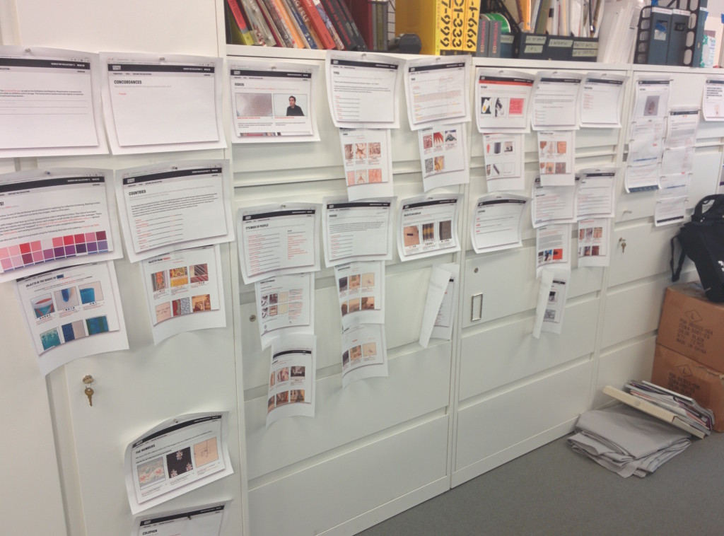
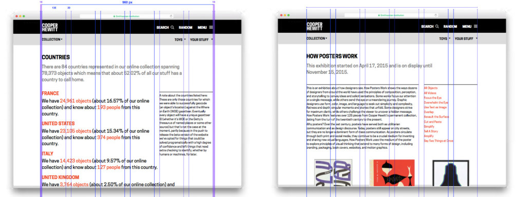
We began this work, internally dubbed “visual consistency”, with the simple exercise of pinning up printouts of some of the pages of our site. With everything presented together, it was easy to see some of the inconsistencies of the layout.
The bird’s-eye view of the site highlighted a few specific layout problems. A clear one, for example, were our three different ways of showing lists:
Another issue we saw with the layout was the awkward positioning of contextual information. The inherent tension in making collections like ours available online is that there are two equally interesting stories to be told: the story of the object itself, and the story about how those objects have (or haven’t) been cataloged, organized, and tended to during the life of our institution. We believe one of the main functions of our collections site is to explore this tension by presenting traditional and experimental ways of organizing and traversing the data, and to simultaneously describe what, why, and how we are doing it. Often, this takes the form of descriptive text which frames the page’s contents in a certain narrative. In our current site, however, that descriptive text was crowding out the rest of the content.
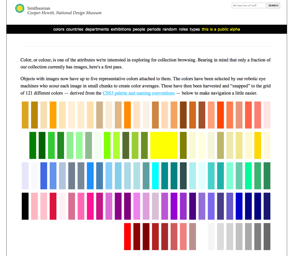
Our “colors” page is a good example of this. This is what it looked like two years ago on the alpha version of the site:
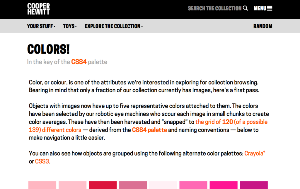
Here, a short description of this experimental feature gives context for the main content of the page, a dissection of our collection by colors in its photograph. Jump to one year ago, after the beta launch of the site (which focused on responsive layouts and presentation of images) and the subsequent application of our new brand, when the page looked like this:
Not only had we added more text in the description of a new feature (color palettes), but the combination of a larger font size and tighter main column had resulted in the main content of the page being pushed down. I hesitate to say that it’s been pushed “below the fold,” because the fold is a myth! But as Sophie Shepherd writes for Happy Cog, to forget the fold is “not to say that we shouldn’t think about the hierarchy of the content on a page.”
The actual color information is the most important thing on the page, but then the only other place we would have to put description and context is at the bottom. Other pages, such as the exhibition page, had also seen an increase in descriptive text which resulted in a difficult-to-read “wall of text.” This got us thinking about a middle ground that would allow us to appropriately place the colors, images or other “main content” of a page atop the visual hierarchy without relegating the context.
Another major inconsistency that stood out was the placement or implementation of navigational or other web-specific tools such as pagination, total counts and filters. It’s tied to the previous issue in that we were just adding various filtering tools to the top of every page, blended in with longer descriptive text that pushed the main content further and further down. We also identified the many ways we go about allowing pages to be filtered, and decided that while a consistent filtering system would be out of the scope of this sprint, it was something to keep in mind as we reconsidered the hierarchy of our current pages.
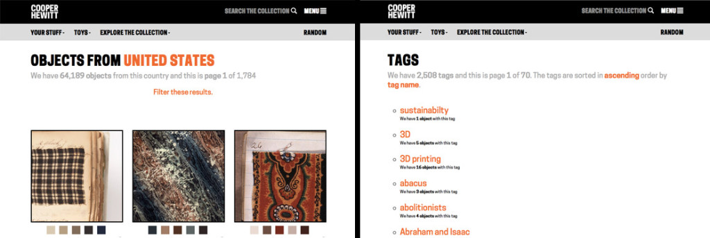
Two ways we handled filters: on the left, a “Filter these results” links expands accordion menu that produces a number of dropdowns. On the right, the subtitle text contains inline dropdowns to toggle sort options.
Ayham, our summer intern, started experimenting with new layouts based on our discussions. He came up with a flexible two-column system which allows a pages main content to show up much higher on the page and gives the contextual content and filtering tools a home of their own off to the side. He experimented with various ways to organize narrative, context and navigational elements in a way which would work across multiply types of webpage. The workflow was based on quick mock-ups and frequent conversations among the Labs, and once the broader layout changes were implemented in code, we abandoned Illustrator comps for edits directly in the CSS so we could address issues like mobile viewports and spacing tweaks.
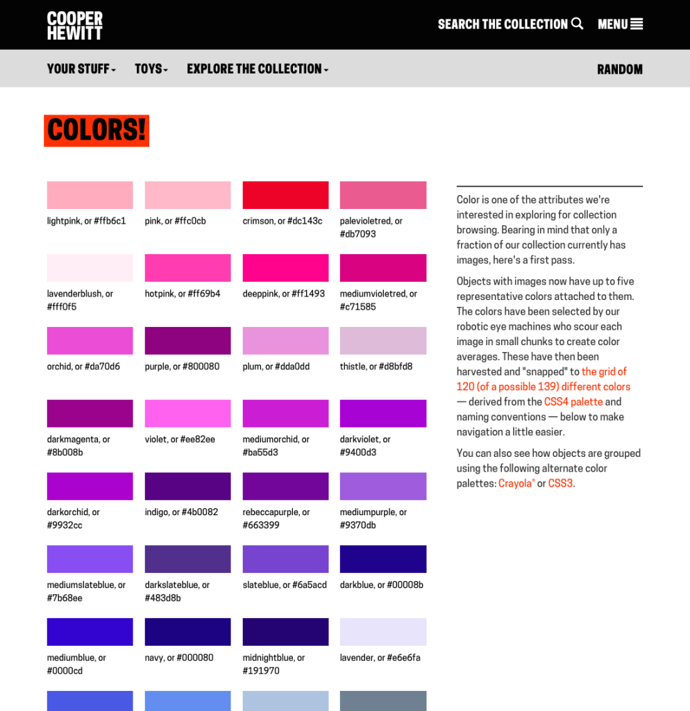
Here’s the result of that work, in this instance, the Colors page with the new template applied. Colors are moved much further up the page, and the contextual information remains present without dominating the main content.
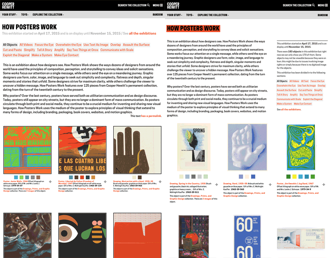
Here are a couple more before / after comparisons, in GIF form.
To support all of these design changes, the styling and templating saw some changes as well. The 1200-line CSS file was obliterated – about 800 of those lines referred to things that were gone from the site or overridden elsewhere. Other CSS rules were split off in to individual files based on section of the site (object.css, visit.css etc) and the templates were updated to load in their individual “specific CSS files” as needed. I created a “master template” that would render all pages instead of having each template be responsible for including its own header, footer and column structure. I built the template to handle three main components: an image grid, an aside, and “everything else.” If any one of those three elements is missing from a page, the template will adapt, which allows us to keep a consistent organizational system across webpages that serve different purposes. Implementing this involved the tedious task of reformatting about 90 template files to use a master template but would be worth the effort: in addition to facilitating a consistent visual hierarchy, the master template will allow us to quickly make future site-wide layout changes, which can aid in user testing.
This is daunting work because it requires things to be torn apart and built back up, which takes longer than the two or three days we normally give ourselves to finish tasks. It forced us to consider mundane things that had previously gone undiscussed like ordering of metadata and typographic best practices – which would have held the necessarily rapid development of the site back. But the work was beneficial for reasons beyond “visual consistency”: it gave us a change to reflect on how the site had evolved, it helped us identify areas most in need of future attention, and going forward it gives us more room to grow.



Pingback: Slowly improving Copyright clarity | Cooper Hewitt Labs
Pingback: A Very Happy & Open Birthday for the Pen | Cooper Hewitt Labs
Pingback: Announcing SkyDesigner! Sam Brenner joins the Labs | Sam Brenner: Notes