One of my longer-term projects since joining the museum has been rethinking how the search feature functions on the collections website. As we get closer to re-opening the museum with a suite of new technologies, our work in collaboration with Local Projects has prompted us to take a close look at the moving pieces that comprise the backend of our collections site and API. Search, naturally, forms a large piece of that. Last week, after a few weeks of research and experimentation, I pushed the first iteration live. In this post, I’ll share some of the thoughts and challenges that informed our changes.
First, a glossary of terms for readers who (like me, a month ago) have little-to-no experience with the inner-workings of a search engine:
- Platform: The software that actually does the searching. The general process is that we feed data to the platform (see “index”), and then we ask it for results matching a certain set of parameters (see “query”). Everything else is handled by the platform itself. Part of what I’ll get into below involves our migration from one platform, Apache Solr, to another, Elasticsearch.
- Index: An index is the database that the search platform uses to perform searches on. The search index is a lot like the primary database (it probably could fill that role if it had to) but it adds extra functionality to facilitate quick and accurate retrieval of search results.
- Query: The rules to follow in selecting things that are appropriate to provide as search results. For users, the query could be something like “red concert poster,” but we have to translate that into something that the search provider will understand before results can be retrieved. Search providers give us a lot of different ways we can query things (ranges of a number, geographic distance or word matching to name a few), and a challenge for us as interface designers is to decide how transparent we want to make that translation. Queries also allow us to define how results should be sorted and how to facet results.
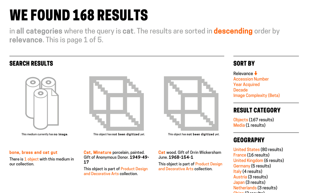
- Faceting/Aggregation: A way of grouping results based on traits they posses. For example, faceting on “location” when you search our collection for “cat” reveals that 80 of our cat-related things are from the USA, 16 are from France, and so on.
- Analysis (Tokenization/Stemming etc): A process that helps a computer work with sentences. Tokenization, for example, would split a search for “white porcelain vase” into the individual tokens: “white,” “porcelain” and “vase,” and then perform a search for any number of those tokens. Another example is stemming, which would allow the platform to understand that if a user searches for “running,” then items containing other words like “run” or “runner” are also valid search results. Analysis also gives us the opportunity to define custom rules that might include “marathon” and “track” as valid results in a search for “running.”
The State of Search
Our old search functionality showed its symptoms of under-performance in a few ways. For example, basic searches — phrases like “red concert poster” — turned up no results despite the presence of such objects in our collection, and searching for people would not return the person themselves, only their objects. These symptoms led me to identify what I considered the two big flaws in our search implementation.
On the backend, we were only indexing objects. This meant that if you searched for “Ray Eames,” you would see all of the objects we have associated with her, but to get to her individual person page, you would have to first click on an object and then click on her name. Considering that we have a lot of non-objects1, it makes sense to index them all and include them, where relevant, in the results. This made my first objective to find a way to facilitate the indexing and querying of different types of things.
On the frontend, we previously gave users two different ways to search our collection. The default method, accessible through the header of every page, performed a full text search on our Solr index and returned results sorted by image complexity. Users could also choose the “fancy search” option, which allows for searches on one or more of the individual fields we index, like “medium,” “title,” or “decade.” We all agreed here that “fancy search” was confusing, and all of its extra functionality — faceting, searching across many fields — shouldn’t be seen as “advanced” features. My second objective in rethinking how search works, then, was to unify “fancy” and “regular” search into just “search.”
Objective 1: Update the Backend
Our search provider, Solr, requires that a schema be present for every type of thing being indexed. The schema (an XML file) tells Solr what kind of value to expect for a certain field and what sort of analysis to perform on the field. This means I’d have to write a schema file — anticipating how I’d like to form all the indexed data — for each new type of thing we want to search on.
One of the features of Elasticsearch is that it is “schemaless,” meaning I can throw whatever kind of data I want at the index and it figures out how to treat it. This doesn’t mean Elasticsearch is always correct in its guesses — for example, it started treating our accession numbers as dates, which made them impossible to search on — so it also gives you the ability to define mappings, which has the same effect as Solr’s schema. But if I want to add “people” to the index, or add a new “location” field to an object, using Elasticsearch means I don’t have to fiddle with any schemas. This trait of Elasticsearch alone made worth the switch (see Larry Wall’s first great virtue of programmers, laziness: “the quality that makes you go to great effort to reduce overall energy expenditure”) because it’s important to us that we have the ability to make quick changes to any part of our website.
Before building anything in to our web framework, I spent a few days getting familiar with Elasticsearch on my own computer. I wrote a python script that loops through all of the CSVs from our public collections repository and indexed them in a local Elasticsearch server. From there, I started writing queries just to see what was possible. I was quickly able to come up with a lot of the functionality we already have on our site (full-text search, date range search) and get started with some complex queries as well (“most common medium in objects between 1990-2000,” for example, which is “paper”). This code is up on Github, so you can get started with your own Cooper Hewitt search engine at home!
Once I felt that I had a handle on how to index and query Elasticsearch, I got started building it into our site. I created a modified version of our Solr indexing script (in PHP) that copied objects, people, roles and media from MySQL and added them to Elasticsearch. Then I got started on the endpoint, which would take search parameters from a user and generate the appropriate query. The code for this would change a great deal as I worked on the frontend and occasionally refactored and abstracted pieces of functionality, but all the pieces of the pipeline were complete and I could begin rethinking the frontend.
Objective 2: Update the Frontend
Updating the frontend involved a few changes. Since we were now indexing multiple categories of things, there was still a case for keeping a per-category search view that gave users access to each field we have indexed. To accommodate these views, I added a tab bar across the top of the search forms, which defaults to the full-collection search. This also eliminates confusion as to what “fancy search” did as the search categories are now clearly labeled.
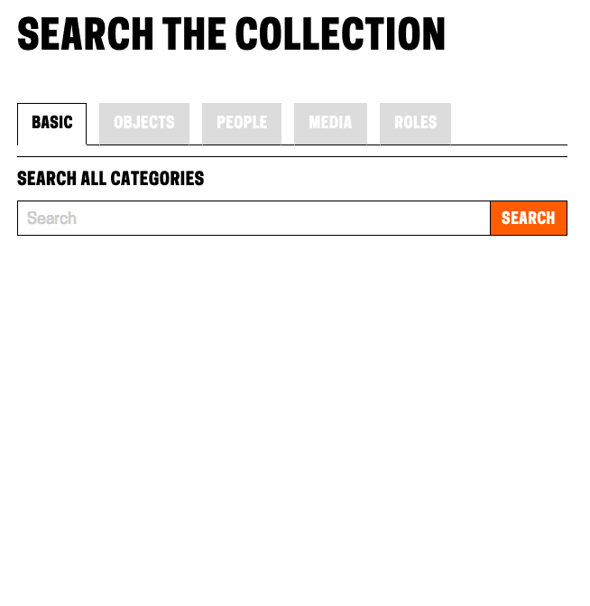
Showing the tabbed view for search options
The next challenge was how to display sorting. Previously, the drop-down menu containing sort options was hidden in a “filter these results” collapsible menu. I wanted to lay out all of the sorting options for the user to see at a glance and easily switch between sorting modes. Instead of placing them across the top in a container that would push the search results further down the page, I moved them to a sidebar which would also house search result facets (more on that soon). While it does cut in to our ability to display the pictures as big as we’d like, it’s the only way we can avoid hiding information from the user. Placing these options in a collapsible menu creates two problems: if the menu is collapsed by default, we’re basically ensuring that nobody will ever use them. If the menu is expanded by default, then it means that the actual results are no longer the most important thing on the page (which, on a search results page, they clearly are). The sidebar gives us room to lay out a lot of options in an unobtrusive but easily-accessible way2.
Switching between sort mode and sort order.
The final challenge on the frontend was how to handle faceting. Faceting is a great way for users who know what they’re looking for to narrow down options, and a great way for users who don’t know what they’re looking for to be exposed to the various buckets we’re able to place objects in to.
Previously on our frontend, faceting was only available on fancy search. We displayed a few of the faceted fields across the top of the results page, and if you wanted further control, users could select individual fields to facet on using a drop-down menu at the bottom of the fancy search form. When they used this, though, the results page displayed only the facets, not the objects. In my updates, I’ve turned faceting on for all searches. They appear alongside the search results in the sidebar.
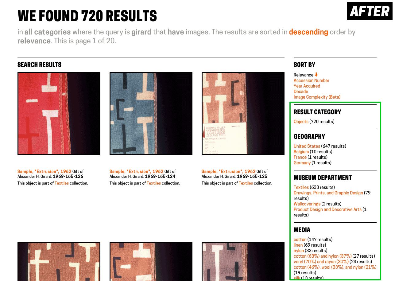
Relocating facets from across the top of the page to the sidebar
Doing it Live
We initially rolled these changes out about 10 days ago, though they were hidden from users who didn’t know the URL. This was to prove to ourselves that we could run Elasticsearch and Solr alongside each other without the whole site blowing up. We’re still using Solr for a bit more than just the search (for example, to show which people have worked with a given person), so until we migrate completely to Elasticsearch, we need to have both running in parallel.
A few days later, I flipped the switch to make Elasticsearch the default search provider and passed the link around internally to get some feedback from the rest of the museum. The feedback I got was important not just for working out the initial bugs and kinks, but also (and especially for myself as a relative newbie to the museum world) to help me get the language right and consider all the different expectations users might have when searching our collection. This resulted in some tweaks to the layout and copy, and some added functionality, but mostly it will inform my bigger-picture design decisions going forward.
A Few Numbers…
Improving performance wasn’t a primary objective in our changes to search, but we got some speed boosts nonetheless.
| Query | Before (Solr) | After (Elasticsearch) |
|---|---|---|
| query=cat, facets on | 162 results in 1240-1350ms | 167 results in 450-500ms |
| year_acquired=gt1990, facets on | 13,850 results in 1430-1560ms | 14,369 results in 870-880ms |
| department_id=35347493&period_id=35417101, facets on | 1,094 results in 1530-1580ms | 1,150 results in 960-990ms |
There are also cases where queries that turned up nothing before now produce relevant results, like “red concert poster,” (0 -> 11 results) “German drawings” (0 -> 101 results) and “checkered Girard samples” (0 -> 10 results).
Next Steps
Getting the improved search in front of users is the top priority now – that means you! We’re very interested in hearing about any issues, suggestions or general feedback that you might have — leave them in the comments or tweet us @cooperhewittlab.
I’m also excited about integrating some more exiting search features — things like type-ahead search and related search suggestion — on to the site in the future. Additionally, figuring out how to let users make super-specific queries (like the aforementioned “most common medium in objects between 1990-2000”) is a challenge that will require a lot of experimentation and testing, but it’s definitely an ability we want to put in the hands of our users in the future.
New Search is live on our site right now – go check it out!
1 We’ve been struggling to find a word to use for things that are “first-class” in our collection (objects, people, countries, media etc.) that makes sense to both museum-folk and the laypeople. We can’t use “objects” because those already refer to a thing that might go on display in the museum. We’ve also tried “items,” “types” and “isas” (as in, “what is this? it is a person”). But nothing seems to fit the bill.
2 We’re not in complete agreement here at the labs over the use of a sidebar to solve this design problem, but we’re going to leave it on for a while and see how it fares with time. Feedback is requested!