
We re-opened the museum with “minimum viable product” relating to online ticket orders. Visitor-facing touchpoints like confirmation emails, eTicket PDFs and “thank you for your order” webpages were built to be simple and efficient. After putting them to the test with real visitors, room for improvement became obvious.
Here’s how we used staff feedback and designerly observation to iterate and improve upon 3 important touchpoints. The goal of this undertaking was to make things smoother for our front-of-house staff (who turned out to have quite a bit to juggle, given the new Pen and its backend complexities), and simpler for visitors (some of whom were confused by our system.. how dare they!).
The original confirmation webpage was designed with visitors buying on mobile (perhaps even while en route to the museum) in mind:
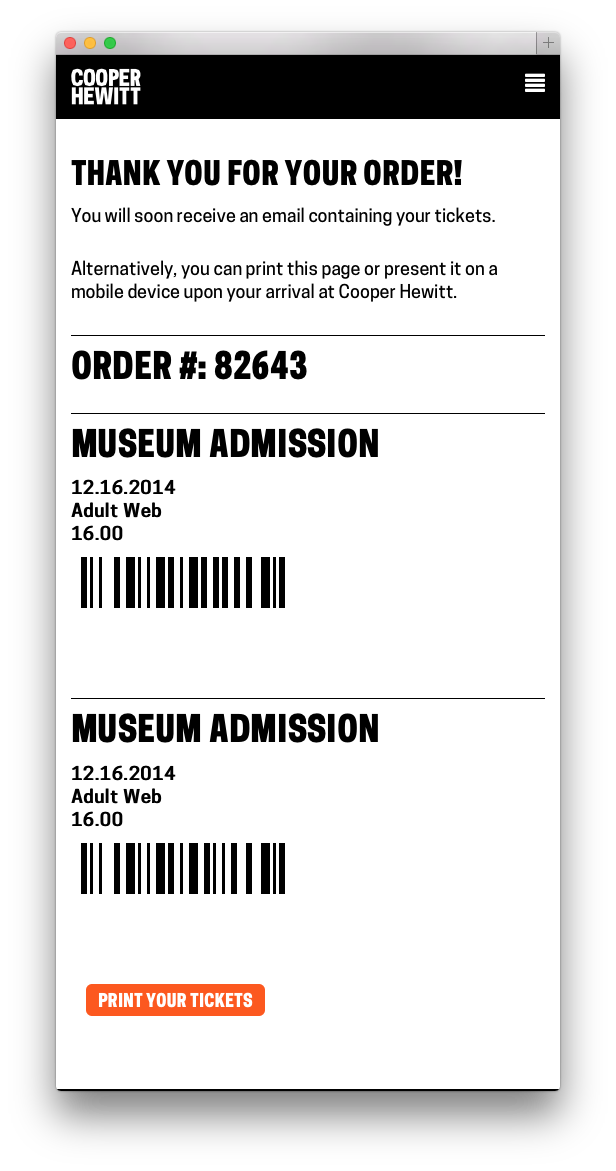
The original “Thank You” webpage was stripped of information, with the idea of getting you through the front desk transaction as efficiently as possible.
The original confirmation email was a few lines of text:
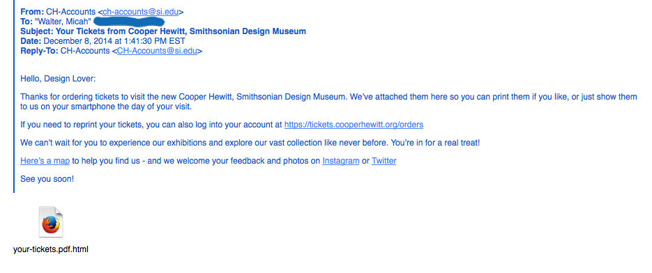
Made in a pre-opening vacuum without real visitors to test upon, The original confirmation email was more self-promotional than it was anticipatory of visitors’ needs.
The original PDF attached to this confirmation email was designed for visitors who like to print things out and have something on paper:
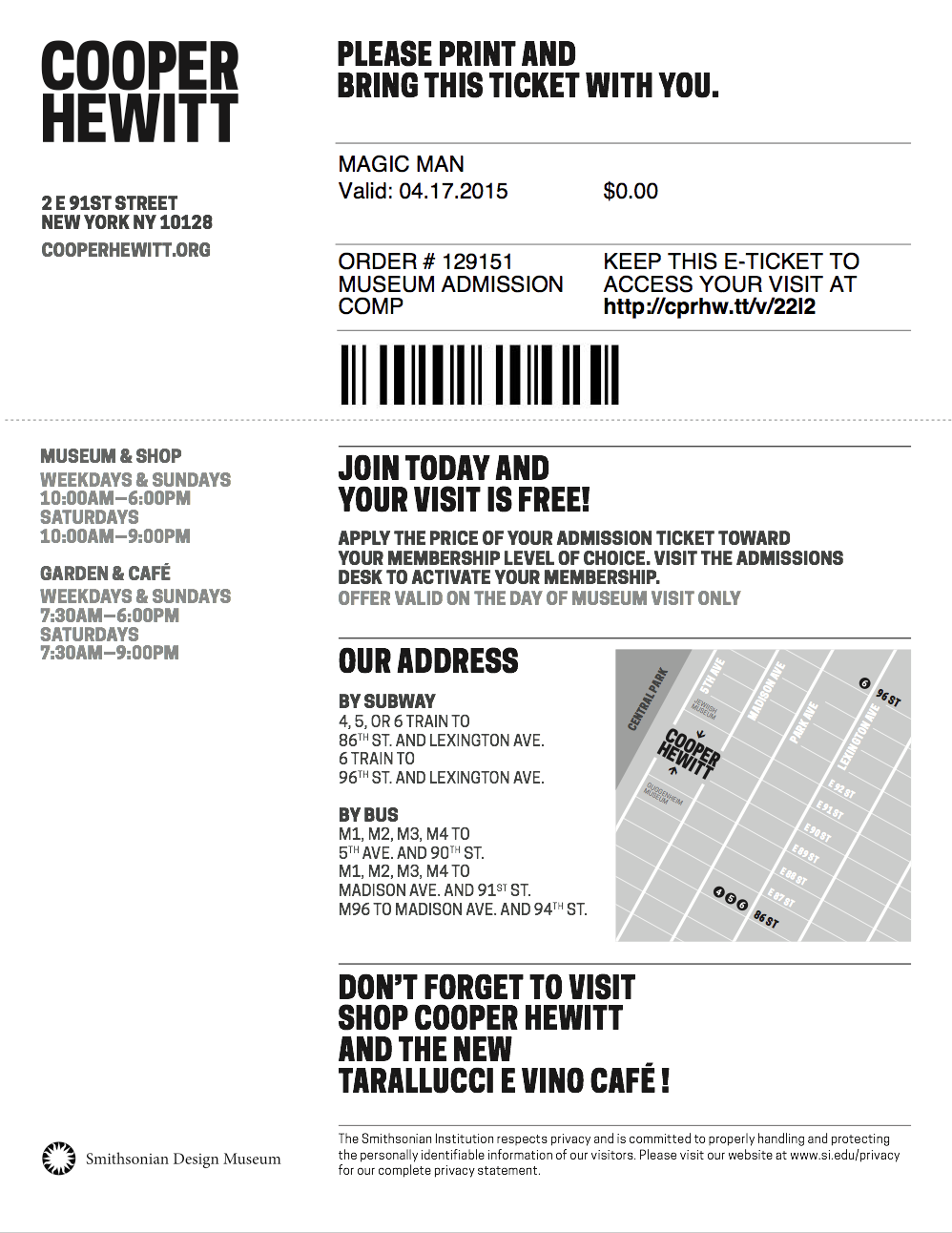
The original eTicket PDF had one page (one “ticket”) per visitor. The email went to the purchasing visitor’s inbox.
Over a few weeks of heavy visitor traffic (with about 20% of visitors buying advance tickets online), I sat behind the front desk staff to quietly observe a handful of transactions every day. I initiated my observation sessions knowing that we needed to make the front desk move smoother and faster, but I didn’t yet know which touchpoints/services/operations would need changing.
These 3 touchpoints stood out to me as something that needed re-addressing if we wanted to make the front desk run more smoothly. (My daily observations also led to many efficiency-boosting changes made to internal tools, IT concerns, staffing needs, signage, and more.) This experience has made me a big believer in quiet observation as a direct route to improving services and systems. “Conference room conjecture” is worth very little compared to real observations and listening-based chats with your public-facing staff.
My advice on Observing and Listening for service design:
- You may observe a staff person answer a question incorrectly, or a problem that you could resolve yourself on the spot. Don’t intervene, tempting as it might be! You’re not there to fix problems, you’re there to fix problem patterns. Your mission is long-term.
- When chatting with staff, listen quietly and attentively. It’s OK if you can’t offer an instant fix. You may not have a magic wand, but listening with empathy is at least half as good.
- Focus on building trust with the staff you are observing over a period of days or weeks, so they will become comfortable sharing bad news as easily as they share the good. Remind them repeatedly that your intention is to improve their daily work situation.
- Remember it can be very intimidating to feel “interrogated” or “observed” by someone who is your direct/indirect superior. Make sure they know your questions are motivated by a spirit of service, not by “tattle-telling” to other staff that things might be going amiss. You will get more honesty, and thereby, better design insights.
Here are the observation-based insights that motivated our choices:
- Visitors sometimes get confused by the barcodes. They think something has to be scanned after their visit in order for their pen diary to get “Saved” or “sent to their email.”
- Because this collateral is called an “eTicket,” some visitors are marching right up to the gallery entrance with their “eTicket,” and bypassing the front desk. “I already bought my ticket, why do I have to wait on this line?”
- Visitors don’t know what the Pen is, and explaining it takes several minutes, slowing down the line.
- Visitors may not have great cell service in our lobby, and probably haven’t gotten the wifi working yet, so if their email attachment hasn’t pre-downloaded, this will slow everything down.
- Front desk staff each have different ways of handling eTickets. Most staff ask for the order number verbally. A few staff take the printout or phone and scan the barcode, avoiding the need to re-print a ticket (this is how the barcode was intended to be used).
- The diversity of collateral that visitors may bring to the transaction makes things more complicated for our staff. “Is my customer looking at a webpage, an email, or a PDF? Should I tell them to look for an order number, hand me a barcode, or open the attachment?”
For their own ease of use, most desk reps were initiating the transaction by asking: “What’s your Order number?” so we designed to accommodate that preference instead of working against it.
The ideas we cycled through:
- A picture of the Pen with an “enticing” explanation of what it does might help offset the burden on the front desk to explain it all very quickly.
- We thought one barcode per visitor displayed in a list might let us hold on to our original “paperless dream.” (The “paperless dream” entailed scanning each barcode and pairing immediately with pens, bypassing our CRM and house-printed tickets.) When we ran this idea by our colleagues at the desk, though, we learned quickly that this would be extraordinarily confusing for guests, who need to remember their personal URL (usually printed on the ticket) to access their post-visit diary. What if a group of 5 friends come together, will we put the burden on the visitor to remember which URL goes with which friend? Will they have to write it down, or forward around the ticket email with added whose-URL-is-whose notes? That’s too much of a burden on guests, who are already working to assimilate new information about our Pen, which has already buffeted their expectations (and tried their transaction-length-patience) about what to expect during a museum front desk experience.
What seems like a good idea at your desk may not seem so smart after you’ve shown it around to ground-level users
The current solution (after all, our work is never final):
The order number is large and at the top of the email. It’s also in the subject line. Click this image to enlarge.
- This solution makes the front desk staffer’s job simpler when a pre-order person arrives. It’s all about the order number. There is no more choice involved about whether to ask for the order number, or the barcode, or the purchaser’s name… or….
- There is still a confirmation webpage, and it looks exactly like this.
- There is no more PDF attachment to the email.
- Since this is a “will-call” paradigm instead of an “eTicket” paradigm, we hope this solution will keep visitors from expecting that they can enter the museum directly without talking to a desk attendant first.
- The order number is in the subject line, so if your email hasn’t fully downloaded, you won’t slow down the line.
- The original idea was to save paper by allowing a visitor’s PDF to work as their ticket/URL reminder. This idea, though it does now involve reprinting tickets, may involve less user-printouts, since we’re simply asking folks to “bring” their order number, and not any printouts.
This is just one piece of an elaborate service design puzzle. More posts will be coming about other touchpoints we’ve created and re-designed based on observations made in the first months of running our new Pen service.