Collect all the things – shoeboxes, shop items and the Pen

Screen Shot 2015-05-27 at 6.15.22 PM

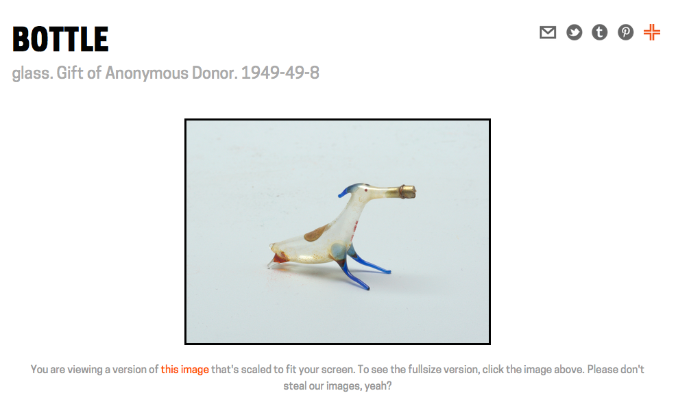
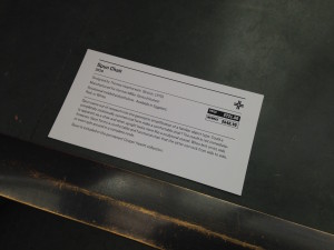
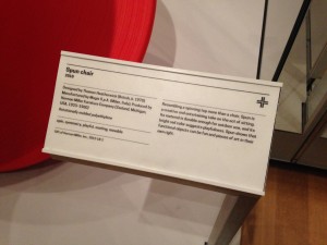
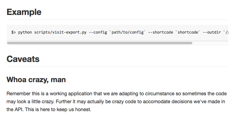
You can now collect any object in the collection, or on display, from the collections website itself. Just like in the galleries there is a small “collect” icon on the top right-hand side of every object page on the collections website. It’s not just individual object pages but also all the object list pages, too. So many “collect” icons!

20150527-shoebox-visit-icon

  Objects that haven’t been collected yet have a grey icon.
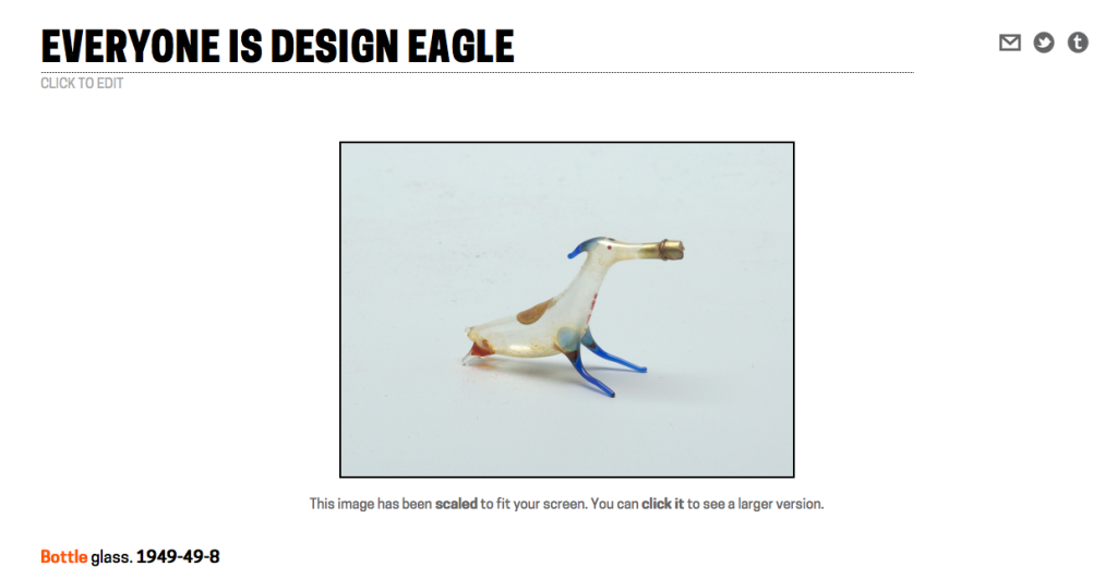
  Objects that have been collected in the galleries, as part of a visit to the museum, have a pink icon.

  Objects that that have been collected on the collections website have an orange icon.

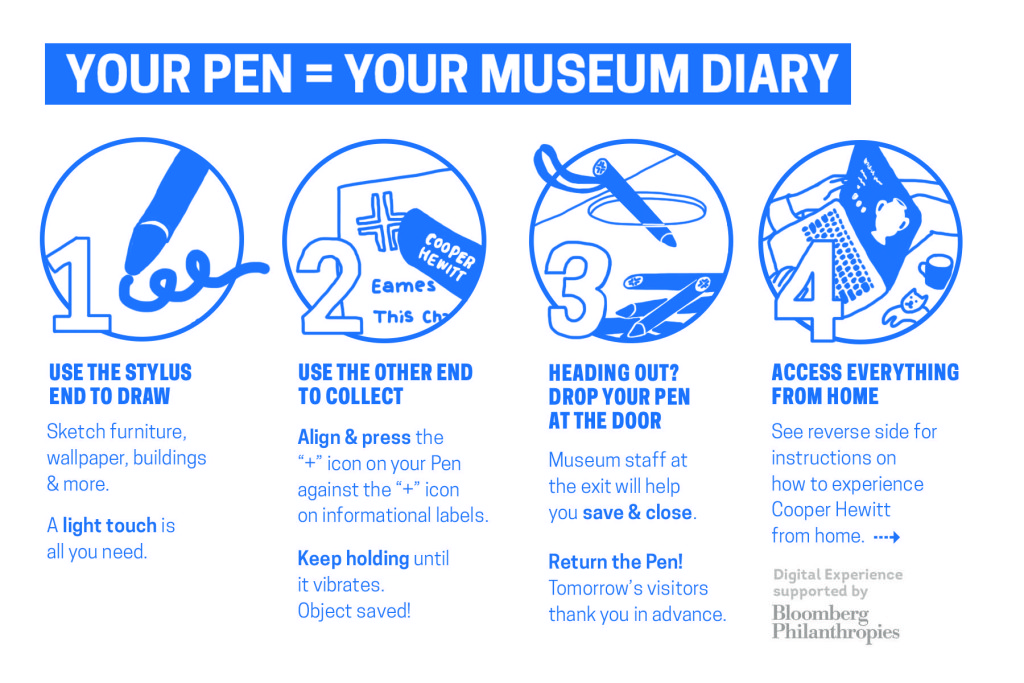
Simply click the grey icon to collect an object or click one of the orange or pink icons to remove or un-collect that object.

That’s it!

Screen Shot 2015-05-27 at 6.14.55 PM

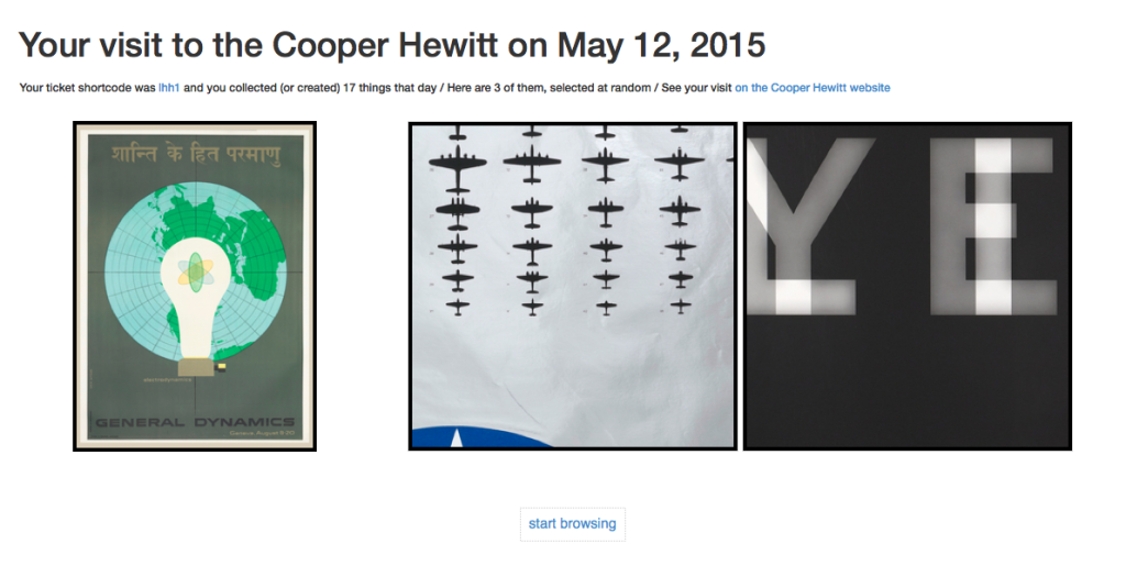
Just like visit items, things you collect on the website have a permanent URL that can be made public to share with other people and can be given a bespoke title or description. Objects that you collect on the collections website live in something we’re calling the “shoebox”.

You can get your to shoebox by visiting https://collection.cooperhewitt.org/users/YOUR-USERNAME/shoebox or if you’re already logged in to your Cooper Hewitt account by visiting https://collection.cooperhewitt.org/you/shoebox/.

There is also a handy link in the Your stuff menu, located at the top-left of every page on the collections website.

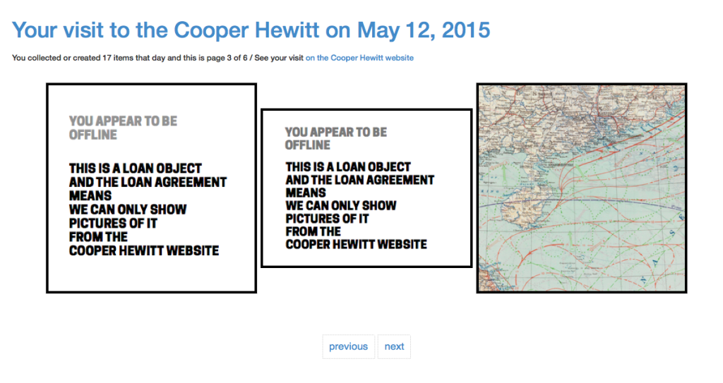
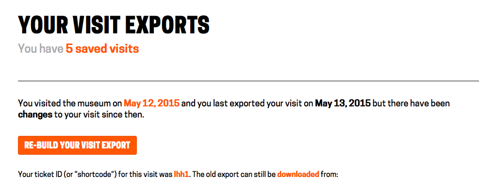
The shoebox is the set of all the objects you’ve collected (or created) on the website or during your visits to the museum. Although visits and visit items overlap with things in your shoebox we still treat them differently because although you need to be logged in to you Cooper Hewitt account to add things to your shoebox a visit to the museum can be entirely anonymous if a visitor so chooses.

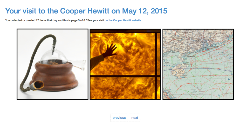
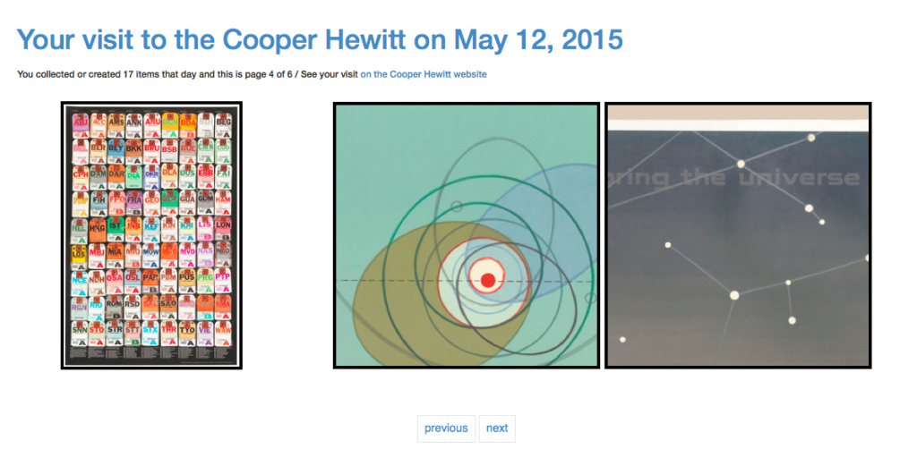
The default view for the shoebox is to display everything together in reverse-chronological order but you can filter the view to show only things collected online or things collected during a visit. You can also see the set of all the objects you’ve made public or private.

20150528-shoebox-loggedout

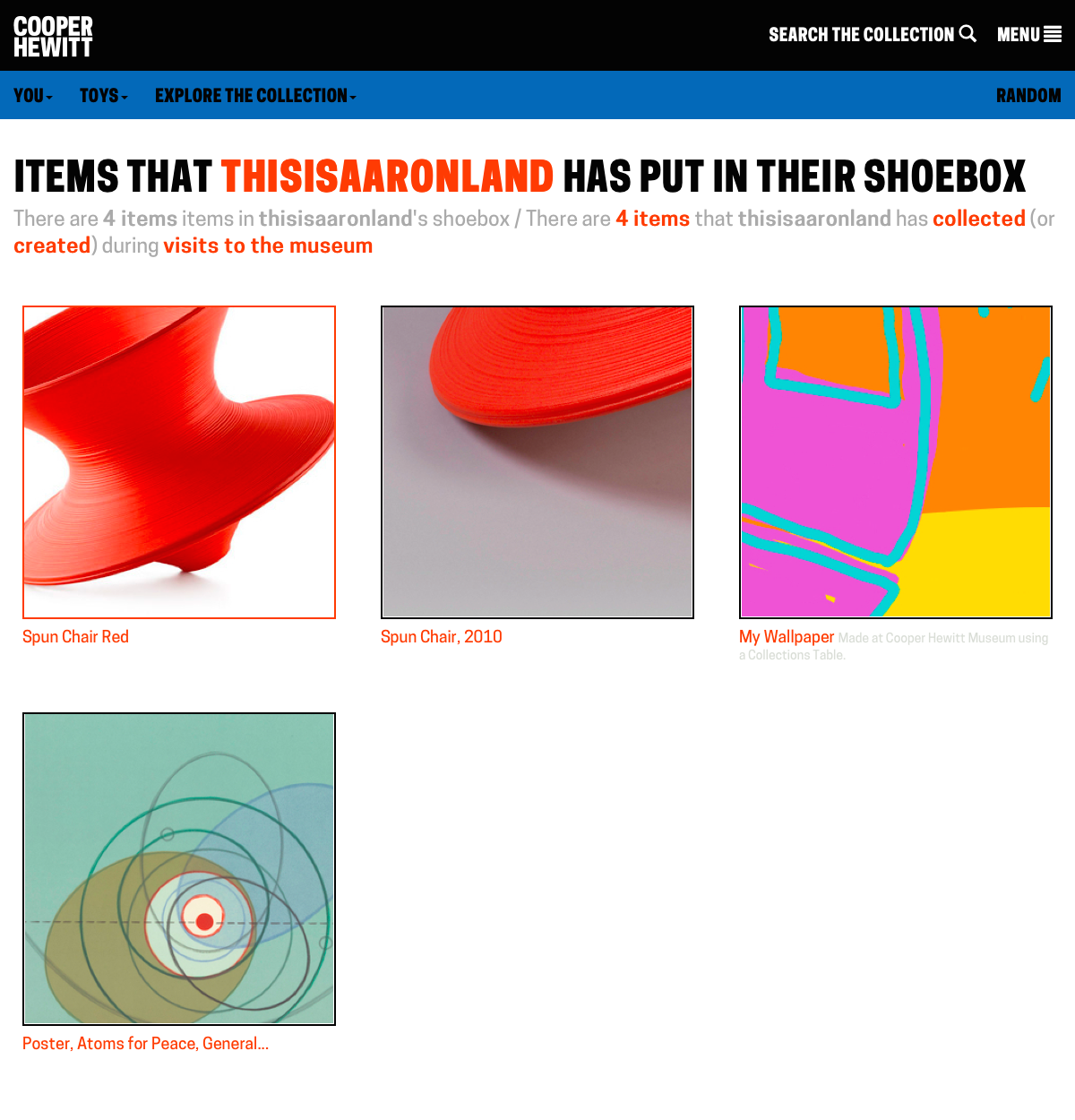
logged out view (large version)

2015-shoebox-loggedin

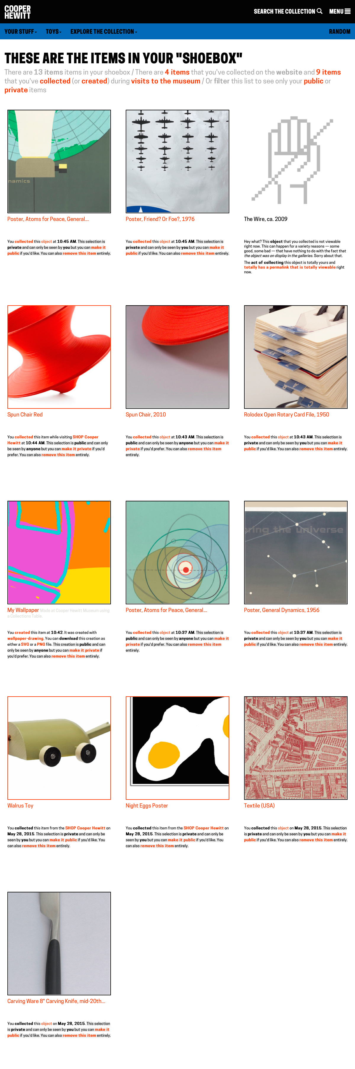
logged in view (large version)

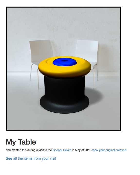
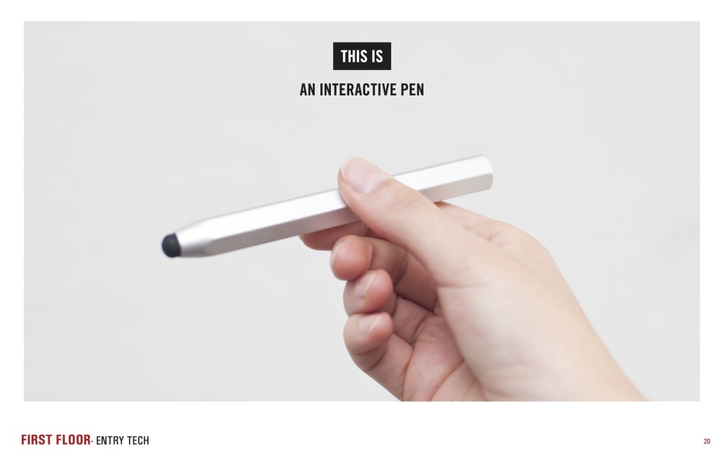
But it’s not just objects, either. You can already collect videos during your museum visit so those are included too. Ultimately the only limit to what you might collect with the Pen is time-and-typing. Things we’re thinking about making collect-able include: entire exhibitions or the introductory texts on the wall for an exhibition or people or individual rooms in the Mansion.

Museum retail

We’ve started this process by allowing you to collect things in the museum Shop.

By “things in the Shop” we mean all the things that have ever been sold in the Shop over the years. And by “all the things” we mean almost all the things. There is some technical hoop-jumping related to inventory management systems and that is why we don’t have everything yet but we’ll get there in time.

We are a captial-D design museum with a capital-D design shop and many of the things that have been available in the Shop have gone on to become part of our permanent collection so it only makes sense to give them a home on the collections website. In fact MoMA already does similarly with their “find related products in the MoMA Store” feature though ours is a bit different.

20150527-shop-landing

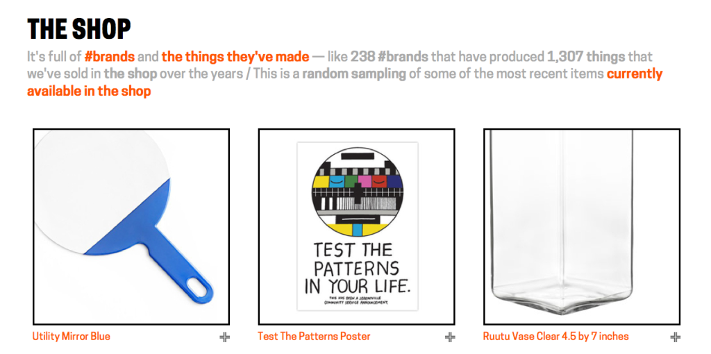
You can see for yourself at https://collection.cooperhewitt.org/shop

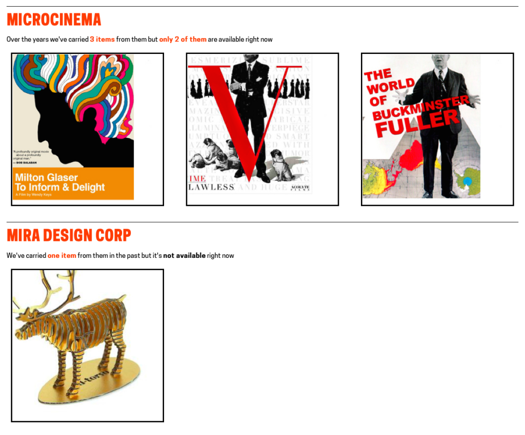
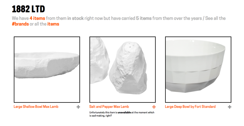
The /shop section is divided in two parts: Brands and Items (and all the items for a given brand of course). There isn’t a whole lot of extra information beyond titles and links to the SHOP Cooper Hewitt website for those items that are currently in-stock but it’s a start. Like the rest of the collections website we’ve started with the idea that providing permanent stable URLs that people can have confidence we create something that can be improved on over time.

20150527-shop-brands-crop

Shop items and brands don’t get updated as regularly as we’d like yet. We are still working through the fiddly details of bridging our systems with the Shop’s ecommerce and POS system and some things still need to be done by hand. We’ve been able to get this far though so we expect things will only get better.

20150527-shoebox-listview-shop

You might be wondering…

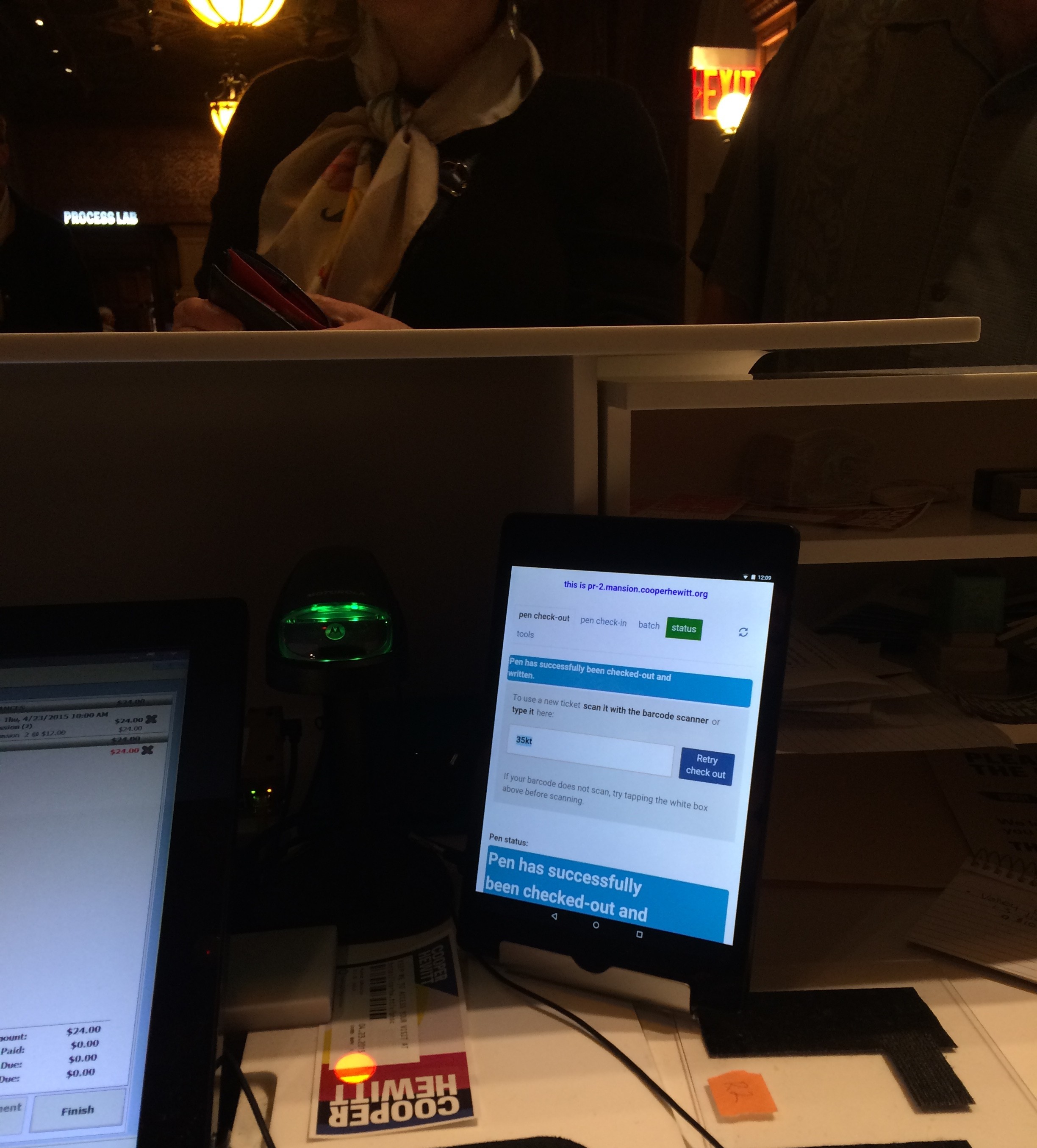
You might be reading this and starting to wonder Hmmm… does that mean I can also collect things in the Shop as I walk around the museum with the Pen? the answer is… Yes!

As of this writing there are only one or two items that can be collected with the Pen because the Shop staff are still getting familiar with the tools and thinking about how making collect-able labels changes in their day-to-day workflow. The obvious future of this might be the infamous ‘wedding register’, however we believe that many museum visitors actually would like to bookmark objects to possibly buy later, or just remember as part of their overall visit to the ‘museum campus’.

Practically what that has meant are some changes to Sam‘s “tag writer” application (the subject of a future blog post) to fetch shop items via our API and then letting the Shop folks decide what they want to tag and when they want to do it.

There has been a whole lot of change here over the course of the last three years and allowing the various parts of the museum warm up to the possibilities that the Pen starts to afford at their own pace and with not only a minimum of fuss but plenty of wiggle-room for experimentation is really important.

In the meantime we hope that you enjoy collecting at least more, if not all, of the things that make up the museum.
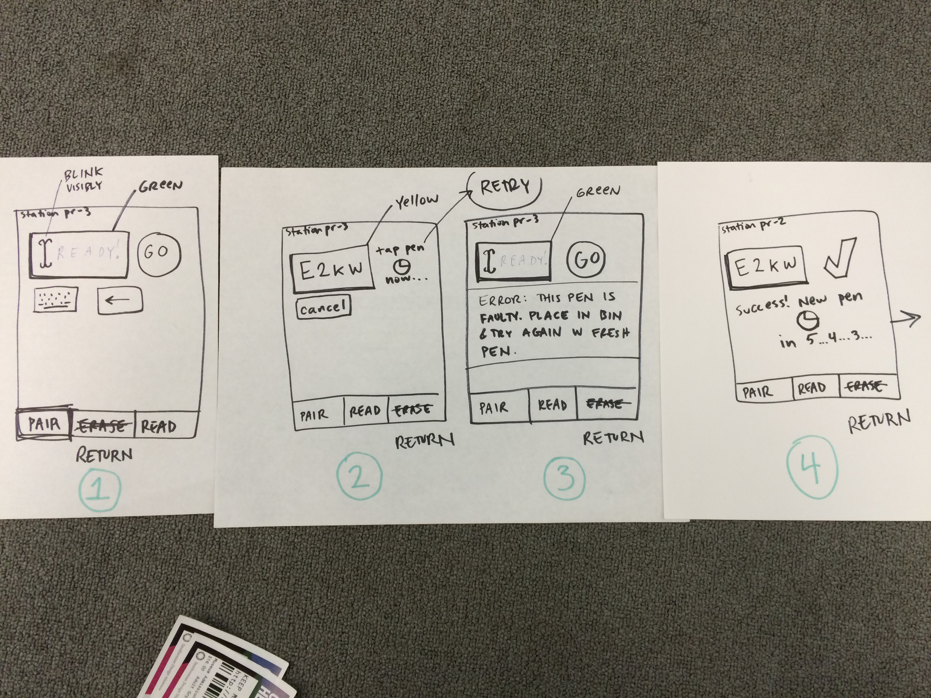
Happy Staff = Happy Visitors: Improving Back-of-House Interfaces

“You have to make the back of the fence that people won’t see look just as beautiful as the front, just like a great carpenter would make the back of a chest of drawers … Even though others won’t see it, you will know it’s there, and that will make you more proud of your design.”

—Steve Jobs

In my last post I talked about improvements to online ticketing based on observations made in the first weeks after launching the Pen.

Today’s post is about an important internal tool: the registration station whose job is to pair a new ticket with a new pen. Though visitors will never see this interface, it’s really important that it be simple, easy, clear, and fast. It is also critical that staff are able to understand the feedback from this app because if a pen is incorrectly paired with a ticket then the visitor’s data (collections and creations) will be lost.

Like a Steve-Jobs-approved iPod or a Van Cleef & Arpels ruby brooch, the “inside” of our system should be as carefully and thoughtfully designed as the outside.

the view from behind a desk with screens and wires everywhere. a tablet positioned upright with some tiny text and bars of color.

Version 1 of the app was functional but cluttered, with too much text, and no clear point of focus for the eye.

Because the first version of the app was built to be procedurally functional, its visual design was given little consideration. However, the application as a whole was designed so that the user interface – running in a web browser – was completely separate from the underlying pen pairing functionality, which makes updating the front-end a relatively straightforward task.

Also, we were getting a few complaints from visitors who returned home eager to see their visit diary, and were disappointed to see that their custom URL contained no data. We suspected this could have been a result of the poor UI at ticketing.

With this in mind, I sat behind the desk to observe our staff in action with real customers. I did about three sessions, for about ten minutes each, sometimes during heavy visitor traffic and sometimes during light traffic. Here’s what I kept an eye on while observing:

  • How many actions are required per transaction? Is there any way to minimize the number of “clicks” (in this case, “taps”) required from staff?
  • Is the visual feedback clear enough to be understood with only partial attention? Or do  typography, colors, and composition require an operator’s full attention to understand what’s going on?
  • What extraneous information can we minimize or omit?
  • What’s the critical information we should enlarge or emphasize?

After observing, I tried my hand at the app myself. This was actually more edifying than doing observations. Kathleen, our head of Visitor Services, had a batch of about 30 Pens to pair for a group, and I offered to help. I was very slow with the app, so I wasn’t really of much help, moving through my batch of pens at about half the speed of Kathleen’s staff.

Some readers may be thinking that since the desk staff had adjusted to a less-than-excellent visual design and were already moving pretty fast with it, this could be a reason not to improve it. As designers, we should always be helping and improving. Nobody should have to live with a crappy interface, even if they’ve adjusted to it! And, there will be new staff, and they will get to skip the adjustment process and start on the right foot with a better-designed tool.

My struggle to use the app was fuel for its redesign, which you can see germinating in my drawings below.

some marker sketches of a tablet interface with lots of scribbled notes

After several rounds of paper sketches like these, the desk reps and I decided on this sequence as the starting point for version two of the app.

These were the last in a series of drawings that I worked through with the desk staff. So our first few “iterative prototypes” were created and improved upon in a matter of minutes, since they were simply scribbled on paper. We arrived at the above stopping point, which Sam turned into working code.

Here’s what’s new in version 2:

  • The most important information—the alphanumeric shortcode— is emphasized. The font is about 6 or 7 times bigger, with exaggerated spacing and lots of padding (white space) on all sides for increased legibility. Or as I like to call it, “glanceability.” This helps make sure that the front of house staff pair the correct pen with the correct ticket.
  • Fewer words. For example, “Check Out Pen With This Shortcode” changed to “GO”, “Pen has been successfully checked out and written with shortcode ABCD” changed to “Success,” etc. This makes it easier for staff to know, quickly, that the process has worked and they can move on to the next ticket/pen/customer.

“I didn’t have time to write a short letter, so I wrote a long one instead.”
Mark Twain

  • More accurate words. Our team uses a different vernacular from the people working at the desk. This is normal, since we don’t work together often, and like any neighboring tribes, we’ve developed subtly different words for different things. Since this app is used by desk staff, I wanted it to reflect their language, not ours. For example, “Pair” is what they call “check-out” and “Return” is what they call “check-in.”
  • Better visual hierarchy: The original app had many competing horizontal bands of content, with no clear visual clue as to which band needed the operator’s attention at any given time. We used white space, color (green/yellow/red for go/wait/stop), and re-arranging of elements (less-used features to the bottom, more-used features to the top) to better direct the eye and make it clear to the user what she ought to be looking at.
  • Simple animations to help the user understand when the app is “working” and they should just wait.

Still to come are added features (bulk pairing, maintenance mode) and any ideas the desk reps might develop after a couple of weeks of using the new version.

Imagine how difficult this process would have been if the museum had outsourced all of its design and programming work, or if it were all encased in a proprietary system.

Exporting your visits

Screen Shot 2015-05-12 at 7.03.10 PM

Starting today you can export the items you have collected or created during your visits to the museum. When you export a visit we will bundle up all the objects you’ve collected and all the items you’ve created in to a static website that is then compressed and made available for you to download directly.

A static website means that you can view all of your visit items in any old web browser, even when it’s not connected to the Internet. It means that if you have your own website you can copy your visit export over it and host it and share it and, well… do whatever you want with it.

Where “whatever you want” means “so long as you comply” with the Smithsonian Terms of Use or assert your rights under Fair Use if you are based in the US.

We think that this is of particular importance to educators who may not have unfiltered or functional internet connections in their classrooms.

Screen Shot 2015-05-13 at 2.44.53 PM

A visit export doesn’t have all the same bells and whistles that your visit on the Cooper Hewitt collections website does but everything you need to view an export (except a web browser obviously) is contained in the file you download. There is a landing page, and a paginated view of everything you’ve done and a page for every object collected and each one of your creations.

Visit exports also come with a friendly and detailed JSON file for every item you’ve collected or created. If you don’t know what that last sentence means, don’t worry about it. It just means that everything you’ve done during a visit also has a file containing structured metadata about that activity which your developer friends may get excited about.

Screen Shot 2015-05-12 at 7.03.29 PM

Visit exports use are very own js-cooperhewitt-images library to manage square-cropped thumbnails that reveal the complete thumbnail when you mouse over them, just like on the collections website.

Screen Shot 2015-05-12 at 5.34.16 PM

Images for loan objects are not included with your visit download. That’s because they’re loan objects and we only have permission to host those images from our own collections website. Instead of including the images locally in your visit download every time there is a loan object we link directly to the image hosted on our own website.

If you’re not online (or your web browser hasn’t already cached a copy of the image on your hard drive) then your visit pages are smart enough to load a placeholder image for that object. Like this:

Screen Shot 2015-05-13 at 2.43.08 PM

We do the same for individual item pages too:

Screen Shot 2015-05-13 at 2.44.08 PM

online
Screen Shot 2015-05-13 at 2.43.41 PM

offline

Visit exports are deliberately minimal, by design. They contain a small amount of HTML markup that’s been enhanced with a little bit of JavaScript and CSS to create a minimally elegant export that people can easily tailor to their own needs. Some people may quibble with the idea that including both the jQuery and Bootstrap libraries is not really a “little bit of JavaScript and CSS” but we hope that we have done things in such a way that it’s easy for people to change if they choose to.

Visit exports are currently only available for visits that have been “paired” with your Cooper Hewitt account. A visit that has been exported is cached on our servers but it can be regenerated when something about your visit changes – you delete an item, or add a note and so on – not more than once per day. Each one of your visits (remember: each one of your paired visits) has a handy export button at the bottom of each page and you can see a list of all your exported/exportable visits by going to: https://collection.cooperhewitt.org/you/visits/exports/

Screen Shot 2015-05-13 at 11.05.26 AM

The exports themselves are generated using our own API and the recently released cooperhewitt.visit and cooperhewitt.visit.items family of methods. There is a bunch of bespoke code that we’ve written to manage how exports are scheduled and stored but the part that actually builds your export is a plain-vanilla API application using the same public API methods that you might use to generate your own visit export.

Screen Shot 2015-05-19 at 2.19.04 PM

In time we may open source the API application we’ve written but for now we’re going to keep putting it through its paces to make sure that it works consistently, as expected, and to force ourselves to use the same tools we’re making available to people outside the “hula hoop“.

Screen Shot 2015-05-12 at 5.53.41 PM

Finally, a little bit of administrivia: Your visit exports are made available under the Smithsonian Terms of Use agreement. You can read the entire document but the short (and relevant) bits are:

The Smithsonian Institution (the “Smithsonian”) provides the content on this website (www.si.edu), other Smithsonian websites, and third- party sites on which it maintains a presence (“SI Websites”) in support of its mission for the “increase and diffusion of knowledge.” The Smithsonian invites you to use its online content for personal, educational and other non-commercial purposes; this means that you are welcome you to make fair use of the Content as defined by copyright law. Information on United States copyright fair use law is available from the United States Copyright Office. Please note that you are responsible for determining whether your use is fair and for responding to any claims that may arise from your use.

In addition, the Smithsonian allows personal, educational, and other non-commercial uses of the Content on the following terms:

You must cite the author and source of the Content as you would material from any printed work.

You must also cite and link to, when possible, the SI Website as the source of the Content.

You may not remove any copyright, trademark, or other proprietary notices including attribution information, credits, and notices, that are placed in or near the text, images, or data.

In addition to copyright, you must comply with all other terms or restrictions (such as trademark, publicity and privacy rights, or contractual restrictions) as may be specified in the metadata or as may otherwise apply to the Content. Please note that you are responsible for making sure that your use does not violate or infringe upon the rights of anyone else.

Screen Shot 2015-05-18 at 3.59.53 PM

Enjoy!

Redesigning Post-Purchase Touchpoints

We re-opened the museum with “minimum viable product” relating to online ticket orders. Visitor-facing touchpoints like confirmation emails, eTicket PDFs and “thank you for your order” webpages were built to be simple and efficient. After putting them to the test with real visitors, room for improvement became obvious.

Here’s how we used staff feedback and designerly observation to iterate and improve upon 3 important touchpoints. The goal of this undertaking was to make things smoother for our front-of-house staff (who turned out to have quite a bit to juggle, given the new Pen and its backend complexities), and simpler for visitors (some of whom were confused by our system.. how dare they!).

The original confirmation webpage was designed with visitors buying on mobile (perhaps even while en route to the museum) in mind:

screen shot of a webpage with order number and a barcode for each ticket.

The original “Thank You” webpage was stripped of information, with the idea of getting you through the front desk transaction as efficiently as possible.

The original confirmation email was a few lines of text:

Screen shot of an email confirming cooper hewitt ticket order

Made in a pre-opening vacuum without real visitors to test upon, The original confirmation email was more self-promotional than it was anticipatory of visitors’ needs.

The original PDF attached to this confirmation email was designed for visitors who like to print things out and have something on paper:

The original eTicket PDF had one page (one "ticket") per visitor. The email went to the purchasing visitor's inbox.

The original eTicket PDF had one page (one “ticket”) per visitor. The email went to the purchasing visitor’s inbox.

Over a few weeks of heavy visitor traffic (with about 20% of visitors buying advance tickets online), I sat behind the front desk staff to quietly observe a handful of transactions every day. I initiated my observation sessions knowing that we needed to make the front desk move smoother and faster, but I didn’t yet know which touchpoints/services/operations would need changing.

These 3 touchpoints stood out to me as something that needed re-addressing if we wanted to make the front desk run more smoothly. (My daily observations also led to many efficiency-boosting changes made to internal tools, IT concerns, staffing needs, signage, and more.) This experience has made me a big believer in quiet observation as a direct route to improving services and systems. “Conference room conjecture” is worth very little compared to real observations and listening-based chats with your public-facing staff.

My advice on Observing and Listening for service design:

  •  You may observe a staff person answer a question incorrectly, or a problem that you could resolve yourself on the spot. Don’t intervene, tempting as it might be! You’re not there to fix problems, you’re there to fix problem patterns. Your mission is long-term.
  • When chatting with staff, listen quietly and attentively. It’s OK if you can’t offer an instant fix. You may not have a magic wand, but listening with empathy is at least half as good.
  • Focus on building trust with the staff you are observing over a period of days or weeks, so they will become comfortable sharing bad news as easily as they share the good. Remind them repeatedly that your intention is to improve their daily work situation.
  • Remember it can be very intimidating to feel “interrogated” or “observed” by someone who is your direct/indirect superior. Make sure they know your questions are motivated by a spirit of service, not by “tattle-telling” to other staff that things might be going amiss. You will get more honesty, and thereby, better design insights.

Here are the observation-based insights that motivated our choices:

  • Visitors sometimes get confused by the barcodes. They think something has to be scanned after their visit in order for their pen diary to get “Saved” or “sent to their email.”
  • Because this collateral is called an “eTicket,” some visitors are marching right up to the gallery entrance with their “eTicket,” and bypassing the front desk. “I already bought my ticket, why do I have to wait on this line?”
  • Visitors don’t know what the Pen is, and explaining it takes several minutes, slowing down the line.
  • Visitors may not have great cell service in our lobby, and probably haven’t gotten the wifi working yet, so if their email attachment hasn’t pre-downloaded, this will slow everything down.
  • Front desk staff each have different ways of handling eTickets. Most staff ask for the order number verbally. A few staff take the printout or phone and scan the barcode, avoiding the need to re-print a ticket (this is how the barcode was intended to be used).
  • The diversity of collateral that visitors may bring to the transaction makes things more complicated for our staff. “Is my customer looking at a webpage, an email, or a PDF? Should I tell them to look for an order number, hand me a barcode, or open the attachment?”
two gentlemen at a large white desk in a dark room full of wood paneling. a third gentleman sits behind the desk.

For their own ease of use, most desk reps were initiating the transaction by asking: “What’s your Order number?” so we designed to accommodate that preference instead of working against it.

The ideas we cycled through:

  • A picture of the Pen with an “enticing” explanation of what it does might help offset the burden on the front desk to explain it all very quickly.
  • We thought one barcode per visitor displayed in a list might let us hold on to our original “paperless dream.” (The “paperless dream” entailed scanning each barcode and pairing immediately with pens, bypassing our CRM and house-printed tickets.) When we ran this idea by our colleagues at the desk, though, we learned quickly that this would be extraordinarily confusing for guests, who need to remember their personal URL (usually printed on the ticket) to access their post-visit diary. What if a group of 5 friends come together, will we put the burden on the visitor to remember which URL goes with which friend? Will they have to write it down, or forward around the ticket email with added whose-URL-is-whose notes? That’s too much of a burden on guests, who are already working to assimilate new information about our Pen, which has already buffeted their expectations (and tried their transaction-length-patience) about what to expect during a museum front desk experience.
printouts of an email confirming tickets with barcodes and giant pen scribbled "x" with handwritten pen notes

What seems like a good idea at your desk may not seem so smart after you’ve shown it around to ground-level users

The current solution (after all, our work is never final):

screen shot of an email with lots of information about cafe, hours, map, the pen, and an image of museum interior and pen usage.

The order number is large and at the top of the email. It’s also in the subject line. Click this image to enlarge.

  • This solution makes the front desk staffer’s job simpler when a pre-order person arrives. It’s all about the order number. There is no more choice involved about whether to ask for the order number, or the barcode, or the purchaser’s name… or….
  • There is still a confirmation webpage, and it looks exactly like this.
  • There is no more PDF attachment to the email.
  • Since this is a “will-call” paradigm instead of an “eTicket” paradigm, we hope this solution will keep visitors from expecting that they can enter the museum directly without talking to a desk attendant first.
  • The order number is in the subject line, so if your email hasn’t fully downloaded, you won’t slow down the line.
  • The original idea was to save paper by allowing a visitor’s PDF to work as their ticket/URL reminder. This idea, though it does now involve reprinting tickets, may involve less user-printouts, since we’re simply asking folks to “bring” their order number, and not any printouts.

This is just one piece of an elaborate service design puzzle. More posts will be coming about other touchpoints we’ve created and re-designed based on observations made in the first months of running our new Pen service.

Publishing is as publishing does – revealing ‘books’ in the collection

Screen Shot 2015-04-23 at 10.48.30 AM

Note: This book is actually 144 pages long and the count is a by-product of the way we’ve stitched things together. By the time you read this that problem may be fixed. So it goes, right?

We’ve added a new section to the Collections website: publications. You know, books.

This is the simplest dumbest thing we could think of to create a bridge between analog publications and the web. It’s only a handful of recent publications at the moment and whether or not older publications will be supported remains an open question, for now.

To be clear – there are already historical publications available for viewing on the main Cooper Hewitt website. As I was writing this blog post Micah reminded me that we’ve even uploaded them in to the Internet Archive so you can use their handy book reader to view the books online. All of which means that we’ll likely be importing those publications to the collections website soon enough.

All of this (newer) work is predicated on the fact that we have the luxury, with these specific publications, of operating outside the “work” versus “edition” dilemma that many other kinds of books have to negotiate. All we’ve done is created stable permanent URLs for each book and each page in that book. That’s it.

Screen Shot 2015-04-23 at 11.28.22 AM

The goal is not to reproduce the book online, for all the usual reasons, but to give meaningful atomic units of a book – pages – a presence on the Interwebs and a scaffolding for future stuff (object lists, additional photographs, notes and other ancillary materials and so on) as time and circumstance permit.

Related, Emily Fildes’ and Allison Foster’s Museums and the Web (2015) paper
What the Fonds?! The ups and downs of digitising Tate’s Archive
is a good discussion around the issues, both technical and user-facing, that are raised as various sources of disparate data (artworks, library and archive data, curatorial files) all start to share the same conceptual space on the web.

Screen Shot 2015-04-23 at 10.47.28 AM

We’re not there yet and it may take us a while to get there so in the meantime every page URL has a small half-toned reproduction of the book page in question. That’s meant to give people a visual cue and confidence in the URL itself — specifically they look the same — such that you might bookmark it, share it with a friend, or whatever awesome use you dream up without having to wonder whether the ground will shift out from underneath it.

Kind of like books, right?

Finally, all the links indicating how many pages a particular book has are “magic” – click on them and you’ll be redirected to a random page inside that book.

Enjoy!

Screen Shot 2015-04-23 at 12.29.48 PM
Screen Shot 2015-04-23 at 12.30.14 PM

Understanding how the Pen interacts with the API

Detail of instructional postcard now available to museum visitors at entry to accompany The Pen.

Detail of instructional postcard now available to museum visitors at entry to accompany The Pen.

The Pen has been up and running now for five weeks and the museum as a whole has been coming to terms with exactly what that means. Some things can be planned for, others can be hedged against, but inevitably there will be surprises – pleasant and unpleasant. We can report that our expectations of usage have been far exceeded with extremely high take up rates, over 400,000 ‘acts of collection’ (saving museum objects with the Pen), and a great post-visit log in rate.

The Pen touches almost every operation of the museum – even though the museum was able to operate completely without it from our opening in December until March. At its most simple, object labels need NFC tags which in turn needs up-to-the-minute location information entered into our collection management system (TMS); the ticketing system needs a constant connection not only to its own servers but also to our API functions that create unique shortcodes for each visitor’s visit; and the Pens need regular cleaning and their monthly battery change. So everyone in the museum has been continuously improving and altering backend systems, improving workflows, and even the front-end UI on tablets that the ticket staff use to pair Pens with tickets.

Its complex.

Katie drew up (another) useful diagram of the journey of a Pen through a visit and how it interacts with our API.

Single visit 'lifecycle' of The Pen. Illustration by Katie Shelly, 2015. [click to enlarge]

Single visit ‘lifecycle’ of The Pen. Illustration by Katie Shelly, 2015. [click to enlarge]

Even more details of the overall system design and development saga can be found in the (long) Museums and the Web 2015 paper by Chan & Cope.

The digital experience at Cooper Hewitt is supported by Bloomberg Philanthropies. The Pen is the result of a collaboration between Cooper Hewitt, SistelNetworks, GE, MakeSimply, Undercurrent, and an original concept by Local Projects with Diller Scofidio + Renfro.

Sorting, Synonyms and a Pretty Pony

We’ve been undergoing a massive rapid-capture digitization project here at the Cooper Hewitt, which means every day brings us pictures of things that probably haven’t been seen for a very, very long time.

As an initial way to view all these new images of objects, I added “date last photographed” to our search index and allowed it to be sorted by on the search results page.

That’s when I found this.

[collection_object id=18692335]

I hope we can all agree that this pony is adorable and that if there is anything else like it in our collection, it needs to be seen right now. I started browsing around the other recently photographed objects and began to notice more animal figurines:

[collection_object id=18460201]

[collection_object id=18615463]

As serendipitous as it was that I came across this wonderful collection-within-a-collection by browsing through recently-photographed objects, what if someone is specifically looking for this group? The whole process shows off some of the work we did last summer switching our search backend over to Elasticsearch (which I recently presented at Museums and the Web). We wanted to make it easier to add new things so we could provide users (and ourselves) with as many “ways in” to the collection as possible, as it’s those entry points that allow for more emergent groupings to be uncovered. This is great for somebody who is casually spending time scrolling through pictures, but a user who wants to browse is different from a user who wants to search. Once we uncover a connected group of objects, what can we do to make it easier to find in the future?

Enter synonyms. Synonyms, as you might have guessed, are a text analysis technique we can use in our search engine to relate words together. In our case, I wanted to relate a bunch of animal names to the word “animal,” so that anyone searching for terms like “animals” or “animal figurines” would see all these great little friends. Like this bear.

[collection_object id=18633719]

The actual rule (generated with the help of Wikipedia’s list of animal names) is this:

 "animal => aardvark, albatross, alligator, alpaca, ant, anteater, antelope, ape, armadillo, baboon, badger, barracuda, bat, bear, beaver, bee, bird, bison, boar, butterfly, camel, capybara, caribou, cassowary, cat, kitten, caterpillar, calf, bull, cheetah, chicken, rooster, chimpanzee, chinchilla, chough, clam, cobra, cockroach, cod, cormorant, coyote, puppy, crab, crocodile, crow, curlew, deer, dinosaur, dog, puppy, salmon, dolphin, donkey, dotterel, dove, dragonfly, duck, poultry, dugong, dunlin, eagle, echidna, eel, elephant, seal, elk, emu, falcon, ferret, finch, fish, flamingo, fly, fox, frog, gaur, gazelle, gerbil, panda, giraffe, gnat, goat, sheep, goose, poultry, goldfish, gorilla, blackback, goshawk, grasshopper, grouse, guanaco, fowl, poultry, guinea, pig, gull, hamster, hare, hawk, goshawk, sparrowhawk, hedgehog, heron, herring, hippopotamus, hornet, swarm, horse, foal, filly, mare, pig, human, hummingbird, hyena, ibex, ibis, jackal, jaguar, jellyfish, planula, polyp, scyphozoa, kangaroo, kingfisher, koala, dragon, kookabura, kouprey, kudu, lapwing, lark, lemur, leopard, lion, llama, lobster, locust, loris, louse, lyrebird, magpie, mallard, manatee, mandrill, mantis, marten, meerkat, mink, mongoose, monkey, moose, venison, mouse, mosquito, mule, narwhal, newt, nightingale, octopus, okapi, opossum, oryx, ostrich, otter, owl, oyster, parrot, panda, partridge, peafowl, poultry, pelican, penguin, pheasant, pigeon, bear, pony, porcupine, porpoise, quail, quelea, quetzal, rabbit, raccoon, rat, raven, deer, panda, reindeer, rhinoceros, salamander, salmon, sandpiper, sardine, scorpion, lion, sea urchin, seahorse, shark, sheep, hoggett, shrew, skunk, snail, escargot, snake, sparrow, spider, spoonbill, squid, calamari, squirrel, starling, stingray, stinkbug, stork, swallow, swan, tapir, tarsier, termite, tiger, toad, trout, poultry, turtle, vulture, wallaby, walrus, wasp, buffalo, carabeef, weasel, whale, wildcat, wolf, wolverine, wombat, woodcock, woodpecker, worm, wren, yak, zebra"

Where every word to the right of the => automatically gets added to a search for a word to the left.

Not only does our new search stack provide us with a useful way to discover emergent relationships, but it makes it easy for us to “seal them in,” allowing multiple types of user to get the most from our collections site.

From concept to video prototype: the early form of the Pen

It was in late 2012 that the concept for the Pen was pitched to the museum by Local Projects, working then as subcontractors to Diller Scofidio & Renfro. The concept portrayed the Pen as an alternative to a mobile experience, and importantly, was symbol that was meant to activate visitors.

Early image of Pen

Original concept for the Pen by Local Projects with Diller Scofidio + Renfro, late 2012.

“Design Fiction is making things that tell stories. It’s like science-fiction in that the stories bring into focus certain matters-of-concern, such as how life is lived, questioning how technology is used and its implications, speculating bout the course of events; all of the unique abilities of science-fiction to incite imagination-filling conversations about alternative futures.” (Julian Bleeker, 2009)

In late 2013, Hanne Delodder and our media technologist, Katie Shelly, were tasked with making a short instructional video – a piece of ‘internal design fiction’ to help us expand the context of the Pen, beyond just the technology. (Hanne was spending three weeks observing work in the Labs courtesy of the Belgian Government as part of her professional development at Het Huis van Alijn, a history museum in Ghent.)

The video used the vWand from Sistelnetworks, an existing product that became the starting point from which the final Pen developed. At the time of production the museum had not yet begun the final development path that engaged Sistelnetworks, GE, Makesimply, Tellart and Undercurrent who would help augment and transform the vWand into the new product we now have.

The brief for the video was simply to create an instructional video of the kind that the museum might play in the Great Hall and on our website to instruct visitors how they might use the Pen. As it turned out, the video ended up being a hugely valuable tool in the ‘socialisation’ of the Pen as the entirety of the museum started to gets its head around what/how/when from curators to security staff, well before we had any working prototypes.

It ended up informing our design sprints with GE and Sistelnetworks which resulted in the form, operation and interaction design for the Pen; as well as a ‘stewardship’ sprint with SVA’s Products of Design where we worked through operational issues around distribution and return.

The video was also the starting point for the instructional video we ended up having produced that now plays online and in the Great Hall. You will notice that the emphasis in the final video has changed dramatically – focussing on collecting inside the museum and the importance of the visitor’s ticket (in contrast to the public collection of email addresses in the original).

The digital experience at Cooper Hewitt is supported by Bloomberg Philanthropies.

Things people make with our API #347: Nick Bartzokas

Shortly after Cooper Hewitt opened on December 12, 2014, the museum hosted a private event. At that preliminary scoping for the event, I bumped into Nick Bartzokas who had written a spiffy little application that he was planning on using for visuals on the night. We got talking and it turned out that he’d made it using the Cooper Hewitt API – all with no prompting. Even though it didn’t end up getting fully used, he has released it along with the source code.

Tell me a bit about yourself, what do you do, where do you do it?

I’m a creative coder. I like trying out new things. That’s lead me to develop a wide variety of projects: educational games, music visualizations, a Kinect flight simulator, an interactive API-fed wall of Arduinos and Raspberry Pis. These days I’m making interactive installations for the LAB at Rockwell Group. I came to the LAB from the American Museum of Natural History, so museums are in my blood, too.

The LAB is a unique place. We’re a team of designers, thinkers, and technologists exploring ways to connect the digital with the physical.

Here’s a couple links to our work: (1 / 2)

You made a web app for an event at Cooper Hewitt, what was the purpose of it, what does it do?

Our friends at Metropolis celebrated their magazine’s redesign at the Cooper Hewitt in December 2014. The LAB worked on a one-night-only interactive installation that ran on one of the museum’s 84″ touchtables. We love to experiment, so when opportunities like this come up, we jump at the chance to pick up a new tool and create.

In preparation for the event, I decided to prototype using Phaser, a 2D Javascript game framework. It markets itself as a tool for making web platformers, but it’s excellent for 2D projects of all kinds.

It gives you an update and render cycle that’s familiar territory for those that work with other game engines or creative coding toolkits like openFrameworks. It handles user input and asset management well. It has three physics engines of ranging sophistication, from simple Arcade collisions to full-body physics. You can choreograph sprites using built-in tweening. It has PIXI integrated under the hood, which supplies fast graphics with useful shaders and the ability to roll your own. So, lots of range. It’s a great tool for rapid browser-based prototyping.

The prototype we completed for the event brought Metropolis magazine’s digital assets to life. Photos drifted like leaves on a pond. When touched, they attracted photos of similar objects, assembling into flower petals and fans. If held, they grew excited until bursting apart. It ran in a fullscreened browser and was reponsive to over 40 simultaneous touch points. Here’s that version in action.

For the other prototype, I used Cooper Hewitt’s API to generate fireworks made of images from the museum’s collection. Since the collection is organized by color, I could ask the API for all the red images in the collection and turn them into a red firework burst.

I thought this project was really cool, so while it wasn’t selected for the Metropolis event, I decided to complete it anyway and post it..

OMG! You used the Cooper Hewitt API! How did you find out about the API? What was it like to work with the API? What was the best and the worst thing about the API?

When the LAB begins a project, we start by considering the story. We were celebrating the Metropolis magazine redesign. Of course that was the main focus. But their launch party was being held at the Cooper Hewitt, and they wrote about Caroline Baumann of the Cooper Hewitt in their launch issue, so the museum was a part of the story. We began gathering source material from Metropolis and Cooper Hewitt. It was then that I re-discovered the Cooper Hewitt API. It was something I’d heard about in the buzz leading up to the museum’s reopening, but this was my first time encountering it in the wild.

You all did a great job! Working with the API was so straightforward. Everything was well designed. The API website is simple and useful. The documentation is clear and complete with the ability to testdrive API methods in the browser. The structure of the API is sensible and intuitive. I taught a class on API programming for beginners. It was a challenge to select APIs with a low barrier to entry that beginners would be excited about and capable of navigating. Cooper Hewitt’s API is on my list now. I think beginners would find it quick, easy, and rewarding.

The pyramid diagram on the home page was a nice touch, a modest infographic with a big story behind it. It gives the newcomer a birds eye view of the API, the new gallery apps, the redesigned museum, all the culmination of a tremendous collaboration.

The ability to search the collection by color immediately jumped out to me. That feature is just rife with creative possibilities. My favorite part, no doubt. In fact, I think it’s worth expanding on the API’s knowledge of color. It knows an image contains blue, but perhaps it could have some sense of how much blue the image contains, perhaps a color average or a histogram.

In preparing a nodejs app to pull images for the fireworks, I checked to see if someone had written a node module for the Cooper Hewitt API, expecting I’d have to write my own. I was pleasantly surprised to see that the museum’s own Micah Walter authored one . That was another wow moment. When an institution opens up an API, that’s good. But this is really where Cooper Hewitt is building a bridge to the development community. It’s the little things.

So if others want to play with what you made where can they find it?

Folks can interact with the prototype here and they can peek at the source code on GitHub.

Thanks for having me, and congratulations on the API, the museum’s reopening, and a job well done!

We choose Bao Bao!

So, the Pen went live on March 10. We’re handing them out to every visitor and people are collecting objects all over the place. Yay!

The Pen not only represents a whole world of brand-new for the museum but an equally enormous world of change for staff and the ways they do their jobs. One of the places this has manifested itself is the sort of awkward reality of being able to collect an object in the galleries only to discover that the image for that object or, sometimes, the object itself still hasn’t been marked as public in the collections database.

It’s unfortunate but we’ll sort it all out over time. The more important question right now is how we handle objects that people have collected in the galleries (that are demonstrably public) but whose ground truth hasn’t bubbled back up to our own canonical source of truth.

In the early days when we were building and testing the API methods for recording the objects that people collected the site would return a freak-out-and-die error the moment it encountered something that a visitor didn’t have permissions to see. This is a pretty normal approach in software and systems development but it made testing over the overall system complicated and time-consuming.

In the interest of expediency we replaced the code that threw a temper tantrum with code that effectively said la la la la la… I can’t hear you! If a visitor tried to collect something that they didn’t have permissions to see we would simply drop it on the floor and pretend it never happened. This was useful in fleshing out the rest of the overall workflow of the system but we also understood that it was temporary at best.

Screen Shot 2015-03-20 at 12.07.07 PM

Allowing a user to collect something in the gallery and then denying any evidence of the event on their visit webpage would be… not good. So now we record the item being collected but we also record a status flag next to that event assuming that the disconnect between reality and the database will work itself out in favour of the visitor.

It also means that the act of collecting an object still has a permalink; something that a visitor can share or just hold on to for future reference even if the record itself is incomplete. And that record exists in the context of the visit itself. If you can see the other objects that you collected around the same time as a not-quite-public-yet object then they can act as a device to remember what that mystery thing is.

Which raises an important question: What should we use as a placeholder? Until a couple of days ago this is what we showed visitors.

streetview-cat-words

Although the “Google Street View Cat” has a rich pedigree of internet meme-iness it remains something of an acquired taste. This was a case of early debugging and blowing-off-steam code leaking in to production. It was also the result of a bug ticket that I filed for Sam on January 21 being far enough down to the list of things to do before and immediately after the launch of the Pen that it didn’t get resolved until this week. The ticket was simply titled “Animated pandas”.

As in, this:

This is the same thread that we’ve been pulling on ever since we started rebuilding the collections website: When we are unable to show something to a visitor (for whatever reason) what do we replace the silence with?

We choose Bao Bao!