Mailchimp & Tessitura together at last

tessitura-mailchimp

The short version is:

There is now an integration between Tessitura & Mailchimp. If you are a Tessitura Licensee, and have access to their BitBucket account, you can get it here.

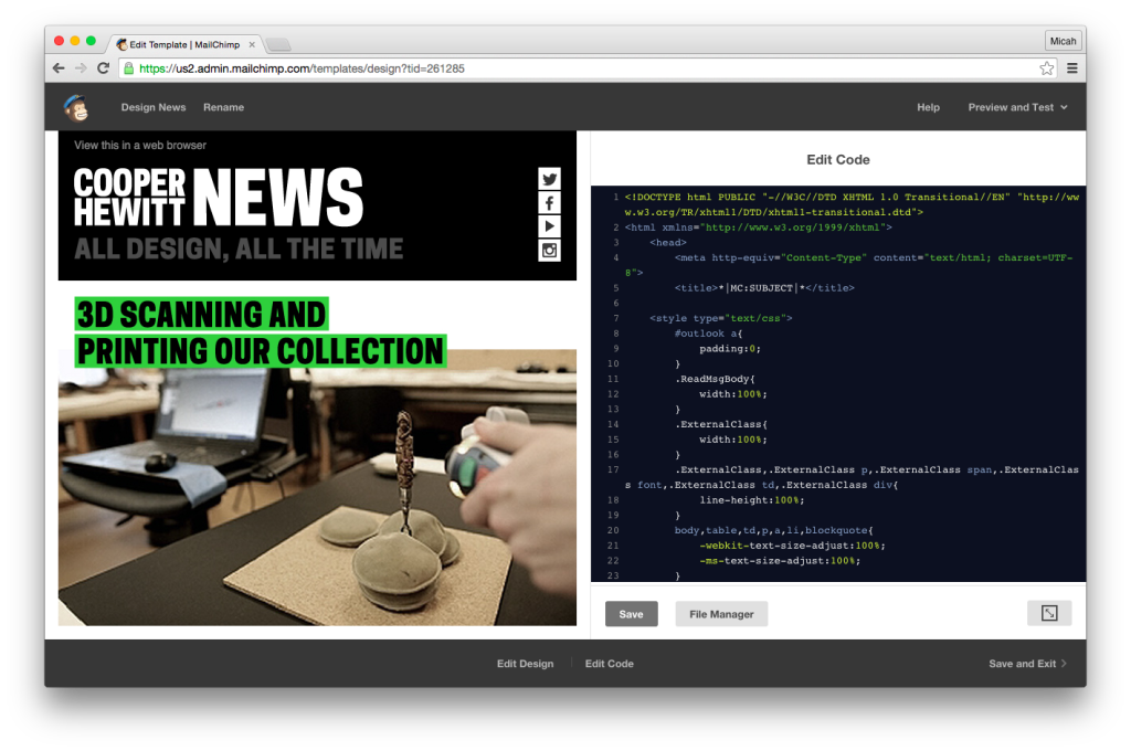
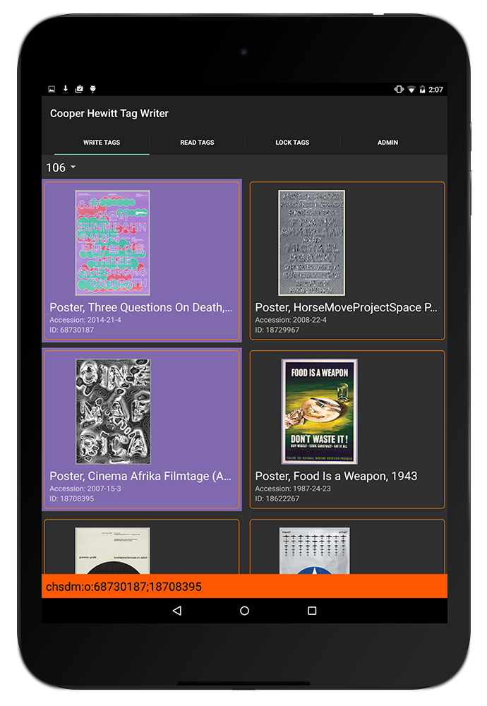
So you can use this lovely Mailchimp Interface to create your emails…

Screen Shot 2015-08-20 at 12.36.19 PM

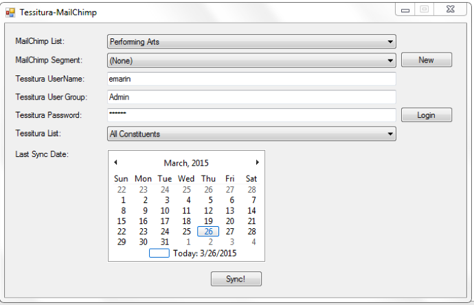
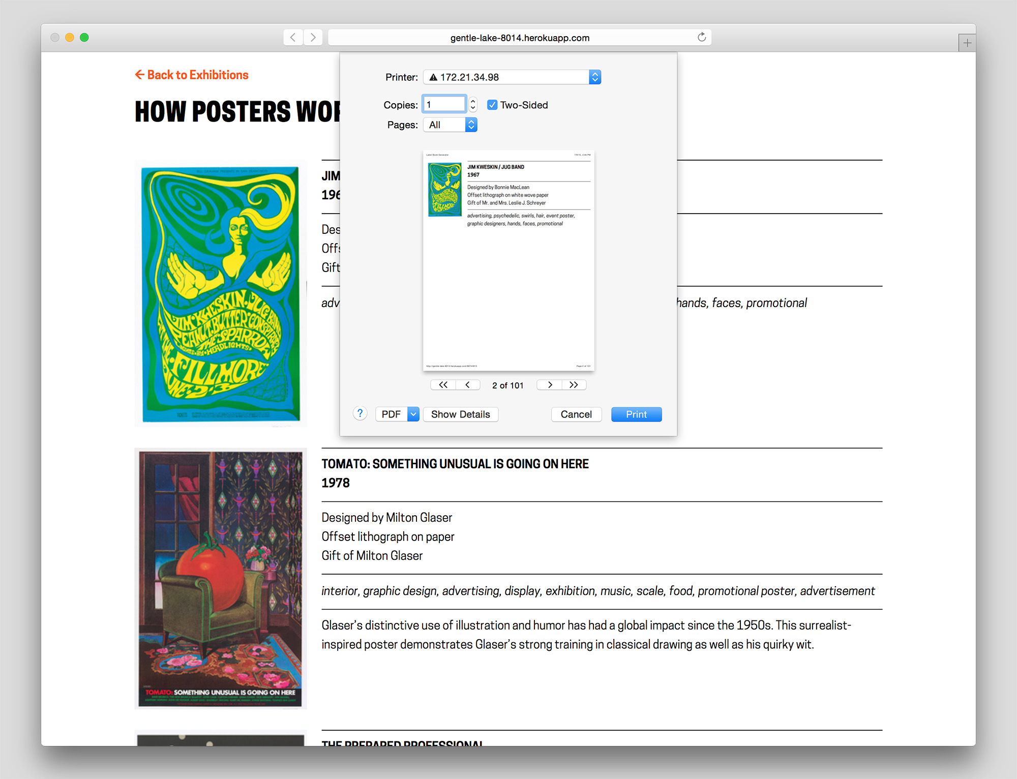
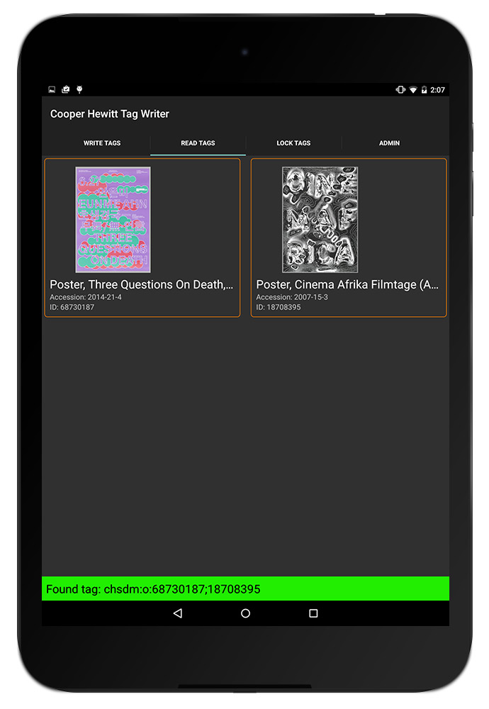
… and connect it with all of the power of Tessitura, through this easy to use tool.

readme-02

The long version is:

It’s the last day of the Tessitura Learning & Community Conference, and I’m all checked out of my hotel, sitting in the conference hall, thinking about all of the things I’ve learned this week, and all of the people I’ve met.

So many of the people I’ve talked to have been asking about the Tessitura-Mailchimp Integration we launched in partnership with Mailchimp and JCA, Inc. this past week, and so I thought I’d write up a blog post to try and explain what it is, how you get it/use it/make it better, and more importantly, why we did it in the first place.

A long while ago, Cooper Hewitt had an enormous email list. Some 60K emails on one massive list powered by a e-marketing service that was clearly heading out of business. This giant list wasn’t working. We weren’t getting the results we thought we should, and what’s more, we had no way of measuring our success. So, we switched to Mailchimp. It was a pretty obvious choice. Mailchimp offered the museum an incredibly quick set up time, a beautiful user interface, with super clean and easy to use templates. What’s more, Mailchimp placed a lot of emphasis on “list quality” and advised us to put out an appeal to our current bloated list to do an “opt-in” and create a whole new list made up of real people, with valid email addresses, who actually wanted to receive mail from us.

The list dropped down. Way down. After a few “last chance” appeals, our 60K subscribers were whittled down to about 2500. This was challenging territory for many departments in the museum who relied on the large numbers for a sense of security more than their effectiveness, like at almost every non-profit.

But we pressed on, and noticed quickly that our open rates were dramatically high. Our click through rates were excellent, and it was clear that people were actually reading our emails, and acting on our calls to action. If you haven’t noticed by now, I’m trying to include as many marketing buzzwords into this post as possible. You know, due-dilligence and all.

This is a long way around to explain that we all started to fall in love with Mailchimp. It’s ease of use and deep analytics and reporting tools were a huge win for the museum as a whole. Our list continues to grow and our “satisfaction” rating remains pretty steadily on the high end. The staff seem to enjoy working in Mailchimp, especially following the recent redesign of the user interface.

One day along the way, the museum decided to implement Tessitura as our CRM ( constituent relationship management ) and ticketing system. It’s a super robust, enterprise class system that is sort of the swiss army knife for non-profits, performing arts centers, and more recently, museums.

In the long term strategic plan for Tessitura, it appeared as though we would have to ditch Mailchimp and move to one of the two providers that offer an integration with Tessitura. We looked at both of them, and while they both did the job at hand, neither of them offered the pleasant experience and incredible analytics tools that Mailchimp did. It would have been a tough sell to our staff to move them off something they clearly all had grown to love and on to a system that would probably work just fine, but not make their hearts any warmer.

So, we talked with Mailchimp. Mailchimp has a wide variety of third party integrations, and we started to converse about what an integration with Tessitura would look like. We all got really excited at the possibilities, and so once a small amount of funding was secured, we partnered with JCA, Inc. to build us something.

Mailchimp was really excited about the idea, and being a forward thinking tech company, they pushed us to make the integration free, and open source. This is something we strongly believe in at Cooper Hewitt as well, so we worked with the staff at Tessitura, and figured out a way to share the code within the Tessitura Network, so as not to violate any non-disclosure agreements. Things were starting to take shape.

So what will it do, and how does it work?

readme-03

We tried to limit the scope of the project to the bare essentials. We wanted to stay within our budget, and build a simple tool that does what it says on the tin. The hope here is that Tessiutra licensees will try it out, see that it’s a good thing, and run with it, adding features and customizing it to suit their needs. Open source goodness.

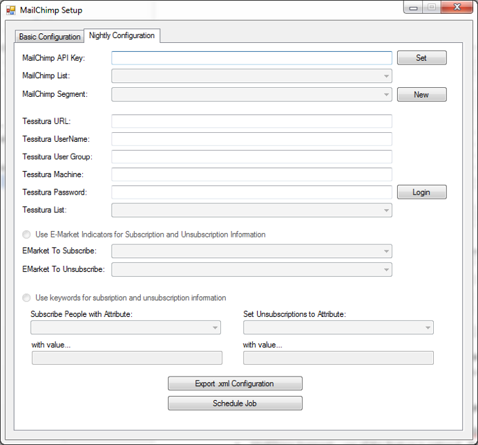
At the moment, the project is a pretty simple .NET application that anyone can install on a windows machine that can talk to Tessitura and Mailchimp. You fill out some initial config information, and then schedule a nightly synchronization job. This allows Tessitura licensees to export their primary lists on a nightly basis into Mailchimp.

You can also perform synchronizations on an ad-hoc basis, meaning, any Tessitura user can easily create a segmented list in Tessitura for a specific purpose, and sync that list to Mailchimp for immediate sending.

This is a really nice feature, because it actually creates or updates a segment in Mailchimp. Rather than create many bespoke email lists, you can then just use a single master list in Mailchimp, and use the exported segments so you are only sending to the addresses you are interested in.

What it’s not

It’s important to understand that this is an open source tool and is provided “as is.” There is no support staff waiting to take your calls and answer your questions. This remains the responsibility of the Tessitura community.

As I mentioned, it’s a simple tool, and at the moment, it basically does the two functions I’ve outlined above. There is no syncing of analytics data back in to Tessitura, for example. We really love the analytics tools built right into Mailchimp, and so for most this may not be a deal breaker. These are the kinds of features we hope will get added by the community down the road.

What it is, again.

It’s a super exciting thing for us to all think about! The Tessitura community really needs to take more control over the entire eco-system of third-party applications and extensions. Without a vested interest in building our own tools, open sourcing the work we are all doing, and joining in the conversation with regards to direction and strategy, the community will always be waiting on the next update from those vendors who have chosen to build products from the system.

How do I get it?

First, you need to be a Tessitura Network licensee. Then, you just need access to the Tessitura Netowrk code sharing site on BitBucket. You can get this by sending an email to web_dev@tessituranetwork.com. Once you are there, you can go to here, and download the code, or the binaries to try it out on your system. The repository has a README with all the relevant info on how to install it from scratch, build from the source, and set things up in Mailchimp. If you don’t have this capability you can also download the compiled binaries and just try it out.

How do I contribute?

If you are a Tessitura Network licensee, and you’ve gotten this far, read the README to get the full picture on how to fork the code and contribute. For the time being, feel free to log issues, and send feature requests, and I will do my best to follow up on them and help get them resolved, but eventually, we hope that someone within the community will pick up the torch and help us to continue to develop what we think is a really valuable integration and option for the broader Tessitura community.

Reminder: First, you need to be a Tessitura Network licensee. Then, you just need access to the Tessitura Netowrk code sharing site on BitBucket. You can get this by sending an email to web_dev@tessituranetwork.com

Content sharing and ambient display with Electric Objects EO1

Scenic panel El Dorado, designed by Joseph Fuchs, Eugène Ehrmann and Georges Zipélius and manufactured by Zuber & Cie , 1915-25, Gift of Dr. and Mrs. William Collis. From Cooper Hewitt Collection displayed on an EO1. Photo by Zoe Salditch

Scenic panel El Dorado, designed by Joseph Fuchs, Eugène Ehrmann and Georges Zipélius and manufactured by Zuber & Cie , 1915-25, Gift of Dr. and Mrs. William Collis. From Cooper Hewitt Collection displayed on an EO1. Photo by Zoe Salditch

One of the cornerstones of Cooper Hewitt’s very visible digital strategy has been promiscuity. From the first steps in early 2012 when the online collection was released, we’ve partnered with many people from Google Art Project and Artsy to Artstor and now Electric Objects.

Electric Objects is a little different from the others in that we’ve worked with them to share a very select and small number of collection objects, much in the way that Pam Horn and Chad Phillips have worked to grow the museum’s ‘licensed product’ lines of merchandise.

Electric Objects is a New York startup that raised a significant amount of money on Kickstarter to build and ship a ‘system for displaying digital art’. Jake Levine, Zoe Salditch and their team have now developed the EO1 into a small ecosystem of screens deployed in the homes and offices of about 2500 ‘early adopters’ and digital artists who have been creating bespoke commissions for the system.

Cooper Hewitt joined the New York Public Library in providing a selection of collection materials to see what this community might make of it – and, internally, to think about what it might mean to have a future in which digital art might become ‘ambient’ in people’s homes.

I spoke to Jake and Zoe late last week in their office in New York.

Seb Chan – I like how the EO1 has ‘considered limitations’ – the lack of a slideshow mode, the lack of a landscape mode – can you tell us a bit more about what went into these decisions? And now that EO1s are in homes and offices around the world, what the response has been like?

Jake Levine – Computing has for the last 50 to 60 years been characterized by interaction, generally for the sake of productivity or entertainment. Largely as a result, we’ve built software whose basis for success is defined by volume of interaction. Most companies start with: ‘how often can we get users to engage with our product? ‘

What we’ve been left with is a world filled with software competing for our attention, demanding our interaction. And we feel like crap. We feel overwhelmed.

EO1 was an experiment in a kind of computing that, by definition, could not demand anything from us. We asked whether we could build a computer that brought value into its environment without asking for user interaction. How do we ensure that the experiment remains valid? We make interaction impossible. You can’t ‘use’ EO1, just like you can’t ‘use’ art.

In the interest of exploring a different kind of computing, we made sure not to take any existing software paradigms for granted. The slideshow, of course, is ubiquitous in digital photo frames, to which we are often compared. For that decision, we went back to first principles — why? Why do we want slideshows? My experience with slideshows is characterized by distraction. The image changes, it catches my eye, it interrupts my conversation. Change demands our attention.

We say we want slideshows, but how much of that has to do with expectations informed by how screens have behaved in the past, without enough time spent thinking about how they might behave in the future? We’re so accustomed to the speed of the web, that even while we complain about it, when we’re presented with an alternative, we decide that we miss it.

But what is the value of change on the Internet? For me it’s not about randomness, it’s not about timers and playlists and settings. Change at its most meaningful happens in social contexts, in software that lives on top of a network, where ephemerality is actually just conversation, people talking. Twitter, Facebook, Instagram, Tumblr — these services aren’t an overwhelming flood of information, they are people talking to each other, and that’s why we keep coming back.

So you will likely see change enter the Electric Objects experience in the future, but it won’t be programmatic. It will be social.

Electric Objects, like all networked media discovery software, is a shared experience. And that’s also why we lack landscape. It’s important that everyone experiences Electric Objects in the same way, to create a deeper connection among its members. It also makes for a better user experience.

SC – Defaults matter, I think we all learned that from Flickr, and I really like that EO1 is ‘by default’ Public. This obviously limits the use of the EO1 as a digital photo frame, so what sort of things are you seeing as ‘popular’?

JL – People love water! So many subtly moving water images! But beyond the collective fascination with water, a lot of people are displaying the artwork we’re producing for Art Club, our growing collection of new and original art made for EO1 (including the awesome collection of wallpaper from Cooper Hewitt!).

Sidewall, wallpaper with stylized trees, ca 1920, designed by René Crevel and manufactured by C. H. H. Geffroy and distributed by Nancy McClelland, Inc. From Cooper Hewitt Collection displayed on an EO1. Photo by Zoe Salditch.

Sidewall, wallpaper with stylised trees, ca 1920, designed by René Crevel and manufactured by C. H. H. Geffroy and distributed by Nancy McClelland, Inc. Gift of Nancy McClelland. From Cooper Hewitt Collection displayed on an EO1. Photo by Zoe Salditch.

SC – Cooper Hewitt joined the Art Club early on and we’re excited to see a selection of our historic wallpapers available on the device. This wasn’t as straight forward as any of us had expected, though. Can you tell us about the process of getting our ‘digitised wallpapers’ ready and prepared for the EO1?

JL – When you’re bringing any art onto a screen, you have to deal with a fixed aspect ratio. Software designers and engineers know the pain of accommodating varying screen sizes all too well. In many ways what we offer artists — a single aspect ratio across all of our users — is a welcome relief. What’s more challenging is “porting” existing work into the new dimensions.

Wallpapers were actually a great starting point, because they’re designed to be tiled. Still, we hand cropped and tiled each object, to ensure an optimal experience for the user (and the art!).

SC – Our friends at Ghostly and NYPL took a slightly different route. Can you tell us about how both of those collaborators chose and supplied the works that they have made available?

JL – Ghostly is a label that represents a fantastic group of artists and musicians. Together, we selected a few artists to participate in the Ghostly x EO collection, featuring original work made specifically for Electric Objects.

And NYPL was somewhere between Ghostly and what we did with Cooper Hewitt. NYPL has this incredible collection of maps that they’ve digitized. We knew we didn’t want to simply show a cropped version of the maps on EO1, so we turned to the artist community, and starting taking proposals. We asked: what would you do with these beautiful maps as source material?

Natural Elements by Jenny Oddell from the NYPL x EO Collection

Natural Elements by Jenny Oddell from the NYPL x EO Collection

Jenny Odell produced an incredible series of collages. She spent ninety-two hours cutting out the illustrations that cartographers often include on the edges of the maps in photoshop — these beautiful illustrations that rarely get any attention since the maps have a primarily functional purpose. In this case we used something old to make something new, something designed with and for the screen. It was perfect.

SC – Art Club feels like it could be sort of a ‘Bandcamp for net art’. I know you’ve been commissioning specific works for the EO1 and making sure artists get paid, so tell us more about how you see this might work in the future?

Zoe Salditch – Without art, EO1 would just be any other screen. And we’ve known since the early days that art made for EO1 is always a better experience.

There are many ways people engage with and have historically paid for art, so we’re exploring a couple different ideas. Right now, we commission artists upfront and ask them to create small series for EO1, and this collection is available for free for EO1 owners for now. Our plan is to eventually put this ever-growing collection behind a subscription, so that the customer can subscribe to gain access to the entire collection.

Other strategies we’re exploring include limited editions, and a commission service for those who want to have something that feels more exclusive and custom. We believe that artists should be paid for their work, and that people will pay for great art. Other than that, we’re open to experimenting, and we have a lot to learn from our community now that EO1 is out in the wild!

SC – Cooper Hewitt’s wallpapers have been up for a little while as you’ve been shipping out units to Kickstarter backers. What can you tell us about how people have been showing them? What sorts of stats are we looking at?

JL – Art from the Cooper Hewitt collection has been displayed 783 times in homes all over the world, with an aggregate on-display time of over 217 days! The three El Dorado scenic panels have been most popular!

Explore the Cooper Hewitt objects available for ambient viewing through Electric Objects, to visit Shop Cooper Hewitt in-store at 2 East 91st in New York to buy an EO1 unit from the museum tax-free [sorry, not currently available via our online store].

5 months with the Pen: data, data, data

Its been five hectic months since the Pen started being distributed to visitors at the ticket counter, and we’ve been learning a lot. We last made some basic stats available at the 100 day mark, but how has usage changed – especially now that almost every area of the museum has been changed over in terms of exhibitions and objects? And what are the tweaks that have made the difference?

Take up rates are improving

March 10 to August 10 total number of times the Pen has been distributed – 62,015
March 10 to August 10 total number of eligible visitors – 65,935
March 10 to August 10 mean take up rate – 94.05%

The Pen launched on March 10, four months after the museum opened its doors, and by the end of March the Pen had a take up rate of 80.44%. By the end of April this had improved to 96.88% and by the end of July to 97.44%. A huge amount of effort by the front-of-house team to improve their scripting and ‘pitch to visitors’ made the difference upfront, and that was backed up by optimisations to the Pen distribution processes later. Late July also saw the introduction of the Pen into Pay-What-You-Wish Saturday evenings which relied a lot on having more streamlined Pen handout processes being implemented. Still to come is the integration of the Pen into education visits and school groups.

Pen usage is improving

March 10 to August 10 total objects collected – 1,394,030
March 10 to August 10 total visitor-made designs saved – 54,029
March 10 to August 10 mean zero collection rate – 26.7%

Not everyone who takes the Pen ends up using it. Some visitors wander around with it but choose not to save anything.

In April we saw a high of 31.28% not using their Pen, and we believe that a sizeable portion of this was actually the result of some backend issues that saw some visitors not being able to ‘write’ the contents of their Pen to their account. We noticed an uptick in “I visited, used the Pen, but there’s nothing when I go to my ticket’ emails coming in to our Zendesk customer service helpdesk. Throughout May and June we tracked down the source of some of these problems and began to resolve them. By the end of July the non-use rate was down to 22.4% and is tracking under 20% for August so far.

Those who do use the Pen, though, use it a lot. The average number of objects saved by a visitor has varied between 33.2 (March) and 26.99 (June) – significantly more than expected. The average number of ‘visitor-made designs’ (wallpapers, 3d models, Sketchbot portraits) has stayed relatively steady at 1.2 per visitor.

Time on campus is stable

March 10 to August 10 mean time on campus – 99.56 minutes

Cooper Hewitt is not a large museum. There’s a lot to do, but it is physically quite small at 16,000 square feet of gallery space. One of the aims of the new museum experience and redesign was to extend the time that visitors spent on site. As the Pen is handed out at the moment of admission and returned upon exit, the time between these two events is a pretty accurate indication of the time each visitor spends in our building (inclusive of shop and cafe).

Month to month the average has oscillated between 91.84 minutes and 104.31 minutes. Because of changes in the way that Pens are collected at the end of the visit, times from July onwards have to be adjusted downwards by 30 minutes. In order to speed the museum exit experience, front-of-house staff clear the Pen deposit box every 30 minutes instead of individually meaning that some Pens may have been sitting ‘unreturned’ for a while.

Post-visit logins need improvement

March 10 to August 10 post visit website retrieval rate – 33.8%

Each ticket that is paired with a Pen contains a unique URL which allows a visitor to login after their visit to see what they collected and designed. For well over 20 years this has been seen, perhaps misguidedly, as the holy grail of museum experiences – “they came to the museum and they enjoyed themselves so much, they went back to the website for more afterwards”. Falk & Dierking, amongst others, have emphasised that visitors recall their museum visits as an amalgam of experiences and often not in the categories or strict differentiations of specific exhibitions, programs, or objects that museum professionals expect.

For the first 4 months, March through June, the percentage of visitors retrieving their visit data from the unique URL on their ticket was flat at 35%. In July we started to see this drop to 30.65%. We’re looking into some of the potential causes for this drop – this may be related to the Pen box at the exit operating in a less-staffed mode (previously every Pen was collected by a front-of-house staff member who would verbally remind the visitor to check out their visit using the URL on their ticket as they left the museum). We will soon be trialling a slightly redesigned ticket with a simpler, clearer call-to-action and URL, as well as better exit signage as a reminder.

That said, these figures for post-visit access are vastly better than most other known initiatives in the museum sector where post-visit web use is usually well under 10%.

Soon, too, the post-visit experience online will see some small tweaks and improvements deployed that will make it easier to navigate, explore, and export your visit.

Surprises

Visitors continue to surprise us. Many of the creations that are being drawn in the Immersion Room are astounding in their complexity and they remain a firm favourite on social media. A simple look at Instagram photos posted from our location make it very clear that visitors love the interactivity and the ability to ‘put themselves into the museum’. Popular objects, too, continue to be a balance of ‘unexpected gems’ and ‘known favourites’.

We’re in the process of drawing up some maps that will help us visualise the distribution of ‘popularity’ throughout the physical gallery spaces. This sort of spatial visualisation, coupled with new data as the objects on all three floors of the museum are switched out for new exhibitions, will help the museum differentiate between the effect of ‘location as an attractor’ [are things closer to doors/thresholds more popular than things in the middle of the room etc], ‘aesthetic qualities as an attractor’ [are bold objects more popular than more subtly displayed/lit objects], and the influence of ‘known classics’ or the concept of ‘landmark objects’ in design of exhibitions (see the work of Stephen Bitgood).

We’re also interested in sequencing. What order do visitors move through spaces? Does this change by visitor-type or by the type of exhibitions on view? How long does it take before visitors of different types take to make their ‘first collection’?

So many questions!

You can always keep an eye on the top line numbers and very basic Pen statistics on our site, and Labs will continue to blog results at periodic milestones.

The digital experience at Cooper Hewitt is supported by Bloomberg Philanthropies.

Long live RSS

Screen Shot 2015-07-10 at 2.35.17 PM

I just made a new Tumblr. It’s called “Recently Digitized Design.” It took me all of five minutes. I hope this blog post will take me all of ten.

But it’s actually kinda cool, and here’s why. Cooper Hewitt is in the midst of mass digitization project where we will have digitized our entire collection of over 215K objects by mid to late next year. Wow! 215K objects. That’s impressive, especially when you consider that probably 5000 of those are buttons!

What’s more is that we now have a pretty decent “pipeline” up and running. This means that as objects are being digitized and added to our collections management system, they are automatically winding up on our collections website after winding their way through a pretty hefty series of processing tasks.

Over on the West Coast, Aaron, felt the need to make a little RSS feed for these “recently digitized” so we could all easily watch the new things come in. RSS, which stands for “Rich Site Summary”, has been around forever, and many have said that it is now a dead technology.

Lately I’ve been really interested in the idea of Microservices. I guess I never really thought of it this way, but an RSS or ATOM feed is kind of a microservice. Here’s a highlight from “Building Microservices by Sam Newman” that explains this idea in more detail.

Another approach is to try to use HTTP as a way of propagating events. ATOM is a REST-compliant specification that defines semantics ( among other things ) for publishing feeds of resources. Many client libraries exist that allow us to create and consume these feeds. So our customer service could just publish an event to such a feed when our customer service changes. Our consumers just poll the feed, looking for changes.

Taking this a bit further, I’ve been reading this blog post, which explains how one might turn around and publish RSS feeds through an existing API. It’s an interesting concept, and I can see us making use of it for something just like Recently Digitized Design. It sort of brings us back to the question of how we publish our content on the web in general.

In the case of Recently Digitized Design the RSS feed is our little microservice that any client can poll. We then use IFTTT as the client, and Tumblr as the output where we are publishing the new data every day. 

RSS certainly lives up to its nickname ( Really Simple Syndication ), offering a really simple way to serve up new data, and that to me makes it a useful thing for making quick and dirty prototypes like this one. It’s not a streaming API or a fancy push notification service, but it gets the job done, and if you log in to your Tumblr Dashboard, please feel free to follow it. You’ll be presented with 10-20 newly photographed objects from our collection each day.

UPDATE:

So this happened: https://twitter.com/recentlydigital

Print The Exhibition – The Label Book Generator

As a Peter A. Krueger intern this summer, I am working in both the Digital and Emerging Media and Cross-Platform Publishing Departments at the Cooper Hewitt. Since I am traversing the two departments, a project that allows me to learn from each and create something that benefits both is of course ideal. The Label Book Generator does this in a twofold manner: It allows me the opportunity to learn and write code to develop a digital product, which in turn, serves to produce a physical publication of interpretive content for an exhibition.

09

Label Book Generator–’How Posters Work’ exhibition page

Currently a prototype, The Label Book Generator is a tool that creates a printed publication of object labels for each exhibition at the Cooper Hewitt. In its most basic use, Visitor Services at the museum can navigate to an exhibition from a list on the website’s homepage and once on an exhibition page, press Command-P (or File > Print) to generate a PDF with an initial cover page followed by a single label on each page–all entirely set in a larger font-size.

What initially prompted the development of this prototype was to solve readability issues visitors may have with existing wall labels. This does not imply that the current label design needs to change or be set in a larger font-size, but instead that the labeling system as a whole should be augmented with something to make them more accessible, to provide a magnifying glass of sorts when needed.

photo (1)

Publication in use in the gallery

The entire process proved to be invaluable as a learning experience. From the start it was obvious that I needed to leverage the museum’s API to access object data by exhibition to ultimately populate fields in each label. As the Label Book Generator website is currently, the selection and order of the fields are in accordance with a predefined template that begins to apply the typographic guidelines of the existing wall labels. As a graphic designer it was particularly interesting for me to consider the meticulous planning that is usually involved in typesetting parallel to the time spent writing the code. Whereas typically, these two processes are dealt with in succession.

Since the end result needed to be a book, I was set on formatting the data in a markdown document that would have typographic styles manually applied in InDesign. A Python script was written to create a markdown document with syntax assigned to each field, e.g., titles would be prepended with ‘#’ to be a top level header, dates with ‘##’ to be a second level, etc.

Stumbling along with my rudimentary skills in Python–and at one point rewriting the whole thing in Javascript, only to go back to Python–led me to conclude that outputting the final document with InDesign can be circumvented. With the much-appreciated help of Micah Walter, it was settled that rather than generating a markdown file, I should instead produce a small web application using Python and Flask as a framework. The most salient aspect of the entire project now being a simple print style sheet for the website that automatically generates the same final document that having to manually use InDesign would have produced (Here is the code available on Github).

With a central concern for typography, the print style sheet seamlessly flows all the content into any fixed page format, which in this case would be a printable PDF. The printed document once bound can be considered an exhibition catalog reduced to its essential elements: A list of every work, with their respective information and descriptions (when available).

06

Interior spread of printed publication

The Label Book Generator solves the initial prompt of assisting those hard of seeing. However, considering that the website from the get-go is built with a responsive layout and scalable typography (again due to the simultaneity of graphic design and web development) there are a number of opportunities to expand it’s role and purpose.

The typography, padding and margins set in REMs (Root EM), rather than fixed sizes, allows for the ability to control the base size and relatively adjust the measurements. A future version of the website can include in the interface a means to control how large or small the base size of the document should be, given the dimensions of the fixed format–whether it be a standard letter-sized PDF, or otherwise.

10

Browser print dialog box

01

Cover page of printed publication generated from the website

02

Interior spread of printed publication

When presenting the prototype to others here at the museum Katie Shelly brought up an interesting future use case involving blind visitors and screen reader software. In addition to the possibilities with printable versions of the Label Book Generator, the website itself provides a responsive mobile view of all the labels which could theoretically be read to the visitors via their personal device.

iphone_01

Mobile view of website

Finally, the printed label book serves as a means to visualize the collection database. If a label in the book and website is missing a field, it reflects an oversight at the ‘source of truth’. In other words, there is a one-to-one relationship between the fields in both the labels and the database. Ultimately, this brings to mind the commonplace workflow of producing wall labels that are manually written, designed, and edited (on this topic see also: Label Whisperer). In perhaps a later version, a similar process of using the museum’s API to automate the process of generating the label book, could theoretically be applied to the entire production of wall labels for the museum.

Missing tags for the object on recto

Missing tags for ‘Amerika’

Give the Generator a go!

When the optimal interface is paper: improving visitor information

Earlier in this series I wrote about improving customer-facing ticketing touchpoints and UX improvements to a internal-facing app. This 3rd post is about the design and thinking behind a valuable— albeit non-tech— touchpoint: a postcard explaining how to use the pen.

When we first launched the Pen, it was obvious that we needed to quicken up the front desk transaction. One thing that was really slowing down the transactions (and causing a big line) was the “Pen schpiel.” A verbal explanation of what the Pen is, why it’s cool, and how to use it could hog up several minutes per transaction.

a comic-book style grid of photos showing a transaction between two gentlemen step-by-step

I made this storyboard in April 2014 with some willing coworkers and simple props (3D printed pen, fake ticket, fake postcard, fake “sample label,” and fake staff badge). In the last frame, the desk rep references an FAQ postcard.

We predicted the need for a postcard almost a year before the pen launch, but didn’t print one until we were sure it was necessary. I mocked up a fake postcard with a photo of a 3D-printed pen to provide some needed conversation-starting visuals in our early meetings. This was long before the pen had a final form factor, and you can see that our initial conversations about pen size and shape were a little uncomfortable.

person's hand holding up a postcard in an office setting. postcard says "LEARN MORE" with a blue plastic tube-like object.

This was the ‘sample’ postcard in the above storyboard, all created months before the Pen had a final form factor.

The postcard idea was on the back burner for many months as we all focused on the bare essentials of getting the Pen and its suite of services running at a baseline level. Once the Pen was released to the public in March 2015, the length of time of each transaction became an obvious “pain point” that needed our attention. So, the postcard was brought back to the table.

two postcards, shown front and back, with 1-2-3-4 illustrated steps

My first pass (left) used real images. The second pass (right) used illustrations, which were widely preferred by everyone I asked for input.

Sam had a cool idea to let visitors peel up the non-badge part of their ticket and stick it to the card, with some text boldly pointing to your “personal URL.” (The whole ticket is printed on sticker paper). This was clever because it could minimize the possibility of visitors losing or unthinkingly discarding their tickets, which contains the precious personal URL they’ll need to access their personal visit diary. When stuck to a postcard, the ticket might have a better chance of making it safely to a visitor’s home.

I worked closely with the front desk staff to get the language just right. It had to be concise but also explanatory. When the cards arrived from the printer, the desk staff was super excited and hopeful that these cards could help them save time and energy at each transaction.

Informational graphic and text with steps 1-4 under the heading " YOUR PEN = YOUR MUSEUM DIARY"

The first printing of the pen postcard.

When put to the test, these postcards turned out to be less useful than we all imagined.

Only about 2 in 5 visitors wanted to take a postcard. And even the guests who did take a postcard still wanted verbal explanation in addition to the card. (We ended up handling this by diverting the most explanation-hungry visitors to a representative stationed at the nearest interactive table for informal “group tutorials”.)

So the postcard was not a panacea, but it did ease the pain somewhat.

There was an overall feeling from visitors and desk reps that the postcard was too verbose and this is why most guests didn’t want to pick it up and read it. Another point brought up by the desk staff was that while the card functions well as a didactic, it doesn’t sell the pen. It doesn’t tell you why you ought to try it. A third observation: most people were not springing for the cool peel-and-stick feature. Humbug.

a person's hand pulling a postcard out of an acrylic stand which holds a stack of cards. the setting is a darkened lobby.

People are more willing to read a document while they’re waiting in line than when they’ve reached the front desk and are already talking to someone.

So we hit the drawing board again. I created a voting ballot so the front desk staff could weigh in on two choices for the front and back of the card. We had clear winners, as you can see in the image below. The voting sparked a conversation that led to further refinement of the text and images.

two pieces of paper with images and written-in-pen names beside each image.

Desk Reps are always working on their feet or dealing with the public, so the most convenient way to get their imput is an old-fashioned paper ballot (not a web form).

The desk reps were unanimously against “PLAY DESIGNER” as sell copy for the Pen, because they were sure that many guests would think the word “play” meant the message was targeted at kids. So, I came up with 7 copy variations and we did another round of voting. The desk staff almost unanimously voted for a “write-in option” from one of their peers for its directness and clarity. The suggestion was: “EXPLORE AND DESIGN.”

a piece of paper, shown front and back, the first with a grid of images and initials scribbled in pen, and the back with many handwritten notes on a blank page, all in pen

The winning idea was actually a “write-in” contender on the back of the page, which sparked impassioned debate among desk staff.

The voting was not just a method for collecting votes, but also a way to spark conversation among many staff, across departments.

What I learned from this experience is that the folks on the “front lines” tend to dislike any language or collateral that is in any way subtle, abstract, or “overly clever,” citing the likelihood that too much coyness will just confuse visitors. It makes sense; when a visitor is trying to get going in the museum, corral his kids, juggle his bag and coat, get himself to the restroom, keep an eye on the time, and so on, he won’t have a lot of “brain space” for interpreting any subtleties. They just need crystal clear information to get them on their way.

a telephone on museum display with a label beneath, a hand holding a large black wand, and steps 1-4 for use written in blue bold text

These instructions are less detailed, but also less tl;dr

three young people in a museum setting holding large black wands and pressing them to a touchscreen glass tabletop

The new postcard shows real people using the pen, making it visually obvious what a person should do with it.

The second version has:

  • Giant copy to “sell” the pen by describing its basic functions (Create, Collect, Save).
  • Bigger images to catch attention and make the card more “pick-up-able.”
  • Less text to ease tl;dr anxiety.
  • Image and word choice is intended to make the function of the pen’s “tip” and “base” obvious just by looking.

100 days

Museum Stats | Collection of Cooper Hewitt, Smithsonian Design Museum

Today marks the 100th day since the Pen started being distributed to visitors. Its been a wild ride and the latest figures are far beyond our estimations.

As of today, Pens have been handed out to 40,846 visitors which represents about 93% of all eligible visitors so far. We’re not currently distributing Pens on Saturday nights, nor to education groups, so they’re excluded from the count.

When we were thinking about the Pen and its integration into the museum, ubiquity was a critical concern. We knew that making it an ‘addon’ or ‘optional’ wasn’t going to achieve the behavior change that we desired, so continuing to make the on-boarding process easier for visitors and staff has been very important.

All of that would be for nought, if those Pens weren’t being used. Those Pens have collected 889,156 objects – averaging nearly 22 per Pen. That’s really surprised us! With a median of 11 we are still working on new methods in the galleries to help visitors collect more with their Pens, and in some cases, get started.

We’ve been equally excited that visitors have chosen to save 35,138 of their own creations from the wallpaper room, 3D designs, and Sketchbot portraits.

We’ve seen dwell times on the campus – from the times visitors take the Pen to when they return on exit – balloon out to a current average of 102 minutes, slightly less on weekends.

Another surprise has been the ‘most collected object’. It is the Noah’s Ark cut paper from 1982, an object that is on display towards the back of Making Design on the 2nd floor – certainly not the first object a visitor encounters. We probably shouldn’t be very surprised though, as it does also show up frequently as a visitor favorite on Instagram.

If you’d like to see what else is popular then hop over to our newly public ‘basic statistics‘ page where the top six objects and other numbers update daily.

And as for the post-visit experience? Just over 25% of ticketed visitors check out their collections after their visit, and a third of them decide to create accounts to permanently store their collection.

Over the coming months we’ll be working on continuously improving the Pen experience in the galleries – and as next week’s new exhibitions open to the public, the museum will have changed over almost every gallery since December. A lot of those improvements are going to be, as we’ve already seen, not technical in nature, but about more human-to-human interaction and assistance.

The digital experience at Cooper Hewitt is supported by Bloomberg Philanthropies.

Label Writer: Connecting NFC tags to collection objects

IMG_20150610_113555

Labels, for better or worse, are central to the museum experience. They provide visitors with access to basic object information (metadata) and a tiny glimpse into the curatorial research for everything in the galleries, helping to place objects in context. At Cooper Hewitt, they are also the gateway through which the Pen‘s “collect” interaction is realized.

In order for the Pen to know which object label you’re trying to collect, every label in the museum contains an NFC tag that is written with the object’s ID. When an object gets added to our database we give it an ID, an integer that is unique across our entire online collections database. Our beloved Spanking Cat, for example, has the ID number 18382391. Writing that number to an NFC tag is a simple task, but doing it hundreds of times for every new exhibition we roll out will get tedious very quickly. Thus, Label Writer was born.

Label Writer is an Android app that writes, reads and locks NFC tags based on the object to which the label refers. The staff member can look up the objects that are in a given room of our museum, select one or more of them, and assign them to the label in question. They can search for specific objects in case an object’s location hasn’t been updated yet. They can also write tags for videos and shop items.

The front and back of the NFC tag we use in our labels, with pennies for scale

From left to right: the back and front of the NFC tags we use in our labels, and pennies for scale.

Planning

After thinking about the app we came up with the following requirements:

  1. When processing a user’s visit, we need to know what type of thing they’ve collected. When the Pen launched, this was either objects or videos, and has since grown to include shop items. To facilitate that process, Label Writer would have to distinguish between types of things and write tags that indicated that.
  2. It would need to write multiple things to a tag, including things of different types. One label might contain three objects. Another label might contain one video and two objects.
  3. It would need to lock tags. Leaving the tags unlocked would enable anyone with an NFC-enabled smartphone to walk around the galleries and overwrite our tags. Locking the tags prevents this.
  4. It would need to read tags and display images of what’s on a tag. This is so we can double-check what is on a tag before we lock it. We only print one copy of every label – sometimes through an offsite service – and the wall labels (as opposed to the rail labels) have their NFC tags glued in and unable to be replaced.
  5. Label Writer would have to present objects in a constrained format — having to find the object on a label from our total collection of 210,000 objects every time, through accession number lookup or other traditional searches, would get annoying very quickly.
IMG_20150608_172543

The NFC tags on our wall labels are built in to the label.

IMG_20150608_172442

The NFC tags on our rail labels are interchangeable.

Production

I decided to build the app in Android because it has great support for NFC and we have plenty of Nexus 9 tablets at the museum for use in the galleries. I started with this boilerplate for an Android read/write NFC app and performed initial tests to make sure we could write a tag that could be read by some of the early Pen prototypes. Once that was established, I began fleshing out the UI of the app and worked on hooking it up to our API.

The API gives us so much to work with on the app’s frontend. Being able to display an object’s image is a much better way to confirm that a label is written correctly than by comparing IDs or accession numbers. The API also lets us see all of the objects in a given room of the museum, which means that the user can write labels in an ordered fashion. When the labels arrive from the printer they are grouped by room, and often we will not write the tags until they have been installed in the galleries, so “by room” is a convenient way to organize objects on the frontend. It also gives us easy access to videos and shop items, and allows the app to easily be expanded to write labels for more things from our collections database. Since our collections site alpha, we have stressed the importance of an easily-accessed permanent ID for everything: people, objects, videos, exhibitions, locations etc., and now with the Pen we can prepare labels that allow users to collect any one of those things during their visit to the museum.

01

When I took all these screenshots, the app was called “Tag Writer”, as in “NFC Tag Writer.” But “Label Writer” sounds better.

When the app is opened, the user is prompted with a few ways to group objects. Since we added videos and shop items to the app, this intro screen has grown a bit so it will probably get a redesign when we next expand its capabilities. But for now, users have a few options here:

  1. They can select a room from a dropdown menu (here’s a list of all of our rooms)
  2. They can enter an individual accession number
  3. They can enter a video’s ID
  4. They can search the shop (see Aaron’s recent post about adding shop items to our online collection)

When one of these options is used, the relevant objects appear on the screen. For example, selecting Room 106 brings up some of the posters from our current How Posters Work exhibition. Being able to display the images of the posters makes it much easier for the user to confirm that they are connecting the dots accurately — accession numbers and object IDs are easily confused (not to mention boring to look at).

02

The user can then tap one or more objects to add them to a label. In the screenshot below, you can see that two objects have been selected and the orange bar at the bottom has formatted them to be written to a tag — in this case, chsdm:o:68730187;18708395. The way that things get written to tags follows a format we agreed upon early in the Pen design process, as various developers would be building applications that relied on reading and parsing a Pen’s content. In brief, chsdm is a namespace for our museum that is not particularly necessary but serves as a header for what follows. o stands for object and then the ID (or semicolon-delimited IDs) that follow are the IDs of objects. The letter can change: v for video, s for shop, and on and on for whatever other things we might eventually write to tags. We add a pipe character (|) to delimit multiple types of things on a tag, so a tag with an object and a video might look like chsdm:o:18714653|chsdm:v:68764195. But all of this is handled by the app based on what the user selects in the interface.

03

Next, a user can hold the tablet up to the object label to write the NFC tag. When the tag is written, the orange bar at the bottom turns green to let the user know it went okay. Later, using the “Read Tags” functionality of the app, the user can confirm the tag’s contents by reading the NFC tag. The app parses the tag and loads the things it thinks the tag refers to. When this is confirmed, the user can lock the tag to make sure nobody overwrites it.

05

Here’s everything, from start to finish, using the object-lookup-by-accession-number functionality.

Next Steps

I mentioned that the home screen of this app will get a redesign as we allow more types of things to be written to tags. The user experience of the tag writing process needs a little finessing — a bug in how success messages get displayed has resulted in a few tags that get written with bunk data. Fortunately that is caught in the “read” phase of the workflow, but should be corrected earlier.

Overall, as we keep swapping out exhibitions, Label Writer will get more and more use. We will use these opportunities to collect feedback from the app’s users and make changes to the app accordingly.

Object concordances – what is the simplest thing to match like with like?

eames-concordances-full

Do you notice anything special about this screenshot of Charles Eames’ famous No. 670 Chair?

It might be hard to see because it’s a tall screenshot and this is a small thumbnail. Have a look at the large version. Hint: It’s not the part where the chair is missing in the picture. It’s actually this, on the right-hand side of the object details:

eames-concordances-crop

Object concordances! With other museums! To the same objects in their collections!! On their own websites !!!

Before you get too excited (and think its actual working ‘Linked Data’), we should point out that as of this writing we have only “concordified” four distinct objects – this one, this one, this one and that one – eight times with four separate organizations, one of which is our own shop, so there is a lot of work left to do.

Screen Shot 2015-05-28 at 6.57.20 PM

If you look carefully you can see that most of the concordances, to date, were added within about 90 minutes of one another. That’s because Seb and I were talking about object concordances over lunch that day and agreed that we could probably push the simplest and dumbest thing out the door before I went home. It has been something that has been on the agenda since mid-2012.

Specifically, we maintain a fixed list of institutions with whom we will “concordify” objects. If your institution isn’t on that list yet it’s not personal. We can add as many institutions as we want but we think the narrow focus helps to explain the purpose of the tool. Then we simply record that institutions unique ID, the object ID for something in our collection and the object ID for something in their collection. That’s it.

Screen Shot 2015-05-28 at 6.10.49 PM

Currently the tools for adding concordances, or editing institutions, are … terrible.

(Or rather, they are the unadorned plumbing that makes the whole thing work. So they are beautiful and elegant in their own way but most people would be forgiven for not seeing those qualities right away.)

Short-term the goal is to build some friendlier “admin” web page for a few more people to add concordances without having to worry about the technical details. Medium-term the goal is to create restricted API methods for doing fancy-pants buttons and pop-up dialogs on the object pages themselves to allow staff to add concordances as they think of them or are otherwise just poking around the collections website. Maybe in the long term, ‘the crowd’ might be invited to do it too.

Screen Shot 2015-05-28 at 6.11.02 PM

Somewhere between those two things we will also build proper “index” pages on the collections website of all the objects that have been concordified, all the institutions that have concordified objects and so on. Just like we’ve already done for people.

The other thing we’ll do shortly is make sure that these concordances are included in the CC0 Cooper Hewitt collections metadata dump which is available on GitHub.

When we said “the simplest thing” we meant it.

There isn’t much yet but it’s a start – a tangible proof of what it could be – and if we’ve done our job right then it is one of those things that will grow exponentially, as always, as time and circumstance permit.

(If you’ve been a long time reader you might remember we did Rijkscolors back in 2013 as an experiment in automatically matching objects – but we were undone by language and structural differences in metadata, and the reality that humans might still be better at this at least until the sector irons a few things out)