A new feature you may never see – ticketing follow up emails

A few weeks ago we rolled out a small update to the ticketing website that sends a reminder email to anyone who has purchased tickets in advance.

This is sort of an experiment. but first, some background.

Recently I attended an event at another cultural institution ( which I won’t name ). A few days prior to the event I received a very up-selling reminder email, reminding me of membership discounts and other events I might like. The links within the email took me to the landing page for the event, and offered little actual information that I found useful unless I wanted to buy even more tickets, or combine my purchase with a book in the shop.

To make things worse, on the night of the event, and just as it was finishing up, I received a “follow up email” , which I found really annoying. It was literally timed to send exactly as the event was ending and while I was on my way out the door, as if to say, “wait, come back in and buy the book too!”

In fact, the subject line read “How did I enjoy [insert event title here]?” But, the email itself didn’t offer me a way to answer that question ( even if I wanted to ) and instead simply pointed me to the same landing page of the event I had just attended, along with links to their social media channels and other upcoming shows I might be interested in. The whole thing made me cringe a little as I pressed the delete button on my phone.

I thought to myself, “let’s not do that.”

I really just wanted to send a gentle reminder email, full of actually useful info to people who were planning to come visit the museum. I thought it would be nice if I had booked tickets in advance to get something like this the day before I was planning to visit. Something with a map and some info on how to get here, and potentially a little synopsis of what I might do once I arrived.

So, here was my thought process.

Like I said, it’s an experiment, and so I’m still just sort of beta-testing this feature, and trying to analyze how useful/annoying people find it. We already get so many emails, so I really wanted to make sure I wasn’t bombarding our visitors with additional garbage, or even worse, confusing them with unneeded information like what I’d recently experienced.

First of all, it would be all about timing. While talking out loud in the Labs about this one, Aaron’s comment was simply “time zones.” Computer’s have time zones ( all of ours are set to UTC ), people are in time zones. It was clearly something to consider.

Right now, we can only assume that you will be here sometime during our open hours on the day you purchased the ticket. We don’t presently do timed tickets, and unlike an event space, each day’s “performance” spans the entirety of our hours.

So we decided to try out sending the reminders the day before at 4pm, our time. I guess it’s generally safe to say that visitors are nearing our time zone the day before their visit, but its really still a best guess. Also, we are not going to “remind you” if you are booking for the same day as that’s probably overkill. So for now, at 4pm, the day before your visit, is when the email goes out.

Next I had some fun coming up with a way to extract all the relevant info from our Ticketing CRM ( Tessitura ).

I needed the following info:

  • All the things going on tomorrow ( this is sort of future proofing for when we let you book other things beyond general admission )
  • All the current orders for all the things going on tomorrow.
  • All the email addresses for all the orders for all the things going on tomorrow.

Getting “tomorrow” was pretty easy in PHP.

$datetime = new DateTime(‘tomorrow’);
$tomorrow = $datetime->format(‘Y-m-d’);

4pm EST is 9pm UTC on the same day, so all good there in calculating “tomorrow.”

Our Tessitura API wrapper I mentioned in my last post has a method that lets us get all the “performances” in Tessitura for a given date range. Simply passing it “tomorrow” yields us all the things we are looking for. We also have a method that can get all the orders placed for a given performance. Finally, we have a method that gets the email for the user that placed the order.

Now we can send the actual email.

Obviously, people place multiple orders and buy multiple tickets per order. I really only want to send one email regardless of what you’ve booked. So when I am looping through all the orders, I only add the email address to the list once.

The last step was to make a cron job that runs this script once a day at 4pm. Done!

( Incidentally, all of our servers are set to UTC, but for some reason our RedHat server’s crontab doesn’t seem to care, and somehow ( possibly magically ) thinks it’s on EST. I have yet to figure out why this is, but for now I am just going with it. )

Right now, the email is a fixed template. We are sending out emails via Mandrill, so we get some decent analytics and can track open rates, and click rates. We also added Google Analytics tracking codes to all the links in the email so we can see what people are clicking right in GA.

So far we’ve experienced an open rate of about 75% and a click rate of about 20%, which seems pretty good to me.

Our open and click rate for the last 30 days.

Our open and click rate for the last 30 days.

And here is the GA results for the “Ticket Reminder” campaign from the same time period. From here you can dive deeper into the analytics to see what pages people are heading to once they are on the site, and all sorts of other metrics.

GA TicketReminder

Since you can only really “see” this feature if you book an advance ticket I’ve posted an image of what the email looks like below. We went through a few design iterations to get it to look the way it looks, and I’d really love to hear your thoughts about it. If you were visiting us, and received this email the day before your visit at 4pm, would you find it useful, annoying, or confusing?

Reminder Email Template

Our reminder email template

Of course this will change again when the Pen goes live shortly.

Labs turns three!

Candles atop a blackberry and giner donut

Happy birthday Cooper Hewitt Labs.

Today Cooper Hewitt Labs turned three.

Back in January 2012 this blog was just an experiment, a flag planted in rough terrain, but now what is actually the ‘Digital & Emerging Media’ team, is better known out there in the world as Cooper Hewitt Labs. In fact there’s a recent #longread in The Atlantic that focuses specifically on the Labs’ work.

It is funny how naming something brings it into the world, but its true. It is also true that what the Labs is is fragile. It is a group of people who happen to work well with each other, and the people around them, to make something much greater than what could be achieved individually.

For the first year the mascot of the Labs was the mischievous Japanese spirit (or yokai) called the Tanuki, and the second was the equally naughty “Cat (and Kitten) in the act of spanking“, the new mascot that watches over the Labs is the memetic and regal, Design Eagle.

Happy birthday to us.

If you’d like the last three years of blog posts wrapped up in easy to carry PDF format (or because ‘blogs don’t last forever’), here they are – 2012 (37mb) | 2013 (34mb) | 2014 (25mb).

How re-opening the museum enhanced our online collection: new views, new API methods

At the backend of our museum’s new interactive experiences lies our API, which is responsible for providing the frontend with all the data necessary to flesh out the experience. From everyday information like an object’s title to more novel features such as tags, videos and people relationships, the API gathers and organizes everything that you see on our digital tables before it gets displayed.

In order to meet the needs of the experiences designed for us by Local Projects on our interactive tables, we added a lot of new data to the API. Some of it was sitting there and we just had to go find it, other aspects we had to generate anew.

Either way, this marks a huge step towards a more complete and meaningful representation of our collection on the internet.

Today, we’re happy to announce that all of this newly-gathered data is live on our website and is also publicly available over the API (head to the API methods documentation to see more about that if you’re interested in playing with it programmatically).

People

For the Hewitt Sisters Collect exhibition, Local Projects designed a front-end experience for the multitouch tables that highlights the early donors to the museum’s collection and how they were connected to each other. Our in-house “TMS liaison”, Sara Rubinow, worked to gather and structure this information before adding it to TMS, our collection management system, as “constituent associations”. From there I extracted the structured data to add to our website.

We created a the following new views on the web frontend to house this data:

We also added a few new biography-related fields: portraits or photographs of Hewitt Sisters people and two new biographies, one 75 words and the other 50 characters. These changes are viewable on applicable people pages (e.g. Eleanor Garnier Hewitt) and the search results page.

The overall effect of this is to make more use of this ‘people-related’ data, and to encourage the further expansion of it over time. We can already imagine a future where other interfaces examining and revealing the network of relationships behind the people in our collection are easily explored.

Object Locations and Things On Display

Some of the more difficult tasks in updating our backend to meet the new requirements related to dealing with objects no longer being static – but moving on and off display. As far as the website was concerned, it was a luxury in our three years of renovation that objects weren’t moving around a whole lot because it meant we didn’t have to prioritize the writing of code to handle their movement.

But now that we are open we need to better distinguish those objects in storage from those that are on display. More importantly, if it is on display, we also need to say which exhibition, and which room it is on display.

Object locations have a lot of moving parts in TMS, and I won’t get into the specifics here. In brief, object movements from location to location are stored chronologically in a database. The “movement” is its own row that references where it moved and why it moved there. By appropriately querying this history we can say what objects have ever been in the galleries (like all museums there are a large portion of objects that have never been part of an exhibition) and what objects are there right now.

We created the following views to house this information:

Exhibitions

The additions we’ve made to exhibitions are:

There is still some work to be done with exhibitions. This includes figuring out a way to handle object rotations (the process of swapping out some objects mid-exhibition) and outgoing loans (the process of lending objects to other institutions for their exhibitions). We’re expecting that objects on loan should say where they are, and in which external exhibition they are part of — creating a valuable public ‘trail’ of where an object has traveled over its life.

Tags

Over the summer, we began an ongoing effort to ‘tag’ all the objects that would appear on the multitouch tables. This includes everything on display, plus about 3,000 objects related to those. The express purpose for tags was to provide a simple, curated browsing experience on the interactive tables – loosely based around themes ‘user’ and ‘motif’. Importantly these are not unstructured, and Sara Rubinow did a great job normalizing them where possible, but there haven’t been enough exhibitions, yet, to release a public thesaurus of tags.

We also added tags to the physical object labels to help visitors draw their own connections between our objects as they scan the exhibitions.

On the website, we’ve added tags in a few places:

That’s it for now – happy exploring! I’ll follow up with more new features once we’re able to make the associated data public.

Until then, our complete list of API methods is available here.

emacs Cheat Sheet

Due to a frequent need to work off of different servers, I found it necessary to graduate from nano and up my command line text editor skills. Enter emacs! Aaron gave me a quick crash course, from which I generated a cheat sheet of everyday commands to tape to my monitor. Rule #1 of emacs (for me at least) was “forget every keyboard shortcut you’ve ever known,” so having a cheat sheet to remind me that “copy” is “escape key, w key” was necessary until my muscle memory kicked in.

If you’re in this situation maybe this cheat sheet will help you too.

Gist is here.

EMACS CHEAT SHEET

C-g . . . . . . . Stop bothering me
C-x C-c . . . . . Exit Emacs

C-x C-f . . . . . Find File
C-x k . . . . . . Kill Buffer
C-x b . . . . . . Load Buffer
C-x o . . . . . . Next Buffer
C-x left/right  . Next/Previous buffer
C-x [0-3] . . . . Fiddle with buffer views

M-g g . . . . . . Goto Line
C-a . . . . . . . Beginning of line
C-e . . . . . . . End of line
C-v . . . . . . . Page down
M-v . . . . . . . Page up
C-s . . . . . . . Search in buffer
C-x C-s . . . . . Save buffer

C-space . . . . . Set mark
C-w . . . . . . . Cut
M-w . . . . . . . Copy
C-y . . . . . . . Paste

M-x things:
M-x shell . . . . . . Open Shell
M-p . . . . . . . . . Previous shell command
M-x replace-string  . Find/Replace in file
M-x rgrep . . . . . . Find in folders
M-x list-packages . . Package Manager

Magit:
s . . . . Stage
u . . . . Unstage
c . . . . Commit
k . . . . Discard modification
P . . . . Push
F . . . . Pull
C-c C-c . Save commit message

Dired Mode:
m . . . Mark file
u . . . Unmark file
! . . . Perform shell command on file(s)

Our new ticketing website

Screenshot 2014-12-16 16.25.03

This past week we launched https://tickets.cooperhewitt.org — a new online ticketing system which leverages our Consitutent Relationship Management application, Tessitura, as its “source of truth.”

It’s a simple application, really. It lets you pick the day you want to come visit us, select the kind of tickets you want to buy, and then you fill out your basic info, plug in your credit card digits and off you go. Moments later you receive an email with PDF versions of your tickets attached.

On the user-facing side of things, it is designed to be as simple as possible. You don’t need to log in, there is no “shopping cart”, and above all, you can do all of this from your phone if you want to skip ahead of the lines this Winter on your first visit back since we closed nearly three years ago.

A little background

The idea to pre-book tickets online came at us from a number of directions. Some time last year we decided to invest in Tessitura to handle all of our CRM needs. Tessitura, if you have never heard of it before, is an enterprise class, battleship that grew out of the Met Opera House and has made its way around the performing arts sector. It’s a great tool if you are looking to centralize everything there is to know about a Constituent. As a museum, it is also appealing in that it does many of the things that non-profit type cultural institutions need to do out of the box.

So, Tessitura. It is now a thing at our museum. Everyone on our staff started ramping up on the software and getting settled into the idea of using Tessitura for one thing or another. Our department began to get requests.

Obviously our membership department would like to use Tessitura to sell and manage memberships. Development would like to use it to manage and collect donations and gifts. Education would like to centralize all public programs, book tours, manage special events, and all of the other crazy things they do. And did I mention we have a museum that sells tickets?

This is how it always starts. The avalanche of ideas, whiteboard sessions, product demos and gentle emails that say things like “When will Tessitura be ready?” begin to pour in. You have to soak it all in and then wring it all out.

The Simplest, Dumbest Thing

Aaron says that quite often. “Just do the simplest, dumbest thing…” and he’s right. Often times you have to boil things down a bit to get to the real core issues at hand. It was clear from the start that this would be an essential part of the “design process” on this project.

So, I started out by asking myself this question:  “What is the most basic thing we want to do with Tessitura?”

I wound up with two clear answers.

  1. We wanted to be able to sell tickets online. Just basic, general admission tickets. Nothing fancy yet.
  2. We eventually want to use Tessitura as our identity provider, and as a way to pair your ticket with the Pen. More on that towards the end…

Tackling Tickets

So to get started, I thought about the challenge of selling a ticket online. I looked at other sites I liked such as StubHub, EventBrite, and other venue websites that I knew used Tessitura like BAM, Jazz at Lincoln Center, and the 92Y. I did some research, I bought some tickets, and I asked all my friends who used these sites what they liked and disliked. Eventually I started to find my way gravitating towards the Eventbrite way of doing things. We have been using Eventbrite for a couple of years here at Cooper Hewitt, for the most part as a way to sell tickets to education programs and events.

To tell you the truth, Eventbrite has been a dream come true for us and our sales for these events, both paid and free, have been very good. So, what is Eventbrite doing right? Simply put they’ve made the process of purchasing a ticket to an event online stupidly simple.

I wanted to know more. So, I spent some time and slowly walked myself through the process of booking all kinds of things on Eventbrite. I tried to step through each page in the process, I tried to notice what kind of user feedback I got, and what sort of emails and notifications I got. I tried the same on mobile devices and through their iPhone app. Here are a few takeaways.

  1. You don’t need to register in order to purchase a ticket on Eventbrite.
  2. If you don’t register when making an initial purchase, you can register later and see your purchase history.
  3. As soon as you book your tickets, you get them in an email.
  4. The Thank You page is just as useful when you are logged out as when you are logged in.
  5. Most importantly, you can only buy one thing at a time. In other words, there is no idea of a Shopping Cart.

That last one was pretty huge. Most eCommerce sites are built around the idea that users put items in a cart and then “Checkout.” Eventbrite doesn’t do it this way. Instead, you simply pick the thing you are wanting to attend, select the kinds of tickets you want ( student, senior, etc ) and then put in your credit card info. Once you hit submit, you’ve paid for your tickets and your transaction is complete.

I felt this flow was incredibly powerful and probably one of the reasons Eventbrite was working so well for our education programs. There are simply less chances to change your mind, less confusion over what you are buying, and the end-to-end process of picking something out and paying for it is just so much smaller than the more traditional shopping cart experience.

I began to think of it kind of like the difference between getting your weekly groceries and just picking up a six pack. The behaviors are totally different because you are trying to accomplish two totally different tasks. One is very routine, requires a little creativity and some patience, and a willingness to wander around and “pick.” The other is a strategic strike, designed to get in and get out so you can get home and relax with a nice cold one.

The Eventbrite concept seemed like what we wanted. I had my simplest dumbest thing, and something to model it on.

Technical Challenges

With every new project comes some kind of technical challenge(s). Tessitura is a “new to us” application and our staff at Cooper Hewitt were clearly at the bottom left of a steep learning curve when we started the project. We also had many challenges we knew we were going to have to face because we are a “Governmental Institution.” So things like PCI compliance, complex network configurations, and security scans were all things I was going to need to learn about.

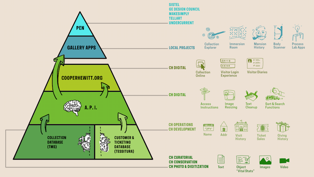
Tessitura comes with two APIs. One is a somewhat older ( as in the first thing they built ) SOAP API, and the other is a newer ( as in still under development ) REST API. Both allow data to get in and out of Tessitura in a variety of forms.

In addition to the standard SOAP and REST APIs, Tessitura has the facility to expose just about anything you can build into an MS SQL Stored Procedure through its API. This is an incredibly powerful feature, which can also be quite dangerous if you think about it.

When I attended the Tessitura Learning Conference & Convention this past summer, it became clear to me that many institutions that use Tessitura are building some kind of API wrapper, or some type of middleware that helps them make sense of it all. We chose to do the same. To accomplish this, I chose to model the API wrapper off our own Collections API, which is a REST-ish API based on Flamework, and uses oAuth2 for authentication. Having this API wrapper allows us to all speak the same language and use the same interface. It is also very, very similar to the Collections API, so among our own staff, it is pretty easy to navigate. The API wrapper, wraps methods from both the Tessitura SOAP and the REST APIs and presents a unified interface to both of them. It doesn’t implement every single API method, and it exposes “new” methods that we have custom built via those Stored Procedures I mentioned.

The Tickets website is a separate project that talks directly to the API. It is also a Flamework project, written primarily in PHP. It uses a MySQL database to store a small amount of local data, but for the most part it is making calls to the API wrapper, which in turn is making calls to either the SOAP or REST Tessitura APIs. Tessitura is the source of truth for most of the things the Ticketing website does.

The Front End

Screenshot 2014-12-16 16.25.44

The Tickets site from the user’s perspective is designed to be extremely simple. I worked with Sam ( our in house front end guru ) to build a responsive, and simple web application that does basically one thing, but the devil is always in the details.

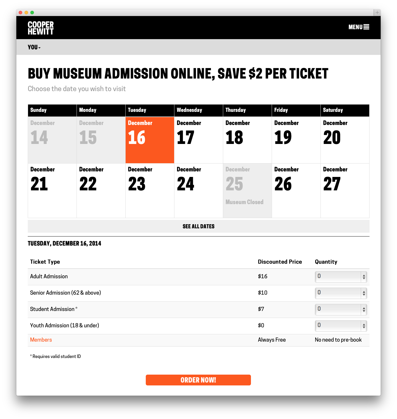
At first glance, all the site does is allow you to select the day you want to come visit us, pick out what kinds of tickets you want, and then fill out your billing info and receive your tickets. It’s basically a calendar and a form and not much more. But like I said, the devil is in the details.

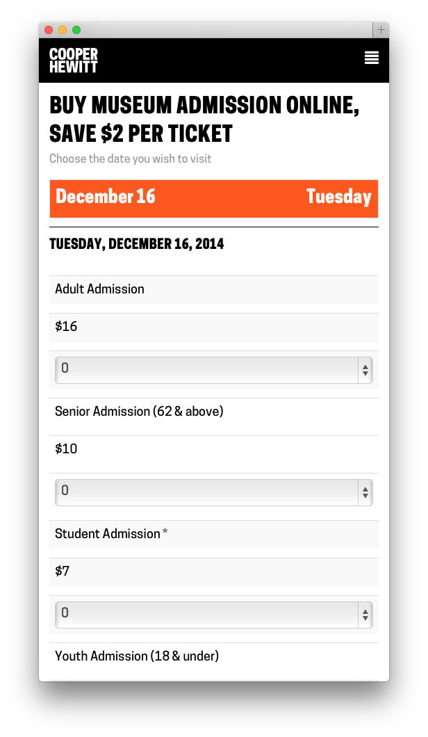
First, Sam built a beautiful calendar like one I’d never seen before. We talked at length about how dumb most website calendars were, and we tried to push things in a new direction. Our calendar starts out by showing you what you most likely are looking for–Today. It displays the next bunch of days up to two weeks worth by default, and if you are looking for a special date, it lets you drop down and navigate around until you find it. On mobile its slightly different in that it doesn’t show you any past dates ( why would you want to book the past? ) and it limits things a little so you’re not as overwhelmed by the interface. We call this “designing for context” and we thought that users might be using their mobile phones to buy a ticket online and jump up to the front of the queue.

Once you’ve selected the date you want, the app loads up the available tickets right below the calendar. You can easily change your mind and pick a different date. From here you just select the type and quantity of each ticket you want. Sam’s code does a bunch of front-end validations to make sure everything you are trying to do makes sense ( you can only purchase a youth ticket with another paid ticket for example ). Between the two of us, we try to do as much validation to what you are selecting as possible, both in Javascript on the front-end and in PHP on the back.

Once you hit Order Now, an order form is generated and displayed. I think its important to note here that nothing has really happened yet in Tessitura-land. We asked Tessitura for some details about the tickets you are interested in, but we haven’t “added them to your cart” or anything like that as of yet.

Screenshot 2014-12-16 16.28.34

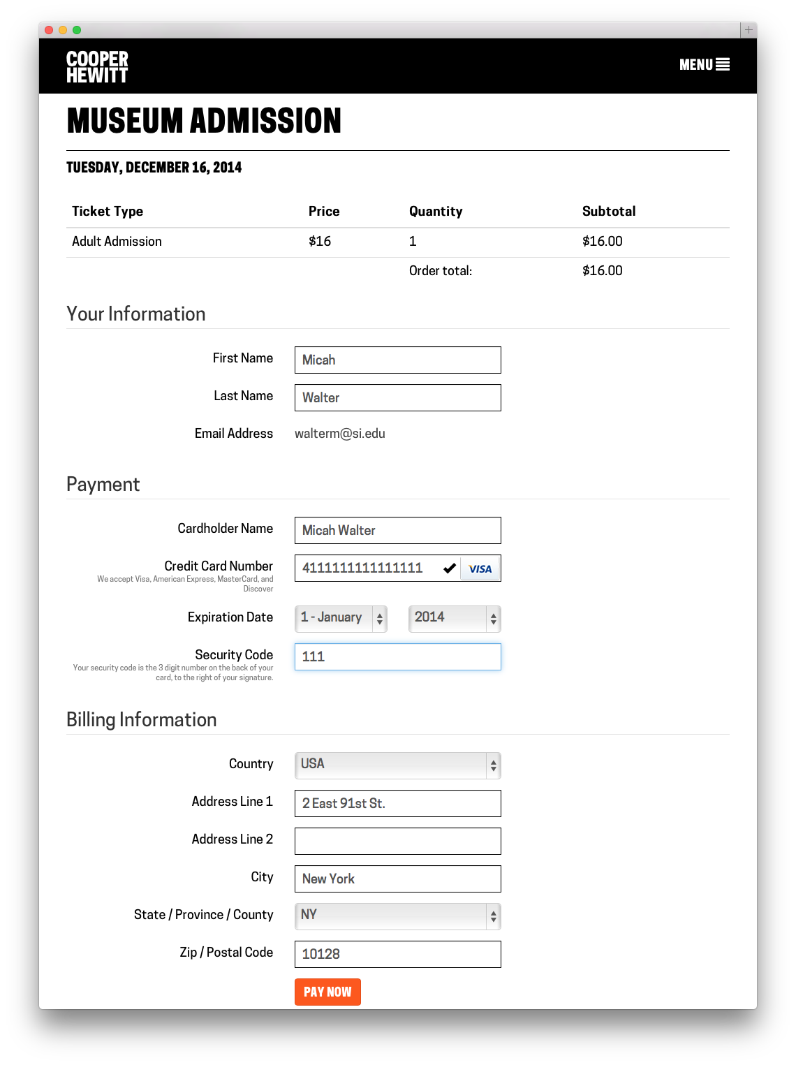
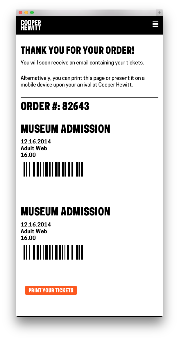
You can then fill out your vitals. We ask you to give us your name, email, credit card details and billing address. We store all of this, with the exception of your credit card, in Tessitura. We make you an account, and at this point we send you an activation email which allows you to set up your password at your leisure. If all goes well with your credit card, we build your tickets ( I chose to do all this with FPDF rather than try and use Tessitura’s built in Print at Home server thing ) send them in an email, and then take you to a Thank You Page. You never had to register, or log in, and you technically never do. Your PDF tickets arrive in your inbox and that is technically all you need.

Screenshot 2014-12-16 16.27.35

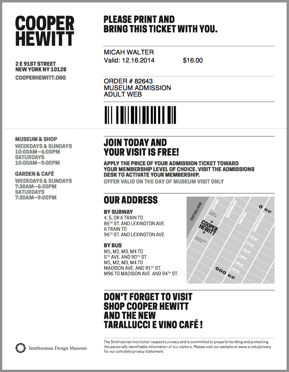
As a little bonus, we just stick the barcode and some basic metadata about each ticket you bought on the Thank You Page so you can just present your phone at the door. This part is still a little rough and I chose to leave it that way for the time being so we can do some user research in the galleries. It’s a nice feature, but only time will tell if people actually use it or if it needs some finesse.

Screenshot 2014-12-16 16.26.50

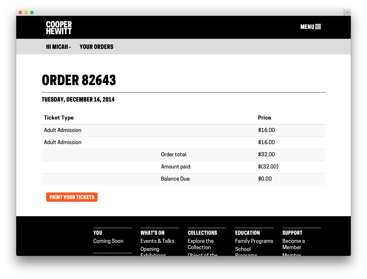
Now that you are in the system, you can buy more tickets using the same email address and they will be connected to your same account, even if you still have never logged in. If you do choose to activate your account and login, you can look at your order history, and reprint your tickets if you’ve lost your email copy.

Screenshot 2014-12-16 16.27.10

Tessitura & The Pen

A while back in this blog post, I mentioned that we also wanted to use Tessitura as our identity provider and as a way to pair the ticket you’ve purchased with the pen we’ve handed you. This work is nearly done, but not yet in production. It will go live when our pen is available sometime in early 2015. But, the short story is, when you buy a ticket, either online or in person, we generate a special coded version of your ticket. This code gets paired up with the internal ID of the pen we gave you and that pairing gets stored in a database. What this all amounts to is that when you get home, and you want to see all the cool things you’ve done with your pen, you simply enter the code ( or go to a custom short URL ) on our website. We look up your pairing and are able to connect your Identity ( Tessitura ) with your Visit ( on the Collections site ). But that is all the topic of a future series of blog posts.

Next

Now that the Tickets site is up and running, and we are watching the sales roll in, it’s easy to start thinking of more features and new ways to expand what the site can do. I’ve already started building simple admin tools and have been thinking about building a basic check-in app for off-site events. It’s too early to talk about all of the things we aim to do and how we plan to expand our online sales, but I’m hopeful that we will stay focused and narrow in our approach, offering our users the most elegant visitor experience possible. Or at the very least, the simplest, dumbest thing.

API methods (new and old) to reflect reality

design-eagle-cloud

A quick end-of-week blog post to mention that now that the museum has re-opened we have updated the cooperhewitt.galleries.openingHours and cooperhewitt.galleries.isOpen API methods to reflect… well, reality.

In addition to the cooperhewitt.galleries API methods we’ve also published corresponding openingHours and isOpen methods for the cafe!

For example, cooperhewitt.galleries.isOpen.

curl 'https://api.collection.cooperhewitt.org/rest/?method=cooperhewitt.galleries.isOpen&access_token=***'

{
	"open": 0,
	"holiday": 0,
	"hours": {
		"open": "10:00",
		"close": "18:00"
	},
	"time": "18:01",
	"timezone": "America/New_York",
	"stat": "ok"
}

Or, cooperhewitt.cafe.openingHours.

curl -X GET 'https://api.collection.cooperhewitt.org/rest/?method=cooperhewitt.cafe.openingHours&access_token=***'

{
	"hours": {
		"Sunday": {
			"open": "07:30",
			"close": "18:00"
		},
		"Monday": {
			"open": "07:30",
			"close": "18:00"
		},
		"Tuesday": {
			"open": "07:30",
			"close": "18:00"
		},
		"Wednesday": {
			"open": "07:30",
			"close": "18:00"
		},
		"Thursday": {
			"open": "07:30",
			"close": "18:00"
		},
		"Friday": {
			"open": "07:30",
			"close": "18:00"
		},
		"Saturday": {
			"open": "07:30",
			"close": "21:00"
		}
	},
	"timezone": "America/New_York",
	"stat": "ok"
}

Because coffee, right?

Sharing our videos, forever

This is one in a series of Labs blogposts exploring the inhouse built technologies and tools that enable everything you see in our galleries.

Our galleries and Pen experience are driven by the idea that everything a visitor can see or do in the museum itself should be accessible later on.

Part of getting the collections site and API (which drives all the interfaces in the galleries designed by Local Projects) ready for reopening has involved the gathering and, in some cases, generation of data to display with our exhibits and on our new interactive tables. In the coming weeks, I’ll be playing blogger catch-up and will write about these new features. Today, I’ll start with videos.

jazz hands

Besides the dozens videos produced in-house by Katie – such as the amazing Design Dictionary series – we have other videos relating to people, objects and exhibitions in the museum. Currently, these are all streamed on our YouTube channel. While this made hosting much easier, it meant that videos were not easily related to the rest of our collection and therefore much harder to find. In the past, there were also many videos that we simply didn’t have the rights to show after their related exhibition had ended, and all the research and work that went into producing the video was lost to anyone who missed it in the gallery. A large part of this effort was ensuring that we have the rights to keep these videos public, and so we are immensely grateful to Matthew Kennedy, who handles all our image rights, for doing that hard work.

A few months ago, we began the process of adding videos and their metadata in to our collections website and API. As a result, when you take a look at our page for Tokujin Yoshioka’s Honey-Pop chair , below the object metadata, you can see its related video in which our curators and conservators discuss its unique qualities. Similarly, when you visit our page for our former director, the late Bill Moggridge, you can see two videos featuring him, which in turn link to their own exhibitions and objects. Or, if you’d prefer, you can just see all of our videos here.

In addition to its inclusion in the website, video data is also now available over our API. When calling an API method for an object, person or exhibition from our collection, paths to the various video sizes, formats and subtitle files are returned. Here’s an example response for one of Bill’s two videos:

{
  "id": "68764297",
  "youtube_url": "www.youtube.com/watch?v=DAHHSS_WgfI",
  "title": "Bill Moggridge on Interaction Design",
  "description": "Bill Moggridge, industrial designer and co-founder of IDEO, talks about the advent of interaction design.",
  "formats": {
    "mp4": {
      "1080": "https://s3.amazonaws.com/videos.collection.cooperhewitt.org/DIGVID0059_1080.mp4",
      "1080_subtitled": "https://s3.amazonaws.com/videos.collection.cooperhewitt.org/DIGVID0059_1080_s.mp4",
      "720": "https://s3.amazonaws.com/videos.collection.cooperhewitt.org/DIGVID0059_720.mp4",
      "720_subtitled": "https://s3.amazonaws.com/videos.collection.cooperhewitt.org/DIGVID0059_720_s.mp4"
    }
  },
  "srt": "https://s3.amazonaws.com/videos.collection.cooperhewitt.org/DIGVID0059.srt"
}

The first step in accomplishing this was to process the videos into all the formats we would need. To facilitate this task, I built VidSmanger, which processes source videos of multiple sizes and formats into consistent, predictable derivative versions. At its core, VidSmanger is a wrapper around ffmpeg, an open-source multimedia encoding program. As its input, VidSmanger takes a folder of source videos and, optionally, a folder of SRT subtitle files. It outputs various sizes (currently 1280×720 and 1920×1080), various formats (currently only mp4, though any ffmpeg-supported codec will work), and will bake-in subtitles for in-gallery display. It gives all of these derivative versions predictable names that we will use when constructing the API response.

a flowchart showing two icons passing through an arrow that says "vidsmang" and resulting in four icons

Because VidSmanger is a shell script composed mostly of simple command line commands, it is easily augmented. We hope to add animated gif generation for our thumbnail images and automatic S3 uploading into the process soon. Here’s a proof-of-concept gif generated over the command line using these instructions. We could easily add the appropriate commands into VidSmanger so these get made for every video.

anim

For now, VidSmanger is open-source and available on our GitHub page! To use it, first clone the repo and the run:

./bin/init.sh

This will initialize the folder structure and install any dependencies (homebrew and ffmpeg). Then add all your videos to the source-to-encode folder and run:

./bin/encode.sh

Now you’re smanging!

HTTP ponies

Most of the image processing for the collections website is done using the Python programming language. This includes things like: extracting colours or calculating an image’s entropy (its “busy-ness”) or generating those small halftone versions of image that you might see while you wait for a larger image to load.

Soon we hope to start doing some more sophisticated computer vision related work which will almost certainly mean using the OpenCV tool chain. This likely means that we’ll continue to use Python because it has easy to use and easy to install bindings to hide most of the fiddly bits required to look at images with “robot eyes”.

shirt

The collections website itself is not written in Python and that’s okay. There are lots of ways for different languages to hold hands inside of a single “application” and we’ve used many of them. But we also think that most of these little pieces of functionality are useful in and of themselves and shouldn’t require that a person (including us) have to burden themselves with the minutiae of the collections website infrastructure to use them.

We’ve slowly been taking the various bits of code we’ve written over the years and putting them in to discrete libraries that can then be wrapped up in little standalone HTTP “pony” or “plumbing” servers. This idea of exposing bespoke pieces of functionality via a web server is hardly new. Dave Winer has been talking about “fractional horsepower HTTP servers” since 1997. What’s changed between then and now is that it’s more fun to say “HTTP pony” and it’s much easier to bake a little web server in to an application because HTTP has become the lingua franca of the internet and that means almost every programming language in use today knows how to “speak” it.

In practice we end up with a “stack” of individual pieces that looks something like this:

  1. Other people’s code that usually does all the heavy-lifting. An example of this might be Giv Parvaneh’s RoyGBiv library for extracting colours from images or Mike Migurski’s Atkinson library for dithering images.
  2. A variety of cooperhewitt.* libraries to hide the details of other people’s code.
  3. The cooperhewitt.flask.http_pony library which exports a setup of helper utilities for the running Flask-based HTTP servers. Things like: doing a minimum amount of sanity checking for uploads and filenames or handling (common) server configuration details.
  4. A variety of plumbing-SOMETHING-server HTTP servers which export functionality via HTTP GET and POST requests. For example: plumbing-atkinson-server, plumbing-palette-server and so on.
  5. Flask, a self-described “micro-framework” which is what handles all the details of the HTTP call and response life cycle.
  6. Optionally, a WSGI-compiliant server-container-thing-y for managing requests to a number Flask instances. Personally we like gunicorn but there are many to choose from.

Here is a not-really-but-treat-it-like-pseudo-code-anyway example without any error handling for the sake of brevity of a so-called “plumbing” server:

# Let's pretend this file is called 'example-server.py'.

import flask
from flask_cors import cross_origin
import cooperhewitt.example.code as code
import cooperhewitt.flask.http_pony as http_pony

app = http_pony.setup_flask_app('EXAMPLE_SERVER')

@app.route('/', methods=['GET', 'POST'])
@cross_origin(methods=['GET', 'POST'])
def do_something():

    if flask.request.method=='POST':
       path = http_pony.get_upload_path(app)
    else:
       path = http_pony.get_local_path(app)

    rsp = code.do_something(path)
    return flask.jsonify(rsp)

if __name__ == '__main__':
    http_pony.run_from_cli(app)

So then if we just wanted to let Flask take care of handling HTTP requests we would start the server like this:

$> python example-server.py -c example-server.cfg

And then we might talk to it like this:

$> curl -X POST -F 'file=@/path/to/file' https://localhost:5000

Or from the programming language of our choosing:

function example_do_something($path){
        $url = "https://localhost:5000";
        $file = curl_file_create($path);
        $body = array('file' => $file);
        $rsp = http_post($url, $body);
        return $rsp;
}

Notice the way that all the requests are being sent to localhost? We don’t expose any of these servers to the public internet or even between different machines on the same network. But we like having the flexibility to do that if necessary.

Finally if we just need to do something natively or want to write a simple command-line tool we can ignore all the HTTP stuff and do this:

$> python
>>> import cooperhewitt.example.code as code
>>> code.do_something("/path/to/file")

Which is a nice separation of concerns. It doesn’t mean that programs write themselves but they probably shouldn’t anyway.

If you think about things in terms of bricks and mortar you start to notice that there is a bad habit in (software) engineering culture of trying to standardize the latter or to treat it as if, with enough care and forethought, it might achieve sentience.

That’s a thing we try to guard against. Bricks, in all their uniformity, are awesome but the point of a brick is to enable a multiplicity of outcomes so we prefer to leave those details, and the work they entail, to people rather than software libraries.

face-tower

Most of this code has been open-sourced and hiding in plain sight for a while now but since we’re writing a blog post about it all, here is a list of related tools and libraries. These all fall into categories 2, 3 or 4 in the list above.

  • cooperhewitt.flask — Utility functions for writing Flask-based HTTP applications. The most important thing to remember about things in this class is that they are utility functions. They simply wrap some of the boilerplate tasks required to set up a Flask application but you will still need to take care of all the details.

Everything has a standard Python setup.py for installing all the required bits (and more importantly dependencies) in all the right places. Hopefully this will make it easier for us break out little bits of awesomeness as free agents and share them with the world. The proof, as always, will be in the doing.

face-mirror

We’ve also released go-ucd which is a set of libraries and tools written in Go for working with Unicode data. Or more specifically, for the time being since they are not general purpose Unicode tools, looking up the corresponding ASCII name for a Unicode character.

For example:

$> ucd 䍕
NET; WEB; NETWORK, NET FOR CATCHING RABBIT

Or:

$> ucd THIS → WAY
LATIN CAPITAL LETTER T
LATIN CAPITAL LETTER H
LATIN CAPITAL LETTER I
LATIN CAPITAL LETTER S
SPACE
RIGHTWARDS ARROW
SPACE
LATIN CAPITAL LETTER W
LATIN CAPITAL LETTER A
LATIN CAPITAL LETTER Y

There is, of course, a handy “pony” server (called ucd-server) for asking these questions over HTTP:

$> curl -X GET -s 'https://localhost:8080/?text=♕%20HAT' | python -mjson.tool
{
    "Chars": [
        {
            "Char": "u2655",
            "Hex": "2655",
            "Name": "WHITE CHESS QUEEN"
        },
        {
            "Char": " ",
            "Hex": "0020",
            "Name": "SPACE"
        },
        {
            "Char": "H",
            "Hex": "0048",
            "Name": "LATIN CAPITAL LETTER H"
        },
        {
            "Char": "A",
            "Hex": "0041",
            "Name": "LATIN CAPITAL LETTER A"
        },
        {
            "Char": "T",
            "Hex": "0054",
            "Name": "LATIN CAPITAL LETTER T"
        }
    ]
}

This one, potentially, has a very real and practical use-case but it’s not something we’re quite ready to talk about yet. In the meantime, it’s a fun and hopefully useful tool so we thought we’d share it with you.

Note: There are equivalent libraries and an HTTP pony for ucd written in Python but they are incomplete compared to the Go version and may eventually be deprecated altogether.

Comments, suggestions and gentle clue-bats are welcome and encouraged. Enjoy!

face-stand

The API at the center of the museum

Extract from "Outline map of New York Harbor & vicinity : showing main tidal flow, sewer outlets, shellfish beds & analysis points.",  New York Bay Pollution Commission, 1905. From New York Public Library.

Extract from “Outline map of New York Harbor & vicinity : showing main tidal flow, sewer outlets, shellfish beds & analysis points.”, New York Bay Pollution Commission, 1905. From New York Public Library.

Beneath our cities lies vast, labyrinthine sewer systems. These have been key infrastructures allowing our cities to grow larger, grow more densely, and stay healthy. Yet, save for passing interests in Urban Exploration (UrbEx), we barely think of them as ‘beautifully designed systems’. In their time, the original sewer systems were critical long term projects that greatly bettered cities and the societies they supported.

In some ways what the Labs has been working on over the past few years has been a similar infrastructure and engineering project which will hopefully be transformative and enabling for our institution as a whole. As SFMOMA’s recent post, which included an interview with Labs’ Head of Engineering, Aaron Cope, makes clear, our API and the collection site that it is built upon, is a carrier for a new type of institutional philosophy.

Underneath all our new shiny digital experiences – the Pen, the Immersion Room, and other digital experiences – as well as the refreshed ‘services layer’ of ticketing, Pen checkouts, and object label management, lies our API. There’s no readymade headline or Webby award awaiting a beautifully designed API – and probably there shouldn’t be. These things should just work and provide the benefit to their hosts that they promised.

So why would a museum burden itself with making an API to underpin all its interactive experiences – not just online but in-gallery too?

Its about sustainability. Sustainability of content, sustainability of the experiences themselves, and also, importantly, a sustainability of ‘process’. A new process whereby ideas can be tested and prototyped as ‘actual things’ written in code. In short, as Larry Wall said its about making “easy things easy and hard things possible”.

The overhead it creates in the short term is more than made up for in future savings. Where it might be prudent to take short cuts and create a separate database here, a black box content library there, the fallout would be unchanging future experiences unable to be expanded upon, or, critically, rebuilt and redesigned by internal staff.

Back at my former museum, then Powerhouse web manager Luke Dearnley, wrote an important paper on the reasons to make your API central to your museum back in 2011. There the API was used internally to do everything relating to the collection online but it only had minor impact on the exhibition floor. Now at Cooper Hewitt the API and exhibition galleries are tightly intertwined. As a result there’s a definite ‘API tax’ that is being imposed on our exhibition media partners – Local Projects and Tellart especially – but we believe it is worth it.

So here’s a very high level view of ‘the stack’ drawn by Labs’ Media Technologist, Katie.

Click to enlarge

Click to enlarge

At the bottom of the pyramid are the two ‘sources of truth’. Firstly, the collection management system into which is fed curatorial knowledge, provenance research, object labels and interpretation, public locations of objects in the galleries, and all the digitised media associated with objects, donors and people associated with the collection. There’s also now the other fundamental element – visitor data. Stored securely, Tessitura operates as a ticketing system for the museum and in the case of the API operates as an identity-provider where needed to allow for personalisation.

The next layer up is the API which operates as a transport between the web and both the collection and Tessitura. It also enables a set of other functions – data cleanup and programmatic enhancement.

Most regular readers have already seen the API – apart from TMS, the Collection Management System, it is the oldest piece of the pyramid. It went live shortly after the first iteration of the new collections website in 2012. But since then it has been growing with new methods added regularly. It now contains not only methods for collection access but also user authentication and account structures, and anonymised event logs. The latter of these opens up all manner of data visualization opportunities for artists and researchers down the track.

In the web layer there is the public website but also for internal museum users there are small web applications. These are built upon the API to assist with object label generation, metadata enhancement, and reporting, and there’s even an aptly-named ‘holodeck’ for simulating all manner of Pen behaviours in the galleries.

Above this are the two public-facing gallery layers. The application and interfaces designed and built on top of the API by Local Projects, the Pen’s ecosystem of hardware registration devices designed by Tellart, and then the Pen itself which operates as a simple user interface in its own right.

What is exciting is that all the API functionality that has been exposed to Local Projects and Tellart to build our visitor experience can also progressively be opened up to others to build upon.

Late last year students in the Interaction Design class at NYU’s ITP program spent their semester building a range of weird and wonderful applications, games and websites on top of the basic API. That same class (and the interested public in general) will have access to far more powerful functionality and features once Cooper Hewitt opens in December.

The API is here for you to use.

A colophon for bias

The term [colophon] derives from tablet inscriptions appended by a scribe to the end of a … text such as a chapter, book, manuscript, or record. In the ancient Near East, scribes typically recorded information on clay tablets. The colophon usually contained facts relative to the text such as associated person(s) (e.g., the scribe, owner, or commissioner of the tablet), literary contents (e.g., a title, “catch” phrase, number of lines), and occasion or purpose of writing.

Wikipedia

A couple of months ago we added the ability to search the collections website by color using more than one palette. A brief refresher: Our search by color functionality works by first extracting the dominant palette for an index. That means the top 5 colors out of a possible 32 million choices. 32 million is too large a surface area to search against so each of the five results are then “snapped” to their closest match on a much smaller grid of possible colors. These matches are then indexed and used to query our database when someone searches for objects matching a specific color.

It turns out that the CSS3 color palette which defines a fixed set of 138 colors is an excellent choice for doing this sort of thing. CSS is the acronym for Cascading Style Sheets (CSS) which is a “language used to describe the presentation” of a webpage separate from its content. Instead of asking people searching the collections website to be hyper-specific in their queries we take the color they are searching for and look for the nearest match in the CSS palette.

For example: #ef0403 becomes #ff0000 or “red”. #f2e463 becomes #f0e68c or “khaki” and so on.

This approach allows us to not only return matches for a specific color but also to show objects that are more like a color than not. It’s a nice way to demonstrate the breadth of the collection and also an invitation to pair objects that might never be seen together.

search-is-over.020-640

From the beginning we’ve always planned to support multiple color palettes. Since the initial search-by-color functionality was built in a hurry with a focus on seeing whether we could get it to work at all adding support for multiple palettes was always going to require some re-jiggering of the original code. Which of course means that finding the time to make those changes had to compete with the crush of everything else and on most days it got left behind.

Earlier this year Rebecca Alison Meyer the 6-year old daughter of Eric Meyer, a long-standing member of the CSS community, died of cancer. Eric’s contributions and work to promote the CSS standard can not be overstated. The web would be an entirely other (an entirely poorer) space without his efforts and so some people suggested that a 139th color be added to the CSS Color module to recognize his work and honor his daughter. In June Dominique Hazaël-Massieux wrote:

I’m not sure about how one goes adding names to CSS colors, and what the specific purpose they fulfill, but I think it would be a good recognition of @meyerweb ‘s impact on CSS, and a way to recognize that standardization is first and foremost a social process, to name #663399 color “Becca Purple”.

In reply Eric Meyer wrote:

I have been made aware of the proposal to add the named color beccapurple (equivalent to #663399) to the CSS specification, and also of the debate that surrounds it.

I understand the arguments both for and against the proposal, but obviously I am too close to both the subject and the situation to be able to judge for myself. Accordingly, I let the editors of the Colors specification know that I will accept whatever the Working Group decides on this issue, pro or con. The WG is debating the matter now.

I did set one condition: that if the proposal is accepted, the official name be rebeccapurple. A couple of weeks before she died, Rebecca informed us that she was about to be a big girl of six years old, and Becca was a baby name. Once she turned six, she wanted everyone (not just me) to call her Rebecca, not Becca.

She made it to six. For almost twelve hours, she was six. So Rebecca it is and must be.

Shortly after that #663399 or rebeccapurple was added to the CSS4 Colors module specification. At which point it only seemed right to finally add support for multiple color palettes to the collections website.

20140818-rebeccapurple-sm

Over the course of a month or so, in the margins of day, all of the search-by-color code was rewritten to work with more than a single palette and now you can search the collection for objects in the shade of rebeccapurple.

In addition to the CSS3 and CSS4 color palettes we also added support for the Crayola color palette. For example, the closest color to “rebeccapurple” in the Crayola scheme of things is “cyber grape”.

You can see all the possible nearest-colors for an object by appending /colors to an object page URL. For example:

https://collection.cooperhewitt.org/objects/18380795/colors

The dominant color for this object is #683e7e which maps to #58427c or “cyber grape” in Crayola-speak and #483d8b or “dark slate blue” in CSS3-speak and #663399 or “rebeccapurple” in CSS4-speak.

Now that we’ve done the work to support multiple palettes the only limits to adding more is time and imagination. I would like to add a greyscale palette. I would like to add one or more color-blind palettes. I would especially like to add a “blue” palette – one that spans non-photo blue through International Klein Blue all the way to Kind of Bloop midnight blue just to see where along that spectrum objects which aren’t even a little bit blue would fall.

Screen Shot 2014-10-26 at 12.42.02 PM

The point being that there are any number of color palettes that we can devise and use as a lens through which to see our collection. Part of the reason we chose to include the Crayola color palette in version “2” of search-by-color is because the colors they’ve chosen have been given expressive names whose meaning is richer than the sum of their descriptive parts. What does it mean for an object’s colors to be described as macaroni and cheese-ish or outer space-ish in nature? Erika Hall’s 2007 talk Copy is Interface is an excellent discussion of this idea.

I spoke about some of these things last month at the The Search is Over workshop, in London. I described the work we have done on the collections website, to date, as a kind of managing of absence. Specifically the absence of metadata and ways to compensate for its lack or incompleteness while still providing a meaningful catalog and resource.

It is through this work that we started to articulate the idea that: The value of the whole in aggregate, for all its flaws, outweighs the value of a perfect subset. The irregular nature of our collection metadata has also forced us to consider that even if there were a single unified interface to convey the complexities of our collection it is not a luxury we will enjoy any time soon.

search-is-over.023-640

Further the efforts of more and more institutions (the Cooper Hewitt included) to embark on mass-digitization projects forces an issue that we, as a sector, have been able to side-step until now: That no one, including lots of people who actually work at museums, have ever seen much of the work in our collections. So in relatively short-order we will transition from a space defined by an absence of data to one defined by a surfeit of, at the very lest, photographic evidence that no one will know how to navigate.

To be clear: This is a good problem to have but it does mean that we will need to starting thinking about models to recognize the shape of the proverbial elephant in the room and building tools to see it.

It is in those tools that another equally important challenge lies. The scale and the volume of the mass-digitization projects being undertaken means that out of necessity any kind of first-pass cataloging of that data will be done by machines. There simply isn’t the time (read: money) to allow things to be cataloged by human hands and so we will inevitably defer to the opinion of computer algorithms.

This is not necessary as dour a prediction as it might sound. Color search is an example of this scenario and so far it’s worked out pretty well for us. What search-by-color and other algorithmic cataloging points to is the need to develop an iconography, or a colophon, to indicate machine bias. To design and create language and conventions that convey the properties of the “extruder” that a dataset has been shaped by.

search-is-over.033-640

Those conventions don’t really exist yet. Bracketing search by color with an identifiable palette (a bias) is one stab at the problem but there are so many more places where we will need to signal the meaning (the subtext?) of an automated decision. We’ve tried to address one facet of this problem with the different graphic elements we use to indiciate the reasons why an object may not have an image.

missing-nnot-available-n

no-photography-n

Left to right: We’re supposed to have a picture for this object… but we can’t find it; This object has not been photographed; This object has been photographed but for some reason we’re not allowed to show it to you… you know, even though it’s been acquired by the Smithsonian.

Another obvious and (maybe?) easy place to try out this idea is search itself. Search engines are not, in fact, magic. Most search engines work the same way: A given string is “tokenized” and then each resultant piece is “filtered”. For the example the phrase “checkered Girard samples” might typically be tokenized by splitting things on whitespace but you could just as easily tokenize it by any pattern that can be expressed to a computer. So depending on your tokenized you might end up with a list like:

  • checkered
  • Girard
  • samples

Or:

  • checkered Girard
  • samples

Each one of those “tokens” are then analyzed and filtered according to their properties. Maybe they get grouped by their phonetics, which is essentially how the snap-to-grid trick works for the collection’s color search. Maybe they are grouped by what type of word they are: proper nouns, verbs, prepositions and so on. I’ve never actually seen a search engine that does this but there is nothing technically to prevent someone from doing it either.

The simplest and dumbest thing would be to indicate on a search results page that your query results were generated using one or more tokenizers or filters. In our case that would be (1) tokenizer and (5) filters.

Tokenizers:

    1. Unicode Standard Annex #29

Filters:

      1. Remove English possessives
      2. Lowercase all tokens
      3. Ingore a set list of stopwords
      4. Stem tokens according to the Porter Stemming Algorithm
      5. Convert non-ascii characters to ascii

That’s not very sexy or ooh-shiny but not everything needs to be. What it does, though, is provide a measure of transparency for people to gauge the reality that any result set is the product of choices which may have little or no relationship to the question being asked or the person asking that question.

These are devices, for sure, and they are not meant to replace a more considered understanding or contemplation of a topic but they can act as an important shorthand to indicate the arc of an answer’s motive.

search-is-over.038-640

And that’s just for search engines. Now imagine what happens when we all start pointing computer vision algorithms at our collections…


Update: Since publishing this blog post the nice people working on the GOV.UK websites launched “info” pages. Visitors can now append /info to any of the pages on the gov.uk website will and see what and who and how that part of the website is supposed to do. Writing about the project they say:

An ‘info’ page contains the user needs the page is intended to meet … Providing an easy way to jump from content to the underpinning needs allows content designers coming to a new topic to understand the need and build empathy with the users quicker. Publishing the GOV.UK user needs should also make the team’s work more transparent and traceable.

Bravo!