Category Archives: Publishing

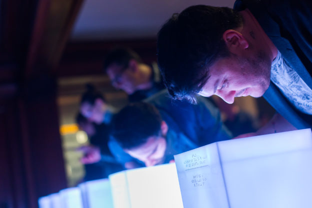
Three low white pillars glow with light while one person leans over each, pressing a button on the right side of each pillar releasing a unique scent.

Accessible Exhibition Guide: Delivering Content to All

When the user is included in the design process from the start, choices multiply for everyone’s benefit.

In Cooper Hewitt’s newest exhibitions, Access+Ability (through September 3, 2018) and The Senses: Design Beyond Vision (through October 28, 2018), designing with the user and visitor at the center are integral. Accessibility and inclusion are a key focus of these current exhibitions and essential strategic goals for the museum, now and for the years ahead. There are many exciting ways we’re stepping up our efforts even more and aiming to provide all audiences the same quality of experience on campus and online. https://www.cooperhewitt.org/accessibility-at-cooper-hewitt

In The Senses, visitors are welcomed into a multisensory playground touching, smelling, hearing, and seeing in dynamic and new ways.
Four adults are lined along and facing a curving wall covered in black synthetic fur. They stand on a wooden floor with backs facing outward as the each touch the wall moving both hands along and around the wall's surface.

Visitors touching a furry wall activate orchestral musical compositions. Designed by Studio Roos Meermanand KunstLAB Arnhem

While preparing for the exhibition we knew that there would be many touchable objects and installations (43 to be exact) in The Senses. What we lacked was the medium to deliver the exhibition content to every visitor. Cooper Hewitt’s Pen offers agency and a new way to explore in a museum for people who are sighted but without audio, how might visitors with low vision and who are blind explore the content?

Making Cooper Hewitt Content Accessible
In 2017, we launched our large print label feature on our collection website. This system makes available each exhibition’s label content (text and image) responsive to the user’s device and customizable in six different font sizes. Our Visitor Experience team also has an efficient way to produce large print label binders, directly from our collection database, for the galleries to share with visitors. We began investigating solutions for making content labels and gallery cues readable for people who are blind. We considered Braille labels, using beacon notifications, and even floor mats in front of each object and installation to message that an interaction is calling. Asking questions such as “which text would be more meaningful to print in Braille on the labels—object tombstone (museum-speak for object stats) or text about the object?” Wrong questions! All of this research and internal discussion wasn’t leading to viable solutions. Our group of five sighted colleagues, good intentioned as we were, weren’t getting at what the user might want. It was during a gallery visit with Sina Bahram—computer scientist, consultant, and researcher and President and Founder of Prime Access Consulting (PAC), which advises museums and other institutions on website and digital accessibility—who was onsite for meeting when he simply said “Identification and verification.” So obvious but somehow we weren’t seeing it! Every visitor wants agency to determine what information to access, about which object, when he or she wants it.

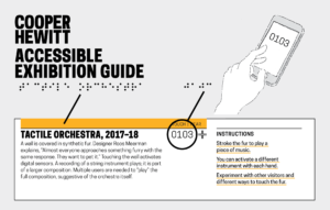
White label displays a bright yellow textures bar that messages touch | hear in Braille. Also printed in Braille are the object ID number that the user will enter into the app.

Accessible Exhibition Content Design

The Scaffolding
Using our API and label rail system—designed for access to the collection in the galleries—we determined the identification would be an assigned object ID number e.g. 0103, and verification is why we have the name of the object in Braille as well. This way, once you type the number of the “identified” object into your phone you can “verify” that you’ve got the right one in front of you. An added benefit since users can choose if they even want to read more about that particular object. An app could call the API and deliver the exhibition content. After discussing with our colleagues we prototyped, tested, and moved forward—with about 15 days to go before exhibition opening—to develop a version 1 native app for iOS with v.2 web-based application for android use.

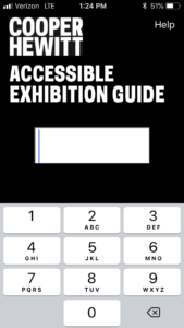
Cooper Hewitt Accessible Exhibition Guide printied in white type on black background about a blank box where the keypad below is used to type in content ID number. HELP appears in top right corner.

Content number entry screen for Coper Hewitt app.

Accessible Systems
Bahram and Joshua Lerner of Monorail built the app. The tactile labels were produced by Steven Landau, whose company Touch Graphics creates accessible audio and tactile graphics. Every label in The Senses features an object title and number, printed in braille and Latin characters. Smartphones are used to access the associated content. Labels are discoverable as they are installed at a consistent height throughout the exhibition on our label rail system. Cooper Hewitt’s first Accessible Exhibition Guide was uploaded and went live on April 18. Download it from the Apple App Store or connect from our website. The guide contains the exhibition’s descriptive and interpretive content in both text and audio formats. A visitor can choose to read the text, hear it with a screen reader, or listen to an audio recording.

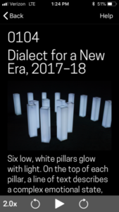
From top down: Black background with drop-out white type: 0104, Dialect for a New Era, 2017–18; Image of six glowing white pillars; label text.

Image of screen that appears when Dialect for a New Era content ID is entered into the app.

The Cooper Hewitt Accessible Exhibition Guide was conceived as we looked for multi-modal channels for content delivery for users with differing abilities. Designing for multiple senses highlights that the methodology of access not dictate level of access, which is the goal for the Accessible Content Guide and for Cooper Hewitt.

Designing for Digital and Print

As this year’s intern in Digital and Emerging Media, I was tasked with creating designs that needed to work as a static .pdf in both print and digital format. This presented a significant challenge: the design created for printable paper dimensions is approached differently than a design for digital display. To accommodate both, the use of space in a limited size must be efficient and readable.
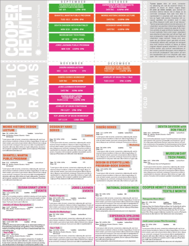
The first project I tackled this issue with was Cooper Hewitt’s Fall 2017 Public Programs calendar. The design brief was to create a brochure that visitors can view on their screens as a landscape orientation .pdf page on the Public Programs website. We designed this .pdf so that visitors could print at home. For easy transport, the brochure needed to fold up small enough to fit in a pocket. The desired layout and size of this brochure presented a fun but difficult design challenge.

The image below is what the .pdf will look like when opened on the website. The dashes represent folding lines, which when printed onto a double-sided letter-size piece of paper act as a guide for folding it into 8 small rectangles for a pocket size calendar or 4 longer vertical rectangles for a brochure size. Should we decide to print on-site, an 11×17 layout was also created.

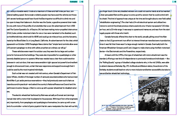
The second project I worked on was less complex to design for print, but was much more complex in creating the digital layout. The book Enwheeled by Penny Wolfson is the latest publication in Cooper Hewitt’s DesignFiles e-book series. The e-books in the series are currently offered through online stores for $2.99 per book. Cooper Hewitt will be shifting this distribution model for the DesignFiles series beginning with Enwheeled publishing in December 2017. Enwheeled will be the first web-based publication available on cooperhewitt.org but that is a whole other post! My task was to create a traditional InDesign layout for the text and then use the instructions developed by last year’s Digital and Emerging Media intern, Emma Weil, for creating a Markdown-friendly HTML code. The text was first entered into threaded text boxes with the related images dispersed accordingly. Once that process was complete, I followed Emma’s instructions for tagging the text and images so that they appear in the correct order when exported to HTML.

Certain images needed to be placed in between threaded text boxes; in this case, the images had to be anchored to their corresponding caption, and the caption anchored to the end of the paragraph that it coincides with.

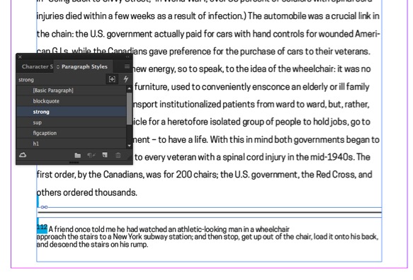
The final step in preparing the InDesign document for export to HTML was to assign paragraph and character styles to the text. Each text format needs to be assigned a specific style setting in order for the text to appear correctly in the HTML. Character styles include all italic, bolded, and superscripted text. Paragraph styles act the same way with entire bodies of text, as well as signifying the headers and sub-headers of the book.

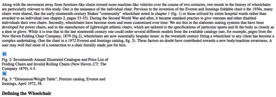
When the document is exported to HTML, the order of the text and images remains intact and correctly formatted in simple text form. The HTML reformats to the size of the window or screen it is being used on, and after being entered into Emma’s Python script is ready to be entered into Markdown.

Post-Launch Update on Exhibition Channels: Metrics Analysis

To date, Cooper Hewitt has published several groupings of exhibition-related content in the channels editorial web format. You can read about the development of channels in my earlier post on the topic. This article will focus on post-launch observations of the two most content-rich channels currently on cooperhewitt.org: Scraps and By the People. The Scraps channel contains a wonderful series of posts about sustainability and textiles by Magali An Berthon, and the By the People channel has a number of in-depth articles written by the Curator of Socially Responsible Design at Cooper Hewitt, Cynthia E. Smith. This article focuses on channels as a platform, but I’d like to note that the metrics cited throughout reflect the appeal of the fabulous photography, illustration, research, and writing of channel contributors.

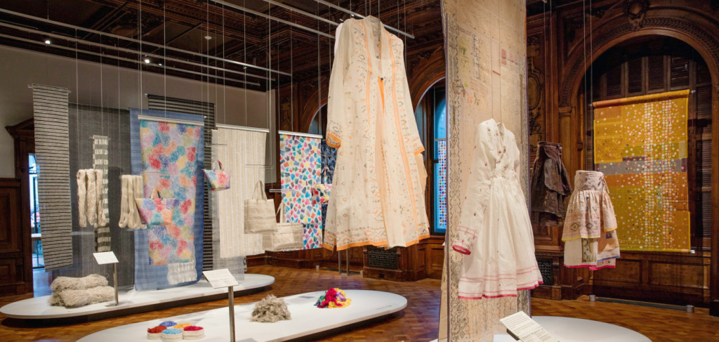
The Scraps exhibition installed in Cooper Hewitt’s galleries.

The Scraps exhibition installed in Cooper Hewitt’s galleries.

Since launch, there’s been a positive reaction among staff to channels. Overall they seem excited to have a considered editorial space in which to communicate with readers and exhibition-goers. There has also been strong user engagement with channels. Through Google Analytics we’ve seen two prominent user stories emerge in relation to channels. The first is a user who is planning or considering a trip to the museum. They enter the most common pathway to channel pages through the Current Exhibitions page. From the channel page, they then enter the ticket purchase path through the sidebar link. [Fig. 1] 4.25% of channel visitors proceeded to tickets.cooperhewitt.org from the Scraps channel; 6.09% did the same from the By the People channel. Web traffic through the Scraps channel contributed 13.31% of all web sales since launch, and By the People contributed 15.7%.

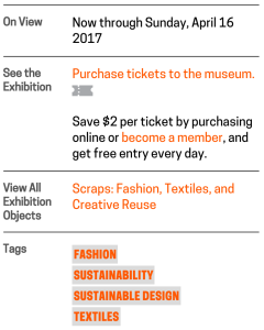
Fig. 1. The Scraps channel sidebar contains two well-trafficked links: one to purchase tickets to the museum, and one to the Scraps exhibition page on the collection website.

Fig. 1. The Scraps channel sidebar contains two well-trafficked links: one to purchase tickets to the museum, and one to the Scraps exhibition page on the collection website.

The second most prominent group of users demonstrates interest in diving into content. 16.32% of Scraps channel visitors used the sidebar link to visit the corresponding exhibition page that houses extended curatorial information about the objects on display; 10.99% used the navigation buttons to view additional channel posts. 19.11% of By the People channel visitors continued to the By the People exhibition page, and 2.7% navigated to additional channel posts.

Navigation patterns indicate that the two main types of users — those who are planning a visit to the museum and those who dive into editorial content — are largely distinct. There is little conversion from post reads to ticket sales, or vice-versa. Future iterations on channels could be directed at improving the cross-over between these user behaviors. Alternately, we could aim to disentangle the two user journeys to create clearer navigational pathways. Further investigation is required to know which is the right course of development.

Through analytics we’ve also observed some interesting behaviors in relation to channels and social media. One social-friendly affordance of the channel structure is that each post contains a digestible chunk of content with a dedicated URL. Social buttons on posts also encourage sharing. Pinterest has been the most active site for sharing content to date. Channel posts cross-promoted through Cooper Hewitt’s Object of the Day email subscription service are by far the most read and most shared. Because posts were shared so widely, 8.65% of traffic to the Scraps channels originated from from posts. (By the People content has had less impact on social media and has driven a negligible amount of site traffic.)

Since posts are apt for distribution, we realized they needed to serve as effective landing pages to drive discovery of channel content. As a solution, Publications department staff developed language to append to the bottom of each post to help readers understand the editorial context of the posts and navigate to the channel page. [Fig. 2] To make use of posts as points of entry, future channel improvements could develop discovery features on posts, such as suggested content. Currently, cross-post navigation is limited to a single increment forward or backward.

Fig. 2. Copy appended to each post contextualizes the content and leads readers to the channel home page or the exhibition page on the collection website.

Fig. 2. Copy appended to each post contextualizes the content and leads readers to the channel home page or the exhibition page on the collection website.

Further post-launch iterations focused on the appearance of posts in the channels page. Publications staff began utilizing an existing feature in WordPress to create customized preview text for posts. [Fig. 3] These crafted appeals are much more to inviting potential readers than the large blocks of excerpted text that show up automatically. [Fig. 4]

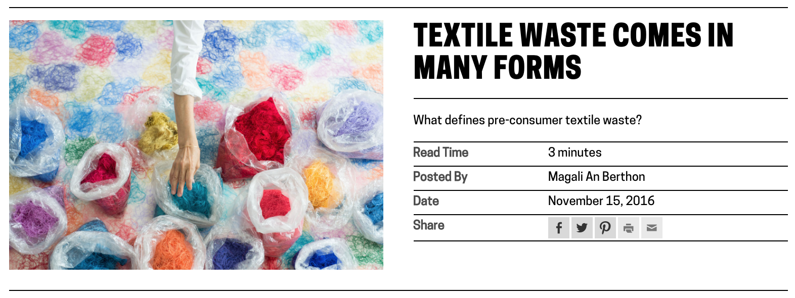
Fig. 3. View of a text-based post on a channel page, displaying customized preview text and read time.

Fig. 3. View of a text-based post on a channel page, displaying customized preview text and read time.

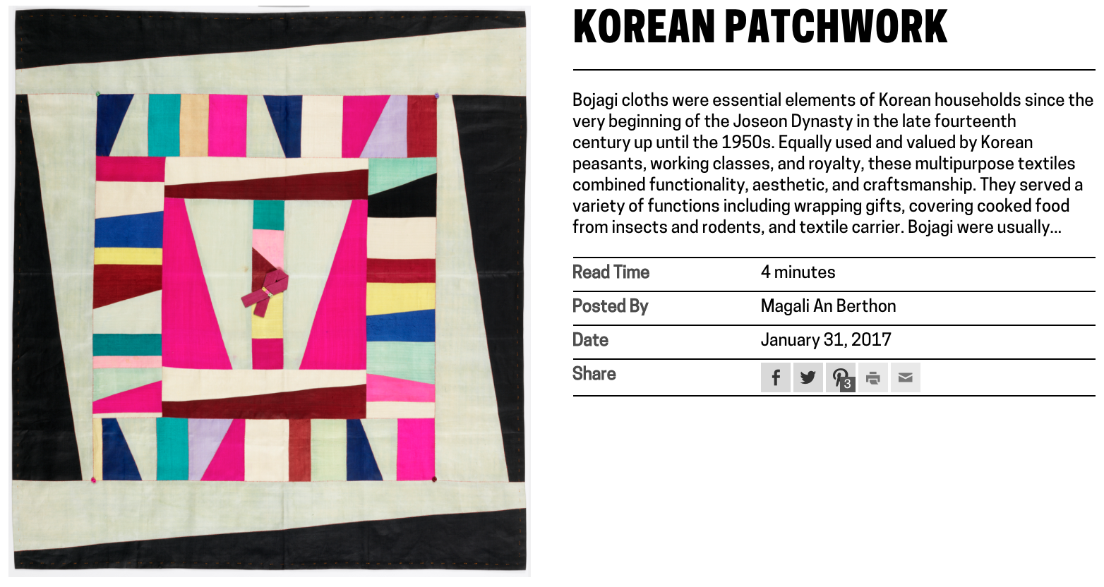
Fig. 4. View of a text-based post on a channel page, displaying automatically excerpted preview text.

Fig. 4. View of a text-based post on a channel page, displaying automatically excerpted preview text.

Digital & Emerging Media (D&EM) department developer, Rachel Nackman, also implemented some improvements to the way that post metadata displays in channels. We opted to calculate and show read time for text-based posts. I advocated for the inclusion of this feature because channel posts range widely in length. I hypothesized that showing read time to users would set appropriate expectations and would mitigate potential frustration that could arise from the inconsistency of post content. We also opted to differentiate video and publication posts in the channel view by displaying “post type” and omitting post author. [Fig. 5 and 6] Again, these tweaks were aimed at fine-tuning the platform UX and optimizing the presentation of content.

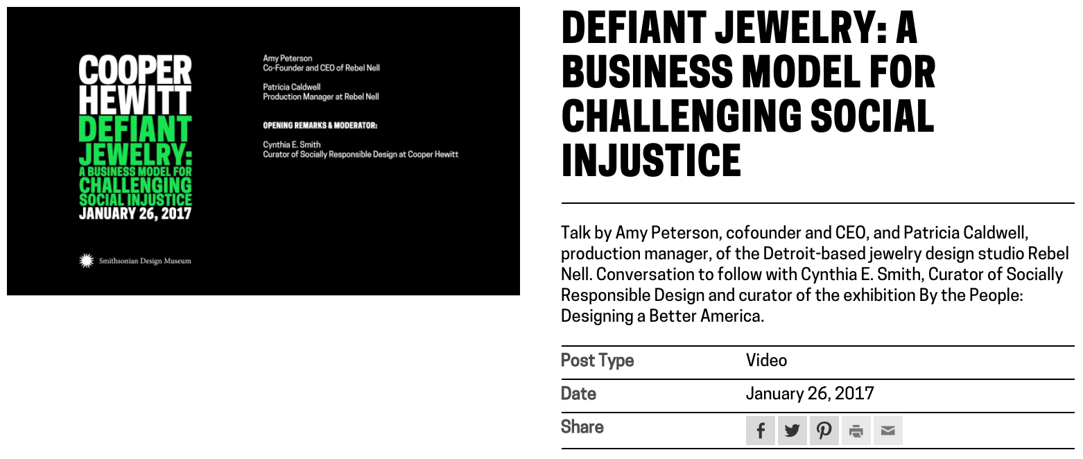
Fig. 5. View of a video post on a channel page, displaying “post type” metadata and omitting post author information.

Fig. 5. View of a video post on a channel page, displaying “post type” metadata and omitting post author information.

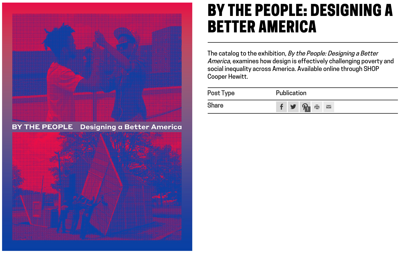
Fig. 6. View of a publication post on a channel page, displaying “post type” metadata and omitting post author information.

Fig. 6. View of a publication post on a channel page, displaying “post type” metadata and omitting post author information.

The channels project is as much an expansion of user-facing features as it is an extension of the staff-facing CMS. It has been useful to test both new methods of content distribution and new editorial workflows. Initially I intended channels to lean heavily on existing content creation workflows, but we have found that it is crucial to tailor content to the format in order to optimize user experience. It’s been an unexpectedly labor intensive initiative for content creators, but we’ve seen a return on effort through the channel format’s contribution to Cooper Hewitt business goals and educational mission.

Based on observed navigation patterns and engagement analytics it remains a question as to whether the two main user journeys through channels — toward ticket purchases and toward deep-dive editorial content — should be intertwined. We’ve seen little conversion between the two paths, so perhaps user needs would be better served by maintaining a separation between informational content (museum hours, travel information, what’s on view, ticket purchasing, etc.) and extended editorial and educational content. The question certainly bares further investigation — as we’ve seen, even the smallest UI changes to a content platform can have a big impact on the way content is received.

Exhibition Channels on Cooperhewitt.org

There’s a new organizational function on cooperhewitt.org that we’re calling “channels.” Channels are a filtering system for WordPress posts that allow us to group content in a blog-style format around themes. Our first iteration of this feature groups posts into exhibition-themed channels. Subsequent iterations can expand the implementation of channels to broader themed groupings that will help break cooperhewitt.org content out of the current menu organization. In our long-term web strategy this is an important progression to making the site more user-focused and less dictated by internal departmental organization.

The idea is that channels will promote browsing across different types of content on the site because any type of WordPress post—publication, event, Object of the Day, press, or video—can be added to a channel. Posts can also live in multiple channels at once. In this way, the channel configuration moves us toward our goal of creating pathways through cooperhewitt.org content that focus on user needs; as we develop a clearer picture of our web visitors, we can start implementing channels that cater to specific sets of users with content tailored to their interests and requirements. Leaning more heavily on posts and channels than pages in WordPress also leads us into shifting our focus from website = a static archive to website = an ever-changing flow of information, which will help keep our web content fresher and more engaged with concurrent museum programs and events.

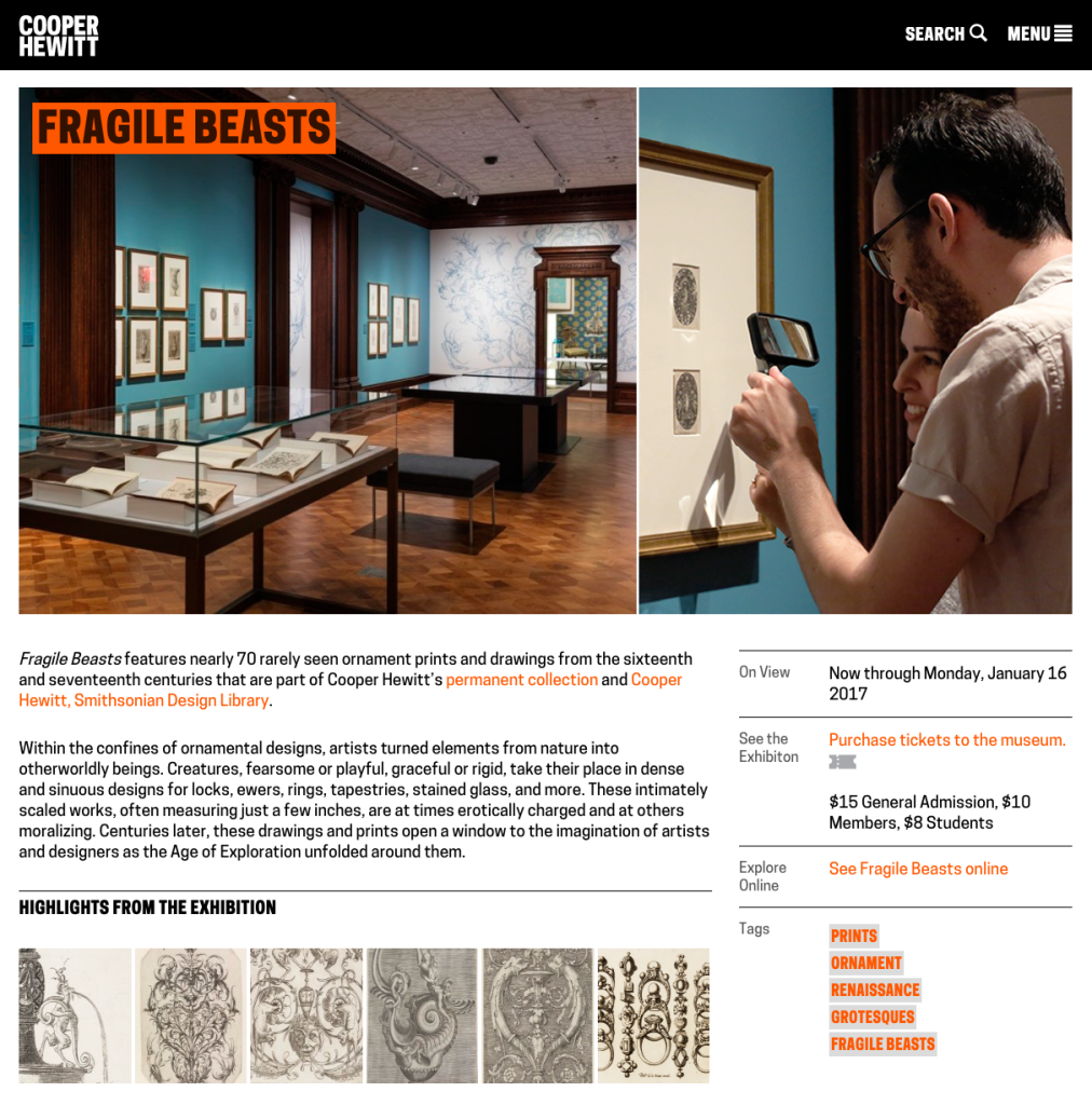
Screenshot of the Fragile Beasts exhibition channel page on cooperhewitt.org

The Fragile Beasts exhibition channel page. Additional posts in the channel load as snippets below the main exhibition post (pictured here). The sidebar is populated with metadata entered into custom fields in the CMS.

In WordPress terms, channels are a type of taxonomy added through the CustomPress plugin. We enabled the channel taxonomy for all post types so that in the CMS our staff can flag posts to belong to whichever channels they wish. For the current exhibition channel system to work we also created a new type of post specifically for exhibitions. When an exhibition post is added to a channel, the channel code recognizes that this should be the featured post, which means its “featured image” (designated in the WordPress CMS) becomes the header image for the whole channel and the post is pinned to the top of the page. The exhibition post content is configured to appear in its entirety on the channel page, while all other posts in the channel display as snippets, cascading in reverse chronological order.

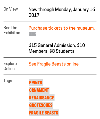
Through CustomPress we also created several custom fields for exhibition posts, which populate the sidebar with pertinent metadata and links. The new custom fields on exhibition posts are: Exhibition Title, Collection Site Exhibition URL, Exhibition Start Date, and Exhibition End Date. The sidebar accommodates important “at-a-glance” information provided by the custom field input: for example, if the date range falls in the present, the sidebar displays a link to online ticketing. Tags show up as well to act as short descriptors of the exhibition and channel content. The collection site URL builds a bridge to our other web presence at collection.cooperhewitt.org, where users can find extended curatorial information about the exhibition.

Screenshot of the sidebar on the <em>Fragile Beasts</em> exhibition channel page.

The sidebar on the Fragile Beasts exhibition channel page displays quick reference information and links.

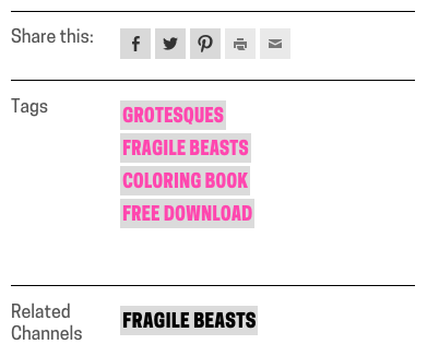
On a channel page, clicking on a snippet (below the leading exhibition post) directs users to a post page where they can read extended content. On the post page we added an element in the sidebar called “Related Channels.” This link provides navigation back to the channel from which users flowed. It can also be a jumping-off point to a new channel. Since posts can live in multiple channels at once this feature promotes the lateral cross-content navigation we’re looking to foster.

Screenshot of sidebar on a post page displaying Related Channel navigation.

The sidebar on post pages provides “Related Channel” navigation, which can be a hub to jump into several editorial streams.

Our plan over the coming weeks is to on-board CMS users to the requirements of the new channel system. As we launch new channels we will help keep information flowing by maintaining a publishing schedule and identifying content that can fit into channel themes. Our upcoming exhibition Scraps: Fashion, Textiles and Creative Reuse will be our first major test of the channels system. The Scraps channel will include a wealth of extra-exhibition content, which we’re looking forward to showcasing with this new system.

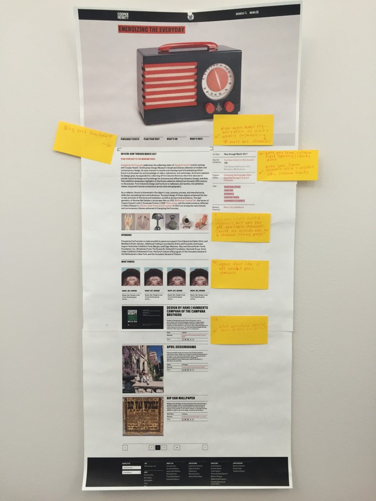
My mock-up for the exhibition channel structure and design. Some of the features on the mock were knocked off the to-do list in service of getting an MVP on the live site.

My mock-up for the exhibition channel structure and design. Some of the features on the mock were knocked off the to-do list in service of getting an MVP on the live site. Additional feature roll-out will be on-going.

Publishing is as publishing does – revealing ‘books’ in the collection

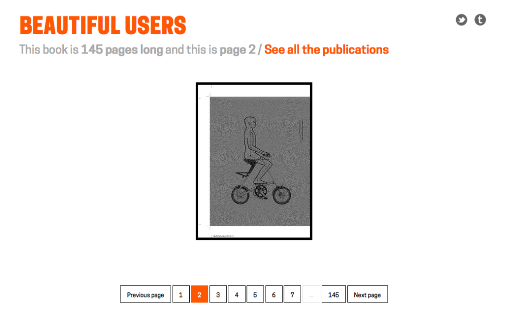
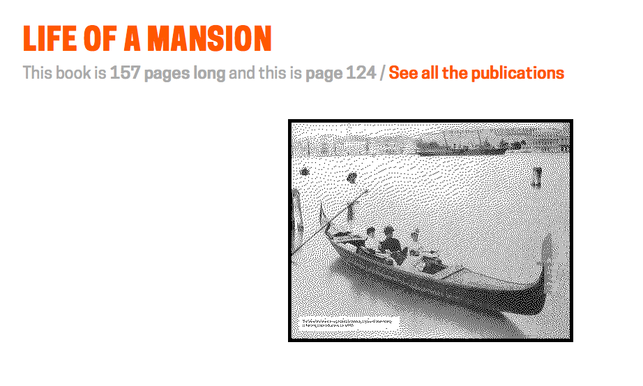
Screen Shot 2015-04-23 at 10.48.30 AM

Note: This book is actually 144 pages long and the count is a by-product of the way we’ve stitched things together. By the time you read this that problem may be fixed. So it goes, right?

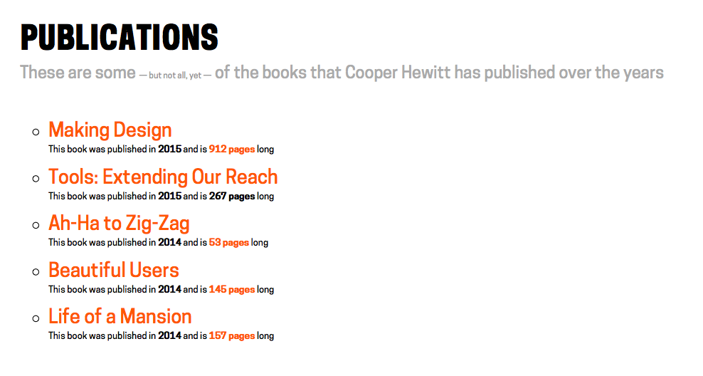
We’ve added a new section to the Collections website: publications. You know, books.

This is the simplest dumbest thing we could think of to create a bridge between analog publications and the web. It’s only a handful of recent publications at the moment and whether or not older publications will be supported remains an open question, for now.

To be clear – there are already historical publications available for viewing on the main Cooper Hewitt website. As I was writing this blog post Micah reminded me that we’ve even uploaded them in to the Internet Archive so you can use their handy book reader to view the books online. All of which means that we’ll likely be importing those publications to the collections website soon enough.

All of this (newer) work is predicated on the fact that we have the luxury, with these specific publications, of operating outside the “work” versus “edition” dilemma that many other kinds of books have to negotiate. All we’ve done is created stable permanent URLs for each book and each page in that book. That’s it.

Screen Shot 2015-04-23 at 11.28.22 AM

The goal is not to reproduce the book online, for all the usual reasons, but to give meaningful atomic units of a book – pages – a presence on the Interwebs and a scaffolding for future stuff (object lists, additional photographs, notes and other ancillary materials and so on) as time and circumstance permit.

Related, Emily Fildes’ and Allison Foster’s Museums and the Web (2015) paper
What the Fonds?! The ups and downs of digitising Tate’s Archive
is a good discussion around the issues, both technical and user-facing, that are raised as various sources of disparate data (artworks, library and archive data, curatorial files) all start to share the same conceptual space on the web.

Screen Shot 2015-04-23 at 10.47.28 AM

We’re not there yet and it may take us a while to get there so in the meantime every page URL has a small half-toned reproduction of the book page in question. That’s meant to give people a visual cue and confidence in the URL itself — specifically they look the same — such that you might bookmark it, share it with a friend, or whatever awesome use you dream up without having to wonder whether the ground will shift out from underneath it.

Kind of like books, right?

Finally, all the links indicating how many pages a particular book has are “magic” – click on them and you’ll be redirected to a random page inside that book.

Enjoy!

Screen Shot 2015-04-23 at 12.29.48 PM
Screen Shot 2015-04-23 at 12.30.14 PM

Sharing our videos, forever

This is one in a series of Labs blogposts exploring the inhouse built technologies and tools that enable everything you see in our galleries.

Our galleries and Pen experience are driven by the idea that everything a visitor can see or do in the museum itself should be accessible later on.

Part of getting the collections site and API (which drives all the interfaces in the galleries designed by Local Projects) ready for reopening has involved the gathering and, in some cases, generation of data to display with our exhibits and on our new interactive tables. In the coming weeks, I’ll be playing blogger catch-up and will write about these new features. Today, I’ll start with videos.

jazz hands

Besides the dozens videos produced in-house by Katie – such as the amazing Design Dictionary series – we have other videos relating to people, objects and exhibitions in the museum. Currently, these are all streamed on our YouTube channel. While this made hosting much easier, it meant that videos were not easily related to the rest of our collection and therefore much harder to find. In the past, there were also many videos that we simply didn’t have the rights to show after their related exhibition had ended, and all the research and work that went into producing the video was lost to anyone who missed it in the gallery. A large part of this effort was ensuring that we have the rights to keep these videos public, and so we are immensely grateful to Matthew Kennedy, who handles all our image rights, for doing that hard work.

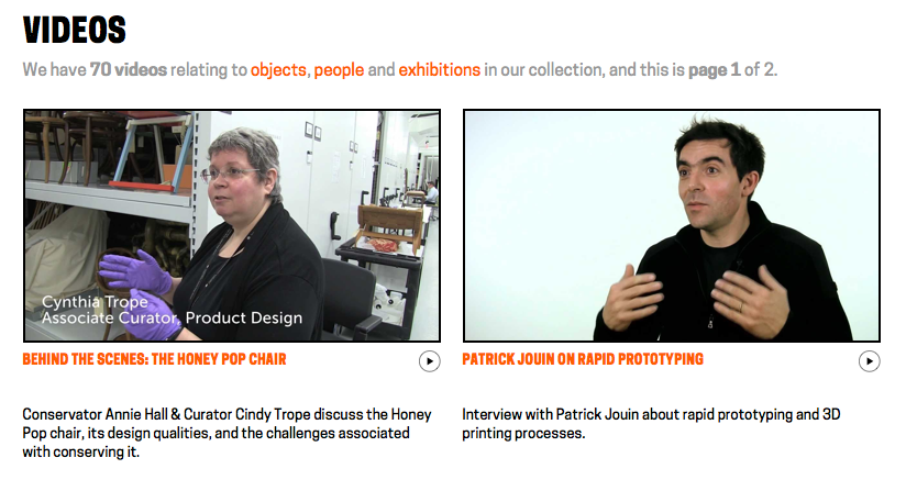
A few months ago, we began the process of adding videos and their metadata in to our collections website and API. As a result, when you take a look at our page for Tokujin Yoshioka’s Honey-Pop chair , below the object metadata, you can see its related video in which our curators and conservators discuss its unique qualities. Similarly, when you visit our page for our former director, the late Bill Moggridge, you can see two videos featuring him, which in turn link to their own exhibitions and objects. Or, if you’d prefer, you can just see all of our videos here.

In addition to its inclusion in the website, video data is also now available over our API. When calling an API method for an object, person or exhibition from our collection, paths to the various video sizes, formats and subtitle files are returned. Here’s an example response for one of Bill’s two videos:

{
  "id": "68764297",
  "youtube_url": "www.youtube.com/watch?v=DAHHSS_WgfI",
  "title": "Bill Moggridge on Interaction Design",
  "description": "Bill Moggridge, industrial designer and co-founder of IDEO, talks about the advent of interaction design.",
  "formats": {
    "mp4": {
      "1080": "https://s3.amazonaws.com/videos.collection.cooperhewitt.org/DIGVID0059_1080.mp4",
      "1080_subtitled": "https://s3.amazonaws.com/videos.collection.cooperhewitt.org/DIGVID0059_1080_s.mp4",
      "720": "https://s3.amazonaws.com/videos.collection.cooperhewitt.org/DIGVID0059_720.mp4",
      "720_subtitled": "https://s3.amazonaws.com/videos.collection.cooperhewitt.org/DIGVID0059_720_s.mp4"
    }
  },
  "srt": "https://s3.amazonaws.com/videos.collection.cooperhewitt.org/DIGVID0059.srt"
}

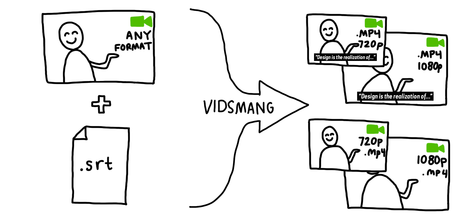
The first step in accomplishing this was to process the videos into all the formats we would need. To facilitate this task, I built VidSmanger, which processes source videos of multiple sizes and formats into consistent, predictable derivative versions. At its core, VidSmanger is a wrapper around ffmpeg, an open-source multimedia encoding program. As its input, VidSmanger takes a folder of source videos and, optionally, a folder of SRT subtitle files. It outputs various sizes (currently 1280×720 and 1920×1080), various formats (currently only mp4, though any ffmpeg-supported codec will work), and will bake-in subtitles for in-gallery display. It gives all of these derivative versions predictable names that we will use when constructing the API response.

a flowchart showing two icons passing through an arrow that says "vidsmang" and resulting in four icons

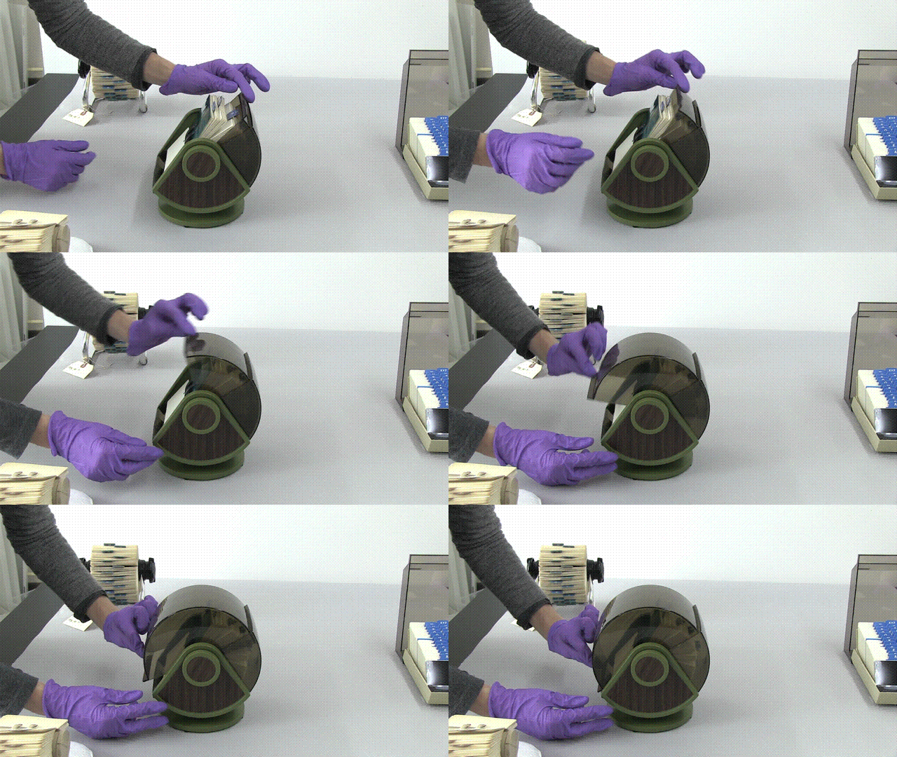
Because VidSmanger is a shell script composed mostly of simple command line commands, it is easily augmented. We hope to add animated gif generation for our thumbnail images and automatic S3 uploading into the process soon. Here’s a proof-of-concept gif generated over the command line using these instructions. We could easily add the appropriate commands into VidSmanger so these get made for every video.

anim

For now, VidSmanger is open-source and available on our GitHub page! To use it, first clone the repo and the run:

./bin/init.sh

This will initialize the folder structure and install any dependencies (homebrew and ffmpeg). Then add all your videos to the source-to-encode folder and run:

./bin/encode.sh

Now you’re smanging!

Making of: Design Dictionary Video Series

We often champion processes of iterative prototyping in our exhibitions and educational workshops about design. Practicing what we preach by actually adopting iterative prototyping workflows in-house is something we’ve been working on internally at Cooper Hewitt for the last few years.

In the 3.5 years that I’ve been here, I’ve observed some inspiring progress on this front. Here’s one story of iterative prototyping and inter-departmental collaboration in-house, this time for our new Design Dictionary web video series.

Design Dictionary is a 14-part video series that aims to demystify everything from tapestry weaving to 3D printing in a quick and highly visual way. With this project, we aimed not only to produce a fun and educationally valuable new video series, but also to shake up our internal workflow.

Content production isn’t the first thing you’d think of when discussing iterative prototyping workflows, but it’s just as useful for media production as it is for hardware, software, graphic design, and other more familiar design processes.

The origin of Design Dictionary traces back to a new monthly meeting series that was kicked off about two years ago. The purpose of the meetings was to get Education, Curatorial, and Digital staff in the same room to talk about the content being developed for our new permanent collection exhibition, Making Design. We wanted everything from the wall labels to the digital interactive experiences to really resonate with our various audiences. Though logistically clunkier and more challenging than allowing content development to happen in a small circle, big-ish monthly meetings held the promise of diverse points of view and the potential for unexpected and interesting ideas.

At one of these meetings, when talking about videos to accompany the exhibition, the curators and educators both expressed a desire to illustrate the various design techniques employed in our collection via video. It was noted that video of most any technique is already available online, but since these videos are of varying quality, accuracy, and copyright allowances, and it might be worth it to produce our own series.

I got the ball rolling by creating a list of techniques that will appear more than once in Making Design.

Then I collected a handful of similar videos online, to help center the conversation about project goals. Even the habitual “lurkers” on Basecamp were willing to chime in when it came to criticizing other orgs’ educational videos: “so boring!” “so dry!” they said. This was interesting, because as a media producer it can be hard to 1) get people to actually participate and submit their thoughts and 2) break it to someone that their idea for a new video is extremely boring.

Once we were critiquing *somebody else’s* educational videos, and not our own darling ideas, people seemed more able to see video content from a viewer’s perspective (impatient, wanting excitement) as opposed to a curator/educator’s perspective (fixated on detail, accuracy, thoroughness, less concerned with the viewer’s interests & attention span).

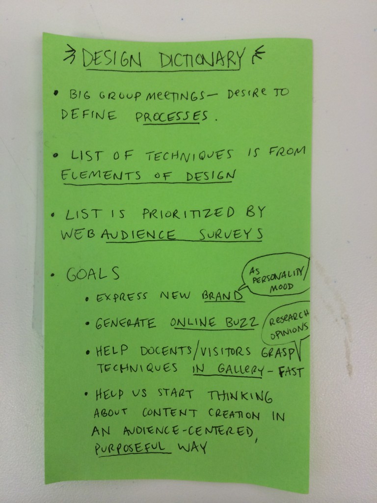
a green post it note with four goals written on it as follows: 1) express new brand (as personality/mood) 2) generate online buzz 3) help docents/visitors grasp techniques in gallery-fast (research opinions) 4) help us start thinking about content creation in an audience-centered, purposeful way

I kept this note taped to my screen as a reminder of the 4 project goals.

It is amazingly easy to get confused and lost mid-project if you don’t keep your goals close. This is why I clung tightly to the sticky note shown above. When everyone involved can agree on goals up-front, the project itself can shape-shift quite nicely and organically, but the goals stay firm. Stakeholders’ concerns can be evaluated against the goals, not against your org. hierarchy or any other such evil criteria.

Even with all the viewer-centric empathy in the world, it can still be hard to predict what your audience will like and dislike. Would a video about tapestry weaving get any views on YouTube? What about 3D printing?

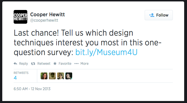
Screen shot of a tweet that says: Last chance! Tell us which design techniques interest you most in this one-question survey: https://bit.ly/Museum4U

We asked our Twitter followers which techniques interest them most.

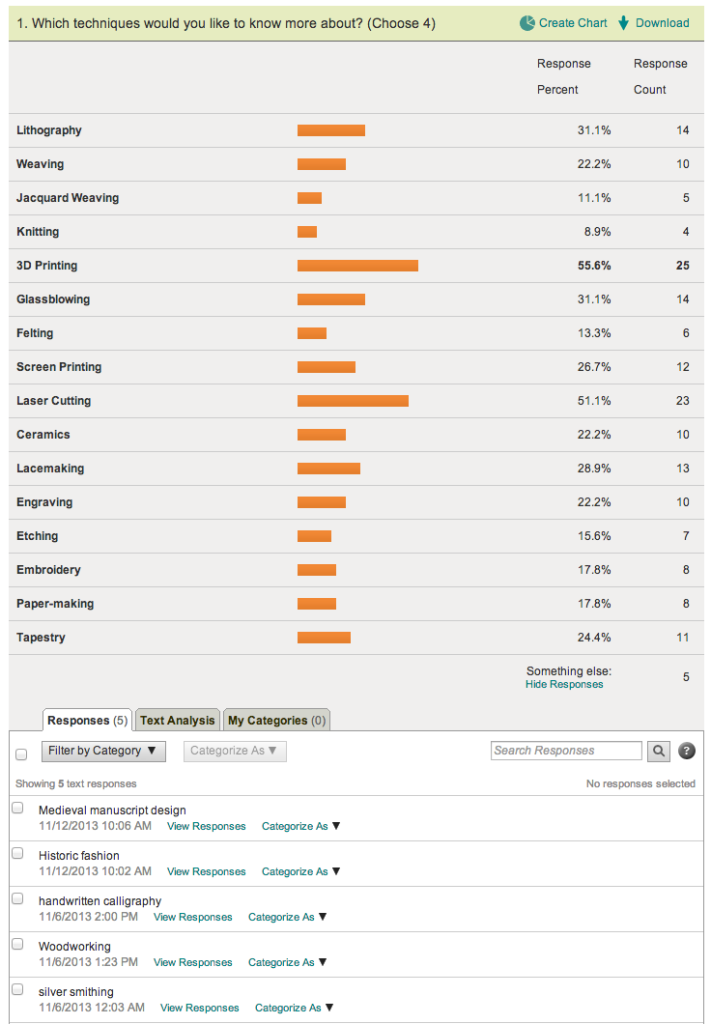
We created a quick survey on SurveyMonkey and blasted it out to our followers on Facebook and Twitter to gauge the temperature.

a list of design techniques, each with an orange bar showing percentage of people who voted for that technique.

Surveying our Twitter and Facebook fans with SurveyMonkey, to learn which techniques they’d be interested in learning more about.

We also hosted the same survey on Qualaroo, which pops up on our website. My hunch about what people would say was all wrong. We used these survey results to help choose which techniques would get a video.

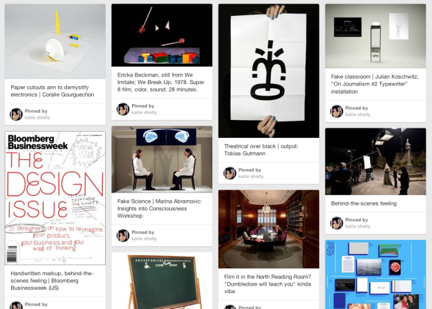
By this point, it was mid-winter 2014, and our new brand from Pentagram was starting to get locked in. It was a good opportunity to play with the idea of expressing this new brand via video. What should the pacing and rhythm be like? How should animations feel? What kind of music should we use?

grid of various images, each with a caption, like a mood board or bulletin board.

Public mood-boarding with Pinterest.

Seb & I are fans of “Look Around You” and we liked the idea of a somewhat cheeky approach to the dreaded “educational video.” How about an educational video that (lovingly, artfully) mocks the very format of educational videos? I created a Pinterest board to help with the art direction. We couldn’t go too kitsch with the videos, however, because our new brand is pretty slick and that would have clashed.

Then I made a low-stakes, low-cost prototype, recycling footage from a previous project. I sent this out to the curatorial/education team for feedback using Basecamp.

In retrospect I can now see that this video is awful. But at the time, it seemed pretty good to me. This is why we prototype, people!

With feedback from colleagues via Basecamp (less book, more live action, more prominent type), I made the next prototype:

I got mixed reactions about the new typography. Some found it distracting. And I was still getting a lot of mixed reactions to the book. So here was my third pass:

I was starting to reach out to artists and designers to lend their time to the shoots, and was cycling that fresh footage into the project, and cycling the new video drafts back to the group for feedback. Partially because we were on a deadline and partially because it works well in iterative projects, we didn’t wait for closure on step 1 before moving on to step 2.

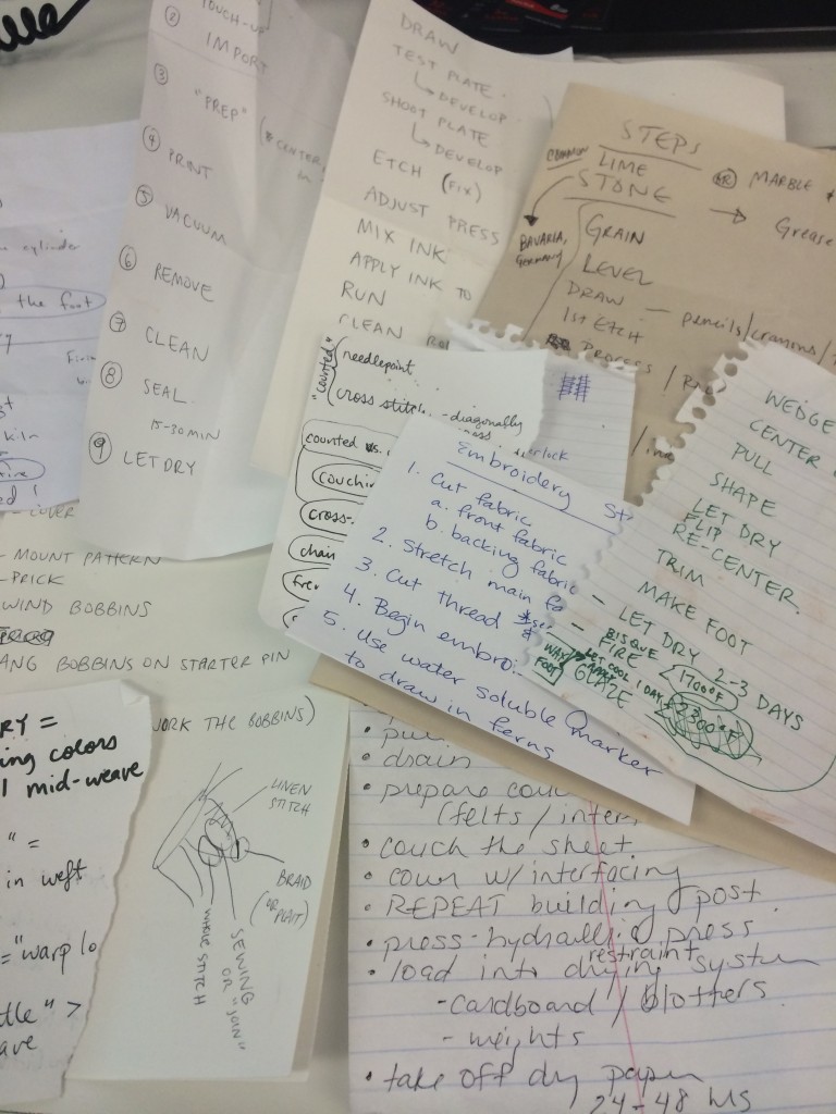
a pile of scrap papers, each with different lists saying things like: "copy pattern, cover pattern with contact paper, mount pattern" or "embroidery steps: 1) cut fabric 2) stretch main fabric onto hoop 3) cut thread" et cetera

I got a crash course in 14 different techniques.

Every new shoot presented a new chance to test the look and feel and get reactions from my colleagues. Here was a video where I tried my own hand at graphical “annotations” (dovetail, interlock, slit):

By this point my prototype was refined enough to share with Pentagram, who were actively working on our digital collateral. I asked them to style a typographic solution for the series, which could serve as the basis for other museum videos as well. Whenever you can provide a designer with real content, do it, because it’s so much better than using dummy content. Dummy content is soft and easy, allowing itself to be styled in a way that looks good, but meets no real requirements when put through a real stress test (long words, bulky text, realistic quantities of donor credits, real stakeholders wanting their interests represented prominently).

Here is a revised video that takes Pentagram’s new, crisp typography into account:

This got very good feedback from education and curatorial. And I liked it too. Yay.

All-in-all, it took about 8 rounds of revision to get from the first cruddy prototype to the final polished result.

And here are the final versions.

Label Whisperer

Screen Shot 2014-01-24 at 6.06.47 PM

Have you ever noticed the way people in museums always take pictures of object labels? On many levels it is the very definition of an exercise in futility. Despite all the good intentions I’m not sure how many people ever look at those photos again. They’re often blurry or shot on an angle and even when you can make out the information there aren’t a lot of avenues for that data to get back in to the museum when you’re not physically in the building. If anything I bet that data gets slowly and painfully typed in to a search engine and then… who knows what happens.

As of this writing the Cooper-Hewitt’s luxury and burden is that we are closed for renovations. We don’t even have labels for people to take pictures of, right now. As we think through what a museum label should do it’s worth remembering that cameras and in particular cameras on phones and the software for doing optical character recognition (OCR) have reached a kind of maturity where they are both fast and cheap and simple. They have, in effect, showed up at the party so it seems a bit rude not to introduce ourselves.

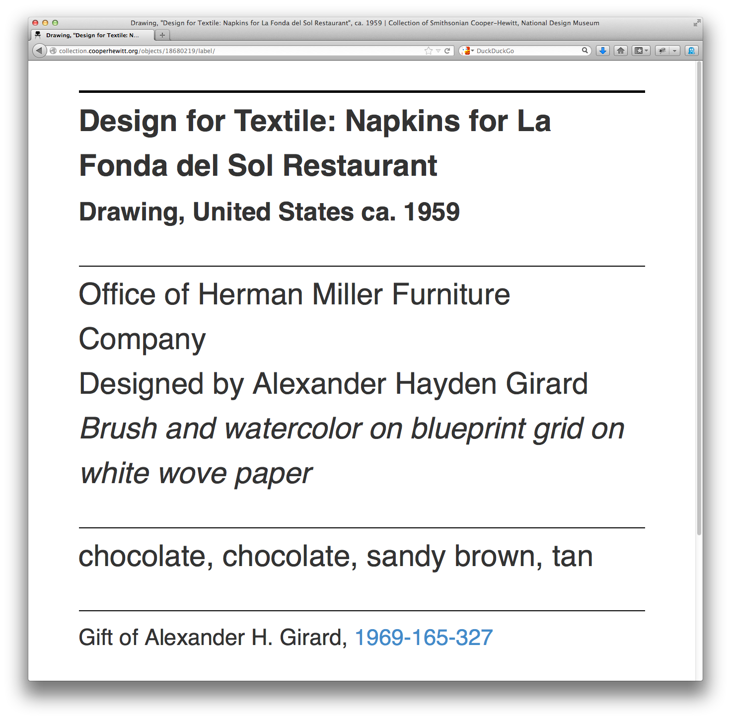
I mentioned that we’re still working on the design of our new labels. This means I’m not going to show them to you. It also means that it would be difficult to show you any of the work that follows in this blog post without tangible examples. So, the first thing we did was to add a could-play-a-wall-label-on-TV endpoint to each object on the collection website. Which is just fancy-talk for “another web page”.

Simply append /label to any object page and we’ll display a rough-and-ready version of what a label might look like and the kind of information it might contain. For example:

https://collection.cooperhewitt.org/objects/18680219/label/

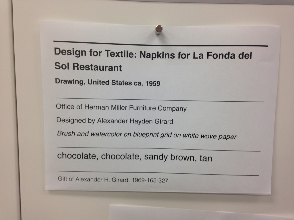
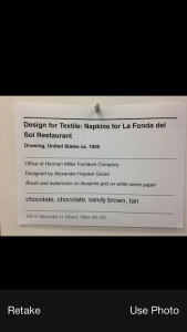
Now that every object on the collection website has a virtual label we can write a simple print stylesheet that allows us to produce a physical prototype which mimics the look and feel and size (once I figure out what’s wrong with my CSS) of a finished label in the real world.

photo 2

So far, so good. We have a system in place where we can work quickly to change the design of a “label” and test those changes on a large corpus of sample data (the collection) and a way to generate an analog representation since that’s what a wall label is.

Careful readers will note that some of these sample labels contain colour information for the object. These are just placeholders for now. As much as I would like to launch with this information it probably won’t make the cut for the re-opening.

Do you remember when I mentioned OCR software at the beginning of this blog post? OCR software has been around for years and its quality and cost and ease-of-use have run the gamut. One of those OCR application is Tesseract which began life in the labs at Hewlitt-Packard and has since found a home and an open source license at Google.

Tesseract is mostly a big bag of functions and libraries but it comes with a command-line application that you can use to pass it an image whose text you want to extract.

In our example below we also pass an argument called label. That’s the name of the file that Tesseract will write its output to. It will also add a .txt extension to the output file because… computers? These little details are worth suffering because when fed the image above this is what Tesseract produces:

$> tesseract label-napkin.jpg label
Tesseract Open Source OCR Engine v3.02.01 with Leptonica
$> cat label.txt
______________j________
Design for Textile: Napkins for La Fonda del
Sol Restaurant

Drawing, United States ca. 1959

________________________________________
Office of Herman Miller Furniture Company

Designed by Alexander Hayden Girard

Brush and watercolor on blueprint grid on white wove paper

______________._.._...___.___._______________________
chocolate, chocolate, sandy brown, tan

____________________..___.___________________________
Gift of Alexander H. Girard, 1969-165-327

I think this is exciting. I think this is exciting because Tesseract does a better than good enough job of parsing and extracting text that I can use that output to look for accession numbers. All the other elements in a wall label are sufficiently ambiguous or unstructured (not to mention potentially garbled by Tesseract’s robot eyes) that it’s not worth our time to try and derive any meaning from.

Conveniently, accession numbers are so unlike any other element on a wall label as to be almost instantly recognizable. If we can piggy-back on Tesseract to do the hard work of converting pixels in to words then it’s pretty easy to write custom code to look at that text and extract things that look like accession numbers. And the thing about an accession number is that it’s the identifier for the thing a person is looking at in the museum.

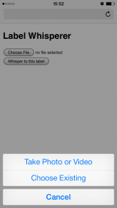
To test all of these ideas we built the simplest, dumbest HTTP pony server to receive photo uploads and return any text that Tesseract can extract. We’ll talk a little more about the server below but basically it has two endpoints: One for receiving photo uploads and another with a simple form that takes advantage of the fact that on lots of new phones the file upload form element on a website will trigger the phone’s camera.

This functionality is still early days but is also a pretty big deal. It means that the barrier to developing an idea or testing a theory and the barrier to participation is nothing more than the web browser on a phone. There are lots of reasons why a native application might be better suited or more interesting to a task but the time and effort required to write bespoke applications introduces so much hoop-jumping as to effectively make simple things impossible.

photo 2
photo 3

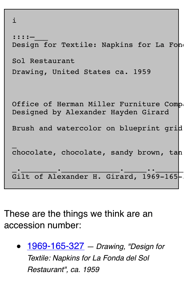
Given a simple upload form which triggers the camera and a submit button which sends the photo to a server we get back pretty much the same thing we saw when we ran Tesseract from the command line:

Untitled-cropped

We upload a photo and the server returns the raw text that Tesseract extracts. In addition we do a little bit of work to examine the text for things that look like accession numbers. Everything is returned as a blob of data (JSON) which is left up to the webpage itself to display. When you get down to brass tacks this is really all that’s happening:

$> curl -X POST -F "file=@label-napkin.jpg" https://localhost | python -mjson.tool
{
    "possible": [
        "1969-165-327"
    ],
    "raw": "______________j________nDesign for Textile: Napkins for La Fonda delnSol RestaurantnnDrawing, United States ca. 1959nn________________________________________nOffice of Herman Miller Furniture CompanynnDesigned by Alexander Hayden GirardnnBrush and watercolor on blueprint grid on white wove papernn______________._.._...___.___._______________________nchocolate, chocolate, sandy brown, tannn____________________..___.___________________________nGift of Alexander H. Girard, 1969-165-327"
}

Do you notice the way, in the screenshot above, that in addition to displaying the accession number we are also showing the object’s title? That information is not being extracted by the “label-whisperer” service. Given the amount of noise produced by Tesseract it doesn’t seem worth the effort. Instead we are passing each accession number to the collections website’s OEmbed endpoint and using the response to display the object title.

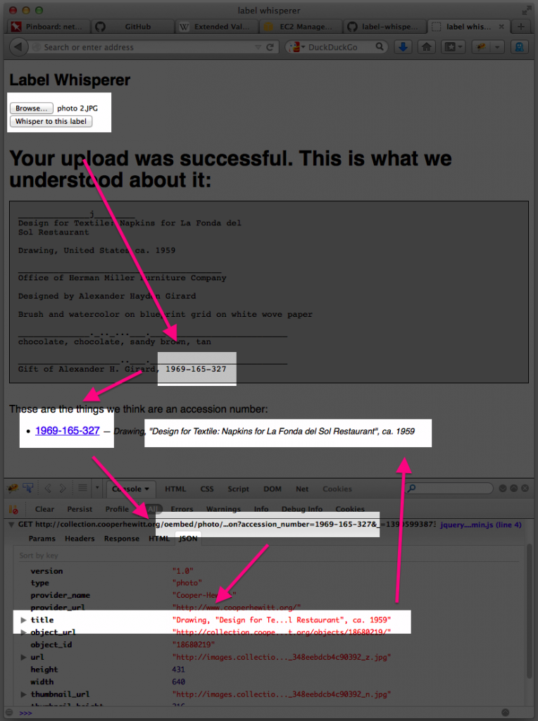
Here’s a screenshot of the process in a plain old browser window with all the relevant bits, including the background calls across the network where the robots are talking to one another, highlighted.

label-whisperer-napkin-boxes

  1. Upload a photo
  2. Extract the text in the photo and look for accession numbers
  3. Display the accession number with a link to the object on the CH collection website
  4. Use the extracted accession number to call the CH OEmbed endpoint for additional information about the object
  5. Grab the object title from the (OEmbed) response and update the page

See the way the OEmbed response contains a link to an image for the object? See the way we’re not doing anything with that information? Yeah, that…

But we proved that it can be done and, start to finish, we proved it inside of a day.

It is brutally ugly and there are still many failure states but we can demonstrate that it’s possible to transit from an analog wall label to its digital representation on a person’s phone. Whether they simply bookmark that object or email it to a friend or fall in to the rabbit hole of life-long scholarly learning is left an as exercise to the reader. That is not for us to decide. Rather we have tangible evidence that there are ways for a museum to adapt to a world in which all of our visitors have super-powers — aka their “phones” — and to apply those lessons to the way we design the museum itself.

We have released all the code and documentation required build your own “label whisperer” under a BSD license but please understand that it is only a reference implementation, at best. A variation of the little Flask server we built might eventually be deployed to production but it is unlikely to ever be a public-facing thing as it is currently written.

https://github.com/cooperhewitt/label-whisperer/

We welcome any suggestions for improvements or fixes that you might have. One important thing to note is that while accession numbers are pretty straightforward there are variations and the code as it written today does not account for them. If nothing else we hope that by releasing the source code we can use it as a place to capture and preserve a catalog of patterns because life is too short to spend very much of it training robot eyes to recognize accession numbers.

The whole thing can be built without any external dependencies if you’re using Ubuntu 13.10 and if you’re not concerned with performance can be run off a single “micro” Amazon EC2 instance. The source code contains a handy setup script for installing all the required packages.

Immediate next steps for the project are to make the label-whisperer server hold hands with Micah’s Object Phone since being able to upload a photo as a text message would make all of this accessible to people with older phones and, old phone or new, requires users to press fewer buttons. Ongoing next steps are best described as “learning from and doing everything” talked about in the links below:

Discuss!

"cmd-P"

I made us a print stylesheet for object pages on the collections website. (What does that mean? It means you can print out the webpage and it will look nice).

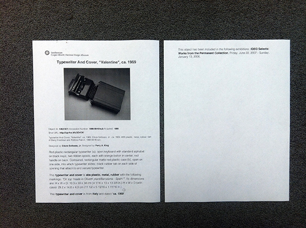
Printout of Object #18621871 before stylesheet

Printout of Object #18621871.. before stylesheet.

Printout of Object #18621871 after stylesheet. Much better.

Printout of Object #18621871 after stylesheet. Much better. Office carpet courtesy of Tandus flooring.

This should be very useful for us in-house, especially curators and education.. and anyone doing exhibition planning.. (which right now is many of us).

It’s not very fancy or anything. Basically I just stripped away all the extraneous information and got right to the essential details, kind of like designing for mobile.

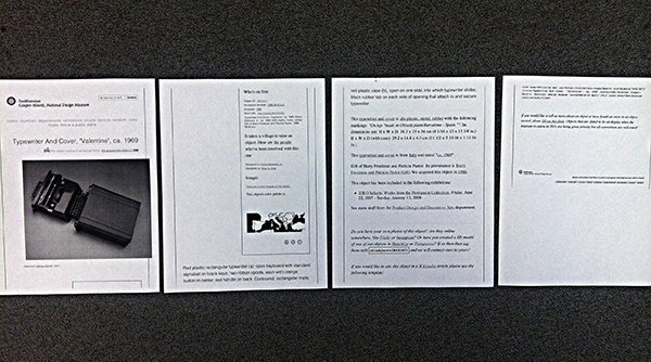
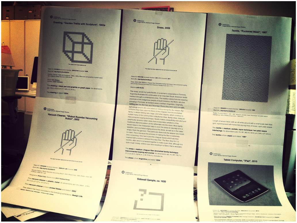
six printouts on standard paper from the collections website, taped in two rows to an iMac screen.

cascading style sheet is cascading.

In a moment of caffeinated Friday goofiness, Aaron printed out a bunch of weird objects he found (e.g. iPad described for aliens as “rectangular tablet computer with rounded corners”) and Scotch taped them all over Seb’s computer screen as a nice decorative touch for his return the next morning.

What we realized in looking at all the printouts, though, is that the simplified view of a collection record resembles a gallery wall label. And we’re currently knee-deep in the wall label discussion here at the Museum as we re-design the galleries (what does it need? what doesn’t it need? what can it do? how can it delight? how can it inform?).

I don’t yet have any conclusions to draw from that observation.. other than it’s a good frame to talk about our content and its presentation.

..to be continued!