Author Archives: Pam Horn

Three low white pillars glow with light while one person leans over each, pressing a button on the right side of each pillar releasing a unique scent.

Accessible Exhibition Guide: Delivering Content to All

When the user is included in the design process from the start, choices multiply for everyone’s benefit.

In Cooper Hewitt’s newest exhibitions, Access+Ability (through September 3, 2018) and The Senses: Design Beyond Vision (through October 28, 2018), designing with the user and visitor at the center are integral. Accessibility and inclusion are a key focus of these current exhibitions and essential strategic goals for the museum, now and for the years ahead. There are many exciting ways we’re stepping up our efforts even more and aiming to provide all audiences the same quality of experience on campus and online. https://www.cooperhewitt.org/accessibility-at-cooper-hewitt

In The Senses, visitors are welcomed into a multisensory playground touching, smelling, hearing, and seeing in dynamic and new ways.

Four adults are lined along and facing a curving wall covered in black synthetic fur. They stand on a wooden floor with backs facing outward as the each touch the wall moving both hands along and around the wall's surface.

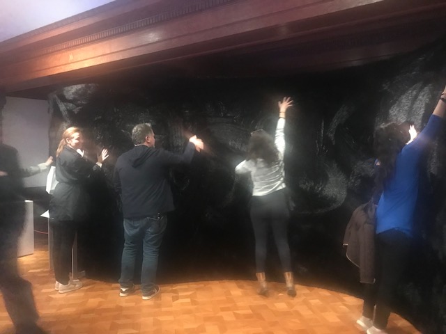
Visitors touching a furry wall activate orchestral musical compositions. Designed by Studio Roos Meermanand KunstLAB Arnhem

While preparing for the exhibition we knew that there would be many touchable objects and installations (43 to be exact) in The Senses. What we lacked was the medium to deliver the exhibition content to every visitor. Cooper Hewitt’s Pen offers agency and a new way to explore in a museum for people who are sighted but without audio, how might visitors with low vision and who are blind explore the content?

Making Cooper Hewitt Content Accessible
In 2017, we launched our large print label feature on our collection website. This system makes available each exhibition’s label content (text and image) responsive to the user’s device and customizable in six different font sizes. Our Visitor Experience team also has an efficient way to produce large print label binders, directly from our collection database, for the galleries to share with visitors. We began investigating solutions for making content labels and gallery cues readable for people who are blind. We considered Braille labels, using beacon notifications, and even floor mats in front of each object and installation to message that an interaction is calling. Asking questions such as “which text would be more meaningful to print in Braille on the labels—object tombstone (museum-speak for object stats) or text about the object?” Wrong questions! All of this research and internal discussion wasn’t leading to viable solutions. Our group of five sighted colleagues, good intentioned as we were, weren’t getting at what the user might want. It was during a gallery visit with Sina Bahram—computer scientist, consultant, and researcher and President and Founder of Prime Access Consulting (PAC), which advises museums and other institutions on website and digital accessibility—who was onsite for meeting when he simply said “Identification and verification.” So obvious but somehow we weren’t seeing it! Every visitor wants agency to determine what information to access, about which object, when he or she wants it.

White label displays a bright yellow textures bar that messages touch | hear in Braille. Also printed in Braille are the object ID number that the user will enter into the app.

Accessible Exhibition Content Design

The Scaffolding
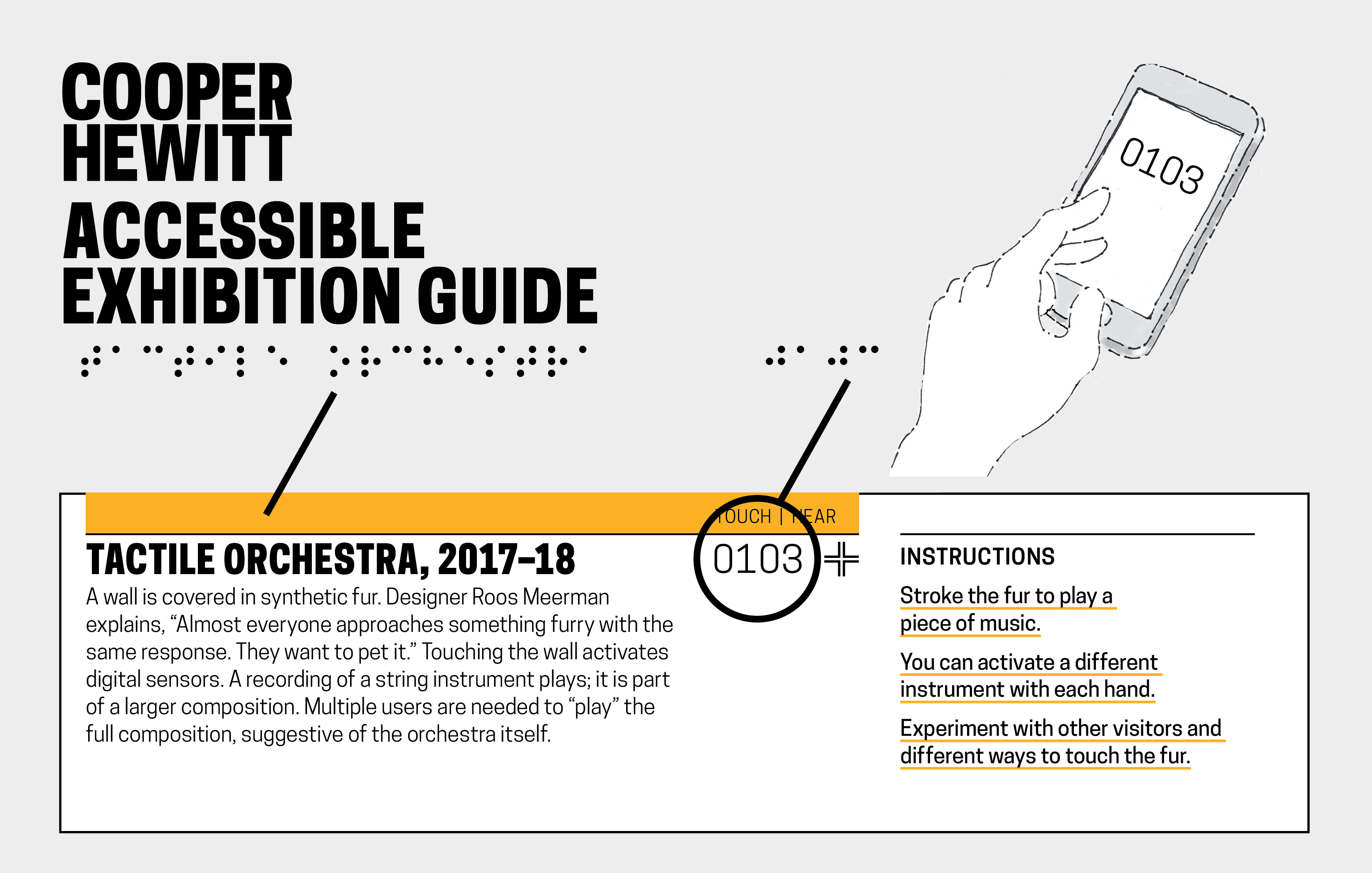
Using our API and label rail system—designed for access to the collection in the galleries—we determined the identification would be an assigned object ID number e.g. 0103, and verification is why we have the name of the object in Braille as well. This way, once you type the number of the “identified” object into your phone you can “verify” that you’ve got the right one in front of you. An added benefit since users can choose if they even want to read more about that particular object. An app could call the API and deliver the exhibition content. After discussing with our colleagues we prototyped, tested, and moved forward—with about 15 days to go before exhibition opening—to develop a version 1 native app for iOS with v.2 web-based application for android use.

Cooper Hewitt Accessible Exhibition Guide printied in white type on black background about a blank box where the keypad below is used to type in content ID number. HELP appears in top right corner.

Content number entry screen for Coper Hewitt app.

Accessible Systems
Bahram and Joshua Lerner of Monorail built the app. The tactile labels were produced by Steven Landau, whose company Touch Graphics creates accessible audio and tactile graphics. Every label in The Senses features an object title and number, printed in braille and Latin characters. Smartphones are used to access the associated content. Labels are discoverable as they are installed at a consistent height throughout the exhibition on our label rail system. Cooper Hewitt’s first Accessible Exhibition Guide was uploaded and went live on April 18. Download it from the Apple App Store or connect from our website. The guide contains the exhibition’s descriptive and interpretive content in both text and audio formats. A visitor can choose to read the text, hear it with a screen reader, or listen to an audio recording.

From top down: Black background with drop-out white type: 0104, Dialect for a New Era, 2017–18; Image of six glowing white pillars; label text.

Image of screen that appears when Dialect for a New Era content ID is entered into the app.

The Cooper Hewitt Accessible Exhibition Guide was conceived as we looked for multi-modal channels for content delivery for users with differing abilities. Designing for multiple senses highlights that the methodology of access not dictate level of access, which is the goal for the Accessible Content Guide and for Cooper Hewitt.

New Relationships: A Summer at Cooper Hewitt

This summer I was the Peter A. Kruger Cross-Platform Publishing intern. When asked about my responsibilities many people want to know, “What does “Cross-Platform” mean?”

At Cooper Hewitt, Cross-Platform Publishing sits at the nexus of the Digital and Emerging Media, Communications, Curatorial, Education, and Exhibitions departments. During my internship I have helped to research, develop, and manage all forms of content for print and electronic publications. As a part of the Cross-Platform Publications team, I have had the opportunity to participate in decision-making that affects the design and content of museum channels, printed books, and digital tables.

One of my favorite projects this summer was collaborating with the Product Design and Decorative Arts department to develop their plan for the digital tables in the museum’s upcoming exhibition, Jewelry of Ideas: Gifts from the Susan Grant Lewin Collection. The process for developing an application appearing on one of the museum’s digital tables in an exhibition begins with thinking about what stories are not being told in the exhibition didactics. When Cooper Hewitt launched its digital tables in 2014 the team built an application that shows relationships between the founding donors of the Cooper Hewitt collection. It has been in use in the exhibition Hewitt Sisters Collect. So I was asked how might we modify that application to apply to the constituents in the Jewelry of Ideas exhibition. I began looking at research about the designers in the exhibition to uncover meaningful relationships and connections between designers. Working with the curator, we decided which relationships we believed were the most important to highlight. From there, I along with the help of our registrar created relationship hierarchies in TMS. For the Susan Grant Lewin exhibition we decided that the most important relationships to feature on the digital table were those created by the schools that various designers attended or taught for. With this information we hope visitors can see how various styles and techniques arose from certain schools and how these designers’ works influenced one another.

To build the foundation of the interactive content in TMS, I recorded the connections between designers based on school, mentorship, and history of collaboration. Currently, new code is being written to modify the donor application. Once completed the collecetion site records and the digital table will reveal the relationships to its users. The table interface is designed with a “river” where objects and designer images will flow on the digital table. When a designer is selected, a short biography will appear. Underneath the biography, related designers are listed who either participated in the same school or worked together in some way. We hope that this interactive digital experience will help visitors visualize the interconnected nature of the collection in a new way.


Designing for Digital and Print

As this year’s intern in Digital and Emerging Media, I was tasked with creating designs that needed to work as a static .pdf in both print and digital format. This presented a significant challenge: the design created for printable paper dimensions is approached differently than a design for digital display. To accommodate both, the use of space in a limited size must be efficient and readable.

The first project I tackled this issue with was Cooper Hewitt’s Fall 2017 Public Programs calendar. The design brief was to create a brochure that visitors can view on their screens as a landscape orientation .pdf page on the Public Programs website. We designed this .pdf so that visitors could print at home. For easy transport, the brochure needed to fold up small enough to fit in a pocket. The desired layout and size of this brochure presented a fun but difficult design challenge.

The image below is what the .pdf will look like when opened on the website. The dashes represent folding lines, which when printed onto a double-sided letter-size piece of paper act as a guide for folding it into 8 small rectangles for a pocket size calendar or 4 longer vertical rectangles for a brochure size. Should we decide to print on-site, an 11×17 layout was also created.

The second project I worked on was less complex to design for print, but was much more complex in creating the digital layout. The book Enwheeled by Penny Wolfson is the latest publication in Cooper Hewitt’s DesignFiles e-book series. The e-books in the series are currently offered through online stores for $2.99 per book. Cooper Hewitt will be shifting this distribution model for the DesignFiles series beginning with Enwheeled publishing in December 2017. Enwheeled will be the first web-based publication available on cooperhewitt.org but that is a whole other post! My task was to create a traditional InDesign layout for the text and then use the instructions developed by last year’s Digital and Emerging Media intern, Emma Weil, for creating a Markdown-friendly HTML code. The text was first entered into threaded text boxes with the related images dispersed accordingly. Once that process was complete, I followed Emma’s instructions for tagging the text and images so that they appear in the correct order when exported to HTML.

Certain images needed to be placed in between threaded text boxes; in this case, the images had to be anchored to their corresponding caption, and the caption anchored to the end of the paragraph that it coincides with.

The final step in preparing the InDesign document for export to HTML was to assign paragraph and character styles to the text. Each text format needs to be assigned a specific style setting in order for the text to appear correctly in the HTML. Character styles include all italic, bolded, and superscripted text. Paragraph styles act the same way with entire bodies of text, as well as signifying the headers and sub-headers of the book.

When the document is exported to HTML, the order of the text and images remains intact and correctly formatted in simple text form. The HTML reformats to the size of the window or screen it is being used on, and after being entered into Emma’s Python script is ready to be entered into Markdown.

Rebooting Museum Publishing

For over two years, much to many people’s surprise, Cooper Union Museum’s and Cooper-Hewitt’s historical publications have been publicly accessible via the Internet Archive. Many of these publications are rare and in some cases, the only known existing copy is held in our National Design Library who worked hard to have them digitized. Sadly, these long digitized Museum publications have languished without much visibility.

In fact, in The New York Times’ 11/26/12 piece “The Art World, Blurred”, Carol Vogel identifies the “graveyard of out-of-print books” that is rapidly haunting museums. In shout-outs to these savvy go-getters, she cheers for a long list of online museum initiatives at the Metropolitan Museum of Art, the Walker Art Center in Minneapolis, LACMA, and the Art Institute of Chicago, to name a few. Can anyone say Cooper-Hewitt?

Thankfully, all that is changing!

With our Historical Publications section, this material is now easily accessible and can be explored right on the page without leaving the site. In addition, integrating these publications on our site provides a growing connection with the Museum collection and exhibition archive, while also establishing an invaluable foundation as the Museum moves into new publishing territory. Expect to see rich connections to and from our evolving Online Collections soon

Publishing is experiencing a renaissance at Cooper-Hewitt, led by the newly-formed Cross-Platform Publishing team now part of Digital and Emerging Media. We are particularly excited about our new imprint, DesignFile, which was created to publish ebooks on design research and writing. Design Cult, a collection of essays by design critic and National Design Award winner, Steven Heller, will be one of three DesignFile releases set to launch in January 2013. Look for it in epub , iBooks, and Kindle. Spoiler alert: there will be an upcoming post offering some cool insights from our in-house graphic designer, Katie, about the process of designing covers for ebooks vs. print.

We have more projects underway—including a rethinking of publishing workflows much in the vein of Auckland Museum’s ‘COPE’ strategy (create once publish everywhere).

In the meantime, check out one of our favorite historical pubs, the 1941 A Brief Introduction to the Museum’s Facilities, which is a fascinating glimpse into both mid-20th-century design thinking and the museum experience.

Pam Horn & Sara Rubinow