Author Archives: raehena

Three adventures: a blindfolded visit to the Guggenheim (1/3)

This is the first in a series of three “adventures in universal design,” a design research experiment carried out by Rachel Sakai and Katie Shelly. For an introduction to the project, see our earlier post, here.

A black and white photo of the Guggenheim Museum in NYC. Traffic lights and pedestrians on the sidewalk are in the foreground. The museum's famous architecture looks like lots of big smooth white shapes stacked on each other: A big rectangle at the bottom, four big circles stacked on the right, and a second rotunda with windows on the left.

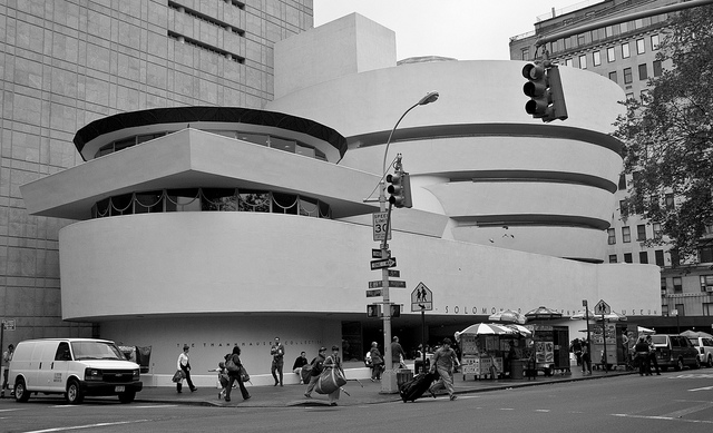
The Guggenheim Museum, which is just a stone’s throw away from our office. Photo by Flickr user Ramón Torrent.

EMPATHY TOOLS:
BLINDFOLDED VISIT TO THE GUGGENHEIM
AUGUST 5 2013 

Taking a cue from Patricia Moore’s empathy research in NYC in the 1990s, Katie and I began our research with an empathy-building field trip to the Guggenheim. I took on the role of the blind visitor and Katie played the part of my sighted companion. The entire trip lasted for about 45 minutes and I kept my eyes shut for the duration.

Even though the Guggenheim is just a block away from our office, this was my first visit so I had no pre-existing mental map of the space. With my eyes closed, it did not take long before I felt completely disoriented, vulnerable, and dependent on my companion. After five minutes I had no idea where I was or where we were going; it felt like we were walking in circles (actually, we may have been because of the Guggenheim spiral…). I trust Katie, but this was unnerving.

(Note: this intensity of discomfort would not apply for a “real” blind or partially-sighted person, who would be entirely familiar with the experience of walking around without sight. A mild feeling of disorientation in the space, though, is still worth noting. Maybe the level of discomfort for a blind person would be more subtle, more like how a sighted person would feel wandering around without a map.)

The Guggenheim's large round lobby, shown completely bathed in ruby-red light. The benches and floor area are crowded with people reclining, laying on the floor, and looking upwards at the light source.

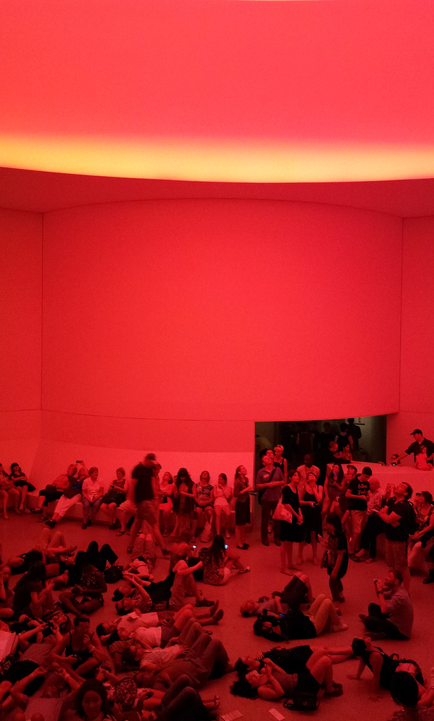
The James Turrell exhibition at the Guggenheim. Photo by Flickr user Mr Shiv.

We started the visit on our own with Katie guiding me and doing her best to describe the space, the other visitors, and the art. After a few minutes, we found one of the Guggenheim’s Gallery Guides wearing a large “Ask Me About the Art” button. When Katie asked the guide whether she was trained to describe art to low-vision guests, her response, “…I had one training on that,” was hesitant. To my ear, it sounded like reluctance and I immediately felt as though our request was a bother. Katie also felt like a pest, like she was “drilling the attendant” on her training. After some initial awkwardness, though, she offered to just share what she usually says about the piece (James Turrell’s Prado (White)), which turned out to be a very interesting bit of interpretation. We thanked her for the info and moved on.

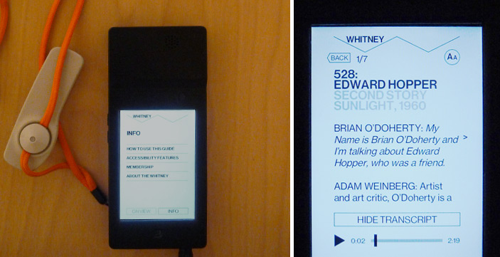
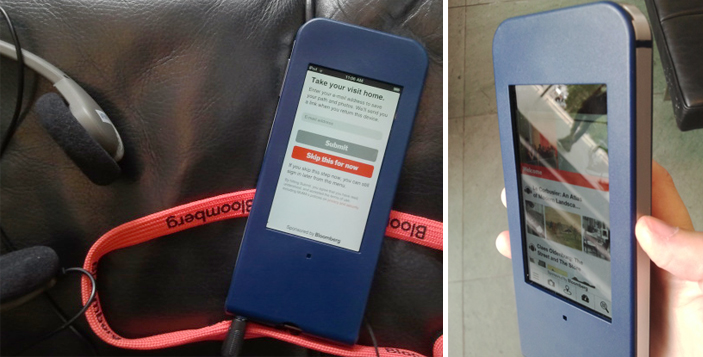
By the second half of our visit we had picked up a couple of audioguides. The Guggenheim, like many other museums, has the encased iPod touch flavor of audio guide. The look and feel is nice and slick, but it’s not great for accessibility because the home button is blocked. (A triple-tap of this button is how you open accessibility controls in iOS).

Dependence on the GUI meant that when I wanted to hear a description, Katie would take my audioguide, start it playing, hand it back to me, then start up her own audioguide. If I missed a word and needed to go back, or if I wanted to pause for a second, well, I was pretty much out of luck. I could have asked Katie, but I felt like too much of a bother, so just I let it go.

The audio content was interesting, but it was written with sighted visitors in mind, with very little visual description of the work being discussed.

There was a big chunk of text on the wall explaining a bit about James Turrell’s work, which Katie read aloud to me. It would have been great to just have that text available for playback in the audioguide.

After our visit, I dug deeper into the Guggenheim’s website and learned that they have a free app that includes verbal imaging description tours written for visitors who are blind. Some of these tours have associated “touch object packs” that can be picked up from staff. That would have been great, but at the time of our trip Katie and I were unaware that these options existed, even though we did check out the Guggenheim website before visiting. None of the staff (who could see that I appeared to be blind) reached out to let us know about these great accessibility options. What a shame!

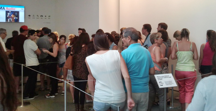
On the afternoon we visited, the Guggenheim was packed. We didn’t want to be too much of a nuisance to the already-busy staff so Katie went into “hacker mode,” looking for ways to tweak the experience to fit our needs. The visit became about hunting for things we could share.

A white cable with one 3.5mm male audio jack plug connected to two 3.5mm female jacks.

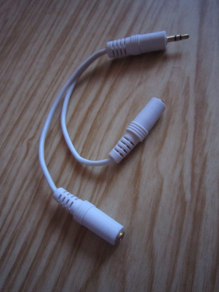
A headphone splitter lets two people listen to the same device.

Takeaways

A simple hack idea: headphone splitters. Though it wouldn’t give blind visitors more control over their audio guide, it would take away the clumsiness of one person having to manage two audioguides. Plus, whether you are blind or not, using a headphone splitter is fun and can strengthen a shared experience.

– I was disoriented throughout the trip and this was very uncomfortable. A better understanding of how I was moving through the space would have helped. How might we orient blind visitors when they first enter the museum so that they have a broad mental map of the space?

– I was dependent on Katie and did not have many options for how I might want to experience the museum (deep engagement with a few works, shallow engagement with many works, explore independently, explore with a friend, etc). How might we provide blind visitors with options for different types of experiences?

– Katie did her best to “hack” the experience and tried to discover things we could share in order to create a meaningful museum visit for both of us. How might we help create and shape shared experiences for pairs who visit the museum?

Staff training is important. The Museum has great accessibility tools, but they were invisible to us because nobody on staff mentioned them. The front desk person didn’t ask whether we would be interested in the accessibility tools, even though she had seen that I appeared to be blind.

– Staff mood is important. Many of the staff we interacted with seemed bashful or embarrassed about the situation and our accessibility questions. The museum was hectic and they were very busy; we felt like asking for too much help would have been pesky.

Check out our next adventure in universal design, a museum tour designed for the blind.

Interns React to…the Whitney's Audio Guide

I spent my summer as an intern in the Digital and Emerging Media department here at the Cooper-Hewitt National Design Museum. Next week, I head home to San Francisco where I will return to the graduate program in design at California College of the Arts. One of my projects this summer has been to visit museums, observe how visitors are using their devices (cell phones, iPads, etc), and to examine audio guides through the lens of an interaction designer.

When I went to check out MoMA’s new mobile guide, Audio+, it was the beginning of my stint at the Cooper-Hewitt, I had never before done a museum audio tour with an iPod touch, and my expectations were lofty. Now that I have spent a summer in Museum World, my perspective and my expectations have changed so I wanted to repeat the exercise of going to a museum and critiquing an audio guide experience.

Last Sunday I spent my afternoon at the Whitney. I arrived at the museum around 1pm. No wait for the audio guide, just walked up and handed over my ID in exchange. Like many other museums, the Whitney uses encased iPods for their audio guides. I was a bit surprised, however, to notice that the battery charge on my guide was around 40%. This turned out not to be a problem for me, but I did overhear other guests complaining that their guides had run out of batteries part way through the visit.

Whitney's audio guide interface

Two different views of the Whitney’s audio guide

The Whitney’s audio guide interface is simple and straight forward. All of the guide’s navigation is text based, and this digital affordance reinforced the fact that the guide does not offer endless paths and options. After just one or two minutes of clicking around the app, there was no more mystery. The minimalist design helped me to immediately understand what I was going to do with the device and it was easier for me to focus attention on what was on the walls rather than what was on the screen.

I was, and still am, pretty taken with the quality of content available on the Whitney’s guide. From what I could tell, in each room of each gallery there is audio content for at least two pieces. It may not sound like a lot, but it ended up being more than enough for me. The consistency of content allowed and encouraged me to use the guide throughout my visit and I was surprised to see how many visitors were using the audio guides – and not just tourists, but locals too.

According to Audio Guide stop 501, Oscar Bluemner once wrote, “Listen to my work as you listen to music…try to feel.” The Whitney’s audio guide embraces this idea by playing mood setting sounds and music to complement their audio descriptions.

Screen shot of audio guide player

Situation in Yellow on the Whitney’s web player

One of my favorites is the description of Burchfield’s Chicket and Chorus in the Arbor, which you can listen to here. With crickets chirping in the background, it’s much easier to put yourself into the world described (late summer, thick trees and bushes, crickets, sunset). The first time I came across one of the audio guide stops with background music I was surprised and delighted. It was a subtle gesture, but one that really elevated the content and did wonders for putting me in the mood, so to speak.

Compared to its counterpart at MoMA, the Audio+, this guide has less content and that was clear from the start. Less content may sound like one point for the “con” list, but I do not think it is always a bad thing. Yes, there were a few times when I missed being able to look up more info about the artist and see related works, but not having the option at all definitely made me more focussed on the art in front of me. In the case of the Whitney, the content is good enough that the “less is more” approach is working well. Plus, all of their audio content is available online, so when I am back at my desk, I can browse through and re-listen or learn more about the clips I found particularly interesting.
visitor looking at a painting

A Whitney visitor using the audio guide

In both the guide for the Whitney and the guide for the MoMA the museum’s own style is reflected. The MoMA states that their “mission is helping you understand and enjoy the art of our time” where as the Whitney is “dedicated to collecting, preserving, interpreting, and exhibiting American art.” It makes sense, then, that the MoMA (focussed on education) includes much more educational content in their mobile guide and that the Whitney does.

From what I’ve learned this summer (through working with the labs team and through visits to other museums), I know that the visitor experience at home is just as important as the visitor experience in the museum. For myself, I liked the Whitney guide so much because I didn’t feel compelled to do an incredibly deep dive on a mobile device when I should be focussing my attention on what is in front of me. However, where was my at home experience? Once I left the museum, I had nothing to take with me that would prompt me to visit their website and learn more about what I saw. I would love to follow up the great audio guide experience with a great at home experience in the vein of what MoMA is doing with the option to take your visit home. There is opportunity here and I hope the Whitney has plans to fill it.

Interns React to…MoMA's Audio+

I spent my summer as an intern in the Digital and Emerging Media department here at the Cooper-Hewitt National Design Museum. Next week, I head home to San Francisco where I will return to the graduate program in design at California College of the Arts. One of my projects this summer has been to visit museums, observe how visitors are using their devices (cell phones, iPads, etc), and to examine audio guides through the lens of an interaction designer.

Before you start, it’s important to note that I ran over to try out the Audio+ out as soon as I could. The new guides are technically still in a pre-release phase and the team at MoMA is actively rolling out tweaks and fixes.

I arrived at the museum around 11 am (they open at 10.30) and already there was a pretty significant line for the mobile guide. After a bit of a wait, I exchanged my photo ID (note: passports and credit cards are not accepted) for the encased iPod touch. Although they are commonly used by museums as audio guides, this was the first time I had ever done an audio tour with an iPod touch and my expectations were lofty from the start. Hanging around my neck from a lanyard was a device full of content, and a device that I knew could connect my experience at MoMA to the world wide web! Cue sunburst and music from the heavens.

Visitors waiting in line

MoMA visitors waiting in line to pick up an audio guide

The guide is handed to you with the prompt to “Take your visit home” and here you can enter your email address, which I did, or skip this step and do it later (or not at all). The in-museum functionality is the same regardless of whether you decide to give them your email address or not.

Email address entered, ready to go.

…Or so I thought. After a few network connection failure screens, I took the guide back to the Audio+ desk and they inserted what looked like a folded up paperclip into a slot in the back of the case and pushed some kind of reset button. Not a big deal since I was still in the lobby, but it would have been nice to, as Nielsen’s 10 usability heuristics suggest, include some help and documentation outside of “network connection failure.” I assume this is one of the kinks being working out.

Image of the Audio+ guide

As I ambled around the third floor, I couldn’t help but get pulled into the guide’s glowing screen; it was a bit distracting, actually. The interface looks like a website; there are clickable images, clickable text, videos, a camera, and icon based navigation system. I spent at least 15 minutes playing around with the app not only trying to figure out what it could do, but trying to figure out what I should do. I had too many options and my attention was on the device in my hands rather than on the walls where it should have been. I wondered what else (besides explore content) I could do with the device. Is it going to navigate me through the maze of MoMA and tell me to turn right at the Gilda Mantilla drawings in order to get to the A Trip from Here to There exhibit? Does it know where I am? No, but I wish it did. This may be unavoidable, but I would be surprised if most visitors don’t feel the same way. It’s an iPod touch and I therefore expect it to do the things a Wi-Fi enabled iPod touch can do (mainly help me to find my way), but it doesn’t…and I really want it to.

Once I stopped fidgeting with the new toy, the first thing I did with the guide was listen to an audio description of Alighiero Boetti’s process in the piece Viaggi postali (Postal Voyages). The audio content was engaging and with the guide I could also read information, see the location within the museum, and…see related works! This last feature was my favorite; I love having a connection to something on the wall and immediately being able to see more from the artist. This was a significantly harder, however, when the piece I was interested in did not have the little audio icon on the label (which is true for the majority of the work at MoMA).

Audio content icon

I want info with a single tap or a simple search for all of the pieces on the walls, as I got for the Boetti piece, not just the ones with the audio icon. Unfortunately, access to extended content for artworks outside of the official tours meant effort because (without a clear alternative) my instinct was to search either the artist name or the title. As you can image, unfamiliar names and looooong titles made this a tiresome process. The cognitive load was on me, the user, rather than on the technology. I want to access to the content without having to think. 

screens from MoMA's new Audio+ guide

Screens on the Audio+ guide: menu options, audio content page, and search screen

One thing I loved about the Audio+ guide was the built in camera. Not having to juggle my own camera along with the audio guide was a relief and it was an easy way to ensure that content would be available for me to really explore on my own time, outside of the museum. Throughout my visit I used the guide to take photos and add stars to the pieces I liked, but unless the piece was part of an official tour (i.e. I didn’t have to search by artist/title), I was not compelled to look up any extended info. Call me lazy, but going through the search process was too much effort for the return. After about an hour I returned the guide and realized it was lucky I arrived when I had; by 11.50 am they were completely out of mobile guides and there was still a line of people waiting.

Post visit, I was emailed a link to My Path at MoMA; it is elegantly designed and responsive to screen size so is just as comfortable to view on a mobile device as it is on the desktop.

My Path at MoMA

Screen capture of My Path at MoMA

In My Path there are three different categories, Dashboard, Timeline, and Type. Dashboard gives a handful of metrics about the visit — duration (52 mins), works viewed (11 out of 1064), artists viewed (14 out of 590), and years explored (65 out of 132). My first thought: “What?! I saw more than 11 works!” I like what Dashboard tells me, but it is an incomplete story and I want to know more. Now that I’m back at my desk and I’ve walked through about ten doorways, my memory is fuzzy. What are these 11 works that I allegedly viewed and how is the guide determining what I did or did not see? 1984 is supposedly my Most Explored Year, well, what was it I saw from 1984?

Years Explored

Screen capture of the years explored section of My Path

The Timeline and Type sections show the stuff I did within the guide: audio listened to, photos taken, and items searched for. Same content in each section, just sorted differently. It’s really great to see, and excellent to have it all on one place. However, this is where I think there is a big opportunity lost from an interaction design perspective. I can play the audio tours in the My Path interface, but the links do not take me to the MoMA website where I can get more information about the artists, related works, etc. Basically, all of the functionality in the Audio+ mobile guide that made it easy to contextualize and relate individual works within a greater context is lost when I am back at my desk and most able to use it. I prefer to have more content and connections available when I’m at home processing my visit (and have a full sized monitor to use), but the Audio+ experience gives you the most content when you are on site (and looking at a tiny screen) and takes it away when you leave.

There are some errors with the My Path interface and I assume that some of these are tweaks being worked out. For example, when I open a photo, the sharing options are convenient, but they don’t include an option for downloading the original. Even the email link, which I expect will email me the photo, just sends a link to My Path. This again brings me to the point that with something like this, users shouldn’t have to think.

Photo share options

Screen capture of the photo share options in My Path

Beyond my gripes, let me say that overall my experience with the Audio+ was a strong positive. I generally hate using audio guides (because they are generally boring and clunky) but kudos to the folks behind the Audio+ because this first iteration is fun to use and provides delightful content above and beyond what I am used to. There is huge potential both with the guide and with the post-visit interface and I look forward to giving it another go in a few months once they have had a chance to work out the bumps.