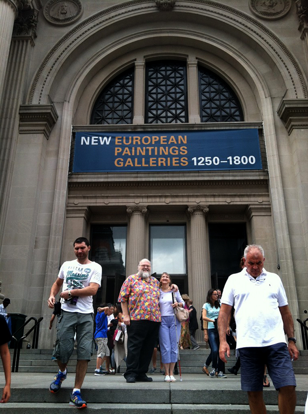
Rijkscolors! (or colorific promiscuity)


rijkscolours-yellow

(Rijkscolors are currently disabled as we consider longer-term solutions for cross-institutional browsing and searching. It’ll be back soon!)

Rijkscolors are an experimental feature that allow you to browse not only images from the Cooper-Hewitt’s collection but also images from the Rijksmuseum by color!

We see this as one way to start to work through the age-old problem of browsing collections across multiple institutions. Not everyone arrives at the Cooper-Hewitt (or the Rijksmuseum) with an expert knowledge of our curatorial and collecting history and the sheer volume of “stuff” available can be overwhelming. Everyone, at some point, has the “Explore” problem: It’s the point where you have so much good stuff to share with people but no good (or many sort-of-bad) avenues for letting people know about it.

Color is an intuitive, comfortable and friendly way to let people warm up to the breadth and depth of our collections. Since adding the ability to search the collection by color it’s quickly become the primary way that people browse our collection (more on that below) and as such feels like an excellent tool for browsing across collections.

rijkscolours-4

Over time, we hope to add this functionality for many other cultural heritage institutions but chose to start with the Rijksmuseum because we share an historical focus in our early collecting practices and because they were nice (read: AWESOME) enough to make all their collection images available under a liberal Creative Commons license.

We then indexed all those images using the same tools we use to extract colors and measure busy-ness or “entropy” from our own collection and combined the two lists. Images from the Rijksmuseum have a different colored border to indicate that they are not part of our collection. Images from the Rijksmuseum link directly to the page for that object on the Rijksmuseum website itself.

rijkscolours-bunny-crop

As with the concordances for people we just want to hold hands (for now — Seb tells me this means we might want to move to second base in the future) with other museums and are happy to send visitors their way. After all, that’s what the Internet is for!

Rijkscolors is an experimental feature so you’ll need to enable it on a per-browser basis by visiting the experimental features section of the collection website, here:

https://collection.cooperhewitt.org/experimental/#rijkscolors

But wait, there’s more.

We’ve also made public all the code used to harvest metadata and images from the Rijksmuseum as well as the resultant data dumps mapping colors and entropy scores to Rijksmuseum accession numbers with internal Cooper-Hewitt object IDs. We created a custom mapping because we use Solr to do color search on the website and that requires a numeric ID as the primary key for an object.

Then we imported all the objects from the Rijksmuseum, along with their color values and other metrics, in to our Solr index giving them a magic department ID (aka 51949951 or the Rijksmuseum) and making them private by default. If you’ve enabled Riskscolors when we search for objects by color instead of only asking for things with a given color that are public we ask for things that are public OR part of department number 51949951. Simple!

The code and the data dumps are provided as-is, more of a reference implementation and a toolbox than anything you might use without modifications. We’ve put it all on GitHub and we welcome your suggestions and fixes:

https://github.com/cooperhewitt/rijksmuseum-collection/


We mentioned search vs browse so let’s take a peek at the last 30 days (Nov 11 to Dec 10, 2013) of visitor behaviour on the collection site.

last30 days nov-dec-2013 new vs returning

Or put another way:

  • 48.89% of visits used color navigation (anywhere – not just color palette page)
  • 4.39% of visits used normal search
  • 2.24% of visits used random button
  • 1.25% of visits used fancy search

The figures for color navigation are artificially inflated by the press the feature got in Slate, The Verge and elsewhere (the comments are amusing), but even removing that spike, color navigation is at least twice as used as search in the time period. We’ll report back on some new data once December and January are done.

last30 days nov-dec-2013 tos & ppv

Not unsurprisingly, visitors who use search spend a lot more time on the site and look at many more pages. They are also far more likely to be returning visitors. For newbies, though, color and random navigation methods are far more popular – and still result in healthy browsing depths.


In related news Nate Solas sent us a patch for the palette-server, the tool we use to extract colors from our collection imagery. He said:

“…this improves the color detection by making it a bit more human. It goes two ways: 1) boost all color “areas” by saturation, as if saturated colors take up more room in the image. 2) add a “magic” color if a few conditions are met: not already included, more than 2x the average image saturation, and above the minimum area for inclusion.”

palette-server-nate

We’ve now merged Nate’s changes in to our code base (technically it’s actually a change to Giv’s RoyGBiv code) and they will be applied the next time we run the color-extraction tools on our collection (and the Rijksmuseum’s collection). Thanks, Nate!

As with all the experimental features they are … well, experimental. They are a little rough around the edges and we may not have found (or even noticed) any outstanding problems or bugs. We hope that you’ll let us know if you find any and otherwise enjoy following along as we figure out where we’re going, even if we’re not always sure how we get there.

Screen Shot 2013-12-11 at 12.23.23 PM

"C" is for Chromecast: hacking digital signage

chromecast-fire-w2

Since the late 1990s museums have been fighting a pointless war against the consumerization of technology. By the time the Playstation 2 was released in 2000, every science museum’s exhibition kiosk game looked, felt, and was, terribly out dated. The visitors had better hardware in their lounge rooms than museums could ever hope to have. And ever since the first iPhone hit the shelves in 2007, visitors to museums have also carried far better computing hardware in their pockets.

But what if that consumer hardware, ever dropping in price, could be adapted and quickly integrated into the museum itself?

With this in mind the Labs team took a look at the $35 Google Chromecast – a wifi-enabled, HDMI-connected networked media streaming playback system about the size of a USB key.

With new media-rich galleries being built at the museum and power and network ports in a historic building at a premium, We asked ourselves “could a Chromecast be used to deliver the functionality of digital signage system, but at the fraction of the cost”? Could some code be written to serve our needs and possibly those of thousands of small museums around the world as well?

chromecast-dongle-pen

Before we begin, let’s get some terms of reference and vocabulary out of the way. The first four are pretty straightforward:

Display – A TV or a monitor with an HDMI port.

Chromecast device – Sometimes called the “dongle”. The plastic thing that comes in a box and which you plug in to your monitor or display.

Chromecast application – This is a native application that you download from Google and which is used to pair the Chromecast device with your Wifi network.

Chrome and Chromecast extension – The Chrome web browser with the Chromecast extension installed.

That’s the most basic setup. Once all of those pieces are configured you can “throw” any webpage running in Chrome with the Chromecast extension on to the display with the Chromecast device. Here’s a picture of Dan Catt’s Flambientcam being thrown on to a small 7-inch display on my desk:

chromecast-small-1

Okay! The next two terms of reference aren’t really that complicated, but their names are more conceptual than specific identifiers:

The “Sender” – This is a webpage that you load in Chrome and which can cause a custom web page/application (often called the “receiver”, but more on that below) to be loaded on to one or more the Chromecast device via a shared API.

The “Receiver” – This is also a webpage but more specifically it needs to be a living breathing URL somewhere on the same Internet that is shared by and can be loaded by a Chromecast device. And not just any URL can be loaded either. You need to have the URL in question whitelisted by Google. Once the URL has been approved you will be issued an application ID. That ID needs to be included in a little bit of Javascript in both the “sender” and the “receiver”.

There are a couple important things to keep in mind:

  • First, the “sender” application has super powers. It also needs to run on a machine with a running web browser and, more specifically, that web browser is the one with the super powers since it can send anything to any of the “displays”. So that pretty much means a dedicated machine that sits quietly in a locked room. The “sender” is just a plain vanilla webpage with some magic Google Javascript but that’s it.
  • Second, the “receiver” is a webpage that is being rendered on/by the Chromecast device. When you “throw” a webpage to a Chromecast device (like the picture of Dan’s Flambientcam above) the Chromecast extension is simply beaming the contents of the browser window to the display, by way of the Chromecast device, rather than causing the device to fetch and process data locally.

Since there’s no more way to talk at this webpage (the “sender”) because it’s running in a browser window that means we need a bridging server or a… “broker” which will relay communications between the webpage and other applications. You may be wondering “Wait… talk at the sender” or “Wait… other applications?” or just plain “…What?”

Don’t worry about that. It may seem strange and confusing but that’s because we haven’t told you exactly what we’re trying to do yet!

We’re trying to do something like this:

chromecast-small-3

We’re trying to imagine a system where one dedicated machine running Chrome and the Chromecast extension that is configured to send messages and custom URLs for a variety of museum signage purposes to any number of displays throughout the museum. Additionally we want to allow a variety of standalone “clients” in such a way that they can receive information about what is being displayed on a given display and to send updates.

We want the front-of-house staff to be able to update the signage from anywhere in the museum using nothing more complicated than the web browser on their phone and we want the back-of-house staff to be able to create new content (sic) for those displays with nothing more complicated than a webpage.

That means we have a couple more names of things to keep track of:

The Broker – This is a simple socket.io server – a simple to use and elegant server that allows you do real-time communications between two or more parties – that both the “sender” and all the “clients” connect to. It is what allows the two to communicate with each other. It might be running on the same machine as a the Chrome browser or not. The socket.io server needn’t even be in the museum itself. Depending on how your network and your network security is configured you could even run this server offsite.

The Client – This is a super simple webpage that contains not much more than some Javascript code to connect to a “broker” and ask it for the list of available displays and available “screens” (things which can shown on a display) and controls for setting or updating a given display.

In the end you have a model where:

  • Some things are definitely in the museum (displays, Chromecast devices, the browser that loads the sender)
  • Some things are probably in the museum (the client applications used to update the displays (via the broker and the sender))
  • Some things that might be in the museum (the sender and receiver webpages themselves, the broker)

At least that’s the idea. We have a working prototype and are still trying to understand where the stress points are in the relationship between all the pieces. It’s true that we could just configure the “receiver” to connect to the “broker” and relay messages and screen content that way but then we need to enforce all the logic behind what can and can’t be shown, and by whom, in to the receiver itself. Which introduces extra complexity that become problematic to update easily across multiple displays and harder still to debug.

chromecast-leather-sm

We prefer to keep the “sender” and “receiver” as simple as possible. The receiver is little more than an iframe which can load a URL and a footer which can display status messages and other updates. The sender itself is little more than a relay mechanism between the broker and the receiver.

All of the application logic to control the screens lives in the “broker” which is itself a node.js server. Right now the list of stuff (URLs) that can be sent to a display is hard-coded in the server code itself but eventually we will teach it to talk to the API exposed by the content management system that we’ll use to generate museum signage. Hopefully this enforces a nice clean separation of concerns and will make both develop and maintenance easier over time.

chromecast-horn

We’ve put all of this code up on our GitHub account and we encourage to try and it out and let us know where and when it doesn’t work and to contribute your fixes. (For example, careful readers will note the poor formatting of timestamps in some of the screenshots above…) — thanks to hugovk this particular bug has already been fixed! The code is available at:

https://github.com/cooperhewitt/chromecast-signage

This is a problem that all museums share and so we are hopeful that this can be the first step in developing a lightweight and cost-effective infrastructure to deploy dynamic museum signage.

This is what a simple "client" application running on a phone might look like.

This is what a simple “client” application running on a phone might look like. In this example we’ve just sent a webpage containing the schedule for nearby subway stations to a “device” named Maui Pinwale.

We haven’t built a tool that is ready to use “out of the box” yet. It probably still has some bugs and possibly even some faulty assumptions (in its architecture) but we think it’s an approach that is worth pursuing and so, in closing, it bears repeating that:

We want the front-of-house staff to be able to update the signage from anywhere in the museum using nothing more complicated than the web browser on their phone and we want the back-of-house staff to be able to create new content (sic) for those displays with nothing more complicated than a webpage.

"B" is for beta

Screen Shot 2013-11-14 at 1.51.06 PM

Without a whole lot of fanfare we released the beta version of the collections website, yesterday. The alpha version was released a little over a year ago and it was finally time to apply lessons learned and to reconsider some of the decisions that we made in the summer of 2012.

At the time the alpha version was released it was designed around the idea that we didn’t know what we wanted the site to be or, more importantly, what the site needed to be. We have always said that the collections website is meant to be a reflection of the overall direction the Cooper-Hewitt is heading as we re-imagine what a design museum might be in the 21st century. To that end the most important thing in 2012 was developing tools that could be changed and tweaked as quickly as possible in order to prove and disprove ideas as they came up.

The beta website is not a finished product but a bunch of little steps on the way to the larger brand redesign that is underway as I write this. One of those small steps is a clean(er) and modular visual design that not only highlights the objects in the collection but does so in a way that is adaptable to a variety of screens and devices.

To that end, the first thing we did was to the object pages to make sure that the primary image for an object always appears above the fold.

This is the first of many small changes that have been made, and that work, but that still need proper love and nurturing and spit and polish to make them feel like magic. In order to make the page load quickly we first load a small black and white version of the object that serves as a placeholder. At the same we are fetching the small colour version as well as the the large ooh-shiny version, each replacing the other as your browser retrieves them from the Internet.

Once the largest version has loaded it will re-size itself dynamically so that its full height is always visible in your browser window. All the metadata about the object is still available but it’s just been pushed below the fold.

Metadata is great but… you know, giant pictures!

isola

The second thing we did was standardize on square thumbnails for object list views.

This was made possible by Micah’s work calculating the Shannon entropy value for an image. One way to think about Shannon entropy is as the measure of “activity” in an image and Micah applied that work to the problem of determining where the most-best place to crop a image might be. There’s definitely some work and bug fixes that need to be done on the code but most of the time it is delightfully good at choosing an area to crop.

cooper_hewitt_mouseover

As you move your mouse over the square version we will replace it with the small thumbnail of the complete image (and then replace it again with the square version when you mouse out). Thanks to Sha Hwang for making a handy animated gif of the process to illustrate things.

Given the cacophony of (object) shapes and sizes in our collection standardizing on square thumbnails has some definite advantages when it comes to designing a layout.

Although the code to calculate Shannon entropy is available on our GitHub account the code to do the cropping is not yet. Hopefully we can fix that in the next week and we would welcome your bug fixes and suggestions for improving things. Update: Micah has made the repository for his panel-of-experts code which includes the crop-by-Shannon-entropy stuff public and promises that a blog post will follow, shortly.

barbara-white-sm

mmmmmm….pretty!

It is worth noting that our approach owes a debt of inspiration and gratitude to the work that The Rijksmuseum has done around their own collections website. Above and beyond their efforts to produce high quality digital reproductions of their collection objects and then freely share them with their audiences under a Creative Commons license they also chose to display those works by emphasizing the details of a painting or drawing (or sculpture) rather than zooming further and further back, literally and conceptually, in order to display the entirety of an object.

You can, of course, still see an object in its totality but by being willing to lead with a close-up and having the faith that users will explore and consider the details (that’s sort of the point… right?) it opens up a whole other world of possibilities in how that information is organized and presented. So, thanks Rijksmuseum!

chess-full

In addition to updating the page listing all the images for an object to use square thumbnails we’ve also made it possible to link to the main object page (the one with all the metadata) using one of those alternate images.

For example the URL for the “The Communists and The Capitalists” chess set is https://collection.cooperhewitt.org/objects/18647699/ and by default it displays an image of all the chess pieces lined up as if on a chess board. If you wanted to link to the chess set but instead display the photo of the handsome chap all dressed up in gold and jodhpurs you would simply link to https://collection.cooperhewitt.org/objects/18647699/with-image-12603/.

The images themselves (on the object images page) all point to their respective with-image-IMAGEID links so just right click on an image to save its permalink.

lustig-full

On most desktop and laptop displays these square list views end up being displayed three to a row which presents many lovely opportunity for surprising and unexpected “haystack triptychs“.

Or even narrative… almost.

homer-comix-text

In the process of moving from alpha to beta it’s possible that we may have broken a few things (please let us know if you find anything!) but one of the things I wanted to make sure continued to work was the ability to print a properly formatted version of an object page.

We spend so much time wrestling with the pain around designing for small screens and big screens and all the screens in between (I’ll get to that in a minute) that we often forget about paper.

Screen Shot 2013-11-13 at 5.37.41 PM

Lots of people have perfectly good reasons for printing out information from our collection so we would like that experience to be as simple and elegant as the rest of the site. We would like for it to be something that people can take for granted before even knowing it was something they needed.

You can print any page obviously but the print-y magic is really only available for object and person pages, right now. Given that the alpha site only supported object pages this still feels like progress.

print-eames-r

Finally, mobile.

Optimizing for not-your-laptop is absolutely one of the things that was not part of the alpha collections website. It was a conscious decision and, I think, the right one. Accounting for all those devices — and that really means all those view ports — is hard and tedious work where the rewards are short-lived assuming you live long enough to even see them. So we punted and that freed us up to think about the all the other things we needed to do.

But it is also true that if you make anything for the web that people start to enjoy they will want to start enjoying it on their phones and all the other tiny screens connected to the Internet that they carry around, these days. So I take it as some small measure of success that we reached a point where planning and designing for “mobile” became a priority.

stetson-print-mobile

Which means that, like a lot of other people, we used Bootstrap.

Bootstrap is not without its quirks but the demands that it places on a website are minimal. More importantly the few demands it does place are negligible compared to the pain of accounting for the seemingly infinite and not-in-a-good-way possibility jelly of browser rendering engines and device constraints.

The nice folks at Twitter had to figure this out for themselves. I choose to believe that they gave their work back to the Internet as a gift and because there is no glory in forcing other people to suffer the same pain you did. We all have better things to do with our time, like working on actual features. So, thanks Twitter!

We’re still working out the kinks using the collections website on a phone or a tablet and I expect that will continue for a while. A big part of the exercise going from alpha to beta was putting the scaffolding in place where we can iterate on the problem of designing a collections website that works equally well on a 4-inch screen as it does on a 55-inch screen. To give us a surface area that will afford us another year of focusing on the things we need to pay attention to rather always looking over our shoulders for a herd of thundering yaks demanding to be shaved.

iphone

A few known-knowns, in closing:

  • IE 9 — there are some problems with lists and the navigation menus. We’re working on it.
  • The navigation menu on not-your-laptop devices needs some love. Now that it’s live we don’t really have any choice but to make it better so that’s a kind of silver lining. Right?
  • Search (in the navbar). Aside from there just being too many options you can’t fill out the form and simply hit return. This is not a feature. It appears that I am going to have dig in to Bootstrap’s Javascript code and wrestle it for control of the enter key as the first press opens the search drop-down menu and the second one closes it. Or we’ll just do away with a scoped search box in the navigation menu. If anyone out there has solved this problem though, I’d love to know how you did it.
  • Square thumbnails and mouseover events on touch devices. What mouseover events, right? Yeah, that.
  • There are still a small set of images that don’t have square or black and white thumbnails. Those are in the process of the being generated so it’s a problem that will fade away over time (and quickly too, we hope).

Enjoy!

Voices on our blog! A new Labs experiment

spokenlayer

I have recently been experimenting with a new service on the web called SpokenLayer. SpokenLayer offers a network of on demand “human voices” who are ready to voice content on the web. SpokenLayer works completely behind the scenes and in an on-demand kind of way. As new page requests come in, SpokenLayer adds them to your queue. Then, the content is sent to SpokenLayer’s Mechanical-Turk-like network of recording artists who voice your content in small recording studios around the world. New sound recordings are then automatically added to your site via a simple Javascript snippet.

There are many possibilities for how Cooper-Hewitt might utilize this kind of a service. We see this as a useful way of experimenting with the podcast-ability of our content, bringing our content to a wider audience and allowing for better accessibility to those who need it. It also works nicely when you are on the go, and I am really eager to figure out how we might connect this up to our own collections API.

For a first pass we’ve decided to try it out on the Object of the Day blog. From now on, you will notice a small audio player at the top of each Object of the Day post. Click the play button on the left and you will be able to hear the “voiced” version of each day’s post ( be sure to turn on your computer’s speakers ). It usually takes anywhere from a half hour to a day for a new audio recording to appear.

I thought this one was particularly good as the recording artist was able to do a pretty good job with some of the Dutch accented words in the text.

https://www.cooperhewitt.org/object-of-the-day/2013/11/03/horsemove-projectspace-poster

It is an experiment and we’ll see how it goes. Here are a few examples you can listen to right now.

https://www.cooperhewitt.org/object-of-the-day/2013/11/02/birdcage-fishbowl

https://www.cooperhewitt.org/object-of-the-day/2013/11/01/turbo

https://www.cooperhewitt.org/object-of-the-day/2013/10/28/horsehair-jewelry

https://www.cooperhewitt.org/object-of-the-day/2013/11/04/casements-more-structural-interest

A Kiwi spends three weeks in the Cooper-Hewitt Labs

NEW YORK
the savage’s romance,
accreted where we need the space for commerce–
the center of the wholesale fur trade,
starred with tepees of ermine and peopled with foxes,
the long guard-hairs waving two inches beyond the body of the pelt;
the ground dotted with deer-skins–white with white spots,
“as satin needlework in a single color may carry a varied pattern,”
and wilting eagle’s-down compacted by the wind;
and picardels of beaver-skin; white ones alert with snow.
It is a far cry from the “queen full of jewels”
and the beau with the muff,
from the gilt coach shaped like a perfume-bottle,
to the conjunction of the Monongahela and the Allegheny,
and the scholastic philosophy of the wilderness.
It is not the dime-novel exterior,
Niagra Falls, the calico horses and the war-canoe;
it is not that “if the fur is not finer than such as one sees others wear,
one would rather be without it”–
that estimated in raw meat and berries, we could feed the universe;
it is not the atmosphere of ingenuity,
the otter, the beaver, the puma skins
without shooting-irons or dogs;
it is not the plunder,
but “accessibility to experience.”

Marianne Moore, ‘New York’.

It has been said of New Zealanders that we are a poetry-loving nation, which is one of the reasons I’ve chosen a poem to start this blogpost on just a few of the experiences I’ve had during my time in the Digital & Emerging Media department (aka Labs) here at Smithsonian’s Cooper-Hewitt, National Design Museum in New York City.

(The tenses change throughout as a reflection of how this #longread was assembled. They have been preserved to preserve the moments that they were written in).

I’m here on a three-week scholarship in memory of the late Paul Reynolds, a man who loved libraries, museums, art, archives and digital access to them. Like Bill Moggridge, the former director of the Cooper-Hewitt, Paul passed away of cancer before his time. Paul would have been so interested by what this museum is doing.

The award is administered by New Zealand’s library and information association, LIANZA, and I’ve also been generously supported by my workplace, the First World War Centenary Programme Office within the Ministry for Culture & Heritage, to take it up.

In particular, I’m here because I wanted to study a museum in the midst of transforming itself into an environment for active engagement with collection-based stories, knowledge, and information – or ‘experiential learning’ – and the innovative use of networked media in this context. It has been a rare privilege to be here while the Cooper-Hewitt are going through this change.

Screen shot 2013-10-03 at 9.45.53 AM

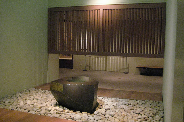
New York is no longer “starred with tepees of ermine and peopled with foxes” – it’s more kale salads and small dogs. Nonetheless, you can get a sense of some of the experiences I’ve had since being here on my #threesixfive project for this year.

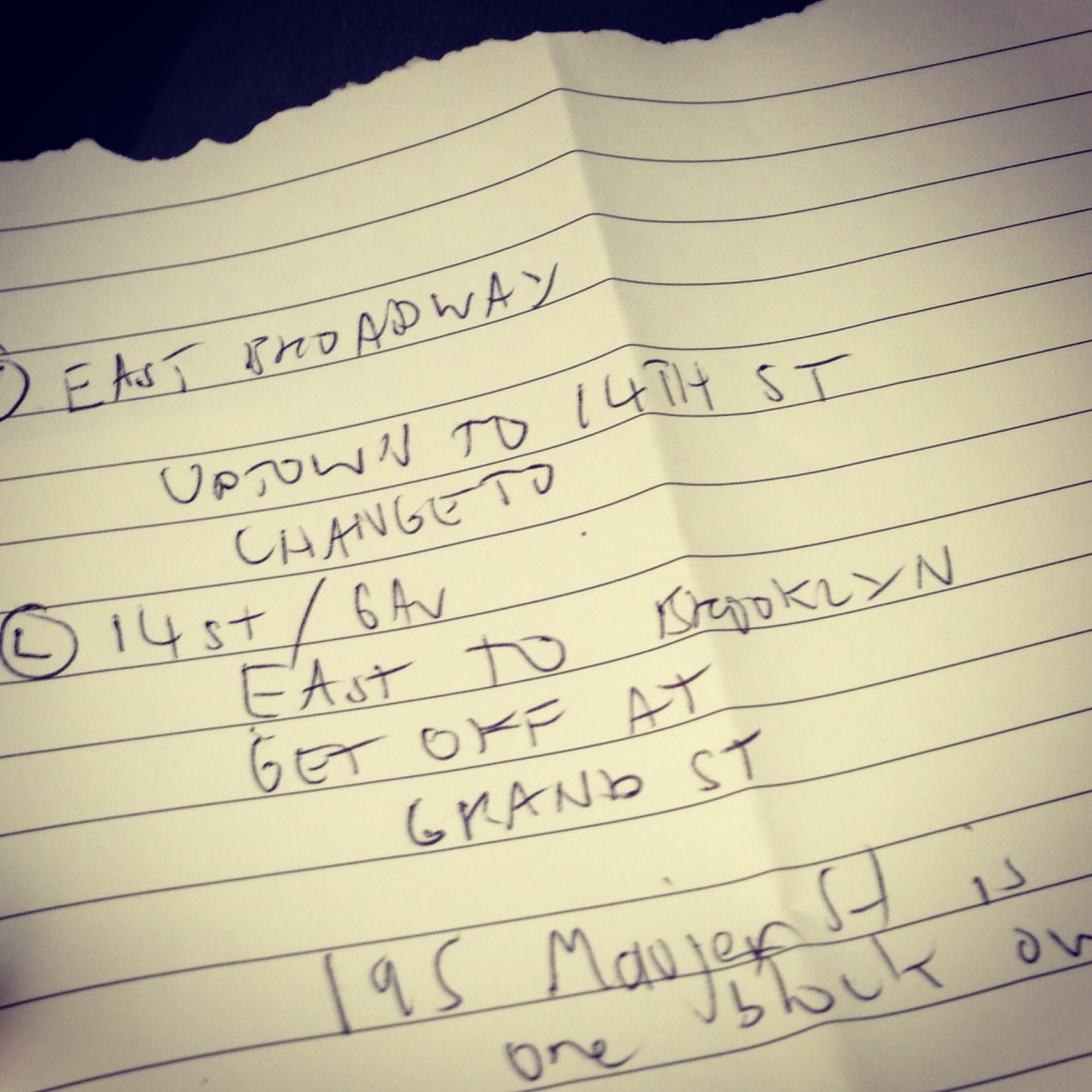
The rules for this project are pretty simple. Each day, I take a photograph using my cell phone and Instagram and connect it with one from the past in the online collections of a library, archive or museum. Connections can be visual, geographical, conceptual, or tangentially semantic.

In New Zealand, I draw on historical images from the pictorial collections of the Alexander Turnbull Library, largely because they make their online items so easy to share and re-use. Here, I’m borrowing (with permission) material from the New York Public Library.

I sometimes refer to this as my ‘this is water’ project, in reference to David Foster Wallace’s commencement address to the graduates of Kenyon College in 2005. As Wallace describes ‘learning how to think’ in his post-modern way:

It means being conscious and aware enough to choose what you pay attention to and to choose how you construct meaning from experience.

I choose to pay attention to the present as well as the past presents within it. I think this is also a reasonably accurate description of the work the team behind the Cooper-Hewitt Labs, and those they work with in the wider museum, are doing as well.

*

photo(313)

I’ve had an eclectic curriculum while I’ve been here. If my learning journey were a mythic story, it would go a bit like this:

Act One:

– The ordinary world: I go about my daily life working for the government in New Zealand, but know that I am lacking in-depth knowledge of how to move from ‘publishing content’ to ‘designing experiences’ for learning.
– Call to adventure: I get an email from LIANZA telling me that I have won an award to gain this knowledge. (A major earthquake also strikes the city).
– Meeting with the mentor: Seb Chan begins preparing me from afar to face the unknown. Emails and instructions arrive. I find an apartment. I book tickets for planes and theatre shows.
– Crossing the threshold: I cross from the ordinary world into the special world. Seb invites me to Central Park (near the Cooper-Hewitt museum) with his family. I get instructions for catching the subway and learn where to get palatable coffee. I obtain a subway ticket – my talisman.

Act Two:

– Approach to the Inmost Cave: I re-enter the subway and enter the Cooper-Hewitt where the object of my quest (knowledge) exists. There are security guards and curators and educators. I meet the members of the Cooper-Hewitt labs team. There is a mash-up picture on the wall of a cat with a unicorn horn. Another shows a cat being . . . Wait, what’s happening in that image?

Things happen . . . I get a virus and lose my voice . . . and then here I am three weeks later preparing to return home to the ordinary world, bottling some of the elixir by way of this blog post.

I draw on the idea of mythic storytelling not to be clever (well, maybe a little bit), but also to introduce some of the values and influences shaping the Cooper-Hewitt’s approach to their museum redevelopment.

Seb has written great posts on the two experimental theatre pieces Then She Fell by Third Rails Projects and Sleep No More by Punchdrunk over on Fresh and New. Among other things, these hint at the Cooper-Hewitt’s choice to knowingly break the rules and tell stories in a non-linear way. I won’t cover the same ground here.

Another key inspiration is the Museum of New Art in Tasmania.

The idea of the talisman (in Then She Fell a set of keys; in Sleep No More a white mask; in MONA the ‘o’) is an important one and seems to inform the Cooper-Hewitt’s approach to visitor technology. Devices that are accessible to all, the visitor’s ability to unlock stories through interaction, and the availability of all the information about collection items being online after you visit are also relevant.

In addition to the ‘memorability’ of the event, a few other thoughts spring to mind on elements of Then She Fell and Sleep No More. Both relate to a conversation I had with Jake Barton of Local Projects on the relationship of audience to successful experience design. I’ll talk more about Local Projects later in this post.

Meanwhile, in both Sleep No More and Then She Fell, all you are given as you are guided to cross the threshold into the story-world are the rules for engagement and a talisman. Beyond this the ‘set’ (which incorporates the atmosphere and fabric of the site it is layered over) feels simultaneously theatrical (magical) and life-like (real).

I mention this because of the observation Jake made on creating digital applications that are wondrous enough to work for everyone because they tap into real-world human experiences. Obviously you wouldn’t take an eight year old to Sleep No More, so content choices are important. But the fundamental interaction works for everyone. This is also the case with the Cleveland Art Museum line and shape interactive.

In Then She Fell, these interactions are also personalised and, while guided, audience members make choices that drive the outcome of the scene. Taking dictation for the Mad Hatter using a fountain pen, for example, an actor improvised and remarked “my, you do have nice handwriting. I can see why you come highly recommended”. In another scene plucked from the database of scenes, a doctor asked me a series of questions as he progressively concocted a blend of tea for me, which I then drank. Other scenes were arrestingly intimate.

Another striking aspect of these environments is the radical trust the theatre company invests in its audience to be human and responsible. Of course none of the objects or archival files and letters in Sleep No More or Then She Fell are real, nor are the books copies of last resort.

But the fact that you can touch them and leaf through them and hold them in your hand, or that you can use them to figure things out is a really potent part of the experience.

*

photo(312)

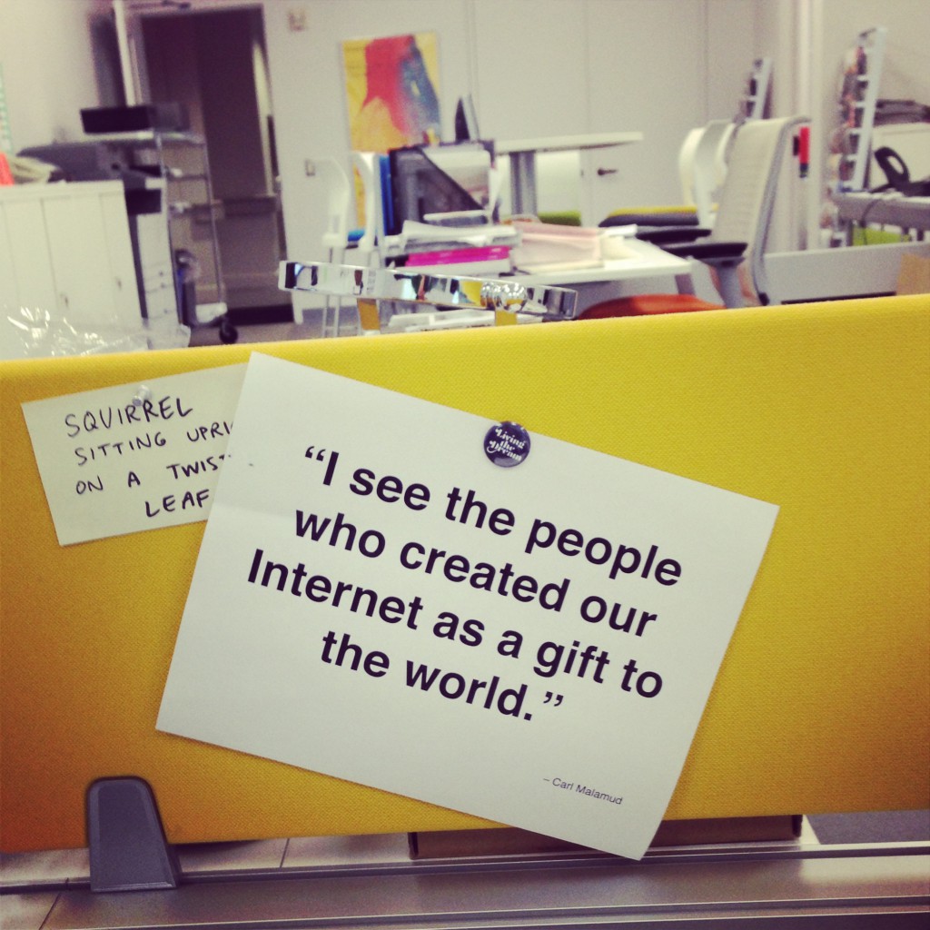
Quote from Carl Malamud above Aaron Straup Cope’s desk.

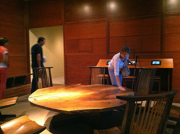
My time in New York hasn’t all been theatre visits and blog publishing. With the Carnegie mansion that houses the Cooper-Hewitt closed for renovation and expansion of the public gallery space, I’ve also been spending time with staff immersed in the process of design and making.

When the building re-opens next year, the museum will be an environment that, as Jake Barton of Local Projects put it, “makes design something people can participate in” – not just look at or learn ‘about’ through didactic label text or the end-product of someone else’s creativity.

Local Projects are the media partners for the Cooper-Hewitt refurbishment, with architects Diller Scofidio + Renfro. Their philosophy is encapsulated in a quote from Confucius that Jake frequently references in his public talks;

I hear and I forget.
I see and I remember.
I do and I understand.

You can see how complementary this thinking is with the immersive theatre environments of Sleep No More and Then She Fell.

By way of illustration, the Cooper-Hewitt wants to encourage a more diverse range of visitors to learn about design by letting them collect and interact with networked collection objects and interpretive content in the galleries.

New Zealanders might think of the ‘lifelines’ table at the National Library of New Zealand designed by Clicksuite, which is driven off the Digital New Zealand API; and Americans might recall the recent collection wall at the Cleveland Art Museum, also designed by Local Projects.

But the Cooper-Hewitt is neither a library nor an art museum. It’s a design museum – “the only museum in the United States dedicated just to historic and contemporary design”.

Consequently, applications Local Projects develops with the museum also seek to incorporate design process layers where visitors can make connections and learn more about objects on display and also be designers.

The challenge, as Jake articulated it when we met, is ‘how you transmit knowledge within experiential learning (the elixir)?’. How do you make information seep in in a deeper way so that visitors or audience members do, in fact, learn?

The gradual reveal of the story in Then She Fell, with spaces also for solitary reflection and contemplation, is significant I think. I suspect I’m not the only one who googled the relationship of Alice Liddell to Lewis Carroll in the days after the performance.

*

If Then She Fell and Sleep No More were like slipping into a forgotten analogue world of the collection stores, Massive Attack v Adam Curtis was like all of the digitization projects of the past decade come back to haunt you.

Curtis describes this ‘total experience’ as a “a gilm’ – a new way of integrating a gig with a film that has a powerful overall narrative and emotional individual stories”. It’s not too far a cry from the word we use in New Zealand to describe the collecting sector of galleries, libraries archives and museums and their potential for digital convergence: a glam.

Imagine Jane Fonda jazzercising it up on a dozen or so massive screens on three walls of a venue, collaged with Adam Curtis’ commentary on how the 80s instituted a new regime of bodily management and control, and Massive Attack with Liz Fraser and Horace Andy covering 80s tunes that you can’t help moving along with. This is the first time I’ve experienced kinaesthetic-visual juxtaposition as a storytelling technique.

It is really hard to find yourself dancing to the aftermath of Chernobyl. It is also very memorable.

As Curtis describes the collaboration between United Visual Artists, Punchdrunk’s Felix Barrett and stage designer Es Devlin: “What links us is not just cutting stuff up – but an interest in trying to change the way people see power and politics in the modern world.”

“I see the people who created our Internet as a gift to the world” – Carl Malamud

“A fake, but enchanting world which we all live in today – but which has also become a new kind of prison that prevents us moving forward into the future” – Adam Curtis

How do we transform our institutions into way-finding devices for the cultural landscapes of the present and past presents, not prisons?

*

moma_soundings_fusinato_2012_massblack-e1375824015679

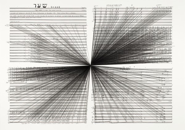
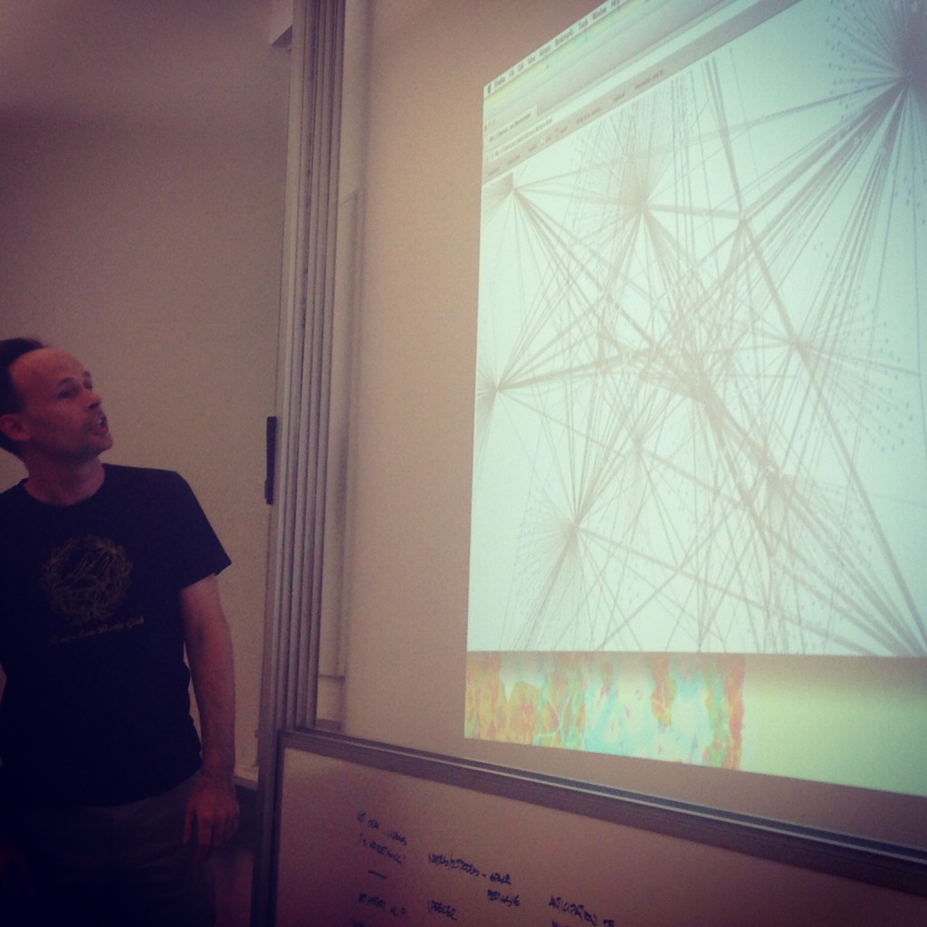
Marco Fusinato, ‘Mass Black Implosion (Shaar, Iannis Xenakis)’ 2012. (Courtesy the artist and Anna Schwartz Gallery)

“To make these drawings, Fusinato chose a single note as a focal point and then painstakingly connected it to every other note on the page” – MOMA interpretation label

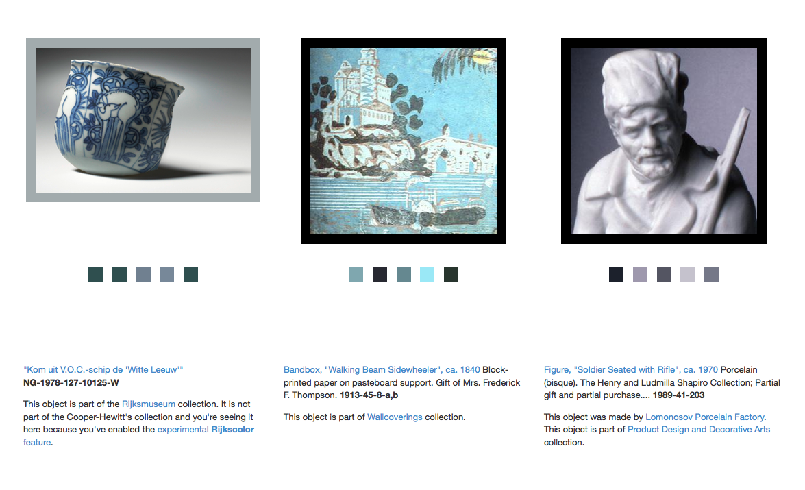
Like many museums around the world, the Cooper-Hewitt as a Smithsonian-Institution has been seeking to broaden access to its collections online and deepen relationships with its audiences.

Much of the recent work of the museum that I’ve observed has focused on establishing two-way connections and associations between each of the many hundreds of objects that will physically be on display in the galleries and at least ten related ‘virtual’ objects and related media.

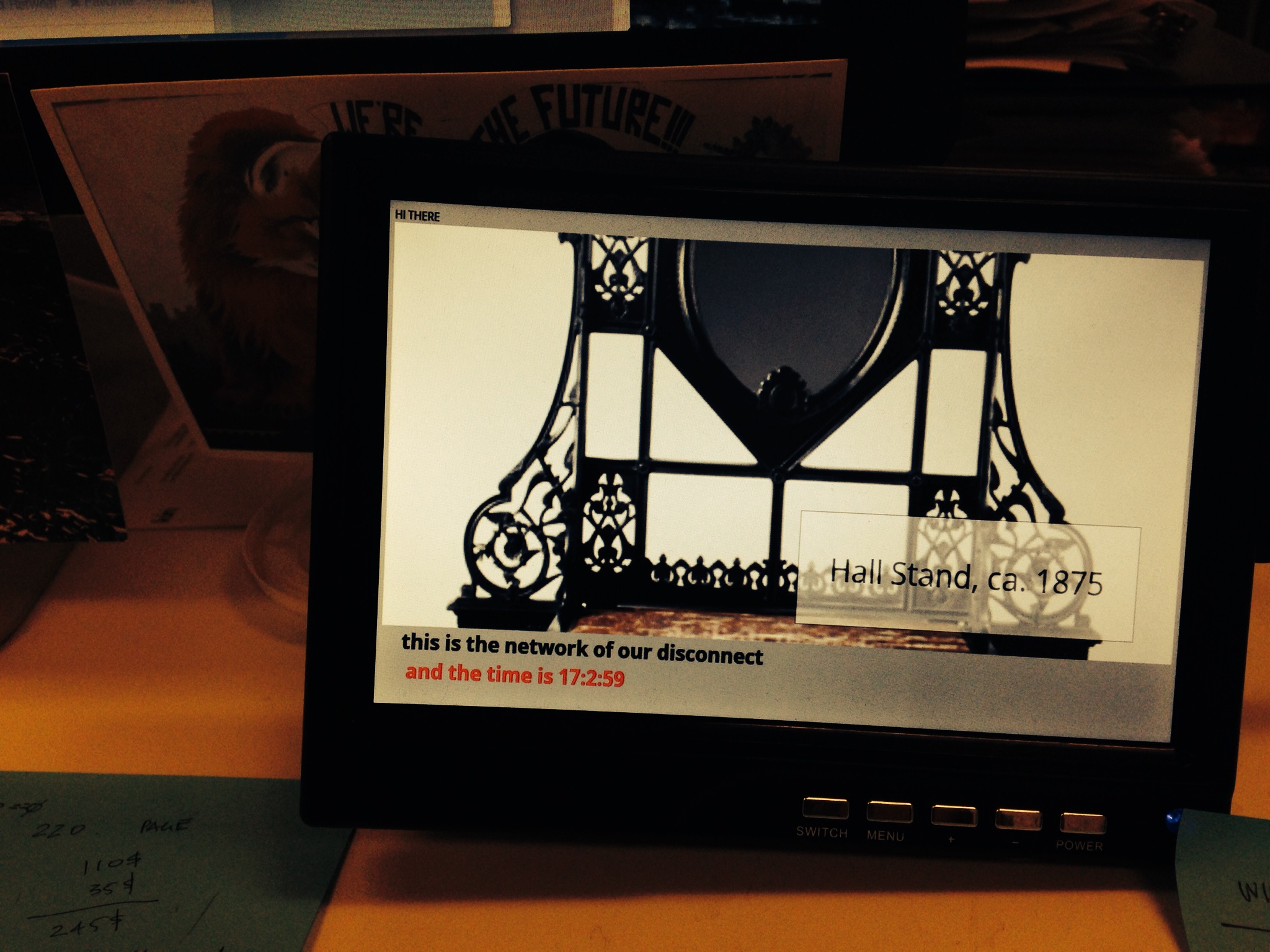
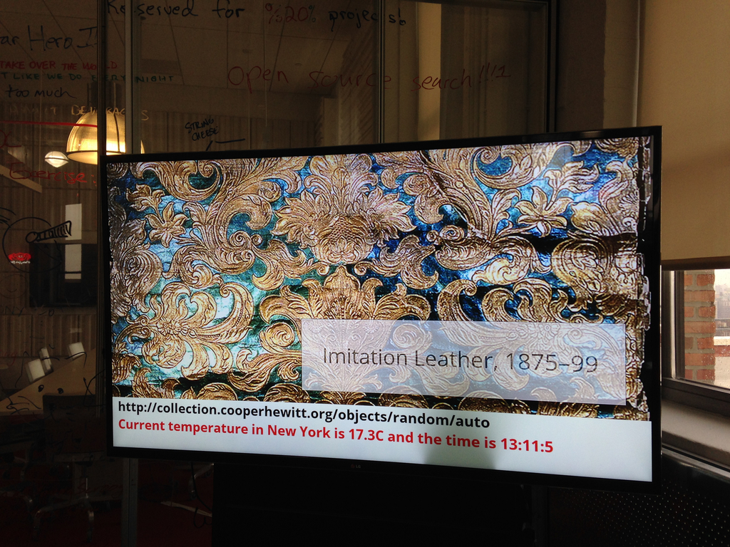
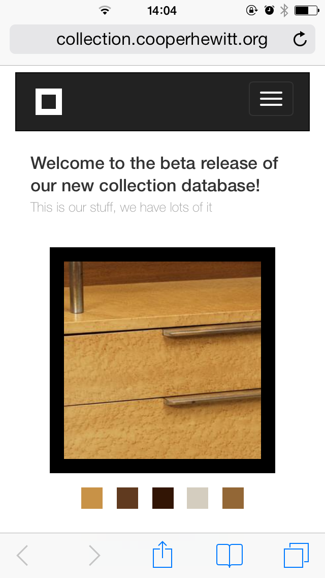
These thousands of digital objects in total will be available through the Cooper Hewitt’s collections API, which will also be a foundation for interactive experiences and other applications where people can manipulate and do things with content to learn more about design and the stories embedded in the museum’s collections.

But there’s a snag.

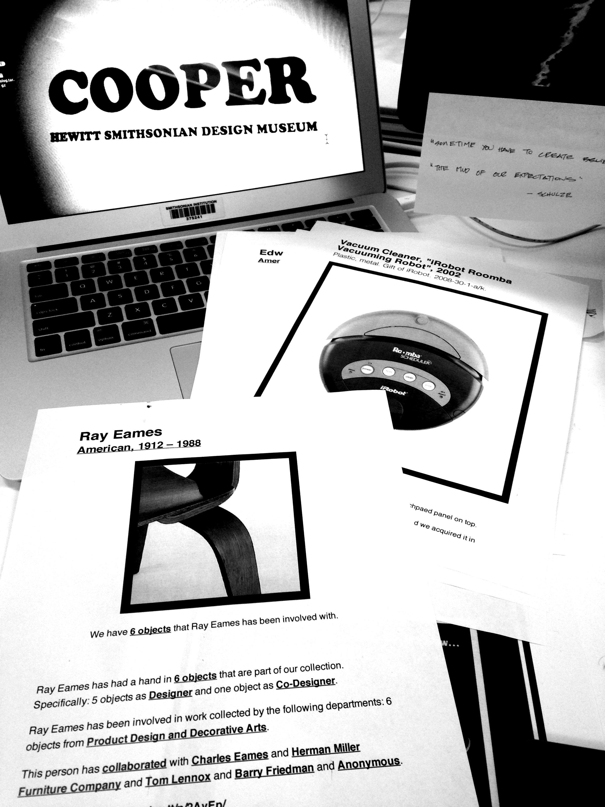
The vast majority of information and story potential, the knowledge and the ability to see meaningful and significant connections, isn’t in the database. It’s in the heads of the collection experts: the curators. Extracting this narrative and getting it into useful digital form is a huge undertaking.

Progress is being made though. I happily sat in on a checkpoint meeting for curators to make sure that objects they were tagging with a vocabulary (co-designed with the museum’s educators who bring “verbs to the curator’s nouns”) would not be orphaned. If objects are tagged, and another curator doesn’t use the same tag, the connection will be lost.

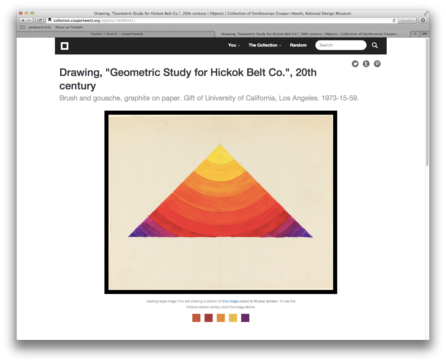
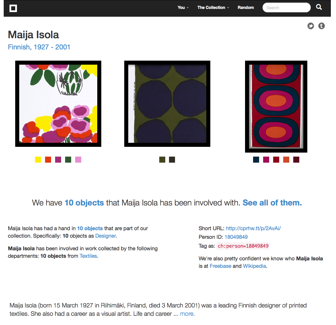
Thus, as one curator put out a call for colleagues to dive into their part of a collection, a wallpaper with a Z pattern found its match in a Zig Zag chair. Pleated paper found its match in an Issey Miyake dress. This is a laborious and time-consuming process, coordinated by Head of Cross-Platform Publishing Pam Horn.

But it means that the collection is starting to come alive in that ‘1 + 1 = 4’ way that is so magical. Through a balance of curatorial and automated processes, these connections and pathways through the collection will (all going to plan) continue to multiply over the months to come.

Visitors will also be able to find their own way through the knowledge the museum holds, and access all of the data online – much as every museum is also trying to connect pre- and post-visits together.

“Now find your own way home” – Massive Attack v Adam Curtis

*

photo(325)

Aaron exposes the power structure that is the donor walls of New York City – Pratt Institute, 14th Street.

On Tuesday nights I’ve been accompanying Seb and Aaron to teach a graduate class at Pratt Institute called Museums and the Network (subtitle Caravvagio in the age of Dan Flavin lights). The syllabus states: “Museums have been deeply impacted by the changes in the digital landscape.

At the same time they are buffeted by the demographic transformations of their constituent communities and changes in education. The collapsing barriers to collection, publishing and distribution afforded by the internet have further eroded the museum’s role as cultural conduit.”

It’s a wonderful learning environment, full of serious play and playful seriousness; theoretical ideas and practical examples. Just like the real Cooper-Hewitt Labs.

The students’ ultimate project will be to create an exhibit – perhaps out of the collection of donor walls of New York’s museums – one of the class’ first assignments. Donor walls loom large and prominently in the cultural institutions here. So much of the work of the sector is funded through endowments and private donations.

Like the Cooper-Hewitt, the students have started by digitising the donor walls and turning all their data into a structured open form so that they (and others) can start to tell stories out of it and present it through a web interface. They are gradually building up to staging an exhibition, “that exists at the intersection of the physical and the internet, from concept through development”.

The readings from this class have become my Instapaper companions as I commute for 40 minutes up the island of Manhattan each morning, and home again. I’ve also started to imagine a museum exhibit of my time in New York. Or perhaps it’s a conceptual art piece or a marketing intervention.

photo(315)

Whatever it is, you enter a space that looks like a real installation install. It’s probably painted off-white. There are pieces of papers on the wall with numbers, plinths on which objects could stand, sheets of blank paper in cabinet drawers, empty glass cases and maybe even 3D replicas of framed paintings that are also off-white.

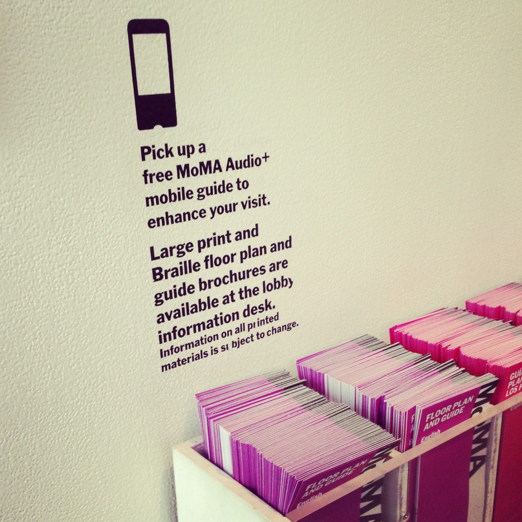
A docent (in New Zealand we call them visitor hosts) guides you to an “information desk” where you can collect a mobile guide or brochures in exchange for your own personal cell phone, which you must check in. You are told that you can read whatever you like on the guide, but you must not erase the content you find there or create new content.

You are told how to use the phone to interact with the numbers on the walls.

Exploring the various applications on the phone you begin to uncover the story of the visitor who came before you. You read their text messages, look at their Instagram feed, explore their Twitter profile and open their photographs (which show photographs of objects, followed by labels with prominent numbers matching the ones on the walls). Maybe there’s a projector installed.

As you stand next to your friend in front of the same object (perhaps it’s the 3D-printed white replica of a framed painting with no texture to indicate the pictorial content) you realize that you have different content on your phones. They are seeing a Van Gogh at #7, you a Rembrandt. You talk about what you (can’t) see. Perhaps there are also some color-less 3D printed replicas of sculptural pieces or other collection items you can hold.

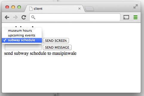
Other audience members text #7 to the number they have been given, and are sent back a record for an object. This is a project that Micah has been playing with using the collections API, using Twilio.

As you hand back the device, you are given the address of a museum where you can see the collection and a URL for it online. Perhaps you exit through a gift shop where you can buy printed postcards of what you didn’t see.

Enough speculation. This is not the collaborative project I came here to consider. Nor am I entirely serious (well, maybe a little bit serious).

photo(2)

(Record of trip to New Museum)

*

There are many comments I could make about the differences and similarities between what I’ve experienced in my short time in New York City and what is familiar to me back home.

At the risk of generalizing, I could talk about the constraints that the grant-based funding model here seem to place on the ability to play a long game with digital infrastructure or to embed sustainable museological practice into the fabric of the institution.

I could talk about how the Cooper-Hewitt seems to run on a skeleton staff of just 73 people, which is small (even by New Zealand standards), for a national institution. How museums I have worked with in New Zealand use visitor and market research and audience segmentation as a foundation for decision-making about programming opportunities, which seems less evident here.

I could mention how far ahead collection documentation and interpretation strategies seem in museums with equivalent missions in New Zealand such as Te Papa – where relating exhibition label text, narratives, external collections and content assets such as videos around online collections is now everyday practice.

I could talk about how ‘coffee plunger’ is a dirty word for French press, how people walk on the wrong side of the sidewalk, and how the light switches go up not down to power on the light. But these are just surface differences for the same basic human motivations.

What I want to highlight, however, isn’t any of these things. Nor is it a comparison. It’s the willingness I’ve seen of staff at the Cooper-Hewitt to start working together across disciplinary boundaries and departments (education/curatorial/digital media) to continue Bill Moggridge’s vision for an ‘active visitor’ to the museum.

This kind of cultural change takes time. (And time already moves slower in museums than the real world). It’s messy and confusing and identity-challenging. It’s hard to achieve when short-term priorities and established modes of operating keep jostling for the attention of the same staff who need to be its agents.

Yet everyone I have met in my short time here has been so friendly and willing to share information with me. Echoing the sentiment of many that I have talked to at the Cooper-Hewitt, I am also hugely grateful to Seb for his encouraging mentorship and guidance, and Aaron for challenging me to think harder.

As Larry Wall puts it in ‘Perl, the first postmodern computer language’, “these are the people who inhabit the intersections of the Venn diagrams”. The accessibility to experience made possible by the Smithsonian’s Cooper-Hewitt, National Design Museum in New York City will be so much richer for their efforts.

I hope it continues to grow and flourish for many years to come.

A Timeline of Event Horizons

We’ve added a new experimental feature to the collections website. It’s an interactive visualization depicting when an object was produced and when that object was collected using some of the major milestones and individuals involved in the Cooper-Hewitt’s history itself as a bracketing device.

Specifically the years 1835 when Andrew Carnegie was born and 2014 when the museum will re-open after a major renovation to Carnegie’s New York City mansion where the collection is now housed. It’s not that Andrew Carnegie’s birth signals the beginning of time but rather it is the first of a series of events that shape the Cooper-Hewitt as we know it today.

The timeline’s goal is to visualize an individual object’s history relative to the velocity of major events that define the larger collection.

Many of those events overlap. The lives of Andrew Carnegie and the Hewitt Sisters all overlapped one another and they were all alive during the construction of Carnegie’s mansion and the creation of Hewitt Sister’s Cooper Union Museum for the Arts of Decoration. The life of the mansion overlaps the Cooper-Hewitt becoming part of the Smithsonian in 1976 and assuming the mantle of the National Design Museum in the mid-1990s.

Wherever possible we show both the start and end dates for an object represented as its own underlined event span. If we only know the start date for an object we indicate that using a blue arrow. The date that the object was acquired by the museum is indicated using a white arrow.

The soundtrack of histories that surround an object are depicted as a series of sequential and semi-transparent blocks layered one atop the other to try and reflect a density of proximate events. If you mouse over the label for an event it is highlighted, in orange, in the overall timeline.

We had three motivations in creating the timeline:

  • To continue to develop a visual language to represent the richness and the complexity of our collection. To create views that allows a person to understand the outline of a history and invite further investigation.
  • To start understanding the ways in which we need to expose the collection metadata so that it can play nicely with data visualization tools.
  • To get our feet wet with the D3 Javascript library which is currently the (friendly) 800-pound gorilla in the data visualization space. D3 is incredibly powerful but also a bit of a head-scratch to get started with so this is us, getting started.

This is only the first of many more visualizations to come and we are hoping to develop a series of building blocks and methodologies to allow to build more and more experimental features as quickly as we can think of them.

So head over to the experimental section of the collections website and enable the feature flag for the Object Timeline and have a play and let us know what you think!

We’ve also made the Github repository for the underlying Javascript library that powers the timeline public and released the code under a BSD license. It should be generic enough to work for any dataset that follows a similar pattern to ours and is not specific to a museum collection.

If you look under the hood you might be horrified at what you see. We made a very conscious decision, at this stage of things while we get to know D3, to focus more on the functionality of the timeline itself rather than the elegance of the code. This is a very early experiment and we would be grateful for bug fixes and suggestions for how to make it better.

Pandas, Press, Planetary

It has been a few crazy days since we announced the addition of iPad App, Planetary, to the museum’s collection.

If you haven’t yet read the long essay about what we’ve done, then it is squirrelled away on the Museum’s Object of the Day blog. The short version is that it is the first time that the museum has acquired code, and that code has also been open sourced as a part of the preservation strategy.

Here’s some of the press it has generated so far. We’ll spare you the hundreds of tweets!

Smithsonian Magazine – “How Does a Museum Collect an iPad app for its Collections?

The Verge – “Hello art world: Smithsonian acquires first piece of code for design collection

Blouin ArtInfo – “The Smithsonian’s Cooper-Hewitt Museum Redefines Design by Acquiring Its First Code

Slate – “How Does a Design Museum Add Software to Its Collection? There’s an App for That.

cNet – “Bragging rights for iPad app: First code in Smithsonian design museum

Gizmodo – “The Smithsonian Just Added a Chunk of Code to Its Permanent Collection

Tech Crunch – “Cooper-Hewitt Adds The First Piece Of Code To Its Design Collection

AllThingsD – “Your iTunes Collection, Displayed as a Solar System

TUAW – “Smithsonian adds iPad app code to its collection

MemeBurn – “Smithsonian acquires first piece of code for design collection

LA Times – “Planetary, an iPad app, enters collection of Cooper-Hewitt museum

Hyperallergic – “The First Code Acquired by Smithsonian’s Design Museum is Released to the World

Future Insights – “Intergalactic Planetary: Tell us what you think

We’re really happy – not least of all because we can confirm that like the Internet, the press also really love pandas.

And also Fast Company – “To Preserve Digital Design, The Smithsonian Begins Collecting Apps

Three adventures: shadowing a visit to the Metropolitan Museum of Art (3/3)

This is the third in a series of three “adventures in universal design,” a design research experiment carried out by Rachel Sakai and Katie Shelly. For an introduction to the project, see our earlier post, here.

SHADOWING:
OBSERVE LINDA & DAVE AS THEY VISIT THE METROPOLITAN MUSEUM OF ART
AUGUST 22 2013

On the Science Sense tour, we met a wonderfully friendly and warm husband and wife duo named Linda & Dave. We asked if they’d be interested in volunteering for some more research by allowing us to shadow them at any museum they chose.

They agreed, and a week later, off we went. Linda is blind and Dave is sighted. They love museums, and they have visited many around the world, together.


Linda & Dave stand in front of the museum, Dave has his arm around Linda. It is a sunny summer day and the entrance is full of people. They are smiling and Dave is wearing a red flowered shirt.

Linda & Dave in front of the Met Museum

Here’s a play-by-play of their visit:

-As we entered the crowded lobby, I noticed that Dave firmly placed his hand near the back of Linda’s neck to guide her—it was so crowded and loud, he had to use firm physical contact to help her navigate the security bag check and chaotic lobby. Linda also used her rolling cane in her left hand.

-Once we got inside, the first thing they did was go to the information desk and ask how to find the exhibition they wanted to see—Brush Writing in the Arts of Japan. The desk person indicated the location on a paper map. L & D didn’t use the map; instead they listened and remembered the attendant’s verbal instructions (left at the arch, elevator to floor 3, make a left, etc).

-Linda carried a paper flyer in her purse with a list of special exhibitions on it, and she brought it out when talking to the attendant, saying “yes, we want to see the one on this list.” Interesting that though she herself could not see what was on the paper, she knew what it said (ostensibly because Dave had told her earlier) and she kept it in her hand, so she could use it later when conversing with others.

-On the way to the elevator, we walked past a table with audioguides, L&D did not notice it.

-At the top of the elevator, we saw an Information Desk with an attendant. Dave expressed excitement that they have Info Desks throughout the Met, saying “before they had these things, I would just wander around this place getting lost!”

-L&D approached the satellite info desk, and asked about the acoustiguide— does it include the Japanese Brush Writing exhibition? The attendant explained that the audioguide covers the whole museum. Audioguides are not being given out from this desk, though. L&D did not get an audioguide.

-We walk down a hall full of artifacts toward the Japanese Brush Writing show. Dave went into “concise tour guide mode” just to give Linda a sense of the scenery, simply naming a few of the objects we went past: “Perfume bottles.” “Ceramic horses.”

-We found our destination: a dimly lit gallery. Linda asked, “is it all paintings?” And Dave explained that no, the gallery had a combination of statues, ceramics, and scrolls. They were pleased that there was a variety of objects and it wasn’t all flat work.

-L&D approached the standing warrior statue at the entrance of the show. Dave began with a visual description of the statue— materials, colors, posture. When talking about the statue’s long earlobes, he lightly tugged Linda’s earlobes. When talking about the statue’s tufty hair, he lightly touched the crown of Linda’s head— anything to make the experience more than just standing and listening. After his thorough description, he read the object label aloud.

-They were very methodical. This is what they did in front of each object they looked at:

1) Dave gave a purely visual description. Colors, size, subject matter, mood.

2) Maybe a few clarifying questions from Linda (“Are the lines roundish or squarish?” “Are the lines harsh?” “Are the people done finely?”)

3) Dave read the object label aloud, sometimes omitting a bit of info, sometimes reading it all right down to the donor details.

4) A bit of back-and-forth, sharing their reactions to the piece, making a connection to prior knowledge or experiences, or simply expressing how pretty and/or interesting they find it.

Dave & Linda standing with their backs to us, facing a beige and black painting.. Dave has Linda's hand in his, and is holding it outstretched.

In front of this artwork, Dave guided Linda’s hand through the air to help explain the size and composition. (It looks a bit like she is touching the artwork because of the angle of this photo, but we assure you that she is not).

-Dave often would take Linda’s hand in his, hold it outstretched, and wave it around to delineate shapes and spatial relationships (“there are mountains here, and a waterfall right here…”)

-A few of the Buddha statues were doing mudras with their hands. Dave would put Linda’s arms and hands into the same position, mimicking the statue. Sometimes he’d join her in the pose, so they’d both be frozen, holding the pose for a moment of contemplation. (Extremely adorable.) I don’t think many sighted visitors would think to do this, but it looked like they were having fun, and perhaps gave them a bit of “somatic insight” into how that statue might be feeling.

-As Linda got more details about the piece in front of her, she would exclaim surprise, “oh!” “oo-ooh!” As if she was building an image in her imagination, and each new bit of info from Dave was like an exciting clue in an unsolved mystery.

Dave and Linda are facing each other, standing a few feet in front of a Buddha statue. Dave is looking at the statue, and hoding Linta's arms. Linda is facing Dave and holding the pose.

Dave puts Linda’s arms into the same position as the statue.

-I noticed that sometimes Linda would touch the glass in front of an object. Just to get some sense of space and anchoring, I’d guess.

-About halfway through the exhibition, Dave took a break to sit down on a bench. Linda, Rachel and I took the chance to chat a bit. Linda commented that she would like to get a sense of scale and mood upon entering a museum. A sighted visitor gets a whole bunch of scene-setting information right upon entering with a sweep of the eye, and can choose what piece they want to check out. For her, however, she’s generally subject to Dave’s decisions about what to look at when they tour an exhibition. She said that she doesn’t mind this, because she likes Dave’s taste, but it is a consideration for any blind visitor.

-From Dave’s perspective, it’s a lot of talking and mental work. He seemed to be a bit worn out at times when reading aloud those long object labels. No wonder he needed a break!

-Linda also mentioned that they like to go to the gift shop, and that sometimes there are statuettes or replicas of things in the exhibition that you can touch, so that’s a good blind person’s “hack.”

Linda stands in front of three shelves full of smallish, about one foot tall statues and figurines. She is touching one of the statues.

Hacking the museum: the gift shop is a good place to find touchable replicas of objects in the collection.

-As we moved on, we neared a fountain. Right away, Linda heard the water trickling and said, “I hear a fountain!” Dave started to describe the fountain, which, as it turned out, is kinda hard to describe in words. There were some children seated on the wooden platform beside the fountain. Linda asked if she could sit down on the platform, which is somewhat bench-like, but sort of ambiguous-looking as to whether you can sit there or not. We said, sure, go for it. One thing led to another.. and soon Linda was feeling the white stones, and then the fountain itself. There was no guard in the area, just a few fellow patrons who seemed touched and tickled, as were we, watching Linda light up as she discovered the different textures and shapes. “Ooooh!” “Ahhh!” “Wowww!!” She was so, so into it. Just totally beaming. Finally, something to touch! Dave turned to us with a wink, and said “See what a difference tactile makes?”

A darkly colored, slick slab of basalt perfectly centered in a rectangular bed of round white stones. The basalt slab has some smooth planes and some rough planes, and a well of water in the top. Water is running down all sides of the slab.

The Water Stone, a basalt fountain by Isamu Noguchi. Photo by Flickr user wallyg

-Our last stop was a Japanese Reading Room, where the museum has tea ceremonies and other social events. The room has some Japanese-style floral arrangements, and beautiful wooden furniture by George Nakashima. Linda gave herself a thorough tour of the furniture, feeling the curves, bends, and joints in the massive walnut table and matching chairs. since it was definitely OK to touch. It was really the only moment when Linda could be independent in the museum.

A room with wood-paneled walls and a large raw-edge, round wooden table in the center. Linda is standing, stooped at the far end of the table, with one hand on the table surface and the other hand on her rolling cane.

Linda giving herself a tactile tour of the Japanese Reading Room furniture at the Met.

Takeaways

– Linda & Dave had carbon-copy experiences. Many people enjoy visiting a museum with a partner and staying side-by-side the whole time. Sometimes, though, you don’t want to visit in that way. Personally, when I’m in a museum, I tend to break off from the group and explore on my own. How might we allow blind visitors to have the option for an independent experience?

– Sighted visitors can easily get a sweep of the room immediately upon entering. What looks interesting in this gallery? What’s the mood? Where do I want to go first? How might we afford blind visitors a “sweep of the room” upon entering?

– Linda pointed this out to us during the tour: neutral description > coded description. A neutral (and blind-friendly) description would be, “on the left there is a small, simple building with a thatched roof and open balcony on all sides.” A coded (and blind-unfriendly) description would be “on the left there is a small building, looks like early Japanese architecture.” Get the difference? A neutral description uses transparent language that requires a minimum amount of previous knowledge. A coded description requires some prior education or knowledge to understand it.

Tactile makes a huge difference. Tactile moments were highlights of the tour: Dave tapping Linda on the head while describing a warrior’s messy hairdo, Dave sweeping her hand around to convey space, folding her hands into a Buddhist mudra, Linda tapping the glass in front of her for a spatial anchor, detailedly exploring the furniture in the Reading Room and a covert tickling of the Noguchi fountain. I’d argue that if these literal “touchpoints” were formally afforded to all visitors, all visitors’ experiences would be enhanced, not just experiences of the blind and partially sighted.

Quietness of the gallery was on our side. The gallery was small, only had a few people in it, and was carpeted. Dave and Linda could hear each other without straining their voices or their ears. This made the experience very tranquil and pleasant. Imagine how different their visit would have felt in a noisier, more echoy gallery.

We didn’t observe much active use of sound. L&D didn’t have audioguides, and there was no music or anything like that in the galleries. Linda mentioned various fountains in different museums that she liked. As a sighted person, I have to admit that fountains are not usually a highlight for me, but I think for Linda, because it’s something she can experience directly, they are often a highlight. What if museums with fountains (or any acoustically cool architectural feature) encouraged all visitors to close their eyes and really listen?

We didn’t observe any use of tech. L&D kept this visit analog. Wonder how the visit might have been better/worse/the same with some type of technological aid? How to design such technology to support and enhance rather than distract and annoy?

Linda, Rachel and Katie smiling inside a contemporary Asian art gallery at the Met museum. There is a very unusual sculpture in the background of a real deer, taxidermied and covered in glass orbs of variable sizes, as if it had been dunked in an oversized glass of club soda, and all the bubbles were sticking to its sides.

Linda, Rachel and Katie at the Met. We had a good time!


Three adventures: the Science Sense tour at American Museum of Natural History (2/3)

This is the second in a series of three “adventures in universal design,” a design research experiment carried out by Rachel Sakai and Katie Shelly. For an introduction to the project, see our earlier post, here.

The entrance to the American Museum of Natural History. Clear blue sky, pedestrians walking up the stairs, banners hanging on the facade, and taxicabs in the foreground. Architecture is stately, four tall columns and ornate inscriptions and statues near the roofline.

The American Museum of Natural History. Photo by Flickr user vagueonthehow.

COMPETITIVE PRODUCT SURVEY:
SCIENCE SENSE TOUR AT AMERICAN MUSEUM OF NATURAL HISTORY
AUGUST 15 2013

About once a month, AMNH offers a special tour for the blind, a program called Science Sense. Many museums in New York City have similar monthly tours for the blind. (The Jewish Museum’s Touch Tours, The Whitney Museum’s Touch Tours, MoMA’s Art inSight, the Met Museum’s Picture This! Workshop, and many more).

We chose to go on Science Sense because it worked with our schedule. Our tour was in the iconic Hall of North American Mammals.

Screenshot of the AMNH site. The page reads: Science Sense Tours  Visitors who are blind or partially sighted are invited to attend this program, held monthly in the Museum galleries. Specially trained Museum tour guides highlight specific themes and exhibition halls, engaging participants through extensive verbal descriptions and touchable objects.  Science Sense is free with Museum admission.  Thursday, August 15th, 2:30 PM North American Mammals Discover the dioramas in the stunningly restored Bernard Family Hall of North American Mammals, which offers a snapshot of North America’s rich environmental heritage.

The AMNH website’s info page about access for the blind and partially sighted

Here are some highlights and observations from our tour:

– We gathered in the lobby of the planetarium. The tour’s organizer, Jess, explained that the tour meets in the planetarium entrance and not the main NMAH entrance because it is a more accessible entrance. (Ramp, no stairs, large doorways with push-button opening, etc)

– It was a summer Thursday at 2:30, so we were a small group. Many of our fellow tour-goers appeared to be about retirement-age, which makes sense given the time of day. There was one teenaged boy, who was with his mom who has partial vision.

– The group had a chatty and friendly vibe. About 10 guests total. People were chatting with each other and having getting-to-know-you type conversations during our walk to the Hall of Mammals.

– Only 2 out of the 10 attendees appeared to be blind or low-vision. Each of the blind/low-vision guests had a sighted companion with them. The other 6 attendees appeared to be fully sighted.

– Irene, our tour guide, wore a small amplifier around her waist and a head-mounted microphone (something like this). The hall wasn’t terribly loud, but the amplifier made for more comfortable listening (and probably more comfortable speaking, too).

In a very dimly lit gallery, Irene stands with a group of attentively listening museumgoers on her left, and a brighly lit diorama of taxidemy bison on her right. She wears a blue employee badge and microphone headset.

Our guide Irene describing the bison diorama for the group.

– Once we arrived in the darkened Hall, Irene began our tour the same way most tours begin: an explanation of historical context. (When and why the dioramas were originally created, when and why they were restored… etc.)

– Irene described the first diorama thoroughly, element by element. (Backdrop, foreground elements, taxidermy animals.) One guest asked about how big the diorama is. Good question. Irene suggested that a second guide take the blind guests for a walk from one edge of the diorama to the other to get a sense of scale. This was a suggestion I wouldn’t have thought of; seems more fun than just stating a measurement.

Irene is holding an approximately two foot by one foot swatch of bison fur in both hands, grinning as she holds it out for others to feel.

Irene delights in sharing the touch sample (bison fur) with the group.

– Irene had a number of touch samples on a rolling cart. Some plastic animal skulls and a sample swatch of bison fur. At the end of our time in front of the bison diorama, she gave everyone a chance to feel the musky, matted fur.

– Naturally, as Irene was explaining the diorama and the touch samples were sitting behind her on the cart, many other visitors to the Hall (not part of the tour) took the opportunity to touch the fun stuff as it sat unattended on the cart.

– We went around to four more stunning dioramas, where Irene and a second guide (who was in training) took turns describing and contextualizing the displays.

– I noticed that sometimes the sighted companion of one of the attendees would quietly add on his own description to what the tour guide was saying. Once I saw him lift his blind partner’s arm, and sweep it through the space to explain where different objects in the diorama were positioned. (We would later chat with these folks, Linda & Dave, who ended up going on a trip with us to the Met, which we’ll talk about in the next section.)

Takeaways:

– Rachel & I both happen to be big radio/podcast listeners. During the tour, I realized that a blind person’s experience is a lot like listening to radio. They are relying only on the guide’s words to “see” what’s there.

What if museum tour guides were trained to think and speak like radio hosts? What if each stop on the tour opened with a detailed, theatrically delivered, visual description? Listening to a luscious, mood-setting, masterfully crafted description of anything on display— be it a Bison diorama or a Dyson Vacuum Cleaner or a Van Gogh painting would be a delight for sighted and blind visitors alike.

A photo of Ira Glass smiling and looking into the distance. There is a microphone in front of him.

What if your tour guide could describe works as viscerally and virtuosically as Ira Glass could?

-There was some confusion about the basic size and shape of the dioramas. What if there was a tiny model of each diorama that visitors could feel? Blind visitors could understand scale and shape right away, and sighted visitors might enjoy a touchable model, too. Imagine touchable mini-models of paintings, sculptures, and other museum stuff, too.

Check out our third and last adventure in universal design research, observing a blind person’s museum visit.

Three adventures: a blindfolded visit to the Guggenheim (1/3)

This is the first in a series of three “adventures in universal design,” a design research experiment carried out by Rachel Sakai and Katie Shelly. For an introduction to the project, see our earlier post, here.

A black and white photo of the Guggenheim Museum in NYC. Traffic lights and pedestrians on the sidewalk are in the foreground. The museum's famous architecture looks like lots of big smooth white shapes stacked on each other: A big rectangle at the bottom, four big circles stacked on the right, and a second rotunda with windows on the left.

The Guggenheim Museum, which is just a stone’s throw away from our office. Photo by Flickr user Ramón Torrent.

EMPATHY TOOLS:
BLINDFOLDED VISIT TO THE GUGGENHEIM
AUGUST 5 2013 

Taking a cue from Patricia Moore’s empathy research in NYC in the 1990s, Katie and I began our research with an empathy-building field trip to the Guggenheim. I took on the role of the blind visitor and Katie played the part of my sighted companion. The entire trip lasted for about 45 minutes and I kept my eyes shut for the duration.

Even though the Guggenheim is just a block away from our office, this was my first visit so I had no pre-existing mental map of the space. With my eyes closed, it did not take long before I felt completely disoriented, vulnerable, and dependent on my companion. After five minutes I had no idea where I was or where we were going; it felt like we were walking in circles (actually, we may have been because of the Guggenheim spiral…). I trust Katie, but this was unnerving.

(Note: this intensity of discomfort would not apply for a “real” blind or partially-sighted person, who would be entirely familiar with the experience of walking around without sight. A mild feeling of disorientation in the space, though, is still worth noting. Maybe the level of discomfort for a blind person would be more subtle, more like how a sighted person would feel wandering around without a map.)

The Guggenheim's large round lobby, shown completely bathed in ruby-red light. The benches and floor area are crowded with people reclining, laying on the floor, and looking upwards at the light source.

The James Turrell exhibition at the Guggenheim. Photo by Flickr user Mr Shiv.

We started the visit on our own with Katie guiding me and doing her best to describe the space, the other visitors, and the art. After a few minutes, we found one of the Guggenheim’s Gallery Guides wearing a large “Ask Me About the Art” button. When Katie asked the guide whether she was trained to describe art to low-vision guests, her response, “…I had one training on that,” was hesitant. To my ear, it sounded like reluctance and I immediately felt as though our request was a bother. Katie also felt like a pest, like she was “drilling the attendant” on her training. After some initial awkwardness, though, she offered to just share what she usually says about the piece (James Turrell’s Prado (White)), which turned out to be a very interesting bit of interpretation. We thanked her for the info and moved on.

By the second half of our visit we had picked up a couple of audioguides. The Guggenheim, like many other museums, has the encased iPod touch flavor of audio guide. The look and feel is nice and slick, but it’s not great for accessibility because the home button is blocked. (A triple-tap of this button is how you open accessibility controls in iOS).

Dependence on the GUI meant that when I wanted to hear a description, Katie would take my audioguide, start it playing, hand it back to me, then start up her own audioguide. If I missed a word and needed to go back, or if I wanted to pause for a second, well, I was pretty much out of luck. I could have asked Katie, but I felt like too much of a bother, so just I let it go.

The audio content was interesting, but it was written with sighted visitors in mind, with very little visual description of the work being discussed.

There was a big chunk of text on the wall explaining a bit about James Turrell’s work, which Katie read aloud to me. It would have been great to just have that text available for playback in the audioguide.

After our visit, I dug deeper into the Guggenheim’s website and learned that they have a free app that includes verbal imaging description tours written for visitors who are blind. Some of these tours have associated “touch object packs” that can be picked up from staff. That would have been great, but at the time of our trip Katie and I were unaware that these options existed, even though we did check out the Guggenheim website before visiting. None of the staff (who could see that I appeared to be blind) reached out to let us know about these great accessibility options. What a shame!

On the afternoon we visited, the Guggenheim was packed. We didn’t want to be too much of a nuisance to the already-busy staff so Katie went into “hacker mode,” looking for ways to tweak the experience to fit our needs. The visit became about hunting for things we could share.

A white cable with one 3.5mm male audio jack plug connected to two 3.5mm female jacks.

A headphone splitter lets two people listen to the same device.

Takeaways

A simple hack idea: headphone splitters. Though it wouldn’t give blind visitors more control over their audio guide, it would take away the clumsiness of one person having to manage two audioguides. Plus, whether you are blind or not, using a headphone splitter is fun and can strengthen a shared experience.

– I was disoriented throughout the trip and this was very uncomfortable. A better understanding of how I was moving through the space would have helped. How might we orient blind visitors when they first enter the museum so that they have a broad mental map of the space?

– I was dependent on Katie and did not have many options for how I might want to experience the museum (deep engagement with a few works, shallow engagement with many works, explore independently, explore with a friend, etc). How might we provide blind visitors with options for different types of experiences?

– Katie did her best to “hack” the experience and tried to discover things we could share in order to create a meaningful museum visit for both of us. How might we help create and shape shared experiences for pairs who visit the museum?

Staff training is important. The Museum has great accessibility tools, but they were invisible to us because nobody on staff mentioned them. The front desk person didn’t ask whether we would be interested in the accessibility tools, even though she had seen that I appeared to be blind.

– Staff mood is important. Many of the staff we interacted with seemed bashful or embarrassed about the situation and our accessibility questions. The museum was hectic and they were very busy; we felt like asking for too much help would have been pesky.

Check out our next adventure in universal design, a museum tour designed for the blind.