Why are we collecting source code?

(via https://rekall.tumblr.com/post/92033337743)

(via https://rekall.tumblr.com/post/92033337743)

Part of what we continue to work on in parallel to the opening of Cooper Hewitt is capacity building for the museum to collect ‘the present’ – which includes the code that underpins and makes functional much of the ‘designs’ of the modern world. That means all the interactive, networked design ‘objects/works’, not just on screens but also those embedded in products, services and systems. I’m not just interested in this for ‘digital preservation’ reasons, but also to help us come up with new ways to interpret, contextualise and communicate the ‘how and why’ of these objects (and the choices the designers made) to our visitors.

Aaron liked what I wrote to a designer with whom we are working with on collecting some interactive pieces, and thought it made sense to share it in a redacted form. Sometimes it is nice to be asked to be explicit about why the underlying code matters – and so here’s what I wrote.

As the (publicly-funded) national design museum, one of the reasons we are interested in acquiring the underlying code and data is that allows the museum and future scholars and researches to explicitly explore and interrogate the choices and decisions made at the time of a work’s creation in response the the technological constraints of the time, as well as the adjustments made through a work’s creation to make it better respond to the needs of users. In the case of Planetary this is why we acquired the entire Github repository – the versioned codebase.

Approaching your choices of language and platform as ‘materials’ that were shaped by the period in which the work was made, as well as your decisions in the code itself, is extremely useful for interpretation and future scholarship. Nick Monfort & Ian Bogost’s book on the affordances of the Atari 2600 platform, Racing the Beam, is just one example of the kind of scholarship we foresee as being possible when code and data is acquired with works. This sort of exploration – of decisions made, and the technological and social constraints encountered – is key to Cooper Hewitt helping the public to interrogate and understand works in the collection and the work of designers as more than just aesthetic experiences.

Increasingly when we are acquiring interactive works we are also interested in how users used and reacted to them. In these cases we would also consider acquiring user research, user feedback and usage data along with a work – so that future scholars and visitors could understand a work’s success in achieving its stated goals. In terms of product design collections this is often reduced to ‘market and sales performance’ but we feel that in the case of works on the internet there is far more potential opportunity to explore other more complex and nuanced measures of relative ‘success’ that reveal the work that interaction designers and the choices they make.

In respect to [redacted] specifically, it helps visitors understand that you made this work in a particular way when you did because that’s how the technology and access to data was at the time. And that if that it was to remade now in 2014, there might be a multiplicity of new ways to do it now and we can explicitly talk about the differences.

The other reason is that the underlying code and data better enables the museum to preserve these works as part of the Smithsonian’s collection indefinitely in the public trust – and perhaps exhibit them 100 years from now.

Discuss.

Rethinking Search on the Collections Site

One of my longer-term projects since joining the museum has been rethinking how the search feature functions on the collections website. As we get closer to re-opening the museum with a suite of new technologies, our work in collaboration with Local Projects has prompted us to take a close look at the moving pieces that comprise the backend of our collections site and API. Search, naturally, forms a large piece of that. Last week, after a few weeks of research and experimentation, I pushed the first iteration live. In this post, I’ll share some of the thoughts and challenges that informed our changes.

First, a glossary of terms for readers who (like me, a month ago) have little-to-no experience with the inner-workings of a search engine:

  • Platform: The software that actually does the searching. The general process is that we feed data to the platform (see “index”), and then we ask it for results matching a certain set of parameters (see “query”). Everything else is handled by the platform itself. Part of what I’ll get into below involves our migration from one platform, Apache Solr, to another, Elasticsearch.
  • Index: An index is the database that the search platform uses to perform searches on. The search index is a lot like the primary database (it probably could fill that role if it had to) but it adds extra functionality to facilitate quick and accurate retrieval of search results.
  • Query: The rules to follow in selecting things that are appropriate to provide as search results. For users, the query could be something like “red concert poster,” but we have to translate that into something that the search provider will understand before results can be retrieved. Search providers give us a lot of different ways we can query things (ranges of a number, geographic distance or word matching to name a few), and a challenge for us as interface designers is to decide how transparent we want to make that translation. Queries also allow us to define how results should be sorted and how to facet results.
  • Faceting/Aggregation: A way of grouping results based on traits they posses. For example, faceting on “location” when you search our collection for “cat” reveals that 80 of our cat-related things are from the USA, 16 are from France, and so on.
  • Analysis (Tokenization/Stemming etc): A process that helps a computer work with sentences. Tokenization, for example, would split a search for “white porcelain vase” into the individual tokens: “white,” “porcelain” and “vase,” and then perform a search for any number of those tokens. Another example is stemming, which would allow the platform to understand that if a user searches for “running,” then items containing other words like “run” or “runner” are also valid search results. Analysis also gives us the opportunity to define custom rules that might include “marathon” and “track” as valid results in a search for “running.”

The State of Search

Our old search functionality showed its symptoms of under-performance in a few ways. For example, basic searches — phrases like “red concert poster” — turned up no results despite the presence of such objects in our collection, and searching for people would not return the person themselves, only their objects. These symptoms led me to identify what I considered the two big flaws in our search implementation.

On the backend, we were only indexing objects. This meant that if you searched for “Ray Eames,” you would see all of the objects we have associated with her, but to get to her individual person page, you would have to first click on an object and then click on her name. Considering that we have a lot of non-objects1, it makes sense to index them all and include them, where relevant, in the results. This made my first objective to find a way to facilitate the indexing and querying of different types of things.

On the frontend, we previously gave users two different ways to search our collection. The default method, accessible through the header of every page, performed a full text search on our Solr index and returned results sorted by image complexity. Users could also choose the “fancy search” option, which allows for searches on one or more of the individual fields we index, like “medium,” “title,” or “decade.” We all agreed here that “fancy search” was confusing, and all of its extra functionality — faceting, searching across many fields — shouldn’t be seen as “advanced” features. My second objective in rethinking how search works, then, was to unify “fancy” and “regular” search into just “search.”

Objective 1: Update the Backend

Our search provider, Solr, requires that a schema be present for every type of thing being indexed. The schema (an XML file) tells Solr what kind of value to expect for a certain field and what sort of analysis to perform on the field. This means I’d have to write a schema file — anticipating how I’d like to form all the indexed data — for each new type of thing we want to search on.

One of the features of Elasticsearch is that it is “schemaless,” meaning I can throw whatever kind of data I want at the index and it figures out how to treat it. This doesn’t mean Elasticsearch is always correct in its guesses — for example, it started treating our accession numbers as dates, which made them impossible to search on — so it also gives you the ability to define mappings, which has the same effect as Solr’s schema. But if I want to add “people” to the index, or add a new “location” field to an object, using Elasticsearch means I don’t have to fiddle with any schemas. This trait of Elasticsearch alone made worth the switch (see Larry Wall’s first great virtue of programmers, laziness: “the quality that makes you go to great effort to reduce overall energy expenditure”) because it’s important to us that we have the ability to make quick changes to any part of our website.

Before building anything in to our web framework, I spent a few days getting familiar with Elasticsearch on my own computer. I wrote a python script that loops through all of the CSVs from our public collections repository and indexed them in a local Elasticsearch server. From there, I started writing queries just to see what was possible. I was quickly able to come up with a lot of the functionality we already have on our site (full-text search, date range search) and get started with some complex queries as well (“most common medium in objects between 1990-2000,” for example, which is “paper”). This code is up on Github, so you can get started with your own Cooper Hewitt search engine at home!

Once I felt that I had a handle on how to index and query Elasticsearch, I got started building it into our site. I created a modified version of our Solr indexing script (in PHP) that copied objects, people, roles and media from MySQL and added them to Elasticsearch. Then I got started on the endpoint, which would take search parameters from a user and generate the appropriate query. The code for this would change a great deal as I worked on the frontend and occasionally refactored and abstracted pieces of functionality, but all the pieces of the pipeline were complete and I could begin rethinking the frontend.

Objective 2: Update the Frontend

Updating the frontend involved a few changes. Since we were now indexing multiple categories of things, there was still a case for keeping a per-category search view that gave users access to each field we have indexed. To accommodate these views, I added a tab bar across the top of the search forms, which defaults to the full-collection search. This also eliminates confusion as to what “fancy search” did as the search categories are now clearly labeled.

Showing the tabbed view for search options

Showing the tabbed view for search options

The next challenge was how to display sorting. Previously, the drop-down menu containing sort options was hidden in a “filter these results” collapsible menu. I wanted to lay out all of the sorting options for the user to see at a glance and easily switch between sorting modes. Instead of placing them across the top in a container that would push the search results further down the page, I moved them to a sidebar which would also house search result facets (more on that soon). While it does cut in to our ability to display the pictures as big as we’d like, it’s the only way we can avoid hiding information from the user. Placing these options in a collapsible menu creates two problems: if the menu is collapsed by default, we’re basically ensuring that nobody will ever use them. If the menu is expanded by default, then it means that the actual results are no longer the most important thing on the page (which, on a search results page, they clearly are). The sidebar gives us room to lay out a lot of options in an unobtrusive but easily-accessible way2.

Switching between sort mode and sort order.

Switching between sort mode and sort order.

The final challenge on the frontend was how to handle faceting. Faceting is a great way for users who know what they’re looking for to narrow down options, and a great way for users who don’t know what they’re looking for to be exposed to the various buckets we’re able to place objects in to.

Previously on our frontend, faceting was only available on fancy search. We displayed a few of the faceted fields across the top of the results page, and if you wanted further control, users could select individual fields to facet on using a drop-down menu at the bottom of the fancy search form. When they used this, though, the results page displayed only the facets, not the objects. In my updates, I’ve turned faceting on for all searches. They appear alongside the search results in the sidebar.

Relocating facets from across the top of the page to the sidebar

Relocating facets from across the top of the page to the sidebar

Doing it Live

We initially rolled these changes out about 10 days ago, though they were hidden from users who didn’t know the URL. This was to prove to ourselves that we could run Elasticsearch and Solr alongside each other without the whole site blowing up. We’re still using Solr for a bit more than just the search (for example, to show which people have worked with a given person), so until we migrate completely to Elasticsearch, we need to have both running in parallel.

A few days later, I flipped the switch to make Elasticsearch the default search provider and passed the link around internally to get some feedback from the rest of the museum. The feedback I got was important not just for working out the initial bugs and kinks, but also (and especially for myself as a relative newbie to the museum world) to help me get the language right and consider all the different expectations users might have when searching our collection. This resulted in some tweaks to the layout and copy, and some added functionality, but mostly it will inform my bigger-picture design decisions going forward.

A Few Numbers…

Improving performance wasn’t a primary objective in our changes to search, but we got some speed boosts nonetheless.

Query Before (Solr) After (Elasticsearch)
query=cat, facets on 162 results in 1240-1350ms 167 results in 450-500ms
year_acquired=gt1990, facets on 13,850 results in 1430-1560ms 14,369 results in 870-880ms
department_id=35347493&period_id=35417101, facets on 1,094 results in 1530-1580ms 1,150 results in 960-990ms

There are also cases where queries that turned up nothing before now produce relevant results, like “red concert poster,” (0 -> 11 results) “German drawings” (0 -> 101 results) and “checkered Girard samples” (0 -> 10 results).

Next Steps

Getting the improved search in front of users is the top priority now – that means you! We’re very interested in hearing about any issues, suggestions or general feedback that you might have — leave them in the comments or tweet us @cooperhewittlab.

I’m also excited about integrating some more exiting search features — things like type-ahead search and related search suggestion — on to the site in the future. Additionally, figuring out how to let users make super-specific queries (like the aforementioned “most common medium in objects between 1990-2000”) is a challenge that will require a lot of experimentation and testing, but it’s definitely an ability we want to put in the hands of our users in the future.

New Search is live on our site right now – go check it out!

1 We’ve been struggling to find a word to use for things that are “first-class” in our collection (objects, people, countries, media etc.) that makes sense to both museum-folk and the laypeople. We can’t use “objects” because those already refer to a thing that might go on display in the museum. We’ve also tried “items,” “types” and “isas” (as in, “what is this? it is a person”). But nothing seems to fit the bill.

2 We’re not in complete agreement here at the labs over the use of a sidebar to solve this design problem, but we’re going to leave it on for a while and see how it fares with time. Feedback is requested!

The Medium is the Message (and pubsocketd)

Screen Shot 2014-08-02 at 1.31.57 PM

Have you ever wanted to see a real-time view of all the objects that people are looking at on the collections website? Now you can!

At least for objects with images. There are lots of opportunities to think about interesting ways to display objects without images but since everything that follows has been a weekends-and-mornings project we’ve opted to start with the “simple” thing first.

We have lots of different ways of describing media: 12, 865 ways at last count to be precise. The medium with the most objects (2, 963) associated with it is cotton but all of these numbers are essentially misleading. The history of the cataloging of the collection has preferenced precision and detail over the kind of rough bucketing (for example, tags) that lots of people are used to these days.

It’s a practice that can sometimes seem frustrating in the moment but, in the long-run, we’re better served for it. In time we will get around to assigning high-level categorizations for equally high-level browsing but it’s worth remembering that the practice of describing objects in minute detail predates things like databases, which we take for granted today. In fact these classifications, and their associated conventions and rituals, were the de-facto databases before computers or databases had even been invented.

But 13,000 different media, most of which only describe a single object, can be overwhelming. Where do you start? How do you know what to look for? Given the breadth of our collection what don’t we have? And given the level of detail we try to assign to objects how to do you whether a search doesn’t yield any results because it’s not in our collection or simply because we’re using a different name for the same thing you’re looking for?

This is a genuinely Big and Hairy Problem and we have not solved it yet. But the ability to relay objects as they are viewed by the public, in real-time, offers an interesting opportunity: What if we just displayed (and where possible, read aloud) the medium for that object?

Screen Shot 2014-08-02 at 1.31.29 PM

That’s all The Medium is the Message does: It is an ambient display that let you keep an eye on the kinds of things that are in our collection and offered a gentle, polite way to start to see the shape of all the different things that tell the story of the museum. It’s not a tool to help you take a quiz so much as a way to absorb an awareness of the collection as if by osmosis. To show people an aspect of the collection as an avenue to begin understanding its entirety.

We’re not thinking enough about sound. If we want all these things to communicate with us, and we don’t want to be starting at screens and they’re going to do more than flash a couple of lights, then we need to work with sound. Either ‘sound effects’ that mean something or devices that talk to us. Personally, I think it’ll be the latter morphing into the former. And this is worth thinking about because it’s already creeping up on us. Self-serve checkouts are talking at us, reversing trucks are beeping at us, trucks turning left are barking at us, incoherently – all with much less apparent thought and ‘design’ than we devote to screens.

— Russell Davies,  the internet of talking

While The Medium is the Message is a full-screen application that displays a scaled-up version of the square-crop thumbnail for an object it also tries to use your browser’s text-to-speech capabilities to read aloud that object’s medium. It may not be the kind of thing you want playing in a room full of people but alone in your room, or under a pair of headphones, it’s fun to imagine it as a kind of Music for Airports for cultural heritage.

Screen Shot 2014-08-02 at 1.32.27 PM

Text-to-speech is currently best supported in Chrome and Safari. Conversely the best support for crisp and pixelated image-rendering is in Firefox. Because… computers, right?

For the time being The Medium is the Message lives in a little sand-box all by itself over here:

https://medium.collection.cooperhewitt.org

Eventually we hope to merge it back in to the main collections website but since it’s all brand-new we’re going to put it some place where it can, if necessary, have little melt-downs and temper-tantrums without adversely affecting the rest of the collections website. It’s also worth noting that some internal networks – like at a big company or organization – might still disallow WebSockets traffic which is what we’re using for this. If that’s the case try waiting until you’re home.

Screen Shot 2014-08-04 at 3.16.31 PM
And now, for the Nerdy Bits: The rest of this blog post is captial-T technical so you can stop reading now if that’s not your thing (though we think it’s stil pretty interesting even if the details sound like gibberish).

The Medium is the Message is part of a larger project to investigate a few different tools in order to understand how they might fit together and to what effect. They are:

  • Redis and in particular its implementation of Publish/Subscribe messaging paradigm – Every once in a while there’s a piece of software that is released which feels like genuine magic. Arguably one of the last examples of this was memcached originally written by Brad Fitzpatrick, for the website LiveJournal and without which entire slices of the web as we now know it wouldn’t exist. Both Redis and memcached are similar in spirit in that their feature-set is limited by design but what they claim to do Just Works™ and both have broad support across the landscape of programming languages. That last piece is incredibly important since it means we can use Redis to bridge applications written in whatever language suits the problem best. We’ll return to that idea in the discussion of “step 0” below.
  • Websockets – WebSockets are a way for a web browser and a server to create and maintain a persistent connection and to shuttle messages back and forth. Normally the chatter between a browser and a server happens akin to the way two people might send each other postcards in the mail and WebSockets are more like a pair of teenagers calling each on the phone and talking for hours and hours and hours. Sort of like Pub/Sub for a web browser, right? WebSockets have been around for a few years now but they are still a bit of a new territory; super-cool but not without some pitfalls.
  • Go – Go is a programming language from the nice people at Google, that recently celebrated its fourth anniversary. It is part of growing trend in language design to find a middle ground between loosely typed languages, and the need to develop stable applications with a minimum of fussiness. Go is probably not the language we would develop a complex user-facing application in but for long-running services with well-defined boundaries it seems kind of perfect. (Go’s notion of code-based channels are a fascinating parallel to both Pub/Sub and WebSockets but that’s a whole other blog post.)

Fun fact: The Labs’ very own Sam Brenner‘s ITP thesis project called Adventures of Teen Bloggers is an archive of old LiveJournal accounts in the shape of an 8-bit video game!

Adventures of Teen Bloggers

In order to test all of those technologies and how they might play together we built pubsocketd which is a simple daemon written in Go that subscribes to a Pub/Sub channel and ferries those messages to a browser using Websockets (WS).

  1. Listen for messages from a specific (Redis) Pub/Sub channel
  2. Accept incoming WS requests
  3. Shuttle any messages from the Pub/Sub channel to all the open WS connections

That’s it. It is left up to WS clients (your web browser) to figure out what to do with those messages.

$> ./pubsocketd -ws-origin=https://example.com
2014/08/01 17:23:38 [init] listening for websocket requests on 127.0.0.1:8080/, from https://example.com
2014/08/01 17:23:38 [init] listening for pubsub messages from 127.0.0.1:6379 sent to the pubsocketd channel
2014/08/01 17:23:44 [10.20.30.40][10.20.30.40:56401][handshake] OK
2014/08/01 17:23:44 [10.20.30.40][10.20.30.40:56401][request] OK
2014/08/01 17:23:44 [10.20.30.40][10.20.30.40:56401][connect] OK
2014/08/01 17:23:53 [10.20.30.40][10.20.30.40:56401][send] OK
2014/08/01 17:24:05 [10.20.30.40][10.20.30.40:56401][send] OK
# and so on...

The “step 0” in all of this is the ability for the collections website itself to connect to a Redis server and send a Pub/Sub message, whenever someone views an object, to the same channel that the pubsocketd server is listening to.

ws-liden

This allows for a nice clean separation of concerns and provides a simple way for related, but fundamentally discrete, applications to interact without getting up in each other’s business.

Given the scope of the project we probably could have accomplished the same thing, with less scaffolding, using Server-Sent Events (SSE) but this was as much an exercise designed to get our feet wet with both WebSockets and Go so it’s been worth doing it the “hard way”.

Matthew Rothenberg, creator of the popular EmojiTracker, was nice enough to open-source the Go-based SSE server endpoint he wrote to feed his application and we may eventually re-write The Medium is the Message, or future applications like it, to use that.

Screen Shot 2014-08-04 at 4.11.45 PM

We’ve open-sourced the code for pubsocketd under a BSD license and we welcome suggestions, patches and (gentle) clue-bats:

https://github.com/cooperhewitt/go-pubsocketd

Enjoy!

Robot Rothko

20140707-robot-rothko-infobox

Now that I’ve written this blog post it occurs to me that it would be trivial to build something similar on top of the Cooper Hewitt Collections API — since that’s ultimately where all this colour stuff comes from — so I will probably do that shortly and stick in it the Play section.

That’s something I wrote last week on my personal weblog. I was writing about a little web “application” that I’d made to generate algorithmic “multiforms” that recall the work of the late painter Mark Rothko. The source of the colors used to create these robot-multiforms are derived from photo uploads and extracted using the same code that the Cooper Hewitt uses to generate color palettes for the objects in our collection. We wrote about that process last year.

These robot “paintings” are built by fetching three photos and using their primary color to fill one of three stacked rectangles that make up the canvas. A dominant color for a fourth photo is used along with an inset CSS3 box-shadow to give the illusion a fuzzy, hazy background on which the rectangles sit. Every 60 seconds a new version is generated and the colors (and boxes) gently transition from old to new.

20140705-robot-rothko-2004

In that original blog post, I also wrote:

That’s it. It doesn’t do anything else and that’s part of the charm for me. It just sits in the background running in second-screen-mode stamping out robot-Rothko paintings. … It’s nice to have a new screen friend to spend the days the days with

They’re not really Rothko paintings, obviously, and to suggest that they are would do the painter a disservice. Rothko’s paintings are not just any random set of colors stacked on top of one another. Rothko worked long and hard to choose the arrangement of his paintings and it’s easy to imagine that he would have been horrified by some of the combinations that Robot Rothko offers up. But like the experimental Albers Boxes feature they are a nod and gesture – and a wink – towards the real thing.

20140707-robot-rothko-fluid

Having gotten things working for a personal non-museum and not-really-for-strangers project I decided that it would be nice to do something similar for for the museum which is absolutely for everyone. So, today we are launching Robot Rothko which is exactly the same as the application described above except that it uses objects from our collection instead of photos as its source material. Like this:

https://collection.cooperhewitt.org/play/robot-rothko/#info


See the #info part of that URL? That will cause the application to load with an information box that explaining what you’re looking at (and that will close itself automatically after 30 seconds). If you just want to jump straight to the application all you have to do is remove the #info from the URL.

https://collection.cooperhewitt.org/play/robot-rothko/

Robot Rothko will automatically update itself using random object records to create a new multiform every 60 seconds. Mouse over any color to see the object it represents. Click on the text to see our collection record for the object itself.

20140707-robot-rothko-decade

You can also filter stuff by person, decade. You can also filter by the year we acquired an object if you can guess where it is; that one still feels a little buggy so we’re going to hold off publishing the URL until we can figure out what’s wrong. Here are some examples of the first two:

https://collection.cooperhewitt.org/play/robot-rothko/people/18046041

https://collection.cooperhewitt.org/play/robot-rothko/decade/1910

Robot Rothko is native to the web which means it will work in any modern web browser whether it’s on your desktop or your phone or your tablet. It can be put it to fullscreen mode (by pressing shift-F) and if you save the website’s URL to your homescreen on your phone, or tablet, it is configured to launch without any of the usual browser chrome. If you use a Mac you can plug the URL for Robot Rothko in to Todd Ditchendorf’s handy Fluid.app which will turn it all in to a shiny desktop application. I am guessing there are equivalent tools for Windows or Linux but I don’t know what they are.

20140707-robot-rothko-tablet

If you’d like to generate your own Robot Rothkos there’s an API method for doing just that:

https://collection.cooperhewitt.org/api/methods/cooperhewitt.play.robotRothko

And of course it works with our recently announced support for DSON as a response format:

curl -X GET 'https://api.collection.cooperhewitt.org/rest/?method=cooperhewitt.play.robotRothko&access_token=SEEKRET&person_id=18041501&format=dson'
such "rothko" is such "canvas" is so "49" and "28" and "23" many and "palette" is so such "colour" is "#b8ab5b" , "id" is "18805769" , "epitaph" is "Folding Fan, 1900u201305. Medium: silk, wood, horn, metal, metal spangles. Gift of Lillian C. Hart. 1985-89-1." wow ? such "colour" is "#c7c7c7" . "id" is "18640557" ! "epitaph" is "Drawing, "Two Studies for Rectangul", ca. 1965. Pen and black ink on white wove paper. Gift of Vladimir Kagan. 1992-56-7." wow , such "colour" is "#db8952" , "id" is "18133219" , "epitaph" is "Fragment, mid-18th century. Medium: silknTechnique: plain weave patterned by supplementary warp floats and complementary weft floats. Gift of John Pierpont Morgan. 1902-1-811." wow many ? "background" is such "colour" is "#c7a9af" . "id" is "18761047" ! "epitaph" is "Booklet Cover Sheet, 1916. Color woodcut on lavender wove paper paper. Museum purchase from Drawings and Prints Council Fund and through gift of Margery and Edgar Masinter and Merrill C. Berman. 1999-50-1-3." wow wow , "filters" is so many and "stat" is "ok" wow

Robot Rothko lives in a new section of the collections website called “Play“. The distinction between the Play section and the Experimental Features section of the website can probably be easiest thought of as: Experimental features are things that apply to the entirety of the collections website, while Play things are small contained applications that use the collections API and focus on or build off a particular aspect of the collection. The first of these was Sam Brenner’s SkyDesigner and Robot Rothko is actually the third such application.

20140707-wwms-boom

In between those two was What Would Micah Say? (WWMS) a quick end-of-day project to test out the W3C’s Text-to-Speech APIs that are starting to appear in some web browsers (read: Chrome and Safari as of this writing, and make sure you have the volume turned up). The WWMS “application” was mostly a simple 20-minute exercise to test whether fetching some content dynamically and feeding to the text-to-speech APIs actually works and produces something useable. It does, which is very exciting because it opens up any number of accessibility-related improvements we can starting thinking about adding to the collections website.

That we happened to use the cooperhewitt.labs.whatWouldMicahSay API method and then configured the text-to-speech API to read his words as if spoken by a “French” robot made it all a little bit silly and a little more fun but those are important considerations. Because sometimes playing at – or making interesting – a technical problem is the best way to work through whether it is even worth pursuing in the first place.

20140707-robot-rothko-girard-2

Making of: Design Dictionary Video Series

We often champion processes of iterative prototyping in our exhibitions and educational workshops about design. Practicing what we preach by actually adopting iterative prototyping workflows in-house is something we’ve been working on internally at Cooper Hewitt for the last few years.

In the 3.5 years that I’ve been here, I’ve observed some inspiring progress on this front. Here’s one story of iterative prototyping and inter-departmental collaboration in-house, this time for our new Design Dictionary web video series.

Design Dictionary is a 14-part video series that aims to demystify everything from tapestry weaving to 3D printing in a quick and highly visual way. With this project, we aimed not only to produce a fun and educationally valuable new video series, but also to shake up our internal workflow.

Content production isn’t the first thing you’d think of when discussing iterative prototyping workflows, but it’s just as useful for media production as it is for hardware, software, graphic design, and other more familiar design processes.

The origin of Design Dictionary traces back to a new monthly meeting series that was kicked off about two years ago. The purpose of the meetings was to get Education, Curatorial, and Digital staff in the same room to talk about the content being developed for our new permanent collection exhibition, Making Design. We wanted everything from the wall labels to the digital interactive experiences to really resonate with our various audiences. Though logistically clunkier and more challenging than allowing content development to happen in a small circle, big-ish monthly meetings held the promise of diverse points of view and the potential for unexpected and interesting ideas.

At one of these meetings, when talking about videos to accompany the exhibition, the curators and educators both expressed a desire to illustrate the various design techniques employed in our collection via video. It was noted that video of most any technique is already available online, but since these videos are of varying quality, accuracy, and copyright allowances, and it might be worth it to produce our own series.

I got the ball rolling by creating a list of techniques that will appear more than once in Making Design.

Then I collected a handful of similar videos online, to help center the conversation about project goals. Even the habitual “lurkers” on Basecamp were willing to chime in when it came to criticizing other orgs’ educational videos: “so boring!” “so dry!” they said. This was interesting, because as a media producer it can be hard to 1) get people to actually participate and submit their thoughts and 2) break it to someone that their idea for a new video is extremely boring.

Once we were critiquing *somebody else’s* educational videos, and not our own darling ideas, people seemed more able to see video content from a viewer’s perspective (impatient, wanting excitement) as opposed to a curator/educator’s perspective (fixated on detail, accuracy, thoroughness, less concerned with the viewer’s interests & attention span).

a green post it note with four goals written on it as follows: 1) express new brand (as personality/mood) 2) generate online buzz 3) help docents/visitors grasp techniques in gallery-fast (research opinions) 4) help us start thinking about content creation in an audience-centered, purposeful way

I kept this note taped to my screen as a reminder of the 4 project goals.

It is amazingly easy to get confused and lost mid-project if you don’t keep your goals close. This is why I clung tightly to the sticky note shown above. When everyone involved can agree on goals up-front, the project itself can shape-shift quite nicely and organically, but the goals stay firm. Stakeholders’ concerns can be evaluated against the goals, not against your org. hierarchy or any other such evil criteria.

Even with all the viewer-centric empathy in the world, it can still be hard to predict what your audience will like and dislike. Would a video about tapestry weaving get any views on YouTube? What about 3D printing?

Screen shot of a tweet that says: Last chance! Tell us which design techniques interest you most in this one-question survey: https://bit.ly/Museum4U

We asked our Twitter followers which techniques interest them most.

We created a quick survey on SurveyMonkey and blasted it out to our followers on Facebook and Twitter to gauge the temperature.

a list of design techniques, each with an orange bar showing percentage of people who voted for that technique.

Surveying our Twitter and Facebook fans with SurveyMonkey, to learn which techniques they’d be interested in learning more about.

We also hosted the same survey on Qualaroo, which pops up on our website. My hunch about what people would say was all wrong. We used these survey results to help choose which techniques would get a video.

By this point, it was mid-winter 2014, and our new brand from Pentagram was starting to get locked in. It was a good opportunity to play with the idea of expressing this new brand via video. What should the pacing and rhythm be like? How should animations feel? What kind of music should we use?

grid of various images, each with a caption, like a mood board or bulletin board.

Public mood-boarding with Pinterest.

Seb & I are fans of “Look Around You” and we liked the idea of a somewhat cheeky approach to the dreaded “educational video.” How about an educational video that (lovingly, artfully) mocks the very format of educational videos? I created a Pinterest board to help with the art direction. We couldn’t go too kitsch with the videos, however, because our new brand is pretty slick and that would have clashed.

Then I made a low-stakes, low-cost prototype, recycling footage from a previous project. I sent this out to the curatorial/education team for feedback using Basecamp.

In retrospect I can now see that this video is awful. But at the time, it seemed pretty good to me. This is why we prototype, people!

With feedback from colleagues via Basecamp (less book, more live action, more prominent type), I made the next prototype:

I got mixed reactions about the new typography. Some found it distracting. And I was still getting a lot of mixed reactions to the book. So here was my third pass:

I was starting to reach out to artists and designers to lend their time to the shoots, and was cycling that fresh footage into the project, and cycling the new video drafts back to the group for feedback. Partially because we were on a deadline and partially because it works well in iterative projects, we didn’t wait for closure on step 1 before moving on to step 2.

a pile of scrap papers, each with different lists saying things like: "copy pattern, cover pattern with contact paper, mount pattern" or "embroidery steps: 1) cut fabric 2) stretch main fabric onto hoop 3) cut thread" et cetera

I got a crash course in 14 different techniques.

Every new shoot presented a new chance to test the look and feel and get reactions from my colleagues. Here was a video where I tried my own hand at graphical “annotations” (dovetail, interlock, slit):

By this point my prototype was refined enough to share with Pentagram, who were actively working on our digital collateral. I asked them to style a typographic solution for the series, which could serve as the basis for other museum videos as well. Whenever you can provide a designer with real content, do it, because it’s so much better than using dummy content. Dummy content is soft and easy, allowing itself to be styled in a way that looks good, but meets no real requirements when put through a real stress test (long words, bulky text, realistic quantities of donor credits, real stakeholders wanting their interests represented prominently).

Here is a revised video that takes Pentagram’s new, crisp typography into account:

This got very good feedback from education and curatorial. And I liked it too. Yay.

All-in-all, it took about 8 rounds of revision to get from the first cruddy prototype to the final polished result.

And here are the final versions.

Announcing SkyDesigner! Sam Brenner joins the Labs

Greetings readers! My name is Sam and I’m the new Interactive Media Developer here at the Cooper-Hewitt’s Digital and Emerging Media department. I’m thrilled to be here with the opportunity to help design and build the future of the museum, both online and in-house.

As part of my application for the position, I built SkyDesigner, a web application that lets users replace the color of the sky with a picture of a similarly-colored object from the Cooper-Hewitt’s collection. The “sky” idea comes from the original assignment, which was to create an application using both a weather API and the Cooper-Hewitt API, but you can use SkyDesigner to swap out colors from anything you can take a picture of (meaning, it’s great for selfies). Give it a try now!

687474703a2f2f7777772e73616d6a6272656e6e65722e636f6d2f70726f6a656374732f736b792f6c69622f696d672f30322e6a7067  687474703a2f2f7777772e73616d6a6272656e6e65722e636f6d2f70726f6a656374732f736b792f6c69622f696d672f30312e6a7067

Here’s how it works: first, users take a picture. If they’re on a computer, they can use their webcam. If they’re on a smartphone, they can use the built-in camera. Android users get (in my opinion) the better experience, because Android supports getUserMedia – this means that users can start their camera and take a picture without ever having to leave the application. iOS doesn’t support getUserMedia yet, so they are sent off to the native iOS camera app to take their picture, which then gets passed back to the browser. Once I receive the picture, I load it into a canvas.

In the next step, users tap on their picture to select a color. The color’s hex code is sent straight to the Cooper-Hewitt API’s search method, where I search for similarly-colored objects that have an associated image. While waiting for a response from the API, I also tell the canvas to make every pixel within range of the selected color become transparent. When I get the image back from the API, I load it in behind the canvas and presto! It shows through where the selected color used to be. Finally, the image is titled based on the object’s creator and your current weather information.

It’s built using HTML, CSS and JavaScript. The original application had PHP to talk to the API but that’s since been ported to JavaScript since I now have the luxury of running the site on the Collections website itself where we have our own built-in API hooks.

Being a weekend project, there are some missing features – sharing is a big one – but I think it demonstrates the API’s ability to provide fresh, novel ways into a museum’s vast collection. Here’s the link again, and you can also find the source on GitHub.

Downgrading your website (or why we are moving to WordPress)

Below are the slides and most of what I said at the 2014 Museums & The Web conference in Baltimore, Maryland.

“I believe that if we think first about people and then try, try, and try again to prototype our designs, we stand a good chance of creating innovative solutions that people will value and enjoy.” — Bill Moggridge

MW2014.002

Let me begin by telling you a little story about a small museum that sat along 5th Ave. on New York’s Upper East Side. This is of course a largely fictional story. Names, and actual events have been changed.

MW2014.003
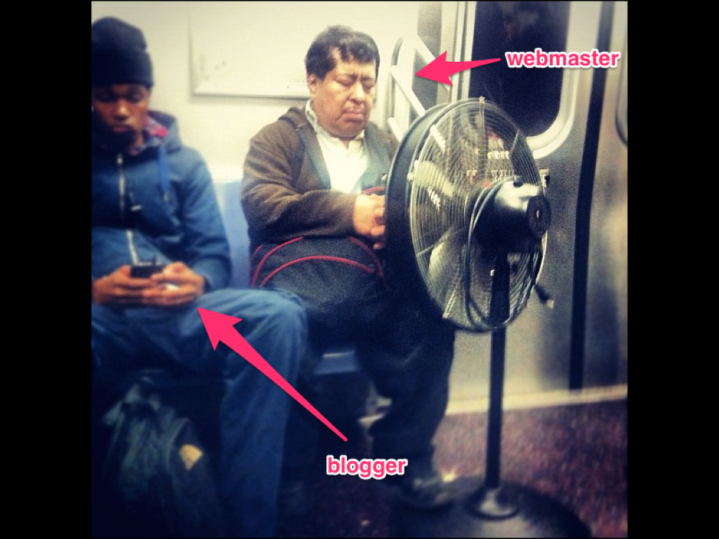
This is the story of a little museum with big aspirations. Long ago this little museum had a website. It had a webmaster, and it published a blog. It even had a whole bunch of microsites, flash driven exhibition sites, event calendars and archives. In fact, it won a few Webby’s.

MW2014.004
The website was very much the product of an organization trying to get the job done. And, it succeeded in this effort. Staff members would produce content on their company issued PCs and would then hand these documents off to the museum’s webmaster who would convert them into HTML and Javascript. The webmaster would press a specially designed “button” which would upload the new content to the little museum’s web servers where the pages would be served and maintained by a giant umbrella organization that had close ties to the government.
MW2014.005
With a single webmaster managing the entirety of the museum’s web properties, the little staff of this museum faced an inevitability. It was just too much work for the webmaster to do alone. Even if they allowed the webmaster an apprentice, the workload would continue to grow, and the little museum’s website would suffer. Eventually, they all realized they would have to move towards a system that would allow the entire staff to collaborate more efficiently.

Eventually, they realized they would need a content management system.

MW2014.006
There were many options out there already, and the little museum’s webmaster took stock in as many of them as he could. Meetings were had, and budgets were considered. The “committee to select a content management system” was formed, and consultants were brought in.

Wire frames were presented, and scopes of work were proposed, but the committee remained vigilant and put off making a decision as long as it could. They simply never felt like they had the right solution placed in front of them.

There was a lot at stake and many facets and bullet points drove them to a moment of indecision. There was due-dilligence due to their “mothership” in Washington, and there were “rights in data” clauses to be haggled over, with threats of time in a Federal prison always on everyone’s minds. Eventually the committee was disbanded and the project was put on hold.
MW2014.007
Time went on and the little museum’s website continued to shine as the public face of the institution. It continued to be updated with more and more content, and eventually the little museum even invested a fair amount of money in putting their collections online for all to see.

The word on the street was that this little museum’s website was starting to blow up, more and more people were beginning to rely on it as source of good information, and the time had come to re-think the idea of re-building.
MW2014.008
The webmaster at the little museum was doing his best, running around from staff member to staff member, trying to understand what had been going on all this time. One day he had the fortune to sit in on a meeting with a prominent weblogger and asked him a very important question.

“What CMS do you think we should chose” the webmaster said.

“CMS’s are all basically the same”, said the blogger, “just chose one you like and don’t look back.”

The webmaster took this to heart and selected three CMS systems that were free and easy to set up. He presented these to the higher ups and after a couple of hours of debate and one technical review board meeting, the webmaster had his answer.

MW2014.009
Drupal would be the content management system for the little museum. Drupal.

MW2014.010
The end, well sorta.

Most of that actually happened at the Cooper-Hewitt. The team eventually just had to pick a system, (without a whole lot of experience with the product itself) and kind of just “go for it.” From that point on, the staff at Cooper-Hewitt were living with Drupal. Drupal, a word almost none of the staff had ever heard before became, in less than a few months, a dirty word, spoken in fits of anger and dismay.

Now, before we go any further, it really needs to be said out loud that Drupal is really fine piece of software that has grown and evolved into a very sophisticated and well thought out framework for building websites. It has a rich community of developers and enthusiasts behind it and it powers some of the most popular websites on the planet. It’s used by giant companies far and wide, governments, and educational institutions all over. As well, our team in Washington has come a really long way in learning how to host and maintain Drupal based websites and presently, many of the latest Smithsonian websites are being built on Drupal. There is nothing intrinsically wrong with Drupal, we just realized, after a long time, it wasn’t for us.
MW2014.011
I’m Micah Walter. I’m part of the nerd crew at Cooper-Hewitt. We are part of the Smithsonian ( that umbrella corporation in Washington )… and we are in the middle of a re-launch of our physical museum, as well as our digital presence.
MW2014.012
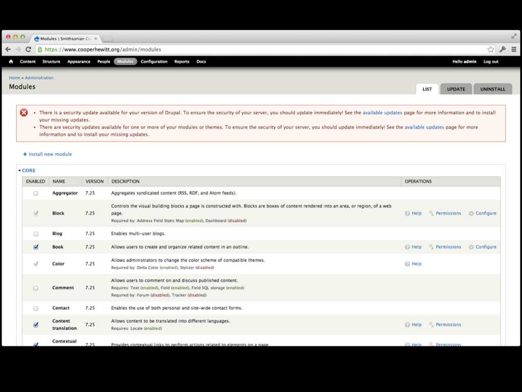
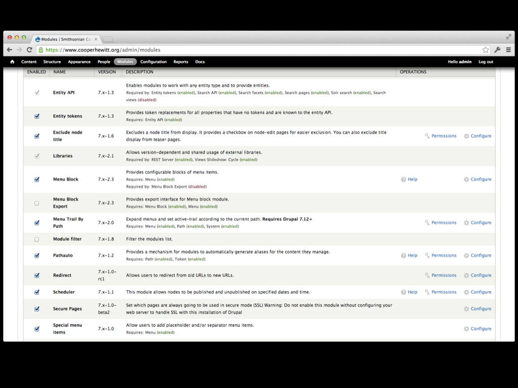
Cooper-Hewitt started it’s life with a CMS by installing a copy of Drupal 6. Shortly thereafter, we installed some modules, and more modules, and more…modules. Eventually we had a pretty awesome website. We hired an engineering team to convert the look and feel of the old website into a Drupal theme, and we “went live.” Cooper-Hewitt was on a CMS and it felt good.

MW2014.013

random extra slide

MW2014.014
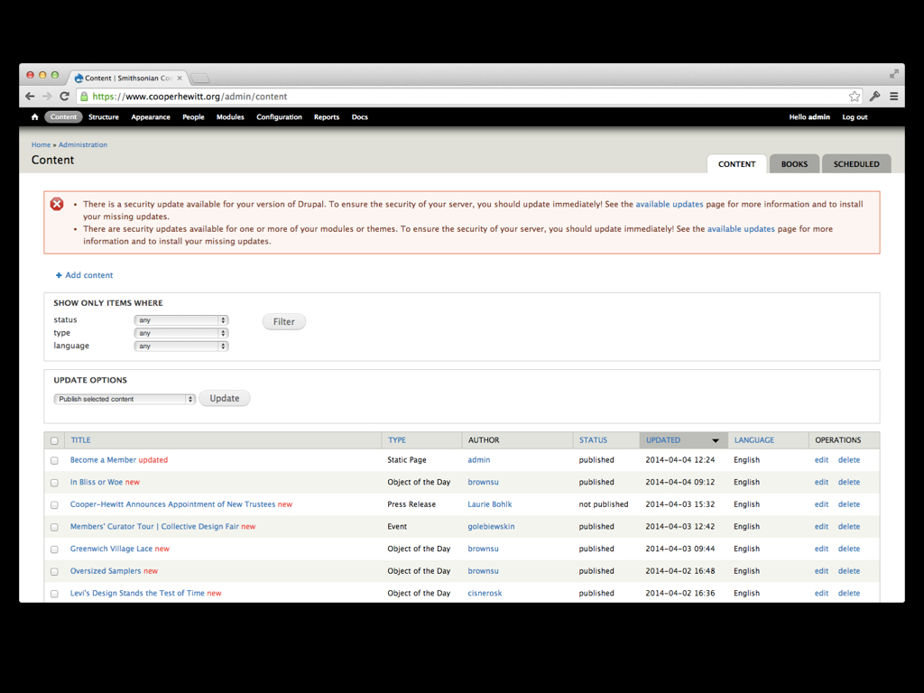
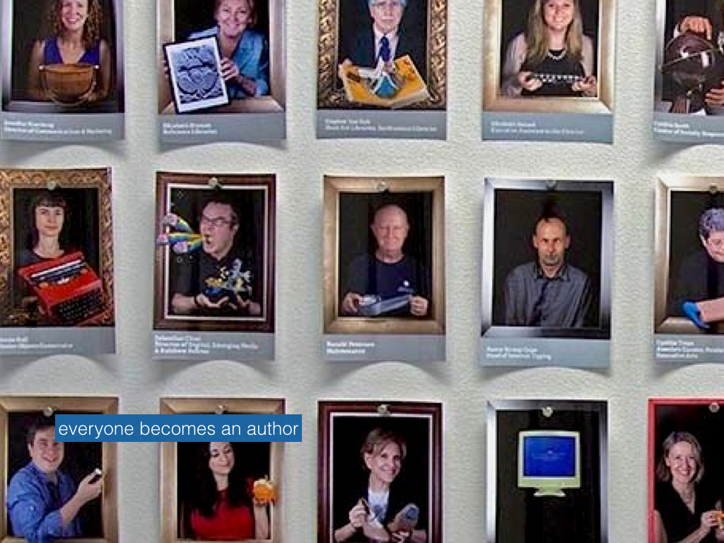
Some time during this process we sat down with all the staff members to show off our new CMS. We took them on a tour of the system and poked around with a few of the CMSs features, with the hopes of getting staffers excited about the whole thing. The staff seemed to respond positively, and after a couple of months of configuring Drupal’s permissions matrix, we gave out login details to a select number of “power users” around the museum. A few of these power users got it right away and were off and running, updating their existing webpages when they needed to. It wasn’t too bad actually. Staff could easily log in, search around for the relevant content and make minor changes to their pages. The problems started to appear when they wanted to do just slightly more. A staffer wasn’t able to easily upload an image to Drupal. The image had to first be sent to our graphics person who would convert it to a jpeg, resize it for the web and then it would be sent to the webmaster who would upload it to an Amazon S3 server. Once this was done the webmaster would email the URL to the image back to the staffer who would then try and figure out how to insert it into their page.

Another issue arose when staffers tried to author new pages. It was simply difficult for them to understand how the new page would find its way within the information architecture that was already in place. How were they to set the new page’s URL and menu items. Those kinds of tasks inevitably wound up back on the webmaster’s desk.
MW2014.015
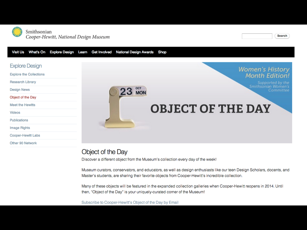
For the most part, notwithstanding a few hiccups here and there, Drupal 6 ran pretty smoothly. Staffers were able to distribute the workload a little more than they used to, and that was considered a good thing. But, about a year into it, a grant became available and the notion of running a daily blog about our objects turned into a reality. Object of the Day was born, and we had our work cut out for us.
MW2014.016
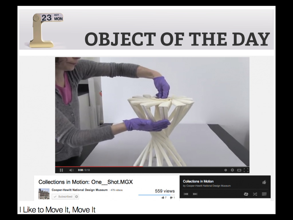
Object of the Day went through many stages of evolution, eventually winding up as an institutional blog authored by staffers, students in our Masters program, docents, and even teens and high school kids interested in design. Every day another object from the collection was chosen and a post was written about it and published to our blog. Great pains were taken to ensure we considered the collection record, tags, the authors vitals and more. We met in committee meetings over and over and eventually worked out a plan to allow us to manage project. The end result would be a new post about a different object, every day.

In the beginning we toyed around with the idea of Object of the Day being run on a separate platform. We considered Tumblr, WordPress.com and even Blogger. But in the end, we decided we would put our new CMS to the test and put ourselves through the process of managing a daily blog with Drupal.
MW2014.017
To accomplish this, the digital team realized we’d probably be wise to migrate to Drupal 7 in order to take advantage of its much improved back end user interface. So, with Object of the Day as catalyst, we moved ahead with plans to migrate our Drupal installation to D7. Consultants were hired, interns were enslaved and the whole process took just a few months. In the end we wound up with a fresh installation of Drupal 7, and about 20 or so contributed modules.
MW2014.018
In parallel to this migration project we began to meet with staff members and work out the details of how this Object of the Day project would go down. We discussed a variety of organizational schemes, we talked about available resources, and how far the grant money might take us. In the end we came up with a pretty simple plan. Each month, one staff member would be the “editor” for Object of the Day. He or She would be responsible for collecting all the entries for the month, making sure they were entered into Drupal, edited and fact checked. They would then get scheduled to be published automatically on their specific day. This included many spreadsheets, checklists and meetings. It was of course, great user research for me and my team.

Once we had D7 up and running staff members started to get the hang of it. They started logging in and authoring content. And then the problems started to happen.
MW2014.019
We already had about 1500 pages ( Drupal calls these nodes ) in the CMS. They were mostly static web pages about one program or another, or blog posts from the old days, or exhibition archives and other kinds of historic content. This was just fine as that content rarely got touched or updated. It was also fine when we wanted to add a fresh blog post or a new static page every once in a while…

The problem though was what happened when the monthly Object of the Day editor had to log in to start work on their thirty some posts for the upcoming month. It was nearly impossible for them to collect all the posts in one place within the CMS so that they could see what had been entered, what was finalized and what was ultimately scheduled. This was a major first hiccup and the digital team worked out a solution involving a number of custom Drupal views that would allow the editors to more easily see what they were working on. It kind of worked, but we could tell that it was a hack solution to a real problem.

The end result was, they lived with it. They lived with the system, learned to hate it, and just didn’t talk about it much. Drupal became this beast that they just came to terms with.
MW2014.020
Time went one, and we all learned to work with Drupal. Many of the staff members became proficient enough to get by, and the calls to the webmaster desk lessened. But, the problems hadn’t gone away. In fact our little experiment to try and get staff members excited about authoring content on the web had actually backfired. Now, staff members authored content for Object of the Day because it was part of their job, listed in their work plans and reviewed during their performance evaluations at the end of each year. They hated it.

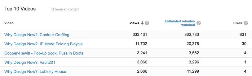
Meanwhile, Object of the Day took off. The public facing version of the blog became a big success. It received additional funding for a second year with the idea around the Sr. Management table being that it would go on forever. It was for a time our most popular page on the site.
MW2014.021
If there is one truth we have learned about maintaining a website using a CMS its that you’ll eventually jump ship and switch to something else. In fact you may do this operation again and again. Its just the nature of the beast—the grass is always greener.

When we realized we needed to jump ship, we took to heart all the feedback we got from our content creators. We realized that what they really wanted were pleasant, easy to work with tools that allowed them to feel empowered. Tools that gave them a sense of authority, and made them feel good about the work they were doing. Like it was a way for them to communicate with the world all the important things they had going on.

In the end we chose WordPress. We looked at lots of options. We thought about even simpler options like a static site generator, or hmm, Squarespace? Could a museum run their entire website on Tumblr? All of these options afforded us with a great user experience, but seemed to trade of the ability to be flexible enough for our institutions needs. It really depends on the needs of each institution.

We searched far and wide. But we kept coming back to WordPress. It was familiar to everyone. Many of the staff already had their own WordPress blogs. WordPress gave us a nice balance between having the ability to create a sophisticated website and also being simple enough to use. In fact, while I was writing tools to migrate our content to WordPress, we realized that its more simplified system allowed us to re-organize our content, making the site easier to navigate. It’s not that we couldn’t do this in Drupal, but over time, Drupal just got out of control, because it let us.
MW2014.022
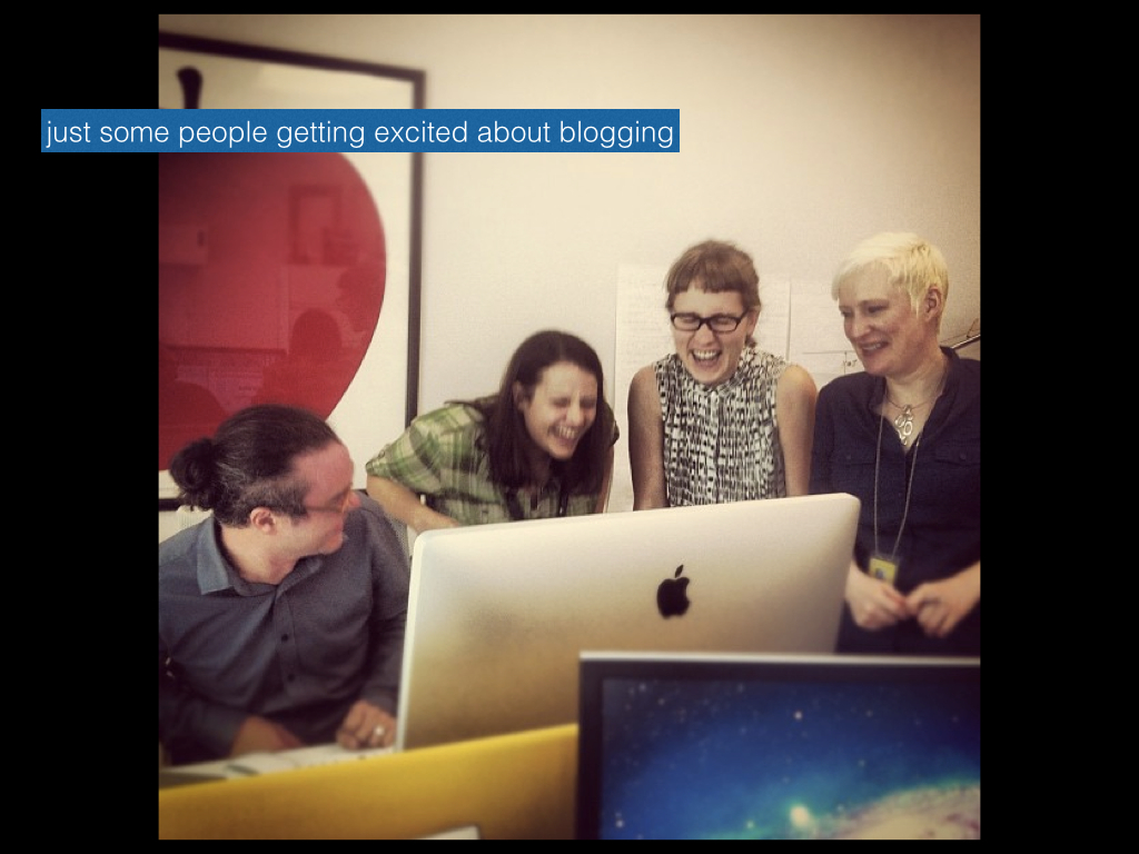
We realized through the Object of the Day project that it was our CMS that stood in the way of success. The content was already good, the audience was already there. We just needed a way to get our own staff excited about doing it. It shouldn’t be hard. It should be really easy and really fun to do. WordPress lets our staff get excited about the work they are doing. It gives them a simple to use, enjoyable writing experience, and for the editors, we found some really great plugins that let them manage all the content without feeling overwhelmed. Thats really why we chose WordPress.

We kind of think of it as a downgrade on the technical side of things, but its definitely an upgrade when it comes to usability.

The end.

Postscript

There was some good discussion following the talk. A few things of note that were brought up included how our staff already had some experience with WordPress via our DesignOther90.org website, our use of EditFlow for notifications and calendaring/scheduling of content and Pressbooks to aid with the production of our eBooks.

We also talked a little about hindsight…


Video Capture for Collection Objects

Stepping inside a museum storage facility is a cool experience. Your usual gallery ambience (dramatic lighting, luxurious swaths of empty space, tidy labels that confidently explain all) is completely reversed. Fluorescent lights are overhead, keycode entry pads protect every door, and official ID badges are worn by every person you see. It’s like a hospital, but instead of patients there are 17th century nightgowns and Art Deco candelabras. Nestled into tiny, sterile beds of acid-free tissue paper and archival linen, the patients are occasionally woken and gently wheeled around for a state-of-the-art microscope scan, an elaborate chemical test, or a loving set of sutures.

A gloved, cardigan-ed museum worker pushing a rolling cart down a hallway of large white shelving units.

A rare peek inside the storage facility.

If you ask a staff member for an explanation of this or that object on the nearest cart or shelf, they might tell you a detailed story, or they might say that so far, not much is known. I like the element of unevenness in our knowledge, it’s very different from the uniform level of confidence one sees in a typical exhibition.

The web makes it possible to open this space to the public in all its unpolished glory – and many other museums have made significant inroads into new audiences by pulling back the curtain. The prospect is like catnip for the intellectually curious, but hemlock for most museum employees.

Typically, the only form of media that escapes this secretive storage facility are hi-res TIFFs artfully shot in an on-site photography studio. The seamless white backdrop and perfectly staged lighting, while beautiful and ideal for documentation, completely belie the working lab environment in which they were made.

We just launched a new video project called “Collections in Motion.” The idea is super simple: short videos that demonstrate collections objects that move, flip, click, fold, or have any moveable part.

Here are some of the underlying thoughts framing the project:

  • Still images don’t suffice for some objects. Many of them have moving parts, make sounds, have a sense of weight, etc that can’t be conveyed through images.
  • Our museum’s most popular videos on YouTube are all kinetic, kinda entrancing, moving objects. (Contour Craft 3D Printing, A Folding Bicycle, and a Pop-up Book, for example).
  • Videos played in the gallery generally don’t have sound or speakers available.
  • In research interviews with various types of visitors, many people said that they wouldn’t be interested in watching a long, involved video in a museum context.
  • Animated GIFs, 6-second Vines, and 15-second Instagram videos loom large in our contemporary visual/communication culture.
  • How might we think of the media we produce (videos, images, etc) as a part of an iterative process that we can learn from over time? Can we get comfortable with a lower quality but higher number of videos going out to the public, and seeing what sticks (through likes, comments, viewcount, etc)?


A screenshot from YouTube Analytics showing most popular videos: Contour Crafting, Folding Bicycle, Puss in Boots Pop-up book, et cetera

Our most popular YouTube videos for this quarter. They are all somewhat mesmerizing/cabinet-of-curiosity type things.

Here are some of the constraints on the project:

  • No budget (pairs nicely with the preceding bullet).
  • Moving collections objects is a conservation no-no. Every human touch, vibration and rub is bad for the long-long-longevity of the object (and not to mention the peace of mind of our conservators).
  • Conservators’ and curators’ time is in HIGH demand, especially as we get closer to our re-opening. They are busy writing new books, crafting wall labels, preparing gallery displays, etc. Finding a few hours to pull an object from storage and move it around on camera is a big challenge.

So, nerd world, what do you think?

Dataclimber explores colors in the Cooper Hewitt collection

Rubén Abad's #museumselfie outside of a museum

Rubén Abad’s #museumselfie outside of a museum

A few weeks ago we became aware of Rubén Abad’s poster which shows all the colours in our collection by decade. We sent a few questions over to Spain to find out more . . .

Q: What were some of the precursors to the color poster? What inspired you?

A: The idea came when I first saw Lev Manovich’s ‘Software Takes Command‘ book cover. When I started looking at the data, another couple of paintings came to my mind. For example, Salvador Dalí’s series about visual perception and ‘pixels’, as in Homage to Rothko (The Dalí Museum). By chance, I attended an exhibition here in Madrid where I discovered ‘Study for Index: Map of the World‘, by Art & Language (MACBA). By the time I came back home, it was clear that I wanted to display color evolution over time using a mosaic.

Q: Did you have any expectation about what the final product would look like? Did the end result surprise you?

A: I didn’t have any preconceived notion. I liked to see how groups of pieces appeared.

Q: What were the challenges of working with the dataset? What were the holes, problems? How could we make it better/easier to work with?

A: Being used to work with data made really easy for me to work with the collection’s dataset, so thanks for releasing it! The only complain I might have is having to parse some fields, like medium, to be able to store the information in a more comfortable format to be queried.

Q: What would you like to do next?

A: I have a network of people and objects in mind, in order to display who has the biggest ‘influence’ in the collection.

Q: If other museums made their data available like this, what might you do with it?

A: I’d like to work on a history of the object project. If we were able to access all the dates and places importants in the object history, we could try to cross all the objects info and maybe, it’s never known, find new hubs where pieces happened to be at the same time and why they were there. Another interesting project would be to find gender inequality among collections, not only when looking at artists/designers, but also with donors and funders and even among representations (iconography). Have this roles changed over the years? Are different depending on countries?

Dataclimber's color poster.

Dataclimber’s color poster.

Label Whisperer

Screen Shot 2014-01-24 at 6.06.47 PM

Have you ever noticed the way people in museums always take pictures of object labels? On many levels it is the very definition of an exercise in futility. Despite all the good intentions I’m not sure how many people ever look at those photos again. They’re often blurry or shot on an angle and even when you can make out the information there aren’t a lot of avenues for that data to get back in to the museum when you’re not physically in the building. If anything I bet that data gets slowly and painfully typed in to a search engine and then… who knows what happens.

As of this writing the Cooper-Hewitt’s luxury and burden is that we are closed for renovations. We don’t even have labels for people to take pictures of, right now. As we think through what a museum label should do it’s worth remembering that cameras and in particular cameras on phones and the software for doing optical character recognition (OCR) have reached a kind of maturity where they are both fast and cheap and simple. They have, in effect, showed up at the party so it seems a bit rude not to introduce ourselves.

I mentioned that we’re still working on the design of our new labels. This means I’m not going to show them to you. It also means that it would be difficult to show you any of the work that follows in this blog post without tangible examples. So, the first thing we did was to add a could-play-a-wall-label-on-TV endpoint to each object on the collection website. Which is just fancy-talk for “another web page”.

Simply append /label to any object page and we’ll display a rough-and-ready version of what a label might look like and the kind of information it might contain. For example:

https://collection.cooperhewitt.org/objects/18680219/label/

Now that every object on the collection website has a virtual label we can write a simple print stylesheet that allows us to produce a physical prototype which mimics the look and feel and size (once I figure out what’s wrong with my CSS) of a finished label in the real world.

photo 2

So far, so good. We have a system in place where we can work quickly to change the design of a “label” and test those changes on a large corpus of sample data (the collection) and a way to generate an analog representation since that’s what a wall label is.

Careful readers will note that some of these sample labels contain colour information for the object. These are just placeholders for now. As much as I would like to launch with this information it probably won’t make the cut for the re-opening.

Do you remember when I mentioned OCR software at the beginning of this blog post? OCR software has been around for years and its quality and cost and ease-of-use have run the gamut. One of those OCR application is Tesseract which began life in the labs at Hewlitt-Packard and has since found a home and an open source license at Google.

Tesseract is mostly a big bag of functions and libraries but it comes with a command-line application that you can use to pass it an image whose text you want to extract.

In our example below we also pass an argument called label. That’s the name of the file that Tesseract will write its output to. It will also add a .txt extension to the output file because… computers? These little details are worth suffering because when fed the image above this is what Tesseract produces:

$> tesseract label-napkin.jpg label
Tesseract Open Source OCR Engine v3.02.01 with Leptonica
$> cat label.txt
______________j________
Design for Textile: Napkins for La Fonda del
Sol Restaurant

Drawing, United States ca. 1959

________________________________________
Office of Herman Miller Furniture Company

Designed by Alexander Hayden Girard

Brush and watercolor on blueprint grid on white wove paper

______________._.._...___.___._______________________
chocolate, chocolate, sandy brown, tan

____________________..___.___________________________
Gift of Alexander H. Girard, 1969-165-327

I think this is exciting. I think this is exciting because Tesseract does a better than good enough job of parsing and extracting text that I can use that output to look for accession numbers. All the other elements in a wall label are sufficiently ambiguous or unstructured (not to mention potentially garbled by Tesseract’s robot eyes) that it’s not worth our time to try and derive any meaning from.

Conveniently, accession numbers are so unlike any other element on a wall label as to be almost instantly recognizable. If we can piggy-back on Tesseract to do the hard work of converting pixels in to words then it’s pretty easy to write custom code to look at that text and extract things that look like accession numbers. And the thing about an accession number is that it’s the identifier for the thing a person is looking at in the museum.

To test all of these ideas we built the simplest, dumbest HTTP pony server to receive photo uploads and return any text that Tesseract can extract. We’ll talk a little more about the server below but basically it has two endpoints: One for receiving photo uploads and another with a simple form that takes advantage of the fact that on lots of new phones the file upload form element on a website will trigger the phone’s camera.

This functionality is still early days but is also a pretty big deal. It means that the barrier to developing an idea or testing a theory and the barrier to participation is nothing more than the web browser on a phone. There are lots of reasons why a native application might be better suited or more interesting to a task but the time and effort required to write bespoke applications introduces so much hoop-jumping as to effectively make simple things impossible.

photo 2
photo 3

Given a simple upload form which triggers the camera and a submit button which sends the photo to a server we get back pretty much the same thing we saw when we ran Tesseract from the command line:

Untitled-cropped

We upload a photo and the server returns the raw text that Tesseract extracts. In addition we do a little bit of work to examine the text for things that look like accession numbers. Everything is returned as a blob of data (JSON) which is left up to the webpage itself to display. When you get down to brass tacks this is really all that’s happening:

$> curl -X POST -F "file=@label-napkin.jpg" https://localhost | python -mjson.tool
{
    "possible": [
        "1969-165-327"
    ],
    "raw": "______________j________nDesign for Textile: Napkins for La Fonda delnSol RestaurantnnDrawing, United States ca. 1959nn________________________________________nOffice of Herman Miller Furniture CompanynnDesigned by Alexander Hayden GirardnnBrush and watercolor on blueprint grid on white wove papernn______________._.._...___.___._______________________nchocolate, chocolate, sandy brown, tannn____________________..___.___________________________nGift of Alexander H. Girard, 1969-165-327"
}

Do you notice the way, in the screenshot above, that in addition to displaying the accession number we are also showing the object’s title? That information is not being extracted by the “label-whisperer” service. Given the amount of noise produced by Tesseract it doesn’t seem worth the effort. Instead we are passing each accession number to the collections website’s OEmbed endpoint and using the response to display the object title.

Here’s a screenshot of the process in a plain old browser window with all the relevant bits, including the background calls across the network where the robots are talking to one another, highlighted.

label-whisperer-napkin-boxes

  1. Upload a photo
  2. Extract the text in the photo and look for accession numbers
  3. Display the accession number with a link to the object on the CH collection website
  4. Use the extracted accession number to call the CH OEmbed endpoint for additional information about the object
  5. Grab the object title from the (OEmbed) response and update the page

See the way the OEmbed response contains a link to an image for the object? See the way we’re not doing anything with that information? Yeah, that…

But we proved that it can be done and, start to finish, we proved it inside of a day.

It is brutally ugly and there are still many failure states but we can demonstrate that it’s possible to transit from an analog wall label to its digital representation on a person’s phone. Whether they simply bookmark that object or email it to a friend or fall in to the rabbit hole of life-long scholarly learning is left an as exercise to the reader. That is not for us to decide. Rather we have tangible evidence that there are ways for a museum to adapt to a world in which all of our visitors have super-powers — aka their “phones” — and to apply those lessons to the way we design the museum itself.

We have released all the code and documentation required build your own “label whisperer” under a BSD license but please understand that it is only a reference implementation, at best. A variation of the little Flask server we built might eventually be deployed to production but it is unlikely to ever be a public-facing thing as it is currently written.

https://github.com/cooperhewitt/label-whisperer/

We welcome any suggestions for improvements or fixes that you might have. One important thing to note is that while accession numbers are pretty straightforward there are variations and the code as it written today does not account for them. If nothing else we hope that by releasing the source code we can use it as a place to capture and preserve a catalog of patterns because life is too short to spend very much of it training robot eyes to recognize accession numbers.

The whole thing can be built without any external dependencies if you’re using Ubuntu 13.10 and if you’re not concerned with performance can be run off a single “micro” Amazon EC2 instance. The source code contains a handy setup script for installing all the required packages.

Immediate next steps for the project are to make the label-whisperer server hold hands with Micah’s Object Phone since being able to upload a photo as a text message would make all of this accessible to people with older phones and, old phone or new, requires users to press fewer buttons. Ongoing next steps are best described as “learning from and doing everything” talked about in the links below:

Discuss!