Three adventures in universal design, or, what does a veggie peeler have in common with a museum? (0/3)

A hand shown holding a black, rubberized OXO veggie peeler against a crisp white backdrop.

Though designed specifically for the arthritic, this product “appeals” to everyone.

“The way to think about ‘everybody’ is not to think about the average person in the middle, but to think about the extremes. Think about people at the edges of your potential buying public and think about people who are most challenged.”
[Dan Formosa interviewed by Debbie Millman in Brand Thinking]
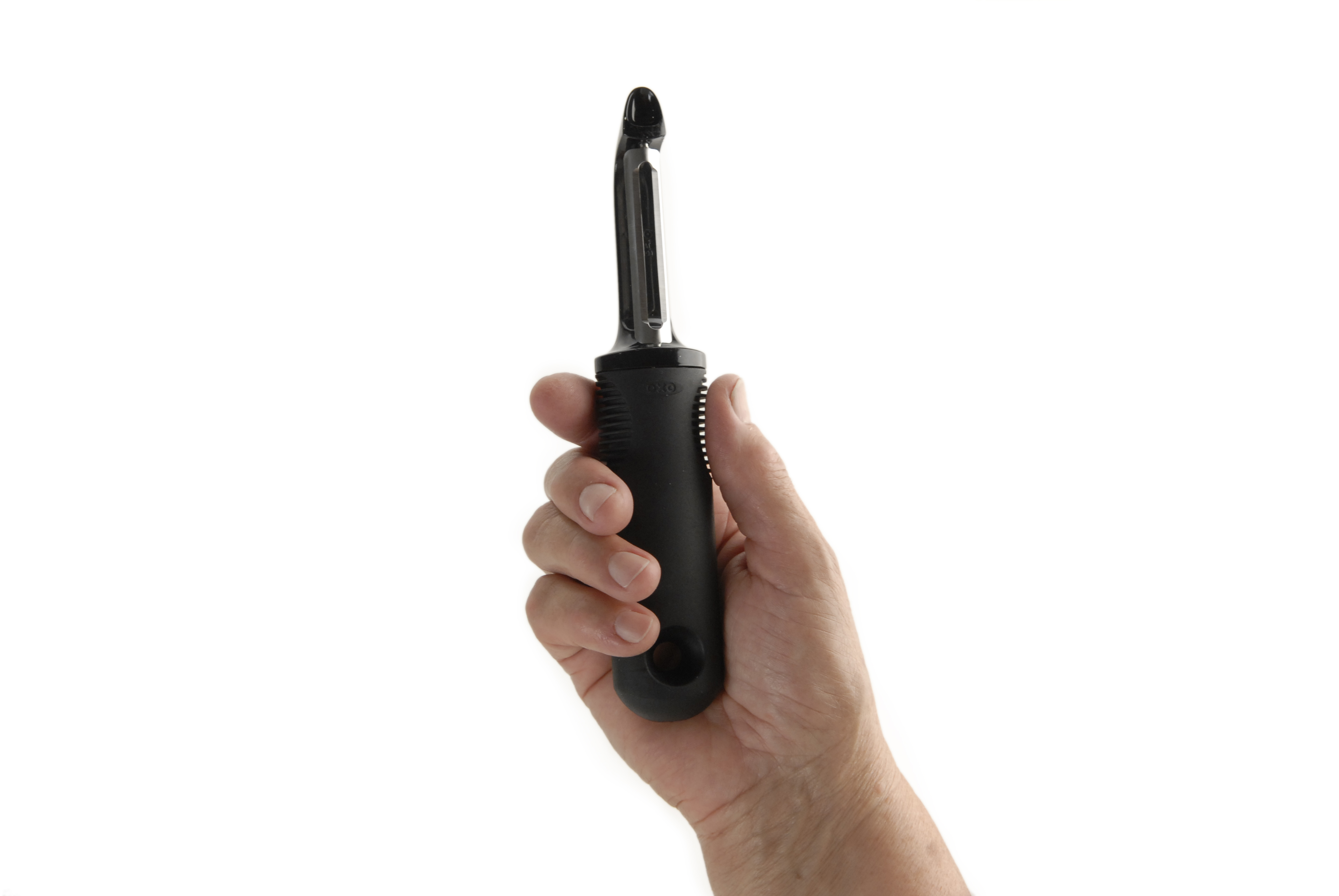
If you hang out at a design museum long enough, you start to pick up on certain recurring concepts. One good recurring concept has to do with a thing called universal design:

The term “universal design” was coined by the architect Ronald L. Mace to describe the concept of designing all products and the built environment to be aesthetic and usable to the greatest extent possible by everyone, regardless of their age, ability, or status in life.
[Wikipedia]

So what’s the lesson behind universal design? Pretend you’re a bossman trying to cut costs wherever possible. For you, universal design might seem like a non-critical endeavor. Sure, it would be nice for the disabled and the elderly to have easy access to all aspects of your [insert product being designed here], but you don’t have room in the budget for anything elaborate. “We’ll tackle accessibility if we have leftover funds at the end of the project,” you’d say. Or “after we design the bulk of our [widget], then we’ll start work on the accessibility stuff because it’s required by law.”

If you were to study your design history, however, you’d realize that this view could limit your opportunities for innovation and crowd-pleasing design.

A sign in the foreground reads "This ramp and fishing platform meet the standards of the Americans with Disabilities Act and may be used by anyone. Please respect the desire of people with disabilities to fish on the fishing platform. In the background is a lake surrounded by trees.

The Americans with Disabilities Act of 1990 required organizations and institutions to make buildings, public transportation, signage, and more accessible to everyone. Image by USFWS Pacific.

The amazing truth of universal design is that when a design team focuses on “edge users,” or “extreme users,” it very often leads to unexpected insights, which can then lead to innovative features that benefit all users. When you design for the edges, everybody benefits.

The OXO Good Grips line is one of the most commonly cited examples of this phenomenon. The Smart Design team sat down to design a line of veggie peelers, can openers and scissors for people with arthritis and limited hand mobility. After the chunky, ergonomically superior new products hit the market, they became a huge mainstream success.
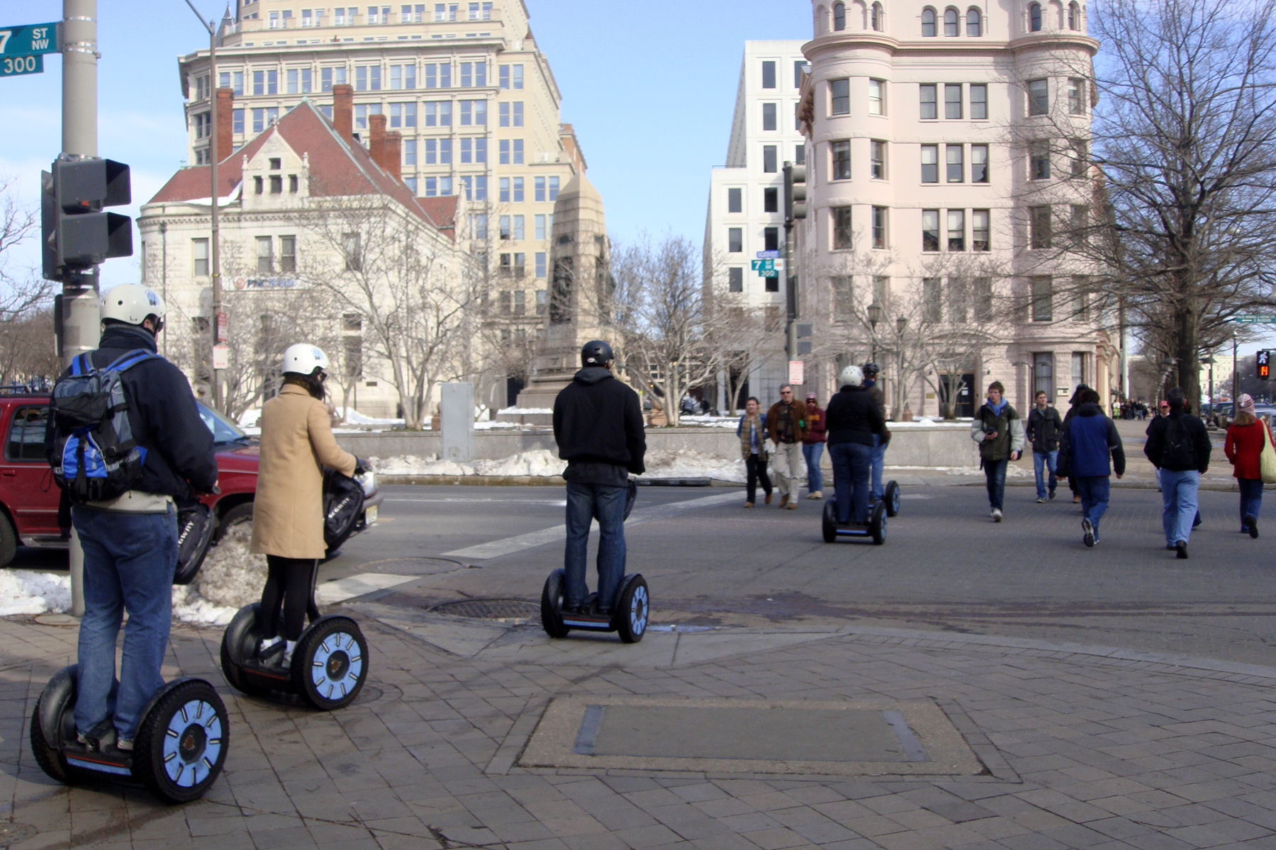
A group of five people riding motorized segway scooters riding single-file down the sidewalk curb cut and into the crosswalk. Washington DC in wintertime. They are wearing winter coats and helmets.

Segway scooter riders enjoy the benefits of curb cut sidewalks. Photo by Mariordo Mario Roberto Duran Ortiz

Another example are Selwyn Goldsmith‘s “curb cuts.” The mini-ramps we see now on most city street corners were designed primarily with wheelchair users in mind. After they were implemented, it became obvious that this ergonomic consideration benefitted not only wheelchair users, but also luggage-toters, stroller-pushers, stiletto-wearers, cyclists and anybody who enjoys a bit of added ease and comfort in getting around.

With all this in mind, our summer intern (psst—applications for next year are open!Rachel Sakai and I set out to do some research. We have a very small part in the über-mega-process that is the Cooper Hewitt gallery re-design, and we wanted to take on a summer project that could enrich that work.

We decided to focus in on a blind person’s museum experience. How might an understanding of a blind visitor’s experience inform and enhance the design decisions being made in our re-design project?

We chose to embrace a mindset of Human Centered Design. (Note that Human Centered Design is not the same thing as universal design). I’ve helped to create lots of Museum content—videos, exhibitions, books—on the topic of Human Centered Design. After so much experience intellectualizing about the technique, I was pretty eager to find a way to try it myself.

Human-Centered Design (HCD) is a process and a set of techniques used to create new solutions for the world….The reason this process is called “human-centered” is because it starts with the people we are designing for. The HCD process begins by examining the needs, dreams, and behaviors of the people we want to affect with our solutions.
[From IDEO’s HCD ToolKit]
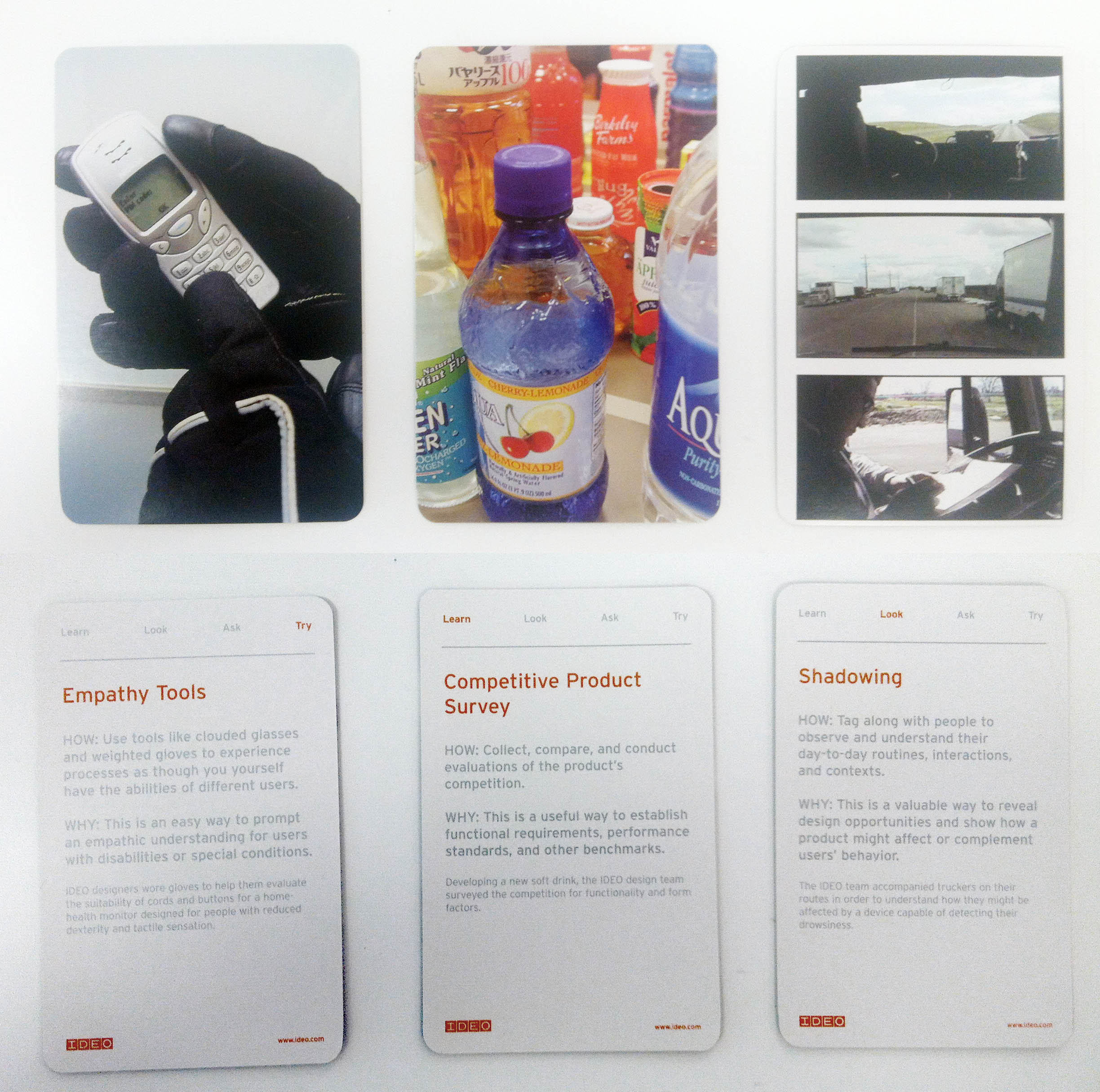
front and back of 3 different method cards. Each card explains a different HCD research method. The front of each card has a full-bleed photo, the back has the name of the method and a short paragraph describing it.

Our 3 chosen IDEO method cards: Empathy Tools, Competitive Product Survey, and Shadowing

We borrowed a set of IDEO method cards from Cara and chose three that served our goal to better understand the blind museum visitor’s experience. In the next three posts, we’ll explain how we applied the methods of Empathy tools, Competitive Product Survey, and Shadowing:

1. Empathy Tools: Go on a blindfolded museum visit.

2. Competitive Product Survey: Take a museum tour designed for the blind.

3. Shadowing: Observe a blind person’s museum visit.
 

Interns React to…the Whitney's Audio Guide

I spent my summer as an intern in the Digital and Emerging Media department here at the Cooper-Hewitt National Design Museum. Next week, I head home to San Francisco where I will return to the graduate program in design at California College of the Arts. One of my projects this summer has been to visit museums, observe how visitors are using their devices (cell phones, iPads, etc), and to examine audio guides through the lens of an interaction designer.

When I went to check out MoMA’s new mobile guide, Audio+, it was the beginning of my stint at the Cooper-Hewitt, I had never before done a museum audio tour with an iPod touch, and my expectations were lofty. Now that I have spent a summer in Museum World, my perspective and my expectations have changed so I wanted to repeat the exercise of going to a museum and critiquing an audio guide experience.

Last Sunday I spent my afternoon at the Whitney. I arrived at the museum around 1pm. No wait for the audio guide, just walked up and handed over my ID in exchange. Like many other museums, the Whitney uses encased iPods for their audio guides. I was a bit surprised, however, to notice that the battery charge on my guide was around 40%. This turned out not to be a problem for me, but I did overhear other guests complaining that their guides had run out of batteries part way through the visit.
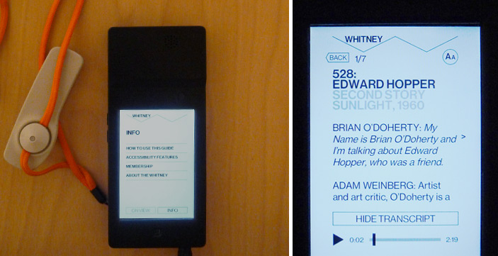
Whitney's audio guide interface

Two different views of the Whitney’s audio guide

The Whitney’s audio guide interface is simple and straight forward. All of the guide’s navigation is text based, and this digital affordance reinforced the fact that the guide does not offer endless paths and options. After just one or two minutes of clicking around the app, there was no more mystery. The minimalist design helped me to immediately understand what I was going to do with the device and it was easier for me to focus attention on what was on the walls rather than what was on the screen.

I was, and still am, pretty taken with the quality of content available on the Whitney’s guide. From what I could tell, in each room of each gallery there is audio content for at least two pieces. It may not sound like a lot, but it ended up being more than enough for me. The consistency of content allowed and encouraged me to use the guide throughout my visit and I was surprised to see how many visitors were using the audio guides – and not just tourists, but locals too.

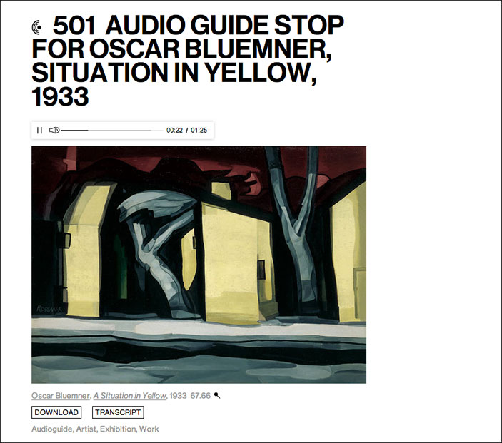
According to Audio Guide stop 501, Oscar Bluemner once wrote, “Listen to my work as you listen to music…try to feel.” The Whitney’s audio guide embraces this idea by playing mood setting sounds and music to complement their audio descriptions.

Screen shot of audio guide player

Situation in Yellow on the Whitney’s web player

One of my favorites is the description of Burchfield’s Chicket and Chorus in the Arbor, which you can listen to here. With crickets chirping in the background, it’s much easier to put yourself into the world described (late summer, thick trees and bushes, crickets, sunset). The first time I came across one of the audio guide stops with background music I was surprised and delighted. It was a subtle gesture, but one that really elevated the content and did wonders for putting me in the mood, so to speak.

Compared to its counterpart at MoMA, the Audio+, this guide has less content and that was clear from the start. Less content may sound like one point for the “con” list, but I do not think it is always a bad thing. Yes, there were a few times when I missed being able to look up more info about the artist and see related works, but not having the option at all definitely made me more focussed on the art in front of me. In the case of the Whitney, the content is good enough that the “less is more” approach is working well. Plus, all of their audio content is available online, so when I am back at my desk, I can browse through and re-listen or learn more about the clips I found particularly interesting.
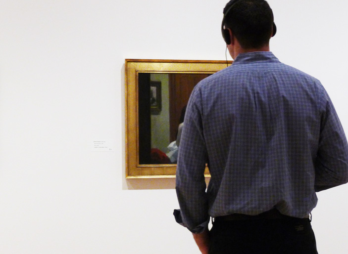
visitor looking at a painting

A Whitney visitor using the audio guide

In both the guide for the Whitney and the guide for the MoMA the museum’s own style is reflected. The MoMA states that their “mission is helping you understand and enjoy the art of our time” where as the Whitney is “dedicated to collecting, preserving, interpreting, and exhibiting American art.” It makes sense, then, that the MoMA (focussed on education) includes much more educational content in their mobile guide and that the Whitney does.

From what I’ve learned this summer (through working with the labs team and through visits to other museums), I know that the visitor experience at home is just as important as the visitor experience in the museum. For myself, I liked the Whitney guide so much because I didn’t feel compelled to do an incredibly deep dive on a mobile device when I should be focussing my attention on what is in front of me. However, where was my at home experience? Once I left the museum, I had nothing to take with me that would prompt me to visit their website and learn more about what I saw. I would love to follow up the great audio guide experience with a great at home experience in the vein of what MoMA is doing with the option to take your visit home. There is opportunity here and I hope the Whitney has plans to fill it.

Interns React to…MoMA's Audio+

I spent my summer as an intern in the Digital and Emerging Media department here at the Cooper-Hewitt National Design Museum. Next week, I head home to San Francisco where I will return to the graduate program in design at California College of the Arts. One of my projects this summer has been to visit museums, observe how visitors are using their devices (cell phones, iPads, etc), and to examine audio guides through the lens of an interaction designer.

Before you start, it’s important to note that I ran over to try out the Audio+ out as soon as I could. The new guides are technically still in a pre-release phase and the team at MoMA is actively rolling out tweaks and fixes.

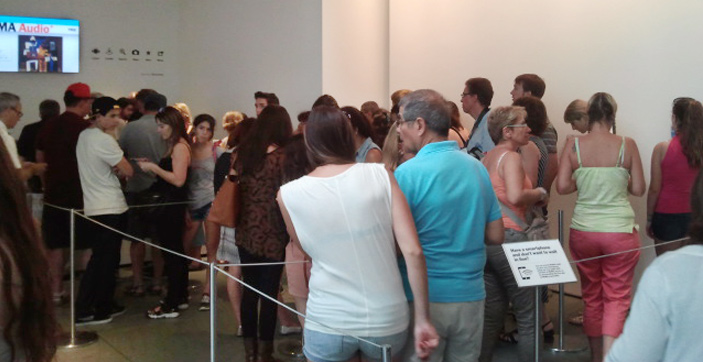
I arrived at the museum around 11 am (they open at 10.30) and already there was a pretty significant line for the mobile guide. After a bit of a wait, I exchanged my photo ID (note: passports and credit cards are not accepted) for the encased iPod touch. Although they are commonly used by museums as audio guides, this was the first time I had ever done an audio tour with an iPod touch and my expectations were lofty from the start. Hanging around my neck from a lanyard was a device full of content, and a device that I knew could connect my experience at MoMA to the world wide web! Cue sunburst and music from the heavens.

Visitors waiting in line

MoMA visitors waiting in line to pick up an audio guide

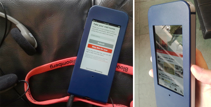
The guide is handed to you with the prompt to “Take your visit home” and here you can enter your email address, which I did, or skip this step and do it later (or not at all). The in-museum functionality is the same regardless of whether you decide to give them your email address or not.

Email address entered, ready to go.

…Or so I thought. After a few network connection failure screens, I took the guide back to the Audio+ desk and they inserted what looked like a folded up paperclip into a slot in the back of the case and pushed some kind of reset button. Not a big deal since I was still in the lobby, but it would have been nice to, as Nielsen’s 10 usability heuristics suggest, include some help and documentation outside of “network connection failure.” I assume this is one of the kinks being working out.

Image of the Audio+ guide

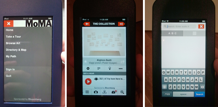
As I ambled around the third floor, I couldn’t help but get pulled into the guide’s glowing screen; it was a bit distracting, actually. The interface looks like a website; there are clickable images, clickable text, videos, a camera, and icon based navigation system. I spent at least 15 minutes playing around with the app not only trying to figure out what it could do, but trying to figure out what I should do. I had too many options and my attention was on the device in my hands rather than on the walls where it should have been. I wondered what else (besides explore content) I could do with the device. Is it going to navigate me through the maze of MoMA and tell me to turn right at the Gilda Mantilla drawings in order to get to the A Trip from Here to There exhibit? Does it know where I am? No, but I wish it did. This may be unavoidable, but I would be surprised if most visitors don’t feel the same way. It’s an iPod touch and I therefore expect it to do the things a Wi-Fi enabled iPod touch can do (mainly help me to find my way), but it doesn’t…and I really want it to.

Once I stopped fidgeting with the new toy, the first thing I did with the guide was listen to an audio description of Alighiero Boetti’s process in the piece Viaggi postali (Postal Voyages). The audio content was engaging and with the guide I could also read information, see the location within the museum, and…see related works! This last feature was my favorite; I love having a connection to something on the wall and immediately being able to see more from the artist. This was a significantly harder, however, when the piece I was interested in did not have the little audio icon on the label (which is true for the majority of the work at MoMA).

Audio content icon

I want info with a single tap or a simple search for all of the pieces on the walls, as I got for the Boetti piece, not just the ones with the audio icon. Unfortunately, access to extended content for artworks outside of the official tours meant effort because (without a clear alternative) my instinct was to search either the artist name or the title. As you can image, unfamiliar names and looooong titles made this a tiresome process. The cognitive load was on me, the user, rather than on the technology. I want to access to the content without having to think. 

screens from MoMA's new Audio+ guide

Screens on the Audio+ guide: menu options, audio content page, and search screen

One thing I loved about the Audio+ guide was the built in camera. Not having to juggle my own camera along with the audio guide was a relief and it was an easy way to ensure that content would be available for me to really explore on my own time, outside of the museum. Throughout my visit I used the guide to take photos and add stars to the pieces I liked, but unless the piece was part of an official tour (i.e. I didn’t have to search by artist/title), I was not compelled to look up any extended info. Call me lazy, but going through the search process was too much effort for the return. After about an hour I returned the guide and realized it was lucky I arrived when I had; by 11.50 am they were completely out of mobile guides and there was still a line of people waiting.

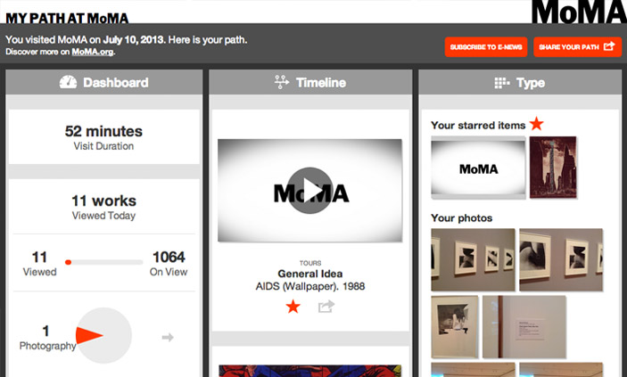
Post visit, I was emailed a link to My Path at MoMA; it is elegantly designed and responsive to screen size so is just as comfortable to view on a mobile device as it is on the desktop.

My Path at MoMA

Screen capture of My Path at MoMA

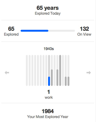
In My Path there are three different categories, Dashboard, Timeline, and Type. Dashboard gives a handful of metrics about the visit — duration (52 mins), works viewed (11 out of 1064), artists viewed (14 out of 590), and years explored (65 out of 132). My first thought: “What?! I saw more than 11 works!” I like what Dashboard tells me, but it is an incomplete story and I want to know more. Now that I’m back at my desk and I’ve walked through about ten doorways, my memory is fuzzy. What are these 11 works that I allegedly viewed and how is the guide determining what I did or did not see? 1984 is supposedly my Most Explored Year, well, what was it I saw from 1984?

Years Explored

Screen capture of the years explored section of My Path

The Timeline and Type sections show the stuff I did within the guide: audio listened to, photos taken, and items searched for. Same content in each section, just sorted differently. It’s really great to see, and excellent to have it all on one place. However, this is where I think there is a big opportunity lost from an interaction design perspective. I can play the audio tours in the My Path interface, but the links do not take me to the MoMA website where I can get more information about the artists, related works, etc. Basically, all of the functionality in the Audio+ mobile guide that made it easy to contextualize and relate individual works within a greater context is lost when I am back at my desk and most able to use it. I prefer to have more content and connections available when I’m at home processing my visit (and have a full sized monitor to use), but the Audio+ experience gives you the most content when you are on site (and looking at a tiny screen) and takes it away when you leave.

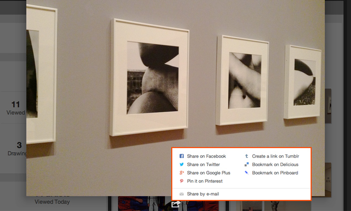
There are some errors with the My Path interface and I assume that some of these are tweaks being worked out. For example, when I open a photo, the sharing options are convenient, but they don’t include an option for downloading the original. Even the email link, which I expect will email me the photo, just sends a link to My Path. This again brings me to the point that with something like this, users shouldn’t have to think.

Photo share options

Screen capture of the photo share options in My Path

Beyond my gripes, let me say that overall my experience with the Audio+ was a strong positive. I generally hate using audio guides (because they are generally boring and clunky) but kudos to the folks behind the Audio+ because this first iteration is fun to use and provides delightful content above and beyond what I am used to. There is huge potential both with the guide and with the post-visit interface and I look forward to giving it another go in a few months once they have had a chance to work out the bumps.

Default Sort, or what would Shannon do?

Claude Shannon

Up until recently our collections website displayed search results ordered by, well, nothing in particular. This wasn’t necessarily by design, we just didn’t have any idea of how we should sort the results. We tossed around the idea of sorting things by date or alphabet, but this seemed kind of arbitrary. And as search results get more complex, ‘keyword frequency’ isn’t necessarily equivalent to ‘relevance’.

We added the ability on our ‘fancy search‘ to sort by all of these things, but we still needed a way to present search results by default.

Enter Claude Shannon and a bit of high level math (or ‘maths’ if, like some of the team, are from this thing called ‘the Commonwealth’).

Claude Shannon was a pretty smart guy and back in 1948 in a paper titled “A Mathematical Theory of Communication” he presented the idea of Entropy, or information theory. The concept is actually rather simple, and relies on a quick analysis of a dataset to discover the probability of different parts of data within the set.

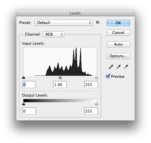
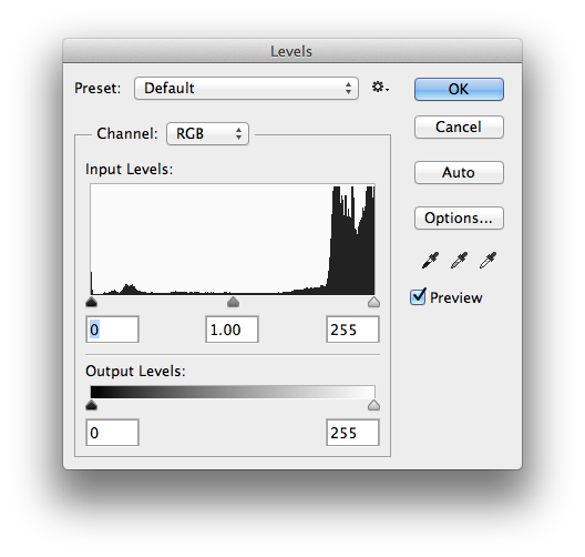
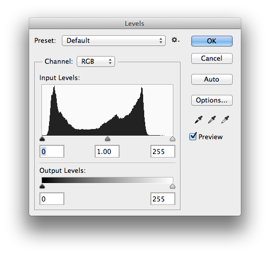
For images you can think about it by looking at a histogram and thinking of the height of each bar in the histogram as a representation of the probability that a particular pixel value will be present. With this in mind you can get a sense of how “complex” an image is. Images with really flat histograms ( lots of pixel values present lots of times ) will have a very high Entropy, where as images with severely spiked histograms ( all black or all white for example ) will have a very low Entropy.

In other words, images with more fine detail have a higher Entropy and are more complicated to express, and usually take up more room on disk when compressed.

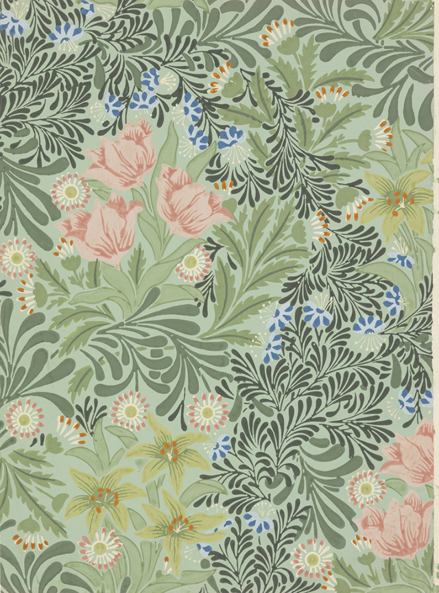
Sidewall, a-w-793, 193040

Think of an image of a wallpaper pattern like this one. It has a really high Entropy value because within the image there is lots of fine detail and texture. If we look at the histogram for the image we can see that there are lots of pixel values represented pretty evenly across the graph with a few spikes in the middle most likely representing the overall palette of the image.

Screen Shot 2013-06-21 at 10.24.25 AM

On the other hand, check out this image of a pretty smooth vase on a white background. The histogram for this image is less evenly distributed, leaning towards the right of the graph and thus has a much lower Entropy value.

Vase, 2010-6-3, 188388

Screen Shot 2013-06-21 at 10.36.42 AMWe thought it might be interesting to sort all of the images in our collection by Entropy, displaying the more complex and finer detailed images first, so I built a simple python script that takes an image as input and returns its “Shannon Entropy” as a float.

https://gist.github.com/micahwalter/5237697

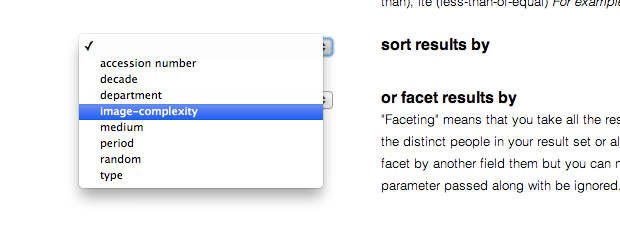
To chew through the entire collection we built this into a simple “httpony” and built a background task to run through every image in our collection and add its Shannon Entropy as a value in the collection database. We then indexed these values in Solr and added the option to sort by “image complexity” in our Fancy Search page.

Screen Shot 2013-06-21 at 10.41.49 AM

Sorting by Shannon Entropy is kind of interesting, and we noticed right away that a small byproduct of this process is that objects that simply dont have an image wind up at the end of the sort. In the end we liked the search results so much that we made “image complexity” the default sort across the entire website. You can always go into Fancy Search and change the sort criteria to your liking, but we thought image complexity seemed to be a pretty good place to start.

But what is the relationship between Claude Shannon and Shannen Doherty? Well, it looks like Shannen, herself, has a very high Shannon Entropy…

tumblr_m5dcl0iT8T1qzr8o4o1_500


Screen Shot 2013-06-21 at 10.58.46 AM

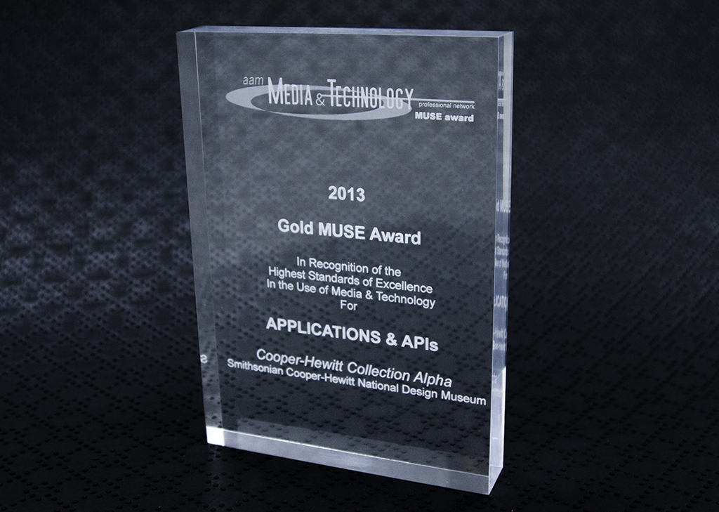
And another award!

MUSE award-1024

This time we picked up a Gold award from the American Association of Museum’s Media and Technology MUSE awards. We won in the ‘APIs and applications’ category against some stiff competition from some very polished tablet and mobile apps. The category rewards “digital presentations, applications, and mashups that utilize existing data and online resources to transform content into new meaningful tools or experiences.”

Once again it is nice to see recognition, this time from the broader museum sector, for the value of ‘public alpha’ releases.

We won an award

_mw2013small

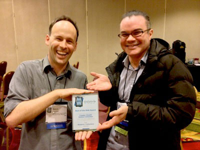
The annual international gathering that is Museums and the Web has just passed and this year we were lucky enough to win one of the Best of the Web Awards in the Research/Collections category.

We are especially proud of this award because it represents critical evaluation by our peers. And we love that they called out its tone, experimental nature, and its early alpha release. These are exactly the qualities that we believe offer the most to others in the field – something that shiny, polished, and ‘finished’ projects often don’t. What we are doing can (and perhaps, should) be copied by others.

We dedicate the award to Bill Moggridge and we’d like to particularly thank the generosity of curatorial and registration staff in letting us experiment to try re-inventing the collections online paradigm – a task that is far from over.

Congratulations to all the other winners – it is nice to be in such great company!

tms-tools == this is a blog post about code

Untitled
icebergs are kind of like giant underwater unicorns when you think about it

tms-tools

This is a blog post about code. Which means it’s really a blog post about data.

tms-tools is a suite of libraries and scripts to extract data from TMS as CSV files. Each database table is dumped as a separate CSV file. That’s it really.

It’s a blog post about data. Which means it’s really a blog post about control. It’s a blog post about preserving a measure of control over your own data.

At the end of it all TMS is a MS-SQL database and, in 2013, it still feels like an epic struggle just to get the raw data out of TMS so that single task is principally what these tools deal with.

tms-tools is the name we gave to the first set of scripts and libraries we wrote when we undertook to rebuild the collections website in the summer of 2012. The first step in that journey was creating a read-only clone of the collections database.

Quite a lot of this functionality can be accomplished from the TMS or MS-SQL applications themselves but that involves running a Windows machine and pressing a lot of buttons. This code is designed to be part of an otherwise automated system for working with your data.

TMS will remain the ultimate source of truth for our collection metadata but for us TMS didn’t turn out to be the best choice for developing and managing the public face of that data. The code in the tms-tools repository is meant to act as a bridge between those two different needs.

There is no attempt to interpret the data or the reconcile the twisty maze of relationships between the many tables in TMS. That is left as an exercise to the reader. This is not a one-button magic pony. This is code that works for us today. It has issues. If you choose to use it you will probably discover new issues. Yay, adventure!

We’re making the tms-tools code available today on Github, released under a BSD license.

We are making this code available because we know many others in our community face similar challenges. Maybe the work we’ve done so far can help others and going forward we can try to make things a little better, together.

Welcome to object phone. Your call has been placed in a queue.

I made another small thing. Again, another way for me to experiment with the Collection API, and again, another way to experiment with new ways of accessing the collection. This time, there aren’t many screen shots to display–there is no website to look at. This time, it’s “Welcome to object phone!”

(718) 213-4915

Object Phone” is ( presently ) a very, very simple implementation of a way to explore our collection by dialing a telephone, or sending a text message. I had been thinking of a few of the more popular museum oriented audio tour products, and how they all seem to be very CMS style in their design, and wondering if we could just use our own API.

For example, TourML and TAP ( which offer the web programmer a very powerful framework for programming a mobile guide using the Drupal CMS ) are very nice, but they are still very dependent on content production. The developer or content manager has to build and curate all of the content for the “tour.” This might be a good way to go about things, especially if you are leaning on an existing Drupal installation for a good deal of your content, but I was looking for a way to access existing data, and specifically the data in our collection website.

In the beginning of developing our collection website, we went through the process of assigning EVERYTHING a unique “bigint” in the form of what we are referring to as an “artisinal integer.” This means that each object record, each person record and each, well, everything else has a unique integer which no other thing can have. This is not in place of accession numbers–we will probably always have accession numbers The nice thing about unique integers is that they’re really easy to deal with on a programmatic level.

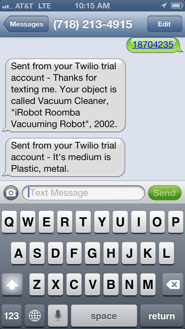
For example, if you text 18704235 to 718-213-4915 you should get a response that looks like the screenshot below. In fact you can text any object id number from our collection and get a similar response.

2013-04-18 10.15.18

You can also dial that same number and use your keypad to either search the collection by object ID, or ask for a random object. The application will respond to you using a text to speech converter, which is usually pretty good.

Presently, the app is not replying with a whole lot of information. You essentially get the object’s title and medium field if it has one. In many cases, asking for a random object may just result in something like “Drawing.” Many of our object records don’t have much more useful information than this, and also, I am trying to wrangle with the idea of how much information is useful in a voice and text message ( with a 160 character limit per SMS).

The whole system is leveraging the Twilio service and API. Twilio offers quite a range of possibilities, and I am very excited to experiment with more. For example, instead of text to speech, Twilio can play back .wav files. Additionally, Twilio can do things like dial another phone number, forward calls and record the caller’s voice. There are so many possibilities here that I wont even begin to list them, but for example, I could easily see us using this to capture user feedback in our galleries by phone and text.

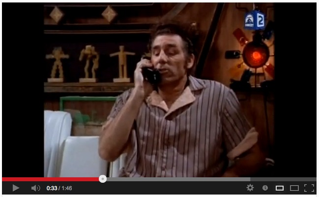
I’m very interested in figuring out a way to search by voice. I’m sort of dreaming of programming the thing to go “Why don’t you just tell me the object number!” as in this great episode of Seinfeld which you can watch by clicking the image below.

Screen Shot 2013-04-18 at 10.35.01 AMIf you are interested, I have also made the code public on this Gist. It’s pretty messy and redundant right now, but you’ll get the idea.

One of the more complicated aspects of this project will be designing the phone interface so it makes sense. Currently, once you hear an object play back, the system just hangs up on you. It would be nice to offer the user a better way to manipulate the system which is still pleasant and easy to understand. By that same token, there is a completely different approach that is needed for the SMS end of things as you don’t really have a menu tree, but instead of list of possible commands the user need to learn. Fortunately, there is a ton of great work that has already been accomplished in this arena, specifically by the Walker Art Center’s very long running and very yellow website Art on Call.

Source code at github.com/cooperhewitt/objectphone

"cmd-P"

I made us a print stylesheet for object pages on the collections website. (What does that mean? It means you can print out the webpage and it will look nice).

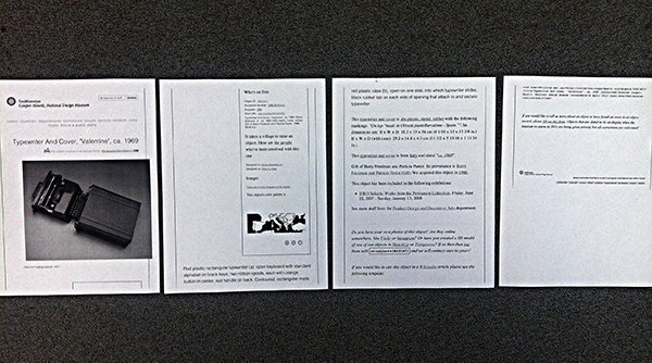
Printout of Object #18621871 before stylesheet

Printout of Object #18621871.. before stylesheet.

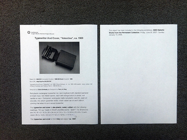
Printout of Object #18621871 after stylesheet. Much better.

Printout of Object #18621871 after stylesheet. Much better. Office carpet courtesy of Tandus flooring.

This should be very useful for us in-house, especially curators and education.. and anyone doing exhibition planning.. (which right now is many of us).

It’s not very fancy or anything. Basically I just stripped away all the extraneous information and got right to the essential details, kind of like designing for mobile.

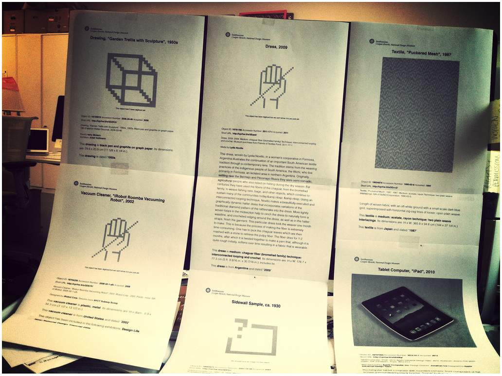
six printouts on standard paper from the collections website, taped in two rows to an iMac screen.

cascading style sheet is cascading.

In a moment of caffeinated Friday goofiness, Aaron printed out a bunch of weird objects he found (e.g. iPad described for aliens as “rectangular tablet computer with rounded corners”) and Scotch taped them all over Seb’s computer screen as a nice decorative touch for his return the next morning.

What we realized in looking at all the printouts, though, is that the simplified view of a collection record resembles a gallery wall label. And we’re currently knee-deep in the wall label discussion here at the Museum as we re-design the galleries (what does it need? what doesn’t it need? what can it do? how can it delight? how can it inform?).

I don’t yet have any conclusions to draw from that observation.. other than it’s a good frame to talk about our content and its presentation.

..to be continued!

Little Printer Experiments

We are fans of the Little Printer here in das labs, so when it was released last year and our Printers arrived, we started brainstorming ideas for a Cooper-Hewitt publication.

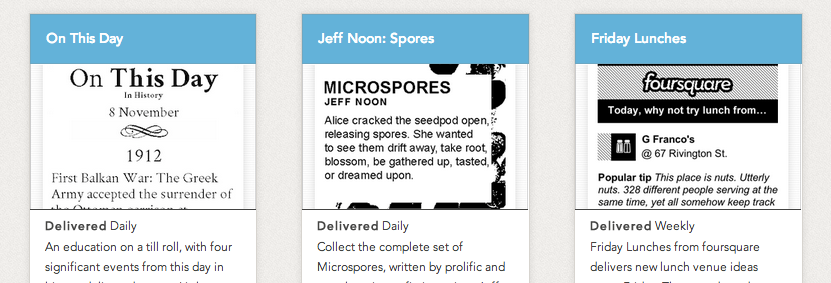
In a nutshell Little Printer is a cute little device that delivers a mini personalized newspaper to you every day. You choose which publications you want to receive, such as ‘Butterfly of the Day’ or ‘Birthday Reminders’. LP publications are created by everyone from the BBC to ARUP to individual illustrators and designers looking to share their content in a unique way.

Screen Shot 2013-04-08 at 4.02.53 PM

some existing LP publications

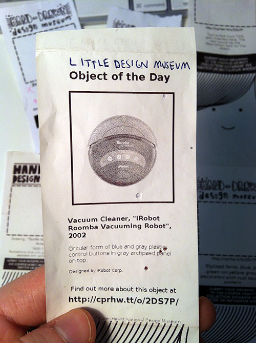
The first thing we thought of doing was a simple print spinoff of the existing and popular series on our blog called Object of the Day.

Aaron's first stab at simply translating our existing Object of the Day blog series into (Little) print format.

Aaron’s first stab at simply translating our existing Object of the Day blog series into (Little) print format.

Then we tried a few more iterations that were more playful, taking advantage of Little Printer’s nichey-ness as a space for us to let our institutional hair down.

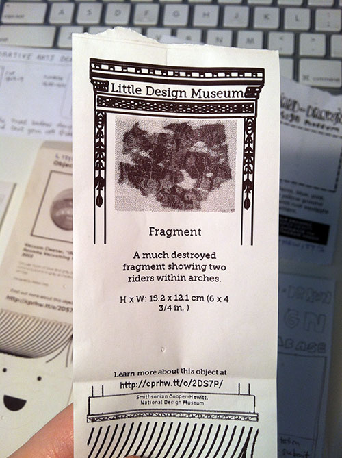
little printer printout with a collecitons object in the middle and graphics that borrow from the carnegie mansion architectural details.

We tried to go full-blown with the decorative arts kitsch, but it came out kind of boring/didn’t really work.

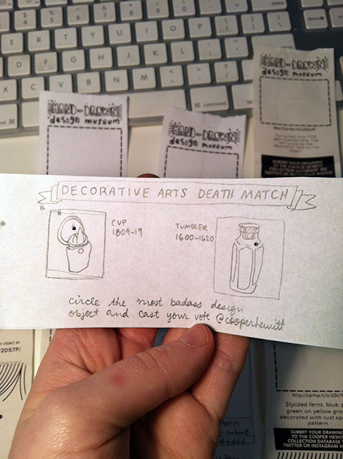
Another interesting way to take it was making the publication a two-way communication as opposed to one-way, i.e., not just announcing the Object of the Day, but rather asking people to do something with the printout, like using it as a voting ballot or a coloring book. ((Rap Coloring Book is a publication that lets you color in a different rapper each week, I think it’s pretty popular. I was also thinking of the simple digital-to-analog-to-digital interaction behind Flickr’s famous “Our Tubes are Clogged” contest of 2006 which I read about in the book Designing for Emotion (great book, I highly recommend).))

paper prototype for little printer publication with hand drawn images and text

Took a stab at a horizontal print format with a simple voting interaction. Why has nobody designed a horizontal Little Printer publication yet? Somebody should do that…

The idea everybody seemed to like most was asking people to draw their own versions of collection objects that currently have no image.

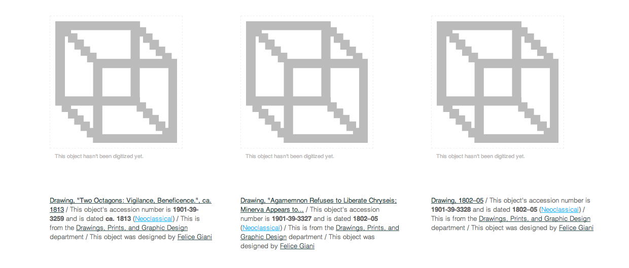
If you look on our Collections Online, you’ll see that there are plenty of things in the collection that “haven’t had their picture taken yet.”

screenshot of cooper hewit collections website showing placeholder thumbnails for three items.

Un-digitized (a.k.a. un-photographed) collections objects

I think this is a better interaction than simply voting for your favorite object because it actually generates something useful. Participants will help us give visual life to areas of our database that sorely need it. Similar to how the V&A is using crowdsourcing to crop 120,000 database images or how the Museum Victoria in Australia is generating alt-text for thousands of images with their “Describe Me” project. The Little Printer platform adds a layer of cute analog quirk to what many museums and libraries are already doing with crowdsourcing.

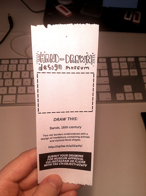
paper printout of little printer publication. big empty box indicating where drawing should go.

This prototype (now getting closer..) uses machine tags to allow people to link their drawings directly to our database. I printed this with an inkjet printer so it looks a little sharper than the Little Printer heat paper will look.

Lately at the museum we’ve been talking about Nina Simon’s “golden rule” of asking questions of museum visitors—that you should only ask if you actually CARE about the answer. This carries over to interaction design, you shouldn’t ask people for a gratuitous vote, doodle, pic, tweet, or whatever. I think some of the enjoyment that people will get out of subscribing to this publication and sending in their drawings will be the feeling that they’re helping the Museum in some way. [We know that there aren’t that many Little Printers circulating out there in the world but we do think that those early adopters who do have them will be entertained and perhaps, predisposed to playing with us.]

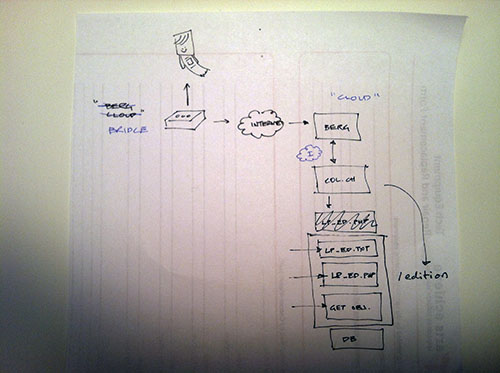
flowchart style napkin sketch showing little printer's connection to the internet, collections site and database.

A typical Aaron diagram.

The edition runs as part of the collections website itself (aka “parallel-TMS“). We chose to do this instead of running it externally on its own and using the collection API because it’s “fewer moving parts to manage” (according to Aaron). Here’s a little picture that Aaron drew for me when he was explaining how & where the publication would run. If you’re interested in doing a standalone publication, though, there are several templates on GitHub you can use as a starting point.

We’ll see how people *actually* engage with the publication and iterate accordingly…