Today marks the first birthday of our beloved Pen. It’s been an amazing year, filled will many iterations, updates, and above all, visits! Today is a celebration of the Pen, but also of all of our amazing partners whose continued support have helped to make the Pen a reality. So I’d like to start with a special thank you first and foremost to Bloomberg Philanthropies for their generous support of our vision from the start, and to all of our team partners at Sistel Networks, GE, Undercurrent, Local Projects, and Tellart.
Updates
Over the course of the past year, we’ve been hard at work, making the Pen Experience at Cooper Hewitt the best it can be. Right after we launched the Pen, we immediately realized there was quite a bit of work to do behind the scenes so that our Visitor Experience staff could better deal with deploying the Pen, and so that our visitors have the best experience possible.
Here are some highlights:
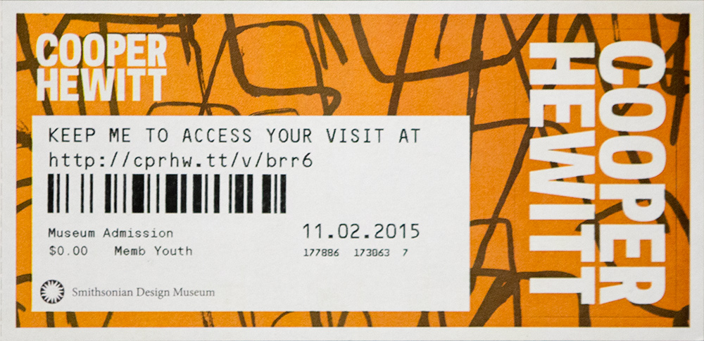
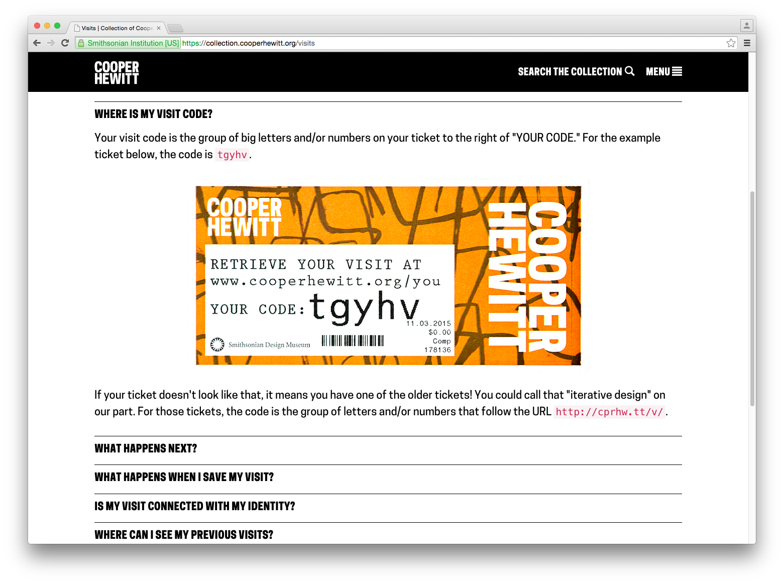
Redesigning post-purchase touchpoints – We quickly realized that our ticket purchase flow needed to be better. This article goes over how we tried to make improvements so that visitors would have a more streamlined experience at the Visitor Experience desk and afterwards.
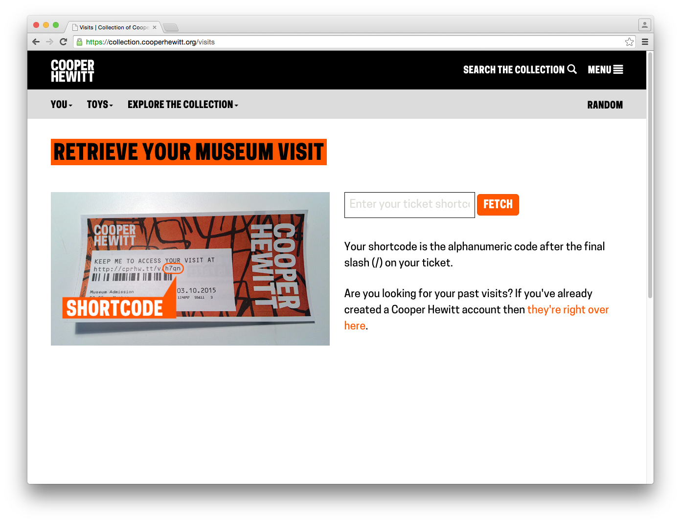
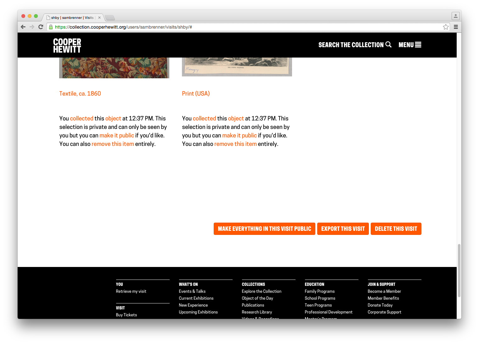
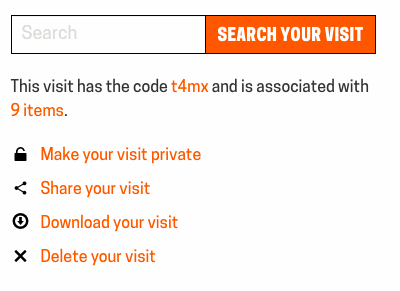
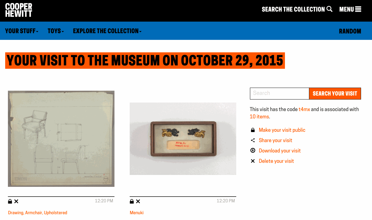
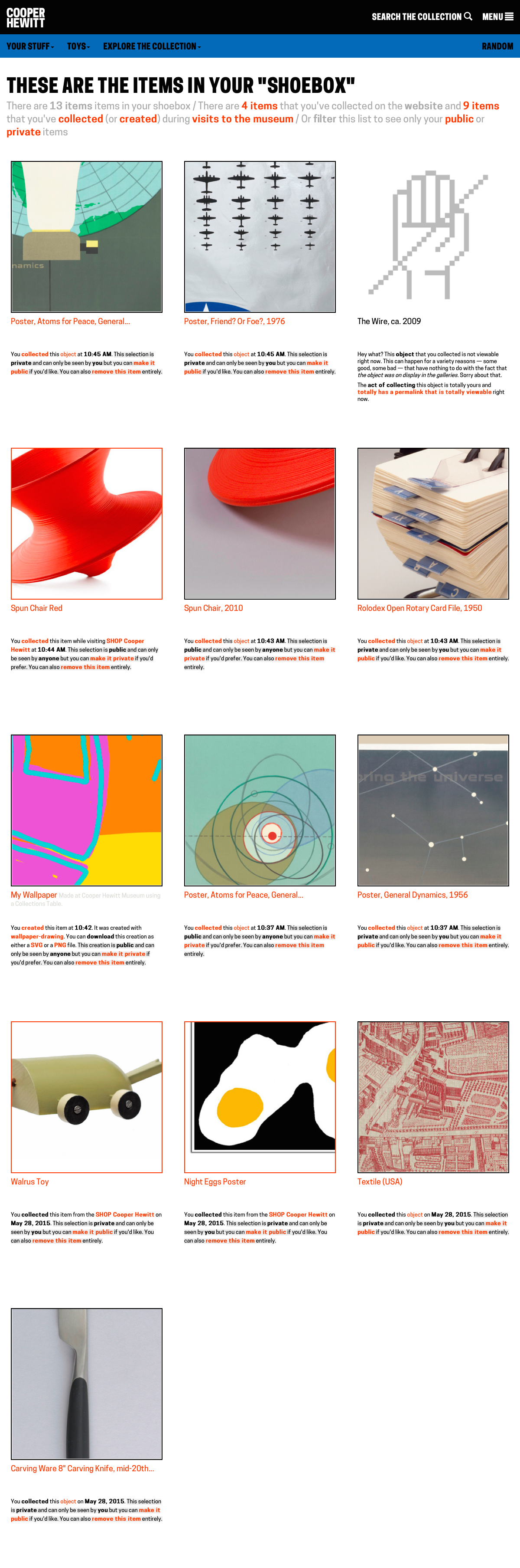
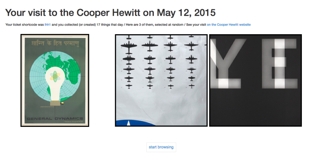
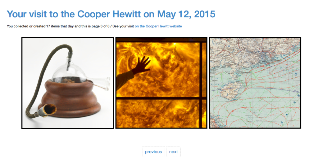
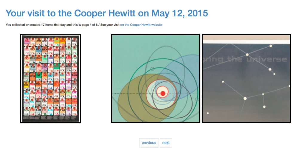
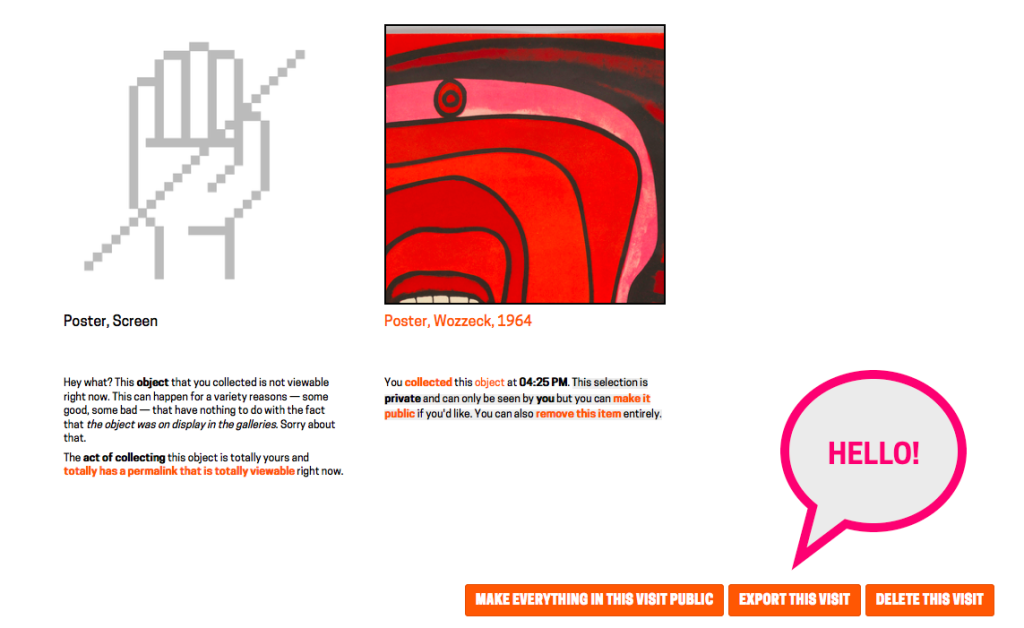
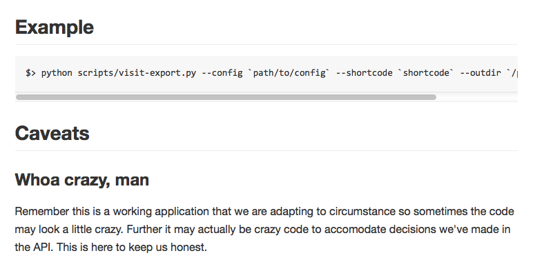
Exporting your visits – The idea of “downloading” your data seemed like an obvious necessity. It’s always nice to be able to “get all your stuff.” Aaron built a download tool that archives all the things you collected or created and packages it in a nice browser friendly format. (Affectionately known as parallel-visit)
Improving Back-of-House Interactions – We spent a lot of time behind the visitor services desk trying to understand where the pain points were. This is an ongoing effort, which we have iterated on numerous times over the year, but this post recounts the first major change we made, and it made all the difference.
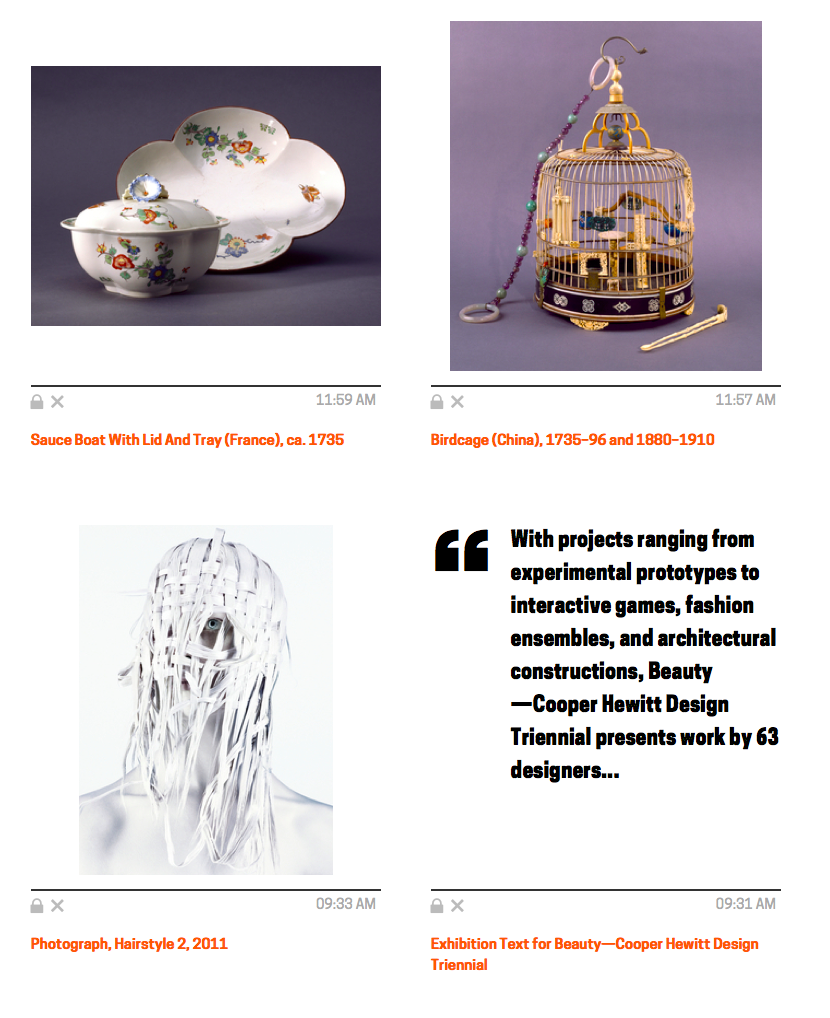
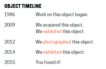
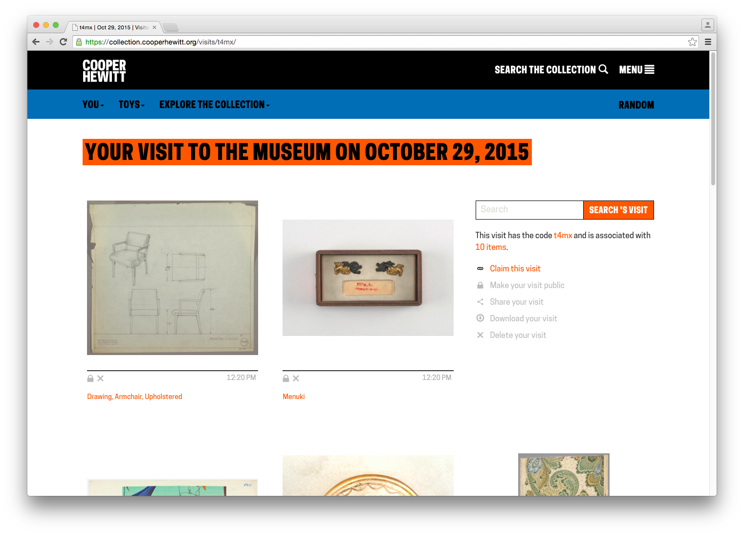
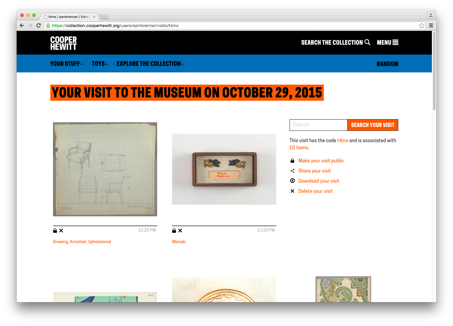
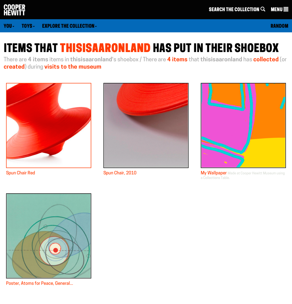
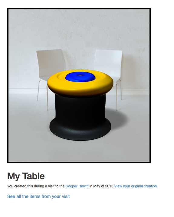
Collecting all the things – We realized pretty quickly that visitors might want to extend their experience after they’ve visited, or more simply, save things on our website. So we added the idea of a “shoebox” so that visitors to our website could save objects, just as if they had a Pen and were in our galleries.
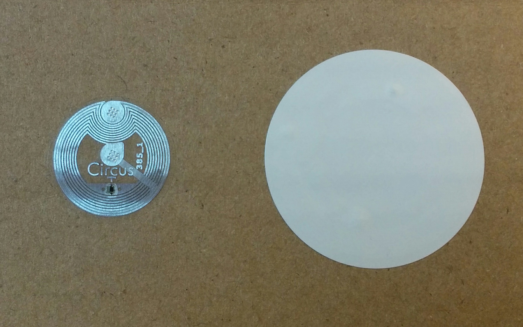
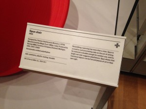
Label Writer – In order to deploy and rotate new exhibitions and objects, Sam built an Android-based application that allows our exhibition staff to easily program our NFC based wall labels. This tool means any staff member can walk around with an Android device and reprogram any wall label using our API. Cool!
Improving visitor information with paper – Onboarding new visitors is a critical component. We’ve since iterated on this design, but the basic concept is still there–hand out postcards with visual information about how to use the Pen. It works.
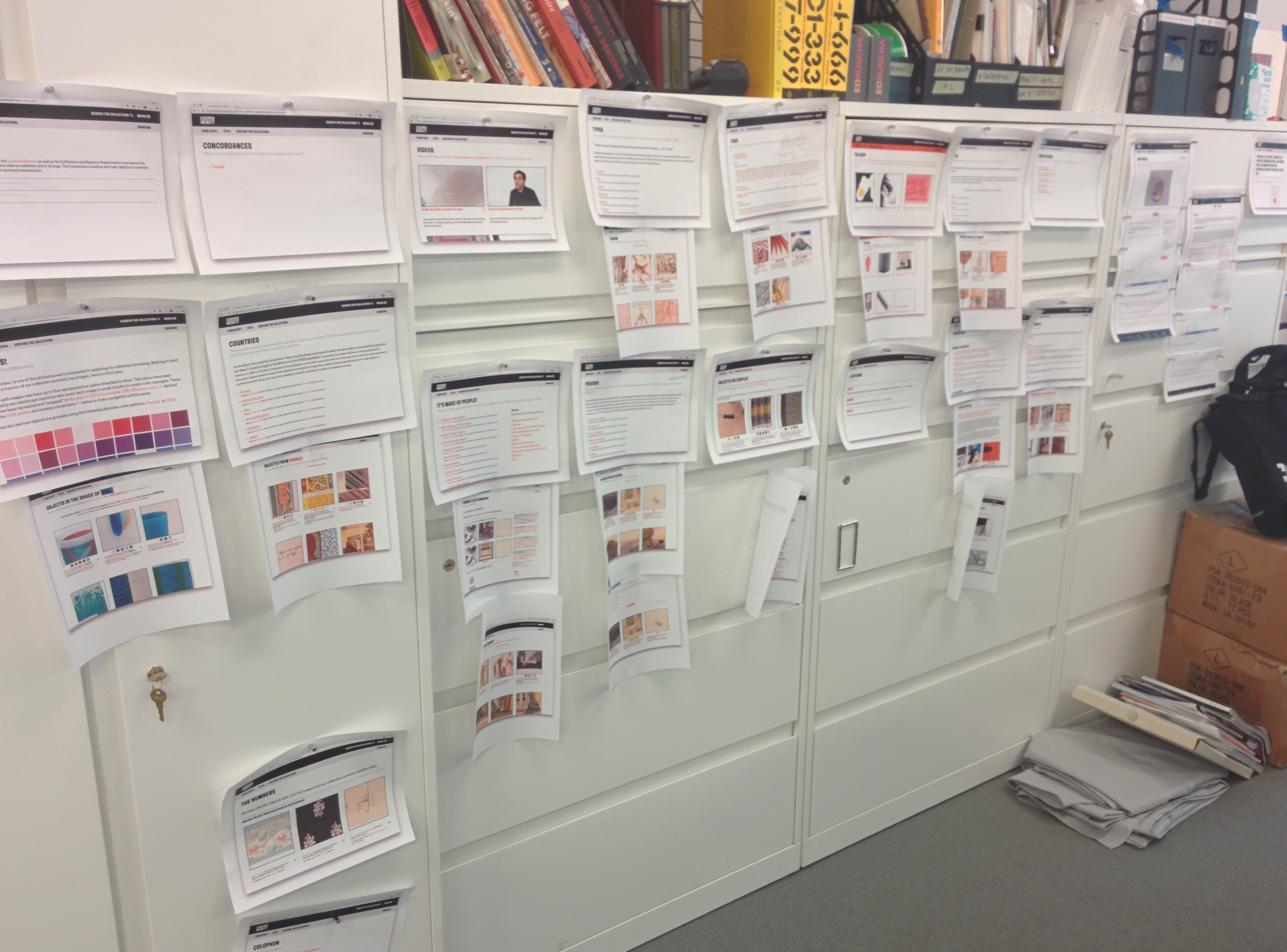
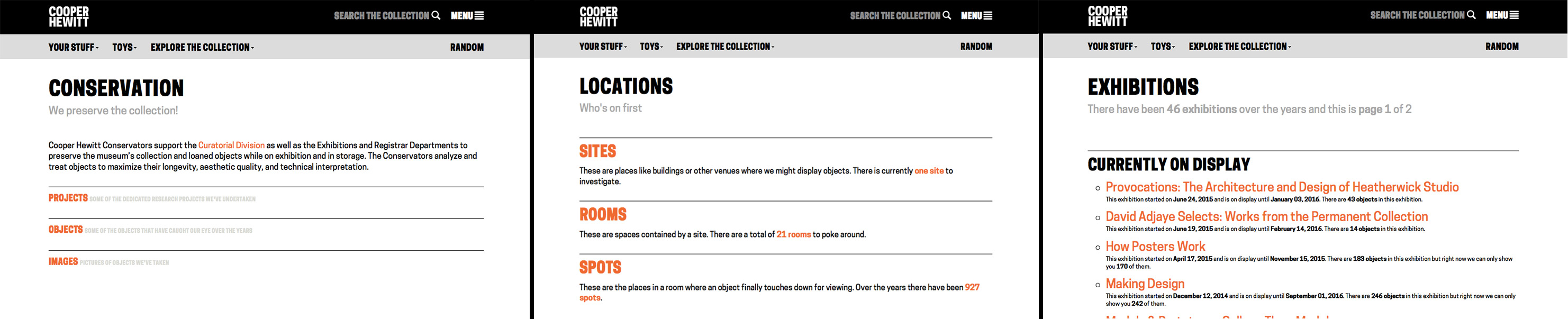
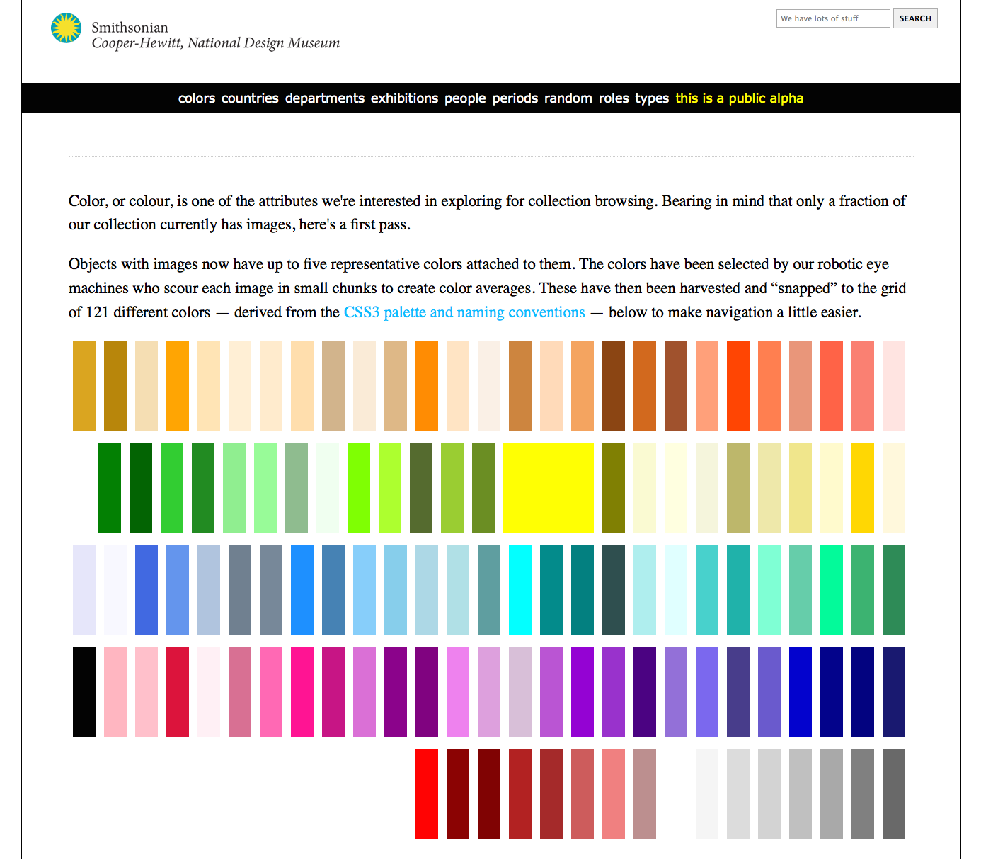
Visual consistency – This has more to do with our collection’s website, but it applies to the Pen as well, in that it helps maintain a consistent look and feel for our visitors during their post visit. This was a major overhaul of the collections website that we think makes things much easier to understand and helps provide a more cohesive experience across all our digital and physical platforms.
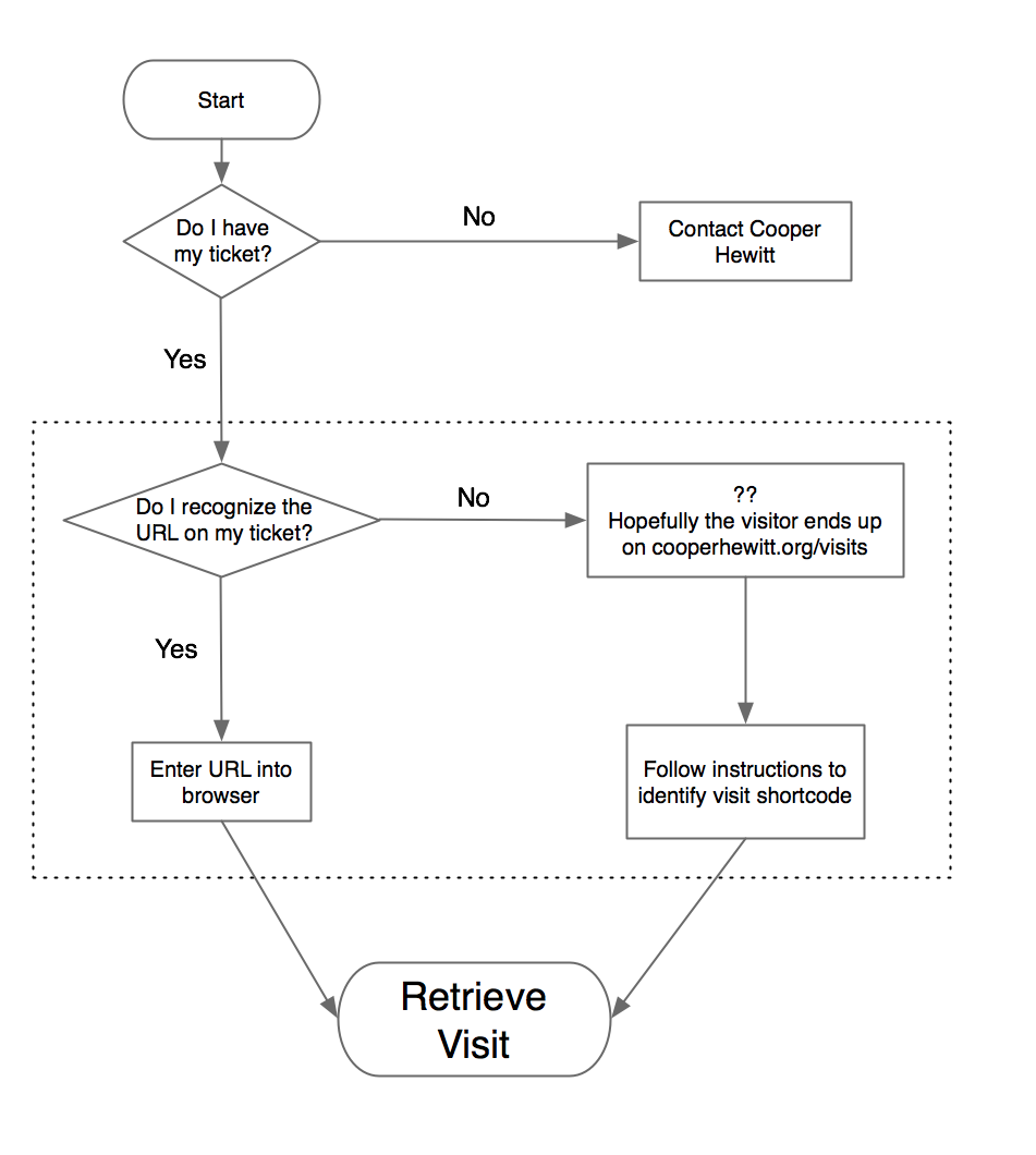
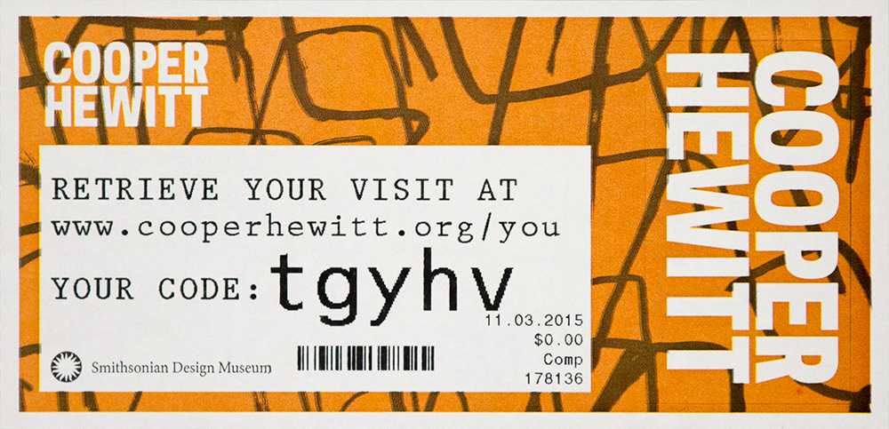
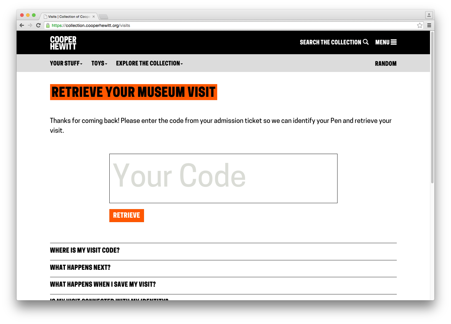
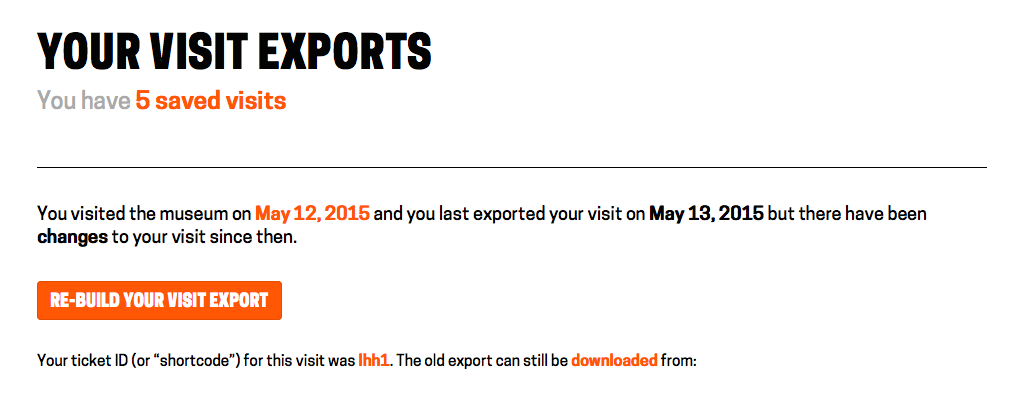
Iterating the Post-Visit Experience – Another major improvement to our post-visit end of things. We changed the basic ticket design so that visitors would be more likely to find their way to their stuff, and we redesigned what it looks like when they get there.
Press and hold to save your visit – This is another experimental deployment where we are trying to find out if a new component of our visitor experience is helpful or confusing.
On Exhibitions and Iterations – Sam summarizes the rollout of a major exhibition and the changes we’ve had to make in order to cope with a complex exhibition.
Curating Exhibition Video for Digital Platforms – Lisa makes her Labs debut with this excellent article on how we are changing our video production workflow and what that means when someone collects an object in our galleries that contains video content.
The Big Numbers
Back in August we published some initial numbers. Here are the high level updates.
Here are some of the numbers we reported in August 2015:
- March 10 to August 10 total number of times the Pen has been distributed – 62,015
- March 10 to August 10 total objects collected – 1,394,030
- March 10 to August 10 total visitor-made designs saved – 54,029
- March 10 to August 10 mean zero collection rate – 26.7%
- March 10 to August 10 mean time on campus – 99.56 minutes
- March 10 to August 10 post visit website retrieval rate – 33.8%
And here are the latest numbers from March 10, 2015 through March 9, 2016
- March 10, 2015 to March 9, 2016 total number of times the Pen has been distributed – 154,812
- March 10, 2015 to March 9, 2016 total objects collected – 3,972,359
- March 10, 2015 to March 9, 2016 total visitor-made designs saved – 122,655
- March 10, 2015 to March 9, 2016 mean zero collection rate – 23.8%
- March 10, 2015 to March 9, 2016 mean time on campus – 110.63 minutes
- Feb 25, 2016 to March 9, 2016 post visit website retrieval rate – 28.02%
That last number is interesting. A few weeks ago we added some new code to our backend system to better track this data point. Previously we had relied on Google Analytics to tell us what percentage of visitors access their post visit website, but we found this to be pretty inaccurate. It didn’t account for multiple access to the same visit by multiple users (think social sharing of a visit) and so the number was typically higher than what we thought reflected reality.
So, we are now tracking a visit page’s “first access” in code and storing that value as a timestamp. This means we now have a very accurate picture of our post visit website retrieval rate and we are also able to easily tell how much time there is between the beginning of a visit and the first access of the visit website–currently at about 1 day and 10 hours on average.
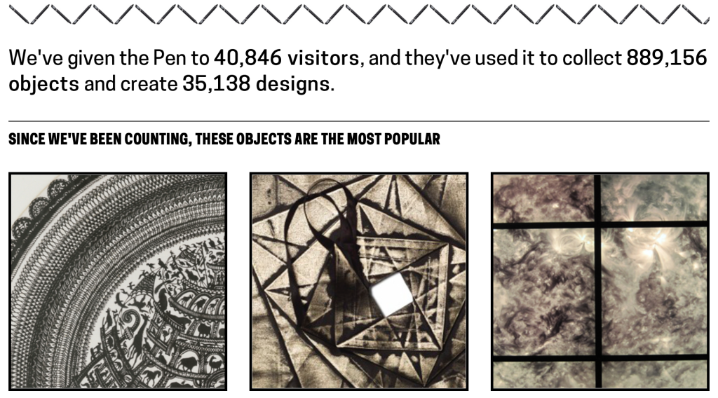
The Pen generates a massive amount of data. So, we decided to publish some of the higher level statistics on a public webpage which you can always check in on at https://collection.cooperhewitt.org/stats. This page reports daily and includes a few basic stats including a list of the most popular objects of all time. Yes, it’s the staircase models. They’ve been the frontrunners since we launched.
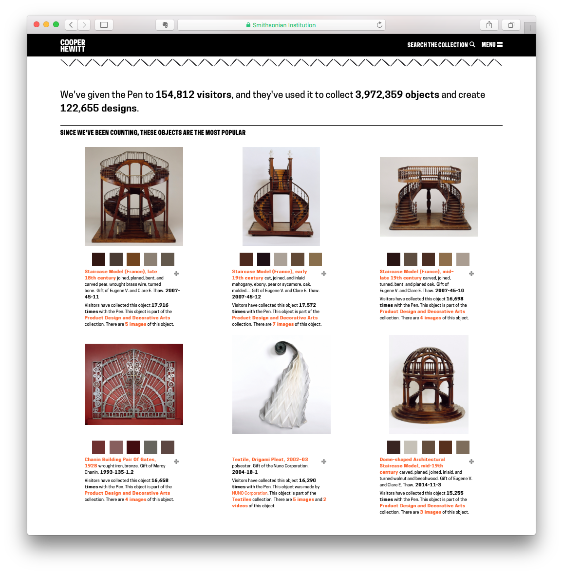
Those staircase models!
As you can see, we are just about to hit the 4 million objects collected mark. This is pretty significant and it means that our visitors on average have used the Pen to collect 26 objects per visit.
But it’s hard to gain a real sense of what’s going on if you just look at the high level numbers, so lets track some things over time. Below is a chart that shows objects collected by day for the last year.
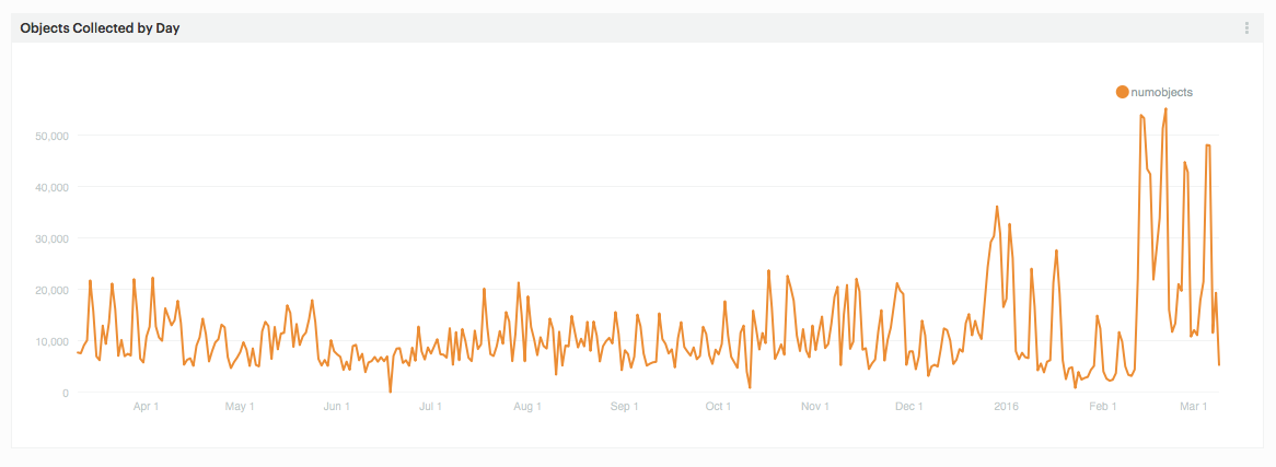
Objects collected by day since March 10, 2015
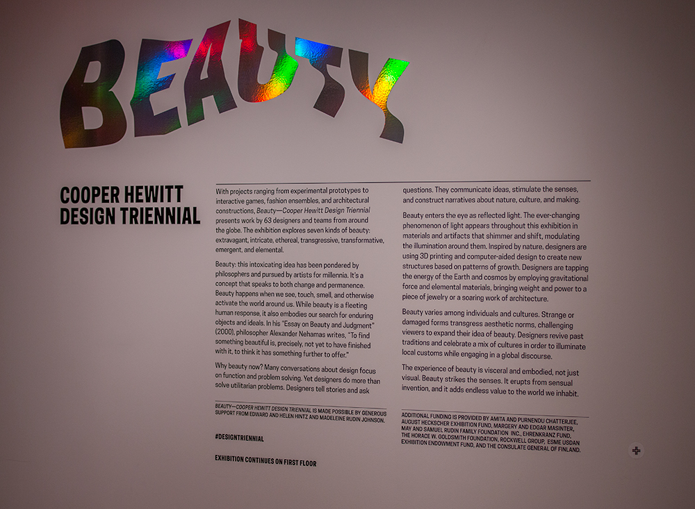
On the right you can easily see a big jump. This corresponds with the opening of the exhibition Beauty–Cooper Hewitt Design Triennial. It’s partly due to increased visitation following the opening, but what’s really going on here is a heavy use of object bundling. If you follow this blog, you’ll have recently read the post by Sam where he talks about the need to bundle many objects on one tag. This means that when a visitor taps his or her pen on a tag, they very often collect multiple objects. Beauty makes heavy use of this feature, bundling a dozen or so objects per tag in many cases and resulting in a dramatic increase in collected objects per day.
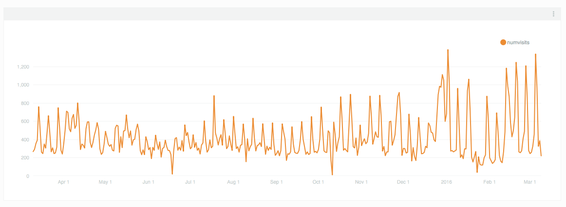
Pen checkouts per day since March 10, 2015
We can easily see that this, is in fact, what is happening if we look at our daily pen checkouts. Here we see a reasonable increase in checkouts following the launch of Beauty, but it’s not nearly as dramatic as the number of objects being collected each day.
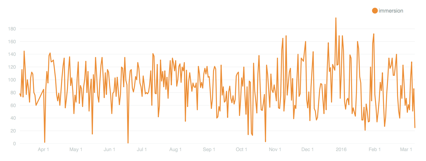
Immersion room creations by day since March 10, 2015
Above is a chart that shows how many designs were created in the immersion room each day over the past year. It’s also going to be directly connected to the number of visitors we have, but it’s interesting to see the mass of it along this period of time. The immersion room is one of our more popular interactive installations and it has been on view since we launched. So it’s not a big surprise it has a pretty steady curve to it. Also, keep in mind that this is only representative of “things saved” as we are not tracking the thousands of drawings that visitors make and walk away from.
We can slice and dice the Pen data all we want. I suppose we could take requests. But I have a better idea.
Open Data
Today we are opening up the Pen Data. This means a number of things, so listen closely.
- The data we are releasing is an anonymized and obfuscated version of some of the actual data.
- If you saved your visit to an account within thirty days of this post (and future data updates) we won’t include your data in this public release.
- This data is being licensed under Creative Commons – Attribution, Non-Commercial. This means a company can’t use this data for commercial purposes.
- The data we are releasing today is meant to be used in conjunction with out public domain collection metadata or our public API.
The data we are releasing is meant to facilitate the development of an understanding of Cooper Hewitt, its collection and interactive experiences. The idea here is that designers, artists, researchers and data analysts will have easy access to the data generated by the Pen and will be able to analyze and create data visualizations so that we can better understand the impact our in-gallery technology has on visitors.
We believe there is a lot more going on in our galleries than we might currently understand. Visitors are spending incredible amounts of time at our interactive tables, and have been using the Pen in ways we hadn’t originally thought of. For example, we know that some visitors (children especial) try to collect every single object on view. We call these our treasure hunters. We also know that a percentage of our visitors take a pen and don’t use it to collect anything at all, though they tend to use the stylus end quite a bit. Through careful analysis of this kind of data, we believe that we will be able to begin to uncover new behavior patterns and aspects of “collecting” we haven’t yet discovered.
If you fit this category and are curious enough to take our data for a spin, please get in touch, we’d love to see what you create!