Tag Archives: data

Interactive timeline design: seeking feedback!

Guest post by Olivia Vane

I’ve been visiting Cooper Hewitt for the last few months designing a new way of exploring the collection using timelines and tags. (For more background and details of the project, I’ve written a post here).

I’m set up with a prototype on a touchscreen in the Cooper Hewitt galleries today seeking impressions and feedback from visitors. Do drop in and have a play! I would love to hear your thoughts.


Exploring the Cooper Hewitt collection with timelines and tags: guest post by Olivia Vane

‘Black & white’ timeline detail, Cooper Hewitt data

A physical museum is itself a sort of data set — an aggregation of the micro in order to glimpse the macro. One vase means little on its own, beyond perhaps illustrating a scene from daily life. But together with its contemporaries, it means the contours of a civilization. And when juxtaposed against all vases, it helps create a first-hand account of the history of the world.
From ‘An Excavation Of One Of The World’s Greatest Art Collections

The ability to draw on historic examples from various cultures, to access forgotten techniques and ideas and juxtapose them with contemporary works, creates provocative dialogues and amplifies the historic continuum. This range is an asset few museums have or utilize and provides a continuing source of inspiration to contemporary viewers and designers.”
From ‘Making Design: Cooper Hewitt, Smithsonian Design Museum Collection’ p.28

Guest post by Olivia Vane

I’m 4 months into a 5-month fellowship at Cooper Hewitt working with their digitised collection. I’m normally based in London where I’m a PhD student in Innovation Design Engineering at the Royal College of Art supervised by Stephen Boyd Davis, Professor of Design Research. My PhD topic is designing and building interactive timelines for exploring cultural data (digitised museum, archive and library collections). And, in London, I have been working with partners at the V&A, the Wellcome Library and the Science Museum.

The key issue in my PhD is how we ‘make sense’ of history using interactive diagrams. This is partly about visualisation of things we already know in order to communicate them to others. But it is also about visual analytics – using visuals for knowledge discovery. I’m particularly interested in what connects objects to one another, across time and through time.

I am very fortunate to be spending time at Cooper Hewitt as they have digitised their entire collection, more than 200,000 objects, and it is publicly available through an API. The museum is also known for its pioneering work in digital engagement with visitors and technical innovations in the galleries. It is a privilege to be able to draw on the curatorial, historical and digital expertise of the staff around me here for developing and evaluating my designs.

As I began exploring the collection API, I noticed many of the object records had ‘tags’ applied to them (like ‘birds’, ‘black & white’, ‘coffee and tea drinking’, ‘architecture’, ‘symmetry’ or ‘overlapping’). These tags connect diverse objects from across the collection: they represent themes that extend over time and across the different museum departments. This tagging interested me because it seemed to offer different paths through the data around shape, form, style, texture, motif, colour, function or environment. (It’s similar to the way users on platforms like Pinterest group images into ‘boards’ around different ideas). An object can have many tags applied to it suggesting different ways to look at it, and different contexts to place it in.

Where do these tags come from? Here, the tags are chosen and applied by the museum when objects are included in an exhibition. They provide a variety of ways to think about an object, highlighting different characteristics, and purposely offer a contrasting approach to more scholarly descriptive information. The tags are used to power recommendation systems on the museum collection website and applications in the galleries. They constitute both personal and institutional interpretation of the collection, and situate each item in a multi-dimensional set of context.


Some examples of tags and tagged objects in the Cooper Hewitt collection

I was interested to trace these themes over the collection and, since objects often have multiple tags, to explore what it would be like to situate or view each object through these various lenses.

The temporal dimension is important for identifying meaningful connections between items in cultural collections, so my first thoughts were to map tagged objects by date.

I’m working on a prototype interface that allows users to browse in a visually rich way through the collection by tags. A user starts with one object image and a list of the tags that apply to that object. They may be interested to see what other objects in the collection share a given tag and how the starting image sits in each of those contexts. When they click a tag, a timeline visualisation is generated of images of the other objects sharing that tag – arranged by date. The user can then click on further tags, to generate new timeline visualisations around the same starting image, viewing that image against contrasting historical narratives. And if they see a different image that interests them in one of these timelines, they can click on that image making it the new central image with a new list of tags through which to generate timelines and further dig into the collection. By skipping from image to image and tag to tag, it’s easy to get absorbed in exploring the dataset this way; the browsing can be undirected and doesn’t require a familiarity with the dataset.


‘Coffee and tea drinking’ timeline: designs in the collection stretch from 1700 to the present with a great diversity of forms and styles, elaborate and minimal.

‘Water’ timeline. Here there are many different ways of thinking about water: images of garden plans with fountains and lakes from the 16th–18th Century, or modern interventions for accessing and cleaning water in developing countries. Contrasting representations (landscape painting to abstracted pattern) and functions (drinking to boating) stretch between.

‘Water’ timeline, detail


‘Space’ timeline: 1960s ‘space age’ souvenirs (Soviet and American) precede modern telescope imaging. And a 19th Century telescope reminds us of the long history of mankind’s interest in space.

I’m plotting the object images themselves as data points so users can easily make visual connections between them and observe trends over time (for instance in how an idea is visually represented or embodied in objects, or the types of objects present at different points in time). The images are arranged without overlapping, but in an irregular way. I hoped to emulate a densely packed art gallery wall or mood board to encourage these visual connections. Since the tags are subjective and haven’t been applied across the whole collection, I also felt this layout would encourage users to view the data in a more qualitative way.


Yale Center for British Art: Long Gallery, image credit Richard Caspole, YCBA & Elizabeth Felicella, Esto

Moodboard, image credit ERRE

Dealing with dates

How to work with curatorial dating?

While most of the post-1800 objects in the dataset have a date/date span expressed numerically, pre-1800 objects often only have date information as it would appear on a label: for example ‘Created before 1870s’, ‘late 19th–early 20th century’, ‘ca. 1850’ or ‘2012–present’. My colleagues at the Royal College of Art have previously written about the challenges of visualising temporal data from cultural collections (Davis, S.B. and Kräutli, F., 2015. The Idea and Image of Historical Time: Interactions between Design and Digital Humanities. Visible Language49(3), p.101).

In order to process this data computationally, I translated the label date text to numbers using the yearrange library (which is written for working with curatorial date language). This library works by converting, for example, ‘late 18th century’ to ‘start: 1775, end: 1799’ For my purposes, this seems to work well, though I am unsure how to deal with some cases:

  • How should I deal with objects whose date is ‘circa X’ or ‘ca. X’ etc.? At the moment I’m just crudely extending the date span by ±20 years.
  • How should I deal with ‘before X’? How much ‘before’ does that mean? I’m currently just using X as the date in this case.
  • The library does not translate BC dates (though I could make adjustments to the code to enable this…) I am just excluding these at the moment.
  • There are some very old objects in the Cooper Hewitt collection for example ‘1.85 million years old’, ‘ca. 2000-1595 BCE’ and ‘300,000 years old’. These will create problems if I want to include them on a uniformly scaled timeline! Since these are rare cases, I’m excluding them at the moment.

Skewing the timeline scale

The Cooper Hewitt collection is skewed towards objects dating post-1800 so to even out image distribution over the timeline I am using a power scale. Some tags, however, – such as ‘neoclassical’ or ‘art nouveau’ – have a strong temporal component and the power scale fails to even out image distribution in these cases.

How are the images arranged?

My layout algorithm aims to separate images so that they are not overlapping, but still fairly closely packed. I am using a rule that images can be shifted horizontally to avoid overlaps so long as there is still some part of the image within its date span. Since images are large data markers, it is already not possible to read dates precisely from this timeline. And the aim here is for users to observe trends and relationships, rather than read off exact dates, so I felt it was not productive to worry too much about exact placement horizontally. (Also, this is perhaps an appropriate design feature here since dating cultural objects is often imprecise and/or uncertain anyway). This way the images are quite tightly packed, but don’t stray too far from their dates.

‘Personal environmental control’ timeline: a dry juxtaposition of these decorated fans against modern Nest thermostats.

‘Foliate’ timeline, detail

‘Squares’ timeline

I’ve also tried to spread images out within date spans, rather than just use the central point, to avoid misleading shapes forming (such as a group of objects dating 18th century forming a column at the midpoint, 1750).

Things to think about

Interface design

  • The layout algorithm slows when there are many (100 or more) images visualised. Is there a more efficient way to do this?
  • I’m considering rotating the design 90° for web-use; I anticipate users will be interested to scroll along time, and scrolling vertically may improve usability with a mouse.
  • Would a user be interested to see different timeline visualisations next to each other, to compare them?
  • It could be interesting to apply this interface to other ways of grouping objects such as type, colour, country or other descriptor.
  • I need to build in a back button, or some way to return to previously selected images. Maybe a search option for tags? Or a way to save images to return to?

Tags

  • This visualisation design relies on curator-applied tags and, therefore, would be difficult to apply to other datasets: might there be a way to automate part of this? Maybe using computer vision technologies?
  • Since objects are only tagged if they are featured in an exhibition, the interface misses many relevant objects in the collection when visualising a theme. For instance there are 23 objects tagged ‘Japanese’, but keyword searching the collection for ‘Japanese’ returns 453 objects. While the interface works well with the current quantities of images (up to about 100), what changes to the design would be needed to increase this number?
  • What about grouping tags together? There is no dictionary or hierarchy to them so some are very similar, for instance: ‘floral’, ‘floral bouquets’, ‘floral swag’, ‘flower’, ‘flowering vine’, and ‘flowers’. Though it can be interesting to see the subtle differences in how related tags have been applied. For instance: ‘biomorphic’ is more often applied to modern objects; ‘nature’ is generally applied to depictions of nature such as landscape paintings; while ‘organic’ is applied in a more abstract sense to describe objects’ form.

I’m at a stage where I’d like to get user feedback from a range of audiences (general and scholarly) to explore some of these questions.

This is very much a work in progress, and feedback is welcome! (olivia.fletcher-vane@network.rca.ac.uk to get in touch by email)

Mia Ridge explores the shape of Cooper-Hewitt collections

Or, “what can you learn about 270,000 records in a week?”

Guest post by Mia Ridge.

I’ve just finished a weeks’ residency at the Cooper-Hewitt, where Seb had asked me to look at ‘the shape of their collection‘.  Before I started a PhD in Digital Humanities I’d spent a lot of time poking around collections databases for various museums, but I didn’t know much about the Cooper-Hewitt’s collections so this was a nice juicy challenge.

What I hoped to do

Museum collections are often accidents of history, the result of the personalities, trends and politics that shaped an institution over its history.  I wanted to go looking for stories, to find things that piqued my curiosity and see where they lead me.  How did the collection grow over time?  What would happen if I visualised materials by date, or object type by country?  Would showing the most and least exhibited objects be interesting?  What relationships could I find between the people listed in the Artist and Makers tables, or between the collections data and the library?  Could I find a pattern in changing sizes of different types of objects over time – which objects get bigger and which get smaller over time?  Which periods have the most colourful or patterned objects?

I was planning to use records from the main collections database, which for large collections usually means some cleaning is required.  Most museum collections management systems date back several decades and there’s often a backlog of un-digitised records that need entering and older records that need enhancing to modern standards.  I thought I’d iterate through stages of cleaning the data, trying it in different visualisations, then going back to clean up more precisely as necessary.

I wanted to get the easy visualisations like timelines and maps out of the way early with tools like IBM’s ManyEyes and Google Fusion Tables so I could start to look for patterns in the who, what, where, when and why of the collections.  I hoped to find combinations of tools and data that would let a visitor go looking for potential stories in the patterns revealed, then dive into the detail to find out what lay behind it or pull back to view it in context of the whole collection.

What I encountered

Well, that was a great plan, but that’s not how it worked in reality.  Overall I spent about a day of my time dealing with the sheer size of the dataset: it’s tricky to load 60 meg worth of 270,000 rows into tools that are limited by the number of rows (Excel), rows/columns (Google Docs) or size of file (Google Refine, ManyEyes), and any search-and-replace cleaning takes a long time.

However, the unexpectedly messy data was the real issue – for whatever reason, the Cooper-Hewitt’s collections records were messier than I expected and I spent most of my time trying to get the data into a workable state.  There were also lots of missing fields, and lots of uncertainty and fuzziness but again, that’s quite common in large collections – sometimes it’s the backlog in research and enhancing records, sometimes an object is unexpectedly complex (e.g. ‘Begun in Kiryu, Japan, finished in France‘) and sometimes it’s just not possible to be certain about when or where an object was from (e.g. ‘Bali? Java? Mexico?’).  On a technical note, some of the fields contained ‘hard returns’ which cause problems when exporting data into different formats.  But the main issue was the variation and inconsistency in data entry standards over time.  For example, sometimes fields contained additional comments – this certainly livened up the Dimensions fields but also made it impossible for a computer to parse them.

In some ways, computers are dumb.  They don’t do common sense, and they get all ‘who moved my cheese’ if things aren’t as they expect them to be.  Let me show you what I mean – here are some of the different ways an object was listed as coming from the USA:

  • U.S.
  • U.S.A
  • U.S.A.
  • USA
  • United States of America
  • United States (case)

We know they all mean exactly the same place, but most computers are completely baffled by variations in punctuation and spacing, let alone acronyms versus full words.  The same inconsistencies were evident when uncertainties were expressed: it might have been interesting to look at the sets of objects that were made in ‘U.S.A. or England’ but there were so many variations like ‘U.S.A./England ?’ and ‘England & U.S.A.’ that it wasn’t feasible in the time I had.  This is what happens when tools encounter messy data when they expect something neat:

Map with mislabelled location and number of records

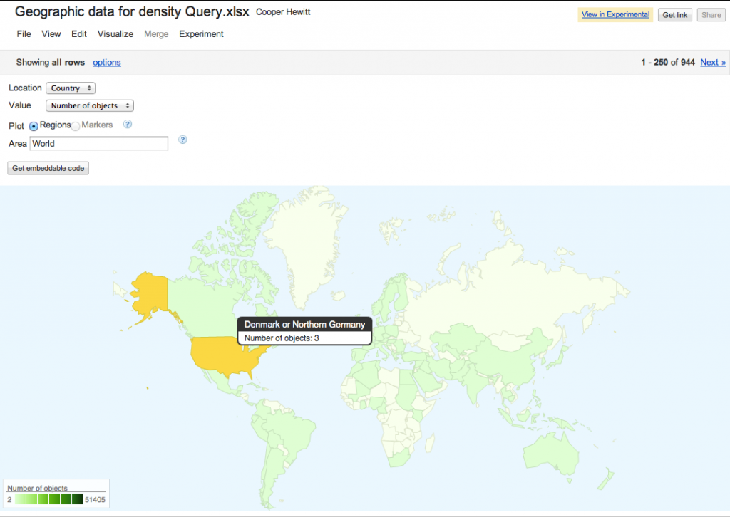
3 objects from ‘Denmark or Germany’? No! Messy data confuses geocoding software.

Data cleaning for fun and profit

I used Google Refine to clean up the records then upload them to Google Fusion or Google Docs for test visualisations.  Using tools that let me move data between them was the nearest I could get to a workflow that made it easy to tidy records iteratively without being able to tidy the records at source.

Refine is an amazing tool, and I would have struggled to get anywhere without it.  There are some great videos on how to use it at freeyourmetadata.org, but in short, it helps you ‘cluster‘ potentially similar values and update them so they’re all consistent.  The screenshot below shows Refine in action.

Screenshot

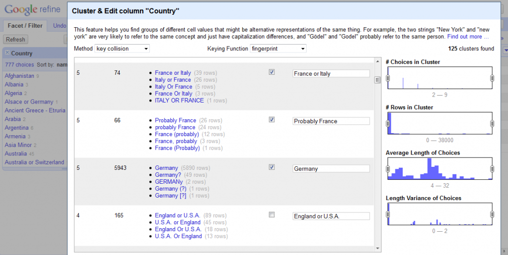
Google Refine in action

One issue is that museums tend to use question marks to record when a value is uncertain, but Refine strips out all punctuation, so you have to be careful about preserving the distinction between certain and uncertain records (if that’s what you want).  The suitability of general tools for cultural heritage data is a wider issue – a generic timeline generator doesn’t know what year to map ‘early 17th century’ to so it can be displayed, but date ranges are often present in museum data, and flattening it to 1600 or 1640 or even 1620 is a false level of precision that has the appearance of accuracy.

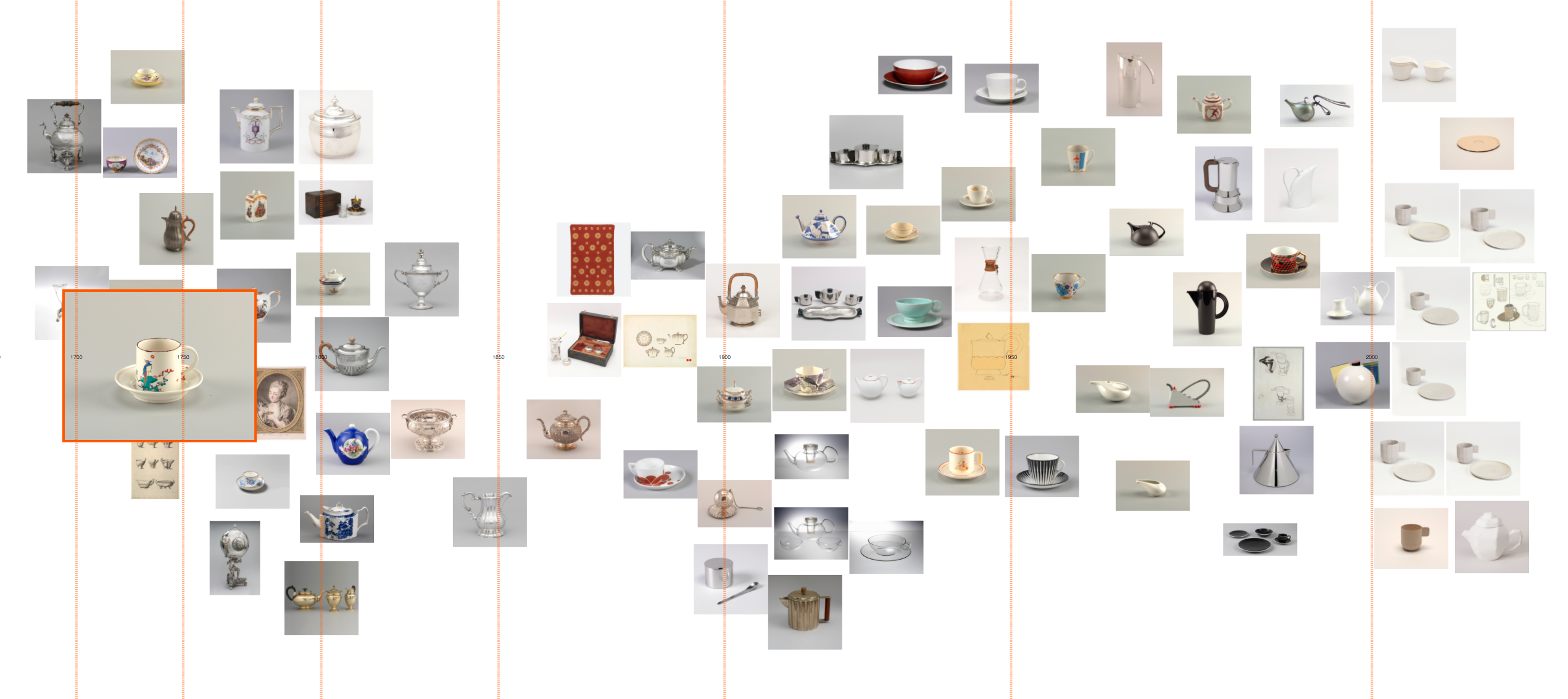
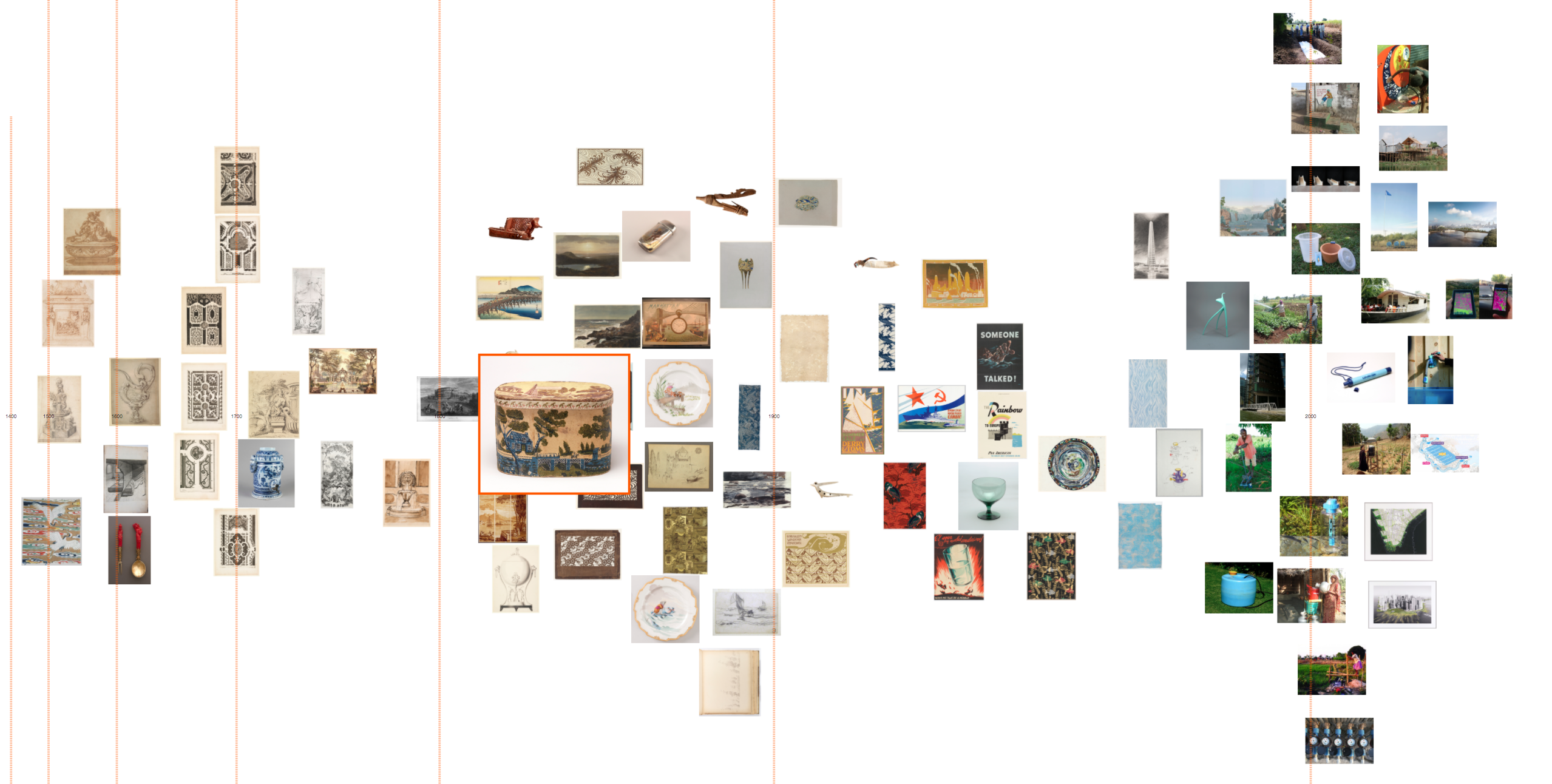
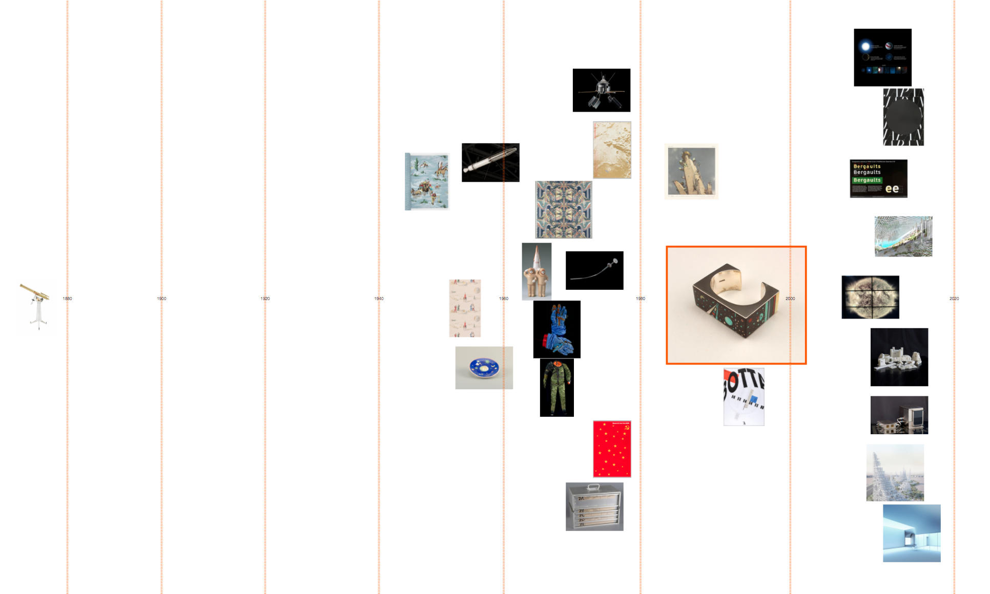
When were objects collected?

Having lost so much time to data cleaning without resolving all the issues, I eventually threw nuance, detail and accuracy out the window so I could concentrate on the overall shape of the collection. Working from the assumption that object accession numbers reflected the year of accession and probably the year of acquisition, I processed the data to extract just the year, then plotted it as accessions by department and total accessions by year. I don’t know the history of the Cooper Hewitt well enough to understand why certain years have huge peaks, but I can get a sense of the possible stories hidden behind the graph – changes of staff, the effect of World War II?  Why were 1938 and 1969 such important years for the Textiles Department, or 1991 for the Product Design and Decorative Arts Department?

Screenshot

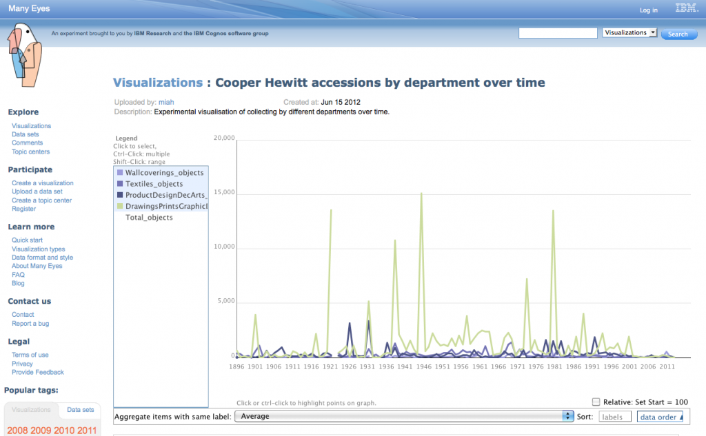
Accessions by Year for all Departments

Or try the interactive version available at ManyEyes.

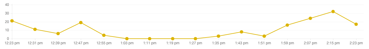
I also tried visualising the Textiles data as a bubble chart to show the years when lots of objects were collected in a different way:

Screenshot

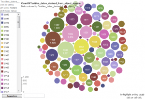
Accessions for Textiles Department by year

Where are objects from?

I also made a map which shows which countries have been collected from most intensively.  To get this display, I had to remove out any rows that had values that didn’t exactly match the name of just one country, etc, so it doesn’t represent the entire collection. But you can get a sense of the shape of the collection – for example, there’s a strong focus on the US and Western Europe objects.

Screenshot of intensity map

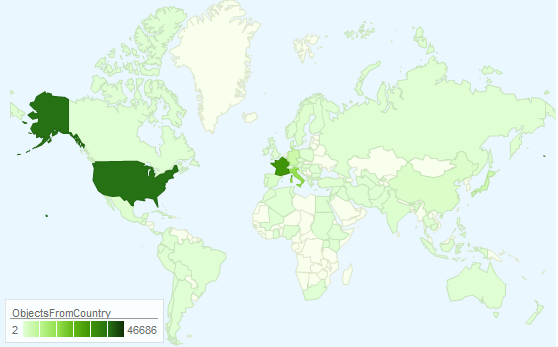
Object sources by country

The interactive version is available at https://bit.ly/Ls572u.

This also demonstrates the impact of the different tools – I’m sure the Cooper-Hewitt has more than 43 objects from the countries (England, Scotland, Wales and Northern Ireland) that make up the United Kingdom but Google’s map has only picked up references to ‘United Kingdom’, effectively masking the geo-political complexities of the region and hiding tens of thousands of records.

Linking Makers to the rest of the web

Using Refine’s Reconciliation tool, I automatically ‘reconciled’ or matched 9000 names in the Makers table to records in Freebase. For example, the Cooper-Hewitt records about Gianni Versace were linked to the Freebase page about him, providing further context for objects related to him.  By linking them to a URL that identifies the subject of a record, those records can now be part of the web, not just on the web.  However, as might be expected with a table that contains a mixture of famous, notable and ordinary people, Refine couldn’t match everything with a high level of certainty so 66453 records are left as an exercise for the reader.

I also had a quick go at graphing the different roles that occurred in the Makers table.

The benefit of hindsight, and thoughts for the future

With hindsight, I would have stuck with a proper database for data manipulation because trying to clean really large datasets with consumer tools is cumbersome. I also would have been less precious about protecting the detail and nuance of the data and been more pragmatic and ruthless about splitting up files into manageable sizes and tidying up inconsistencies and uncertainties from the start.  I possibly should have given up on the big dataset and concentrated on seeing what could be done with the more complete, higher quality records.

The quality of collections data has a profound impact of the value of visualisations and mashups. The collections records would be more usable in future visualisations if they were tidied in the source database.  A tool like Google Refine can help create a list of values to be applied and provide some quick wins for cleaning date and places fields.  Uncertainty in large datasets is often unavoidable, but with some tweaking Refine could also be used to provide suggestions for representing uncertainty more consistently.  I’m biased as crowdsourcing is the subject of my PhD, but asking people who use the collections to suggest corrections to records or help work through the records that can’t be cleaned automatically could help deal with the backlog.  Crowdsourcing could also be used to help match more names from the various People fields to pages on sites like Freebase and Wikipedia.

If this has whetted your appetite and you want to have a play with some of Cooper-Hewitt’s data, check out Collection Data Access & Download.

Finally, a big thank you to the staff of the Cooper-Hewitt for hosting me for a week.

People playing with collections #14: collection data on Many Eyes

Many Eyes Website

Many Eyes Website

I love seeing examples of uses of our collection metadata in the wild. bartdavis has uploaded our data to Many Eyes and created a few visualizations.

I found it interesting to see how many “matchsafes” we have in the collection, as you can easily see in the “color blindness test” inspired bubble chart! Here are a few screen grabs, but check them out for yourself at https://www-958.ibm.com.

Of interest to us, too, is that these visualisations are only possible because we released the collection data as a single dump. If we had, like many museums, only provided an API, this would not have been possible (or at least been much more difficult) to do.

Bubble chart of object types

Bubble chart of object types

Number of objects by century

Number of objects by century

Word cloud of object types

Word cloud of object types

Building the wall

Last month we released our collection data on Github.com. It was a pretty monumental occasion for the museum and we all worked very hard to make it happen. In an attempt to build a small example of what one might do with all of this data, we decided to build a new visualization of our collection in the form of the “Collection Wall Alpha.”

The collection wall, Alpha

The collection wall, Alpha

The idea behind the collection wall was simple enough–create a visual display of the objects in our collection that is fun and interactive. I thought about how we might accomplish this, what it would look like, and how much work it would be to get it done in a short amount of time. I thought about using our own .csv data, I tinkered, and played, and extracted, and extracted, and played some more. I realized quickly that the very data we were about to release required some thought to make it useful in practice. I probably over-thought.

Isotope

Isotope

After a short time, we found this lovely JQuery plugin called Isotope. Designed by David DeSandro, Isotope offers “an exquisite Jquery plugin of magical layouts.” And it does! I quickly realized we should just use this plugin to display a never-ending waterfall of collection objects, each with a thumbnail, and linked back to the records in our online collection database. Sounds easy enough, right?

Getting Isotope to work was pretty straight-forward. You simply create each item you want on the page, and add class identifiers to control how things are sorted and displayed. It has many options, and I picked the ones I thought would make the wall work.

Next I needed a way to reference the data, and I needed to produce the right subset of the data–the objects that actually have images! For this I decided to turn to Amazon’s SimpleDB. SimpleDB is pretty much exactly what it sounds like. It’s a super-simple to implement, scalable, non-relational database which requires no setup, configuration, or maintenance. I figured it would be the ideal place to store the data for this little project.

Once I had the data I was after, I used a tool called RazorSQL to upload the records to our SimpleDB domain. I then downloaded the AWS PHP SDK and used a few basic commands to query the data and populate the collection wall with images and data. Initially things were looking good, but I ran into a few problems. First, the data I was querying was over 16K rows tall. Thats allot of data to store in memory. Fortunately, SimpleDB is already designed with this issue in mind. By default, a call to SimpleDB only returns the first 100 rows ( you can override this up to 2500 rows ). The last element in the returned data is a special token key which you can then use to call the next 100 rows.

Using this in a loop one could easily see how to grab all 16K rows, but that sort of defeats the purpose as it still fills up the memory with the full 16K records. My next thought was to use paging, and essentially grab 100 rows at a time, per page. Isotope offers a pretty nifty “Infinite Scroll” configuration. I thought this would be ideal, allowing viewers to scroll through all 16K images. Once I got the infinite scroll feature to work, I realized that it is an issue once you page down 30 or 40 pages. So, I’m going to have to figure out a way to dump out the buffer, or something along those lines in a future release.

After about a month online, I noticed that SimpleDB charges were starting to add up. I haven’t really been able to figure out why. According to the docs, AWS only charges for “compute hours” which in my thinking should be much less than what I am seeing here. I’ll have to do some more digging on this one so we don’t break the bank!

SimpleDB charges

SimpleDB charges

Another issue I noticed was that we were going to be calling lots of thumbnail images directly from our collection servers. This didn’t seem like such a great idea, so I decided to upload them all to an Amazon S3 bucket. To make sure I got the correct images, I created simple php script that went through the 16K referenced images and automatically downloaded the correct resolution. It also auto-renamed each file to correspond with the record ID. Lastly, I set up an Amazon CloudFront CDN for the bucket, in hopes that this would speed up access to the images for users far and wide.

Overall I think this demonstrates just one possible outcome of our releasing of the collection meta-data. I have plans to add more features such as sorting and filtering in the near future, but it’s a start!

Check out the code after the jump ( a little rough, I know ).

Continue reading