Category Archives: Collection data

Little Printer Experiments

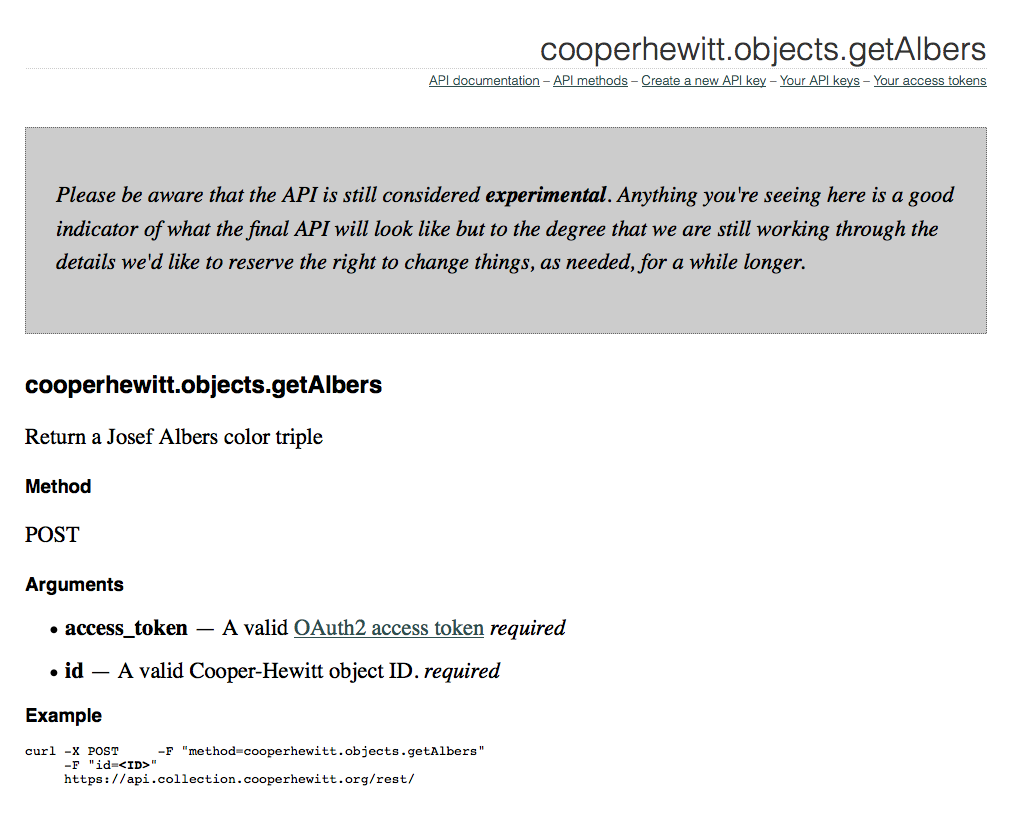
We are fans of the Little Printer here in das labs, so when it was released last year and our Printers arrived, we started brainstorming ideas for a Cooper-Hewitt publication.

In a nutshell Little Printer is a cute little device that delivers a mini personalized newspaper to you every day. You choose which publications you want to receive, such as ‘Butterfly of the Day’ or ‘Birthday Reminders’. LP publications are created by everyone from the BBC to ARUP to individual illustrators and designers looking to share their content in a unique way.

Screen Shot 2013-04-08 at 4.02.53 PM

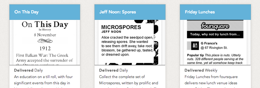
some existing LP publications

The first thing we thought of doing was a simple print spinoff of the existing and popular series on our blog called Object of the Day.

Aaron's first stab at simply translating our existing Object of the Day blog series into (Little) print format.

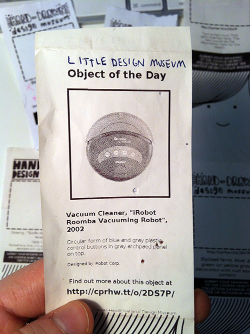
Aaron’s first stab at simply translating our existing Object of the Day blog series into (Little) print format.

Then we tried a few more iterations that were more playful, taking advantage of Little Printer’s nichey-ness as a space for us to let our institutional hair down.

little printer printout with a collecitons object in the middle and graphics that borrow from the carnegie mansion architectural details.

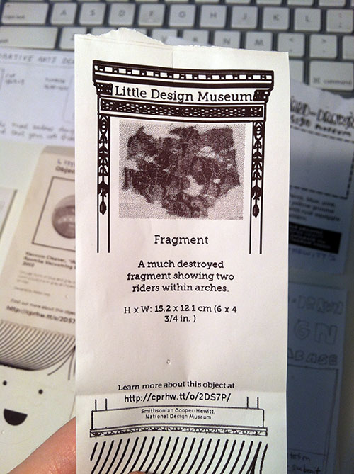
We tried to go full-blown with the decorative arts kitsch, but it came out kind of boring/didn’t really work.

Another interesting way to take it was making the publication a two-way communication as opposed to one-way, i.e., not just announcing the Object of the Day, but rather asking people to do something with the printout, like using it as a voting ballot or a coloring book. ((Rap Coloring Book is a publication that lets you color in a different rapper each week, I think it’s pretty popular. I was also thinking of the simple digital-to-analog-to-digital interaction behind Flickr’s famous “Our Tubes are Clogged” contest of 2006 which I read about in the book Designing for Emotion (great book, I highly recommend).))

paper prototype for little printer publication with hand drawn images and text

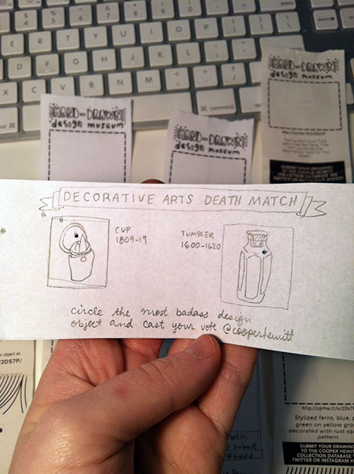
Took a stab at a horizontal print format with a simple voting interaction. Why has nobody designed a horizontal Little Printer publication yet? Somebody should do that…

The idea everybody seemed to like most was asking people to draw their own versions of collection objects that currently have no image.

If you look on our Collections Online, you’ll see that there are plenty of things in the collection that “haven’t had their picture taken yet.”

screenshot of cooper hewit collections website showing placeholder thumbnails for three items.

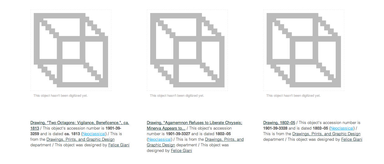
Un-digitized (a.k.a. un-photographed) collections objects

I think this is a better interaction than simply voting for your favorite object because it actually generates something useful. Participants will help us give visual life to areas of our database that sorely need it. Similar to how the V&A is using crowdsourcing to crop 120,000 database images or how the Museum Victoria in Australia is generating alt-text for thousands of images with their “Describe Me” project. The Little Printer platform adds a layer of cute analog quirk to what many museums and libraries are already doing with crowdsourcing.

paper printout of little printer publication. big empty box indicating where drawing should go.

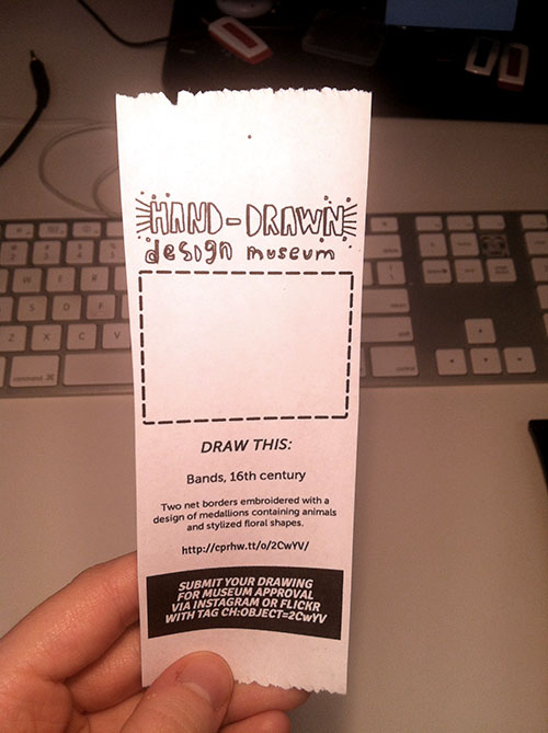
This prototype (now getting closer..) uses machine tags to allow people to link their drawings directly to our database. I printed this with an inkjet printer so it looks a little sharper than the Little Printer heat paper will look.

Lately at the museum we’ve been talking about Nina Simon’s “golden rule” of asking questions of museum visitors—that you should only ask if you actually CARE about the answer. This carries over to interaction design, you shouldn’t ask people for a gratuitous vote, doodle, pic, tweet, or whatever. I think some of the enjoyment that people will get out of subscribing to this publication and sending in their drawings will be the feeling that they’re helping the Museum in some way. [We know that there aren’t that many Little Printers circulating out there in the world but we do think that those early adopters who do have them will be entertained and perhaps, predisposed to playing with us.]

flowchart style napkin sketch showing little printer's connection to the internet, collections site and database.

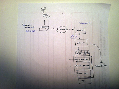
A typical Aaron diagram.

The edition runs as part of the collections website itself (aka “parallel-TMS“). We chose to do this instead of running it externally on its own and using the collection API because it’s “fewer moving parts to manage” (according to Aaron). Here’s a little picture that Aaron drew for me when he was explaining how & where the publication would run. If you’re interested in doing a standalone publication, though, there are several templates on GitHub you can use as a starting point.

We’ll see how people *actually* engage with the publication and iterate accordingly…

Introducing the Albers API method

Screen Shot 2013-02-06 at 12.11.51 PM

We recently added a method to our Collection API which allows you to get any object’s “Albers” color codes. This is a pretty straightforward method where you pass the API an object ID, and it returns to you a triple of color values in hex format.

As an experiment, I thought it would be fun to write a short script which uses our API to grab a random object, grab its Albers colors, and then use that info to build an Albers inspired image. So here goes.

For this project I chose to work in Python as I already have some experience with it, and I know it has a decent imaging library. I started by using pycurl to authenticate with our API storing the result in a buffer and then using simplejson to parse the results. This first step grabs a random object using the getRandom API method.

api_token = 'YOUR-COOPER-HEWITT-TOKEN'

buf = cStringIO.StringIO()

c = pycurl.Curl()
c.setopt(c.URL, 'https://api.collection.cooperhewitt.org/rest')
d = {'method':'cooperhewitt.objects.getRandom','access_token':api_token}

c.setopt(c.WRITEFUNCTION, buf.write)

c.setopt(c.POSTFIELDS, urllib.urlencode(d) )
c.perform()

random = json.loads(buf.getvalue())

buf.reset()
buf.truncate()

object_id = random.get('object', [])
object_id = object_id.get('id', [])

print object_id

I then use the object ID I got back to ask for the Albers color codes. The getAlbers API method returns the hex color value and ID number for each “ring.” This is kind of interesting because not only do I know the color value, but I know what it refers to in our collection ( period_id, type_id, and department_id ).

d = {'method':'cooperhewitt.objects.getAlbers','id':object_id ,'access_token':api_token}

c.setopt(c.POSTFIELDS, urllib.urlencode(d) )
c.perform()

albers = json.loads(buf.getvalue())

rings = albers.get('rings',[])
ring1color = rings[0]['hex_color']
ring2color = rings[1]['hex_color']
ring3color = rings[2]['hex_color']

print ring1color, ring2color, ring3color

buf.close()

Now that I have the ring colors I can build my image. To do this, I chose to follow the same pattern of concentric rings that Aaron talks about in this post, introducing the Albers images as a visual language on our collections website. However, to make things a little interesting, I chose to add some randomness to the the size and position of each ring. Building the image in python was pretty easy using the ImageDraw module

size = (1000,1000)
im = Image.new('RGB', size, ring1color)
draw = ImageDraw.Draw(im)

ring2coordinates = ( randint(50,100), randint(50,100) , randint(900, 950), randint(900,950))

print ring2coordinates

ring3coordinates = ( randint(ring2coordinates[0]+50, ring2coordinates[0]+100) , randint(ring2coordinates[1]+50, ring2coordinates[1]+100) ,  randint(ring2coordinates[2]-200, ring2coordinates[2]-50) , randint(ring2coordinates[3]-200, ring2coordinates[3]-50) )

print ring3coordinates

draw.rectangle(ring2coordinates, fill=ring2color)
draw.rectangle(ring3coordinates, fill=ring3color)

del draw

im.save('file.png', 'PNG')

The result are images that look like the one below, saved to my local disk. If you’d like to grab a copy of the full working python script for this, please check out this Gist.

Albersify

A bunch of Albers images

So, what can you humanities hackers do with it?

'Discordances' – or the big to-do list

Yesterday Aaron rolled out a minor data update to the online collection. Along with this he also whipped up a ‘anti-concordances’ view for our people/company records. (Yes, for various reasons why are conflating people and companies/organisations). This allows us to show all the records we have that don’t have exact matches in Wikipedia (and other sources).

Along with revealing that we don’t yet have a good automated way of getting a ‘best guess’ of matches (Marimekko Oy is the same as Marimekko) without also getting matches for Canadian hockey players who happen to share a name with a designer, the list of ‘discordances’ is a good, finite problem that can be solved with more human eyes.

People | Wikipedia | Collection of Smithsonian Cooper-Hewitt, National Design Museum

We are currently inviting people (you, for instance) to parse the list of non-matches and then tell us which ones should link to existing but differently-spelled Wikipedia pages, and which ones need to be created as new stubs in Wikipedia itself.

If you’re feeling really bold you could even start those stubs yourself! You can even use our easy-to-insert Wikipedia citation snippet to reference anything in our collection from your newly created articles. You’ll find the snippet tool at the bottom of each object and person/company record.

Getting lost in the collection (alpha)

Last week marked a pretty significant moment in my career here at Cooper-Hewitt.

As I’m sure most of you already know, we launched our Alpha collections website. The irony of this being an “alpha” of course is that it is by leaps and bounds better than our previous offering built on eMuseum.

If you notice in the screengrab below, eMuseum was pretty bland. The homepage, which is still available allowed you to engage by selecting from one of 4 museum oriented departments. You could also search. Right…

Upon entering the site, either via search or through browsing one of the four departments several things were in my mind huge problems.

Above is a search for “lennon” and you get the idea. Note the crazy long URLs with all kinds of session specific data. This was for years a huge issue as people would typically copy and paste that URL to use in blog posts and tweets. Trying to come back to the same URL twice never worked, so at some point we added a little “permlink” link at the bottom, but users rarely found it. You’ll also note the six search options under the menu item “Search.” OK, it’s just confusing.

Finally landing on an object page and you have the object data, but where does it all lead you to?

For me the key to a great, deep, user experience is to allow users to get lost within the site. It sounds odd at first. I mean if you are spending your precious time doing research on our site, you wouldn’t really want to “get lost” but in practice, it’s how we make connections, discover the oddities we never knew existed, and actually allow ourselves to uncover our own original thought. Trust me, getting lost is essential. (And it is exactly what we know visitors enjoy doing inside exhibitions.)

As you can probably tell by now, getting lost on our old eMuseum was pretty tough to do. It was designed to do just the opposite. It was designed to help you find “an object.”

Here’s what happens when you try to leave the object page in the old site.

So we ditched all that. Yes, I said that right, we ditched eMuseum! To tell you the truth, this has been something I have been waiting to do since I started here over two years ago.

When I started here, we had about 1000 objects in eMuseum. Later we upped that to 10,000, and when Seb began (at the end of 2011) we quickly upped that number to about 123,000.

I really love doing things in orders of magnitude.

I noticed that adding more and more objects to eMuseum didn’t really slow it down, it just made it really tough to browse and get lost. There was just too much stuff in one place. There were no other entry points aside from searching and clicking lists of the four departments.

Introducing our new collections website.

We decided to start from scratch, pulling data from our existing TMS database. This is the same data we were exporting to eMuseum, and the same data we released as CC0 on GitHub back in February. The difference would be, presenting the data in new ways.

Note the many menu options. These will change over time, but immediately you can browse the collection by some high level categories.

Note the random button–refreshing your browser displays three random objects form our collection. This is super-fun and to our surprise has been one of the most talked about features of the whole alpha release. We probably could have added a random button to eMuseum and called it a day, but we like to aim a little higher.

Search is still there, where it should be. So let’s do a similar search for “lennon” and see what happens.

Here, I’ve skipped the search results page, but I will mention, there were a few more results. Our new object page for this same poster by Richard Avedon is located at the nice, friendly and persistent URL https://collection.cooperhewitt.org/objects/18618175/. It has its own unique ID (more on this in a post next week by Aaron) and I have to say, looks pretty simple. We have lots of other kinds of URLs with things in them like “people” , “places” and “periods.” URLs are important, and we intend to ensure that these live on forever. So, go ahead and link away.

The basic page layout is pretty similar to eMuseum, at first. You have essential viatal stats in the gray box on the right. Object ID, Accession Number, Tombstone data, etc, etc. You also have a map, and some helpful hints.

But then things get a little more exciting. We pull in loads of TMS data, crunch it and link it up to all sorts of things. Take a scroll down this page and you’ll see lots of text, with lots of links and a few fun bits at the end, like our “machine tag” field.

Each object has been assigned a machine tag based on its unique ID number. This is simple and straightforward future-proofing. If you’re on a site like Flickr and you come across (or have your own) photo of the same object we have in our collection, you can add the machine tag.

Some day in the near future we will write code to pull in content tagged in this way from a variety of sources. This is where the collection site will really begin to take shape as well not only be displaying the “thing we have” but its relevance in the world.

It puts a whole new spin on the concept of “collecting” and it’s something we are all very excited to see happen. So start tagging!

Moving on, I mentioned that you can get lost. This is nice.

From the Avedon poster page I clicked on the decade called 1960’s This brings me to a place where I can browse based on the decade. You can jump ahead in time and easily get lost. It’s so interesting to connect the object you are currently looking at to others from the same time period. You immediately get the sense that design happens all over the world in a wide variety of ways. It’s pretty addictive.

Navigating to the “person” page for Richard Avedon, we begin to see how these connections can extend beyond our own institutional research. We begin by pointing out what kinds of things we have by Avedon. This is pretty straight-forward, but in the gray box on the right you can see we have also linked up Avedon’s person record in our own TMS database with a wide variety of external datasets. For Avedon we have concordances with Freebase, MoMA, the V & A, and of course Wikipedia. In fact, we are pulling in Wikipedia text directly to the page.

In future releases we will connect with more and more on the web. I mean, thats the whole point of the web, right? If you want to help us make these connections ( we cant do everything in code ) feel free to fork our concordances repository on GitHub and submit a pull request.

We have many categorical methods of browsing our collection now. But I have to say, my favorite is still the Random images on the home page. In fact I started a Pinterest board called “Random Button” to capture a few of my favorites. There are fun things, famous things, odd things and downright ugly things, formerly hidden away from sight, but now easy to discover, serendipitously via the random button!

There is much more to talk about, but I’ll stop here for now. Aaron, the lead developer on the project is working on a much more in depth and technical post about how he engineered the site and was able to bring us to a public alpha in less than three months!

So stay tuned…. and get exploring.

Patrick Murray-John hacks our collection at #THATcamp

And following Mia’s residency in the Labs we were excited to find out collection data ended up being toyed with at THATCamp.

Patrick Murray-John wrote up his experience with our data, reflecting many of the same issues that Mia cam across.

He calls out our CC0 licensing –

If the data had been available via an API, that would have put a huge burden on my site. I could have grabbed the data for the ‘period’, but to make it useful in my recontextualization of the data, I would have had to grab ALL the data, then normalize it, then display it. And, if I didn’t have the rights to do what I needed, I would have had to do that ON EVERY PAGE DISPLAY. That is, without the licensed rights to manipulate and keep the data as I needed, the site would have churned to a halt.

Instead, I could operate on the data as I needed. Because in a sense I own it. It’s in the public domain, and I have a site that wants to work with it. That means that the data really matters to me, because it is part of my site. So I want to make it better for my own purposes. But, also, since it is in the public domain, any improvements I make for my own purpose can and should go back into the public domain. Hopefully, that will help others. It’s a wonderful, beautiful, feedback loop, no?

As a fork of CC-0 content from github, it sets off a wonderful network of ownership of data, where each node in the network can participate in the happy feedback.

Go read his full post.

Mia Ridge explores the shape of Cooper-Hewitt collections

Or, “what can you learn about 270,000 records in a week?”

Guest post by Mia Ridge.

I’ve just finished a weeks’ residency at the Cooper-Hewitt, where Seb had asked me to look at ‘the shape of their collection‘.  Before I started a PhD in Digital Humanities I’d spent a lot of time poking around collections databases for various museums, but I didn’t know much about the Cooper-Hewitt’s collections so this was a nice juicy challenge.

What I hoped to do

Museum collections are often accidents of history, the result of the personalities, trends and politics that shaped an institution over its history.  I wanted to go looking for stories, to find things that piqued my curiosity and see where they lead me.  How did the collection grow over time?  What would happen if I visualised materials by date, or object type by country?  Would showing the most and least exhibited objects be interesting?  What relationships could I find between the people listed in the Artist and Makers tables, or between the collections data and the library?  Could I find a pattern in changing sizes of different types of objects over time – which objects get bigger and which get smaller over time?  Which periods have the most colourful or patterned objects?

I was planning to use records from the main collections database, which for large collections usually means some cleaning is required.  Most museum collections management systems date back several decades and there’s often a backlog of un-digitised records that need entering and older records that need enhancing to modern standards.  I thought I’d iterate through stages of cleaning the data, trying it in different visualisations, then going back to clean up more precisely as necessary.

I wanted to get the easy visualisations like timelines and maps out of the way early with tools like IBM’s ManyEyes and Google Fusion Tables so I could start to look for patterns in the who, what, where, when and why of the collections.  I hoped to find combinations of tools and data that would let a visitor go looking for potential stories in the patterns revealed, then dive into the detail to find out what lay behind it or pull back to view it in context of the whole collection.

What I encountered

Well, that was a great plan, but that’s not how it worked in reality.  Overall I spent about a day of my time dealing with the sheer size of the dataset: it’s tricky to load 60 meg worth of 270,000 rows into tools that are limited by the number of rows (Excel), rows/columns (Google Docs) or size of file (Google Refine, ManyEyes), and any search-and-replace cleaning takes a long time.

However, the unexpectedly messy data was the real issue – for whatever reason, the Cooper-Hewitt’s collections records were messier than I expected and I spent most of my time trying to get the data into a workable state.  There were also lots of missing fields, and lots of uncertainty and fuzziness but again, that’s quite common in large collections – sometimes it’s the backlog in research and enhancing records, sometimes an object is unexpectedly complex (e.g. ‘Begun in Kiryu, Japan, finished in France‘) and sometimes it’s just not possible to be certain about when or where an object was from (e.g. ‘Bali? Java? Mexico?’).  On a technical note, some of the fields contained ‘hard returns’ which cause problems when exporting data into different formats.  But the main issue was the variation and inconsistency in data entry standards over time.  For example, sometimes fields contained additional comments – this certainly livened up the Dimensions fields but also made it impossible for a computer to parse them.

In some ways, computers are dumb.  They don’t do common sense, and they get all ‘who moved my cheese’ if things aren’t as they expect them to be.  Let me show you what I mean – here are some of the different ways an object was listed as coming from the USA:

  • U.S.
  • U.S.A
  • U.S.A.
  • USA
  • United States of America
  • United States (case)

We know they all mean exactly the same place, but most computers are completely baffled by variations in punctuation and spacing, let alone acronyms versus full words.  The same inconsistencies were evident when uncertainties were expressed: it might have been interesting to look at the sets of objects that were made in ‘U.S.A. or England’ but there were so many variations like ‘U.S.A./England ?’ and ‘England & U.S.A.’ that it wasn’t feasible in the time I had.  This is what happens when tools encounter messy data when they expect something neat:

Map with mislabelled location and number of records

3 objects from ‘Denmark or Germany’? No! Messy data confuses geocoding software.

Data cleaning for fun and profit

I used Google Refine to clean up the records then upload them to Google Fusion or Google Docs for test visualisations.  Using tools that let me move data between them was the nearest I could get to a workflow that made it easy to tidy records iteratively without being able to tidy the records at source.

Refine is an amazing tool, and I would have struggled to get anywhere without it.  There are some great videos on how to use it at freeyourmetadata.org, but in short, it helps you ‘cluster‘ potentially similar values and update them so they’re all consistent.  The screenshot below shows Refine in action.

Screenshot

Google Refine in action

One issue is that museums tend to use question marks to record when a value is uncertain, but Refine strips out all punctuation, so you have to be careful about preserving the distinction between certain and uncertain records (if that’s what you want).  The suitability of general tools for cultural heritage data is a wider issue – a generic timeline generator doesn’t know what year to map ‘early 17th century’ to so it can be displayed, but date ranges are often present in museum data, and flattening it to 1600 or 1640 or even 1620 is a false level of precision that has the appearance of accuracy.

When were objects collected?

Having lost so much time to data cleaning without resolving all the issues, I eventually threw nuance, detail and accuracy out the window so I could concentrate on the overall shape of the collection. Working from the assumption that object accession numbers reflected the year of accession and probably the year of acquisition, I processed the data to extract just the year, then plotted it as accessions by department and total accessions by year. I don’t know the history of the Cooper Hewitt well enough to understand why certain years have huge peaks, but I can get a sense of the possible stories hidden behind the graph – changes of staff, the effect of World War II?  Why were 1938 and 1969 such important years for the Textiles Department, or 1991 for the Product Design and Decorative Arts Department?

Screenshot

Accessions by Year for all Departments

Or try the interactive version available at ManyEyes.

I also tried visualising the Textiles data as a bubble chart to show the years when lots of objects were collected in a different way:

Screenshot

Accessions for Textiles Department by year

Where are objects from?

I also made a map which shows which countries have been collected from most intensively.  To get this display, I had to remove out any rows that had values that didn’t exactly match the name of just one country, etc, so it doesn’t represent the entire collection. But you can get a sense of the shape of the collection – for example, there’s a strong focus on the US and Western Europe objects.

Screenshot of intensity map

Object sources by country

The interactive version is available at https://bit.ly/Ls572u.

This also demonstrates the impact of the different tools – I’m sure the Cooper-Hewitt has more than 43 objects from the countries (England, Scotland, Wales and Northern Ireland) that make up the United Kingdom but Google’s map has only picked up references to ‘United Kingdom’, effectively masking the geo-political complexities of the region and hiding tens of thousands of records.

Linking Makers to the rest of the web

Using Refine’s Reconciliation tool, I automatically ‘reconciled’ or matched 9000 names in the Makers table to records in Freebase. For example, the Cooper-Hewitt records about Gianni Versace were linked to the Freebase page about him, providing further context for objects related to him.  By linking them to a URL that identifies the subject of a record, those records can now be part of the web, not just on the web.  However, as might be expected with a table that contains a mixture of famous, notable and ordinary people, Refine couldn’t match everything with a high level of certainty so 66453 records are left as an exercise for the reader.

I also had a quick go at graphing the different roles that occurred in the Makers table.

The benefit of hindsight, and thoughts for the future

With hindsight, I would have stuck with a proper database for data manipulation because trying to clean really large datasets with consumer tools is cumbersome. I also would have been less precious about protecting the detail and nuance of the data and been more pragmatic and ruthless about splitting up files into manageable sizes and tidying up inconsistencies and uncertainties from the start.  I possibly should have given up on the big dataset and concentrated on seeing what could be done with the more complete, higher quality records.

The quality of collections data has a profound impact of the value of visualisations and mashups. The collections records would be more usable in future visualisations if they were tidied in the source database.  A tool like Google Refine can help create a list of values to be applied and provide some quick wins for cleaning date and places fields.  Uncertainty in large datasets is often unavoidable, but with some tweaking Refine could also be used to provide suggestions for representing uncertainty more consistently.  I’m biased as crowdsourcing is the subject of my PhD, but asking people who use the collections to suggest corrections to records or help work through the records that can’t be cleaned automatically could help deal with the backlog.  Crowdsourcing could also be used to help match more names from the various People fields to pages on sites like Freebase and Wikipedia.

If this has whetted your appetite and you want to have a play with some of Cooper-Hewitt’s data, check out Collection Data Access & Download.

Finally, a big thank you to the staff of the Cooper-Hewitt for hosting me for a week.

People playing with collections #14: collection data on Many Eyes

Many Eyes Website

Many Eyes Website

I love seeing examples of uses of our collection metadata in the wild. bartdavis has uploaded our data to Many Eyes and created a few visualizations.

I found it interesting to see how many “matchsafes” we have in the collection, as you can easily see in the “color blindness test” inspired bubble chart! Here are a few screen grabs, but check them out for yourself at https://www-958.ibm.com.

Of interest to us, too, is that these visualisations are only possible because we released the collection data as a single dump. If we had, like many museums, only provided an API, this would not have been possible (or at least been much more difficult) to do.

Bubble chart of object types

Bubble chart of object types

Number of objects by century

Number of objects by century

Word cloud of object types

Word cloud of object types

Releasing the collection on GitHub

Late last week we released the Cooper-Hewitt’s collection metadata as a downloadable file. And in a first for the Smithsonian, we dedicated the release to the public domain, using Creative Commons Zero.

I’m often asked why releasing collection metadata is important. My teams did similar things at the Powerhouse Museum when I was there, and I still believe that this is the direction that museums and other collecting institutions need to go. With the growing Digital Humanities field, there is increasing value in scholars being able to ‘see’ a collection at a macro, zoomed out level – something which just isn’t possible with search interfaces. Likewise the release of such data under liberal licenses or to the public domain brings closer a future in which cross-institutional discovery is the norm.

Philosophically, too, the public release of collection metadata asserts, clearly, that such metadata is the raw material on which interpretation through exhibitions, catalogues, public programmes, and experiences are built. On its own, unrefined, it is of minimal ‘value’ except as a tool for discovery. It also helps remind us that collection metadata is not the collection itself.

Of course it is more complex than that.

There are plenty of reasons why museums are hesitant to release their metadata.

Collection metadata is often in a low quality state. Sometimes it is purposely unrefined, especially in art museums where historical circumstance and scholarly norms have meant that so called ‘tombstone data’ has sometimes been kept to a bare minimum so as to not ‘bring opinion’ to objects. Other times it has simply been kept at a minimum because of a lack of staff resources. Often, too, internal workflows still keep exhibition label and catalogue publishing separate from collection documentation meaning that obvious improvements such as the rendering of ‘label copy’ and catalogue narrative to object records is not automatic.

But I digress.

We released our metadata through GitHub, and that needs some additional explanation.

GitHub is a source repository of the kind traditionally used by coders. And, lacking a robust public endpoint of our own which could track changes and produce diff files as we uploaded new versions of the collection data, GitHub was the ideal candidate. Not only that, the type of ‘earlyvangelists’ we are targetting with the data release, hang out there in quantity.

The idea for using GitHub to host collection datasets had actually been bouncing around since April 2009. Aaron Straup-Cope and I were hanging out in-between sessions at Museums and the Web in Indianapolis talking about Solr, collection data, and APIs. Aaron suggested that GitHub would be the perfect place for museums to dump their collections – as giant text blobs – and certainly better than putting it on their own sites. Then 2010 happened and the early-mover museums all suddenly had built APIs for their collections. Making a text dump was suddenly off the agenda, but that idea of using GitHub still played on my mind.

Now, Cooper-Hewitt is not yet in a suitable position infrastructurally to develop an API for its collection. So when the time came to make release the dataset, that conversation from 2009 suddenly became a reality.

And, fittingly, Aaron has been the first to fork the collection – creating individual JSON for each object record.

Could GitHub become not just a source code repository but a repository for ‘cultural source code’?

(But read the data info first!)