Category Archives: CH 3.0

"All your color are belong to Giv"

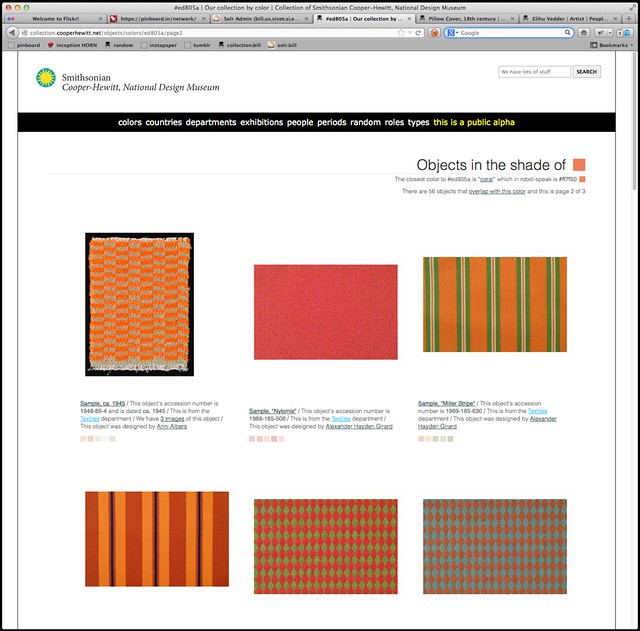
Today we enabled the ability to browse the collections website by color. Yay!

Don’t worry — you can also browse by colour but since the Cooper-Hewitt is part of the Smithsonian I will continue to use US Imperial Fahrenheit spelling for the rest of this blog post.

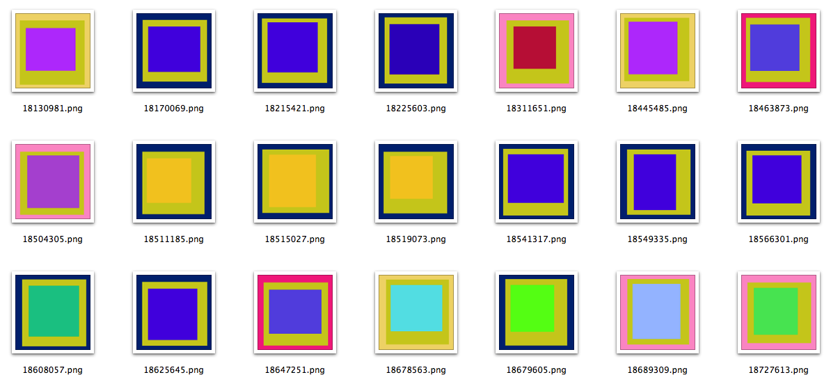
Objects with images now have up to five representative colors attached to them. The colors have been selected by our robotic eye machines who scour each image in small chunks to create color averages. We use a two-pass process to do this:

  • First, we run every image through Giv Parvaneh’s handy color analysis tool RoyGBiv. Giv’s tool calculates both the average color of an image and a palette of up to five predominant colors. This is all based on the work Giv did for version two of the Powerhouse Museum’s Electronic Swatchbook, back in 2009.

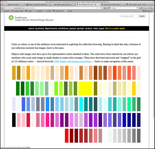
  • Then, for each color in the palette list (we aren’t interested in the average) we calculate the nearest color in the CSS3 color spectrum. We “snap” each color to the CSS3 grid, so to speak.

We store all the values but only index the CSS3 colors. When someone searches the collection for a given color we do the same trick and snap their query back down to a managable set of 121 colors rather than trying to search for things across the millions of shades and variations of colors that modern life affords us.

Our databases aren’t set up for doing complicated color math across the entire collection so this is a nice way to reduce the scope of the problem, especially since this is just a “first draft”. It’s been interesting to see how well the CSS3 palette maps to the array of colors in the collection. There are some dubious matches but overall it has served us very well by sorting things in to accurate-enough buckets that ensure a reasonable spread of objects for each query.

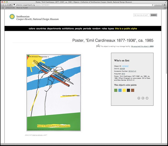
We also display the palette for the object’s primary image on the object page (for those things that have been digitized).

We’re not being very clever about how we sort the objects or how we let you choose to sort the objects (you can’t) which is mostly a function of knowing that the database layer for all of this will change soon and not getting stuck working on fiddly bits we know that we’re going to replace anyway.

There are lots of different palettes out there and as we start to make better sense of the boring technical stuff we plan to expose more of them on the site itself. In the process of doing all this work we’ve also released a couple more pieces of software on Github:

  • color-utils is a mostly a grab bag of tools and tests and different palettes that I wrote for myself as we were building this. The palettes are plain vanilla JSON files and at the moment there are lists for the CSS3 colors, Wikipedia’s list of Crayola crayon colors, the various shades of SOME-COLOR pages on Wikipedia, both as a single list and bucketed by family (red, green, etc.) and the Scandawegian Natural Colour System mostly just because Frankie Roberto told me about it this morning.

  • palette-server is a very small WSGI-compliant HTTP pony (or “httpony“) that wraps Giv’s color analyzer and the snap-to-grid code in a simple web interface. We run this locally on the machine with all the images and the site code simply passes along the path to an image as a GET parameter. Like this:

    curl  'https://localhost:8000?path=/Users/asc/Desktop/cat.jpg' | python -m json.tool
    
    {
    "reference-closest": "css3",
    "average": {
        "closest": "#808080",
        "color": "#8e895a",
    },
    "palette": [
        {
            "closest": "#a0522d",
            "color": "#957d34",
            }
    
            ... and so on ...
        }
    }

This allows us to offload all the image processing to third-party libraries and people who are smarter about color wrangling than we are.

Both pieces of code are pretty rough around the edges so we’d welcome your thoughts and contributions. Pretty short on my TO DO list is to merge the code to snap-to-grid using a user-defined palette back in to the HTTP palette server.

As I write this, color palettes are not exposed in either the API or the collections metadata dumps but that will happen in pretty short order. Also, a page to select objects based on a random color but I just thought of that as I was copy-paste-ing the links for those other things that I need to do first…

In the meantime, head on over to the collections website and have a poke around.

Introducing the Albers API method

Screen Shot 2013-02-06 at 12.11.51 PM

We recently added a method to our Collection API which allows you to get any object’s “Albers” color codes. This is a pretty straightforward method where you pass the API an object ID, and it returns to you a triple of color values in hex format.

As an experiment, I thought it would be fun to write a short script which uses our API to grab a random object, grab its Albers colors, and then use that info to build an Albers inspired image. So here goes.

For this project I chose to work in Python as I already have some experience with it, and I know it has a decent imaging library. I started by using pycurl to authenticate with our API storing the result in a buffer and then using simplejson to parse the results. This first step grabs a random object using the getRandom API method.

api_token = 'YOUR-COOPER-HEWITT-TOKEN'

buf = cStringIO.StringIO()

c = pycurl.Curl()
c.setopt(c.URL, 'https://api.collection.cooperhewitt.org/rest')
d = {'method':'cooperhewitt.objects.getRandom','access_token':api_token}

c.setopt(c.WRITEFUNCTION, buf.write)

c.setopt(c.POSTFIELDS, urllib.urlencode(d) )
c.perform()

random = json.loads(buf.getvalue())

buf.reset()
buf.truncate()

object_id = random.get('object', [])
object_id = object_id.get('id', [])

print object_id

I then use the object ID I got back to ask for the Albers color codes. The getAlbers API method returns the hex color value and ID number for each “ring.” This is kind of interesting because not only do I know the color value, but I know what it refers to in our collection ( period_id, type_id, and department_id ).

d = {'method':'cooperhewitt.objects.getAlbers','id':object_id ,'access_token':api_token}

c.setopt(c.POSTFIELDS, urllib.urlencode(d) )
c.perform()

albers = json.loads(buf.getvalue())

rings = albers.get('rings',[])
ring1color = rings[0]['hex_color']
ring2color = rings[1]['hex_color']
ring3color = rings[2]['hex_color']

print ring1color, ring2color, ring3color

buf.close()

Now that I have the ring colors I can build my image. To do this, I chose to follow the same pattern of concentric rings that Aaron talks about in this post, introducing the Albers images as a visual language on our collections website. However, to make things a little interesting, I chose to add some randomness to the the size and position of each ring. Building the image in python was pretty easy using the ImageDraw module

size = (1000,1000)
im = Image.new('RGB', size, ring1color)
draw = ImageDraw.Draw(im)

ring2coordinates = ( randint(50,100), randint(50,100) , randint(900, 950), randint(900,950))

print ring2coordinates

ring3coordinates = ( randint(ring2coordinates[0]+50, ring2coordinates[0]+100) , randint(ring2coordinates[1]+50, ring2coordinates[1]+100) ,  randint(ring2coordinates[2]-200, ring2coordinates[2]-50) , randint(ring2coordinates[3]-200, ring2coordinates[3]-50) )

print ring3coordinates

draw.rectangle(ring2coordinates, fill=ring2color)
draw.rectangle(ring3coordinates, fill=ring3color)

del draw

im.save('file.png', 'PNG')

The result are images that look like the one below, saved to my local disk. If you’d like to grab a copy of the full working python script for this, please check out this Gist.

Albersify

A bunch of Albers images

So, what can you humanities hackers do with it?

Albers boxes

We have a lot of objects in our collection. Unfortunately we are also lacking images for many of those same objects. There are a variety of reasons why we might not have an image for something in our collection.

  • It may not have been digitized yet (aka had its picture taken).
  • We may not have secured the reproduction rights to publish an image for an object.
  • Sometimes, we think we have an image for an object but it’s managed to get lost in the shuffle. That’s not awesome but it does happen.

What all of those examples point to though is the need for a way to convey the reason why an image can’t be displayed. Traditionally museum websites have done this using a single stock (and frankly, boring) image-not-available placeholder.

We recently — finally — updated the site to display list style results with images, by default. Yay!

In the process of doing that we also added two different icons for images that have gone missing and images that we don’t have, either because an object hasn’t been digitized or we don’t have the reproduction rights which is kind of like not being digitized. This is what they look like:

The not digitized icon is courtesy Shelby Blair (The Noun Project).
The missing image icon is courtesy Henrik LM (The Noun Project).

So that’s a start but it still means that we can end up with pages of results that look like this:

What to do?

We have begun thinking of the problem as one of needing to develop a visual language (languages?) that a person can become familiar with, over time, and use a way to quickly scan a result set and gain some understanding in the absence of an image of the object itself.

Today, we let some of those ideas loose on the website (in a controlled and experimental way). They’re called Albers boxes. Albers boxes are a shout-out and a whole lot of warm and sloppy kisses for the artist Josef Albers and his book about the Interaction of Color.

This is what they look like:

The outer ring of an Albers box represents the department that an object belongs to. The middle ring represents the period that an object is part of. The inner ring denotes the type of object. When you mouse over an Albers box we display a legend for each one of the colors.

We expect that the Albers boxes will be a bit confusing to people at first but we also think that their value will quickly become apparent. Consider the following example. The Albers boxes allow us to look at this set of objects and understand that there are two different departments, two periods and three types of objects.

Or at least that there are different sorts of things which is harder to do when the alternative is a waterfall of museum-issued blank-faced placeholder images.

The Albers boxes are not enabled by default. You’ll need to head over to the new experimental section of the collections website and tell us that you’d like to see them. Experimental features are, well, experimental so they might go away or change without much notice but we hope this is just the first of many.

Enjoy!

Also: If you’re wondering how the colors are chosen take a look at this lovely blog post from 2007 from the equally lovely kids at Dopplr. They had the right idea way back then so we’re just doing what they did!

Curatorial Poetry

Curatorial Poetry

I made a fun thing…yesterday. In my 20% time, downtime, er.. 2am time, I decided to build a simple tumblr blog called Curatorial Poetry. I was inspired by Aaron’s take on our collection data and how he chose to present objects in our collection that have no image, but have a “description.” In the office we often have fun reading these aloud, or better, with Apple’s screen reader.

But, I thought it would be fun to “reblog” these in another form. So, I built a simple python script to do just that. To do this, I forked our collection data and wrote a short tool to convert our JSON objects into an sqlite3 database. I chose sqlite3 because, well, it’s light, and doesn’t require me to set up a DB server or anything.

Next, I spent most of my time trying to learn how oAuth2 works. It took me a good bit of time googling around before I realized that the python-oath2 library includes oAuth1 ( which tumblr uses ). All I really needed to do with the tumblr API was to create the post. Once I had my keys worked out and authenticating, it was just one line of code.

Once the post is published, the script updates my sqlite3 db so it makes sure to not post the same thing twice. Thats all!

I’d like to expand the code for this a bit to add some error checking, build in connections to our own API ( instead of using the data dump ) and connect with Twitter. I’m also interested in adding other museum’s data. We have the IMA data available on GitHub, but they don’t include “description” text, so well see… In the meantime, follow it and you’ll receive a new “poem” in your tumblr feed every two hours, for the next 8 years!

Who's on first?

Houston Jet Shoes, 2013

photo by Martin Kalfatovic

We made a new thing. It is a nascent thing. It is an experimental thing. It is a thing we hope other people will help us “kick the tires” around.

It’s called “Who’s on first?” or, more accurately, “solr-whosonfirst“. solr-whosonfirst is an experimental Solr 4 core for mapping person names between institutions using a number of tokenizers and analyzers.

How does it work?

The core contains the minimum viable set of data fields for doing concordances between people from a variety of institutions: collection; collection_id; name and when available year_birth; year_death.

The value of name is then meant to copied (literally, using Solr copyField definitions) to a variety of specialized field definitions. For example the name field is copied to a name_phonetic so that you can query the entire corpus for names that sound alike.

Right now there are only two such fields, both of which are part of the default Solr schema: name_general and name_phonetic.

The idea is to compile a broad collection of specialized fields to offer a variety of ways to compare data sets. The point is not to presume that any one tokenizer / analyzer will be able to meet everyone’s needs but to provide a common playground in which we might try things out and share tricks and lessons learned.

Frankly, just comparing the people in our collections using Solr’s built-in spellchecker might work as well as anything else.

For example:

$> curl  'https://localhost:8983/solr/select?q=name_general:moggridge&wt=json&indent=on&fq=name_general:bill'

{"response":{"numFound":2, "start":0,"docs":[
    {
        "collection_id":"18062553" ,
        "concordances":[
            "wikipedia:id= 1600591",
            "freebase:id=/m/05fpg1"],
        "uri":"x-urn:ch:id=18062553" ,
        "collection":"cooperhewitt" ,
        "name":["Bill Moggridge"],
        "_version_":1423275305600024577},
    {
        "collection_id":"OL3253093A" ,
        "uri":"x-urn:ol:id=OL3253093A" ,
        "collection":"openlibrary" ,
        "name":["Bill Moggridge"],
        "_version_":1423278698929324032}]
    }
}

Now, we’ve established a concordance between our record for Bill Moggridge and Bill’s author page at the Open Library. Yay!

Here’s another example:

$> https://localhost:8983/solr/whosonfirst/select?q=name_general:dreyfuss&wt=json&indent=on

{"response":{"numFound":3,"start":0,"docs":[
    {
        "concordances":["ulan:id=500059346"],
        "name":["Dreyfuss, Henry"],
        "uri":"x-urn:imamuseum:id=656174",
        "collection":"imamuseum",
        "collection_id":"656174",
        "year_death":[1972],
        "year_birth":[1904],
        "_version_":1423872453083398149},
    {
        "concordances":["ulan:id=500059346",
                "wikipedia:id=1697559",
                "freebase:id=/m/05p6rp",
                "viaf:id=8198939",
                "ima:id=656174"],
        "name":["Henry Dreyfuss"],
        "uri":"x-urn:ch:id=18041501",
        "collection":"cooperhewitt",
        "collection_id":"18041501",
        "_version_":1423872563648397315},
    {
        "concordances":["wikipedia:id=1697559",
                "moma:id=1619"],
        "name":["Henry Dreyfuss Associates"],
        "uri":"x-urn:ch:id=18041029",
        "collection":"cooperhewitt",
        "collection_id":"18041029",
        "_version_":1423872563567656970}]
    }
}

See the way the two records for Henry Dreyfuss, from the Cooper-Hewitt, have the same concordance in Wikipedia? That’s an interesting wrinkle that we should probably take a look at. In the meantime, we’ve managed to glean some new information from the IMA (Henry Dreyfuss’ year of birth and death) and them from us (concordances with Wikipedia and Freebase and VIAF).

The goal is to start building out the some of the smarts around entity (that’s fancy-talk for people and things) disambiguation that we tend to gloss over.

None of what’s being proposed here is all that sophisticated or clever. It’s a little clever and my hunch tells me it will be a good general-purpose spelunking tool and something for sanity checking data more than it will be an all-knowing magic pony. The important part, for me, is that it’s an effort to stand something up in public and to share it and to invite comments and suggestions and improvements and gentle cluebats.

Concordances (and machine tags)

There are also some even-more experimental and very much optional hooks for allowing you to store known concordances as machine tags and to query them using the same wildcard syntax that Flickr uses, as well as generating hierarchical facets.

I put the machine tags reading list that I prepared for Museums and the Web in 2010, on Github. It’s a good place to start if you’re unfamiliar with the subject.

Download

There are two separate repositories that you can download to get started. They are:

The first is the actual Solr core and config files. The second is a set of sample data files and import scripts that you can use to pre-seed your instance of Solr. Sample data files are available from the following sources:

The data in these files is not standardized. There are source specific tools for importing each dataset in the bin directory. In some cases the data here is a subset of the data that the source itself publishes. For example, the Open Library dataset only contains authors and IDs since there are so many of them (approxiamately 7M).

Additional datasets will be added as time and circumstances (and pull requests) permit.

Enjoy!

Thumbnails First & General Visual Bendiness

Our Museum has a new digital-only book series coming out called DesignFile.

I designed the covers, and we want to show here how much thought we put into them, because it’s more than first meets the eye. Designing anything for a design museum is always very meta-meta-meta.

Design we liked: Strelka Press

There is a sort of prerequisite reading for this–Craig Mod’s essay called Hack the Cover. The essay introduces ways to re-think what book covers can and should do in digital format. (What if the cover had a little dashboard area for updates and related information? What if the cover imagery somehow dispersed itself throughout the body of the text? What if we designed separate graphics for pre and post-purchase?) We kept this essay in mind and shared it with everyone involved in the process as an intro to our mindset.

Design we liked: Sternberg Press

The essay also has basic tips on what works visually (large icons, large typography, boldness) when you shrink the cover down and look at it in its true natural habitats: Amazon, publishing websites, iBook shelf, Kindle library, etc.

How it looks on the iBook shelf should not be an afterthought.

DesignFile is cool because the books can be about ANYthing design-related (similar to our exhibitions and programs, which range from cutting edge interaction design to 16th century glassware). I love to find the connections among these diverse examples of design (i.e., the eternal human pursuit of creating and improving stuff) across times, nations, ideologies and peoples.

This is a lofty way to say that the DesignFile visual system had to be flexible: comfortably covering all sorts of content, whether historical, contemporary, popular, obscure, nerdy, or fancy.

They also had to be flexible technically– function on Kindle, iPad, iPhone, as a thumbnail on Amazon, etc.

How does it look in the Kindle library? We were inspired by how this Oliver Sacks series about Neuroscience created a giant image of a human head when ordered alphabetically in the Kindle library.

How to be graphically flexible and technologically all-encompassing without being a total visual snooze? And also somehow communicate that the single and beautiful unifying thread across all the different books is something as broad and polysemic as design?

Iteration was the key for us. Once we agreed on the above requirements, we played with a lot of different ideas.

A design we liked but decided against because it didn’t translate to greyscale.


Super plain! Inspired by Architecture Words, a print book series we saw at the Designers & Books fair and liked.

We also agreed to fight logo creep. The only logo on the cover would be the DesignFile logo. A collaborative publishing project like this had the potential for a cover swamped with fussy, tiny logos.

This design is still my favorite even though we didn’t choose it.


This very simple and elegant version was inspired by a German publisher, Reclam, whose schoolbooks and textbooks I really like.


We almost went with this as final, but when Pam came in as head of Cross-Platform Publishing, she thought it didn’t grab enough attention. At first I didn’t want to re-open the design process (oy!) but in retrospect I’m glad we did, I like the new ones better. And graphic design is pretty much always fun to do.

This one was well-liked. but still not the one.


Another idea that came very close…

You’ll have to peep the books on Amazon to see what the final design looks like.

I would love to hear your comments & thoughts on these ideas and iterations.

thinking / about dongles

So confused...

We launched the alpha version of the new collections website at the end of September. Then I spent a good chunk of the next two months, on the road, talking about it. Or talking around it, sometimes.

There’s the nerdy nerd version with walks through some of the technical architecture and statements of bias for those choices. This was one half of a talk that I did with Micah at the Museum and Computers Network conference (MCN) in November.

It’s nerdy but just as importantly it discusses the reasons why we chose to do things the way we have. Namely that: The speed with which the code running an application can be re-arranged in order to adapt to circumstances. This is not the only way of doing things. Other museums may have legitimate reasons for a slower more deliberate pace but given that we are in the middle of a ground-up renovation and re-imagining of the museum and given the nature of the squishy world of design we don’t.

The other talks bracket the one we did at MCN. There is a long talk and a very very long talk. They are the “think-y” talks. Both were funhouse-mirror keynotes delivered first at Access 2012, a libraries and technologies conference, in Montreal and then a month later at the New Zealand National Digital Forum (NDF) in Wellington.

Both talks are, ultimately, very much about the work we’re doing at the Cooper-Hewitt and the core of each keynote covers the same shifting ground that define our daily grind. Neither talk is a timeline of events or a 12-step songline for re-inventing your museum or the mother of all product demos. Those have their place but I don’t think that a keynote is one of them.

I chose instead to ask the question of why we bother collecting any of the stuff we keep hidden away in our storage facilities in the first place and to work through the claim that the distinction between museums and archives, and by extension libraries, is collapsing in most people’s minds. Assuming it every existed in the first place.

In between (or rather before) all this talking was even more talking. In October I attended To Be Designed (TBD), a three-day design fiction workshop held in Detroit. The goal of TBD was to produce, from scratch, a near-future product catalog and in the process the experience worked its way in to every other talk I did in 2012.

I also spoke with James Bridle and Joanne McNeil as part of Rhizome’s Stories from the New Aesthetic, at the New Museum. My talk doesn’t actually hold hands with any of the other “museum” talks but does sort of wink at them from across a crowded subway car. It was also the first time this slide, which has shown up in every subsequent talk, appeared.

self aware roomba

Because this is what 2012 looks like for museums.

It is most definitely not about Twitter but about the fact that some random person out there on the Internet is building a record of understanding about Roombas that may well rival anything we will ever do ourselves.

Beyond that, we are being forced to accept the fact that our collections are becoming “alive”. Or at least they are assuming the plausible illusion of being alive.

We are having to deal with the fact that someone else might be breathing life in to our collections for us or, frankly, despite us. We are having to deal with the fact that it might not even be a person doing it.

These earlier talks were the soundtrack music. They were soundtrack music in a busy room with lots of people talking. The reason I mention them here is because the place where I think they overlap with the three “museum” talks is at the intersection of motive and how we understand its consequences and how we measure it in a world where the means of production are no longer much of a proxy for anything.

Motive and desire. Desire and means.

The good news is that this is okay. This is better than okay. This presents an opportunity that we’ve never had before and we have proven, by the work that precedes us, that we are not complete morons so I believe we can make something of this.

The bad news is that we are competing with Tumblr. Not Tumblr the company but the ability to, more easily than ever before, collect and catalog and investigate a subject and to share — to publish and to distribute — that knowledge among a community of peers.

Which sounds an awful lot like classical scholarship to my ears. Even if the subject happens to be exercise treadmills. Or tyre swans.

Call me naive but I thought that we had decided that what was important was measuring people on the rigour and merit of their study and not so much on the subject themselves. We’ve been bitten by those blinders so many times already that maybe we could just get past them this time?

Because people are going to do this. They are going to build catalogs and registries and pointers to the things in their life and they are going to put them online so that they have… a center of mass around with the rest of their lives can orbit.

But most important of all is that people are going to do this because they have the means at their disposal. We no longer operate in a world where we have any kind of special access to the means of production and no one is ever going to go back to that world, at least not willingly.

Ask yourselves this: Why didn’t David Walsh give his collection to one of our museums? I am less concerned with the answer than with the question, in this case. MONA is the far end of the spectrum when we talk about what’s possible. David Walsh has, I’m told, more money than the sky but squint your eyes a bit and you see not money but means and desire.

Now look back at the internet.

So, what’s happened between then and now? Aside from just getting back to thinking about and sweating the details as we look towards 2014 the Labs team had a meeting, with a visiting museum nerd, a couple weeks ago.

We were sitting in one of the bigger conference rooms so there was a projector resting in the middle of the table surrounded by a small inanimate support staff of VGA dongles. At one point Seb picked up one of the dongles and asked: How do we (the Cooper-Hewitt) show something like this?

It seems like a throwaway question and in some ways it is. The simultaneous peril and opportunity of a design museum is that our mandate is to consider the entire universe of objects like this. Think of everything you’ve ever known about formal design and aesthetics multiplied by automated manufacturing and distributed openly available databases of designs (and gotchas) and then multiplied again by the steady, plodding march of technology.

And there’s the rub: The VGA dongle is made even more fascinating in that light. All VGA dongles are the same at one end. The end with the VGA adapter. The end with the weight of a black hole that the computer industry despite all their best efforts, and advances, can’t seem to escape.

In fairness we might just barely be starting to see a world beyond VGA in that fewer and fewer devices are using it as their default input standard but I suspect it will still be another five (probably ten) years before it will be unnecessary to ask whether there’s a VGA-to-whatever adapter.

And that’s the other end of the adapter. That whole other world of trying to improve or re-imagine video display. That whole other world of computers and other equally real and conceptual “devices”, at the end of those adapters, that we can use a way to understand the shadows of our history.

Untitled

That would be an awesome show, wouldn’t it?

And if someone wanted to they could just set up a Tumblr (or whatever) account and grab all the press shots for each dongle from Amazon. There’s probably even a decent opportunity for corporate sponsorship in the form of affiliate/referral links or simply Google Ad Words ads.

A comprehensive cataloging of images of VGA dongles does not an archive, or an expert or a scholar, make but it is a pretty important piece of the puzzle. And what happens when that random person with a Tumblr account writes — and posts — the most comprehensive history of VGA dongles the world has ever seen? Everyone remembers the epic 9, 000 word Quora post on airplane cockpits, right?

I mentioned all this to Joanne one evening and she pointed out that you could probably do the entire show for free if you just ordered all the dongles from Amazon and sent them back before the return policy expired. It’s a genius idea.

You probably wouldn’t be able to remove the dongles from those overwrought and horrible plastic moulds that all electronics are packaged in but that might also be more interesting than not.

Piotr Adamczyk was one of the other keynote speakers at NDF this year and he spoke about the work he’s doing with the Google Art Project (GAP). He pointed out that GAP is really more like a Rachel Whiteread scuplture than anything else; that GAP can show you the shape of the inside of a museum. It’s a lovely way to think about what they’re doing whatever else you think about the project.

Piotr!

To likewise belabour injection-moulded packaging would be a mostly silly way to articulate and conceptualize how we might display a circus show of VGA dongles. But only a little. Given how difficult is it to remove anything from moulded packaging (without also destroying the packaging itself) putting the whole thing on a pedastal un-opened might be the only way we have to consider the formal qualities of the shells that house all the electronic barnacles that cover our lives.

So, yeah. Welcome to 2013.

The O and the Minutiae of the Future-Now

“What’s theo dot php?” Nate asked.

We were sitting in a coffee shop in Melbourne and catching up on things because we still hadn’t sorted out internet access at the hotel. We’d arrived the night before from Hobart, the capital of Tasmania, where we’d spent the day visiting the Museum of Old and New Art which is often just referred to as “MONA”.

“Theo” is actually “The O” the name of the retrofitted iPod touch with custom software that MONA gives to every visitor when they enter the museum. “theo.php” is the URL that you’re emailed the following day which shows you all the stuff you saw during your visit.

It’s not a page that’s especially well-designed for looking at on your phone’s tiny web browser. You can do the pinchy-zoomy thing to move around the page and make the links big enough to click on but only at the cost of feeling vaguely annoyed and disappointed.

Links to individual works are loaded in-situ using Javascript so there are no permalinks (not even self-updating hash marks) or any way to share a link for a particular piece of art that you loved (or hated) with another person. Or even just yourself if you wanted to, say, bookmark it for later reference.

So, that’s not great. On the other hand: Working code always wins.

Few other museums have mustered up the ambition (not to mention the cash dollars) to do something on the scale of The O so until we do any criticism of the work that MONA has done needs to be cut down to size by running it through a filter that is equal parts envy and armchair quarterbacking.

The first thing I did when I got The O was remove the lanyard that you’re supposed to use to drape the thing around your neck. Wearing it around your neck is meant to make the device easier to use which sounds like a classic engineering-as-philosophy excuse. It does actually make it easier to use but only because neither the hardware or the software are particularly well-suited for being shoved in to, and pulled out of, your back pocket.

The second thing I did was put the headphones I was given in the pocket of my jacket. I should have just given them back to the nice “front of house” person but a first visit to the lobby of MONA is a bit overwhelming. I couldn’t tell you what the person who gave me The O said about the device. Mostly I was looking at the impressive glass staircase beyond the entrance and thinking: Oh, it’s an iPod. I can figure this out.

The headphones seemed like overkill. Maybe that’s me. I’ve never been much for audio tours and between The O and the headphones I was starting to feel like I might soon be wearing a fighter pilot’s helmet complete with a built-in heads-up display. One of the nicer bits of The O is that every piece of art comes with a soundtrack; one or more songs that you can play while you contemplate a given work.

I might have been inclined to put the headphones on if The O sported a continuous partial soundtrack. Something that would just play by itself in the background and cut over, from one track to the next, as you moved around the museum.

Or a spoken narrative. That would be awesome and they don’t necessarily need to be pre-recorded. I once walked the 30 minutes it takes to get from the Detroit Institute of the Arts to the city’s downtown core listening to my phone’s text-to-speech software read aloud a very long email from my friend James, so it’s all in the realm of the possible.

Instead it felt like more buttons to press.

The third thing I did, as we were walking down the stairs in to the museum itself, was ask why I couldn’t take pictures with The O.

No one is discouraged from taking photos in the museum but it means fiddling with yet another device. Lots of people are going to want to use their fancy digital SLRs to take high(er) quality photos but most people are going to be perfectly happy with whatever this year’s iPod camera can do. Especially if it makes things easier and especially-er if those photos can be tied to all the stuff that MONA knows about a work that’s being photographed.

Managing photo uploads in a gallery would be a genuine engineering challenge (read: storage and bandwidth) but hardly an insurmountable one and the benefits would be pretty awesome. First of all, it demonstrates that a museum isn’t blind to a reality where everyone walks around with a network-enabled camera, sharing things as they go. Secondly, if you’re thinking about doing 3D digitization of your objects you could do a lot worse than stitching together all the photos that your visitors are taking.

One of the “crazier” aspects of MONA if you’re talking to museum professionals is the absence of wall labels. You know: Those pieces of cardboard stuck to the wall that tell you who the artist is, when a work was made and usually some overly polite interpretive text that is both too short to tell you anything of substance and too long to fit in a Twitter message.

MONA is full of wireless receivers and The O does some fancy-pants triangulation to figure out where you are in the building and only show you works that are nearby. It’s pretty clever, really. It’s also not very fast. Or rather it’s only fast if you remember that our ability to do this at all is still kind of magic – but that gets olds pretty quickly in a museum setting.

Maybe it was because the device isn’t configured to stay on all the time and silently update its location as I moved around? After all, the iPods all come with big honking extra battery packs. Maybe it was because I kept turning the iPod off every time I stuck in my back pocket? Maybe it was because the app itself kept crashing and I had to wait for it to restart?

When it is working and you click on an individual piece you get a handsome photo of the thing you’re looking at with five additional tabs for finding out more information. They are:

Summary

The basics like artist name, dimensions and a button to indicate you’ve seen the work, so that it will show up in the history of your (theo.php) tour around the museum.

There’s also a “love” and “hate” button which is bit heavy-handed but still kind of charming. After you’ve indicated a choice there’s some nice copy telling you where your ranking falls relative to everyone else’s. I sort of wish that those stats were shown to you before you indicated a preference precisely to see how people would game the system. I would totally go on a tour of the most hated things on view at MONA.

Meanwhile, why can’t I love or hate an artist?

Ideas

Or as I’ve started calling them: Fortune cookies. Short little pithy and fluffy aspirational dribblings of interpretation that are cornier than they are funny. They feel like throwaway comments that betray a lack of faith in the ability of visitors to be smart enough to figure things out on their own.

Art Wank

This felt like a deliberate provocation but it is David Walsh’s party so he can do whatever he wants. MONA is his personal art collection and he paid for the whole thing, building included, out of pocket. I didn’t read any of these texts if that’s what you’re wondering. They were too long to read standing up and too long to make me want to stare at a bright screen in an otherwise dark room.

Gonzo

I wish this hadn’t been labeled “gonzo“. At the end of the day, though, I don’t really care what it’s called so long as it never goes away. This is the best part of The O. It leaves you feeling like there’s some avenue for understanding why a given piece was collected by the museum. The tone is conversational and through it emerges all the wiggly and sometimes contradictory motives that went in to acquiring a piece.

It says: We probably know more of the shop-talk that surrounds a work of art but we are still human like you and our appreciation is something that we can, and want, to share with you. That we can hopefully make you appreciate how we fell in love with a work even if you think it’s crap.

Call me crazy, but I’m just not sure what’s “gonzo” about that. It seems like minimal competence, really.

Media

So. Many. Buttons. Do I have to press them all?!

A few quibbles about the tabs:

  • It’s not clear when you’re using the device whether the texts will be included in the summary version of your tour so I found myself literally taking pictures of the thing in order to ensure that I’d have a way to recall the text I was reading. This suggests something that could be made… better.

  • The layout and formatting of the text is terrible. There’s not really any excuse for this. The type is all smushed up together and the line heights are too small and the margins are non-existent. It all smells like some sort of default iOS NSTextWrapper handler from 2007. There is no shame in looking at what Readability or Instapaper are doing and just copying that.

  • If I’ve gone to the trouble of clicking on one of the buttons for an artwork, or maybe clicking on a button and scrolling through some amount of a text, can that please count as having “viewed” a work? There are a bunch of things, like the creepy-worm-body-artist-guy, that MONA doesn’t think I’ve seen because I neglected to click the <I SEE YOU> button.

But it mostly works. Except when it doesn’t. Every once in a while, some or all the items in a room (sometimes upwards of 30) will be bundled up in to a single listing that, when clicked, opens a nested list of individual objects which you then have to scroll through to find the thing you’re looking for. In anger.

(pause)

It’s kind of a terrible time to be making mobile apps or, rather, it’s sort of the mobile equivalent of that time when people thought writing websites in Java was a good idea. Java is awesome for lots of things just maybe not websites, or anything that needs to change often. Native mobile apps feel the same way and there’s the added burden that they are being aggressively used as a weapon by the companies (the vertical “stacks“) that support them. See also: The long, sad history of vendor-specific authoring tools.

One of the things that seems to get lost in the discussion of “native” versus the “web” is that the web has not-quite-already-but-nearly won. Which is to say that rendering engines not browsers have won. Which means that HTML (and some combination of Javascript and CSS) has won. As has HTTP.

Almost.

HTTP has basically won as the network and transport layer for most things. Web-based rendering engines are still not really the equal of fussy and bespoke hardware and device-specific APIs when it comes to performance but everyone expects them to be soon, or to reach an acceptable threshold where the rest of it doesn’t matter. Once that happens why would you ever go back?

But we’re not there, yet. And tomorrow’s future promises do little to help get things done today. That is our burden, working in the present.

So, if you ever meet anyone who was involved in building The O buy them a drink and thank them for being willing to step up and stab themselves in the face with the minutiae of the future-now. We are better for it.

Also, when was the last time you had oysters at a museum?

A proposal: Glossaries (dot json)

Untitled

Early in the development cycle of the new Cooper-Hewitt collections website we decided that we wanted to define as many concordances, as possible, between our collection and the stuff belonging to other institutions.

We’re going to save an in-depth discussion of the specifics behind those efforts for another blog post except to say that the first step in building those concordances was harvesting other people’s data (through public data dumps or their APIs).

Defining equivalencies is still more of an art than a science and so having a local copy of someone else’s dataset is important for testing things out. A big part of that work is looking at someone else’s data and asking yourself: What does this field mean? It’s not a problem specific to APIs or datasets, either. Every time two people exchange a spreadsheet the same question is bound to pop up.

It’s long been something of a holy grail of museums, and cultural heritage institutions, to imagine that we can define a common set of metadata standards that we will all use and unlock a magic (pony) world of cross-institutional search and understanding. The shortest possible retort to this idea is: Yes, but no.

We can (and should) try to standardize on those things that are common between institutions. However it is the differences – differences in responsibilities; in bias and interpretation; in technical infrastructure – that distinguish institutions from one another. One needs look no further than the myriad ways in which museum encode their collection data in API responses to see this reality made manifest.

I choose to believe that there are good and valid, and very specific, reasons why every institution does things a little differently and I don’t want to change that. What I would like, however, is some guidance.

In the process of working with everyone else’s data I wrote myself a little tool that iterates over a directory of files and generates a “glossary” file. Something that I can use as a quick reference listing all the possible keys that a given API or data dump might define.

The glossary files began life as a tool to make my life a little easier and they have three simple rules:

  • They are meant to written by humans, in human-speak.

  • They are meant to read by humans, in human-speak.

  • They are meant to updated as time and circumstances permit.

That’s it.

They are not meant to facilitate the autonomous robot-readable world, at least not on their own. They are meant to be used in concert with humans be they researchers investigating another institution’s collection or developers trying to make their collections hold hands with someone else’s.

So, here’s the proposal: What if we all published our own glossary files?

What is a glossary file?

Glossary files are just dictionaries of dictionaries, encoded as JSON. There is nothing special about JSON other than that it currently does the best job at removing the most amount of markup required by machines to make sense of things, and is supported by just about every programming language out there. If someone comes up with something better it stands to reason that glossary files would use that instead.

You can see a copy of the Cooper-Hewitt’s glossary file for objects in our collection repository over on Github. And yes, you would be correct in noting that it doesn’t actually have any useful descriptive data in yet. One thing at a time.

The parent dictionary contains keys which are the names of the properties in the data structure used by an institution. Nested properties are collapsed in to a string, using a dot notation. For example: 'images' : { 'b' : { 'width' : '715' } } would become 'images.b.width'.

The values are another dictionary with one required and two optional keys. They are:

description

This is a short text describing the key and how its values should be approached.

There is no expectation of any markup in text fields in a glossary file. Nothing is stopping you from adding markup but the explicit goal of glossary files is to be simpler than simple and to be the sort of thing that could be updated using nothing fancier than a text editor. It’s probably better to rely on the magic of language rather than semantics.

notes

This is an optional list of short texts describing gotchas, edge cases, special considerations or anything else that doesn’t need to go in the description field but is still relevant.

sameas

This is an optional list of pointers asserting that you (the person maintaining a glossary file) believe that your key is the same as someone else’s. For example, the Cooper-Hewitt might say that our date field is the same as the Indianapolis Museum of Art’s creation_date field.

There are two important things to remember about the sameas field:

  • You (as the author) are only asserting things that you believe to be true. There is absolutely no requirement that you define sameas properties for all the fields in your glossary file. Think of these pointers as the icing on the cake, rather than the cake itself.

  • There is currently no standard for how pointers should be encoded other than the stated goal of being “easy” for both humans and robots alike. The hope is that this will evolve through consensus – and working code.

For example, we might say our date field is the same as:

  • ima:creation_date

  • x-urn:indianapolismuseumofart:creation_date

  • https://www.imamuseum.org#creation_date

My personal preference would be for the first notation (ima:creation_date) but that does mean we, as a community, need to agree on namespaces (the ima: prefix) or simply that we pledge to list them someplace where they can be looked up. Again, my personal preference is to start simple and see what happens.

The unstated rule with glossaries is that they also be easy enough to change without requiring a lot of time or heavy-lifting. If something fails that criteria that’s probably a good indication it’s best saved for a different project.

It’s easy to consider both the possibilities and the pitfalls afforded by sameas pointers. They are not going to solve every problem out there, by any means. On the other hand they feel like they might be a better than 80/20 solution (or at least forward motion) towards addressing the problem of equivalencies. It’s really just about ensuring a separation of concerns. If we each commit to stating the things we believe to be true and to publishing those statements somewhere they can found then, over time, we can use that data to tell us new and interesting things about our collections.

More importantly, between now and then – whatever “then” ends up looking like – we can still just get on with the work at hand.

Git(hub)

I mentioned that our glossary files are part of the Cooper-Hewitt’s collections metadata repository on Github. Those files will always be included with the collections metadata but I am considering putting the canonical versions in their own repository.

This would allow other people, out there in the community, to contribute suggestions and fixes (“pull requests” in Git-speak) without having to download the entirety of our collection. As always with Git(hub) it offers a way for institutions to preserve the authority over the meaning of their collections and to give other institutions some degree of confidence in the things we are saying.

It also means that institutions will need to commit to taking seriously any pull requests that are submitted and tracking down the relevant people (inside the building) to approve or reject the changes. This is maybe not something we’re all used to doing. We are not really wired, intellectually or institutionally, for dealing with the public pushing back on the things we publish.

But if we’re being honest everyone knows that it’s not only a thing seen distantly on the horizon but a thing approaching with a daunting (and some times terrifying) speed. We’re going to have to figure out how to address that reality even if that just means better articulating the reasons why it’s not something a given institution wants to do.

Which means that in addition to being a useful tool for researchers, developers and other people with directed goals glossaries can also act as a simple and safe device for putting some of these ideas to the test and, hopefully, understand where the remaining bumpy bits lay.

Discuss!

Guest post: Notes from hacking on the Cooper-Hewitt collections API

A couple of days ago the Labs hosted a guest to play with our API.

Over to Frankie to explain what he did and the challenges he faced. As it turns out, there’s a lot you can get done in a day.

Hi, I’m Frankie Roberto. I used to work at the Science Museum in London, where I produced their web projects. I’ve also worked with museums such as the British Museum whilst at digital agency Rattle. One theme running through all of this time is the importance of data, and the things that it can enable.

So when I learnt that the Cooper-Hewitt Museum had released a ‘public alpha’ of their collections database, the idea of spending a day playing with the data whilst in New York (on holiday!) seemed like it’d be fun. Plus, I get to hang out with Seb & co.

I signed up for a an API account ahead of time. This does feel like a bit of hurdle. Because the API uses oAuth 2.0, as well as creating an account, you then have to create an application, and then authorise yourself against your own application in order to get an access token which ultimately grants you access to the data. This makes more sense for situations where you want to get access to another user’s data (e.g. let’s say that users can bookmark favourite objects and you want to display a visualisation of them). For accessing public data it’s a little overkill. Thankfully the web interface makes it all fairly straightforward.

Ideally, I think it’d be simpler and more developer-friendly not to require API keys at all, and instead to simply allow anyone to retrieve the data with a simple GET request. These can even be tried out in a browser – a common convention is to simply add ‘.json’ on the end of URLs for JSON views. This also lets you use HTTP-level caching, which works at the browser end, the server end and proxies in the middle, keeping things speedy. On the downside, this would make it harder to monitor API usage.

Authentication quibbles aside, once set up I could begin querying the data.

I came to the Cooper-Hewitt knowing very little about the institution other than that it is a design museum. My expectations then were that the collection would be a treasure trove of great design from the past century – things like the Henry vacuum cleaner or the Juicy Salif lemon squeezer by Philippe Starck. In short: ‘design classics‘.

‘Classic’ is a funny word, after abused as a euphemism for old and obsolete, but when applied to design I think it implies quality, innovation, and timelessness – things you might still use today (hence the community around maintaining ‘classic cars’).

My challenge then was to see if, for a given type of thing, I could show the ‘classic’ versions of that thing from the Cooper-Hewitt collection.

To kick off, I looked at the list of ‘types’ in the collection. There are 2,998 of these, and they are for the most part simple & recognisable words or short phrases – things like ‘teapot’ and ‘chair’. The data is a little messy, also including more specific things like ‘side chair’ and ‘teapot and lid’, but, y’know, it’s good enough for now.

I could have retrieved the entire list of types through the API, but as you only get a small bunch at a time, this would have required ‘paging’ through the results with multiple requests. Not too tricky, but rather than coding the logic for this, it was a lot simpler to just import the full list from the CSV dump on GitHub.

The next step was to retrieve a list of objects for each type.

Unfortunately, this didn’t actually seem to be possible using the API (yet). So I went back to GitHub and used the CSV dump of all objects. This contains around a 100,000 objects. Not a huge amount, but with a tip-off from Seb, I realised that I was actually only interested in the objects from the ‘product design’ department – a much smaller list of just 19,848 objects (the rest seem to be mainly drawings and textiles).

With these objects imported, the next step was to match the objects with the types.

This data didn’t seem to be in the CSV file – and it isn’t returned in the API response for object details either (an accidental omission, I think). Stuck, I turned to Seb’s team, and soon learned that what I thought was the object ‘name’ was actually a concatenation of the object’s type and age, separated by a comma. So, I could get an object’s type by simply reversing the process (slight gotcha: remember to ignore case).

At this point I had a database of objects by type, but no images – which for most purposes are pretty crucial.

Ideally, links to the images would’ve been in the CSV dump. Instead, I’d have to query the API for each object and collect the links. Objects can have multiple images, but I only really need the main one, which is designated the ‘primary’ image in the API. Oddly, a good proportion of the objects had no primary image, but did have one or more non-primary images. In these cases, I’d just select the first image.

Script written, I started hitting the API. With 19,848 requests to make, I figured this’d take some time. About a quarter of the way through, I realised that the same data was also available in GitHub, and this could be queried by requesting the ‘raw’ version of the URLs (constructed by splitting the object id into bunches of three digits). So I modified my script to do just that, and set it going, this time starting from the bottom of my list of objects and working up. The GitHub-querying script ran a little faster than the Cooper-Hewitt API (probably not too surprising), and so both scripts ‘met’ somewhere in the middle of the list.

The results of this were that I had images for roughly a quarter of the product design objects, with around 5,000. This seems like quite a lot, but given that lots of these are rather obscure things like ‘matchsafes’, the collection actually isn’t that big, and is rather patchy.

There’s a limit to how many products you can actually collect (and store), of course, and so I’m not suggesting that the museum go on an acquiring spree. But I do wonder whether, to present a good experience online, it might be wise to try and merge in some external product design databases to fill in the holes.

By the time I’d assembled all the data, I didn’t have too much time to consider how to present the ‘classic’ products from among the collection.

Ideally, I think this is something that the museum should expose its expertise in. It can be tempting for museums to pretend that all objects have equal value, but in reality there are always some objects that are considered better, more unique, or in this case ‘more classic’ than others. Museum curators are ideally placed to make these judgement calls (and to explain them). For mass-manufactured design objects, this is arguably more important than collecting them in the first place (it’s unlikely you’d not be able to find an original iPod for an exhibition if you needed one).

Ideas we came up with amongst the team were to try and look up the price of the object on eBay (price isn’t a perfect indicator of design value, but might be a reasonable proxy), or to try and see whether other museums, like the V&A, had also collected the same object.

In the end, I went with a simple crowd-sourcing model. Initially three random objects from each type are picked to be shown as the ‘classic’ ones (3 feels like a good number), with the others shown as smaller thumbnails below. You can then very simply vote objects up or down.

The result of this very simple demo is online at https://designclassics.herokuapp.com – feel free to explore (and vote on the objects).

Thanks to the Cooper-Hewitt for hosting me for the day. I look forward to seeing how the ‘alpha’ collections database develops into the ‘beta’, and then the full launch.

If you are an interaction design or digital humanities student, or just a nerd with a bent for playing with museum collections, and you feel like hanging out for a day or two in the Labs to make things then we’d love to have you over.

Drop us a line and we’ll make it happen.