Our Museum has a new digital-only book series coming out called DesignFile.
I designed the covers, and we want to show here how much thought we put into them, because it’s more than first meets the eye. Designing anything for a design museum is always very meta-meta-meta.

Design we liked: Strelka Press
There is a sort of prerequisite reading for this–Craig Mod’s essay called Hack the Cover. The essay introduces ways to re-think what book covers can and should do in digital format. (What if the cover had a little dashboard area for updates and related information? What if the cover imagery somehow dispersed itself throughout the body of the text? What if we designed separate graphics for pre and post-purchase?) We kept this essay in mind and shared it with everyone involved in the process as an intro to our mindset.
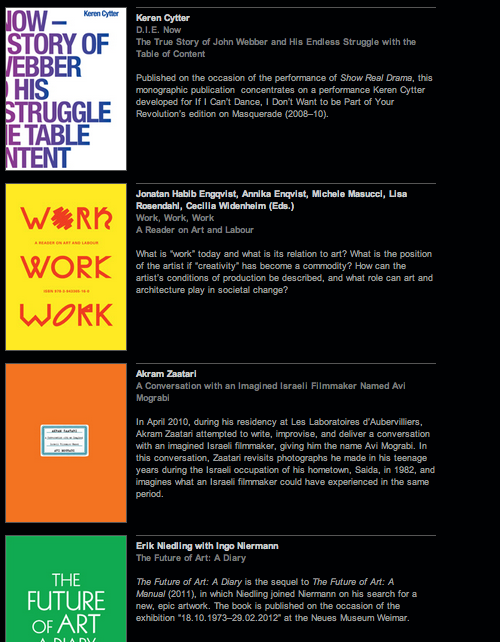
Design we liked: Sternberg Press
The essay also has basic tips on what works visually (large icons, large typography, boldness) when you shrink the cover down and look at it in its true natural habitats: Amazon, publishing websites, iBook shelf, Kindle library, etc.
DesignFile is cool because the books can be about ANYthing design-related (similar to our exhibitions and programs, which range from cutting edge interaction design to 16th century glassware). I love to find the connections among these diverse examples of design (i.e., the eternal human pursuit of creating and improving stuff) across times, nations, ideologies and peoples.
This is a lofty way to say that the DesignFile visual system had to be flexible: comfortably covering all sorts of content, whether historical, contemporary, popular, obscure, nerdy, or fancy.
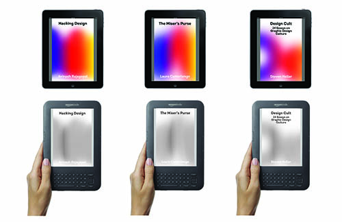
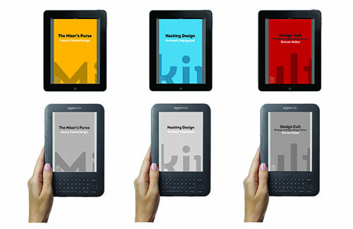
They also had to be flexible technically– function on Kindle, iPad, iPhone, as a thumbnail on Amazon, etc.
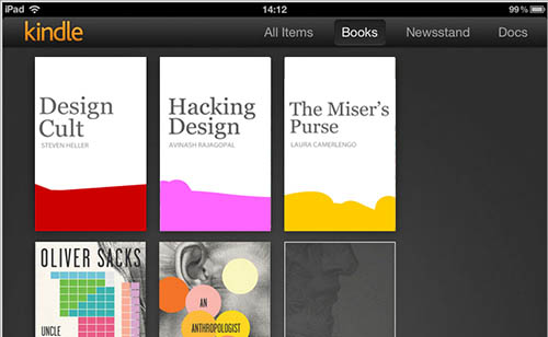
How does it look in the Kindle library? We were inspired by how this Oliver Sacks series about Neuroscience created a giant image of a human head when ordered alphabetically in the Kindle library.
How to be graphically flexible and technologically all-encompassing without being a total visual snooze? And also somehow communicate that the single and beautiful unifying thread across all the different books is something as broad and polysemic as design?
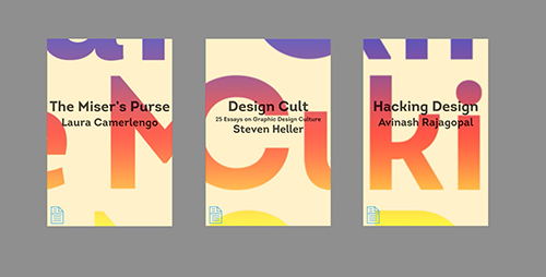
Iteration was the key for us. Once we agreed on the above requirements, we played with a lot of different ideas.
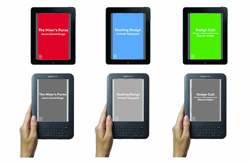
Super plain! Inspired by Architecture Words, a print book series we saw at the Designers & Books fair and liked.
We also agreed to fight logo creep. The only logo on the cover would be the DesignFile logo. A collaborative publishing project like this had the potential for a cover swamped with fussy, tiny logos.
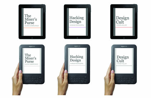
This very simple and elegant version was inspired by a German publisher, Reclam, whose schoolbooks and textbooks I really like.

We almost went with this as final, but when Pam came in as head of Cross-Platform Publishing, she thought it didn’t grab enough attention. At first I didn’t want to re-open the design process (oy!) but in retrospect I’m glad we did, I like the new ones better. And graphic design is pretty much always fun to do.
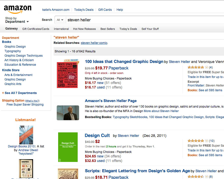
You’ll have to peep the books on Amazon to see what the final design looks like.
I would love to hear your comments & thoughts on these ideas and iterations.



Pingback: DesignFile | desktop