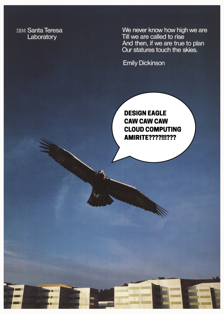
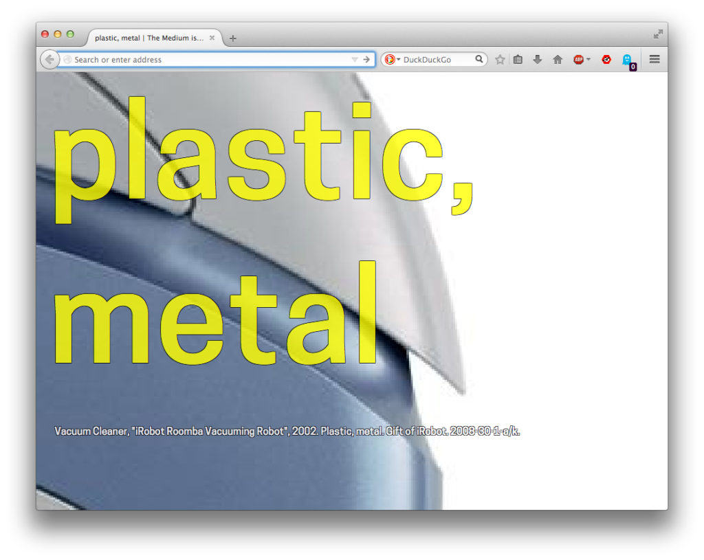
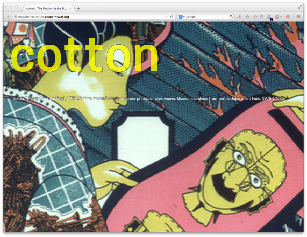
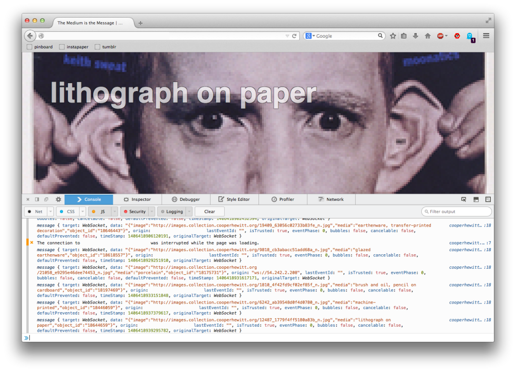
The term [colophon] derives from tablet inscriptions appended by a scribe to the end of a … text such as a chapter, book, manuscript, or record. In the ancient Near East, scribes typically recorded information on clay tablets. The colophon usually contained facts relative to the text such as associated person(s) (e.g., the scribe, owner, or commissioner of the tablet), literary contents (e.g., a title, “catch” phrase, number of lines), and occasion or purpose of writing.
— Wikipedia
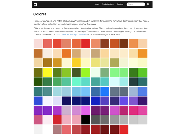
A couple of months ago we added the ability to search the collections website by color using more than one palette. A brief refresher: Our search by color functionality works by first extracting the dominant palette for an index. That means the top 5 colors out of a possible 32 million choices. 32 million is too large a surface area to search against so each of the five results are then “snapped” to their closest match on a much smaller grid of possible colors. These matches are then indexed and used to query our database when someone searches for objects matching a specific color.
It turns out that the CSS3 color palette which defines a fixed set of 138 colors is an excellent choice for doing this sort of thing. CSS is the acronym for Cascading Style Sheets (CSS) which is a “language used to describe the presentation” of a webpage separate from its content. Instead of asking people searching the collections website to be hyper-specific in their queries we take the color they are searching for and look for the nearest match in the CSS palette.
For example: #ef0403 becomes #ff0000 or “red”. #f2e463 becomes #f0e68c or “khaki” and so on.
This approach allows us to not only return matches for a specific color but also to show objects that are more like a color than not. It’s a nice way to demonstrate the breadth of the collection and also an invitation to pair objects that might never be seen together.

From the beginning we’ve always planned to support multiple color palettes. Since the initial search-by-color functionality was built in a hurry with a focus on seeing whether we could get it to work at all adding support for multiple palettes was always going to require some re-jiggering of the original code. Which of course means that finding the time to make those changes had to compete with the crush of everything else and on most days it got left behind.
Earlier this year Rebecca Alison Meyer the 6-year old daughter of Eric Meyer, a long-standing member of the CSS community, died of cancer. Eric’s contributions and work to promote the CSS standard can not be overstated. The web would be an entirely other (an entirely poorer) space without his efforts and so some people suggested that a 139th color be added to the CSS Color module to recognize his work and honor his daughter. In June Dominique Hazaël-Massieux wrote:
I’m not sure about how one goes adding names to CSS colors, and what the specific purpose they fulfill, but I think it would be a good recognition of @meyerweb ‘s impact on CSS, and a way to recognize that standardization is first and foremost a social process, to name #663399 color “Becca Purple”.
In reply Eric Meyer wrote:
I have been made aware of the proposal to add the named color beccapurple (equivalent to #663399) to the CSS specification, and also of the debate that surrounds it.
I understand the arguments both for and against the proposal, but obviously I am too close to both the subject and the situation to be able to judge for myself. Accordingly, I let the editors of the Colors specification know that I will accept whatever the Working Group decides on this issue, pro or con. The WG is debating the matter now.
I did set one condition: that if the proposal is accepted, the official name be rebeccapurple. A couple of weeks before she died, Rebecca informed us that she was about to be a big girl of six years old, and Becca was a baby name. Once she turned six, she wanted everyone (not just me) to call her Rebecca, not Becca.
She made it to six. For almost twelve hours, she was six. So Rebecca it is and must be.
Shortly after that #663399 or rebeccapurple was added to the CSS4 Colors module specification. At which point it only seemed right to finally add support for multiple color palettes to the collections website.

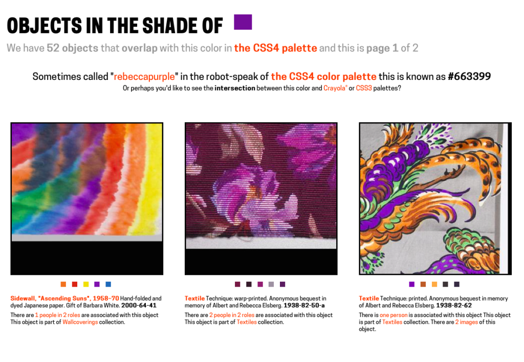
Over the course of a month or so, in the margins of day, all of the search-by-color code was rewritten to work with more than a single palette and now you can search the collection for objects in the shade of rebeccapurple.
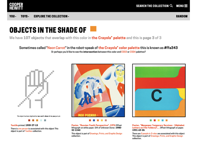
In addition to the CSS3 and CSS4 color palettes we also added support for the Crayola color palette. For example, the closest color to “rebeccapurple” in the Crayola scheme of things is “cyber grape”.
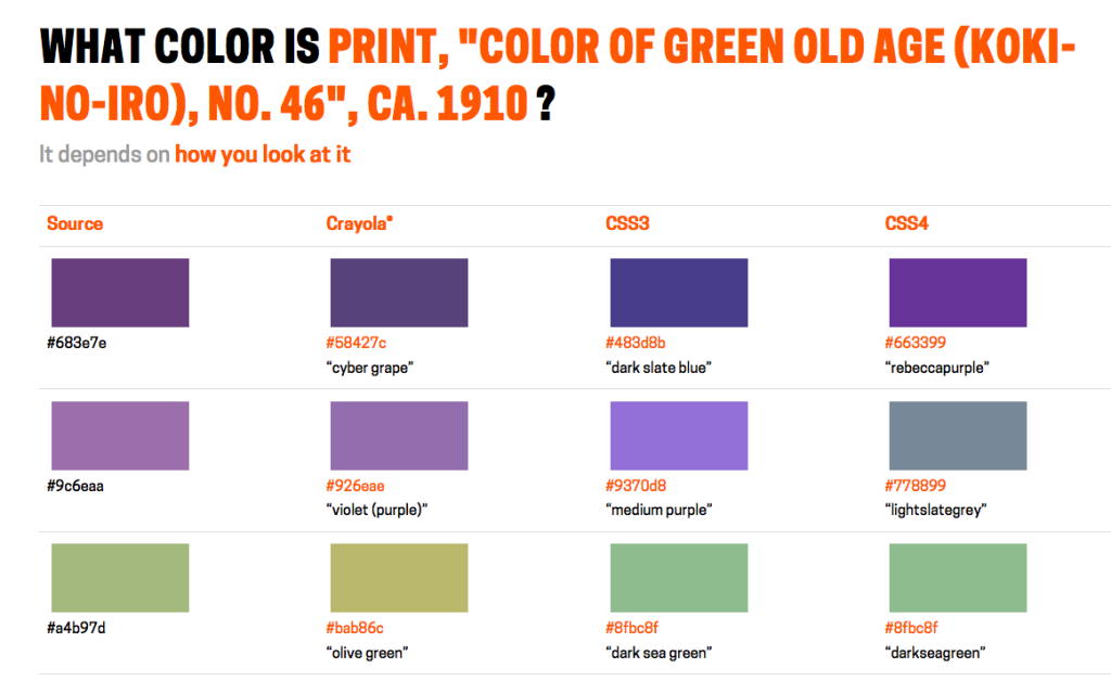
You can see all the possible nearest-colors for an object by appending /colors to an object page URL. For example:
https://collection.cooperhewitt.org/objects/18380795/colors
The dominant color for this object is #683e7e which maps to #58427c or “cyber grape” in Crayola-speak and #483d8b or “dark slate blue” in CSS3-speak and #663399 or “rebeccapurple” in CSS4-speak.
Now that we’ve done the work to support multiple palettes the only limits to adding more is time and imagination. I would like to add a greyscale palette. I would like to add one or more color-blind palettes. I would especially like to add a “blue” palette – one that spans non-photo blue through International Klein Blue all the way to Kind of Bloop midnight blue just to see where along that spectrum objects which aren’t even a little bit blue would fall.

The point being that there are any number of color palettes that we can devise and use as a lens through which to see our collection. Part of the reason we chose to include the Crayola color palette in version “2” of search-by-color is because the colors they’ve chosen have been given expressive names whose meaning is richer than the sum of their descriptive parts. What does it mean for an object’s colors to be described as macaroni and cheese-ish or outer space-ish in nature? Erika Hall’s 2007 talk Copy is Interface is an excellent discussion of this idea.
I spoke about some of these things last month at the The Search is Over workshop, in London. I described the work we have done on the collections website, to date, as a kind of managing of absence. Specifically the absence of metadata and ways to compensate for its lack or incompleteness while still providing a meaningful catalog and resource.
It is through this work that we started to articulate the idea that: The value of the whole in aggregate, for all its flaws, outweighs the value of a perfect subset. The irregular nature of our collection metadata has also forced us to consider that even if there were a single unified interface to convey the complexities of our collection it is not a luxury we will enjoy any time soon.

Further the efforts of more and more institutions (the Cooper Hewitt included) to embark on mass-digitization projects forces an issue that we, as a sector, have been able to side-step until now: That no one, including lots of people who actually work at museums, have ever seen much of the work in our collections. So in relatively short-order we will transition from a space defined by an absence of data to one defined by a surfeit of, at the very lest, photographic evidence that no one will know how to navigate.
To be clear: This is a good problem to have but it does mean that we will need to starting thinking about models to recognize the shape of the proverbial elephant in the room and building tools to see it.
It is in those tools that another equally important challenge lies. The scale and the volume of the mass-digitization projects being undertaken means that out of necessity any kind of first-pass cataloging of that data will be done by machines. There simply isn’t the time (read: money) to allow things to be cataloged by human hands and so we will inevitably defer to the opinion of computer algorithms.
This is not necessary as dour a prediction as it might sound. Color search is an example of this scenario and so far it’s worked out pretty well for us. What search-by-color and other algorithmic cataloging points to is the need to develop an iconography, or a colophon, to indicate machine bias. To design and create language and conventions that convey the properties of the “extruder” that a dataset has been shaped by.

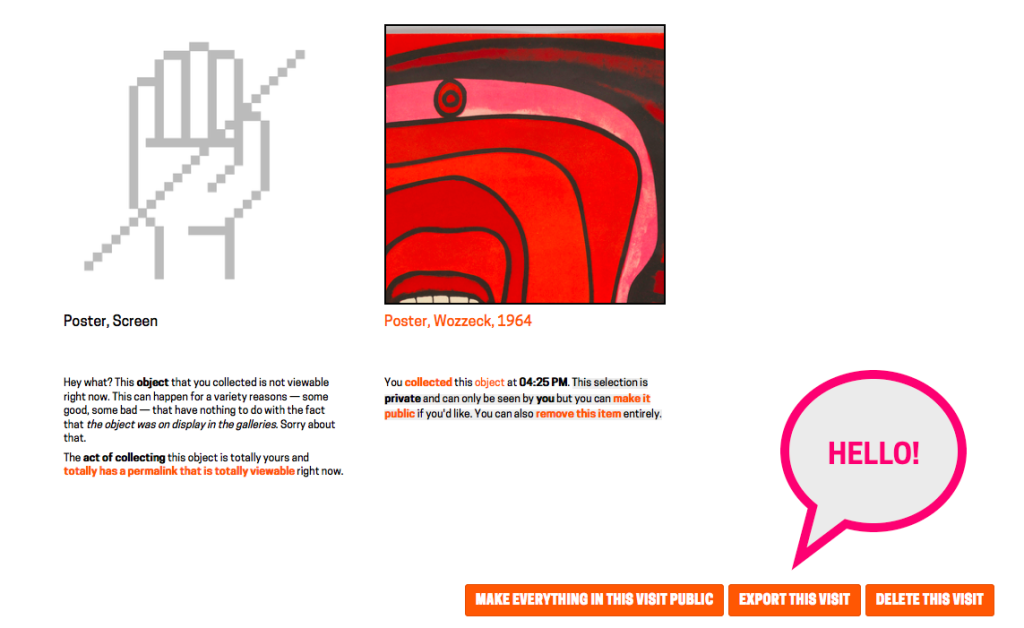
Those conventions don’t really exist yet. Bracketing search by color with an identifiable palette (a bias) is one stab at the problem but there are so many more places where we will need to signal the meaning (the subtext?) of an automated decision. We’ve tried to address one facet of this problem with the different graphic elements we use to indiciate the reasons why an object may not have an image.


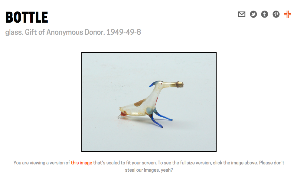
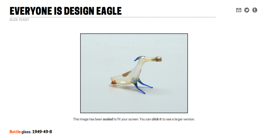
Left to right: We’re supposed to have a picture for this object… but we can’t find it; This object has not been photographed; This object has been photographed but for some reason we’re not allowed to show it to you… you know, even though it’s been acquired by the Smithsonian.
Another obvious and (maybe?) easy place to try out this idea is search itself. Search engines are not, in fact, magic. Most search engines work the same way: A given string is “tokenized” and then each resultant piece is “filtered”. For the example the phrase “checkered Girard samples” might typically be tokenized by splitting things on whitespace but you could just as easily tokenize it by any pattern that can be expressed to a computer. So depending on your tokenized you might end up with a list like:
Or:
Each one of those “tokens” are then analyzed and filtered according to their properties. Maybe they get grouped by their phonetics, which is essentially how the snap-to-grid trick works for the collection’s color search. Maybe they are grouped by what type of word they are: proper nouns, verbs, prepositions and so on. I’ve never actually seen a search engine that does this but there is nothing technically to prevent someone from doing it either.
The simplest and dumbest thing would be to indicate on a search results page that your query results were generated using one or more tokenizers or filters. In our case that would be (1) tokenizer and (5) filters.
Tokenizers:
- Unicode Standard Annex #29
Filters:
- Remove English possessives
- Lowercase all tokens
- Ingore a set list of stopwords
- Stem tokens according to the Porter Stemming Algorithm
- Convert non-ascii characters to ascii
That’s not very sexy or ooh-shiny but not everything needs to be. What it does, though, is provide a measure of transparency for people to gauge the reality that any result set is the product of choices which may have little or no relationship to the question being asked or the person asking that question.
These are devices, for sure, and they are not meant to replace a more considered understanding or contemplation of a topic but they can act as an important shorthand to indicate the arc of an answer’s motive.

And that’s just for search engines. Now imagine what happens when we all start pointing computer vision algorithms at our collections…
Update: Since publishing this blog post the nice people working on the GOV.UK websites launched “info” pages. Visitors can now append /info to any of the pages on the gov.uk website will and see what and who and how that part of the website is supposed to do. Writing about the project they say:
An ‘info’ page contains the user needs the page is intended to meet … Providing an easy way to jump from content to the underpinning needs allows content designers coming to a new topic to understand the need and build empathy with the users quicker. Publishing the GOV.UK user needs should also make the team’s work more transparent and traceable.
Bravo!
