Author Archives: asc

Label Whisperer

Screen Shot 2014-01-24 at 6.06.47 PM

Have you ever noticed the way people in museums always take pictures of object labels? On many levels it is the very definition of an exercise in futility. Despite all the good intentions I’m not sure how many people ever look at those photos again. They’re often blurry or shot on an angle and even when you can make out the information there aren’t a lot of avenues for that data to get back in to the museum when you’re not physically in the building. If anything I bet that data gets slowly and painfully typed in to a search engine and then… who knows what happens.

As of this writing the Cooper-Hewitt’s luxury and burden is that we are closed for renovations. We don’t even have labels for people to take pictures of, right now. As we think through what a museum label should do it’s worth remembering that cameras and in particular cameras on phones and the software for doing optical character recognition (OCR) have reached a kind of maturity where they are both fast and cheap and simple. They have, in effect, showed up at the party so it seems a bit rude not to introduce ourselves.

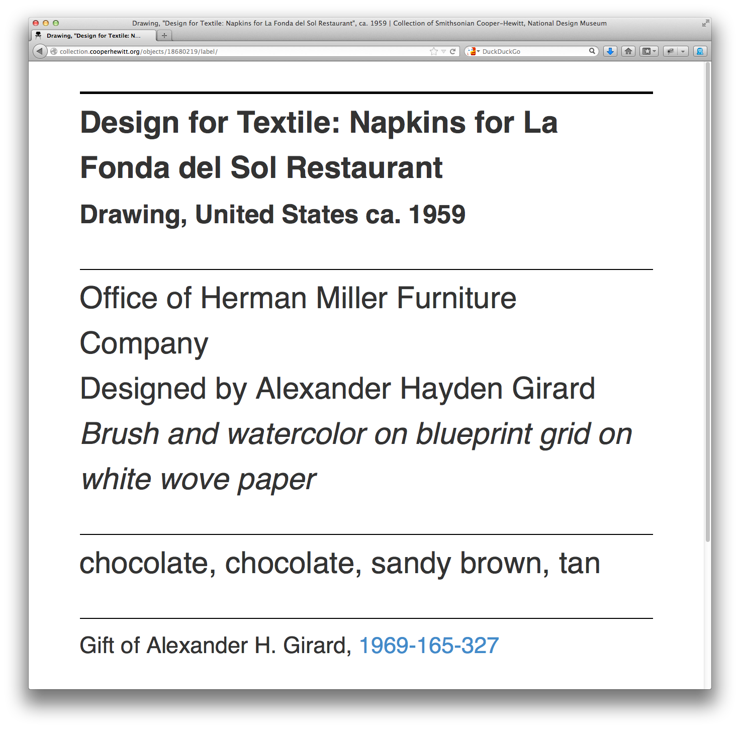
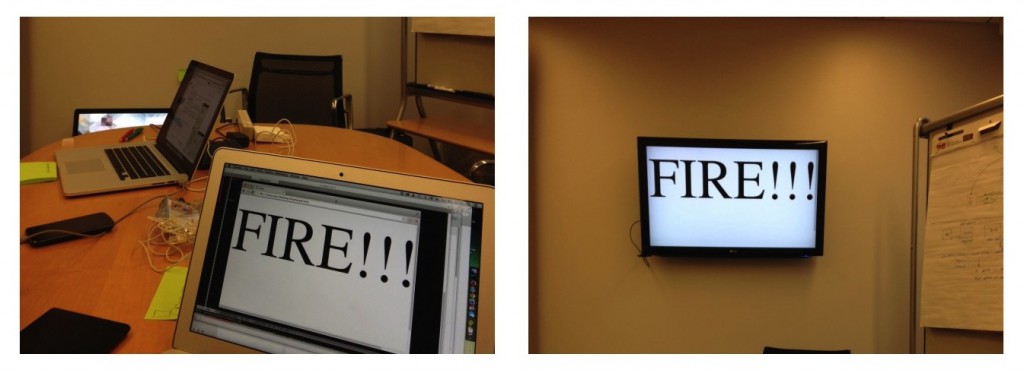
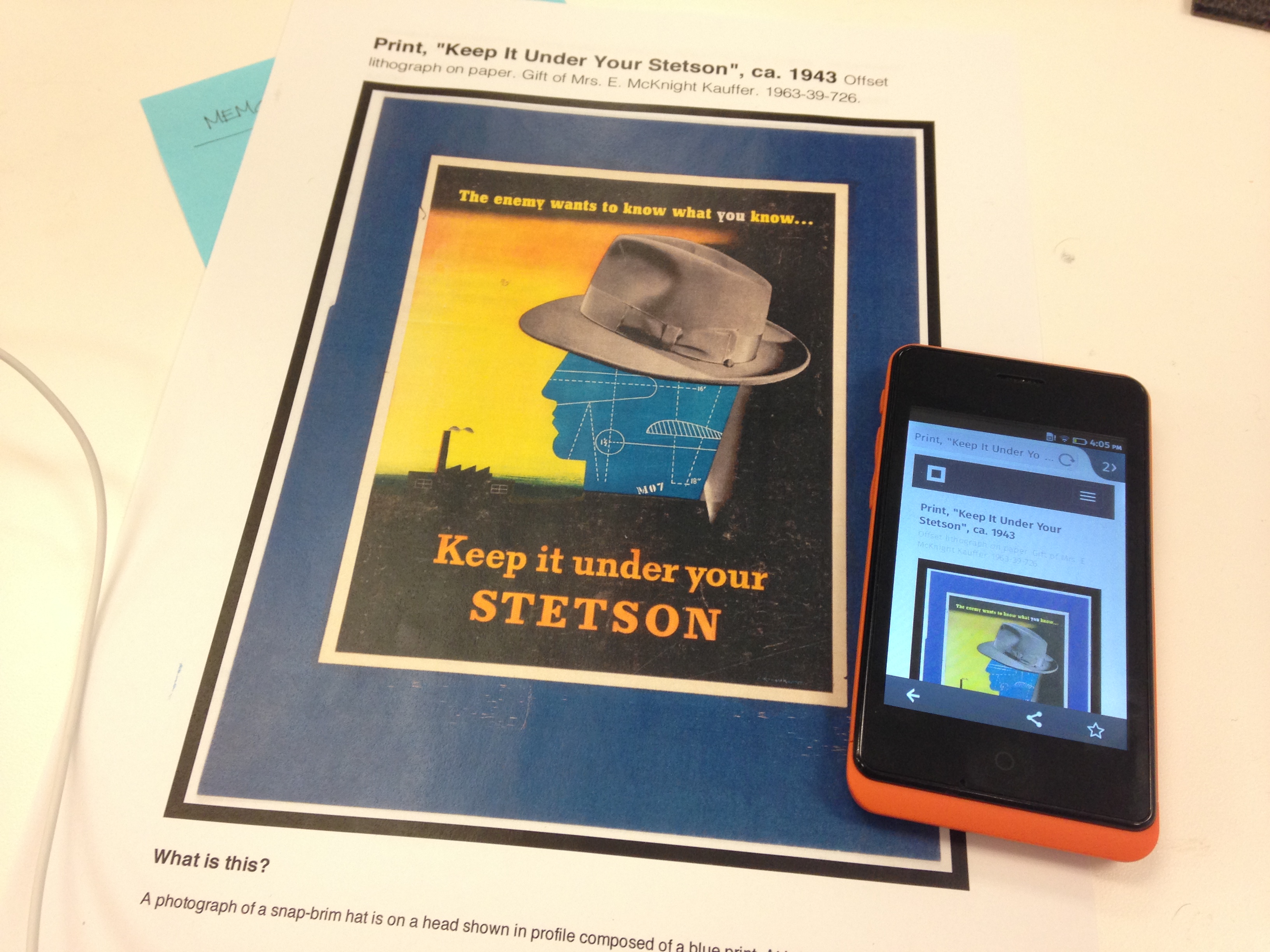
I mentioned that we’re still working on the design of our new labels. This means I’m not going to show them to you. It also means that it would be difficult to show you any of the work that follows in this blog post without tangible examples. So, the first thing we did was to add a could-play-a-wall-label-on-TV endpoint to each object on the collection website. Which is just fancy-talk for “another web page”.

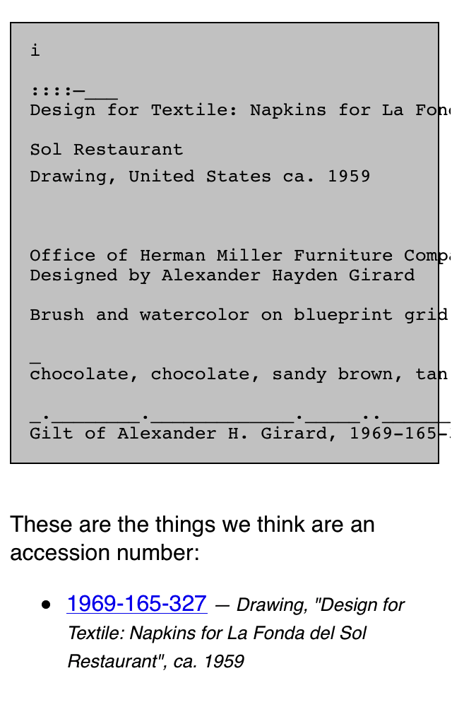
Simply append /label to any object page and we’ll display a rough-and-ready version of what a label might look like and the kind of information it might contain. For example:

https://collection.cooperhewitt.org/objects/18680219/label/

Now that every object on the collection website has a virtual label we can write a simple print stylesheet that allows us to produce a physical prototype which mimics the look and feel and size (once I figure out what’s wrong with my CSS) of a finished label in the real world.

photo 2

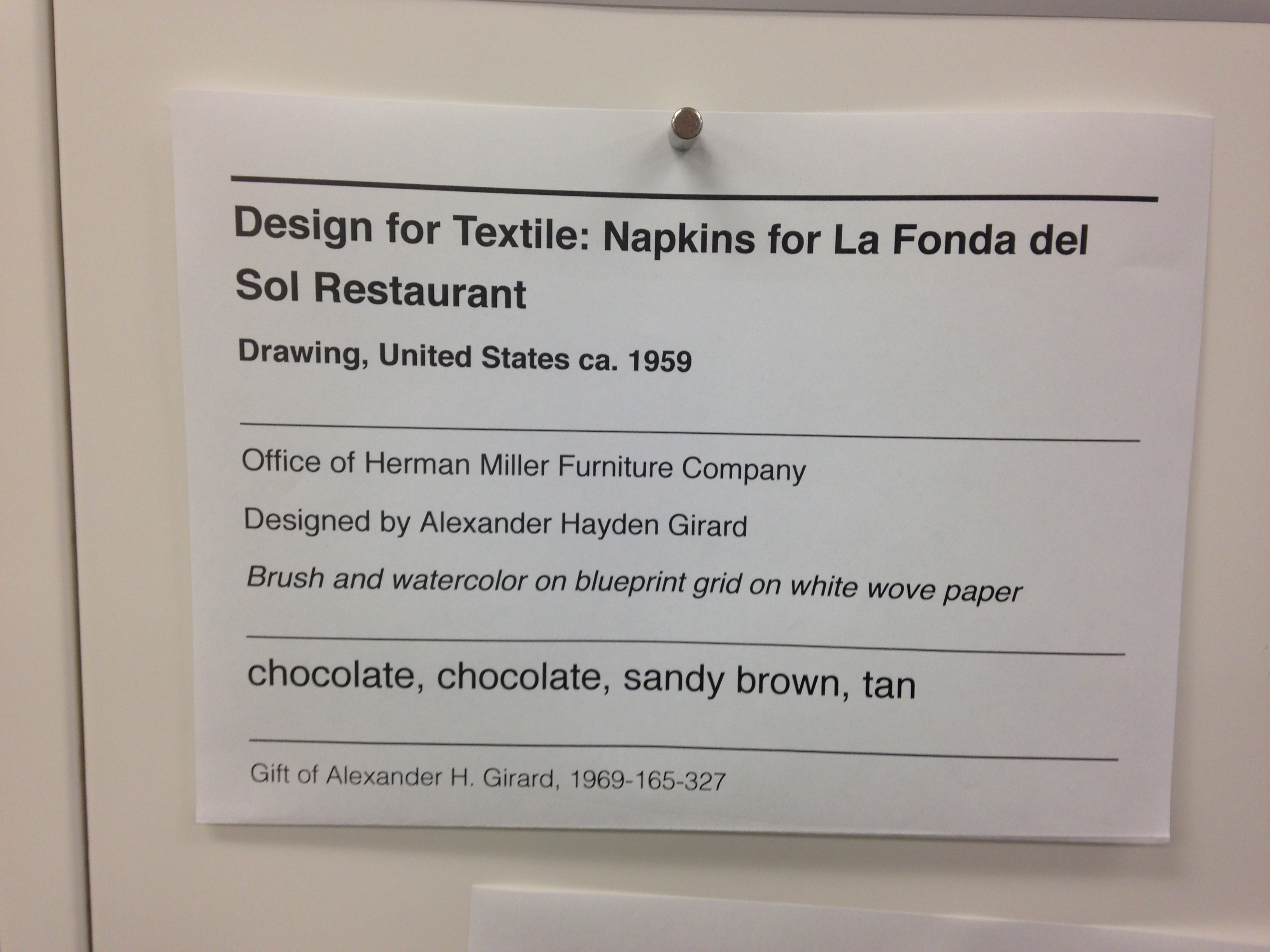
So far, so good. We have a system in place where we can work quickly to change the design of a “label” and test those changes on a large corpus of sample data (the collection) and a way to generate an analog representation since that’s what a wall label is.

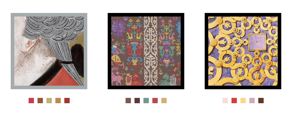
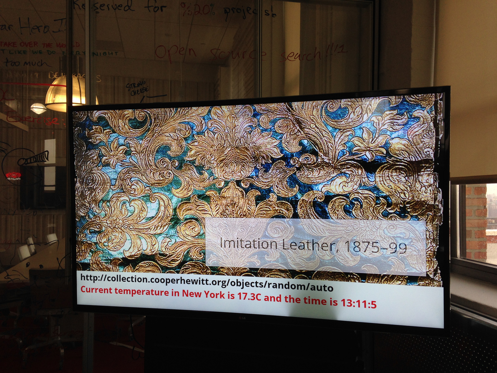
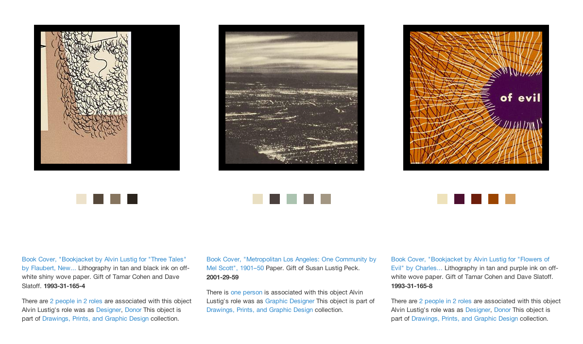
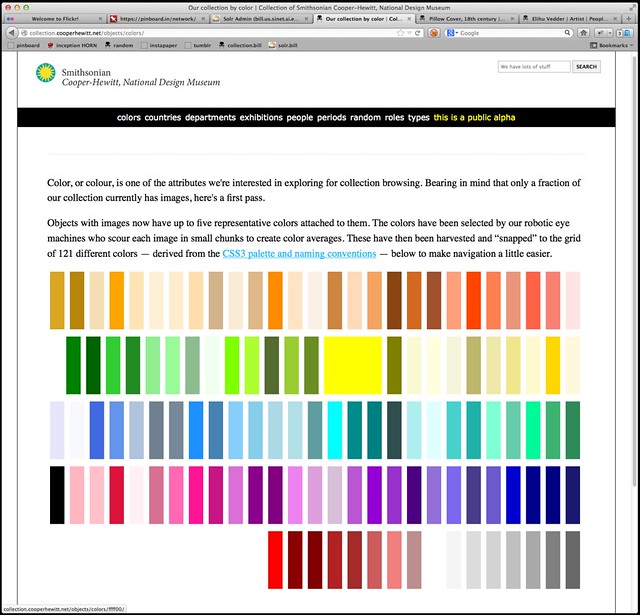
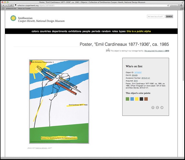
Careful readers will note that some of these sample labels contain colour information for the object. These are just placeholders for now. As much as I would like to launch with this information it probably won’t make the cut for the re-opening.

Do you remember when I mentioned OCR software at the beginning of this blog post? OCR software has been around for years and its quality and cost and ease-of-use have run the gamut. One of those OCR application is Tesseract which began life in the labs at Hewlitt-Packard and has since found a home and an open source license at Google.

Tesseract is mostly a big bag of functions and libraries but it comes with a command-line application that you can use to pass it an image whose text you want to extract.

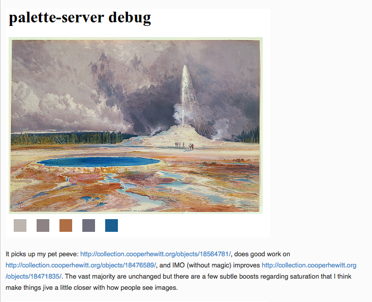
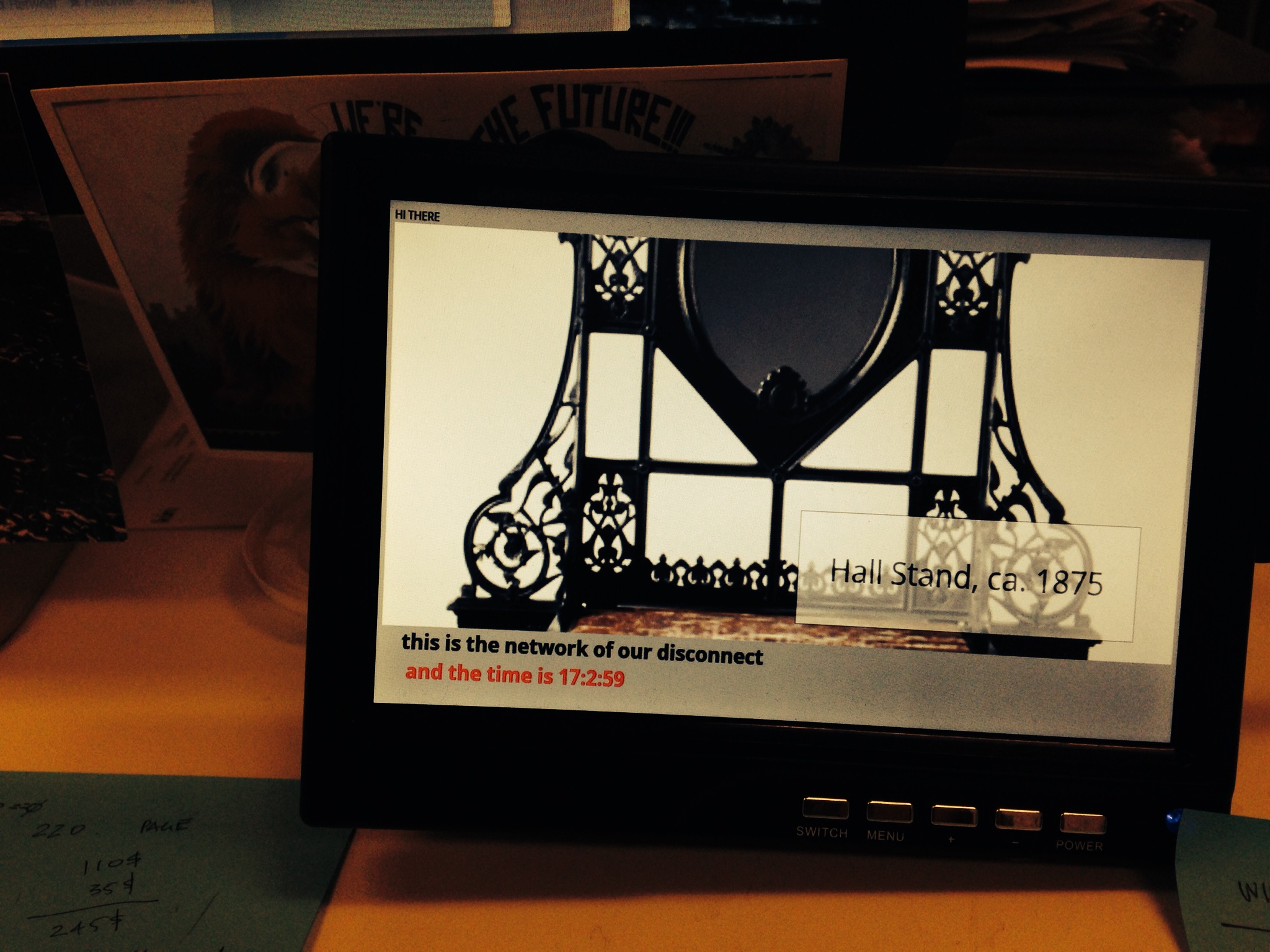
In our example below we also pass an argument called label. That’s the name of the file that Tesseract will write its output to. It will also add a .txt extension to the output file because… computers? These little details are worth suffering because when fed the image above this is what Tesseract produces:

$> tesseract label-napkin.jpg label
Tesseract Open Source OCR Engine v3.02.01 with Leptonica
$> cat label.txt
______________j________
Design for Textile: Napkins for La Fonda del
Sol Restaurant

Drawing, United States ca. 1959

________________________________________
Office of Herman Miller Furniture Company

Designed by Alexander Hayden Girard

Brush and watercolor on blueprint grid on white wove paper

______________._.._...___.___._______________________
chocolate, chocolate, sandy brown, tan

____________________..___.___________________________
Gift of Alexander H. Girard, 1969-165-327

I think this is exciting. I think this is exciting because Tesseract does a better than good enough job of parsing and extracting text that I can use that output to look for accession numbers. All the other elements in a wall label are sufficiently ambiguous or unstructured (not to mention potentially garbled by Tesseract’s robot eyes) that it’s not worth our time to try and derive any meaning from.

Conveniently, accession numbers are so unlike any other element on a wall label as to be almost instantly recognizable. If we can piggy-back on Tesseract to do the hard work of converting pixels in to words then it’s pretty easy to write custom code to look at that text and extract things that look like accession numbers. And the thing about an accession number is that it’s the identifier for the thing a person is looking at in the museum.

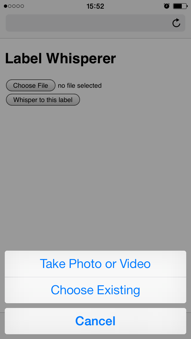
To test all of these ideas we built the simplest, dumbest HTTP pony server to receive photo uploads and return any text that Tesseract can extract. We’ll talk a little more about the server below but basically it has two endpoints: One for receiving photo uploads and another with a simple form that takes advantage of the fact that on lots of new phones the file upload form element on a website will trigger the phone’s camera.

This functionality is still early days but is also a pretty big deal. It means that the barrier to developing an idea or testing a theory and the barrier to participation is nothing more than the web browser on a phone. There are lots of reasons why a native application might be better suited or more interesting to a task but the time and effort required to write bespoke applications introduces so much hoop-jumping as to effectively make simple things impossible.

photo 2
photo 3

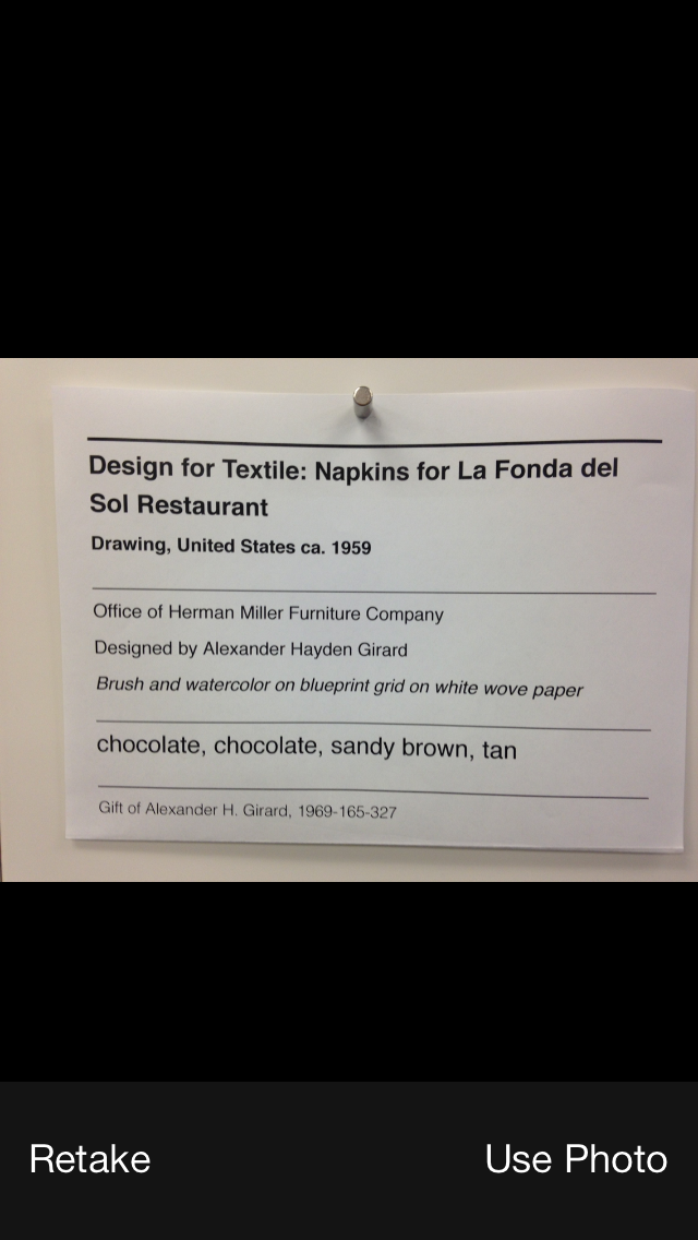
Given a simple upload form which triggers the camera and a submit button which sends the photo to a server we get back pretty much the same thing we saw when we ran Tesseract from the command line:

Untitled-cropped

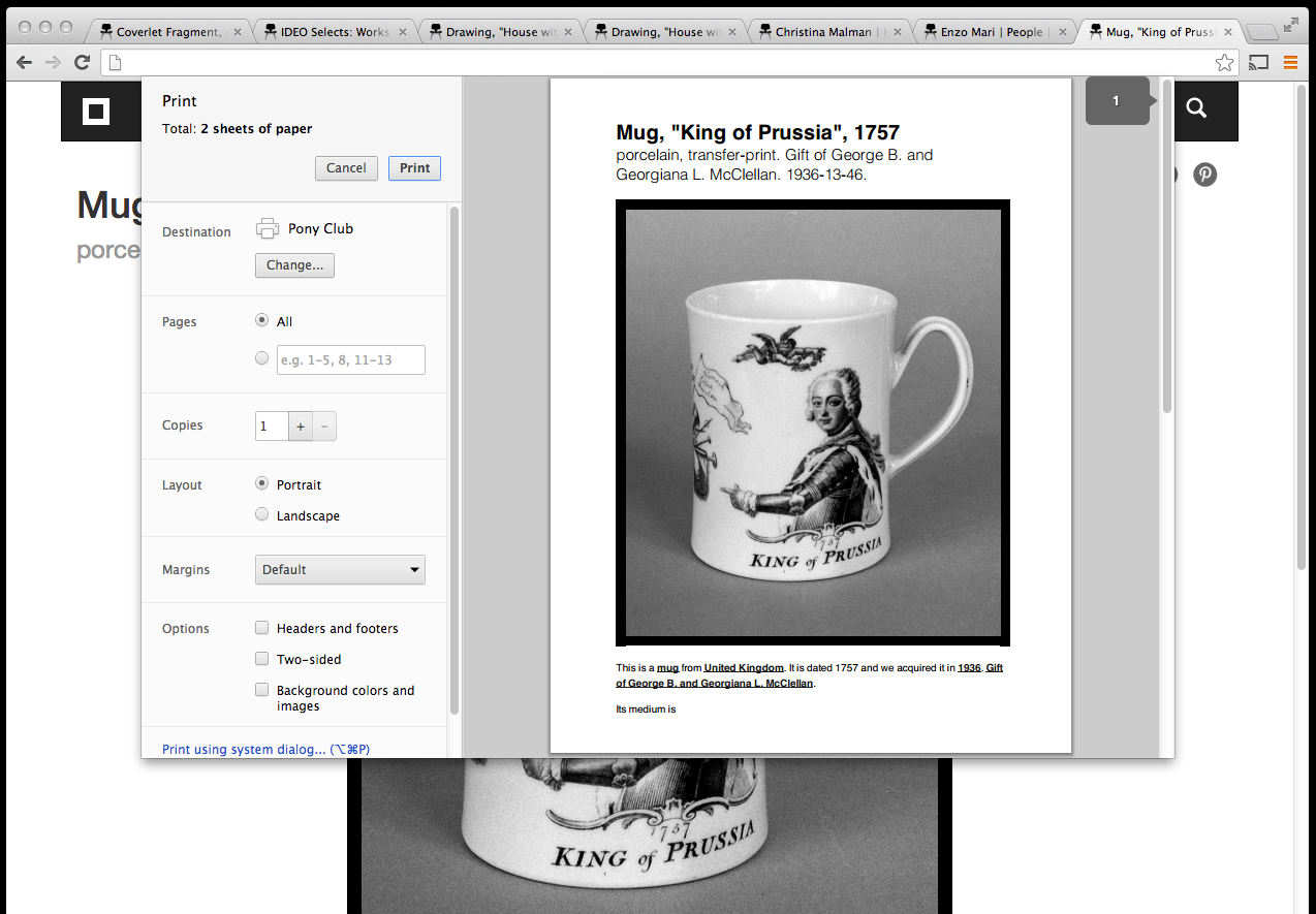
We upload a photo and the server returns the raw text that Tesseract extracts. In addition we do a little bit of work to examine the text for things that look like accession numbers. Everything is returned as a blob of data (JSON) which is left up to the webpage itself to display. When you get down to brass tacks this is really all that’s happening:

$> curl -X POST -F "file=@label-napkin.jpg" https://localhost | python -mjson.tool
{
    "possible": [
        "1969-165-327"
    ],
    "raw": "______________j________nDesign for Textile: Napkins for La Fonda delnSol RestaurantnnDrawing, United States ca. 1959nn________________________________________nOffice of Herman Miller Furniture CompanynnDesigned by Alexander Hayden GirardnnBrush and watercolor on blueprint grid on white wove papernn______________._.._...___.___._______________________nchocolate, chocolate, sandy brown, tannn____________________..___.___________________________nGift of Alexander H. Girard, 1969-165-327"
}

Do you notice the way, in the screenshot above, that in addition to displaying the accession number we are also showing the object’s title? That information is not being extracted by the “label-whisperer” service. Given the amount of noise produced by Tesseract it doesn’t seem worth the effort. Instead we are passing each accession number to the collections website’s OEmbed endpoint and using the response to display the object title.

Here’s a screenshot of the process in a plain old browser window with all the relevant bits, including the background calls across the network where the robots are talking to one another, highlighted.
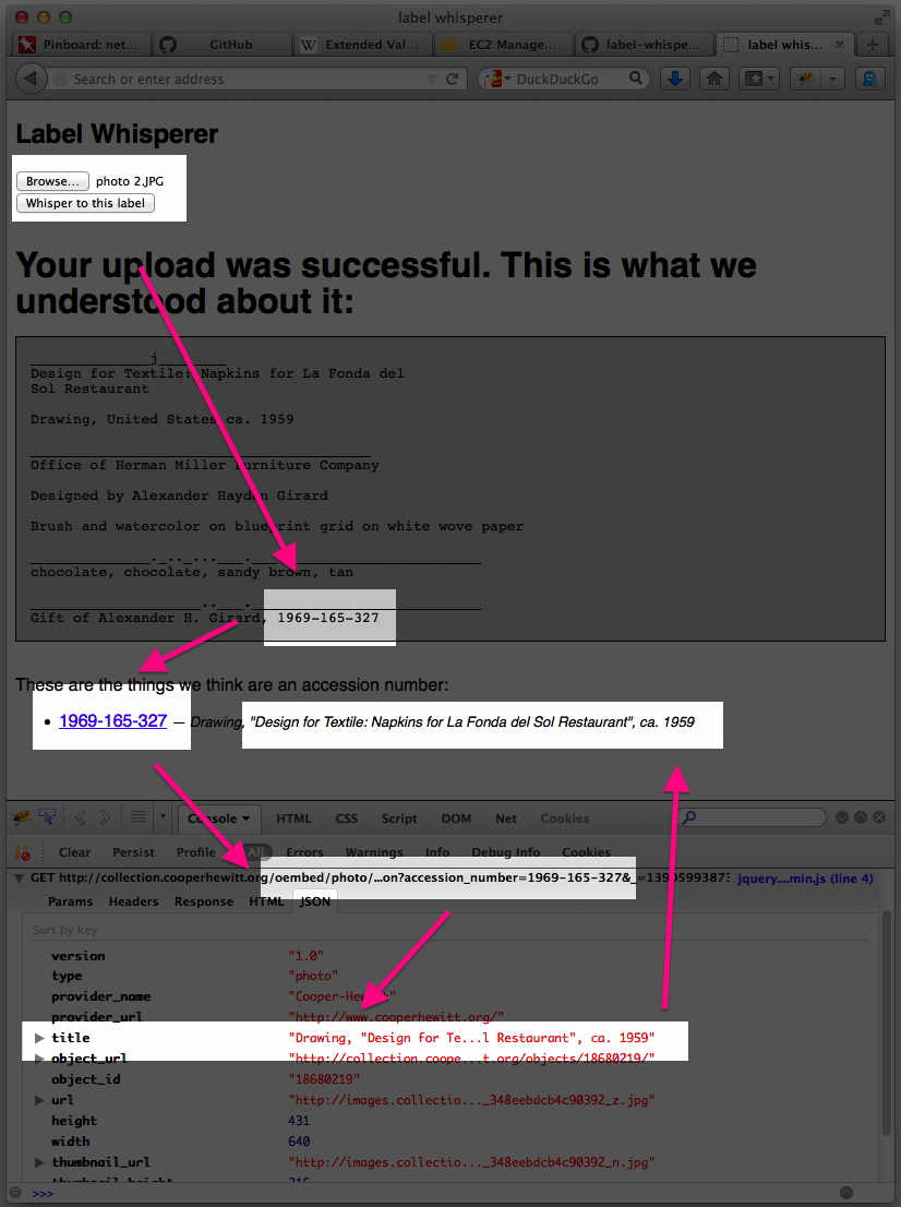
label-whisperer-napkin-boxes

  1. Upload a photo
  2. Extract the text in the photo and look for accession numbers
  3. Display the accession number with a link to the object on the CH collection website
  4. Use the extracted accession number to call the CH OEmbed endpoint for additional information about the object
  5. Grab the object title from the (OEmbed) response and update the page

See the way the OEmbed response contains a link to an image for the object? See the way we’re not doing anything with that information? Yeah, that…

But we proved that it can be done and, start to finish, we proved it inside of a day.

It is brutally ugly and there are still many failure states but we can demonstrate that it’s possible to transit from an analog wall label to its digital representation on a person’s phone. Whether they simply bookmark that object or email it to a friend or fall in to the rabbit hole of life-long scholarly learning is left an as exercise to the reader. That is not for us to decide. Rather we have tangible evidence that there are ways for a museum to adapt to a world in which all of our visitors have super-powers — aka their “phones” — and to apply those lessons to the way we design the museum itself.

We have released all the code and documentation required build your own “label whisperer” under a BSD license but please understand that it is only a reference implementation, at best. A variation of the little Flask server we built might eventually be deployed to production but it is unlikely to ever be a public-facing thing as it is currently written.

https://github.com/cooperhewitt/label-whisperer/

We welcome any suggestions for improvements or fixes that you might have. One important thing to note is that while accession numbers are pretty straightforward there are variations and the code as it written today does not account for them. If nothing else we hope that by releasing the source code we can use it as a place to capture and preserve a catalog of patterns because life is too short to spend very much of it training robot eyes to recognize accession numbers.

The whole thing can be built without any external dependencies if you’re using Ubuntu 13.10 and if you’re not concerned with performance can be run off a single “micro” Amazon EC2 instance. The source code contains a handy setup script for installing all the required packages.

Immediate next steps for the project are to make the label-whisperer server hold hands with Micah’s Object Phone since being able to upload a photo as a text message would make all of this accessible to people with older phones and, old phone or new, requires users to press fewer buttons. Ongoing next steps are best described as “learning from and doing everything” talked about in the links below:

Discuss!

Rijkscolors! (or colorific promiscuity)


rijkscolours-yellow

(Rijkscolors are currently disabled as we consider longer-term solutions for cross-institutional browsing and searching. It’ll be back soon!)

Rijkscolors are an experimental feature that allow you to browse not only images from the Cooper-Hewitt’s collection but also images from the Rijksmuseum by color!

We see this as one way to start to work through the age-old problem of browsing collections across multiple institutions. Not everyone arrives at the Cooper-Hewitt (or the Rijksmuseum) with an expert knowledge of our curatorial and collecting history and the sheer volume of “stuff” available can be overwhelming. Everyone, at some point, has the “Explore” problem: It’s the point where you have so much good stuff to share with people but no good (or many sort-of-bad) avenues for letting people know about it.

Color is an intuitive, comfortable and friendly way to let people warm up to the breadth and depth of our collections. Since adding the ability to search the collection by color it’s quickly become the primary way that people browse our collection (more on that below) and as such feels like an excellent tool for browsing across collections.

rijkscolours-4

Over time, we hope to add this functionality for many other cultural heritage institutions but chose to start with the Rijksmuseum because we share an historical focus in our early collecting practices and because they were nice (read: AWESOME) enough to make all their collection images available under a liberal Creative Commons license.

We then indexed all those images using the same tools we use to extract colors and measure busy-ness or “entropy” from our own collection and combined the two lists. Images from the Rijksmuseum have a different colored border to indicate that they are not part of our collection. Images from the Rijksmuseum link directly to the page for that object on the Rijksmuseum website itself.

rijkscolours-bunny-crop

As with the concordances for people we just want to hold hands (for now — Seb tells me this means we might want to move to second base in the future) with other museums and are happy to send visitors their way. After all, that’s what the Internet is for!

Rijkscolors is an experimental feature so you’ll need to enable it on a per-browser basis by visiting the experimental features section of the collection website, here:

https://collection.cooperhewitt.org/experimental/#rijkscolors

But wait, there’s more.

We’ve also made public all the code used to harvest metadata and images from the Rijksmuseum as well as the resultant data dumps mapping colors and entropy scores to Rijksmuseum accession numbers with internal Cooper-Hewitt object IDs. We created a custom mapping because we use Solr to do color search on the website and that requires a numeric ID as the primary key for an object.

Then we imported all the objects from the Rijksmuseum, along with their color values and other metrics, in to our Solr index giving them a magic department ID (aka 51949951 or the Rijksmuseum) and making them private by default. If you’ve enabled Riskscolors when we search for objects by color instead of only asking for things with a given color that are public we ask for things that are public OR part of department number 51949951. Simple!

The code and the data dumps are provided as-is, more of a reference implementation and a toolbox than anything you might use without modifications. We’ve put it all on GitHub and we welcome your suggestions and fixes:

https://github.com/cooperhewitt/rijksmuseum-collection/


We mentioned search vs browse so let’s take a peek at the last 30 days (Nov 11 to Dec 10, 2013) of visitor behaviour on the collection site.

last30 days nov-dec-2013 new vs returning

Or put another way:

  • 48.89% of visits used color navigation (anywhere – not just color palette page)
  • 4.39% of visits used normal search
  • 2.24% of visits used random button
  • 1.25% of visits used fancy search

The figures for color navigation are artificially inflated by the press the feature got in Slate, The Verge and elsewhere (the comments are amusing), but even removing that spike, color navigation is at least twice as used as search in the time period. We’ll report back on some new data once December and January are done.

last30 days nov-dec-2013 tos & ppv

Not unsurprisingly, visitors who use search spend a lot more time on the site and look at many more pages. They are also far more likely to be returning visitors. For newbies, though, color and random navigation methods are far more popular – and still result in healthy browsing depths.


In related news Nate Solas sent us a patch for the palette-server, the tool we use to extract colors from our collection imagery. He said:

“…this improves the color detection by making it a bit more human. It goes two ways: 1) boost all color “areas” by saturation, as if saturated colors take up more room in the image. 2) add a “magic” color if a few conditions are met: not already included, more than 2x the average image saturation, and above the minimum area for inclusion.”

palette-server-nate

We’ve now merged Nate’s changes in to our code base (technically it’s actually a change to Giv’s RoyGBiv code) and they will be applied the next time we run the color-extraction tools on our collection (and the Rijksmuseum’s collection). Thanks, Nate!

As with all the experimental features they are … well, experimental. They are a little rough around the edges and we may not have found (or even noticed) any outstanding problems or bugs. We hope that you’ll let us know if you find any and otherwise enjoy following along as we figure out where we’re going, even if we’re not always sure how we get there.

Screen Shot 2013-12-11 at 12.23.23 PM

"C" is for Chromecast: hacking digital signage

chromecast-fire-w2

Since the late 1990s museums have been fighting a pointless war against the consumerization of technology. By the time the Playstation 2 was released in 2000, every science museum’s exhibition kiosk game looked, felt, and was, terribly out dated. The visitors had better hardware in their lounge rooms than museums could ever hope to have. And ever since the first iPhone hit the shelves in 2007, visitors to museums have also carried far better computing hardware in their pockets.

But what if that consumer hardware, ever dropping in price, could be adapted and quickly integrated into the museum itself?

With this in mind the Labs team took a look at the $35 Google Chromecast – a wifi-enabled, HDMI-connected networked media streaming playback system about the size of a USB key.

With new media-rich galleries being built at the museum and power and network ports in a historic building at a premium, We asked ourselves “could a Chromecast be used to deliver the functionality of digital signage system, but at the fraction of the cost”? Could some code be written to serve our needs and possibly those of thousands of small museums around the world as well?

chromecast-dongle-pen

Before we begin, let’s get some terms of reference and vocabulary out of the way. The first four are pretty straightforward:

Display – A TV or a monitor with an HDMI port.

Chromecast device – Sometimes called the “dongle”. The plastic thing that comes in a box and which you plug in to your monitor or display.

Chromecast application – This is a native application that you download from Google and which is used to pair the Chromecast device with your Wifi network.

Chrome and Chromecast extension – The Chrome web browser with the Chromecast extension installed.

That’s the most basic setup. Once all of those pieces are configured you can “throw” any webpage running in Chrome with the Chromecast extension on to the display with the Chromecast device. Here’s a picture of Dan Catt’s Flambientcam being thrown on to a small 7-inch display on my desk:

chromecast-small-1

Okay! The next two terms of reference aren’t really that complicated, but their names are more conceptual than specific identifiers:

The “Sender” – This is a webpage that you load in Chrome and which can cause a custom web page/application (often called the “receiver”, but more on that below) to be loaded on to one or more the Chromecast device via a shared API.

The “Receiver” – This is also a webpage but more specifically it needs to be a living breathing URL somewhere on the same Internet that is shared by and can be loaded by a Chromecast device. And not just any URL can be loaded either. You need to have the URL in question whitelisted by Google. Once the URL has been approved you will be issued an application ID. That ID needs to be included in a little bit of Javascript in both the “sender” and the “receiver”.

There are a couple important things to keep in mind:

  • First, the “sender” application has super powers. It also needs to run on a machine with a running web browser and, more specifically, that web browser is the one with the super powers since it can send anything to any of the “displays”. So that pretty much means a dedicated machine that sits quietly in a locked room. The “sender” is just a plain vanilla webpage with some magic Google Javascript but that’s it.
  • Second, the “receiver” is a webpage that is being rendered on/by the Chromecast device. When you “throw” a webpage to a Chromecast device (like the picture of Dan’s Flambientcam above) the Chromecast extension is simply beaming the contents of the browser window to the display, by way of the Chromecast device, rather than causing the device to fetch and process data locally.

Since there’s no more way to talk at this webpage (the “sender”) because it’s running in a browser window that means we need a bridging server or a… “broker” which will relay communications between the webpage and other applications. You may be wondering “Wait… talk at the sender” or “Wait… other applications?” or just plain “…What?”

Don’t worry about that. It may seem strange and confusing but that’s because we haven’t told you exactly what we’re trying to do yet!

We’re trying to do something like this:

chromecast-small-3

We’re trying to imagine a system where one dedicated machine running Chrome and the Chromecast extension that is configured to send messages and custom URLs for a variety of museum signage purposes to any number of displays throughout the museum. Additionally we want to allow a variety of standalone “clients” in such a way that they can receive information about what is being displayed on a given display and to send updates.

We want the front-of-house staff to be able to update the signage from anywhere in the museum using nothing more complicated than the web browser on their phone and we want the back-of-house staff to be able to create new content (sic) for those displays with nothing more complicated than a webpage.

That means we have a couple more names of things to keep track of:

The Broker – This is a simple socket.io server – a simple to use and elegant server that allows you do real-time communications between two or more parties – that both the “sender” and all the “clients” connect to. It is what allows the two to communicate with each other. It might be running on the same machine as a the Chrome browser or not. The socket.io server needn’t even be in the museum itself. Depending on how your network and your network security is configured you could even run this server offsite.

The Client – This is a super simple webpage that contains not much more than some Javascript code to connect to a “broker” and ask it for the list of available displays and available “screens” (things which can shown on a display) and controls for setting or updating a given display.

In the end you have a model where:

  • Some things are definitely in the museum (displays, Chromecast devices, the browser that loads the sender)
  • Some things are probably in the museum (the client applications used to update the displays (via the broker and the sender))
  • Some things that might be in the museum (the sender and receiver webpages themselves, the broker)

At least that’s the idea. We have a working prototype and are still trying to understand where the stress points are in the relationship between all the pieces. It’s true that we could just configure the “receiver” to connect to the “broker” and relay messages and screen content that way but then we need to enforce all the logic behind what can and can’t be shown, and by whom, in to the receiver itself. Which introduces extra complexity that become problematic to update easily across multiple displays and harder still to debug.

chromecast-leather-sm

We prefer to keep the “sender” and “receiver” as simple as possible. The receiver is little more than an iframe which can load a URL and a footer which can display status messages and other updates. The sender itself is little more than a relay mechanism between the broker and the receiver.

All of the application logic to control the screens lives in the “broker” which is itself a node.js server. Right now the list of stuff (URLs) that can be sent to a display is hard-coded in the server code itself but eventually we will teach it to talk to the API exposed by the content management system that we’ll use to generate museum signage. Hopefully this enforces a nice clean separation of concerns and will make both develop and maintenance easier over time.

chromecast-horn

We’ve put all of this code up on our GitHub account and we encourage to try and it out and let us know where and when it doesn’t work and to contribute your fixes. (For example, careful readers will note the poor formatting of timestamps in some of the screenshots above…) — thanks to hugovk this particular bug has already been fixed! The code is available at:

https://github.com/cooperhewitt/chromecast-signage

This is a problem that all museums share and so we are hopeful that this can be the first step in developing a lightweight and cost-effective infrastructure to deploy dynamic museum signage.

This is what a simple "client" application running on a phone might look like.

This is what a simple “client” application running on a phone might look like. In this example we’ve just sent a webpage containing the schedule for nearby subway stations to a “device” named Maui Pinwale.

We haven’t built a tool that is ready to use “out of the box” yet. It probably still has some bugs and possibly even some faulty assumptions (in its architecture) but we think it’s an approach that is worth pursuing and so, in closing, it bears repeating that:

We want the front-of-house staff to be able to update the signage from anywhere in the museum using nothing more complicated than the web browser on their phone and we want the back-of-house staff to be able to create new content (sic) for those displays with nothing more complicated than a webpage.

"B" is for beta

Screen Shot 2013-11-14 at 1.51.06 PM

Without a whole lot of fanfare we released the beta version of the collections website, yesterday. The alpha version was released a little over a year ago and it was finally time to apply lessons learned and to reconsider some of the decisions that we made in the summer of 2012.

At the time the alpha version was released it was designed around the idea that we didn’t know what we wanted the site to be or, more importantly, what the site needed to be. We have always said that the collections website is meant to be a reflection of the overall direction the Cooper-Hewitt is heading as we re-imagine what a design museum might be in the 21st century. To that end the most important thing in 2012 was developing tools that could be changed and tweaked as quickly as possible in order to prove and disprove ideas as they came up.

The beta website is not a finished product but a bunch of little steps on the way to the larger brand redesign that is underway as I write this. One of those small steps is a clean(er) and modular visual design that not only highlights the objects in the collection but does so in a way that is adaptable to a variety of screens and devices.

To that end, the first thing we did was to the object pages to make sure that the primary image for an object always appears above the fold.

This is the first of many small changes that have been made, and that work, but that still need proper love and nurturing and spit and polish to make them feel like magic. In order to make the page load quickly we first load a small black and white version of the object that serves as a placeholder. At the same we are fetching the small colour version as well as the the large ooh-shiny version, each replacing the other as your browser retrieves them from the Internet.

Once the largest version has loaded it will re-size itself dynamically so that its full height is always visible in your browser window. All the metadata about the object is still available but it’s just been pushed below the fold.

Metadata is great but… you know, giant pictures!

isola

The second thing we did was standardize on square thumbnails for object list views.

This was made possible by Micah’s work calculating the Shannon entropy value for an image. One way to think about Shannon entropy is as the measure of “activity” in an image and Micah applied that work to the problem of determining where the most-best place to crop a image might be. There’s definitely some work and bug fixes that need to be done on the code but most of the time it is delightfully good at choosing an area to crop.

cooper_hewitt_mouseover

As you move your mouse over the square version we will replace it with the small thumbnail of the complete image (and then replace it again with the square version when you mouse out). Thanks to Sha Hwang for making a handy animated gif of the process to illustrate things.

Given the cacophony of (object) shapes and sizes in our collection standardizing on square thumbnails has some definite advantages when it comes to designing a layout.

Although the code to calculate Shannon entropy is available on our GitHub account the code to do the cropping is not yet. Hopefully we can fix that in the next week and we would welcome your bug fixes and suggestions for improving things. Update: Micah has made the repository for his panel-of-experts code which includes the crop-by-Shannon-entropy stuff public and promises that a blog post will follow, shortly.

barbara-white-sm

mmmmmm….pretty!

It is worth noting that our approach owes a debt of inspiration and gratitude to the work that The Rijksmuseum has done around their own collections website. Above and beyond their efforts to produce high quality digital reproductions of their collection objects and then freely share them with their audiences under a Creative Commons license they also chose to display those works by emphasizing the details of a painting or drawing (or sculpture) rather than zooming further and further back, literally and conceptually, in order to display the entirety of an object.

You can, of course, still see an object in its totality but by being willing to lead with a close-up and having the faith that users will explore and consider the details (that’s sort of the point… right?) it opens up a whole other world of possibilities in how that information is organized and presented. So, thanks Rijksmuseum!

chess-full

In addition to updating the page listing all the images for an object to use square thumbnails we’ve also made it possible to link to the main object page (the one with all the metadata) using one of those alternate images.

For example the URL for the “The Communists and The Capitalists” chess set is https://collection.cooperhewitt.org/objects/18647699/ and by default it displays an image of all the chess pieces lined up as if on a chess board. If you wanted to link to the chess set but instead display the photo of the handsome chap all dressed up in gold and jodhpurs you would simply link to https://collection.cooperhewitt.org/objects/18647699/with-image-12603/.

The images themselves (on the object images page) all point to their respective with-image-IMAGEID links so just right click on an image to save its permalink.

lustig-full

On most desktop and laptop displays these square list views end up being displayed three to a row which presents many lovely opportunity for surprising and unexpected “haystack triptychs“.

Or even narrative… almost.

homer-comix-text

In the process of moving from alpha to beta it’s possible that we may have broken a few things (please let us know if you find anything!) but one of the things I wanted to make sure continued to work was the ability to print a properly formatted version of an object page.

We spend so much time wrestling with the pain around designing for small screens and big screens and all the screens in between (I’ll get to that in a minute) that we often forget about paper.

Screen Shot 2013-11-13 at 5.37.41 PM

Lots of people have perfectly good reasons for printing out information from our collection so we would like that experience to be as simple and elegant as the rest of the site. We would like for it to be something that people can take for granted before even knowing it was something they needed.

You can print any page obviously but the print-y magic is really only available for object and person pages, right now. Given that the alpha site only supported object pages this still feels like progress.

print-eames-r

Finally, mobile.

Optimizing for not-your-laptop is absolutely one of the things that was not part of the alpha collections website. It was a conscious decision and, I think, the right one. Accounting for all those devices — and that really means all those view ports — is hard and tedious work where the rewards are short-lived assuming you live long enough to even see them. So we punted and that freed us up to think about the all the other things we needed to do.

But it is also true that if you make anything for the web that people start to enjoy they will want to start enjoying it on their phones and all the other tiny screens connected to the Internet that they carry around, these days. So I take it as some small measure of success that we reached a point where planning and designing for “mobile” became a priority.

stetson-print-mobile

Which means that, like a lot of other people, we used Bootstrap.

Bootstrap is not without its quirks but the demands that it places on a website are minimal. More importantly the few demands it does place are negligible compared to the pain of accounting for the seemingly infinite and not-in-a-good-way possibility jelly of browser rendering engines and device constraints.

The nice folks at Twitter had to figure this out for themselves. I choose to believe that they gave their work back to the Internet as a gift and because there is no glory in forcing other people to suffer the same pain you did. We all have better things to do with our time, like working on actual features. So, thanks Twitter!

We’re still working out the kinks using the collections website on a phone or a tablet and I expect that will continue for a while. A big part of the exercise going from alpha to beta was putting the scaffolding in place where we can iterate on the problem of designing a collections website that works equally well on a 4-inch screen as it does on a 55-inch screen. To give us a surface area that will afford us another year of focusing on the things we need to pay attention to rather always looking over our shoulders for a herd of thundering yaks demanding to be shaved.

iphone

A few known-knowns, in closing:

  • IE 9 — there are some problems with lists and the navigation menus. We’re working on it.
  • The navigation menu on not-your-laptop devices needs some love. Now that it’s live we don’t really have any choice but to make it better so that’s a kind of silver lining. Right?
  • Search (in the navbar). Aside from there just being too many options you can’t fill out the form and simply hit return. This is not a feature. It appears that I am going to have dig in to Bootstrap’s Javascript code and wrestle it for control of the enter key as the first press opens the search drop-down menu and the second one closes it. Or we’ll just do away with a scoped search box in the navigation menu. If anyone out there has solved this problem though, I’d love to know how you did it.
  • Square thumbnails and mouseover events on touch devices. What mouseover events, right? Yeah, that.
  • There are still a small set of images that don’t have square or black and white thumbnails. Those are in the process of the being generated so it’s a problem that will fade away over time (and quickly too, we hope).

Enjoy!

A Timeline of Event Horizons

We’ve added a new experimental feature to the collections website. It’s an interactive visualization depicting when an object was produced and when that object was collected using some of the major milestones and individuals involved in the Cooper-Hewitt’s history itself as a bracketing device.

Specifically the years 1835 when Andrew Carnegie was born and 2014 when the museum will re-open after a major renovation to Carnegie’s New York City mansion where the collection is now housed. It’s not that Andrew Carnegie’s birth signals the beginning of time but rather it is the first of a series of events that shape the Cooper-Hewitt as we know it today.

The timeline’s goal is to visualize an individual object’s history relative to the velocity of major events that define the larger collection.

Many of those events overlap. The lives of Andrew Carnegie and the Hewitt Sisters all overlapped one another and they were all alive during the construction of Carnegie’s mansion and the creation of Hewitt Sister’s Cooper Union Museum for the Arts of Decoration. The life of the mansion overlaps the Cooper-Hewitt becoming part of the Smithsonian in 1976 and assuming the mantle of the National Design Museum in the mid-1990s.

Wherever possible we show both the start and end dates for an object represented as its own underlined event span. If we only know the start date for an object we indicate that using a blue arrow. The date that the object was acquired by the museum is indicated using a white arrow.

The soundtrack of histories that surround an object are depicted as a series of sequential and semi-transparent blocks layered one atop the other to try and reflect a density of proximate events. If you mouse over the label for an event it is highlighted, in orange, in the overall timeline.

We had three motivations in creating the timeline:

  • To continue to develop a visual language to represent the richness and the complexity of our collection. To create views that allows a person to understand the outline of a history and invite further investigation.
  • To start understanding the ways in which we need to expose the collection metadata so that it can play nicely with data visualization tools.
  • To get our feet wet with the D3 Javascript library which is currently the (friendly) 800-pound gorilla in the data visualization space. D3 is incredibly powerful but also a bit of a head-scratch to get started with so this is us, getting started.

This is only the first of many more visualizations to come and we are hoping to develop a series of building blocks and methodologies to allow to build more and more experimental features as quickly as we can think of them.

So head over to the experimental section of the collections website and enable the feature flag for the Object Timeline and have a play and let us know what you think!

We’ve also made the Github repository for the underlying Javascript library that powers the timeline public and released the code under a BSD license. It should be generic enough to work for any dataset that follows a similar pattern to ours and is not specific to a museum collection.

If you look under the hood you might be horrified at what you see. We made a very conscious decision, at this stage of things while we get to know D3, to focus more on the functionality of the timeline itself rather than the elegance of the code. This is a very early experiment and we would be grateful for bug fixes and suggestions for how to make it better.

tms-tools == this is a blog post about code

Untitled
icebergs are kind of like giant underwater unicorns when you think about it

tms-tools

This is a blog post about code. Which means it’s really a blog post about data.

tms-tools is a suite of libraries and scripts to extract data from TMS as CSV files. Each database table is dumped as a separate CSV file. That’s it really.

It’s a blog post about data. Which means it’s really a blog post about control. It’s a blog post about preserving a measure of control over your own data.

At the end of it all TMS is a MS-SQL database and, in 2013, it still feels like an epic struggle just to get the raw data out of TMS so that single task is principally what these tools deal with.

tms-tools is the name we gave to the first set of scripts and libraries we wrote when we undertook to rebuild the collections website in the summer of 2012. The first step in that journey was creating a read-only clone of the collections database.

Quite a lot of this functionality can be accomplished from the TMS or MS-SQL applications themselves but that involves running a Windows machine and pressing a lot of buttons. This code is designed to be part of an otherwise automated system for working with your data.

TMS will remain the ultimate source of truth for our collection metadata but for us TMS didn’t turn out to be the best choice for developing and managing the public face of that data. The code in the tms-tools repository is meant to act as a bridge between those two different needs.

There is no attempt to interpret the data or the reconcile the twisty maze of relationships between the many tables in TMS. That is left as an exercise to the reader. This is not a one-button magic pony. This is code that works for us today. It has issues. If you choose to use it you will probably discover new issues. Yay, adventure!

We’re making the tms-tools code available today on Github, released under a BSD license.

We are making this code available because we know many others in our community face similar challenges. Maybe the work we’ve done so far can help others and going forward we can try to make things a little better, together.

"All your color are belong to Giv"

Today we enabled the ability to browse the collections website by color. Yay!

Don’t worry — you can also browse by colour but since the Cooper-Hewitt is part of the Smithsonian I will continue to use US Imperial Fahrenheit spelling for the rest of this blog post.

Objects with images now have up to five representative colors attached to them. The colors have been selected by our robotic eye machines who scour each image in small chunks to create color averages. We use a two-pass process to do this:

  • First, we run every image through Giv Parvaneh’s handy color analysis tool RoyGBiv. Giv’s tool calculates both the average color of an image and a palette of up to five predominant colors. This is all based on the work Giv did for version two of the Powerhouse Museum’s Electronic Swatchbook, back in 2009.

  • Then, for each color in the palette list (we aren’t interested in the average) we calculate the nearest color in the CSS3 color spectrum. We “snap” each color to the CSS3 grid, so to speak.

We store all the values but only index the CSS3 colors. When someone searches the collection for a given color we do the same trick and snap their query back down to a managable set of 121 colors rather than trying to search for things across the millions of shades and variations of colors that modern life affords us.

Our databases aren’t set up for doing complicated color math across the entire collection so this is a nice way to reduce the scope of the problem, especially since this is just a “first draft”. It’s been interesting to see how well the CSS3 palette maps to the array of colors in the collection. There are some dubious matches but overall it has served us very well by sorting things in to accurate-enough buckets that ensure a reasonable spread of objects for each query.

We also display the palette for the object’s primary image on the object page (for those things that have been digitized).

We’re not being very clever about how we sort the objects or how we let you choose to sort the objects (you can’t) which is mostly a function of knowing that the database layer for all of this will change soon and not getting stuck working on fiddly bits we know that we’re going to replace anyway.

There are lots of different palettes out there and as we start to make better sense of the boring technical stuff we plan to expose more of them on the site itself. In the process of doing all this work we’ve also released a couple more pieces of software on Github:

  • color-utils is a mostly a grab bag of tools and tests and different palettes that I wrote for myself as we were building this. The palettes are plain vanilla JSON files and at the moment there are lists for the CSS3 colors, Wikipedia’s list of Crayola crayon colors, the various shades of SOME-COLOR pages on Wikipedia, both as a single list and bucketed by family (red, green, etc.) and the Scandawegian Natural Colour System mostly just because Frankie Roberto told me about it this morning.

  • palette-server is a very small WSGI-compliant HTTP pony (or “httpony“) that wraps Giv’s color analyzer and the snap-to-grid code in a simple web interface. We run this locally on the machine with all the images and the site code simply passes along the path to an image as a GET parameter. Like this:

    curl  'https://localhost:8000?path=/Users/asc/Desktop/cat.jpg' | python -m json.tool
    
    {
    "reference-closest": "css3",
    "average": {
        "closest": "#808080",
        "color": "#8e895a",
    },
    "palette": [
        {
            "closest": "#a0522d",
            "color": "#957d34",
            }
    
            ... and so on ...
        }
    }

This allows us to offload all the image processing to third-party libraries and people who are smarter about color wrangling than we are.

Both pieces of code are pretty rough around the edges so we’d welcome your thoughts and contributions. Pretty short on my TO DO list is to merge the code to snap-to-grid using a user-defined palette back in to the HTTP palette server.

As I write this, color palettes are not exposed in either the API or the collections metadata dumps but that will happen in pretty short order. Also, a page to select objects based on a random color but I just thought of that as I was copy-paste-ing the links for those other things that I need to do first…

In the meantime, head on over to the collections website and have a poke around.

Albers boxes

We have a lot of objects in our collection. Unfortunately we are also lacking images for many of those same objects. There are a variety of reasons why we might not have an image for something in our collection.

  • It may not have been digitized yet (aka had its picture taken).
  • We may not have secured the reproduction rights to publish an image for an object.
  • Sometimes, we think we have an image for an object but it’s managed to get lost in the shuffle. That’s not awesome but it does happen.

What all of those examples point to though is the need for a way to convey the reason why an image can’t be displayed. Traditionally museum websites have done this using a single stock (and frankly, boring) image-not-available placeholder.

We recently — finally — updated the site to display list style results with images, by default. Yay!

In the process of doing that we also added two different icons for images that have gone missing and images that we don’t have, either because an object hasn’t been digitized or we don’t have the reproduction rights which is kind of like not being digitized. This is what they look like:

The not digitized icon is courtesy Shelby Blair (The Noun Project).
The missing image icon is courtesy Henrik LM (The Noun Project).

So that’s a start but it still means that we can end up with pages of results that look like this:

What to do?

We have begun thinking of the problem as one of needing to develop a visual language (languages?) that a person can become familiar with, over time, and use a way to quickly scan a result set and gain some understanding in the absence of an image of the object itself.

Today, we let some of those ideas loose on the website (in a controlled and experimental way). They’re called Albers boxes. Albers boxes are a shout-out and a whole lot of warm and sloppy kisses for the artist Josef Albers and his book about the Interaction of Color.

This is what they look like:

The outer ring of an Albers box represents the department that an object belongs to. The middle ring represents the period that an object is part of. The inner ring denotes the type of object. When you mouse over an Albers box we display a legend for each one of the colors.

We expect that the Albers boxes will be a bit confusing to people at first but we also think that their value will quickly become apparent. Consider the following example. The Albers boxes allow us to look at this set of objects and understand that there are two different departments, two periods and three types of objects.

Or at least that there are different sorts of things which is harder to do when the alternative is a waterfall of museum-issued blank-faced placeholder images.

The Albers boxes are not enabled by default. You’ll need to head over to the new experimental section of the collections website and tell us that you’d like to see them. Experimental features are, well, experimental so they might go away or change without much notice but we hope this is just the first of many.

Enjoy!

Also: If you’re wondering how the colors are chosen take a look at this lovely blog post from 2007 from the equally lovely kids at Dopplr. They had the right idea way back then so we’re just doing what they did!

Who's on first?

Houston Jet Shoes, 2013

photo by Martin Kalfatovic

We made a new thing. It is a nascent thing. It is an experimental thing. It is a thing we hope other people will help us “kick the tires” around.

It’s called “Who’s on first?” or, more accurately, “solr-whosonfirst“. solr-whosonfirst is an experimental Solr 4 core for mapping person names between institutions using a number of tokenizers and analyzers.

How does it work?

The core contains the minimum viable set of data fields for doing concordances between people from a variety of institutions: collection; collection_id; name and when available year_birth; year_death.

The value of name is then meant to copied (literally, using Solr copyField definitions) to a variety of specialized field definitions. For example the name field is copied to a name_phonetic so that you can query the entire corpus for names that sound alike.

Right now there are only two such fields, both of which are part of the default Solr schema: name_general and name_phonetic.

The idea is to compile a broad collection of specialized fields to offer a variety of ways to compare data sets. The point is not to presume that any one tokenizer / analyzer will be able to meet everyone’s needs but to provide a common playground in which we might try things out and share tricks and lessons learned.

Frankly, just comparing the people in our collections using Solr’s built-in spellchecker might work as well as anything else.

For example:

$> curl  'https://localhost:8983/solr/select?q=name_general:moggridge&wt=json&indent=on&fq=name_general:bill'

{"response":{"numFound":2, "start":0,"docs":[
    {
        "collection_id":"18062553" ,
        "concordances":[
            "wikipedia:id= 1600591",
            "freebase:id=/m/05fpg1"],
        "uri":"x-urn:ch:id=18062553" ,
        "collection":"cooperhewitt" ,
        "name":["Bill Moggridge"],
        "_version_":1423275305600024577},
    {
        "collection_id":"OL3253093A" ,
        "uri":"x-urn:ol:id=OL3253093A" ,
        "collection":"openlibrary" ,
        "name":["Bill Moggridge"],
        "_version_":1423278698929324032}]
    }
}

Now, we’ve established a concordance between our record for Bill Moggridge and Bill’s author page at the Open Library. Yay!

Here’s another example:

$> https://localhost:8983/solr/whosonfirst/select?q=name_general:dreyfuss&wt=json&indent=on

{"response":{"numFound":3,"start":0,"docs":[
    {
        "concordances":["ulan:id=500059346"],
        "name":["Dreyfuss, Henry"],
        "uri":"x-urn:imamuseum:id=656174",
        "collection":"imamuseum",
        "collection_id":"656174",
        "year_death":[1972],
        "year_birth":[1904],
        "_version_":1423872453083398149},
    {
        "concordances":["ulan:id=500059346",
                "wikipedia:id=1697559",
                "freebase:id=/m/05p6rp",
                "viaf:id=8198939",
                "ima:id=656174"],
        "name":["Henry Dreyfuss"],
        "uri":"x-urn:ch:id=18041501",
        "collection":"cooperhewitt",
        "collection_id":"18041501",
        "_version_":1423872563648397315},
    {
        "concordances":["wikipedia:id=1697559",
                "moma:id=1619"],
        "name":["Henry Dreyfuss Associates"],
        "uri":"x-urn:ch:id=18041029",
        "collection":"cooperhewitt",
        "collection_id":"18041029",
        "_version_":1423872563567656970}]
    }
}

See the way the two records for Henry Dreyfuss, from the Cooper-Hewitt, have the same concordance in Wikipedia? That’s an interesting wrinkle that we should probably take a look at. In the meantime, we’ve managed to glean some new information from the IMA (Henry Dreyfuss’ year of birth and death) and them from us (concordances with Wikipedia and Freebase and VIAF).

The goal is to start building out the some of the smarts around entity (that’s fancy-talk for people and things) disambiguation that we tend to gloss over.

None of what’s being proposed here is all that sophisticated or clever. It’s a little clever and my hunch tells me it will be a good general-purpose spelunking tool and something for sanity checking data more than it will be an all-knowing magic pony. The important part, for me, is that it’s an effort to stand something up in public and to share it and to invite comments and suggestions and improvements and gentle cluebats.

Concordances (and machine tags)

There are also some even-more experimental and very much optional hooks for allowing you to store known concordances as machine tags and to query them using the same wildcard syntax that Flickr uses, as well as generating hierarchical facets.

I put the machine tags reading list that I prepared for Museums and the Web in 2010, on Github. It’s a good place to start if you’re unfamiliar with the subject.

Download

There are two separate repositories that you can download to get started. They are:

The first is the actual Solr core and config files. The second is a set of sample data files and import scripts that you can use to pre-seed your instance of Solr. Sample data files are available from the following sources:

The data in these files is not standardized. There are source specific tools for importing each dataset in the bin directory. In some cases the data here is a subset of the data that the source itself publishes. For example, the Open Library dataset only contains authors and IDs since there are so many of them (approxiamately 7M).

Additional datasets will be added as time and circumstances (and pull requests) permit.

Enjoy!

thinking / about dongles

So confused...

We launched the alpha version of the new collections website at the end of September. Then I spent a good chunk of the next two months, on the road, talking about it. Or talking around it, sometimes.

There’s the nerdy nerd version with walks through some of the technical architecture and statements of bias for those choices. This was one half of a talk that I did with Micah at the Museum and Computers Network conference (MCN) in November.

It’s nerdy but just as importantly it discusses the reasons why we chose to do things the way we have. Namely that: The speed with which the code running an application can be re-arranged in order to adapt to circumstances. This is not the only way of doing things. Other museums may have legitimate reasons for a slower more deliberate pace but given that we are in the middle of a ground-up renovation and re-imagining of the museum and given the nature of the squishy world of design we don’t.

The other talks bracket the one we did at MCN. There is a long talk and a very very long talk. They are the “think-y” talks. Both were funhouse-mirror keynotes delivered first at Access 2012, a libraries and technologies conference, in Montreal and then a month later at the New Zealand National Digital Forum (NDF) in Wellington.

Both talks are, ultimately, very much about the work we’re doing at the Cooper-Hewitt and the core of each keynote covers the same shifting ground that define our daily grind. Neither talk is a timeline of events or a 12-step songline for re-inventing your museum or the mother of all product demos. Those have their place but I don’t think that a keynote is one of them.

I chose instead to ask the question of why we bother collecting any of the stuff we keep hidden away in our storage facilities in the first place and to work through the claim that the distinction between museums and archives, and by extension libraries, is collapsing in most people’s minds. Assuming it every existed in the first place.

In between (or rather before) all this talking was even more talking. In October I attended To Be Designed (TBD), a three-day design fiction workshop held in Detroit. The goal of TBD was to produce, from scratch, a near-future product catalog and in the process the experience worked its way in to every other talk I did in 2012.

I also spoke with James Bridle and Joanne McNeil as part of Rhizome’s Stories from the New Aesthetic, at the New Museum. My talk doesn’t actually hold hands with any of the other “museum” talks but does sort of wink at them from across a crowded subway car. It was also the first time this slide, which has shown up in every subsequent talk, appeared.

self aware roomba

Because this is what 2012 looks like for museums.

It is most definitely not about Twitter but about the fact that some random person out there on the Internet is building a record of understanding about Roombas that may well rival anything we will ever do ourselves.

Beyond that, we are being forced to accept the fact that our collections are becoming “alive”. Or at least they are assuming the plausible illusion of being alive.

We are having to deal with the fact that someone else might be breathing life in to our collections for us or, frankly, despite us. We are having to deal with the fact that it might not even be a person doing it.

These earlier talks were the soundtrack music. They were soundtrack music in a busy room with lots of people talking. The reason I mention them here is because the place where I think they overlap with the three “museum” talks is at the intersection of motive and how we understand its consequences and how we measure it in a world where the means of production are no longer much of a proxy for anything.

Motive and desire. Desire and means.

The good news is that this is okay. This is better than okay. This presents an opportunity that we’ve never had before and we have proven, by the work that precedes us, that we are not complete morons so I believe we can make something of this.

The bad news is that we are competing with Tumblr. Not Tumblr the company but the ability to, more easily than ever before, collect and catalog and investigate a subject and to share — to publish and to distribute — that knowledge among a community of peers.

Which sounds an awful lot like classical scholarship to my ears. Even if the subject happens to be exercise treadmills. Or tyre swans.

Call me naive but I thought that we had decided that what was important was measuring people on the rigour and merit of their study and not so much on the subject themselves. We’ve been bitten by those blinders so many times already that maybe we could just get past them this time?

Because people are going to do this. They are going to build catalogs and registries and pointers to the things in their life and they are going to put them online so that they have… a center of mass around with the rest of their lives can orbit.

But most important of all is that people are going to do this because they have the means at their disposal. We no longer operate in a world where we have any kind of special access to the means of production and no one is ever going to go back to that world, at least not willingly.

Ask yourselves this: Why didn’t David Walsh give his collection to one of our museums? I am less concerned with the answer than with the question, in this case. MONA is the far end of the spectrum when we talk about what’s possible. David Walsh has, I’m told, more money than the sky but squint your eyes a bit and you see not money but means and desire.

Now look back at the internet.

So, what’s happened between then and now? Aside from just getting back to thinking about and sweating the details as we look towards 2014 the Labs team had a meeting, with a visiting museum nerd, a couple weeks ago.

We were sitting in one of the bigger conference rooms so there was a projector resting in the middle of the table surrounded by a small inanimate support staff of VGA dongles. At one point Seb picked up one of the dongles and asked: How do we (the Cooper-Hewitt) show something like this?

It seems like a throwaway question and in some ways it is. The simultaneous peril and opportunity of a design museum is that our mandate is to consider the entire universe of objects like this. Think of everything you’ve ever known about formal design and aesthetics multiplied by automated manufacturing and distributed openly available databases of designs (and gotchas) and then multiplied again by the steady, plodding march of technology.

And there’s the rub: The VGA dongle is made even more fascinating in that light. All VGA dongles are the same at one end. The end with the VGA adapter. The end with the weight of a black hole that the computer industry despite all their best efforts, and advances, can’t seem to escape.

In fairness we might just barely be starting to see a world beyond VGA in that fewer and fewer devices are using it as their default input standard but I suspect it will still be another five (probably ten) years before it will be unnecessary to ask whether there’s a VGA-to-whatever adapter.

And that’s the other end of the adapter. That whole other world of trying to improve or re-imagine video display. That whole other world of computers and other equally real and conceptual “devices”, at the end of those adapters, that we can use a way to understand the shadows of our history.

Untitled

That would be an awesome show, wouldn’t it?

And if someone wanted to they could just set up a Tumblr (or whatever) account and grab all the press shots for each dongle from Amazon. There’s probably even a decent opportunity for corporate sponsorship in the form of affiliate/referral links or simply Google Ad Words ads.

A comprehensive cataloging of images of VGA dongles does not an archive, or an expert or a scholar, make but it is a pretty important piece of the puzzle. And what happens when that random person with a Tumblr account writes — and posts — the most comprehensive history of VGA dongles the world has ever seen? Everyone remembers the epic 9, 000 word Quora post on airplane cockpits, right?

I mentioned all this to Joanne one evening and she pointed out that you could probably do the entire show for free if you just ordered all the dongles from Amazon and sent them back before the return policy expired. It’s a genius idea.

You probably wouldn’t be able to remove the dongles from those overwrought and horrible plastic moulds that all electronics are packaged in but that might also be more interesting than not.

Piotr Adamczyk was one of the other keynote speakers at NDF this year and he spoke about the work he’s doing with the Google Art Project (GAP). He pointed out that GAP is really more like a Rachel Whiteread scuplture than anything else; that GAP can show you the shape of the inside of a museum. It’s a lovely way to think about what they’re doing whatever else you think about the project.

Piotr!

To likewise belabour injection-moulded packaging would be a mostly silly way to articulate and conceptualize how we might display a circus show of VGA dongles. But only a little. Given how difficult is it to remove anything from moulded packaging (without also destroying the packaging itself) putting the whole thing on a pedastal un-opened might be the only way we have to consider the formal qualities of the shells that house all the electronic barnacles that cover our lives.

So, yeah. Welcome to 2013.