I spent my summer as an intern in the Digital and Emerging Media department here at the Cooper-Hewitt National Design Museum. Next week, I head home to San Francisco where I will return to the graduate program in design at California College of the Arts. One of my projects this summer has been to visit museums, observe how visitors are using their devices (cell phones, iPads, etc), and to examine audio guides through the lens of an interaction designer.
Before you start, it’s important to note that I ran over to try out the Audio+ out as soon as I could. The new guides are technically still in a pre-release phase and the team at MoMA is actively rolling out tweaks and fixes.
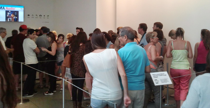
I arrived at the museum around 11 am (they open at 10.30) and already there was a pretty significant line for the mobile guide. After a bit of a wait, I exchanged my photo ID (note: passports and credit cards are not accepted) for the encased iPod touch. Although they are commonly used by museums as audio guides, this was the first time I had ever done an audio tour with an iPod touch and my expectations were lofty from the start. Hanging around my neck from a lanyard was a device full of content, and a device that I knew could connect my experience at MoMA to the world wide web! Cue sunburst and music from the heavens.
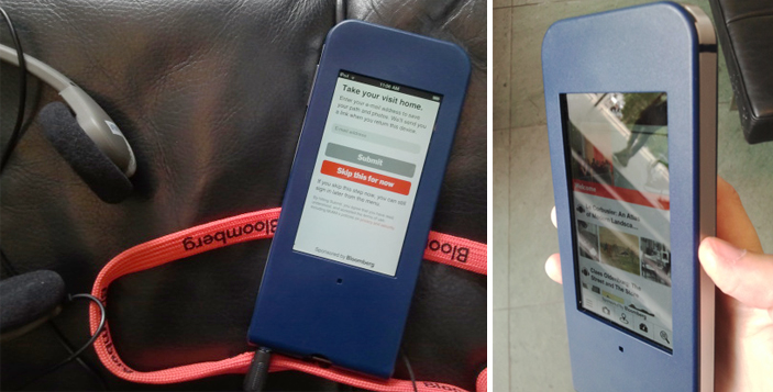
The guide is handed to you with the prompt to “Take your visit home” and here you can enter your email address, which I did, or skip this step and do it later (or not at all). The in-museum functionality is the same regardless of whether you decide to give them your email address or not.
Email address entered, ready to go.
…Or so I thought. After a few network connection failure screens, I took the guide back to the Audio+ desk and they inserted what looked like a folded up paperclip into a slot in the back of the case and pushed some kind of reset button. Not a big deal since I was still in the lobby, but it would have been nice to, as Nielsen’s 10 usability heuristics suggest, include some help and documentation outside of “network connection failure.” I assume this is one of the kinks being working out.
As I ambled around the third floor, I couldn’t help but get pulled into the guide’s glowing screen; it was a bit distracting, actually. The interface looks like a website; there are clickable images, clickable text, videos, a camera, and icon based navigation system. I spent at least 15 minutes playing around with the app not only trying to figure out what it could do, but trying to figure out what I should do. I had too many options and my attention was on the device in my hands rather than on the walls where it should have been. I wondered what else (besides explore content) I could do with the device. Is it going to navigate me through the maze of MoMA and tell me to turn right at the Gilda Mantilla drawings in order to get to the A Trip from Here to There exhibit? Does it know where I am? No, but I wish it did. This may be unavoidable, but I would be surprised if most visitors don’t feel the same way. It’s an iPod touch and I therefore expect it to do the things a Wi-Fi enabled iPod touch can do (mainly help me to find my way), but it doesn’t…and I really want it to.
Once I stopped fidgeting with the new toy, the first thing I did with the guide was listen to an audio description of Alighiero Boetti’s process in the piece Viaggi postali (Postal Voyages). The audio content was engaging and with the guide I could also read information, see the location within the museum, and…see related works! This last feature was my favorite; I love having a connection to something on the wall and immediately being able to see more from the artist. This was a significantly harder, however, when the piece I was interested in did not have the little audio icon on the label (which is true for the majority of the work at MoMA).

I want info with a single tap or a simple search for all of the pieces on the walls, as I got for the Boetti piece, not just the ones with the audio icon. Unfortunately, access to extended content for artworks outside of the official tours meant effort because (without a clear alternative) my instinct was to search either the artist name or the title. As you can image, unfamiliar names and looooong titles made this a tiresome process. The cognitive load was on me, the user, rather than on the technology. I want to access to the content without having to think.
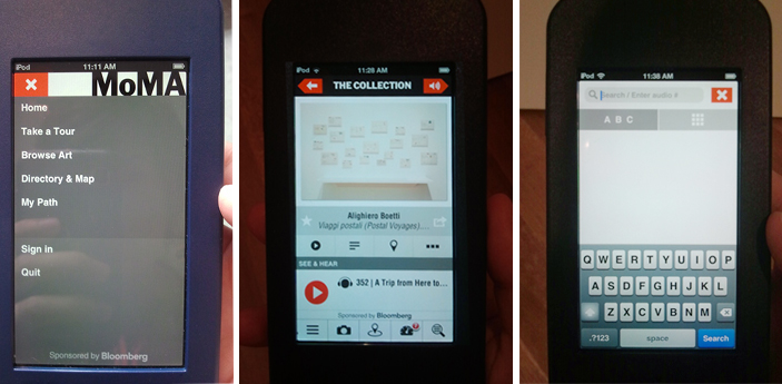
Screens on the Audio+ guide: menu options, audio content page, and search screen
One thing I loved about the Audio+ guide was the built in camera. Not having to juggle my own camera along with the audio guide was a relief and it was an easy way to ensure that content would be available for me to really explore on my own time, outside of the museum. Throughout my visit I used the guide to take photos and add stars to the pieces I liked, but unless the piece was part of an official tour (i.e. I didn’t have to search by artist/title), I was not compelled to look up any extended info. Call me lazy, but going through the search process was too much effort for the return. After about an hour I returned the guide and realized it was lucky I arrived when I had; by 11.50 am they were completely out of mobile guides and there was still a line of people waiting.
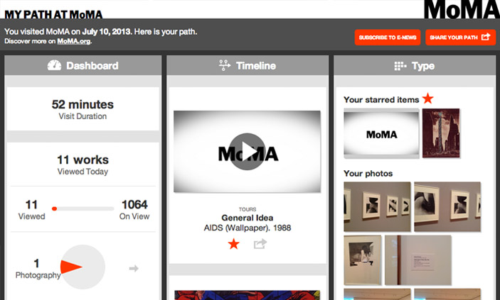
Post visit, I was emailed a link to My Path at MoMA; it is elegantly designed and responsive to screen size so is just as comfortable to view on a mobile device as it is on the desktop.
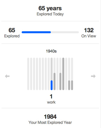
In My Path there are three different categories, Dashboard, Timeline, and Type. Dashboard gives a handful of metrics about the visit — duration (52 mins), works viewed (11 out of 1064), artists viewed (14 out of 590), and years explored (65 out of 132). My first thought: “What?! I saw more than 11 works!” I like what Dashboard tells me, but it is an incomplete story and I want to know more. Now that I’m back at my desk and I’ve walked through about ten doorways, my memory is fuzzy. What are these 11 works that I allegedly viewed and how is the guide determining what I did or did not see? 1984 is supposedly my Most Explored Year, well, what was it I saw from 1984?
The Timeline and Type sections show the stuff I did within the guide: audio listened to, photos taken, and items searched for. Same content in each section, just sorted differently. It’s really great to see, and excellent to have it all on one place. However, this is where I think there is a big opportunity lost from an interaction design perspective. I can play the audio tours in the My Path interface, but the links do not take me to the MoMA website where I can get more information about the artists, related works, etc. Basically, all of the functionality in the Audio+ mobile guide that made it easy to contextualize and relate individual works within a greater context is lost when I am back at my desk and most able to use it. I prefer to have more content and connections available when I’m at home processing my visit (and have a full sized monitor to use), but the Audio+ experience gives you the most content when you are on site (and looking at a tiny screen) and takes it away when you leave.
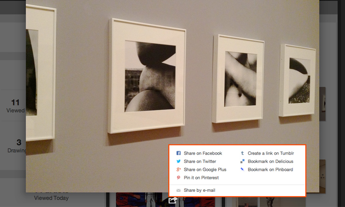
There are some errors with the My Path interface and I assume that some of these are tweaks being worked out. For example, when I open a photo, the sharing options are convenient, but they don’t include an option for downloading the original. Even the email link, which I expect will email me the photo, just sends a link to My Path. This again brings me to the point that with something like this, users shouldn’t have to think.
Beyond my gripes, let me say that overall my experience with the Audio+ was a strong positive. I generally hate using audio guides (because they are generally boring and clunky) but kudos to the folks behind the Audio+ because this first iteration is fun to use and provides delightful content above and beyond what I am used to. There is huge potential both with the guide and with the post-visit interface and I look forward to giving it another go in a few months once they have had a chance to work out the bumps.

Pingback: Avec Audio+, le MoMA offre une première transformation numérique de son guide de visite