Category Archives: UX

From concept to video prototype: the early form of the Pen

It was in late 2012 that the concept for the Pen was pitched to the museum by Local Projects, working then as subcontractors to Diller Scofidio & Renfro. The concept portrayed the Pen as an alternative to a mobile experience, and importantly, was symbol that was meant to activate visitors.

Early image of Pen

Original concept for the Pen by Local Projects with Diller Scofidio + Renfro, late 2012.

“Design Fiction is making things that tell stories. It’s like science-fiction in that the stories bring into focus certain matters-of-concern, such as how life is lived, questioning how technology is used and its implications, speculating bout the course of events; all of the unique abilities of science-fiction to incite imagination-filling conversations about alternative futures.” (Julian Bleeker, 2009)

In late 2013, Hanne Delodder and our media technologist, Katie Shelly, were tasked with making a short instructional video – a piece of ‘internal design fiction’ to help us expand the context of the Pen, beyond just the technology. (Hanne was spending three weeks observing work in the Labs courtesy of the Belgian Government as part of her professional development at Het Huis van Alijn, a history museum in Ghent.)

The video used the vWand from Sistelnetworks, an existing product that became the starting point from which the final Pen developed. At the time of production the museum had not yet begun the final development path that engaged Sistelnetworks, GE, Makesimply, Tellart and Undercurrent who would help augment and transform the vWand into the new product we now have.

The brief for the video was simply to create an instructional video of the kind that the museum might play in the Great Hall and on our website to instruct visitors how they might use the Pen. As it turned out, the video ended up being a hugely valuable tool in the ‘socialisation’ of the Pen as the entirety of the museum started to gets its head around what/how/when from curators to security staff, well before we had any working prototypes.

It ended up informing our design sprints with GE and Sistelnetworks which resulted in the form, operation and interaction design for the Pen; as well as a ‘stewardship’ sprint with SVA’s Products of Design where we worked through operational issues around distribution and return.

The video was also the starting point for the instructional video we ended up having produced that now plays online and in the Great Hall. You will notice that the emphasis in the final video has changed dramatically – focussing on collecting inside the museum and the importance of the visitor’s ticket (in contrast to the public collection of email addresses in the original).

The digital experience at Cooper Hewitt is supported by Bloomberg Philanthropies.

A new feature you may never see – ticketing follow up emails

A few weeks ago we rolled out a small update to the ticketing website that sends a reminder email to anyone who has purchased tickets in advance.

This is sort of an experiment. but first, some background.

Recently I attended an event at another cultural institution ( which I won’t name ). A few days prior to the event I received a very up-selling reminder email, reminding me of membership discounts and other events I might like. The links within the email took me to the landing page for the event, and offered little actual information that I found useful unless I wanted to buy even more tickets, or combine my purchase with a book in the shop.

To make things worse, on the night of the event, and just as it was finishing up, I received a “follow up email” , which I found really annoying. It was literally timed to send exactly as the event was ending and while I was on my way out the door, as if to say, “wait, come back in and buy the book too!”

In fact, the subject line read “How did I enjoy [insert event title here]?” But, the email itself didn’t offer me a way to answer that question ( even if I wanted to ) and instead simply pointed me to the same landing page of the event I had just attended, along with links to their social media channels and other upcoming shows I might be interested in. The whole thing made me cringe a little as I pressed the delete button on my phone.

I thought to myself, “let’s not do that.”

I really just wanted to send a gentle reminder email, full of actually useful info to people who were planning to come visit the museum. I thought it would be nice if I had booked tickets in advance to get something like this the day before I was planning to visit. Something with a map and some info on how to get here, and potentially a little synopsis of what I might do once I arrived.

So, here was my thought process.

Like I said, it’s an experiment, and so I’m still just sort of beta-testing this feature, and trying to analyze how useful/annoying people find it. We already get so many emails, so I really wanted to make sure I wasn’t bombarding our visitors with additional garbage, or even worse, confusing them with unneeded information like what I’d recently experienced.

First of all, it would be all about timing. While talking out loud in the Labs about this one, Aaron’s comment was simply “time zones.” Computer’s have time zones ( all of ours are set to UTC ), people are in time zones. It was clearly something to consider.

Right now, we can only assume that you will be here sometime during our open hours on the day you purchased the ticket. We don’t presently do timed tickets, and unlike an event space, each day’s “performance” spans the entirety of our hours.

So we decided to try out sending the reminders the day before at 4pm, our time. I guess it’s generally safe to say that visitors are nearing our time zone the day before their visit, but its really still a best guess. Also, we are not going to “remind you” if you are booking for the same day as that’s probably overkill. So for now, at 4pm, the day before your visit, is when the email goes out.

Next I had some fun coming up with a way to extract all the relevant info from our Ticketing CRM ( Tessitura ).

I needed the following info:

  • All the things going on tomorrow ( this is sort of future proofing for when we let you book other things beyond general admission )
  • All the current orders for all the things going on tomorrow.
  • All the email addresses for all the orders for all the things going on tomorrow.

Getting “tomorrow” was pretty easy in PHP.

$datetime = new DateTime(‘tomorrow’);
$tomorrow = $datetime->format(‘Y-m-d’);

4pm EST is 9pm UTC on the same day, so all good there in calculating “tomorrow.”

Our Tessitura API wrapper I mentioned in my last post has a method that lets us get all the “performances” in Tessitura for a given date range. Simply passing it “tomorrow” yields us all the things we are looking for. We also have a method that can get all the orders placed for a given performance. Finally, we have a method that gets the email for the user that placed the order.

Now we can send the actual email.

Obviously, people place multiple orders and buy multiple tickets per order. I really only want to send one email regardless of what you’ve booked. So when I am looping through all the orders, I only add the email address to the list once.

The last step was to make a cron job that runs this script once a day at 4pm. Done!

( Incidentally, all of our servers are set to UTC, but for some reason our RedHat server’s crontab doesn’t seem to care, and somehow ( possibly magically ) thinks it’s on EST. I have yet to figure out why this is, but for now I am just going with it. )

Right now, the email is a fixed template. We are sending out emails via Mandrill, so we get some decent analytics and can track open rates, and click rates. We also added Google Analytics tracking codes to all the links in the email so we can see what people are clicking right in GA.

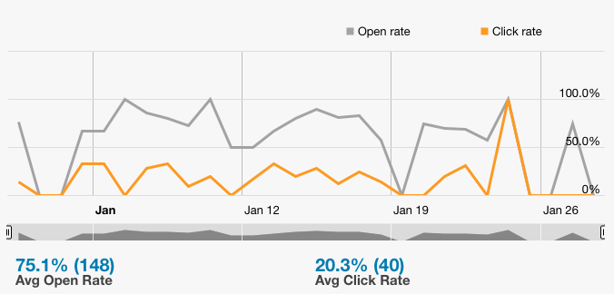
So far we’ve experienced an open rate of about 75% and a click rate of about 20%, which seems pretty good to me.

Our open and click rate for the last 30 days.

Our open and click rate for the last 30 days.

And here is the GA results for the “Ticket Reminder” campaign from the same time period. From here you can dive deeper into the analytics to see what pages people are heading to once they are on the site, and all sorts of other metrics.

GA TicketReminder

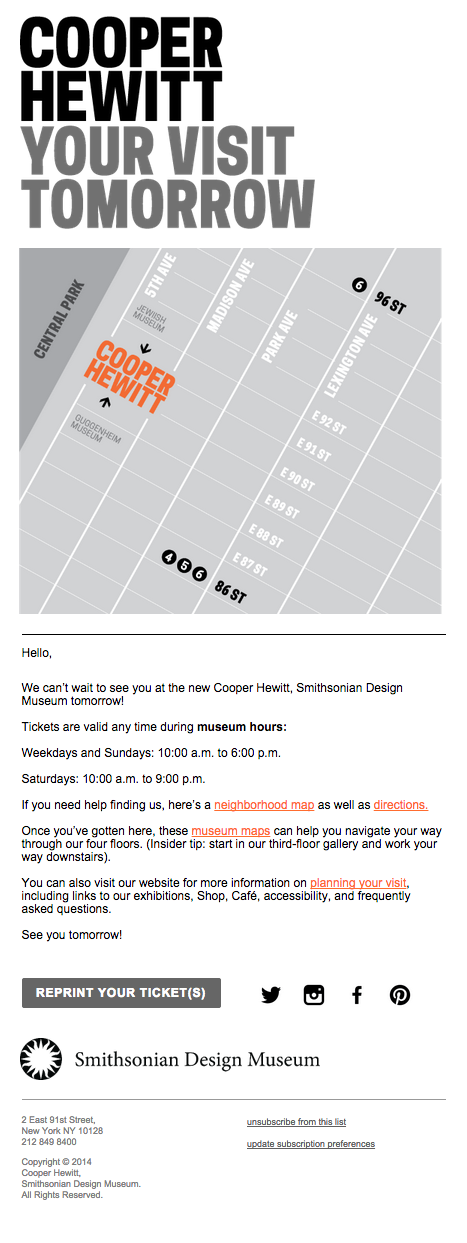
Since you can only really “see” this feature if you book an advance ticket I’ve posted an image of what the email looks like below. We went through a few design iterations to get it to look the way it looks, and I’d really love to hear your thoughts about it. If you were visiting us, and received this email the day before your visit at 4pm, would you find it useful, annoying, or confusing?

Reminder Email Template

Our reminder email template

Of course this will change again when the Pen goes live shortly.

Our new ticketing website

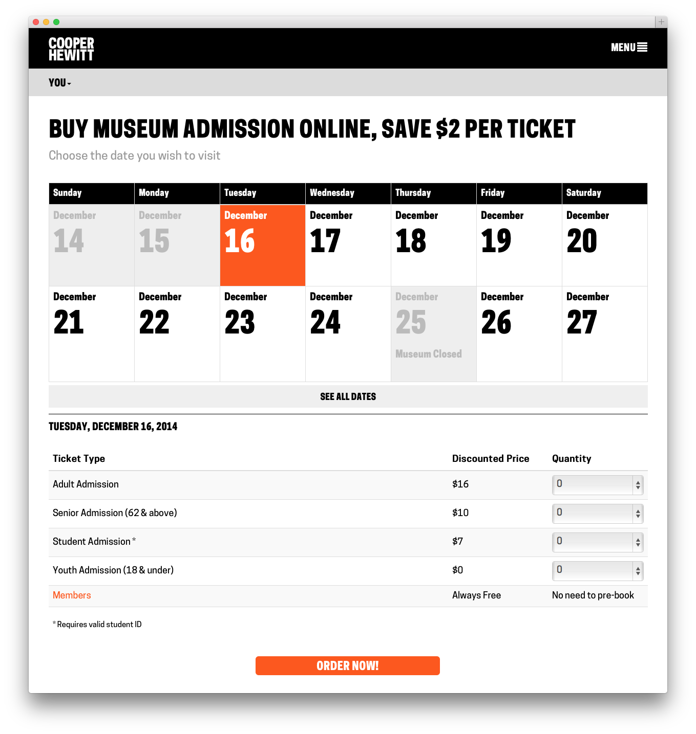
Screenshot 2014-12-16 16.25.03

This past week we launched https://tickets.cooperhewitt.org — a new online ticketing system which leverages our Consitutent Relationship Management application, Tessitura, as its “source of truth.”

It’s a simple application, really. It lets you pick the day you want to come visit us, select the kind of tickets you want to buy, and then you fill out your basic info, plug in your credit card digits and off you go. Moments later you receive an email with PDF versions of your tickets attached.

On the user-facing side of things, it is designed to be as simple as possible. You don’t need to log in, there is no “shopping cart”, and above all, you can do all of this from your phone if you want to skip ahead of the lines this Winter on your first visit back since we closed nearly three years ago.

A little background

The idea to pre-book tickets online came at us from a number of directions. Some time last year we decided to invest in Tessitura to handle all of our CRM needs. Tessitura, if you have never heard of it before, is an enterprise class, battleship that grew out of the Met Opera House and has made its way around the performing arts sector. It’s a great tool if you are looking to centralize everything there is to know about a Constituent. As a museum, it is also appealing in that it does many of the things that non-profit type cultural institutions need to do out of the box.

So, Tessitura. It is now a thing at our museum. Everyone on our staff started ramping up on the software and getting settled into the idea of using Tessitura for one thing or another. Our department began to get requests.

Obviously our membership department would like to use Tessitura to sell and manage memberships. Development would like to use it to manage and collect donations and gifts. Education would like to centralize all public programs, book tours, manage special events, and all of the other crazy things they do. And did I mention we have a museum that sells tickets?

This is how it always starts. The avalanche of ideas, whiteboard sessions, product demos and gentle emails that say things like “When will Tessitura be ready?” begin to pour in. You have to soak it all in and then wring it all out.

The Simplest, Dumbest Thing

Aaron says that quite often. “Just do the simplest, dumbest thing…” and he’s right. Often times you have to boil things down a bit to get to the real core issues at hand. It was clear from the start that this would be an essential part of the “design process” on this project.

So, I started out by asking myself this question:  “What is the most basic thing we want to do with Tessitura?”

I wound up with two clear answers.

  1. We wanted to be able to sell tickets online. Just basic, general admission tickets. Nothing fancy yet.
  2. We eventually want to use Tessitura as our identity provider, and as a way to pair your ticket with the Pen. More on that towards the end…

Tackling Tickets

So to get started, I thought about the challenge of selling a ticket online. I looked at other sites I liked such as StubHub, EventBrite, and other venue websites that I knew used Tessitura like BAM, Jazz at Lincoln Center, and the 92Y. I did some research, I bought some tickets, and I asked all my friends who used these sites what they liked and disliked. Eventually I started to find my way gravitating towards the Eventbrite way of doing things. We have been using Eventbrite for a couple of years here at Cooper Hewitt, for the most part as a way to sell tickets to education programs and events.

To tell you the truth, Eventbrite has been a dream come true for us and our sales for these events, both paid and free, have been very good. So, what is Eventbrite doing right? Simply put they’ve made the process of purchasing a ticket to an event online stupidly simple.

I wanted to know more. So, I spent some time and slowly walked myself through the process of booking all kinds of things on Eventbrite. I tried to step through each page in the process, I tried to notice what kind of user feedback I got, and what sort of emails and notifications I got. I tried the same on mobile devices and through their iPhone app. Here are a few takeaways.

  1. You don’t need to register in order to purchase a ticket on Eventbrite.
  2. If you don’t register when making an initial purchase, you can register later and see your purchase history.
  3. As soon as you book your tickets, you get them in an email.
  4. The Thank You page is just as useful when you are logged out as when you are logged in.
  5. Most importantly, you can only buy one thing at a time. In other words, there is no idea of a Shopping Cart.

That last one was pretty huge. Most eCommerce sites are built around the idea that users put items in a cart and then “Checkout.” Eventbrite doesn’t do it this way. Instead, you simply pick the thing you are wanting to attend, select the kinds of tickets you want ( student, senior, etc ) and then put in your credit card info. Once you hit submit, you’ve paid for your tickets and your transaction is complete.

I felt this flow was incredibly powerful and probably one of the reasons Eventbrite was working so well for our education programs. There are simply less chances to change your mind, less confusion over what you are buying, and the end-to-end process of picking something out and paying for it is just so much smaller than the more traditional shopping cart experience.

I began to think of it kind of like the difference between getting your weekly groceries and just picking up a six pack. The behaviors are totally different because you are trying to accomplish two totally different tasks. One is very routine, requires a little creativity and some patience, and a willingness to wander around and “pick.” The other is a strategic strike, designed to get in and get out so you can get home and relax with a nice cold one.

The Eventbrite concept seemed like what we wanted. I had my simplest dumbest thing, and something to model it on.

Technical Challenges

With every new project comes some kind of technical challenge(s). Tessitura is a “new to us” application and our staff at Cooper Hewitt were clearly at the bottom left of a steep learning curve when we started the project. We also had many challenges we knew we were going to have to face because we are a “Governmental Institution.” So things like PCI compliance, complex network configurations, and security scans were all things I was going to need to learn about.

Tessitura comes with two APIs. One is a somewhat older ( as in the first thing they built ) SOAP API, and the other is a newer ( as in still under development ) REST API. Both allow data to get in and out of Tessitura in a variety of forms.

In addition to the standard SOAP and REST APIs, Tessitura has the facility to expose just about anything you can build into an MS SQL Stored Procedure through its API. This is an incredibly powerful feature, which can also be quite dangerous if you think about it.

When I attended the Tessitura Learning Conference & Convention this past summer, it became clear to me that many institutions that use Tessitura are building some kind of API wrapper, or some type of middleware that helps them make sense of it all. We chose to do the same. To accomplish this, I chose to model the API wrapper off our own Collections API, which is a REST-ish API based on Flamework, and uses oAuth2 for authentication. Having this API wrapper allows us to all speak the same language and use the same interface. It is also very, very similar to the Collections API, so among our own staff, it is pretty easy to navigate. The API wrapper, wraps methods from both the Tessitura SOAP and the REST APIs and presents a unified interface to both of them. It doesn’t implement every single API method, and it exposes “new” methods that we have custom built via those Stored Procedures I mentioned.

The Tickets website is a separate project that talks directly to the API. It is also a Flamework project, written primarily in PHP. It uses a MySQL database to store a small amount of local data, but for the most part it is making calls to the API wrapper, which in turn is making calls to either the SOAP or REST Tessitura APIs. Tessitura is the source of truth for most of the things the Ticketing website does.

The Front End
Screenshot 2014-12-16 16.25.44

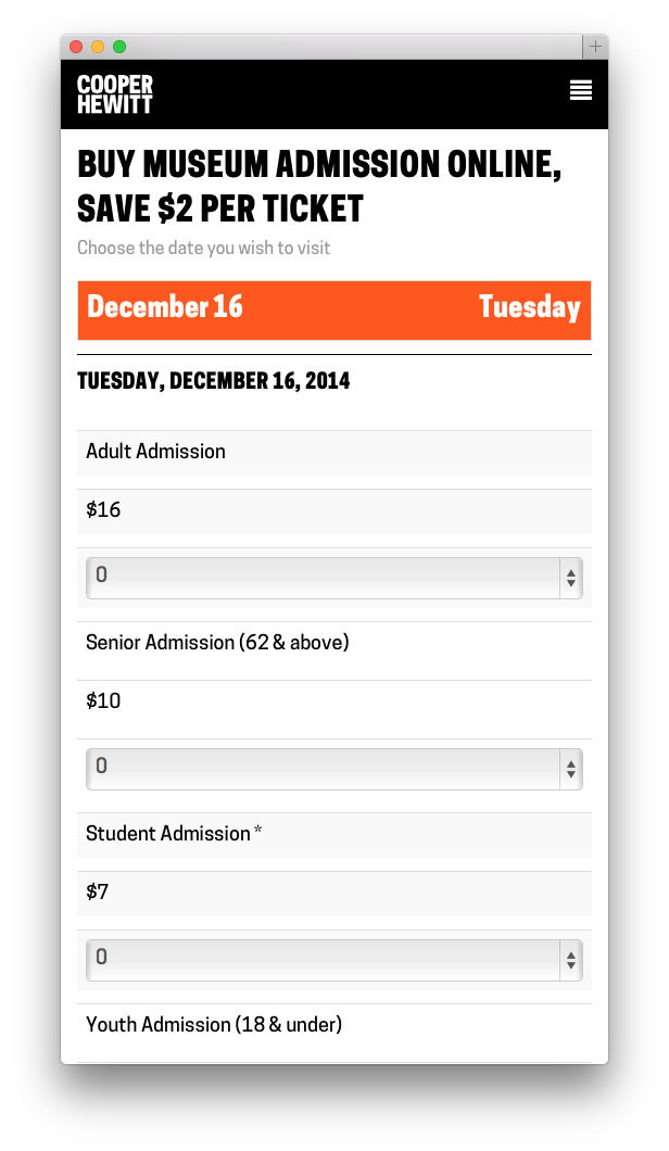
The Tickets site from the user’s perspective is designed to be extremely simple. I worked with Sam ( our in house front end guru ) to build a responsive, and simple web application that does basically one thing, but the devil is always in the details.

At first glance, all the site does is allow you to select the day you want to come visit us, pick out what kinds of tickets you want, and then fill out your billing info and receive your tickets. It’s basically a calendar and a form and not much more. But like I said, the devil is in the details.

First, Sam built a beautiful calendar like one I’d never seen before. We talked at length about how dumb most website calendars were, and we tried to push things in a new direction. Our calendar starts out by showing you what you most likely are looking for–Today. It displays the next bunch of days up to two weeks worth by default, and if you are looking for a special date, it lets you drop down and navigate around until you find it. On mobile its slightly different in that it doesn’t show you any past dates ( why would you want to book the past? ) and it limits things a little so you’re not as overwhelmed by the interface. We call this “designing for context” and we thought that users might be using their mobile phones to buy a ticket online and jump up to the front of the queue.

Once you’ve selected the date you want, the app loads up the available tickets right below the calendar. You can easily change your mind and pick a different date. From here you just select the type and quantity of each ticket you want. Sam’s code does a bunch of front-end validations to make sure everything you are trying to do makes sense ( you can only purchase a youth ticket with another paid ticket for example ). Between the two of us, we try to do as much validation to what you are selecting as possible, both in Javascript on the front-end and in PHP on the back.

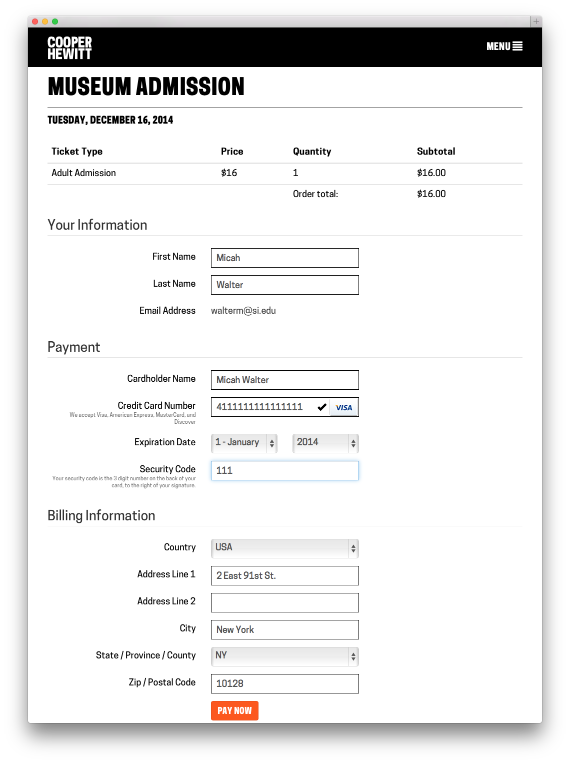
Once you hit Order Now, an order form is generated and displayed. I think its important to note here that nothing has really happened yet in Tessitura-land. We asked Tessitura for some details about the tickets you are interested in, but we haven’t “added them to your cart” or anything like that as of yet.
Screenshot 2014-12-16 16.28.34

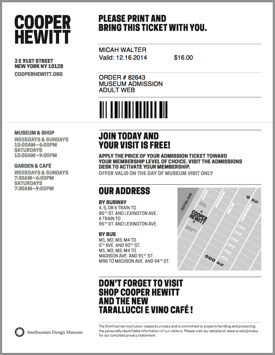
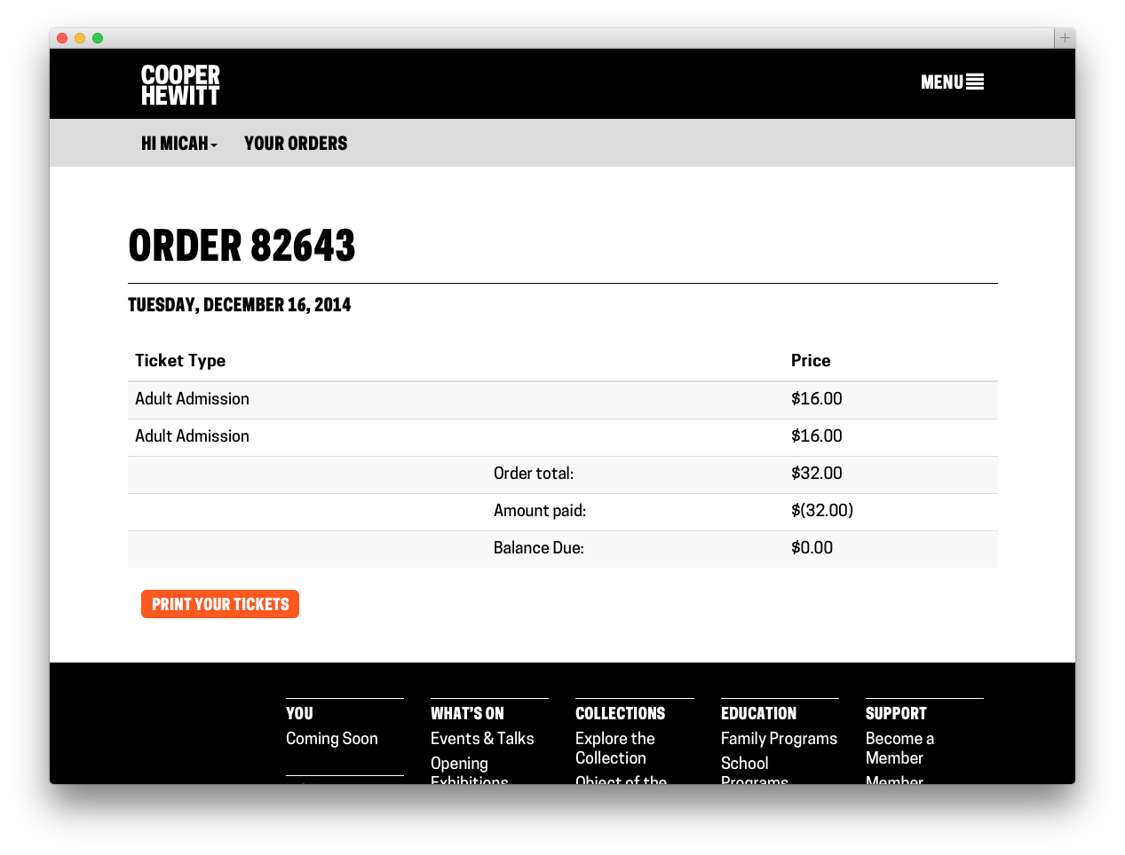
You can then fill out your vitals. We ask you to give us your name, email, credit card details and billing address. We store all of this, with the exception of your credit card, in Tessitura. We make you an account, and at this point we send you an activation email which allows you to set up your password at your leisure. If all goes well with your credit card, we build your tickets ( I chose to do all this with FPDF rather than try and use Tessitura’s built in Print at Home server thing ) send them in an email, and then take you to a Thank You Page. You never had to register, or log in, and you technically never do. Your PDF tickets arrive in your inbox and that is technically all you need.
Screenshot 2014-12-16 16.27.35

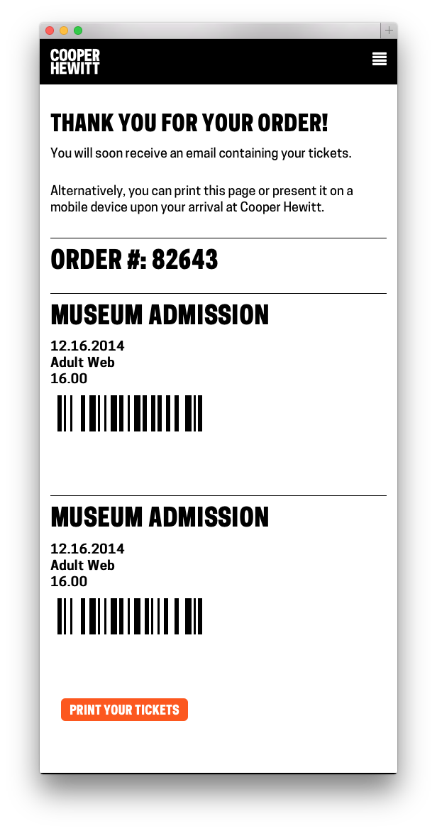
As a little bonus, we just stick the barcode and some basic metadata about each ticket you bought on the Thank You Page so you can just present your phone at the door. This part is still a little rough and I chose to leave it that way for the time being so we can do some user research in the galleries. It’s a nice feature, but only time will tell if people actually use it or if it needs some finesse.
Screenshot 2014-12-16 16.26.50

Now that you are in the system, you can buy more tickets using the same email address and they will be connected to your same account, even if you still have never logged in. If you do choose to activate your account and login, you can look at your order history, and reprint your tickets if you’ve lost your email copy.
Screenshot 2014-12-16 16.27.10

Tessitura & The Pen

A while back in this blog post, I mentioned that we also wanted to use Tessitura as our identity provider and as a way to pair the ticket you’ve purchased with the pen we’ve handed you. This work is nearly done, but not yet in production. It will go live when our pen is available sometime in early 2015. But, the short story is, when you buy a ticket, either online or in person, we generate a special coded version of your ticket. This code gets paired up with the internal ID of the pen we gave you and that pairing gets stored in a database. What this all amounts to is that when you get home, and you want to see all the cool things you’ve done with your pen, you simply enter the code ( or go to a custom short URL ) on our website. We look up your pairing and are able to connect your Identity ( Tessitura ) with your Visit ( on the Collections site ). But that is all the topic of a future series of blog posts.

Next

Now that the Tickets site is up and running, and we are watching the sales roll in, it’s easy to start thinking of more features and new ways to expand what the site can do. I’ve already started building simple admin tools and have been thinking about building a basic check-in app for off-site events. It’s too early to talk about all of the things we aim to do and how we plan to expand our online sales, but I’m hopeful that we will stay focused and narrow in our approach, offering our users the most elegant visitor experience possible. Or at the very least, the simplest, dumbest thing.
Three adventures in universal design, or, what does a veggie peeler have in common with a museum? (0/3)

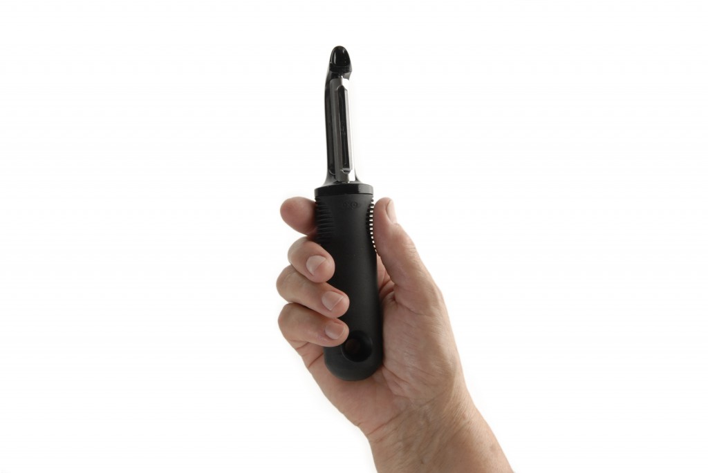
A hand shown holding a black, rubberized OXO veggie peeler against a crisp white backdrop.

Though designed specifically for the arthritic, this product “appeals” to everyone.

“The way to think about ‘everybody’ is not to think about the average person in the middle, but to think about the extremes. Think about people at the edges of your potential buying public and think about people who are most challenged.”
[Dan Formosa interviewed by Debbie Millman in Brand Thinking]

If you hang out at a design museum long enough, you start to pick up on certain recurring concepts. One good recurring concept has to do with a thing called universal design:

The term “universal design” was coined by the architect Ronald L. Mace to describe the concept of designing all products and the built environment to be aesthetic and usable to the greatest extent possible by everyone, regardless of their age, ability, or status in life.
[Wikipedia]

So what’s the lesson behind universal design? Pretend you’re a bossman trying to cut costs wherever possible. For you, universal design might seem like a non-critical endeavor. Sure, it would be nice for the disabled and the elderly to have easy access to all aspects of your [insert product being designed here], but you don’t have room in the budget for anything elaborate. “We’ll tackle accessibility if we have leftover funds at the end of the project,” you’d say. Or “after we design the bulk of our [widget], then we’ll start work on the accessibility stuff because it’s required by law.”

If you were to study your design history, however, you’d realize that this view could limit your opportunities for innovation and crowd-pleasing design.

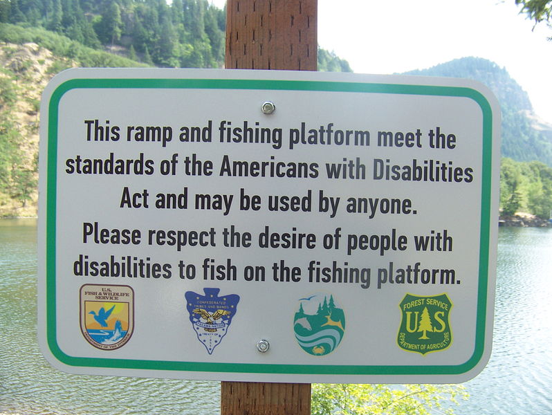
A sign in the foreground reads "This ramp and fishing platform meet the standards of the Americans with Disabilities Act and may be used by anyone. Please respect the desire of people with disabilities to fish on the fishing platform. In the background is a lake surrounded by trees.

The Americans with Disabilities Act of 1990 required organizations and institutions to make buildings, public transportation, signage, and more accessible to everyone. Image by USFWS Pacific.

The amazing truth of universal design is that when a design team focuses on “edge users,” or “extreme users,” it very often leads to unexpected insights, which can then lead to innovative features that benefit all users. When you design for the edges, everybody benefits.

The OXO Good Grips line is one of the most commonly cited examples of this phenomenon. The Smart Design team sat down to design a line of veggie peelers, can openers and scissors for people with arthritis and limited hand mobility. After the chunky, ergonomically superior new products hit the market, they became a huge mainstream success.

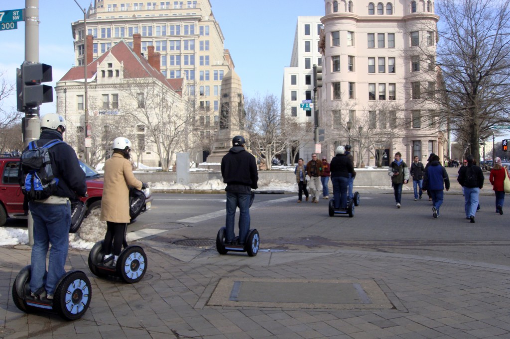
A group of five people riding motorized segway scooters riding single-file down the sidewalk curb cut and into the crosswalk. Washington DC in wintertime. They are wearing winter coats and helmets.

Segway scooter riders enjoy the benefits of curb cut sidewalks. Photo by Mariordo Mario Roberto Duran Ortiz

Another example are Selwyn Goldsmith‘s “curb cuts.” The mini-ramps we see now on most city street corners were designed primarily with wheelchair users in mind. After they were implemented, it became obvious that this ergonomic consideration benefitted not only wheelchair users, but also luggage-toters, stroller-pushers, stiletto-wearers, cyclists and anybody who enjoys a bit of added ease and comfort in getting around.

With all this in mind, our summer intern (psst—applications for next year are open!Rachel Sakai and I set out to do some research. We have a very small part in the über-mega-process that is the Cooper Hewitt gallery re-design, and we wanted to take on a summer project that could enrich that work.

We decided to focus in on a blind person’s museum experience. How might an understanding of a blind visitor’s experience inform and enhance the design decisions being made in our re-design project?

We chose to embrace a mindset of Human Centered Design. (Note that Human Centered Design is not the same thing as universal design). I’ve helped to create lots of Museum content—videos, exhibitions, books—on the topic of Human Centered Design. After so much experience intellectualizing about the technique, I was pretty eager to find a way to try it myself.

Human-Centered Design (HCD) is a process and a set of techniques used to create new solutions for the world….The reason this process is called “human-centered” is because it starts with the people we are designing for. The HCD process begins by examining the needs, dreams, and behaviors of the people we want to affect with our solutions.
[From IDEO’s HCD ToolKit]

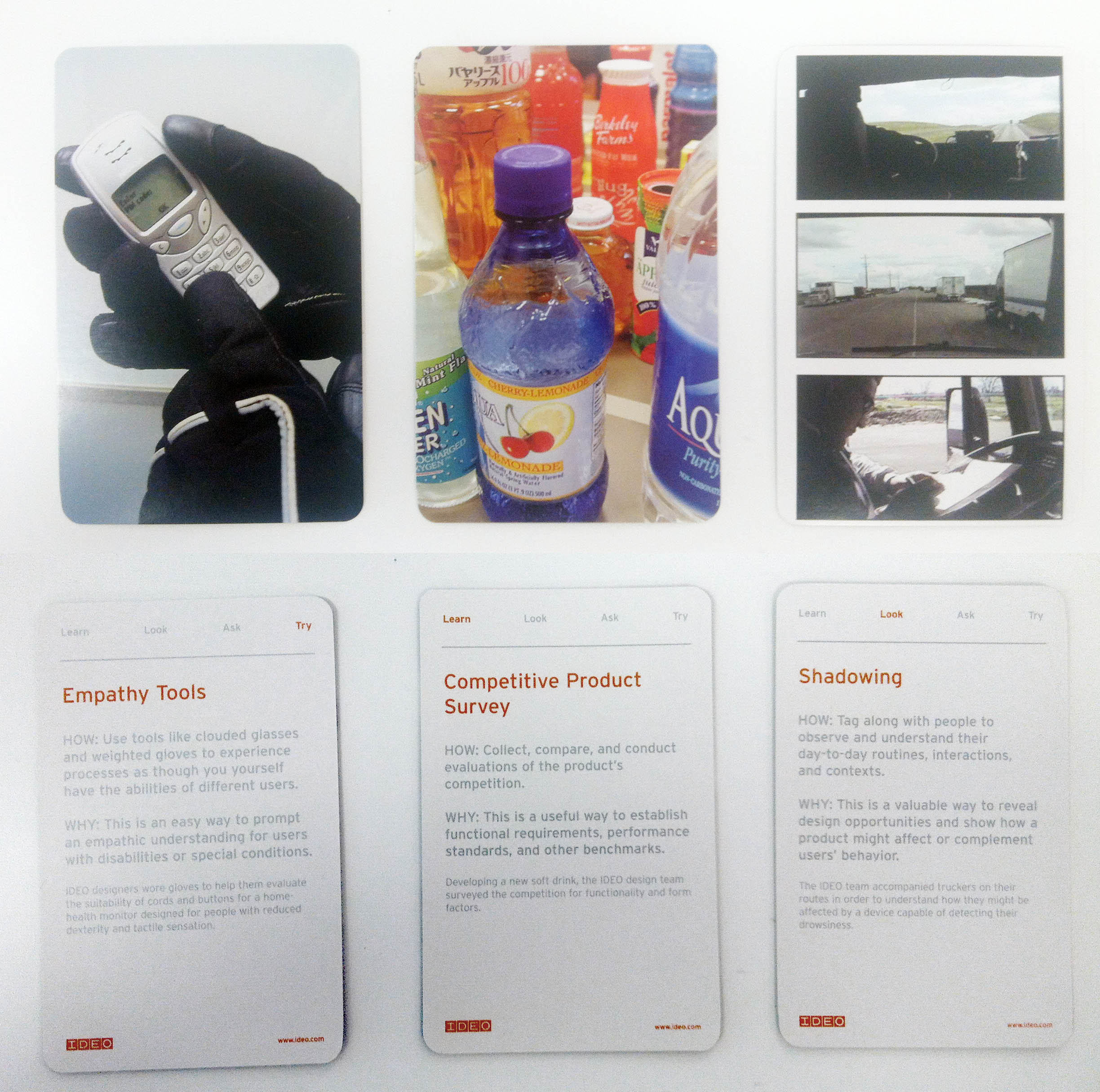
front and back of 3 different method cards. Each card explains a different HCD research method. The front of each card has a full-bleed photo, the back has the name of the method and a short paragraph describing it.

Our 3 chosen IDEO method cards: Empathy Tools, Competitive Product Survey, and Shadowing

We borrowed a set of IDEO method cards from Cara and chose three that served our goal to better understand the blind museum visitor’s experience. In the next three posts, we’ll explain how we applied the methods of Empathy tools, Competitive Product Survey, and Shadowing:

1. Empathy Tools: Go on a blindfolded museum visit.

2. Competitive Product Survey: Take a museum tour designed for the blind.

3. Shadowing: Observe a blind person’s museum visit.


Interns React to…the Whitney's Audio Guide

I spent my summer as an intern in the Digital and Emerging Media department here at the Cooper-Hewitt National Design Museum. Next week, I head home to San Francisco where I will return to the graduate program in design at California College of the Arts. One of my projects this summer has been to visit museums, observe how visitors are using their devices (cell phones, iPads, etc), and to examine audio guides through the lens of an interaction designer.

When I went to check out MoMA’s new mobile guide, Audio+, it was the beginning of my stint at the Cooper-Hewitt, I had never before done a museum audio tour with an iPod touch, and my expectations were lofty. Now that I have spent a summer in Museum World, my perspective and my expectations have changed so I wanted to repeat the exercise of going to a museum and critiquing an audio guide experience.

Last Sunday I spent my afternoon at the Whitney. I arrived at the museum around 1pm. No wait for the audio guide, just walked up and handed over my ID in exchange. Like many other museums, the Whitney uses encased iPods for their audio guides. I was a bit surprised, however, to notice that the battery charge on my guide was around 40%. This turned out not to be a problem for me, but I did overhear other guests complaining that their guides had run out of batteries part way through the visit.

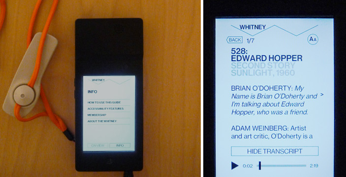
Whitney's audio guide interface

Two different views of the Whitney’s audio guide

The Whitney’s audio guide interface is simple and straight forward. All of the guide’s navigation is text based, and this digital affordance reinforced the fact that the guide does not offer endless paths and options. After just one or two minutes of clicking around the app, there was no more mystery. The minimalist design helped me to immediately understand what I was going to do with the device and it was easier for me to focus attention on what was on the walls rather than what was on the screen.

I was, and still am, pretty taken with the quality of content available on the Whitney’s guide. From what I could tell, in each room of each gallery there is audio content for at least two pieces. It may not sound like a lot, but it ended up being more than enough for me. The consistency of content allowed and encouraged me to use the guide throughout my visit and I was surprised to see how many visitors were using the audio guides – and not just tourists, but locals too.

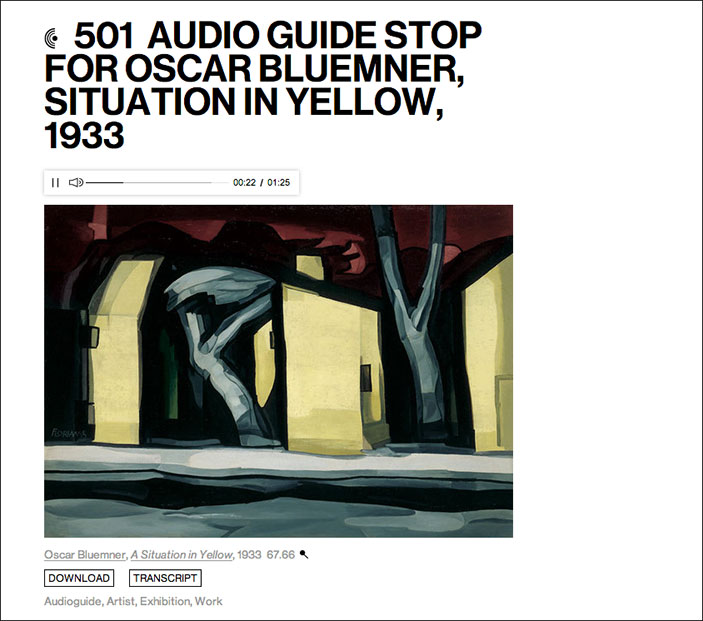
According to Audio Guide stop 501, Oscar Bluemner once wrote, “Listen to my work as you listen to music…try to feel.” The Whitney’s audio guide embraces this idea by playing mood setting sounds and music to complement their audio descriptions.

Screen shot of audio guide player

Situation in Yellow on the Whitney’s web player

One of my favorites is the description of Burchfield’s Chicket and Chorus in the Arbor, which you can listen to here. With crickets chirping in the background, it’s much easier to put yourself into the world described (late summer, thick trees and bushes, crickets, sunset). The first time I came across one of the audio guide stops with background music I was surprised and delighted. It was a subtle gesture, but one that really elevated the content and did wonders for putting me in the mood, so to speak.

Compared to its counterpart at MoMA, the Audio+, this guide has less content and that was clear from the start. Less content may sound like one point for the “con” list, but I do not think it is always a bad thing. Yes, there were a few times when I missed being able to look up more info about the artist and see related works, but not having the option at all definitely made me more focussed on the art in front of me. In the case of the Whitney, the content is good enough that the “less is more” approach is working well. Plus, all of their audio content is available online, so when I am back at my desk, I can browse through and re-listen or learn more about the clips I found particularly interesting.
visitor looking at a painting

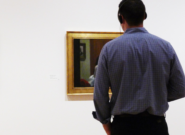
A Whitney visitor using the audio guide

In both the guide for the Whitney and the guide for the MoMA the museum’s own style is reflected. The MoMA states that their “mission is helping you understand and enjoy the art of our time” where as the Whitney is “dedicated to collecting, preserving, interpreting, and exhibiting American art.” It makes sense, then, that the MoMA (focussed on education) includes much more educational content in their mobile guide and that the Whitney does.

From what I’ve learned this summer (through working with the labs team and through visits to other museums), I know that the visitor experience at home is just as important as the visitor experience in the museum. For myself, I liked the Whitney guide so much because I didn’t feel compelled to do an incredibly deep dive on a mobile device when I should be focussing my attention on what is in front of me. However, where was my at home experience? Once I left the museum, I had nothing to take with me that would prompt me to visit their website and learn more about what I saw. I would love to follow up the great audio guide experience with a great at home experience in the vein of what MoMA is doing with the option to take your visit home. There is opportunity here and I hope the Whitney has plans to fill it.

Interns React to…MoMA's Audio+

I spent my summer as an intern in the Digital and Emerging Media department here at the Cooper-Hewitt National Design Museum. Next week, I head home to San Francisco where I will return to the graduate program in design at California College of the Arts. One of my projects this summer has been to visit museums, observe how visitors are using their devices (cell phones, iPads, etc), and to examine audio guides through the lens of an interaction designer.

Before you start, it’s important to note that I ran over to try out the Audio+ out as soon as I could. The new guides are technically still in a pre-release phase and the team at MoMA is actively rolling out tweaks and fixes.

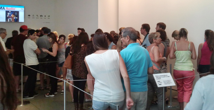
I arrived at the museum around 11 am (they open at 10.30) and already there was a pretty significant line for the mobile guide. After a bit of a wait, I exchanged my photo ID (note: passports and credit cards are not accepted) for the encased iPod touch. Although they are commonly used by museums as audio guides, this was the first time I had ever done an audio tour with an iPod touch and my expectations were lofty from the start. Hanging around my neck from a lanyard was a device full of content, and a device that I knew could connect my experience at MoMA to the world wide web! Cue sunburst and music from the heavens.

Visitors waiting in line

MoMA visitors waiting in line to pick up an audio guide

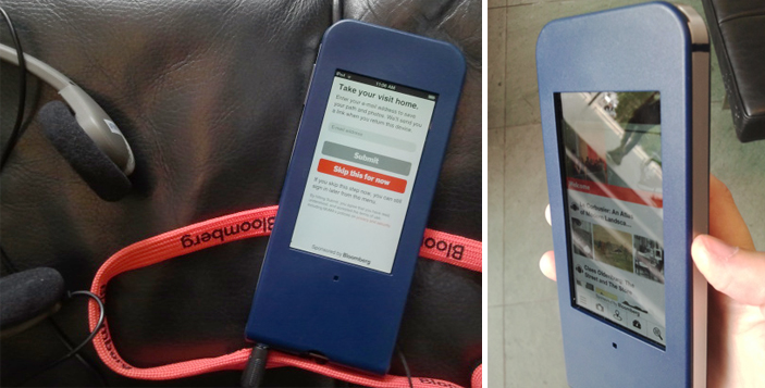
The guide is handed to you with the prompt to “Take your visit home” and here you can enter your email address, which I did, or skip this step and do it later (or not at all). The in-museum functionality is the same regardless of whether you decide to give them your email address or not.

Email address entered, ready to go.

…Or so I thought. After a few network connection failure screens, I took the guide back to the Audio+ desk and they inserted what looked like a folded up paperclip into a slot in the back of the case and pushed some kind of reset button. Not a big deal since I was still in the lobby, but it would have been nice to, as Nielsen’s 10 usability heuristics suggest, include some help and documentation outside of “network connection failure.” I assume this is one of the kinks being working out.

Image of the Audio+ guide

As I ambled around the third floor, I couldn’t help but get pulled into the guide’s glowing screen; it was a bit distracting, actually. The interface looks like a website; there are clickable images, clickable text, videos, a camera, and icon based navigation system. I spent at least 15 minutes playing around with the app not only trying to figure out what it could do, but trying to figure out what I should do. I had too many options and my attention was on the device in my hands rather than on the walls where it should have been. I wondered what else (besides explore content) I could do with the device. Is it going to navigate me through the maze of MoMA and tell me to turn right at the Gilda Mantilla drawings in order to get to the A Trip from Here to There exhibit? Does it know where I am? No, but I wish it did. This may be unavoidable, but I would be surprised if most visitors don’t feel the same way. It’s an iPod touch and I therefore expect it to do the things a Wi-Fi enabled iPod touch can do (mainly help me to find my way), but it doesn’t…and I really want it to.

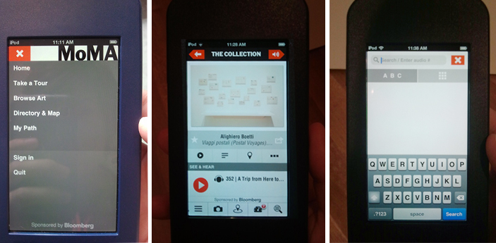
Once I stopped fidgeting with the new toy, the first thing I did with the guide was listen to an audio description of Alighiero Boetti’s process in the piece Viaggi postali (Postal Voyages). The audio content was engaging and with the guide I could also read information, see the location within the museum, and…see related works! This last feature was my favorite; I love having a connection to something on the wall and immediately being able to see more from the artist. This was a significantly harder, however, when the piece I was interested in did not have the little audio icon on the label (which is true for the majority of the work at MoMA).

Audio content icon

I want info with a single tap or a simple search for all of the pieces on the walls, as I got for the Boetti piece, not just the ones with the audio icon. Unfortunately, access to extended content for artworks outside of the official tours meant effort because (without a clear alternative) my instinct was to search either the artist name or the title. As you can image, unfamiliar names and looooong titles made this a tiresome process. The cognitive load was on me, the user, rather than on the technology. I want to access to the content without having to think. 

screens from MoMA's new Audio+ guide

Screens on the Audio+ guide: menu options, audio content page, and search screen

One thing I loved about the Audio+ guide was the built in camera. Not having to juggle my own camera along with the audio guide was a relief and it was an easy way to ensure that content would be available for me to really explore on my own time, outside of the museum. Throughout my visit I used the guide to take photos and add stars to the pieces I liked, but unless the piece was part of an official tour (i.e. I didn’t have to search by artist/title), I was not compelled to look up any extended info. Call me lazy, but going through the search process was too much effort for the return. After about an hour I returned the guide and realized it was lucky I arrived when I had; by 11.50 am they were completely out of mobile guides and there was still a line of people waiting.

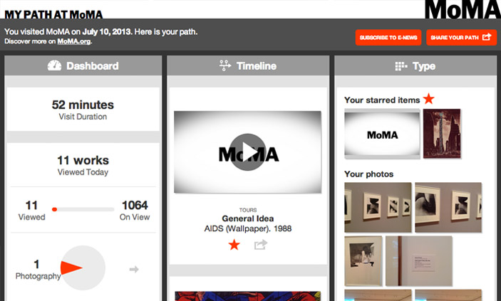
Post visit, I was emailed a link to My Path at MoMA; it is elegantly designed and responsive to screen size so is just as comfortable to view on a mobile device as it is on the desktop.

My Path at MoMA

Screen capture of My Path at MoMA

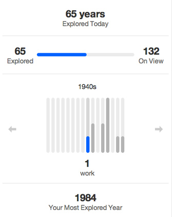
In My Path there are three different categories, Dashboard, Timeline, and Type. Dashboard gives a handful of metrics about the visit — duration (52 mins), works viewed (11 out of 1064), artists viewed (14 out of 590), and years explored (65 out of 132). My first thought: “What?! I saw more than 11 works!” I like what Dashboard tells me, but it is an incomplete story and I want to know more. Now that I’m back at my desk and I’ve walked through about ten doorways, my memory is fuzzy. What are these 11 works that I allegedly viewed and how is the guide determining what I did or did not see? 1984 is supposedly my Most Explored Year, well, what was it I saw from 1984?

Years Explored

Screen capture of the years explored section of My Path

The Timeline and Type sections show the stuff I did within the guide: audio listened to, photos taken, and items searched for. Same content in each section, just sorted differently. It’s really great to see, and excellent to have it all on one place. However, this is where I think there is a big opportunity lost from an interaction design perspective. I can play the audio tours in the My Path interface, but the links do not take me to the MoMA website where I can get more information about the artists, related works, etc. Basically, all of the functionality in the Audio+ mobile guide that made it easy to contextualize and relate individual works within a greater context is lost when I am back at my desk and most able to use it. I prefer to have more content and connections available when I’m at home processing my visit (and have a full sized monitor to use), but the Audio+ experience gives you the most content when you are on site (and looking at a tiny screen) and takes it away when you leave.

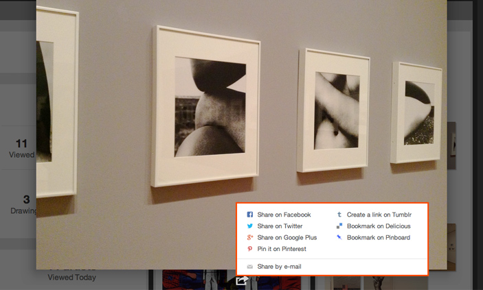
There are some errors with the My Path interface and I assume that some of these are tweaks being worked out. For example, when I open a photo, the sharing options are convenient, but they don’t include an option for downloading the original. Even the email link, which I expect will email me the photo, just sends a link to My Path. This again brings me to the point that with something like this, users shouldn’t have to think.

Photo share options

Screen capture of the photo share options in My Path

Beyond my gripes, let me say that overall my experience with the Audio+ was a strong positive. I generally hate using audio guides (because they are generally boring and clunky) but kudos to the folks behind the Audio+ because this first iteration is fun to use and provides delightful content above and beyond what I am used to. There is huge potential both with the guide and with the post-visit interface and I look forward to giving it another go in a few months once they have had a chance to work out the bumps.