
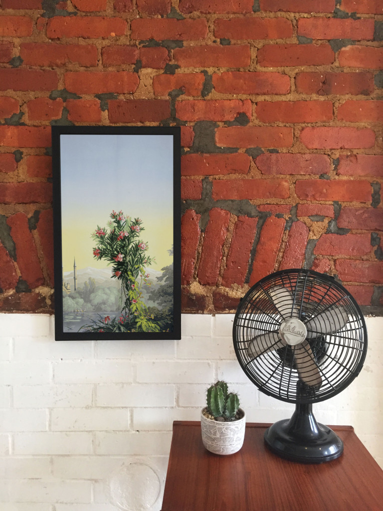
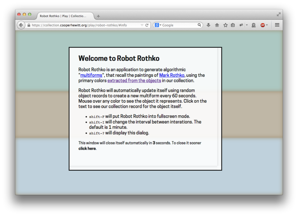
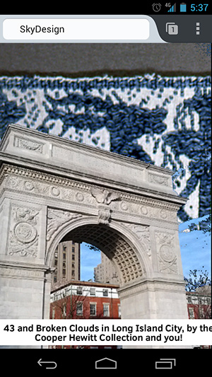
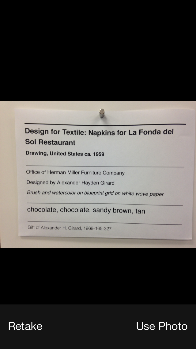
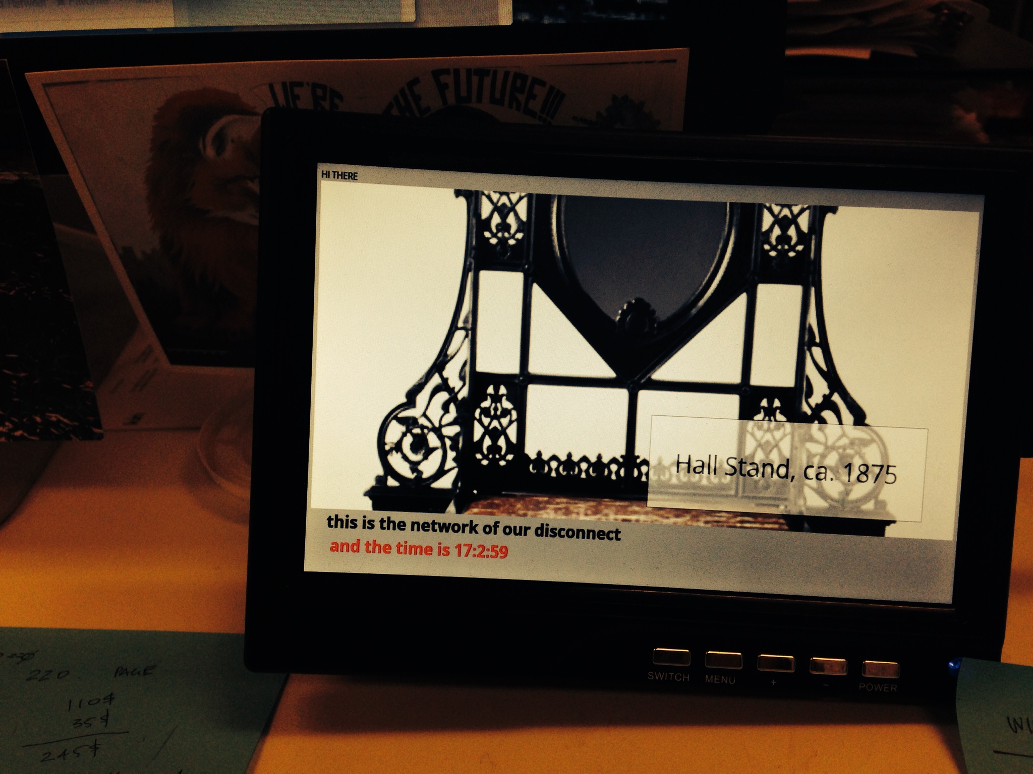
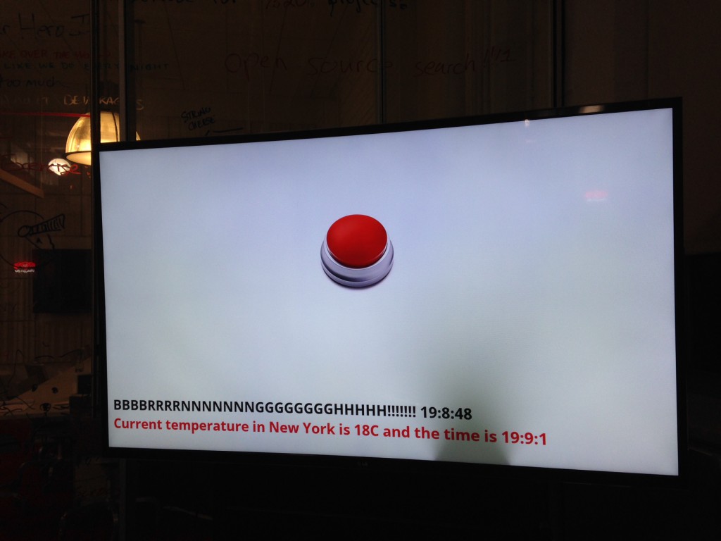
Scenic panel El Dorado, designed by Joseph Fuchs, Eugène Ehrmann and Georges Zipélius and manufactured by Zuber & Cie , 1915-25, Gift of Dr. and Mrs. William Collis. From Cooper Hewitt Collection displayed on an EO1. Photo by Zoe Salditch
One of the cornerstones of Cooper Hewitt’s very visible digital strategy has been promiscuity. From the first steps in early 2012 when the online collection was released, we’ve partnered with many people from Google Art Project and Artsy to Artstor and now Electric Objects.
Electric Objects is a little different from the others in that we’ve worked with them to share a very select and small number of collection objects, much in the way that Pam Horn and Chad Phillips have worked to grow the museum’s ‘licensed product’ lines of merchandise.
Electric Objects is a New York startup that raised a significant amount of money on Kickstarter to build and ship a ‘system for displaying digital art’. Jake Levine, Zoe Salditch and their team have now developed the EO1 into a small ecosystem of screens deployed in the homes and offices of about 2500 ‘early adopters’ and digital artists who have been creating bespoke commissions for the system.
Cooper Hewitt joined the New York Public Library in providing a selection of collection materials to see what this community might make of it – and, internally, to think about what it might mean to have a future in which digital art might become ‘ambient’ in people’s homes.
I spoke to Jake and Zoe late last week in their office in New York.
Seb Chan – I like how the EO1 has ‘considered limitations’ – the lack of a slideshow mode, the lack of a landscape mode – can you tell us a bit more about what went into these decisions? And now that EO1s are in homes and offices around the world, what the response has been like?
Jake Levine – Computing has for the last 50 to 60 years been characterized by interaction, generally for the sake of productivity or entertainment. Largely as a result, we’ve built software whose basis for success is defined by volume of interaction. Most companies start with: ‘how often can we get users to engage with our product? ‘
What we’ve been left with is a world filled with software competing for our attention, demanding our interaction. And we feel like crap. We feel overwhelmed.
EO1 was an experiment in a kind of computing that, by definition, could not demand anything from us. We asked whether we could build a computer that brought value into its environment without asking for user interaction. How do we ensure that the experiment remains valid? We make interaction impossible. You can’t ‘use’ EO1, just like you can’t ‘use’ art.
In the interest of exploring a different kind of computing, we made sure not to take any existing software paradigms for granted. The slideshow, of course, is ubiquitous in digital photo frames, to which we are often compared. For that decision, we went back to first principles — why? Why do we want slideshows? My experience with slideshows is characterized by distraction. The image changes, it catches my eye, it interrupts my conversation. Change demands our attention.
We say we want slideshows, but how much of that has to do with expectations informed by how screens have behaved in the past, without enough time spent thinking about how they might behave in the future? We’re so accustomed to the speed of the web, that even while we complain about it, when we’re presented with an alternative, we decide that we miss it.
But what is the value of change on the Internet? For me it’s not about randomness, it’s not about timers and playlists and settings. Change at its most meaningful happens in social contexts, in software that lives on top of a network, where ephemerality is actually just conversation, people talking. Twitter, Facebook, Instagram, Tumblr — these services aren’t an overwhelming flood of information, they are people talking to each other, and that’s why we keep coming back.
So you will likely see change enter the Electric Objects experience in the future, but it won’t be programmatic. It will be social.
Electric Objects, like all networked media discovery software, is a shared experience. And that’s also why we lack landscape. It’s important that everyone experiences Electric Objects in the same way, to create a deeper connection among its members. It also makes for a better user experience.
SC – Defaults matter, I think we all learned that from Flickr, and I really like that EO1 is ‘by default’ Public. This obviously limits the use of the EO1 as a digital photo frame, so what sort of things are you seeing as ‘popular’?
JL – People love water! So many subtly moving water images! But beyond the collective fascination with water, a lot of people are displaying the artwork we’re producing for Art Club, our growing collection of new and original art made for EO1 (including the awesome collection of wallpaper from Cooper Hewitt!).
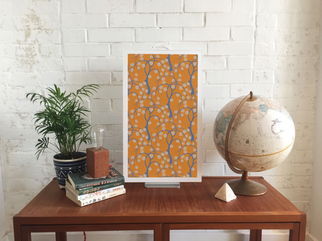
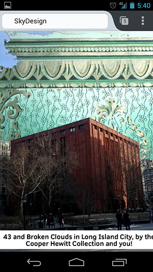
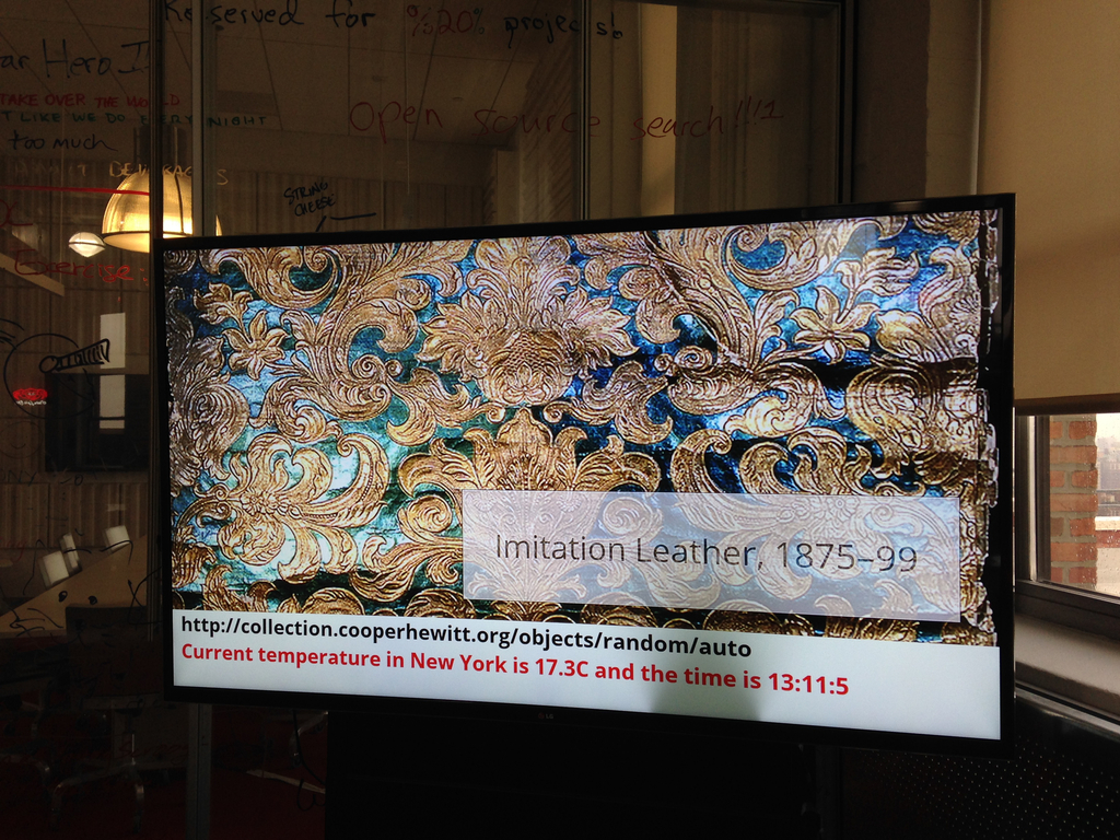
Sidewall, wallpaper with stylised trees, ca 1920, designed by René Crevel and manufactured by C. H. H. Geffroy and distributed by Nancy McClelland, Inc. Gift of Nancy McClelland. From Cooper Hewitt Collection displayed on an EO1. Photo by Zoe Salditch.
SC – Cooper Hewitt joined the Art Club early on and we’re excited to see a selection of our historic wallpapers available on the device. This wasn’t as straight forward as any of us had expected, though. Can you tell us about the process of getting our ‘digitised wallpapers’ ready and prepared for the EO1?
JL – When you’re bringing any art onto a screen, you have to deal with a fixed aspect ratio. Software designers and engineers know the pain of accommodating varying screen sizes all too well. In many ways what we offer artists — a single aspect ratio across all of our users — is a welcome relief. What’s more challenging is “porting” existing work into the new dimensions.
Wallpapers were actually a great starting point, because they’re designed to be tiled. Still, we hand cropped and tiled each object, to ensure an optimal experience for the user (and the art!).
SC – Our friends at Ghostly and NYPL took a slightly different route. Can you tell us about how both of those collaborators chose and supplied the works that they have made available?
JL – Ghostly is a label that represents a fantastic group of artists and musicians. Together, we selected a few artists to participate in the Ghostly x EO collection, featuring original work made specifically for Electric Objects.
And NYPL was somewhere between Ghostly and what we did with Cooper Hewitt. NYPL has this incredible collection of maps that they’ve digitized. We knew we didn’t want to simply show a cropped version of the maps on EO1, so we turned to the artist community, and starting taking proposals. We asked: what would you do with these beautiful maps as source material?
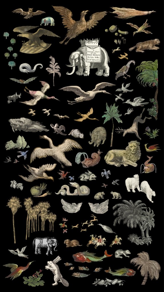
Natural Elements by Jenny Oddell from the NYPL x EO Collection
Jenny Odell produced an incredible series of collages. She spent ninety-two hours cutting out the illustrations that cartographers often include on the edges of the maps in photoshop — these beautiful illustrations that rarely get any attention since the maps have a primarily functional purpose. In this case we used something old to make something new, something designed with and for the screen. It was perfect.
SC – Art Club feels like it could be sort of a ‘Bandcamp for net art’. I know you’ve been commissioning specific works for the EO1 and making sure artists get paid, so tell us more about how you see this might work in the future?
Zoe Salditch – Without art, EO1 would just be any other screen. And we’ve known since the early days that art made for EO1 is always a better experience.
There are many ways people engage with and have historically paid for art, so we’re exploring a couple different ideas. Right now, we commission artists upfront and ask them to create small series for EO1, and this collection is available for free for EO1 owners for now. Our plan is to eventually put this ever-growing collection behind a subscription, so that the customer can subscribe to gain access to the entire collection.
Other strategies we’re exploring include limited editions, and a commission service for those who want to have something that feels more exclusive and custom. We believe that artists should be paid for their work, and that people will pay for great art. Other than that, we’re open to experimenting, and we have a lot to learn from our community now that EO1 is out in the wild!
SC – Cooper Hewitt’s wallpapers have been up for a little while as you’ve been shipping out units to Kickstarter backers. What can you tell us about how people have been showing them? What sorts of stats are we looking at?
JL – Art from the Cooper Hewitt collection has been displayed 783 times in homes all over the world, with an aggregate on-display time of over 217 days! The three El Dorado scenic panels have been most popular!
Explore the Cooper Hewitt objects available for ambient viewing through Electric Objects, to visit Shop Cooper Hewitt in-store at 2 East 91st in New York to buy an EO1 unit from the museum tax-free [sorry, not currently available via our online store].


