The Labs team had a great time at Museums and the Web this year. We published two papers for the conference and presented them both to the audience of cultural heritage thinkers, makers, planners and administrators. Sam Brenner and I shared our paper, “Winning (and losing) hearts and minds of museum staff: Administrative interfaces at Cooper Hewitt,” which outlines the process of designing, developing and iterating two in-house built, staff-facing tools: Tagatron and the Pen Pairing Station. Both administrative tools are essential aides to staff managing new responsibilities associated with visitor-facing gallery technologies.
Here is the deck from our presentation:
Introduction
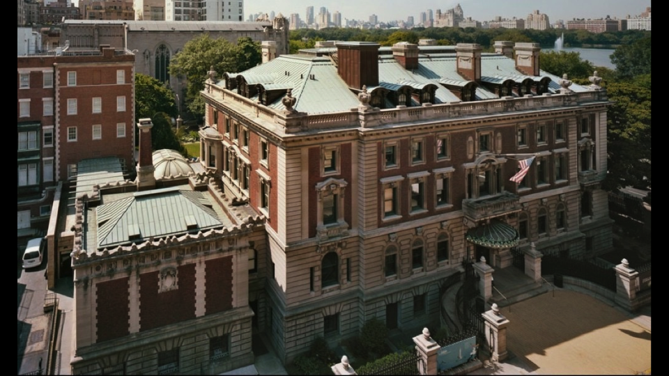
- Cooper Hewitt, Smithsonian Design Museum. New York, New York.
- Our strategy around presenting design is to expose process—how things are made, how they are conceived, how they are designed.
- This presentation will speak to our philosophy of openness around design process in sharing part of the back-story of how our current visitor-facing experience came together and how it’s maintained.
Visitor Interfaces
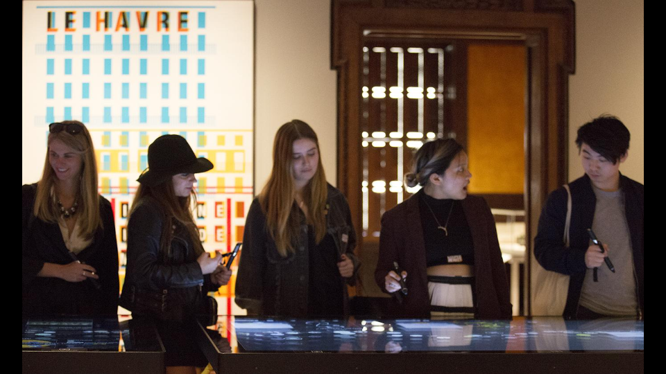
- The visitor-facing technologies in the museum, introduced in 2014, invite new forms of engagement with the Cooper Hewitt collection. They encourage active participation, letting visitors play, design and collect through multi-touch table applications and the Pen.
- Before we were able to re-design the visitor’s relationship to the museum we went through comprehensive changes at every level.
Comprehensive Re-design / Institutional Shift
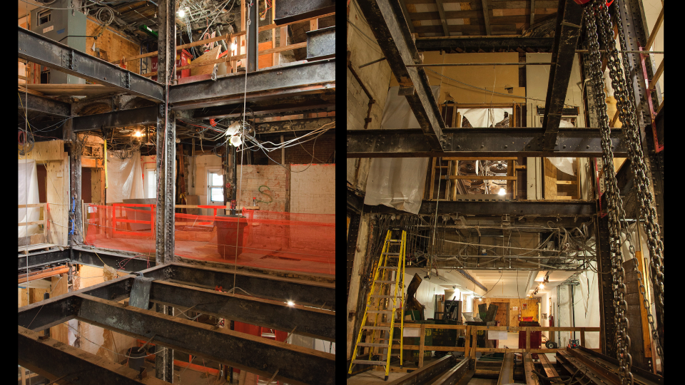
- We began a restoration of the mansion, stripping it down to its Carnegie steel girders.
- To a similar degree we rethought the organizational infrastructure of Cooper Hewitt with a comprehensive re-design of operations, workflows and responsibilities.
New Responsibilities (for Everyone)
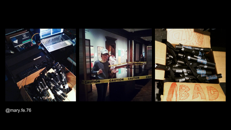
- There were new jobs created to support the new visitor experience, including that of our Gallery Technology Manager, Mary Fe, whose job responsibilities include maintaining the Pens and troubleshooting touch tables and gallery interactives
- The re-design affects every staff member at Cooper Hewitt:
- Registrars: aggressive timetable to enter data
- Security: understand the mission and visitor experience, teaching visitors on pen usage
- Exhibitions: label programming, maintenance
- Curators: tags, relations, chat formatting for length
- Visitor services: pen pairing – whole new step in between “welcome” and ticket sale
- Before we got to this stage there was the task of onboarding staff to new responsibilities, which fell largely to the Digital & Emerging Media department. With the allocation of new responsibilities also came the opportunity to create tools that could facilitate some of the work.
Defining the Need for Considered Interfaces
- Why did we decide that new interfaces were necessary in certain parts of the workflow?
- We started with observation, watching workflows as they emerged. We created tools to assist where necessary. The need for interfaces was in part logistical, in part technical and also in part human.
- Candidates for interface development are parts of the new digital ecosystem where there is:
- High volume of data
- Large number of users
- Complex tasks
- Something that needs constraints or enforcement
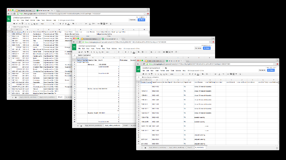
- Example: the job of assigning tags and related objects to everything we put on display for the reopening. The touch table interfaces utilize tag and related object information. This data does not live in TMS, so it is housed in a custom database.
- The task of creating the data fell to the curators. Originally this was stored in Excel files. While the curators were happy using spreadsheets, we identified a few major issues with them. The biggest one was that every department had devised their own schema for storing the data, which would ultimately have to be reconciled
- This example fits all of the criteria above.
Case Study 1: Tagatron
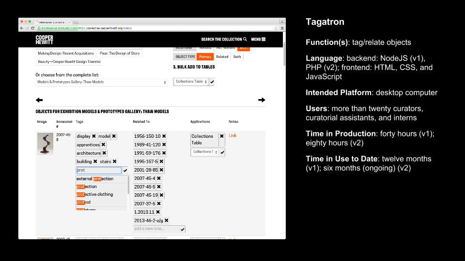
- Explicit purpose of the Tagatron tool: make the work quicker; make the metadata consistent; make the organization of the metadata consistent
- Making this tool highlighted for the digital team the complex relationship between the work, the tool, and the people responsible for each—even though we believed the tool made things easier, the tool had its own set of ongoing technical and usability issues
- We found that those issues propagated an amount of distrust or lack of confidence in the larger project. Some of these were due to bugs in the tool, but some of it was just that now it was known that this was work that would be “enforced” or taken more seriously, which made users uncomfortable.
- Key idea: the interface takes on a symbolic value in representing “new responsibilities” and can bring about issues that it might not have been designed to address. It takes on a complex position between human needs and technical needs.
Tagatron (continued)
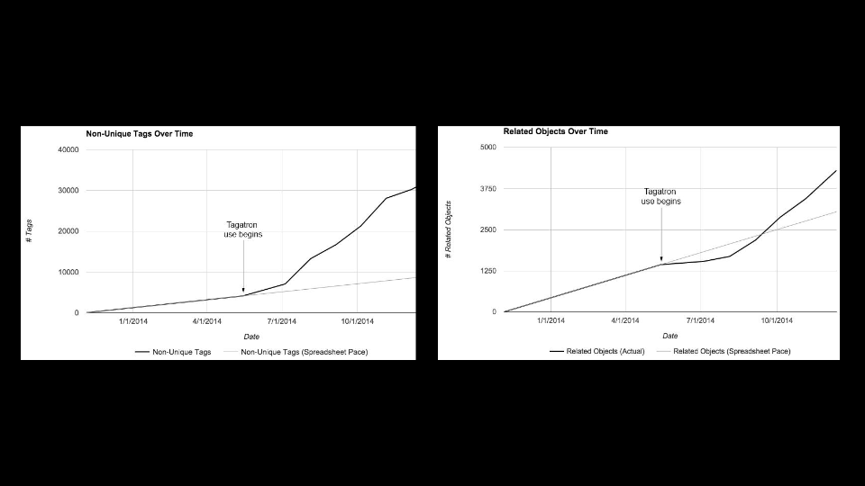
- These graphs illustrate how prolific the task of tagging and relating objects is. It was important to build Tagatron because it is crucial tool in the ongoing operation of the museum’s digital experience. More so than the spreadsheets ever could, it allows for scalability.
- Since the re-opening the tool went through one major design and backend overhaul, and continues to see small iterations.
Case Study 2: Pen Pairing Stations
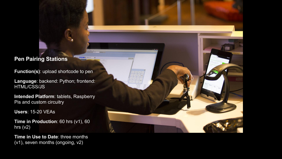
- Context of Pen Pairing: Every visitor to the museum receives a Pen. At the museum’s front desk each Pen is paired with a unique admission ticket. Every ticket has a shortcode identifier that allows visitors to retrieve their Pen visit data online when they enter the code on their ticket.
- Pen pairing is done at a very critical point in the visitor experience when the interaction needs to be quick and frictionless. Visitor Services Associates have to coordinate a number of simultaneous tasks.
Pen Pairing Station (continued)
- This video depicts the Pen pairing process behind the front desk. It documents the first version of the Pen Pairing application, and shows the exposed Pen-reading circuit board before housing was built.
- Pen pairing is one of the most demanding of the new responsibilities created by the “new experience”–has to fit between welcoming a visitor, taking their money, answering any questions, looking up their member ID.
- Each use of the tool only lasts 5-10 seconds but we’ve spent many hours and built many versions of this tool to figure out exactly what needs to happen in that time to accomplish all the tasks, including updating databases, handling failures, serial communication
- Every one of these iterations gave us an opportunity to be connected to the staff using the tools, not only to make something that works better, but to be a part of the conversation
Administrative Interfaces: What does success look like? How does it feel?
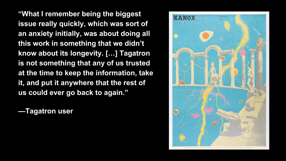
- In informal interviews with Tagatron users we found trust to be a central theme of users’ response to the interface
- Since Tagatron augments the curators’ use of TMS, they were less trusting of its database as a long-lasting data repository
- Improving user feedback (like confirmation messages) helped build trust in the interface
- Bill Moggridge, Designing Interaction: designing interaction is designing the relationship between people and things
- We came to realize the responsibility of designing interfaces—validating and responding to users’ concerns; acknowledging the burden of new responsibilities
- Administrative interfaces at the crux of the staff relationship to the new Cooper Hewitt experience
- Anticipating issues in developing and maintaining administrative interfaces (when success feels like failure):
- First, the human factor: being open to the feedback and creating an environment where the channels exist to communicate staff thoughts on the tool.
- Second, the technical factor: being able to act on what you hear from staff and make the required changes to complete the feedback loop.
- Our responsibility as facilitators of technology in the museum to hear and act on concerns.
Questions to ask when starting an administrative application to anticipate issues and accommodate of feedback.
Question 1: To what degree should the (administrative) tool fit with pre-existing notions?
- This question addresses the need to understand contextual use of the tool
- Tagatron: curatorial culture around spreadsheets and TMS
- Pen Pairing Station: this tool disrupted the expected ticket selling workflow. We learned the that the tool needed to make Pen Pairing as unobtrusive as possible
Question 2: How much of the underlying technology should come through to the interface?
- Infrastructure & interfaces are layers of an onion—the best mental model for a tool’s interface might not reflect the best technical model for its back end
- Tagatron: the filtering tools were a reflection of how data was stored in the database, not how curators expected it
- Pen Pairing Station: error messages from all parts of the application stack came through to the user unaltered, this was not helpful to users
- Highlights the need for a technical solution that allows for flexibility in the middle, “translation layer” of an application
Question 3: What kinds of feedback does the tool provide?
- Feedback is the voice of the interface/ its personality–is it finicky or reliable? Annoying or supportive?
- Tagatron: missing feedback created distrust
- Pen Pairing: too much feedback caused confusion (error messages, validation handshake)
- Our design and production methodology: working code always wins/ learning through doing; build small, working prototypes and continually iterate.
- A more anticipatory form of design (like design thinking) could have helped us find answers to this question sooner
Question 4: Is it an appropriate time for experimentation?
- Tagatron’s v1 included relatively unknown-to-us technology like MongoDB and nodejs. We should have used more familiar technology or done small-scale tests before implementing a project of this scale–it severely hindered our ability to accommodate feedback
- Other tools we built that involved experimental tech were only successful because their scale and userbase were far smaller (label writer)
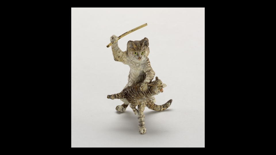
The result of everything: bridges, lines of communication opened
- Building administrative tools for staff created cross-departmental conversation—in taking on the role of building and maintaining Tagatron and the Pen Pairing Station, the Digital & Emerging Media team engaged users from departments across the museum and observed closely how the tools fit into staff members’ larger roles
