First, let me begin this post with a hearty “hello”! This is my first Labs blog post, though I’ve been on board with the Digital and Emerging Media team since July 2015 as Media Technologist. Day-to-day I participate in much of the Labs activity that you’ve read about here: maintaining and improving our website; looking for ways to enhance visitor experience; and expanding the meaningful implementation of technology at Cooper Hewitt. In this post I will focus on the slice of my work that pertains to video content and exhibitions.
The topic of exhibition video is fresh in my mind since we are just off the installation of Beauty—Cooper Hewitt Design Triennial. This is a multi-floor exhibit that contains twenty-one videos hand-picked or commissioned by the exhibition curators. My part in the exhibition workflow is to format, brand, caption and quality-check videos, ushering them through a production flow that results in their display in the galleries and distribution online. Along with the rest of the Labs team, I also advise on the presentation and installation of videos and interactive experiences in exhibitions and on the web, and help steer the integration of Pen functionality with exhibition content. This post gathers some of my video-minded observations collected on the road to installing Beauty.
The Beauty curators and the Labs team came together when content for the show began to arrive—both loans of physical objects and digital file transfers. At this time, my video workflow shifted into high gear, and I began to really see the landscape of digital content planned for the exhibit. Videos in Beauty fall into roughly two categories: those that are the primary highlighted object on display and those that supplement the display of another object. Sam Brenner recently posted about reformatting our web presentation of video content when it stands in as primary collection object and has a medium that is “video, animation or other[wise] screen-based.” This change was a result of thinking through the flag we raised earlier for the curators around linking collection records to tags, i.e. “what visitors get when they collect works with the Pen.” As has been mentioned before on this blog, the relationship of collecting points (NFC tags) to collection objects does not need to be one-to-one; Beauty expanded our exploration of the tags-to-collection records relationship in a few interesting ways.

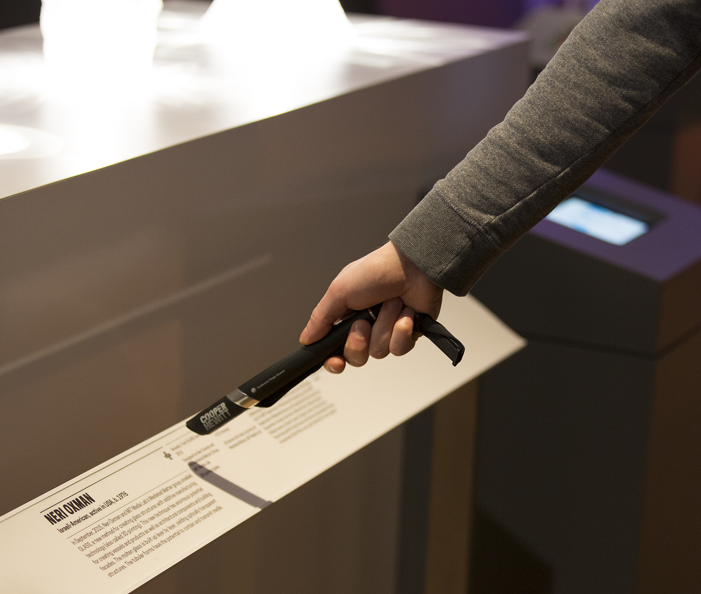
When visitors collect at the Neri Oxman tag they save a cluster of collections database records, including 12 glass vessels and a video.
In the Beauty exhibition, collecting points are presented uniformly: one tag in each object label. Additionally, tags positioned beside wall text panels allow visitors to save chunks of written exhibition content. The curatorial format of the Triennial exhibition organized around designers (sometimes with multiple works on display), however, encouraged us to think carefully about the tag-collecting relationship. I was impressed to see the curators curating the Pen experience, including notes to me along with each video, like “the works in the show are jewelry pieces; the video will supplement,” “video is primary object; digital prints supplement,” and “video clips sequenced together for display but each video is separately collectible.” They were really thinking about the user flow of the Pen and the post-visit experience, extending their role in organizing and presenting information to all aspects of the museum experience.
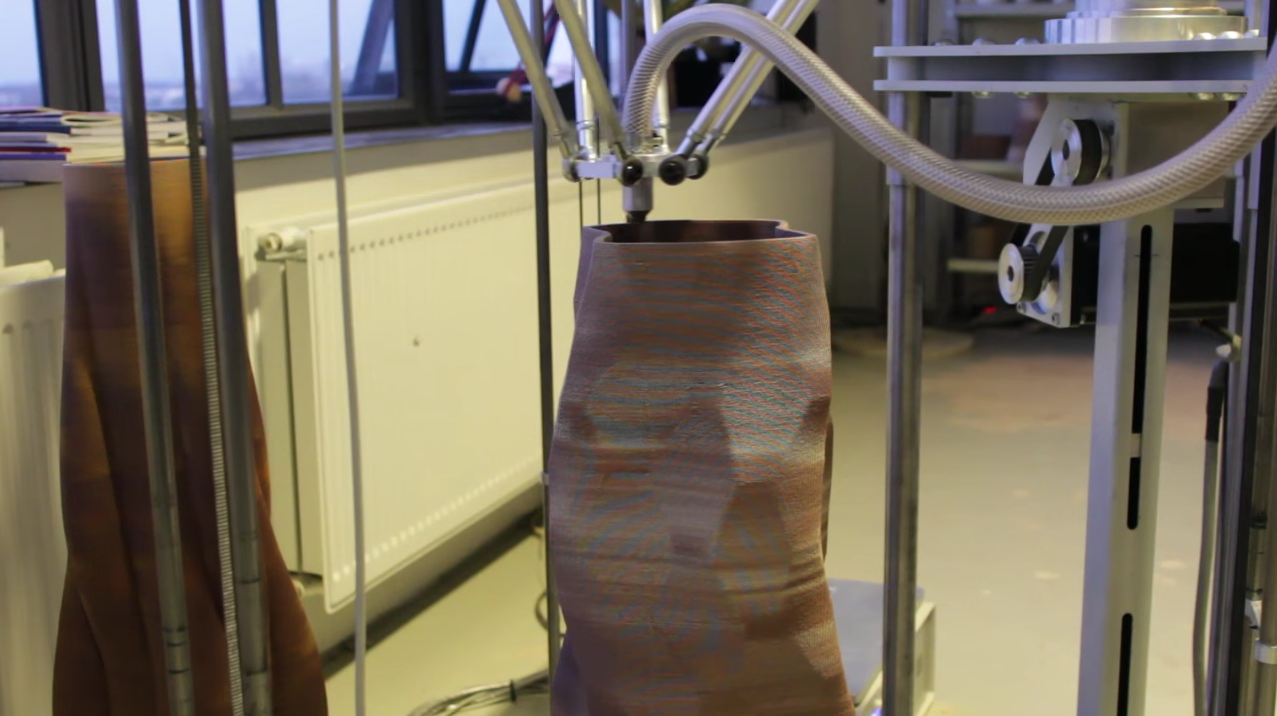
Another first in the Beauty exhibition is the video content created specifically for interactive tables. With the curators’ encouragement, the designers featured in the exhibition considered the tables as a unique environment to present bonus content. For example, Olivier van Herpt provided a video of his 3D printer at work on the ceramic vessels on display in the exhibition. It was interesting to see the possibilities that the tables and post-visit outlets opened up—for one thing, the quality standards can be more relaxed for videos shown outside the monitors in the galleries. Also notable is the fact that the Beauty curators selected behind-the-scenes-type videos for tables and post-visit, suggesting that these outlets make room for content that might not typically make it onto gallery walls.

The video “3D Printed Ceramic Process” by Oliver van Herpt is an example of behind-the-scenes video content that was made for tables and website display only.
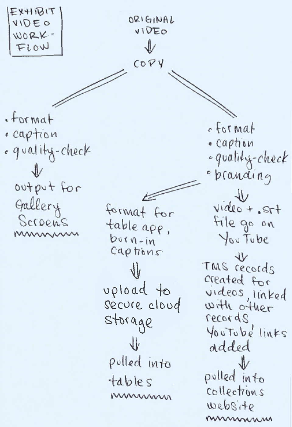
The practical fallout on my end was that these supplemental videos added to the already video-heavy exhibition, putting increased pressure on the video workflow. In turn, this revealed a major lack of optimization. The diagram of my video workflow shows, for example, several repeated instances of formatting, captioning and exporting. Multiplied by twenty-one, each of these redundant procedures takes up significant time. Application of branding is probably the biggest time-hog in the workflow—all of it is done manually and locking in the information of maker, credit line and video title with curators and designers is a substantial task. It’s funny, the amount of video content is increasing in exhibitions at Cooper Hewitt and it’s receiving increased attention from curators, but the supplementary videos in the galleries are not treated as first-order exhibition objects, so they don’t go through as rigorous a documentation process as other works in the show. Because of this, video-specific information required for my workflow remained in flux until the very last minute. Even the video content itself continued to shift as designers pushed past my deadlines to request more time to make changes and additions. In truth, the deadlines related to in-gallery video content are much stricter than those for table/post-visit-only content because gallery videos require hardware installation. The environment of the tables and website afford continual change, but deadlines act as benchmarks to keep those interfaces stocked with new content that stays in sync with objects in the physical exhibition.

The workflow that videos follow to get to gallery screens, interactive tables and the collections website.
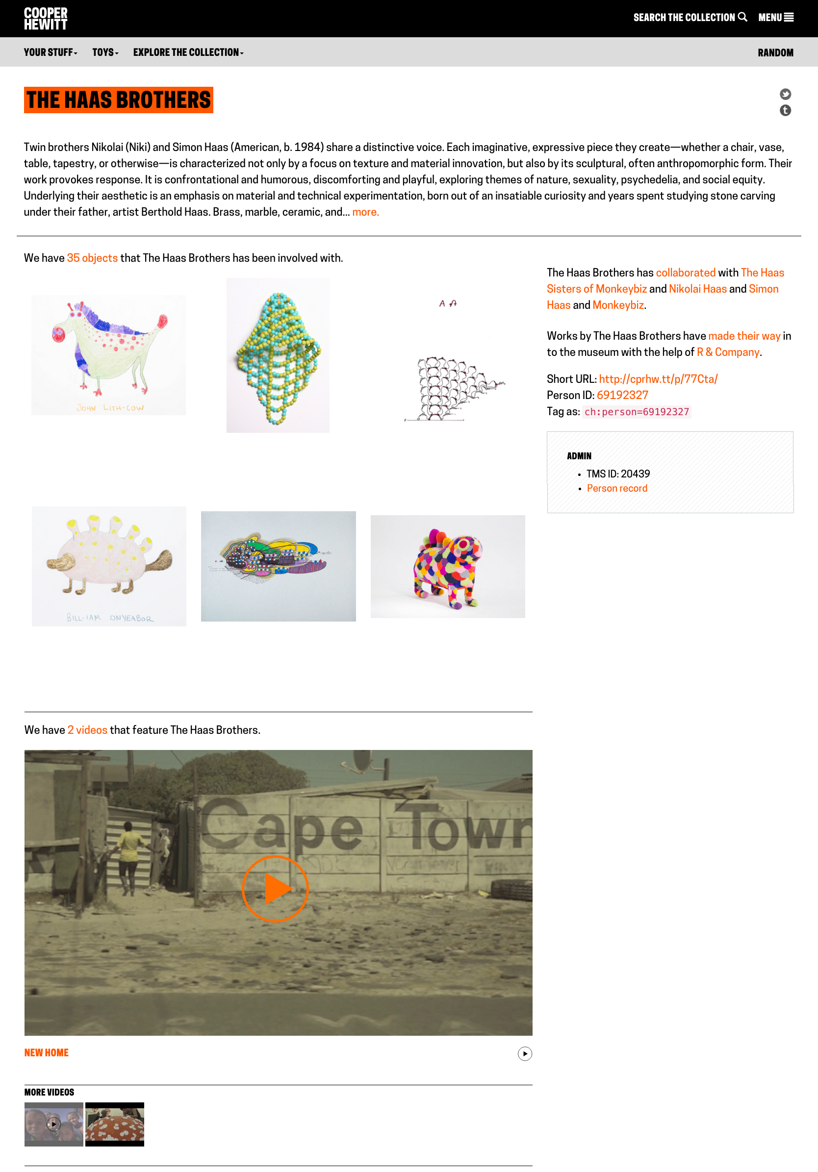
By the exhibition opening, I had all video information confirmed, and all branding and formatting completed. The running spreadsheet I keep as a video to-do list was filled with check-marks and green (good-to-go) highlighting. I had created media records in TMS and connected them to exhibition videos uploaded to YouTube; this allows a script to pull in the embed code so videos appear within the YouTube player on the collections site. I also linked the media records to other database entries so that they would show up on the collections site in relation to other objects and people. For example, since I linked the “Afreaks Process” video record to all of the records for the beaded Afreak objects, the video appears on each object page, like the one for The Haas Brothers and Haas Sisters’ “Evelyn”. Related videos like this one (that are not the primary object) are configured to appear at the bottom of an object page with the language, “We have 1 video that features Sculpture, Evelyn, from the Afreaks series, 2015.” Since the video has its own record in the database, there is also a corresponding “video page” for the same clip that presents the video at the top with related objects in a grid view below. I also connected object records to database entries for people, ensuring that visitors who click on a name find videos among the list of associated objects.
It is highly gratifying to seed videos into this web of database connections. The content is so rich and so interesting that it really enhances the texture of the collections site and of exhibitions. Cooper Hewitt curators demonstrated their appreciation for the value of video by honoring video works as primary objects on display. They also utilized video in a demonstrative way to enhance the presentation of highlighted works. Beauty opened the doors for curating video works on interactive tables, and grouping videos in with clusters of data linked to collecting points (aka. tags). I’m pleased with the overall highly integrated and considered take on video content in the latest exhibition, and I hope we can push the integration even further as the curators become increasingly invested in adapting their practice to the extended exhibition platforms we have in place like tables, tags and web.


