Author Archives: Seb Chan

About Seb Chan

Seb Chan was the inaugural Director of Digital & Emerging Media (2011-2015) and the founder of the Labs. He likes imaginary creatures and overly sweet beverages. You may already have met him and you can find him on the other side of the world at Fresh & New.

Slowly improving Copyright clarity

Ever since the online collection first properly went live in 2012 our collection images had a little line under them that said “please don’t steal our images, yeah?”. Whilst it was often commented that this was a friendly, casual approach that felt in keeping with the prevailing winds of the Internet, the statement was purposely vague and, at the end of the day, pretty unhelpful.

screencap-cooper-hewitt-rights.jpg 1,181×570 pixels

After all, “what is ‘stealing’ an image”? “Isn’t the Smithsonian, as a public institution, already owned by the ‘public'”? “What about ‘fair use'”? And, as many pointed out, “why are you claiming some kind of rights over images of objects that are clearly date from before the 20th century?”. Some also spotted the clear disconnect between the ‘please don’t steal’ language and our other visible commitments to open licensing and open source.

First, a bit of history.

The majority of the Cooper Hewitt collection predates its acquisition by the Smithsonian. The collection was originally at Cooper Union until the museum there closed in 1963. It was officially acquired by the Smithsonian in 1968 and the Cooper Hewitt was opened in the Andrew Carnegie Mansion in 1976. The effect of this history is that much of the pre-1968 collection is unevenly documented and its provenance very much still under active research. Post-1976 it is possible to see, in the metadata, the different waves of museum management and collection documentation, as new objects were added to the collection and new collection policies became formalised. Being a ‘new museum’ in 1976 also meant that much of the focus was on exhibitions, not so much on the business of documenting collections. Add to this the rise of computer-based catalogues and you have a very ‘layered’ history.

Cooper Hewitt has not had the resources or staff to undertake the type of multi-year Copyright audits that museums like the V&A have done, and as a result, with provenance and documentation in many cases quite scant, the museum has had to make ‘best efforts’.

With the recent tweaks to the online collection, we have finally been able to make some clarifying changes.

Like all Smithsonian museums, all online content is subject to institution-wide ‘Terms of use‘. This governs the ‘permitted uses’ of anything on our websites, irrespective of underlying rights. These terms are not created at an individual museum level but are part of Smithsonian-wide policy. You can see that whilst these terms allow only ‘allows personal, educational, and other non-commercial uses’ they encourage the use of Fair Use under US Copyright law.

However, that said, we think it is important to be clear on what is definitely out of Copyright, and what may not be. And over time, as the collection gets better documented, more of the unknowns will become known.

So here’s what we have done – its not perfect – but at least its better than it was. And, to be perfectly honest, we’re only talking about the possible rights inherent in the underlying object in the image, as the digital image itself was created by the Smithsonian. Some of the types of object in our collection may not be eligible for Copyright protection in the first place.

For objects from our permanent collection

1. acquired before 1923 then we say “This object has no known Copyright restrictions. You are welcome to use this image in compliance with our Terms of Use.” For example, this medal acquired in 1907.

2. acquired in or after 1923 but has a known creation date [‘end date’ in our collection database] that is before 1923, then we say “This object has no known Copyright restrictions. You are welcome to use this image in compliance with our Terms of Use.” This 1922 textile acquired in 2015 is a good example.

3. acquired in or after 1923 but without a known, documented, creation date [‘end date’ in our collection database], then we say “This object may be subject to Copyright or other restrictions. You are welcome to make fair use of this image under U.S. Copyright law and in compliance with our terms of use. Please note that you are responsible for determining whether your use is fair and for responding to any claims that may arise from your use.” For example this ‘early 20th century’ Indonesian textile.

This scenario is far too common and you will come across objects that clearly appear to be pre-20th century that have not been formally dated, as well as objects that say in their name or description that they are pre-20th century but have not been correctly entered into the database and don’t have their ‘end date’ field completed. An especially egregious example is this 18th century French textile that has incomplete cataloguing. In the collection database it has no ‘end date’ (it should have 1799 as an ‘end date’) and clearly should have no Copyright restrictions.

4. acquired in or after 1923 with a known creation date also in or after 1923 [‘end date’ in our collection database], then we say “This object may be subject to Copyright or other restrictions. You are welcome to make fair use of this image under U.S. Copyright law and in compliance with our terms of use. Please note that you are responsible for determining whether your use is fair and for responding to any claims that may arise from your use.” For example this 2010 wallpaper.

Many of the ‘utilitarian objects’ in our collection – clocks, tables, chairs, much of the product design collection – are legally untested in terms of whether Copyright applies, however in many of these cases other IP protection may apply.

As the US Copyright Office states,

“Copyright does not protect the mechanical or utilitarian aspects of such works of craftsmanship. It may, however, protect any pictorial, graphic, or sculptural authorship that can be identified separately from the utilitarian aspects of an object. Thus a useful article may have both copyrightable and uncopyrightable features. For example, a carving on the back of a chair or a floral relief design on silver flatware could be protected by copyright, but the design of the chair or flatware itself could not. Some designs of useful articles may qualify for protection under the federal patent law.” [source]

For objects on loan from other institutions, companies or individuals

5. irrespective of its known age, we now say “This object may be subject to Copyright, loan conditions or other restrictions”.

As you can see we have had to make some very conservative decisions, largely as a result of the incompleteness of our data and museum records.

If you spot any of these (you could download the entire metadata from Github to programmatically do this), log them with their accession number in our Zendesk and they will be prioritised to be fixed.

Small steps.


—–

Update: Steven Lubar asked us on Twitter to share the number of object records that fall in to each of the categories. Here are those numbers:

Acquired before 1923 32,442
Acquired on or after 1923 and known creation date before 1923 5,232
Acquired on or after 1923 and no known creation date 136,372
Acquired on or after 1923 and known creation date on or after 1923 30,357
Loan objects 13,477

Content sharing and ambient display with Electric Objects EO1

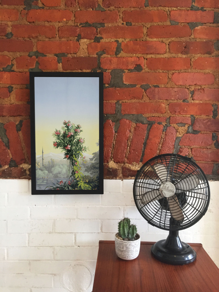
Scenic panel El Dorado, designed by Joseph Fuchs, Eugène Ehrmann and Georges Zipélius and manufactured by Zuber & Cie , 1915-25, Gift of Dr. and Mrs. William Collis. From Cooper Hewitt Collection displayed on an EO1. Photo by Zoe Salditch

Scenic panel El Dorado, designed by Joseph Fuchs, Eugène Ehrmann and Georges Zipélius and manufactured by Zuber & Cie , 1915-25, Gift of Dr. and Mrs. William Collis. From Cooper Hewitt Collection displayed on an EO1. Photo by Zoe Salditch

One of the cornerstones of Cooper Hewitt’s very visible digital strategy has been promiscuity. From the first steps in early 2012 when the online collection was released, we’ve partnered with many people from Google Art Project and Artsy to Artstor and now Electric Objects.

Electric Objects is a little different from the others in that we’ve worked with them to share a very select and small number of collection objects, much in the way that Pam Horn and Chad Phillips have worked to grow the museum’s ‘licensed product’ lines of merchandise.

Electric Objects is a New York startup that raised a significant amount of money on Kickstarter to build and ship a ‘system for displaying digital art’. Jake Levine, Zoe Salditch and their team have now developed the EO1 into a small ecosystem of screens deployed in the homes and offices of about 2500 ‘early adopters’ and digital artists who have been creating bespoke commissions for the system.

Cooper Hewitt joined the New York Public Library in providing a selection of collection materials to see what this community might make of it – and, internally, to think about what it might mean to have a future in which digital art might become ‘ambient’ in people’s homes.

I spoke to Jake and Zoe late last week in their office in New York.

Seb Chan – I like how the EO1 has ‘considered limitations’ – the lack of a slideshow mode, the lack of a landscape mode – can you tell us a bit more about what went into these decisions? And now that EO1s are in homes and offices around the world, what the response has been like?

Jake Levine – Computing has for the last 50 to 60 years been characterized by interaction, generally for the sake of productivity or entertainment. Largely as a result, we’ve built software whose basis for success is defined by volume of interaction. Most companies start with: ‘how often can we get users to engage with our product? ‘

What we’ve been left with is a world filled with software competing for our attention, demanding our interaction. And we feel like crap. We feel overwhelmed.

EO1 was an experiment in a kind of computing that, by definition, could not demand anything from us. We asked whether we could build a computer that brought value into its environment without asking for user interaction. How do we ensure that the experiment remains valid? We make interaction impossible. You can’t ‘use’ EO1, just like you can’t ‘use’ art.

In the interest of exploring a different kind of computing, we made sure not to take any existing software paradigms for granted. The slideshow, of course, is ubiquitous in digital photo frames, to which we are often compared. For that decision, we went back to first principles — why? Why do we want slideshows? My experience with slideshows is characterized by distraction. The image changes, it catches my eye, it interrupts my conversation. Change demands our attention.

We say we want slideshows, but how much of that has to do with expectations informed by how screens have behaved in the past, without enough time spent thinking about how they might behave in the future? We’re so accustomed to the speed of the web, that even while we complain about it, when we’re presented with an alternative, we decide that we miss it.

But what is the value of change on the Internet? For me it’s not about randomness, it’s not about timers and playlists and settings. Change at its most meaningful happens in social contexts, in software that lives on top of a network, where ephemerality is actually just conversation, people talking. Twitter, Facebook, Instagram, Tumblr — these services aren’t an overwhelming flood of information, they are people talking to each other, and that’s why we keep coming back.

So you will likely see change enter the Electric Objects experience in the future, but it won’t be programmatic. It will be social.

Electric Objects, like all networked media discovery software, is a shared experience. And that’s also why we lack landscape. It’s important that everyone experiences Electric Objects in the same way, to create a deeper connection among its members. It also makes for a better user experience.

SC – Defaults matter, I think we all learned that from Flickr, and I really like that EO1 is ‘by default’ Public. This obviously limits the use of the EO1 as a digital photo frame, so what sort of things are you seeing as ‘popular’?

JL – People love water! So many subtly moving water images! But beyond the collective fascination with water, a lot of people are displaying the artwork we’re producing for Art Club, our growing collection of new and original art made for EO1 (including the awesome collection of wallpaper from Cooper Hewitt!).

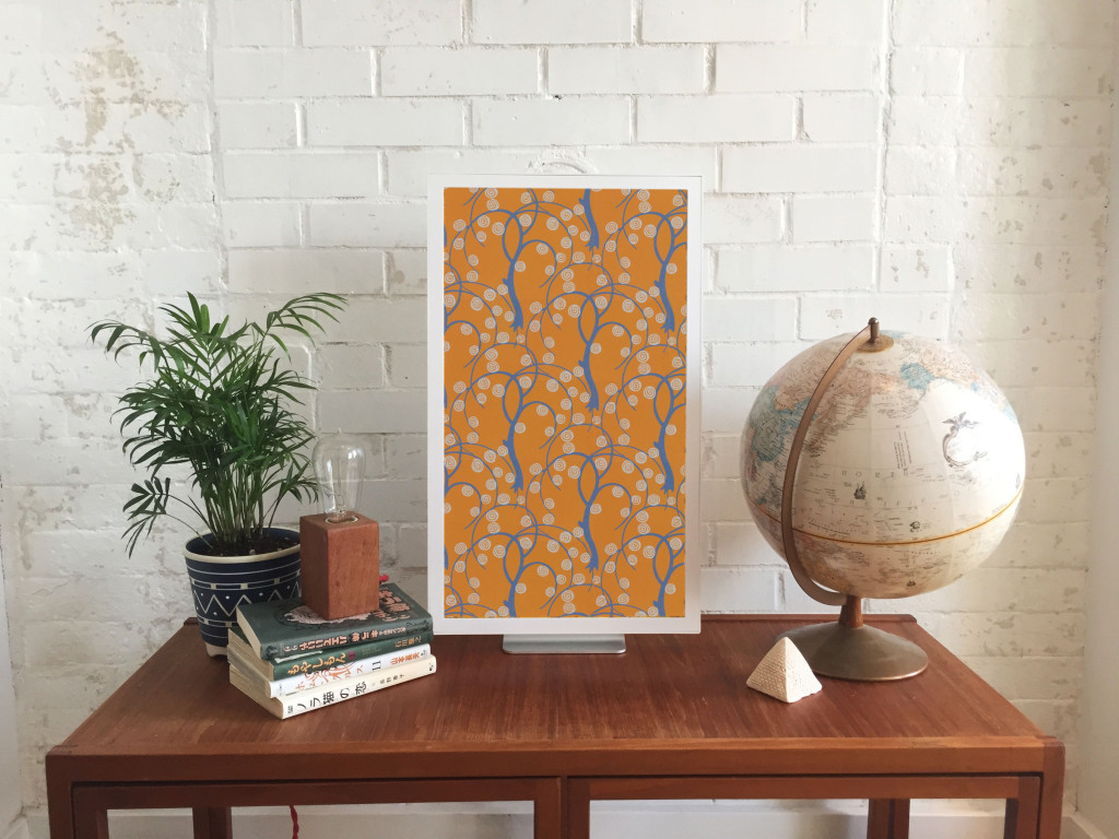
Sidewall, wallpaper with stylized trees, ca 1920, designed by René Crevel and manufactured by C. H. H. Geffroy and distributed by Nancy McClelland, Inc. From Cooper Hewitt Collection displayed on an EO1. Photo by Zoe Salditch.

Sidewall, wallpaper with stylised trees, ca 1920, designed by René Crevel and manufactured by C. H. H. Geffroy and distributed by Nancy McClelland, Inc. Gift of Nancy McClelland. From Cooper Hewitt Collection displayed on an EO1. Photo by Zoe Salditch.

SC – Cooper Hewitt joined the Art Club early on and we’re excited to see a selection of our historic wallpapers available on the device. This wasn’t as straight forward as any of us had expected, though. Can you tell us about the process of getting our ‘digitised wallpapers’ ready and prepared for the EO1?

JL – When you’re bringing any art onto a screen, you have to deal with a fixed aspect ratio. Software designers and engineers know the pain of accommodating varying screen sizes all too well. In many ways what we offer artists — a single aspect ratio across all of our users — is a welcome relief. What’s more challenging is “porting” existing work into the new dimensions.

Wallpapers were actually a great starting point, because they’re designed to be tiled. Still, we hand cropped and tiled each object, to ensure an optimal experience for the user (and the art!).

SC – Our friends at Ghostly and NYPL took a slightly different route. Can you tell us about how both of those collaborators chose and supplied the works that they have made available?

JL – Ghostly is a label that represents a fantastic group of artists and musicians. Together, we selected a few artists to participate in the Ghostly x EO collection, featuring original work made specifically for Electric Objects.

And NYPL was somewhere between Ghostly and what we did with Cooper Hewitt. NYPL has this incredible collection of maps that they’ve digitized. We knew we didn’t want to simply show a cropped version of the maps on EO1, so we turned to the artist community, and starting taking proposals. We asked: what would you do with these beautiful maps as source material?

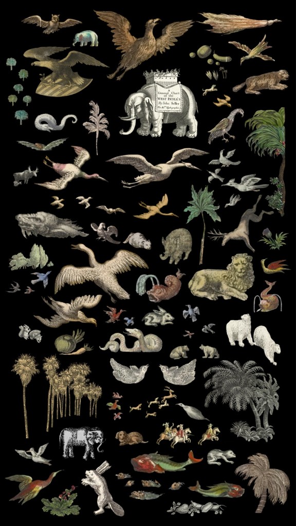
Natural Elements by Jenny Oddell from the NYPL x EO Collection

Natural Elements by Jenny Oddell from the NYPL x EO Collection

Jenny Odell produced an incredible series of collages. She spent ninety-two hours cutting out the illustrations that cartographers often include on the edges of the maps in photoshop — these beautiful illustrations that rarely get any attention since the maps have a primarily functional purpose. In this case we used something old to make something new, something designed with and for the screen. It was perfect.

SC – Art Club feels like it could be sort of a ‘Bandcamp for net art’. I know you’ve been commissioning specific works for the EO1 and making sure artists get paid, so tell us more about how you see this might work in the future?

Zoe Salditch – Without art, EO1 would just be any other screen. And we’ve known since the early days that art made for EO1 is always a better experience.

There are many ways people engage with and have historically paid for art, so we’re exploring a couple different ideas. Right now, we commission artists upfront and ask them to create small series for EO1, and this collection is available for free for EO1 owners for now. Our plan is to eventually put this ever-growing collection behind a subscription, so that the customer can subscribe to gain access to the entire collection.

Other strategies we’re exploring include limited editions, and a commission service for those who want to have something that feels more exclusive and custom. We believe that artists should be paid for their work, and that people will pay for great art. Other than that, we’re open to experimenting, and we have a lot to learn from our community now that EO1 is out in the wild!

SC – Cooper Hewitt’s wallpapers have been up for a little while as you’ve been shipping out units to Kickstarter backers. What can you tell us about how people have been showing them? What sorts of stats are we looking at?

JL – Art from the Cooper Hewitt collection has been displayed 783 times in homes all over the world, with an aggregate on-display time of over 217 days! The three El Dorado scenic panels have been most popular!

Explore the Cooper Hewitt objects available for ambient viewing through Electric Objects, to visit Shop Cooper Hewitt in-store at 2 East 91st in New York to buy an EO1 unit from the museum tax-free [sorry, not currently available via our online store].

5 months with the Pen: data, data, data

Its been five hectic months since the Pen started being distributed to visitors at the ticket counter, and we’ve been learning a lot. We last made some basic stats available at the 100 day mark, but how has usage changed – especially now that almost every area of the museum has been changed over in terms of exhibitions and objects? And what are the tweaks that have made the difference?

Take up rates are improving

March 10 to August 10 total number of times the Pen has been distributed – 62,015
March 10 to August 10 total number of eligible visitors – 65,935
March 10 to August 10 mean take up rate – 94.05%

The Pen launched on March 10, four months after the museum opened its doors, and by the end of March the Pen had a take up rate of 80.44%. By the end of April this had improved to 96.88% and by the end of July to 97.44%. A huge amount of effort by the front-of-house team to improve their scripting and ‘pitch to visitors’ made the difference upfront, and that was backed up by optimisations to the Pen distribution processes later. Late July also saw the introduction of the Pen into Pay-What-You-Wish Saturday evenings which relied a lot on having more streamlined Pen handout processes being implemented. Still to come is the integration of the Pen into education visits and school groups.

Pen usage is improving

March 10 to August 10 total objects collected – 1,394,030
March 10 to August 10 total visitor-made designs saved – 54,029
March 10 to August 10 mean zero collection rate – 26.7%

Not everyone who takes the Pen ends up using it. Some visitors wander around with it but choose not to save anything.

In April we saw a high of 31.28% not using their Pen, and we believe that a sizeable portion of this was actually the result of some backend issues that saw some visitors not being able to ‘write’ the contents of their Pen to their account. We noticed an uptick in “I visited, used the Pen, but there’s nothing when I go to my ticket’ emails coming in to our Zendesk customer service helpdesk. Throughout May and June we tracked down the source of some of these problems and began to resolve them. By the end of July the non-use rate was down to 22.4% and is tracking under 20% for August so far.

Those who do use the Pen, though, use it a lot. The average number of objects saved by a visitor has varied between 33.2 (March) and 26.99 (June) – significantly more than expected. The average number of ‘visitor-made designs’ (wallpapers, 3d models, Sketchbot portraits) has stayed relatively steady at 1.2 per visitor.

Time on campus is stable

March 10 to August 10 mean time on campus – 99.56 minutes

Cooper Hewitt is not a large museum. There’s a lot to do, but it is physically quite small at 16,000 square feet of gallery space. One of the aims of the new museum experience and redesign was to extend the time that visitors spent on site. As the Pen is handed out at the moment of admission and returned upon exit, the time between these two events is a pretty accurate indication of the time each visitor spends in our building (inclusive of shop and cafe).

Month to month the average has oscillated between 91.84 minutes and 104.31 minutes. Because of changes in the way that Pens are collected at the end of the visit, times from July onwards have to be adjusted downwards by 30 minutes. In order to speed the museum exit experience, front-of-house staff clear the Pen deposit box every 30 minutes instead of individually meaning that some Pens may have been sitting ‘unreturned’ for a while.

Post-visit logins need improvement

March 10 to August 10 post visit website retrieval rate – 33.8%

Each ticket that is paired with a Pen contains a unique URL which allows a visitor to login after their visit to see what they collected and designed. For well over 20 years this has been seen, perhaps misguidedly, as the holy grail of museum experiences – “they came to the museum and they enjoyed themselves so much, they went back to the website for more afterwards”. Falk & Dierking, amongst others, have emphasised that visitors recall their museum visits as an amalgam of experiences and often not in the categories or strict differentiations of specific exhibitions, programs, or objects that museum professionals expect.

For the first 4 months, March through June, the percentage of visitors retrieving their visit data from the unique URL on their ticket was flat at 35%. In July we started to see this drop to 30.65%. We’re looking into some of the potential causes for this drop – this may be related to the Pen box at the exit operating in a less-staffed mode (previously every Pen was collected by a front-of-house staff member who would verbally remind the visitor to check out their visit using the URL on their ticket as they left the museum). We will soon be trialling a slightly redesigned ticket with a simpler, clearer call-to-action and URL, as well as better exit signage as a reminder.

That said, these figures for post-visit access are vastly better than most other known initiatives in the museum sector where post-visit web use is usually well under 10%.

Soon, too, the post-visit experience online will see some small tweaks and improvements deployed that will make it easier to navigate, explore, and export your visit.

Surprises

Visitors continue to surprise us. Many of the creations that are being drawn in the Immersion Room are astounding in their complexity and they remain a firm favourite on social media. A simple look at Instagram photos posted from our location make it very clear that visitors love the interactivity and the ability to ‘put themselves into the museum’. Popular objects, too, continue to be a balance of ‘unexpected gems’ and ‘known favourites’.

We’re in the process of drawing up some maps that will help us visualise the distribution of ‘popularity’ throughout the physical gallery spaces. This sort of spatial visualisation, coupled with new data as the objects on all three floors of the museum are switched out for new exhibitions, will help the museum differentiate between the effect of ‘location as an attractor’ [are things closer to doors/thresholds more popular than things in the middle of the room etc], ‘aesthetic qualities as an attractor’ [are bold objects more popular than more subtly displayed/lit objects], and the influence of ‘known classics’ or the concept of ‘landmark objects’ in design of exhibitions (see the work of Stephen Bitgood).

We’re also interested in sequencing. What order do visitors move through spaces? Does this change by visitor-type or by the type of exhibitions on view? How long does it take before visitors of different types take to make their ‘first collection’?

So many questions!

You can always keep an eye on the top line numbers and very basic Pen statistics on our site, and Labs will continue to blog results at periodic milestones.

The digital experience at Cooper Hewitt is supported by Bloomberg Philanthropies.

100 days

Museum Stats | Collection of Cooper Hewitt, Smithsonian Design Museum

Today marks the 100th day since the Pen started being distributed to visitors. Its been a wild ride and the latest figures are far beyond our estimations.

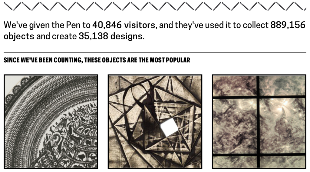
As of today, Pens have been handed out to 40,846 visitors which represents about 93% of all eligible visitors so far. We’re not currently distributing Pens on Saturday nights, nor to education groups, so they’re excluded from the count.

When we were thinking about the Pen and its integration into the museum, ubiquity was a critical concern. We knew that making it an ‘addon’ or ‘optional’ wasn’t going to achieve the behavior change that we desired, so continuing to make the on-boarding process easier for visitors and staff has been very important.

All of that would be for nought, if those Pens weren’t being used. Those Pens have collected 889,156 objects – averaging nearly 22 per Pen. That’s really surprised us! With a median of 11 we are still working on new methods in the galleries to help visitors collect more with their Pens, and in some cases, get started.

We’ve been equally excited that visitors have chosen to save 35,138 of their own creations from the wallpaper room, 3D designs, and Sketchbot portraits.

We’ve seen dwell times on the campus – from the times visitors take the Pen to when they return on exit – balloon out to a current average of 102 minutes, slightly less on weekends.

Another surprise has been the ‘most collected object’. It is the Noah’s Ark cut paper from 1982, an object that is on display towards the back of Making Design on the 2nd floor – certainly not the first object a visitor encounters. We probably shouldn’t be very surprised though, as it does also show up frequently as a visitor favorite on Instagram.

If you’d like to see what else is popular then hop over to our newly public ‘basic statistics‘ page where the top six objects and other numbers update daily.

And as for the post-visit experience? Just over 25% of ticketed visitors check out their collections after their visit, and a third of them decide to create accounts to permanently store their collection.

Over the coming months we’ll be working on continuously improving the Pen experience in the galleries – and as next week’s new exhibitions open to the public, the museum will have changed over almost every gallery since December. A lot of those improvements are going to be, as we’ve already seen, not technical in nature, but about more human-to-human interaction and assistance.

The digital experience at Cooper Hewitt is supported by Bloomberg Philanthropies.

Understanding how the Pen interacts with the API

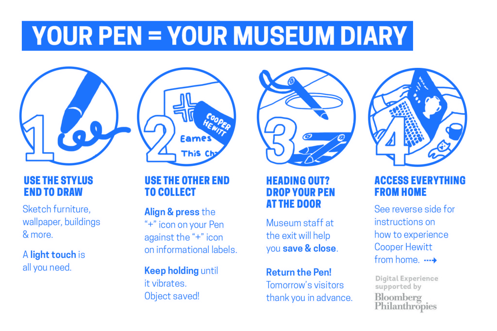
Detail of instructional postcard now available to museum visitors at entry to accompany The Pen.

Detail of instructional postcard now available to museum visitors at entry to accompany The Pen.

The Pen has been up and running now for five weeks and the museum as a whole has been coming to terms with exactly what that means. Some things can be planned for, others can be hedged against, but inevitably there will be surprises – pleasant and unpleasant. We can report that our expectations of usage have been far exceeded with extremely high take up rates, over 400,000 ‘acts of collection’ (saving museum objects with the Pen), and a great post-visit log in rate.

The Pen touches almost every operation of the museum – even though the museum was able to operate completely without it from our opening in December until March. At its most simple, object labels need NFC tags which in turn needs up-to-the-minute location information entered into our collection management system (TMS); the ticketing system needs a constant connection not only to its own servers but also to our API functions that create unique shortcodes for each visitor’s visit; and the Pens need regular cleaning and their monthly battery change. So everyone in the museum has been continuously improving and altering backend systems, improving workflows, and even the front-end UI on tablets that the ticket staff use to pair Pens with tickets.

Its complex.

Katie drew up (another) useful diagram of the journey of a Pen through a visit and how it interacts with our API.

Single visit 'lifecycle' of The Pen. Illustration by Katie Shelly, 2015. [click to enlarge]

Single visit ‘lifecycle’ of The Pen. Illustration by Katie Shelly, 2015. [click to enlarge]

Even more details of the overall system design and development saga can be found in the (long) Museums and the Web 2015 paper by Chan & Cope.

The digital experience at Cooper Hewitt is supported by Bloomberg Philanthropies. The Pen is the result of a collaboration between Cooper Hewitt, SistelNetworks, GE, MakeSimply, Undercurrent, and an original concept by Local Projects with Diller Scofidio + Renfro.

From concept to video prototype: the early form of the Pen

It was in late 2012 that the concept for the Pen was pitched to the museum by Local Projects, working then as subcontractors to Diller Scofidio & Renfro. The concept portrayed the Pen as an alternative to a mobile experience, and importantly, was symbol that was meant to activate visitors.

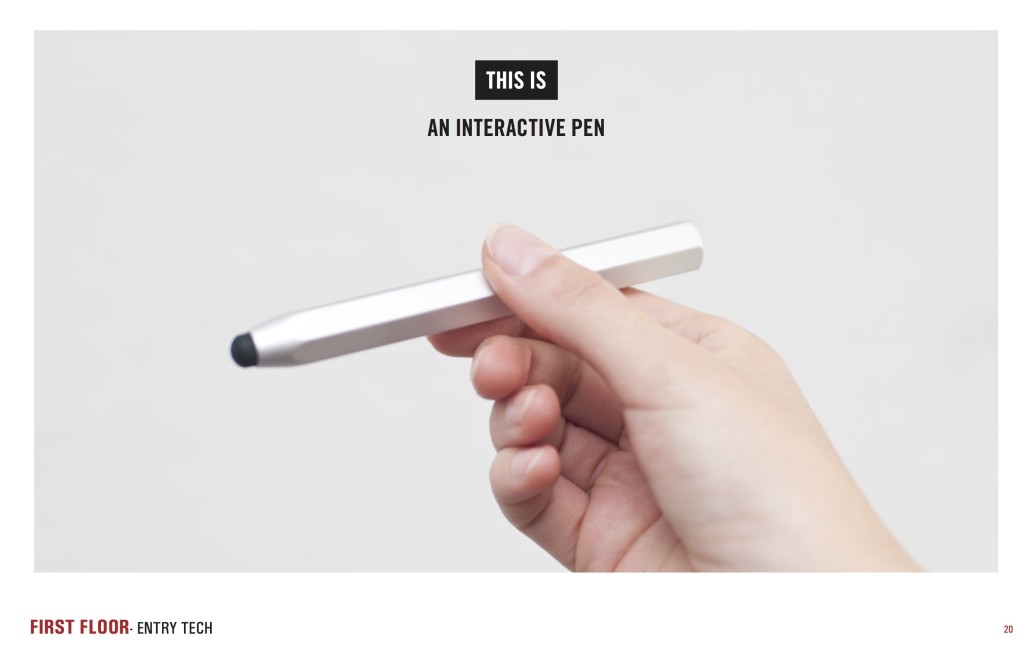
Early image of Pen

Original concept for the Pen by Local Projects with Diller Scofidio + Renfro, late 2012.

“Design Fiction is making things that tell stories. It’s like science-fiction in that the stories bring into focus certain matters-of-concern, such as how life is lived, questioning how technology is used and its implications, speculating bout the course of events; all of the unique abilities of science-fiction to incite imagination-filling conversations about alternative futures.” (Julian Bleeker, 2009)

In late 2013, Hanne Delodder and our media technologist, Katie Shelly, were tasked with making a short instructional video – a piece of ‘internal design fiction’ to help us expand the context of the Pen, beyond just the technology. (Hanne was spending three weeks observing work in the Labs courtesy of the Belgian Government as part of her professional development at Het Huis van Alijn, a history museum in Ghent.)

The video used the vWand from Sistelnetworks, an existing product that became the starting point from which the final Pen developed. At the time of production the museum had not yet begun the final development path that engaged Sistelnetworks, GE, Makesimply, Tellart and Undercurrent who would help augment and transform the vWand into the new product we now have.

The brief for the video was simply to create an instructional video of the kind that the museum might play in the Great Hall and on our website to instruct visitors how they might use the Pen. As it turned out, the video ended up being a hugely valuable tool in the ‘socialisation’ of the Pen as the entirety of the museum started to gets its head around what/how/when from curators to security staff, well before we had any working prototypes.

It ended up informing our design sprints with GE and Sistelnetworks which resulted in the form, operation and interaction design for the Pen; as well as a ‘stewardship’ sprint with SVA’s Products of Design where we worked through operational issues around distribution and return.

The video was also the starting point for the instructional video we ended up having produced that now plays online and in the Great Hall. You will notice that the emphasis in the final video has changed dramatically – focussing on collecting inside the museum and the importance of the visitor’s ticket (in contrast to the public collection of email addresses in the original).

The digital experience at Cooper Hewitt is supported by Bloomberg Philanthropies.

Things people make with our API #347: Nick Bartzokas

Shortly after Cooper Hewitt opened on December 12, 2014, the museum hosted a private event. At that preliminary scoping for the event, I bumped into Nick Bartzokas who had written a spiffy little application that he was planning on using for visuals on the night. We got talking and it turned out that he’d made it using the Cooper Hewitt API – all with no prompting. Even though it didn’t end up getting fully used, he has released it along with the source code.

Tell me a bit about yourself, what do you do, where do you do it?

I’m a creative coder. I like trying out new things. That’s lead me to develop a wide variety of projects: educational games, music visualizations, a Kinect flight simulator, an interactive API-fed wall of Arduinos and Raspberry Pis. These days I’m making interactive installations for the LAB at Rockwell Group. I came to the LAB from the American Museum of Natural History, so museums are in my blood, too.

The LAB is a unique place. We’re a team of designers, thinkers, and technologists exploring ways to connect the digital with the physical.

Here’s a couple links to our work: (1 / 2)

You made a web app for an event at Cooper Hewitt, what was the purpose of it, what does it do?

Our friends at Metropolis celebrated their magazine’s redesign at the Cooper Hewitt in December 2014. The LAB worked on a one-night-only interactive installation that ran on one of the museum’s 84″ touchtables. We love to experiment, so when opportunities like this come up, we jump at the chance to pick up a new tool and create.

In preparation for the event, I decided to prototype using Phaser, a 2D Javascript game framework. It markets itself as a tool for making web platformers, but it’s excellent for 2D projects of all kinds.

It gives you an update and render cycle that’s familiar territory for those that work with other game engines or creative coding toolkits like openFrameworks. It handles user input and asset management well. It has three physics engines of ranging sophistication, from simple Arcade collisions to full-body physics. You can choreograph sprites using built-in tweening. It has PIXI integrated under the hood, which supplies fast graphics with useful shaders and the ability to roll your own. So, lots of range. It’s a great tool for rapid browser-based prototyping.

The prototype we completed for the event brought Metropolis magazine’s digital assets to life. Photos drifted like leaves on a pond. When touched, they attracted photos of similar objects, assembling into flower petals and fans. If held, they grew excited until bursting apart. It ran in a fullscreened browser and was reponsive to over 40 simultaneous touch points. Here’s that version in action.

For the other prototype, I used Cooper Hewitt’s API to generate fireworks made of images from the museum’s collection. Since the collection is organized by color, I could ask the API for all the red images in the collection and turn them into a red firework burst.

I thought this project was really cool, so while it wasn’t selected for the Metropolis event, I decided to complete it anyway and post it..

OMG! You used the Cooper Hewitt API! How did you find out about the API? What was it like to work with the API? What was the best and the worst thing about the API?

When the LAB begins a project, we start by considering the story. We were celebrating the Metropolis magazine redesign. Of course that was the main focus. But their launch party was being held at the Cooper Hewitt, and they wrote about Caroline Baumann of the Cooper Hewitt in their launch issue, so the museum was a part of the story. We began gathering source material from Metropolis and Cooper Hewitt. It was then that I re-discovered the Cooper Hewitt API. It was something I’d heard about in the buzz leading up to the museum’s reopening, but this was my first time encountering it in the wild.

You all did a great job! Working with the API was so straightforward. Everything was well designed. The API website is simple and useful. The documentation is clear and complete with the ability to testdrive API methods in the browser. The structure of the API is sensible and intuitive. I taught a class on API programming for beginners. It was a challenge to select APIs with a low barrier to entry that beginners would be excited about and capable of navigating. Cooper Hewitt’s API is on my list now. I think beginners would find it quick, easy, and rewarding.

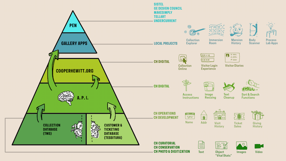
The pyramid diagram on the home page was a nice touch, a modest infographic with a big story behind it. It gives the newcomer a birds eye view of the API, the new gallery apps, the redesigned museum, all the culmination of a tremendous collaboration.

The ability to search the collection by color immediately jumped out to me. That feature is just rife with creative possibilities. My favorite part, no doubt. In fact, I think it’s worth expanding on the API’s knowledge of color. It knows an image contains blue, but perhaps it could have some sense of how much blue the image contains, perhaps a color average or a histogram.

In preparing a nodejs app to pull images for the fireworks, I checked to see if someone had written a node module for the Cooper Hewitt API, expecting I’d have to write my own. I was pleasantly surprised to see that the museum’s own Micah Walter authored one . That was another wow moment. When an institution opens up an API, that’s good. But this is really where Cooper Hewitt is building a bridge to the development community. It’s the little things.

So if others want to play with what you made where can they find it?

Folks can interact with the prototype here and they can peek at the source code on GitHub.

Thanks for having me, and congratulations on the API, the museum’s reopening, and a job well done!

Labs turns three!

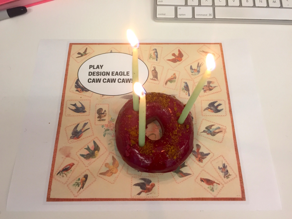
Candles atop a blackberry and giner donut

Happy birthday Cooper Hewitt Labs.

Today Cooper Hewitt Labs turned three.

Back in January 2012 this blog was just an experiment, a flag planted in rough terrain, but now what is actually the ‘Digital & Emerging Media’ team, is better known out there in the world as Cooper Hewitt Labs. In fact there’s a recent #longread in The Atlantic that focuses specifically on the Labs’ work.

It is funny how naming something brings it into the world, but its true. It is also true that what the Labs is is fragile. It is a group of people who happen to work well with each other, and the people around them, to make something much greater than what could be achieved individually.

For the first year the mascot of the Labs was the mischievous Japanese spirit (or yokai) called the Tanuki, and the second was the equally naughty “Cat (and Kitten) in the act of spanking“, the new mascot that watches over the Labs is the memetic and regal, Design Eagle.

Happy birthday to us.

If you’d like the last three years of blog posts wrapped up in easy to carry PDF format (or because ‘blogs don’t last forever’), here they are – 2012 (37mb) | 2013 (34mb) | 2014 (25mb).

The API at the center of the museum

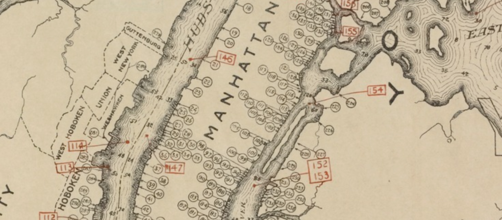
Extract from "Outline map of New York Harbor & vicinity : showing main tidal flow, sewer outlets, shellfish beds & analysis points.",  New York Bay Pollution Commission, 1905. From New York Public Library.

Extract from “Outline map of New York Harbor & vicinity : showing main tidal flow, sewer outlets, shellfish beds & analysis points.”, New York Bay Pollution Commission, 1905. From New York Public Library.

Beneath our cities lies vast, labyrinthine sewer systems. These have been key infrastructures allowing our cities to grow larger, grow more densely, and stay healthy. Yet, save for passing interests in Urban Exploration (UrbEx), we barely think of them as ‘beautifully designed systems’. In their time, the original sewer systems were critical long term projects that greatly bettered cities and the societies they supported.

In some ways what the Labs has been working on over the past few years has been a similar infrastructure and engineering project which will hopefully be transformative and enabling for our institution as a whole. As SFMOMA’s recent post, which included an interview with Labs’ Head of Engineering, Aaron Cope, makes clear, our API and the collection site that it is built upon, is a carrier for a new type of institutional philosophy.

Underneath all our new shiny digital experiences – the Pen, the Immersion Room, and other digital experiences – as well as the refreshed ‘services layer’ of ticketing, Pen checkouts, and object label management, lies our API. There’s no readymade headline or Webby award awaiting a beautifully designed API – and probably there shouldn’t be. These things should just work and provide the benefit to their hosts that they promised.

So why would a museum burden itself with making an API to underpin all its interactive experiences – not just online but in-gallery too?

Its about sustainability. Sustainability of content, sustainability of the experiences themselves, and also, importantly, a sustainability of ‘process’. A new process whereby ideas can be tested and prototyped as ‘actual things’ written in code. In short, as Larry Wall said its about making “easy things easy and hard things possible”.

The overhead it creates in the short term is more than made up for in future savings. Where it might be prudent to take short cuts and create a separate database here, a black box content library there, the fallout would be unchanging future experiences unable to be expanded upon, or, critically, rebuilt and redesigned by internal staff.

Back at my former museum, then Powerhouse web manager Luke Dearnley, wrote an important paper on the reasons to make your API central to your museum back in 2011. There the API was used internally to do everything relating to the collection online but it only had minor impact on the exhibition floor. Now at Cooper Hewitt the API and exhibition galleries are tightly intertwined. As a result there’s a definite ‘API tax’ that is being imposed on our exhibition media partners – Local Projects and Tellart especially – but we believe it is worth it.

So here’s a very high level view of ‘the stack’ drawn by Labs’ Media Technologist, Katie.

Click to enlarge

Click to enlarge

At the bottom of the pyramid are the two ‘sources of truth’. Firstly, the collection management system into which is fed curatorial knowledge, provenance research, object labels and interpretation, public locations of objects in the galleries, and all the digitised media associated with objects, donors and people associated with the collection. There’s also now the other fundamental element – visitor data. Stored securely, Tessitura operates as a ticketing system for the museum and in the case of the API operates as an identity-provider where needed to allow for personalisation.

The next layer up is the API which operates as a transport between the web and both the collection and Tessitura. It also enables a set of other functions – data cleanup and programmatic enhancement.

Most regular readers have already seen the API – apart from TMS, the Collection Management System, it is the oldest piece of the pyramid. It went live shortly after the first iteration of the new collections website in 2012. But since then it has been growing with new methods added regularly. It now contains not only methods for collection access but also user authentication and account structures, and anonymised event logs. The latter of these opens up all manner of data visualization opportunities for artists and researchers down the track.

In the web layer there is the public website but also for internal museum users there are small web applications. These are built upon the API to assist with object label generation, metadata enhancement, and reporting, and there’s even an aptly-named ‘holodeck’ for simulating all manner of Pen behaviours in the galleries.

Above this are the two public-facing gallery layers. The application and interfaces designed and built on top of the API by Local Projects, the Pen’s ecosystem of hardware registration devices designed by Tellart, and then the Pen itself which operates as a simple user interface in its own right.

What is exciting is that all the API functionality that has been exposed to Local Projects and Tellart to build our visitor experience can also progressively be opened up to others to build upon.

Late last year students in the Interaction Design class at NYU’s ITP program spent their semester building a range of weird and wonderful applications, games and websites on top of the basic API. That same class (and the interested public in general) will have access to far more powerful functionality and features once Cooper Hewitt opens in December.

The API is here for you to use.

Why are we collecting source code?

(via https://rekall.tumblr.com/post/92033337743)

(via https://rekall.tumblr.com/post/92033337743)

Part of what we continue to work on in parallel to the opening of Cooper Hewitt is capacity building for the museum to collect ‘the present’ – which includes the code that underpins and makes functional much of the ‘designs’ of the modern world. That means all the interactive, networked design ‘objects/works’, not just on screens but also those embedded in products, services and systems. I’m not just interested in this for ‘digital preservation’ reasons, but also to help us come up with new ways to interpret, contextualise and communicate the ‘how and why’ of these objects (and the choices the designers made) to our visitors.

Aaron liked what I wrote to a designer with whom we are working with on collecting some interactive pieces, and thought it made sense to share it in a redacted form. Sometimes it is nice to be asked to be explicit about why the underlying code matters – and so here’s what I wrote.

As the (publicly-funded) national design museum, one of the reasons we are interested in acquiring the underlying code and data is that allows the museum and future scholars and researches to explicitly explore and interrogate the choices and decisions made at the time of a work’s creation in response the the technological constraints of the time, as well as the adjustments made through a work’s creation to make it better respond to the needs of users. In the case of Planetary this is why we acquired the entire Github repository – the versioned codebase.

Approaching your choices of language and platform as ‘materials’ that were shaped by the period in which the work was made, as well as your decisions in the code itself, is extremely useful for interpretation and future scholarship. Nick Monfort & Ian Bogost’s book on the affordances of the Atari 2600 platform, Racing the Beam, is just one example of the kind of scholarship we foresee as being possible when code and data is acquired with works. This sort of exploration – of decisions made, and the technological and social constraints encountered – is key to Cooper Hewitt helping the public to interrogate and understand works in the collection and the work of designers as more than just aesthetic experiences.

Increasingly when we are acquiring interactive works we are also interested in how users used and reacted to them. In these cases we would also consider acquiring user research, user feedback and usage data along with a work – so that future scholars and visitors could understand a work’s success in achieving its stated goals. In terms of product design collections this is often reduced to ‘market and sales performance’ but we feel that in the case of works on the internet there is far more potential opportunity to explore other more complex and nuanced measures of relative ‘success’ that reveal the work that interaction designers and the choices they make.

In respect to [redacted] specifically, it helps visitors understand that you made this work in a particular way when you did because that’s how the technology and access to data was at the time. And that if that it was to remade now in 2014, there might be a multiplicity of new ways to do it now and we can explicitly talk about the differences.

The other reason is that the underlying code and data better enables the museum to preserve these works as part of the Smithsonian’s collection indefinitely in the public trust – and perhaps exhibit them 100 years from now.

Discuss.