This is the first in a series of three “adventures in universal design,” a design research experiment carried out by Rachel Sakai and Katie Shelly. For an introduction to the project, see our earlier post, here.

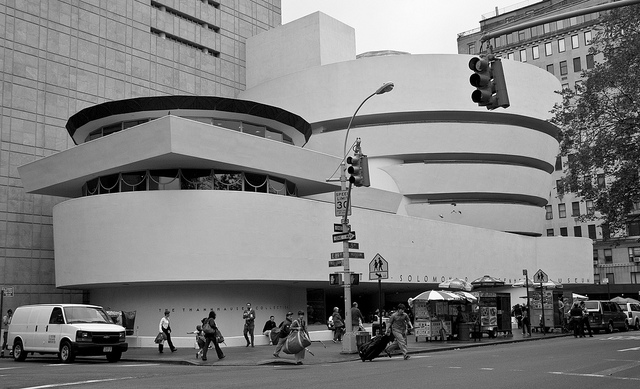
The Guggenheim Museum, which is just a stone’s throw away from our office. Photo by Flickr user Ramón Torrent.
EMPATHY TOOLS:
BLINDFOLDED VISIT TO THE GUGGENHEIM
AUGUST 5 2013
Taking a cue from Patricia Moore’s empathy research in NYC in the 1990s, Katie and I began our research with an empathy-building field trip to the Guggenheim. I took on the role of the blind visitor and Katie played the part of my sighted companion. The entire trip lasted for about 45 minutes and I kept my eyes shut for the duration.
Even though the Guggenheim is just a block away from our office, this was my first visit so I had no pre-existing mental map of the space. With my eyes closed, it did not take long before I felt completely disoriented, vulnerable, and dependent on my companion. After five minutes I had no idea where I was or where we were going; it felt like we were walking in circles (actually, we may have been because of the Guggenheim spiral…). I trust Katie, but this was unnerving.
(Note: this intensity of discomfort would not apply for a “real” blind or partially-sighted person, who would be entirely familiar with the experience of walking around without sight. A mild feeling of disorientation in the space, though, is still worth noting. Maybe the level of discomfort for a blind person would be more subtle, more like how a sighted person would feel wandering around without a map.)
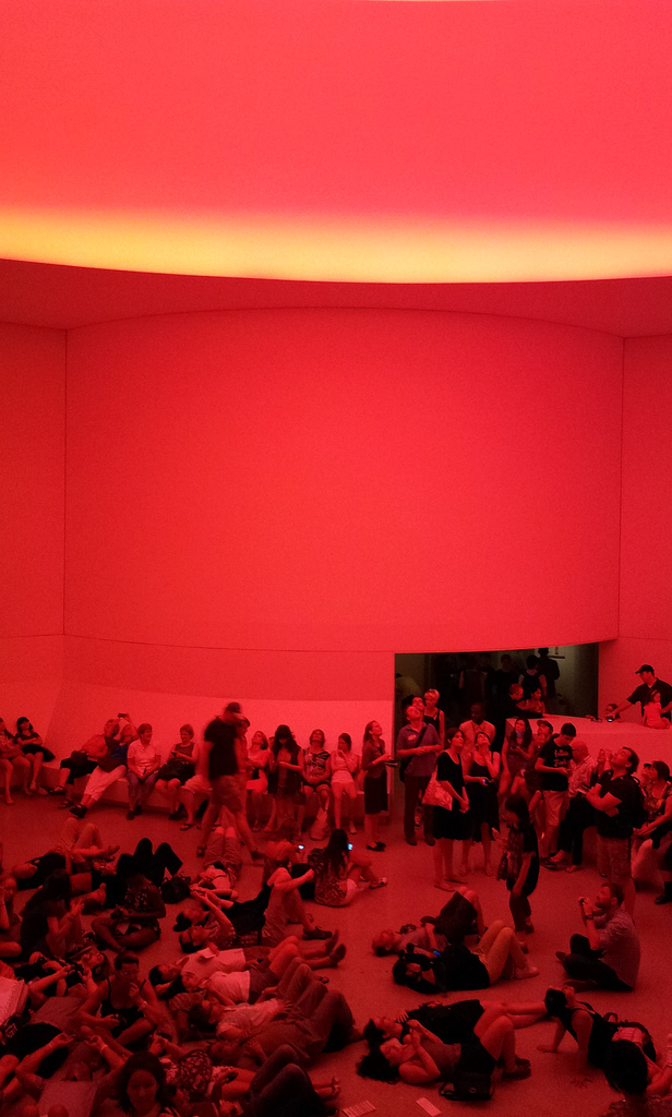
We started the visit on our own with Katie guiding me and doing her best to describe the space, the other visitors, and the art. After a few minutes, we found one of the Guggenheim’s Gallery Guides wearing a large “Ask Me About the Art” button. When Katie asked the guide whether she was trained to describe art to low-vision guests, her response, “…I had one training on that,” was hesitant. To my ear, it sounded like reluctance and I immediately felt as though our request was a bother. Katie also felt like a pest, like she was “drilling the attendant” on her training. After some initial awkwardness, though, she offered to just share what she usually says about the piece (James Turrell’s Prado (White)), which turned out to be a very interesting bit of interpretation. We thanked her for the info and moved on.
By the second half of our visit we had picked up a couple of audioguides. The Guggenheim, like many other museums, has the encased iPod touch flavor of audio guide. The look and feel is nice and slick, but it’s not great for accessibility because the home button is blocked. (A triple-tap of this button is how you open accessibility controls in iOS).
Dependence on the GUI meant that when I wanted to hear a description, Katie would take my audioguide, start it playing, hand it back to me, then start up her own audioguide. If I missed a word and needed to go back, or if I wanted to pause for a second, well, I was pretty much out of luck. I could have asked Katie, but I felt like too much of a bother, so just I let it go.
The audio content was interesting, but it was written with sighted visitors in mind, with very little visual description of the work being discussed.
There was a big chunk of text on the wall explaining a bit about James Turrell’s work, which Katie read aloud to me. It would have been great to just have that text available for playback in the audioguide.
After our visit, I dug deeper into the Guggenheim’s website and learned that they have a free app that includes verbal imaging description tours written for visitors who are blind. Some of these tours have associated “touch object packs” that can be picked up from staff. That would have been great, but at the time of our trip Katie and I were unaware that these options existed, even though we did check out the Guggenheim website before visiting. None of the staff (who could see that I appeared to be blind) reached out to let us know about these great accessibility options. What a shame!
On the afternoon we visited, the Guggenheim was packed. We didn’t want to be too much of a nuisance to the already-busy staff so Katie went into “hacker mode,” looking for ways to tweak the experience to fit our needs. The visit became about hunting for things we could share.
Takeaways
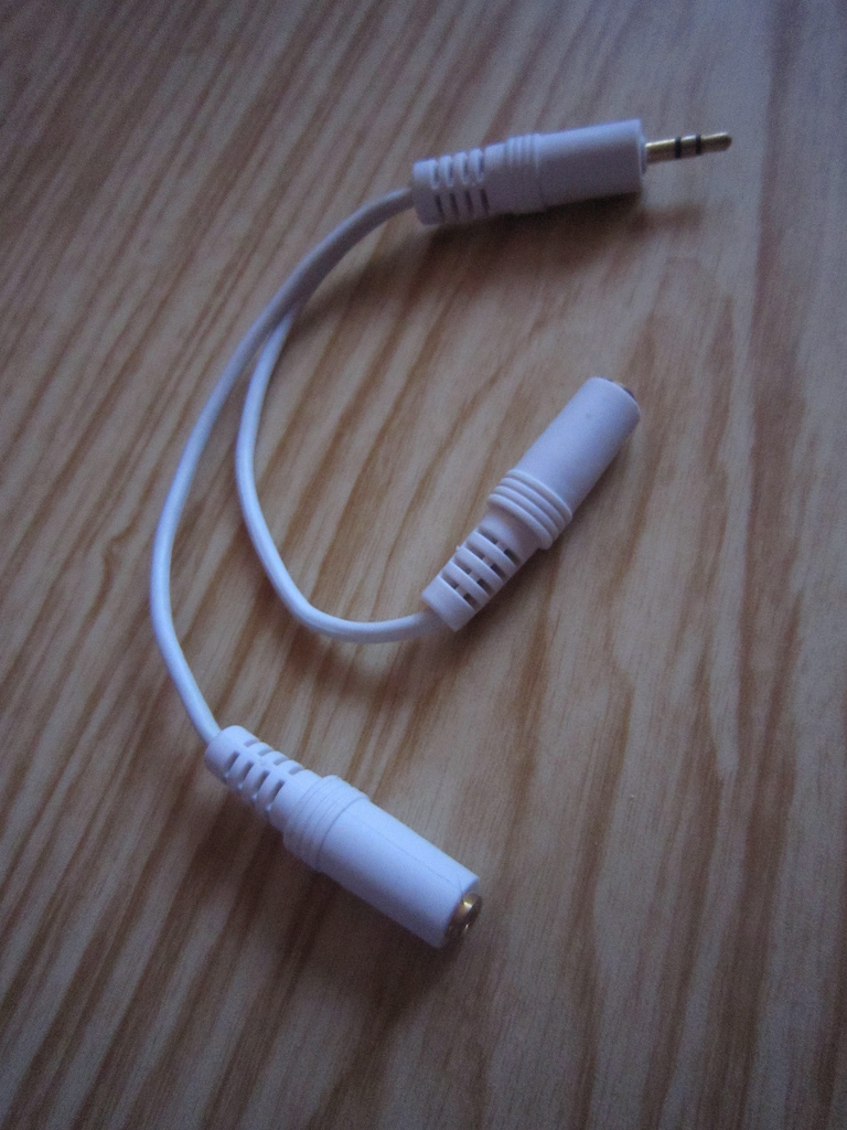
– A simple hack idea: headphone splitters. Though it wouldn’t give blind visitors more control over their audio guide, it would take away the clumsiness of one person having to manage two audioguides. Plus, whether you are blind or not, using a headphone splitter is fun and can strengthen a shared experience.
– I was disoriented throughout the trip and this was very uncomfortable. A better understanding of how I was moving through the space would have helped. How might we orient blind visitors when they first enter the museum so that they have a broad mental map of the space?
– I was dependent on Katie and did not have many options for how I might want to experience the museum (deep engagement with a few works, shallow engagement with many works, explore independently, explore with a friend, etc). How might we provide blind visitors with options for different types of experiences?
– Katie did her best to “hack” the experience and tried to discover things we could share in order to create a meaningful museum visit for both of us. How might we help create and shape shared experiences for pairs who visit the museum?
– Staff training is important. The Museum has great accessibility tools, but they were invisible to us because nobody on staff mentioned them. The front desk person didn’t ask whether we would be interested in the accessibility tools, even though she had seen that I appeared to be blind.
– Staff mood is important. Many of the staff we interacted with seemed bashful or embarrassed about the situation and our accessibility questions. The museum was hectic and they were very busy; we felt like asking for too much help would have been pesky.
Check out our next adventure in universal design, a museum tour designed for the blind.


Pingback: Three adventures in universal design, or, what does a veggie peeler have in common with a museum? (0/3) | Cooper Hewitt Labs