Monthly Archives: October 2016

Process Lab: Citizen Designer Digital Interactive, Design Case Study

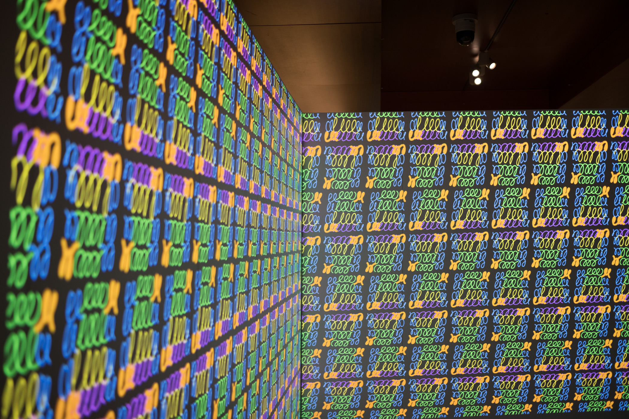
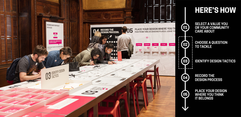
Fig.1. Process Lab: Citizen Designer exhibition and signage, on view at Cooper Hewitt.

Fig.1. Process Lab: Citizen Designer exhibition and signage, on view at Cooper Hewitt

Background

The Process Lab is a hands-on educational space where visitors are invited to get involved in design process. Process Lab: Citizen Designer complimented the exhibition By the People: Designing a Better America, exploring the poverty, income inequality, stagnating wages, rising housing costs, limited public transport, and diminishing social mobility facing America today.

In Process Lab: Citizen Designer participants moved through a series of prompts and completed a worksheet [fig. 2]. Selecting a value they care about, a question that matters, and design tactics they could use to make a difference, participants used these constraints to create a sketch of a potential solution.

Design Brief

Cooper Hewitt’s Education Department asked Digital & Emerging Media (D&EM) to build an interactive experience that would encourage visitors to learn from each other by allowing them to share and compare their participation in exhibition Process Lab: Citizen Designer.

I served as project manager and user-experience/user-interaction designer, working closely with D&EM’s developer, Rachel Nackman, on the project. Interface Studio Architects (ISA) collaborated on concept and provided environmental graphics.
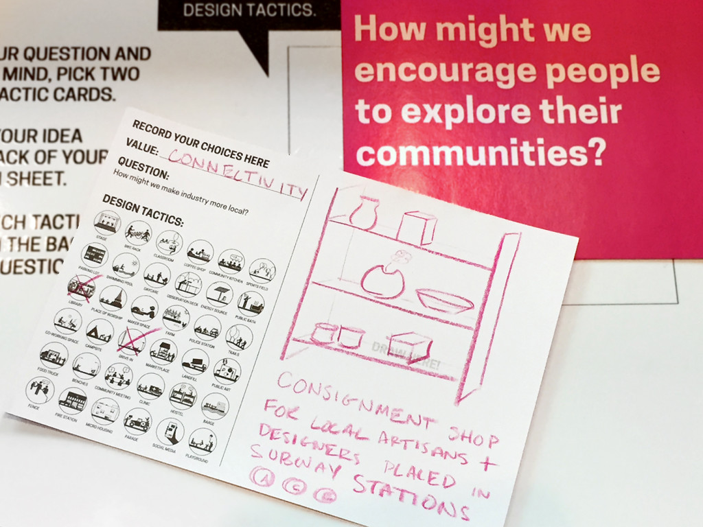
Fig. 2. Completed worksheet with question, value and tactic selections, along with a solution sketch

Fig. 2. Completed worksheet with question, value and tactic selections, along with a solution sketch

Process: Ideation

Project collaborators—D&EM, the Education Department, and ISA—came together for the initial steps of ideation. Since the exhibition concept and design was well established at this time, it was clear how participants would engage with the activity. Through the process of using cards and prompts to complete a worksheet they would generate several pieces of information: a value, a question, one to two tactic selections, and a solution sketch. The group decided that these elements would provide the content for the “sharing and comparing” specification in the project brief.

Of the participant-generated information, the solution sketch stood out as the only non-discrete element. We determined that given the available time and budget, a simple analog solution would be ideal. This became a series of wall-mounted display bins in which participants could deposit their completed worksheets. This left value, question, and tactic information to work with for the content of the digital interactive.

From the beginning, the Education Department mentioned a “broadcast wall.” Through conversation, we unpacked this term and found a core value statement within it. Phrased as a question, we could now ask:

“How might we empower participants to think about themselves within a community so that they can be inspired to design for social change?”

Framing this question allowed us to outline project objectives, knowing the solution should:

  • Help form a virtual community of exhibition participants.
  • Allow individual participants to see themselves in relation to that community.
  • Encourage participants to apply learnings from the exhibition other communities

Challenges

As the project team clarified project objectives, we also identified a number of challenges that the design solution would need to navigate:

  • Adding Value, Not Complexity. The conceptual content of Process Lab: Citizen Designer was complex. The design activity had a number of steps and choices. The brief asked that D&EM add features to the experience, but the project team also needed to mitigate a potentially heavy cognitive load on participants.
  • Predetermined Technologies. An implicit part of the brief required that D&EM incorporate the Pen into user interactions. Since the Pen’s NFC-reading technology is embedded throughout Cooper Hewitt, the digital interactive needed to utilize this functionality.
  • Spatial Constraints. Data and power drops, architectural features, and HVAC components created limitations for positioning the interactive in the room.
  • Time Constraints. D&EM had two months to conceptualize and implement a solution in time for the opening of the exhibition.
  • Adapting to an Existing Design. D&EM entered the exhibition design process at it’s final stages. The solution for the digital interactive had to work with the established participant-flow, environmental graphics, copy, furniture, and spatial arrangement conceived by ISA and the Education Department.
  • Budget. Given that the exhibition design was nearly complete, there was virtually no budget for equipment purchases or external resourcing.

Process: Defining a Design Direction

From the design brief, challenges, objectives, and requirements established so far, we could now begin to propose solutions. Data visualization surfaced as a potential way to fulfill the sharing, comparing and broadcasting requirements of the project. A visualization could also accommodate the requirement to allow an individual participants to compare themselves to the virtual exhibition community by displaying individual data in relation to the aggregate.

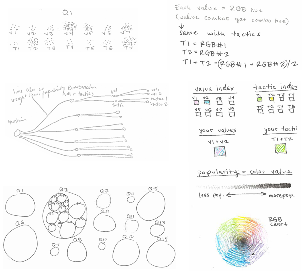
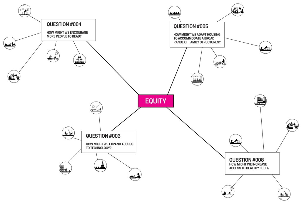
ISA and I sketched ideas for the data visualization [figs. 3 and 4], exploring a variety of structures. As the project team shared and reviewed the sketches, discussion revealed some important requirements for the data organization:

  • The question, value and tactic information should be hierarchically nested.
  • The hierarchy should be arranged so that question was the parent of value, and value was the parent of tactics.
Fig. 3. My early data visualization sketches

Fig. 3. My early data visualization sketches

Fig. 4. ISA’s data visualization sketch

Fig. 4. ISA’s data visualization sketch

With this information in hand, Rachel proceeded with the construction of the database that would feed the visualization. The project team identified an available 55-inch monitor to display the data visualization in the gallery; oriented vertically it could fit into the room. As I sketched ideas for data visualizations I worked within the given size and aspect ratio. Soon it became clear that the number of possible combinations within the given data structure made it impossible to accommodate the full aggregate view in the visualization. To illustrate the improbability of showing all the data, I created a leaderboard with mock values for the hundreds of permutations that result from the combination of 12 value, 12 question and 36 tactic selections [fig. 5, left]. Not only was the volume of information overwhelming on the leaderboard, but Rachel and I agreed that the format made no interpretive meaning of the data. If the solution should serve the project goal to “empower participants to think about themselves within a community so that they can be inspired to design for social change,” it needed to have a clear message. This insight led to a series steps towards narrativizing the data with text [fig. 5].

Concurrently, the data visualization component was taking shape as an enclosure chart, also known as a circle packing representation. This format could accommodate both hierarchical information (nesting of the circles) and values for each component (size of the circles). With the full project team on board with the design direction, Rachel began development on the data visualization using D3.js library.
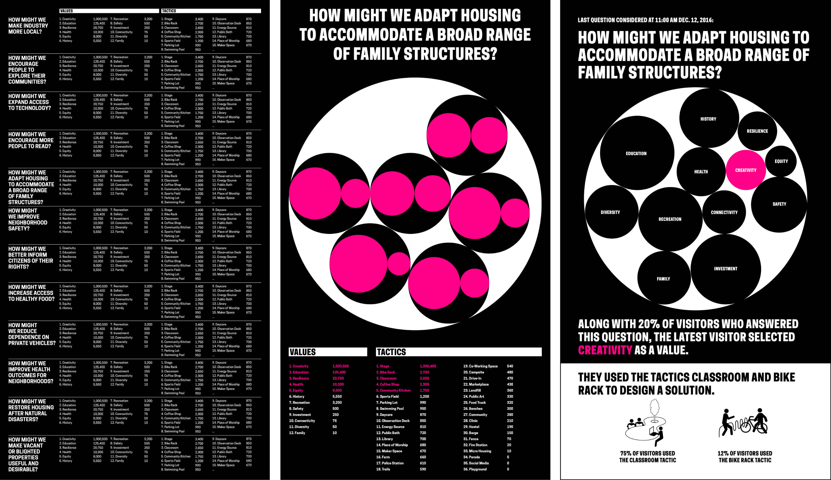
Fig. 5. Series of mocks moving from a leaderboard format to a narrativized presentation of the data with an enclosure chart

Fig. 5. Series of mocks moving from a leaderboard format to a narrativized presentation of data with an enclosure chart

Process: Refining and Implementing a Solution

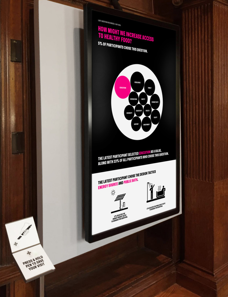
Through parallel work and constant communication, Rachel and I progressed through a number of decisions around visual presentation and database design. We agreed that to enhance legibility we should eliminate tactics from the visualization and present them separately. I created a mock that applied Cooper Hewitt’s brand to Rachel’s initial implementation of the enclosure chart. I proposed copy that wrapped the data in understandable language, and compared the latest participant to the virtual community of participants. I opted for percentage values to reinforce the relationship of individual response to aggregate. Black and white overall, I used hot pink to highlight the relationship between the text and the data visualization. A later iteration used pink to indicate all participant data points. I inverted the background in the lower quarter of the screen to separate tactic information from the data visualization so that it was apparent this data was not feeding into the enclosure chart, and I utilized tactic icons provided by ISA to visually connect the digital interactive to the worksheet design [fig. 2].

Next, I printed a paper prototype at scale to check legibility and ADA compliance. This let us analyze the design in a new context and invited feedback from officemates. As Rachel implemented the design in code, we worked with Education to hone the messaging through copy changes and graphic refinements.
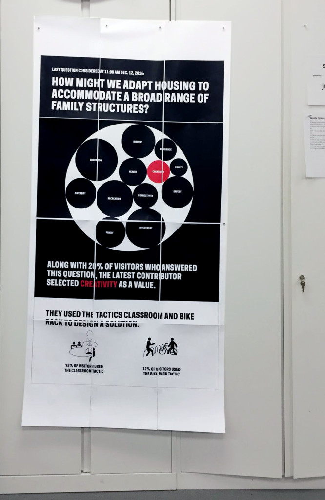
Fig. 5. A paper prototype made to scale invited people outside the project team to respond to the design, and helped check for legibility

Fig. 5. A paper prototype made to scale invited people outside the project team to respond to the design, and helped check for legibility

The next steps towards project realization involved integrating the data visualization into the gallery experience, and the web experience on collection.cooperhewitt.org, the collection website. The Pen bridges these two user-flows by allowing museum visitors to collect information in the galleries. The Pen is associated with a unique visit ID for each new session. NFC tags in the galleries are loaded with data by curatorial and exhibitions staff so that visitors can use the Pen to save information to the onboard memory of the Pen. When they finish their visit the Pen data is uploaded by museum staff to a central database that feeds into unique URLs established for each visit on the collection site.

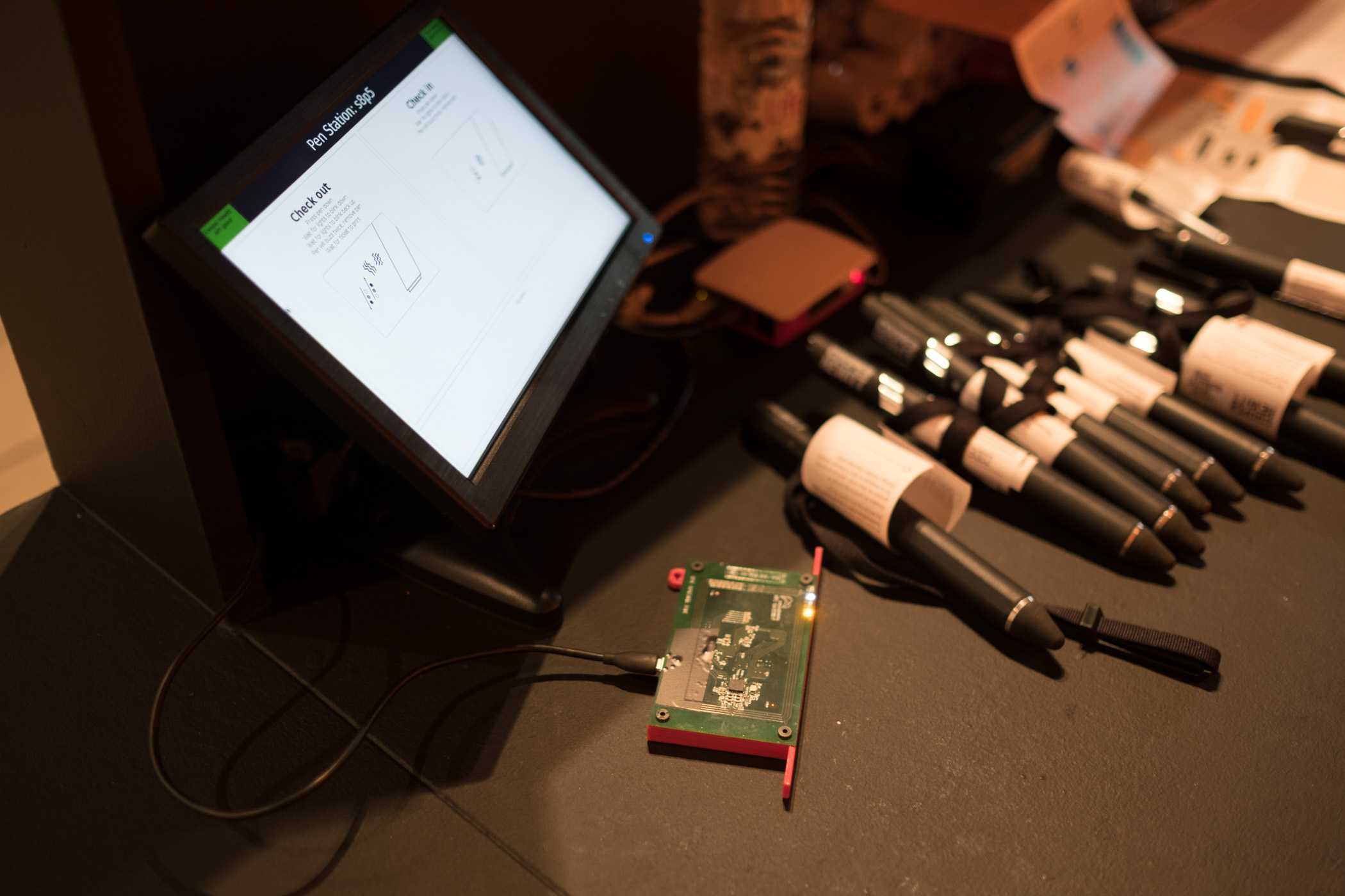
The Process Lab: Citizen Designer digital interactive project needed to work with the established system of Pens, NFC tags, and collection site, but also accommodate a new type of data. Rachel connected the question/value/tactic database to the Cooper Hewitt API and collections site. A reader-board at a freestanding station would allow participants to upload Pen data to the database [fig. 6]. The remaining parts of the participant-flow to engineer were the presentation of real time data on the visualization screen, and the leap from the completed worksheet to digitized data on the Pen.

Rachel found that her code could ping the API frequently to look for new database information to display on the monitor—this would allow for near real-time responsiveness of the screen to reader-board Pen data uploads. Rachel and I decided on the choreography of the screen display together: a quick succession of entries would result in a queue. A full queue would cycle through entries. New entries would be added to the back of the queue. An empty queue would hold on the last entry. This configuration assumed that if the queue was full when they added their entry participants may not see their data immediately. We agreed to offload the challenge of designing visual feedback about the queue length and succession to a subsequent iteration in service of meeting the launch deadline. The queue length has not proven problematic so far, and most participants see their data on screen right away.

Fig. 6. Monitor displaying the data visualization website; to the left is the reader-board station

Fig. 6. Monitor displaying the data visualization website; to the left is the reader-board station

As Rachel and I brought the reader board, data visualization database, and website together, ISA worked on the graphic that would connect the worksheet experience to the digital interactive. The project team agreed that NFC tags placed under a wall graphic would serve as the interface for participants to record their worksheet answers digitally [fig. 7].
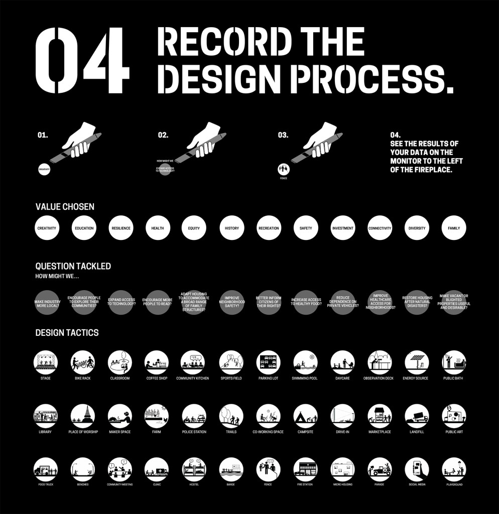
Fig. 7. ISA-designed “input graphic” where participants record their worksheet selections; NFC tags beneath the circles write question, value and tactic data to the onboard memory of the Pen

Fig. 7. ISA-designed “input graphic” where participants record their worksheet selections; NFC tags beneath the circles write question, value and tactic data to the onboard memory of the Pen

Process: Installation, Observation & Iteration

Rachel and I had the display website ready just in time for exhibition installation. Exhibitions staff and the project team negotiated the placement of all the elements in the gallery. Because of obstacles in the room, as well as data and power drop locations, the input wall graphic [fig. 7] had to be positioned apart from the reader-board and display screen. This was unfortunate given the interconnection of these steps. Also non-ideal was the fact that ISA’s numeric way-finding system omitted the step of uploading Pen data at the reader-board and viewing the data on-screen [fig.1]. After installation we had concerns that there would be low engagement with the digital interactive because of its disconnect from the rest of the experience.

As soon as the exhibition was open to the public we could see database activity. Engagement metrics looked good with 9,560 instances of use in the first ten days. The quality of those interactions, however, was poor. Only 5.8% satisfied the data requirements written into the code. The code was looking for at least one question, one value, and one tactic in order to process the information and display it on-screen. Any partial entries were discounted.
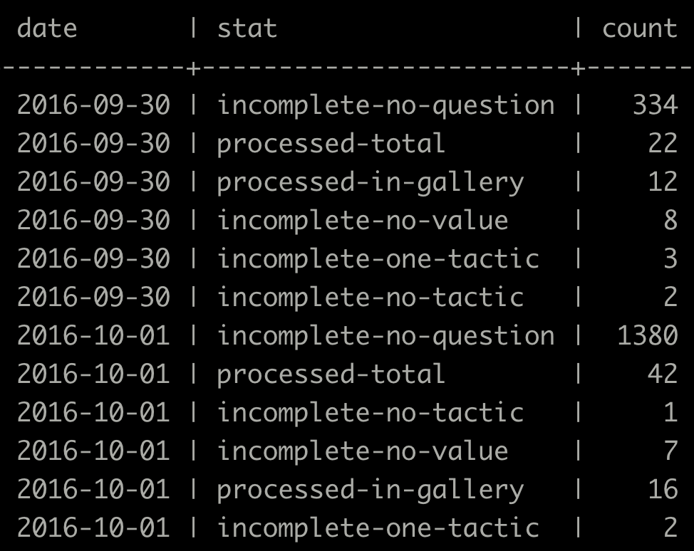
Fig. 8. A snippet of database entries from the first few days of the exhibition showing a high number of missing question, value and tactic entries

Fig. 8. A snippet of database entries from the first few days of the exhibition showing a high number of missing question, value and tactic entries

Conclusion

The project team met the steep challenges of limited time and budget—we designed and built a completely new way to use the Pen technology. High engagement with the digital interactive showed that what we created was inviting, and fit into the participatory context of the exhibition. Database activity, however, showed points of friction for participants. Most had trouble selecting a question, value and tactic on the input graphic, and most did not successfully upload their Pen data at the reader-board. Stringent database requirements added increased difficulty.

Based on these observations, it is clear that the design of the digital interactive could be optimized. We also learned that some of the challenges facing the project could have been mitigated by closer involvement of D&EM with the larger exhibition design effort. Our next objective is to stabilize the digital interactive at an acceptable level of usability. We will continue observing participant behavior in order to inform our next iterations toward a minimum viable product. Once we meet the usability requirement, our next goal will be to hand-off the interactive to gallery staff for continued maintenance over the duration of the exhibition.

As an experience, the Process Lab:Citizen Designer digital interactive has a ways to go, but we are excited by the project’s role in expanding how visitors use the Pen. This is the first time that we’ve configured Pen interactivity to allow visitors to input information and see that input visualized in near real-time. There’s significant potential to reuse the infrastructure of this project again in a different exhibition context, adapting the input graphic and data output design to a new educational concept, and the database to new content.

Mass Digitization: Digital Asset Management

This part two in a series on digitization. My name is Allison Hale, Digital Imaging Specialist at Cooper Hewitt. I started working at the museum in 2014 during the preparations for a mass digitization project. Before the start of digitization, there were 3,690 collection objects that had high resolution, publication quality photography. The museum has completed phase two of the project and has completed photography of more than 200,000 collection objects.


Prior to DAMS (Digital Asset Management System), image files were stored on optical discs and RAID storage arrays. This was not an ideal situation for our legacy files or for a mass digitization workflow. There was a need to connect image assets to the collections database, The Museum System, and to deliver files to our public-facing technologies.

Vendor Server to DAMS Workflow

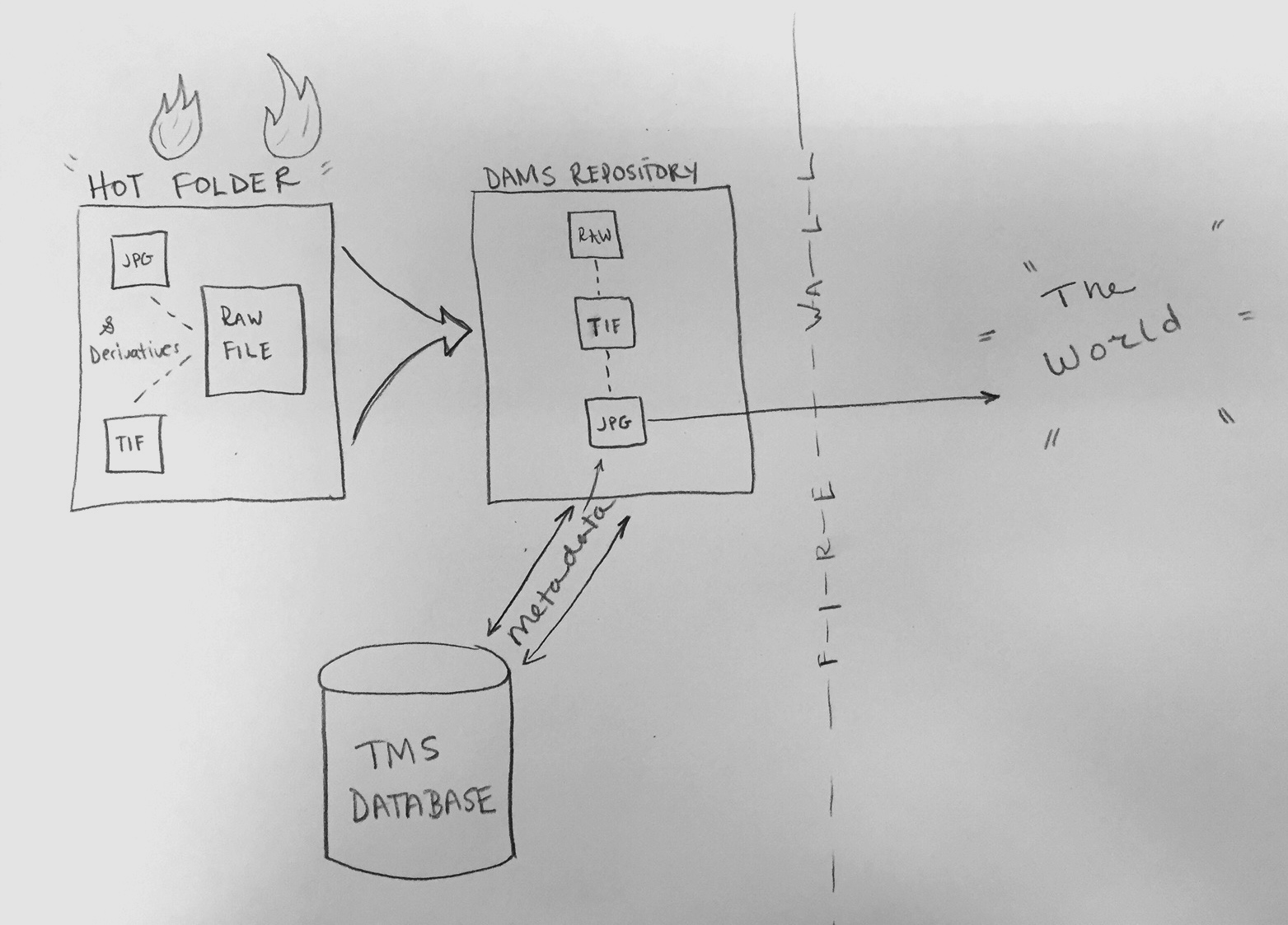
The Smithsonian’s DAMS Team and Cooper Hewitt staff worked together to build workflow that could be used daily to ingest hundreds of images. The images moved from a vendor server to Smithsonian’s digital repository. The preparation for the project began with 5 months of planning, testing, and upgrades to network infrastructure to increase efficiency. During mass digitization, 4 Cooper Hewitt staff members shared the responsibility for daily “ingests” or uploads of assets to DAMS. Here is the general workflow:

Cooper Hewitt to DAMS workflow.

Cooper Hewitt to DAMS workflow.

  • Images are stored by vendor in a staging server, bucketed by a folder titled with shoot date and photography station. The vendor delivers 3 versions of each object image in separate folders: RAW (proprietary camera format or DNG file), TIF (full frame/with image quality target), JPG (full-scale, cropped and ready for public audience)
  • Images are copied from the server into a “hot folder”–a folder that is networked to DAMS. The folder contains two areas, a temporary area and then separate active folders called MASTER, SUBFILE, SUB_SUBFILE
  • Once the files have moved to the transfer area, the RAW files move to the MASTER folder, the TIF to the SUBFILE folder, and the JPG files to the SUB_SUBFILE folder. The purpose of the MASTER/SUB/SUB_SUB structure is to keep the images parent-child linked once they enter DAMS. The parent-child relationship keeps files “related” and indexable
  • An empty text file called “ready.txt” is put into the MASTER folder. Every 15 minutes a script runs to search for the ready.txt command
  • Images are ingested from the hot folder into the DAMS storage repository
  • During the initial setup, the DAMS user created a “template” for the hot folder. The template automatically applies bulk administrative information to the image’s DAMS record, as well as categories and security policies
  • Once the images are in DAMS, security policies and categories can be changed to allow the images to be pushed to TMS (The Museum System) via CDIS (Collection Dams Integration System) and IDS (Image Delivery Service)

DAMS to TMS and Beyond: Q&A with Robert Feldman

DAMS is repository storage and is designed to interface with databases. A considerable amount of planning and testing went into connecting mass digitization images to Cooper Hewitt’s TMS database. This is where I introduce Robert Feldman, who works with Smithsonian’s Digital Asset Management Team to manage all aspects of CDIS—Collection Dams Integration System. Robert has expertise in software development and systems analysis. A background in the telecommunications industry and experience with government agencies allows him to work in a matrixed environment while supporting many projects.

AH: Can you describe your role at Smithsonian’s DAMS?

RF: As a member of the DAMS team, I develop and support CDIS (Collection-DAMS Integration System). My role has recently expanded to creating and supporting new systems that assist the Smithsonian OCIO’s goal of integrating the Smithsonian’s IT systems beyond the scope of CDIS. One of these additional tools is VFCU (Volume File Copy Utility). VFCU validates and ingests large batches of media files into DAMS. CDIS and VFCU are coded in Java, and makes use of Oracle and SQL-Server databases.

AH: We understand that CDIS was written to connect images in DAMS to the museum database. Can you tell us more us more about the purpose of the code?

RF: The primary idea behind CDIS is to identify and store the connection between the image in DAMS and the rendition in TMS. Once these connections are stored in the CDIS database, CDIS can use these connections to move data from the DAMS system to TMS, and from TMS to DAMS.

AH: Why is this important?

RF: CDIS provides the automation of many steps that would otherwise be performed manually. CDIS interconnects ‘all the pieces together’. The CDIS application enables Cooper Hewitt to manage its large collection in the Smithsonian IT systems in a streamlined, traceable and repeatable manner, reduces the ‘human error’ element, and more.

AH: How is this done?

RF: For Starters, CDIS creates media rendition records in TMS based on the image in DAMS. This enables Cooper Hewitt to manage these renditions in TMS hours after they are uploaded into DAMS and assigned the appropriate DAMS category.

CDIS creates the media record in TMS by inserting new rows directly into 6 different tables in the TMS database. These tables hold information pertaining to the Media and Rendition records and the linkages to the object record. The Thumbnail image in TMS is generated by saving a copy the reduced resolution image from DAMS into the database field in TMS that holds the thumbnail, and a reference to the full-resolution image is saved in the TMS MediaFiles table.

This reference to the full-resolution image consists of the DAMS UAN (the Unique Asset Name – a unique reference to the particular image in DAMS) appended to the IDS base pathname. By stringing together the IDS base pathname with the UAN, we will have a complete url – pointing to the IDS derivative that is viewable in any browser.

The full references to this DAMS UAN and IDS pathname, along with the object number and other descriptive information populates a feed from TMS. The ‘Collections’ area of the Cooper Hewitt website uses this feed to display the images in its collection. The feed is also used for the digital tables and interactive displays within the museum and more!

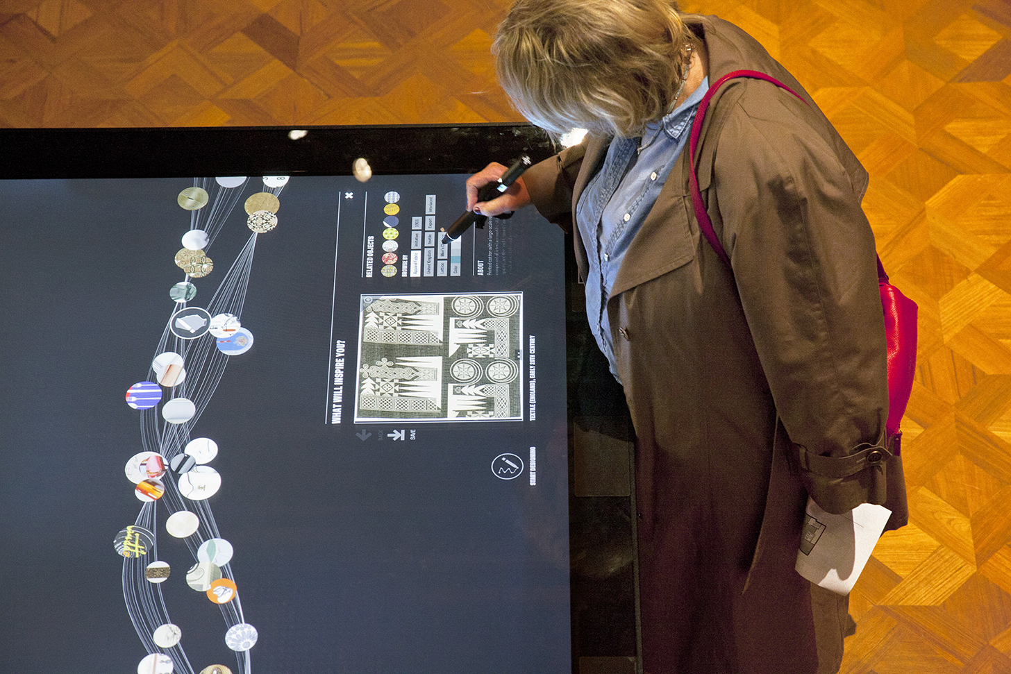
A museum visitor looking at an image on the Digital Table. Photo by Matt Flynn.

A museum visitor looking at an image on the Digital Table. Photo by Matt Flynn.

Another advantage of the integration with CDIS is Cooper Hewitt no longer has to store a physical copy of the image on the TMS media drive. The digital media image is stored securely in DAMS, where it can be accessed and downloaded at any time, and a derivative of the DAMS image can be easily viewed by using the IDS url. This flow reduces duplication of effort, and removes the need for Cooper Hewitt to support the infrastructure to store their images on optical discs and massive storage arrays.

When CDIS creates the media record in TMS, CDIS saves the connection to this newly created rendition. This connection allows CDIS to bring object and image descriptive data from TMS into DAMS metadata fields. If the descriptive information in TMS is altered at any point, these changes are automatically carried to DAMS via a nightly CDIS process. The transfer of metadata from TMS to DAMS is known as the CDIS ‘metadata sync’ process.

On the left, image of object record in The Museum System database. On right, object in the DAMS interface with mapped metadata from the TMS record.

On the left, image of object record in The Museum System database. On right, object in the DAMS interface with mapped metadata from the TMS record. Click photo to enlarge.

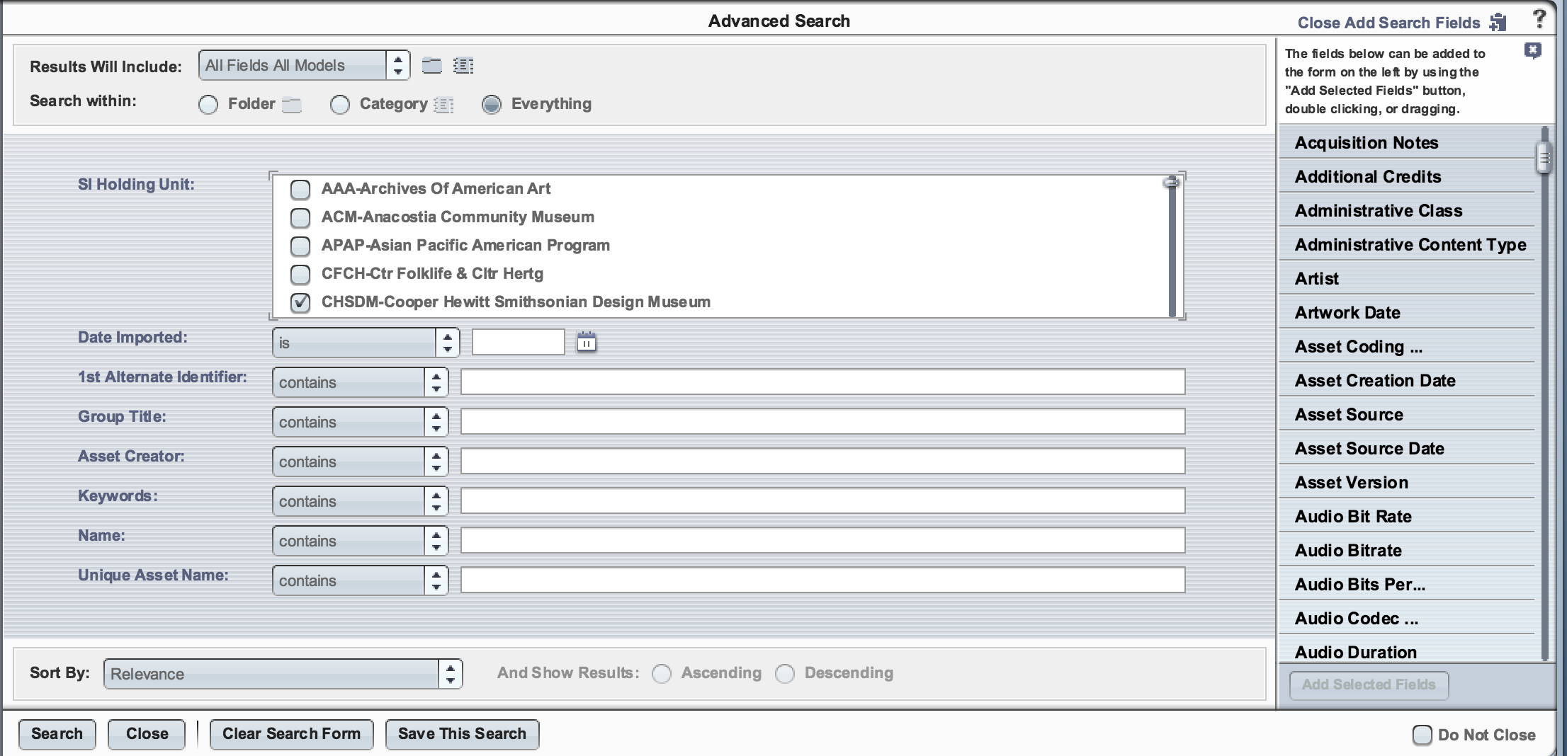
Because CDIS carries the object descriptive data into searchable metadata fields in the DAMS, the metadata sync process makes it possible to locate images in the DAMS. When a DAMS user performs a simple search of any of the words that describe the object or image in TMS, all the applicable images will be returned, provided of course that the DAMS user has permissions to see those particular images!

Image of search functionality in DAMS. Click to enlarge image.

Image of search functionality in DAMS. Click to enlarge image.

The metadata sync is a powerful tool that not only provides the ability to locate Cooper Hewitt owned objects in the DAMS system, but also provides Cooper Hewitt control of how the Smithsonian IDS (Image Delivery Service) displays the image. Cooper Hewitt specifies in TMS a flag to indicate whether to make the image available to the general public or not, and the maximum resolution of the image to display on public facing sites on an image by image basis. With each metadata update, CDIS transfers these settings from TMS to DAMS along with descriptive metadata. DAMS in turn sends this information to IDS. CDIS thus is a key piece that bridges TMS to DAMS to IDS.

AH: Can you show us an example of the code? How was it written?

RF: What was once a small utility, CDIS has since expanded to what may be considered a ‘suite’ of several tools. Each CDIS tool or ‘CDIS operation type’ serves a unique purpose.

For Cooper Hewitt, three operation types are used. The ‘Create Media Record’ tool creates the TMS media, then the ‘Metadata Sync’ tool brings over metadata to DAMS, and finally the ‘Timeframe Report’ is executed. The Timeframe Report emails details of the activity that has been performed (successes and failures) in the past day. Other CDIS operations are used to support the needs of other Smithsonian units.

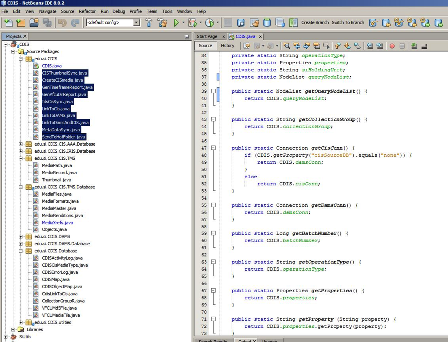
The following is a screenshot of the listing of the CDIS code, developed in the NetBeans IDE with Java. The classes that drives each ‘operation type’ are the highlighted classes in the top left.

A screenshot of the listing of the CDIS code, developed in the NetBeans IDE with Java.

A screenshot of the listing of the CDIS code, developed in the NetBeans IDE with Java.

It may be noted that more than half of the classes reside in folders that end in ‘Database’. These classes map directly to database tables of the corresponding name, and contain functions that act on those individual database tables. Thus MediaFiles.java in edu.si.CDIS.CIS.TMS.Database performs operations on the TMS table ‘MediaFiles’

Something I find a little more interesting than the java code is the configuration files. Each instance of CDIS requires two configuration files that enable OCIO to tailor the behavior of CDIS to each Smithsonian unit’s specific needs. We can examine one of these configuration files- the .xml formatted cdisSql.xml file.

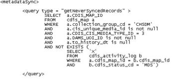
The use of this file is two-fold. First, it contains the criteria CDIS uses to identify which records are to be selected each time a CDIS process is run. The criteria is specified by the actual SQL statement that CDIS will use to find the applicable records. To illustrate the first use, here is an example from the cdisSql.xml file:

The cdisSql.xml file.

The cdisSql.xml file.

This query is part of the metadataSync operation type as the xml tag indicates. This query obtains a list of records that have been connected in CDIS, are owned by Cooper Hewitt (CHSDM), and have never been metadata synced before (there is no metadata sync record in the cdis_activity_log table).

A second use for the cdisSql.xml file is it contains the mappings used in the metadata sync. Each Smithsonian unit has different fields in TMS that are important to them. Because Cooper Hewitt has its own xml file, CDIS provides specialized metadata mapping for Cooper Hewitt.

Code for the metadata sync mapping.

A selection of code for the metadata sync mapping.

If we look at the first query, the creditLine in TMS database table ‘object’ is mapped to the field ‘credit’ in DAMS. Likewise, the data in the TMS object table, column description is carried over to the description field in DAMS, etc. In the second query, there are three different fields in TMS appended to each other (with spaces between them) to make up the ‘other_constraints’ field in DAMS. In the third query (which is indicated to be a ‘cursor append’ query with a delimiter ‘,’ a list of values may be returned from TMS. Each member of the list is concatenated into to a single field in DAMS (the DAMS ‘caption’ field) with a comma (the specified delimiter) separating each value returned in the list from TMS. The metadata sync process combines the results of all three of these queries AND MORE to generate the update for metadata sync in DAMS.

The advantage of locating these queries in the configuration file is it allows for flexibility for each Smithsonian unit to be configured with different criteria for the metadata sync. This design also permits CDIS to perform a metadata sync on other CIS systems (besides TMS) that may use any variety of RDBMS systems. As long as the source data in can be selected with SQL query, it can be brought over to the DAMS.

AH: To date, how many Cooper Hewitt images have been successfully synced with the CDIS code?

RF: For Cooper Hewitt, CDIS currently maintains the TMS to DAMS connections of nearly 213,000 images. This represents more than 172,000 objects.

AH: From my perspective, many of our team projects have involved mapping metadata. Are there any other parts of the code that you find challenging, rewarding?

RF: As for challenges – I deal with many different Smithsonian Units. They each have their own set of media records in various IT systems and they all need to be integrated. There is a certain balancing act that must take place nearly every day. That is provide for the unique needs for each Smithsonian Unit, while also identifying the commonalities among the units. Because CDIS is so flexible, without proper planning and examining the whole picture with the DAMS team, CDIS would be in danger of becoming too unwieldy to support.

As far as rewards- I have always valued projects that allow me to be creative. Investigating the most elegant ways of doing things allows me to keep learning and be creative at the same time. The design of new processes, such as the newly redesigned CDIS and VFCU fulfill that need. But the most rewarding experience is discovering how my efforts are used by researchers, and educate the public in the form of public facing websites and interactive displays. Knowing that I am a part of the historical digitization effort the Smithsonian is undertaking is very rewarding in itself.

AH: Has the CDIS code changed over the years? What types of upgrades have you recently worked on?

RF: CDIS has changed much since we have integrated the first images for Cooper Hewitt. The sheer volume of the data flowing through CDIS has increased exponentially. CDIS now connects well over half a million images owned by nearly a dozen different Smithsonian Units, and that number is growing daily.

CDIS has undergone many changes to support such an increase in scale. In CDIS version 2, CDIS was intrinsically hinged to TMS and relied on database tables in each unit’s own TMS system. For CDIS version 3, we have taken issues such as this into account, and have migrated the backend database for CDIS to a dedicated schema within DAMS database. Cooper Hewitt’s instance of CDIS was updated to version 3 less than two months ago.

Now that the CDIS database is no longer hinged to TMS, CDIS version 3 has opened the doors to mapping DAMS records to a larger variety of CIS systems. We no longer depend the TMS database structure, or even that the CIS system uses the SQL-Server RDBMS. This has enabled the Smithsonian OCIO the ability to expand CDIS’s role beyond TMS and allow integration with other CIS systems such as the National Museum of Natural History’s EMuseum, the Archives of American Art’s proprietary system as well as the Smithsonian Gardens IRIS-BG. All three are currently using the new CDIS today, and there are more coming on board to integrate with CDIS in the near future!


Conclusion

One challenge has been correcting mass digitization images that end up in the wrong object record. If an object was incorrectly barcoded, the image in barcode’s corresponding collections record is also incorrect. Once the object record’s image is known to be incorrect, the asset must be exported, deleted, and purged from DAMS. The image must also be deleted from the media rendition in TMS. When the correct record is located, the file’s barcode or filename can be changed and re-ingested into DAMS. The process can take several days.

The adoption of Smithsonian’s DAMS system has greatly improved redundancy and our workflow with digitization and professional photography. The flexibility of the CDIS coding has allowed me to work with photography assets of our collection’s objects, or “collection surrogates” and images from other departments, such as the Library. Overall, the change has been extremely user-friendly.

Thank you Smithsonian’s DAMS Team!


Traveling our technology to the U.K.

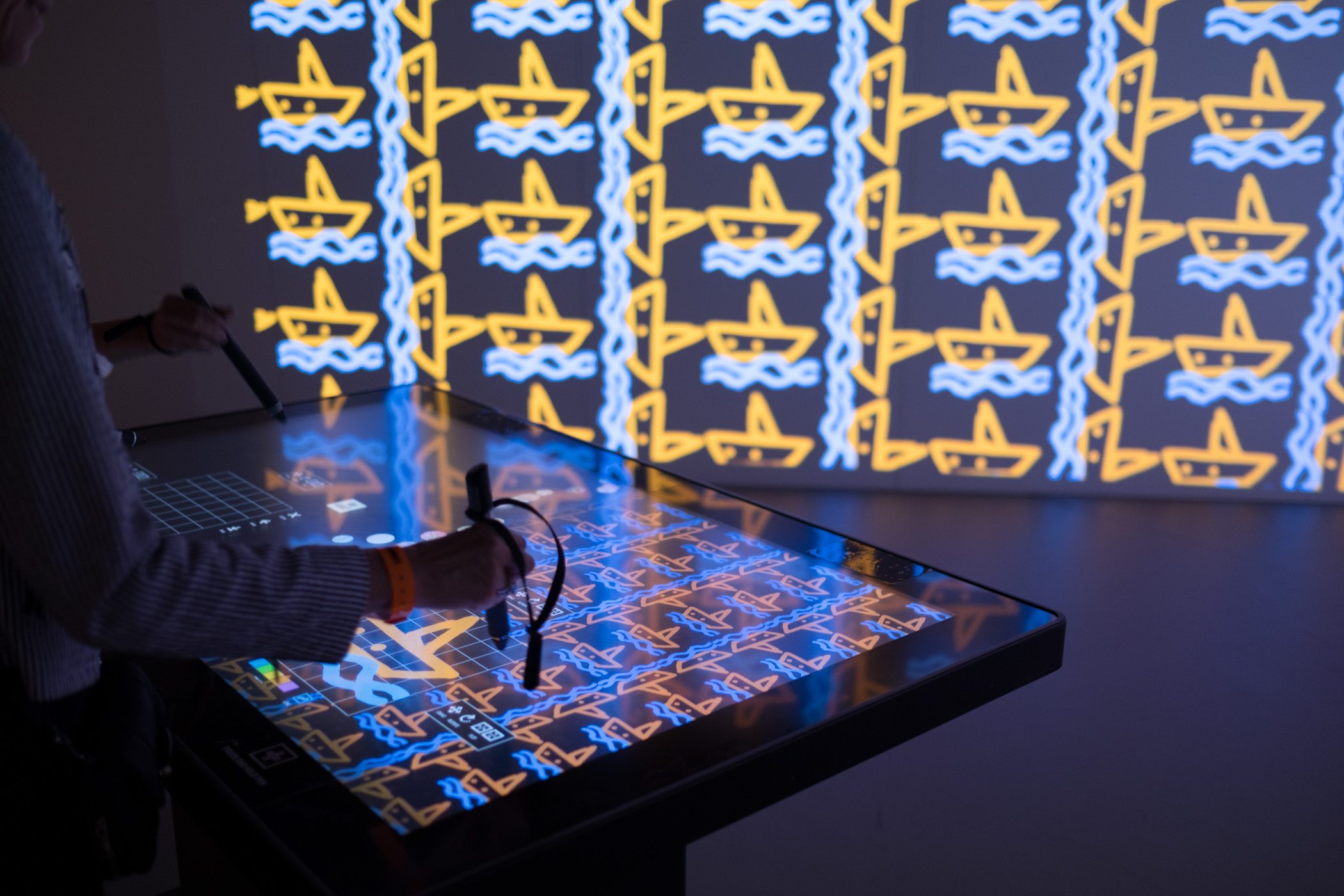
Visitors to the London Design Biennale use our “clone” of the Wallpaper Immersion Room.

Recently, we launched a major initiative at the inaugural London Design Biennale at Somerset House. The installation was up from September 7th through the 27th and now that it has closed and the dust has settled, I thought I’d try and explain the details behind all the technology that went into making this project come alive.

Quite a while back, an invitation was extended to Cooper Hewitt to represent the United States in the London Design Biennale, an exhibition featuring 37 countries from around the world. Our initial idea being to spin up a clone of our very popular “Wallpaper Immersion Room” and hand out Cooper Hewitt Pens.

The idea of traveling our technology outside the walls of the Carnegie Mansion has been of great interest to the museum ever since we reopened our doors in 2014. The process of figuring out how to make our technology portable, and have it make sense in different environments and contexts was definitely a challenge we were up for, and this event seemed like the perfect candidate to put that idea through its paces.

So we started out gathering up the basic requirements and working through all that would be needed to make it all come together, including some very generous support from the Secretary of the Smithsonian and the Smithsonian National Board, Bloomberg Philanthropies, and Amita and Purnendu Chatterjee.

The short version is, this was a huge undertaking. But it all worked in the end, and visitors at the first-ever London Design Biennale were able to use Cooper Hewitt Pens to explore 100 wallpapers from our collection, create their own designs and save them. Plus, visitors could collect and save installations from other Biennale participants.

https://www.instagram.com/p/BKGZ9u9gcHI

https://www.instagram.com/p/BKGZu4yA6dq

The long version is as follows.

An Immersion Room in England

First and foremost, we wanted to bring the Immersion Room over as our installation for the London Design Biennale. So, let’s break down what makes the Immersion Room what it is.

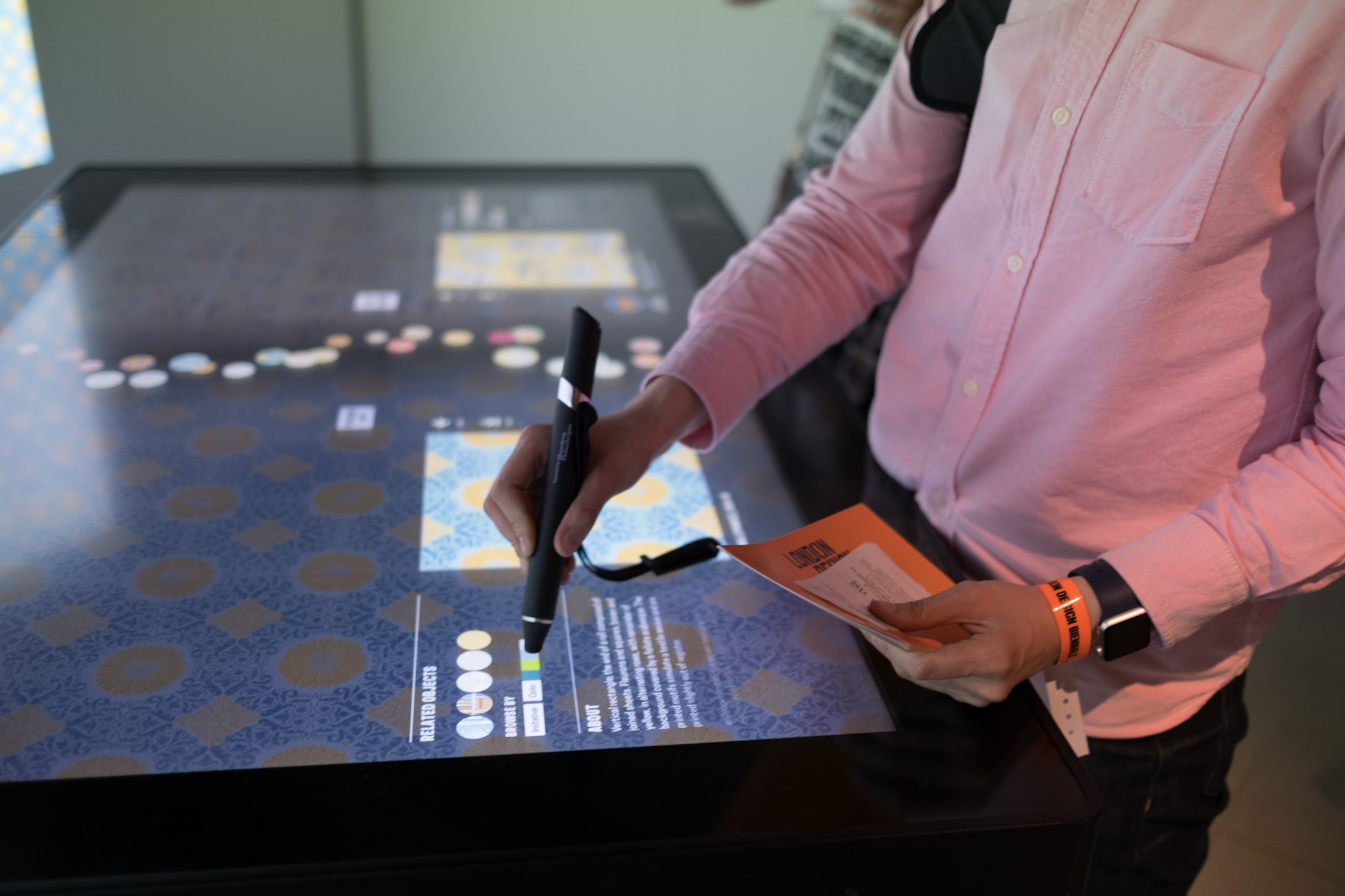
The original Immersion Room, designed by Cooper Hewitt and Local Projects, made its debut when the museum reopened in December 2014, following a major renovation. It is essentially an interactive experience where visitors can manipulate a digital interactive touch-table to browse our collection of wallpapers and view them at scale, in real time, via twin projectors mounted to the ceiling. Additionally, visitors can switch into design mode and create their own wallpapers; adjusting the scale, orientation, and positioning of a repeating pattern on the wall. This latter feature is arguably what makes the experience what it is. Visitors from all walks of life love spending time drawing in the Immersion Room, typically resulting in a selfie or two like the ones you see in the images below.

https://www.instagram.com/p/BKTZ7F0g_eA

https://www.instagram.com/p/BKRMU-QD11m

What I’ve just described is essentially the minimal viable product for this entire effort. One interactive table, two ceiling mounted projectors, a couple of computers, and a couple of walls to project on.

https://www.instagram.com/p/BIlDulOgrBu

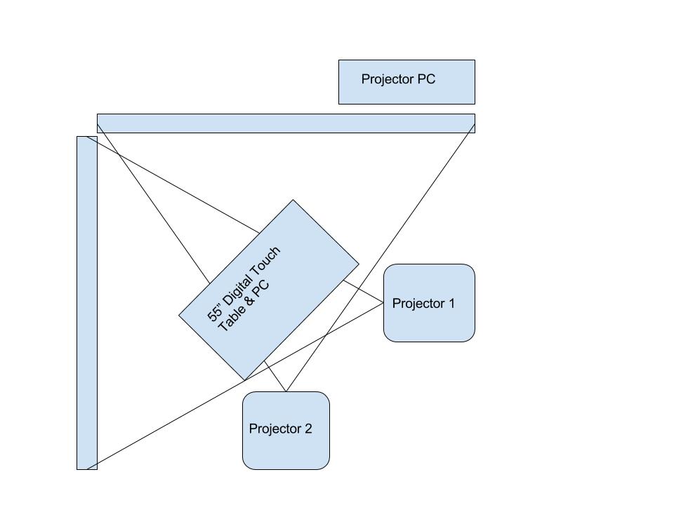
The Immersion Room uses two separate computers, each running an application written in OpenFrameworks. There is the “projector app,” which manages what is displayed to the two projectors, and there is the “table app,” which manages what visitors see and interact with on the 55” Ideum table. The two apps communicate with each other over a local network, with the table app essentially instructing the projector app with what it should be displaying in real time.

Here is a basic diagram of how that all fits together.

Twin projector and computer setup for Wallpaper Immersion Room

Twin projector and computer setup for Wallpaper Immersion Room

Each application loads in content on startup. This is provided to the application by a giant json file that is managed by our Collections API and meant to be updated each night through a cron job. When the applications start up, they look at the json file and pull down any new or changed assets they might need.

At Cooper Hewitt, this means that our curators are able to update content whenever they want using our collections management system, The Museum System (TMS). Updates they make in TMS get reflected on the digital table following a data-deploy and reboot of the table and projector applications. This is essentially the workflow at Cooper Hewitt. Curators fill in object data in TMS, and through a series of tubes, that data eventually finds its way to the interactive tables and our collections website and API. For this project in London, we’d do essentially the same process, with a few caveats.

Make it do all the things

We started asking ourselves a number of questions. It’s a mix of feature creep and a strong desire to put some of the technology we’ve built through it’s paces–to determine if it’s possible to recontextualize much of what we’ve created at Cooper Hewitt and have it work outside the museum walls.

Questions like:

  • What if we want to allow visitors to save the wallpapers and the designs they create?
  • What if we wanted to hand out a Cooper Hewitt Pen to each visitor?
  • What if we want to let people use the Pen to save their creations, wallpapers, and ALL the other installations around the Somerset House?!

All of a sudden, the project becomes a bit more complicated, but still, a great way to figure out how we would translate a ton of the technology we’ve built at Cooper Hewitt into something useful for the rest of the world. We had loads of other ideas, features, and add-ons, but at some point you have to decide what falls in and out of scope.

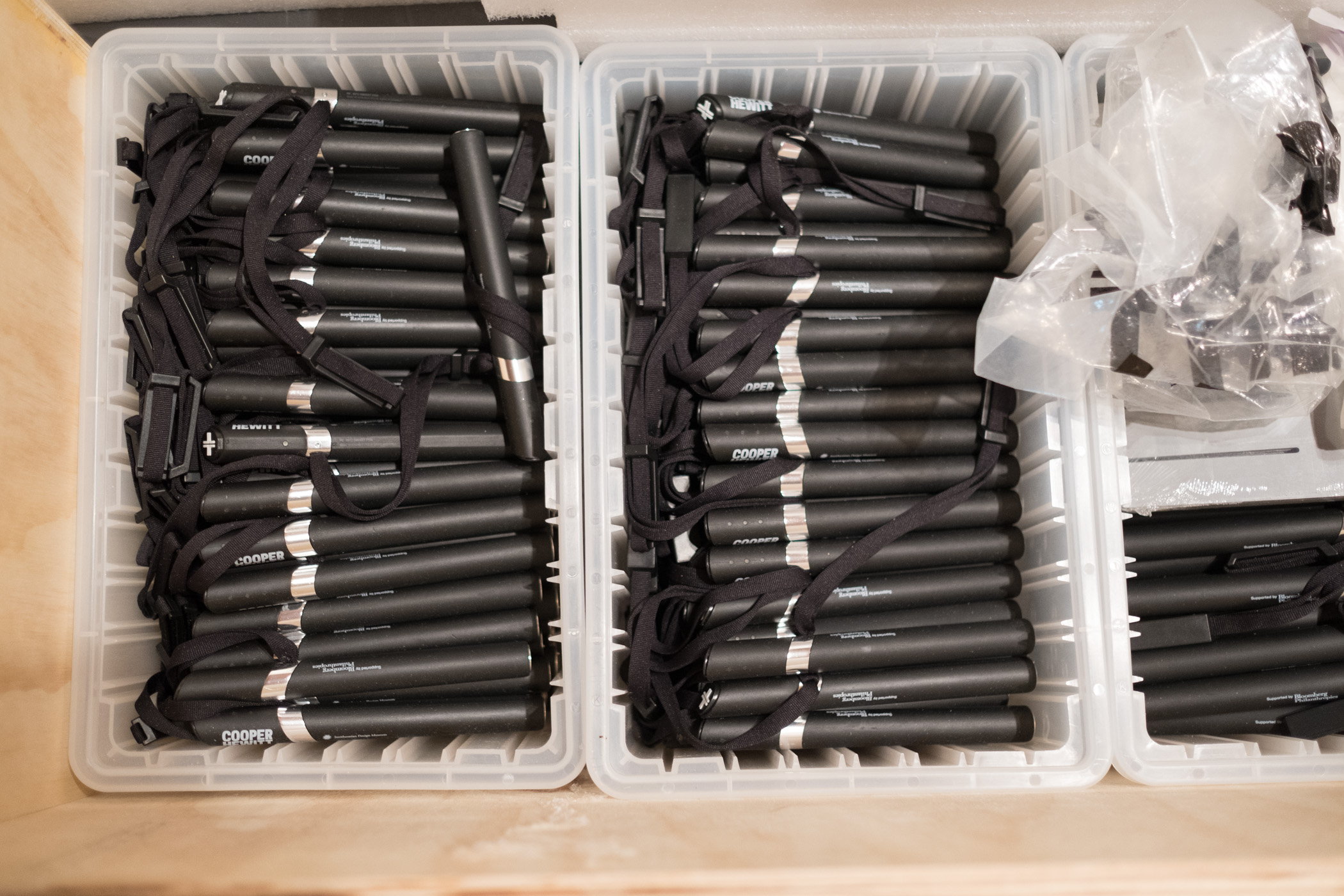
Unpacking 700 Cooper Hewitt Pens we shipped to the U.K., batteries not included!

Unpacking 700 Cooper Hewitt Pens we shipped to the U.K., batteries not included!

So this is what we decided to do.

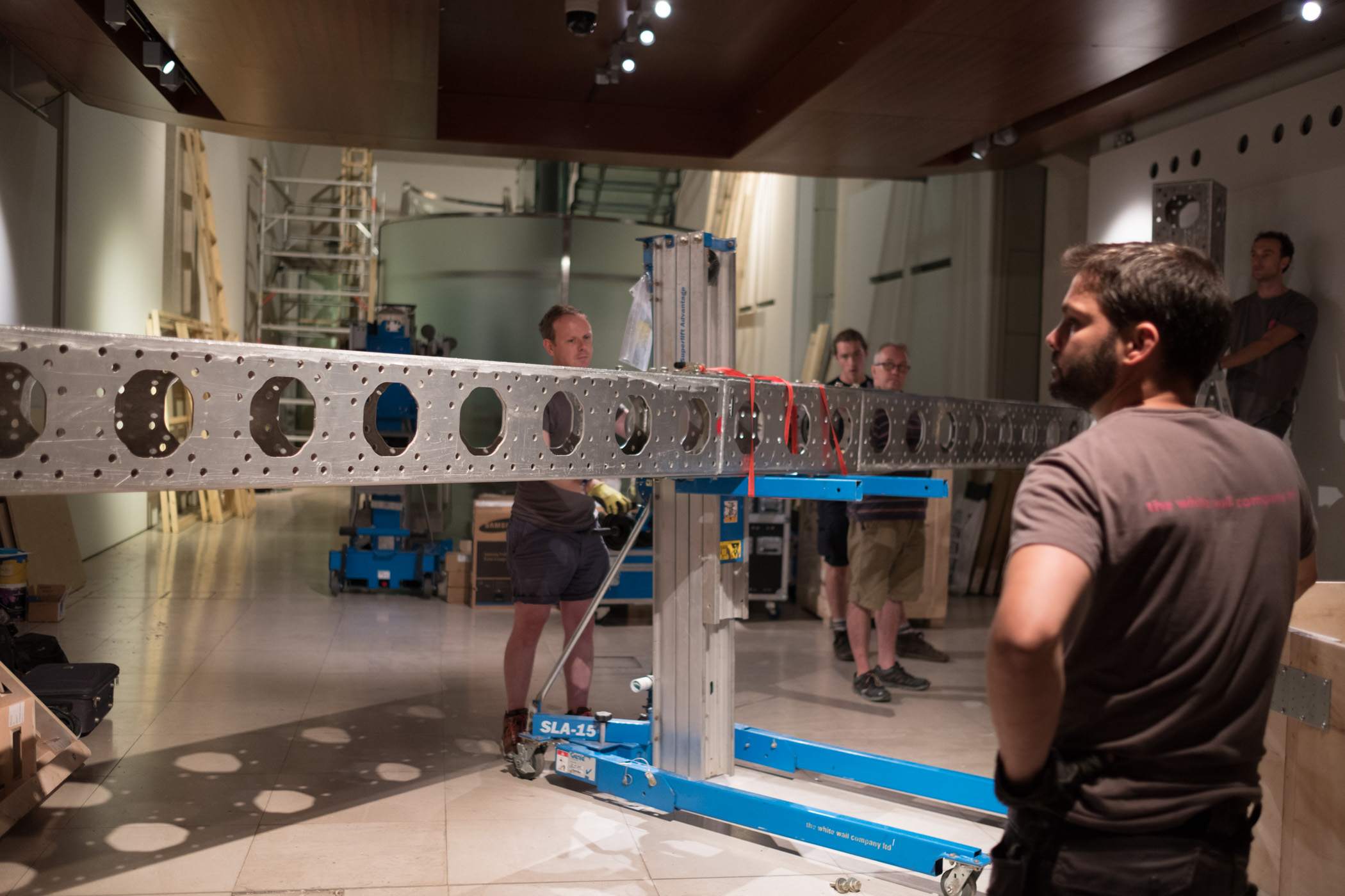
  • We would devise a way to construct the physical build out of a second Immersion Room. This would essentially be a “set” with walls and a truss system for suspending two rather heavy projectors. It would have a floor, and would be slightly off the ground so we could conceal wiring and create a place for the 55” touch table to rest.
  • We’d pre-fabricate the entire rig in New York and ship it to London to be assembled onsite.
  • We’d enable the Immersion Room to allow visitors to save from a selection of 101 wallpapers from our permanent collection. These would be curated for the Utopia theme of the London Design Biennale.
  • We’d enable the design feature of the Immersion Room and allow visitors to save their designs.
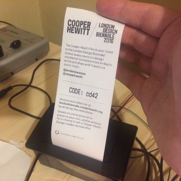
  • We’d hand out Cooper Hewitt Pens to each visitor who wanted one, along with a printed receipt containing a URL and a unique code.
  • We’d post coded NFC tags all throughout Somerset House to allow visitors to use their Pens to collect information about each participating country, including our own.
  • We’d build a bespoke website where visitors would go following their visit to see all the things they’ve collected or created.

These are all of the things we decided to do from a technology standpoint. Here is how we did it.

pen-www

The first step to making this all work was to extract the relevant code from our production collections website and API. We named this “pen-www” and intended that this codebase serve as a mini framework for developing a collecting system and website. In essence it’s simply a web application (written in PHP) and a REST API (also PHP). It really needed to be “just the code” required to make all the above work. So here is another list, explaining what all those requirements are.

  • It needs to somehow generate a simple collections website that is capable of storing relevant info about all the things one could potentially collect. This was very similar to our current codebase at Cooper Hewitt, but we added the idea of “organizations” so that you could have multiple participants contributing info, and not just Cooper Hewitt.
  • It needs all the API methods that make the Pen work. There are actually just a handful that do all the hard work. I’ll get to those in a bit.
  • It needs to handle image uploads and processing of those images (saved designs from the Immersion Room table).
  • It needs to create “visits” which are the pages a visitor lands on when entering their unique code.
  • It needs a series of scripts to help us import data and set things up.
  • We would also need some new code to allow us to generate paper receipts with unique codes printed on them. At Cooper Hewitt this is all done via our Tessitura ticket printing system, so since we wouldn’t have that at Somerset House, we’d need to devise a new way of dealing with registering and pairing pens, and printing out some kind of receipt.

So, pen-www would become this sort of boilerplate framework for the Pen. The idea being, we’d distill the giant codebase we’ve developed at Cooper Hewitt down to the most essential parts, and then make it specific to what we wanted to do for London. This is an important point. We aren’t attempting to build an actual framework. What we are trying to do is to boil out the necessary code as a starting point, and then use that code as the basis for a new project altogether.

From our point of view, this exercise allows us to understand how everything works, and gets us close enough to the core code so that we can think of repeating this a third or a fourth time—or more.

The API at the center of everything

We built the Cooper Hewitt API with intentions of making it flexible enough to be easily expanded upon or altered. It tries to adhere to the REST API pattern as much as it can, but it’s probably better described as “REST-ish.” What’s nice about this approach has been that we’ve been able to build lots and lots of internal interfaces using this same pattern and code base. This means that when we want to do something as bespoke as building an entire replica of our seemingly complex Pen/Visit system, and deploy it in another country, we have some ground to stand on.

In fact, just about all of the systems we have built use the API in some way. So, in theory, spinning up a new API for the London project should just mean pointing things like the Immersion Room interactive table at a new API endpoint. Since the methods are the same, and the responses use the same pattern, it should all just work!

So let’s unpack the API methods required to make the Pen and Immersion Room come to life. These are all internal/private API methods, so you can’t take them for a spin, and I can’t share the actual code with you that lies beneath, but I think you’ll get the idea.

Pens – there’s a whole class of API methods that deal with the Pen itself. Here are the relevant ones:

  • pens.checkoutPen – This marks a Pen as having been checked out for an associated visit
  • pens.getCurrentCheckout – This gets the currently checked out Pen for a specific visit
  • pens.getCurrentVisit – This does the opposite of the getCurrentCheckout, and returns a visit for a specific Pen.
  • pens.returnPen – This marks the Pen as having been returned.

Visits – There is another class of API methods that deal with the idea of “visits.” A visit is meant to represent one individual’s visit to the museum or exhibition, or some other physical location. Each visit has an ID and a corresponding unique code (the thing we print on a visitor’s paper receipt).

  • visits.getActivity – Returns all the activity associated with a visit
  • visits.getInfo – Returns detailed info about a specific visit
  • visits.processPenActivity – This is a major API method that takes any activity recorded by the Pen and processes it before storing the info in the appropriate location in the database. This one gets called frequently and is the method that happens when you tap your Pen on a reader board at one of our digital tables. The reader board downloads all the info on the Pen, and calls this API method to deal with whatever came across.
  • visits.registerVisit – This marks a visit as having been registered. It’s what generates your unique code for the visit.

Believe it or not, that is basically it. It’s just a handful of actions that need to be performed to make this whole thing work. With these methods in place, we can:

  • Pair pens with newly created visits so we can hand Pens out to visitors.
  • Process data collected by the Pen, either from NFC stickers it has read, or via our Interactive Table.
  • Do a final read of the Pen and return the Pen to the pool of possible pens.

So, now that we have an API, and all the relevant methods we can start building the website and massaging the API code to do things in the slightly different ways that make this whole thing live up to its bespokiness.

On the website end of things we will follow the KISS principle or “Keep it simple, stupid.” The site will be devoid of fancy image display features, extended relationship mapping and tagging, and all the goodies we’ve spent years developing for the Cooper Hewitt Collections website. It won’t have search, or fancy search, or search by color, or search by anything. It won’t have a shoebox or even a random button (ok, maybe I’ll add that later today). For all intents and purposes, the website will simply be a place to enter your unique code, and see all your stuff.

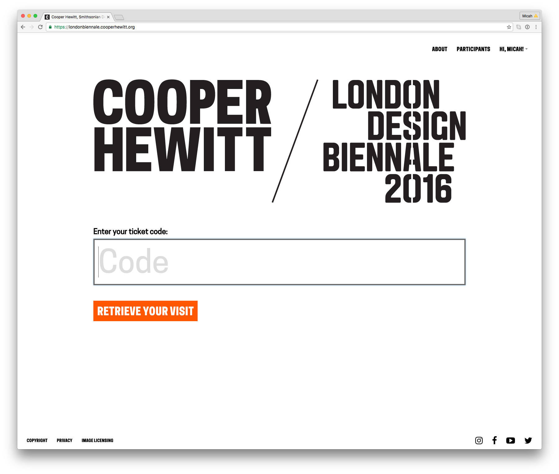
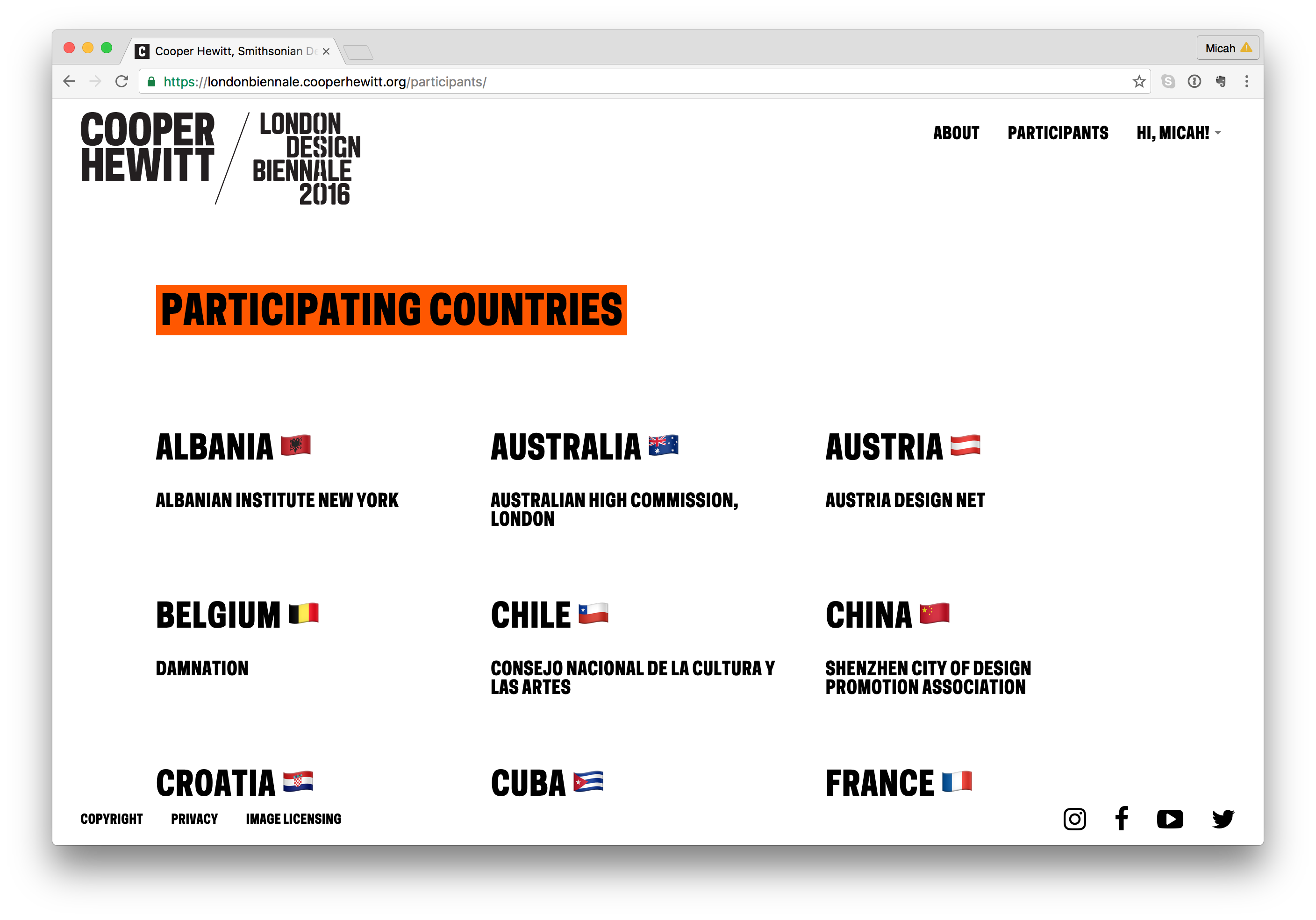
https://londonbiennale.cooperhewitt.org

https://londonbiennale.cooperhewitt.org

The website and its API will live at https://londonbiennale.cooperhewitt.org. It consists of just two web front ends running Apache and sitting behind an NGINX load balancer, and one MySQL instance via Amazon’s RDS service. It’s very, very similar to just about all of our other systems and services except that it doesn’t have fancy extras like Logstash logging, or an Elasticsearch index. I did take the time to install server monitoring and alerting, just so we can sleep at night, but really, it’s pretty bare bones.

At first glance there isn’t much there to look at. You can browse the different participants and you can create a Cooper Hewitt account or sign in using our Single Sign On service, but other than that, there is really just one thing to do–enter your code and see all your stuff.

Participants

Participants

All your content are belong to us

In order for this project to really work, we’d need to have content. Not only our own Cooper Hewitt content, but content from all the participants representing the 36 other countries from around the world.

So here is the breakdown:

  • Each participant or organization will have a page, like this one for Australia https://londonbiennale.cooperhewitt.org/participants/australia/
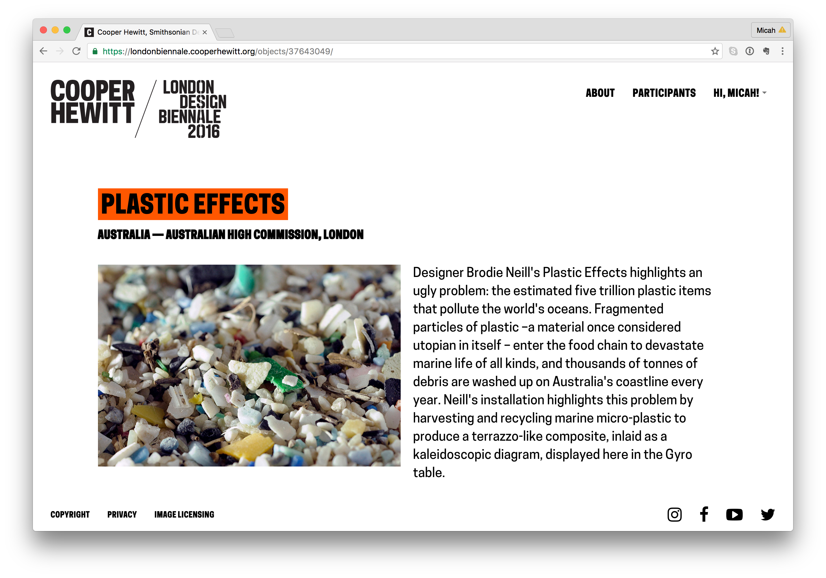
  • Each participant will have one “object.” In the case of all 37 participants, this object will represent their “booth” like this one from Australia – https://londonbiennale.cooperhewitt.org/objects/37643049/
  • Each “booth” will contain an image and the catalog text provided by the London Design Biennale team. If there is time, we will consider adding additional information from each participant (we haven’t done this as of yet).
  • Cooper Hewitt’s record will have some more stuff. In addition to the object representing Cooper Hewitt’s booth, we will also have 100 wallcoverings from our permanent collection.
  • You can collect all of these via the Immersion Room table and your Pen. Here is our page – https://londonbiennale.cooperhewitt.org/participants/usa/ There are also two physical wallapapers that are part of our installation, which you can of course collect as well.

All told, that means 140 objects in this little microsite/sitelet. You can actually browse them all at once if you are so inclined here – https://londonbiennale.cooperhewitt.org/objects/

"Booth" pages

“Booth” pages

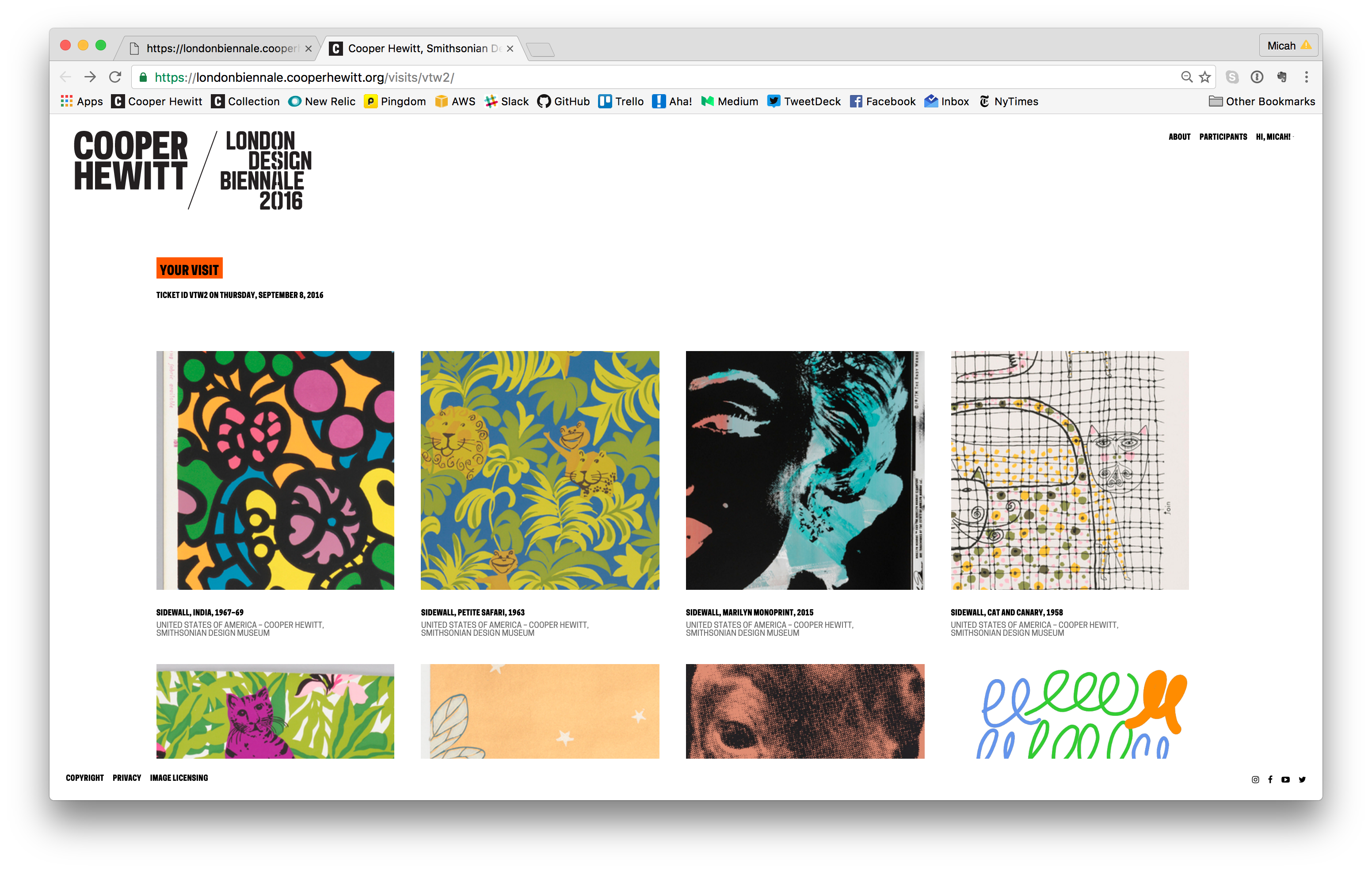
Visit Pages

So what does a visitor get when they go to the webpage and type in their unique code. Well, the answer to that question is “it depends.” For objects that we imported from our permanent collection (the 101 wallpapers) you get a nice photo of the wallpaper, a chatty description of the wallpaper written by our curator, Greg Herringshaw, having to do with “Utopia” — the theme of this year’s London Design Biennale. You also get a link back to the collection page on the Cooper Hewitt website. For the 37 booths, you get a photo and the catalog info for each participants, and if you created and saved your own design in the wallpaper immersion room, you get a copy of the PNG version of your design, which you can, of course, download and do with what you like. (Hint: they make cool wall posters.)

Additionally, you get timestamps related to your visit. This way, just like on the Cooper Hewitt website, you get to retain a record of your visit–the date and time of each collected object and a way to recall your visit anytime in the future.

Visit page example

Visit page example

Slow Progress

All of this code replication, extraction, and re-configuring took quite a long time. The team spent long hours, nights, and weekends trying to sort it all out. In theory this should all just work, but like any project, there are unique aspects to the thing you are currently trying to accomplish, which means that, no matter what, you’re gonna be writing some new code.

Ok, so let’s check in with what we’ve got so far.

  • A physical manifestation of the Wallpaper Immersion Room and all it’s hardware, computers, wires, etc.
  • A website and API to power all the fun stuff.
  • A bunch of content from our own permanent collection and the catalog info from the London Design Biennale team.
  • Visit pages

We still need the following:

  • A way to issue Pens to visitors as they arrive.
  • A way to print a unique code on some kind of receipt, which we give to the visitors as well.
  • A way to check in Pens as visitors return them.
  • The means to get the table pointing at the right API endpoint so it can save things and processPenActivity as well.

To accomplish the first three items on the list, we enlisted the help of Rev Dan Catt.

https://www.instagram.com/p/BJ3WizdAYfc

Dan is planning to write another extensive blog post about his role in all of this, but in a nutshell, he took our Pen registration code and built his own little mini-registration station and ticket printer. It’s pictured below and performs all of the functions above (1 through 3). It uses a small Adafruit thermal printer to print the receipts and unique codes, and it is simple enough to use with a small web based UI to give the operator some basic feedback. Other than that, you tap a pen and it does the rest.

Dan's Raspberry Pi powered Pen registration and ticket printing station.

Dan’s Raspberry Pi powered Pen registration and ticket printing station.

Tickets printing for the first time

Tickets printing for the first time

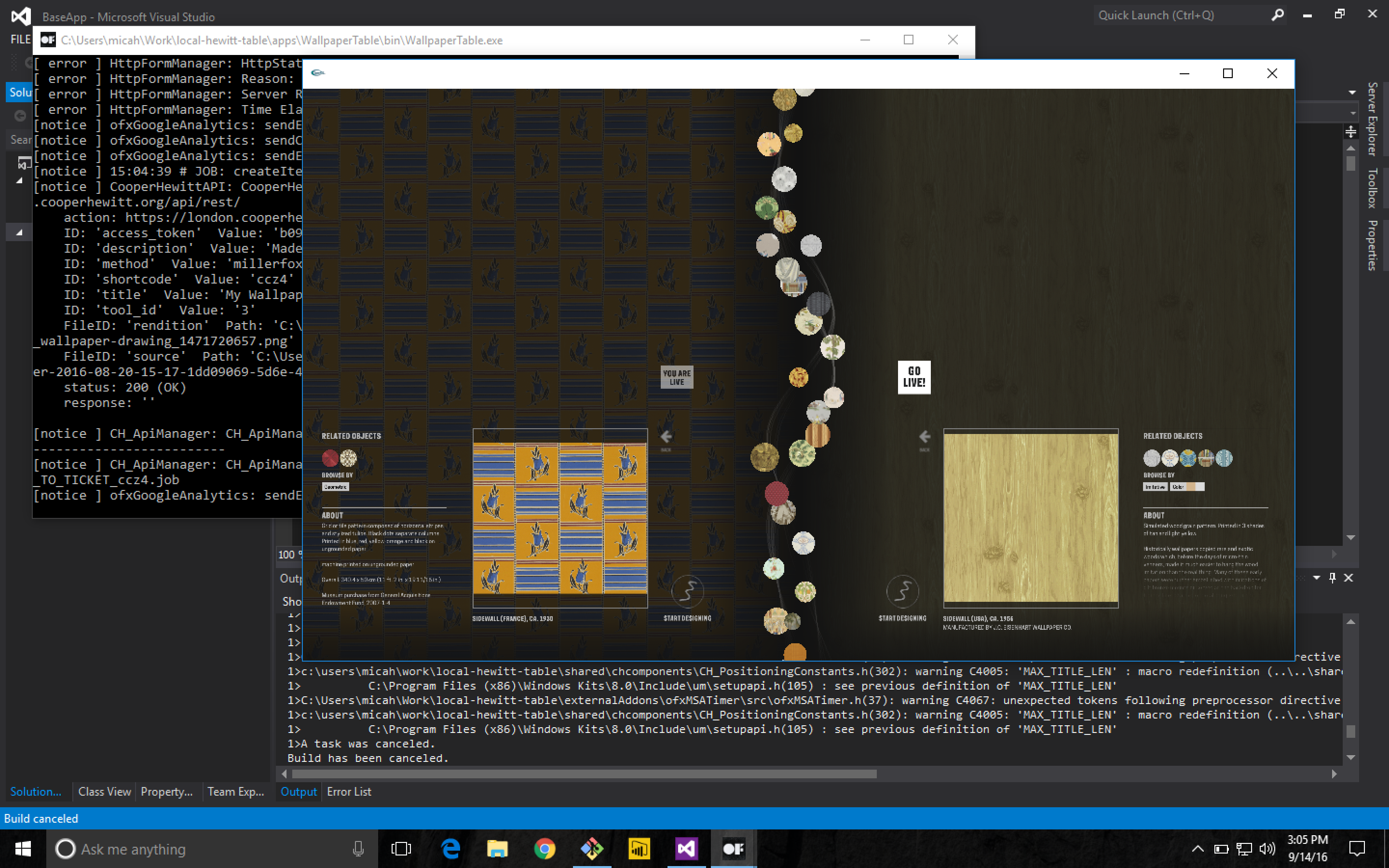
For the last item on the list, I had to re-compile the code Local Projects delivered to us. In the code I had to find the references to the Cooper Hewitt API endpoints and adjust them to point at the London API endpoint. Once I did this, and recompiled the OpenFrameworks project we were in business. For a while, I had it all set up for development and testing on my laptop using Parallels and Visual Studio. Eventually I compiled a final version and we installed it on the actual Immersion Room Table.

Working on the OpenFrameworks code on Parallels on my MacBook Pro

Working on the OpenFrameworks code on Parallels on my MacBook Pro

Cracking open the Local Projects code was a little scary. I’m not really an OpenFrameworks programmer, or at least I haven’t been since grad school, and the Local Projects code base is pretty vast. We’ve had this code compiled and running on all the interactive tables at Cooper Hewitt since December of 2014. This is the first time I (or anyone I know of) has attempted to recompile it from source, not to mention make changes to it beforehand.

That said, it all worked just fine. I had to find an old copy of Visual Studio 2012, but other than that, and tracking down a few dependencies, it wasn’t a very big deal. Now we had a copy of the Immersion Room table application set up to talk to the London API endpoint. As I mentioned before, all the API methods are named the same, and set up the same way, so the data began to flow back and forth pretty quickly.

Content Management

I mentioned above that we had to import 100 wallpapers from our collection as well as the data for all 37 booths. To accomplish all of this, we wrote a bunch of Python and PHP scripts.

We needed to do the following with regard to content:

  • Create a record for each of the 37 participants
  • Import the catalog info as an object for each of the 37 participants
  • Import the 100 wallcoverings from the Cooper Hewitt collection. We just used, you guessed it, our own API to do this.
  • Massage the JSON files that live on the Projector and Table applications so they have the correct 100 wallpapers and all their metadata.
  • Display the emoji flag for each country, because emoji.

In the end, this was just a matter of building the necessary scripts and running them a number of times until we had what we wanted. As a sort of side note, we decided to use London Integers for this project instead of Brooklyn Integers, which we normally use at Cooper Hewitt, but that’s probably a topic for a future post.

Shipping code, literally

At some point we would need to put all the hardware and construction pieces into crates and ship them across the pond. At the time, our thinking was to get the code running on the digital table and projector computers as close to production ready as we could. We installed all the final builds of the code on the two computers, packed them up with the 55” interactive table, and shipped them over to London, along with six other crates full of the “set” and all its hardware and parts. It was, in a nutshell, impressive.

As the freight went to London, we continued working on the website code back home—making the site look the way we wanted it to look and behave the way we wanted it to behave. As I mentioned before, it’s pretty feature free, but it still required some spit and polish in the form of some of Rachel’s Sassy-CSS. Eventually we all settled on the aesthetics of the site, added a lockup that reflected both the Cooper Hewitt and London Design Biennale brands (both happen to be by Pentagram) and called it a day. We continued testing the table application and Dan continued working on the Pen registration app and receipt printer so it would be ready when we landed.

Building the set with the team at Somerset House.

Building the set with the team at Somerset House.

We landed, started to build the set, and many, many things started to go wrong. I think all of the things that went wrong are probably the topic of yet another blog post, but let’s just say for now: if you ever decide to travel a whole bunch of A/V equipment and computers to another country, get everything working with the local power standard and don’t try to transform anything.

https://www.instagram.com/p/BJ2dROFAjLQ

Eventually, through a lot of long days and sleepless nights, and with the help of many, many kind-hearted people, we managed to get all the systems up and running, and everything began to work.

dscf0213

We flipped the switch and the whole thing came to life and visitors started to walk up to our booth, curious and excited to see what it would do. We started handing out Pens and I started watching the data flow through.

By the close of the show, visitors had used the Pen to collect over 27,000 objects. Eventually, I’ll do a deeper data analysis, but for now, the feeling is really great. We created a portable version of the Pen and all of its underlying systems. We traveled a giant kit of A/V tech and parts overseas, and now people in a country other than the United States can experience what Cooper Hewitt is all about: a dynamic, interactive deep dive into design.

Design your own Utopia at the London Design Biennale

Design your own Utopia at the London Design Biennale

-m