We now have a responsive main website. To a degree.
Like everything it is a stopgap measure before we do a full overhaul of the Cooper-Hewitt online – timed to go live before we reopen our main campus (2014).
With the proportion of mobile traffic to our web properties increasing every month we couldn’t wait for a full redesign to implement a mobile-friendly version of the site. So we did some tweaking and with the help of Orion, pulled responsiveness into the scope for a migration of backends from Drupal 6 to Drupal 7.
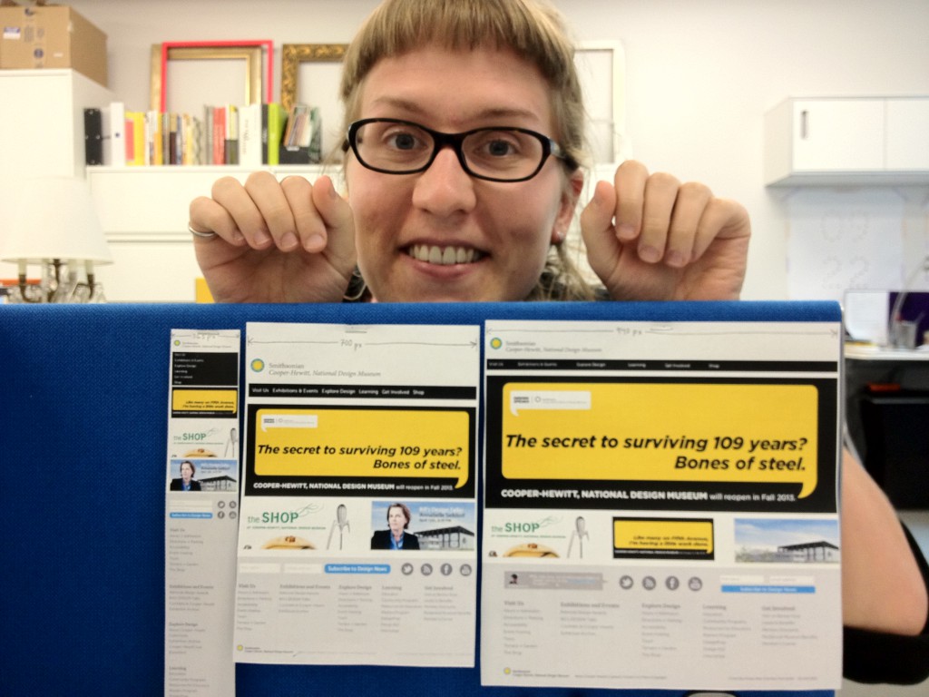
Katie did the wireframing and design of the new funky fat footer – which you’ll notice, changes arrangements as it switches between enormous (desktop), large (tablet) and mini (mobile) modes.
Here she is explaining the what and why.

Why did you do paper prototypes for the responsive design?
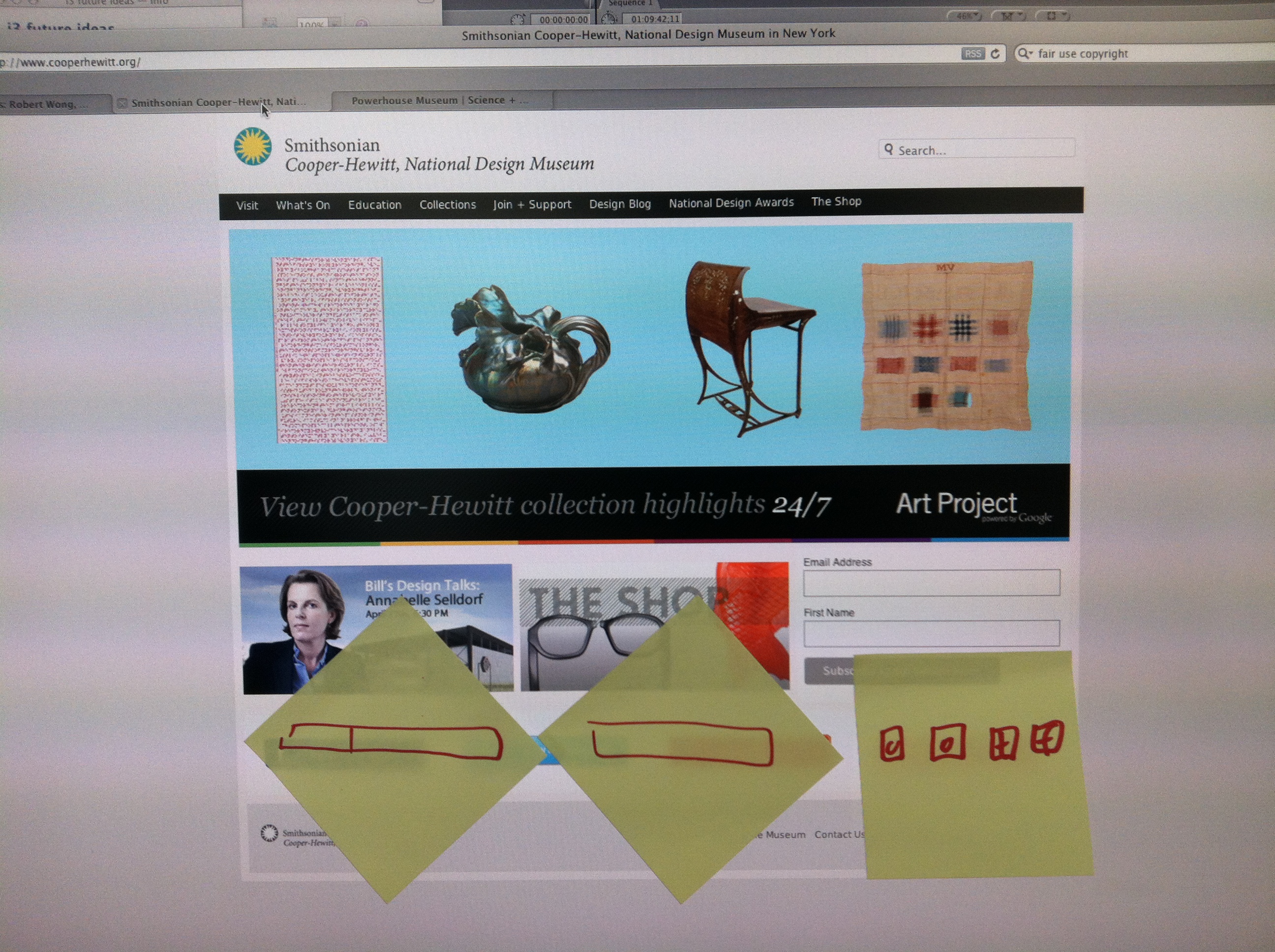
A few months ago I was working on a design for the Arts Achieve website. I showed my screen to Bill, our museum director, to get his thoughts. Bill is a former industrial designer and one of the pioneers of interaction design. The first thing he said was “ok, let’s print out a screenshot.” He then drew his suggestions right onto the printed page. We didn’t really look at the screen much during the conversation. Writing directly onto the paper was more immediate and direct, and made his suggestions feel very possible to me. Looking at a site design on a screen makes me feel like I’m looking at something final, even if its just a mockup. The same thing printed on paper seems more malleable. It’s a mind trick!
Paper also lets me print out many versions and compare them side-by-side (you can’t do that on a single monitor).
Paper also ALSO lets me walk around showing my print-outs to others and ask for rapid reactions without pulling everyone into a screen hover session. This is a simple body/communication thing: when everyone is facing toward a screen to talk about a design, you’re not in a natural conversational position. Everyone’s face and body is oriented toward the screen. I can’t see people’s faces and expressions unless I twist around. When you’re just holding a paper, and there’s no screen, it’s more like a natural conversation.
Why do some of the elements move around in the responsive footer? (why do the icons and signups move)
They move around to be graphically pleasing. And to make sure the stuff we wanted people to notice and click on is most prominent.
We had a strong desire for the social media icons to be really prominent. So they’re front and center in the monitor-width design (940px width). They’re on the right hand side in the tablet-size design (700px wide) and in the mobile-size design (365px wide) because I think it looks sharpest when the rectilinear components are left-justified and the round stuff is on the right.
What were the challenges for the responsive design?
We had a really clear hierarchy in mind from the beginning (we knew what we really wanted people to notice and click) so that eliminated a lot of complexity. The only challenge was how to serve that hierarchy cleanly.
One challenge was the footer doesn’t always graphically harmonize with the body of the page, because the page content is always changing.
Another challenge was getting the latest tweet to be clear and legible, but still appear quiet and ambient and classy.
What were some of the things you are going to be looking out for as it the site goes live?
I want to see how the footer harmonizes with our varying page body content and then decide if it makes sense to change the footer to match the body, or re-style the body content to sit better atop the footer.
I wonder if people on Twitter will start saying stuff @Cooperhewitt just because they know they’ll get a few minutes of fame on our homepage. That participation could be awesome or spammy. We’ll see.
I’m really excited to see the analytics. I want to see if this new layout really does boost our newsletter signup and social media participation and everything. It will be super gratifying if it does.
Of course, we’ll reiterate and revise based on all the analytics and feedback.

