Monthly Archives: April 2013

We won an award

_mw2013small

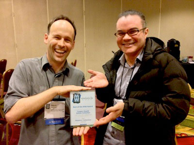
The annual international gathering that is Museums and the Web has just passed and this year we were lucky enough to win one of the Best of the Web Awards in the Research/Collections category.

We are especially proud of this award because it represents critical evaluation by our peers. And we love that they called out its tone, experimental nature, and its early alpha release. These are exactly the qualities that we believe offer the most to others in the field – something that shiny, polished, and ‘finished’ projects often don’t. What we are doing can (and perhaps, should) be copied by others.

We dedicate the award to Bill Moggridge and we’d like to particularly thank the generosity of curatorial and registration staff in letting us experiment to try re-inventing the collections online paradigm – a task that is far from over.

Congratulations to all the other winners – it is nice to be in such great company!

tms-tools == this is a blog post about code

Untitled
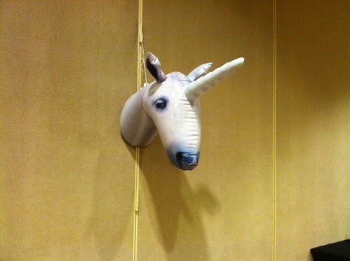
icebergs are kind of like giant underwater unicorns when you think about it

tms-tools

This is a blog post about code. Which means it’s really a blog post about data.

tms-tools is a suite of libraries and scripts to extract data from TMS as CSV files. Each database table is dumped as a separate CSV file. That’s it really.

It’s a blog post about data. Which means it’s really a blog post about control. It’s a blog post about preserving a measure of control over your own data.

At the end of it all TMS is a MS-SQL database and, in 2013, it still feels like an epic struggle just to get the raw data out of TMS so that single task is principally what these tools deal with.

tms-tools is the name we gave to the first set of scripts and libraries we wrote when we undertook to rebuild the collections website in the summer of 2012. The first step in that journey was creating a read-only clone of the collections database.

Quite a lot of this functionality can be accomplished from the TMS or MS-SQL applications themselves but that involves running a Windows machine and pressing a lot of buttons. This code is designed to be part of an otherwise automated system for working with your data.

TMS will remain the ultimate source of truth for our collection metadata but for us TMS didn’t turn out to be the best choice for developing and managing the public face of that data. The code in the tms-tools repository is meant to act as a bridge between those two different needs.

There is no attempt to interpret the data or the reconcile the twisty maze of relationships between the many tables in TMS. That is left as an exercise to the reader. This is not a one-button magic pony. This is code that works for us today. It has issues. If you choose to use it you will probably discover new issues. Yay, adventure!

We’re making the tms-tools code available today on Github, released under a BSD license.

We are making this code available because we know many others in our community face similar challenges. Maybe the work we’ve done so far can help others and going forward we can try to make things a little better, together.

Welcome to object phone. Your call has been placed in a queue.

I made another small thing. Again, another way for me to experiment with the Collection API, and again, another way to experiment with new ways of accessing the collection. This time, there aren’t many screen shots to display–there is no website to look at. This time, it’s “Welcome to object phone!”

(718) 213-4915

Object Phone” is ( presently ) a very, very simple implementation of a way to explore our collection by dialing a telephone, or sending a text message. I had been thinking of a few of the more popular museum oriented audio tour products, and how they all seem to be very CMS style in their design, and wondering if we could just use our own API.

For example, TourML and TAP ( which offer the web programmer a very powerful framework for programming a mobile guide using the Drupal CMS ) are very nice, but they are still very dependent on content production. The developer or content manager has to build and curate all of the content for the “tour.” This might be a good way to go about things, especially if you are leaning on an existing Drupal installation for a good deal of your content, but I was looking for a way to access existing data, and specifically the data in our collection website.

In the beginning of developing our collection website, we went through the process of assigning EVERYTHING a unique “bigint” in the form of what we are referring to as an “artisinal integer.” This means that each object record, each person record and each, well, everything else has a unique integer which no other thing can have. This is not in place of accession numbers–we will probably always have accession numbers The nice thing about unique integers is that they’re really easy to deal with on a programmatic level.

For example, if you text 18704235 to 718-213-4915 you should get a response that looks like the screenshot below. In fact you can text any object id number from our collection and get a similar response.
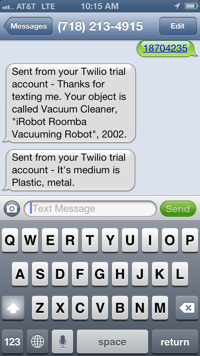
2013-04-18 10.15.18

You can also dial that same number and use your keypad to either search the collection by object ID, or ask for a random object. The application will respond to you using a text to speech converter, which is usually pretty good.

Presently, the app is not replying with a whole lot of information. You essentially get the object’s title and medium field if it has one. In many cases, asking for a random object may just result in something like “Drawing.” Many of our object records don’t have much more useful information than this, and also, I am trying to wrangle with the idea of how much information is useful in a voice and text message ( with a 160 character limit per SMS).

The whole system is leveraging the Twilio service and API. Twilio offers quite a range of possibilities, and I am very excited to experiment with more. For example, instead of text to speech, Twilio can play back .wav files. Additionally, Twilio can do things like dial another phone number, forward calls and record the caller’s voice. There are so many possibilities here that I wont even begin to list them, but for example, I could easily see us using this to capture user feedback in our galleries by phone and text.

I’m very interested in figuring out a way to search by voice. I’m sort of dreaming of programming the thing to go “Why don’t you just tell me the object number!” as in this great episode of Seinfeld which you can watch by clicking the image below.

Screen Shot 2013-04-18 at 10.35.01 AMIf you are interested, I have also made the code public on this Gist. It’s pretty messy and redundant right now, but you’ll get the idea.

One of the more complicated aspects of this project will be designing the phone interface so it makes sense. Currently, once you hear an object play back, the system just hangs up on you. It would be nice to offer the user a better way to manipulate the system which is still pleasant and easy to understand. By that same token, there is a completely different approach that is needed for the SMS end of things as you don’t really have a menu tree, but instead of list of possible commands the user need to learn. Fortunately, there is a ton of great work that has already been accomplished in this arena, specifically by the Walker Art Center’s very long running and very yellow website Art on Call.

Source code at github.com/cooperhewitt/objectphone
"cmd-P"

I made us a print stylesheet for object pages on the collections website. (What does that mean? It means you can print out the webpage and it will look nice).

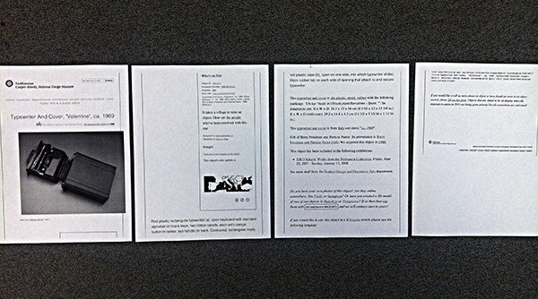
Printout of Object #18621871 before stylesheet

Printout of Object #18621871.. before stylesheet.

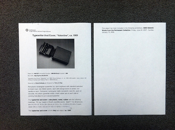
Printout of Object #18621871 after stylesheet. Much better.

Printout of Object #18621871 after stylesheet. Much better. Office carpet courtesy of Tandus flooring.

This should be very useful for us in-house, especially curators and education.. and anyone doing exhibition planning.. (which right now is many of us).

It’s not very fancy or anything. Basically I just stripped away all the extraneous information and got right to the essential details, kind of like designing for mobile.

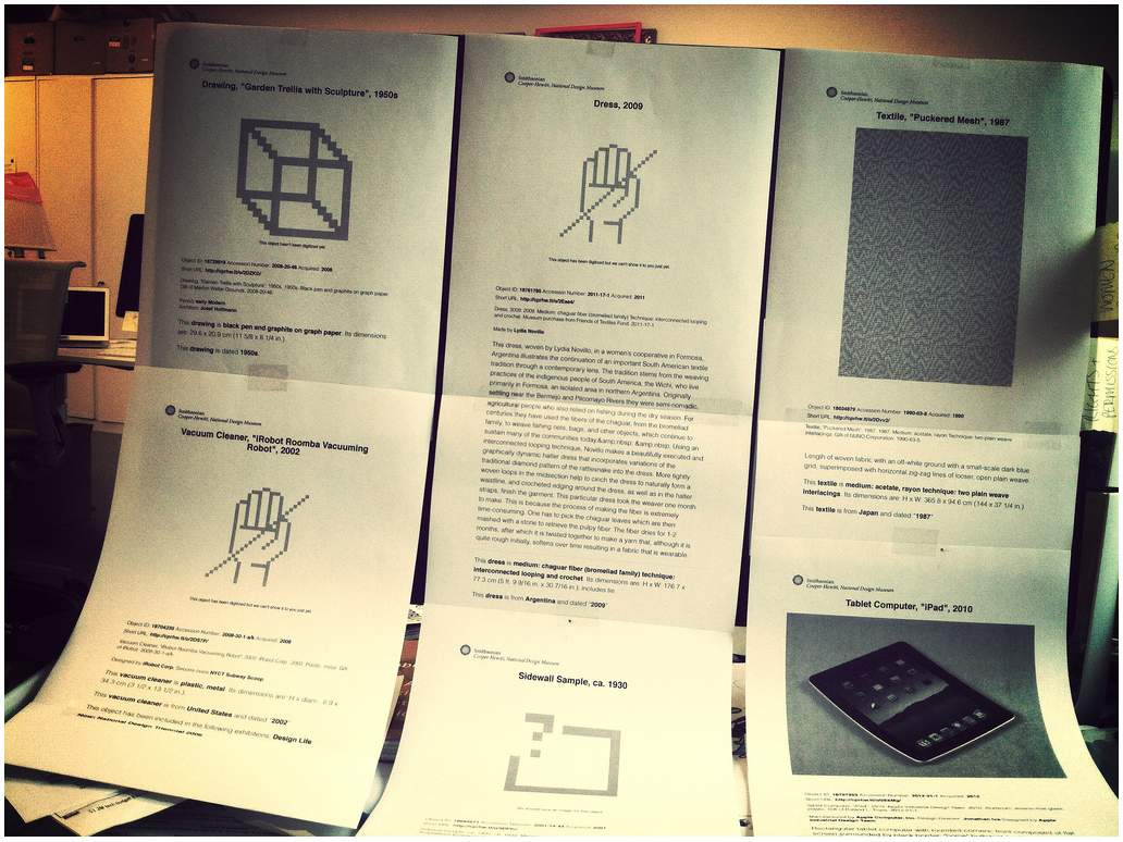
six printouts on standard paper from the collections website, taped in two rows to an iMac screen.

cascading style sheet is cascading.

In a moment of caffeinated Friday goofiness, Aaron printed out a bunch of weird objects he found (e.g. iPad described for aliens as “rectangular tablet computer with rounded corners”) and Scotch taped them all over Seb’s computer screen as a nice decorative touch for his return the next morning.

What we realized in looking at all the printouts, though, is that the simplified view of a collection record resembles a gallery wall label. And we’re currently knee-deep in the wall label discussion here at the Museum as we re-design the galleries (what does it need? what doesn’t it need? what can it do? how can it delight? how can it inform?).

I don’t yet have any conclusions to draw from that observation.. other than it’s a good frame to talk about our content and its presentation.

..to be continued!

Little Printer Experiments

We are fans of the Little Printer here in das labs, so when it was released last year and our Printers arrived, we started brainstorming ideas for a Cooper-Hewitt publication.

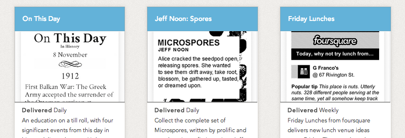
In a nutshell Little Printer is a cute little device that delivers a mini personalized newspaper to you every day. You choose which publications you want to receive, such as ‘Butterfly of the Day’ or ‘Birthday Reminders’. LP publications are created by everyone from the BBC to ARUP to individual illustrators and designers looking to share their content in a unique way.

Screen Shot 2013-04-08 at 4.02.53 PM

some existing LP publications

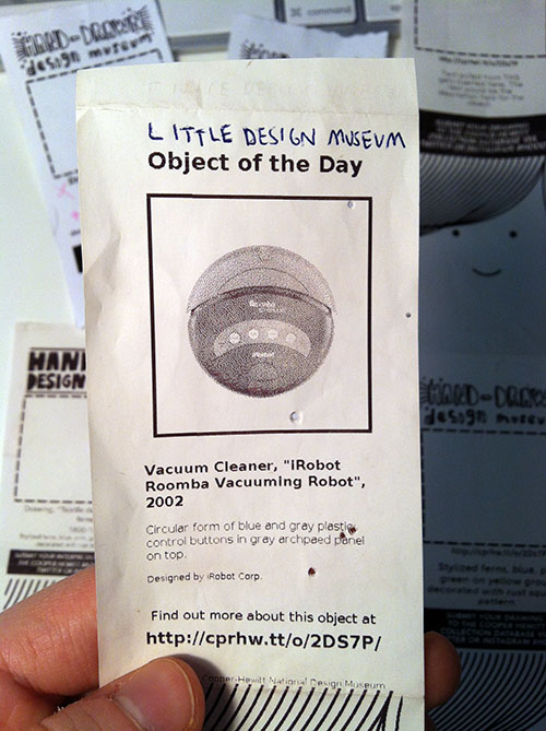
The first thing we thought of doing was a simple print spinoff of the existing and popular series on our blog called Object of the Day.

Aaron's first stab at simply translating our existing Object of the Day blog series into (Little) print format.

Aaron’s first stab at simply translating our existing Object of the Day blog series into (Little) print format.

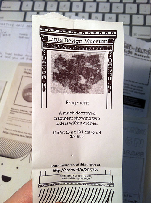
Then we tried a few more iterations that were more playful, taking advantage of Little Printer’s nichey-ness as a space for us to let our institutional hair down.

little printer printout with a collecitons object in the middle and graphics that borrow from the carnegie mansion architectural details.

We tried to go full-blown with the decorative arts kitsch, but it came out kind of boring/didn’t really work.

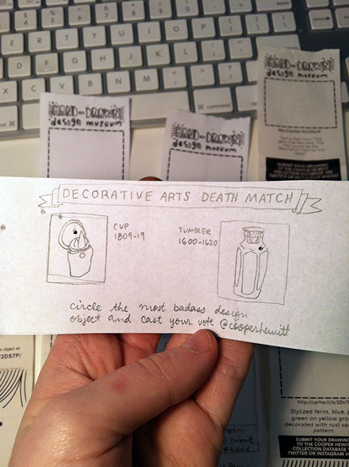
Another interesting way to take it was making the publication a two-way communication as opposed to one-way, i.e., not just announcing the Object of the Day, but rather asking people to do something with the printout, like using it as a voting ballot or a coloring book. ((Rap Coloring Book is a publication that lets you color in a different rapper each week, I think it’s pretty popular. I was also thinking of the simple digital-to-analog-to-digital interaction behind Flickr’s famous “Our Tubes are Clogged” contest of 2006 which I read about in the book Designing for Emotion (great book, I highly recommend).))

paper prototype for little printer publication with hand drawn images and text

Took a stab at a horizontal print format with a simple voting interaction. Why has nobody designed a horizontal Little Printer publication yet? Somebody should do that…

The idea everybody seemed to like most was asking people to draw their own versions of collection objects that currently have no image.

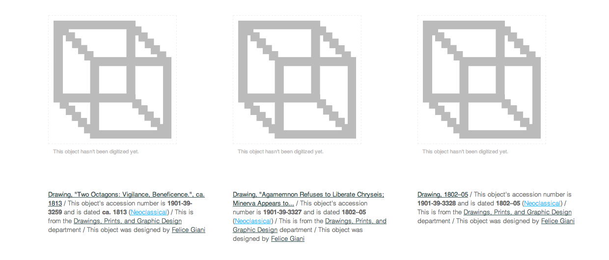
If you look on our Collections Online, you’ll see that there are plenty of things in the collection that “haven’t had their picture taken yet.”

screenshot of cooper hewit collections website showing placeholder thumbnails for three items.

Un-digitized (a.k.a. un-photographed) collections objects

I think this is a better interaction than simply voting for your favorite object because it actually generates something useful. Participants will help us give visual life to areas of our database that sorely need it. Similar to how the V&A is using crowdsourcing to crop 120,000 database images or how the Museum Victoria in Australia is generating alt-text for thousands of images with their “Describe Me” project. The Little Printer platform adds a layer of cute analog quirk to what many museums and libraries are already doing with crowdsourcing.

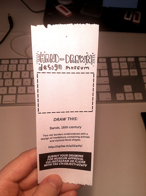
paper printout of little printer publication. big empty box indicating where drawing should go.

This prototype (now getting closer..) uses machine tags to allow people to link their drawings directly to our database. I printed this with an inkjet printer so it looks a little sharper than the Little Printer heat paper will look.

Lately at the museum we’ve been talking about Nina Simon’s “golden rule” of asking questions of museum visitors—that you should only ask if you actually CARE about the answer. This carries over to interaction design, you shouldn’t ask people for a gratuitous vote, doodle, pic, tweet, or whatever. I think some of the enjoyment that people will get out of subscribing to this publication and sending in their drawings will be the feeling that they’re helping the Museum in some way. [We know that there aren’t that many Little Printers circulating out there in the world but we do think that those early adopters who do have them will be entertained and perhaps, predisposed to playing with us.]

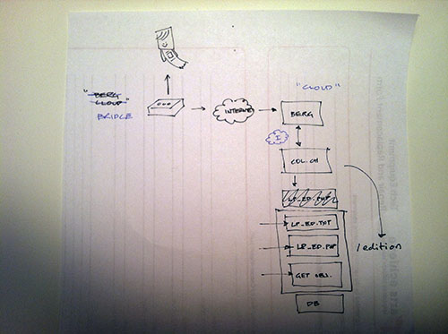
flowchart style napkin sketch showing little printer's connection to the internet, collections site and database.

A typical Aaron diagram.

The edition runs as part of the collections website itself (aka “parallel-TMS“). We chose to do this instead of running it externally on its own and using the collection API because it’s “fewer moving parts to manage” (according to Aaron). Here’s a little picture that Aaron drew for me when he was explaining how & where the publication would run. If you’re interested in doing a standalone publication, though, there are several templates on GitHub you can use as a starting point.

We’ll see how people *actually* engage with the publication and iterate accordingly…