

We have a lot of objects in our collection. Unfortunately we are also lacking images for many of those same objects. There are a variety of reasons why we might not have an image for something in our collection.
- It may not have been digitized yet (aka
had its picture taken
). - We may not have secured the reproduction rights to publish an image for an object.
- Sometimes, we think we have an image for an object but it’s managed to get lost in the shuffle. That’s not awesome but it does happen.
What all of those examples point to though is the need for a way to convey the reason why an image can’t be displayed. Traditionally museum websites have done this using a single stock (and frankly, boring) image-not-available placeholder.
We recently — finally — updated the site to display list
style results with images, by default. Yay!
In the process of doing that we also added two different icons for images that have gone missing and images that we don’t have, either because an object hasn’t been digitized or we don’t have the reproduction rights which is kind of like not being digitized. This is what they look like:


The missing image icon is courtesy Henrik LM (The Noun Project).
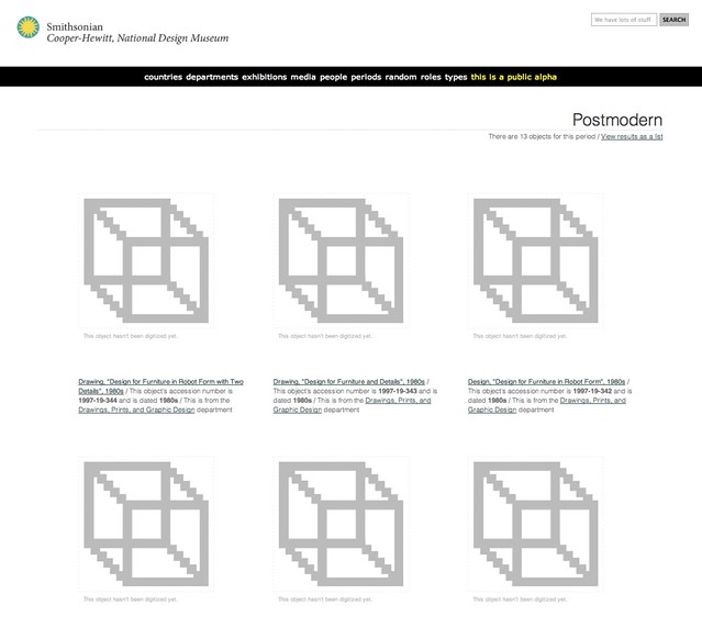
So that’s a start but it still means that we can end up with pages of results that look like this:
What to do?
We have begun thinking of the problem as one of needing to develop a visual language (languages?) that a person can become familiar with, over time, and use a way to quickly scan a result set and gain some understanding in the absence of an image of the object itself.
Today, we let some of those ideas loose on the website (in a controlled and experimental way). They’re called Albers boxes.
Albers boxes are a shout-out and a whole lot of warm and sloppy kisses for the artist Josef Albers and his book about the Interaction of Color.
This is what they look like:
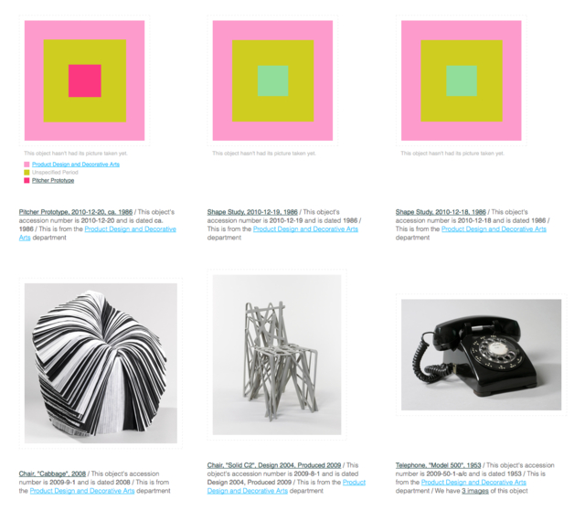
The outer ring of an Albers box represents the department that an object belongs to. The middle ring represents the period that an object is part of. The inner ring denotes the type of object. When you mouse over an Albers box we display a legend for each one of the colors.
We expect that the Albers boxes will be a bit confusing to people at first but we also think that their value will quickly become apparent. Consider the following example. The Albers boxes allow us to look at this set of objects and understand that there are two different departments, two periods and three types of objects.
Or at least that there are different sorts of things which is harder to do when the alternative is a waterfall of museum-issued blank-faced placeholder images.
The Albers boxes are not enabled by default. You’ll need to head over to the new experimental
section of the collections website and tell us that you’d like to see them. Experimental features are, well, experimental so they might go away or change without much notice but we hope this is just the first of many.
Enjoy!
Also: If you’re wondering how the colors are chosen take a look at this lovely blog post from 2007 from the equally lovely kids at Dopplr. They had the right idea way back then so we’re just doing what they did!
Pingback: Bookmarks for February 4th from 11:59 to 13:18 : Extenuating Circumstances
I love this idea. Such a creative solution to the catalog. Thanks for sharing!
Aaron, this is a great idea, and like all the best ideas I think we may have to flatter you by imitation 🙂
Cheers, Jeremy @ IWM
Pingback: Robot Rothko | Cooper Hewitt Labs
Pingback: A new app turns a design museum’s collection into digital Rothkos – Quartz
Pingback: Related News Sources: Robot Rothko << Cooper-Hewitt Labs | archaeoINaction
Pingback: A colophon for bias | Cooper Hewitt Labs
Pingback: Little Printer Experiments | Cooper Hewitt Labs