
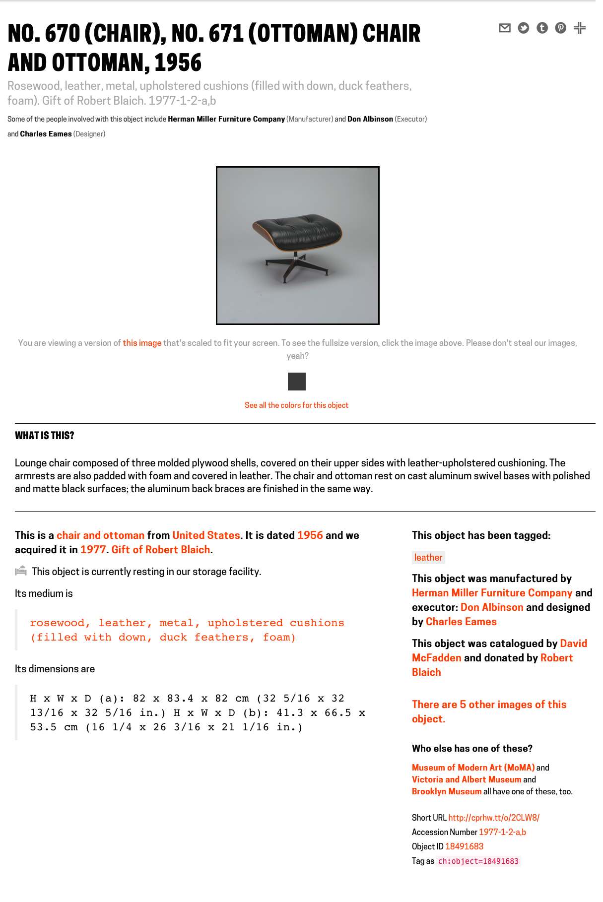
As a Peter A. Krueger intern this summer, I am working in both the Digital and Emerging Media and Cross-Platform Publishing Departments at the Cooper Hewitt. Since I am traversing the two departments, a project that allows me to learn from each and create something that benefits both is of course ideal. The Label Book Generator does this in a twofold manner: It allows me the opportunity to learn and write code to develop a digital product, which in turn, serves to produce a physical publication of interpretive content for an exhibition.
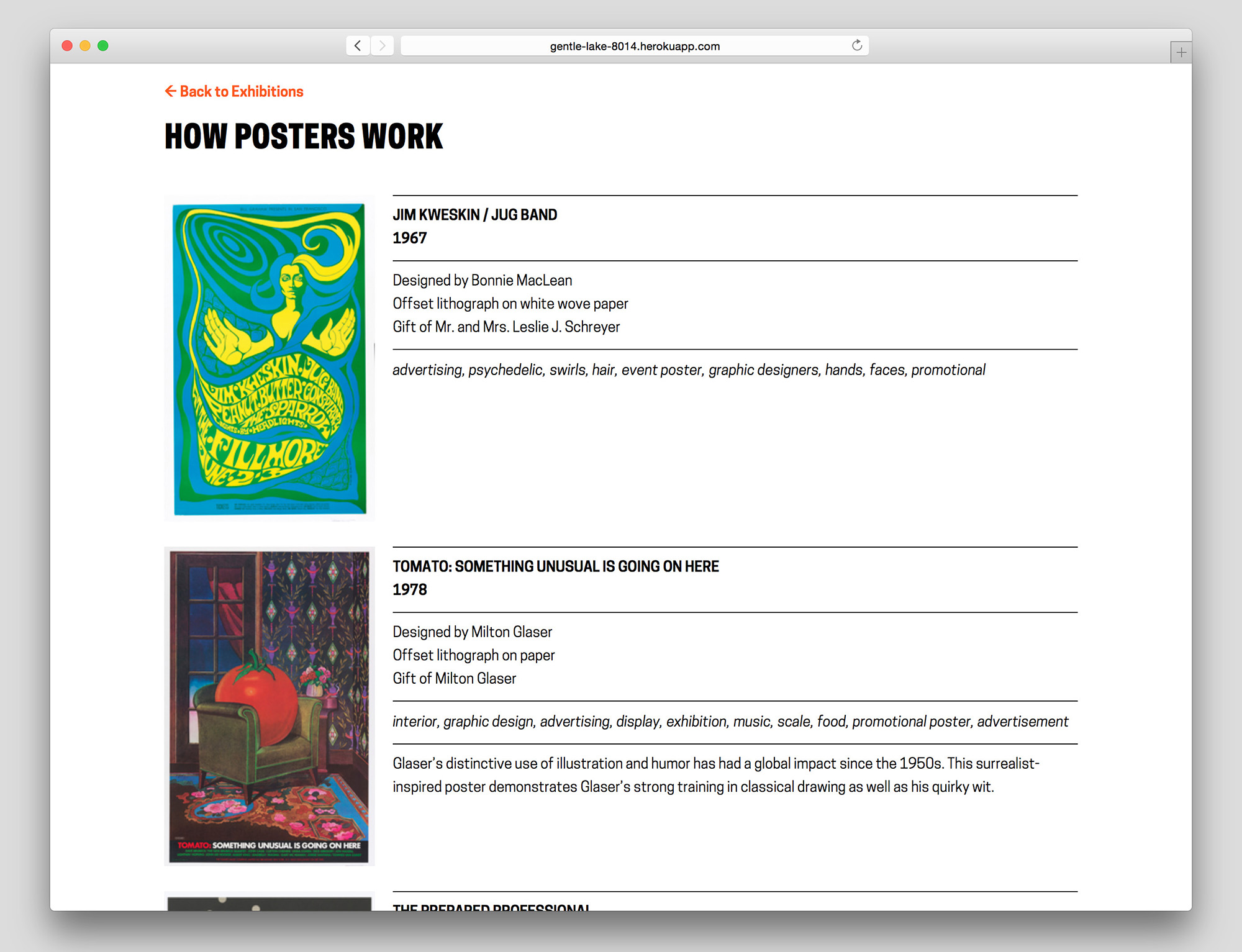
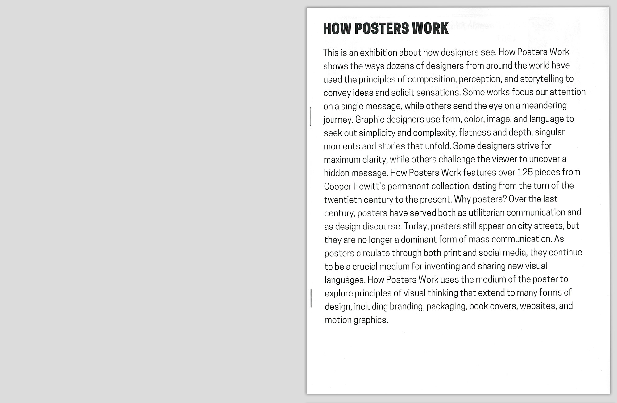
Label Book Generator–’How Posters Work’ exhibition page
Currently a prototype, The Label Book Generator is a tool that creates a printed publication of object labels for each exhibition at the Cooper Hewitt. In its most basic use, Visitor Services at the museum can navigate to an exhibition from a list on the website’s homepage and once on an exhibition page, press Command-P (or File > Print) to generate a PDF with an initial cover page followed by a single label on each page–all entirely set in a larger font-size.
What initially prompted the development of this prototype was to solve readability issues visitors may have with existing wall labels. This does not imply that the current label design needs to change or be set in a larger font-size, but instead that the labeling system as a whole should be augmented with something to make them more accessible, to provide a magnifying glass of sorts when needed.
Publication in use in the gallery
The entire process proved to be invaluable as a learning experience. From the start it was obvious that I needed to leverage the museum’s API to access object data by exhibition to ultimately populate fields in each label. As the Label Book Generator website is currently, the selection and order of the fields are in accordance with a predefined template that begins to apply the typographic guidelines of the existing wall labels. As a graphic designer it was particularly interesting for me to consider the meticulous planning that is usually involved in typesetting parallel to the time spent writing the code. Whereas typically, these two processes are dealt with in succession.
Since the end result needed to be a book, I was set on formatting the data in a markdown document that would have typographic styles manually applied in InDesign. A Python script was written to create a markdown document with syntax assigned to each field, e.g., titles would be prepended with ‘#’ to be a top level header, dates with ‘##’ to be a second level, etc.
Stumbling along with my rudimentary skills in Python–and at one point rewriting the whole thing in Javascript, only to go back to Python–led me to conclude that outputting the final document with InDesign can be circumvented. With the much-appreciated help of Micah Walter, it was settled that rather than generating a markdown file, I should instead produce a small web application using Python and Flask as a framework. The most salient aspect of the entire project now being a simple print style sheet for the website that automatically generates the same final document that having to manually use InDesign would have produced (Here is the code available on Github).
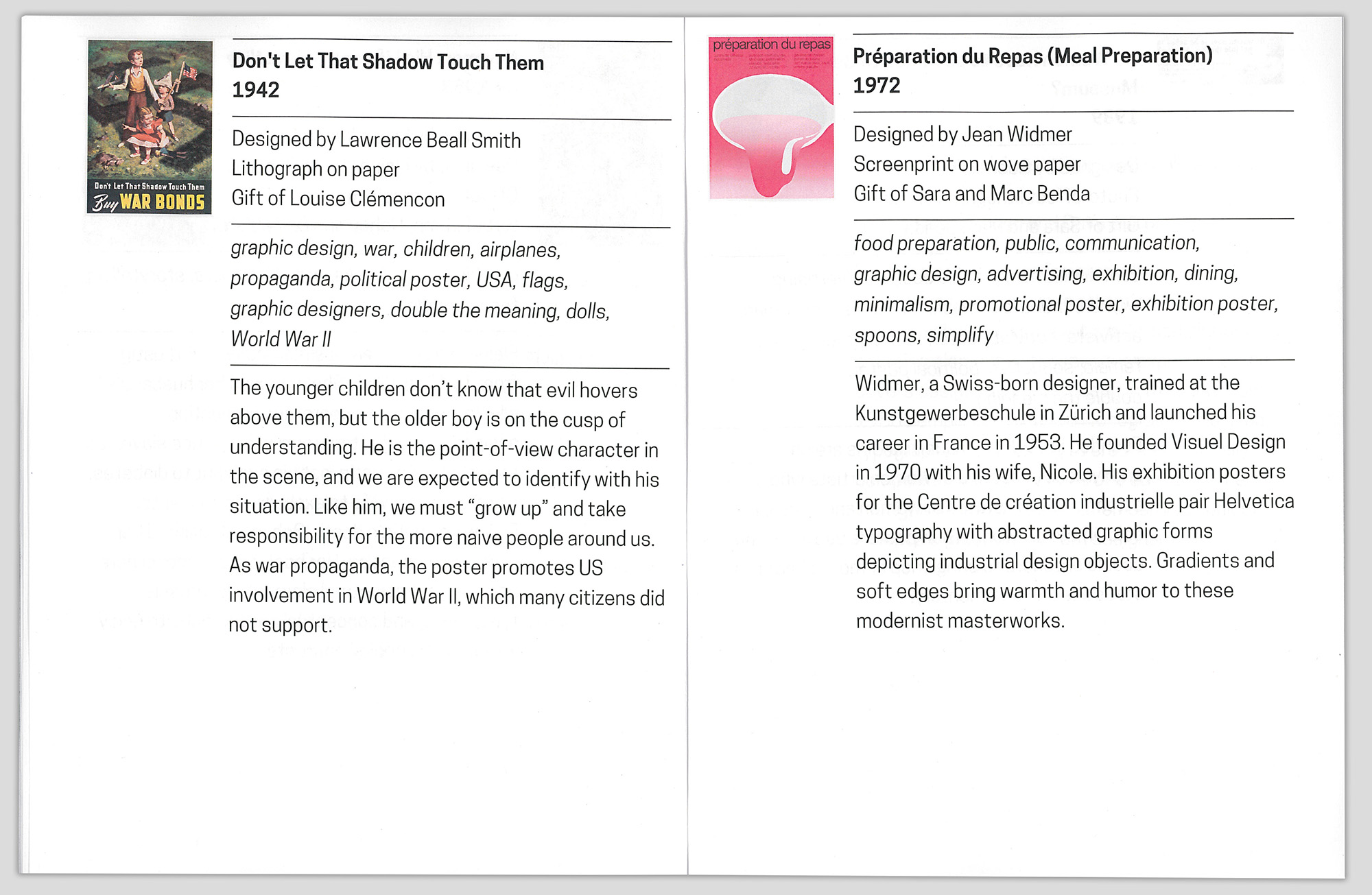
With a central concern for typography, the print style sheet seamlessly flows all the content into any fixed page format, which in this case would be a printable PDF. The printed document once bound can be considered an exhibition catalog reduced to its essential elements: A list of every work, with their respective information and descriptions (when available).
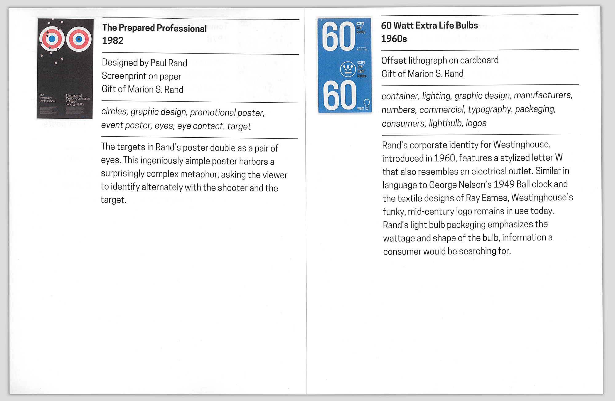
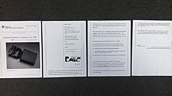
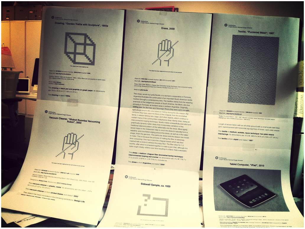
Interior spread of printed publication
The Label Book Generator solves the initial prompt of assisting those hard of seeing. However, considering that the website from the get-go is built with a responsive layout and scalable typography (again due to the simultaneity of graphic design and web development) there are a number of opportunities to expand it’s role and purpose.
The typography, padding and margins set in REMs (Root EM), rather than fixed sizes, allows for the ability to control the base size and relatively adjust the measurements. A future version of the website can include in the interface a means to control how large or small the base size of the document should be, given the dimensions of the fixed format–whether it be a standard letter-sized PDF, or otherwise.
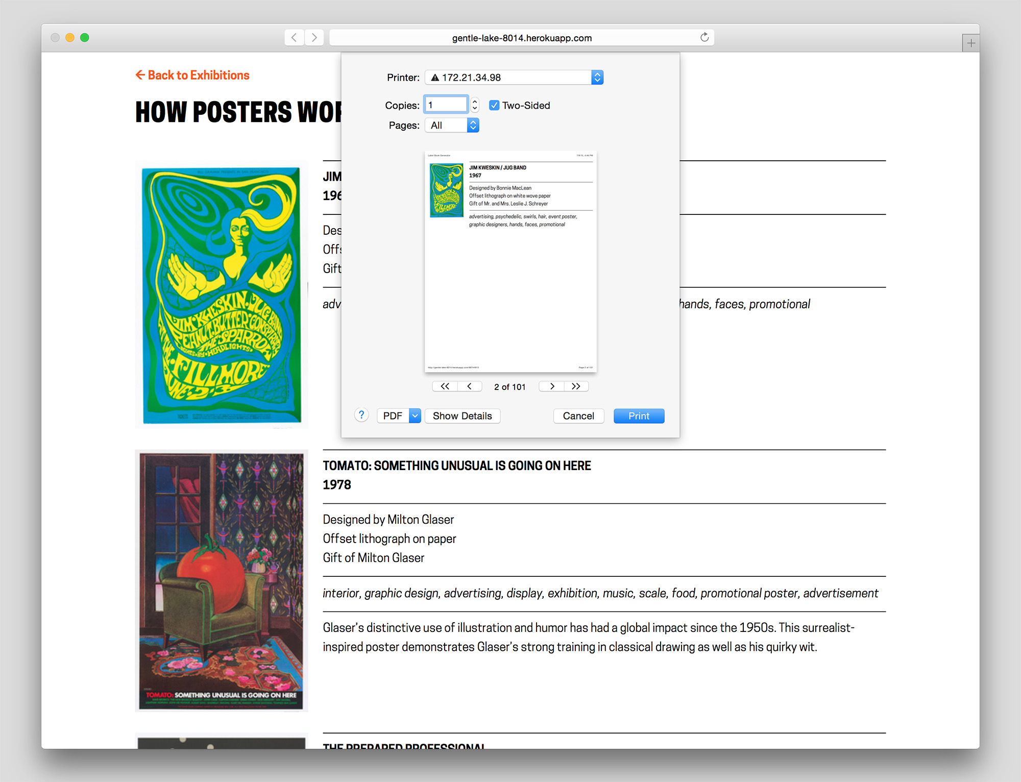
Browser print dialog box
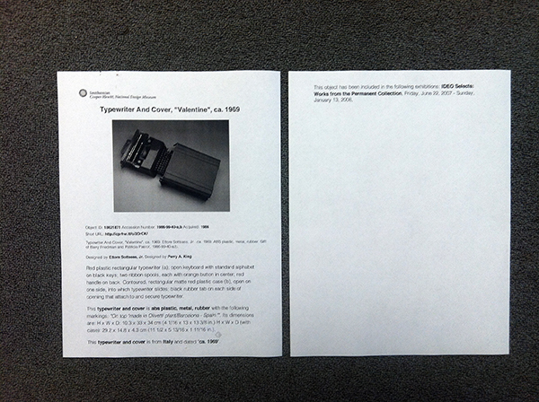
Cover page of printed publication generated from the website
Interior spread of printed publication
When presenting the prototype to others here at the museum Katie Shelly brought up an interesting future use case involving blind visitors and screen reader software. In addition to the possibilities with printable versions of the Label Book Generator, the website itself provides a responsive mobile view of all the labels which could theoretically be read to the visitors via their personal device.
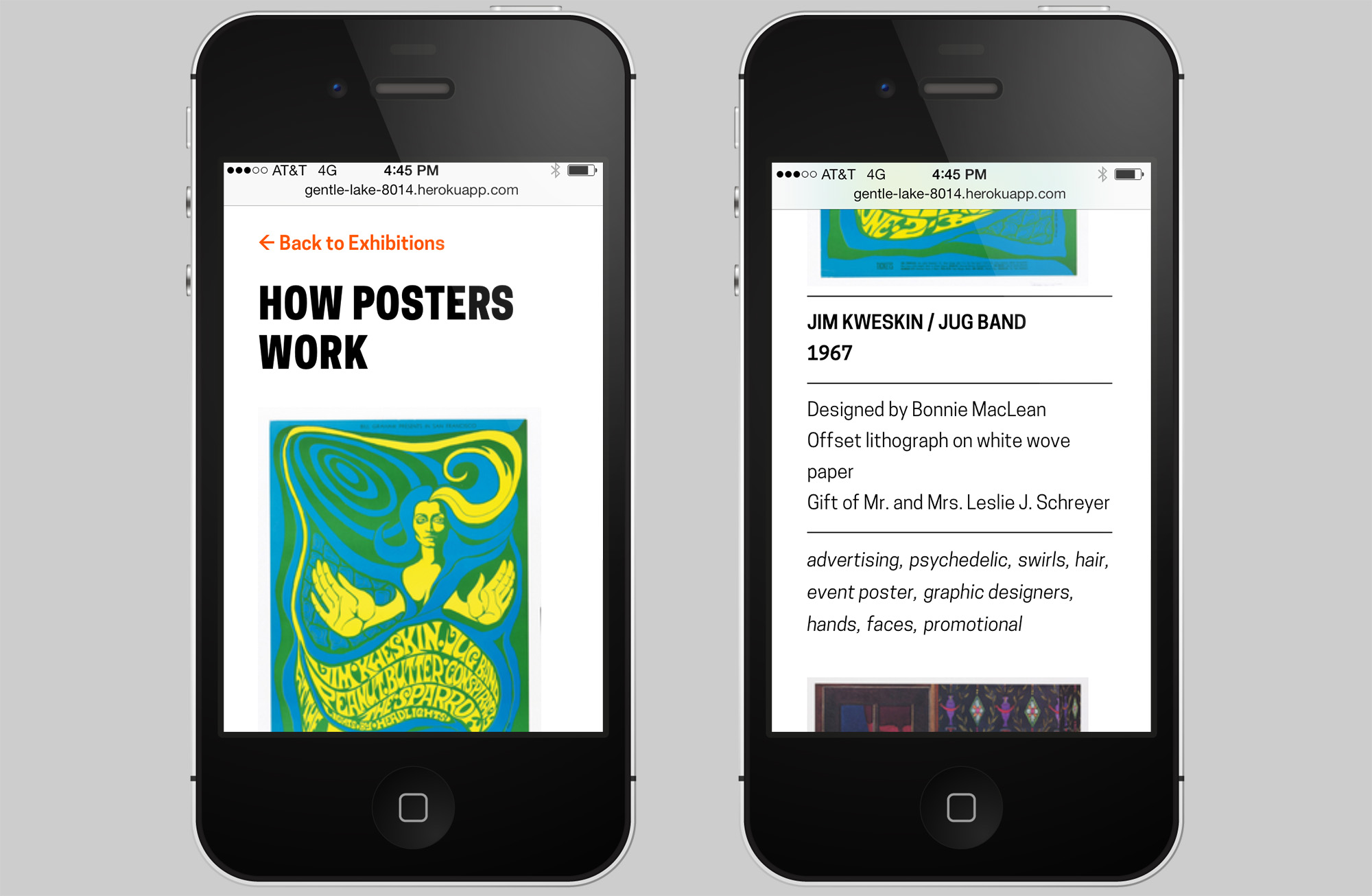
Mobile view of website
Finally, the printed label book serves as a means to visualize the collection database. If a label in the book and website is missing a field, it reflects an oversight at the ‘source of truth’. In other words, there is a one-to-one relationship between the fields in both the labels and the database. Ultimately, this brings to mind the commonplace workflow of producing wall labels that are manually written, designed, and edited (on this topic see also: Label Whisperer). In perhaps a later version, a similar process of using the museum’s API to automate the process of generating the label book, could theoretically be applied to the entire production of wall labels for the museum.
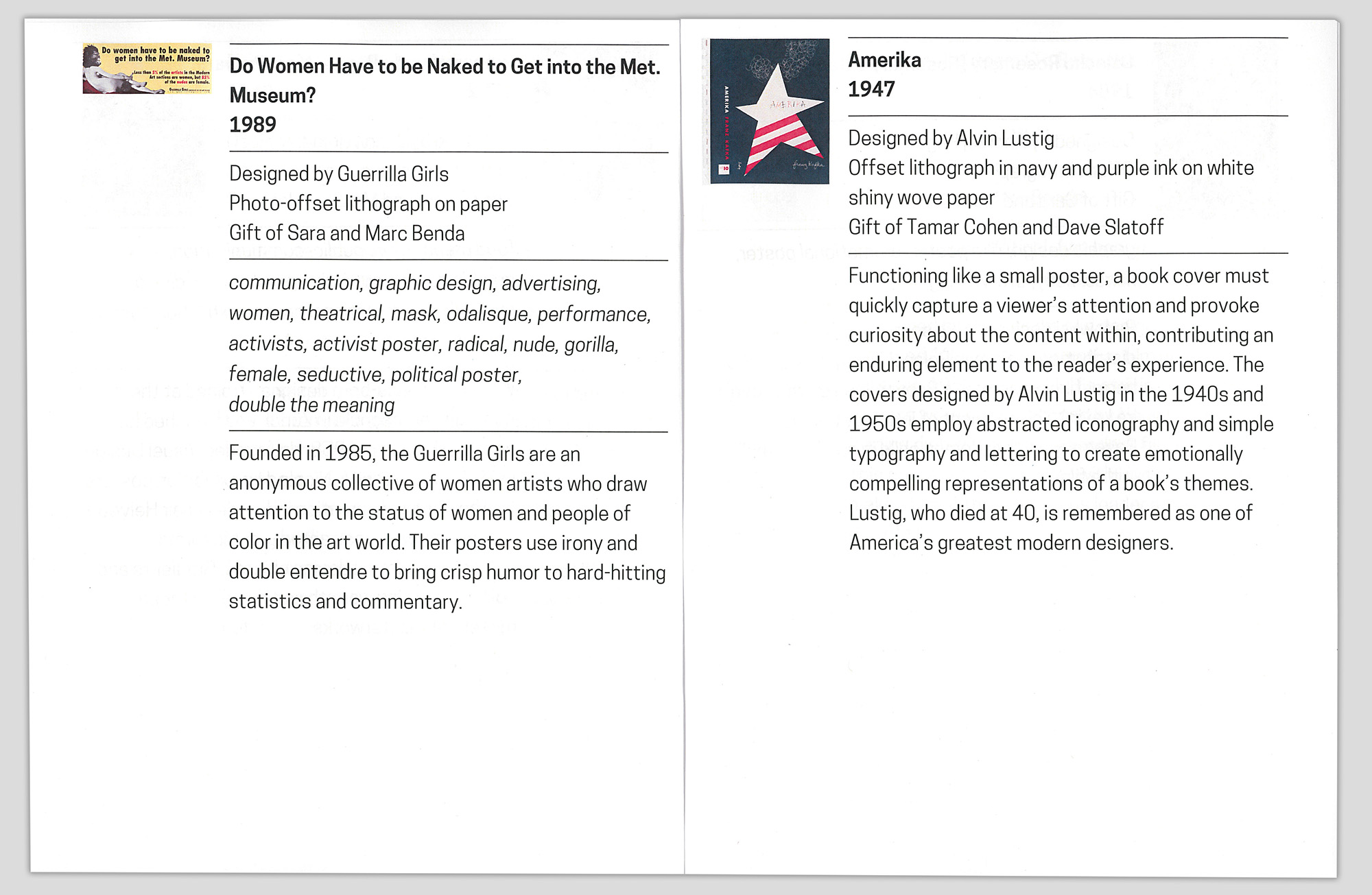
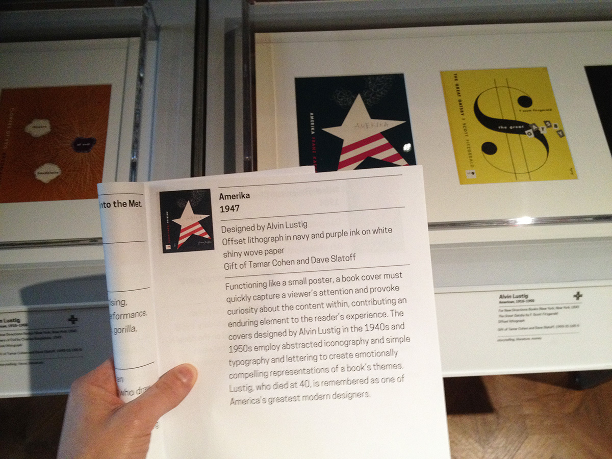
Missing tags for ‘Amerika’
Give the Generator a go!


